Transcripts
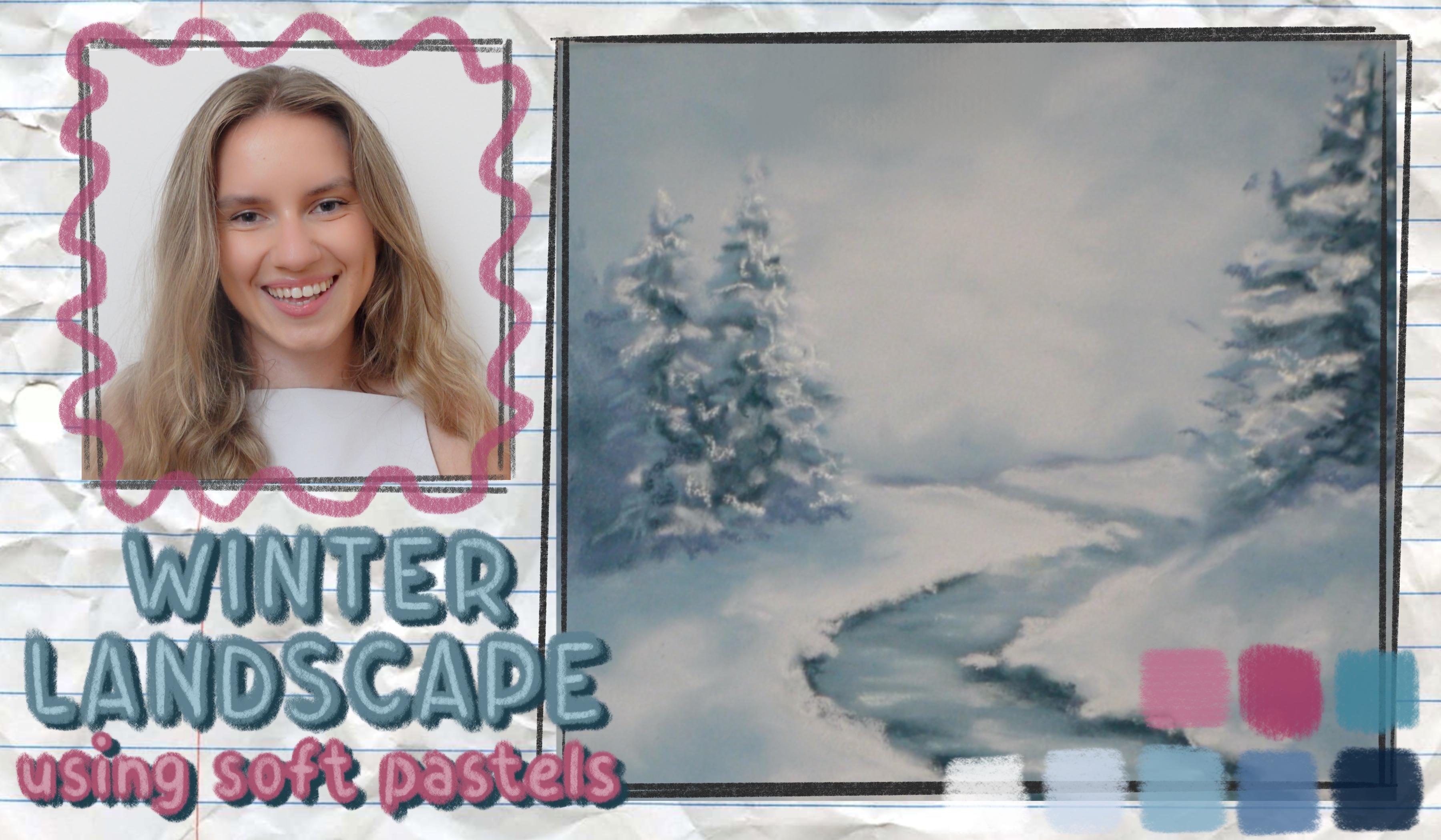
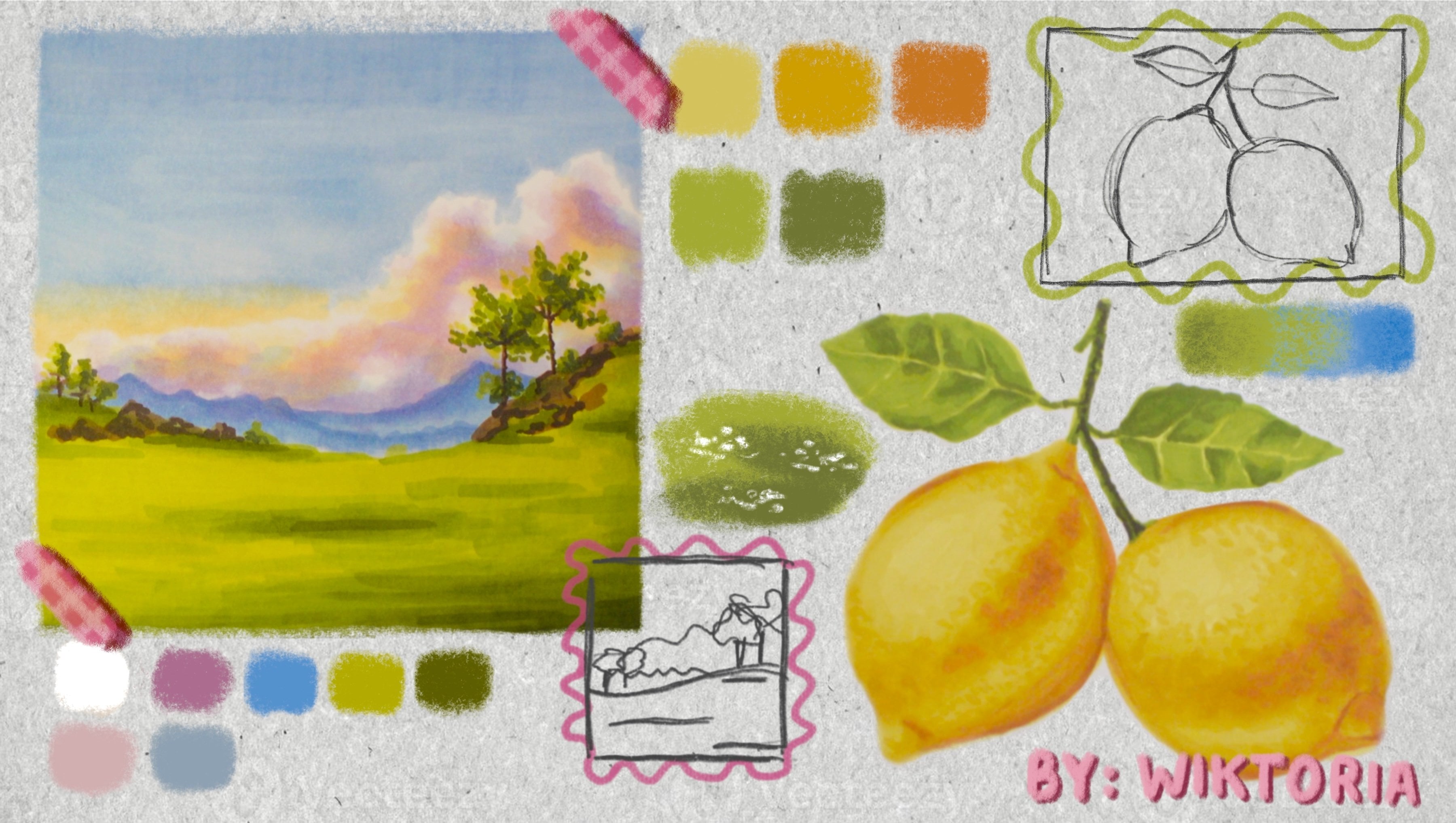
1. Welcome!: Hi artists. I would love for you to join me in today's class where we will create a beautiful,
snowy winter landscape. My name is Victoria Miko, and for many years, I have been working as an art teacher. I love creating realistic
portraits of people, animals such as this drawing
of my little dog, Toby, and cozy landscapes, similar to the one we
are working on today. The process is
breaking down into simple beginner
friendly sections, so it's perfect for anyone, whether you're just starting out or already have some experience. We will begin by creating the outlines where
we will create a line down the
middle of our page to separate the
land from the sky, and we will outline a rough
shape of the river and trees. Next using only two colors, we will move on to
painting the sky. Here we will learn to blend our colors and create
a smooth layer. After that, we will complete
the river and the field. Together, we will
create the reflective water texture and fluffy snow. Finally, we will
tie the painting together by creating the trees. Here I will show you
a simple technique of how to use the shape of the pastel stick to
create the appearance of distant trees and snow sitting
on top of its branches. I hope you will join
me in today's class so we can create the
winter landscape together, so let's grab our
materials and get started.
2. Materials & Outlines: Hi artists. So in
this last lesson, we are going to
complete the outlines. So I'm going to be using
a light gray pencil. This is a pastel pencil. You can use any kind of pencil, as long as it's not too dark. You just don't want
the pencil to be able to show through the
outlines at the end. So yes, I'm using a gray pencil. If you happen to be working on a paper that's a darker color, maybe something dark gray, then you can even go ahead
and use a white pencil. Really, the lighter, the better. So I'm using this one. It's just a light gray color. And really, I'm not going to pay too much attention
to the outlines. I'm kind of just going to block out where I
want things to be. So you can take a look
at the reference photo. So maybe we're going to start
with the line that kind of separates the background
from the foreground. So this horizontal line runs almost through the
middle of the drawing, but it's not quite exactly in the middle outside.
It's a tiny bit lower. So we can start by creating a line doesn't
have to be perfect. And then, why don't
we do the river next? So let's look at the
furthest point of the river. Again, it's kind of exactly
almost in the middle, maybe a teeny bit to
the left of the middle. So it would start
somewhere like here. And then it goes. Let's look at the next
point of the river, so the one where
it kind of turns. So it looks like I like to divide my
paper into fractions, and it looks like
maybe that would be three quarters of the width of the paper,
starting from the left. So it would be
like half is here, three quarters would
be about here. So I'm just going
to do this line. And then the next point, um, it looks like it's about here. So I'm kind of trying to measure the
distance between things. So now I'm looking at this line and the bottom of the paper. And it looks like this area where it kind of
curves and it goes back would be kind of exactly in the middle
of the width of the paper. But if you look at
the height between this point and this
line down the middle, um, it looks like it's
not exactly like halfway. It's a bit higher than halfway. And then we go all the way back, not quite into the corner, but close enough. Okay. And now we're going to draw the line on the
left of the river, and it's pretty much
parallel to the right side. The only thing we have
to remember is that it's more narrow the
further it goes. So maybe if we start with
this point over here, it looks like this point where
you can see the bottom of the river comes out of maybe, like, the same area
where this is. So if you draw a
straight line from here, the bottom of the river
would come out from heat. And now this is where
it really narrows. And now all that's left
to do are the trees. So first, maybe let's continue this line so we
can draw the hell. And then the tree looks
like just a rough shape. Something like this,
right? And then we've got these
two smaller trees. Again, I'm just roughly
mapping them out. It really doesn't matter
where you put them. Drawing landscapes
is not quite like drawing something like
people or animals where everything has to
be exactly measured out because this
landscape could have been could have looked 1
million different ways. And yeah, like, you know, this tree could
have been bigger, it could have been
more further back. It could have been to
the left to the right. So yeah, it really doesn't
matter if you make any differences that you
see in the reference. Now we've got the smaller tree. Um, okay, so this was the
last of our outlines. We don't really need to
outline anything else. The rest we can kind of figure out as we're
applying the colors. Um, right now, I'm actually not sure if I'm
in love with the branches. Um, maybe I'll just leave them out in the
end. So we'll see. You can add them if you want to, but I'm actually not
that crazy about them, so I'll see in the end. Either way, I wouldn't
really be drawing them right now in
the outline phase, because we can just create
them with the chalks. So that's it. And now the next thing to
do is to add color, so I will see in the
next lesson where we will actually start
using our pasteles. So I will see you there.
3. Paint the Sky!: So for the sky, we are probably just going to
use these two colors. So this is the medium blue, and this is the light blue. So we are going to start
with the medium blue. So we are going to
start layering it here, and we are going
to start by doing a very thin layer because
we can always add more, but we don't want to add
too much because then it's going to be a little bit
difficult to remove. And also, we are going to
overlap some of the trees because the sky is going to
show through the branches, and we can add a new layer
for the trees anyway. So you do kind of want to go
into the trees a little bit. You don't really
need to be, like, perfectly neat with this. And then we have there's a bit of a darker shade of
blue here at the bottom. And then all over here. Okay. I'm going to kind of, like, do a lot of this area here is the
lighter blue shade, right? But we want them to
overlap slightly. So I'm actually going
to go into this. We have a tiny bit of that medium blue because we
want there to be a gradient. We want the colors to kind of blend nicely into each other
as opposed to just like, you know, this being a
light blue circle and then the rest of it being
a medium blue circle. And now I'm grabbing
the light blue, and I'm going to fill out
mostly fast over this area. And if it looks crazy at
this stage, it always does. So once we blend it will
look a little bit better. And then also, you kind
of have to test out the colors and see what works, what doesn't, how it blends. Like, right now, I think,
we definitely need, dark blue and then light
blue in the middle. But when we blend, we can see how much of which
we need to add. Maybe we need to
go over the entire thing with the light blue. So it's kind of trial and error. That's why you
want to go slowly. Okay, so this is what we have. I think I'm going to blend at this stage and then see
how everything looks, and then we can always
come back to it. So I'm already going
to wipe my hands. I really don't like the feeling of the pastel dust on my hands, so I always have
a wet wipe ready. Now we are going to blend. So just be careful
that you don't have a color on your blender. My blender is
definitely not new. It's got, like, a grayish
blue color on it, but that's okay
because we are still blending gray and blue. So, if your blender has, like, white on it or if it
has a blue on it, you can probably just,
like, you know, use it. But if it has, like, you
know, neon green or pink, it's probably not ideal. So yeah, now I'm going to blend. And once we blend, we'll be able to see how
much we need to add. So I'm kind of just
blending all over. Ida that you want to blend
in circles like this because that's how you'll get, like, the nicest blend. If you blend in straight lines, it's going to appear
very streaky. So ideally we'll just blend
in small circles like this. Okay, and now I can see that I definitely need another layer. The placement of the
color looks good, but I can see I don't have enough Pastore
because I can see, like, the scratches where I was applying that blue
medium blue layer. So I think I'm
just going to take both and go over them again. Um and then we'll
see what's next. So again, I'm grabbing
my medium blue. And you don't really want to make your lines look streaky. So try not to use, like, the very edge of
your pastel stick, because if you just draw off the corner and
then you blend it, it's not going to look
like a very smooth blend. You're gonna be able to see kind of like the zigzag shape, of how you're
applying that pastel. So I try to kind of conceal
the direction of the pastel, so I go over it with
a big I use, like, a big area of the pastel
stick, and that helps. And again, I'm just going to go into the light blue
area slightly. And then maybe what I'll do is I'll blend this separately, and then I'll add the light blue and blend separately as well. So again, I'm blending now
in the circular motion. And I also didn't
see that there's a little corner of the
sky showing through here. I'm going to kind of
blend into the tree. Okay, that looks much better. That's a much thicker layer. And so now when we
apply the lighter blue, it's going to look
a lot more natural. So again, I'm grabbing
the light blue, and I'm just going to kind
of fill out in the middle. And then for now,
we're just kind of applying the color and
then in the second, we'll create a little
bit of texture. Okay. Now I'm
lending this again. And I'm going from the outside in because when you go
from the inside in, the dark blue color
that was previously on the sponge is going to kind of deposit itself in the middle. So then you would have,
like, a darker pata. So it's easier to just go
from the edges inwards. So then by the time
you get to the middle, this is covered with
the lighter shade. Okay. So now we can actually go ahead
and create some texture. So what we want
to do is we still want to use those two colors, but we are going to kind of not blend into the
paper so much. So, for example, now I'm
looking at the skyline, and it seems like
in the distance, there are some trees, maybe. Either way, there's a little
shape happening here. And so I'm filling that in. Anywhere that I see
a lighter blue, I'm kind of just going in there, adding some of this color, and then I'll blend. And then we also have some
on the sky higher up. So here as well. Maybe
some above the trees. And now what we will do is we will actually just
blend with our hand. So there's a small difference between blending with
the sponge and then blending with your hand
because the sponge picks up so much because the texture of the sponge is able to pick
up a lot of pastel dust, so it kind of spreads it. So if you want to achieve a gradient and have colors blend very
smoothly into each other, the sponge is much better
for something like that. But if you want to kind of leave the pastel where it is
on the paper and just, like, work it into the paper, blending with your hand is much better because
we don't have as much texture on our skin, so you can see when we blend. It kind of stays
where it is, right? So you can use both lending methods depending on the effect you're
trying to achieve. And in this case, I think lending of a
hand is more suitable. Okay. I think I might have gone a little
overboard in some areas. So I'm actually just going
to blend of a sponge, a tiny bit just around here, and you can immediately see
what a big differences make. It just, like,
disappears the color and blends it into everything
that's surrounding it. Okay. And now we can use our medium blue
again and just create a little bit of texture where
we see, we see medium blue. So there's some
here at the bottom. And I'm going to
add much less of this blue than I was adding the light blue because I think the medium blue is a
little bit strong, so I don't want to
add a crazy amount. The light blue was more subtle, so it was okay to do that, but I want to be a bit more
careful of this color. And we'll blend again. And I'm not really pressing my hand too hard onto the paper. I'm just lightly touching it. Not applying too much pressure. Okay, and I think I'm just going to go over some areas
of this as well, just to make it a little neater because I do think that
blue is quite strong. Well, we can even use the sponge to create a bit of texture here. Okay, so I think this might be it for the sky.
It's very simple. Um, if you feel like you
want to make changes, maybe keep on adding layers just to make sure
everything is smooth. And remember, pastels
are very forgiving, so if you feel like an
area doesn't look right, you can kind of blend it
and just redo it again. So I think that's it
for me for this stage, and I will see you in
the next lesson. Bye.
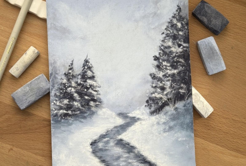
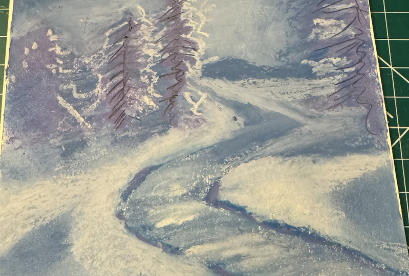
4. Snowy Land & River : Okay, now we are going to work on the land
and on the river. And I think for this section, we will pretty much
need all of our colors. So perhaps I think we should
start with the river. I'm going to begin
with the darkest blue, and my darkest blue
isn't that dark, so I think it will be okay. But if yours is too dark, then maybe you should start
with your medium blue. And when I'm applying this, I'm actually going
in straight lines, and this is important because we're already starting to create that texture of water. If you look on the
picture, the water is going side to side. And if we do this
from the beginning, it really helps to convey that texture right
from the start. And we'll also be blending in the sideways motion as well. So here we have this sofa. And let's maybe let's just go ahead and blend and then we'll apply our next colour. So you can see I'm
blending side to side. It kind of already looks like a Riva with the
color of the paper showing through underneath. Okay. Next up, we are going to
grab our medium blue, and now we will
start to kind of go over the areas where that
medium blue appears. So I see some here. We're just kind of going
over it again and again. And I'm going to
put a little bit more of that light
blue here because this area isn't as dark as the rest of it
here at the bottom. Okay. There's not that big of a difference between my dark
blue and my medium blue. So I think that's enough,
and I will blend again, again, going side to
side the entire time. Okay. Now, I'm actually going to introduce another color
before I only had light blue, medium blue, and dark blue. But then I realized
that those areas here, my dark blue isn't really
dark enough for that. So I introduced this color, so hopefully this one
will be dark enough. However, if you don't have a color that's
as dark as that, you can actually just use black and mix it with some dark blue, the original dark blue
that you were using because if you just
use black on its own, it can kind of make things
appear a little bit lifeless. So that's why you want to
use a blue on top of it, so then you're kind of
mixing the two together, and then you're
getting a dark blue. So yes, this does look good. So now I'm just
adding this dark blue on the sides right here, and also some at the
base of the watern. Now, there's a lot more
of this dark here because we can actually see the
bottom of this hill, but we can't see the bottom
of it because it's like behind this hill, if
that makes any sense. So most of this dark area
is going to appear Heum. Okay, so now I'm
going to blend this. Again, still going side to side. Okay. That's how
it looks so far. Um, I think we should add
the lighter blues now. So first, I will add
the very light blue, and then I think
we'll even add some white in some of these areas. And I think we'll have to
do the same thing we did with the sky where we kind
of just blend with our hand. But we'll do that in a second. I think we should do the snow first and then kind of do the details because
when we're blending the snow, we're going to be blending
all over the place anyway, so it doesn't pay to
create nice textures. This is kind of let's
think of this as, like, a base layer for the
details that are to come. Maybe we'll do a small
amount of white. My white broke, by the way. So we'll do a little
bit of white here. And very, very delicately
will blend the sin. Okay. We'll come back
for round two and add a little bit more detail
to this in a second. But for now, let's just
do the snow quickly. So I'm kind of wondering
if we should do the branches that
are coming out of the snow on this
side on this side, just because I'm not that
crazy about this detail, and I think that
the landscape would look a bit nicer without them. So I think I'm just
going to ignore those. So we'll just do the
snow and that's it. So now we will grab
the medium blue. Well, now that I've
introduced the darkest blue, I guess, this is the
second lightest blue. But originally we referred
to this as the medium blue. And I'm just adding some snow. And for this one, we don't
actually need to go in lines because we're not working
on that texture anymore. And while we're doing this, we'll actually start to build up the shadows beneath
the big trees. So we've got some
shadows in a few places. A lot of this
landscape is, like, a very similar color, so
it might start to overlap, but if it does, we'll bring if it does, we'll bring back the details. Okay. Okay. Looks very
crazy right now. That's okay. Now we'll
add the lightest blue. And I am looking at the
photo and trying to see where all those
lightest blue sections are This is the part of the
painting where we have to have faith that it
will turn out, well, because I have to admit
it is looking very crazy, but this always happens. If you look in the
background as well, I have some paintings over there that you can't really see them that well
because they're small, but they do the crazy right now. That's just the mid stage of
any pastel painting really. Okay. And I think just
like with the sky, we are going to have
to go over this a few times and create
that texture. But for now, this looks good. And you see why it didn't pay to make those details because
when we're blending, we're going really, really
close to that river. So if we had applied
any texture here, it would have kind of
just blended anyway. So this is why we'll do, like, a nice pace layer,
and then we'll do the details at the end. Okay, so I guess we have
the same two colors. Let's go over it one more time, and then we'll see
where we're at. Okay. I'm actually just going to bend with
my hand for this. Okay. And now, again, we'll come back with
the lightest blue, and we'll really try to focus
on those little details. And again, just
blending with my hand because now I'm really trying
to build up that texture. Okay, I actually don't like what I've created this little bump. Go try to blend it away. Yes. Okay, I think I'm going to do a teeny bit more of
that light blue. I just have to keep on
adjusting accordingly. Okay. I'm wondering if we should keep on
adjusting the snow, but I'm going to leave it for
now because I just want to go into the details of the river and then we'll see if we need to adjust
anything else after that. So yes, it looks very,
very crazy right now, but I hope we can see the
vision once a get the trees. I will look a little cutter. So I just going to start
with the dark areas. Now I will also
burn with my hand. Okay. Alright, that's better. And now I'm going
to go over each of the colors one by one
and add the details. Next up, I'm going to go
in with the medium blue. And we are still just
creating that texture. I don't think I need
to add too much of this because
this color seems to be very dominant on my painting. So I think I'm just
gonna go straight into the light blue. And then start adding my little, like, reflectivis on the water. Okay. And now just a touch of the white. Oops. O. Okay. And now I'm just gonna do a redo of the light blue of,
like, the corners. Um, like, right here, I want to make things
a bit more neat. So that's what I'm
going to quickly do. And I'm trying to not
have to blend these areas because it's just gonna kind
of reverse the details. So I'm just going to try
to leave those in place. Okay. I think that looks good. I'm just going to blend
the areas that are, like, not that close. Um, anywhere that I'm worried, I'll kind of fade away
the details I will leave. Okay. Uh, this looks good. I think I think what we have
left now are the trees. And that's gonna make the biggest difference
because I know, as I keep saying, right now, it's looking very crazy. I'm just gonna add a
little bit more texture with my sponge
before we move on. Okay, I think we're ready. Uh, yes. Okay. So in the next lesson, we are going to do the
trees, and that will be it. So I will see you there. Bye.
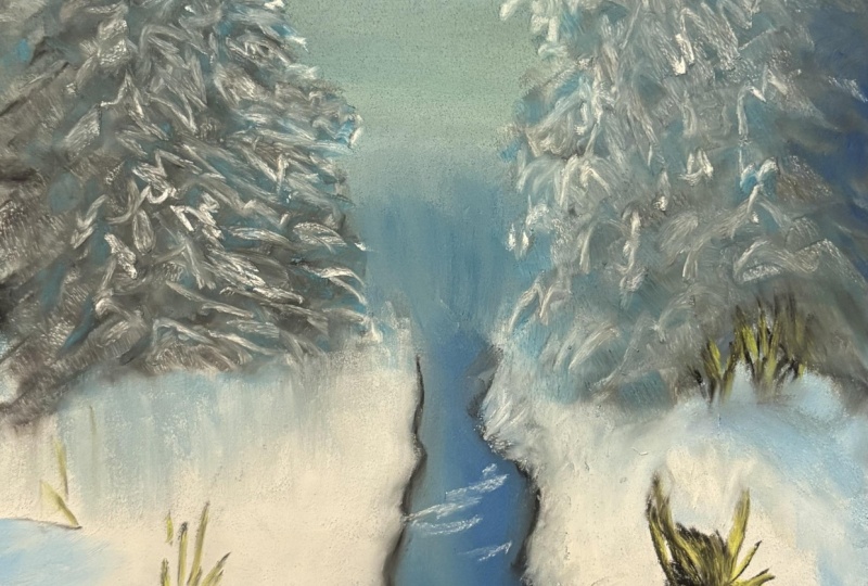
5. Realistic Trees: Okay, so this is going to be the last part of
this drawing and probably the most impact one because this is really going to bring
everything together. We are going to be
painting the trees. So there's a lot of blending
involved in this technique. It's not quite different than what we've
been doing so far, so I think you'll find it, okay. So let's start with
our dark blue. So this is the third blue, second, darkest blue, okay? So the first thing we're
going to do is we are just going to fill out kind of, like, the direction of
all of those branches. I feel like it's
already. Even though we only have a few scratches, I feel like it's already
making such a big difference. It doesn't have to
be too detailed. As you can see, I'm just doing
a very simple tree shape. And what we're actually going to do is we
are going to take the blender and we are going
to bring it out words. And we will kind of keep on
building on top of this. And that's how we'll
create the trees. Okay. So that's number one. Then we'll do this one, and, of course, we'll add to it. But we've got another
tree happening here now. We've got a distant tree. We can't really see
what's going on there. So we will kind of blend
this one out a little more. But still, I'll just add kind of like the
shape of a tree. Let's blend this one out first because this
one is going to be we're going to need to blend this one a
little bit more than others. So we'll just do it now. And then we'll still
layer some colors on top of it because
it's not just one value. Uh, okay. So next up, we'll still
using the same color. We are now going to create
the tree next to it. So just following, like,
the shape of that tree, so it's going to be a
bit more narrow at the top, wide at the bottom. I'm just going to blend it in. Okay. And then we have one more. You can even draw a line, start with a line
and then just like I should have made this tree
a tiny bit taller. Okay. All right. So this is the
base laa for the trees, and now we will keep
adding more details. So maybe now let's move
on to the darkest blue. So if you don't
have a dark blue, a very dark blue like this, you can mix black with the same dark blue we've been using, and that will look
great as well. So I'm kind of going
over the same shape. I'm looking at the reference verteo carefully
and trying to see whether really dark
areas are most common, because they're not evenly
spread throughout the tree. They're in some areas
more than others. And I guess this right side of this tree is more in the shadow
on the right side of it. So the left side is
going to be a bit lighter and the right side
is going to be quite darker. So you can add a little extra to the right side. Now we'll blend. The snow on these branches is going to be
really fun to draw. We'll get there in
a second. Okay. And then we've got
these two trees. So this one first
of all, does have, like, some random
darker patches on it. So I'm just gonna add it there. And again, I'll just
blend this one first because this one's gonna
have to be over blended. Like, so now I'll do this one. And this one looks like it has those darker patches more towards, like,
the middle of it. So just observe the
photo carefully. H and then I'll do this
one at the same time. And now I will blend. It might even make sense
to blend with our hand here kind of retain
that texture. You have to do it carefully when you're going into
the background? So we are almost done. Next up, we just have
two more colors to add. I don't know if I'm gonna
do any of the medium blue, because I feel
like there's quite high contrast in these trees, so I feel like I can just
go straight in with these. So I'm just going
to do that now. So now we're basically doing
the snow on the branches. So just look carefully
at the fighter. Where do you see the snow? And I'll just blend
with my hand. And then we'll do
the other side. I actually think it looks
better before blending. So I think I might just do that again and then not
blend as much. I'm just re adding it here because I didn't like how
it looked after blending, so I'm just adding it a tiny
bit more. And you know what? I actually do think I'm going
to use that blue colour because this tree looks too
it has too much contrast, and I want to have
just a little bit more blue in some areas. Just adding a tiny bit of that blue to give a little bit
more texture to the trees. And I think before I consider
this painting finished, I will kind of spend a
few minutes just fixing up anything that just could benefit from a
little bit more work. So I think I'm just going
to add a tiny bit more of that light blue and just make the snow a little
bit more clumpy in areas. And the next thing that I will do is I will use some white. And that will be probably the last thing
that I do of the trees. And I'm just kind of
sprinkling on as though it's I'm just sprinkling
on white texture. I'll do the same on this side. Okay. And I think that I want to add just a little
bit more of the stock. So now these are just
my final touches. Okay. Now, I realize that
there's, like, a few branches pointing upwards, so I find those cute, and
I'm going to add them. Okay. Then I'm just going
to blend over here. Add a bit more shadow
beneath the tree. Okay. So now I guess we'll
just do any final touches. So have a look at your
drawing and then have a look at the reference photo and decide what you
want to change. So for me, I don't really like
something about this area. I feel like it's
not crisp enough. So I'm just going to
go over this area, add some texture, extend
this a little more. Okay. And then on this side, it's very necessary
to do the same. And I think I'm just going
to add a touch of this Oh. Okay, a little too much. I wanted to add a
bit of this blue. Just to add some
texture, but again, it's a little bit darker
than I would like. So I'm just gonna
go very carefully. And I think I'll add a bit of that dark blue at the bottom to accentuate the trees a tiny bit. Okay. I think that's it. Um, I'm not sure if there's anything else
that I want to add. I see it as I add
more to the painting. Okay, but this is really it. Um, no, I really
think this is done. It's a bit more of like a
loose painting, you know, not like, hyper hyperrealistic, but it looks
realistic from afar. Um, so, yeah, I think now we are ready to
take off the tape, which is always
my favorite part. So that's it for the lesson. I hope you enjoy
the drawing of me, and I hope that you really, really like what you've created. I will see you in
the next video, which is the conclusion and
the final project. Bye.
6. Class Project & Thank YOU!: Hi artists. Congratulations on making
it through the class. I hope you enjoyed the lessons and are proud of your
pastel painting. For the class project, I'd love to see a
completed painting. Please upload it so I can see your work and
give you feedback. If you can, please
consider leaving a review of the class
and let me know what you thought and
perhaps what kind of paintings you'd like to
follow in the future. If you are interested
in more classes, I have a portraiture class where we go through each
facial feature, and I show you how
to create them realistically step by step. We start with the outlines, and then we move on to creating the base layer and finish
off of the details. Portraiture is not
your cup of tea, I may also recommend
a class where we learn the very
basics of drawing. We go over light and shadow, shading, one, two, and
three point perspective. This class is great if you are just starting out
with pencil drawing. That's all from me. Thank you so much for following the class, and I can't wait to see
what you've created. Thank you again, and I hope
to see you in my next class.
 Wiktoria, Professional portrait artist