Transcripts
1. Welcome!: Artist. My name is Victoria, and I love sharing
everything I know about. I enjoy drawing pretty much everything between realistic
portraits of people, animals like these cute dogs, and bright joyful landscapes. In this video, I would love to share with you
everything that is essential to know about
drawing with alcohol markers. We will start with very basic
techniques like blending, layering, and
creating gradients. We will put all our
knowledge to practice and create two beginner
friendly projects together. We will start with
vibrant lemons, where we will begin by
creating the outlines, then the base layer, and
finally the details. Then we will move on to
the cheerful landscape. Here we will start by
creating a smooth, blended sky, then the
vibrant green grass and finish with details. You don't need any experience
to take this class. In fact, this can be a very
first time using markers. I will guide you through
every step of the class, and by the end of
it, you will have artwork that you're
excited to display. So grab your markers,
and let's get started. I will see you in
the first lesson.
2. Basics of Ohuhu Markers: Students. In this video, I would like to share
with you everything that is essential to
know about markers. The first thing I want you
to know is that there are many different types of
markers such as watercolor, alcohol and acrylic
based markers. And the ones we
will be discovering today are the Ohuhu Markers, and they are alcohol
based markers. I would like to tell
you a few things that are characteristic
of alcohol markers. Alcohol markers apply in
thin, transparent layers, and this makes them really
good for blending and creating gradients because
as you add more layers, the shade becomes richer. Second thing is that
alcohol markers also dry very quickly, so you don't have to
wait in between layers if you want to apply colors
on top of each other. The third thing is, since they
are slightly transparent, light colors do not appear very easily on top of darker colors, which isn't necessarily
a disadvantage. It just means that
we have to work from light to dark, but
more on this later. No I would love to give you a very quick demonstration
of acrylic markers, so you can see a difference
between them and the alcohol Ohuhu markers
we are exploring today. Acrylic markers are actually
highly pigmented markers, which make them almost feel like very smooth
acrylic paint, and this actually makes them
a little harder to blend and create gradients with since the layers
are very opaque. So if I show you, for example, how the blending is quite
different by comparing this sample here to
acrylic markers. So as we saw, blending
was very easy with the alcohol markers because you can apply the colors
on top of each other, and since they are transparent, the more layers you have,
the darker it will get. But since the acrylic markers
are very, very pigmented, they are actually a little bit harder to blend and
create gradients with. So since they are opaque, if you layer the colors
on top of each other, they don't necessarily
get any darker. So even if you layer the
colors on top of each other, since they are very opaque, they won't get much darker. Now, if we compare
the drying aspect, the acrylic markers actually
take a second longer to dry. So there is a short time
period where you should really wait before applying
other colors on top, just so that they don't kind
of bleed into each other. And the last thing and also
my favorite feature of acrylic markers is that since they are so
opaque and pigmented, you are able to lay a light over dark colors super easily, which is the opposite of what we can do with alcohol markers. So this feature of
acrylic markers make them very good to have because you can use them as accents on top of
alcohol markers. So, for example, if you are
painting a floral field and you would like to create a white color over green grass, that is very easy to do using a combination of alcohol
and acrylic markers, whereas this effect
would be tough to achieve with alcohol
markers alone. This is everything you need to know about alcohol markers, and next we are moving
on to blending.
3. Blending Techniques: This video, we
will be going over some quick blending techniques with our alcohol based markers. First of all, I would
like to mention that the Ohuhu Markers come with dual ends where one is a broad tip and the other
is a fine brush tip. The broad end is really
good for filling out larger areas
such as backgrounds or base layers like
we will practice in our landscape and
the Lemon project soon. The brush tip can
create fine lines, so it's really good for
coloring in smaller areas and creating details such
as grass over the blue sky. Now we will practice some ways
we can blend our markers. Like we mentioned in
the previous lesson, alcohol markers are transparent. So as you layer a
color over itself, you can create a gradient. We will practice this
with our blue marker. A gradient is when
you have a smooth, well blended transition
between two values like this slightly darker blue over here and a lighter blue. You may also blend two
shades of the same color. Let's use two shades of yellow. This will be good practice
for our lemon project. Alright, these colors look very similar on the sample over here. This one is actually
lighter than this one, so I have a light yellow
and a dark yellow. Begin by creating a base
layer of lighter yellow. We can create a gradient like we did in the blue sample by making a few more layers towards the left hand
side of our swatch. Now we will darken the left side further with our
darker yellow shade. You'll likely find that there
is a harsh line between the darker yellow and the
lighter yellow sides. So as the final layer, we will go over the whole
region with light yellow, creating a beautiful,
seamless blend. You may also blend two very
different colors together. Let's try this with light
blue and light green. The key here is to overlap your colors as much as possible. So we will begin with
a blue gradient on the left side and a green
gradient on the right side. We will overlap our
colors in the middle. We will make a few
layers and overlap green and blue a number of times
to get the smoothest blend. This is all you need to
know about blending, and next we will
move on to how to work from light to
dark with our markers.
4. Layering: Lesson, we will focus on the order in which we want
to apply our markers. When I am creating
a marker drawing, I always like to begin
with a base layer. A base layer is just a section
of the drawing filled with color without much focus
on the depth and details. For example, if I am
painting the grass, I would fill it out
with a light shade of green before
applying the shadows. It's essential for the
base layer to be created with the lighter shade
because you cannot apply light colors on top
of dark colors, but you can apply dark colors
on top of light colors. Since the colors
are transparent, the lighter tones
simply will not show up on top of a
darker base layer. So we move in order. Once we
apply the lightest shades, we then apply the medium shades and lastly, the darkest shades. We will follow the same
steps for the lemon, starting with the
lighter tones and adding the dark tones gradually
whenever they are necessary. So with this
information in mind, we are ready to start our
first marker drawing.
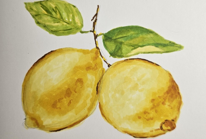
5. Practice Drawing: Lemons: Students in this lesson, we are going to be creating our first of the two projects, and we are going to
start with the lemon. For this lesson,
we are, of course, going to need paper. The paper that I'm
using today is the bristol smooth surface pad. And this is actually
my preferred paper for drawing with markers because I find that I am able to achieve, very
seamless blends. And also the paper can
handle many layers, which is nice, but be careful because this paper
will bleed through. So make sure that you
put something underneath the paper so that you
don't stay in your desk. Also going to need a
regular graphite pencil for creating outlines, and, of course, we are
going to need our markers. These are all the
colors that I am using for this drawing. I am using these five colors for drawing the lemon itself, so I have a light, medium and dark shade of yellow, and I also have two
shades of more like an orange color just for
making my really deep shadows. If you happen to have this
exact set of Ohuhu Markers, then those are the exact
colors that I recommend. But if you're using
a different set, then just try to
get anything that's closest to what I have here. And these four we will be
using for making the leaves. So I have a light,
medium and dark green, and I also have a brown for making the deep
shadows on the branch. And again, if you
have this exact set, then those are the
colors I recommend. But if you are using
a different set, then you can just
find whatever is closest to what I
am holding here. So, of course, we are going to begin by creating the outlines. I am going to try to follow the outlines as close as I can, but I'm really not going to put pressure on myself to make them perfect because
these are just lemons. It's not like a face where you
have to be super accurate. So as long as you have two lemon shaped
objects that is fine. It can be a little bit
on the wider side. It can be a bit more narrow. Lemons can look in all
sorts of different ways. So anything is good. So the paper size that I am using is actually
just six by 6 ". And you can choose any
size that you want. You can make this a
very small study, or you can make it a really big drawing if you would
like to do that. But today, I just kind of went
for something in between. So you can see, or
maybe you can't see that my outlines are
actually very, very light. I will darken them
in just a second. What I like to do when
I'm making outlines is I like to just put down, whatever is the closest shape. So right now I'm kind of I
know these are not perfect. I'm just putting down,
any kind of lemon shape. And once I have a shape on here, I'll be able to
tell, like, Okay, this needs to be
moved to the right. This needs to go up. It's like, too narrow or it's too wide. Then I can make my adjustments. Once you have something
on the paper, it's then easier to tell
what needs to be changed. So I know this is
very, very light. You really want to keep your
outlines light because you don't want those outlines to flash for at the end
of your drawing. So my key advice here is
aside from, you know, making these look like lemons, you also want to
make the outlines very light because that's
going to help you later. So I definitely made
my lemon too narrow, making it just a
little bit wider. And because I'm making it wider, I will have to
move the bottom of the lemon more towards here. So as you can see, you can make all
the mistakes you want when you make your
outlines quite light because that just gives
you endless opportunity to erase anything that
you don't quite like. Now, I am using an
erasa to get rid of my outlines or at least the outlines that
I don't want to keep. I'm actually going to refine this whole area at the bottom. This eraser, by the way, it's called a kneaded eraser. This is the original box. I really like this eraser because you can make it
any shape that you want. And it also doesn't
create those little, like, bits that fall off the
eraser when you're erasing. It just kind of sticks
together in one shape, and it's quite an
effective eraser, too. So I really recommend this. One thing that's quite important to actually make this look like a realistic lemon is
you kind of want this and this to be kind
of in the same line. So if you imagine a line
going through the middle, you kind of want them to
be along the same line. Like, you don't want
this one to be too far to left and this one
too far to the right. Okay, so here's
lemon number one. And now we're going to
draw lemon number two. So again, you're going to start with a rough circular shape. And this second lemon
actually overlaps the tiniest amount over here, and it also goes
it looks like it's kind of like a little bit lower than
the first one, right? Because this one goes
all the way up here, whereas this one,
the highest point of it is like, over here. So You want to sketch
in those outlines. And by the way, I am making
this outline process quite complicated because I try to stick to the reference
photo as much as I can, but you really don't need to. If you happen to have,
like, the lemons, like, this one is higher, then the
other one, it's really fine. It's really okay either way. And you want to make
an effort to make your lemons roughly
the same size. So I think my actual
lemon shape is complete. So as you can see,
I'm just trying to erase the outlines that
were kind of my guidelines, not necessarily lines I
want to keep right now. And then we'll just
do the branches, and we'll be done and
ready to start coloring. So I actually created
this image using AI, and honestly, now that
I'm looking at it, you can't tell you
because there's a weird branch running
through the middle. So we will ignore that. So I am going to start by
creating this branch over here. It's kind of got a curved shape going up like this. Then I'll draw both
sides of it because we'll be filling in this shape. But I guess I kind of drew a little bit too far
from the lemon over here. Like this branch is
actually kind of touching the tip of that
lemon, but it's okay. I'll just draw a little
stick connecting to it. The reference is just
kind of a guide. It really doesn't
have to be exactly how it is on the reference. And then we've got this leaf. Maybe I'll draw that line
down the middle first, so that might make things
a little bit easier. Now you'll draw
the shape around. Okay. There's one leaf, and now we'll do the other one. This one is a little bit lower. I see, I don't really
like this leaf. I'm just going to make it
a little bit different. I'll make it similar to the one above I'm not going to make it fold or
anything like that. Okay. Again, you're going to erase the outlines
you don't need to keep. And that's really it. So a pro tip here, sometimes you can still
see the outlines, through the markup,
especially when we're drawing something
that's light like lemons. Like lemons are
going to be yellow, and it's possible that
especially in some light areas, you'll be able to
see those outlines. So what I like to do is
I just like to kind of, like, keep the outlines
as light as possible. So I will take my erasa over all the areas that can
kind of, like, be lightened. Like, I'm just going to
go up and down like this. I'm not going to
erase the outlines, but I'm going to keep them just light enough that I can
see them because otherwise, I'm going to risk them
showing up, kind of, like, beneath my
layers of marker. Okay, I know this is making
it difficult to see, but we are about to fill in the base layer of
our shapes anyway. So this is just for a second. Going to be a bit
tougher to see. But yes, you want it to
look something like this. Now you can put
your pencil away, you can put your eraser away, and we're going to start with the actual coloring
in of the lemons. We'll begin with the
yellow part of a drawing, the lemons, and then we'll
do the leaves later. So by the way, I
should also mention, I'm probably not going to
do the background here, but if you would like
to, you totally can. So just as a reminder, we have the Y free, which is the lightest yellow, Y six, which is
the medium yellow, and then Y R three, four, which is the
darkest yellow. And again, you don't
need these exact colors, but this is just what I'm using in case you have the same set. And then in addition
to these free, we are also going to be
using these two colors, Y R seven, and Y five. And these two will be kind
of like the darker shadows, and these are going to be the main free. So we'll
start with these. So I'm going to refer to
these as light yellow, medium, yellow, and dark yellow. And then I'll say for these two, light orange and dark orange. So just keep in mind
which ones are which, and that way, we can make sure that we're
using the same color. So I am starting with
the light yellow. And like I said, in the class earlier, you really want to start with the lighter colors and
then as you move along, you're going to put
the dark colors on top of the light
colors because you can't do it the
other way around. Like we can't put
the dark shadows and then put the light values on top of that because this is just transparent and it's not going to show up on
the dark colors. So you make sure you're
starting with the light first and you're building up
towards the darker shadows. So I am honestly probably
going to use this brush and of the maker the whole time because
I feel like I want to maintain my precision when
I'm filling in my colors. Like, all over here, I want to make sure I can really get in the little areas because I don't really want to go into
the white background. So we're going to start by filling out
the entire shape of the lemon using
the lightest yellow. And then, remember,
we have a bit of the lemon overlapping, the lemon on the
right hand side. So we're going to kind of have
to carve into this shape. And now you want to fill
out the rest of the lemon. Honestly, you can use
kind of the other end for this side since we've already
outlined the entire lemon. So you can even go
over your layer. Twice just to smooth things
out because the first layer probably won't be as even. Okay. And you can see that
once your layer dries out, it dries a little bit smoother. Like for now, it doesn't
look that smooth over here, but once it dries, this will be a little bit nice, a
little bit more even. Okay. So now we are going to try to blend
the other colors on top, so for now we have used
our lightest yellow, and next up we will
use our medium yellow. So you will try to kind of start paying attention to where those medium
yellow colors are. So I would say that
they are pretty much everywhere
except over here. Like, this part over
here looks quite light. And honestly, we're not going
to try to do the lemons, like in the same detail
that they are in a photo, but we'll try it best. And also, even in the areas where there's a darker shadow
over here and over here, we're still going to
go on with this color because as we are applying
the darker colors on top, we'll kind of start
building up that tone. I'm kind of applying
it almost everywhere, except in that
highlight over here. And I'm going to apply my color gradually
because we will be going back in with the yellow
to blend this in because, of course, we don't want
any of those harsh lines. We want everything to be
blending very smoothly. I am honestly going to fill
out this whole area because I feel like this area here is docker than this
area here anyway. So we want this to be a
little more intense. Okay. Okay. And now we'll
go back in with the lightest yellow and
we'll blend all of this in. So this is the lightest
yellow, the Y three. And we're kind of just
going to focus this mostly on the edge here just to blend all
of those shades in wherever a little bit of, like, unevenness is showing up. I'm also going to Memphis area. Okay. So what we've done so far is we have started
with the base layer, and that was the
lightest yellow. We applied that, and
then we went over it again just to make sure that it's a little
bit more even. And then we took the medium yellow and we started adding in
a bit of shadow. So we can see that the right
hand side of the yellow is a bit darker than
the left hand side. So we kind of focused this
medium yellow more over here. And right now this lemon doesn't
have that much contrast, but we still haven't added
the darkest yellow shade. So we're going to do that next. But that's the two things
we've done already. We've done the base
layer, and we've done the shading with
the medium yellow. And then we blending over everything with
the lightest yellow. You always have to go back with the lighter color to blend
everything because otherwise, you're probably
going to get like scratchy, like, mark marks. Like you can see
the direction of the marker, like those lines. So yeah, you just
have to blend with the lighter shades and then
everything looks smooth. Now we're going to go in
with the darker yellow, and that's the yr34. So again, I'm using all of the brush ends on a sleep
throughout this tutorial. So now you can really see what those darker
yellow shades are. So we have them over here
in the center of the lemon. And we also have them towards the right hand
side of the lemon. So you're really trying
to be careful now to not go outside of those areas because once you add
the darker color, it's not really possible
to cover it up. So we're going to
focus this color here. There is a bit of a
darker shade here. And we have this shadow. But the shadow doesn't
really have a neat shape. It's kind of very scribbly, so I'm kind of creating
texture over here. And once we blend, I think
this might look quite nice. And then we have a little
shadow over here on this side, which we will also
blend momentarily. What else? Is there anything
else that should be added, maybe a little bit more
honestly over here. Okay. And now pay attention
to how this looks now versus when it's blending. So we'll next use we'll go to the previous
lighter colour. So the one that was lighter than this was
the medium yellow. So we'll be using the medium yellow to blend this out now. So that's the Y six yellow. And we are just going to make
this a little bit neater, blend it all in, and maybe just maybe we'll go in with the
lightest yellow, too. M Okay, and now I'll use
the lightest yellow to try to blend
here on the edges. So again, I'm using
the brush tip. Okay. Okay, so we have
pretty much gone through all three
shades of yellow. So we've done so far the base
layer with lightest yellow, and then we added the shadows
with the medium yellow, and then we blended
that, and then we added the shadows with
the darkest yellow, and now we have
blending that too. So this is how our lemon
is looking right now. Next up, we're going to reach
for the two darker colors. So we had the two kind of orange shades, which
were these two. And we're going to
start with this one, and we're just going
to kind of deepen the shadow wherever it
needs to be a bit darker, over here and over here. So we're really going to
focus this in small areas. Again, you're using
your brush tip. And I also recommend, like, kind of, like, trying your color on the side
somewhere on, like, a spare piece of paper
just to see that you actually like the color
because sometimes, especially with those markers, the color on the
end isn't really, like, a good representation
of what the color really is. So really just
make sure that you test it on the side before going in so just a bit of this color. Really, little is
gonna go a long way. So we're adding a tiny bit of texture with this orangy tone. You can also focus on
those little shadows. Here we have those
little details. And then here as well,
we've got a line. And then that nice
shadow in the corner. Okay. And now let's apply
the darkest orange. So that's the Y five
terracotta color. So again, using the brush end, we'll blend these both
together in a second. You're really just
going to focus this in those areas where you
want to really create depth only in the select
areas over here. Definitely we'll do
this little crease. Of, I went out of the lines. It's okay. This over
here. Let's see. Okay. And now we're
going to grab. Let's go for the medium yellow, and we'll start
blending this in. So again, this is the
Y six, by the way. We're going to start
working this in, so I'm blending over it. You can also use this color
to create any texture on top. So if you see any areas that
look particularly textured, like you have those roofs and the lemon and the little dots, you can go ahead and
start putting those in. I'm actually going
to add a tiny bit of that lighter orange color, the YR seven because I feel like I could use a little
bit more shadow over here. This is just a minor adjustment. Okay, that's pretty much it. Go ahead and blend.
Everything that still needs to be blended. And we will consider
the first lemon done. So make sure you like
everything here, and next up, we'll move into
the second lemon. So wtree just repeat
all of the steps. Okay. Now we are going to
start the second lemon. This one should be a little
bit easier because one, we've already got the practice with the lemon on the left, and two, we're really just
going over the same steps. So grab your lightest
yellow. That's the Y three. And again, literally same steps, we are going to start
with a base layer, so we need to have the lightest tone filling out
the entirety of the lemon. So we'll be careful
here to stay within the outlines all around. And we will shade it in. And it always looks a
little bit scruffy. The first time it's shaded in. But when you apply that
color the second time, things tend to even
out a bit. Okay. Okay, now we'll just go over it the second time to
smooth things out. Really, it doesn't
need to be that smooth because you can see how
many layers we applied. Um, with the lemon on the left, so things will kind of
naturally smooth out anyway over the progression
of the drawing. So anyway, lightest
color is done. Now we will do the
medium yellow, which is the Y six,
and we are going to start by focusing
on where the shadows. So I would say the
lightest point of the lemon will be over here. So we need to fill
out this area. This area here is obviously
going to be quite dark, but pretty much we'll
fill in the entirety of, like, this part of the lemon. Maybe we'll actually leave this small section a
little bit lighter because it looks like there's quite
a soft highlight viaja, so maybe we can just kind of, like, focus the shadow
a bit above that. So I'll show you. La all of this. Okay. And now we can blend this in with the
lightest yellow. That's the Y three. So again, making sure there are no hash lines. Something like this. And next up, we're moving
into the darkest yellow. So that's the Y, three, four. Again, brush tip always, we're going to start filling out this area where there's
a bit more of a shadow. We can also shade in this
area over here a little bit. Right now, it looks
like this shadow and this shadow would be even, but we will darken
this one and kind of leave this one the same
shade it is right now, but, of course, we'll blending. Now, again, we're moving
down to the lighter shades, so we're using the medium yellow to blending the dark yellow, so that's the Y six. Oh, this is actually called
the lemon yellow color. How appropriate makes it reassuring that we selected
the right colour for this. Anyway, we're now blending over all of those shadows to prevent them from
looking so rough. And next up, we'll use the lightest yellow to now blend the edges of
the medium yellow. So grab this color. I just try to smooth all
the remaining edges. Okay. And now we're moving
into the two darker tones. So that's kind of
the orangy tone. So we're going to
start with it R seven. And we are really going to
focus this kind of, like, over here and where that
shadow is because oh, and over here because
these are really the only areas we want
to stand out like that. So I'm kind of applying it using a scribbly texture
because I'm trying to mimic that same that kind of
like the lemon skin texture. When we blending it, it
won't look so rough, but you'll be able to see that texture beneath
a little bit. You can go over the areas
that appear a little bit darker or over them
once or twice. Then we have shadow here. Okay. And just like we did
with the previous lemon, we will go straight into
the dark orange color, so that's the white R five. And then we will
blend those together. I may actually go back in
with the lighter orange color to add a bit more depth
at the base of the lemon. I kind of missed
out on that part. Okay. And now we're
going to blend this in with the darkest yellow. So that's the Y R three, four, Okay. Let me go over
this a little bit more. Okay. And now we're going to
go into the medium yellow. This was the darkest yellow
we were using a second ago. We'll go into the medium yellow and blend the darkest yellow, and then maybe we'll need
to also go into it with the lightest yellow to blend the medium yellow,
if that makes sense. You always kind of
just want to go. Whenever you're adding a shadow, you want to use a lighter
colour to blend it because markers have
an edge to them, and they always
look a little bit, like scribbly when
you draw of them, so they always need
to be blended. Anyway, we'll blend this now. And then you can also start
to create that texture. So just do a bit of like dots wherever you see
that the texture is particularly visible. So in this next
part of the lesson, we are going to be focusing on the branches and the leaves. And we're actually going to be using the reference photo as more of an inspiration rather
than following it exactly, especially the leaf on
the right hand side. Here are the four colors
we will be using to create the branches
and the leaves. We have three shades of green, and we have a dark brown. So we will be using the lightest green first
and then the medium green, and then the dark green, and then the darkest
brown just to complete any necessary deep shadows,
especially on the branch. So we will start with
the lightest green, and we are just
going to fill out the entire branch and both
leaves with this shade. So our base layer is complete. So now we are going for the
medium green color and we are going to start creating
some details and shadows. So maybe we'll start
with the branch. We can see that the light
must be coming from the left hand side because
the shadow is kind of towards the right
hand side of the branch. So over here, we're going to
start darkening the branch. And then the leaves are a little bit interesting
because we have, like, the lightest line. You see almost like the
biggest vein of the leaf. It's quite light, and we
don't really want to put any colour over that because we want to leave
it as bright as possible. So we are kind of just going to avoid that line in the middle. Try to keep it as
neat as we can. So we are kind of just
going to go around them, and there's also little
veins that are coming off to the sides like this. So we're going to try
to fill out more like the sides and leave like tiny little veins of the leaf without any of the darker green or
the medium green red. And the same on this side. So I'm leaving the middle
the lightest shade of green. Okay. And now we're going
to do this little shadow. As well, needs to be darkened. And then the leaf on
the right hand side. Okay, so we have this
kind of shape right now. We also need to
fill out this side. I'm going to make this
shape a little bit rough. I felt like it looked too neat. I quite like how this one
has more of a shape to it. This one looked
kind of too oval. So I'm just going to make it a little bit
more interesting. Like this. Okay, so next we are going to move on to the darkest green. So that's the bronze green. And we are going to fill in the shadows
and then we'll come back and blend everything with the lightest
green at the end. So again, just
reinforcing where all of those dark shadows should be
Looking at the reference. We can see that
this leaf ulcer has some pretty deep
shadows here and there. So once this is blended, it will look a little nice, huh? This h. I can see that
there is a bit more of a shadow here
on this side, too. So I'm trying to fill out
this detail. Let's see. Okay, so here we have to use
a bit of our imagination. So let's just play some random shadows just
for some depth. Maybe some here and here. Okay, and we'll see if we
should add any more once we be. Actually, let me
also add some here. Okay. Okay. Now let's blend and then we'll go back in and
see how it's looking, see if we need to
go back in with any of the previous colors. So we'll grab the
lightest green, and this will be
our blending color. And we'll just try to merge
all of these greens together. And okay. And since we are going to be
blending the darkest green, we need to grab the
color below that. So that's going to
be the medium green. And with this, we will start
blending in those shadows. Okay. And then we'll also
blending in the branch. All right. And then we'll go down to the shade
even lighter than that. So the light is green,
and we're going to blend anything that still
looks a little bit uneven. And you want to
be really careful around those small
areas here like that, little branch connecting
the leaves to the branch. I'm also honestly
creating a bit of texture with my marker. And I'm going over any part
of the veins of the leaf that I want to darken because perhaps in some areas they
look a bit too bright. So I'm going to make
them a bit darker, make the leaf look a
little more realistic. Okay, I quite like that. Now, last but not least, we are going to add
the darkest shadows with the dark brown. Those will probably also
have to be blended, but we'll see at the end. So this one you're
going to add quite carefully because this color
at least, is quite dark. If you're curious, this is the Y 13 in case you're
also using the same set. It's called Chestnut Brown Y 13. And we're really not going to apply much
of this because it is quite a strong, powerful color. It's quite dark. So I think a little will
go a long way here. Okay, now let's blend this, see how it's looking, and we're going to blend it
with the darkest green. And you can kind of
see when I'm blending, I'm actually using,
it's very subtle, so it might not be so obvious, but I'm actually kind of
using a scribbling motion because I don't want to blending it, up and
down, up and down. That would look
very, like, uniform. When I'm kind of
scribbling going all over, it's giving a bit more texture. And I'll do the same thing with the medium green because I feel like that
looks quite strong. And I'll also take
this opportunity to fix the shape
of the branch in any necessary areas. Okay. And we'll now use
the lightest green to blend any final heart lines. Okay, I'm actually going to take the dark green to
fix up the shape of the branch because I kind of went out of
the line over here, and now this part
looks very narrow. So I'm honestly just
gonna go over it very carefully to try to make it
look a little more even. Alright. That's better. You don't want to overdo
it because, you know, if you fix one side
and then it turns out it's thicker than the side you were
initially trying to fix, then you'll be
fixing it forever. Okay, that looks done. I think we're pretty much
finished with the lema. Unless you want to make
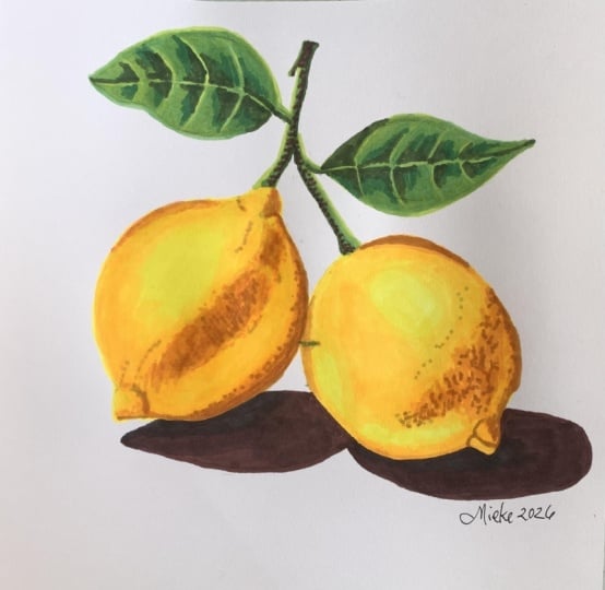
any final changes, add any final shadows,
this is the finished look. So I hope you enjoyed
this project. Feel free to also
add a background. I left mine white, but I think it would look
quite nice if you use the pink background or maybe even blue would look
quite nice, too. So I would be really curious
to see if you tried this. I would love to see it as your project and
give you feedback. So thank you so much
for following along, and I will see you
in the next project where we will be
completing the landscape.
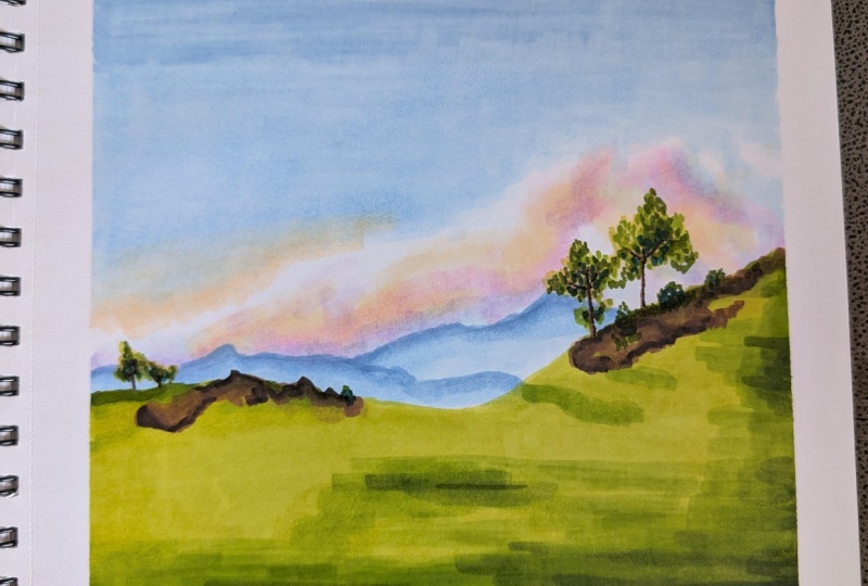
6. Practice Drawing: Landscape : Students. In this lesson, we are going to be completing
the landscapes. Here are all of the colors
if you would like to pause this video here and
you have the exact same set. Those are all the
colors I am using, but I will show you section by section which colors
you will need. For the sky, we will be
creating a gradient, which means that we need
two shades of blue. This one is slightly
darker than this one, they're both still quite light. So I am using these
two for the sky. Next, I am using these
free tones for the cloud. So we have more of a
yellow tone that's going to be towards the bottom left
hand side of the painting. Then we have kind of a purply and a pinkish tone
as well for the cloud. Next up, for the grass, we have free shades of green. We have a light, medium
and dark shade of green, and those are actually
the same colors we were using for the leaves
in our lemon painting. And finally, we
have free shades of brown for the trees
and the rocks. So we have a light,
medium and dark brown. And we will also be using these free shades of green to make the leaves on the trees. We are now ready to start. So we are going to begin
with creating the sky, and then we will
create the grass, and finally we will
create the trees. So we're kind of
just going to be working from back to front. So it looks like the
sky is kind of in the back and the hills
are overlapping the sky, and then the trees and the rocks are on
top of everything. So we are going to
start with the sky. Now, normally, I would
actually start by painting the blue sky and make it lighter and lighter
and lighter as I go down. But in this reference,
it looks like there is a very light cloud. It almost looks quite
white in some areas, and we know that with markers, we can't go from dark to light. If there is already
a blue sky here, we won't be able to create
a white cloud on top of it. So this means that we have to actually start with the cloud, and then we will create
the blue above that. We will kind of be
using the blue marker to carve out the
shape of the cloud, and we will leave a lot
of the cloud area here, kind of the color of the paper. So we'll be using the color of the paper as the lightest tone of last but not least to make
some details on the Cloud, we will be using a
colorless blender. So this actually comes
with most Ohuhu sets. But if you don't have
a colorless blending, just find whatever is
the lightest shade. Maybe you have a white
marker or a very, very pale yellow marker, find whatever the
lightest shade is, and we'll use this as kind of the white
part of the cloud. So with the lemons, we actually started by creating
the outlines, but we really don't have to
create the outlines here because we can kind of
just create them as we go. And also, because
the sky is so light, I actually don't want to
very dark graphite marks underneath all the layers
because the cloud is white. So if we have kind of like a gray graphite line going through, it's
going to show up. And also, landscapes are very
forgiving because, you know, if we make the hill a bit too high or a bit
too far to the right, it's really not going
to show at all. Whereas with the lemons, you did really want
the outlines there because you wanted to, like, capture the
roundness of the lemon, and you wanted to make
them even in shape. So there was a little
bit more to consider. But with this, we can kind
of just go straight in. But if you do want to
make the outlines, I would kind of just only
really encourage you to make the outline separating
the grass from the sky. And also, you could maybe pencil in some
of the tree shapes, but you really don't have
to, because like I said, you can just make
this as you go. We are going to begin with the
purply areas of our cloud. So it looks like there is
a cloud shape right here. So you see I'm kind of just
figuring this out as I go. I'm going to I know that
there is a cloud that has this kind of shape
going this way, and I will blend all of
this in in a second. Okay. So I was making this with
the lighter pink color, and now I will go ahead and create some of
the darker turns. So we have the purply turn, and this appears in some
areas throughout the cloud. And I'm actually creating, like, a little bit of a
scribbling texture here, which will help to capture
that fluffiness of the cloud. And next up, we are going
to grab our yellow color. And this one, I can
kind of also see it throughout the cloud. Maybe I can see some over
here and here as well. We have this kind of texture. Okay. Maybe we should
also add a bit of the lightest blue because
I can see a bit of blue here towards the bottom
and towards the right side. So let's grab the
lightest blue for that. Okay. And now comes the important part
of making the cloud. We need to blend all of
those tones together, but the cloud is
obviously very light. So this is why we need either a colorless blender or we need a very light marker. So I've got my colorless
blending here, and I will kind of
just try to blend away the edges and try to
mix all of my colors. And you will see them kind of
all spill into each other. Okay. And now I will go over this with some of
the same colors. So again, I'm going to go
over it with the pink. Try to add some
depth in some areas. And now I'm going into
it with the yellow. Okay. Now that pur polyton you see how I'm kind of always creating that scribbling motion. This really helps to create
that fluffiness of the cloud. Now we'll add a bit of the
blue. That's the light blue. I think I'll go back in with the yellow and the pink
one more time. And this is the pink. So the cloud is
basically just created by going over the colours, trying to blend them together. There's a lot of, like, different
tones within the cloud, and they all have this
airbrushed appearance. So, um, the best way to
achieve this look is to just keep going over it
again and again and again, blending your tones as well
because you don't want any sharp corners because that's not going to represent the
likeness of the cloud. So yes, the process so
far was I went in with all of my colors
and then I blended so that there's kind of
a nice layer underneath, and then I applied all
of my colors again. I'm going to just blend
away any areas again that I feel like too strong, like any sharp edges
like over here. I feel like this could
be toned down a bit. Okay. I think I've made this cloud a little bit more vibrant than it is on the photo, but I actually like it this way. I like how all of those
colors go together. I'm also blurring it
right at the edge where those colors
will meet the sky. I want them to appear a little
bit more blended as well. So I'm going over the
silhouette of the cloud. Okay. Okay, so this is the cloud done. We're finished with the
first part of the painting. Next up, we are going to create the sky in the background
behind the cloud. So we only need these two
shades of blue to make the sky, and we will also use a bit
of the very light yellow to make this yellow hue
in the background. So we'll start first of
all with the darkest blue, and we are going to make
a gradient in the sky. So it's going to be darker
blue here at the top, and it's going to get
lighter and lighter as it kind of hits the cloud. So we'll start at the top and then we'll just
blending our blues together. We'll overlap them like we did in the first few lessons
we had together. And it's okay if it
looks messy for now, we'll be going over
this a few times, so you kind of want
it to overlap. And here we're going to fin down our layer a little bit. Okay. So this was the darkest blue, and now we will try creating a layer on top
with the lighter blue. So here we go. We can start all the
way from the top. And we are kind of just
blending over everything, trying to even out that layer. And as we'll get
close to the cloud, we'll use it to kind of carve
out the shape of the cloud. So we'll try to make
this shape kind of not like very a neat shape. We'll try to make
the outline of the cloud kind of, like,
messy, I guess. You don't want it to
be, like, too perfect, if that makes any sense at all. Like, this is why you don't want the outline of the cloud to
be like, very neat, right? Like, you don't want to
create perfect curves. You want it to have a bit more
of like a fluffy texture. Okay. This is the base layer. And now we will go over it
again with the darker blue at the top. Okay. Looks like the top here is
already quite nice and rich, and now we'll just try to do the same with the
bottom or try to blend. And you can see that you need
to go over it a few times to get rid of the streakiness. So that's what I'm doing here. I'm going over it
again and again and again until I
can even things out. That looks a bit better. It
might require one more layer, but well, this is drying and
we wait to see how it looks. We will add a bit of
that yellow tone. So I'm starting by making a bit of an outline
above the clouds. And it's just a
tiny bit of yellow peeking out from
behind the clouds, so I just did a small section, and we will blend the top
of that with the blue so that we don't
have a harsh line. So that's the light blue
we're using right here. Okay. Alright, that looks nice. Next up, we will use that light blender again just to clean up this
edge of the cloud. So I'm going to
try to make it not as bright as it is now because
it kind of sticks out. It doesn't look very natural. So I'm blending over
it a slight bit just so it's not such so it's
not like so eye catching. And Okay. I really like this so
far. It looks quite nice. I'm just going to blend here, a tiny bit more because
I feel like that. Yellow looks a little
bit too strong. I want it to be a tiny
bit more blended. So this is it so far for
the sky and the cloud. We're finished with all of that. And next up, we will be creating the mountains in the distance. So we will actually just
grab the dark blue for that. That's the same dark blue
we're using here at the top. And we are the tree
just going to carve out those distant mountains. So you can see you really don't have to be
following the exact shape. Just something like this. And it looks like there's
actually two of them like this one's going down. Okay, here it looks
something like this. Now we'll take the lighter
bloom to blend beneath it. Okay, and now we'll take
the dark glue again just so that it's not
such an intense contrast. We'll start blending
between the two values. Okay. And now we'll blend
again with the lighter blue. It's actually much easier to do it when the marker is still wet. When it dries, it's kind of like more resistant to blending. So if you're quick, try to do it while the marker is
still wet, it does help. Okay. Now the
mountains are done, we are ready to move
on to the grass. So here are the three colors we will be using for the grass. So we are going to start with the lightest
shade of green, then use the medium shade of green then the darkest
shade of green, and we will blend
between the layers. And for now, we're
actually going to ignore the rocky hills because
they're going to be brown. So the brown will kind of be darker than
the green anyway. So you can kind of
just, like, safely ignore them and then we'll
add them at the end, and they'll have no
problem showing up. So we are first going to use
the lightest shade of green, and we will basically
cover the entirety of the, the grass with this tern. Actually, I'll try using the wide end to make it
a little bit faster. Okay, lightest shade done. And you can see there's a bit of the mountains kind
of showing through, but that's okay because
that area will get darker. Okay, next up, we are going to go ahead with
the medium green, and this one you're
just going to fill out wherever areas look darker. So whatever areas aren't, like, the brightest
shade of green. So definitely this hill over
here has some shade to it. And, of course, this one And it's kind of an area
here in the middle. This will definitely
have to be blending. And a lot of, like, the bottom
portion is much darker. So we'll add a layer
here and we will kind of blending it in Okay. Next up, I will add the
darkest shade of green, and then we'll go back
and blending everything. So again, I'm using the
brush end of this marker. And we can see that it's particularly dark
here on the bottom side of our landscape. Okay. So right now it
looks very messy, but we'll go back in with the lightest shade of green
and blend everything over. So maybe I'll start my
way here at the top. So now I'm going to go back
through all the colors. I'm going to go in with the medium green and try to blending the
dark green with that. And then we'll grab
the lightest green and do more blending that way. Okay, so this is pretty much it. I think I'm going to go in
with the medium green again, just to add a bit more
depth in some areas. Like here, and I'll go in
with the darkest green, but I won't blend it
this time around. I kind of like this
more sketchy look. I'll just blend this
here on the side. It looks a bit too rough. Now I'll go in with
the Daca screen and just add a little extra
bit of depth here and there. There's also a bit
of a shadow here. There's gonna be some
rocks here later, so I'm just going to create a small shadow here
and here as well. Okay. Next up. So now the
grassy hills are done, and next up, we are going
to create the rocks. Again, here are the
three colors we'll be using to create the rocks, and we'll start
with the lightest and make our way to the darkest. So I currently have
this light brown color, which honestly doesn't
show up that much, but it will serve
as kind of like a nice light tone to the rocks. Okay. I think that's
good for now. Then we are going to
take the medium brown and screating all of the
shadows around the rocks. A Okay. And now we'll grab the
darkest brown, this one. Again, the brush, and we'll
create all of the details. So mostly those will
be shadows, kind of, like, at the base of each rock. Again, you don't need to
really copy it down exactly. Just get the kind of general
effect of those rocks. You want to, like, represent that there are rocks
that you don't have to necessarily do all the
details that you see on the image. Okay. Honestly, I kind of like
this unblended look. I'm just going to
leave it like that. Okay. Next up, we are
going to create the trees. So I don't think we'll really
use the lightest color. Let's just use the two browns because the trees are
honestly quite dark. So you're going to use
the fine tip of your pen, and you're going to make
the core of the tree. And this is still quite narrow. So try not to press
down too hard because the harder you press, the wider the brush will be. So really try to control
the pressure here. Right this. Okay. And we have some over here as well. And those are even more narrow. Okay. And now we'll use
the darkest brown to make any kind of shading
on those trees so far. I'm really trying to
control the pressure here. I'm really trying to not
press down too hard. I just want to
introduce some texture to the tree to try
not to make it appear too flat to just like
one single shade of brown. Okay. Okay. And now, last
but not least, we have the actual
leaves of the tree. So we'll start with the
lightest shade of green, and we'll really just kind of, like, try to build
up that texture. So I think the best
way to do this will probably just to,
like, make dots. So let's start here on
the right hand side. So this is kind of like
what I'll be doing. I'll be creating dots in
the shape of the tree here, and we'll start with
the lightest color, and we'll create all of
the darker colors on top. So here is the lightest shade of the first tree, and
we'll do one by one. And Okay. Now we'll move to the
second shade of green. So that's the medium green. And we'll pretty much apply
this more or less everywhere. We'll be a little bit
more conservative with the darkest shade because that one will really
introduce a lot of depth. But we can kind of
see it looks like the light is coming from
the left hand side, so the trees are kind of
illuminated on the left side. So as you get kind of
towards the right side, you'll be applying a bit less. I mean, as you go
towards the right side, you'll be applying more
of the darker shades. Okay. And now the darkest shade, again, you'll use the brush end. If you have an even
darker shade of green, it might be worth going into it because I feel
like this could honestly be a bit darker and I can't really get it darker
than it is with this. Let me try introducing
another shade. Okay, I found this one. This one honestly
looks quite dark. So let's see if that one works. Oh, yeah, that
looks a bit better. You might not need to
do this, but my one my green was actually
a little bit too light for these branches. So I'm just adding a tiny bit of a darker shade and
a few details here, and we are pretty much finished. If you would like to,
you can go ahead and add a few bushes here on the ground. Maybe add it with a slightly lighter shade. Okay. It. So we are finished. I hope you like this if you
want to. So we are finished. The only thing you can do is you can look back
and forth between your painting and
the reference photo and see if there's anything
you want to change. So, for example, one
thing I can see for myself is I feel like
those mountains. Since they dried, the color kind of blending into
itself a bit more. So I actually want
to go back in with that dark so I actually
want to go back in with that dark blue
and kind of work on isolating those two
layers a little bit more. So just a small
detail, like this. Maybe add a bit more of a
texture to the mountains. Something like this. I just felt like they were
kind of spilling into each other. Like so. Okay, so we are finished. I really hope you
enjoyed this class, and I hope you are very proud
of both of your projects. I cannot wait to see
what you've done, and I will see you in
the next lesson where we will talk about the class
project and conclude our class.
7. Thank YOU! : Congratulations on getting
through the class. I really hope that you've learned something
useful and will feel confident making
mark art of your own. If you enjoyed the class, I would really
appreciate if you left a positive review
because that would get my class out there and help
me find more students. I would love to
see your artwork, so please upload your
work as a project, and I will be so happy to see your art and
give you feedback. If you are interested
in more classes, I have a portraiture class where we go through each
facial feature, and I show you how
to create them realistically step by step. We start with the outlines, and then we move on to creating the base layer and finish
off of the details. That's it for me. I am waiting very impatiently to
see your artwork. Thank you so much for following
along and happy creating.
 Wiktoria, Professional portrait artist