Transcripts
1. Introduction: huh? And Letty, Illustrator Adena by design and software. Welcome to the fourth Gus about drawing in procreate. We already know the basic, so it's time to create our own brushes. First, we will talk about the breast settings. Then we will discover how is is to create your own calligraphy brushes and you will no longer need to pay for them. We will create different calligraphy brushes. In no time on, I will share all of them with you in your product section. We will also learn how to create steps and simple patterns and use them for our calligraphy persists. Finally, I will show you full different methods to add color to our work. As usual, I will use an iPod on apple pencil on my fingers. It's better if you have a pencil this time, because some settings don't work without it. If you don't have it, it's OK. Your bruises will look slightly different. That's all for the class project we will create this month calendar. Writing down the month letters with a calligraphy brush you've created on using a stump for the numbers on days. See in the next video
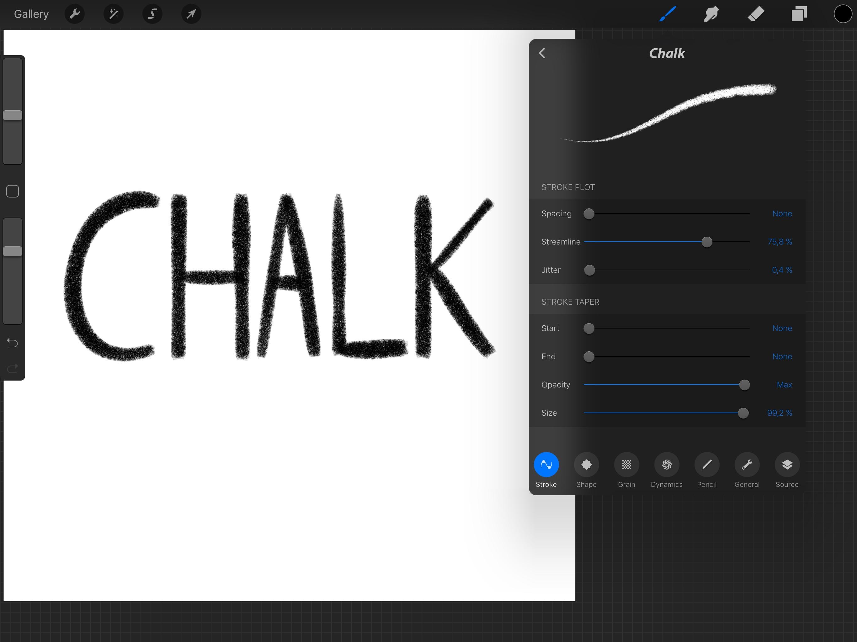
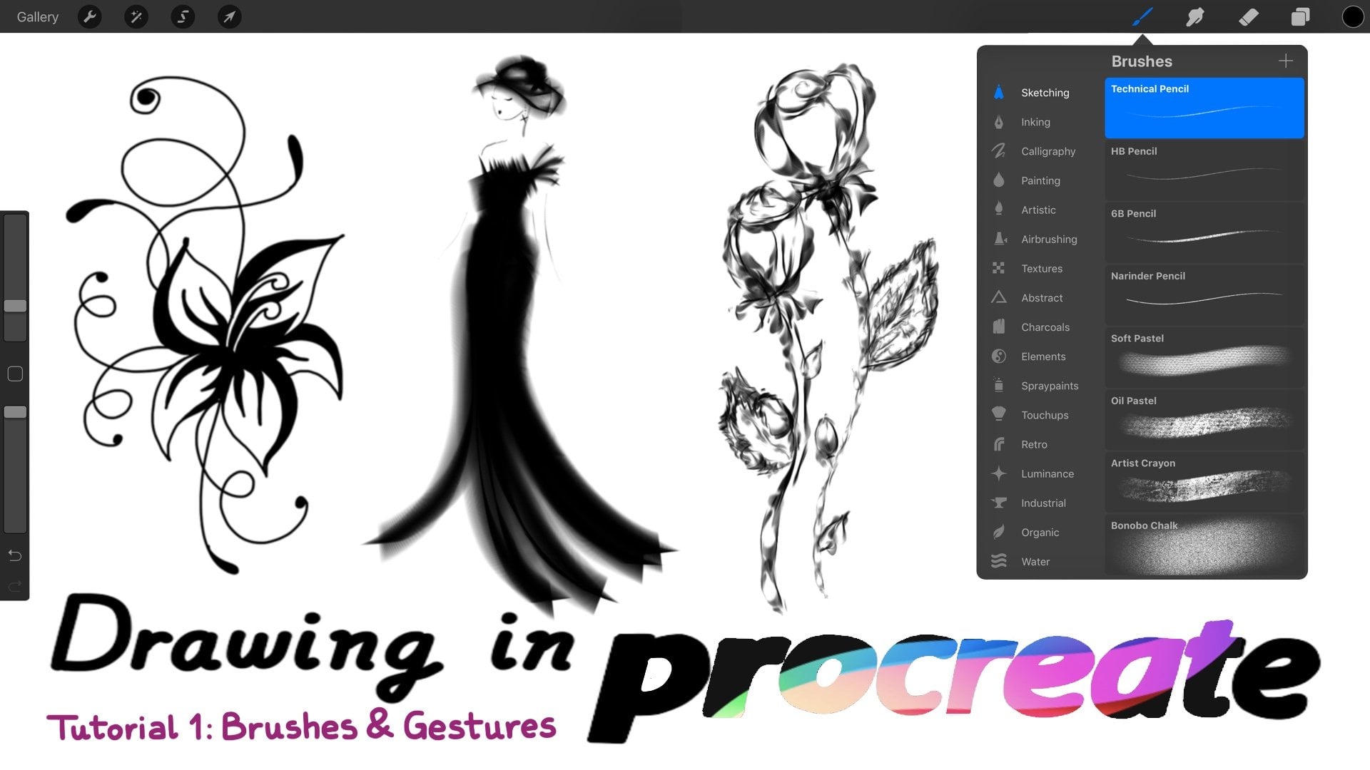
2. Brush settings: We already took a glance at the brush sentence in the previous courses. Now it's time to take a closer look. First of all, don't let the breath settings overwhelm you. They are easier to manage than you probably think, and you will have them totally under control at the end of these cars. In any case, if you have any doubts gestures, the community section and I will answer you as soon as possible. Having said that, that will top over the desire brush to open the settings menu and then top source in procreate. Brushes are made up off two images, one for the shape on another for the grain. The shape will be there. Container for the grain on the brain will roll inside off it like a bell roller when you paint a stroke. In this case, the shape is a circle. On grain are diagonal lines, so the stroke will look like this top over the shape or the grain image. In order to change it, you can choose between all these sources or just important an image from the pro library where you will find them. It's used by pro creates percent brushes the most of my SIM brushes come from Sperry Menton , so feel free to change your shape and grain images as many times as you wound. Then that present. You can also duplicate the press in case you want to keep it and then reset the present one top general name. Here you will find general brass characteristics when or into iPad. Screen is on, the brush will orientate itself according to the iPad screen orientation with abstract brushes. It doesn't really matter if it is on or off. But with brushes like this, all I created, it's important to turn it on. I show you if I rotate the iPod with it on, this is what happens. But if I turn it off well, you will see turn a stump review own when the important thing is the shape and you will visualize the shape instead of the stroke. I usually journey Tom for my stump rushes. Max and Min size will determine the maximum on the minimum radius that the brush can reach on the same for the past city. Here, modify the sentence in case the size and a positive are doesn't give you what you need. Okay, pencil sentence. Now, if you are using Onley your fingers to draw, you won't be able to modify anything here. If you are using a support of the signers, you will be able to change the pressure. Sentence tilled is only available with apple pencil. Having said that, let's start with pressure capacity when set to see room. The brush will not react at all to the pressures changes. When said to Max, the more pressure women's that stronger will be the stroke capacity. When said to 100% in verse, more pressure will make this joke transparency increase. Usefully. We will said the capacity between zero and Max, because this way is how riel pencil works. Pressure size when set to zero, the brush will not react to pressure changes. One set to max. More pressure will make the stroke size bigger when said to 100% inverse. More pressure will make the stroke sizes. Muller. Mostly, we will said the size between Syria and Max pressure, soft in in lower values, will give our brush a quicker response to changes in pressure on large values will smooth out the pressure response. Larger bodies allow us to get gradual changes with blades brushes, which is great timpte angle. Still angle allows us to customize stilled exactly much how we work. It's represent the angle from which the size and capacity of the rush will be affected by the tilt off the pencil. I will show you to have capacity. When Tim capacity it sets a max. This is what happens and when we said it to know the brush will not react to up opens until changes. David signs. When this is said to Max, Apple pencil will make the Brust size smaller or bigger, dependent on its steeled. When size is said to known, the brush will not react. Toe up. Openssl teeth changes dynamic sentence. Fall off. Fall off controls the length off the stroke. If we increase it, we will loose paint as we go, as you can see here. Dilution. I don't usually modify these. Basically, it's like adding water to our brush. It was said it to Max or near it. We will not see a thing, but it works like it's much. It's kind of interesting for watercolors. Drawings charge allows us to control the amount off pain applied to our brush. I don't really use these either, but it's true. If you combine dilution on charge, you will get unique and very realistic effects. For example, with the water cooler bras or the ink brush, let's change our breasts to explain the next settings. Glazed went off. The bras will behave like a really brush. I show you. I've decreases the capacity for you to see this more clearly. When you turn plays on your brush will be having purely digital manner, much life for the shop. We will turn plays, Um, when we create brushes to drop patterns. Accumulative and flow only work when glaze is active. When a cumulative is on, the shape will build up as the stroke is made, so we will lose our brush screen. Nomar's the rapacity off our brush. I don't use this set, and it hasn't been useful for me so far. Flow flow will determine the amount of pain applied every time the brush moves. I don't use this either. Capacity is speed it Well, very. Our brush capacity dependent on the spit off our stroke. If I said it to zero now, if I said it to Max, this is what happens on on if I set it to inverse. It looked like these sizes be sizes. Bid will vary our breast size dependent on the speed off our stroke. So you see how it works here. Okay, Jason. Now. So I will increase the spacing again now, um opacity. Jitter. Then a passage Digital will vary the shape capacity off our brush as it is to stamp across the campus. When we make a stroke, OK, I will increase the size. As you can see here, the capacity is different. Every time the brush stumps, it's shapes angry. If we increase Jeter to Max, we will lose some off the stumps, sighs Dita size digital will vary the shape size off our breath as stated stamp across the cameras when we make a stroke. As you can see here this is how are brass looks with no jitter at all Grand Sutton's movement I always said this to rolling because choosing this option the grain will apply its texture just like a pen roller. When set to stamp the grain texture with not rollerball, set it to rolling again scale. We use these one to adjust its size off the grain texture. Zoom when set to follow size. The grain will scale with your brush shape. Let's make an example on one said to cropped. The grain on the shape will scale independently, as you can see here, Rotation this set in Wilts Mare, the grain image dependent on the directional stroke changes. I will increase space and first for you to see this better. Okay, let's see for a stroke for stroke costs the grain to follow your stroke Directions. It seemed here is not following the stroke, but it is because remember, in this case, our grain are diagonal lines, static blocks, grain direction to remain static. 100% inverse Makes the grain rotate inversely to stroke direction. Filter. Okay, lets throw with it on. And now with it off. Do you see the difference between them shape settings? I've chosen the bolt brush to talk about the shape setting. So Scott surfaced Scott, I will change the orientation off our brush shape as we are drawing. If we said it to numb the shape off our brush will always a stump in the same position when we make a stroke. Scatter is not effective by birth direction. Rotation, Territo nations, Lighter effects. How our brush reacts to directional change for a stroke. If we said it to full stroke, the shape will follow your painting direction. It was set it to static. The shape direction will remain the same all the time. Um, it was set it 100% in verse. The shape will rotate it inversely to stroke gyration for calligraphy brushes. I usually choose between 30% inverse and forward stroke. But if you are looking for riven effects, try near the 100%. Inverse randomize went off. Danish in shape. Direction will be the same for every stroke. Women, when on direction, will be different. So Tony Tone in case you're looking for a more organic field, asi myth when on the shape will follow the perpendicular angle off our pencil. When off the direction of the brush, it will be the same as the direction off our pencil, just like a holographic Ben stroke. Satan's spacing. We will drawn line set in this Deunan first for you to see the difference. Let's bring it up a little bit. Um, I made a bit more, as you can see when we increased the spacing. We create more gaps in our brush. Streamlines stabilized our strokes for perfect precision curbs on flourishes Jetta Higher volumes of Cheetah will spread the shape out from the language row, while smaller values will look like solid line strong taper we will modify these setting are not creating calligraphy. Brush is so let's start adjusting the size off the Taper start. We'll apply a taper to the start off our stroke. The higher the value that great to the taper. The same for the end as you can see here, sighs toe a justice eyes off the table and now rapacity capacity announce us to adjust their month off a pass ity applied to a taper. If we said this to Nome, it will look like this. But it was said that to Max, you will see here the difference
3. Creating my first calligraphy brush: In this video, I will show you step by step, how to create your first calligraphy brush. You can create a calligraphy brass using almost any shape, but we will start with the ones you will find at per library. Later on, we will create our own shapes and grains. So, first of all, create a new set of brushes on name its literary. Create a new brush tapping the class sign. Get your brush a name. My Ben. Let's choose a shape and agree now tap select shape and then pull library, scroll down and choose oval. Now tap Select Grain Pro Library again. We want to get the look of an ordinary brought spin, so we will choose an image with no texture. So scroll down and choose blank. Now we have to modify the other sudden so that it behaves like a real brush man. Let's start from left to right top stroke. This time we will keep spacing at known because we are looking for a clean line sex streamlined at about 75% on increase or decrease it later until you're comfortable with this. Movements of your strokes off course keep Jetta are known to, as we learned in the previous video, that table settings affect whether or not your landscaper soft at the beginnings and ends off each stroke you make. I will set the first to none. This is a personal preference. It simply works better for me, on the others, to Max through, free to play with us later, something you find the perfect combination for you. The brush shape is fine like it is so we will not change the thing here with chosen at play angry. So we don't need to mollify any off this citizens because we won't see any difference at all when the great image has no texture. If I were brain had a butter or Dexter, we will generally said Movement to rolling on adjusts this scale soon and rotation. But it's not that pace, so let's move on. Dynamics turn own place. This time we want our brush stooping in a newly formed transporting manner on. We no longer build up over time. Pencil sentence. We want our oppo pencil to restore to our changes. Impressive the same way abroad spend will react on paper, so we will set capacity to Sierra percent because We don't want our land to fading or faded out when we change depression, said Softness to see Rose Will because we don't want that to chain until either. What we do want to change is the size off the land. I will set size to Max so our line will look speaker when we increase the pressure. And Athena, when we decrease it. You can certainly play around with a sliding this up on down to see how it looks and choose where it works better for you. We don't want the deal's off the pencil to effect the capacity or the size of our brush. So for our brain brush, we will set all to him or where breast. It's almost them. Top general turn on day or in to either screen option. We will, said the max Science. Live it too much on the men to none on the same for the past city limits Our breast is ready to use. It mimics the behavior off some off my favorite reopens. A look of it depends on how I said to size when I'm working so I can get the appearance off a few pen as well as a larger deep, like the dual brush pens. If you want something a little different, play around with his letters and you'll see through trial and ever how they affect the look off your breasts truths. Once you get the hang of it, you can have fun creating all the types of Russia's, too.
4. Creating more calligraphy brushes: Okay, we've already created our friends. Fresh in these video, we would create none more brushes. First of all, we will always choose a square campus to modify or create new images for our brushes. Don't use and on square campus because of drawing one. Keep its proportions when we use it for our brush change. Also the color of the background to black To keep in mind, we cannot use black because black will be transparent. I mean everything we creating black will disappear on Everything in white will be opaque when we place our drawing in the brush shape or grand space. Also a dark agree will have less a pass ity than a lighter rate. It seems a bit complicated, but it's not. You will see I use this color palette to create my brushes. If you want imported, you will find it in the project section as well as all the brushes we would create during this coast to import it. Downloaded top choice over. Eat on. Follow the instructions in case that doesn't work there. Strike down on top import unfollowed destructions. We will also use a weight to help us to create stumps patterns and calligraphy brushes. It is available for you to download it at Approaches section as well. Duplicate your first brush. Change its name to delete because we will use this brush on Lee to create our overall image . Now tap a stroke onset space, Injure Max. This will help us to get easily the oval shaped a world with. We need our shape as big as possible because we don't want a pixellated image. So we need to go to General and said the max size limit to Max, then go to pencil and said the size pressure to none. This will allow us to control the size only with the sidebar. Now it's time to create a new layer ovo shape. Make sure you're painting white tapping the chemist center. Okay, this is way too small, So I will use the side spot to increase the size until I get on over. Big enough. Too big. Almost perfect. Rivet. Lactic. Relate to avoid drawing her needs and duplicate the Opel layer on high one off them. Okay, Now we have a novel in It's to work with for our second brush. We're going to keep on Lee. These two parts of the oval. The selection to is going to help us with that task. Just up here. Here, here, here, and find out here. Cut on. We've got what we were looking for. We will use this image as our new brush. So let's make a copy. Swiping three fingers downwards. Delete this brush. Duplicate our first brush. Give it a name for me. It's going to be No Corp in. You will see why in a sec. Okay. Top source, then the shape source on just a poor congrats. Your second brush is ready to use. Let's create a new layer to see how it looks like. Okay, let's write something. For example, June. Okay. This is our sick and brush. Well, the fair one. We are going to duplicate the overlay again on move it to the top. This is useful when you are not giving a name to all the layers. I always moved to the top. The lay I am currently using our next brush is going to live. It's Brazel strain in every stroke. So we are going to select our first brush and use their races to draw some lines with it. Don't worry. If the lines are not perfect, they no need to be. Could be the aim it to them. Duplicate the first brush again, even the name, for example. I don't know. Hey, re pain. Why not now? Paste the new image on Discover how it looked tonight I would write down again for you to see the difference. This is what we were looking for to create a brush with an eye shadow. We will follow the same steps, but this time we are going to use to ovals one for the line. I'm one for the shadow. - The logo for the line is going to be what on we will choose grain for the shadow. This is how it's finally looks like for our carted or three D Look. We will divide the over in five or more parts on color them with different shapes of great . I like the results very much. This finishes school. What do you think? It's time to add things to our brush shape image. So let's turn duplicate in the oval layer on Dick risen, it sends then active degreed layer on draws. Sometimes they don't need to be perfect, so whatever you want. It's OK if you prefer to draw leader circles or flowers. I don't know. Free. Free to play around when you finish copy and based as usual, then top shape and set. Scatter to Max. You already can see how it looks like here, but let's write June again anyway. It's nice, isn't it? It's all fluffy over here. For the next brush, we will use the selection to draw something inside our oval, and then we will substructure it again. Feel free to draw a different shape. It's okay if you don't keep the over border or if you draw in the centre off the over. Well, mine is ready, so I'm going to cope. Eight. Name my bronze whimsy. Go, Ben. Why not? Hey stated useful on modify some city, it's We need to raise the spacing in order to view the drawing we just created. Around 30% works for me, but modifying if it's not OK for you go to shape on set rotation to follow a stroke on. Let's see how it looks. Oh, it looks like tentacles. This is really fun. Okay, let's create a monoline brush off course. You can create the brush from the very beginning, but it's not necessary. We just have to do some modifications over our first brush. So once you have it duplicated on with any name, go to source. We are going to change our oval shaped for circle. I would choose a circle name hard for my basic Mona pen. But of course, give the other circles. I'll try when you have time. Now we're going to do the most important thing for these breasts, said the science pressure to zero. We don't want any changes in our letter independent on the pressure we have as you can see , our stocks no longer half the thick and think variations. Next thing, let's set a shadow to our monoline brush. For that, we will use a circle maker brush we already created in the second course on Draw. Two circles duplicate the layer because we will leave it for our next brush. 10. The corner off, one off the circles. Oh, okay. Threats, Cooley said. 200% adjusted. We only need one circling great and then so be it. This time. Duplicate the Mona pen brush on base. The new image I wear a monitor shadow Ben is ready to use. We've got an eye shadow here. If the shadow is too heavy for your taste, just truce. Alighted brain. Our last brush off this video is going to nuke Liceu in stitches, duplicate them on open crash agan Cheney its name and then go to the layer we duplicate before on joined the circles use in this selection to on the color drug. Don't that copy and paste it as usual. Modify this basin underneath. It looks good. I said mine around 70%. Then go to shape. Andi said rotation to follow stroke. Oh, I forgot to turn off or into hyper screen. Let's do it. Well, I think this is looking good. Okay, that's all for now. See you in the next video.
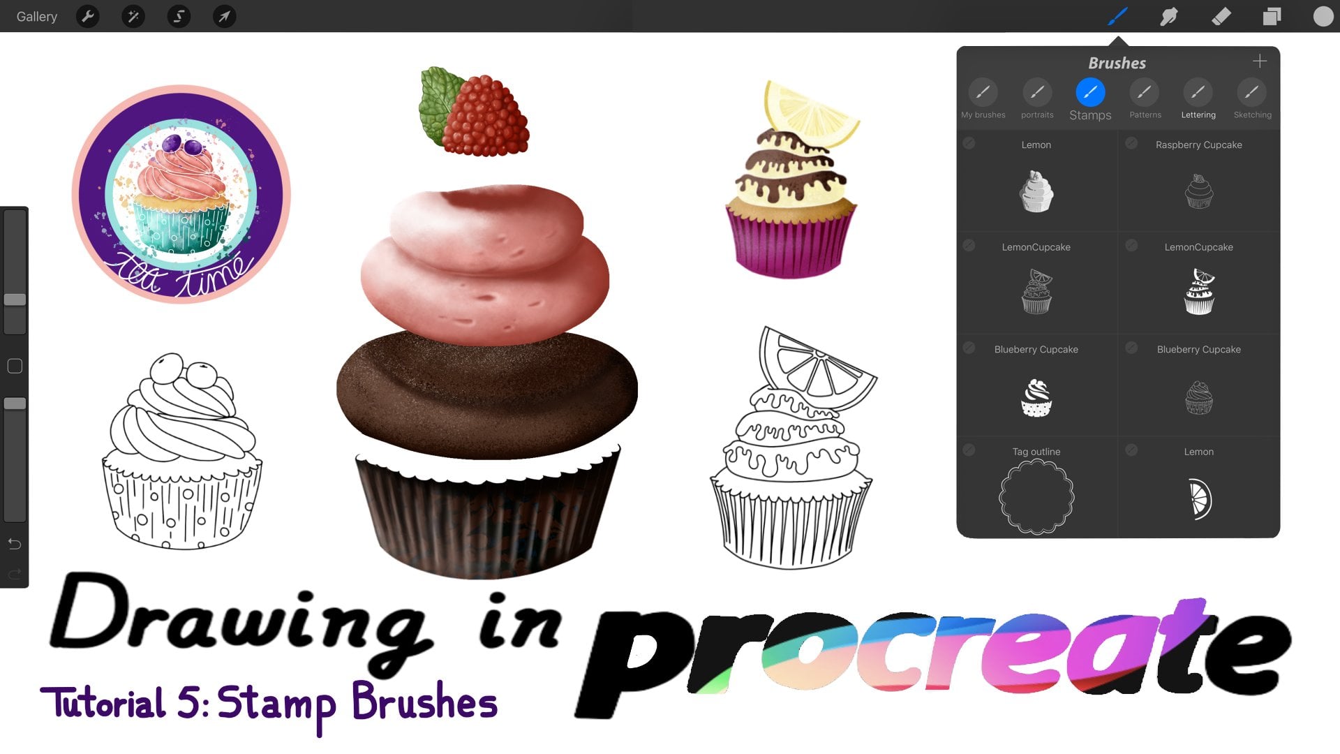
5. Creating stamps: and they brush shape is the image. The brush stuns again and again in every stop we make. So to get a new image, one spare stroke, we just have to go to stroke on, said the spacing to Max. What do you think about this clinic of your birth? What breast shape do you think it has? Well, it's on all I use this brush a system. So for stumps, I always you're on you. Stump Review At general. If the preview image is too small or to be, just modify its size limits. A general, too. As you can see, I keep my stumps and brushes. I useful call decoration on it. Some set any of your drones can become a stamp. Just remember the coral rules. Everything in black will disappear. Everything in white will be opaque on different shades. Off colors will have different capacities are color. Image will be transformed into a grayscale. So at just the color off your drawing before to use it as brush shape, I will show you some examples. Here. I have a stomach I made with the Burn with during the second course. I didn't change its colors to use it as a stump, so procreate transform them. As you can see, everything in black is missing on darker colors have now Let's capacity than the lighters Ones here is an historic I created for the past Easter. I draw it in white because I wanted completely opaque In a few videos, I will show you how is he is to add color to our work. As you can see, I also have a stump with my signature on. I also added some of them for our count. I created the maced. Um Then I modified it years in the selection to to change the numbers places on Created June Stan. One more example on. We will create any system for you to modify and play around. This is a lazy well, this breast doesn't stump just one image. That's because I didn't said spacing to Max the son. I was looking for the daisies to follow my stroke. I said scatter to 30% because I didn't want all my flowers in the same position, but a little bit rotated. They retake randomly when I make a stroke, and I also raised Cheetah to spread them. Okay, let's start something. I will draw something easy. For example, a heart. But you can draw something more complexity wanted in this case. I want to keep the settings we created for our first brush. So I will duplicate it and move it to my stump set. Once you're drawing his fish copy and paste it in a new brush, it okay lets throw a heart. Then I won't use my pen breast to draw the shape. Copy paste, Flip it on. Plays it here. Okay, Next feeling. Oops. I forgot to merge the two layers. So match down and use the color drop to to feel the heart. Now make it bigger, Unsent Terry to the campus as we're going to use it for our birth shape. Black color is not an option. So go to adjustments. Re color on and choose white. Now it seems the heart is missing, but it's right there. Okay, So cobian paste it in the shape space off our first stump brush off course. If I draw a line now, you will not see the heart anywhere. We have to add just the settings. First we will create a some rush on my calligraphy breast mate off hearts, so we need to duplicate the brush again to create the heart stem, said Space into Max. Turn on you stamp review on If you don't want to size off the stump to depend on the pressure we make on the cameras, go to pencil and set size to zero. In this case, I want my stamp not only change its sides, depending on the pressure, but also it's a pass ity, so I will set size and capacity to Max. Let's see how it looks. This is way too small, so I need to go to general on increased the max size decrease capacity. Okay, now go to pencil again on decrease capacity. In fact, I will send it about 50% in verse. That's better. Now go to shape on journal randomized because we are looking for a more organic look. Let's see how our first stamp looks. Don't forget to create a new layer because we will use the drawing we're about to make for our first button brush in the next video. Don't apply the same pressure all the time. We are looking for a combination off sizes and opacity. Ease trying to touch the edges off the campus. If you don't have a pencil, you can change the size on a pass ity off the stump using the size and capacity bar. Last thing we have to do is go to general. Make sure you stamper view, is on on a justice size limits. Now our hearts stump review looks great. We will modify now some settings to get our calligraphy brush made of hearts. First go to shape and said rotation to follow a stroke. Then that stroke a modify spacing until the distance between one heart on the next one looks good. Create a newly I. Let's see how it looks. I think there are too much distance between hearts, so let's decrease it a little bit. Um, write something. You can also set size pressure to zero if you prefer to. On increases scatter. Why not on increased Jetta as well? Oh, now they look like butter flights instead of hearts. Okay, just play a room
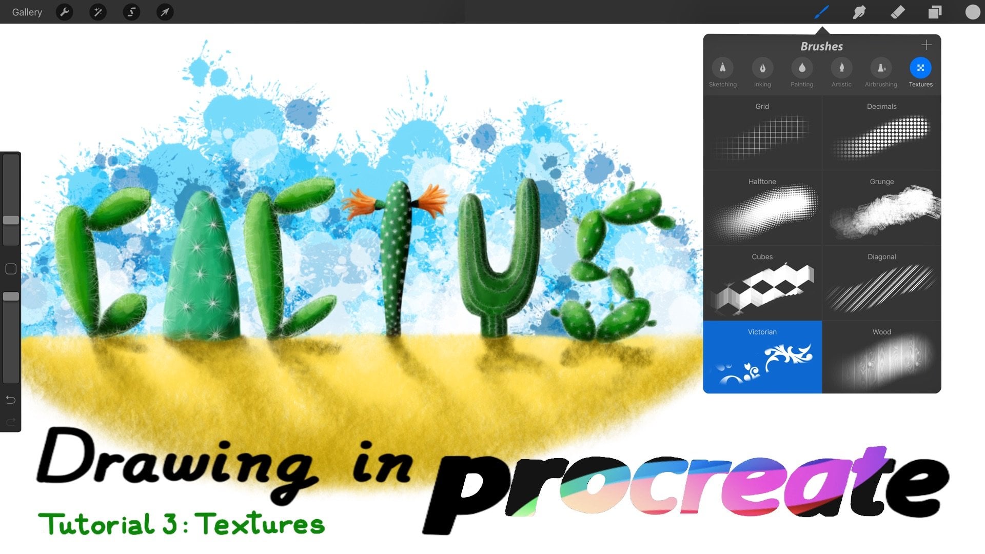
6. Creating patterns: this video, we will create a simple butter using the drawing we created in the previous video. We will learn more about complex and seamless pattern in the next course. Okay, first thing we have to do east to go be the image, create a new brush or duplicate our first brush. If you want to keep the same settings, I will duplicate it. Change its name. Remember we have to be organized or we will this a lot of time looking for our brushes The sun. We're going to use our image for our breast grain so pasted here choose oblong shape because you didn't duplicate our first brush. Let's see how he looks. Oh, to his mom. Now we have a line ful off hearts. If you don't see the hearts, go to your brush settings. Tap dynamics on turn place on my Nissan. But if you turn it off, I will no longer see the hearts so plays on. Okay, now top grade. We are going to play around with the grain sentence. Be sure. Movement. It's set to rolling. Let's increase the scale on. See how it looks increased and decreased. Zoom and see what happens but don't forget to set it to cropped or close to it when you're finished, because the size off our current brust depends on the pressure we apply. When we make a stroke on the grain will take its size two. So it will be a mess if we said it. So follow size. If you have chosen a monoline. Braase said it wherever you like. Remember one rotation due to our grain. I don't like it Bergman's so I wouldn't set it to zero. Remember to duplicate your brushes if you're happy with the result, but you want to play around with this sentence because you can reset the present once, but you cannot do that with the ones we create you. Just so how easy is to create a button for your brush? But if you don't have time to create it, you always can choose any percent images from pro library. As you see here, there are great variety to choose from. Let's choose blinds low. For example, I will rotate the grain to create the effect off the blank, blocking out the sunlight. I probably should add color and modify the grains gain to improve this But this is only an example. So let's choose another one. What, for example? Oh, I will show you one. I like a look. Please, when it's nice, don't you think? Okay, let's create a jokey brush using the present texture. Since shapes for the grain, we have several options we could use bonobo splatters, but let's try with noise. Furs. I think the grain. It's a bit smoke. So let's in Greece its size. That's not bad. Let's change the shape. Now. We need an oval shape with no hard edge. So this one is fine. I think it looks good, but let's choose other texter unsee What happens? Let's see. I will choose bonobo. Okay, too big. Let's modify the stay. You Mm, No, we need to set soon To crop on increases came a little bit yet I think now it's perfect. So let's write something good. We've just created our first chalk brush
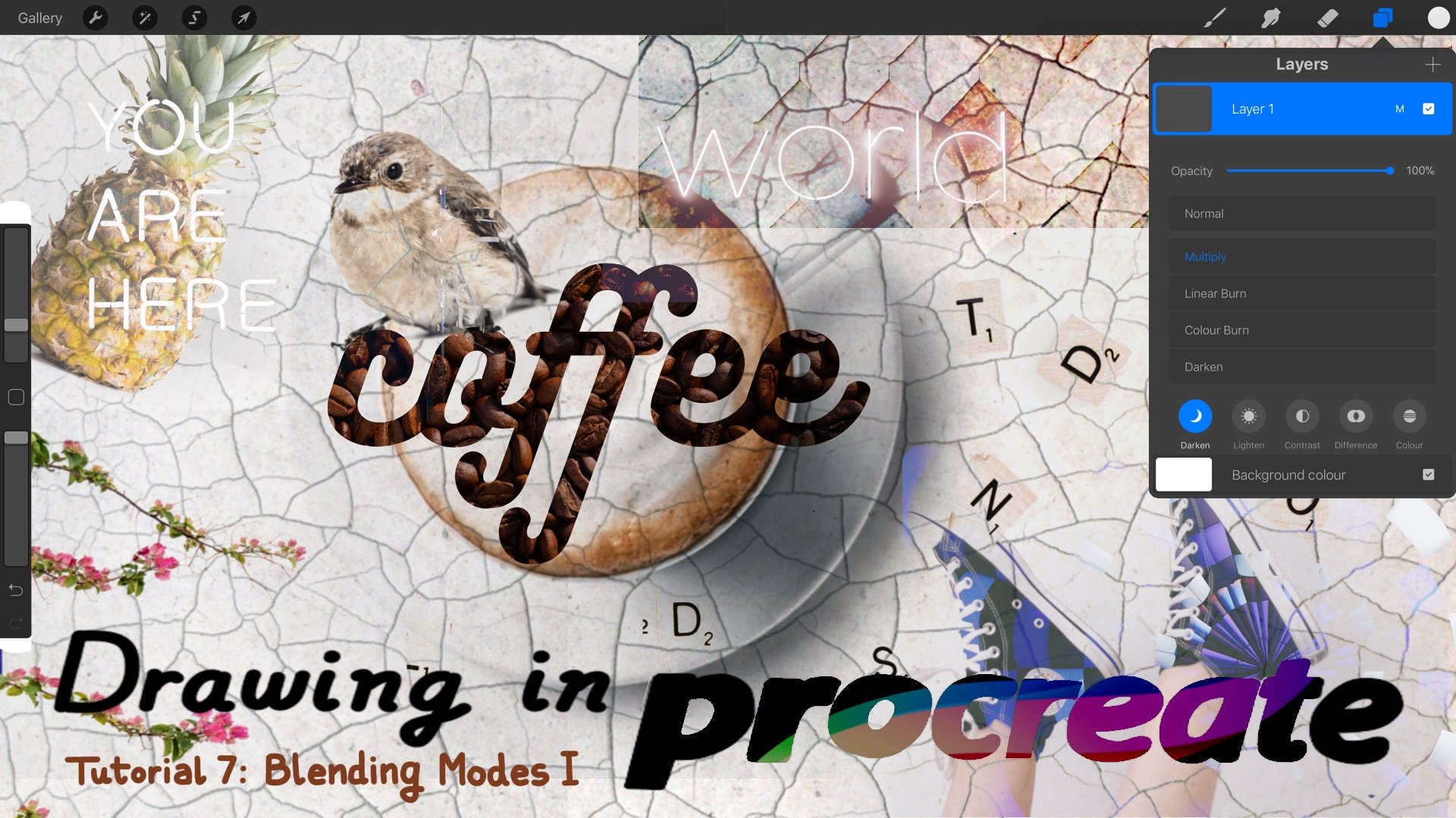
7. Adding color to our lettering: in this video, I will show you 40 for methods to add color to our letters. Where's my phone? This is the fastest and easiest way. Just use a color. This women, for example. It's a pain twosome brush and write something is yes. By second method, we will use the racer to instead off the pain to to write a word or phrase. First thing we have to do is to place an image in a new layer, my feets. A campus so it's benefit. Notify yours if it's too big or too small using the transform tool, then create another layer. This will be our lettering layer. I feel the leather layer with any quality warned or paste another image. Instead, I will choose white for these practice. Know where the layer passivity so that we can see what we are about to write now. Top day racer. I will choose our shadow pin brush on, and I will Bright Paradies. Once you're done, raised the layer rapacity use. It turns for button to move up on down your lettering on. Did you find the perfect place? Use color drop if it's necessary. Okay, now it's perfect. Let's hide a big girly. I would like to show you more options, so creates a new layer below the letter layer. Okay. Another option will be to feel the layer with color using color. Drop off course you can use feel as well. The result will be exactly the same. Now I will show you how easy is to create a radiant used in the pain, too. I will choose this color upon it. Let's start with Dark Blue. Um, let's use this stuff airbrush. Now I like to do now this one and it's done. Now we're going to add some texture. So let's create another layer to succour. What example? These light yellow and a brush, for example. Retro rec on. Let's see how it's loose. Okay, it's nice. Now we will use the nephew left version. I used this branch quite often for backgrounds, so let's give it a try here. Remember to create and you lay for its texture. OK, so luminous nebula. It's not bad. I don't know if you can see the Sprinkles here. Okay, I could be doing this for hours because it's really fun, but I have to show you more things so just one more brush, for example. This one usually looks cool. Let's see. Oh, it's nice to Okay, This method is my favorite because you can change really easily between the options you got and see which one looks better for you or even combined them. In case you want to write something else, use a racer on. If you want to make something disappear, just use the pain tool. If you already have a phrase but you want to follow these methods topped the selection. To be sure, automatic is after this is important. Top over the letters, modify the threshold if necessary, then up here to invert this election. Create a new name off course. Um, I just feel now we can add images. So whatever we want to our phrase, sir, method we will use some off the blending molds options. We will do nothing to blend the mote in the future. But now I will show you how to use them to add color to our lettering. Once we have one phrase, son, we will create a layer over it up here on the blending options will appear. I only used to off them for this exclusion on Lytton. Let's start with lighten. We're going to drawing. This led the colors for our ledges. Juice a cooler on obras on Enjoy play along with the brushes. Some of them are perfect for Grady ins like the airbrushing set overs like the charcoal said, Or the spring pain said, Offer us really nice textures. Of course, you can also use your own brushes. Uses many colors, is unique. I will use five to emulate a sunrise I am doing. It's really quick just for you to show how it works. - I like this finish. But if you don't choose all the brush or use this much too. Okay, let's see how exclusion works. If you love color blocking, you will also love this. Okay, we are going to use these phrase name, so create a lay above the phrase layer on juice. Exclusion. Then she's a color on a brush. I would just like brush for these example. As you can see, every stroke we make creates two opposite colors, one for our letters on over for the background. This is a bit rough. I will retouch it later. Take your time to choose your brush its size and capacity and it will look great creating overlay for the second example and choose red on the broads named pools. Another lay. I'm now broken lights. I used this one a lot. What do you think? Now let's use the half tone brush to create some circles on a stand out. Be okay. Full method. In this case, we will use all for work. The letters on the color will be in the same way. So if you choose this method, I recommend you to duplicate first your letter relay just in case something goes from then active Alfa. Look, select the brush I color and it started calorie. I will choose thes brush and I will paint red dots everywhere. Okay, I need to darker right now. That's not enough. I will do it again with a darker one. Now we need to light too, right? Not enough again. This is okay. Now I'm going to at some shadows using a brush from the airbrushing set. Let's decreases size and now some highlights. And that's all
8. Class project: Okay, At this point, you are more than ready to create your own calligraphy Brush is so for the class President . I will love to see your calendar page off this month. Your favorite saying no, motor your name or I don't know wherever you want to write or draw using everything you've learned in this cuts. As usual, I am going to make these month calendar. I am going to use the second on the third method to up color. So first thing I have to do is to change my background color, then feel the letter in layer with white. I will create another layer to make a sketch off the letters. This is something I used to do. It helps me to balance the composition and see if everything fits well in the canvas before to start out in details. Another layer for the numbers and I will use the gin stump to do this quickly. You will find it in your product section. Everything is okay, so I will write. Jim is in the eraser on the first brush women. But first I have to lower the passage of the gens gets layer Fisher to write in the land with filled with color. Okay, now it's sent to add color. So I need to create a new layer and place it under the ladder relay. I will make a great didn't using the sunset polit shortages. You will also find it in your produce section. I will start with a lighter color on. I will choose the fat no. So brush from the spray pins set. My layer capacity is not set at max. That's why you can see the pain outside the largest to I will fix this in a second fixed. I will hide the sketch to Okay. Next color. I usually make the grade Ian's from light to dark colors and also use a big size brush because I like a lot to see the brush grain in my drawings. Well, splatters in this case. But Fif, free to do it your way. I recommend you to use the airbrush and set for smooth third radiance. Okay. Next, I will create a new layer to add color to stump. I will act if lighten, choose a cooler and won't change the brush. Ok, okay. So small. Change the Bross again. Unchain decides to okay. Gente Kelowna on create any layer to add a special effect to my Sunday letter. I will activate exclusion now. I'm changed my brush before drawing anything. This time I'm not sure about the color. Mm. Now it's perfect. I think this calendar will look better with more turquoise at the top. So I will choose the stitches brush with created on play around. Oops, wrong color again, Daddy eyes that it looks like two different fabrics joined with stitches your layer. Now I will use the selection to to mark out the area for Day two. Coy's father. Okay, now I will choose a texter brush. I like those molds a justice size on star painting. Remember, don't leave the apple pensar or your finger from the cameras until you're finished or your pattern will overlap on. It's not going to look. If you want to add a shadow, create a new layer or choose the letter in layer on. Asked if Alfa look know where the layer opacity choose a brush on Drollas shadow. - Okay , my calendar is done. Can't wait to see yours
 Lettie Blue, Architect & Digital Illustrator