Transcripts
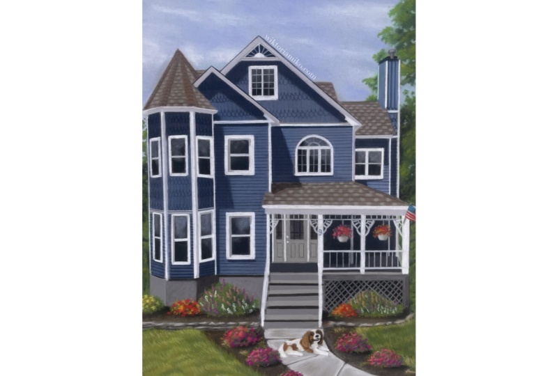
1. Welcome!: Hello, my name is
Victoria Mikoart. I'm a portrait artist
specializing in pastel medium. I have been working
professionally as an artist for many years. I have created countless
portraits of people, animals, and landscapes. I also have a passion for teaching and sharing
the joy of art, which is why I
would love for you to join me in this class where we will learn how to
draw a traditional home. This class is best
suited for artists on the intermediate
and advanced level. We will go through
all the stages necessary to complete
this house drawing. We will learn how to use soft pastel sticks and
blenders to create layers in our work,
and how to use pastel pencils to draw details. We will begin with a
sketch, and continue by creating a smooth background. Next, we will look
at how to draw the roof and
appearance of tiles. We will move on to the walls and learn how to mix the colors, and get the perfect cue, and
accurately draw the shadows. Next, we will draw a variety of windows with different
shapes and sizes. We will then draw the
port and focus on capturing depth and
dimensionality. Finally, we will create the
landscape and learn how to draw beautiful floral
bushes and grass. We will also take a look at the framing process to
beautifully display our work. In this class, I
will guide you for the entire drawing process. I would love for you to
create this portrait with me as though we are
working on it together. After this class,
you will not only be able to draw a
home like this one but take the skills
learned to create other beautiful pastel drawings. I am confident you will enjoy this course, and master the
techniques necessary to complete a portrait using the beautiful pastel
technique. See you in class.
2. Materials: Hi, everyone. Welcome to the class. I'm very excited
for you to be here. Before drawing, we'll begin
by looking at the tools and materials we're
going to be using. First, let's take a look at the surface we're drawing on. I use Clairefontaine
Pastelmat in dark gray. You can get both the board
and the card version of this. I always prefer the board, but both work perfectly. I choose the dark
gray color because it makes all the
pastels appear more natural as opposed
to white paper which makes the colors appear
too bright and vibrant. I also like this
paper for pastels because it's very grainy, almost like soft sand paper. This holds the pastel very well and makes sure that the
drawing lasts a lifetime. This is the kind I
like but you can use any paper that has enough
tooth to hold the pastel. The size I'm using
today is roughly 10 by 14 inches or 25
by 35 centimeters. I usually buy the large sheets and cut out the size I like, as the size range of this
paper is quite limited. You don't have to use
the same size as I do, choose whatever you
feel comfortable with. I like to tape this paper
to my drawing board to give it a clean
professional look at the end. Next, we have the soft pastels. I use these to create
the background and the base layer
of the subject. These are the sets I use. You do not need as many as this. I would recommend
just having this set if you are starting out. All of these are relatively inexpensive and work
perfectly for me. Next, we have the blending tool. I use this to blend the soft
pastels into the paper. This allows me to create
a very smooth layer. There are various
shapes and sizes, but this is the one that I use. It's great for blending
both small and large areas. Finally, we have the pencils. I use pastel pencils to draw
the textures and details. This is the most important tool for creating pastel portraits. I use a combination
of three brands; the Stabilo CarbOthello, Caran d'Ache, and the
Faber-Castell Pitt pastel pencils. These sets get very expensive, so if you're starting out, I would absolutely recommend the Stabilo CarbOthello pencils. For the first few months
of working as an artist, I only used this set
and it was perfect. There are so many natural
tones in this color range. Also, they are very
soft and easy to blend. Especially the Caran d'Ache set can be particularly expensive, but the colors are
very pigmented. So if you can, I would
encourage you to buy just a few individual pencils. I would recommend
this Chinese white in particular for the
reflections in the eye. These are all materials I use. Next, we will be moving
on to the drawing. Can't wait to begin. See you there.
3. Background - Cloudy Sky & Trees: Hello. Welcome to the
first part of the drawing. I start each portrait by first
creating the background. These other colors
I will be using. The blues are for the sky, and the greens are for creating the beautiful trees
in the background. I begin by covering
the sky region with a light blue soft pastel. Be careful to leave room
for the trees on the sides and not draw over this
region with the pastels. I am creating just a
thin layer not worrying if the paper is showing from underneath as this will
all blend together. I am also taking care to
stay within the lines and not draw into the
silhouette of the house. Now that we have
this first layer, we blend this all together
with the soft blending sponge. Again, I'm being careful
to stay within the lines. We do not want to cover our outlines of the
house with blue because we will need to see
these reference lines later. Here I felt that a little
more blue was needed so I am just making
another layer using the same color and proceed
to blend this too. Now we are going to pick up a slightly darker shade of
blue but still quite light and draw a few
horizontal strokes. This helps to make the
sky appears slightly more shaded and not just
a flat blue color. We want the sky to be
slightly darker higher up. If you are lucky enough to
have a clear sky right now, you will observe that
the sky blends from darker to lighter
blue as it goes down. We also blend using a
horizontal hand motion. Next, we're taking a white soft pastel
to draw the clouds. We are first going to create an effect of very faint clouds and so we are creating
little patches like this. Once we blend them in, they will resemble
these faint clouds. Again, we're going to use
a horizontal hand motion. I feel that they appear
a little more realistic when they are blended this way. You can use your hand to press this pastel into the paper, just make sure your hand
is very dry and clean. Now we are revisiting
our blue color and we're just
using this to make the sky appear more vibrant and to separate the
clouds a little. Now we are creating the trees. These other colors I am using. Try to find a similar
range in your collection. We are using three
shades of green; light, medium, and dark, and black for the
depths in the tree. I approach each
portrait by first creating a base layer
with soft pastels. After that, I use pastel
pencils to draw the details. I am using the
medium color first. Essentially, we are using little circular motions to
create the leafy texture. I am looking back and forth
at my reference photo and observing where these
medium green colors are and I try to roughly replicate
this shape and location. It's okay if it isn't perfect, we can go back to this color later if something is missing. We are picking up the dark green and following the same process. We observe and try to replicate where the dark regions zone. I am only loosely following
the reference photo, I'm not trying to replicate
the real tree exactly. The references are
only there as a guide. We have a lot of artistic
freedom in drawing the tree because it's very ordinary and nobody will notice if we made it different
from the original. Next, we are using black to capture the darkest
parts of the tree. This is mostly the lower area. Don't be afraid to apply this. Once we blend the
colors together, the black won't
stand out so much. I'm using my fingers
to blend this tree. There is a bit of a
difference between using your sponge and
your fingers to blend. When using the sponge, we
almost mix all the colors together into one whereas,
with your fingers, the pastel tends
to stay in place, just the transitions between
the colors are more smooth. For the trees, we want to keep the appearance of leaves and not blend all
the greens into one so I'm using my finger. Next, we're going to
take the lightest green and work on creating
the highlights. Again, don't worry too
much to make this perfect. Once we blend it, it
will all come together. Now we're going to pick
up the pastel pencils. This is the range I was using. I have three shades of green;
dark, medium, and light, and I have black
to create depths. We are going to be using
blue to create gaps between the leaves as though
the sky is showing through. We are starting with
the lightest green. I am drawing in circular motions to create the effect of leaves. The light green
should be at the top where the light hits the
leaves and the dark green will be below in the shadows. We are now using
the blue to show the sky between the leaves. I just draw tiny random shapes. I like doing this because
it makes the tree appear a little more convincing. Next, we are taking
the dark green to draw below the
tree highlights. I am using the same
circular motion to create the effect of leaves. I go back and forth between the colors a lot as
I work on the tree. If you are stuck, just move
on to the next color and you can always go back if something is
still missing later. Here I'm creating
a few leaves over the sky to make the tree a little less even
around the edges. Now we're working our way down the tree and applying
the same techniques, focusing the light green on
the top layers of the tree and the darker green where
there is less light. We're moving onto the
left side of the portrait and we get to practice drawing
the tree one more time. I started by creating leaves
with the dark green pencil, I am adding the lighter green to create some dimensionality so it appears as though
some leaves are in front and some are in the shadows. Here I'm adding a
layer of black to suggest that this part of
the tree is in the shadow. I am using the dark
green pencil to blend this with the
rest of the tree. Now we're going to
add some details and start building
this leafy texture. There are some more details
in the reference photo, but I am choosing to
continue drawing the tree here because I would like to leave the focus on the house. That is the beauty of painting. A camera captures
things as they are, but as artists, we can
perfect these images. This is all that I
do for the trees. I hope you like this
technique and found the video not only informative
but also fun. I really love drawing, and I hope you enjoy that too. In the next lesson, we
will create the roof. See you there.
4. Roof - Drawing the Tiles: Hello, welcome back. We are now going
to be looking at how to draw the roof of
this lovely blue house. There are a couple of different
sections of the roof. here we have the tower, we have the section in the back, and the port roof. We're going to be learning how to represent this
particular material. There are also a lot of
interesting shadows, so we'll have a look at
how to portray those. We are going to start
with soft pastel sticks. Here I'm just testing out to
see which color works best. Sometimes pastels look
different on paper than they do on
the actual sticks so it's useful to test
them out in this way. We will of course cover this
patch test in a moment. I want the outlines of
the roof to be very clear and very even, so
I am first going over them with a brown pencil. I am still trying to figure
out here what color works best and decided to blend
two browns together. Here I am using blending stumps to work this pastel
into the paper. I am not using the sponge because this is
quite a small area, so I want more precision. Now, we want to bring out
the shapes of this roof. We are going to
lighten the size of the roof using a
very light beige, almost like a gray pastel. We are drawing
in-between the borders that connect the three
sides of the roof. I don't want this to blend
with the rest of the roof so I am just using my finger to work this pigment
into the paper. Now, this looks good. The two borders are
a little darker than the free sides of the roof. Now it's time to create
the tiles on the roof. We're just going to represent the overall effect of tiles. The way that this works best
for me is to first create horizontal lines about five millimeters apart, like this. I am using dark brown for this. Next, I take beige and draw rectangular shapes evenly
spaced out like this. I'm just reinforcing the
horizontal lines here. I also like to blend this
other too with my fingers so the details don't
stand out too much. Now that is done, I am adding
details to the borders. This consists of just creating
angled lines like so. Now the tower roof is done, we are going to move
on to the next roof. This one is a little easier because it's just flat
and front-facing. We begin by drawing
the base layer. We only need the same colors
as we did for the tower. Here we have a brown layer and I'm adding a bit of the
slightly more green pastel to get the accurate color. I'm only doing this
because I don't have a good soft pastel
color in my collection, but if you do, you of
course don't need to use two different colors like I am. We are picking up
the blending stump and mixing the two
layers together. I'm adding the beige, grayish color to
lighten the roofs more. Again, we are creating
horizontal lines pass and you can use a ruler for this to make the
lines perfectly straight. Now, again, with the beige, we're just drawing small
rectangular shapes to represent the tiles. Remember to space
them out evenly. I'm just reinforcing
the brown lines because sometimes they can get
covered up by the new layers. As we can see, the tops of these roofs have
a little border, so I am taking a blending stump and bending a little
straight line together to remove the tiles and make it a little distinct
from the rest of the roof. Now onto the final roof. As you can see, this one has a little
shadow in the corner so I am creating the shape of
the shadow using dark brown. This is the same brown I used to create the
horizontal lines. I am going to continue drawing the lines onto the
shadow using black. If we use the same beige to draw the tiles on the shadowy
area in the corner, they will appear too light so we have to
compensate for this and pick up a gray pencil
instead to draw the tiles. There is another border
along the side of this roof so we can take a ruler
and create this. That is the roof
lesson complete. I hope you found this
enjoyable and useful. In the next class, we will be drawing the beautiful
blue poles of this house. See you shortly.
5. Walls - Shadows & Borders: Welcome back. In this lesson, we will be drawing the
blue walls of this home. I chose to use this
particular blue as the main wall color. With this pencil, I draw
a base layer of the wall. I'm being careful to not
draw over the windows. That is not perfect color
of the original house so I am using a very
desaturated blue, almost gray to draw
a layer over it. Here I'm also adding navy. Finally, I am adding
a little white. I find that combination
of these colors gives me the closest
resemblance to the house. Here we are blending it altogether with our
blending stumps. This right wall of
the tower is a little darker so are the sections
right below the roof, so we are going to use
just the navy blue. Again, we are
repeating these steps, adding all the
necessary tones of blue to get the accurate shade. We are not worrying about the patterns on
the walls just yet. For now, we just want to capture the color and the shadows. There is a little shadow
here on the right, so we are looking at
the reference photo and trying to copy its shape. It goes all the way
down on the left side and then edges out towards
the middle of the wall. I guess that must be the
roof casting the shadow. If you draw over the outlines
a little, don't worry, we will be adding the
white wall trim soon so the little imperfections
will be covered. We are almost at the
end of this stage. We're just making sure that
all the walls are colored and the shadows are in place. It helps to look at the house in sections to break it down. First, look at the tower and make sure all the
shadows are represented. Then the next, then the
wall after that and so on. Now we get to do the fun part of drawing the wall patterns. We will begin with this wall. This looks fairly simple. There are planks on the walls which are fun and
easy to represent. All we have to do is draw a straight horizontal lines
using the navy blue pencil. While I am making my
way down off the ruler, I'm also drawing this pattern
on both of these walls to make the process
a little bit faster. If the lines are
to permanently you can gently blend them
with your finger. Again, don't worry about
going out of the lines we will be adding
the white wall trims which will clean up the marks. I am drawing this
pattern on all the walls and checking the reference photo to make sure I don't
miss anything. Here on the chimney there are little curves at the
bottom of the planks. We are now moving on
to the second pattern. These are also quite simple. I am drawing little curves
in rows of two like so. Now I am making lines to connect to these
curves to each other. I am just blending this a little into the paper
to make it stand out less. Now, this is my favorite
part of the lesson because it brings
the walls together. This is pretty intuitive, we are just taking
our radar with a white pencil to
draw the lines. The lines are quite thick, so we might have to move the
ruler around a little bit. I am using quite a firm hand. I want these lines to be
very bright and apparent. We are using two
colors for this. Some of the borders are
lighter than the others because some are in the shadow and some are in the light
so we use the slightly gray one for the borders
in the shadows and the white ones
where the light hits. We make sure that we keep checking the reference
photo to see where all of these borders are and what shape they are as well. Also don't forget the
borders underneath the roof, they are a little darker, so I am using the gray pencil
except the very top of the border where a little bit
of the light bounces off. There is a very nice detail here at the top of the house
so don't miss that. First, I am drawing the
border and the semicircle. Now I'm filling in
the area of the wall using the same navy pencil we used to draw the
wall in the shadow. Now using white, I am free handing
the line details. I am using gray to
capture some depth. This corner is not in line
with the rest of the borders, it's a little bit further back, so I am using gray to
capture some depth here and separate it from the border. We are now approaching the end, I am just adding
some final shadows and details here so that's all. Thank you for
watching the class. This is actually
my favorite part when I'm doing a house portrait so I hope you liked it too and in the next lesson we will have a go at
drawing the windows. I'm very excited,
so see you then.
6. Windows - Different Shapes & Sizes: Hello, welcome to the lesson. I'm particularly looking
forward to this one. Windows are very fun to draw and they bring the house
together, so let's begin. There are quite a
few windows here, let's start with the one on top. I like to start with the glass. We are using black to
shade this all in. Next, we proceed to work this into the paper with
the blending stump. When those are reflective so I'd like to add
a hint of blue to represent the sky as though it's reflecting away
from the glass. Now, similar process to how
we drew the wall borders, we are going to take our ruler and outline the window
frame using white. I am looking at the
reference and ensuring I capture the right
thickness of the frame. If you slightly draw
out of line here, you can remove the pigment
with the blending stamp. Don't forget to draw the
frame inside the window. This is much thinner
than the outside frame, so I am using a gentler hand and not pressing as firmly as I would for the
outside frame. I'm very happy with this window, so I'm going to move
on to the next. Again, I start with
the black glass. I am using various colors here to represent reflections
in the window. I am gently blending
this in with my finger. Here the window has
some depth in a frame, I am using gray to reflect that. There are details behind the
windows like the shutters, but I don't think it's
necessary to capture those. They're not very
characteristic to the house, so we're going to simplify
the windows a little bit and draw a clean black glass. Again, the process
is the same here. We start with the glass, we shade it all in with black. Next, we add reflections. I am using a few
different colors to faintly reflect the sky. The windows here are
at a slight angle because they're on the tower. When drawing the frames, we have to make sure we
capture this perspective. Actually, in retrospect, I think I over-exaggerated
the angle slightly, so make them a
little less angled, the bottom windows too. Now, onto the final window. This one is my favorite, so we're saving the
best for the last. We continue with the same steps, starting with the glass
then the reflections and finally the frame. This frame is a little rounded, so we have to
freehand this curve. Can't really use a ruler here. Again, I am just cleaning up the edges with the
blending stump. This is it for the lesson, I hope you find it simple and were able to follow along. In the next lesson, we will be drawing
the porch area. See you there.
7. Porch - Door, Steps & Other Details: Hello, welcome to the lesson. Here, we will be
working on the porch. We will begin by creating the walls at the
back of the porch. They are very deep
in the shadows so they are almost black. I'm using a black pastel pencil here to create a base layer. I will go over this using navy. The intention is to create
a very dark blue wall, once they are mixed and
that's what we will achieve. Here we are using
the blending stump to integrate the two colors. As you can see, the wall is a very
deep shade of blue, which is what we want. Now, we are drawing the door. Actually, the one I'm doing is a little bit different
from the reference, that's because the
owners of the home were changing the door soon after
the drawing is created, so I want the drawing
to be updated. This is a picture of
the door I am drawing. You can draw either one. I'll start the door by
drawing the basic shapes, the doors gray color
and the black windows. I am also adding all
the necessary details such as the doorknobs, the white borders, the
lines in the window. Again, here we are drawing the white borders
of the porch roof. I am using a white
pencil and a ruler. Below is another border. This one is withdrawn a
little in the shadows, so it's slightly darker
from the one above. We are using gray to draw it. Here, I'm just fixing up
the line so it is straight. I have also drawn the pillars that are supporting
the porch roof. We can see some of
the tree peeking through the sides of the porch, so we are going to
complete this gap. I am using the dark green color and a bit of black to
fill this in using the same technique as we did
for the rest of the tree. There are these beautiful
arches here in the corner. I am working on them of the same white I used for the pillars. First, I am doing
the outer lines, making sure they are all even size then I will
fill in the details. This is the floor of the porch. Here in the shadow is very dark, so I am using dark gray. I am creating a pretty
thick layer of this. Now, I'm working on
the porch fence. There is a little porch
visible here on the side. Notice how it is
slightly angled, that's because of
the perspective. We want to replicate this
to give it the porch depth, so make sure you
angle your ruler. Now, we're doing the
front of the fence. This is pretty straightforward. I am drawing the
top of the fence at the same height as the
fence on the side. This looks very good. The lines on the fence
are evenly spaced out. Now, we will just complete
the bottom of the house. Let's start with the tower. This right wall of the
tower is in the shadow, so the bottom is a
little darker too. I am using a dark gray pencil, almost black to fill this out. There is a little shadow on the top of the middle section, it's the same dark gray color, so we will add in
this little shadow. The middle wall is a little
lighter than the right, but still darker than the left, so I am going to create a color that is
in-between these two. For this, I will
draw a thin layer with the dark gray pencil, then a lighter gray
pencil on top. Now, we will use the
same light gray pencil on the left side and you'll see how it's
just a little lighter without the dark gray
layer underneath. Now, let's do the area
underneath the porch. When we go about coloring this, let's take a look at the gray
shades we've already used. There are only free shades
in this whole area. There is a dark gray, which is the same dark gray as the right side of the bottom, there is a medium gray like
the middle tower bottom, and finally a light gray
just like the left side. You You don't just want
to look at the porch and compare colors
against each other, move out looking
at anything else. We want to compare the
colors on the porch against the rest of the drawing so that everything looks
realistic and cohesive. I'm saying this because
it's good to be consistent throughout
the drawing, which is what makes the
artwork more realistic. The area underneath the porch is roughly the same color
as the medium gray, so I am using the same
color to fill this in. We will draw the details over
this in a moment but first, let's fill it all in with
black to represent depth and shadows under the porch. There will be a bush here, so I am not taking this black all the way
down to the ground. Now, I am capturing the
pattern on the porch. I had initially spaced
them out too much and later decided that
the lines were too scars, so I added another set of lines between the existing ones. Finally, we get
to do the stairs. They're all the same free
shades of gray here. If we look at this as a
pattern from top to bottom, the colors go light gray, dark gray, medium gray,
and it continues. Light, dark medium
again and again, so I'm using these
colors in that order. The top of the step
is light gray. The finish shadow
underneath it's dark gray and then the side of the step, the pop facing us
is medium gray. I am also looking at the
reference to make sure I capture the right
thickness of these steps. Here, I'm just drawing the
handrail of the staircase. Finally, I will be adding
these hanging flowers. I begin with the pot. I am drawing a very
simple grade pot. We don't want this
to appear flat, so we're adding a
lighter gray on the side as there it is round and reflecting some of the light which is coming
from the left side. Next I'm using
green as the base. Now, for the fun part, we get to add the flowers. I am adding pink dots here. From a file it's difficult to distinguish the shapes
of the flowers, so if we just draw little dots they represent
flowers pretty well. I am using a couple of different
colors here for variety. This is actually
my favorite part. The flowers add such
a beautiful touch. I am using a lighter
green now to add leaves. I am repeating the
same process now. For this one, I am making
the flowers red and orange. I think this looks very nice
next to the pink flowers. In the original picture, there's flowers one actually but they haven't yet bloomed
at the time of the photo. But again, that's
the beauty of art. We can optimize the pictures. I hope this was useful and that it inspired you
to pick up your pencil and draw with me. In the next lesson, we will
be trying the landscape. We will draw the grass
and more flowers. We will add a lot of
color to the drawing, so I'm very excited. See you shortly.
8. Landscape - Floral Bushes & Grass: Hello, welcome to the lesson. Here we are going to be
working on the landscape I will begin by drawing the
soil underneath the bushes. I am starting with a dark brown. I'm drawing a layer
of this color over the whole soil region. I am working into the paper
with the blending stump. I am adding a layer of brown, but focusing it in the
areas that are darkest, particularly where the
bushes cast the shadow I am going over these
shadows using black. I want them to be
a little deeper. Again, I am blending them in. Here I'm picking
up my beige pencil and creating some
texture in the soil. I'm making very
small, gentle marks and I will press them into
the paper with my finger. I'm going over the
texture a little of the dark brown to make
it more interesting. Now we're going to
work on the bushes. I am drawing a dark
green base layer Now, I am using the
light green pencil to draw texture on the bush. I am keeping in mind that the light source is
coming from the left, so I try to reflect this. I'm making the top-left area of the bush lighter than
the bottom right. Now, we are drawing
little flowers. I am using some
artistic liberties and changing up the
flowers a little. I like the way
yellow looks here. The flowers look
pretty and natural, so I'm blending them a
little with my finger to make the flower
stand out less. The process is
very much the same as for the flowers on the porch. We are not drawing the
exact shape of a flower, we're just drawing
marks as though we are looking at the
flowers from a distance, so of course, the shape
is a little less clear. Here, I am adding a
little bit of black in between the flowers
to make the bush, appear a little
darker on that side. Again, here I'm adding some texture and
shadows to this bush. Remember we want it to look consistent with the
rest of the drawing, so we have to form the
shadows in the same places. If the light is
coming from top-left, the shadows will most the
angle to the bottom right, so we make the top-left of the bush lighter than
the bottom right area. Now onto the flowers. For this bush, we are creating lavender-like flowers to
add a bit of variety. First, I am drawing little
downward spirals using pink, then I am adding a bit of
dimension using purple. I am randomly
spreading these out. I am also adding
some white flowers to make this brush a
little more interesting. I'm not creating a
neat specific shape, just some random
elongated shapes. I actually missed a
little section of the background tree over here, so I'm completing it now. Again, we are
working on the soil. We take the dark brown and draw a layer
over the region. Next, we take black and establish the shadowy areas. We blend this all together. To finish off, we are creating some texture with
a beige pencil. Moving onto the bushes, we are starting by drawing
some black shadows. Then we create a thick
dark green layer over the two bushes. We follow by drawing texture and light in the top
left side of the bushes remembering that we have to make the side lighter to account
for the light source. Next, we get to do the fun
part, which is the flowers. We are creating clusters
of small patches of color, then we draw using a
lighter color over them. We are adding some
green leaves to make this brush a
little less even. Now, we are creating the
lavender bush again. We are drawing elongated shapes, first in pink, then draw
the shadows in purple. We add some white flowers and random leaves around
the outside of the bush. That section is done and
now onto the bricks. I am starting by creating
the outlines of black, I'm drawing very thick shapes. Next, I am taking a beige color and filling in the
rest of the area. Next, I am picking
up a dark brown and adding some more
shapes to the bricks. With this light beige color, I am adding some
highlights in places where the light
reflects a little. This represents the
brick pretty well. Now onto the soil along
the sides of the path. First, I am outlining the
path so I don't draw over it. Just like with the
previous soil, I am doing a layer
of dark brown, leaving out the areas
where the bushes will be. Next, I am adding some
black to create shadows. Remember we create these
below the bottom right of the bushes because the
light comes from top-left. I felt that my layer of
brown was not thick enough, so I am going over it here. Here we are adding
some rough texture on the soil using beige. We will blend this into
the paper a little so it will look more
natural in the moment. Moving onto the grass. I also really like drawing this, so I'm excited to show you
how I go about doing it. Ignore me making all
these scribbles here. I figured out later
they would just be best to draw an even green there. On the right side, the grass is a little darker, so I am creating
some black patches. I notice it looks very scary, but once we draw green over it, the layer will blend very nicely and these black patches will
just look like dark green. Here we are creating
the green layer. As I said, you don't need
those scribbles underneath. I was just experimenting I am adding some
light green patches. For the right side, I am
looking at the reference and trying to capture roughly
where the light hits. On the left side, the grass has been a little dried
out by the sun, so I'm working from my
imagination for that section. We will be blending
this all together, so don't worry if it's not neat. We just want to add different
values in the grass. I want to make the layer
a little more thick so I am applying the dark
green a little heavier. I'm going over the same areas that were already dark green. Next, I am using a light
green to go over the rest. Now, once that is blended, I began creating grass strands. I take a light green pencil, this one is current dash
brown olive 50 percent, so it's almost a little yellow. I like that because it's
a little more natural than the very saturated green. I'm using the pastel
layer as a guide and drawing strokes over the
areas that are light green. [NOISE] Now I`m taking a dark
green pencil and creating strokes over
the dark green areas. There were a little
patches of grass here, so I am adding some detail to
this using the brown olive. Here, I am using a bit of green to create strokes over the soil. We are drawing the set of
bushes alongside the path now, we start with black and
create the deepest shadows. Next we draw over the whole
bush with dark green. Next we will add some
definition using light green to show some light bouncing
off the top left side. Now I'm actually drawing a dog. This was not part of
the original photo, but the owners of this house
had a really cute dog, and therefore it
would be cute to show him laying on the path. Feel free to leave
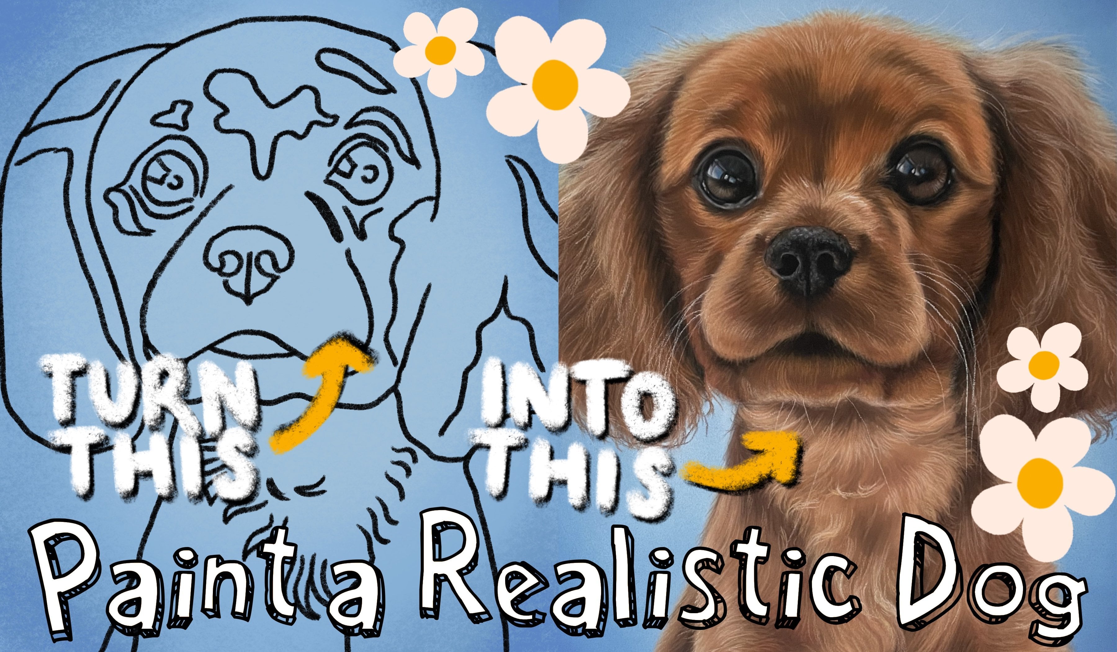
out this detail. I actually have another course where I drew a realistic dog. If you are interested, I would love for you
to have a watch. It's a 45-minute class and I went through the
whole drawing process, it's definitely worth watching and it would help me a lot too. Now we are walking on the path. This is fairly simple because there isn't so much
in detail on this. I am starting out by filling in the path with light beige,
almost white color. I'm adding some gray over
this and some beige too. Notice how the path
consists of tiles, I am drawing some
dark gray lines to break up this path
and represent the tiles. I wanted to make the corners of the tiles a little
bit more round, so I am using some dark
brown around the edges. We've almost made it. There are just a
few final details left before the drawing is done. Fast, we want to draw the American flag hanging
from the porch. This is quite small, I make sure to have
my pencils sharpened. That is all, we've now
finished the portrait. I really loved working on this. This was in fact the first house I had the pleasure of
drawing and it was very fun. In the next video, I will show you how
I frame the portrait and we will conclude the class and talk about the project. See you in the moment.
9. Framing - How to Beautifully Present Your Work: Hi everybody. This is the final
lesson of the class. Now that our beautiful
drawing is complete, we'll take a look
at how to frame it. First we have to take
the tape off the edges, I love this part. It's usually more satisfying when it doesn't
rip like this one. Look at the perfect,
clean even lines. They make the drawing look
so much more professional. Here I am taking
a mount or a mat. This is extremely important, especially when
drawing with pastels. The drawing needs
breathing space between the glass to prevent
it from aging. Pastels are very dusty, so if the drawing is
directly touching the glass, it will transfer onto the glass and we really don't want that. It's also a beautiful
visual effect because it attracts
attention to the drawing. Yes, make sure you use a mount. I am taping the drawing
to the back of the mount. I want it to stay in
one place in the frame and not worry about
it moving around, so I just use small amounts of tape on each side
of the drawing. Next, we're going to place
our drawing into the frame. Here make sure you wipe
the inside of the glass. You don't want to put
the drawing inside, then find a small hair or dust. It happens to me all the time and I find it very
annoying to fix this, so don't make the same mistake. I'm just writing my signature
and sealing the frame. If this drawing is
for you to keep, this is how I would leave it. However, as this
is a commission, I want it to look
really beautiful and presentable for the client, so I'm adding a
few extra details. First, I am tying a little
ribbon around the frame. I'm creating a nice bow here. You can make the packaging
even more special by adding a little
flower like this one. I also would like to
write some nice words to the owner of the
drawing and show my appreciation for
the commission. I am tucking in
this written note in the corner, and that's it. Very simple and elegant framing. I love how the drawing looks with the white mount around it, and the frame color beautifully
compliments the drawing. This is it, you've made it
through the whole class. Let's conclude all the lessons and talk about the
class project.
10. Class Project & Conclusion : Congratulations on
completing the class. This was not a simple portrait, so I really want to applaud
you for doing it with me. To summarize, we began by
drawing the background. We created a smooth cloudy
sky and green trees. Then we drew the
roof and focused on capturing the texture of tiles. After that, we
attempted the walls. We looked at how
to draw shadows on the walls and create
dimensionality. Next, we learned how to draw windows of different
shapes and sizes. After, we draw the porch where we focused on creating depth. Finally, we learned how
to draw the landscape and created beautiful grass
and colorful flowers. We finished off by looking
at the framing where we discussed how to best
present our very hard work. I hope that by breaking
down the process into sections that is starting
with the background, then doing the roof, the walls, windows and so on. It made the process
seem a little easier. I also hope that by
showing you how I created this portrait you feel more confident in creating your own. For the class project, I would really like for you to create this blue
house with me or maybe do a drawing
of another house perhaps as a gift to a
friend or a family member. Follow the class and draw along as though we are
working on it together. If you have more
questions, please ask. I would be very happy to explain something further or
give more guidance. I would be very happy to help. I would like to thank you
again for joining me. I had so much fun
creating this for you. I really love drawing
especially with pastels, and I also have a
passion for teaching. Thank you very much
for being here. Here is my Instagram page
and my website if you would like to see more of
my work and support me. I also create portraits of people and landscapes
and animals. If you would like to see those, that's where you'll find them. I also have other classes
here on Skillshare, so if you enjoyed
this one I would really like to encourage
you to check those out. Thank you for being
here and again, congratulations for
completing the class. I am very excited to
see your project. Bye.
 Wiktoria, Professional portrait artist