Transcripts
1. 00 Introduction: Hi there. In this class on
drawing daffodils, you will learn how to look at four different
types of daffodils. Each daffodil is
demonstrated with an a specific analysis of the photograph reference
that we're using. Where I break down, looking at the triangular
geometric anatomy of that photo reference. I look at construction lines and how I'm going to measure. Then I proceed to start a very light block in with
the geometric shapes. I demonstrate for you
the line drawing, adding tone, and then hatching. This drawing methodology is a way that you can apply
to anything you want to draw a bit more floral drawings or drawing portraits,
graphite portraits. And I think you'll learn a lot. And so let's get started.
2. Anatomy of Daffodils: In this class, I'm going to talk about the anatomy of daffodils. And specifically,
I'm going to look at these four different
cultivars there. Daffodils come in
as many varieties as you can imagine out there. Because just because, so I, I'll start with, first of all, I want to identify, so this
is called Dutch master. It's an heirloom, daffodil. This is called ice follies, and these are all early
season daffodils. That means that they bloom as early as February
and in early March. And this is called
fortune, another heirloom. And then this one's called
February gold because it does, It's the very first definite all that blooms in my garden. And we're going to dive deep into understanding the
anatomy of a daffodil. When you're painting
and drawing a daffodil, I think it's important
to first understand the basic anatomy of a daffodil. Because I think when you understand the anatomy and also the differences between
the different cultivars. You have an ability to make your art come across
an elevated more. You are no longer just making
a generic representation. Instead, you have elevated your creative endeavor into
something unique and special. Kind of think of it as
like you're creating a very special portrait
of these flowers. That's how I like to think about flower painting
and flower drawing. So let's look at the basic
anatomy of all daffodils. Daffodils have a Corona, that's this trumpet
part of the flower. So all daffodils have a corona, which is the trumpet. Or like, I like to call
it the nose of a paint. The flower. All daffodils have a corona. The trumpet shape of the
central part of the flower. Inside the flower,
you have a stigma, which is the item that
points out the farthest. And then you have a whole
bunch of statements. When I say a whole
bunch, it's usually six that are inside of it. And they can either
be tight up to the stigma like in this master, or they can be like this flower, where they have the stigma. The stamens have separated out, and then there's the
stigma, again, the corona. And then all daffodils
have six petals. And the petals are in
two groups of three. I like to think of them as an equilateral triangle of 123. And then these are
the forward petals. And then you have
another set of 123, which are the petals
that are in the back. And then you have like the
back part of the flower. This is the ovary. But we're artists
were not botanist or so we don't need this tissue, brown tissue paper quality
piece is what covers the bud of the flower and
that is called the space. And then you have
this little part right here of your stem, which is called the neck. And then you actually have
the stem of the flower. And I want you to look at the, you see how this stem has its got two edges
that are pretty rigid and then it actually
twists and kinda turns. And that gives the flowers
structural rigidity. Because otherwise
they would fall down probably very easily
because March, April in April are
pretty windy months. Okay, So let's, let's
diagrammatically look like look at the
anatomy of a flower. And so then what I
want to point out is that all flowers, all daffodils. I like to always think
about them as when you first start thinking
about how to draw when and how to organize your thoughts
around the flowers. Look for these landmarks of the two equilateral triangles
of the, of the flower. And within that equilateral
triangle is your corona, which often also follows the inside polygon
that's created from those two equilateral
triangles that come in. That is, if you're looking
straight on at the daffodil, when I started drawing, I always look at the, at the, I find the equilateral triangles
points essentially. And within that
equilateral triangle, then I know that the polygonal shape of the
corona is reinforced as well. But what's interesting is. I find it interesting is that where the corona,
the trumpet shape, meets up with the six petals, that polygonal shape,
six sided polygon, gets reinforced and drawn. And so daffodils are so fun because they are
geometry in nature. They are the beauty of
geometry found in nature. And then you can
see from the back, you can see the the 123, the equilateral triangle there with the petals
that are outside. And they tend to be a little
bit fatter than the petals, the three petals
that are inside. And then you've got 123. And then you've got 123. I just find it so fascinating. And so with that, that's how I'm always
thinking about and drawing as best I can. So when thinking, when I
think about the shape, I'm always looking for my underlying geom,
geometrical shape. And so I know that
the center where the stigma is in alignment with, if I did a cross section, it would align with it would
go straight through to the center point here of your center point of where
the flower meets the ovaries. And so there's always, you can always use the geometry of a daffodil to help
you out for drawing. I like to, sorry, I've got my stigma. And then you can even, so there's often a stamen that either hold up really tight to the stigma or they splay
out like that flower, like that one dies right there. You've got the
corona, which some, most of them have frill, some are more
freely than others. So you've got your corona edge. This is a front pedal, front pedal, front petal, and then you'll have your
back peddle as well. Then let's look
at it in profile, depending on what type
of daffodil you have. You've got some that are
that are small cupped. Then you have some that are big capped but are really wide. And the trumpet aspect of the daffodil is really
kind of on the small side. And then you have a trumpet. You have a daffodil like this. This one is considered, it's called a cyclin because
all of the petals fold back. And then that trumpet
comes forward. And then you've got the space. So let's look, let's do a site. Let's also look at the anatomy
if we did a side profile. And so I often like to
think again the geometry. So you've got a stem, you've got the neck for drawing. It's just fun to
identify the textures, but if you're going
to be painting it, you, I'd also like to pay attention to
the anatomy shifts. So that way I can really capture
the difference in color. So I've got my, and then you've got the space. Then like in behind
here is an ovary. But then if I wanted
to, I'll create, there's a central
line that always demarc Kate's, that flower. And then from that over you've
got the flower comes out, and then you have the
petals that come out. Then what's interesting is this continuation
is off the line. The continuation
of the corona too. Depending on what
type of flower it is, it will either roll out
like a Dutch master or it will stay
and just kind of, sort of splay out, but not much. So depending on what you're
painting in daffodils, it's a good idea to know. And then like also, you've got, you'll have the the
polygonal shape of how the daffodils
petals work. So let's do then this
is a behind one. And then we'll have one
that comes forward. We'll have another behind one. And then there'll be
another behind one here. And then this one probably
would be fully forward. And then like so when
we're looking at the side, there is my, it's no longer
an equilateral triangle. It becomes, typically, I
forget the name of it, but we're essentially two
sides of your triangle tend to be similar links. And then there's your,
but you still have those intersecting
triangles working on top of your flower.
3. Differences in the Daffodil Cultivars: Okay, so let's talk about the different
types of cultivars. So right now, I have, I have four different cultivars that we're gonna be
playing and drawing with. And this is called Dutch master. And Dutch master is a traditional trumpet
shaped daffodil. It's the very classic one. I mean, like you've got this wonderful long corona and then you've got this
wonderful ruffled edge. You've got that
wonderful deep center. And one of the things
that makes a daffodil so fun to draw and
paint is that depth, is that it gets
so dark in there. But then you have this wonderful
translucent light here. But because of how the flower petal structure gets a little bit
thicker and denser. And the way the light shifts, you get this little bit
of shadowing right there. And it's just got so much dimensionality,
It's just so fun. So this is called, this is a trumpet
shaped daffodil. I always like to think
about a trumpet shaped the daffodil is one
that has a long, we're going to just
graphically describe it. Has a long trumpet and it tends to have a very
wonderful trumpet. And then the flowers, I'm actually going to do that. So we've got r will be your stem comes off. And then the next type we have
is a large kept daffodil. And what makes it identified
as a large cup is because of its ratio of how far its plays out and its coverage
of the petals. And now this is called
an ice valley and it's one of my favorite flowers. And as it stays in the sun, this pale lemon yellow
cup becomes almost white. And you can see where
it's already fading to white on the, on the edge. And so this is a large cup. I think of them as they have. They have a large cup center. And oftentimes you
can see the stamens and the stigma
really, really well. And then the ratio of coverage
of the is more limited. It's okay, It's not
always, but oftentimes, also, the side of a large cup. Daffodil is very shallow in that the petals
are very shallow. And in the cup also is
very shallow as well. Now this stigma, the stigma and the stamens
will never pop out beyond the edge of your of
the corona. And wonderful. When I look at this, I
just absolutely loved the friendliness of this flower. And look at that,
again, anatomy wise. It's got this
wonderful darkness. And you've got this glow from, due to the translucency
of the yellow petals. And it just glows
so wonderfully and you get this wonderful
visual depth. And then like the
shadow shapes and the petals are also like you can see how
translucent they are. Now, let's look at
the, the fortune. Fortune is a small cup daffodil. So that means that you'll
see more pedal to corona. It's doesn't protrude as much. So it, it, it, it also has some really nice, It's got some really
nice geometrical shapes and organic shapes that
really worked well together. So I like to think of my
small cup as being really, it's more of, it's the petite, it's kind of a quasi petite. You've got and you have more petal showing,
which is wonderful. And again, you always, always have the three on three. Now, there's, of course, there will be times when you
pick a flower and it will be an outlier for that design. But this is pretty traditional. So this one is not
as flat as the, as the large cup. The small cup is, has a little bit of a flatter, flatter profile compared to. The trumpet. But not as you know, I always like to think
about like my central line. So in this example, I'm drawing the center line, but in my mind I will sometimes just visually
think about that, that angle or I will, I will. Because every flower, when
you're doing a composition, some point up, some point down. So it's always good
to think about like, where is that center
line of that flower? And that will help you organize your overall drawing
of the flower. But instead of it being
as flat, it does. It comes, it comes out
just a little bit. It doesn't splay out as much. And so then that's the
anatomy of a small cup. The cyclin, in fact, daffodils are very
fun in that their, their petals scroll back like a cyclin and some of them are
even stronger than others. Like here is, let
me find one that's, there's one that's
a wonderful example of one that just
really rolls back. There's, there's so many
benefits to painting. The different types of
daffodils in one of them is just the exploration of
trying new things out. But like, look at this one. This one is wonderful
because you really see the anatomy of the the, the six-sided polygon that where the petals meet
with the corona, the trumpet of the flower. And it does tend to have the, it's got a really,
really deep centers. So that really creates some really wonderful
shadow shapes. And then the inner translucency, so really create some really
wonderful visual depth and cyclin daffodils. The thing about them is
that they front on there. They're not as
different than like say your trumpet daffodil. It's a little bit different, but not significantly
sea side to side. The difference is, this one is by coincidence is smaller in scale, but not significantly. It's truly how the petals on the side interact
with each other. And that allows for some pretty wonderful dynamic opportunities in your drawing. So front on, it's pretty
much still the same. You've got your, your stigma, the stamen, your corona. And then the petals
that roll back. But they do tend to
be thinner petals. So they're long and skinny. So like another cultivar that is a good cyclin is the Thallium. I think it's in that profile or three-quarters where we're cycling mins type daffodils
really get there. Their uniqueness gets
to really showcase. So you've got my space. They have the ovary. And the ovary are, are pretty pronounced
on this one. It my central line of my flower. So I know that the flower comes. And then like if this is my, that's my Corona, the trumpet. And then I have the petals
and the petals rollback. That's before in front. This will be behind, behind and then before. You won't see them coming off, that way, they'll,
there'll be peak. The other two petals
will be peeking out. Somewhere like that. Okay, so those are the
four cultivars that we're exploring in this class.
4. Materials Used : Okay, I wanted to talk about the materials that
we're going to use for the drawing
portion of the class. And I use mechanical pencils
when I draw with graphite. Just as easier. You keep a sharper point
throughout the drawing process. And I think you also get
better quality lead overall. So I'm using a graph
1,000.5 Pentel pencil. And I like to use that
lead right there. And then if I decide to add more hatching and
texture and value depth, I will move up to
using my LED holders and the orange tip is Tooby
and the pink tip is for B, I use this Uni lead,
which is great. And there is, there's
the lead holder. And what's wonderful
is the point stays good when you're not using it because you just retracted
into your, into the pin. And then I use this
point sharpener. You sharpen. You'll have some graphite
dust on your pencil tip. We just wipe that off
and then you have one fantastic sharp point. So those are the other two
pencils that I might use. And then for erasing, I love using a kneaded
eraser fabric. Estelle generals makes a
really nice kneaded eraser. And that's important with
the kneaded eraser to make sure that you give
time to warm up. It erases best when it's warm. While I'm drawing,
I often will be holding of the kneaded
eraser and my left hand. So that way it's
becoming warmed up and malleable to
these do wear out. Depending on how much you draw. They will wear out
anywhere from like say two years to say 67 months. It really depends on how
much drawing you use and what if you're having
to use a lot of eraser? And then I have
to fancy erasers. This is a mono zero and it's
a little tiny round tip. And then there's this
Tombow Mono Zero, which has a rectangular shape. Then for this class, I will also be using an iPad to, to see my drawing, my photo reference from. And I'm, I have this
setup in Procreate. So that way I can like write
notes on if I want to. I'm sorry. I also have the use
of an Apple pencil. And then for paper, I love drawing on Bristol paper. And I love using
this smooth surface. This is an 11 by 14. And so I'll just draw the four daffodils
on this sheet of paper. Okay, so let's get started
with the first daffodil.
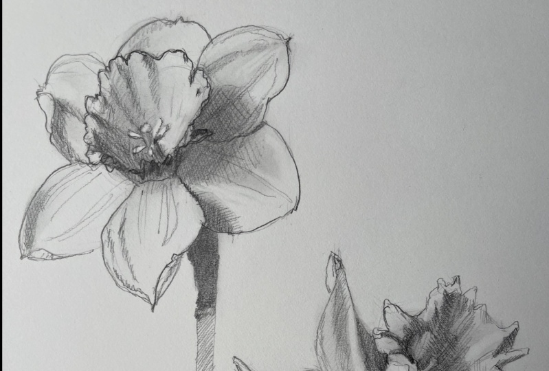
5. Dutch Master Daffodil - Photo Analysis: Okay, let's look
at the geometry of the Dutch master daffodil that we are investigating for
that we're going to draw. And first off, I want to find my two sets of triangles
that overlap each other. So I've got one there, there's two there and there. And then there's a slight value and color saturation
difference right here that tells me that the third petal is probably
somewhere right there. It's slightly different
than the corona ruffle. And Dutch master
daffodils always have a more saturated nose or
Trump it to the petals. So that means that I can
also make an assumption of what the triangle, how, What's cool about this is that it also gives
us our perspective. Essentially we can see how
it's a little bit skewed. Then what I want to
point out also is that the base of the corona
where it meets up with the petals mimics
the the inside shape of the six-sided polygon. So e.g. this side of the trumpet
that meets with this petal. There's a line there,
one there and there. And we can infer that
there's one here. There's one there.
There's one there. We don't see it, but we can. That's the nice thing about painting daffodils and drawing
daffodils is that they have an underlying geometric
shape that controls them. Then let's also look at the
gesture of this flower. So we've got a
wonderful upsweep. And then we have the overall, the ruffles can even also be identified book it's a
six-sided polygon as well. And those ruffles
fit into that shape. And that helps us order
in support or drawing. And then we've got
some wonderful gesture like this petal right here has this wonderful S curve that is reinforced with a beautiful
swooping diagonal. And then we have this curve
that, that's the center. And then we've got
another curve. And then we've got
this beautiful curve. Just, so there's a lot of
movement also going on. And then we've got
our wonderful stem right there in our neck. With that, It's always good when you're
starting to drawing, to investigate and
make sure that we are seeing what
we want to see. Okay?
6. Dutch Master Daffodil - Drawing Part 1: I'm gonna get started now and I want to get I want
to make sure that all four daffodils
fit on my paper. So I know I want my daffodil
to be about this size, about the width of a half a pencil with
super light marks. I'm kinda tick
marking where I wanna go and then that
will be my height. So I thought I would show
something real quick too. Is that the, if I was drawing
a straight plumb line, this is also that shape. And so those are, those are
important measurements that I always work with
when I'm measuring. And I also like to do a
horizontal to the tip of that intersects that
intersection right there. And that helps me I mean, it helps me in lots of ways. And then I will take a
vertical and it will almost be where this plane, in this pedal plane meet up. And so I always like
when I'm measuring, I'm always measuring
and comparing. And the geometrical shapes
are always, always helpful. So I have, if I have my, this diagonal is actually
a little bit flatter. Because I want this diagonal. I'm going to look at that angle. I want to come down. And I know that the bottom of
that petal is right there. So I know that's my, this is my triangle
for the first petal. And then I can also measure this bit like that edge, that edge and that
point very far off. And then you've got
that point right there. Okay. So I also like
to look at I also like to look at what
is my that's my line. So I'm always thinking about, so like I'm thinking about
that angle, that angle. And it just helps set up, it just helps me like diagram
and make comparisons. Okay? So that's like this. Okay? And then the corona
is this pedal kind of goes down and it sweeps
over, which is nice. Then I've got a really
nice S-shaped curve. The corona comes up like this. And at this part of his where the first ruffle is
when it goes up. And if that's the end, this is the edge of the raffle
right here. Right there. We have the edge. And I like this flower petal. Like when you're
blocking in like this, these are your initial shapes. You don't have to be
thinking seriously about stuff and I might actually be a little
bit, nowhere might be. Okay. So they might, the corona is
the chronic trumpet shape. So that comes down. This is more horizontal. This, we only really see half. And then this is actually
the edge of the trumpet as it's moving out to the fringe. And then we have fringe. Fringe, and then this
is the inside edge. I have inside edge. Another, this we
get to see a bit of a stigma. That's kinda fun. Okay, so the first part of the construction of
this daffodil was drawn. Now, this top petal
is an above pedal, so that means I
want to make sure that that one is all seen, then that one isn't. And then we've got
this wonderful shape and their curves down. And then this petal right
here is very foreshortened, which means that it's
coming towards us. So we're not seeing. As long of a shape as maybe it is in real
life just because it's, it's shortened visually to towards us because
it's projecting forward in the picture plane. And so when we're
drawing realistically, we have to pay
attention to how like different things like that
show up and are perceived. Because that's one of the things that enables us to really create some wonderful three-dimensional
visual effects with our drawings
and our paintings. So this pedal got too
big, it looks to me, but this is we've got an above
0. That's why it's so big. And then we have, okay, so there we go. And then we've got the stem, which we always
get a little bit. And then we see the neck, and then we see the stem. Okay, So that is
the shape blocking. And now I'm going to refine it. And I don't yet, like get to the the erasing
of things that I don't need. But what I'm gonna
do is I am going to clean up my drawing
just sum and I'm going to reinforce some of my lines. I want my lines to be firmer. When you put down
pressure on paper, you can damage the
surface of your paper. You want to. Initially always do
your drawing light in case you have to erase stuff. And I'll just tell
you right now, I think you always
have to erase. I mean, there are times
when you are totally in the creative flow and
your brain is like totally spot on and you get exactly what you're
going for in one go. However, there are a lot of other times where
you're having to fill it out and
use both positive, which is positive
spaces the object. And then negative
space is the space between your two
positive petals. So like e.g. I'm working
on this ruffle right here and I'm using negative space as much as the positive of the ruffles to help
me make sure that my my sizes are where
they need to be. And if I'm doing what
needs to be done. Peaking of another petal, but I'm going to
ignore that peeking petal because it doesn't really support what I'm doing as much. Okay? And then I've got
shadow shape that goes there. I also use this refining
phase as the phase of one. I also start to block
in my shadow shapes. So like e.g. there's
a highlight here. But then there's kind of some shadows shaping
going on right there. See, we've got some shadows
shaping going on there. Cast shadow right here, and a little bit of form shadow. Now, what's the
difference between form shadow and cast shadow? A cast shadow is
a shadow created. A cast shadow is a shadow
created when an object is blocking the
transmission of light onto that form, that item. So e.g. this right here is a cast shadow of this
petal onto that pedal. A form shadow, which is, we have a form
shadow right here. You have a little bit of
a form shadow right here. And a form shadow is when a essentially round object or an object that has
three-dimensionality in space, has, as it turns, as that object itself turns
away from the light source, it, its own shape
casts a shadow. Now also guys, I just wanted
to show you something. I'm going to switch
to having a sheet of printer paper under my hand
because as I was refining, my hands started to sit on top of this
part of the drawing. That is the sure-fire way
of running your drawing. Because even if you don't
put lotion on your hands, you create, your
body, creates oils, and then you can damage your
drawing paper that way too. So let's just always protect our paper. Okay.
7. Dutch Master Daffodil - Drawing Part 2: Okay, this petal is pretty good. So I don't know if I really
need to do much with that. It's good enough that I can actually start drawing,
I think, yeah. So my drawing, I have
all my structures. And now I want to start adding some some three-dimensional
form to it. And how do you do that
with drawing you, since you do not have the
luxury of using color to add details to your,
your subject matter. You have to use this
like the sense of three-dimensional space and
the effect of light and dark. Light and shade on
your subject matters. So with that in mind, I always like to add tone and there's
multiple ways to add tone, but the way I'm
going to add tone initially is I'm going to add
tone using my 0.5 pencil. And I'm going to just gradually, one of the reasons why I put, I'm putting some of these lines. It gives me a sense
of where is the tone and haven like this one
has a couple of gradation. So I decided to even
put that in there too. Actually, all shadow is more, more sensitive than
you might think. So I'm gonna get started. I'll start on this side and
I'm just going to go back and forth lightly to, I'm not using a ton of
pressure because again, it's so easy to damage your paper surface and
you don't wanna do that. So I always strive to
just go back and forth. You'll notice I'm
holding my pencil way far back and that enables me to to have a
really light touch. So I'm not using too hard
to pressure on the paper. Again, I'm always
interested in not destroying the surface
quality surface of my paper. And you do that in multiple
ways by oil on your hands. And also by leaving
little tiny micro groups that graphite will
leave on your paper if you use too hard a pressure. Okay, so there's one area
where this has some shadows. So when I get that and it's kind of a diamond shape,
so I put that in. And then we have this
wonderful S curves. I'm going to put that in. And as we go from here to right
there, it gets darker. So I'm going to actually
cross hatch and go in a slightly different angle to get that just a
little bit darker. But I realized this also needs to have a softer transition. So I'm going to work on that. And there is a little bit of overall the edge. We have a little
bit of cash shadow. Again, I'm keeping my pressure
really, really light. I don't want it to
get too dark, so there was a bit softer. Then we have this
wonderful form shadow. So I'm going to that end. When I squint my eyes. The shadows on the petals or is not as dark as the
form shadow here. And that's probably gotta
do with the fact that the corona is hitting light. The petal itself
is translucent and so light is still
disseminating in and still kinda glows on the
opposite side of the corona. So it's darker in like in comparison to what's
going on, on this side. But it is lighter in value than what's
going on right here. So right now I'm just going
to add my middle basic tone. And what that tells me
is that I actually need to make sure that I build up the the darker values of this
daffodil petal right here. Okay, Let's look so the stigma is lighter in value. Then the shadow inside there. So I'm going to draw
that negatively. The top has just a little bit
of light or no light value. All right, here
we have a raffle. We don't see in
profile of the corona, but we see it because
we have light and dark. Another one right there. One here. This one. Okay, So getting close to essentially doing
the first layer, I think I'm also
gonna do a little bit of adding value to the stem. Then I'm just gonna give
just a little bit of tone. So that way it jumps out
from the white of the paper. That's layer one.
And I'm going to quickly erase some of
my construction lines. So I like to keep some construction lines so I'm not going to get
rid of all of them. I think leaving a couple of
construction lines in is nice because it gives that
sense of the human touch, touch this versus say, no, it was not man-made, I guess. And you'll notice it's extra sticky because
I didn't warm it up. I wasn't holding onto it in my left hand while
I was drawing. But that's okay.
It's still working. It would be just
a little bit more effective if it was
a warmer eraser. So you need it to warm it up. If you don't want to use. One of the benefits of using a kneaded eraser is that it
does not leave any residue, doesn't leave any of
that eraser dirt. Which I'm not crazy about. But if you wanted to,
you could totally use a spot eraser. So e.g. this line right there, I'm not erasing a ton. It's not leaving too much stuff, but I got a little bit
of the eraser goop create being created. And you want to be
careful about not. Here we go. I can use that. See there's a little
bit of that gunk. You don't really want to
use your hands to get rid of it when a blow at it. That is the first step of
this drawing we're gonna do. We're gonna do a little
bit more refining in the next video.
8. Fortune Daffodil - Photo Analysis: Okay, so I am going to work on a
fortune, fortune daffodil. And this daffodil is
a small cup daffodil. And again, I always
start off looking for my two triangles. So there are my, there's one triangle and then
there is the other one. As you can see, this daffodil has the petals are just a little bit more
round, which is nice. You can see how the corona, the edge of the corona, does mimic the angles of the inside of the polygon as well that the
two triangles make. And I want to point out, is that three-dimensionally, that's our center of the flower. Somewhere in there. That then goes to the ovaries, then my neck, and then the stem. So I'm going to start measuring, but first before I
measure this one is a very round flowers. So I'm going to also think about my outside shape
when I start blocking in. And I want to make sure i'll, I'll draw a plumb line. Because like that's
almost vertical. That's very vertical. So then this plumb
line is the next, and then this one is, has a slight angle, maybe a one degree angle
that helps me set up. And then I even look here, there's a slight angle two, so this helps establish. And yeah, okay, so I'm gonna get started on drawing
this flower next.
9. Fortune Daffodil - Drawing Part 1: This is the size of
the Dutch master, and then this is the
size of fortune. So the fortune
flower is gonna go, I'm gonna put it into this little corner of
my piece of paper. And then I will start with
a 0.5 mechanical pencil. I will, I don't want to
spit smudge or smear that. So I'm going to lay down my
piece of printer paper now, I thought I would
say that if you happen to have a
sheet of glycine, that works probably
even better than this. But you don't need fancy glycine to do this
if you don't want to. It, It works a. Okay, just doing it like this. So I want to put my, my flower right here. So right triangle. I could go a little bit wider out that it doesn't go up high. It's like right about
right there actually. And then this one
goes straight down. And then I have this straight down mark
right here which goes to, which tells me that my point, the position of this is, is a little bit further. So that means either this point needs to move over or this point
needs to move over. And what I'm gonna
do is I'm gonna kinda split the difference. I'm going to move my
point over a little bit and I'm going to
move this one down. So that way there's
the edge of the stem. And I don't want that
construction line confusing me. I'll erase it right away. And that's why I
start so softly. I always start softly. My pencil drawings
because of that. Then there's just a
slight angle there. Okay? So there's my, there's my triangles there. Be maybe a little
bit higher up there. Okay? And then my Corona
is right there. This is a small cup
corona, very circular. So I'm going to really
just maximize that. Comes down at an angle. Made my circle two big. Instead of redrawing it, I'm going to actually
just proportionate. There we go. That's, that seems better. There's my edge right there
and then I've got an angle. And then that allows
me to come out. And over. There we go. There we go. Then
I have right here. So this is the pedal
that is above, because 123, those
are above petals. There we go. So I've got the
basic construction. And so now I'm going
to work on finalizing the corona of the
small cup daffodil. This daffodil is
called a fortune in their early season daffodils. I absolutely love
how like orange, sometimes the orange of the corona is almost
read at its tip, which is just really wonderful. I love. I love the
vibrancy of this daffodil. Okay, so there's the
shape of the corona. And now I'm going to get to. So what I love
about the staff at O2 is that you get
to see the stigma, which is the like the
little stick that comes, that is essentially your
center point of the flower. With all these, all the
little pollen coded stamens. And and like the
anatomy of a daffodil, so amazing in that, like you have six petals. The corona has like six sides to where it
connects with the petals. You have six stamen in the
center of the trumpet. And then the,
oftentimes the sig, the stigma, has three
lobes in it too. So it's just a very fun, very fun piece of, you know, of nature and nature
and geometry. Go. There we go. So again, I'm gonna kinda
clean up some of my, my lines. So the space of, of this flower goes all the way down and there
isn't really much of a neck. It just goes automatically,
goes to the stem. I'm going to clean up my
lines just a little bit. Here we go. Okay. And now I'm going to clean up my
construction lines. Going back to my kneaded eraser. Whenever I do have
erasers stuff, I do not use my hands
to wipe it away. I we use a Kleenex
or paper towel, some than others in my hands. I just I do not. I really, really
work hard to keep my oil marks away from. Let's look at that. Those two look really
good with each other. I'm thrilled with that.
So now it's time for me to draw in. I want to add a little bit of
tone like I could actually, like the irony in the funding
about drawing daffodils is I could leave it at this and be done with
it, but I'm gonna, I'm gonna move my drawing
just a little bit further along because all
because that's what I wanna do. And with, with all drawings, you use the artist's gets to decide where do you start
and where do you end. So I'm going to refine
some of my lines. I'm going to just
I'm just getting, when I refine my lines, what I find is that it gives me an opportunity to just get a little bit more familiar
with my drawing, with my subject matter. I love that. I love this
opportunity just to get just a just to like build my understanding
just a little bit more. There we go. Okay. And then I've got a cast shadow. So I'm going to actually
identify that cache shadow. And there's who's like, this is the soft shadow, cast shadow and then there's
a little bit deeper, more firm cast shadow. And that's the softer one. And then we have a little bit, we have a cast shadow here. Then it's just a little
bit softer there. And I'm choosing
because this is a, a graphite pencil drawing. I'm not going to add value where the the flower petals like the corona is a
deep orange or whatever. I'm actually just going to
be looking at the shadow shapes for this
graphite drawing. That allows, that also
allows me to have just a little bit of variety and I guess just a
little bit of variety. So with that in mind.
10. Fortune Daffodil - Drawing Part 2: See, I've got a line there. Okay, so first minute but I am squinting my eyes
to look at cast shadows. And there are some cast
shadows on the corona. So I'm going to grab those. Are actually, some of them
are more like form shadows. It's like shade. It's the shadow on the
backside of an object that does not get sun or the light. Then we have some
shadow shapes here. And if I look, this side of the corona
is getting light for this is just slightly
in shade, shadow. The stamens are very
light, pale yellow, so I'm going to identify
them separate and then I'm going to add a light tone, a little bit lighter
here we've got a couple of things going on. Actually, I realize this
shadow shape right here might be a little bit too hard. So you can also use your kneaded eraser to like reverse draw where
like you want to, you don't want to
like fully erase, but you want to just kind
of soften a little bit. I love that. How the kneaded
erasers so versatile. I feel like some erasers, the only thing you
can do is erase. You can kinda do a half
erase if you don't want to. Okay. Then right here I need to darker. This area is darker than that, but lighter than that. So I'm going to just put
a basic tone on that. I will eventually knocked
down with a Kleenex. And then here is
a little bit why this is really dark, so I gotta get that in. Okay, this is HB, some kind of maxing out
I'm putting I've liked choked up a little bit more
given as given more pressure. That's about as dark as I
bet I'll get with my HB. Add some tone to
this, that stem. Then this is darker here. Pedal here. This isn't shadow. Cast shadow. Then there's a little bit of a
cast shadow here. Okay, so I've got a little
bit of stuff going on here. I'm gonna take my Kleenex
and I'm just going to knock down the center area a bit because that shadow shape in love with going on
there, going on there. I know I'm going to
have to erase out too, but I wanted to add
just a little bit of tone in a couple of
places for uniformity. So I didn't really do
much with the stem. I'm going to knock that one down just a little bit
because I'm going to put up some of the darker
pencil on that stem. Now, it's time to
erase out negatively. And so I'll do a little
bit with this one. I've got stamens that are
picking up lots of light. So I went. Those to really be
erased out and clean. Okay? And okay, so this side, the stigma is lighter, but this side the
stigma is darker. This part of the
statement is darker. It looks like it's a little
bit darker than its adjacent. In fact, a little bit of a lighter here, so Okay. Here we go. Okay, so I'm liking how that's going to I'm
going to switch to my Tooby just so that way I can have a little bit more. Okay. I don't have a sharp pencil. I don't. That's okay. So let's get this one going. This one is pretty easy, so I'm just going to work
on some of the lips. I just broke my lead on my edge, so I'm going to have to
really sharpen pretty soon. That happens when you
use the LED pointer. Sometimes if you press
down too hard, the, the tip is so narrow that and so fine that it does break pretty easily if
you're not careful. Look on that outline
just makes it pop. I love that about
graphite drawing. How something as
simple as a line can totally change the
fill of a drawing. I can. I just noticed that
this stigma is also a little bit
lighter than when I had. That's pretty dark right there. So I'm gonna get that in dark. And it's pretty dark in
this loop right there. It's darker here, so
I'm gonna keep making sure sign is just a little bit darker, so it's got a little
bit going on more. Oops. It's okay. I'm sorry. I drew over my
statement a little bit. That's okay. It's got some shadow
shapes there. Okay. This is such a
pretty little flower. I love fortunes. So let's get, let's get
some fun hatching in. And there's a little
bit of striation. So I want to make
sure I do that. There's a lot more
striation over here. Then there's some
striation here. So I'll get that in. Then we have some cache shadow. And then we have
I'm going to cross hatch and hatching like
that blended shout shadow. And I looked like I really said, I've been a little
bit overzealous in how I softened the shadow over here because I see
that there's a lot, it's a little bit lighter here, so I want to erase. Some same goes for right here. Let me get that erased out. And right here, right
there at the tip. And right here. It's a beautiful
beautiful setup. Okay. We've got some of
that striation. It's like the, it's the
natural wrinkles. The petals. You don't have to include them, but I do like including them
because I kinda think of my drawings and my paintings
as portraits of the flowers. And if a flower has
these striations, then it only makes sense
that I would include them because they're part of what makes these
flowers so special. Now, you see I just did
a slight crosshatch. That's just to make
the shadow shape just a little bit
more interesting. A little bit more texture. Here we go. I don't want, I'm
going to show there. Okay, So fortune complete. So we've got to daffodils down. And they are looking
pretty yummy.
11. Ice Follies Daffodil - Photo Analysis: Okay, so the next flower, next video I'm going to
work on is ice follies. And this is a, it is a white on pale lemon yellow corona and it's a large cup staff
video and that it's got, the cup is really
big in comparison, like in its ratio
to pedal to cup. The cup displays
out really wide. So let's, again, I'll look
for my two triangle shapes. This one has, that's
my center right there. And then here are, here's the frill
for the daffodil. If I go, if I drop a plumb line, Let's actually draw
some plumb lines. Okay, so if I draw a plumb
line from the center, a little bit off,
that's better, okay, so if I draw a line from a
plumb line from the center, this is so the stigma. And if I use the stigma
as my as my horizontal, that's where I am
horizontally with the setup. Let's look at the outside shape. So we have a slight angle on this side and a little
bit more on this side. The top seems to
be smaller and it gets wider as it goes down. So yeah, this is
gonna be a fun one. So let's get started.
12. Ice Follies Daffodil - Drawing Part 1a: Before we get started,
let's also look at scale. So for flowers, ice follies
is about that size. Ice values is about that size. Fortune is that size. And Dutch master this side. So I need to make sure that
I give it enough area. So that way, I also
want to kinda get it, keep my drawing to scale. I saw these will go here. Get that started. Okay, so remember when I took
a plumb line down and what that did was it got
me in the center of the stigma. That helps me. Kinda it's kinda
like on this side. And then I wanna be really, There's the first angle
outside of the corona. And like I've drawn,
started the drawings, the two other
flowers from drawing the corners of the daffodil. So today, for this one, I thought I would explore how you would start and
organize your drawing. If you're drawing
using the, you know, like the corona, the ruffles as your as your starting point. And so that's what
I'm doing right now. I'm measuring, I'm
thinking about that. Here we go. That's stigma right there. And then coming from
this part, then here. And then at this angle we have one shadow shape
and another one. Okay. That's that.
Okay, right there. Okay, so from there, I can then draw my petals. My petals become easy to draw
because I have my markers. For the flower. I'm going to say maybe it might be that one. Now I do want to get my triangle. Thinking
about my training. How I'm thinking about this
triangle two is I'm a piece. That's my center line.
That's my center line. It's kinda got a curve to it. It's not that big. It's more like a curved petal. Petals are just so gestural. There's so much going on. Strike there,
overlapping at all. Then pedal, center line there. And this one has that high. So I spell these are also, has it where the
outer petals are significantly larger
than the inner petals. And you really see it on this, slept on this breed of flowers. Alignment. Okay? So this one has a cast shadow that
kinda goes like this. Little bit. I think
this flower petals just a little bit bigger. So I'm refining real quick
before I start adding tone. I think that's it. Okay, so now it's time to
add a little bit of town. So shadow shape cast shadow. That's the coronas
casting the shadow. And also this pedal
on that pedal shadow. We have to be identified as a cast shadow or a form
shadow because it's the shape of this pedal that is
casting light there. We have a translucency thing. They're shadow. Shadow. Okay. I think it's
actually bigger. There we go. Okay, So I wanna get rid of some pencil
marks that I drew. I want to get rid of
some pencil marks. Okay? Okay, that looks pretty good. Let's give the refined and add a little bit of tone
simultaneously, I think today. So I actually, I think I
should start on this side.
13. Ice Follies Daffodil - Drawing Part 1b: So why Justice there? We've got probably shouldn't even do anything because
I want to first add, like what I've done in
the previous two shifts. Flowers is I add some
basic tone and then I wipe it down with
a napkin or Kleenex. So now here's a little bit here. And then there's cast shadow
here. I'm gonna get that in. Let me get that in. Here we go. Okay, Now this is
actually darker over here. So, so I'm putting a second layer on for
the softer boundary to soften the boundary of
that initial shadow shape. But also it adds, I
mean, look at that. It adds it does add
tone when you go across your hatch in an
opposite direction of what you were
done previously. And that's because
you're filling up all the little tiny micro
groups of your paper more. And that's where
having a really, really small point really
makes a difference in your, in your pencil shapes. There's a cast shadow
here. Form shadow. That's looking so good. And I really, really worked
with negative stuff. Okay, I'm gonna get this one in. I'm going to leave that
for the refining page. And so now I want to, I want to get the first
layer aspect of this. That also will be part
of the refining layer, but I'm gonna still
get my first layer of the darker value in. Going to have to, well, okay, so there is
a little bit of darkness right here too. So I'm gonna just add a very pale tone that
will smear well. Isn't that a shadow
shape right there? Up into there? Okay. Something like that. Cheddar she'd been I'm just going to be right
here from there. This is kinda like a half
fog to about right here. And then it goes down
and then it goes over the darker
value right there. Now when you're working
with mechanical pencil, you also want to make
sure that you never let your LED get to too low to the metal because then
you're totally like grooving your paper and
you don't want that. You don't want that at
all if you can help it. So it's always a good
idea to make sure that your lead is out enough
that when you are drawing and you've
got a whole area to to add some
quick tone to her, a lot of tone to you're
not damaging your paper. A little bit lighter,
so there we go. And then there's some
shadow shape there. I'll deal with that. It's lighter than
what's going on here. And then there's some
stuff and then we've got some really fun wrinkles. So oh boy. Okay. That is okay. So I've lost some of
its form unfortunately, so I'll have to, I
have to get it back. I want to do the stem. There we go. Okay, So I want
to knock down some of this. Really want to knock down
what's going on in here. I'll have to change that. They'd been ****,
I'll change that is I'm going to erase stuff. Some stuff going. Okay. Start erasing out some of the corona. So every time I use it, I then renamed it to reshape it. Depending on what I need. I need long and skinny. I make it long and skinny. If I need it pointee,
I'll make it a point. But I find that the
long and skinny is some of the most helpful
mark-making you can get. Okay, so what I discovered
is that the light, the dark over here, but then
the light right here is actually lighter than the
white, the adjacent white. So oftentimes when you
find yourself drawing a white on white or a pale yellow on white, you'll, they'll, the value nonce is become
more crucial because you're the values that you
have available to work with have just become a
little bit more constraint. Which means that
they've gotten just a little bit more limited in what, like what you can use as a tool. So white flowers do that to you. White flowers and pale yellow, they constrain your value
range so much that it really affects your ability
to see the value.
14. Ice Follies Daffodil - Drawing Part 2a: I'm going to just
work at building up some of the softness of
this ice follies daffodil. And one of the
things I'm noticing is that I've gotten a little bit dark along the edge here
of this, this shadow. So I want to soften that sum. And just like your pencil, the pressure you apply when
you're using an eraser can, can alter the quality of the eraser so you
don't always have to erase also at the same level. And I will occasionally, I call it a drawing
with my eraser. It's just a matter of just just making it just
a little bit softer. And there's a couple of areas where I want to actually go back to the
white of the paper. So with that, like what I noticed when
I squint really close, the white of this petal
is just the way it is, the translucency and shadow
is a little bit darker than the palace yellows
that it's adjacent to. So I need to make sure
that I I account for that. And I started my shapes here, but it's a little bit
too hard and heavy. So I'm going to soften some of my lines that I erased out. I'm even like right here, this is the yellow, the pale yellow is
lighter than the, the white of the petal. Same goes for right here. Also there's always, you know, there's also when
you're drawing, you're always also making
some judgments yourself. And the reality is that there might be times
when you make mistakes. But I think that's okay. I'm always about exploring
and getting curious. And just using every
time I'm drawing, every time I'm sketching, every time I'm painting, I come to the practice with
as much curiosity as I can. So now I want to
use this eraser, but do you see how
dirty the eraser is? So that means I need to I
want to erase it clean. I wanna get rid of
any buildup of dirt. Because sometimes
if your eraser is a little dirty, you'll smear. And that's not what I went. So I've kinda cleaned
up my eraser some and that's because I wanted to have really want to use
harder pressure and I want to really clean off, clean up a couple of spots here. And because I want to
use harder pressure, this eraser works, which works better than the kneaded eraser. Okay, Let's see. Oh, and then right there, then there's some translucent reflected light kind of
going on right there. I blow off. I don't use my hands too to
get rid of the eraser dunk. But instead, I I'll
either use a Kleenex or I'll blow it away because that's the
better way to do it. Okay, So now I'm thinking, okay, I went to switch
over to my tube. Right now. I think I think I've
got enough going on. It's time to move
forward on my drawing. Make this drawing
just really sing. And I want to do that
by going working with a little bit deeper graphite. So it's a little bit deeper
in value right here. So I'm purposely leaving
that edge really sketchy. I want that edge to be sketchy. I'm going to put a hard line
here or a darker line there. I want that to be very stark. Get rid of some of
that sketchiness. I might actually, I said, Well, I'll have to, I will reassess
if I want to keep that edge sketchy or not. Okay. Really like
how that's going. I am like there. And then there's a couple of striations that I
want to get in. Okay, we've got a shadow shape. And yes, there's some
cast shadow here. So I'm gonna get that in. And that will be having
the value differential between the cast shadow and the edge of the corona will
pop this part forward. There's a lost edge in value between the pedal and
like about right there. So I'm gonna leave that. I'm not going to heighten that. Even with drawings, you have
lost and found the edges. And in fact, actually drawing
is one of the best ways to practice your interpretation
of your edge quality. When you're painting. Like, it helps. It sets up an opportunity for you to explore how do you
interpret edges? How do you, how do
you want your edges too to come across? And I just love drawing because
drawing is an opportunity for you to get curious and get investigate without really, you're not, you're
not risking anything. You're just, it's all about just exploration and getting curious and seeing like what, what is going on
that's darker here. So I'm going to get some
of that dark in there.
15. Ice Follies Daffodil - Drawing Part 2b: So it's a softer
shadow right here. So I'm going to make that
softer and softer at here. Little bit of
wiggle and my line. And right here I see that
it's very, very light. So I'm going to go back to
the white of the paper. And I see I've smeared some
outside of the flowers. I want to get clean
that up a bit. Okay. Now, when I squint, my darkest dark values
are right here. You've got a, alright, there is a bit. And then there's like where the different stamen go down into that in the
deepest part of the neck. So I went to grab and
make sure I on it is just C and then there's a shadow right there, It's kinda dark there. And then we have another
one that's dark. Something. And then we've got the stigma comes out and it is
actually lighter. So I'm going to have to
erase out some of that. And then even some of the stems of the stamen are,
are lighter too. So this is where this
eraser works off, works out really, really good. There we go. See,
you've got still a little bit darker value there. There. Okay, so it's a little
bit darker here. So I'm gonna get that in. Now. The shadow shape on
this pedal or is not as dark as what's
going on on this petal. Because this petal has a little bit more
distance from the light. And like right here, this is cast shadow
from this petal. And then it's also, we've
got some of the shadow of the corona too. So with that,
there's a little bit of a lot more variety going on. In this part of the flower. This pedal comes forward. Very pale area, right
there. Right there. Okay. A bit of a shadow right there. That's there and it's
really light right here. So I'm going to put that in. And then there's a little bit of like extra light
value, they're there. And along here, as
is, right there. See, there we go. It's so fun to draw. I love how we just, how drawings just
build on themselves. And then you just work through. And I'm going to have to
go really lightly here. There's some striations, so
I'm going to get that in. Okay. Let's see. Okay, that's looking
really nice. I'm really liking how
it's coming together. Squint my eyes. The few things I wanna do
is I want to make this, I want to make that feel just a little bit more directional. So I'm putting in kind of directional signs that
reinforce the form of the way the
corona flows open. Okay. And also when I'm
noticing if I squint. Okay. And then there we go. Then, you know, a little bit darker right there. Okay. This is coming to an end. I'm just putting
in texture because I think I want to
vs, it needs it. And that's actually
a really good way to tell whether or
not you're drawing is at a point where you can
probably call it finished. Is like ask yourself, are you just putting in lines and texture
because you want to Vs, because the drawing needs it. And I'm realizing
I'm, I like hatching. So I am putting in
lines because more, because I want to then
because this flower needs it. Though I've noticed what I do need to do is I need
to put a couple of hatch marks down here. So I'm gonna do that for
this part of the shadow. There we go. Then just a
couple of hatch marks here. Okay. So that looks that
looks done to me. So sure. They're okay. This
is ice follies.
16. Feb Gold Daffodil - Photo Analysis: The last video that
I'm going to draw for this demonstration
is February gold, which is a smaller, a smaller cyclin type daffodil. And though, even though
the petals fall back, it still has the same
structure of a triangle, superimposed over
another triangle. And then you have the stigma, the stamens that go
down into the middle. And then you have a
wonderful rightfully Corona. And so this is what I'm going to draw and
I want to actually pull out and show you one purse life again to just get you familiar
again with how, see how long that the nose, the trumpet is of the, of the daffodil and how it
really goes back into it. And so I just, it's,
it's a wonderful, wonderful daffodils in that
they have a lot of gesture. In fact, here's another one
that actually falls back more than the one that I just showed you.
But do you see that? That is just so fun? And so we're going to draw one. We're going to draw this, this
image of a February gold, and it's smaller in scale. So like e.g. let's look
at the scale comparison between an ice folly
and a February gold. It's about half the size. So I'll make sure that my drawing also is
smaller in scale. To make sure that the that I just want
to draw it to scale. You don't have to if
you don't want to, but that is what I'm
going to choose to do.
17. February Gold Daffodil - Drawing Part 1: I'm going to start here. I want, I want to do is this is gonna be my
curve of the corona. And I have to make sure
I don't get too big. And already I have
made it too big. So let's go back and
make it smaller. So I, I want right there. And then the stamens, the shape of the stamens. They're a bit foreshortened. So then the stigma
is right there. And then they go out 123. And then like what's interesting is the cast shadow of the shape of then you get nice, beautiful interior reflected
light right there. Now, withdrawing it does, this interior reflected
light is just a value. But if you would be painting
this, that becomes, that becomes a very
beautiful color passage that I make it bigger,
too big again. Okay guys, see,
it's not uncommon to have to start
over a few times. And I want to show you
that like what do you do when you realize like
this is two times in a row? I've made my scale of
my drawing too big. I definitely need
to shrink it down. And I need to shrink it down to because like at the
rate that I'm going, I'll make my February gold
as big as the ice follows, or Dutch master, and
I don't want that. So first off, if I want, I like this position right here. So what that means is I need to probably shrink that
size just a little bit, shrink this size down. The stigma goes there. Shrink, shrink, shrink. And then that allows for this is also why you want to draw softly and lightly
at the beginning. So that way I don't
damp, you don't damage your paper. And then okay. So if that's there and then
then the yeah, this is right. Then that's the outside. Then this is becomes
the edge of the curve. Doesn't go too far out. It's more like right there. Then that's the
edge of the corona. There we go. Okay,
so it's a little bit messy and I'll have to go
back and reinforce that. One thing I am going to erase is this shape of the
stigma and the stamen. And what I will do. Also, there. There we go. Okay, so let's see, make sure that okay, So that angle might still be a little bit
too big. There we go. I think that's getting to be
more where it needs to be. And yeah, that's it. So then I can measure off. Okay. So then this pedal goes
here and it doesn't come out far from the
edge of the stigma. Let's see There. There. And then curl it. Wow, right there. Oh my goodness. So there we go. Now, I'm now the scale is right. And so right there. So pretty I need go up
just a little bit more. Then this guy comes out. There's this pedal. A little bit bigger. Might be, I might have drawn that a bit too big,
but we'll see. There we go. That's working. And then there's quite a bit of space between that
pedal and this petal. There we go. Now it comes down like that. And then this one comes down. Over. There we go. So there is the drawing
of the February gold. And I just had to
start over a few times and there's no harm guys. And starting over in fact, I think it's always
a good idea to, to, to like turn, when you have to start over, turn that experience into
something positive like. Let yourself speak to
yourself in a great way. That's like saying,
Wow, this is so great. I'm, I'm gaining better
awareness and my ability to cite measure has
just improved you. It's really important to be, to overcome any negative chatter that occurs when you're drawing. Just because, you know, you're drawing is the practice
of of experimentation. You do draw something and then you ask yourself, Did that work? And if it didn't work, then you ask yourself like, well, what can I do to fix it? And sometimes we can identify, like fix it as like a
negative versus like no, uh, fix it is just to like a new
iteration of improvement. Okay, so I'm very happy with
how this is coming together. So I'm going to quickly, I'm going to, I'm starting, as you can see, I'm
starting to draw in like my basic shadow shapes. So that way I can, I'll start, I'll add some tone. Had a cast shadow and then
we have a form shadow. Right there. Again, what is the
difference between a cast shadow and a form shadow? A cast shadow is a
shadow created when another object blocks the light from whatever you're drawing. So like if like this corona
casts a shadow right here. But then the way the
light is in the form, the shape of the petal. Petal rolls over. And so if it wasn't for
the cast shadow here, the form shadow would probably
go continue straight on. We just want our
shadow shapes to support the what's,
what's going on. So okay, there we go. So
there's hardly there's just a slight form shadow
here, but not much. Okay, let's start putting
in some of my value. I want to starker than we have. Okay? Squint my eyes. The reflected or the translucent
light glow that's going on inside the corona is
darker than what's going on. What's here. When I squint my eyes at it, it is lighter than this shadow and this
part of the shadow. But it looks like
it's similar in value as like this shadow right there. But there's darker shadows
on this petal as well. So I'm going to actually identify the different
darkness, okay. And I'll sometimes,
as you can see, I have mapped out my
different shapes. So I'm going to use my
0.5 HB lead to lay down my first layer of shadow shape. So I'm just gonna
go back-and-forth. And I'm choosing to cover up what's going on with
the stamen and stigma. I'm gonna, I'm gonna, I'm planning to erase that out. And so where there's
the reflected light, I'm going to go lighter then. But it's still darker in
value than what's right, what's going on over there. So then where it's darker, you know, when you're, when you're judging
your value shapes, you're always
making comparisons. You're compare, you're
comparing adjacent values to the two local shapes
to earn, like e.g. this area right here. I'm going to compare
it to that color, that value of the
color of the petal. And by, by doing those, those adjacent color or
adjacent value judgments, I get to make decisions on like, why does lighter,
what is darker? And then I'm putting in
the tone on my paper to reinforce any of
that change. Okay. I'm gonna be lightening. Rubbed down soon. Then like I'm not
going to even though I know this is shadowy right
here, but I'm not going to, I'm going to use my
Kleenex when I'm smearing to get that
tonality there. I'm just going back-and-forth
to make an even tone. And you can see, I can kinda
sometimes like get sloppy. If I really want my edge to
be very, very controlled. What I'll do is I'll,
I'll make a crib. I always have posted around. So I'll make a crib. And I'll just like if I, if I want to be, I'll just
draw to the paper edge. I'll use the paper to
give me a boundary. But I don't mind that a
little bit of variation, so it doesn't bother me so much. But if it did, that's what
I would do to fix that and prevent just a little bit of shadow right there. Tiny shadow right there, and tiny shadow right there. Okay, So that's first
basis of the drawing. I'm going to now smooth and unify that gray tone
with just a plain x. Okay, so see you. I'm
going to smear that there. And I'm going to have to
erase out some areas. And that's cool.
I'm fine with that. Okay. So I'm pretty pleased with that. And I will erase and
reinforce some areas. And then we'll
finish this drawing. Since gonna go fast, I think because it feels
very straightforward. And again, like
see how I needed, I needed into the shape
that I want it to be. Then I and then if I
need more control, I'll go to the eraser. Right now. I'm feeling like I've got what I need to control lies. I do want to see where the stigma is, and I also want to get some of the translucent
glow erased out. Here we go. Again. The amount of pressure you
apply when you're erasing also can affect the
quality of the leaf. The effect. Okay, so let's, let's
reinforce the drawing. And then I will go
to town essentially. See right there, there's a
really dark triangle shape. And another one right here. A little bit darker right here. So I'm going to add that in. And then we've got the stick, the edge of the stigma. Then I have some stamen shapes, which I'll have to
erase out with. Okay, so I'm going to
first try and see if I can get it with my kneaded eraser. And I'm gonna make a tiny, tiny point and see if
I can what I need. Okay, So worked in
a couple of areas, but not in other areas. So let's try again. There we go. Okay. So in every time you
hear, let me show you. So you want every
time you do a really, really delicate when
you don't want to reuse that tip because it gets a little bit
of graphite on it. And so the next time will
not be as effective erasing. Okay.
18. February Gold Daffodil - Drawing Part 2: Now that's kind of established. I've, I've added a, I'm adding more tone. I'm still using the HB lead. Very soon I'm going to switch
over to the to-be lead, but I just wanted to
reinforce a couple of things with mine, my HB lead, but I'm thinking I'm
ready to switch over so I have my Tooby pencil. Okay. So this is a behind petal. I used to harder
pressure and it broke the tip. There we go. Reinforcing my edge there. This pedal roles catches light. There's a little bit
of shadow right here, so I'm gonna put a
little bit of Hatch. Not much. What's
important is what's going on in this
part of the petal. So there is a, some really nice form,
shadows that are, that are going
back and forth and like or making some
really beautiful shapes. Okay, right there. I'm noticing, see, there we go. We've got a little bit of
shadow shape right there. Line, line. Not much going on, on this part of the petal. There's a little bit
of curl right there. Little bit of. But the thing that is the most is this
is really dark right here. I want to get that dark in. I don't want to
get that dark in. And here's another dark
portion right there. I want to get that in there. Here we go. We got
some more core shadow going on right here. There we go. There's
a little bit more. I'm going to Tim look in here. I need to put a
little bit of texture in. Just a little bit. And then I'm gonna
put in right around. That's really
darker. There we go. Okay. So the coronas done. So now I just need to
finalize some of the petals. And what I wanna do is
I want to reinforce some of the striations that
we're seeing in the pedal. Then this upsets. One that's up. There we go. We have some glow. There we go. That's so pretty on top. Really nice. Sorry, Joe. Finished this drawing. Okay, and then this is above. There we go. And I went to reinforce some
of the striations, that of the way the pedal runs. Some lines that go that way. You can see it even
here, right there. And then I'm going to build the, the shadow too high, it gets. There we go. So pretty last two petals
and then the stem. And Okay, again, I want the
striations of the petal. There's curve and then stuff. There we go. Okay, and I
need to erase out that. First, I'm going to
put the striations in. And I want to erase out with, I want to erase that hard. So I'm gonna use my
little mono Zero eraser. There we go. And then
I'm going to use, I've been keeping, holding this kneaded eraser in my
left hand while drawing. So that way it stays warm
because kneaded erasers work best when they
have, when they're warm. And I'm gonna just
kinda do a little bit of creating really soft touches. There we go. Okay,
let's get the shadow. Then, a little bit
of cross hatching. Crosshatching over here. There we go. Okay. Squint my eyes. There we go. This stem. The way the cast shadow. The shadow and the
way the light is. The stem is dark. Yes. But then there's a darker like cast shadow shape
right there that the petal. So I'm going to first put a basic tone and then
I'm going to decide, does that that all that My that it needs
or does it need to have that darker
value as it rolls? Okay, let's I'm
gonna cross hatch just a bit. There we go. Okay, so the last
thing I need to do on this daffodil is
the striation marks for this at all. Now, because it's so light, I'm using a really,
really soft touch. And let's see if
there's I got okay. And there's a spot
that I need to erase. Okay. Look at that. I smeared a little
bit of graphite, which now it's okay. And then this one is gold. Okay? So this is the, all four of the daffodils
drawn in graphite. And it has been so
fun doing this. Thank you so much
for being here.
19. 15 Thank You: Thank you so much for
taking this class. I really appreciate it. And I want to share an end the class with just
a quick like summation. And one of the things is
that drawing is one of the best ways to explore and
grow your artistic practice. And if you have
the desire to take your drawings and maybe apply them to other subject matters. This methodology
works for everything. Other flowers, drawing
people, landscapes. It's really amazing
how all drawing is. A simple breakdown to the
basic geometric shapes. Refine your line drawing. Add tone, and then texture. And drawing is one of the best ways to enhance
your artistic practice. And so I'm just so thankful
that you took the class and that you I hope you
learned a lot from it. And I'm getting more comfortable at looking at measuring
and observing. And yeah, thank you so much. And please check
out my website if you are curious
about more stuff. And also, I'm always creating
art. I'm always sharing. And thank you so
much for being here.
 Elizabeth Floyd, Artist | Elevating Everyday Moments