Transcripts
1. Introduction: Drawing is a great
skill to learn, but as a complete beginner, where do you actually start? I'm Jamie, and I've been
a professional artist for around about 20 years now. Many of my works
have been published, as well as widely exhibited
in galleries and exhibitions. And I also have a
YouTube channel that showcases the type
of work that I do. There are many
different aspects to drawing from basic sketches. To much more complicated pieces. But when starting
out, it's always a good idea to keep things
as simple as possible. So that's what we're going
to do in this class. We'll start by looking at
the choice of materials. I'll then show you a very
simple system that can be used to help to create
a very accurate likeness, as well as how to use contrast to create a very
striking drawing. And of course, there'll
be many other tricks and tips along the way. This class is aimed at
a complete beginner or somebody who is just looking to improve their basic
drawing skills. So if there is something
that appeals to you, then why not sign up, and I look forward to
seeing you in class.
2. Class Project: For the class projects,
you're going to learn some relatively
simple techniques, and these will act as
the main foundation when it comes to creating
a piece of artwork. And, of course,
the main thing is to just take your
time when learning these In this class, we'll first start by looking at the different types of materials that we're
going to be using. We then need to create
a basic sketch. So to do this, I'll show you a very simple system
that you can use, and this will allow you to get a highly accurate likeness. We can then add some shading, and this will not only give
the picture some shape, but it will also
provide a foundation to then build darker tones upon. And then for the fun part,
adding detail and contrast, and this will really bring
the picture to life. Each lesson forms part
of the class project. And as you progress, you'll
gain more confidence in the application of the
techniques that you're using. Now, it is totally up
to you how much of your work you actually upload to the class project section, but it would be really great to be able to see your progress. And remember, I'm always here to offer any
help and advice. I have provided a few different reference images that
you can work from, or of course,
alternatively you can always choose to
work from your own. In the first lesson, we'll take a close look
at the types of materials that we're
going to be using during this class. No
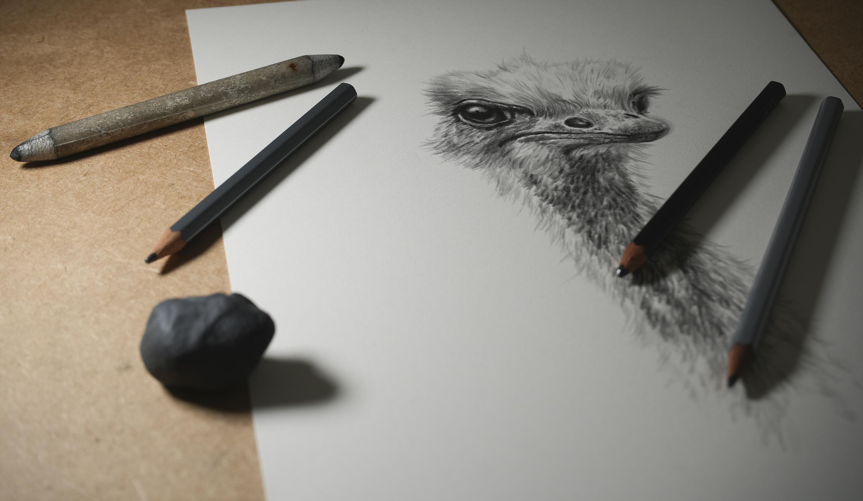
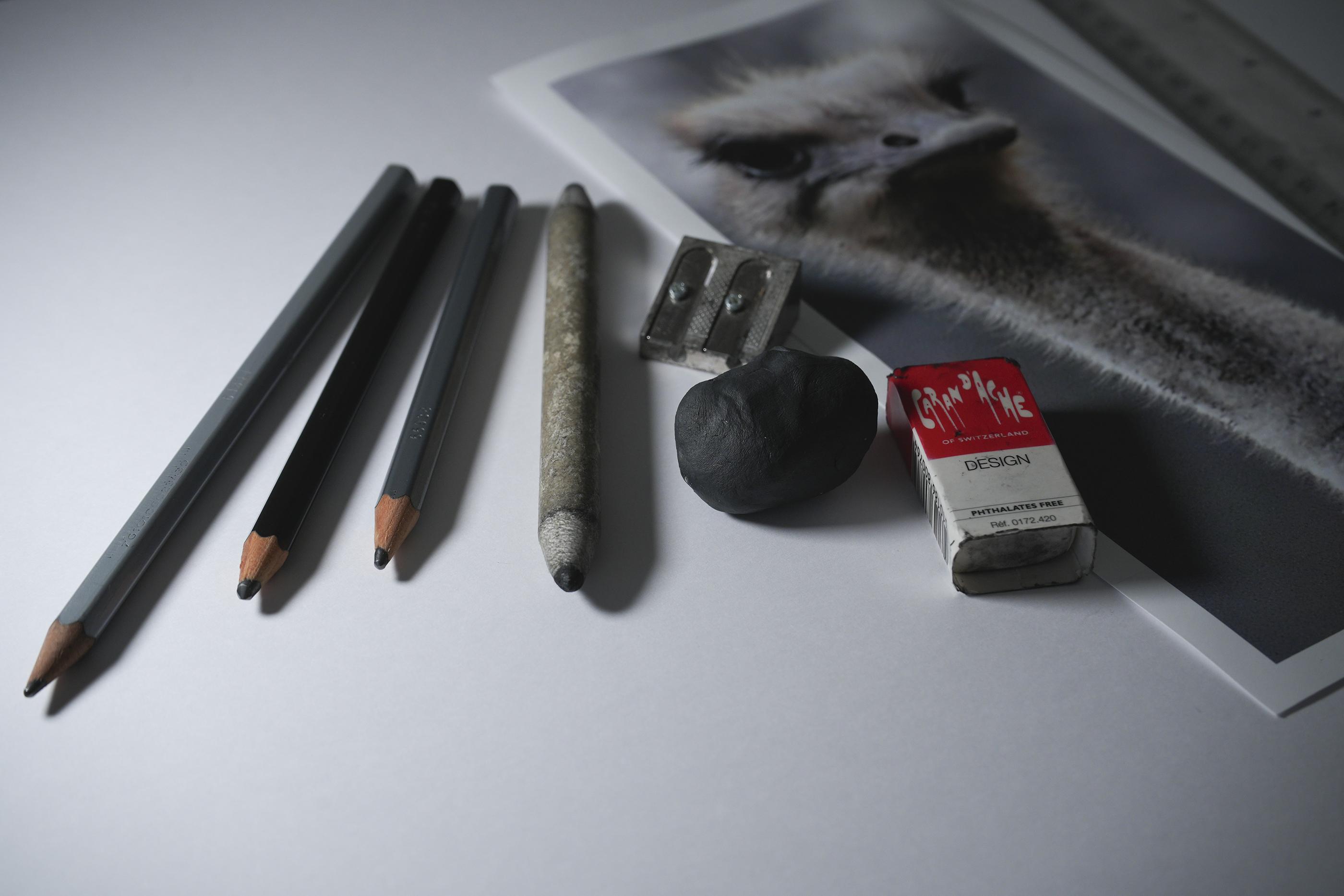
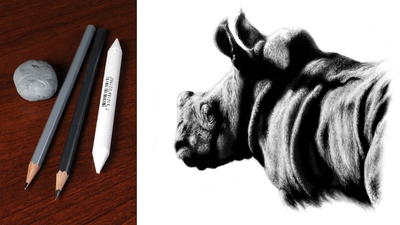
3. Materials: Let's take a look at
the different types of materials that we're
going to be using. Now, I have tried to keep
this to a minimum, and also, there are some alternatives that you can use to a
couple of these. So this is just a
very small amount of the different types of materials that there
are available. But you certainly don't need anywhere near that much stuff, particularly if you're
just starting out. The first place to start is
with the choice of paper, as this is our main foundation. Now, you can use any
paper for this class, but I would suggest that it has a relatively smooth
finish to it. I'm going to use St.
Cuthbert Saunders Waterford 300 gram hot press
watercolor paper for this. I generally find that hot
press watercolor papers work the best with graphite. As they do have a very
slight grain to the surface, this allows it to
accept the graphite, and this is particularly useful when you want to
build darker tones. The grading system
for graphite pencils can be a little bit confusing, but the simplest
way to look at it is that with the H
range of pencils, the higher the number, the harder and lighter
the pencil becomes. With the B range of pencils, the higher the number, the
softer and darker it is. A lot of manufacturers
these days also have an F
pencil in the range, and this fits between the H and HB pencil and is
generally for finer work. You are going to
want three grades of pencils for this class, and I'd recommend using
an h2b and nine B, or any similar grade around
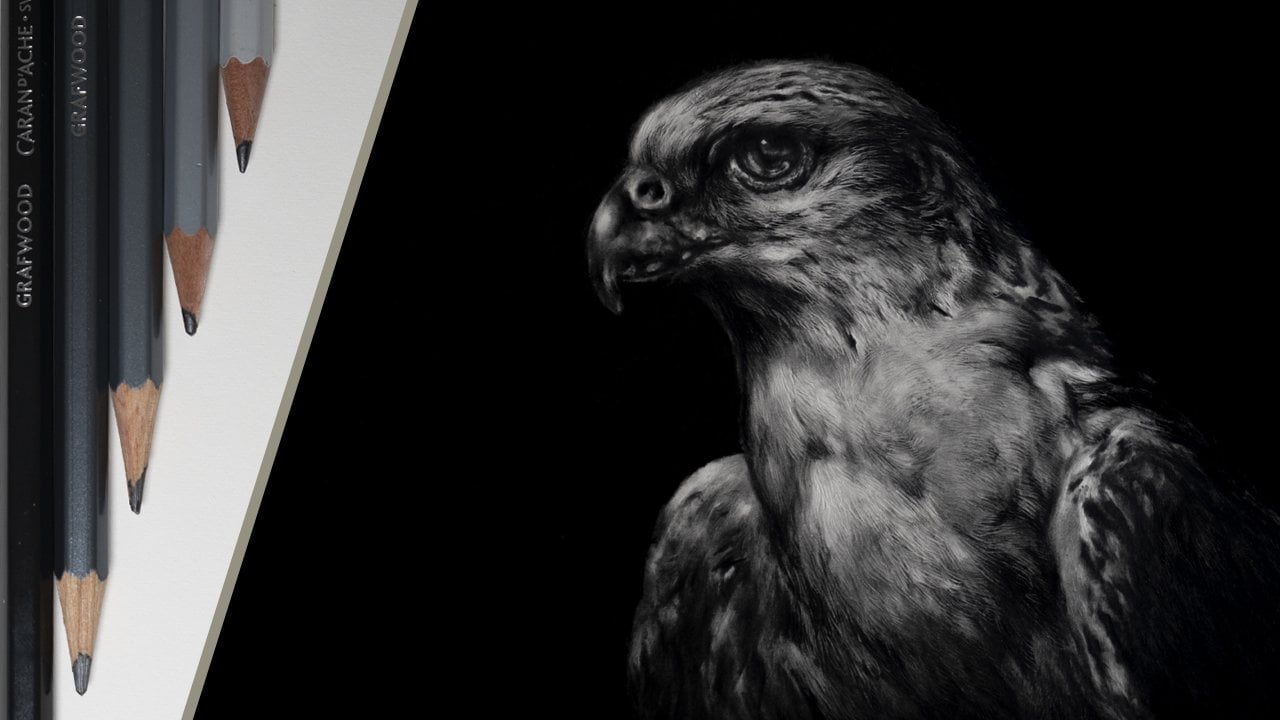
this will be absolutely fine. Now, I'm using the KarnahGraf
wood range of pencils, but this is purely down
to personal choice, as pencils do tend to vary from one
manufacturer to another. You're also going to need
a couple of erasers. The first of these can just
be any normal, regular one, but the second one does
want to be needable as this is ideal for doing
more finer detailed work. Now, these do again tend to vary from one
manufacturer to another, and the two that I
personally use would be a facts K 20 and a Karen dash. Alternatively, though, you can use blue
Tech or sticky tack. A blending stamp is ideal for
shading and blending tones. But of course, alternatively, another option is
to use something like a tip or cotton
bud for this. So some additional items
that you're going to need. Firstly, two rulers. These are just a regular length. Also some masking
tape, and ideally, this wants to be low
tack and lastly, just a regular pencil sharpener, nothing
special for this. So that's all the
materials covered, and in the next lesson,
we can start to work on creating
our initial sketch.
4. Set Up and Initial Sketch: For a lot of people, getting an accurate likeness can
be quite a challenge, but there are ways
to achieve this. And that's what I'm going
to show you in this lesson. To start with, we first need
to set up our workspace. So this is why we
need the two rulers and the masking tape. You want to start by taking about a two inch strip of tape. And then you want to attach
this to the first ruler. And then just fold this around. You want to make sure
that the tape is positioned towards
one end or the other. It doesn't matter which one, and we're not using
the numbers for this. The tape is going to be
our reference point. You now want to do
exactly the same thing to the second ruler, so
as both are the same. We now need to attach one of our rulers to our
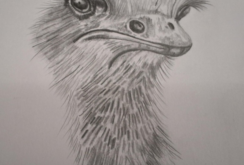
reference photograph. So I'm going to be working on
this picture of an ostrich. Now, I want to attach
my first ruler. You can do this on either side, but I'm going to
attach it down here. So to do this, I
turn the picture over and I attach two pieces of tape to the back and
then turn it back over. So I'm going to
align the edge of the ruler up with the
edge of the image just here and the blue tape will line up with the
bottom of the image. And then I can just
press this down. I then want to attach my second ruler to
the drawing paper. So I just line the picture
up roughly where I want it, place the second ruler down, move it over just a little bit, and then take that away. And now all I have to do is attach the ruler with
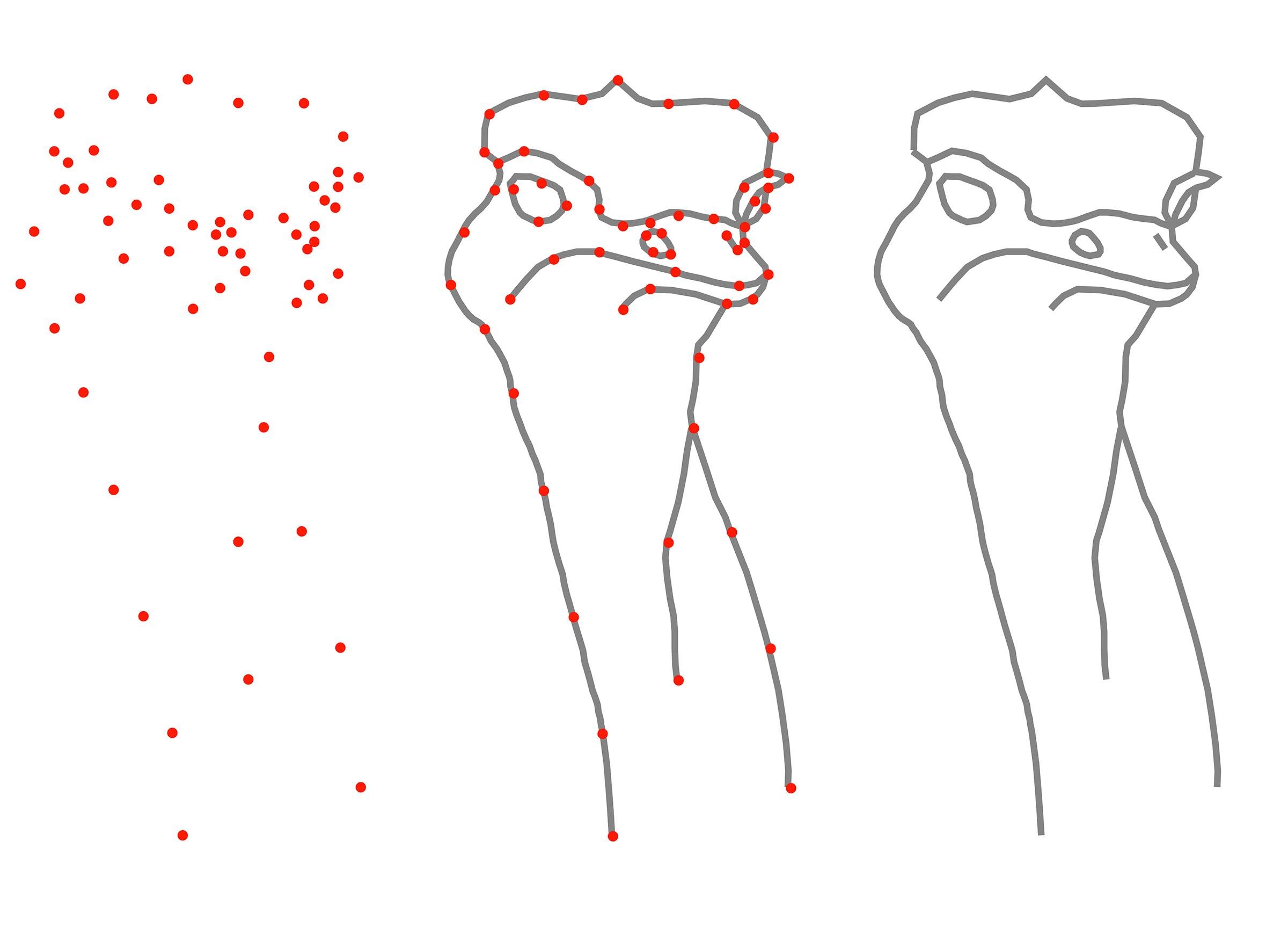
two more bits of tape. To the paper. Like that. So with that done, you should end up with something like this. So, now we've got our
workspace set up. We can start to concentrate
on our drawing. To do this, we're going to
plot a series of marks, and this will help us to
build up the picture. Kind of like drawing the dots, but a bit more advanced. So we've got our drawing
paper and our reference, but we're also going to need
a couple of other things. Firstly, the normal eraser
and also an H pencil. It's important that the H
pencil is blunt as this avoids any chance of indenting or damaging the surface
of the paper. And lastly, a piece
of scrap paper. Anything can do for this. It just needs to be roughly the same size as the
reference image. When doing this, you
don't want to get distracted by any of
these rough edges. Just concentrate purely on the
basic shape of the animal. You don't want to plot too
many points at a time, because as you can see here, it just becomes
incredibly confusing. I suggest limiting yourself
to about three at a time, as this will make things
a lot more simple. Once the points are
transferred over, you can then sketch
in between them. It's important to not just use straight lines for this, though. Make sure to study the
reference and look for any shape that there may be
and then just sketch this in. That's the theory, so let's
now put it into practice. Hold the ruler down and then butt the scrap paper
up against it. This prevents it
from slipping under. Then you can just simply slide the scrap up to the
position that you want. Then using our blunt age pencil, we can plot our first point. Place a mark for the point
that you want to transfer, and then another in line
with the tape on the ruler. So now we've got
our first point. We can transfer this
to our drawing. But the scrap up
against the ruler and then line the markup with
the top of the tape. I can now transfer this
point to the paper. I'm using the blunt H
pencil for this again. You can see I'm
holding it away from the tip quite lightly. I don't want to indent
the surface of the paper, so I don't want to just
press down to place a mark. I'm just going to do this
very lightly, like that. But I do want to go over it a few times,
and then this way, it would just build enough of a tone to make this
quite easy to see. And that's our first
point plotted. After you plot each point, make sure to remove
the mark from the scrap paper using
the normal eraser. This is very important, as you only want to concentrate on plotting one point at a time. The same process can then be repeated to plot the
next two points, but make sure to take
your time when doing this and don't be
tempted to rush. Also, it's a good
idea to really study the reference before deciding on which points it is
that you want to use. The points can now be connected. Just lightly use the
H pencil to sketch in any shape or curvature that
you can see in the reference. If you need to, you can
go over the lines a few times to strengthen
the tone further. So we can now continue this same process slowly working around the
rest of the picture. I suggest avoiding more complicated areas
such as the beak and the eye for the time being and just concentrate on
the basic outline. You can see here this is
quite a methodical process, but it is well worth taking
the time to get it right, and you will end up with a
highly accurate drawing. So that's most of the head
and neck sketched in. But let's now take
a closer look at the individual points that were transferred to get
us to this stage. We started with
these three points here and then sketched in. Moving on from that, one here, one here and one here. Now, I didn't worry about
this part, remember, we don't want to
worry about any of these rough strands on the
edges which stick out, and these will just be
free handed in later. Also, as well, this is a bit
of a curvature through here. Next point here, one here, and then one there,
and then those can be connected
through as well. Again, don't be distracted by
these bits which stick out. Stick to what is the
basic animal itself. I suggest avoiding the beak and the eyes for the time being, and we'll come back to
those a little bit later. So this part is
relatively simple. Starting under the beak, put this section in just here, and then where it branches, I've added this part in,
followed by this part. On here, broken this down
into three sections of here, here, and here to finish. With the basic outline now done, we can move on to what are the more focal elements
of the picture. So for each I'm going
to plot four points. On this one, one
here, two, three, four, and then on the other eye, one, two, three, and four. So just as with the
rest of the drawing, line the scrap paper
up with the edge of the ruler and just move
it up into position. Place a mark, and then place
another mark for the bottom. Line the bottom mark
up on the drawing, and then transfer the point. Remember, make sure to
erase the marks from the scrap paper after you've
transferred each point. The next two points can
then be transferred. The last one that we want to do is a little bit more
difficult to see. But all you have to do is to move the scrap up to
the position that you think and then just flick the scrap back to double
check the position, place the mark, just double
check it one last time. And then transfer the
final point over. Study the reference, looking for the shapes that you can see, and then just sketch in. And that's our first eye done. You can now do exactly
the same thing to create the second eye and
also the nostril. The beak is relatively
straightforward. Transfer a few points at a time, study the reference,
and then sketch in. I suggest breaking this up into three separate parts of mouth, lower and upper beak. I'm starting with the mouth, but you can do this in
any order that you like. I chose to do it this way
because I feel it creates a clear division between
the upper and lower areas. Once the remaining points
are plotted and sketched in, the outline for the
beak is complete. So just a few last
bits to finish. A couple of these
are above the eyes, and we've also got just one
last nostril to put in. The one above the left hand
eye consists of four points. And when this has
been sketched in, there are just two
small parts to do to connect this to
the surrounding outline. Just two points for
the second eye, and then this can be sketched
in using a crescent shape, starting from the
bottom of the eye, going through the first point, clipping the edge
of the outline, and then out to the second. And then this is
just sketched back in to connect with
the top of the eye. And lastly, the nostril, and this is just two points with a line sketch between them. When using this system, I suggest working
on a relatively flat surface like a table, as this will tend to make
things a little bit easier. But now the basic
sketch is done, I'm going to take
the picture over to the easel where I can just
tidy and clean things up. But before I do that, I just need to remove the
ruler from the picture. To do this, just very
carefully peel the tape back. Don't try and pull
it too aggressively, just gently roll
it back like that. And then you can just
very carefully peel it off from the
pitcher. Here we go. So that's the picture
attached to the easel, and this is how I
prefer to work. But you could work on a
table or a drawing board. It really makes no difference. Some of the points
that we use to create the initial drawing do stand
out, as you can see here. So what we need to do is just
diminish their appearance, and to do this, we're going
to use the kable eraser. Take the eraser and then
just roll a point on it. Then just press in with a
tip. To remove the point. I will suggest only removing
one point at a time, because if you do accidentally remove part of the outline, you can just sketch this
back in with the H pencil. So that's our initial
drawing done. And the key points to remember, make sure to only transfer a few points at a time
before sketching in. Always remove the marks
from the scrap paper, and the most important one
is to just take your time. In the next lesson,
we'll add some shading, and this will help to give
the picture shape and form. H
5. Shading: At the moment, we
have what appears to be a very basic looking outline. But by simply adding a
little bit of shading, we can give this a much more three
dimensional appearance. For this, we first
need to look at the tools that we're
going to be using. So for this, we're going
to use the blending stump, two B pencil and able eraser. Now, the blending stump that
I'm using is quite old, and as such, it's very ingrained with graphite from years of use. But when using a new one, you do need to initially
load some graphite into it. To do this, take
the two B pencil. And then just lightly
brush it over the surface. It's important to only
do this lightly as you don't want to press
the tone into the paper. You just purely want
it on the surface. The blending stump can then
be used to pick this tone up. And then just transfer
it somewhere else. So remember, if you don't
have a blending stump, you can always use
a tip to do this, and it's exactly
the same process. With that done, we can start to build some shape
into the picture. The eyes help to give
a picture character, so I usually find that that's
the best place to start. Always study the
reference thoroughly before tackling any
part of the picture, so it's quite clear in your mind what you want to do
before you start. Using a tight circular motion, tone is applied to what
will be the pupil. Now, this is quite
difficult to see in the reference as the whole
eye is relatively dark. Again, you only want to
use the blender lightly, and by working over this area, this will allow you to build
a very smooth base tone. This is very important
to build tone this way as we want to give the eye
that glassy appearance. Eyes are a great
place when it comes to using a degree of
artistic license, particularly when it comes
to positioning highlights. For example, there is
quite a subtle highlight in the upper left hand corner, but I've decided to make more of a prominent
feature of this. A little bit of subtle tone is added to the outside
edge of the eyeball, as this will help to
add a bit more shape. Just make sure to be careful not to lose the actual
outline itself. And if you do start to
find this vanishing, then just add it back
in with the H pencil. Once the eye is done
to this degree, we can then start to work
on the surrounding area. Shadow is added around
the top of the eye, and then the line just
above this is blurred out. And you can see here I'm using quite an erratic
stroke to do this. This has the effect
of breaking the line up and giving it a much
more random appearance. It's also important to
look for any texture or direction that there may be and then try to replicate this. Tone can now be applied to
the lower part of the eyelid. Just make sure to
leave quite a good gap between this area and the eye itself as it has a
very highlighted edge to it. If any of the tones need to
be strengthened further, you can just simply
work back over them again to add another layer. For the other eye, tone is applied to the lower
parts of the eyeball, as well as both edges. Remember, if you need to load more graphite into
the blending tool, you can simply do this by
going to the scrap paper, and with the eyes
now established, we can start to
work on the beak. The lower part of the tip
of the beak is fairly dark, but still make sure
to be conscious of any textures that you can see in these very darkest areas, particularly where
you see a transition between the beak
into the feathers. For this type of
transitional area, it simply requires
a short stroke in the direction that
the feather takes, whereas the beak is a
much more random pattern. The feathers above the beak require a more varied approach, with some strokes being
longer than others, and this helps to give a
more natural appearance. Toe can now be applied
to both nostrils. Just make sure to leave
a highlighted area for the more
prominent of the two. I dab a little bit of light tone onto the tip of the beak, as well as just in
front of the nostril. And again, this will
help to add some shape. And to finish, I just add a little bit more
tone under the mouth. So with the eyes
and the beak done, you should really start to see the pitcher developing nicely. It can be tempting to want
to rush the feathers, but you really do need to
take time when doing this. So only work in small
areas at a time. The feathers in this
area are quite downy. There's also a lot of
texture and direction there, so I say that that's a
good place to start. You can see here I'm using a relatively short stroke in the direction that
the feathers take. Make sure to constantly
refer back to the reference. And one thing I would
say is you want to avoid too much consistency
in the strokes. So a good way to avoid this is to work quite randomly
over an area, and this will give the feathers that downy rough appearance. Remember, if you want to
darken any parts further, you can just go back
over them again. What we're effectively doing
here is to create an under drawing to which eventually detail and contrast
can be built upon. The advantage of doing
this is that it gives us an idea of how the picture
will look when it's done. Plus any changes
or alterations can very easily be made
with the kable eraser. So the neck now has some
good shape and depth to it. But for the actual head itself, we need to use a longer
more flowing stroke, and you can see this
in the reference. The area below the eye is
a good place to start. Now, this doesn't need
a lot of strokes, but they do still need
to vary in length. Moving on to the cheek, a few more strokes this time. Plus also I want
to work back over some parts again to
strengthen the tone further. This also applies above the eye, but this time, the strokes
need to be much longer. Just a few more shorter random strokes for
the top of the head, and then it's back to longer
ones for the other side. It is very easy to get
carried away when doing this, but do try to keep it
as simple as possible. To finish, there are
just a few more places that need a little bit of tone. And then also don't be afraid to look at
the picture and then decide if there are
any other parts that you need to work back over. So the shading added, that's
our underdrawing completed. And you can always practice any of these textures
on a piece of scrap paper first before
going to the actual picture. And remember, if you
do make any mistakes, because this is such a
non invasive process, they can very easily
be corrected. The key points to remember, study the reference thoroughly, be conscious of the different
patterns, textures, and the direction
that they take, and also don't be afraid
of making mistakes. In the next lesson, we
can now start to work on building more tone and contrast
into the eye and beak.
6. Depth and Contrast: So the underdrawing
has given us shape, but we now need to build on this by adding
tone and contrast, and this will really bring
the picture to life. To do this, we're going to use a combination of two
and nine B pencil, as well as the blending
stump and kneadable eraser. We want to build our tone in layers progressively
getting darker, and this is particularly important when dealing
with something like the eye where we want to create that smooth, glassy appearance. This is also the area that
gives the subject character, so I generally find that it's
the best place to start. The first thing we want to do is to strengthen the line that's around the eye using
a blunt two B pencil. You don't want to press
too hard when doing this, as we don't want to
accidentally indent this line. Just simply rely on the natural tone that
the pencil produces. The TB is again,
lightly applied, but this time using a
tight circular motion to apply tone to what will be
the darkest areas of the eye. And as you can see here, this produces a slightly
grainy appearance. Still using a tight
circular motion, use the blending stump to
brush some of the two B down into the grain of the
paper to smooth out the tone. Repeat this adding more
layers until you have a nice, even rich dark tone. Incidentally, there is no precise number of layers to use. It just wants to be
relatively dark. Tone can also be added to
the upper left hand corner, as well as any harsh
edges blended out. Now, you may find that you diminish the line
around the eye. So if you do find
this happening, just go back in with a two B
pencil and re establish it. So now we've got some
dark tone established. We can build on this further. I suggest breaking
up the edge of the highlight as you don't
want it to appear to uniform. Also, by adding some shadow
to the top of the eye, you create a sense of depth. Highlights can look quite harsh. So to deal with this, just use the blending stump to soften
the edge of the two B, and this will create
a nice transition between the dark to light areas. This also helps to give the
appearance of curvature. Don't be afraid to
use a degree of artistic license when
working on eyes, as this is a great area to be able to add some
character to the picture. The bottom of the eye also
needs more curvature. So to do this, just use
the blending stump, work back in over
the lower line, and this will create
a softer edge and give a more
rounded appearance. This will diminish the
appearance of the line, so you'll probably have
to go back in with a two B pencil to
just re establish it. You can also see that I make constant alterations as I work, even if these are
only very minimal. We can now start to work on the areas surrounding the eye, and the best place to start
is with the lower lid. Now, you still want to
use the two B pencil, but this time, you want to
use quite an erratic stroke. This will help to give
the rougher appearance that we want for
this area of skin. Also, again, it's worth
studying the reference, and you want to look
for how inconsistent the line is and how some parts
are thicker than others. The same principle
also applies when working on the dark areas
to the sides of the eye. Before tackling any area, however small it may be, always study the reference
thoroughly and look for the direction of the
stroke that you need to use. The upper lid can
now be established, as well as some
minor details added. For example, this part that I'm working on helps to create a transition between the
areas of skin and feather. The highlighted part
of the lower lid looks a little bit harsh, but by applying a
few random strokes, this helps to break this up. The eyes are such an important
part of any picture, and it is worth taking the
extra time to get these right. And now we built some
contrast into the first one. We can work on the second, and it has to be said that
this one is much simpler. So this is basically the same principle as what
we've just done. Apart from this time, the
actual highlighted area is on the upper right hand side, and this is nowhere near as prominent as on the other eye. You still want to work between the two B and blending stump, as this will create a nice
depth and graduation of tone. And to finish study
the reference to create the surrounding
transitional area. We now have a good
level of contrast, but by using a nine B pencil, we can push that a
little bit further. Just as with the two B, this
wants to be used blunt. This prevents any chance
of the tip breaking off, and also a very soft pencil like this won't hold
a point anyway. The difference,
though, this time, is that if you want to
soften any of the edges, then use the two B as a blender. So what do I mean by use
the two B as a blender? Well, I've put some
two B and nine B on this piece of scrap
paper, so let's take a look. If I use the blender
over the two B, you can see that this
blends out quite nicely. But if I do the
same over the nine, You can see it doesn't
have much of an effect. Now, this does tend to vary from one make a
pencil to another, so it's always worth
trying this on a piece of scrap paper first before
trying it in the picture. Because the tub is
a graphite pencil, it will blend the edge
just by working over it. And as you can see, that
just softens the appearance. Now, you may find that this works perfectly alright
with just a blender. But the key thing
before going to the picture is
just try it first. You can see here I'm just using this to soften
some of the edges. But equally as well,
if you also look at the actual main highlight
at the bottom of this, there are also
some harder edges, and these act more
like a reflection. The nine B can then
be added to some of the surrounding areas before then moving on to the other eye. The nine B does only make
a slight difference, but we do want to get the
maximum contrast that we can, as it does make for a
more striking picture. If you need to reestablish or make any of the highlights
more prominent, then you can just
use the kable eraser by rolling a point
on it like that. This can then be used to
very delicately remove a little bit of tone from the left hand part of
the main highlight. And then equally, we need to remove a little bit
from the lower right, and this creates the effect of light traveling
through the eye. Remember, don't be
afraid of using a degree of artistic license, particularly when it enhances
the look of the picture. The eraser is also used to clean up the edge
of the other eye. These types of
erasers are sticky, so they do tend to clog with
graphite relatively quickly. So it's always a good idea to regularly knead
them like that, and then that will
basically just keep them clean and disperse the
graphite within them. The eyes are definitely
the hardest part, but with those done, we can
now move on to the beak. I'm starting with the nostrils and remember just with the eyes, work between the two B and blender to build a
nice depth of tone. But remember with the
main visible nostril, there is a highlighted
area towards the center. Again, you don't want any
grain to show through in the very darkest parts as you want to create
a sense of depth. Still using the
blunt two B pencil drawing the line for the mouth. Now, this doesn't want to
be particularly smooth, and as you can see from the
line that I'm drawing in, this is quite inconsistent as this gives a more
natural appearance. The left hand side of the mouth wants to be a
little bit thicker. And because this is also
a transitional area, make sure to study the
reference to look for the direction of the stroke
that you need to use. And this is exactly the same for the lower left hand
side of the beak. The front of the beak wants
to be quite dark and again, apply the two B using a
tight circular motion. This time, though, the
grain of the paper will help to give the
appearance of texture. Don't be afraid to work
on other parts as well. Just use the
appropriate strokes to replicate the patterns that
you can see in the reference. For the upper beak, work
randomly using a looser pattern. Also, try to avoid any areas
that want to be highlighted. And if you do need to
darken any areas further, just simply work back
over them again. This is now a good time to stand back and look
at what you've just done and decide if you want to add anything
extra to it. Remember, you can
always practice any of these patterns or textures
on the scrap paper first before using them
in the picture from tight circular to looser, more random, as well as for
the transitional areas. Once you're happy with the
textures that you've done, you can now use the nine B and we can put that last
bit of contrast. Starting with the nostrils, you just want to strengthen
the existing tone. One thing you don't need
to do this time is to use the tube to finish the
edges as we did in the eye. And this is because we don't
want a smooth appearance as the appearance of grain
helps to add a bit of texture. You can then darken the mouth
as well as the lower beak. By using it lightly,
you can also exaggerate the texture
around the nostrils, as well as the upper
part of the beak. You can see here I'm just literally dabbing this
on in various places, adding contrast and giving us that three dimensional
appearance that we want. To finish, just
study the picture. And as you can see
here, I'm just using the two B just to add a
little bit more detail, as well as the kb eraser to just reestablish a little bit more of a highlight in the nostril. So that's the eyes
and beak done. And the key points to
remember this time. Look for any textures and patterns that you can see
within the reference. Use the pencils blunt and make sure to build
your tone in layers. In the next lesson, we can now start to work
on the feathers.
7. Feathers: In the last lesson,
we built our tones adding depth and contrast
to the eyes and beak. And now we want to continue
this working on the feathers. The thing to do
first is to again study the reference and look for the different patterns
and textures that you can see within the area that
you're going to be working on. We're going to start by
using the two B pencil, but I would suggest
practicing the texture on the scrap paper first before
going to the picture. For example, these downy
feathers here require quite a short stroke compared to the ones up
on the top of the head, which require a much longer one. It's also a good idea to
work from the base of the feather to the tip as this creates a more
tapered appearance. So once you've done
a little bit of practice and you're happy
with the technique, let's go to the picture, and we'll start with the
feathers on the head. For these longer finer feathers, remember to start at the base and then finish the
stroke at the tip. This tends to have a tapering
effect as the start of the stroke is usually thicker and will get finer
towards the end. The reason for this is
that we will generally apply more pressure at
the start of the stroke, and then this will naturally
reduce as we go through it, producing a finer line. If you do need to darken
any areas further, then just simply
work back over them again to add another
layer of two B. You don't want these
feathers to look too neat, so you want to vary the length and direction of the stroke, so as you create that rough, tangled appearance that you
can see in the reference. Also in the very lightest areas, you don't need to draw
in every single feather. Sometimes just a few strokes is enough just to hint at them, as you can see I'm doing here. This gives a very
subtle appearance and prevents it from
being too overpowering. Make sure to avoid going over the initial outline
for the time being, as we're going to
tackle that bit next. Once the feathers on
the head are done, we can start to work
on the outer edge. But before we do that, we first need to
remove the outline. Start by using the
kable eraser with a point rod on the end of it to remove part of the outline. Then use the two B pencil
to draw in the feathers. Now, I've started with
the long dark feathers, which are over the
right hand eye, but you can always choose
to start wherever you like. This area requires a
long stroke, but again, it has to vary in length as well as slightly
in direction. Also, because these
are quite dark, they have to be worked
over a few times to get the depth of
tone that's needed. Continue working round the head, adding the feathers
and remember to make sure to only work in
small areas at a time. Most of these only
need to be very subtle and also
don't be afraid to leave the odd gap as this helps to connect the subject
and background together. Back to longer darker feathers
for the left hand side, and mainly what we're
trying to do is to just replicate what we can see
within the reference. But remember, you can always use a degree of
artistic license. To finish the top of the head, I just want to use the
two B pencil to add a few more darker
strokes to some areas. So with the top
of the head done, we can now start to work
on the area below the eye. This area is quite
ragged looking, but it is exactly
the same principle as what we've used on
the rest of the head. Just remember to
vary the length and direction of the strokes
that you're using. And because this side of
the face is in shadow, make sure to add more layers
to the very darkest areas. The need eraser is not only used for
removing the outline, but you can also use this to add very subtle highlights
to some of the feathers, as you can see I'm doing here. The area to the right of the eye looks a little bit too harsh. So I'm just going to use the
same random pattern as we did for the beak to add a little bit of
tone to this area. The longer feathers extend
down the side of the face, as well as just below the beak. You can see that by
working quite loosely, this gives the feathers a really nice random, tangled appearance. Add to this a good
level of contrast, and this really helps to give the subject that three
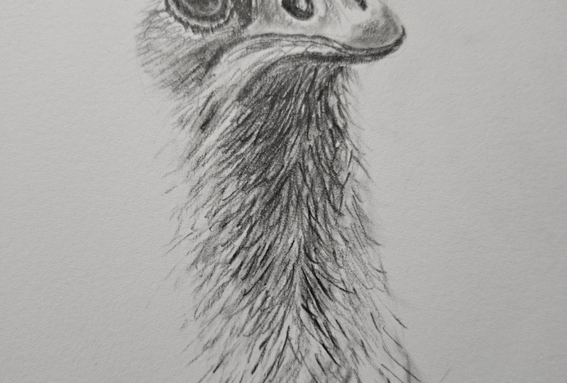
dimensional quality. So that's the head done.
And now we can move on to the matted downy feathers
that we've got on the neck. These do require a
much shorter stroke, but they still have to
have direction to them, so make sure to study
the reference first. Now, the area below the beak is quite dark because
it's in strong shadow. But still use the two B pencil, but just apply more layers of the pencil until you achieve the depth of tone that you want. Areas like this can
seem quite repetitive, but don't be tempted to rush it. As you work down the neck, you can also start to add in those longer feathers that
there are on the edge. You want to use exactly
the same technique for this as we did around
the rest of the head at first removing part of
the outline and then just using the two B pencil to sketch in using a longer stroke. As you work down the neck, just make sure to
maintain a good level of contrast between the very
darkest and lightest areas. This also helps to define certain areas and give that rough appearance
that we want. We want the bottom of the neck to fade out into the background. So as you work down, start to reduce the
amount of strokes as well as the
amount of pressure that you put through the pencil. It's also a good
idea to avoid having to straight line
across the bottom. You can see here I've decided to go for a much more
random bottom edge, as well as fading out both
of the sides higher up. This helps to give
a nice, natural transition between the
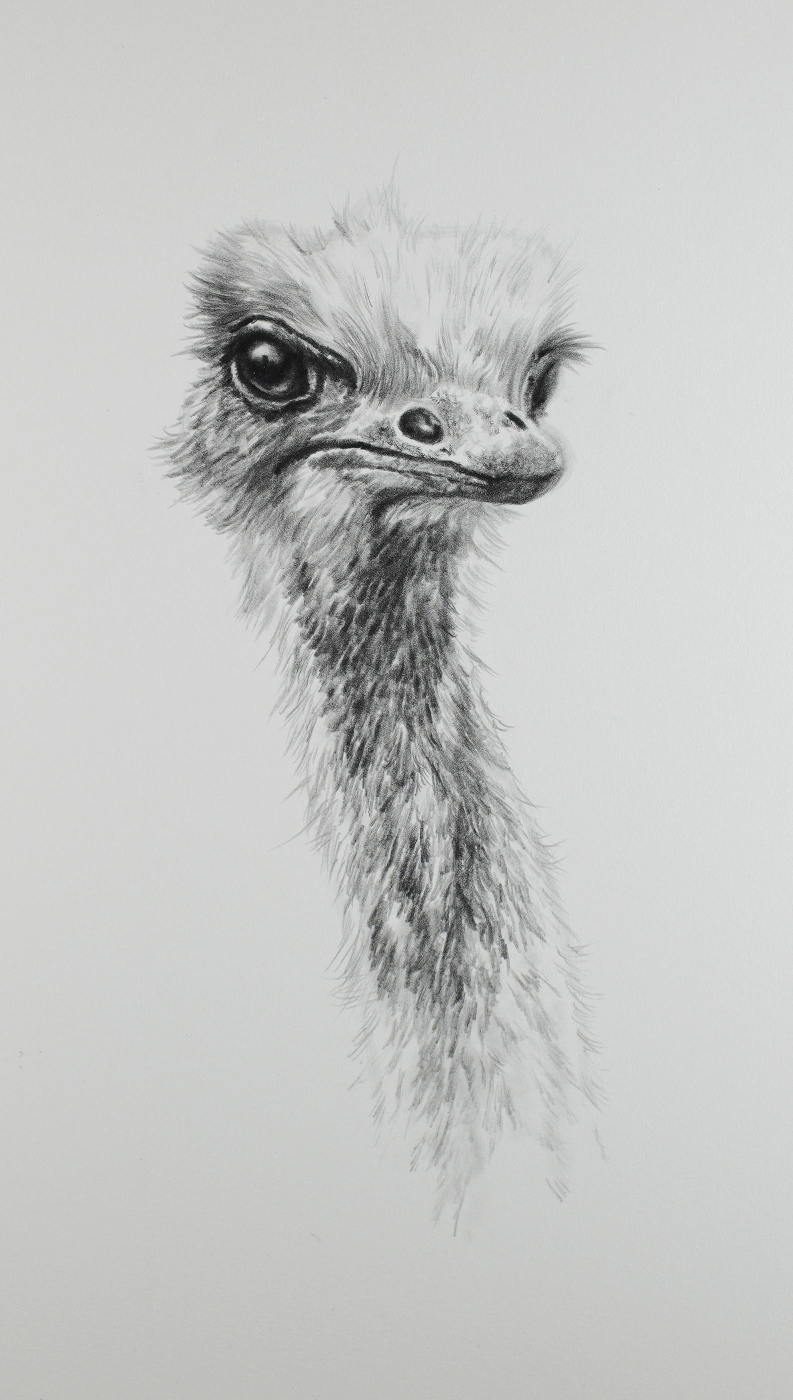
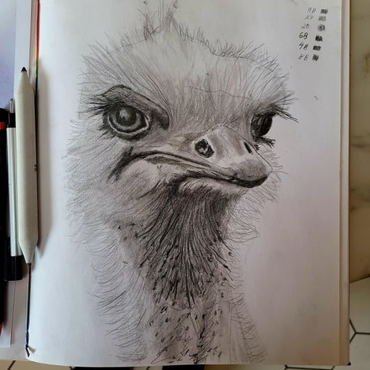
subject and the background. So that's the picture
pretty much finished, and all we need to do now is just those last few
finishing touches. This starts by studying
both the reference and the drawing to see what else can either be added or altered. The advantage of this is
that you're looking at the whole drawing and not just focusing on one area at a time. And you can see here
I'm just making some minor changes
using the two B pencil. Alternatively, if you do have to do something
more drastic, you can always remove
some of the tone using the kneadable eraser before going back in with
the two B pencil. If you want to add a
bit more contrast, then you can do this
with the nine B pencil. For example, with my picture, I'm doing this predominantly down the left hand
side of the neck. And finally, the kable eraser with a point rolled
on the end of it can be used to work back
into the lower part of the neck to fade
this out further. This can also be used to add any additional
highlights if needed. So that's the picture finished. And the key points to
remember this time. Make sure to practice your textures on the
scrap paper first, finish your strokes at the tip, as well as varying the
length and direction, and also don't be afraid of using a degree of
artistic license. In the next lesson, I'll
give you a couple of bonus tips as well as
my final thoughts.
8. Bonus Tips and Conclusion: So we've been through all the steps to
create the drawing, but I do have a couple
of extra bonus tips that may come in useful. The first of these is to
do a choice of subject. And if you're a
complete beginner, you really want to keep
things as simple as possible. Also, stick to relatively
small pictures and focus in on specific areas,
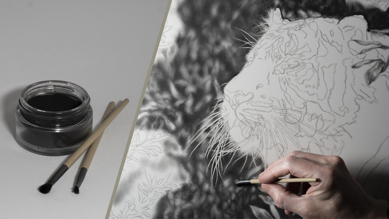
as we've done with this one. For example, this picture
of a tiger that I'm working on is
incredibly complicated. It requires a lot
more techniques and will take somewhere in the
region of a year to complete. So something like
that is probably best to be avoided
for the time being. But as you gain confidence
in your abilities, don't be afraid to
challenge yourself further with each
picture that you do. The next may seem strange, but it's to actually
draw the picture twice. Now, this is literally if
you are a complete beginner, and the first one is
your practice piece with the second one
being the main drawing. This allows you to
learn the techniques, as well as be able
to make mistakes without having to
worry about them. Then when you tackle the
picture the second time, you should be able
to do this with more confidence and notice
a marked improvement. But don't worry, you don't have to do this with every
picture that you do. So the key points to
remember this time. Choose relatively simple
subjects to start with, and don't be afraid
to draw the picture twice using the first
one as a practice piece. Don't forget you can upload your work to the projects
gallery at any time, as it would be
really nice to see. And remember, I'm always
happy to offer any advice. In conclusion, I
hope that you found the class useful
and informative, but more than that enjoyable, as that's what creating a piece of artwork should always be. And with each picture
you do, you'll gain experience and develop
this skill further. Just remember to take your time and don't overcomplicate things. So thank you very
much for watching, and I look forward to seeing
you in another class.