Transcripts
1. Introduction: Hi everyone. Welcome. Have you ever looked at any of those old art books or
even some modern art books and saw drawings done completely in pen and
ink with nothing else. Maybe you've tried it out. Maybe you're a current artist who likes to draw in pencil and thought it would be cool to try that pen and ink method out. Or if you're completely
new and just want to start drawing
in pen and ink. Well, you're in the right place. Hi, my name is Carl Wilson. I'm an artist and illustrator based in Taylor's
Ville, Kentucky. I've been doing all kinds
of art for many years. I've done oil painting, I've done acrylic painting, airbrushing, pencil
drawing, ink drawing. And I am constantly on the look for more things to get
into and learn how to do. So. I've loved art All my life. I started when I was
four years old doing pencil drawing of
typical things that, that age, comic heroes, monsters, all kinds
of characters. I've got to rescue
dogs here at home. And I love doing
portraits of them. I've done them in paint, pencil, and my latest, of course,
it's pen and ink. And I want to welcome
you to my class and we'll go over basics
of pen and ink drawing. But it's also great for seasoned artists that maybe
want to try out pen and ink, but might have a few questions on kind of where to get started, how to get started. Some of the materials may be the best paper to start with. Once we've covered the basics, then we're going
to progress into different types of mark-making. And then once we've
gone over that, we're going to get to what
you really came here for. And that's how to get different types of textures when you're doing animal drawings, we're gonna go over
different methods for achieving different types
of animal textures. There are short hair, long hair, bumpy skin
like on reptiles. And then at the end of the
class we're going to conclude with you being able to
do your own project. So I'd like to share some
of those techniques and experiences and things I've learned along the way with you. And maybe it can
help you to achieve better and more realistic
looking animal drawings. So why don't we get started. I'm excited to see
what you can do. So let's go.
2. Project Introduction: Welcome everyone to
our class project. As you can imagine, based on the title of our class, our projects going to focus
on drawing animal textures. And one of the things that you should keep in mind
from the very beginning, especially if you're a beginner. Don't rush and think it may come out perfectly the way you want it the
very first time. Of course, I've done many of these drawings with a
variety of textures. Short hair or long hair, bumpy skin, you name it. But of course, didn't come
my very first time I had practiced so that I could get mine to a place
where I'm happy with it. So something you may want to keep in mind as we're getting into the lessons is just
kinda follow along. Practice. I'll give you a
little hint before we even get into the lessons. Once we've gone
through the basics, this will make more sense. But think of layers. So as we start to learn about the different
methods for shading, different types of hatching. You'll learn that the look that you're going for may not be
achieved just by one pass. You might come back
several times. One of the tricks to
getting some shading in while keeping that
same texture is layering. And you'll see
plenty of examples of that as we get
through our lessons. So really to get started
with the project, that first step
really is on you. So since this is a
class about learning to draw animal textures to
get a more realistic look. First thing you need to do
is just pick out an animal. Of course, having a completed
animal would be great. But if you're more
comfortable starting with just a section
of an animal, That's perfectly fine too, because the textures
are going to be on every part of the animal. So with that said, first thing to do is get your paper that
you're going to be drawing on and
just get a pencil. So once you've got your
sketch laid out on the paper, really it's just
taking a look to see where you would
start things. You can start maybe on the
perimeter contour, outline. It's really just what
you're comfortable with. So with that in mind as far as what our project is going to look like and what you'll be turning in at the
end of the class. Let's go ahead and
get started and I'll see you in the next lesson.
3. Background on the Pen & Ink Medium: Welcome everyone. I'm really excited that you're joining me for
this first lesson. So in this first
lesson we're gonna be going over just some simple things about the
medium of pen and ink. Some of it's briefly
some of its history, how it's different than maybe drawing with pencil or
some other mediums. And just touch on how it's a classic and traditional way that drawing has been
done throughout history. So the medium of pen and ink has been used
throughout history, going all the way back to
ancient Egyptian times. And as you probably know, it's one of the main
mediums that's been used for book illustration. If you pull out a book that's decades or even centuries old, very likely you're going
to see drawings done and illustrations at the
time in pen and ink. Pen and ink wasn't medium
though that was not only used by ancient Egyptians, it's been used by many
cultures throughout history. Chinese culture is very
big on pen and ink. So the medium of
pen and ink really encompasses a lot
of different tools. There's, of course, what we're gonna be
using fine liners. There's dip pens, quill pens, reservoir pins, all kinds. But the common denominator
is that they all use ink. One of the reasons there
are so many tools to use is that it can infect
your line quality. And line quality is something
that can add interests too. Otherwise, just
normal line drawing. If you're unfamiliar
with line quality, that's a term in the art
world that really refers to the thickness or
the weight, the line. And as I said, it can add
a lot of interests to an otherwise just plain
line drawing that might use the same weight
throughout the entire drawing. So in regards to the difference between pen and ink
and using pencil, well, obviously, pen and ink is a wet medium that
you have to let dry. Pencil. It's more of a
temporary medium versus a permanent medium
in pen and ink. So thinking about that temporary versus permanent concept, well, you might hear pen and ink is
less forgiving that pencil. And all that means is when
you're drawing in pen and ink, there, when you make a mistake, you're going to have to either
leave it or kind of work around it and incorporate that
into your overall drawing. Pencil, of course,
you can erase. So in a way you could think
of drawing in pen and ink as forcing you out of those
perfectionist habits. And maybe into one that
may be improvisers or texture drawing in a
different direction than you originally thought. So think about it. If you're drawing with
pencil and you know, you have the option for erasing, you may end up doing that
too often or all the time. However, with pen and ink, It's a more precise and
maybe thought out type of medium because it's not
so E or you can erase it. There are ways to fix it. As I mentioned, you
can work around it, change your drawing
a little bit, but there are other ways
to correct mistakes. So one of the reasons that I love drawing in pen
and ink so much, I grew up in the seventies
and eighties and I loved the comic and horror
black and white magazines. And I just thought
it was amazing what they were
able to accomplish with just black ink
on white paper. Now some of them
took a step further. And we'll get into this
in future lessons. But there's something used
called ink wash and that can let you dilute your black ink to achieve different
levels of gray. But that is just amazing to me. And that is really one
of my inspirations for getting into it and trying to pass this
knowledge onto you all. So that's a little bit
about the medium of pen and ink and some of the differences
between that and pencil. So let me leave you with
an idea or a quote if you will, embrace mistakes. So as we've talked about before, when you're working with pencil, it's really easy to
fix those mistakes. However, with pen and ink, you have to be creative. It's a little bit more
work to fix them, but it gives you a chance
to learn more and move, maybe take your drawing
and different direction. So in the next lesson, we're gonna be going
a little bit more in depth on the different
tools to be used, the papers that you can
use for pen and ink. And I think that's
really going to move into an exciting
part of this class. So be sure and join me in
the next class coming up.
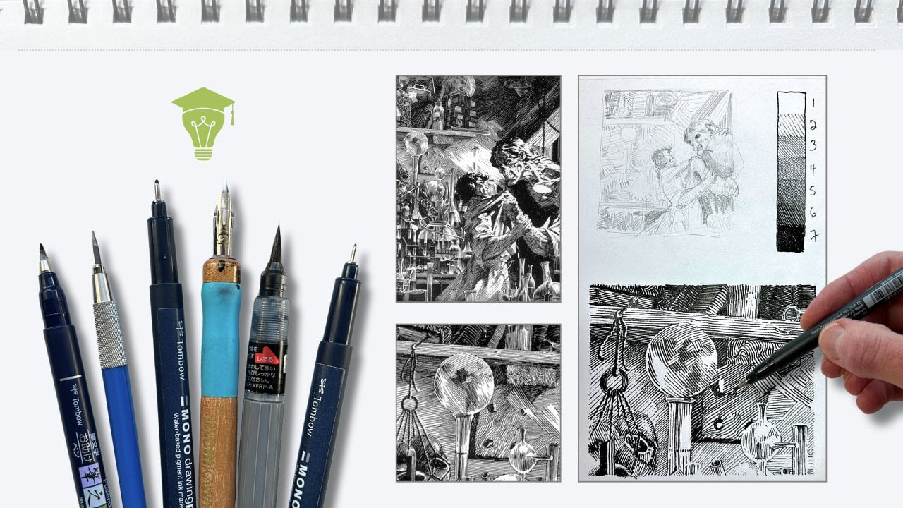
4. Pen & Ink Media, Tools, and Papers: Hi everyone. Thanks for coming back and
joining me for less than two. So in this lesson, we're
gonna go over some of the tools that'll help you get started with
your ink drawing. So of course we're going
to talk about those. Obviously a very important part. But we're gonna be
talking about papers. Other types of ink you can
use besides the pen type. And we'll also
cover just some of the other art supplies in general that will help
you with your drawing. Let's get started. So probably the first
thing that we need to talk about are the
different types of tools that you can use with which to make
marks on your paper. So those are the ink tools. So there's a few
different types. What I use most often
are these right here. These are what's
called fine liners. You may also hear them
called technical pins. So we'll come back to these in a minute because
there's something important about choosing
the right type. There's the classic
crow quill pen, which you would dip into
a bottle or a palette of. Now there are some
that are made, that have a little
reservoir built into the actual pen itself, preventing you from
having to constantly dip. But this is definitely the
classic version of what people use to draw or write with ink. Of course, we've
also got brushes. Here. We've got a
bamboo brush here, just a plain old
watercolor brush. So those are perfectly
fine to use as well. We're not really
going to get into using those in this class. Maybe in a future class we will, because we're going to focus
more on using fine liners. But what the paint brushes, you would use a bottle of some kind of black ink
to brush onto your paper. Very much like watercolor. You could even use something as simple as just a plain old pin. This happens to be
a Sharpie gel pen. But you can use just a
regular ballpoint pen. Really anything. It's really up to you what
you want to start with. Only thing is, I would recommend not going with
anything with a paintbrush, but some kind of
pin or fine liner. To keep things simple
in this early part. Some of the other tools you
might want to use are just gonna be traditional
pencil drawing tools. So some erasers and
of course pencils. Now what you use those for, we're doing ink drawing here, but Getting Started will do what you call
an under drawing. So that sketching out what it is you're wanting to
draw in pencil, get it the way you
want it to look. Erase a little bit
if you need to. And then once that's down, you take your fine liners or whatever tool it
is you want to use for putting the ink down and you go over those sketch lines. Now as you're going
through choosing the type of ink tool that you want
to use for your drawing. Whether it's a fine liner
or later on down the road, maybe you want to use wet
ink with a paintbrush. There's essentially two
types that you'll find. There's pigment based
and then die based. So pigment based are the ones
really you want to go with, you know, until you get
more familiar with it. Maybe you want to
experiment later on. But pigment based are
going to be the ones that are going to be water
resistant after they're dry. They're gonna be more permanent. What they call archival. There'll be resistant to
fading in the sunlight. Dye based are where you can get some really bright
brilliant colors in ink. But they're really not
going to, generally, they're really not
going to be water resistant and last as long. So I'd recommend going
with a pigment based, and that would be what
you'd use these four. Okay, now, let's
talk about paper. Now. There's lots of
different kinds of paper. You may have some already. I'm going to recommend one
of three different types. So one of my favorites to use that I really like
working on because sometimes I combine the use of a fine liner with ink wash. So that's much has much
more liquid to it. So I wouldn't
necessarily run out. This is kind of an
expensive paper. There's a whole, there's a lot less expensive
paper that you can get. But basically what
you're wanting to find is watercolor paper. Watercolor paper is
just a heavier weight. If you look on any pad
of watercolor paper, you're going to see a await. And what I like to use, although it comes lighter, sometimes a little heavier, hundred and 40 pound. So. That's really just a good
measure of how thick the paper is and the
more wet your drawing is going to be or your work
of art will be better because it's less likely to warp from
the liquid going onto it. But if you're gonna go
with watercolor paper, you want to remember to look for something with
a nice smooth texture. Some watercolor paper is
very textured and can be kind of rough to get
nice clean ink lines on. So another type of paper which really works well is Bristol. It comes in a couple
of different textures. I'd recommend going
with the smooth. It's nice. There's not much of
any texture to it. It'll be really easy to learn, or at least maybe on your
first couple of ink drawings. And then a third
type you might go with is something called
mixed media paper. And that's a type
of paper that's ideal for wet or dry medium. So pencil, charcoal,
pastel, watercolor. That's another good
type you can use. It's going to be thick enough, not as thick as
watercolor paper, but it's going to be thick enough if you're
using something like fine liners or
ballpoint pen gel pen, that'll be plenty thick enough where it's not
going to go through the paper and start to warp it. Now, let's jump back for a
minute to the fine liners. So I said this is really what we're gonna be using
primarily in the class. And I loved working with these. I actually have several
different brands and I kind of interchange them in
a given drawing. But the thing I want to
point out is they do come in different ink colors about
any bright brilliant colors, but I typically will use black. And if you take a look, There's usually, there is always going to be
a number on here. And I'm looking at
one here, 0.20, 0.1. And those are usually measured
in terms of millimeters. So what that is, that's describing the size
of what they call the nib. The nib is the point at
the end of the fine liner that is going to tell you how much ink is going to come
out as you draw with it. So the smaller the nib size, the finer and lighter
the lines gonna be. So imagine a, I like
using a real small one, a 0.03 for getting
some really nice, fine details versus a 1.0. That is going to
produce a really nice, crisp but thick,
heavy weight line. So just kinda keep that in
mind as we're getting started. The smaller nib
size is going to be a lighter but finer line that's produced when you draw with
it versus a larger nib size. And that, as I said, just simply means
that is a measure of how much ink is coming out on your paper when you
draw with that. So let's just quickly review
what we've gone over as far as tools and materials
to use in the class. So we went over the different
types of ink drawing tools. We're primarily going to
be using the fine liners, but if you don't have access
to those ballpoint pens, gel pens, those are
perfectly fine. We went over paper, the types of paper you can use, watercolor and mixed media,
smooth Bristol paper. All of those will work
great for our ink drawings. And we also covered what
nibs are and how they relate to your ink drawing in the different tools
that you're going to use. So with that said, let's move on to
the next lesson.
5. Basic Strokes: Shading & Value Part 1: Welcome back everyone. Thanks for joining me
for less than three, what we're going to learn about different types of
mark-making you can use to achieve shading and
value in your ink drawings. Now, we're gonna be going over
really the core concepts, the basics to help you
achieve that shading. But also this will help you with the main point
of this class, which is animal textures. So we're gonna be going over all types of something
called hatching. There's other types of mark
making besides hatching, which we will go over. But let's go ahead
and get started. So let's first talk
about strokes. So this is really
any kind of mark that you make on
your paper in order to either get texture or shading value or
just simply lines. These are the core of every drawing that
you're going to make. You can use these strokes and
marks to achieve patterns, texture, convey light and
shadow and much more. Since these really are fundamental to what
we're trying to do, it's critical that you practice. These may not get it the
very first time around, but just practice
and you'll be amazed at what you can accomplish in a really short amount of time. Hatching really is
the name of the game. There's all kinds of
hatching that you can do to help achieve what you're trying to
do when you're drawing. There's long hatching,
short hatching, uneven hatching, cross hatching. But there's also some others
not really considered hatching and that scribbling
and also stippling, which can really give you a really neat effect that's completely different than
any kind of hatching. What the best thing
you can do really, once you learn the basics
is to just experiment, see what you like, see
what works for you. So, as we were talking
about hatching is an art technique using a
series of correlated lines, not always parallel per se, but it's used to achieve
different levels of value. But it can also be used to help achieve the illusion of form. Because you got to
remember, of course, when we're doing drawing, it's a two-dimensional view. So we have to use
different techniques with whether it's pen
or pencil or paint. Even. We want to achieve an illusion to make
it look three-dimensional. So hatching and some of these other techniques
are some of the ways that we can do that. So let's start with just an example of going over each of the different
types of hatching. So long hatching. So first of all, we're just going to
start with a series of parallel lines and long hatching just means we're gonna be
using some long lines here. You can see I've got them
spaced out a little bit. But look what happens if you
bring them closer together. That actually kinda gives you the illusion that it
looks a little bit darker. So that would be an
example of long hatching. And of course the, of course we can make them a little
bit further apart, which makes it even a
little less dark looking. Short hatching is really the
same thing as long hatching. It's just you're
using shorter marks. Now if we move them
again closer together, you can see your value
looks a little bit darker. Then of course further apart. Now uneven hatching. See with the first two types, long hatching, short hatching, we pretty much made them in a straight line,
straight across. So uneven hatching
could be the end. This goes for either
long or short hatching. Just not in an even kind of Rho. Now, this is probably
going to be one of the key ways you can achieve
that animal texture. Save the animals,
have some short hair. Using quite a bit. You can see where you
can kind of start to achieve some of that
short hair texture look. Now one thing I should mention
is I'm using a one-point, oh, black liner, 1 mm. So imagine if you're using a Smaller size, nib size. So I have a 0.3. Look how the texture or the appearance of the
texture changes. It's a much finer line. Maybe you don't want to
go as dark as with a 1.0. So that's uneven hatching
with a smaller nib size. Let's look at crosshatching. This is a very common
type of hatching. So you start again just with some lines and you can vary the width between the
lines if you want. And you can do crosshatching
with long or short hatching. Now that where the
cross comes in is you then cross the lines this way. So let's look at an example of curved hatching and then we'll look at how you can
kind of combine these. Remember I was talking
earlier about varying the different methods here and to give a totally
different look. Curved hatching, simply be curved lines much in the same way as the long
and the short hatching. But your lines are curved. And again, you can vary the widths depending on
what you're looking for. Now, I may be skipping
ahead a little bit, but let's look at
what happens if you do some curved hatching and
mix it with crosshatching. So we've got our
curved lines here. Look, see what that
looks like here. Now, if you look at that, that starts to give
you a little bit of an illusion of some form
like a rounded edge. So just real quick, let's, let's do a, say a side of an apple. Now we'll start with
the curved hatching. And if you follow the
contours of the apple, you can kinda see that it
starts to take some form. Let's go up from this way. Normally I'd probably use a
lighter, smaller nib size. But you kind of
get the idea using this combination of the curved
hatching and crosshatching kinda gives you an idea of some three-dimensional form
to this apple looks like it has a rounded surface going in this direction
as well as vertical. So let's go over what we
learned in our lesson today. So we started going over some of the very basic foundational
types of marks you can make, Which are several different
types of hatching. And also that you're
going to need to practice these to really get
them to the point where you are happy with them. So thanks for watching, and I'll see you in
the next lesson.
6. Basic Strokes: Shading & Value Part 2: Welcome back everyone. Thanks for joining me. So in today's lesson, we're going to continue
with our discussion on hatching and a few other
different types of mark-making for achieving
value and shading and texture that aren't necessarily in the category of hatching, but they are stippling
and scribbling. So let's jump right into it. So flowing lines, again, another type of hatching. And as with the others, you can vary the amount of space in-between the
lines to help you achieve that look of a darker
value or further apart. So that's flowing lines. Now, moving on from
something that's not considered hatching
is scribbling. And you'll, you'll
discover uses for this. I didn't initially use it, but I started
finding uses for it. So really scribbling is just
kinda what it looks like. Not any one
particular direction, just just random lines going in different
kinds of directions. And again, with,
as with hatching, if you do a little bit more
scribbling in a certain area, it gives you your
filling in more of the, the white from the paper. And it gives you that
appearance of being darker but leaving a little bit
of light coming through. So stippling is simply
a series of dots, not necessarily in a row, just kind of random. And I use stippling
a lot when I'm doing a portrait of a dog and I use it for
their nose very often. I mean, I don't use just stippling for
drawing their noses, but it usually is one of the methods that I will use in combination
with some hatching. So just like with
the scribbling, let's take a look and
see what it looks like with a smaller nib size. So you can see
it's much lighter. And as an example, you might use a
smaller nib size. If you still want that
sort of texture, look, it gives you, but
not quite as dark. So if you're like in
this example here, we have darker up here
and we're going lighter. So and of course, using even a smaller nib size
will make it even lighter. Now, this one is
depending on how large the area is and how
dark your wanting it. It can be a little
time-consuming because it takes, takes a bit to fill in an
area with all the dots. But it really has a cool effect. It's very different looking than any of the hatching methods
because it's just dots, it's not any lines. But keep in mind
what we talked about earlier is to experiment, try out some different ones,
combine them together. So just as an example, we'll just do a quick
little dog knows here. So usually this part inside the nostril will usually be completely dark and filled in. Now what you may want to do, I have a 0.03. Now this is going
to be pretty light. But I may want to do a little hatching here on the side maybe where
the light's hitting it. That's really light. It might be a
little hard to see. But if you want to have some of that texture here with the 0.03, you might have light
coming down this way. So this area is going
to be a bit lighter. Then say over on this side, they'll still be some
light hitting it. You won't be completely dark. But won't be as light as the surface over on the side here that's
in the direct sunlight. So you can just keep
on filling this in with the stippling until you get the look that
you want taken into account, shadows and mid tones. So that's just a
quick little example. And of course, if we
have a larger nib size, gets filled in a bit quicker. So you'd probably
only want to use this larger nib size for
areas that are going to be really dark there. So just a quick
example of stippling. So here you see all are examples of the different
types of hatching. Let's do one last thing and
we'll use the 0.3 for this. So let's do real quick, just a simple cube. And as I mentioned before, this is something you want to just kinda keep
in mind as you're planning out your drawing
and doing your drawing. So this is our light
source up here. The darkest is going to
be this side right here, because it's not indirect
sunlight at all. So using some hatching and
to get it even darker, we could do crosshatching. So yeah, that's side's
gonna be pretty dark. Now on top. That's pretty much in
the direct sunlight off to the side. We might want this just
having like a mid tone, so a little bit of shading
but not a whole lot. So there we go. That is your overview of
the different types of mark-making that we're
going to use to do our drawings and
achieve those textures. So long, short, uneven, cross, curved, flowing lines,
scribbling and stippling. And just make sure, like I said, keep in mind where
your light source is. So it just has a more realistic
look for your drawing. Not something you need to be overly concerned with
when you're just beginning to learn these
different types of techniques. But when you move on to
your finished drawing, as you're planning it out, that'll be something you
want to keep in mind is where your light
source is coming from. One of the other things you
want to remember as you start to practice these
different types of mark making is that
you can vary each of these to achieve
different levels of size, spacing, layers,
direction, and light. So combining these
different stroke types and using some of
those variations, you can achieve different
levels of value or how dark or light an
area on your drawing is. So there's something we have in art called the value scale. It's a relative degree of
darkness or lightness and how you can achieve all those sort of gray
areas in between. So talking about the value
scale and lighter and darker, you want to also keep in
mind your light source. Your light source might
be coming directly above your drawing to the
upper right corner, upper left corner. But you just want
to keep that in mind as you plan
out your drawing. So that helps you get
a more realistic look. So let's quickly review what we've gone over in this lesson. We talked about values, lightness or darkness of
an area in the drawing, we've talked extensively about different types of hatching,
mark-making, scribbling, stippling, flowing
lines, all kinds of strokes just did you can make
and use in your drawings. Make sure that you spend a little time practicing
what we've gone over. And that will really help you
in a very short amount of time achieved the looks that
you want in your drawing, textures, lightness, darkness, that all is
going to come together. So I'll see you in
the next lesson.
7. Animal Textures Part 1: In the previous lessons, we've gone over materials
and introduction to pen and ink
drawing, the basics. Now we're gonna get
into what you came to this class for animal textures. Now out there in
the animal world, there obviously are all kinds of animals out there
with a variety of different texture
types making up their hair there for
bare skin, all kinds. So of course we're not
gonna be able to go over each and every
one of those. We'll go over several of the most common types of
textures out there on animals. But the thing to remember is, it depends on what you're
looking for in your drawing. If you're going for very
realistic textures, then you're going to spend a bit more time getting that little bit of
detail very accurate. If you're doing a
more loose style, something stylistic than you have more room to
experiment with. In our demo today, we're gonna be talking
and doing a demonstration on achieving short hair and long hair textures
with pen and ink. Now I just want to mention a quick thing about
reference photos. Of course you're more
than welcome to just draw from memory or, you know, kind of
created as you go. But what I like to do for my reference photos
is find a nice, really detailed,
very clear image. If you can find black
and white, That's great. A lot of times I find
colored pictures and then I use a photo editor
to convert them to black and white
because I just find it easier since you're working in essentially black ink on white paper or a
lighter colored paper. I find it easier to just
have your image already in black and white with some mid tones graze
different shades of gray. So let's go ahead and get started with those
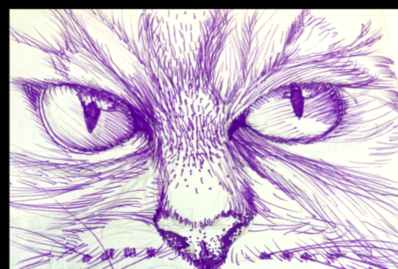
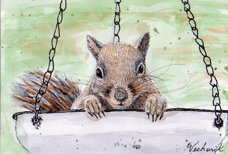
animal textures. We're going to start
with a squirrel. Now I've sketched out just a part of the squirrel
and of course we're not going to fill
in his entire head, but we'll take a section of it. You can see from the picture, the reference photo that
I have here of the score. We're going to work
between his eyes, a little bit above the nose
where we have some variation in the color or the
tone of his fur. So we'll just start by just using some uneven hatching here. Now this is kind of
a combination of short hair and uneven
patching technique for your first layer, you want to remember not
to go too dark with it. We will start filling in a
little bit more again with the short hatching,
uneven hatching lines. Because you don't
want to make it where it's basically
just straight across because we want that
to appear a little darker. There are some examples
of animals that have an abrupt change in tone or value in their hair
for skin color. But most cases,
especially with hair, you want that change
in tone to be gradual. Of course you can, you
can kinda see that where it's darker down here at the bottom where we've
been working and it slowly gets a little
lighter as we go up. The best thing and artists can do is do things their own way. So I'm just giving you
a jumping off point. But it's ultimately all up to you how you
want it to look. So okay. I think you get the idea here. We have a darker
area here towards the bottom and we slowly
started layering it. So it filled in more, takes away more of the
white of the paper, which gives it the illusion
that it's a darker tone. Then as you move up towards the top or as you
continue further up, we have less layering. You can see more white coming
through, so it's lighter. That's the way we can achieve the short hair
texture in animals. So for our next example, we're gonna do some
long hair texture or using some long hatching. So here I've got a dog. And just like before, I've sketched out just some
basic reference lines. But where we're
going to focus on is right here on the
side of the snout. And the areas where you
want it to appear darker. You'll kinda layer
in some lines. And you can see from
what I'm doing here, these are overlapping and
just take your time with it. And the areas that have shadow. Go back over those. One of the things that adds to the realism of your
animal drawing is you'll, you'll learn that
drawing hair is not really just a bunch of
parallel, straight lines. You'll get to a point where
you can draw clumps of hair and then add some effects. There are artists out there that draw all the individual
strands of hair, but that can really
take a very long time. And it just may not be the
look that you're going for. So having some shadows
as a result of the overlapping
clumps of hair or even just strands of hair will help add
to the realism here. So this is a lot like
the other one we did. The more layering you do, the more darker tones
you're going to have. And just need to
be aware either of your reference photo
or if you're just doing this on your own from
where your light source is. So in this case, because we have some
dark tones from the for, over on this side. We could think that the light
source is coming this way. That is long hair texture and
using long hatching lines. So we finished up our demos. So let's do a quick little recap of what we covered today. So we talked about some of the common types of animal
textures out their long hair, short hair, and the
ways that you can go about getting that
effect on your drawing. So you've seen how we
go about doing that. Now the name of the game is just keep with it and practice. It's unlikely that you'll
be able to get your method down exactly like you want
having just done at one time. So just practice with it. Experiment, see what you
like to try and figure out, do you like realism? Do you like a more loose
approach that's less realistic? Do you want to combine the two? It's really all up
to you and what you're looking for
in your drawing. So I'll see you in
the next lesson.
8. Animal Textures Part 2: Welcome back everyone. In today's lesson,
we're gonna be going over the ways
that you can use your mark-making skills to
achieve a curly hair texture, as well as a scaly and kind
of bumpy scan that you may often find on reptiles. So let's go ahead and get started starting with
some curly hair. So for this next one, we're going to do a sheep that happens
to have curly hair, as you can see from the image, got some basic
marks sketched out. So for this one, we're not going to use hatching. We're actually going
to use scribbling. And you can see from
the picture that there's a lot of
different tones here. So the areas where you
want it to be darker, you're going to scribble
more and fill in the, fill in the white of the paper. So we'll just start over here
on the side of his snout. And remember, you can
use a smaller nib size. I'm going to switch
over to my 0.1, and that'll give you
overall a lighter. Now the scribbling is
really all up to you. So here we have scribbling to somewhat mimic the
curly hair of the sheep. And closer to the snout here
is a little bit more in shadow so we can layer
it with more scribbling. And just like with
the other types, we can gradually ease up on
the scribbling so that it has a nice transition from the dark area on the
head here, too light. So clearly darker over
here where we've done more scribbling by layering
it versus this outer part, where you can clearly see much more white of the
paper showing through. So that's a use for
the scribbling method. You don't have to use. You can use one of the other
methods we talked about, which was curved hatching. For really curly animals, this might be a
little bit harder. It really just kinda
depends what you like. You can experiment with
either one of those or maybe you have a
combination of both. So let's move on to the next. So for the last one we're
going to do a chameleon. So the chameleon actually has a couple of different
textures we can work with. And again, not gonna
do the whole thing, we're going to focus
right here in this area, just below his mouth. So it kind of looks a bit
scaly, a little bit bumpy. So for the scaly
part and the scale, the part you could also use if you're doing other
kinds of reptiles. Snake, lots of reptiles
have scaly skin. So whatever you choose to do, you can use this
method for scaly skin. So we're going to stick
with the point 1 mm. And we're essentially
just doing little curves. Now one way you can help with the realism when you're doing scaly skin is not to make
the scales all the same, either the same size, the same arc they have. But variate. Because like I said before, out there in the animal world, there's rarely, as
far as textures go. It's not very often that you'll find the symmetrical shapes. So I'll add to the
realism if you just kind of vary
it up a little bit. Now if you're going
for some realism, kinda hard, this, this drawing
is a little bit small, but once you have
your scales laid out, you can go back in with an
even finer nib if you'd like. And just add a tiny little
bit of shadow of depth, which is something else that can add to the realism
of your drawing. Now, drawing the scales one at a time can be a little
time-consuming. So just keep that in mind when you're planning out your drawing and how you want it to turn out. Now the other part
of this chameleon, and this could go for
other animals as well. If you go further down, start moving away
from the scales. It kinda looks like bumpy skin. So if you remember from one of the earlier lessons we talked about the
use of stippling. So I can start off
with my point 1 mm. And stippling, if you remember, is just a series of dots
randomly placed down. Just like I'm doing here. Still with the point 1 mm. And just like the other
forms of hatching, you can layer it. So areas that you
want it to be darker. You just keep going back
over it with more dots. And honestly, even if
this doesn't mimic exactly the texture of the
animal you're drawing. It's still a really cool effect
for something different. Here we're gradually going
from a darker area with more layers of stippling
to a lighter area. And remember, you can change
the size of the staples. Here I'm using a 0.3 millimeter. So it's going to put
down a larger dot. So there you have some examples of commonly
found animal textures, scribbling for a curly
effect on the sheep. Here, on the chameleon, we use stippling to achieve
that bumpy skin effect. So now that you've seen
these different types, I'd recommend doing some
practice with this experiment. See what works for
you, what you like, maybe what you need to spend
a little bit more time with and see how that works out. So once you have
these basics down for all the other variety of
animal textures out there, you should be able to use
one or a combination of these methods to achieve
other textures out there. So we finished up our demo. So let's do a quick little recap of what we covered today. So we talked about some
of the common types of animal textures
out there, bare skin, scaly skin, and the ways that you can go about getting
that effect on your drawing. So now that you've
seen these techniques, the best thing you
can do is just go out and experiment and practice. That's really the best
way to get better at getting the more realistic
look to your drawings. I look forward to helping bring everything together
in our final lesson. So I'll see you in the next one.
9. Conclusion: Hi everyone. Glad you joined me for our final lesson where
we're going to just bring everything altogether and
just kind of quickly go over everything that we've
covered in this class. So we started off talking about the background on
the pen and ink medium. Then we moved on
to talking about the tools that you can use
to apply ink to your paper. We talked about the types of paper that would be best
to use pen and ink on. We talked about fine liners and nibs and nib sizes
and how that can affect your drawing and your art elements that you want to put
down on your paper. Thick, thin, fine
details, larger details. And then we got into
a big discussion on hatching, scribbling
and stippling. Hatching being comprised of
several different techniques. Short, long, curved,
uneven, flowing. And then we talked about
scribbling and then stippling, which is just a series of random dots that you place down. And all of these
are tied together. And you can achieve
different levels of value with each of these types
by the use of layering. Layering being the way that you can achieve a darker area for one of those types or techniques of mark-making
on your paper. And then we brought it
all back around to what you signed up for this
class for animal textures. And we did a demonstration on the use of short hair
with short hatching, then long hair with some long hatching than
we did curly hair. And then we did
scaly or bumpy skin. And we also stressed
that you can achieve different effects by using more than one of those
techniques together. Short hatching with
some stippling, long hatching with
some curly hair. It's really all up to you and that's why I've
been stressing to experiment and
just practice with these techniques that you've
learned during the class. So now that the class is wrapped up and we've gone
over everything, I'm looking forward to
your all's class projects, so make sure you get
those done, post them up. I'm very excited to take a
look at them and see how much you've learned throughout all the lessons that
we've gone over. And as always, I'm
available if you have questions or need some
help with something, just post them up in
the project section. Thanks everyone for making it through to the end of the class. And I look forward to seeing
you in the next class.
 Carl Wilson, Pencil, ink, and paint artist