Transcripts
1. Introduction: For the longest time,
composition, to me, seemed almost like a
mysterious black box, no entrances and no clear
way to see what's inside. For sure, there was always
the rule of thirds, which a lot of us have heard of, but I always felt
like there was maybe more that I was somehow
not understanding, lacking or just
didn't know about. Turns out I was right,
and there is so much more to composition than
the rule of thirds. Today, in this class, we're going to look at some of the many aspects feed into
composition and that helps us create art compositions
that feel impactful and convey the kinds of emotions and messages that
we want to communicate. Hi, my name is Marinel Worm. I'm an artist, illustrator, also a top teacher
on Skillshare, where I've taught more than
90,000 students to tap into your creativity in
ways that feel more free, more fun, and more fulfilling, but also while building skill sets that empower
you in your art. That's what this
class is about today. We're going to be looking
into art composition. Whether you've taken my other art composition fundamentals in class or you're starting
out with this one, they both build on each other. They're complementary
in whichever order that you like so
that you can really understand what it is that underpins compositional
principles in powerful artwork. Going to look beyond
the rule of thirds to really understand the
importance of shapes, how they connect to value, flow, which is a path that your
eye takes within a painting, and the most important
thing in my books feeling. Because yes, feeling is something that we
think of maybe last, but if you start with it first, I think you'll
notice a huge shift in the kinds of artworks
that you create. Feeling is, to me, at the root of the most
powerful and impactful artwork. So we're going to look at all of those aspects in a
few different ways, looking at past and
current masters, artists, and illustrators who have
created beautiful illustrations and who use these principles
in a very purposeful way. We're going to break
down what they're doing. And then we're going to get out some scissors, some paper, and do some cutouts, playful exercises where we're going to create our
own compositions. We're also going to
brainstorm a personal piece, work on thumbnails that bring together all the
things that we've learned to launch us off on this journey of creating the kind of artwork
you want to make. This is really more
of an exploration and a journey into learning
these principles so that you have these tools in your backpack the next time that you want to
create your piece of art. And the good thing
is, we're starting off on that piece of
art in this class. So I hope you join. Quick note, this is a slightly different format than I usually do because
it's actually taken from my cozy
little art cafe on Patrion where I do
live classes every month, and this is one
of those classes. But I hope that you'll
enjoy it just the same, and I can't wait to
see what you make.
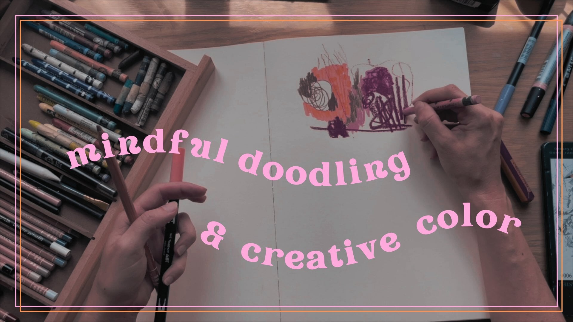
2. Class Structure + Materials: So, hello. Today, we're embarking on an exploration
into composition. As you know, composition
is a subject that I love that is vast. And we're going to look at it through a few
different lenses today. Of course, you can't learn
everything that there is to know about composition
within one single session, but we're going to try to get a few of these principles that can be really helpful when you're trying to create
your own pieces. We're also going to look
at some artists and illustrators and see kind of what it is that
they're doing, the principles that
they're following, and what we can learn
and take away from what past or present
people have already done. And then we're going to do some playing with I have a few, like, creative composition
exercises for us. But I will say that
in the beginning, I have a presentation, again, where we're
going to be looking at illustrators and other artists. What I would suggest is that in the interim or while I'm
doing that presentation, of course, you're
welcome to look at the images, listen
to what I'm saying. But you can still already grab some art materials and
just start playing. Today, what we're going
to do in terms of the exercises is more going
to be black and white, so, you know, like graphite
or color pencils or markers. So if you want to have some color, this
would be the time. Enjoy the color mixing, that kind of stuff so
that we can then embark on really the composition
explorations that we're going to are going to do
maybe a little bit of color in one of the
exercises, but we'll see. So yeah, so you can bring
out your sketchbook. Oh, and by the way, it
would be good if you had either a piece
that you've done in the past and that you're
not very happy with or an idea of something that
you'd like to create. And maybe you have a
thumbnail or two or maybe you even have just
one little snippet in your sketchbook
that you're like, Oh, that's a fun
little character or that's a fun little tree. I'd like to build
something with that. So for the exercises that we're going to do, it would
be good to have that. If you don't have any of that and you're like,
Oh, I have no idea, then you can also take this time during the
presentation to kind of just think of something you might want to
explore in a drawing. And I would actually recommend if you don't have an idea to go
with something simple, you know, it can be something
as simple as, like, Oh, well, I'd love to draw a
beautiful tree or I'd love to have one character
drinking a cup of coffee. I don't know. You know, something really, really simple. The materials that
you're going to need for this class are pretty
straightforward. All you'll need
is some scissors. A few markers, one that's
black, one that's mid gray. You could also use paint. That's a totally
feasible option as well. Paper so that you can
cut out shapes on, and then maybe a sketchbook, as well as a graphite pencil. And if you want, you could
also have a few colors as I do invite you to add a little bit of color
right at the end. So that could be
colored pencils, markers, whatever
you have on hand. There's really no
obligation here. Other than that,
I hope you bring your curiosity cap your
backpack with everything that you've learned up
until now and a spirit of adventure to embark on this
composition journey together.
3. What Is Composition?: So I called this
exploration sorry, exploring composition,
shape, flow, and feeling. But of course,
there's a bunch of other things that can
go into composition. And so I guess what I
wanted to say is if you ask people what the
definition of composition is, most simply or the
most common answer is it has to do with
the arrangement of elements on the page, right? It's like, how the
image is built. But actually, the more you
look into composition, and the more you realize that it's not just about
the arrangement. And actually, it's
about choices, whether those choices are
intentional or unintentional. So everything that you put into a drawing participates
in the composition. The choice of
subject, of course, the shapes, the lines, the colors, the line quality, the textures, all of
those are really kind of the structure that
brings forth the drawing. And so the thing with that notion of composition
being a little bit bigger than just the arrangement of shapes on a page or
elements on a page, it means that it can sound very overwhelming because each single choice that you make is going to kind of influence
the composition. But I rather see it more as opening a door into
a vast landscape, something that allows
you to kind of discover something every time that you visit the subject
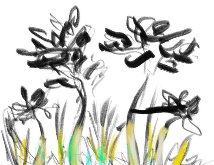
of composition. That's how I like to see it. I wanted to share with you just this illustration of mine, which I'm sure you've seen
before because it's one of my favorites of a
greenhouse that I made, and I did it all
with the brush pen. What I want you to notice what can you tell
about the composition? If you look at it, it's
actually very simple. I have one huge black swath. I have one sort of band in the middle that
has a lot of texture. Yes, there are plants, and
yes, there's a greenhouse, and you can see that
there's a difference between those two things. But if you kind of squint, they all have a similar value. Do you see that? And then you have the white
space at the bottom. So this is really a very, very simple composition that
is basically three values. And what I want you
to understand is that powerful compositions
use simplicity. That is really the
core principle that underpins good,
powerful compositions. Not to say that there aren't other ways
that you can do that, but I will say that often
we try to too complicated, and that's why we get lost. We look at our drawing. We're like, I don't really
know why it's not working, but there's something
that's not working. It's because we've maybe not simplified it
to its essence. What is your drawing about? So, like I said, composition carries absolutely all the
choices that you make. We did actually do, like, a pretty in length
composition session, but I think it was like
maybe two years ago. And I was thinking that
it could be fun to revisit it again more like recently with absolutely
every single principle that I've heard of, at least, even though
there are many others. But I'll just give you
a few little elements or little words that might kind of ignite things
that you've heard before or things that you
might want to explore. I'm not going to say them all, but I said it earlier,
shapes, color. Of course is also a
compositional tool. Line quality, rhythm,
framing, edges, contrast. And then, et cetera, et cetera. I'm not going to name them all. Those are the ones that I
just wanted to evoke today. Contrast is actually
the one that I think at least the way that
I've integrated everything that I've
learned about composition. It's the one that's
kind of the most important in my books, and contrast is
something that can be used in many,
many different ways. So I was thinking,
also, we could do a whole session just on
contrast. That could be fun.
4. The Power of Simplicity & Flow: So simplicity carries power. That's what I was
trying to show you with that illustration
that I made. It's still a dear favorite, and I think it has a powerful composition
because of its simplicity. But we're gonna look
at other examples of people who have used simplicity as a core tool of their paintings
or illustrations. So Felix Valeton, one of my favorite masters
from the past, and he has a lot of different
types of paintings. I mostly love his landscapes, but he does have obviously
some paintings of people. And this one, I thought was a particularly perfect image to show how powerful
simplicity can be. Look at the structure
of that painting. It's literally just one
big black block and then one light block with a dark line that kind
of separates the two. If you squint at it, you don't really see the face of
the person on the right. You can kind of see a little bit of lightness that's coming out where it's the face
the half face of the guy, and you kind of see
that hat a tiny bit. But if you zoomed out even more, it probably would look just
like one big black block. And then you have
that light band and then the dark band
underneath. Very simple. But it's very powerful.
And I don't know, for me, you can tell me what
you think, but I sense, like, a lot of for me, it's a very lonely painting. I'm imagining that it's in
some sort of context of, like, a concert or something
like that, where, you know, people are like, W you
know, in their boxes, looking at the classical
composer, whatever. And there are two characters, but they're not very connected. And the simplicity and
the starkness of the composition kind of participates in this sense of loneliness, because there's a lot
of spaciousness in that dark section and
in the light section. Okay, let's look at
the one underneath. James McNeil Whistler
classic painting. I absolutely love this one. I don't know if you know it, but it's one of my favorites, and it looks way
more complicated, if you look at it on
the surface level. It also looks way more abstract. It's actually not entirely abstract because I should have written down
the title of it, but it's something
like lights on a ship or a bridge or
something like that. And if you actually
look closely, you can see a character
at the bottom there. But for me, there's really
this element in Whistler, where he really loves just abstraction and
mood and feeling. So let's look at that one a
little bit more precisely. One of the things with
composition is values. That's a very, very important
part of composition, and values are, you know, the lightness or the
darkness of a color. So if you strip this painting of all its color, this
is what it looks like. And you can see that again, yes, it's got a little
bit more complexity. There's a lot of texture, and there's some, you
know, value transitions. But if you squint at it, it's actually really simple. Again, it's one big
dark swath then there's a white line and then another white line that
goes up and then it curls, and then there's maybe another
white line up at the top. Do you see what I mean? So
it's really the abstraction, the abstract shapes that are underneath paintings
that have to do with the value
structure are what make it really powerful and
interesting to look at. You have this path so do you see how in
Whistler's painting, there's really this
sense of flow. And when I just used the
word flow because I was meaning it as your eye
flows within the painting. And I think this is a really perfect
illustration of that. You really have, you know, within this dark mass, you have a lightness
that you follow, and then it kind of curls over and then it goes
back down again. So composition is also about that path that your eye takes. But again, let's get
back to some simplicity. I want to remind you
that color is not the be all and end
all of all things, even though we all love color. I spent three years doing only black and white
work with the brush pen, and that's why I think I
was able to, in the end, create this piece because
I spent so much time just working with two
values black and white, and then the textures that can create these in between grays. So one of the practices that you can really
do to increase your compositional skills is to allow yourself to explore
black and white work. To create finished pieces
in black and white. This is an example of one of those pieces in black and white. Very simple. Again, do you
see the structure of it? Do you see how it's
again, just I mean, it's slightly different than the ones that we were looking at, but you really almost only
have two values in this one. You have a third, of course, you can have a your eye kind
of still travels within the space in a really
interesting way because the outline of the
house isn't completed. Do you see that? But
your eye goes from the side of the house
to the characters. And then maybe it
looks at the texture because all the grasses are pointing in one direction that point you
towards that texture. And then back at the roof
and at that little window. The window is really the
first thing that I looked at, and then the second thing that I look at is the characters. And because of the way that the big shapes are placed here, there's something very ominous. Most of this piece is dark, but then not only that, it's also very textural
in that darkness. So there's something
in that that also conveys look at the white space, how it really, if we just
took it as two values, you would have basically
that dark band at the top. You would have the white of
the house that continues, and then you would
have the bottom hill. But do you see how
that white space, it actually goes from big to the left to
small on the right. There's a what's the word? A compression, like a
thinning out of that path. And if you actually
bring in the texture, really the only space that
has light is in that left part where it merges with
the house and the window. And then the rest is
more of a mid tone. It's almost like your path
is closed towards the right. And in the western world, we read from left to
so even simple things like that of, like, Oh, space got closed off
on the right can have a significance and a symbolism that you feel when
you look at it. There's an entrapment that's
happening in this image, and it's very striking with the characters and the
alignment with that window. And it's just this house
and these characters. Let me know if
you're seeing this or if you're struggling
to see it or if there's any other
things that you saw that I didn't don't hesitate
to chime in.
5. Structure, Framing & Grouping Values: So this is a piece of mine that I also wanted to show
you to, I guess, really drive home the fact that black and white work can be finished pieces in and
of itself and that you learn a lot in terms of
composition when you do that. This is actually a
watercolor piece that I made a while ago. It's actually still a
dear favorite of mine. I was really obsessed with
clouds and storms at the time. I was doing a lot of
work around that. And so that's what
I wanted to do. I wanted most of my painting to be about the
storm and to have a house there also kind of ominously connected
to the storm. Again, though, if you
look at the structure, it's very simple, right? It's much easier to
look at it when you're looking at something that's
already in black and white. You can see that simplicity
in the structure. And that's kind
of what we try to aim for even when we're
doing color work. So also gaining an added
awareness of the values of our colors is going to contribute to being able to create the kind of
compositions that we want. Speaking of color,
here's one that actually and I didn't notice
this right at the beginning. It's after as I was doing my presentation, I
was like, It's funny. There's actually a lot
of similarities in terms of the structure to my piece. So do you see how my piece, there's a lot of this ominous
space with the storm. It really takes
out up everything. You also have the scary sort of haunted house kind of thing. But you have the opening
on the white side, on the right side
with the light. And then it connects back up to the cloud and then
back to the house. So you kind of really
have this sort of triangular almost structure. More circular because
all the shapes are more circular and organic. This piece by Mary Blair also has something a little
bit similar where you have this big swath of darkness and it ends up being
lighter on the right side. And in this piece by Mary Blair, what I love about it is, I mean, not only the color palette, Mary Blair is she's an illustrator from the 1950s.
She was very well known. She worked for Disney,
incredible work. And it's clearly a journey. There's a journey theme here. And so thus that
opening on the right really kind of builds
into that message. And yet there's
something still very ominous because of
the darkness of the tree and kind of the entrapment of the
character within that tree. So in some sense, it's like it's not
just an entrapment. It's also a framing device. And that's what I also
want you to think about when you think
about composition is framing is very important
or can be used in ways that will serve the message that you're trying to convey. Here, everything helps you focus in on that blue character. Do you see the value
structure of the tree? Yes, there's a different
color in the leaves than in the trunk and also in the
plants that are in the front. But do you see that they're
all the same value? If you squint, it would look
like just one big black sa. Obviously, there's a
little bit of variation. That's the thing that's
tricky about explaining this is when you're trying to get a sense of what
the simplicity is, there's something
called grouping values. And what that means is
you take values that are next to each other
and you compress them, and you establish that
those are one value, even if in reality, it's not exactly one value. And especially if you're
looking at, like, you know, paintings from the
masters, where there's, like, constant value shifts. But if you look at
the value groups, you'll always notice
that there's a very, very simple structure behind it. And that's why you know, I don't know if some
of you have taken my Skillshare class
about composition, but it's one of the
reasons that my first Skillshare
class on composition, I decided to focus it on
the notion of no ten, which is the balance
of lights and darks. So black and white
two value studies. That is how you kind of
learn to compress values, and it's how you learn to read images that will in a
way that will help you because you'll be able
to understand what's going on compositionally it'll help you look at your own images and read what's going
on compositionally, so that you are no longer
looking at a piece and like, Oh, it's not working, but I'm not sure why. But so you look at
it and you're like, Oh, yeah, of course,
it's not working. My value structure is way too complicated
in this section. It's pulling me away
from the focal point. What is my focal point? What is it that I want to call
attention to in my image? So it's by learning to read images that we can also
better build images. And so that's kind of also why I wanted to have us look at
some of these things today.
6. Interesting Abstract Shapes: So one of the things that you'll notice is that a lot of the
images that I've shown you, not all of them, I mean,
with some variation, of course, are high contrast. So there's a big
difference between the lightest lights and
the darkest darks, right? This one is a perfect example. This one, not so much. It's a little bit,
but that first one by Felix auto also very,
very high contrast. Mine is pretty high contrast. Mary Blair, definitely
high contrast. So if I had to simplify
these with just, you know, two values, it would be one very dark value and
one very light value. And I will say that's a very
simple trick. Very simple. Super simple. That you can
use in any of your drawings. If you use one very dark
and one very light, then it's going to already
have a stronger impact just because you're
automatically creating contrast through that value. That being said, low
contrast paintings can still carry the same principles
that I explained earlier. And the low contrast
paintings bring in a different flavor,
a different feeling. So, this one is
still, I would say, on the higher contrast range, but we're edging towards
slightly lower contrast. It was too beautiful
not to share with you. I love this illustration by Monica Berngo,
amazing Illustrator. Look at the abstract shapes that you're seeing.
Squint at the image. Actually, you know
what? I'm going to do something just very
quickly so that you can kind of see what I'm talking
about. See how tiny that is? Okay, I'm going to go
through these again. So you can see Looking
I actually use Procreate like this at a lot of times when
I use digitally, I'll take my own drawing that I'm making and
I'll make it tiny. So I can see what
that structure is. Do you see how with
the Whistler painting, how you immediately see that path that I was talking about, now that it's much
smaller, the house. You see it very
simply. Even this one, mine, Mary Blair's. There's a very, very clear
thing that's going on. Look at this illust if you
look at it very small and if I hadn't even showed you what it was, would you know
what it was about? You'd have no idea
what it's about. But somehow it's interesting because the shapes
are interesting. The value structure
is interesting. There's an abstract
shape that's roundish, but it goes diagonal
and kind of curves, and then it gets smaller, and
then the rest is all pale. So it's really cool. I mean, if you have Procreate, I think it's a great
exercise to do this with any painting that you like or any painting
that you've made. But then, of course,
when you look at it more closely,
you're like, Oh, oh, it's a lady who's
sitting on a chair and she has two cats or sorry, three cats, and they're kind of all She's
like a cat lady. And you can see that the dark shape that we had no idea what it
was, and it just, like, kind of squiggled not only
is it not just the dress, it's the dress and the cat. And that's okay,
the fact that it is both things because
the structure of it, the abstract value
structure is interesting. So squinting, and
the thing is when you start squinting, I
think in the beginning, it's kind of we're
so used to with our brains to latch onto details and to try to read
what's going on, right? That's just what our
brains automatically do. So when we want to better understand art and our own
art and other people's art, it's like we need to train our brain to not
see the details, to not try to read
what's happening, and to look past that into what is that abstract
structure underneath. And so when you
squint, I remember in the beginning when I
started squinting, I was like, Well, I don't know. I'm not sure what I'm What I'm looking at or
what I'm seeing. Now when I squint, I'm
really able to say, there's this shape over here, there's that shape over there, and it's a very useful tool when I want to work on my own.
7. Simple Values + Leading Lines: Okay, this is a piece, however, with much lower contrasts than the ones that we
looked at previously. This is by Mark English. He was an illustrator
from the 60s and 70s. Beautiful work, very,
very powerful stuff. And the values are much
closer here, right? There's nothing that's really, like, ultra bright white
or ultra ultra dark. You can really get a sense
of that if, let's say, you take it on
Procreate and then you try to put a
super bright thing, like a bright white or
dark color somewhere. That's when you really
see like, Oh, yeah, okay, this is really
low contrast. But the thing is also, our
eyes get used to whatever the contrast is within an image
or within an environment. So even if the painting
itself has low contrast, we read in a similar way that we did the
high contrast ones. We see the differences because that's what our
eyes are meant to do. They see the differences
between the light and the dark. And so it'll seem higher
contrast than it is. I hope that kind of makes sense. So what I did instead is I just put it in black
and white so that you could kind of see how low
of a contrast image it is. It's almost and you know
what? Why don't we do this? You can look at it
in tiny and you can get a sense of how
low contrast that is. But do you see that
there's still a very, very simple
underlying structure. There's a dark band on the left, there's a dark
band on the right. There's some sort of texture like slightly darker
at the bottom, and then there's a lighter.in the kind of middle
top. Do you see that? So even when you're looking at low contrast paintings,
if they are done well, it's because they
have maintained very simple value structures and an interesting path
for your eye to follow. Look at the little boy with
the stripes because that's a big contrast from
everything else that has kind of
these smooth shapes. And I also look at the
teacup that she's holding, and then the white
shirt of the boy that's behind the boy
with the stripes. And then my eye kind
of goes back down to the stripes and then back
up to the teacups, you? So you see there's
this very simple path that your eyes following. But there's also even,
and I didn't mention it, but there's that light
spot at the top right, and that kind of gives us a
little bit of breathing room. So kind you do at some point kind of look at that
and you're like, Oh, did I go back down. Go back up, go back down. And that's kind of what I think constitutes really
the strength of good artwork is it invites the viewer to spend
time within the image. There's nothing that forces your eye outside of the image, whether intentionally
or unintentionally, usually unintentionally. It's really like, Oh, there's
this thing to notice, and there's this
thing to notice, and there's this
thing to notice. But all brought together with that super simple underlying
abstract value structure. Here's one more low contrast
painting from one of my favorite living artists who I also met and who's
a friend of mine. Now, her name is Andrea Kolova. Incredible artist, if you
haven't seen her work. Just such beautiful sensitivity and mastery of color and light. It's such a sensitive,
beautiful image, and it's got a very pretty low contrast
underlying structure, if we look at it in
black and white. But again, do you see the
simplicity in the statement? It's almost only
two values here. 11 mid. I wouldn't even say really
that there's three. It's really more like two. There's a big shape
in the bottom half, there's those
interesting shapes of the fence and the
birds all connected, all that same value, and then
the mid, which is the sky, but also the spaciousness brought in at the
bottom in the grass. Again, you just have these very interesting
paths that you can follow. You can even see that within
that big space of dark, bottom, there's some lighter
elements in the middle. Do you see how they're
kind of that stick? So there's the fence and then there's a stick sticking out. And that stick kind of points to that section
with all the texture. Do you see that something
called leading lines? And that's another
principle of composition that we haven't gotten
into deeply, but we could. You could spend a whole
session just on leading lines. Most well composed images have these lines that lead
your eye in the ways that the artist wants
you to in the ways that serve the message
of the painting. Oh, sorry, I didn't
see your message. The small areas areas of light of the cups and clothing
are very interesting to me. Yeah, you're talking
about this one, right? Yeah. I think it's
absolutely stunning. Like, the cups really
just draw you in. It's funny, isn't it? And
the lady holding the cups, she almost disappears
completely into the background. It's a fascinating image. R one of my favorites. So, yeah, I hope you get a sense of how you can look at images in a way that helps you see compositional principles
that are working.
8. Feeling as a North Star: Here's another little
thing. So again, I keep talking about the
abstract value structure, and it's one of the reasons
that I love abstraction, like even just drawing
and painting abstraction. Abstraction teaches you
about shapes and about interesting shapes and about the path that your eye
takes within the image. So you can do the same sort of exercise with
abstract work or with your own abstract
and I know that I have learned so much
in doing abstraction. I did abstraction for many, many years, especially
at the beginning. Then most of my work
is semi abstract. And then now I do a mix of
figurative, illustrative. But abstraction is
always a part of my art practice because
it's just it's ah, Yeah. It comes back to these beauty of shapes and how your
eye can be intrigued by shapes and textures and the sizes and scales
and the textures. So this artist, Miseto Suzuki, love her work,
especially the one on the bottom is one
of my favorites. And you can already just see how she's building
contrasts between these sort of very
distinct flat shapes of different colors
and then all the, like, intricate textures that are happening at the bottom. But if you squint again,
let's make it small. Let's make that one small. Let's look at the
value structure. Actually pretty light all over with one black section
at the bottom left, one black section kind
of in the middle right, and then one little black line. And so you have this kind of triangular thing
that's happening. And most compositions
that really work have very simple shapes in terms of the path of eye the path
that your eye takes. Speaking of shapes,
Shapes, inform, feeling. This one's a really,
really important one. The way that I like to start any image or compose any image, and I think it's such
an automatic thing for me that for a long time, I didn't realize
that that was, like, a thing that I was doing is that I think
of feeling first. To me, it's less about what
it is that I'm drawing. And of course it is. Of
course it is, you know, there are things I
love to draw and things I don't love as much. But if you have a feeling
that you want to convey, it really gives you a Northstar
for your entire piece. So there are a lot of ways that the different visual elements
in your image can inform feeling or can be represent or can represent feelings.
Shapes is one of them. There's a great
book by Mali Bing called How Shapes Work, I think. That's what it's
called, where you start to get a sense of
how powerful this is. But what I'll do is I'm just
going to share two images. Some of you might have seen
these before that I think really show how
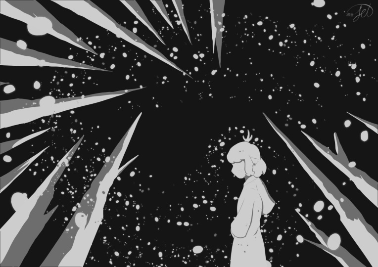
powerful shapes can be. So the top one by Arnel Woker
and at the bottom one by Rio Takamasa both beautiful
illustrations, very simple. And I also wanted to
in the presentation show you that even with
very simple shapes, you can create very
powerful drawings and powerful compositions. So both of these have a very strong shape
language in each of how would you
characterize the first one, the top one by Arnel Wilker? How would you describe the feeling or adjectives
or I don't know, whatever? For me, there's a sense of calm in that image
in the top image. Languid has also that
same connotation. There's something very stable and something very
cozy about it. There's also something more
akin to something daunting, but it's funny because
all the other things, the coziness, the
languidness kind of balances that out
and brings that down. And then it invites
more into that, like, Oh, wow, there's
a big world to explore. There's something really
adventurous but cozy about it. So, I want to break it
down a little bit later, but first I want to talk about now the image on the bottom. How would you describe that one? What are the words
that come to mind? Intense? Yes, absolutely. Vastness, so awesome. I love everything
that you've said, and I agree with all the
descriptors that you've given. I would add another one. I would also add scary. For me, there's something a
little bit scary about it. Dangerous. Yeah, there's
something dangerous about it. And why is that?
Where does that sense of danger come from?
The pointy lines. These images, I think, really just show so beautifully how shape
works with our psychology. Pointy lines, whether they're trees or tree shadows
or anything else, we automatically have
a sense of danger, and a lot of pointy lines
increases that danger. But the funny thing
is, is, like you said, there's also a sense of spaciousness in this
image of endlessness. There's also this
weird sort of tension of between those two things
that seem paradoxical, right? And both the images
that we looked at have a sense of adventure, but they have a very
different feeling. And the one on top
on the top left, the coziness is brought in by all the roundness of the shapes. Edge of the water. Everything is all round and smooth. Some of
the trees are round. Yes, there are
some pointy trees, but the value of those trees are actually the
same value as the water. So that shape isn't as striking. There's only the one on
left that kind of pops out and that maybe gives that
little added sense of Oh, wow, big world, which we were also talking
about in that one. Both of these images
feel detached to me. Yeah, very interesting. I agree with you,
and I think that has a lot to do this
is just my theory, and you can tell me what your theory is as
to why that is. For me, there are two
elements that are participating to that
sort of detachedness. And the first one and the biggest one is
the point of view. So do you see how the point
of view is, like, we're like, way above we're super far
away from the character, so the fox or from the train or the people
in the train that you're, you know, supposing
are in there. So there's, like, really
kind of this like, Oh, we're not really part of it. We're observing it. And so
there's that detachment. The second thing is, I think the thing that
connects both of them, that endless spaciousness
also somehow creates a sense of slight detachedness
because they're both very smooth and
it's not very realistic. I could be wrong about that one, but that's how I I see it. Yeah, so you think it's
the point of view and the focal figure
is tiny. Exactly. So that goes to show that
even compositionally, the choice of your point of view participates in
your composition. If you want to show the
emotion of a character, you cannot have a point of
view that is this far away. You can convey feeling in a different way,
like we did here. We're conveying, you know, a feeling through the landscape. But if you want to
convey a feeling of a specific character, then you probably need to be a little bit closer
to your character. It's funny. Like, that's
why I kind of talked about it because I realized the more I've learned
about composition, often it's not something that people talk about
at the forefront, whereas, for me, that's
always been at the forefront. And people usually usually
they talk about it kind of afterward or as a consequence of all the other
choices that they've made. But I find that when you
really try to work on, let's say, an abstract
piece, and you're like, Oh, I want to create an abstract
piece that feels sad, that will automatically
lead to different types of shapes than when you're creating an abstract piece that ful. And yeah, I would invite you
to do that exercise, then, because starting with the
abstraction is the easiest way. It's also the hardest, but it's also the easiest
because you don't have the distractions of what it
is that you're representing, and you're just thinking
about the shapes, the textures, the placement of those shapes in your page,
and what that conveys.
9. Planned or Intuitive: Same Principles: So what I did want to mention is everything that I've
been talking about today has been talking about
kind of building a piece intentionally from
the bottom up, you know? Like you might have an idea, and that's kind of what we're going to do with some
of our brainstorming, all the little exercises,
that kind of thing. But I want to make sure
that you know that all these principles apply even if you're
working intuitively. So you'll know that
most of my work that I've done has been intuitively. And what I mean by that is most of the time, I come to my sketchbook and I have no
idea what I want to draw, and I just start making marks. And as I make marks, I have different ideas
or things that come up, or I'm just enjoying playing with the marks and
seeing where it brings me. All those principles that we
talked about compositionally apply even if you're
using that method. It's just more challenging
because you're not thinking of it
from the ground up and you're having to
constantly adapt. Shift and observe what's
happening and kind of dialogue with yourself in terms of what's happening
compositionally. So I just wanted that to be clear that all these
principles can be applied no matter
what the method is that you use to make your
10. Start Your Project: Two Value Puzzle Pieces: So here's what we're
going to start out with. So I want you to grab, This is just a random page that
has, like, some texture on it, but grab a piece of paper, or you can rip it out of, like, a cheap sketchbook,
if that's better. So I'm going to
actually just rip this. Okay, so we're going to
take a piece of paper, and you can either use
paint or a marker, but I'm going to
ask you to simply, and maybe we'll cut it
in half one more time. And one of these sheets, I'm going to use a marker
because that'll be the easiest, and I'm just going to
cover all of it in black. It can be a dark gray if
you don't have any black. And you don't have to go
all the way to the edges. It's just so that
you have, like, a big black shape. That's
a permanent marker. Oops. Alright. With
my second page, I'm going to actually
do kind of a mid gray, and maybe that's
not dark enough, so I'm going to go a
little bit darker. To say, my gray is
more of a purple. I need to find, like,
one that is It's okay. If there's a little
bit of a tint to your color, it's not a big deal. There we go. That's a better
mid gray. And you might be doing this with paint. That's another option, gouache
or something or acrylic. Something that
dries fast would be better than let's
say watercolor. But a marker is a
great alternative. Obviously, it's not perfect
because you see, like, the marks, and actually, like I said, my paper wasn't white. It has a little flex in it, but whatever, it's fine.
It's not a big deal. And what we're going to do
with our two little sheets of paper is we're just going
to cut up some shapes. And some of these can be a
regular shape, as in, oh, I want to cut a circle or
rectangle or a triangle. But you can also have
just weird shapes, okay? So we're going to
do a bunch of them. And I want you to actually have different sizes
of shapes, okay? So right now I'm making
mine quite small. Doing a rectangle. But
I could then just make also some weird blobby shape. Maybe I can make a tiny
triangle and not an Iosles one, like, something a little
different like that. And you can even,
like, you know, because you have shapes that are kind of cut
out already from, like, what you cut out, you
can even use that as a shape. So, you know, this is, like, some sort of weird line
with, like, a ridge in it. Um, this one is a blob, but a geometrical blob with,
like, lines, you know. But then I also maybe want to
do something a little big. Like, what if I did one big
shape over here like this? Oh, sorry, I realized you
can't see what I'm doing. Here you go. Like, what if I
did a big shape like that? Or big shape like that. I know we don't usually do cutting in our live
drawing sessions, but I thought today it
would be fun to do this. You know, you could also
have straight lines, more triangles. Let's do one last one over here. Okay, I could keep on cutting, but I'm just gonna leave
it at that, basically. And we're going to do the
same thing with our midtone. You can keep all your
tiny little parts. It's good to have a
big range of sizes. Okay? And I mean, actually, I could have gone even bigger, but that's okay, or you
can go even tinier. So these are my
little black pile, and I'm going to do the
same thing with my gray. Oh, I might put in a
triangle and circle. Maybe I'll make a circle
that's slightly bigger. You don't need to be a
perfectionist about it. Cutting circles is hard. If it looks kind of like a
wonky circle, that's fine. Remember to also have
tiny little shapes. You know, you can even just
cut little things like that, thin lines, make some blobs. Maybe I'll make
one really big one that kind of more
geometrical stuff. I can make more if I need more.
11. Puzzle-Piecing Your First Composition: So now we're going to go back to our sketchbooks and just
open to a blank page. I'm going to just make a
few rectangular things they can be vertical
too, if you want. If you want to explore that, but I think something like that. 'Cause the thing is, you
know, with composition, like, we often resort to rectangles, but you can also make squares. That can be a fun
switch in composition, and that makes a big difference in your composition, actually. So now we're just going to play around with some
of these shapes. And so what you'll
notice is, of course, you have the white of the page, which is your third value, okay? And so the cool thing here is that we don't
have a subject, and we're really just kind
of playing around with, Oh, what if I put these
shapes down on my page? It doesn't matter if they stick out the sides,
that's totally fine. You can do it in
different sides. Then look at the thing
that I've been doing here. I've been doing each shape
kind of individually, right? Who said you had to do that? You can overlap shapes. And kind of see, well, wait, what does that do if
I overlap a shape? And if I change its direction, and is there something
interesting? Something that just captures
my attention where I'm like, Oh, that's kind of cool. Oh, I only used one value here, but what if I actually come
in and add a few more? Or what if there's a shape
that I think of and I'm like, Oh, wouldn't it be fun to
add a little shape here? You can try to see if
it gives you ideas. So for example, I had
this on the side, but then now when I
put it like this, it reminds me of a tree, sort of wonky sort
of tree, right? What if I had a little sun or something and you can experiment and be like,
Oh, what if I add that? No, don't like that. What
if I add it over here? What if I add a little bit more? Oh, I know. I'm gonna use
some of these mid grays. And I just want you
basically I want you to allow yourself to fall
in love with shapes. For me, I think that's really what art is about is shapes. And when we allow ourselves
to fall in love with them, it just like everything becomes just a source
of endless curiosity. Okay, I'm not sure I
like that one there. What if I added it over here? What if I connected that? What if instead of my moon? And do you see what I mean? I decided that I would have
a moon or a sun over here. I'm not staying stuck
with that idea. I'm still allowing
myself to play. Okay, well, what if instead
this is like clouds, gigantic cloud. Does that work? Kind of works, but not
as much as I'd like. So this is really
just reconnecting with a sense of playfulness, and I think that's
really my bottom line here is composition can be something that
you can play with. I'm pretty happy with that, but something bothering
me over here. Maybe you would
if I add a little bit more detail over here. Oh, that makes it much
more interesting to me. Okay. So once I
land on something, then I think it's fun to just kind of contour
what I'm doing, 'cause, of course, these
shapes are imperfect. Or maybe you think
they're perfect. In which case, you can
just glue them down. That's also a total possibility. But I just like
simplicity of this. Okay. Those ones
are out of the way. Okay. And what's interesting
with this is, you know, I'm doing the outline
of this whole block, which is a mix of my very
dark color and my mid. But then I can
remove the mid ones and then outline my dark ones. And I kind of remember
what's right. So this is basically
my structure. Oh, and in this, they
touch, but in my original, they didn't touch, so I could just adjust that
when I'm doing it. And then I can just go in. I put this a find in my page
so it doesn't bleed through. And I can go back in with my marker and just fill
in with the same values. Oh, this one's darker. Oops. Man, you should write
down which colors you use? 'Cause I just screwed
mine up. That's okay. Okay. This is the
one. We'll just say it's a little bit darker
than what I intended. This was also kind
of a mid tone, and then we had
black. Over here. And this is a
really fun exercise when you're not sure what it
is that you want to draw, and it can give you
ideas of things and feel free to kind of change the shapes
a little if you want. So I'm going to make my trunk
a little thinner, maybe. But I do like the shape of that make it maybe
a little blockier. Can give you an idea of
something to work with. And you can at any point because you're the
one in charge, right? So you can at any point, add things, modify
the shapes a little. So I don't know why
for some reason, I want to add a swing here. I just feels like the
kind of place with a swing where a swing
would be fun and cool. You can, you know, maybe add a few branches that
you didn't see. And if you're using paint, you can even add a
little bit more detail, but still you want to maintain
that simplicity, right? I'm actually, I feel
like it would be fun to connect maybe these
shadow cloud spaces. Maybe have the edge of another cloud over here,
something like that. There's a fun composition
that I would not have thought of if I hadn't allowed myself to just play
around with shapes. Hopefully you've
arrived at something, or if you're in the
middle of outlining, I'm going to just invite you
to join me on this second one and you can maybe finish
the outlining or sorry, the coloring in after
12. Two-Value Composition: Start With a Feeling: For this second one, I want us to actually
think of a feeling. So let's say we want to
make something scary. What would I do if I wanted
to make something scary? What kind of composition
looks scary? So you can think back to
some of the things that we saw maybe in the
images earlier. I think something with a
lot of darkness at the top, for example, could be scary. The shapes really
allow you to kind of just group things by value. Maybe what if I let only
just a very thin path? That looks kind of sharp, and I'm only using a mid tone, but you can also you can choose. Maybe you only want to
do a two value draw. You only want to use black
and white for your scary one. Just play around with making
something interesting. What is it that feels
interesting to you? And then if you are, like, lacking shapes and you want to add shapes, you can do that. I'm going to do that here.
I want to have some, like, straight lines
for some reason. You know, we talked
about in some of the compositions
that we saw that pointy shapes automatically can invoke something a
little bit scary. That's one option. But what if you also tried
to do it a different way? So I'm doing kind
of pointy shapes, but I'm trying to do
it more in terms of the placement of my values. And if it makes you
think of something figurative and you want to make it more figurative, that's fine. Please feel free to do that. Don't like that one in there. What if? It's hard to, like, grab the tiny shapes. I don't know if
you agree, but I'm struggling with the tiny shapes. I don't know, for some
reason, it makes me think kind of like a scary forest. I guess 'cause I love forests in general, maybe. That's why. There's something about
that that I think is fun. Okay, so I'm going
to keep mine at two value drawing and I'm going
to do the same thing. I'm going to outline my
shapes, and of course, I'm going to adjust
to I actually quite like these little white spots
that are at the top here. They can give some
breathing room. I feel like I haven't done
this since I was a kid. I don't know about
you, but I'm loving it. I hope you are too. Okay. I'm just going
to fill this in now. Oh, no, I went over to the little triangle that I
wanted to have in there. Oops. That's okay. When that happens, just adjust and maybe modify
your composition a little. Yeah, there's something quite
interesting about that. I might add more little
lines for some reason. To me, this is feeling pretty scary in the sense that it
feels very constricted, there's nowhere really to
13. Compositions 3+4: Non-Realism & Creating a Path: Alright. I realized that I
just placed these earlier, and I really love this.
It's super simple. So, you know, if you
just happen to have a random assortment of shapes where you're like,
Oh, that's cool. You know, you can also
just note that down. To me, it looks
like a mountainous landscape, which is cool. And what you'll notice also, I don't know if you've noticed. Maybe you
haven't noticed. But one thing that can help a good composition is having a variety of
different shapes. So having some shapes
that are small, some that are big,
some that are tiny. And that variation
in and of itself is really intriguing for the
viewer for an eye to look at. Also playing around. Ing? Oh, that's fun. Oh, that's like a lake with a mountain that's
coming out of the lake. Ooh, fun. Okay. Because the cool thing with illustrating is
that you don't need to be realistic in order for
it to represent something. So I can make a landscape that is not realistic in
terms of perspective, and you can still recognize
it as a landscape. And maybe in doing
this exercise, it actually maybe forces you to make it a little
bit less realistic. If you know how to
make it realistic, if you want to actually be
practicing making, like, a real like, sorry, accurate, like, landscape
with perspective. Obviously, this would be more of a kind of
ideation thing, and you would have to work it in to make it more
accurate with, you know, perspective,
et cetera, et cetera. But also, isn't
realism overrated? Alright. And honestly, I'm
having a lot of fun with this. I hope that you guys are, too, and this is the kind of thing
we literally could spend, you know, 2 hours
just doing this. But I did have a few
other exercises to do, so we're not going
to do just this. So maybe start getting to the
end of what you're doing. And, you know, you can go for
very simple compositions, kind of like the one I just did, or you can try to have
things that are a bit more complex with more
shapes or you can even, you know, you could
even do something like, Oh, I like this blob. What if I just have that blob? Then I have one line over here. What maybe two lines. You know, who says that you have to tons of stuff
down. You don't. You can just make small
minimalist type paintings and just notice how look, if I just put this, what
is my painting about? Clearly, it's about this blob. If I do this, what is it about? Oh, there's some sort of
relationship between the two. My eye dances between the two. If I add another little thing over here, what happens there? Oh, okay. It calls my attention. And you can really kind of learn to see how your eye reacts. To varying values,
varying shapes, how things interact with
each other or don't happens to the path of your eye when you add or
remove different elements? This really teaches you so much about what you can
do with your image. I'll finish this up. And then I think I am gonna cause
isn't it fun to do something a little
bit more minimalist and abstract separate elements. Let's do one that has something
a little bit like that. Just outline these last ones, and then we'll move on
to the next exercise. Okay. Third line. So I will. I'm going to add a
third one over here. Thinner. I kind of forgot what values I put for
each one of these, but I think this one was gray. I think I remember it.
Let me just add in the darks and I can see
what feels more right. But I can already say, even just looking at the
ones that I just did, that this last one
that I did to me, feels a little less interesting. And so that's an
interesting observation. You know, you can be
like, Oh, why is that? Then maybe you can play around
with adding a few things. Like, Okay. Maybe
that makes it a little bit more interesting, but you know what? I don't know. I just feel like I need maybe more small details over here, for example, or maybe I need
a bigger section of Black. Maybe my proportion
my proportions are wrong. And I say wrong. There's nothing wrong.
There's no right or wrong in composition. It's just about what serves
your message or not. And obviously, in this
one, I didn't like, specify specific message, and maybe that's why this
one is more difficult. Maybe that's why this one
isn't working as well as the one where I wanted to do something scary, for example. No, you can just
keep adding stuff, see what that does. This is becoming more
interesting to me now. You know, when you
start doing this, it's almost like
akin to doodling. It feels like an
infinite thing that, you know, could just keep going. So I'm going to stop
there because we do have a few little other exercises I want to get to. So, who knows? Maybe you've arrived at a few
compositions that you like, and maybe you've arrived
at none that you like, but at least you've
kind of played around with these
shapes, explored, seen how your eye reacts to the different colors,
the different values. And it's an exercise that you can come back
to no matter what. I can use this and be like, Okay, I didn't think
I was going to do, like painting with a landscape, but with a mountain and a
mountain coming out of a lake. But that's just what I saw here. And it's cool, and I'm pretty
happy with the composition. So why wouldn't I play
around with that, you know, see how I
can represent it.
14. Your Personal Piece: The Idea Saprk: I hope that you
guys have had fun doing some drawing
or warming up. We're going to now start into
our composition exercises. So hopefully you all have something that you
are thinking of. Either you have a
piece next to you that's a piece that you
did that you didn't like. And so you kind of know what's in it and that you
want to, like, maybe rework compositionally, or you thought of something
over the past, you know, 45 minutes of what you
wanted to do today, or you might have a little thumbnail of something that you want to going to show you
what my starting point is. My initial spark is this
little tiny illustration. I'm going to actually
be working on paper today just because I know most of you were working on paper, and I think
that can be fun. But I wanted to show you what it is that I'm
starting out with. So those of you who participated in the
art retreat in May, you'll recognize this actually from when we did the retreat, I kind of had an art material
list that everyone got and also a day by day breakdown of what it was
that we were going to do. And so I made these kind of little illustrations
to illustrate the bottom of it and
the sides of it. And I actually really
love color combo. Obviously, the colors
that you're seeing on the screen are not the same as what I'm seeing on my iPad, so they're slightly different. But I would love to create an illustration based
on this, as in, like, this is kind of a
starting point of the vibe or the thing that
I'm kind of looking for. And I don't really have
any other clarity, other than I want to create
an illustration that is more about a journey
and maybe a landscape. So obviously, these are very common themes
or common prompts, but that's what I'm
starting out with. Okay? So hopefully you
have you might have something that's actually more
advanced than what I have. I will tell you
that, for example, what I'm choosing
today is probably more complicated how can I say
than what I would recommend? I guess. Just because both of these are so vast that there's, like, a kajillion ways
that you can do them. So if you really
want to just work on one simple thing, like, Oh, I want to draw a little
house or I want to draw a little windmill
or beautiful tree, or I want to draw a cat, you know, and my cat needs
to be the focal point. You know, that might
be easier than going for kind of things
that I'm going for. But I just felt like I should just go with the thing
that I want to do, even if it's more challenging. If you want to go ahead
and challenge yourself, feel free to, as well. So I'm going to just show
you how I would kind of work with these very
vague starting points. If you have more precise ideas, you'll be able to follow
along with your own ideas, but just applying
the same principles, but you'll probably just be a little bit more
precise than I will. So what we're going
to do now is we're going to do the
brainstorm phase. So I want to know how many of you actually allow yourselves to really brainstorm visually
have my little snippet here. I could, if I wanted to just, you know, represent
very, very summarily, some of the shapes
that I have here, just to remind me of what it
is that I'm working with, or I could just
keep it alongside me the whole time. I like that. Then we have my rock. I have a rock that I had
a lot of fun making, and then I have my
little trees or bushes, rather, with little
fruits on them. And then, of course,
I had my grass. So you can see I'm
doing this, like, super messy, and that's fine. I could maybe put some
lines in my rock just to remind me of kind of what
I've done with my rock. And I have two plants
over here. Okay.
15. Brainstorm: Feeling & Mood: So in the brainstorm phase, we want to maintain the exact same freedom that
we had in this. We want to allow
ourselves to play, to just try stuff out, to not worry about the results. Our drawings can be ugly.
It's not about that. So if I'm thinking about
journey and landscape, and I have these
elements in mind, okay? So since I'm thinking
of a landscape, I think I'm going to
go more horizontal, which is, you know, more classic, but I
think that'll work. What I'm going to
start with, actually, now that I know I kind
of have an idea of some of the elements might
be in my illustration, but not really because journey
and landscape can be very vast and I might not be that close up that I can
see these elements. My first order of business
is thinking of a feeling. So, you know, we were
talking about it earlier how a feeling is a great way
into an illustration. It's the one that I swear
by because I love it. And because I think
it really gives you a north star in terms of
what your shapes might be, where you might be going,
that kind of thing. So a feeling can be
many different things. So you can already just sort of kind of identify
the main feeling. I'll just give you an
idea of the primary ones. Happy, sad, disgusted, angry, fearful, bad, or surprised.
Those are the main ones. So identify one that
you think would be fun to convey in your drawing. And then you can look at the
secondary ones. You know? So let's say you want to have something that's
more on the sad spectrum, you could have lonely, vulnerable, despair,
guilty, depressed or hurt. If you wanted more on the happy, you could have
optimistic, trusting, peaceful, powerful, accepted, proud,
interested, content play. Can kind of just look
at any of these words and see if there's any one of them that kind of
jumps out at you. It can also be a word
that isn't in this. So for example, I don't see
nostalgia in the sad section, but nostalgia is one that I
personally use all the time. I love things that
are nostalgic, and it's just one kind of feeling that I really
love because it has this blend of happy and sad that I find really
appealing somehow. You can sometimes have
these intersections between like two
feelings or two things. And then how can you maybe
use the colors, for example, or the other elements of the design to lean more towards
one or towards the other? So I'm going to write down
I think nostalgic is one. And then I might
think of something else that is related to mood, but that isn't necessarily
a direct feeling. So just imagine what it is that you're
wanting to represent. And what is a characteristic of that that you would
like to represent? So, for example, if you took a super large one
like landscape, you could think, well,
what kind of landscape? Do I want a peaceful landscape? Do I want a wild landscape? Do I want a spooky landscape? That also participates in mood, even if it's not
a direct feeling from the feelings wheel. Here are characteristics that I think I want in my landscape. I want something windy. Since there's a
journey, maybe I'll have a character of some sort. I really like grass, so I want grasses and I want
different kinds of plants. Do I want trees? I'm
not totally sure yet. Maybe I'll put in trees? Could there be a water? There could be some
sort of river, but maybe not. We'll see. You can just write
down any words that kind of come to mind. And now I want you
to try to play around with just
placing these elements. And again, we're in this phase where we're not
ruling anything out. So let's say, if I'm thinking
of windy grasses, you know, I could do something like from
above and just have, like, tons of windy grasses, and it would just create
this massive pattern. Actually, it's reminding me of an illustration that
I absolutely love. But I think that that
would be maybe too simple. Then I could have
like, you know, little rocks looking
through some flowers. But I'm still going
to play with it. That's the thing is
even if I'm like, Oh, I don't know about
this, allow yourself to play with the idea all
the way to the end. So I could have a character that you see from really
far, maybe over here. Maybe the character's dark. Maybe there's a tree over here
to kind of balance it out. How small is my
character? I don't know. I have a lot of
plants over here. Okay, let me think
of another image. What if I have a
little bit of a river? Or what if I'm
looking at kind of windy hills and you see my character from
behind pretty close up. There's wind maybe
in their hair. And what are they looking at? They're kind of
looking this way. Maybe there's actually
a little house way in the distance that
they're looking at, and I have some plants
and some rocks. But again, I'm not I
don't want to get bogged down too much by the details, and I'm really wanting
to think of kind of the big shapes and the big arc of my drawing.
Let's do some more. I'm gonna do another one over
16. Brainstorm: Play with Shapes + All Ideas: And if you want, you
can also actually come back in with the shapes
that you made already. And be like, Okay, so,
let's say, I'm like, Oh, I'm not really finding
something with just my pencil. What if instead I
used these shapes, like, Oh, this could
be my character. The hills are over here. So, but I want to have an
interesting composition, so I'm still thinking
of, like, Oh, okay, well, where's my balance
of lights and darks? What am I doing here with
this? Pointing in the back. I could have a volcano
in the background. Anything goes. In this
phase, really anything goes. If my tiny little house is
just you just see the roof. So I just have one
tiny little triangle. And what if my character
is actually smaller? I'm gonna just cut out a
character maybe in here. What if I made this
dark over here? And my character
is kind of, like, looking out onto
this vast landscape. That's another
option. Okay. So if I take that and I kind of
represent what I'm thinking, like, let's say there's, like, a big and all this
is really dark. And my character is looking down kind of
at the landscape, but the wind is like rushing. Then all the rest. And then you have this
tiny little house over here. I don't
know what this is. I think I might add
maybe some trees or some shadows or something that kind of something like
that, maybe some trees. And then you can use your
graphite to kind of darken some of those areas
so that you can get a better sense of
what you're doing. Wanted that to be a small thing. My character would be dark. And then I would have maybe
the midtone over here. But then I would maybe
have some lighter spots like some white highlights that kind of like little plants or maybe it's like there's
clouds all around, but then there's
some light spots over here where you can
see things in light. So I don't know if you can see, but my drawings are really ugly. And that's the point
with this phase is really we're not looking
for anything beautiful. We're just looking to
think on paper and to think of shapes and
to think of values and to think of the placement of the elements and really just allow all of those things
to be a playground. So, what if I erase that
completely, and I think, Okay, well, what if instead the
grasses are super high? Still have my little
roof over here. But actually, I'm kind of
looking through grasses, and maybe you see my character walking through the
grasses over here. But there's already been a bit of a journey. And who knows? Maybe there's like
a river over here. So it's like the banks
of a river, kind of. And then allow yourself to
also flip things around. You know, I've been
pretty static with the fact that my house
is on the horizon. What if I don't have a house? What if it's a tree and it's over here
somehow in this area, in this wind blown area? What if that? I've been doing also the wind in this direction. So you have to kind of
notice what you assumed when you're doing your drawing and then change those assumptions. So I assumed that the
wind would be blowing in this direction because
of the idea of a journey, and I want to move
towards something. But what if I flip that on
its head and I was like, No, but the wind actually goes
in the other direction. So instead of going that
way, it'll go that way. Then I'm flipping this around. Maybe it won't work,
but that's the point of this section is to really
allow any and all ideas, even the worst ones to survive. We maybe have more
trees that are kind of and the wind is going. It's funny. It makes
me realize how I never make the wind
go in this direction. It's actually hard
for me to drive in that way. But that
could be interesting. Then what if I had a
sort of path like this, a meandering path like that? That could be fun, so maybe that would
actually increase this idea of the journey. Maybe I make it a little
daunting by making it too thin at the top so that
it's like we're almost stuck in these trees. And what if I have no character? And what if it's
really more about this grass and this tree? Quite like that.
It's not a bad idea. So I'm not finished
with my brainstorm. Obviously, you've only done
a few of them like I have, but this is something that
I would continue until I feel like I've landed on something very solid and
that I'm excited about. And maybe within that, you
might actually be like, Oh, but I actually
two of these images. And so then that can give you an idea of a series or,
like, three of them. I'm like, Oh, it
would be cool to do one from this and one like
this and one like that. But even within one image, allow yourself to play with
moving things around, okay? Make it ugly, bring out all
the ideas, play with it, play with the values,
play with the shapes until you arrive at something that feels a little bit more
17. Ungrouping Objects & Values: I wanted to show
you one last thing. Here's a very important
principle that is one that I never really thought of
until maybe a year or two ago. Sounds, you know, but that's how you learn
things, you know, you learn things and then you learn a little more, and
then you're like, Oh, wait. How did I never think
of that before? The values and your objects
don't need to overlap. Okay, what do I mean by that? It's maybe not the
right words exactly. I didn't know how
to convey exactly. What I meant is the
values and your objects, they don't need to be mirrored
on top of each other. So let me give you an example. Let's say you have a landscape
and you have a tree, and you have a character, and you have a rock, and you have grass. When you think of those
different elements, I think automatically,
you just think, Okay, well, my tree,
it's gonna be dark my grass is going to be light. My character depends on what
they're wearing, I guess. But do you see what I mean?
It's kind of like there's this fixed idea of the
object having a value. But the thing is, if you do that, it doesn't
mean that it can't work. There are a lot of
people that make it work and it can work,
and I've made it work, and other people
have made it work, and it's a totally fine
way of creating an image. It's the only thing you ever do, then you're missing out
on this whole swath of a compositional tool. So, for example, you
can have a tree, and part of the trunk
is dark and part of the trunk is light because maybe there's some sort
of cloud coming, and there's light shining
on it, for example. Same thing with your character. Or maybe you thought of
your grass as light, but actually your grass
has dark patches in it. And this is where we get
back to that notion of simplicity carries
power and the fact that your values are
the most important, which I didn't write down. But but that's the point. The values are what are most important. Not your objects. Okay? So that's what I mean when I say the values
and your objects, they don't need
to be one to one. It's not one object, one value. Think of your values first, and here are some beautiful
examples of where the objects and the
values do not overlap. A stunning painting by
Andrea Kova it's Pastel, if I'm not mistaken, the
bulk of her work is Pastel, though she does a range
of different things. Think of a cloud. You
think of a white cloud. Okay, yeah, maybe it's a little
bit darker at the bottom. So, okay, it's got two values. But look at how stark
the value difference is between the bottom part of this cloud and the top
part of this cloud. And look at the separation. Isn't that interesting?
It's just a straight line. It's not even very
realistic at all, but it is so powerful, and it creates a stunning
image. She designs creating images, composing
our images is designing them, designing the values so that
they serve the purpose. Here, to me, the purpose of
this image, and, you know, we can argue about
it, but, like, if you have another idea of what you think
this image is about. But for me, this
image is about wind, it's about light, and
it's about birds. And you really get that
from the composition. If she had made the
entire cloud white, yeah, it would still
be about wind. I'm not sure it would be
about the birds as much. Because the fact that
we have this line, it kind of leads
you to those birds. And then you notice you
have some birds that are in the darkness and some birds
that are in the light. And so it's really about that playing between the
light and the dark. Almost like your own language. Exactly. And that's
why, yeah, Heidi, that's why you need
to have an idea or a feeling in mind
first and to compose with values because that's what will drive the message
of your image. Here's another example, and this is the one
that I was telling was making me think
of when I was like, Oh, I want to do
a lot of grasses. This is an image I've
loved for years. I've had it on my
Pinterest forever. It actually and I've
never shared it before because you know how on
Pinterest, it's really annoying. Sometimes people share images, but they don't know the artist. And it's like Pet peeve. I'm like, God sake. Like,
just share the artist. So it took me forever to find the artist that created
this piece, stella Park. And here's another example of an object not being just the
color that you think it is. Do you see the grass
has shadows on it, and the shadows are used in
the design of the image. You have that darkness that
is the diagonal bottom. Which brings you
to the character. Immediately, obviously,
you look at the character, and you look at the cat, too. There's like a straight
line that connects the two. But actually, you also have
those shadows that kind of bring you around to a
curve back to the cat. So it's like this circular
triangle, if you will. And here, again, it
would be a very, very different image if the
grass was just yellow white. You wouldn't have
that same feeling. You would maybe
not get that sense of spaciousness
as much as you do in this one where
you feel like it's connected to a world outside
of the image, as well. So even though you
don't see a sky, the sky is also represented
here through those shadows. That's more like symbolically
or in terms of elements, but more concretely in
terms of visual design, is helping guide your eye to the important elements
of the image. So remember that your objects
can have multiple values. So here, I'll give
you just an example. Let's get back to our
and we're not going to do much drawing because I realize that we're
coming to time, but I do want to kind
of show you what I mean by that or
how you can use.
18. Ungrouping: Rock Example: What I want you to do is we're going to actually
take we're going to do just five more minutes of drawing, if that's
okay with you. And we're going to draw
something really simple. So we're going to use
some color. Colors fun. So I have a few colors here. And we're going to
draw something simple. You could draw a tree, you could draw a plant. You could draw a rock.
And I'm just going to So, like, let's say I'm
drawing a rock. Okay. Actually, the other
session that we were gonna consider was doing a whole session on
rocks and cliffs. If you've never drawn a
rock before, that's okay. It's hard. Don't worry about it. It's just an example, okay? But you can draw
something different. You could do a plant or a tree, and that would be also perfect. So let's say I'm
thinking like, Oh, okay, I'm kind of in a
deserty landscape, and I'm using a different
color for part of this. But pretty much this
is my rock. Okay? You can argue about if it
looks like a rock or not. I probably doesn't that's okay. Forgive me if my rock
skills are not up to par. We haven't done a
rock session yet. But here's my rock, okay? I'm like, Okay,
cool. I have a rock. The thing is, my rock is
all one value, right? I'm like, Oh, yeah, my rock's
brown, blah, blah, blah. But what if in my
composition, I decided like, Oh, but I want my
composition to be Sorry, I'm trying to give
you a better example. Like, I want a dark shape
here only goes to here, and then I want
light shape here. And then I'm gonna
have a dark shape over here and a dark shape
over here or something. So let's say I mean, this is not a very
good composition, but just to show you, okay? So this is a composition
that I landed on. I'm like, Oh, okay, like, I just find this shape
really interesting, these values really interesting. And now I want to bring in
my elements of my landscape. And I'm like, Oh, but I had
my rock that I designed, and that doesn't fit into
any of these shapes. I can do exactly this. I'm like, Okay, I'm
going to try to keep that shape that I had.
It's kind of dark. And for the rest of my rock, maybe it's a lighter color. Oops, I went past a little bit. Sorry, that defeats the
purpose of my example. And I'm using very unrealistic
colors here, right? It's just because that's
only what I have on hand. But you can imagine, like, oh, maybe there's sun shining
through the clouds. And yeah, maybe I'm
going to have to do a few things like add kind of a contact
shadow so that it's clear that it's connected, you know, or
something like that. But then let's say if I wanted my grasses to also be light. And that's why I wanted
this composition specifically because I wanted this big light spot over here, and I only wanted
a dark spot here. It can so do you
see what I mean? It gives you another
realm of possibilities to expand on if each of your objects is not
beholden to a single value. And I wish I had done
a better example, but I hope you get a sense
of what I mean here. Another example, I guess, is, let's say, if
I've had a tree, and I've done this before in
some of my illustrations, like I have a tree or
sorry, do the opposite. But the bottom of the
trunk is in the light, and so it's a lighter value. And yeah, I still understand
that it's a tree. Again, I might, you know, darken one side for the
shadow or something, but the main grouping of that
value is a lighter color. And so maybe that'll work better compositionally with
what I had planned, where the values at
this section are light. So do you see how this
opens up a whole new realm when you don't connect the
objects and the values. But when the objects serve your values and not
the other way around.
19. Becoming Comfortable With Ugly: I would love to
hear how it went. See what you made if
you feel like sharing, even though it's, you know,
I mean, mine isn't much. I can maybe show you
mine again just so you can see the kind of you know, we're working when you're
working with composition, you have to be very
comfortable with the ugliness. Ugly drawings are a part of it. So I can just go back to showing you where we started
with these shapes. All these fun little
shapes that you now have a little repository of mid tones and dark
tones to play with. If you ever feel bored and you just want to do some collage, we drew them out, but
you could, of course, glue them to the
page. Very, very fun. And then the brainstorm,
thinking of emotion, thinking of what will participate
in terms of the shapes, in terms of the values, and allowing yourself
to play within those realms until you
land on something solid. And then also the fact
that your shapes do not need to be connected
only to a single value. And that will give you
a lot more to work with in terms of
your composition.
20. Final Thoughts: Thank you so much for
joining in this class today. I hope that you enjoyed it, that you learned a few
things here or there, and I would love to see what you made in the
project section, even if it's just these process, these attempts, these
maybe ugly drawings. But these are really where the fruit of your
artwork really lies. Yes, the finished pieces are great. We love
to share those. But everything that comes before that to me is
almost more beautiful because it's a testament
of the journey that you've taken and how much you've been
learning along the way. So I hope that you'll share your shape exercises,
maybe your brainstorm, as well as the thumbnails
in the project section, and that you cheer each other on because that is also
what art is about. It's also about creating
a community of people that can accompany
us on this journey. Of course, like I said, the class was taken from
my cozy little Art Cafe, which is the place where I host two live classes every month on Patrion and it's a lovely, beautiful community
where we get to dive really deep into a bunch of different topics that
you get to vote on. So if ever you did want to
join in that, of course, you are most welcome to join
our cozy little art cafe. And if not a problem, I will still always post other classes over
here on Skillshare, one or two a year,
something like that. I'm going to aim for
more, but we'll see. And other than that, of course, you can find me on Instagram. Well as YouTube, where I sometimes share creative
exercises as well. So many places to connect. I am really excited to get to
know you a little bit more, so please share in
the project section. And if you like the class, it would mean the world to
me if you left a review. So please consider doing that. I would mean a lot. I hope
you have a lovely day. I think that's it.
Yeah. All right. Congrats. Bye.
 Marie-Noëlle Wurm, Artist, illustrator, HSP