Transcripts
1. Draw Characters 106 Introduction: Hello and welcome
to draw characters 106, composition and design. In this part of the course, we take a look at the key essential components of character composition
and character design. These two elements to help us establish the visual
hierarchy on the page. Helping us and God the viewer, where to look what is important, what is not important, and also helping to
keep them engaged in the character drawings
that we're creating. We look in depth at
posing composition, as well as elements of
symmetry and asymmetry, and how to manipulate visual and symbolic as well
as iconographic elements in order to keep the viewer
engaged with our work. Character composition is really a subcategory of art
composition in general. And in this part of the
course, I'm going to show you how just knowing
anatomy and just knowing how to draw
anatomy well and just knowing how to
pose well is not enough to create a
good character design and how you need to use key compositional
elements to create engaging and
appealing characters. As usual, I want you to go
through all the lessons first and then go through them again and do the assignments. I'm really excited to
teach you this content. This is really
high-level content and you don't need to
be able to learn it, but it's at the top of
the pyramid of knowledge. So yeah, I'm really excited
to teach it to you, and I'll see you in
the lessor's Cheers.
2. Center of Gravity: Welcome to the first
lesson of module six. And in this lesson we're
going to be looking at how to keep your characters balanced. Now, you might find that you are drawing your characters
in a way where they seem to possibly be falling
over from one side to another or that
they kind of tilt and they just don't
seem balanced. And one of the reasons for
this is that in general, it's because the head or the center of
gravity in general, but the head is not aligning
with the feet on the ground. And whenever this happens, the character tends to
seem to be falling over. Now the simple rule is, if you can remember to make sure that the
character's head is in-between the legs or in
line with a single leg, then the character in general
will feel fairly balanced. I'm just going to sketch
out a example here, a very basic
temporary rough pose. And here we have our
character's head, nice and in the
middle of the feet, right in-between the feet. And you can certainly draw that same head in line
with just a single foot. Let's do another example here. And the character will still
seem fairly well balanced. So whenever the head kind of leaves the range of the feet, the pose will tend
to seem unbalanced. However, this is
mainly discussing it in terms of standing poses. What if e.g. your character was leaning, overruled,
bending over. So e.g. their head is here. I'm going to draw
the body like this. Maybe their legs are over here. Maybe they're reaching
down to grab something. Well, why does this
still looks balanced? And this brings us to the topic
of the center of gravity. As long as the center of
gravity of the foam is falling on inline with the feet or around the area of the feet generally in
the middle of the feet. You should be good.
Your character won't appear to be falling
over any particular way. So just make sure that
you understand where the bulk of the weight
of the form is. If a character is peering
over to one side, maybe they're looking over a
peer or something like that. As long as in this instance, let's assume that the
character's legs do not fit in with the theory
that we've learned here. As long as the bulk of the
mass is inline with the feet, or that center of gravity
is kinda projecting down into the middle of the
feet or onto a single leg. You should be good
and your characters won't appear to be falling down. So in these examples here, a good general rule is that we want to
try to make sure that the hand is usually
aligning with the leg or in-between both legs. And in terms of bending over poses or poses
where the head is clearly outside of the form and not aligning with
the legs at all. That the general
center of gravity is aligning with
the form so that the bulk mass or the
weight is aligning down to between legs
are random variance. And in this third instance here, where the head is totally
not aligning it all, but the bulk of the mass is, again, between the legs. You should be good. Your characters won't look
like they're falling over. And then you may
be asking, well, what about in the
instance of a character running or jumping or
flying through the air, or what have you, how
do you make sure that they don't appear to be
falling over in that instance. Now the key really is, if you are in fact
drawing it in such a way where it's clear
that the character is doing an active pose, then you won't really
have much of an issue. Because the viewer really assumes based on the
activity that yes, this character is in motion. And as such, it doesn't
really need to align. It makes sense based on the context of what
you're drawing. So keep these three things in mind and you should be good and your characters
won't fall over. This is a nice, easy
one to remember. Great. See you in
the next lesson.
3. Assymetry in Character Drawing: Let's now take a
look at avoiding parallels and tangents in
our character drawings. And when we think about
parallels, particularly, we don't want to just think
of two parallel lines. We want to think
about anything that parallels ideas that parallel shapes that parallel
negative space that parallels objects
that parallel. And so the first thing
we want to avoid is something called mirroring. Mirroring is when one side of the body tends to overly
mirror or the other. So e.g. in this
basic drawing here, I'm going to create the
arms in a special way. They mirror one another. So pretend I was
planning this to be a final drawing and I'm busy
doing my dynamic shapes yet, I'm going to have this
character's arms basically doing exactly the same pose. This is mirroring, right? So essentially the shape
here is mirrored on both sides and it creates a visual
parallel for the viewer. And visual parallels
are really bad. They suck, they're boring, dull the image to the viewer, and we want to avoid them. And obviously to correct that, we would focus on
perhaps making one of the arms do a different pose. So the first thing we want to
avoid is mirroring, right? We do not want any mirroring. Okay. Put that to one side. The next thing we want to avoid is something called
Sawtooth thing. And sort2 thing is this
kind of pattern or shape. You most commonly see this when people are
drawing hair or fur. The reasons sort2 thing
is pretty terrible is because it too is also
a visual parallel. All of these little
triangular structures are exactly the same and
they mirror each other. And what you want to strive for rather is shape-based
composition theory, where you are varying
the size of elements. So here we have different size of elements going
on for hearing for, and we aren't saw two things. So keeps sort2 thing in mind
and avoided at all costs, especially when
you're doing here. And at fringes, do not sawtooth. Alright, so that's
what sort2 thing is. Then we're going to talk
about curves again, straits, particularly in a shape, since, right, particularly
in a shape scenes. Let's say e.g. you're busy doing the final touches on an
arm and we'll start with the shoulder here and pretend
we've already planned out all of our dynamic
forms and so on. And we want to draw the arm, and we've drawn the
upper arm here, and then we can come down
here and we'll just draw in the lower arm
elements here, e.g. this area over here is
very much paralleling. And you might say,
well, isn't this crazy on me going
into too much detail? I think that all looks fine. I would say to, you know, we have to basically spend a lot of our time
eliminating parallels. And so what we'd want to do here is use the straight
against curve theory to try and straighten
up one side and leave the other side curvy. And so in this instance, what we could do to modify
this is really say, oh, well let's make the tricep
more of a straight shape. And you can see that overall, we get a much more dynamic
looking arm because we have this visual straight
contrasted against this curve. Again, what we're doing here is we are eliminating parallels. So we want to spend
a lot of time eliminating parallels in
our work and straight against curve for the
purposes of eliminating parallels is one of the
best tools that we can use. And last but not least, we want to definitely take a position where we are
eliminating tangents. And tangents will creep
up on you if you're not paying attention to
your line overlaps, It's going to make
all of these a little bit smaller just so that we have a bit more
space to draw here. As a basic example, I'm going to draw a tangent
of an arm and a shoulder. It's a common area for
attention to occur. So let's say we have our
chest drawing over here. And we're going to put
our arm over here. And now I'm getting ready
to go and do some of my detailed anatomy
drawing on top here. And so what you will see
sometimes is that people will just put this shape like that and we'll
move into the arm. And what is happening is
that we're forgetting to put the overlap
in to the viewer. It's not clear whether the bicep here or the arm
muscle here is the arm itself, should I say is in front
of the chest or not? Or if the chest is
in front of the arm. There are instances where you
really need to show that. And so what we need to do, we've learned about
this already, but I wanted to reinforce in this lesson is overlap, right? We want overlap
and we have to be very aware of these tangents
happening in our pieces. These four things are really, really something we want
to be paying attention to. All the term. You'll have exercises
dealing with us, helping you to make
sure that you're always aware and always
looking out for, let's call them the
four evils of drawing. Alright? Eliminating parallels. Making sure we're not mirroring
elements in our piece. Those are visual parallels,
symbolic parallels. Making sure we don't
have sawtooth things shaped parallels. And of course we want to
make sure that we are showing our overlaps clearly. There were supporting the forms that we've
worked so hard to establish in our
drawings. Let's move on.
4. Squash and Stretch- Animation Concepts for Drawing: In this lesson, we're going
to take a quick look at a concept called
squash and stretch. And squash and stretch
really just means that if something is
stretching on one side, it's squashing on the other. Generally speaking,
this is usually has to do with actuation points. So if we pretend this
is our hand over here, and this is our forearm
and the upper arm. If the actuation point here was to move up in this fashion, we would get a compression on one side and we'd get a
stretching on the other. And so this really is the very basics of
squash and stretch. That because of a mechanical
feature of the anatomy. When the movement occurs, we will get a
compression of muscle on one side and a stretching of the muscle on the other side. Now, where this also applies
and is extremely relevant. And we will cover
this in more detail later in the course, is in terms of character
facial expressions. Now, the head also has an
actuation point on it, which would be the jaw
somewhere around there. And of course that
is going to have the expected squashing and stretching occurring as the
mouth opens and closes. And it's something we want
to be aware of so that we're always keeping in mind what is happening
to the muscles? What is happening clinically in way should we
be squashing and stretching the actual skin surface area of our characters? But when we come to the face, because there are so many
muscles in the face, there are quite a
range of movements. So the mouth area can
move to a degree. The nose has a kind of a small range of movement,
but it can move. The eyebrows, have a range
of movements as well. We also have the
eyelid movements, the brow movements, and so on. There are many different
movements that can occur. So squash and stretch
also tends to happen on the muscular level, even when there aren't
points of actuation in terms of the actual
bone structure. So we really just want to take a quick look at what the concept of squash
and stretch is. It's not a vastly broad
subject really for us, although probably
for animators at something that they really scrutinized over because
of course they need to be aware of it in
every single scene that they're sketching out. But nevertheless, the squash and stretch is an
important thing we want to keep in mind to keeping that realism in
that believability. Just say more that
believability in our pieces so that their skin
seems like skin, their muscles is
seem like muscles. And so we're
persuading the viewer more so of the existence
of this character. And that is our quick overview
of squash and stretch.
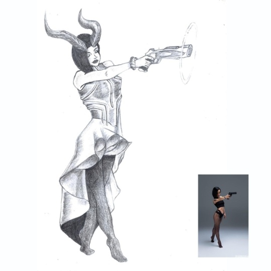
5. Drawing Action and Re-action: In this lesson, we're
going to take a look at secondary animation
or secondary actions. And right from the offset before we even look at any examples, because we have the
word secondary there. It makes us then think, well, what is the primary animation
or the primary actions? Secondary animation
or secondary actions and its role with
actions, henceforth, really are the things
that are happening secondarily to the primary
action of the pose. Here we have two examples
to gestural examples of a character running and a character standing,
carrying a case. And in this instance, we can see here that the primary directionality
of each of these, as indicated by a
line of action, has got a particular
kind of angle to it, a particular kind of tilt or particular direction
of action in the pose. Now of course, the character
running is doing something way more active than the
character just standing still. Yet at the same time, we can use this theory
to enhance both of them. A common mistake
is for people to draw the secondary
elements, doing nothing. Here's our character running. We've got the hair in
a static position, the shirt and
aesthetic position and the pants are really
in a static position. There is no mind to paid towards perhaps
these elements are moving as a secondary result
of the primary force. And similarly here in the
static character, well, we just assume that because
the character is static, everything else should be static to what the character
is standing still. So perhaps everything
else is very much still. The character's hair here is
just really straight down. The scarf is straight down, the dress is straight down, and the case is
very much parallel. However, a better way to approach this would
then be to say, well, what secondary things could be happening as a result
of the primary force. Here in the runner. We've got the hair
now waving back. And we've got this shirt
flicking up back as well. And the Pence are now kind of flailing in the
wind a little bit. And it adds an immense
amount of energy and dynamism and flow
to the piece to have its secondary
actions taking place. Similarly in the character
that is standing still, it's almost as if we've got a snapshot of her in real life, things are moving
and we just pause. That movement in our drawing. Here is tilted slightly back and her scarf is flailing
forwards a little bit, who is scared in more
of a dynamic angle and perhaps is affected a
little bit by the wind. And we've adjusted the
case angle as well, perhaps as a result of how she's balancing the
weight in her body. So really secondary actions
are those actions that are secondary to the primary action that is happening
in the entire form. The characters
punching a character's fighting with doing
a sport or running, even if they're standing
in a particular way, we will always want
to ask ourselves, what are the secondary actions? Or have I drawn in any
secondary actions? Am I drawing things
that could have moved, That could have done
it in a static way. This is extremely
important to remember in your pieces because having secondary elements
that I'll state, it can really kill all
the work you've put into making the primary
action dynamic. As a practical example of secondary actions
in a final piece, here we have this blood
elf top character who is casting a spell. The spell is not in this particular drawing
because it's in fact painted in afterwards. But nevertheless,
there is a magic spell sort of happening
around this area. And as a result of the
force of that spell, we have the character's
hair blowing back as a secondary
action in the piece. So hair is blowing back. But at the same time she's
also moving forward. She's running forward
here so we can see your leg one leg
other leg coming forward with the other leg
coming forward as well. We have a secondary
action happening in her dress elements here. In addition, because
our bodies in movement, when we look at her jewelry, earrings are swaying
and flaming back. Alright, and so are these
little jewels on her neck. They're sort of at
a slight angle. Nothing is really static. And here we see these
jewels as well, float flailing back as
the character moves. So there are quite
a few elements of secondary actions happening
in this particular piece. We even have some
secondary action is happening from some
unknown source. We have rocks flying in
the background, though, that's not really related to the character, but nevertheless, it's still an example
of secondary actions occurring here in
the dress as well. So hopefully you have
a very clear idea of how valuable and useful implementing secondary
actions into your work is. And really you want
to include them. You don't want to
leave them out there. Something that can really
enhance your work. So why would you leave it out? So as we move forward
in the course, be very aware of
secondary actions and be sure to implement
them wherever you need to. I'll see you in the next lesson.
6. Gender and Age Differences: In this lesson, we're
going to look at some key concepts that differentiate between
the feminine and the masculine forms, right? And we want to use
these elements to help us make our men look manly, make a woman look
womanly, or vice versa. You can also cross
and mix and match based on the type of
character that you're doing, whether they're male or female. However, these are the general rules that we want to follow. The general
guidelines we want to follow and implement
in our work when we're trying to have it
feminine looking woman and masculine looking men. In addition to that,
we're going to look at some key points that
differentiate ages. Alright, let's get into it. The first thing we want to note is that generally speaking, when we're drawing
feminine forms, we want to use softer
curvier lines and generally try to avoid
harsh angles in the lines. Similarly with or should
I say conversely, in the masculine forms, we want to have some angles. This adds rigidity and more structured to the
look of the line. And so it makes whatever
you're drawing with these types of lines look
a little bit more robust, a little bit more masculine, little bit more rigid. And of course conversely, there's more gracefulness in
the feminine types of lines. This is really straightforward, but it's really one of the most important things
when you're trying to get a feminine or a masculine look
in a particular character. The next thing we want to look at are the differences between the hips and the pelvis width between the male
and female forms. As we've already noted in
our anatomical forms module, main teams to have a narrower pelvis and women
tend to have a wider pelvis. And conversely,
women tend to have shorter shoulders and men tend to have more
broader shoulders. And so you have this
general pattern in the masculine form
of broad shoulders, narrow pelvis ended narrow hips. And conversely in
the feminine form, shorter shoulders, wider pelvis, and as such, wider hips. And really, if you just follow
this very basic structure, it's a very quick way to have your feminine
characters and looking feminine and masculine
character is looking masculine. Moving on from that, a critical, critical thing that must
be paid attention to, particularly obviously
here in the facial area, which is a big focal
point for characters, is the neck thickness. When you draw a thin
necks on characters, very much like here
in the feminine side. The head and the neck area, the head tends to look
much more feminine. And conversely, when the neck is made thicker and broader, the head looks more masculine. And this is really, really important
because when you start trying to put a
thinner neck on a character, you intend to
become a masculine. The masculine character
tends to look a feminine or too soft. Of course, if that
is your goal with the character, then that's fun. But generally, if
you're going for a guy, you want to have a thicker neck. If you're going for a female, you want to have a thinner neck. Of course, once
again, general rules. The next thing I want
to look at is our size. Typically, of course,
we're talking in the context of
image-making here. We want to have
feminine characters or if feminist characters
have bigger eyes. And to make a character
look more masculine, more robust, we want to have the character
have smaller eyes. So this is just another
general rule to follow. Bigger eyes are more feminine. Smaller eyes are more masculine. And then of course we
move on to nose sizes. It really is a very similar
thing just in reverse. More feminine nose is
typically smaller and a more masculine nodes is
typically bigger, right? Of course, nothing stops you at any point from mixing and
matching these various things. However, if your goal is to have a masculine male form or
a masculine female form, these are the guidelines
you want to follow. Right? Let's move on to
age differences. And we're going to take a
look here at age proportions. Alright? So first on the left we have a typical aid head
proportioned female body, but the wide hips
and the shoulders. But the thing we want to
pay attention to is really the general eight heads
proportions are going on here. And then conversely,
we have another form. It could be a young boy or a young girl At six heads only. And so what we've
done to achieve this edge difference
is generally speaking, compress the torso into
a smaller heads amount. Here it's in three heads. And here we've brought
the age down somewhat. We've put the entire
torso into two heads. And of course, the
other proportions are affected as well. We've compressed them into
a smaller heads amount, although we keep the head
size fairly similar. Generally when you want
to edge characters, the first thing you want to do really is compressed the torso. Whether you're going a character with four heads or three heads even or seven heads
compressing the torso is the first thing
you want to do to get that age difference to show. But the other thing you can do, and it looks a little crazy
here on the right side is increasing the head size
of a younger character. The minute you increase
their head size, they immediately look
somewhat younger. In fact, even though
these two characters are the same height here, this character tends to
look a little younger if we had to put them
in the same world, this character on the right would probably be a little bit shorter and a little bit younger than the
character on the left. We want to keep
in mind that when we want to show the
difference in ages, we want to start changing
the proportions and compressing the torso and increasing the head
size a little bit. That's the very first thing. The second thing is
fairly straightforward, that forehead size is one of the biggest
indicators of age. So here we have four short, roughly drawn diagrams showing the difference that forehead
size makes to edge. As we get older, our
foreheads get shorter. So we start here with the number one as the oldest character. Here. We move into number two, slightly bigger
forehead character looks slightly younger. Number three, a slightly
bigger forehead, and the character looks younger. Store. And then over here on number four and more
of an extreme example. If you look at babies, they have absolutely massive
foreheads, right? And so it's really just
a basic rule to follow. So obviously three is more of your teen age group and
then to your young adult, and then one you're older
adult and so forth. And those are some key
guidelines to getting gender differences
and age differences into your work fairly easily. Let's move on.
7. Foundations of Character Design: Welcome to the lesson on the foundations of
character design. And I'm emphasizing
the word design. It's gonna be a bit
of a talky lesson, but extremely,
extremely important. Alright, so when we're talking
about character design, the first thing
that we really want to be aware of is vision. Now, early on the course are emphasized how
important this is. Vision or the story, or the feeling, right? Or the idea. Okay? Now, being able to
draw well and being able to create good characters are kind of two
different things. You can be good at drawing, whether observational
or imaginative, but whether the character
that you're doing itself is a great character, is a well-designed character
is another matter entirely. And so what we want to do
before we get to the page, right, to draw the
actual character. Perhaps we could do
it on another page to do some planning
or thinking in our minds is we want to constantly be aware of
and asking ourselves, what is the story
of this character? What are they? Feelings of the character? What is the idea
behind the character? And basically this all
falls into vision. You wants to have a strong
vision of what you wanna do. And I don't mean a strong image in your mind what the
character looks like. Now, I want us to
think more about not, I wanted to draw this thing more like I want
to create this person. So you're not going
to make an, IT, you're going to make a right. And getting into this mode
of thinking gives you a far, far, far richer, deeper
drawing of a character. At the end of the day, you
want ideally people to look at your work and buy into and believe in the character
that you're creating. In order to do that, you have to already understand
who they are as a person, outside of the realm of
thinking about drawing implementation and outside the wrong thing
about drawing theory, the implementation of
how we draw things. Because here we want
to work on our idea. Alright, here's another example
for you to think about. If you have a poor idea
that is drawn really well, it's still a poor idea, right? If you have a great idea
that is drawn badly, it's still a great idea. Maybe the idea is not if
communicated effectively, but the idea itself
is still very good. This is one reason
why I personally believe everybody has
the ability to draw, because everybody is creative. Drawing is just really
the implementation of this creativity. Alright? Because we can all
think of really good ideas. We can all create really cool
characters in our minds. All right, so some
questions we want to ask while we're thinking about and planning is the first
big important question is, what is the character
thinking or feeling? What is the character
thinking or feeling? Right? So we want to say to ourselves, Okay, We got this idea. We wanna do this
type of character in the moment that
you're drawing it, in the moment that you're
trying to capture in the image. What is the character thinking? What is the character feeling? And why do we want to ask
ourselves these questions? What impact will it
have on the drawing? Well, if we know what the
character is thinking, we know how they might move. If we know what they're feeling, we may know how they might
move or express themselves. These things may have
been tied to what they're wearing on that particular day. And you can see how deep the
rabbit hole actually goes. It's quite a complex world
that we're trying to do. Because when you're
creating deep characters, they require deep thought. Also ask yourself, what choices is this character going
to make in the scene? So e.g. if I said to you, well, let's draw a character
drinking a glass of water. If you only thought to yourself, character drinking
water, then you're drawing what the
character is doing. And the best advice you
can get when it comes to character drawing is draw what
the character is thinking, not what they're doing. So now, if you converted your mind to draw in where
the character's thinking, why are they drinking
the gloss of whatever? Are they thirsty? Is that water? Is, are they famished? How are they feeling
as they drink it? Right? And that might change
subtleties in the piece. How they hold the gloss, what the expression
on their face looks like on a really thirsty, or they're just
having a large drink, or they're at a restaurant, or they just finished
running a race. And this impacts so much about how we implement
in our drawings, right? How we implement what the
characters are thinking and feeling doing the
drawings, right? Other questions to ask or
who are the characters? Who are they? Do they
have names, right? What are their aspirations? And knowing this helps you, again flesh out what they
wear, how they move. E.g. you might say, well, what is all this that he's talking about
saying how they move? Does it really
impacted anything? Of course, it does
think about this. E.g. you notice a man at the mall and he
looks kind of sad. You've never met him,
you've never spoken to him. He doesn't appear to be crying, but you're quite certain
that this person is down, perhaps down on his luck. And what tells you that the
way the character is moving, perhaps his shoulder
positions, right? Perhaps his head position, perhaps these arms are
hanging very parallel, that is sides and
he's moping about. And why is his body doing that? Because of something
going on in his hot, something going on in
the inside of him. And so we get into the hearts of our characters
were able to draw, they're outside, they're outside movements
and they're outside posing to reflect
what is inside. That is just some of the magic of character
design where we are able to draw characters that are believable because they
have this hot to them. They're not just
drawings in a sense. They're kind of images of characters that could very
viably be real, right? And they have a world and the
story and to live. Right? So the other thing
here is that you want to get the feeling, you get the feeling, feel what the characters are feeling. Consider their purpose, right? So let's put that here. Feel what the
characters are feeling. And also consider their purpose. And you'll find when
you feel and you're trying to feel what the
characters are feeling. You can take on the role of an actor or an
actress, right? Where you have to become
something else to make people buy into this character or the story you're really
telling with the character. You can see that story
feeling the idea, the emotions behind what you're doing are extremely
important and they add so much value to your drawing beyond just
your bed drawing skill, just beyond your
ability to implement anatomies and workflows
and all of these years. Other things. Something else that we want
to think about though, is once you start getting
into this mode of getting ideas and visions and stories and
things like that. We tend to do work that
is quiet cliched, right? It's quiet cliched. Let's just see here the shade. Alright, don't know why did
a small edge doesn't matter. We tend to do work that
is quiet, cliched. And what we want to do is avoid this because a cliche in itself, the accretion idea, e.g. a. Wizard, that kinda
looks like Gandalf. It's very much a
cliched character. The cliche in itself is a
type of symbolic parallel. When you draw a cliche, someone sees that it's a cliche. They recognize that. They say to themselves, Well, I've seen that before. That's what they
would probably say. So I've seen that before, I've seen this kind
of Wizard before. And so what they're
doing is they're imagining the wizard
they've seen before. They're imagining your piece. And those two images
in the amount of very much like two
parallel lines. And as we know in
character design, we hate to parallels. We want to eliminate them. What can you do to take
ideas that you love? You want to do fan out of
your favorite characters. You want to do new ideas, you want to do love wizards, and you do love fantasy
for argument's sake. What do you do? And the key is to take that particular genre
and ask yourself, how can I add a twist, right? How can I add a twist to it? How can I mix it up so that
it becomes something new, that it is no longer a parallel. So that's really
where you want to go. You want to bring a kind of symbolic asymmetry to the idea. And the things we've
been talking about in this lesson do not
underestimate them. You really can't get away from thinking about how the
character is feeling and so on, a story, they're
feeling the world, the idea in all the various
things we've touched on. And then still expect
the piece to be really good and really
engaging for viewers. When people look at images, something you as an artist
must recognize is that the consumption time of an
image is very short, right? You look at an image and
perhaps in even 1 s, you may click to the next image. And so we, as artists, have a very small timeframe to try to capture the
imagination of the viewer, even if your drawing
is really good, but it lacks these elements. People will just click
Next after a second. And what we really
wanna do is try and extend the viewing to 2 s, 3 s. Maybe they download
and save the image. Maybe they like the image. Maybe they add you to their favorite artists lists on whatever platform you may be on, maybe they remember you. And the way we do that is don't just give them
a good drawing. Give them a world
and a character and a WHO that they
can believe in. Alright, I hope I've
been emphatic and I hope you starting to see a picture
of an potent this stuff is, Let's move on to
the next lesson.
8. Character Focal Points: In this lesson, we're
gonna be learning about character composition,
focal points. Alright? Now, if you've ever done
photography before, you've learned
anything about art, you may have heard of this
rule of thirds, right? So the picture plane, as they say, is
divided into thirds. And the areas here where
the lines intersect, Consider the good locations to put focal areas
of your picture. So I'm gonna do just a
very basic environment. Let's put a mountain up here. And we can put a sign
up here, y naught. And that would be considered a pretty reasonable composition because we've
positioned the peak of the mountain there
on that focal point. And we'll just do some
background mountains here. And we'll just add some
extra emphasis there. But really it doesn't matter. The point is that we have a system which is the
page or the picture plane here to help us calculate where the good
focal point areas are. Now of course,
this is one system or a few systems you can use. So what we're doing is
we're saying, alright, we're going to define, divide the page
into these thirds. And wherever there are intersections of
these three points, we can put focal points. And then you can build
systems where you can read, divide the page into
more squares and find new focal points and have a one-two-three system of focal points going and
so on and so forth. But the problem with this top of compositional for
compositional system, which is a page-based
compositional system because of this picture plane area
in red, the border is, our page, is that we
cannot use this type of compositional system to compose the characters
composition. Not sure if we're laying out a character on this page, e.g. yes, it would be a good idea to perhaps put a character here. We'll put a character here
if this were vertically and we can have the character standing over here and so forth. And that would be fun
because we're laying them out based on the
rules of the page. But how do you compose
a good character? Now of course, there are
quite a few theories to that. But before we get to that, the first thing we want
to learn about really is the importance of the face
and the hands in a character. Drawing. The head of a character is always our number
one focal point. It is always our
number one focal point regardless of what is happening
in the rest of the form, the head is always the
number one focal point. And the secondary focal
point really is the hands. The hands are always our
number two focal points. The reason for this is because when we see other human beings, we tend to look immediately
at their heads first. Perhaps they're talking or
they're saying something. And then we look at their hands. What are their hands
gesturing toward? What are their hands are doing? And so we tend to ignore in some senses what's happening
with the rest of the form. That doesn't mean we
can draw it badly or ignore it suddenly not, but the focal points
of the peace teams to be primarily the head
and then the hands. And so what does this mean for our practical
implementation of drawing? Well, it means one, that we want to
draw the head well, draw the head well, and draw the face well. Okay, we really want
to put a lot of attention into drawing the
head well and the face. Well, the second thing
it means is it's Tom people to get really good
at drawing hands, right? We need to draw the hands. Well, if you mess up the hands, it can actually mess
up the whole piece. And obviously similarly, if you mess up the head and the face, you can mess up
the entire piece. Let's say for argument's
sake, you draw, drew a perfect body, awesome buddy, awesome hands,
and you messed up the head. You might as well throw
the piece away because the key focal point of the
piece has been messed up. Now, it's very important that
we take this super serious. You can actually get away
with a mediocre body, awesome head or some hands, but you certainly can't get away with the vice-versa of that. However, there's something
else we want to do in terms of composition when we're talking
about character drawn. And that is because we know that the head in the hands
of focal points, we can manipulate this
to create a visual loop. And what do I mean by that? Well, we know that generally they're going
to look at the headfirst. What if we positioned
the hands in a way where they float in some kind
of system, let's say e.g. this character here is
pointing to themselves. With the hands float in a
particular way as to create a visual loop I haven't drawn in the body here,
but bear with me. Just draw that in a quick. And so what we're doing here is let's say his
hand is on his hip. We end up looking here at
focal point number one, which is the head, the face. And then we started
looking around the piece. But you can see
here that we have this directionality
happening with little characters left hand. And despite what may be happening in the
legs or the feet, this hand has a directionality
there and it has a sneakily put in pointer in the thumb pointing back
to the character's face. And so what we're doing is
we're creating a visual loop. And why is this visual
loop important, or why is this visual
loop a good idea? Because it keeps
view is engaged in our piece and they can't understand why they
keep looking at it. Now, hopefully, of course
you've implemented the head and the hands
and the face really well. So that's already an
engaging reason in the piece of art that
you're doing is really a nice piece of
art if you've done your refinement
in your structure and everything's really good. But these are sort of, I don't want say
sneaky, but it's, these are some kind of subconscious things
that we're doing in order to keep view
is more engaged in our work by
creating visual loops. And this isn't a new concept. This isn't some kind
of crazy new concept. It's done all the time from landscape paintings to
portrait paintings. Various techniques are used. Whether they're playing with
the value or the edges, or the amount of detail they are doing things to keep
you looking at their piece. And often you
wonder, I don't know why I like this piece
of art so much. Well, take a look
and say to yourself, are they creating a visual
loop between focal points, focal points leading to
each other in a way that keeps my eyes engaged in
moving around the page. Alright, hopefully this has been an exciting thing for you
if you didn't already know, because it's quite
fun to do as well. Now of course, not
every character pose you do and
every drawing you do is going to have this particular if you're
doing concept art, there were focusing
more on the design of the character in terms of their
outfit and their costume, and not so much about
engaging because that work is created
for something else, for a video game or for a form. But when we're talking about explicit character drawings and character art for the sake
of being viewed and enjoyed. Doing these visual loops
is a very good idea. But we want to cover an
additional topic as well. That topic is the face. And what I want to point out
here is that the face is such a wonderful Canvas for
its own types of composition. And it hasn't structured order of what is important
on the face. If we're talking about
just the face on its own, then the number one focal point of the face would be the eyes. Of course, it seems
pretty obvious, but let's just state it anyway. Our number one here is the eyes, and then our number
two focal points on the face would be
the mouth, right? So whilst it's a lot harder to create visual loops in here, It's important to
note that people will look at the
honest first and then kind of look at the mouth as a secondary focal points to backup what the
eyes are doing. So e.g. this might look
very strange if I make the character said and
looking up and smiling, although they look
a little unsure now that looks a little weird, but nevertheless, where I was trying to make the
character look sad. So in order to backup what's happening at focal
0.1 in the eyes, olivine wants to match what
is happening in the mouth. So maybe the math moves to
more of a sad kind of mouth. Alright? And something to
think about in regards to this is the order of importance in terms of
overall composition. Where primarily the
eyes or the headline. This is in terms
of our emotions. In communicating emotion. Secondarily. The math supports the eyes, the mouth is the sub-headline. And then the body. Primarily starting with
the hands and then the body supports what is
happening on the face. All right, So we
want to think about these focal points in
terms of the entire body, the head and the hands being super important in
the rest of the body. Being focal 0.3.
We want to think about those loops and
we want to think about the order of composition
and importance on the face with the eyes being
pivoted really important. And then secondarily
the mouth and in the hand sample and
the rest of the body supporting what's
happening in the face. And this really is our character composition
focal points. Let's move on to
the next lesson.
9. Designing Iconic Characters: In this lesson, we're going to be talking a little bit about designing iconic characters
or character iconography. Now when you think
of the word icon, like someone is an icon, or why is this person an icon? Or you think about characters that you know are
very familiar to you, whether they're from
books or video games or movies or what have
you asked yourself? What is that one thing? That if it were taken
away from that character, would have that character
cease to be who they are? If you change that one
aesthetic visual thing about them would have them
cease to be who they are. Iconography in character design
is all about taking away things so that there are only
a few things that are truly definitive of that
character's visual aesthetic. So e.g. if you were
drawing a magical girl, you added millions
of pockets to or in a magical dresses and medical gloves and a crown and a one, and these types of boots and these various color
schemes and so on. In that sense, she would have many elements that
define who she was and what she wanted to try
and do with your characters is distill them down, remove elements so that you have a particular look that is quite definitive of that character. To further expand on this, Let's take a look
at some examples. Here I have drawn just a basic faceless character
is a no named character. She's doesn't really exist
to anybody in any context. There's no story to her
or anything like that. But if we start adding a
degree of iconography to her, you'll notice that she
starts to become somebody. In this instance, she looks a little bit
like Wonder Woman, and that's because she
has the hairstyle in the crown and this
stall on the crown. Things that are iconic
of Wonder Woman. Wonder Woman would cease to be Wonder Woman in many respects, you wouldn't be able to tell the difference between
her and anyone else if she didn't
have her crown. In the second example, I'm sure you can
guess who this is Princess Leia from Star Wars. Her hair buns or her main
iconographic elements. They define who
the character is. And if we only saw a
silhouette of Princess layer, we would know it's
her because of the distinct shape and the distinct iconography
of her hair bands. Once again, a popular
video game character. This character now looks like Tracer from a video game
called Overwatch and her large goggles and her funky hairstyle or
her definitive elements. But even more so than that, it really is Her goggles
that define her. If we took her goggles away, we might assume
it may be tracer, but we're not quite sure
if it was really hurt. Her goggles really, or her main thing right
here, main icon. And just as an aside, I added this last one. I don't know if you can guess who this particular
part might be. But there are certain elements that define this
particular character. And if we add just
a small splash of color to this
particular scene here, we start getting a picture of another very popular
icon, right? And that in that sense, is using color as well as design elements for
the iconography. So going back to
the beginning about designing iconic characters
and character iconography, the short version of it is
really that when you're designing characters
and you want your characters to
be unique or iconic, particularly your
hero characters or your main characters. What do you want
to strive for is not adding elements to
make them more unique, but seeing how many
things you can remove in order to distill the
character down into a purist, the most pure form of themselves that were used to
remove that one thing, they would cease to
become that character. But as you add
that one thing in, they become the character who
you've designed them to be. The question we want to
ask ourselves when we're designing our own characters
is what one thing, if I removed it, would have my
character cease to be iconic or had your character
cease to be character, you've designed them to be so focused on distillation,
if you will, not adding millions of
details that will perhaps frivolous or meaningless, right? That is the end of this lesson. I'll see you guys
in the next lesson.
10. Utilising Symbolism When Drawing Characters: In this lesson, we're going to learn about shapes symbolism, and how it relates
to character design. Now, the basic shapes
of square, circle, and triangle have certain sort of almost embedded
meanings in us. They mean particular
things to us. And when we apply
those general shapes, so our character designs, we can imbue our characters with those particular meanings
as well and utilize the shape language of
the shapes symbolism to reach our ends in
terms of our drawings. Let's first take a look
at the humble square. And the square is symbolic
of amongst other things, strength, trustworthiness,
dependability, and power. Squares and square shapes like rectangles and other similar
shapes seem to be strong, robust, durable, and so forth. And when we imbue
our characters, particular character
heads and their body shapes with this type
of shape square, they seem to be strong, reliable, and
dependable characters. When we think about circles, we get a completely
different vibe. They're curvy, they're round. And so we think about
things like friendly, soft, cute, gentle, kind, even. And round shapes
are usually used on characters that are very
friendly or Hubble or cuddly, the good characters or the
cute, sweet characters. And triangular shapes
had a sense of mystery. There Sharp, those three
corners are very sharp. They give a sense of evil. They also give a
sense of danger. Even in our society, many sons that we have that are triangular are usually
warning you of something. So triangles are very
much warnings as well. So I have some examples yet, just showing three
character heads and what the different shapes of those heads due to
the characters. The first character
on the left is a guy. He looks like a dependable, everyday guy who you can trust. Somebody could probably
lift heavy boxes for you. Then the second character is an enemy's style girl
or manga style girl. And she looks cute and soft and she has a lot of round forms. And then last but not least, we have a character
that is not too trusting and he looks a
little bit suspicious. And his overall shape silhouette is of course that of a triangle. Overlay the shapes. Hopefully you start getting the general idea of
how powerful using basic shapes symbolism can be in bringing an archetype
to your character, whether they're good or evil, dependable, or a mix of shapes. It's your call on how
you want to use them. But I want to make you aware
that shaped symbolism is there for us to exploit when
we're designing characters. Let's move on.
11. Silhouette Value for Character Drawing: Silhouette value refers to the value that the
overall silhouette of our character drawings adds
to the piece and brings to the piece good
silhouette value is clear, understandable, readable, and
makes sense to the viewer. As you can see in front of you, we have five silhouettes. And I need not label what they are
because you can already tell what these objects are
simply by their silhouette. Hopefully you can already see that silhouette has quite a lot of weight in terms of the understandability
of the subject matter. In our character work, we want to be sure that
we are making a clear and a readable silhouette and
that we can bring some of that value that the silhouette
adds to the piece overall. Let's take a look at example. This piece here is quite
hard to distinguish. We couldn't really tell
what's happening here. And you can try to wager a
guess what this piece is. It looks kind of mutants to me. Might be someone
sitting on a mushroom. I'm not entirely sure. They have some kind
of manly hairdo and perhaps a ponytail
or something in there. I'm not sure. Right? This is an example
of a bad silhouette. It doesn't really give
much information. We have some hints
that it's a human. It's got a head shape, ish, some Harish possibly, and these are probably fingers, but there's not much else here. You couldn't really
ask a five-year-old, Hey, what's going on here? They probably wouldn't be
certain of what is this, in fact, even is. But when we make sure that our silhouettes read
well in our pieces, we suddenly have a
completely different vision entirely of what is going on. So clear and
readable silhouettes are definitely something we want to be aware of and
something we want to strive for. However, usually speaking, when we learn about silhouettes, that leads us into
another problem. And this problem is
called fly swatter. As we seek to make
better silhouettes, we sometimes get tempted to draw every single component of the
body outside of the form. And so we end up having
characters that kind of look like they've been
hit with a fly swat. I'll just draw this little
dude out over here. And he's a bit of
an extreme example, but you'll get my point. He looks as if a
flashcard has come and literally smacked him completely a giant floss what is hidden. And he's really kind
of like squished onto the page as if he were
splattered right onto the page. Now of course we want
readable silhouettes, but at the same time, we want the silhouette
and the forms of the drawing to
read well altogether, in order for us to
actively persuade the viewer that we have
realistic believable forms. We need to introduce
overlaps into our work and sometimes we
need to hide body parts. So if e.g. this was a drawing of someone with one hand
on their hip and the other on their leg would probably still read pretty
fun as a silhouette. But we're hiding the
right-hand side arm. And because we're
hiding the arm, the viewer gets a sense
that the overlaps the arm. And so we've introduced
a sense of depth, right? So wherever there are overlaps,
we're introducing depth. And here we can even
hide the back leg with the front leg and
the silhouette will probably still read, right? So what we wanna do is
find a balance between silhouette value and having our overlaps and
making sure that our image does not fly swat. Take e.g. the two
people on the bench, we can see generally that
they're sitting down, they're looking
toward each other. We can't see their
arms that well, but we can see their legs. And yet we know that there are overlaps happening and that
there is depth happening. And this is the kind of balanced we want to strive to achieve. Good silhouette value,
goods silhouetted, read that is clear and
easy to understand. But at the same
time we don't want to fly swatter characters, squish them so that all
limbs and all elements of the drawing are available in viewable at the same time. Because that then kills the three-dimensionality
and the depth that we want. This has been useful
for you. Let's move on.
12. The Three Core Elements of Character Design: They may be three
seemingly simple, easy to understand things. However, these three
elements are essentially the core overarching
things we want to always be focusing on when
we're drawing characters. The facial expression,
the character's pose, and their clothing
and accessories. But simple looks are
deceiving and there's a lot more depth to this
regarding the facial expression. Whenever we're working
on a character, the head is the number
one focal point and so is of course, the face. The facial expression
needs to read clearly, exactly the feeling
and the emotion that we're going
for in the piece, whatever that may be, whether the character is stoic, whether the character is
excited, sad, or contemplated. We need the facial
expression to read. And it's first and at
the top of this list, simply because
compositionality, that head is number one and we want
to always remember that. However, that number
one focal point needs to be supported
by the pose. Whatever the face
is emoting or doing based on the feelings that the
character is experiencing. The pose needs to support
that to the post, needs to read well, it needs to be dynamic. It needs to have a
great silhouette. It needs to have dynamism. It needs to have overlaps
and flow opposing curves and many other theories that we've learned
along the way. And the posing is an
especially tricky part because many people find that they tend to master the head, get the heads that they want in the style that they
want done well. But when it comes to
character posing, it remains a mystery. However, in the next video, we will cover this extensively. Nevertheless, the pose pivotal to supporting the
facial expression. And last but not least, is the clothing and accessories, or the outfit or the costume that the character is wearing. Why this is important
is it tells the viewer about
the greater world that the character is in. Imagine if you will,
the character in a construction outfit or a character in a
submarine outfit, it tells us a lot more
about the greater world. It gives us a greater idea of context and story
to the character. And we can say a lot about the character's personality,
what they wear, how they wear it, the colors
that they're wearing, the styles that the where
and the way that they do their hair and
so on and so forth. When you are
designing characters, make sure that your
workflow order in your mind in terms of the ideation of the character is making sure that facial
expression reads, making sure the pose supports
that facial expression, and then making sure
the clothing and accessories also tie in. This is one of the keys secrets
of good character design. Covering these basis
and constantly thinking about them as you
work through your piece. This lesson may seem somewhat simplistic
and straightforward. However, don't be deceived by the apparent simplicity
of these three elements. If you are someone who
is very perceptive, we'll start to realize that these three elements
can be translated relevantly to a vehicle
design environment, design, industrial design. And they really mark out the three major elements of all designs that we
want to focus on. In the upcoming demos, we will go in-depth into the practical reality of implementing these
three core topics. So consider these
your three main goals and your three main points of focus when designing
your characters. See you in the next lesson.
13. The 5 Core Elements of Good Character Composition: What we're going to learn
about now is perhaps the most straightforward
explanation you will probably ever receive of
dynamic character posing. Character posing can
often be very tricky. A lot of times, artists
will find themselves having to utilize and lean on reference too much because they find it very hard
to think of good poses. Or if they think of good poses, it's very hard to implement
those poses in a way that things don't look
static or strange. But with these five very
straightforward rules, I suppose I wouldn't want to call them
rules with these sort of five straightforward
guidelines, you're gonna be
able to dynamically pose character as well. Let me say just before we get started looking at these things, that this is one of those, one of the most important
things I would ever teach you, top of things. So really if you commit to memory these five
things or heck, if you write them down
and you use them as a checklist fashion, right? As you're drawing, you will
be able to dynamically pose characters really well by just following these guidelines. Obviously, you also need
all the other theory. That's just how it works. But these five guidelines
or a shortcut, if you will, to easily understanding how
to dynamically pose and what elements to
include when you want to dynamically
pose your characters. I'm going to list them out. And then we're going to go
and look at what they are. The very first one is
the lines of action. Lines of action, that would be the primary line of action. And then the secondary
lines of action. The next big one are the horizontal and the
vertical tilts. The third one are
twisting elements, right? You might be like
twisting elements. What does that mean?
Twisting elements? The fourth one is foreshortening, right? And the fifth one is multiple. Object overlaps. Let's take these guys, pop them in the corner, right? And look at them one at a time. These five elements
with you include every one of these five elements in your character drawing. You're going to have a
dynamic pose, right? Of course, once again, with all the previous
theory gesture, we want the gesture to be
strong, etc., etc. etc. But these five elements, you can really check
box them and say, Have I got this,
have I got this, I got this right. Let's look at line of action, the primary line of action,
secondary infection. The line of action, as we
discussed in module four, refers to the primary line of gestural movement
in the form. Here, when we're
talking about in terms of dynamic posing, we want to make sure that the overall rhythm of the
primary line of action, which is this big line we've got running through
the form here. And the rhythm of the
secondary elements. That would be the arms and the legs flow with one another. That there is a kind of flow, a rhythmic flow that
we're not having. Weird, Let me do this a
different color at weird angles coming out like a line and arms doing this in an OMS doing this. There's no flow in that. It's kind of counter to the rhythm and the
flow that we're seeing when we have a good primary and
secondary lines of action. Let me do this in
a different color just to emphasize them. So these would be our
secondary lines of action. And then the big red one in the middle is our
primary line of action. So if you're looking at your
piece and ensuring that your primary line of action
and your secondary lines of action flow well together. That is the first key
element to dynamic posing. Let me also say
that you of course, need to ensure that your
forms of following this flow. And that would bring us to our opposing curves theory
where elements are opposing, of course, based on
the angle of the limbs and the angle of the various
elements of the body. But we need the opposing
curves to work. And this is where we get that
term, rhythm once again, so you can see it pulsating, everything flows in a rhythm. You want to check the
box that you will pose has a strong primary
line of action, right? And we want to exaggerate that. So that because we know that
detailing and bolding detail on top kills the gesture
quite, quite heavily. And then we want to have
secondary lines of action that flow with the
primary line of action. And that is our first thing
that we want to take care of when we're doing
dynamic character posing. Raj, horizontal and
vertical tilts. We covered this in the
gesture module, module four. And that really is
ensuring that while you've got that
flow going effect, Let's use that previous example. While we've got that flow going, we want to make sure that the
airline, the shoulder line, the pelvic line, if possible, the knee lines are not parallel
with one another, right? You can see that
all of these lines would converge at some point. Okay. And those are the horizontal
and the vertical tilts refer to just the vertical
versions of those tilting. So if at all possible, you want to ensure that
they aren't parallels yet. Now just keep in
mind this is more of a guideline because
they are gonna be times where you may have
the airline and the shoulder line parallel
or what have you. But the idea is you want it to constantly be striving to break these parallels because
doing so adds dynamism. It makes the piece
not look static or like a sticker or
like a dead object, or maybe like a figurine. It makes the character look real as if you've caught them
in a moment of time. So you want to make
sure and check the box that the horizontal
and vertical tilt severe and that there
are no parallels between these lines right? Now in terms of
twisting elements. This refers to, possibly
by now you've probably been drawing every element
facing the same direction. So as a demonstration, we'll draw character here just
to quick gestural drawing. Okay, so there we
have our forms. And let's change the
tilt that pelvis. Doing a dynamic, quick
dynamic forms, sketch it. Right now in this example here, we've got the head
facing this way. The chest is facing
this way, right? The pelvis is facing this way. The knees are both
facing this way. We haven't really
drawn in the hands, the arms, the arms and things, while these guys are actually mirroring each
other a little bit. But nevertheless, you can see the bulk of
these big elements. They're all facing
the same direction. Now, twist refers to adding rotations to things and
rotations can be in arms. So e.g. you may draw
arms and hands or you may draw a fist coming
forward like this perhaps. Right? However, to twist it, what we would do is we would
actually give it a bit of a rotation and have
a twisting in. And that is an element or a way for us to imbue more
dynamism in our piece. So in this example, if we took this character's head and we just flipped it around. We've now got a more dynamic
piece of the chest is facing one way and the
head is facing the other. And indeed we can even make the pelvis face the
opposite way as well. And really it's
about thinking about those points of articulation
in the form in the body. Where can we twist things? Where can we rotate
things, right? And we use these twists
in combination with a horizontal and
vertical tilts to bring in a lot of
dynamism into the piece. So this looks like a slightly impossible
pose just because of the degree of the twisting will learn about
someone that they can probably reproduce this. But I'm not sure exactly
what pose this would be. But the idea is that
we're rotating elements. We're rotating, we're
adding rotations to the arms and legs and the feet, wants to twist things, right? Twisting elements
here we rotated. They had so they had
enough faces that way, in the chest faces that way, and the pelvis faces that way. And a lot of the time
you're going to see the rotation is happening around the pelvic area
and the head area. These are the main these
are the main zones, right? The main zones. But as I said, there's nothing
stopping you from having the wrist twist or the
feet ankles twist, have the feed point in
different directions. You can you can do so
much with the twisting. And it's, it's pretty
straightforward. It just think about where are those points of
articulation, right? And that is what
twisting elements, making sure that the entire body doesn't just point
in one direction. And if possible, try to get three different
three or four twists happening in the piece. Three or four,
somewhat obvious to us that the viewer
can clearly see. One thing is pointing this way, and other things
pointing this way, and another thing is
pointing this way. This is actually how we
add that dynamic detail, if you want to call it dynamic detail into a piece
without actually having to render tons of
millions of details trying to draw in
dynamism like that. We kind of imbuing it with these subtle things like
twisting elements, right? Then coming to 0.4,
foreshortening. Foreshortening as I've
done in this risks yet, is we tend to generally not do too much
foreshortening because we're, we're afraid,
generally speaking, because it does seem complicated to foreshore an elements. But this really goes back
to us drawing in 3D. If you were going to draw a fist coming down
like this, e.g. you might draw it like that. But it might be more
dynamic to have the character lift up their arm and actually have the hand
overlap the back of the arm. And so we have this dynamic
foreshortening happening with the hand is clearly closer
to the viewer, right? And it's coming toward them. Now, you get something called
extreme foreshortening. And that's sort of
those scenes where the character's head is
kind of like down here. And maybe it's a superhero
and they're flying forward in their fist is
really huge like this. And you can do that as well. It's really the
same principles of drawing through drawing in 3D and just resizing
based on distance. Alright? So perhaps there's
our character there. Okay, so that's extreme
foreshortening. But extreme foreshortening, It's great for extra drama and that. But I think in your
general character designs, just ensuring you've got some
foreshortened elements in the piece and there
doesn't have to be the body specifically. It could be a sword, e.g. the character, imagine this
character is holding a sword. It could be a sword coming forward toward the
camera like that. And that you have at least, I would say 123
foreshortened elements in the piece if possible. And again, this now adds
additional dynamism to the piece because
not only do you have a character in a scene, but there's things showing
depth in the scene, things coming toward the
camera and showing that the character maybe further back or further forward
or what have you. So foreshortening is our
fourth really, really, really important
thing we want to be implementing in our
character posing. And let me just
pause there and say that we all going
to have plenty of demos where you will
see this happening constantly and you'll hear me talking about it constantly. And that is how we can achieve
dynamic character posing. And of course, the last
one is very important. Multiple object overlaps. Now if we look at
this character here, let me get a different
color to draw over. If we look at the
character here, at least in this dynamic view, we have to ask ourselves
what is overlapping? Well, obviously there's
not a lot of details yet, but really the only overlaps I can see is the head
over the neck. And I'm assuming
the sword is here, the sword overlapping these
elements of the body. And that would only
count as two overlaps. And that's quite terrible. We want to have multiple
object overlaps. So whether this is objects and clothing that is
overlapping elements on the character's form
here then overlaps the character's head objects, perhaps a belt strap
that's overlapping. You want to ensure that you have multiple points of overlap. And again, don't fly
swatter, the piece. Don't fly swatter, if you can, move an arm behind in the
piece can still look great and dynamic due
so hard that arm, because then you're introducing another overlap and you can actually circle and count
the overlaps in the piece. Multiple object overlaps, making sure there are a bunch of different objects that all
your big overlapping objects, I would say a minimum
of five to seven. Of course, everything I'm saying is really
just guidelines, draw and implement
things as you need them. But remember, you want
to have a quantity of foreshortened
elements and multiple object overlaps in the piece. Because once again,
when we overlap, we imply depth and then
we also therefore implies dynamism in the piece or add it makes it look
more believable. And these things are
really crucially one of the greatest art secrets. I suppose, that there are doing all five of these
things in a piece. Bring your artwork to levels, unprecedented levels
of awesomeness. All right, let's now take a look at some examples where
we're going to be identifying these elements
in these two pieces. And I'll just use different
colors here to indicate them. And it would be a
good exercise as well for you to go and find
some artwork that you really like or that inspires you and do these same draw overs over those pieces and
see if you can find the multiple object overlaps and the twisting and the tilts
and so on and so forth. Alright, so let's first take a look at the
line of action here. This guy right here, he has that kind of line of action in terms of his
primary line of action. And then his secondary
lines of action here. This, this arm here is doing this and that one's
kind of going like that. This one is coming around, this one's moving in. Then the legs aren't really
detailed here very much. Alright, so those
are lines of action. Could be a little stronger, could definitely be
a little stronger. The chest, could it be
out a little bit more? Of course, there's always things to improve, but nevertheless, those are our lines of action making sure that flow is there. Rash. We can look at our horizontal
and vertical tilts. There's our online she
has a shoulder line. The pelvic line is a
little hard to read here. But based on the indication of the belt, it's
probably around there. Right? And so we have no parallels
in our horizontal torts. And generally speaking,
if that's the case, you generally don't
have parallels in your vertical tilts either. Although the pelvis here
may may be similar, It's hard to read that one. Alright. Then in terms of twisting, no twisting happening
in this piece. So I'm actually going to
write here no twisting. And when you're
doing your roughs, if you notice that
you might want to introduce some twists
into the piece, I'm talking about a major twist. See, I don't see any major
twisting really happening. His head is tilted a little bit. You could argue that
it's a slight little, little bit of a twist. But generally speaking,
I would say that there's no twists,
major twists happening. The risks on twisting
either on the hands. So take a note of that on your pieces because it's
somewhat thing you can improve and something to
definitely improve on in the rough stage, right? And foreshortening. Here we can see this
hand is foreshortening. It's coming towards us, certainly far larger
than the backend. And there are of course, more smaller examples
of foreshortening. Little horn here is
foreshortening a little bit. And the sword hilt here as it goes down
into the sort area, you can see that there
is no parallel here. It's also going back
into the distance. So the hand and the entire sword itself or
foreshortened elements. And there's a degree
of foreshortening happening out on the arm. It's coming towards us,
right, foreshortening. And then I'm just going to
take these layers away. For our analysis of the
multiple object overlaps, you will see how important multiple object overlaps are in how many there
are in this piece. And that's what gives it its
sense of dynamism in a way. So e.g. we have the
horns overlapping, the face of the
ring, overlapping there to the earring
overlapping the year. The whole head
overlapping the neck, the head overlapping
the hair here and here. So we've got a bunch
of overlaps there. The shoulder and the
arm overlapping. The sword carrying
thing image again. I've forgotten his
name all of a sudden, but anyway, we'll
leave it at that. The hand overlapping
the chest here, nicholas overlapping the chest, the shoulder
overlapping the hair. These elements here,
overlapping the hair. This whole hand and arm section, overlapping
the characters, entire body, the hand
overlapping the sword, right? The sword overlapping the thumb. Because of these elements
are being foreshortened. We have this hilt section here overlapping
the sword blade. And then we've got
all of these elements overlapping to the belt,
overlapping the cloth, the cloth overlapping
the sword sheath, and the cloth overlapping
the knee pad here. This hone spikier
overlapping multiple things. It's overlapping its own
base and it's overlapping. The sword sheath has
a cloth overlap. And so when you start introducing
lots of these overlaps, you get tons and tons and tons and tons of
dynamism in the piece. But you need to be aware of it and you need to
be brave and your drawing to make sure that you're not floss
holding the piece. Now, sure, I can definitely say, I'm pretty certain
that the silhouette of this character doesn't
read a super strongly, typically because
of the ponytail, it's changing the
shape of the head. But I'm going for those overlaps really adds dynamism when you're not
looking at the silhouette. If I was focusing on sort
of what I might have added a negative space shape here just to Show that this is a character whose arm is on their chest and so on. These things you could do
when you're in that mindset. But nevertheless,
this is the example of the multiple object overlaps. So we're gonna look
at another example. Please do go ahead and find odd work that inspires
you and taste. Test and approve these elements
that I'm talking about, these five key elements. Let's take another look
at another example here. We've seen this lady before. Let's look at her
line of action. Quite a nice line
of action here. In her form. Let's just say it's
something like that. It's a nice S-curve. Just want to make sure
that that's 100% right. Something like that, right? And we have the arm
elements flowing. When I say flowing, you must always think about this in
terms of opposing curves. How is the, what is the general dynamic
form of this hand? Okay, It's that, so therefore, I know that it's going
to flow that way, which means the next flow
line will be opposing, right? And that is how we ensure
that everything flows, making sure the opposing curves flow nicely into each other. Similarly here on the leg and the left leg is
opposing like that. And so we have nice flow. And now supposing curves. Throughout the piece. Right? Let's take a look at the
horizontal, vertical tilts. So there's the airline,
the shoulder line, the pelvis line, and the knee line, all
completely different. Great. That box is checked. Cool. Right twisting. So here we have kind of a
dynamic degree of twisting. Her chest is twisting this way. I'm kind of trying to
draw a 3D arrow there. It's sort of facing towards us. Her chest, her head is facing three-quarters to our right. Her pelvis is facing
three-quarters to our left. Now, he has an instance
here on her foot where we could have actually
added additional twisting. The foot could have come
down more like this. And you can see
immediately as I twist it, it actually looks better, right? It would have been better
if I had gone thoroughly through the twists and
contemplated what was happening. Here. We have a slant hand twist
to the right, just slot. It could have been enhanced
a little bit more. And here also, the hand is a doesn't actually seem
like it's twisting that much. So this seems like
another lost opportunity where this hand
could have twisted a bit more to the right for that extra added
bit of dynamism. Alright, so those are
our twists in the piece. And then in terms
of foreshortening, we have this knee coming forward and then the
leg trailing backwards. We have this hand
coming forward and some foreshortening
happening on this arm. This hand is foreshortening
forwards as well. Right? So it's coming forward in space. Looks about, it, looks about it for the bulk
of the foreshortening, we could argue
that this piece of hair is coming forward as well. All right, and last
but not least, let's move to the
multiple object overlaps. Here we have just tons
and tons and tons of them happening the ear over the
hair that urine over the ear. Let's just zoom in here. The head over the neck, the Nicholas over that, this piece of hair
over multiple objects. The hair overlapping
itself at multiple points. This piece of hair
overlapping the arm. This arm overlapping the hair, this hand overlapping the dress, the dress overlapping the knee, the front knee overlapping
the back of the legs. The stress overlapping that leg. So you can see there are major and minor overlaps happening. This overlap here. There's a minor overlaps, the clothing overlapping
the breasts, the chest area, which
would be a major overlap, overlapping the hair
and the background. Minor overlap of this
ornament on her arm. You can see there
are multiple object overlaps happening in the piece. And these, once again, they really add
that dynamism here. This piece of cloth is overlapping the background
piece of cloth, and the foot is overlapping
the back of the dress. And no doubt there are far more as we work
through the piece, There's quite a few
of these instances of overlapping happening, right? So that is fundamentally
the end of this lesson. These five key, key, key elements to dynamic
character posing. I don't think that it has
ever been stated this simply in the straight
forward, so to speak. But nevertheless,
here you have it. Follow these, check
the boxes and you can create a dynamic character
poses out of your mind. Alright, I'm not saying
to forego reference. Sometimes they are
very complex poses that you're really going
to have to reference. But for the most part, if you follow these guidelines, you can draw pretty much most common poses,
most common actions. When you have these
five elements, these five tools
at your disposal. Alright, we've got a
bunch of demos coming up, but we still got a few
more theory lessons to go. I'll see you guys
in the next lesson.
14. Using all of your Drawing Knowledge: Here's a phrase I
don t think you expected to hear in the course, use all of the Buffalo. Now what does this mean? Well, let me first
tell you where I'd first heard this from. A friend of mine
a few years ago, was telling me about a
particular podcast he had heard with a
particular director, Brad Bird, who worked on
The Incredibles at pixel. And he's one of the
top dogs there. And at that time, apparently in this podcast, I think he was talking
to his animators or his artists or
something like that. And he was telling them
to use all of the buffer. And this reference
to the buffalo comes from the American Indians who would never leave any part of a buffalo that
they had killed go to waste. So they'd use, they use
the skin for clothes. They maybe eat the meat that use the horns for this
and the hooves for that and the bones
for this and that. And they used all
of the buffalo. They never let
anything go to waste. And I really wanted to
tell you guys about this, because what it really
means for us is use all the elements of
theory that you use, every trick in the book that you have to make your
art work amazing. So when we think about this e.g. something simple, let's
say drawing in 3D. We want to look through
a piece and make sure we've drawn
everything in 3D. Let's not draw anything flat. And if we have drawn
something flat, we've wasted some opportunity. We've wasted some piece of the buffalo that we
could have used, right? So we want to try
to not be wasteful. We want to use all of
their buffalo so to speak. So when we know about
horizontal tilts and twists, and we know all the
various theories that we've learned so far, opposing curves and line waiting and being loose
and so on and so forth. And of course, there's
many theories, I'm sure you know by now all these many theories
that we've been learning, we want to use all of
them and we want to push our story of a character
because story is another piece of the buffalo
and feeling and emotion. It's another piece of the
buffalo that we want to use. We want to use every
element we possibly can to make our characters
really, really great. So I wanted to share
this with you. Hopefully it's useful to
you and you'll remember it. Use all of the buffalo
use all the theories. Don't leave anything out, don't waste any opportunities
you have to make your piece just that tiny little bit
better with 1,000 tiny pieces, you can have one
really great piece. Thanks guys, and I'll see
you in the next lesson.
 Scott Harris, Illustrator, Painter | Character Artist