Transcripts
1. Introduction: Animals make fantastic
subjects for illustrations. They can be beautiful,
expressive, funny, cute, or a combination
of all of these things. This is what makes them
so much fun to draw. In this Skillshare class, I'm going to show
you how to make your very own animal
illustration and spoiler alert. It's easier than you think. Hi, I'm still good. Alba and I'm an illustrator
and designer based in the UK. I've spent over a
decade in the field of design, creativity
and illustration. I worked full-time as the creative head for
a large global brand. And I also freelance
as a designer, illustrator, and make
classes here on Skillshare. I've loved animals
my whole life, and I love to create playful
and whimsical pieces, using them as a subject. It's so much fun to incorporate
their personality into your piece and add elements
to really make things pop. In this class, I'm
going to show you how easy and fun it is to create your very own
animal illustration using Procreate on the iPad. You're going to learn
helpful techniques on sketching from
a reference photo. Setting your sketch within
a wider composition, adding color and finishing
with textures and details. And by the end of this class, you're going to have a
finished illustration of your pet or chosen
animal that you can print out and put up using a greeting card or a
digital wallpaper. The options are endless. This class is suitable for all levels, including beginners. So don't worry if you've
never used Procreate before or if it's been years since the last picked up a pencil to draw. I take you through
everything step-by-step and explain what I'm
doing at every stage. You'll also get helpful tips and tricks along the way to help improve your workflow and learn a few handy
shortcuts as well. All I'm going to need is an iPad with procreate installed and Apple Pencil and any sketchbook or pencil that
you have lying around. They're also going to
need a reference photo of your bet or the animal that
you've chosen to draw. I'm so excited to share this
class with you and help you discover just how much fun
illustrating analysts can be. So let's jump in
and get started.
2. Class Project: For your class project, you're going to be creating
an illustration of your bed or choose an
animal on Procreate. And then exporting
a JPEG version that you can use
any way you wish. In terms of the
materials needed, you're going to need an
iPad with Procreate. If you don't have it installed, you can buy and download
it via the app store. You're also going to need
an Apple Pencil because that's what we'd be using
to draw in Procreate. There's going to be
sunlight offline drawings. So just grab a sketchbook and any pencil that
you have to hand. And finally, you're going
to need a reference photo of the animal that you've chosen to draw
throughout the class. I'm going to be
demonstrating all of the steps needed to
complete the project using three very different
reference photos that I've included in the
class resources section. I'm doing this because I want to show you how the
techniques that I'm demonstrating can be applied to your illustration regardless
of what the subject is. So feel free to take your pick from the ones that
I've included. And if you're using photo
of your own for reference, you can still follow
along in the same way. Once you've completed
your project, I encourage you to share it in the project gallery so
we can all take a look. I always make it a
point to look at our shared projects and I
will leave feedback as well. And if you have any questions either during the
class or after, feel free to use the
Discussions tab, I will get back to you. So now that you know what the class project
is going to be, I hope you are as
excited as I am. So let's move on to the first
lesson. I'll see you there.
3. Setting up Your Canvas: Before we actually start
drawing our illustration, I'm going to show you how to set up your canvas in Procreate. If you're new to
Procreate, don't worry. I'm going to talk you through
everything as I'm doing it. When you open up the app, you'll be greeted
with thumbnails of all the art that you've
created in procreate. As you can see, I
have a lot on already here because I use
Procreate a lot. In the top right-hand corner, you have four options. Select, Import, photo, and
the new canvas option, which is denoted by
this little plus icon. So let's tap on that
and set up a Canvas. There are a whole
bunch of presets that come with procreate, such as e4 and photo. If you tap on the icon
in the top right, you'll be able to define
your own width and height for a custom canvas size. For the purposes of
this class though, I am going to go with paper, which has a size of
11 by 8.5 inches. If you'd like a bigger Canvas, feel free to go ahead
and define your own. The only thing you need
to bear in mind though, is that the bigger you
go with your canvas, the fewer layers you
have to work with. So speaking of layers, you can view them by
tapping on this icon here. As a default, you've got a white background layer and
a transparent layer one. If you use Adobe Photoshop, they were very
similarly to that. You've then got your
color panel here. And all of your brushes can be found in the brush library here. Procreate comes with a great
range of different brushes. And while you can certainly
add more to your collection, we be using brushes from procreates default brush
library in this class. We've also got a few more
additional options up top here. I'll talk you through
any ones that we end up using so you
can follow along. Now that we have a blank
canvas that's calling a name, it's time to bring in
our reference photo. If you don't have a photo of your pet or choose an animal, save on your iPad. Go ahead and do that. Now there are a
couple of ways in which you can bring
in your image. You can click on the
spanner icon and then tap on Add and insert photo. You can find the photo
that you're looking for and drop it in the
middle of the canvas. From this point, you can tap and drag it off to one
side. Maybe resize it. If it's taking up too much room. If you are resizing, it makes sure that
the uniform option is selected because that will keep the proportions and check. And if you tap on
the latest panel, you will see that the
photo is an on layer one. Another way to do
this is by using the reference feature that
Procreate has built-in. I'm just going to
hide this layer for now by unchecking this box. So to use the
reference feature data on the spanner icon again and then go to Canvas
and tap on reference. You'll see this box pop up. Then tap on image
and import image. Find your photo again, and it will show up in this box. The advantage of using this is that your
reference image is in its own container separate
from your canvas. This means that you're
not having to constantly switch between layers or
accidentally draw on it. Within this box, you can
use your fingers to zoom in and out of areas that you want to look
at more closely, as well as Dan around the image. If you want to move the
reference box around, just press and hold on
the horizontal bar at the top and place it
wherever you want. I'm going to work with the
reference feature turned on. So let's go ahead and delete the other layer
with the photo on it. You can do that by swiping to
the left and tapping clear. You can see now that layer
one is empty once again. Alright, so we've got
our reference photo and the final thing we need
to do before moving on to sketching is
to choose a brush. Go up to the Brush Library, and locate the sketching
brush category. As you can see, there are many options to choose
from, and they're all good. My personal favorite
is called Darwin's. So I'm going to use this one. Now there are two sliders here. The first one controls
the brush size, and the second one
controls the opacity. I'm going to leave the first
one at around 80 per cent, also, the opacity at a 100%. And like I said earlier
at the top right corner, is where you can select
your brush color. We'll get talking about the color palette for
illustration in later lessons. So for now, let's go
with something like a dark blue or gray
color to sketch it. Let's do a few tests, strokes and see how that feels. Yeah, I'm liking field of that. You can see it behaves just
like a regular pencil does. The more pressure you apply, the thicker and darker your stroke becomes
and vice versa. To undo a stroke, you can either tap
on this arrow here or a shortcut is to
tap with two fingers. So for example,
your CEO sketching something and you don't
want that anymore. Just tap with two fingers. If you'd like to
redo the stroke, tap ones but with three fingers. So you've got undo and redo. That's everything we
need to get started. Join me in the next
lesson where we work from the reference photo and create an illustrated
version of your pet. See you there.
4. Sketching: In the last lesson, we had
a quick tour of Procreate, set up a canvas and
reference photo, and select the pencil that
we're going to sketch with. Before we jump in,
I just want to draw your attention to
a couple of things. The first is that we're not going for lifelike
replicas here, but not trying to
create something that looks exactly like
our reference photo. The point of this
class is to show you a quick and easy technique to illustrate your
bandwidth in a fun, whimsical and illustrative way. And following on from that, I want you to have fun. We're giving you tips and tricks along the way as
you follow along, accompanied by ideas
to make this your own. I made it really easy to follow. So you'll be able to create
something even if you're a total beginner to
the world of drawing. All said and done, it's
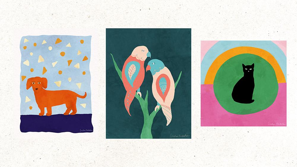
time to start sketching. As I said in a project video, I'm going to be showing you three different
illustrations so you can see how the same technique can be applied to
different photos. I'll start with our
cute little ducks in here and then move on to the
cat and finally the bird. You're welcome to use the
same photos if you'd like, but don't feel like you
need to do all three. So let's begin by looking
at our reference photo. If you're looking at
your photo and are feeling a little overwhelmed because you don't
know where to start. I'm going to let you
in on a little secret. The key to drawing
your animal is breaking it down
into basic shapes, namely circles,
triangles, rectangles, squares, things like that. Doing this allows you to roughly get the pose and the
proportions rate. Once you've got that down, the hard part's
pretty much over. So what does this look
like in practice? Let's make our reference
photo a little larger. And I'll show you what I mean. So let's begin with the head. It looks a little
irregular at first glance, but if we look again, we can see it can be broken down into two circles stacked
on top of each other. Then if we move
down to the body, can you see how the chest
is kind of rounded? You've got a circle
shape in there. Then when you move to the
back, towards the tail, it's rounded once again, which gives us another circle. This one is smaller
than the chest. So take a couple of minutes and analyze your
reference photo. See if you can spot the
basic shapes in your animal. Once you've done that,
Let's start to sketch. I'm going to move my reference
photos without the way, but I can still see it. I'm also going to make sure that I'm starting on a new layer. It doesn't matter too much where in the Canvas
you start with, just as long as you've got
enough space on either side. Unlike something like Photoshop, if you run your pen
stroke off the page, you will be able to get it back. The boundaries of the page
are the boundaries of your sketch and anything
beyond that is lost. So beginning with the head, I'm just going to
make it a bit larger. So I've got that. I'm now
going to draw my two circles. Now, this is very rough, so don't get hung up on trying
to get a perfect circle. So I'm going to begin
with a large one. And then I'm going to follow
that up with a smaller one. Now, this is just laying a
few strokes to begin with. Okay, so now that
I've got two circles, I'm very likely going to join
them together so we can see the beginning of the head
shape coming together. So just with light strokes. A key thing to note about
the Eraser tool is that you can use any brush that
you want to erase with. I like to use syrup, which is part of the
inking brush set because it's got
a good size range and has no transparency. So it brushes, strokes,
ordinary clean way. I'm going to erase
the inner circles now and just see how my how the shape of
the head looks in comparison to the photograph. This is the point at which
you start to make any tweaks. Like I said, we're not
going for life-like, but you wanted to bear
resemblance to your photo. So I can see here that it's a
bit too long for my liking, so I'm just going to
shorten it a little bit. Okay. I'm happy with
this head for now. So I'm going to tap
on the select tool, which selects the entire sketch. And I'm going to
move it a little way so that I've got
room for the body. Now, we're going to
tackle the chest area. What I wanted to
at this point is keep an eye out on proportions. In this case, I know that the chest circle has to
be bigger than the head. So to make things easy
in terms of placement, I'm going to tap Layers and I'm going to
open up a new layer. Then I'm going to draw
the circle roughly where I think it might
work. In this photo. It's below the head and a
little bit to the right. The advantage of doing
the second circle on a new layer is that
you can move it around to get it to
exactly where you need. I'm going to hover over
where the head line is and move it a little
bit down and to the right. And that gives me my starting
point for my chest circle. Which is again, a big circle. Feel free to zoom in and out
of your canvas as you need. I do this all the time.
I'm constantly zooming in, zooming out, flipping my canvas around, everything like that. So just do what you need. Right? We've got our head
and we've got our chest. So cool. Now, I am more or less
happy with the placement. I might tweak it a
little bit later, but for now I'm
going to keep it. Now we move on to the
final basic shape, which is the back part of
the dog near the tail. So tap on a new layer again, and that adds a third layer. And we'll draw a
smaller circle roughly where I think it is in
relation to the other two. So let's follow the top
of the circle again. Sort of trace. We're assuming that's the back. And then land about here where we've come
up with our thoughts, OK. Now we've got our three shapes on
three different layers. And we can play around with the positioning
a little bit to see if it needs to be changed or for a roughly
happy with where it is. I think I'm actually alright
with where they are. I might do some further tweaks later on once we
join everything. But for the most
part, I don't think I need them to be on three
different layers anymore. So the way to merge them is open up your Layers
panel and you can see all three in there
and it's really easy. You literally just
pinch them together. Now you'll see that
they're all on one layer. And you move them around. They're all, they're
together. So now that we flatten the layers
and you're left with one, the next step is to connect these three shapes using light strokes and using
your reference photo. Start to join your
shapes together. Let's start with joining
the head to the body. So I'm just going to
start with light strokes. You can see it tapers
towards the back. So I'm just doing that. Now. Once I've joined the
shapes together, I can see that the head
is perhaps a little bit higher than I
wanted it to be. What I'm going to do is rather than erase the whole
thing and draw a new head, I'm going to go to
my select tool up here and go make sure
free hand is selected. And then I'm going to just
draw around the head. Right? So that's selected ahead. And then we're going
to go to the Move tool and then just drag
it down a bit. And I'm just going to move this back to the
center of the beach. I'm happy with how
this is looking now. So next, I'm going to add
in the ears and the legs. Now, these shapes
are more irregular, but you can apply the same
principles of breaking them down into more manageable pieces and going from there. So if we begin with the ears, I'm just going to roughly mapped them
out next to the head. There, very, very large. And that is sort of a triangular
shape, but not exactly. So I'm just going to start
with the base of a triangle. If you want to deviate
from your reference image, that's fine as well. For example, in my
reference photo, the dog has one porous, but I want to have all four
paws resting on the ground. So I'm going to draw them all. This is a very stylized image with not a whole lot of details, so don't worry
about getting every single element a 100% correct. I'm just going for
the basic shapes. This is fine. Since I'm deviating from
my reference photo here, I'm just going to
literally and do the same. And that's a reduction. You can go ahead and erase these circles that
are inside the dog. I think one final tweak I'm
going to do is actually make the legs a little
bit shorter because I feel like I quite
long at the minute. So let me just like
I did with the head, I'm just going to select the legs and good free form so that it doesn't
constrain the proportions. And then literally
just squash them. If you want. Don't want to make any
more tweaks at this stage. Go ahead and do that. I'm just going to stop here. So this is the Jackson sketch. At this point, I'm going
to very quickly run through the cat and the bird
using the same principles. So you can see how
this approach of using basic shapes translates to any kind of photograph
or any kind of subject. So I'm starting out by using the basic shape
approach shown earlier, where the gods head, followed by the torso and finally the lower
half of the body. I'm happy with where the
three shapes or position. So I'm going to go ahead and
merge the layers together. Now it's time to join up all of these shapes to actually
form the body of the cat. Then I'm going to erase all the lines on the
inside and we're done. This is our final drawing,
which is the buret. For this one, there
are two shapes that I'm going to be drawing the head and body before I add
in the smaller body baths. So now we've got three very different
animals that were all drawn together using
the same technique. In the next lesson, we're
going to look at placing them within a wider
composition using thumbnails. See you there.
5. Exploring Composition Using Thumbnails: In the last lesson, we learned how to sketch our animal using a reference
photo in Procreate. So you should now have fun illustration that you've drawn, which is a great start. Before we can jump in and
start coloring it in, do we need to put it within a wider composition and rough thumbnails are the
best way to do that. So grab your notebook
and let's get started. Thumbnails are many versions of different compositions
using your main subject, which in this case is
the animal you've drawn. There are a great way to play around with different
ideas and layouts to see what works before you
commit to a final version. I'm going to start
off by drawing a series of rectangular boxes. I'm doing them in
a portrait format, but feel free to do
them in landscape or square if that's your preference for your final illustration. I'm just going to do three
boxes for each animal. Let's begin with a DAX
and illustration first. Now he's more horizontal
than he is vertical. So we need to bear
that in mind when working on a thumbnail
composition. I'm going to be using
the rule of thirds, which is when you divide the page into a
three-by-three grid with your subject
being placed at a point where any of
the lines intersect. So in this case, I'm going to do a
very rough sketch of the dog in the lower
third of the page. I could then add in a
block at the bottom. This could be an
outside scene with maybe some trees
in the background or something to that effect. The other one could
be if you just want to have the dog in
the middle of the page. So you've got the dog here. And then anything that you
do happens around the dog. So you could have in a circle. Again, this is just to get your ideas flowing and
C via wind takes you. Another idea you could
try is creating a sort of vignette of freedom
within the Canvas. And you could have your
dog within that rough box. And then you could
add in any details within the same box as well. So now I've got three
different composition options for my dog illustration. Now we move on to our bird. While the Jackson
was wider than it was told the buret
is the opposite. You can use the rule of
thirds for this one as well, but in a different way to allow for the
vertical proportions. So you can have the bird B here along the right-hand
side of the page. Then you could maybe
have a tree branches or something like that that expands towards the
rest of the page. So you're leading the eye
outwards and upwards. Another interesting
thing you can do is play with mirror images. This works whether you're doing a vertical or horizontal
illustration. But essentially you can
have the bird like this. And then you can have a
duplicated and reflected. So it's a mirror image. This is very easy to
do within Procreate. For the third
composition option, you can have the bird in
the middle of the page. And just like we
did with the dog, you can create a
rough frame around it to vary up the effect though, you can have the tail of the bird spilling
out of the frame, which is a nice visual effect. For our last set of thumbnails, we're going to be looking
at the cat illustration. The reason I'm doing this
at the end is because the dimensions of this sketch
is a little bit of both. Neither the width or the height are drastically more or
less than the other. So there's a lot of versatility with what
you can do with it. Let's start by placing it
in the middle of the page. And then whatever you want happening can
happen around it. Sort of similar to what
we did with the door, but it's not as wide as the dog. So the space it occupies
on the beat is different. You can also do a mirror
version of the cat, but you can do it flipped upside down instead of to the side. And for our final option, I'm going to show you
something a little different. Instead of having just
the one illustration, I'm going to duplicate
it all over the page, almost like a pattern. If you choose a
composition like this one, you can have a lot
of fun playing with different colors and patterns
for each duplicate animal. Again, this is very easy to do since we're
working digitally. So you can see here, there are so many different
ways in which you can play around with
thumbnail ideas. Whether you're following
along with me using one of my reference
photos OF your own. So take a little time to study the proportions and
orientations of your sketch. And using thumbnails, find a composition
that works for you. For the purposes of this class, I'm going to be
choosing one thumbnail for each of these
rows to progress. For my dog illustration, I think I'll go with this one. For the bird. I go
with a metal one. And for the cat, I go with the first one, maybe with a few tweaks. Now that you've seen how to
create rough thumbnails, why don't you have
a go at creating some of your own figure sketch. Once you've done this
and have selected which one is going to be
using for your illustration. I will see you in
the next lesson where we'll start
bringing it all together by composing
the final sketch. I'll see you there.
6. Creating Your Final Sketch: In the last lesson, we create a thumbnail
compositions and played around with different ideas
using our animals sketch. By now, you should
hopefully have decided which composition
you're going with. Now, we're going to
bring the composition to life by creating the final
sketch in Procreate. I'm going to start
with my dog sketch. I'm going to go to
my Layers panel. Make sure the layer
with the sketch is selected and swipe to the left. I'm then going to
tap on Duplicate, which creates a
copy of that layer. I'm doing this because
I don't want to work on the original sketch in case I make a mistake that
I can't reverse. So this week I've got a backup of the
original if I need it. I'm then going to hide
the original layer at the bottom by tapping on
the checkbox to uncheck it. The next thing I want
to do is to work in portrait because that's what I want according to my
thumbnail composition. So I'm just going to
zoom out a little bit. Then I'm going to hold
and rotate and please, so that it's now in portrait. You'll see now that the sketch moved with the Canvas
as I rotated it. So I need to change that. I'm going to go back to
the Layers panel and make sure that the correct
layer is selected. I'm going to rename it to sketch to avoid any
kind of confusion. Now, I'm going to tap on the select tool and make
sure it's on uniform. You see that the whole
sketch has been selected. I want to rotate it 90 degrees. So I'm going to tap on, rotate 45 degrees twice. I'm now going to
make it smaller. If your sketch has gone over the boundaries
of the canvas, let mine had made sure that it remains selected with
a box around it. Otherwise, if you'd have
outside the box and de-select, you will lose the bit
that's beyond the canvas. I'm now going to tap
and drag the sketch to the lower third of the page
as per my company reference. Now that I've got the
sketch to where I want it, I'm going to start adding in the other elements I want
to the final sketch, I'm going to go to
my Brush Library and select my sketching pencil, which again is diamond, which is found in the
sketching section. I've also selected
a dark gray color similar to what I did
my initial sketch with. Looking at my
thumbnail reference, there is a vignette type of
frame around my main sketch. So that's what I'm
going to draw first. I'm just going to go
to my Layers panel and create a new layer that I'm
going to call other elements. You can call yours
whatever you want. The main thing is
that it should be separate from your
main sketch layer. I'm then going to tap and hold to drag it below
my sketch layer. Now I'm just going to
draw the roof frame. I'm intentionally
keeping it wavy and squiggly because that's
the look I'm going for. Now that I've done that, I'm going to check
whether I'm happy with the position of the dog
relative to the frame. I like to move it further down. And this is where
having the dog sketch be on different layer is
going to come in handy. So I'm going to go
to the Layers panel, select the sketch layer, click on the selection tool and move it slightly downwards. So now I've got the dog
and the frame around it. Next, I'm going to have a think about what additional
elements I can add behind and around the dog to flesh out
this illustration mole. This is where you can really let your imagination run wild. So decide what you want to draw to bring your
piece to life. When you're ready,
make sure that you've selected the other
elements layer. Once again, for my sketch, I'm going to do a little
block at the bottom so that the dog has
something to stand on. As for my thumbnail, as for the rest of it, I'm
going to have some fun with it and go a
little abstract. I'm going to draw some
irregular triangular shapes to fill up the space
above and around the dog. If you're following
along with me with the same
composition and sketch, feel free to do the same. Or perhaps try different
shapes like circles or squares or even a dog bones
if that takes your fancy. Something like this,
once finished, would make a really
cute greeting card or maybe even a printer
you can hang on your wall. There are a ton
of possibilities, so have fun with it and
let your creativity flow. I'm happy with how
this is shaping up. So the final thing I'm
going to do is add an EIS and facial
features to my dog. I'm going to go back
to the Layers panel and select the sketch layer. Because I'm going to
be working on the dog. I'm going to zoom in so I can see what I'm doing
a little better. I'm also going to bring up my reference photo by tapping on Settings canvas and
turning on reference. Now, the dog and the photo has a pretty serious expression, which while Q isn't what
I'm going for my sketch, drawing in your beds features
is a great way to add in a little bit of character and make that personality shine. So I'm going to roughly
draw in the eyes and nose and add in a
little detail to them. You could also add
in things like eyebrows or anything
else that you want. This is to give us a
little bit of a guide while we're coloring in our
photo in the next lesson, feel free to make adjustments until you're happy
with how it looks. I think I'm going to
move the nose a little lower to make the
face look longer. And on second thought, I think I'll redraw the
eyebrows on this one. There we have it. My finished vaccine sketch. I'm now going to quickly
run through the bird and the cat using a
similar approach. So I put my bird sketch and
my reference thumbnail, just like with the dog, I'm going to rotate the
canvas to make it a portrait, and then duplicate the layer to create a backup
of the sketch. And then I'm going to
rotate the bird as well. If you're following along and
using the same composition, or if you're using
your own animal, but want to go with the
mirror effect that I'm using. Here's how you do it. It's very easy. First, I'm going to drag my book towards the bottom right of
the corner of the canvas. Then I'm going to
duplicate the layer and move it towards
the top left corner. While it's still selected, I'm going to tap on
flip horizontal, which will make it
face the opposite way. Since each bird is
on its own layer, I'm going to rename
the duplicate birth to avoid any confusion. And then I'm going
to match them around slightly until I'm happy
with the positioning. Now, it's time to add
in the other elements. Although these birds are currently a mirror
image of each other, I don't want them to be
carbon copies either. So I'm first going to
zoom in and bringing the reference photo to get an idea of where
the eye should be. I'm also going to tweak a
few details with the tail. I'm going to have a curve like this and refund some of
the features a little. I'm now going to add
in a little detail to the wings and the neck as well. For the second bird, I'm
going to do the same. But this is where
the bit about them not being carbon copies
comes into play. Because although I'm drawing
in the same details, the fact that they are
hand-drawn and old copies as in a bit of variation. I'm also going to be coloring
them in differently, but you'll see more of
that when we get to it. For the added elements. While I want the bird
to be the main focus, they do need to be
sitting on something. So I'll create a
new layer for it. And then I'm going to very
loosely draw a branch. I'm going to extend it
outwards a little bit as well. Nothing fancy. The birds are still the
focus of the piece, but it makes the whole thing
look a lot more cohesive. And there's a final vote sketch. Now, let's finish off
our trio with the cat. I'm going to repeat
the same steps I did with the dog and
the bird to set up. For this sketch, I'm going to position the cat
in the center of the canvas and then going to create the
other elements layer. Now, I know my
thumbnail had the cat be in a portrait orientation
like the other two. I've changed my mind. And you can as well if you feel like it, I'm going to make this a
square canvas instead. So let me show you
how to do that. I'm going to tap on the
spanner to bring up the settings and then
go to crop and resize. You can see this boundary box has appeared around my sketch. I'm then going to go to settings and you can see
the current size, 8.5 by 11 inches. I want to make it
11 by 11 inches. So I'm going to tap on this
and enter 11 and done. You'll see that the
Canvas has expanded, but it's done so from
the bottom right. So I'm going to hit Done
and then I'm going to have to reposition my cat to
bring it to the center. Once again, I'm going to
keep the size as is for now. I'm now going to go back to
the other elements layer. I'm going to draw a rough
circle around the cat. I have this in my town
near composition. And again, it's leaning more towards an abstract style
like I did with the dog. If you're following along,
feel free to move around to your Canvas to get a better handle on drawing
your shapes. Like I am. If I was going for
something very minimal, I would just leave it as is. However, I think I'd like
to add a little bit more. So I'm going to
divide this into half and draw almost a rainbow
shape and the top half. And I'm going to leave the
bottom as it is for now. I don't like to
add in a whole lot of detail to my sketches because inspiration often strikes me
once color hits the beach. But if you're someone
who wants to add in more details at this
stage, go for it. Everyone is different. That's another advantage
of working digitally. You don't have to
commit to anything. Now, the final thing I'm
going to do is zoom in, select my sketch layer, and drawing the eyes,
nose and whiskers. You can add them out or any
other features you want. But I think I'll skip that. And that's my cat
sketch complete. All right, so I've got three final sketches
ready to be colored in. So I'll see you in
the next lesson.
7. Colouring In: In the last lesson, we can post our
final sketches and procreate using our hand-drawn
thumbnail compositions. Now, it's time to
cover it all in. Before we jump into it, I just wanted to
take a couple of minutes to talk about color. If you're new to
illustration or odd, choosing a color palette
can feel a little daunting, especially when you're
working digitally because you have
virtually every color available to you to choose from to make things easy
for you of a Florida, the three color palettes
that I'm going to be using to the class resources. I like to work with a limited
color palette because this ensures that I end
up with a piece where everything works
together really well. I like to stick to
five or six colors, and if I need any
further variation, I'll stick to making the ones
I have darker or lighter. If you'd like to learn
a little bit more about basic color theory and tips on creating your
own color palette. I've got a whole
video dedicated to it in my previous class
on pattern design. I've linked to that in
the class description, so feel free to check it out. Now, let's get
back to Procreate. To access color
palettes on Procreate, tap on the little circle
in the top right corner. Procreate comes with some
default pallets already, but you can also
create your own. As you can see, I have
loads of them because I'm constantly creating
custom palettes for all my illustrations. So now I'm going to show you how you can make
your own as well. You're going to
need an image with the colors you want to
include in your palette. As I said earlier, I've
included the ones I'm going to be using in the class
resources section. So the first thing I'm
going to do is go to the Settings menu
and tap on Add, and then insert a photo. And then going to
find the image I'm looking for and tap on it. This instance, the image into the Canvas as a separate layer. I'm just going to increase the size and then
de-select this. This is the color
scheme I've chosen for my dog illustration. When working with the palette, it's good to set
it as the default, which you can do by tapping
on the three dots on the right and selecting
set as default. Procreate has two ways
of displaying pallets. You have the compact view, which is what this is. And then you have
the cards for you, which displays the
swatches in a larger size. Now to create a
palette for my image, I'm going to tap on the plus
symbol at the top right. I'm going to tap on
create new pallet. And you see now how a
new one has appeared at the top and it's currently
called Untitled. I'm going to tap on it and
change the name to dog. So you can see that all
the swatches here agree, which means that the blank
and ready to be used. So how am I going
to fill them up? I want to draw your attention
to this little square here, which sits in-between
the brush size and brush opacity sliders. This is the color picker. To use it, press down
on it with one finger, and while it's pressed, select the color you want to
add with the Apple pencil, you will see the color
and the circuit change as you move over
different colors. So I'm going to begin with
this orange color first, and you'll see how the color in the top right corner
has changed as well. So with it selected, I'm going to tap on a blank
square and my color palette, you can see now that the orange is now part of the palate. This is how you add a color to the palette using
an existing image. I'm not going to do this for
all the remaining colors. Now that we've finished
filling up the palette, I don t need the image anymore, so I'm going to go to
the Layers panel and swipe to the left
and then tap Delete. You will see that
there are lots of empty slots, slots left. But since I'm working
with a limited palette, I'm not going to be
filling them up. Alright, so we have a
color palette all set up. Now, the next thing I'm going
to do is kind of blocking. Blocking is a great
way to test out your color palette
to see if it works. Because although
you have a set of colors that all
go well together, how much you use each one and where you use it makes
a world of difference. When your color
blocking, you don't have to worry about
being accurate because it's meant to be a rough color map
of the end result. So you can experiment
and have fun without feeling like you need
to commit to your choices. I'm going to color block my illustration all in one layer. So I'm going to create a new one and name it color blocking. I'm then going to drag it
under my active sketch layers. I'm doing this so that
I'll still be able to see the pencil strokes as I
start blocking in the color. When it comes to brushes, I like to use the brush syrup, which is found under
the inking section. I liked. It has a nice smooth stroke
and it can be sized up to. Now they'll run
that. Let's begin. I think I'd like to have
a light background, so I'm going to select this
light yellow color and start drawing very loose strokes
to create the border. When it comes to
filling this in, I could do this by hand, but a quicker way is to tap on the color icon and drag it the
area that you want filled. It's a faster way than
doing it manually and works especially well in
large areas like this. Now, with a block in the bottom, I'd like it to be
the light blue. So I'm going to
reduce the size of my brush and follow
the same steps. Filling in shapes
using this method only works if you have close
the loop on your shape. If you leave a gap
in your shape, then the color will fill
everything like this. So make sure you close off your shape to ensure that
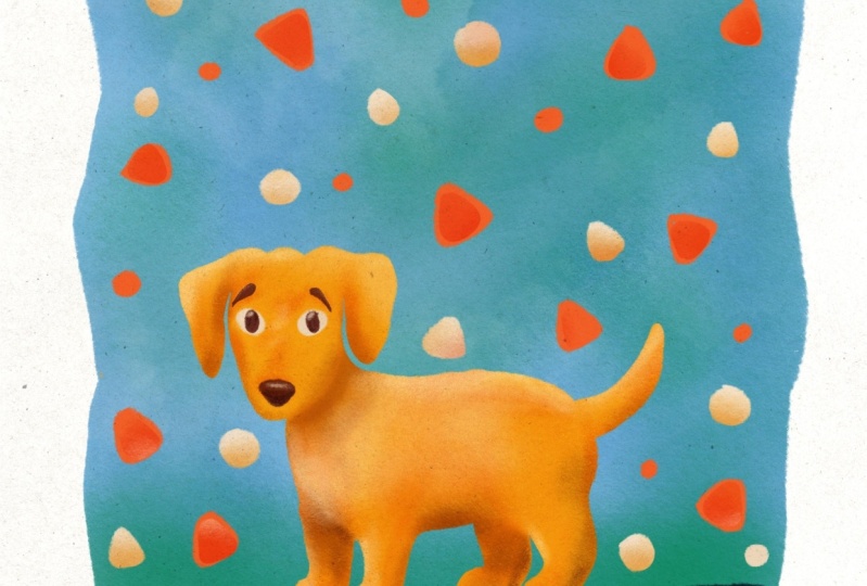
gets filled properly. Now, for the dog had said, I think I'll go for
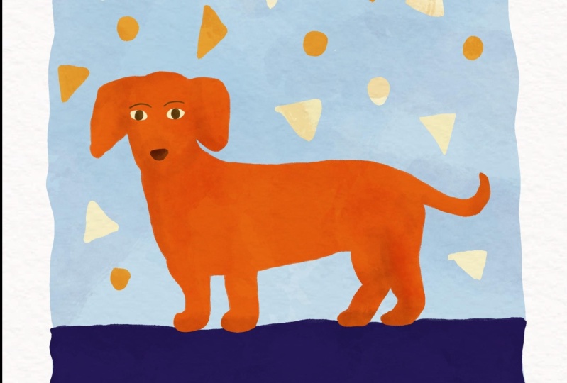
an orange color. If you're drawing your
pet and want to stick to colors as close to
real code as possible. That's absolutely fine. I'm just going for a
more playful palate here that includes
an orange dog. So again, you'll
see that I'm being very loose and reflect
my brushstrokes here. Now, all that's left are the
abstract triangle shapes. And I'm going to pick the
reddish brown color for them. Okay. I've got all my main
areas color blocked here. I'm not adding any details because that's in
the next lesson. I'm going to turn off my
sketch layer so I can get a better idea of the color
patterns of the piece. I think that looks fine, but I'd like to do
one more version using the same palette
just for comparison sake. So I'm going to duplicate this layer by
swiping to the left. And then I'm going to use the fill tool to swap
the colors around. I think I'll mix around
the triangle colors just to add variation in them. Now, let's look
at the difference between the two options we have. They're both using the
same color palette, but they look so different. This is my color blocking
is such a useful exercise. I add in some dark triangles to the light version as well. I really thought I
prefer the first option, but comparing the two, I actually think I'm gonna
go with the second one because I really liked the
orange against the light blue. Okay, now it's time to
color it in properly. I'm going to create a new layer called final color background. And then I'm going to select the light blue again
and start coloring. In. This time, I'm going to take care
to stick to the sketch. Now that the background is done, I'm going to create a new layer for the dark colored block. I'm going to add in the
dog on another layer. If you're following along, tried to stick to the
sketch as much as you can. But if you need to
make little tweaks along the way, Go ahead. Finally, I create my
last coloring in there, which is for the
little triangles. In fact, I think I'm
going to mix things up a little and add some
circles as well. Alright, I'm happy
with how this looks. So I'm just going to group
all my final color layers together by swiping them
and tapping on group. You'll see the difference
between the blocking layer and the final color layer
by turning them on and off. Now, I'll quickly run
through this process with the bird and the
cat illustrations. I've got my color palette
for the bird all set up. So I'm going to do a
quick color blocking exercise like I did with
the dog illustration. I'm going for a dark
background here, which means that my
sketch is invisible. So I'm going to reduce
the opacity by tapping on n and then moving the
slider to the left. With this piece,
I want the bus to use the same colors,
but in different ways. I'm happy with this
scheme. I'm not going to try a second variation. So let's move on to
the final coloring in I'm going to do separate
layers for the background, the brand, and
each of the birds. Since this is the final coloring in I'm being careful
if I restaurants. There we have it. This bud
sketch is all colored in. Now, let's move on
to the catheter. That final piece.
As my color palette has been set up
and I'm blocking. Now I'm gonna go a bit rogue
and color the cat and black, which isn't a part of
the original valid. This is because of my
own black cat, Lucy, who is amused for
most of the I create. I think I'll do it on the
pink a little because I feel like it's
clashing with the green. I'm going to do this by going
to the value panel with it selected and move the
saturation slider to the left. This has created a new swatch, which I'm going to add
to my palette by tapping on the blank square
underneath the original bank. Okay, that's lighter
by still feel like it could be told
on a little bit more. So I'm going to repeat
what I just did there. I think that looks much better. I'm also going to adjust the width of some
of these arches. Now this is where I'm
deviating from the sketch, but that's okay because as I
said in the previous lesson, you don't get a complete
sense of how something works unless you start
adding color in. So if you need to adjust
things, please go ahead. Now, because I've made so many adjustments to
the color blocking layer is starting to resemble what the final version would be. So I'm just going
to duplicate it and rename it to
find the background. I do, however, need
to refund the caps, so I'll remove it
from this one by painting over it in green. And then I create a
final cast layer. Then using my sketch
as a reference, I'm going to carefully
calibrate my cat in black. And we're done all three
colored inversions. And I'll complete
in the next lesson, we're going to add in
details and textures to really bring their animals
life. I'll see you there.
8. Adding Texture and Detail: In the last lesson, we learned about color and how to add it into our sketches. We went through
the color blocking technique before doing
a final coloring in. Now we're in the homestretch
where we're going to add in textures and details
to finish off our piece. So let's jump in. First,
let's take a look at the layers panel where I've got the final color layer
group selected. Now the first thing that
I want to do is to add in a little bit of a hand-drawn
feel to my illustration, starting with the
edges are outlines. If I zoom into my illustration, you'll see that the
edges are very smooth because I use the brush to
make it easy to color it. Clean lines are a visual choice. But like I said,
I finished piece to look like it was drawn
and painted by hand. So I'm going to go
to my brushes panel and select a brush
called Tinderbox, which has slightly
fluffy texture edges, as you can see here. Now, I'm going to start going over the edges of my sketch, starting with a dog. I'm going to create a
new layer just above it and call it dog edges. I'm then going to zoom in, select the color of my dog by tapping and holding
on the color picker square and start to go over the edges of my
dog with a brush. You can see straight away how the outline starts to
look, texture and gritty. That's the look I'm after. It doesn't really matter
where you start in the sketch because you're going to be
going all the way around. I'm going to keep rotating my
canvas around so I can get the best angle for drawing and avoid physically
moving the iPad. So feel free to do the same. I'm taking care to not start right on the edge
because that will result in dramatically
increasing the size of my illustration. So start a little
lower than the outline and the thickness of the brush will take
care of the rest. It's okay if it
extends our little. So if you need to
do a little bit of trial and error, that's okay. Now I'm going to do the whole
job with this technique. Once you've finished
outlining the dog, you might notice that in some areas the airplane
is a little bit lighter due to this being a
pressure sensitive brush. So if you need to
go over any areas, go ahead, but don't
worry too much about it. A little color variation. Just asked the hand
painted aspect. Now that the dog is done, I'm going to do the same for the blue block and the shapes. If you're following
along with this or doing an illustration
of your own, make sure that you do this
on a separate layer that sits on top of the element
that you're working with. Now that I've added
in textured outline, I'm going to merge
the edges layers with their counterparts
underneath. So as I showed previously, this can be done by simply
pinching the layers together. So now everything is one shape. Once again. The next
thing I'm going to do is adding facial expressions
or features to my dog. So I'm going to turn on my
sketch layer for reference. I'm then going to create
a new layer above the dog layer and
call it expressions. I'm then going to bring the
opacity of my sketch layer weighed down by dragging the slider all the
way to the left. Then I'm going to go back
to my brushes panel. I want to select a brush that retains that hand-drawn feel. Almost like if you're using a very fine brush away or painting or even
a colored pencil. The Russian going to be
using is called Blackburn, and it can be found in
the drawing section. I'm going to begin
with the eyes first. I'm going to select
the light yellow color for the whites of
the eyes and paint them in one drawing animal
features. Here's a quick tip. If you want to
emphasize cuteness, you should make the eyes
really vague and exaggerated. That's my baby animals
in particular, like kittens and
puppies have massive. So the bigger you make the
eyes of your illustration, the more cartoonish they end up looking for the eyebrows
and the pupils, I'm going to need
a darker color. And this is where
I'm going to add a new one to the palate because the only dark color
of God is this blue one, which wouldn't really work. I said in my previous class that if you stick to
a limited palette, and that is still the case
here for the main elements. But for things like
small details, It's okay to add in an extra
color or two if needed. I'm going to go to the
classic section of the colors menu and
find a suitable dark brown by moving the sliders around and then go to
draw in the eyeballs. Then I'm going to turn off the sketch layer to
see how it looks. I'm okay with that. So I'm going to turn
the sketch layer back on and draw the rest
of the features. For the eyebrows.
I'm going to make the brush smaller and
then draw them in. For the nose. I'm going to stick to
the Orange family, but just make it darker. I'm then going to turn off the sketch again to see
how that's working. I'm happy with that. So much so that I don't think I need to
add anything else. And now that we're done
with the facial features, the final step is to add an overall texture and
shading to the piece. I'm going to walk
in the door first. So I'm going to create
a new layer above it called texture and shading. Now, I don't want the
texture I add to the dog to bleed over to the background
or surrounding areas. So I'm going to use procreates
clipping mask option by tapping on the thumbnail of my new layer and then
on clipping mask. This ensures that
whatever I paint onto the clipping mask
layer is limited to the area of what
is underneath it. So you'll see here that it
doesn't extend beyond this. This helps you to
draw freely without worrying about going
over the lines. Then going to turn
my sketch back on, but turn the opacity even lower. This is so I can use it as a guide when I'm
adding in the texture. When it comes to brush
selection for adding texture, you have quite a few
default options. I often go to the artistic
section which has some great brushes like
terribly and old beach, but any of these would work. So let's choose terribly now to make textures look
natural and cohesive, I'm going to play around
with layer styles, which can be accessed by
tapping on this N here. That stands for normal and it's the default layer style
setting and procreate. You'll see that we've got
a whole list of styles, each of which will result
in a different look. I'm going to use Multiply, which as the name suggests, multiplies any
color that you put on the layer with the
one underneath it, resulting in a darker color. So even if you're using
the exact same color, you can still see it turn
up darker on the canvas. If you go with a darker color, you're going to have a
much more dramatic effect. Also keep an eye on
your opacity slider setting because if you
haven't done all the way up, you're going to end up
with a very dark stroke. Now, one way to add
in texture is to just lightly run your
brush across your piece. If I turn the layer on and off, you'll see the difference
that extra has made. So you can start to see
how just a few strokes can dramatically change the
appearance of your piece. I liked the way it looks, but it's a bit much
so I'm going to change the opacity of
the layer slightly. So I've got a nice piece and now I want to define the
features a little more. I'm going to select
a brown color and bring the brush opacity down and adding
some shading around the ears to make them
stand out a bit. Along with any other
areas that I want to emphasize like the
bars and the legs. So once again, if you don't
the layers on and off, you can see the
difference going from flat dog to texture dog. Now that I've run
the body of the dog, I don't want the eyes and
the nose to be left out. So now I'm going to create
a clipping mask layer for them as well and
adding some shading. Because these are small
areas, they don't need a lot. I'm now going to do
the same thing for the block shapes
and backgrounds. So I'll see you
when that's done. Right. I've now added a texture to all the
elements and you can see how much of
a difference it's made compared to the original. Now I've got one
final step to share with you before we mark
this one as complete. I've included a paper texture with the class
resources and we're going to apply this
to the whole piece to make the whole
thing come together. So I'm going to insert a
photo and bringing the file. Now, it's smaller
than the canvas, but don't worry
about that because any pixelation you see even making the larger will be hidden by how we're
going to use it. Just make it as
big as the canvas. And you'll see it's covering
the whole illustration. It turns up in the layers panel as an image about all
of that active layers. Then going to change the
layer style to multiply. And you can see now
how it looks like the whole illustration has
been painted on the paper. I'm going to lower
the opacity though, so it looks a little
bit more natural. Now, the whole thing
looks a lot more cohesive with the
paper background, but the illustration
is still a star. If you'd like to use a texture that you don't have to resize. I've included some
larger size pants and the resources as well. Now, the only thing left to do is to add in your signature. It's always good to
do this as you've got your name on it
when you share it, whether that's
online or offline. So I'm going to create
a new layer and say my name using a thin brush. And a dog illustration
is now complete. I'm now going to quickly take
you through the bird and the cat, the dog. I'm going to first
outline the edges of the brush to make them
look more hand-drawn. I'm doing this
separately for each book because they're both on
two separate layers. I'm going to do the same
for the branch and then mostly edges with their
corresponding layers. When it comes to adding
and facial details are drawing the eyes and
adding eyelashes. But I'm going to be decorating
the rest of the buds, which I'll get to in a second. First, I'm going to add
an overall texture to the branch using entirely and
multiply as Layer setting. Coming back to the birds, we have a lot of color going on. So I think adding in texture
and in similar ways, it's good to make
things look a bit much. So instead, I'm going to be adding in
decorative elements. Starting with the left foot. I'm going to start out again, decorative lines and curves
using the same color palette. If you're following
along this piece, this is a great
opportunity to let your imagination run wild and
add it. Anything you like. This is quite different
from the door, which is all about simple
shapes but lots of texture. And here we have
minimalistic show, but lots of details. Now do the second vote, still sticking with
the same palette but different designs. Now that that's done
as a final touch, I'm going to add in
texture to the background and the paper texture
like we did with the dog. Now complete. Now onto our final
illustration, the cat. I'm going to work with a cat
first and added the edges. Now, moving on to the edges
of the colored background. While the cats expressions, I turn on the sketch
layer once again, I'm drawing the eyes,
nose, and whiskers. On second thought, I think
I'm going to leave out the whiskers because I like
how it looks without it. Now to add in texture, because the cat is black, any texture won't
really show up. So I'm going to limit the
texture to the background only because it's
all in one layer. I just have to be a little
bit more careful to make sure that the colors
don't bleed into each other. If this happens, just use Undo Eraser tool to get
rid of any mistakes. Now that the textures
have been added, I'm going to adjust the opacity so it's not too overpowering. And finally, I will add the paper texture
and my signature. Dumped it all through
your illustrations. I'm really pleased with
how these have turned out and I hope that you are
with your work as well. We've got just one final
quick lesson video left where I think he's
receiving your work, so I will see you there.
9. Saving: In the last lesson, we finished our illustration by adding
in texture and details. Now, all we need to do
is save and export. Procreate has a
number of formats available when it comes to
exporting your artwork. So let's start off by tapping on the Settings icon
and then unshare. Here's the list of all the
different formats available. In addition to saving
as a Procreate file, it also allows you to
save in PSD format, which is great if you'd like to work on your piece further in Adobe Photoshop as it saves
all your layer information. It also has the standard
image options like PDF, JPEG, PNG, and tiff. If you save as an image, your layers are all flattened and you won't be
able to edit them. I typically tend
to export my art in JPEG format because it's a good balance of
preserving the quality of my piece without the
file size being massive. Now that I've selected
to save in shape, but I can do a number of things. If I want to get it off my iPad and onto
another Apple device, I can add drop it, or I can email it to myself. Or I can just save it to my iPad directly by tapping
on Save image. One thing to remember is that
once you have exported it, your existing Procreate
files doesn't go away. It will just create
a new file for you. So you're not losing
any of this information and all your layers will
remain in the form of a Procreate file
that will be found within the app unless
you choose to delete it. So now that you know how to
save and export your file, you are officially done
with your illustration.
10. Final Thoughts: You're now done with all
the lessons in this class. So a big congratulations
on finishing it. I really appreciate you taking
the time to learn with me, and I hope you found it
both fun and useful. We've covered a lot of
ground in this class, starting off with a
simple sketch before placing it within a
wider composition, adding in supporting
elements, coloring it all in, before finally
adding and textures and details to properly
bring it to life. If there's one thing I hope
you take from this class, it's that illustrating
animals can be a fun, enjoyable, and
relaxing exercise. I hope it's given you
confidence to create more and inspired you to try something that perhaps you hadn't
thought of before. As a final note, I would
love for you to share your project in the
project gallery so that we can all take a look. If you enjoyed this class, I would appreciate
you leaving me a review and following me on Skillshare so you can get notified when I
published my next class. I'm also on Instagram. So if you share your work
on there and tag me, I'm more than happy to give you a shout out on my stories. Thanks once again for your time and I will see you
in the next one. Bye.
 Sneha Kadaba, Illustrator and Designer