Transcripts
1. Introduction: Buttons are all around us and knowing
how to create a repeat surface pattern
is a really useful skill. In this class,
you'll learn how to create a modern
surface pattern in Adobe Illustrator with
more teeth that you can re-purpose to create
your very own art print. Patterns can be any size, shape, or color with motifs as fiber, practically anything
you can think of. Hi, I'm [inaudible]. I worked for over 10
years in the field of design and I live in
Oxfordshire in the UK. For my full-time job, I work as a creative head for a large company
here in the UK, but I freelance as a
designer and illustrator. I love creating patterns because the possibilities are limitless. They can be used
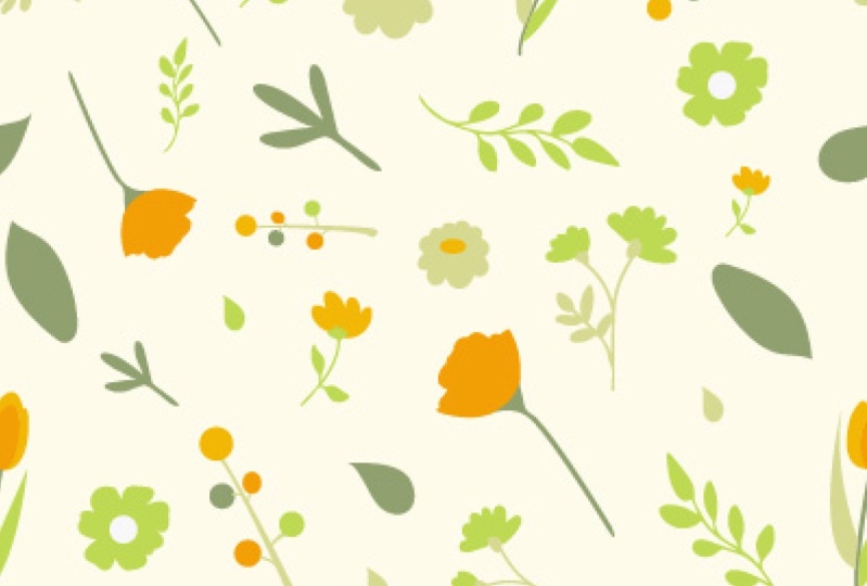
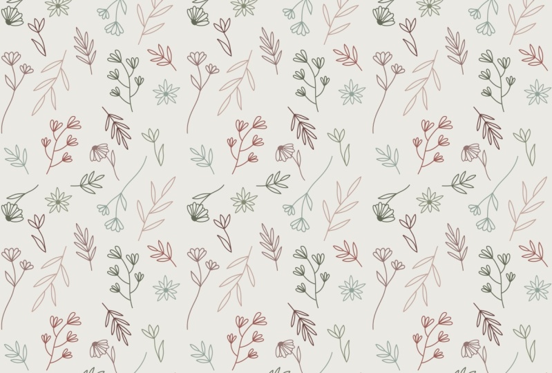
on everything from home decor to stationery, from fabric to word paper. Botanical motifs such as
flowers, leaves, fans, branches are incredibly
popular because they are so versatile and can be used on a whole bunch of
different things. I am never short of inspiration because nature is all around us. This class is aimed and beginner to intermediate
level students. You don't need to have
had prior experience with illustration or design,
but it will help. You will also need a basic
level of knowledge with Adobe Illustrator because
that's what we're going to be using to
build our patterns. If you don't have it,
I will link you to a trial version in the
resources section. Who should be taking this class? This class will be
a great fit for you if you're a freelancer,
a designer, an illustrator, or just
someone who's looking to pick up a rewarding
creative skill. The great thing
about pattern design is that it teaches you a lot of things that are
essential to being a really good visual creative. Things like color theory, composition, and working
in an intuitive process. We'll go through finding references and
creating a palette, sketching and digitizing motifs, composition, and finally, saving and exporting your work. At the end of this class, you will have a botanical
motif that you created from scratch along with the
corresponding art print. With the new skills
that you learn, you'll be able to
experiment and play and create designs that
are unique to you. Surface pattern design
is a skill that is in very high
demand and I will be telling you a little bit more
about how you can monetize the skill later on in
the class as well. Now that you know a little
bit more of what's coming up, let's jump in and get started.
2. Class project: Your project for this
class is to create your own botanical surface
pattern using motifs that you then repurposed to create an accompanying
art print. The reason I've chosen this project is because
it will take you through all the steps and fast-track you into creating patterns
on Adobe Illustrator. If you follow along with me, it shouldn't take you
too long and you have both the pattern and
print at the end of it, so it's really a two-for-one. Let's go through what
you're going to need. The first thing you need is
access to Adobe Illustrator. If you don't already have it, I've linked you to
a seven-day trial in the resources section. We're going to be
using photographs as references for
drawing our motifs. I have included a set of
photos that I will be using to work from in
the resources section. Go ahead and download them. However, if you want to use your own, feel free to do so. Finally, you're going
to need a sketchbook, a pencil, eraser,
and fineliner pen. Nothing fancy, just grab
whatever you have lying around. When you're doing this project, you can either follow
along with me as we go or do it at the end
once you finish the class. Whichever way you choose, remember that it's
all about having fun. Once you finish your project, remember to post in
the project gallery so we can all take a look. See you in the next lesson.
3. Collecting references: When you're starting any
new creative project, collecting references
is a great first step. It helps to get creative
juices flowing and ensures that you have a lot
of inspiration to draw from. When it comes to pattern design, there really is no
limit on what you can use because anything
can spark off an idea. Remember, this is
just the first step. Don't hold yourself back or think too hard about
what you're collecting. References don't mean
you're going to be using exactly what you see. Think about them as
jumping off points that will take you in new sometimes
unexpected directions, and that's a good thing. Starting to look for references
from scratch can see a bit overwhelming because
there's so much out there. So where do you begin? I'm going to be sharing a few of my tips to get you started. The first question you
want to ask yourself is, what kind of pattern
am I looking to make? In this case, it's a
botanical surface pattern, so the references
that I wanted to collect will be related to this. There are many ways you can go about
collecting these. You can look on stock
photography websites, Pinterest, or do a Google search
for a specific motif, for example, if there is a particular leaf or flower
that you're interested in. When you find images that
you'd like to look off, save them to a references
folder on your computer, so you always got them to hand. A site that I like to
use is called Unsplash, which supplies beautiful
images that are free to use. The reference photos
I'll be using for the class project are from here. Another way I like to
collect references is to go out and explore nature
and see what I find. All of these photos
were taken in my garden and the variation
in them is astounding. Yes, it takes a little bit
longer than a Google search, but you can find some
real gems plus anything that gets me away from my desk even for a few minutes is a win. Now that you've gone to
find the reference photos, let's talk about how we're
going to be using them. In order to create our pattern, we're going to be identifying elements in these
references that we want to use and then sketch them out on paper before
we digitize them. So, for example, let's look at this photo with all of these different leaves. There are so many
interesting shapes in here, and seeing them on in
front of me is already sparking off a bunch
of different ideas. Another thing to bear
in mind is that it's not just about the shape
of what you're seeing. You can draw inspiration from the color palette more on
that in the next lesson, the textures or even
just one single element. We'll dive more into this when we're sketching our motifs. But the main thing I'd
like you to take away from this is you never know what
can spark off an idea. So, look at everything
with a fresh pair of eyes. Now that you've
learnt references, let's move on to picking
a color palette.
4. Choosing a colour palette: The colors in the
palette are just as important as the
motifs themselves. The right color palette can make even the most basic pattern pop. But using one that isn't quite right can bring
the whole thing down. I really encourage you to spend some time looking for colors for your pattern so that you can find a palette that
works for you. Color theory is a whole
subject enough itself. But before we jump in and choose a color palette for our
pattern I want to touch on a few basics that will
be especially helpful if you are new to
design or illustration. A good way to make
sure you end up with a harmonious combination of colors is to use
the color wheel. There are many color schemes
within the wheel but I want to focus on
the four main ones; monochromatic, analogous,
triad, complementary. Monochromatic colors use
shades and tints from the same color family which results in a cohesive
and harmonious look. Analogous colors are found side-by-side on the color wheel. They provide a good
degree of contrast and color variation without things looking too dramatic or bold. A complementary
color scheme uses colors from opposite
ends of the color wheel. These schemes provide
a lot of contrast and you can get some really
fun combinations using them. A triad color scheme is perhaps the most
adventurous of all of these because it uses three colors that are evenly
spaced on the color wheel. If you're using a
scheme like this you're going to get some vivid
hues in your design. Now that you have a
good understanding of color schemes I'd also like you to think a little
bit about mood. Colors elicit emotions
and feelings in us. If you want your design to have a certain impact you need
to take this into account. Here's an example of a
pattern I've created in the past in three very
different color palettes. The first palette is soft,
romantic, and natural. The second is bold,
bright, and playful. Third is mysterious and
alluring with a touch of drama. The motifs haven't
changed at all so it's just the color
setting the mood. Picking a color palette can
seem a little daunting. After all your options
are largely limitless. But it doesn't have to
be as hard as you think. I'm going to share some
of the tips that I use to make things easy and fun. One of my favorite websites
to use is Adobe Color. This is a completely free tools that does all the
heavy lifting for you. Remember the color schemes we talked about earlier
in the lesson? They're all available here
and you'll have a lot of fun experimenting with all
the different options available to find what you need. In addition to the color wheel, Adobe Color also has ready-made palettes
that have been added by the Adobe Community. Just type in what
you're looking for and you'll get loads of results. There's also a transection for you to see what's up and coming. Another site I like to use
is called color lovers. It's another great
one for finding custom palettes and
tracking color trends. I also enjoy getting color
inspiration from magazines. I'm a big fan of interior design and subscribe to quite
a few magazines. Anytime I see any color
combinations I like, I cut it out and file it away. Fashion magazines and
even food magazines would work well for this too. Finally, just like I said
in the previous lesson, nature provides loads of
color inspiration as well. My camera roll is filled
with photos I've taken in my garden on walks or on hikes. For the purpose of
this class project, I've included five color
palettes for you to choose from. As with the references, if you'd like to create and use your own, please go ahead. Just remember to not have
more than six colors in your palette to avoid making
your pattern too busy. We now have our references in place as well as
a color palette. It's time to start sketching. I will see you in
the next lesson.
5. Sketching your motifs: [MUSIC] Now we've come to the
fun bit which is drawing. Before we get started,
I'd like to do a little bit of a warm-up. It's similar to how you do a warm up before
exercising, I suppose. It just has you to get in
the flow a little bit. If you're feeling a little bit anxious or stressed because you haven't really sketched
much recently or ever, it will just help you to
overcome that and get a little bit more into
the swing of things. [MUSIC] Now that you're done with your
warm-up drawing exercise, let's move on to
actually sketching the motifs that we are going
to be using for our pattern. I'm just going to
grab what I need. When it comes to
sketching things that I eventually want to
digitize like in this case, I prefer to go for a pencil that has a little bit
more of a finer tip. This one, which
is my 0.7 pencil, it's the mechanical one and
I just like it because it's got a nice sharp stroke. I'm also going to
grab a fineliner pen [NOISE] because what we're
going to do is we're going to sketch with this and then we're going to draw
over that with the pen. Finally, I'm going to just
grab an eraser as well. We've got what we need.
Let's turn the page. [NOISE] All of these are
images that are included in the resources section of the class. We've
got quite a few. I've got quite a
selection here because I think when you're
drawing from references, it's quite important to have [LAUGHTER] cast as
wide a net as you can. I want to have a good mix of
different botanical motifs. I want to have multiple flowers
with varying petal sizes, multiple sizes and
variations of leaves, some different ferns and other small random
motifs sprinkled in. What I'm going to do is I'm
going to go through each of the reference photos
and draw from there. You don't have to draw
all of them obviously, but draw as many as you can. If you're not using the
reference photos that I've provided in this class and
you're using your own, just follow the same approach. Let's look at this
reference photo here. This has got a whole
lot of motifs going on. Obviously, we're not going to be drawing
each one of them. Another thing that
I also want to stress on is when
you're drawing, it's not so much about getting the exact shape or size of what you're
seeing on the screen. You're not making a carbon copy, you're literally just
using it for reference. Don't get too hung up on your drawing not looking
exactly like the photo. We're not going for
that look here. This is very illustrative, it's a very loose modern,
contemporary style. Just feel free to infuse your own style into
it and deviate from the photos if you feel like that's the way your
drawing is going. From this photo there are
a few elements that I like to look off and I think
would make good motifs. There's these two here, which I think are
very interesting. We've also got these
little lavender ones here and a few leaves as well. Let's get started with this. [MUSIC] Then I'm just going to
draw the other as well. We've got those two done. I think let's try the
little purple one, which is a similar
longs reed style. I like the look of these leaves. I like how they're bunched together and I'm just going
to try that approach. [MUSIC] When you're
looking at an image, it can be quite
daunting and you think, oh my goodness,
there's no way I can really replicate that. I wouldn't know where to start. You just start at the
most simple point. Then often you will find that your brain just gets
into that flow of drawing and you'll end
up just doing something that you hadn't even
expected when you started and those
are the best bits. Let's now look at
another reference photo. You've got this and similarly
it's got similar motif, but I'm just going to
try this one instead. Now we move onto
some more leaves. Now we move on to this
image of flowers. This one is a pretty
standard flower shape. It's got five petals. [MUSIC] This is another reference
image and this flower is a lot more compact. [MUSIC] In any pattern it's always good to have a
lot of variation going on. You've got these flowers that are taken from a
straight on angle, we've got these ferns that are obviously at a different kind of dimension to things,
we've got leaves. [NOISE] These flowers
are taken from the site, so they just add a
bit more variation and a bit more interest. [MUSIC] We've got a few more
reference photos. I'm just going to quickly draw a few more motifs from these references then we can
crack on and digitize them. [MUSIC] If you are using a pencil
that is quite light, and you want to just make it a lot easier for
you to be able to see these motifs when you scan them in or
take a photo of them, go ahead and just
start to ink them in. Now that our motifs are ready, it's time to digitize them. I will see you in
the next lesson.
6. Setting up your workspace: In the last lesson, we sketched out our motifs and then are ready to digitize. Before we go ahead and
import them though, we need to set up my workspace
and Adobe Illustrator. Why do we need to do this? When working digitally it
is a huge advantage to our workflow that is as easy
and efficient as possible. It ensures that
you are working in an iterative,
non-destructive way. Which basically means
that you're never making any changes or edits
that you can't reverse. It saves time, which means
you're able to design freely without worrying about fiddling around with settings. Finally, it keeps
things organized. So if you ever need to revisit your artwork to edit or use
elements in other pieces, you know exactly where to look. In this lesson, I'm
going to show you how to set up a
workspace that will work for your button design
and art print class project. Let's begin by opening up a new file in Adobe Illustrator. I'm going to use a web preset as a starting point because it already has a lot of the
settings are going to need. I'm going to change the
file name to pattern. Next, let's change the
size of the art board. I'm going to make this
400 by 400 pixels and I'm going to set the
number of art boards to three. Hit Create when you're done. You should now be seeing
something similar to this with tools on the left, your art boards in the middle, and additionally
windows to the right. This particular setup is the default Essentials
Classic workspace that I'm going to use as a base. First, I'm going to
modify these work boards. We leave the first one as is, because that's what
we're going to be building the pattern tile on. I'm just going to rename it to pattern tile by
double-clicking on it. The second art board is for
us to build our motifs on. I'm going to change the name to motifs and make it
double the size. Let's move that
side side a little. Finally, the third art
board is where we are going to be digitizing the motifs we drew in the previous lesson. I'm going to rename
it to digitize, change the size to 800 by 800, like with the previous one
and move it to the side. Now, let's look at the panels we're going to
need on the right. We've got the colors, swatches and Color Guide panels and I'd like to keep them as is. We also got the Pathfinder panel and that's something we're
going to be using a lot, so I'd like to keep it. I'm going to close
the brushes panel because that's not
something I'm going to need and I'd like to use the
space that has been created to make ideas
panel as big as possible. We've also got the
image trace panel dopped on here and I'm going to close it because
we're not going to be using that in this class. Depending on the button
you're creating, you may decide to have
more panels stacked on, but I'm happy with this for now. Next we move on to
the color's file. I'd like to get
it all setup with the color swatches I'm
going to use in my pattern. We start off by deleting the existing ones except
for black and white. Click on the first square,
you want to delete, hold Shift and then
click on an last square, then click on Delete. Now we're going to import the colors I have included
with this lesson. Just open up the AI file, provided the resources section, copy everything in it
and paste it in here. Now we just create color
groups from them by selecting them and clicking
on New Color Group. Let's do this for all of them. So this is our workspace, all setup and ready for
creating a pattern. I recommend saving this in
it's blank form somewhere on your computer so
that you can use it anytime you're
starting a new button. You just need to replace
the colors with whatever valid you end up using
and you are good to go. See you in the next lesson
where we will import our sketches and
treat our motifs.
7. Digitising your motifs: [MUSIC] It's now
time to digitize your lovely sketches
and bring them to life in Adobe Illustrator. In the last lesson, we set up our workspace to make things organized
and efficient. Doing this has made
sure that we've got a good base to
build a button on. The first thing we
need to do is to import our sketches
into Adobe Illustrator. There are a couple of
ways you can do this. You can either take
photos of them and transfer them to the
computer you're working on, or you can scan them in. I'm going to be using
the first approach, taking photos of my sketches. The main reason for
this is that I don't need my images to be
super high-quality, and you'll see why
later in this lesson. If you also decide to take
photos of the sketches, make sure that you're doing
this in good lighting, natural lighting is best, and you're taking
the photos from an angle that is
directly overhead, so you're getting the most accurate perspective
of your sketches. You can photograph your
sketches individually or in groups depending on how
closely you've drawn them. Once you've taken your photos, transfer them to your computer. Because I like to keep
things organized, I've created a folder
called scans in my main button folder to save all of these
images together. Now it's time to import them
into Adobe Illustrator. Go to File and click on "Place" to bring the first
of your sketches in. There are many different ways
images can be digitalized with something more complex and time-consuming than others. I'm going to show you
a very simple method that I use very often
in my own work. We're going to trace
over and recreate the basic shapes of our motifs
using the blob brush tool. Once this is done, we
will add our details in. You can access the blob brush
tool by clicking on it in the toolbar or by pressing
Shift plus B on your keyboard. If you'd never use
the blob brush tool before, don't worry, it's really simple, but
a very versatile tool. While a paintbrush tool
draws brushes as paths, the blob brush tool draws
brushes as filled shapes. This means that you can draw and fill your shapes
as you go along, which is super useful when
you're tracing over something. Let us begin with our first
motif that we brought in. I'm now going to
click the lock so you don't accidentally
move it around. Then I'm going to hit Shift plus B to bring up the blob
brush tool again. Before I start tracing over, I'm going to double-click
the blob brush tool to check if the
settings are okay. This bar allows you to control the smoothness
of the brush. In other words, how
accurately you wanted to be. If you have set it
to either of these, you're going to get a
very forgiving brush, which is good if you're
going to be doing things freehand
using your mouse. If you've got a graphics tablet, then build a slider which
will give you more control. I'm going to have it set here. Now it's time to trace. Zoom in as much as
you need and take a few practice strokes to get comfortable with the blob brush. You can adjust the size
of the brush by using the left and right curly
bracket keys on your keyboard. I like to have my brush
be medium to small when I'm drawing the
outline like I'm here. Once the outline is done, I increase the brush size
and just color the shape in. Remember that the blob brush
creates one big shape, so you need to make sure
you're not leaving any gaps. Also make sure that you have
a single color selected, it doesn't matter which
one at this stage. Because if you were to
use a second color, it will treat it as
a separate shape. I'm going to move on
to my next motif, I'm going to outline it just like we did our previous motif. Now, this one is a
much bigger motif, so I'm going to show
you a handy shortcut. Outline it just like
the previous one, but instead of manually
fitting them in, we're going to use the
shape builder tool. Select the whole ship and
click on the tool from the panel or hit Shift
plus M on your keyboard. Then hover over the empty areas, you'll see a little plus
next to your cursor. Click inside the empty area, it has now created a new shape. Do this for all the petals. Then select everything
and draw a line through the whole thing by keeping
a left mouse button down. Voila, you now have
one solid shape. Now that we've got
a couple of ways to trace over our sketches, I'm going to go ahead and
do this for all of mine. We've got all of our motifs here that we traced
from our sketches. Before we start creating
our button with them, I'd like to add in some fun
details to make them pop and add in dimension and
variation to your button. We're going to continue to use the blob brush tool and the shape builder tool
for this as well. Let's zoom in and start
with this flower here. I'm going to press Shift plus B to bring up the blob brush, and then I'm going to paint a little circle in
the middle using a different color so that it doesn't become part
of the main flower. I'm then going to
reduce the size of the brush and select
a third color. Now, this is where you can be really nice and loose
with your brushstrokes. Starting at the
center of the flower, draw lines that radiate
outwards towards the petals. The important thing to make sure here is that they
cross over the petals, so make them nice and long. Once you're done, use the selection tool to
select everything together. Now we select the
shape builder tool. Remember how we use it to create and marge shapes
earlier in the lesson, this time we're going to
use it to eliminate shapes, which are the bits here that
go past the petal edgers. To do this, just hover over
the bit you want to delete, hold down the Option key or Alt if you're using
Windows, and click. I'm going to do this
for all the lines. You can zoom in further if you need to see exactly
what you're doing. We can see that the
round center of the flower is very behind
these lines I added on top. To fix that, I'm going to select the center shape and press
Ctrl and X to cut it, and then Ctrl plus F. This piece sit above the lines
but in the same spot. Now just group everything and
move it to the art board at the top to get it out of the way while you work on the others. Let's do this leaf next. I'm going to follow
the same approach where I select a
different color, and using the blob brush, I add in the detail. I'm then going to
delete the bits I don't need using shipbuilder
and the Option key. Now that that's done, I'm going to move it up to
the top as well. One thing I'd like
to highlight is that there are many different
ways of adding detail. For example, with this flower, I have varied the
color of the petals, so adding a whole lot of
lines would be a bit much. Instead, I'm going to draw a center circle and a few
lines in and leave it at that. Don't forget to group everything together so you don't leave little bits in slices of your motif behind as
you move it around. Let's go ahead and do
the other motifs now. Here are all of our motifs
with the details added in. You will see that I have put
details into all of them, this is to make sure that the pattern doesn't
get too busy. If you have too much going on, it can look like things are
clashing with each other. Unlike with most
pieces of design, you need to give the ice
some places to rest, which is why there's a mix of solid shapes along with
more detailed motifs. There's also one that I
decided to leave out at the final set because I wasn't too happy with
how it turned out. But that's fine, that's the advantage of having a lot of options to choose from. I will see you in
the next lesson where we will put
our button together.
8. Creating your pattern: [MUSIC] In the last lesson, we digitized our sketched
motifs using the blob brush and shipbuilder tools and added in details to some of them to make our pattern fun and interesting. We've ended with a nice
variety set of motifs. This lesson we're
going to put it all together to make our
final pattern swatch. We've got our set
of motifs here, but before we jump in and start using them to
create the pattern, I want to first run you
through how to make a basic pattern in
Adobe Illustrator. We've got our pattern
square artboard that we set out when we were putting
our workspace together. I'm just going to use the
artboard tool to move it a little to the left so I've
got more room to work with. I'm also going to
zoom in and neaten up my layers palette a little by collapsing the
ones that don't need. I've created a new
layer and I'm going to be using this to
build my pattern on. First, we need to create a background for
our pattern tile. I'm going to select
the rectangle tool, select one of the
colors from my palette. Hold down "Shift" and draw
a square that is equal to the size of our 400
by 400 pixel artboard. I can see it's not quite 400, so I'm going to tweak this
from the settings up top. Make sure that it's
all aligned properly. Now the main thing to
keep in mind when you are creating a repeat
pattern square is that everything on
your left-hand side should correspond with
your right-hand side. In the same way, everything at the top has to correspond
to the bottom. This is what makes
your pattern seamless. The other thing to
keep in mind is that your pattern square has to have another square that
sits behind it. This is called the bounding box and it will have no
fill and no stroke. I'm going to "Copy"
my pattern background square and "Paste" it
using Control plus B, which pastes it behind
the background. With that square selected, I'm going to change it to
no fill and no stroke. You can see that here. Then I'm going to lock both
these layers because we don't want either of them moving around while we
build our pattern. For this basic pattern, I'm going to use just one
motif to keep things simple. I'm going to press" Control
plus C" to copy it. Select Layer five and
then press "Control plus F" so that it pastes
above our pattern background. When creating a pattern I
always do the edges first because we need to get them done properly to get a
seamless repeat. Once they're done,
you can fill up the middle without any issues. Let's start on the left. I'm just going to use
Option plus click to keep duplicating this as I
go down the left-hand side. Now that I've got my
left-hand sorted, we need to replicate
it on the right. Use your Selection
tool to select everything and press
"Control plus C" to copy and "Control plus F" to paste them in place above
the current selection. Now that that's done, we'll
go to the Setting toolbar at the top where we've
got our x and y-axis. We're currently working
with the x-axis. This number here is
telling you where our selection is on that axis. We need to move
them 400 pixels to the right because remember our square is the same
size as the artboard, which is 400 by 400. All you need to
do is add in plus 400 to the right of
whatever numbers on there. There you go. Your motifs are moved to the other
side of the square. Now let's create the top and
bottom rows in the same way. We'll make the top row first
by duplicating the motif. Copy all of them are paste
and place in front of the existing row and then
change the position. The only difference this
time around is that you're adding plus 400 to
the y-axis instead. We've now got the
borders all done. Now it's just a matter of
filling in the middle. I'm going to
duplicate the motifs again and just fill
up the square. Our basic pattern is
complete and ready to test. I'm going to unlock
our background and pattern bounding box layers now, "Select" the whole thing and "Click" and "Drag" It
to the Swatches panel. You'll see a tiny version
of it has appeared here. This is your pattern swatch. Let's test it out
by zooming out, drawing a rectangle shape and filling it with our pattern. There we have it. It's nice and seamless and our pattern is repeating well with no issues. If you'd like to take a few
minutes to practice creating another basic pattern using this approach so
you get used to it. Once you're ready, we're
going to move on to using multiple motifs to create
a class project pattern. I'm going to delete the
pattern test rectangle and clear out our board
for a basic pattern. Let's start by creating a pattern background like
we did with the first one. I'm going to click on
the Rectangle tool and enter the dimensions I need, 400 by 400 to mask
the artboard again, I'm also going to temporarily
fill it with a color so I can check that I'm lining it up properly with the artboard. Then I'm going to
create a square that sits underneath it, which is a pattern bounding box with no fill and no stroke. I "Copy" the square press
"Control plus B" to paste it behind and remove the fill I'll then lock
both these layers. I'm now going to select
all of our motifs, duplicate them by holding Alt Option while I
"Click" and "Drag" them, and then cut and paste them on top of our pattern
background layer. I'm also going to
decrease the size of them because they're a
little too big at moment. Now let's start
building the button. Like I showed in the
previous pattern, I'm going to work on
the borders first. I'll start by duplicating my motifs and clicking and
dragging them to the borders. This is a contemporary
botanical pattern, so keeping things
nice and loose. Not worried about the color
palette at this stage, but I wanted to make sure
there's enough contrast and variation so I'm going to avoid grouping similar
colors together. That way, no matter
which ballot we end up using it will
all still work. Play around with rotation
and angles as well, and make adjustments
as you go along. [MUSIC] Now that the
left-hand side is done, I'm going to "Copy"
and "Paste" on top and then "Move" it 400
pixels to the right. Let's do the same for
the top and bottom. I'm trying to make sure
I get a variety of motifs in here that all
work well together. For example, there are a couple of solid
ones and a couple of with some details along
with varying shapes as well. This keeps things
visually interesting. [MUSIC] Now that the
borders are done, Let's move to the
middle of the pattern. Remember to be
careful to not move the motifs you placed
along the borders. You can edit them of course, but if you do make sure you edit the corresponding
motifs as well. [MUSIC] Pattern-making is an
iterative process. As you work on the
composition of your pattern, you'll feel like you need
to shuffle things around, adding more elements or
take some motifs away is all part of the process and it's [LAUGHTER]
actually really fun. [MUSIC] I'm just moving these a little further away
and making some final tweaks. My pattern is now
ready to test out. I'm going to "Select"
the whole thing and "Move" it to
the swatches panel. Now let's draw a rectangle to see what the pattern
looks like in action. There we go. I really
like that actually. When you're looking at
your pattern try to see if there are any gaps or
anything you need to edit. Seeing it in a big
shape like this helps you to get the little
things finalized. We're going to move on to
colors in just a second, but I want to throw in a
little bonus pattern for you. The one we just created is nice, but what if we wanted
something a little bit more complex with overlapping shapes? Let's make one using the
motifs we already have. I'm going to create a new 400 by 400 artboard and
bring up our motifs. I'm going to follow
the same basic steps for creating a pattern. Create a background
square that is the same size as the artboard, and then a bounding box
that sits behind it. And then lock those two layers. Since this pattern is going
to have overlapping motifs, I'm going to put
in some large ones first that fill up
the background. They're going to cross over
the borders of the box. So I need to make sure
that they all match up on the x and y-axis in terms
of their positions. Now we add in the
motifs and had them sitting on top of each other to give them a more layered look. [MUSIC] I'm happy with this, so let's test it out. What's happened here? Everything seems to be in the
right place, position-wise. So what's going on? I didn't change the position of the big background shapes, but I did change the color. Fortunately, that's an easy fix. We just make them match up. Let's try that again. Shall we? [MUSIC] There we go.
It's all seamless. Now. We've now got two different patterns
using the same motifs. I will see you in
the next lesson where we'll play around with different color palettes and learn how to scale our patterns, which can dramatically
change how they look. See you there.
9. Recolour, scale and save your pattern: [MUSIC] In the last lesson, we learned how to
create a pattern in Adobe Illustrator
using our motifs. We created a simple
pattern as well as a more complex one with
overlapping motifs. We're now going to learn how to easily change the
colors of a pattern, as well as how to scale
our motifs up or down. Doing one or both
of these things can dramatically change the way
your pattern looks and feels. That's the advantage
of doing this all in Adobe Illustrator and working
with vector graphics. There's so much room
for experimentation. I'm also going to
show you how to save and export your pattern
tile once you're done. Let's begin by duplicating
our two squares here. I'm first going to re-color
our pattern on the left. Click on the square, and then on "Recolor
Artwork" at the top. This will bring up the
Recolor Artwork box, which shows you all your colors at a glance on the color wheel. Click on "Advanced Options". These are all the
colors I've got in my artwork along with
the color white, which is the background color. I'd like to add this
into the mix as well, so I'm going to click
on the box next to it and "Yes" to adding it
to the color harmony. There, now all our colors
can be swapped around. We've also got all of the various other color
palettes on the right, but for now, I'm sticking
to our existing one, so let's have some fun. Click on the leftmost icon which says randomly
change color order. You'll be able to preview your colors changing
in real time. Because we've got six
colors in the mix, there are loads of color
combinations to try out. Cycle through them until you find something you
like the look of. Remember though that if
you cycle past a color, there's no way to backtrack. Make sure you hit "Okay"
if you wanted to keep it. I've seen a few so far
that catch my eye, but let's keep going. There we go, I really
like this one. You can see how the
colored background has added a whole new
dimension to the pattern. All the colors on it really pop, but in a way where they
all work together. I'd like to keep this, so
I'm going to hit "Okay". You'll now see that
doing this has added a new pattern swatch in
your swatches panel. I'm now going to move on
to our second pattern. I'm going to select
it and click on "Recolor Artwork" like we
did with the first one. For this one though, I'd like to select a completely
different color palette. I'm going to add the sixth
color to the color harmony, and then I think I
choose color group 3. We've got some
really interesting color combinations in here. That's the thing about choosing
a board color palette, you really need to
strike the balance. Unless of course,
you're going for a piece where the colors
intentionally clash, in which case more power to you. I want something where the
background is a little lighter with the bold
colors coming out on top, so let's keep going. I like this one a lot, so I'm going to click on
"Okay", and there we are. Same base patterns as before but completely different looks
with only the colors changing. Let's now move on to
scaling our patterns. [MUSIC] We've learned
how to change colors, but how about if you want to change the scale of your motifs? This is another
place where building your pattern in Adobe
Illustrator is so important. Sizing your motifs up or down can completely
transform your pattern, sometimes even more than
changing the color scan. Let's just duplicate
our squares again. We've got the pattern on the left where the
motifs are pretty small, and the one on the right where they're a
little bit bigger, but still not huge. What if we wanted to make
them a lot bigger though? I'm just going to right-click and click on "Transform"
and then "Scale". This is what the
pattern looks like at a 200 percent scale. But you see it's not
just the motifs, the square has expanded as well. I don't want that,
so I'm going to uncheck the transform
objects box. Let's see what it looks
like at 150 percent scale. Now, I think I prefer it at 200 percent and then hit "Okay". You can see how it looks so different compared to
what we started off with. Because you're not seeing the
motifs in their entirety, but you're seeing the big
background shapes it takes on a much more abstract field
which I really like. Now let's look at our
pattern on the left. I'm going to do the
opposite and scale it down so it's even smaller, to give it an almost
deep sea floral look. Let's get it down to 70 percent. I really like how
cute that looks. Imagine a summer dress or scarf with that pattern, so pretty. There we have it. A
few simple clicks with two very different results. I encourage you to play
around with recolor and scale settings to see how your
pattern can be transformed. Now that you've created
your pattern and know how to recolor and
transform them, I'm going to show you
how to save them. [MUSIC] Open up a new file and change the size of the
artboard to 400-by-400 pixels. Then, grab the pattern
that you'd like to save and paste
it into a new file. You'll see that the
pattern swatch, along with the pattern color swatches has been copied over, so you can delete this. Now, click on the pattern swatch and drag it to your workspace. Everything is automatically
grouped together, which makes it easy
to move it around. Align it with your artboard. Now, go to File and
select "Export As". Check the use artboards box and you can save it either
as a PNG or JPEG. I'm going to save
it as a PNG and rename it and hit "Export". You'll be able to
select the resolution, I'm going with 300, and also makes sure that
art optimized is selected. Then click "Okay". Now if you open up
that file location, you will find it
all ready to go. I'm quickly going to
tile them in Photoshop, so you can see how
seamless it all looks. There we have it. You
now know how to create, re-color scale, and
save your patterns. In the next lesson,
I'm going to show you how to take your motifs one step further by repurposing them
to create an info art print, so I will see you there.
10. Creating your art print: In the last few lessons, you learned how to create
a seamless pattern and recolor and resize it to dramatically change
its look and feel. Now, we're going to make
your motifs work harder for you by repurposing them
to create art prints. The big advantage of
working digitally is that there are multiple ways
you can use your assets. In this case, you've got a grid selection of motifs that you made for your button, so why not get more out of them? We'll start off by
creating a new file. We're going to make an A4 print, and Adobe Illustrator
has preset for that. Click on the print
section and select A4. Change the color water RGB, since that's what we
made our patterns on. I'm just going to delete the
existing swatches and then copy and print the pattern
square into this new file. You'll see that the
pattern swatch, as well as the button colors
have been copied over. I'll now delete
the button square. Now I'm going to
bring over my motifs. Let's copy and paste them
and move them to one side. I'm going to start by drawing a background for my art print. I'm going to set the
color to yellow. But if I select the exact
yellow for my pattern, it's going to cause
some visibility issues because some of my motifs
use the same shade. To get around this,
I'm going to go to the Color Guide tab and select a tint of
the yellow color, which means that it's a little lighter than the yellow
that's in my pattern. Now I can see my
motifs are all behind the rectangle and I want to
bring them in the front, so I'm going to press Control
plus C and Control plus F. This makes it easy for me to duplicate motifs with the
Alt key as I build my print. Let's start creating. I want to make a print
that's basically like a flower burst with all my motifs overlapping
in a riot of color. I'm going to start by placing
my biggest motifs first. In this case, it's the flowers. Let's drag them
onto the artboard. When doing this, you want
to keep an eye on how the colors and shapes are
all working together. Just a heads up,
there's going to be a lot of adjusting coming up. Also, feel free to recolor
motifs if you need to. Now that I've placed
the big flowers, I want to get some green
leaves in there to break things up and
add in some variation. Let's drag some of them in and place them behind the flowers. I find that starting
from the middle point and going outwards is the best way to work on the composition of
something like this. Just like the pattern, I want to get a good
mix of solid shapes, different sizes, and
varied textures. I'm happy with this.
The temptation to keep on tweaking and
nudging is strong, but I'm going to
stop now because I think it's looking
nice and balanced. Just for fun and
as a little bonus, I'm going to do a
couple of more prints so we've got a
nice set of three. I'm going to create
another artboard next to this one and draw a
rectangle background. I'm going to make
this one green. Now, this print is going to use a pattern but in a
modern and fresh way. Just draw a shape
on your background. I'm going for a
circle and center it and then fill
it with a pattern. I'm just going to scale
the pattern down a little bit. There you have it. Or you could try a more
complex shape like a flower or a heart and then
fill it with your pattern. For our last pattern, I'm going to do
another flower burst to round off the
tree all nicely. For background color. I'm going to select the
orange and the palate, but make it a tint again. As with the last one,
I'm going to start from the center with our bigger
motifs and work from there. There we go. I've got a nice
trio of prints that can be used on their own as individual
artwork or as a set. You can save them all at once by going to "File"
and "Export As." I'm going to save these as
JPEGs and use artboards. You want to make sure all
artboards are selected. Then hit "Export." Check you're happy
with the settings and then click "Okay." All three prints are now
being saved as higher as JPEGs and can be printed
off to use his wall art. Now that we're almost at
the end of this class, you should have your
seamless pattern and art print all ready to go. In my case, I've got
multiple versions, maybe you do as well. In the next lesson,
I'm going to give you a few tips on
how you can license your patterns and prints
online to print-on-demand websites so you can start
to monetize your work. See you in the next one.
11. Monetising your work: Now that you've created your
button on your art print, let's chat a little
bit about how you can potentially
sell this online. Monetizing your
art is a great way to earn a little bit
of faster income on their side and if you do it on a regular basis and
keep at it potentially, it could also be one of your
main streams of income. [MUSIC] This isn't a class about selling On
Print On Demand, there are a lot of
Skillshare classes out there that I will
recommend you take a look at. But I'm just going to give
you a few of my tips and some of the websites that I look
at to sell my artwork. [MUSIC] The first website that I will recommend you
take a look at is Society6. Society6 is a website where
you can upload your artwork, whether that's a print
or a pattern and it will do all of the
order fulfillment for you. You don't worry about
things getting things printed or where to
store all of your stock, they take care of all of that. All you need to do is just
upload your file to Society6, and you will get to see it
on a wide range of things. Everything from
t-shirts to home-ware, to things like tote bags, there's so much on this. I really recommend you
take a look at Society6. Another site with a similar
concept is called Redbubble. It has a very distinct style. Society6 is quite lifestyle oriented and Redbubble is
more about graphic tees. Again, vector art,
that sort of style. If that's something that you think you might
want to look at, feel free to go and take a look. You can upload your
patterns just like on Society6 and see it on a wide range of
different material, and they are also a print
on demand websites, so you don't have
to worry about any of the logistical bits. Spoonflower is another website that you can sell
your buttons on. They have a range of
products like fabric, wallpaper and homeware
and accessories. The only thing with
Spoonflower flower, is that you need to
order a swatch of your fabric in order to put
your pattern off for sale, so bear that in mind. They also run weekly
design competitions that anyone can participate in, which are definitely
worth a look. Another website that
I'm actually interested in applying for in the near future is
called Creative Market. They are a little
bit more selective. You have to first apply
to be a seller on there. But if you do get accepted, then you can sell
all of your artwork. On Creative Market, you sell your artwork as digital assets. For example, if you are creating a pattern and you've got your pattern and you've got
all of the different motifs, you can sell it as a graphic
set on Creative Market, and then people will
buy buy from there and you would just get
paid per download. It's really interesting concept, it's very popular
and it's especially increased in popularity
over the last few years. I recommend you take a
look at that as well. Finally, you can always set up your own shop on
you're on a website. If you already have
a website or a blog, you can look at
things like Shopify, or Print Full that
would integrate with your existing website
platform so you can start to sell your products on
your actual website as well, which is another really good way to make a little
bit of extra cash. My last step, which is not
really to do with selling, is to just use
social media a lot. This is something that I'm
going to do personally because I think the more you get your work and your art out there and the more
eyes you get on it, the more exposure you get and
you're more likely to get found by people looking for
art licensing opportunities, for example, buyers for brands or art directors
and people like that. If you don't already have
social media profile, just to do with your art, set one up, start uploading
your art right away. It doesn't matter how many followers [LAUGHTER]
you have to begin with. Everybody has to
start somewhere. The more you post over time
and more art you create, the better chance
you have of getting a following and also
being discovered. If you have any
questions to do with this or anything else that
you've seen in the class, pop them as a discussion on this Skillshare class page
and I will get back to you.
12. Final thoughts: Congratulations. You have now made it to
the end of the class. Pat yourself on the back, this is a really
great achievement. Over the course of this class, you have picked up
a wide range of skills to do with pattern
design and beyond. We went through everything
from finding references, picking color palettes
to drawing your motifs, and finally digitizing them and composing your final pattern
and your art print as well. If there's one
thing I want you to take away from this
class it's this, you now have all the
tools you need to make an infinite number of
patterns all at your disposal. Don't let anything hold you back because you've got
the foundation right. Anything that you do
beyond this point, it's your creativity,
so have fun. Be sure to upload
your projects to the project gallery so that
we can all take a look. I would love to see
what you come up with. If you liked this class, I would love for you
to leave a review. You can also follow me on
Skillshare by clicking on the "Follow"
button so you will know when I upload a new class. Thank you so much for
taking this class. I really appreciate it and I hope that you found it useful. I will see you next time. Bye.
 Sneha Kadaba, Illustrator and Designer