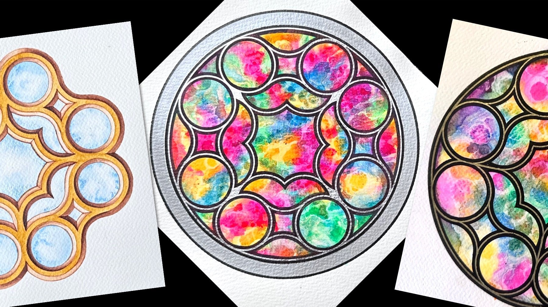
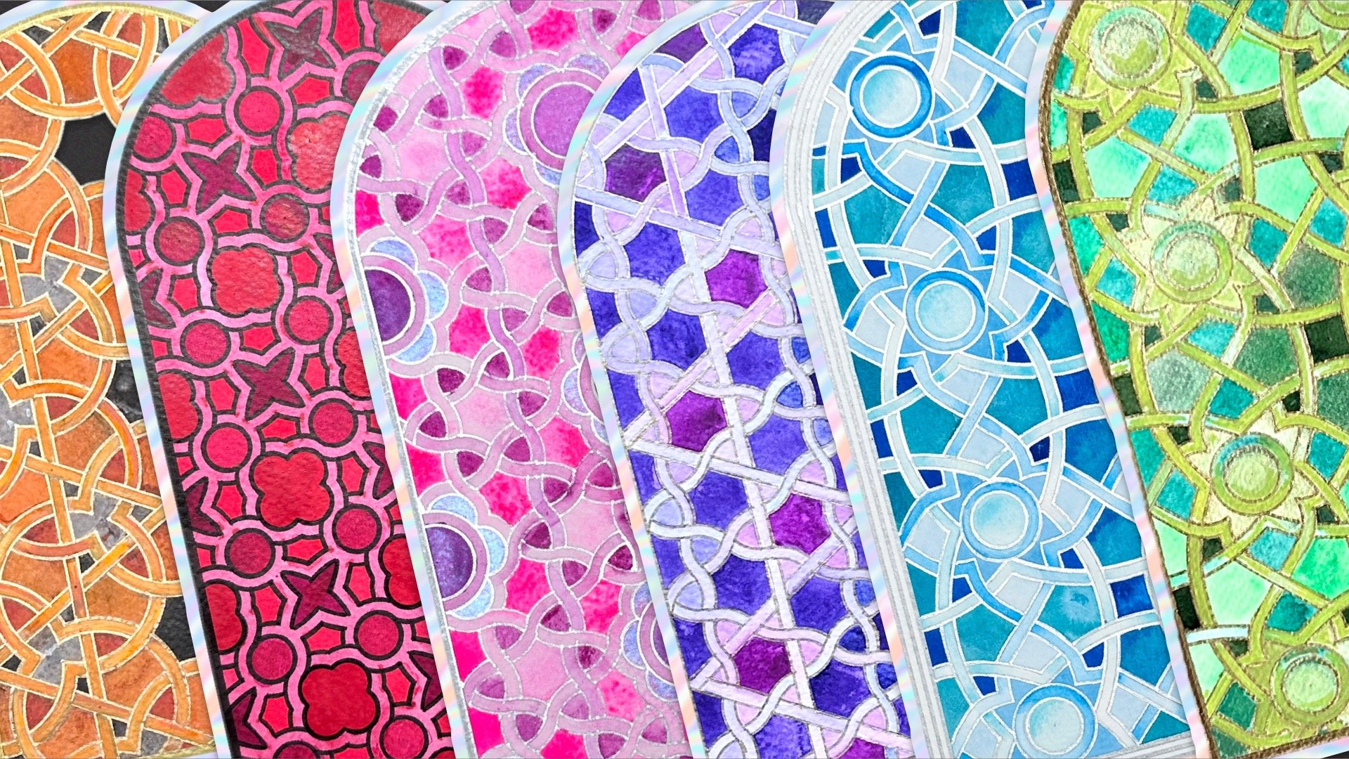
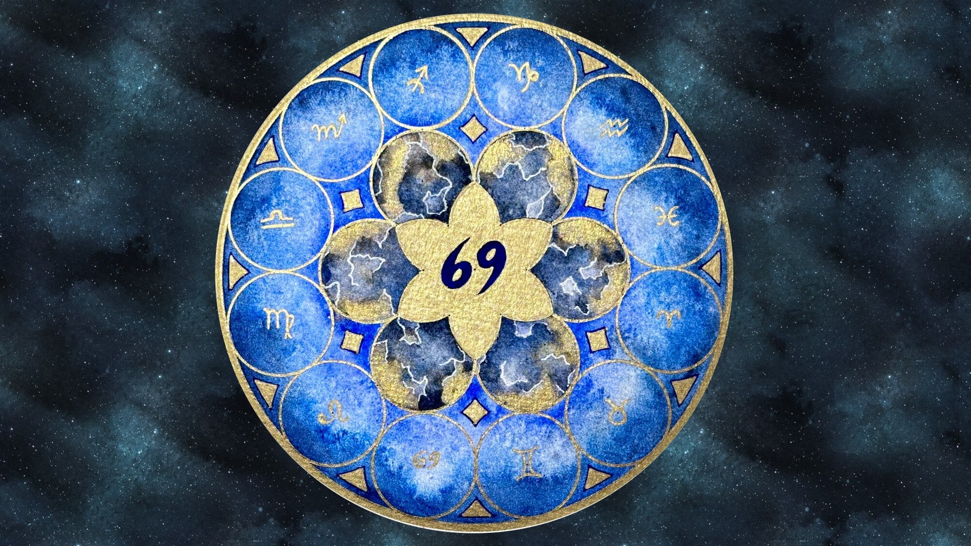
Transcripts
1. Introduction: Voronoid diagrams are geometric
patterns that frequently appear in nature on
the coats of giraffes, in the motifs of leaves,
and dragonfly wings. Their geometric
structure is often an inspiration in design,
architecture, and art. They feature in
porcelain decoration and can be found on
buildings such as the Water cube aquatic center in Beijing and the Gold Coast
Art Center in Australia. Hi, I'm Diana, a mathematics teacher
and a geometric artist. In this class, I will be
guiding you step by step, how to draw your own
Voronoi diagram art. I will teach you how to apply just three simple geometric
concepts using a compass. So you can generate your
own infinite variety of polygon tessellations, as well as circular designs. Then I will
demonstrate a range of fun coloring techniques
and texture explorations, such as water color layering, using salt, masking fluid, and even bubble wrap. This class is suitable
for all levels, and it includes
visual instructions, as well as ready,
traceable templates. The skills learned
in this class can be applied to any of
your own future art.
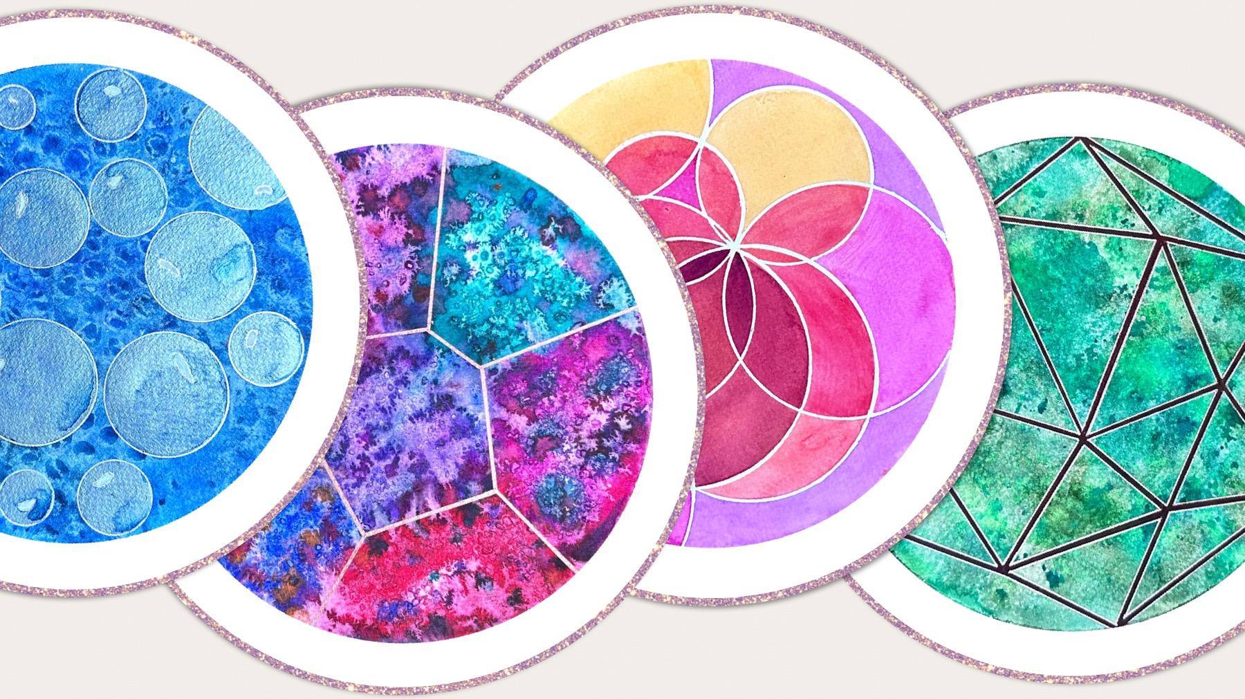
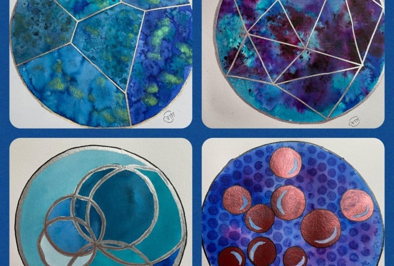
2. Project & Materials: The project in this
class is to create four designs based on
a Voronoi diagram. Now Voronoi diagram is just a way of splitting
the surface in an efficient way by finding regions which are closest
to a given point. For example, any part of this region is closer to this point than any
of the other points. That have huge applications
in the real world. But of course, it creates really interesting
patterns and designs, which is why we
find it so often in nature as well as
design and architecture The way to find where
the lines go and create the actual polygons
in the pattern is to find the shortest
distance between the two points which splits
it in half at a right angle. You're going to learn
three simple techniques, how to split a line at
a right angle in half, how to split an angle in half, and how to draw a perpendicular, 90 degree angle from
any point to a line. By using these three
simple techniques, we can generate those four and more because you can
combine any of these. Each time you start, it will
create a different pattern, a unique pattern because of
where the points are located. In order to be able
to make any of those and have fun
decorating them as well. This is what we're
going to need, some watercolor paper, any
shape or size, tracing paper, some cling film or
plastic or bubble wrap, You're going to need
paints, masking fluid, possibly some salt or anything that you think
can create texture. Of course, we can't
construct anything without having a
compass, a pencil, a ruler, and then we
need a waterproof and a metallic paint as
well. Let's get started.
3. Halving a Line Segment at a Right Angle: Before starting to
learn how to do Voronoi diagrams and create
our polygon teslations, we first need to learn a very simple geometric concept that is used over and
over in geometric art. That's how to take any line, random line, and be able to split it in half
at a right angle. This is called a
perpendicular bisector, perpendicular
because we're going to find the right angle, bisector, because
we're going to split the line into two
equal sections. The line segment has any length. All we have to do now is open our compass to a length
that's larger than halfway. And start from one
end of the line. Instead of drawing
a full circle, we're just going to
draw an arc from below to above somewhere
along the middle. Without changing the radius, we just do exactly the
same from the opposite end of our line segment and
make sure they cross. If these aren't long enough, we can go back to extend them. The two points that we've
just created by intersecting these two circle arcs shows
us where to draw the line. Which will be at a right angle, so this here now
is a right angle, and these two line segments
are equal to each other. The reason why this
works is because by drawing a circle to there, this distance and this distance, and this dice and this distance, were equal, we've created
essentially a rhombus, and the diagonals of a
rhombus are always at a right angle to each other and always split each other in half. Now using this simple concept, we can start drawing
noi diagrams.
4. Drawing the Voronoi Diagram : A Voronoi diagram, essentially, all it does is if we have two different points
in space or sits, let's say one here and one here. What the Voronoi diagram does, it partitions the surface into two areas that shows us which side we are
actually closest to. We're going to start with
two, two arbitrary points. Now we want to split the
space into two parts. Because for example, if
I pick this point here, do I know whether I'm closer
to this point or this point? This is how we're
going into the side? We're going to find
the perpendicular bisector of this line segment. However, I'm not going to draw the line because the diagram
will get too overloaded. Just like before, open distance as long as it's small and half, but make sure that
it will cross within the boundaries of
your paper and draw an arc and do the same from the other point without changing the radius just
as before, there you go. Now we know which two points
the line will go through. This will be the
perpendicular bisector to the line segments that
we haven't actually drawn, the one through those
two points we had. The points are going to
determine the shapes in. If we only had two sites, then we're only going
to have two polygons. Any point in this region is closer to this
point than this point. An point in this region will be closer to this point
than that point. Any point on the line is
equally distanced from both. And that's how it
diagram is created. Now, of course, we're
not just going to split the page in two,
we want to add more. I always recommend just
add one at a time. I'm having to go around watercolor piece of
paper, see how it goes. Of course, we can rotate
it however we like. I'm going to start
with two sites. The first thing that
we need to do is find the perpendicular bsector
of this line segment, if the two points we drew
were the end of the segment. We're not drawing
the actual line, but just finding its bisector. Two arcs from both ends
through the two intersections. And we've partitioned our Voronoi diagram
into two regions, each of which is
closer to the site. Next, we're going to
add another point. We're going to find the
perpendicular bisector of the new point with
the existing points. Let's do the nearest one first. We can go back to extend. The next line goes
through these two points, and we can stop at the
point of intersection, and this line now
becomes unneeded. Now we need to find out where the perpendicular
bisector between these two points is
because something is going to be added down the bottom as we're
looking for three regions. Open wider to make sure
that we th at least half. This looks good. Little short. It often happens and align through the two
new intersections, but only draw from
the vertex down. Generally, when we build
our Voronoi diagram, all the new vertices we find, which are the boundaries
of the regions. There should always be
three line segments coming out in
different directions. Let's add a point here. Same as before. Now, when you are close to the
edge of the paper, you need to be careful that you have an arc long
enough to cross. It must be more than halfway
but short enough to cross, not to go past that edge. Let's take this and stop
at the new intersection. Here we have two lines. This is unlikely to be
needed anymore this part. So there should be another
line going across. Now I suggest that we take the new point and find the perpendicular
bisector with this point. It looks like this point
is closer than this one. Again, a bit of a wide radius. Carefully locate where
the intersections were. The top one is easier
to see bottom one and only draw the segment
from that intersection. At this intersection,
there are now three lines, but now here the ramp. As you can see, this
is definitely not the middle, can
delete this part. If I find the perpendicular
bisector of these two, I can predict it's going
to start most likely from that point there because we're looking for a third line
coming out of that vertex. New intersection there and here. Then it's coming
down through here. Yes, that makes
sense. Now we have four regions and
four sites in them. I'm going to add one here. It's a little bit bare.
Let's add one here, and we will need to
find a few others. I always start with the nearest. It's obvious that we're
going to need that. Some of the others we might not. And let's have one more here. Hal way between these two. One here. We are going to fix this here by looking at halfway
between these two. And this one here between
these two is going to be through here because
these needs three each. And that can be thud. Let's just add one
more down here. And that makes sense that
it goes through here. You can add more, you
can stop at any time, but I'm quite happy with the
size and shapes of these. It turned out quite regular. A we're going to
keep these lines, and then the rest
will get erased and that will be the design. Before we move on to
decorate it, however, we can trace three more
designs from the same, so get your tracing
paper rey. Go.
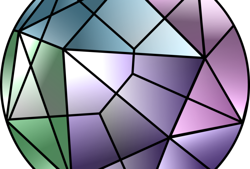
5. Drawing the Triangulation Design: This is the Voronoi
diagram completed, and I've put a piece of
tracing paper on top. Luckily, we can still see
the sites we started with. These were the original points, and around each site, there's a region
where the edges of each region meet,
there's a vertex. All the vertices we found in the Voronoi diagram have
three edges meeting there. Now what's really nice, a secondary design, we can
do directly from this grid. It's actually what we
call the dual graph of the Voronoi diagram, and that's simply
a triangulation, because all we do now is connect the sites
that we started with. Since every point is
close to two others, we're going to create
a chain of triangles. The Voronoi diagram can have any shapes or polygons inside, where the triangulation is
strictly made of triangles. We connect all the sites, but it makes just triangles. You'll see how
easily that works. Now, if I draw this line, that was the original two points I believe we started here. This is the distance
between the sites. The diagram we're drawing now focuses on the distance
between the sites, whereas the Voronoi diagram focuses on the area which
is closer to the site. We just connect all the sites together to create triangles. Looks a bit like a sea
shell, doesn't it? Now we don't just
want the triangles in the middle and we don't have
enough points further out. That's fine. A bit
of creativity here. What I like to do
is to take each of the vertices on the outside. These are the sites actually
and just connect them each with those at the
edge of our paper. Just like this. That
means that we have triangular shapes all the way
to the edge of the paper. I connected this to
there and there. Some lines might look like
they lie on a straight lines, some might bend slightly, might look a little bit
like a star on the end. That's okay. Generally, it's a design of a variety
of different triangles. All along the edges, there's also triangles, and
we have all these vertices. When we trace this back onto
another piece of paper, we can see where the
circle will match. Now, you could have that as a standalone design
in its own right, or you can leave it as overlapped over the
Voronoi diagram. Not only can you
leave it overlap, you could rotate it and
create a new pattern. It doesn't have to
be in that order. If you rotate it, it will
create other shapes. It depends on how many shapes you want inside your design. Do you want fewer bigger shapes, or you can combine
the Voronoi and the triangles together.
It will make this. This is one example. Don't take the tracing paper off just yet because we're
going to use both of these layers to
create the next one, which is going to be circular.
6. Drawing a Circle around a Triangle: The third variation is going
to be based on circles, and the first type of circles
we're going to learn, are called circum circles. That's short for
circumscribed circle. Start with any three
points on your surface. We want to find a circle which surrounds all these
three points. It goes through exactly
those three points and it's always possible
with any three points. Essentially, this is a triangle. Whether we draw
the lines or not. We will just for
clarity in this case. How do we find
where the center of this circle is going
to be? We can draw it. I will be somewhere
here, we can't guess it. The way to find it is by finding the perpendicular bisectors of the lines of that triangle. Let's start with this
line on the bottom, open your compass a
bit more than halfway, T arcs as before, exactly the same concept as
we have been using and draw a line through the
two intersections and extend through
the other side. Of the triangle. Just make sure it's long enough. Next, let's do this side. I can use the same. Radius. These are the
two intersections. Extend to make sure these cross. You won't be surprised now
that I told you earlier, when you draw the third bisector
perpendicular bisector, it should go through
exactly the same point. In which case, it means we don't need all three any
two or enough, but just to show you that this should work through
here and here. Extend all three
cross at this point. This is going to
be the center of the circle which goes
through all three points. What is the radius
going to be then? Well, the distance
between that center and the three vertices be equal. Just measure, make sure it's going to go
through all three, and there you have a full circle that goes through
any three points. That can be really useful
in any geometric design. If you have three
points and you know you want to make a curve
that connects three, even if it's not a full
circle, this is how you do it. Connect the three
points into a triangle, find two of the
perpendicular bisectors and find the center by crossing.
7. Drawing the Circumcircles Design: As you saw on the
previous video, we can circumscribe a circle
around any triangle as long as we can find out the
perpendicular bisectors of the edges of that triangle. In fact, two edges are enough. But what's the good news here? We have already
drawn the triangles. And we know for every
triangle that we've drawn, we have already bisected it by drawing the Voronoi
diagram underneath. Let's take this
triangle, for example. This is a triangle. That
edge has already been bisected at the right angle by this line and the same for this edge by this
line and this line. That means that we already have the center of where our
circle is going to be. We don't have to do
any extra working out because the work
has already been done. This is the center the radius should be to the three
points of that triangle. Let's draw it. There we have it. There's a circle. We
didn't have to do any more working out than what
we've already drawn. Now, see this triangle here, it's interesting
because of the shape, its center is very
near the edge. In fact, sometimes
it is possible that the center of the triangle could be outside
of the triangle. It will just depend
on the shape. You look at where do the three perpendicular
bisectors of the edges meet here and then extend
your radius to go through. The three vertices that
make up that triangle. This one is not as accurate. I think I just need to
be a bit further down. Here we have different
overlapping circle. That's what I like
about this design, different overlapping
circles, but not random. They have a structure
underneath. Let's move to this one.
There is the center. This is even bigger by
the look of things. Let's just check that
it crosses points. Yeah, I'm happy with that. Great. There's the next
one. Here is the center. This one, sometimes they have the same size or this
one slightly bigger. I think the center slightly
lower than what I went for, but that's okay.
There's one more here. It's okay if some are
partial and some come outside because ideally we
want something on the outside. There's one more here. You could of course just add a few extra arcs from
here, just arbitrarily. For example, we
could go from here and draw an arc through
this point, for example. We could do the same
from here to this point. H. As I feel that not that many other
places need more arcs, perhaps one more here
and then I'm happy to stop. Yeah, I'll stop. Now, as I said, you
could just find one more perpendicular
bisector, let's say this line, just by drawing the two arcs, and see where it crosses and do this one
entirely inwards. But it's nice to have some
unfinished ones on the edge. Now this is the circum
circle design all complete. As you can see, it can
work on its own as a design in its own right and painted really interestingly, or of course, you can keep it as part of the straight
line designs. For example, you
can combine it with just the triangulation or
just the Voronoi diagram. That might be
interesting as well.
8. Drawing a Circle inside a Triangle: Final variation is
also made of circles, but not the circles
that surround any of the triangles
that we have, it's the circles that fit
inside of the triangle. In order to find the in circle, we need to learn two more
very simple concepts. We know how to bisect a line. That's the first
thing I told you. But now we need to learn how to bisect an angle.
What does that mean? Well, an angle simply measures the amount of turn from
one direction to the next, how much is this turned? The angle bisector,
what it's going to do is going to find
the line that will split it in exactly half. We don't need to measure
it, we're very simply going to construct it
using our compass. Similar to before,
we're going to just draw a few arcs and
see where they overlap. Starting from the
vertex of the angle, where the two lines cross, Just draw an arc that will
cut through both lines. Then that means that these
two distances are equal. From the two
intersections we created, just cross in the middle where two more arcs
are going to cross. And that shows us
where the third line will go from the vertex of the angle through
the new intersection we created in the middle,
and there we have it. These two parts now are equal. How do we find the in circle? We need to find the
angle bisectors. Just as before, we only
need two out of three because they are going to
cross at the same place. I'm going to do start from the bottom and split this angle. Go to make that a
little shorter. Cut both lines
with the same arc, and then from the two
new intersections. Just two short arcs that will cross in the middle if they're not long enough, extend them, and here we have the bisector of this angle going through the intersection and
through the vertex. Extend through the other side of the triangle just to be sure, and now we're going to do
exactly the same on this side. You can change the radius on here, doesn't
have to be the same. Go to make it slightly longer since it's a bit of a smaller. Opening, and then from
these two intersections, cross through the middle and extend this line through the vertex and the
new intersection. From here, Yeah. Where do these two lines cross? It's exactly here. If we did the same thing
through this angle, it will also go through there. You could do that to try
and verify this or use it just as a way of checking
your accuracy if you like. But for now, I don't need to. Now we know where the center
of our inscribed circle is. Unfortunately, we don't know yet how far to open the compass. We don't actually
know the radius. The radius doesn't go
through those points. Those points here are
irrelevant. We just needed this. We could try and
guess it like this by just hovering around and seeing where it's
going to touch. But we don't need to guess. All we have to do now
is find where any of the radii of this circle will
touch any one of the lines. The simple rule here is that
the radius of a circle will make a right angle with the point of tangency
to that line, which means we just need to find the right angle,
in other words, the perpendicular line from that point to any one
of the three lines, and I'm just going to use
this one because it's wide. The last fundamental skill
you need to learn is how do we find the perpendicular of any
line from any point, not necessarily the
one that splits it in half, but any other point. This is what we
do. This is called the perpendicular from a point, not the perpendicular bisector, because quite clearly we're not going to split the line in half. From the point we have, we need to open the
compass wide enough that it will cross the existing
line in two places, one here, one here, or just one continuous arc. Now we have two
new intersections. From the new intersections. Just check the distance
here is the same. Create an arc on the bottom, from the opposite intersection, another arc on the bottom, and you guess that through the point and the
new intersection. This line here creates a right
angle to the horizontal, but it doesn't split it in
half. Why is that useful? Because this is how
we're going to find at what point our circle is going to be touching this line. We know the center
of the circle. That's the point, and
we know the line we want to find the
perpendicular two from here. We're going to start
from the circle center or that point above the line. Open the arc, so you know
it's going to cross your line twice with the same radius from the two new intersections, draw another two arcs below. And now align the circle center with the new intersection
that we found, and just draw this vertical, which is at the right angle. This is the in center, that's the center
of the in circle. This is the point of tangency. In other words, we've just found the radius for our
inscribed circle, so now we can draw it. Start from the center and align the radius with
this point here. Now, you could do this
for all three sides, but you only need
to do one of them. A little bit wide. There
we've inscribed the circle.
9. Drawing the Incircles Design: The final design is slightly
trickier because we need to use two more concepts just as in the previous video. For this one, we need angle by sectors and then a
perpendicular from a point. I've removed everything.
We just need the triangles because the other two designs aren't helping, and I'm just going
to put another piece of tracing paper on top. Let's start with this triangle here on the right,
it's fairly big. We need to find two of
the angle by sectors. A two. I'm going to go for
this one to start with. If you remember from
the previous video, from the corner and arc
to cut both segments. Then from those
new intersections, another two arcs in the
middle until they cross. We know where to draw
the line through. I ruler, align the
vertex that we used and the new intersection and
extend more than half. Now we know the in
circle is going to be fully inside the triangle, therefore, we don't need to extend beyond any
of the triangles. I'm going to do
exactly the same from this corner inwards
into the same triangle. Cross the two arcs,
cross the two edges, two more arcs, a straight
line through here and here. It's not an easy technique to
get super accurate by hand, but it is definitely very
valuable geometric technique. Now we know that the center of the circle is going to be here. Now we need to find
the perpendicular from this point to let's say this line so that
we know exactly where the circle will touch
without having to guess. Again, with the compass, from that center where the
22 bisectors have crossed, extend to make sure
that your arc is going to cross the edge of the tri and go in
two distinct places. And from those places and arc below from and
another one to cross. Now the reason why
these are tricky. This is a very
shallow intersection and it might be difficult to judge exactly the millimeter of where they meet.
Don't be discouraged. We're still going
to do exactly the same what we need it to do. We're going to align through
here and the center, but we're not going
to go beyond. In fact, we only need
that point there, but basically what
we've just drawn now is the radius up to here
from there to there, is the radius of the circle that we're looking
for the in circle. As I said before, you could guess where your circle touches. Once you know where the center, that is really the
most important part. This should just touch
through our triangle. Let's try it. And
there we have it. All we have to do now is do that for all the
triangles there. I added a few on the
outside as well and deleted some of the arcs so that
it's easier to transfer. It's just those bubbles. It's a design on its own. However, they're all separated, unlike all of the other
designs we've made. I recommend that you overlap
it with the other circles in any orientation
or the oi diagram or see how it goes once
it's been transferred.
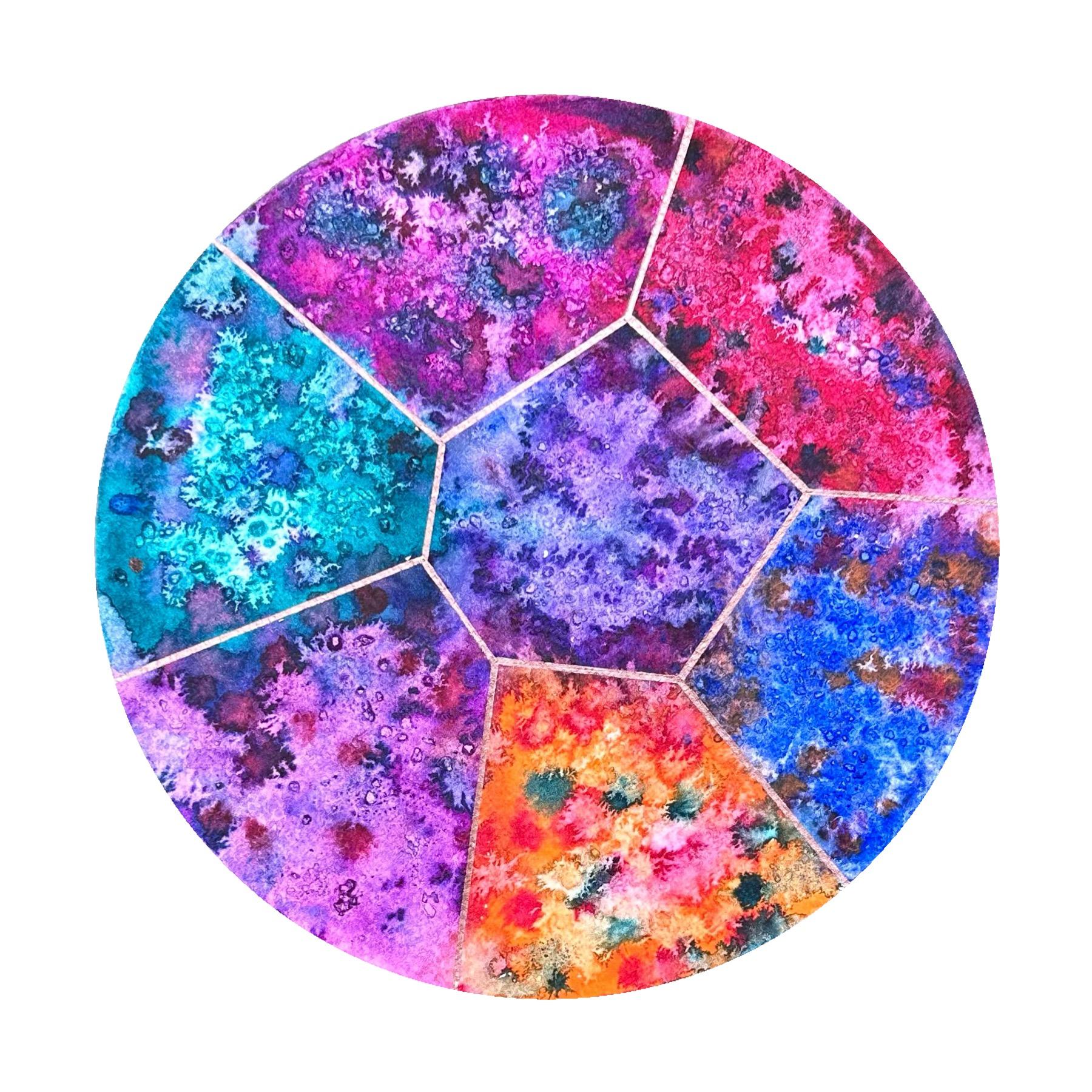
10. Painting the Voronoi Diagram: Okay. We're ready to
decorate our first design. That's the Voronoi diagram
we created earlier. I'm going to use some
very bright colors and decorate each region
in a similar shade. I'm also going to use some salt to give each color
a bit of texture, and I'm going to first wet the paper and then add
the individual colors. For example, I'm going to
start with the middle. I'm going to put some water on. I like using a flat
brush for this. It's ok if the colors
bleeding to them, but I'm going to do
them separately. I like to apply the
color with a big brush. That way. My color isn't
going to dry too quickly. I'm going to start with violet, which is my favorite and
put that in the middle. I'm going to add a
bit of water here. I really like how the water
distributes the pigment. Just trying to make sure
that the edges are saturated even though we are
going to outline the corners at the end. What I'm going to
do now is put just sprinkle a few sea salt grains. As they are still on there, just going to drop another
couple of bits of color, and they're going to go the gaps that the salt is creating. I'm going to do something
similar with the next color. Next, I'm going to go
here and I'm going to use some hyacinth. My magenta shade. This one. As I said, I don't mind that the colors are bleeding
a little bit into them. In fact, I like that
effect on the edges. I'm ready for some salt. Just add a few bits
here and there. I feel like I might add a
little bit of this color here. And a little bit of
this color here. Next, I'm going to go for some turquoise,
for a different vibe. I actually do really
like the combination of purple and turquoise. It's one of my favorite
color combinations. Some salt. A couple
of purple drops. Next, I'm going to go for cis, which is cherry red. Looks similar to
that, but it isn't. That's great here. Let's add a few turquoise loves and salt. Notice here I added the
turquoise before the salt, so it will create a slightly
different pattern, I think. Next, I'm going to go for, which is the red vibrant red. I'm going to add a
bit of red on here as well to break up that turquoise. Okay, salt. P drops
of turquoise. And p drops of purple. Next, I'm going to go for blue. Lt Marie. These two are looking
a bit too similar now because of the addition
of the other colors. Probably put a bit
too much in clusters. But that's fine. It's
unpredictable and fun. And that's what we
like about this. Might be unusual, but I
am going to drop a bit of orange into here. A little bit of red. A bit more here. I want it to be distinguished
from this one. Then the final one, I'm
going to do an orange. I'm actually going to use this brush for this final color. So some more cherry red. I touch more purple in the
middle because I feel like it's not quite as purple
as it started off with, and I wanted this to
be more purple and to have different color to one. Then I'm just going to drop a couple of turquoise bits into the orange. So interesting. I love the geometric structure, but with these abstract
coloring techniques. Now, anywhere on the
edge is where I feel like it needs to join in, I'm just going to
drop a bit of water. That's too much. I'm going to
use a bit of tissue there. Gently, just join in. As I said, we're going to
outline this with a golden pen, but we don't want to
risk having any gaps. Quickly go with some water along the edges, just
to tidy things up. Just drop water, don't even worry about
merging the color. I feel this means a little
bit of dabbing off. Very vibrant and yet
lots of textures. Allow the salt to
completely do its job and for this to
completely dry as it is before we can scrape
off the salt and then outline the
edges with gold. The Voronoid diagram
is now all dry. I do feel like it
needs a contrast. I'm going to go with a
thicker pen and it's copper. Hopefully that stands out. You can use anything metallic, silver would look great, gold, but I feel like using copper. I'm going to use my ruler. I flipped it upside down. The metallic doesn't smear
too much on the ruler, although some will,
so we'll have to just wipe it off afterwards. Just go over the boundaries
for the nice and vibrant. I think I like the thicker
one better for this design. So I'm going to repeat
some of the thinner lines, make them look uniform. You should be able
to clearly see the lines from the
waterproof line underneath. Yeah, that's nice. Wow, there we have
it fully complete, worked out, painted, outlined,
beautiful Voronoi diagram.
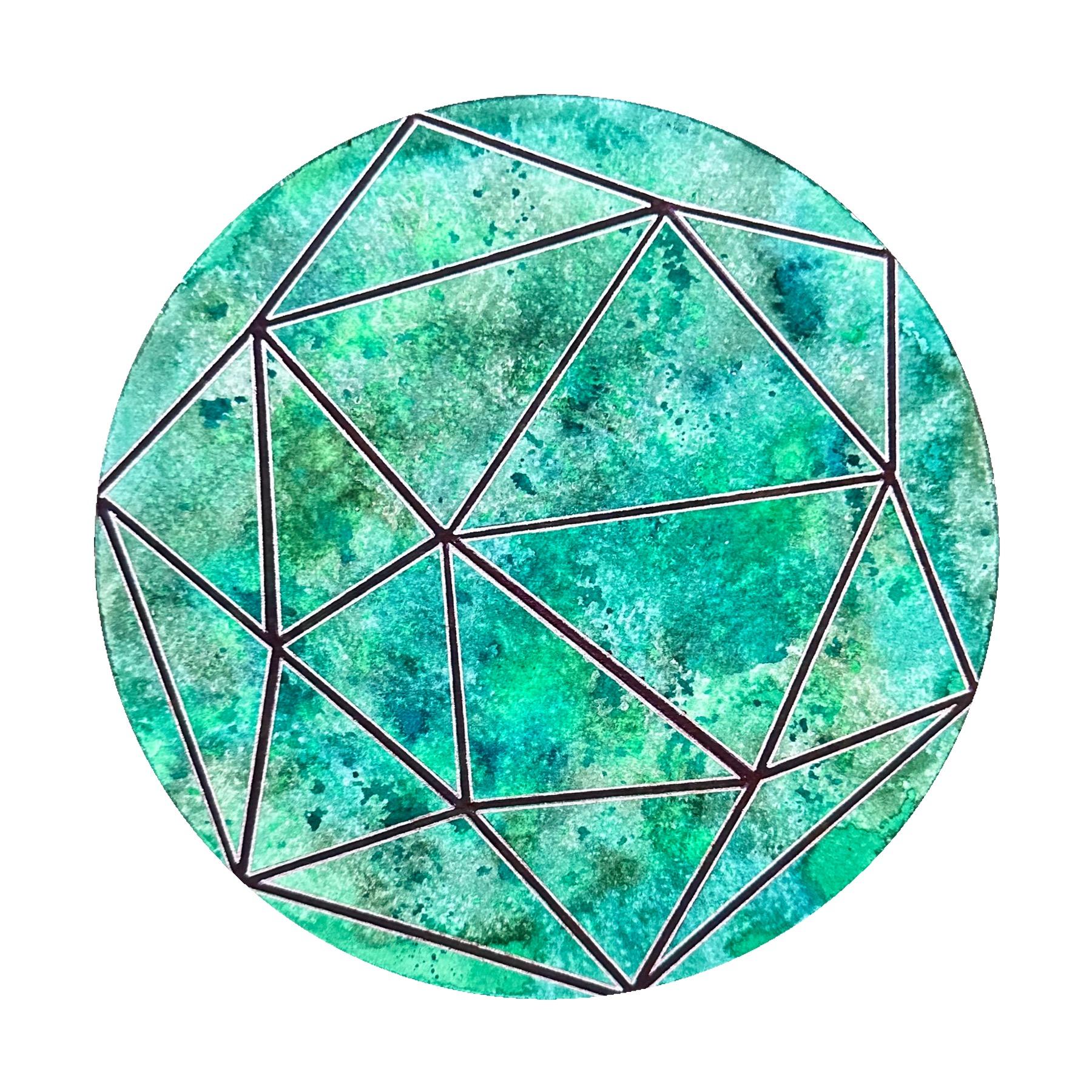
11. Painting the Triangulation Design: For the next pattern,
we are now going to transfer the
triangulation design that we traced out earlier. Because I'm using
a circular paper. It doesn't actually
matter which way around. If you're using a square paper, you can decide which
way around you want it. I'm going to just secure
the tracing paper. Okay. I've turned over
the tracing paper so that the graphite is going to make contact
with the paper. This is the orientation
I've chosen. I'm simply going to go over the existing lines with a ruler and a pencil. Okay. Here we go. Here is
the trace design. I do feel like I want to add three more segments just here because these are quite nice and flat, but these are fairly big. You don't have to. Just to feel like it's more
of a complete design. We're going to paint the
triangulation design now. I've decided to go with
lots of different greens and I'm going to just scatter a lot of greens around
the whole thing. I'm going to wet
the page again with my flat brush to make sure that each part of
it is saturated. Now I'm not going to worry about where the boundaries
of the triangles are. I'm just going to
randomly put the greens. Later on, we're going to outline the boundaries to give
it that extra structure. I'm going to start with
some brilliant green. And randomly scatter
it around the page. Paying particular
attention to the corners. I like the, the boundaries
of the page to be saturated. Next, I'm going to go
with some peak green, which is a lighter shade. Be careful with the
edges. There's always going to be more water
that gathers there. That's normal because of how
the paper is going to move. Next, I'm going to add a bit of a darker shade of grass green. Create shapes if you like, or just allow the water to distribute the paint in
whichever direction. Want. Create a bit
of a shading here. I'm going to add a
bit of turquoise now. It will give it a bit of
a blue blueness to it. But of course, the majority will be green, so that will be. Going to go over some
peak green again. That was the original
the light shade. It's like breathing
through in a forest. That's what this
makes me feel like. I'm going to add a bit of
brilliant green again. And last but not least, I'm going to scatter a
little bit of neon green. That's just to give that extra little brightness
of the whole thing. Going to try and
spray some of it. I do like this effect as well. That's why I wanted
something brighter, so it's a bit more contrasting. You could do the same with
a bit of white as well. But I think that's
what I was after. This effect. It's
interesting. And abstract. I'm completely going
to leave that to dry. Now if you think that's
too intense as a color, you could just cover
it with a bit of tissue and just dab
some of the color off. The green is all
dry. It's beautiful. I really like the
contrast, as you can see, I took away some
of its vibrancy, but it's still quite dark, but we can still see the lines. Now for the frame,
I'm going to go for firstly a thick
black marker. But then I'd like
a bit of shine. I'm going to put
some silver around the black so it looks like a
frame above the background. I'm just going to go over the lines with a
thick black marker. Now, I'm going to outline on either side of each black
line, meaning basically, I'm going to align
the inner side of the triangles in silver. That's the triangulation
design complete. I like it. Wonderful. Next, we can
turn to the round designs.
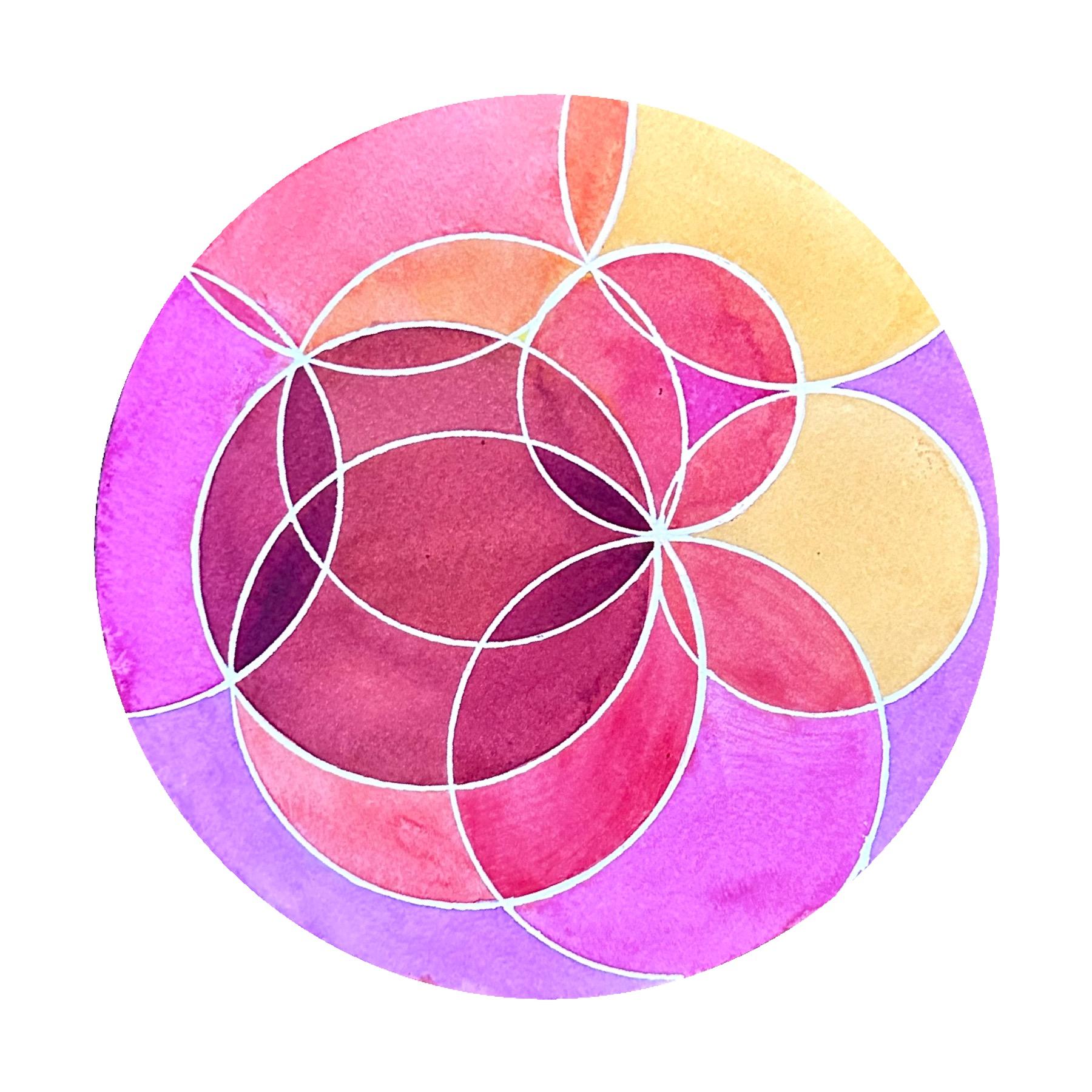
12. Painting the Circumcircles Design: We're now going to transfer
the circum circle design. These are the larger
circles that we're going ad the triangles earlier. Luckily, the points where we've used earlier to
draw each circle, we could still see should be
able to see and even feel through your tracing paper
when we traced it earlier. All I'm going to do now is
find carefully the center of each individual circle
and make sure that the graphite is pointing downwards and just draw
on top of each circle. Hard enough to make sure it transfers underneath,
so we can paint that. What I have now, I
haven't outlined this in a waterproof pen
unlike all the others. What I've got here is
some masking fluid, and I have this silicon
taper end which I can use to actually draw with mine luckily
fits in my compass. What I'm going to do is outline all the circles using
the masking fluid. We just need to let this dry
out before we can paint. The masking fluid is now dry. I'm just going to paint
a few random colors as I go along in each circle. I'm just trying to anticipate which color will
overlap with which. I'm not going to
make this very wet, just trying to make it uniform, but it will be very nice once we've rubbed off
the masking fluid later because it will have hopefully that
definition that we're looking for in between the circles. I'm going to wait between
layers for each of them to dry before I start
the new colors. Next I'm going to
do some orange. I'm going to do some
orange here as well. Hopefully, it should dry well. So orange here as well. So I'm trying to overlap
with a different color, but not with the same color. That's kind of what
I was envisaging. Okay wait for the orange to
dry or use a hair dryer. Next, I'm going to have some red starting here and here. Have to go as fast
as you can really, which I'm not
necessarily doing well, but it's so that the colors
don't get transferred, but stay more overlapped. I will stop with this color now. Next I'm going to add the
slightly darker cherry red. Bit shed here and
there, but be fine. I'm going to start
with this part. Oh, this color is just glorious. I'll make that smaller circle. It all laps pretty
much everything. And then this one here. Now I'm going to add some
hyacinth on the outside. All these colors
look nice together. This isn't the best
brush for this. It's pretty, isn't it? I'm
just considering now whether I should paint one
of these here. It feels like a lot. Whether this one or this one. Which means that
yellow will disappear. But it will still create
different shades. I'm going to do this
middle one in this color. Okay, the colors are now dry, and I'm definitely going to
put this under a heavy book after in order for it
to flatten a bit more. But for now, that's great. But let's have a go. So I have this special rubber
for masking fluid. This actually worked really beautifully just as I wanted it. Some of the paints spilled
over to the next one, but that was more
me with the brush rather than the masking fluid
did its job really well. There's only one
obvious point there. The reason why this happened is because the point of
the compass for one of the circles had to
go on there several times after I had put this, I remember having to put the
pin on the masking fluid, and of course, that's made a
hole in the masking fluid. Some of the paint has gone
through. That's not a problem. Just a little bit of
white will fix it, which will probably disguise
the actual point as well. The little hole. Even though they never
bother me they're part of my normal geometric art, a little imperfection there, a little bit here where either
the pencil hasn't covered or some of the brush
transferred a different color. A couple of tiny
finishing touches. But I'm very happy with that. I really like it where at some points different
overlaps happen. There's a tiny bit of yellow there on its own,
which is great. There's a bit here. But I always say, this
can work a little bit, but nothing can
really in my view, nothing can fake the
whiteness of paper. That's why I don't
want to get carried away doing this in white because the whole point of this for me was I wanted the
white of the paper. Yeah. We're all done.
13. Painting the Incircles Design: We are now ready to
outline our last design, the bubbles, the in circles, they're the only design that isn't actually
interconnected. We're only going to
trace the circles and ignore all the
construction marks. I'm going to start
with the biggest one and follow them in
this round order. Then I'm going to
do the side ones. Make sure you press
as hard as you can, in order to transfer below. And remember we added a
few around the edges. I highly recommend
when you finish playing with this to try
overlapping the designs. I particularly like the two
circular designs together. All the small in circles
always fit inside all the larger circum circles if you align them in the
way they were constructed, or you can overlap them
totally randomly at a different angle and
the Voronoi diagram, if you want to combine
straight edges, and circles, that's another good
idea that you can try. I think that the in
circles look better with the Voronoi diagram rather
than the triangulation, simply because with
the triangulation, all the circles are exactly
fitting in each triangle. It's a bit too regular.
Was it's not as obvious and it has a bit more of
a movement and dynamic if it goes together with
the Voronoi diagram. Was the triangulation
goes really well with the large circumscribed circles. If you feel like you need to repeat some of
them, that's fine. Yeah, I'm happy with that. This is what it
looks like if you combine it with the
larger circles. At the moment, they are
crossing each other, meaning they're not in
the same orientation as when we first
constructed them. If you see the three
big circles here, they would be within the
three bigger circles here and the three closest ones. This is likely to have been
the original and you have a circle inside each
of the larger circle. But in any case, I think they look fantastic overlap together. Now, because this really
reminds me of bubbles, I am actually going to use some bubble wrap
to try and create some texture and I see this as because they're
separate shapes, I feel like I want to
paint the whole thing and then later
emphasize the circles. I'm going to start with
wetting the paper. Then I'm going to go with lots
of different blues because it just reminds me
of water bubbles. Then the first layer
of the background. We're going to use
the bubble wrap to create some texture. You can use cling feel more or anything else that
will create texture. However, I think because of the circles on the bubble wrap, it's just that
extra thing added. I'm going to start with
my medium blue color. And I really don't mind in
which order I place the color. The water is curling the paper. That's completely normal. I'm going to go
with deep blue now. I'm going to emphasize
the edges in particular. Finish. Doing the edges because I want to emphasize the roundness of
the paper as well. So even if it's not
very dark shade, I don't want any white spaces around the ends, if
that's possible? A few more shades
here and there, just to mix it a bit. It has a few more
layers in depth. We do want this to
be quite strongly colored because the
plastic is going to take some of that off and the intensity
will not be as strong. We won't see the
texture very well if we don't saturate the
paper with color. Finally, a little bit
of bright neon blue. In a random completely
random order. Now I'm just randomly going to place this, push that down. It's okay if it's torn apart. In fact, it will probably
create an interesting shape. If if I torn that apart and it wasn't
all joined together, but it was torn and it
had gaps in between, see the effect it
already creates. Let's leave it to dry
and see what happens. I'm going to reline them with silver because they're
very difficult to see. What the silver is going to
do and help us with Lao as well is that when we
paint inside the bubbles, the paint marker,
the silver paint should help the paint not
come out of the boundaries. Of course, they can be relined after we
paint the bubbles, and layer them on top as well. Now, I'm going to
paint with metallic silvery blue or metallic blue. That should cover up
the previous layer. Of course, we don't have to
cover the entire bubble. Let's start with this
one, for example. We can just do the
outline, see how you feel. Very nice metallic accent here. You could of course
add silver or gold if you have that paint. I feel like pushing the pigment towards one end of
the circle to give it that almost bubble look a bit like here,
it's sedimented. Of course, that will be a
bit tricky when the paper isn't completely flat,
but it should be okay. Should draw in a very
interesting way. And the in circle design
number four is also complete.
14. Conclusion: I really hope you
enjoyed learning about these four variations that can be all created from
the same grid. The main thing, of course,
is the foi diagram, and then anything
related with it, the triangulation, and the
two circular designs that can be inscribed or circumscribed
around each of them. I hope that you
get to experiment by overlapping different
designs with each other and enjoy the
idea that you can create as many different
ones as you like each time. I hope you enjoyed
exploring some of the fun decorating
ideas that you've had, and you can take this forward
into any of your own art. Please don't forget to share what you create in
the project section, and tag me in an Instagram
so I can see your artwork.
 Diana Reeves, Geometric Artist & Educator