Transcripts
1. Pencil Avocado Introduction: Hello. Welcome to Artisat. My name is China and
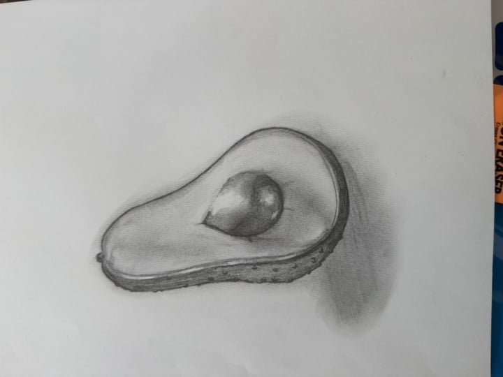
I'm a realistic artist. I'm here to show you how to paint an avocado using pencil. We're going to look
at how to construct something that is quite
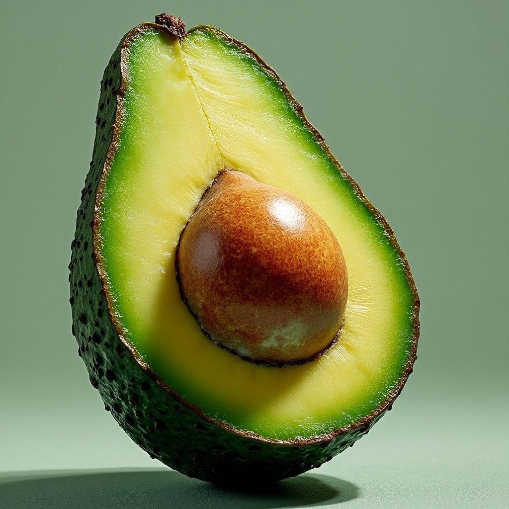
difficult because first of all, the avocado is at an angle
and it's chopped in half. Then I'm going to show you
how to construct the shading. Now, this is very technical because we have a flat surface. We also have curved
surfaces from the pip and from
the flesh itself. If you're up for a challenge, this is the perfect
class for you. You'll need your two B pencil, your eight B pencil,
and if you want to, and if you have them, you can also add an
additional pencil, as well, called lithographs. These are super, super dark and help to
push that contrast from dark to light and make things really,
really interesting. So, what are you
waiting for, Team? Grab your pencils and
let's get started.
2. Stage 1 - The Outline: Okay, Tim, we're
going to start with the outline of this avocado. So what we first want to do is get this center line
going down here. So I'm going to try
and get that angle. And then I can put my
pencil on the avocado, drag that across, and
it just helps me to check that the line is going
in the right direction. Then I'm going to try and draw the right side
of the avocado. So notice that it is
at an angle as well. And then we have this good old
hip that goes across here. So it's roughly going to
be a shape like this. So notice how I'm
applying my pencil. I'm not doing it in
one continuous line. I'm doing it nice and sketchy to give my hands a chance to catch up with my brain or
my brain a chance to catch up with my hands. I
don't know which order is. Then on the left side. So I want this to be
a little bit taller, so I'm going to try
and push that higher. Then we go down, so that's a vertical line down. And then we start to head
out of here as well. So pop in that there, remove this center point there. And then I'm going
to add the stone. So you'll notice that on the
right side of the stone, it's a curve and
then another curve, whereas the left side is more of a straight line
and then a curve. So let's start on the left side. That's going to be a
little bit easier. So straight line. It's not vertical
this time, though. It is going at an angle. And then we're going
to go around here, continue up around here. And then we're going to pop
that extra part on there. So if I treat these two
as separate curves, it will naturally give you this dip rather than
over exaggerating that. And then what we're going
to do is draw the skin. So it's an angle line down here. We're going to go out and around and then we want to make sure that we're not
going too far around here or too far around the top. So it just makes sure that
the perspective is correct. So what we need after
that are the shadows. So I'm going to
draw a thin oval. It is tempting to
draw them so big, but it's really not
that big of a shadow. Then I have a pinching effect of this shadow being
cast from the pip, so it's pinching in this way. And then finally,
on the top of here, we have a shadow that curves
around with the ball. So I'll remove that
construction line. We don't need that anymore. There we go. And
then you're left with the lovely shape
of your avocado, and we're gonna shade it in now.
3. Stage 2 - Block Shades: So using my Tubi pencil, I'm going to start on the flesh. So we can go a couple of different directions in
this, and I probably will. But for now, I'm just doing
my natural direction, which is pointing up
and to the right. So that's what most right
handed people naturally are. And if you're left handed, yours will just go
in this direction, obviously with this hand. So I'm using the flat side of my pencil just so that
it's a little bit wider. It covers the area quicker, but also it's much softer than pointing the pencil
up to the sky. So let's get that
all on the flesh. I am ignoring the cast shadow on the flesh because I'm going to use a dark
pencil for that. So it's just for the
light green part. I trying to keep my lines
close together as well. I'm trying to keep the pressure consistent just to
avoid any mishaps or any harsh lines that we have an asphalt
or do not need. Then once they've done
that, I'm going to go in a different direction
with the same technique. Keeping the lines
close together. Trying to be consistent. And you'll notice that it's much smoother here than
anywhere else. So if I'm trying to keep
the pressure the same, it doesn't necessarily
make the layer any darker. But it does, just keeps
the lines less visible. So you're flattening
out that pressure. Okay. And then on the PIP itself, there
is a highlight here. So I'm just going to
draw a little gait so I don't shade on that. And then I'm just going to do a light layer on top
of here as well. Okay. Once you've
done that team, we're going to switch to our AP. And then we're going
to do the same thing, so we're not worried
about detail. We're just block coloring
in the darker parts. And on this one, just
because it's a bit smaller, it's easier for me to go in the direction of the curve
rather than my natural angle. So I'm just going
down the curve, seeing how smooth it is, do I need to do a second layer? I'm not hugely worried about
matching the tone just yet, but do make sure it is darker than the flesh so
that you can start to see the differences and the tones where they set
forward or set backwards. And then we'll do the
same for the Pip. So make sure it's darker
than the lighter side. Keep those lines close together. There we go. And then on the cast shadow, this wants to it doesn't want
to be darker than the PIP. But it is tricky because we
haven't fully set the tones. We're just kind of saying,
Alright, this is light, this is dark, and we're not doing all the in between tones. So for this case shadow, just do it a little
bit lighter than the PIP than the skin as well. Okay, and then we're going to add this background
to the bottom. So there's shadow on the floor. Finally, don't forget the
little nub in on top. Okay. Great. So, now
we've set our tones, we're going to start
pushing the detail.
4. Stage 3 - Pushing The Darks: Okay, team. So let's start
on the skin, actually, because we want to
set some dark tones, and the darkest part of the skin is going to
be right underneath. So it's the furthest back part, which is super dark. So I'm just going to push
that all the way in. If you've had a **** week, this is the time,
get it all out, make sure that's really
lovely and dark. And don't worry massively
about the bobbly skin. You can leave it, and
it'll still look great. Or we can add it on later on. So for now, I'm just pushing that as
dark as a pencil can go. And then as I'm moving
up, it does get a little bit lighter,
but not much. So I'm just going to
transition that. There we go. And then as we go around, that is also going to transition
to a little bit lighter. Again, it's not a
huge transition. We do want this to be nice
and dark. Okay, there we go. Then on the PIP, so we're going to start
to push that as well. So first of all, I want to try and make this roundness
very definite. It's definitely darker than the cast shadow on
the green flesh. So I'm pushing that
a little heavier. And again, I'm not super
worried about the detail. I'm just pushing the tone
darker, making it smoother. And in a second, I am going to start to add a little bit
of the tonal differences. So I'm not worried about the
little speckles on there, but what I am worried about is we have a darker edge here. So I'm just going to get
rid of that line now. You see, just here, this is going to be
darker than this, but this is going to
be darker than this. So essentially, I'm going
to shade around it, making it feel like there
is a glow underneath. But in order to do
so, we need to make sure that this is
darker than this. So that's why we're working
in these tonal areas. And then I'm pushing that a
little bit darker over there, followed by darker under here. So now I've set the tones. I just want to try
and blend the edges. So I'm trying to
transition my pressure so that I'm not just
making it one solid block. And again, I'm not looking at any crusty bits that
are on the pip. I'm just trying to blend that
in so keep looking at it. Keep seeing where it's
darker, where it's lighter. And already, this has
given this much more of an interesting area rather
than just a solid block. Okay, that is looking good.
5. Stage 4 - Dark Details: Alright. Then,
whilst we're here, let's try and blend
it into the bore. So I'm going along the
edge of the shadow, and as I go out, I'm getting lighter and lighter. So it just means
that your shadow that you defined earlier,
that was quite harsh. That's now going to become
a really soft edge. So I'm just working on
blending that edge outwards. And then I'm looking
at the ball itself. So I'm still using
my eight B because we are a little bit
darker over here. And then I'm going
to just blend that upwards and then
on the left side, I'm going to blend that
upwards to the middle as well. So it's darkest along the edge. And as we're heading towards that light zone, I'm
gonna get lighter. Okay, and if it's getting
too dark or too harsh, do just switch to your
tube pencil because sometimes we could be naturally heavy handed and
it's not a fault. It's just what we are sometimes. Okay. Good. Alright, now, we're going to
work on this part. So first of all, my
edge is nice and crisp, and it does change as I go down. So it's darker at the edge. And then as I start to
rotate into the middle, it starts to get lighter. So I'm just working
in this direction. So my pressure now is a little lighter so that
the edge is standing out. Then as I get round to here, I'm pushing that down a
little bit heavier as well. So now my edges have a
darker ratio than the green. But also, it's a little
darker this way. So I'm going to go do a
transition from here. So I'm not softening
the stone in at all. I'm just trying to get a
little bit of a contrast, so that we end up with
a bit of a glow here. So we make that soft. And then across here, I'm
going to go for a darker edge. This is going to be like green, dark green pattern, but
that one does blend in. So then eventually
you're left with just a small area that's
a little bit lighter. So that's showing a lovely
cast shadow from the stone. And now we're going to work
on the edging of the flesh. So again, I'm sticking
with my A B pencil. And first of all, I've
noticed that there is a bit of a skin edge
where it's been sliced. So I'm just going to draw
myself a little barrier. And then all I'm going to do is that same blending that we've been doing where
we're going down. So it's darker, near the edge. And then as I'm squeezing down, I release some of that pressure. So we're going to do this
along the whole thing. And then we will refine it
with our tube if it's looking a bit rough or we can just
tidy the edges slightly. So let's keep working on that and just work
your way around now, and let's do that same thing all the way around the
flesh of the avocado. Okay, so it's giving definitely some texture,
which is great. It's giving some gradient. However, the pencil naturally
is quite a grainy pencil, and I'm not a huge fan of that. So I'm going to grab my Tubi just to sharpen up
the edges, really. And if you find any texture
is a little too rough, you can also just start
to go over it, too. So that's going to give
you another opportunity to soften the image. And try not to rush it.
Just gently go through it. Enjoy this process
because you're not really having to
think huge amount. We're not having to look
at the reference picture. We're just trying to get a nice gradient on the
green green to the green, but obviously using pencil. So enjoy this process, tidy up those edges. Try and tidy up some of
that texture as well.
6. Stage 5 - Shadow Final Details: Okay, nice. I'm happy with that. I'm going to switch back
to my eight B just to make the skin on this edge a bit darker because I
think that's going to help frame it a lot better. And it is darker
anyway on the picture. So let's color in
this edge it's gonna look really cool with the contrast compared
to the left side. So pop that in. Okay. Good. And it
is darker there, but the majority of it is a lot lighter going
around there. Okay. Great. So now we are going to just tidy up the edge
of the outside skin. So make that nice and crisp. It can be bobbly as well. And then if you want to add the texture to the
skin with the bubbles, just think different sizes. So you might have a big bubble. You might have a little bubble. And you're literally just
pushing your pencil in. And it's just a gesture. It's a suggestion to the audience that,
Ah, this is rough. You'll have some that come out. That's going to add a little
bit of texture as well. And just put them
in rondom places. So try not to be too tidy about it because
then it looks weird. And then it's going to
look really, really good. So on the shadow on the ground, I'm going to just tidy up
the texture with my tube. So I'm trying to get
rid of the grain, but I'm not necessarily making it dark as dark as it should be. But let's see how we get on because we do have dark
pencil underneath. It's mostly the texture.
That I'm worried about. I want to try and
make it smoother, so pushing that a
little bit darker, there's almost a two shadow. Well, there is a two shadow
because we have a couple of different light sources,
so add that on. And then add this on. And then we can just push that shadow 'cause
we have two shadows, so I'm making my second shadow, a little bit clearer and also a little bit
darker, as well.
7. Stage 6 - Optional Lumograph: So let me just hold this without the reflection of the light. And you can see, it's not
too bad, to be honest. What I'm just going to
do for the final stage of the drawing is just try to refine it a
little bit more. So, most importantly,
I do want to push this dark bit a little bit darker and mostly
just push everything a little bit stronger so we
have that lovely contrast. Now, what I am going to use
are some darker pencils. So let me just get
those out and show you. Of course, this is
totally optional, but I have these
lumograph black pencils, and let's see what
I still have in the kit because I was
using one earlier. Eight B. I'm gonna
use my darkest one, and then I'm gonna give
it a good sharpen. To make sure the point
is nice and sharp. I should really do this
over a bin. It's broken. Okay, that's a bit
better. I had to go off camera for that because
it was quite stressful. I kept breaking. Okay. And
then what I'm going to do is just really push
the dark bits in. Now, this is going to be
more challenging because I have normal pencil underneath. So what I could have done
is gone for this first. But let's just see how it looks. Let's see if we can still get some lovely contrast and just
push those darker bits in. Yeah, you can see it
is working, actually. So spend the next few minutes now just trying to
improve your contrast. That's the most important
thing with any sort of still life drawing or
any drawing in general, to be honest, we want to make sure it's interesting
for the viewer. Is it wide enough in terms of how many tones we have
light, medium and dark? And can we push
things even darker? But not everything. We need the contrast. So
enjoy this next part. This is one of my
favorite stages where all the hard work's done, and all we're doing is just playing around with
that contrast, keep it nice and interesting. Okay, folks, one thing
I have noticed is the contrast between the
stone and the green. You got to ask yourself
which one's darker? The stone or the flesh? And the answer, hopefully, everyone agrees, is the stone. So when I look at my own, I know it's actually this
is the wrong way around you're not actually
seeing the stone come forward more
than the flesh. So what I'm going
to do is go back to my Tubi because I don't
want it to be too dark, but I do want to
push that gently. So I'm just going to go over
this lighter half and make sure that is darker
than the flesh. Okay. Not quite there, so I'm going
to just add my eight B, my graphite eight
B, not the new one. And then just push that edge. And I have a visitor in
the room. I have a dog. If you hear any pig noises, it is a little pug. So apologies in
advance for that. But let's just make
that a bit darker. That's looking much better. So again, I'm looking
for any gradients. I'm not just coloring
it in blindly. I keep looking at the
reference picture. And what I am going to do is use this darker lithograph pencil. I just pop that on here. I can go Dreftly can
go a bit darker. Oh, yeah, gosh, look at
that glow. Gosh, who am I? Okay, good. I'm happy with that. So, team, I hope you enjoyed
that. I hope it was useful. It's quite a difficult
technical drawing this, but really, really fun results. So well done, and I will
see you in the next video.
 China Jordan, Art Teacher