Transcripts
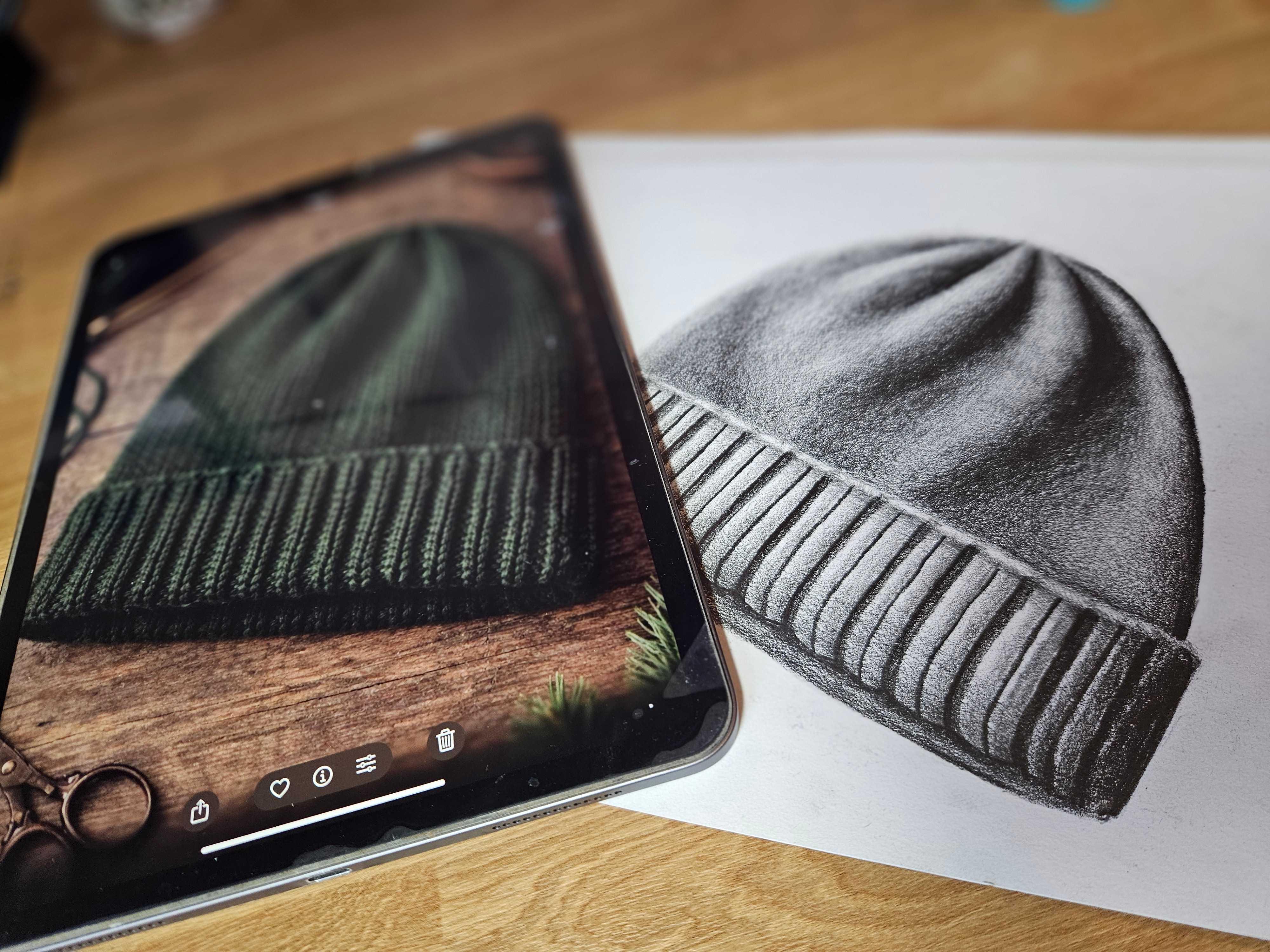
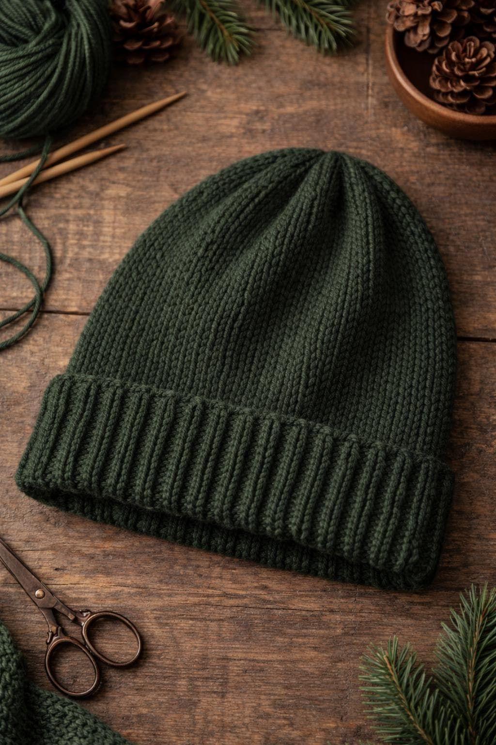
1. Introduction: Hello. Welcome to Artisan. My name is China. And today, I'm going to show you how to draw this realistic hat. Now, this is something
everyone can achieve. All you have to do
is watch carefully, pause and rewind if
and when you need, and you'll be able
to draw this, too. Today, you're going to
need your two B pencil and your eight B pencil, your paper, a rubber, and hopefully that's
everything you'll need. Now, this drawing did take me about an hour so make sure you have enough time
to slow it down, really be careful
with the lines, the shading, and most
importantly, the blending. That's what's really
going to make this hat look three D. You will notice in this video that I
don't focus on the detail. I'm not too worried about getting every single
piece of knit, but I am interested in getting the texture and the shape
of the brim of the hat. The rest of it, I just want
to focus on the form and the lovely shading underneath that really, really fine detail. And as you can see,
it's still realistic. If you do want some
extra lessons on shading and how to do the gradients and get a really smooth texture, feel free to check out
any of my other courses. So, grab your pencils
and let's get started.
2. Stage 1 - The Outline: Let's look at the
foundations of the hat. First, I'm just going
to get a different pen so I can show you exactly what I look at when I look at
something like this. So first of all, I'm
looking at the orientation. So if I think about
roughly the middle line, I can see that it is going at an angle rather than going
straight up or straight down. So find the middle of the hat, and then think about what
direction that is going. And grab your pencil. You can do a little rehearsal. It's like an air rehearsal. Go onto your paper. And then let's try and
get that same angle. So I'll make it a little
darker. There we go. And then I can check my angle, see whether it's the
same. Pretty much. So I think that will do. Next, I'm looking
for the width of it. So if I just draw a line
that goes across here. I've added a slight bend, just kind of represent that motion of the opening,
the opening of the hat. And then I want to try
and do the same on here. So first of all, make
sure I have enough space. Slight bend. And let's
look at that width. So it's probably a
tiny bit too long. I'll just shorten it
ever so slightly. And it probably can go
a little bit taller. Now, once I got to this stage, I can start to see
whether my hat is too close to the top or
too low to the bottom. So my piece of paper, I probably could go
a little bit lower. So I'm just gonna
do parallel line. Down here, it means it's
quite easy to change. I'll extend that
middle line down, and then I'll just rub this out. There we go. And now it looks
like this is far too long, so that's good because then
I can move this lower, and the spacing is
much, much better. So let's try and go
for an egg shape. So I just want to attach this just to start
seeing what it's like, and I can amend the shape, but I can also use this center
line as a way to compare my left and my
right side because symmetry is very challenging. Let's go ahead and maybe add the fold so we can look at
the height of the fold. Is it enough? Is it too much? Does it need to be
actually a little bit bigger Because
we want to see this overlap over here where we have the hat going up and
then the fold going over it. Okay. So I can
tell from the top, it's a little bit too pointy, so let's just carve off the top. Maybe a small trim over here. So spend a few minutes
just refining your shape, and then we'll start the
shading in just a second. And then, of course, don't
forget right at the bottom. We're just going to add another line for the
opening of the hat, and that's just going to tuck
up inside here on the edge, but then it's not attached, so make sure you don't have a line going all
the way through. And that'll keep the hat
nice and open for you. And then finally, before we move on to the shapes of the shadows, we're just going to
remove the middle. There we go. There
we have our outline.
3. Stage 2 - Shadow outline and base layer: So now the drawing isn't over. Before we start shading,
we want to make sure we're at the
best place possible. So this time, we're
going to have a look at the dark bits, the shadows, the shadows that are being cast from the ridges. I'm going to outline
the dark tones, and you'll just see
these dark tones. They're pretty
much just one tone within my little section. We also have one that
goes around here. We've got a bit of a tone there, and then inside, this little
part of the hat, as well. We have a dark tone in the hip. So what we're doing is
setting ourselves up to say, Okay, this is in light,
this is in shadow. Once we can separate the two, it makes things a
lot easier for us. So let's go back to where
these folds are coming out of. So first of all, we do have a little curve going down there. So I'm going to add gentle
little coming down here. Then we've got another one
which has a shadow on it. So let's try and pop this on. It's it's quite a long one, but just make sure it's not
more than what is this. If this is halfway down, it doesn't go beyond halfway, so don't make that one too big. The next one, I'm looking at the distance between the first
shadow and the second one. So first of all, I'll
make sure I get that. Then looking to make sure
that shadow is long enough. Connect that one. Well,
let's get this one here. So this gap becomes bigger. As we go down, it's
smaller at the top, bigger at the bottom,
but not too big. And then when I look at
this, it's smaller here, wider here and
smaller again there, so it's a bit like a
boomerang, this shape. I we go. And then just the edge, we have a little
shadow along there, followed by down here, and then under the opening too. So I'm trying to do the
form before the detail. So if this was a really smooth
hat, you wouldn't well, you would be able to tell
that it is moving and it is fabric without adding any
of these fine details here. So now we go ahead and we add
the base layer of shading. So I'm still using my Tubi because I want it to
be nice and smooth. I don't want to have
too much texture, but it is a textured hat, so the texture will look
good on the fabric. So all we're doing is doing a block tone just to get
rid of all the white. So don't worry about
any detail for now. The only thing I would say you could do
at this stage is just push this little crease
in a tiny bit darker. Just so you can see
the difference between the light tone and
the medium tone next to it. You don't
want to lose that line. So go ahead and fill in your
block tones in your to B, just ignoring the
shadows for now. So the texture, as you
can see, is quite rough. And I tried to keep
in the direction of the thread because it will just help with the
overall appearance. But if you do want to
make it super smooth, go for a lighter pressure, and you can go in a
different direction, and that just evens out
the texture even more. Now, the key to smooth shading is keeping your
lines close together. So if my lines are
going really far apart, then that's just going to
create a really rough, super rough texture, but
this is ideal for fabric. So now we're going
to grab our ape. And we're just going to go in the dark bits and
do the same again. So just fill them in. We're not going too dark, but we are going dark
enough so that we see a huge difference between
this tone and this tone.
4. Stage 3 - Gradients : A little reflective, so it looks a bit lighter than it is. But as you can see,
it's very simple. Dark lights, really rough, looked really bad, but it's
going to get a lot better. So what we want to
do now is we want to try to separate the foreground, which obviously isn't a
huge amount of foreground, but it's just a
little bit closer, and this is going to create
a little shadow on here. So we're going to start
to separate that just by doing a bit of shadow
or a bit of gradient, sorry, going from
the rim upwards, and we're also just going
to look at the edges. So when I'm looking
at the edges, I'm always asking
myself, what's lighter or darker? This or this. So when I mentioned earlier, you can see that all down here, it's a little bit darker because the top of the brim
is a bit lighter. And then when we look at the
folds, this side is darker. It's a gradient going round, which obviously we do have
on our drawing already. This side is lighter, so I'm actually not
gonna touch that at all because it goes
lighter to darker. This has texture, so
we're gonna leave that. But this down here it
goes darker to lighter, and we're just going to
make sure we push this a little bit crisper with adding these
little ridges, as well. So let's start with this part. So using my Tubi, I just want to first of all, get a slightly tidier edge, make it very definite where the rim is and where
the hat is, as well. Then I'm going to do a
gradient going upwards. So I am being more careful with my shading now and
making sure I'm a little bit slower so that my pencil
grain is more accurate, more softer, and less textured. So you'll see I'm working
from that ridge and then releasing the pressure that I'm pushing down
into the pencil, so I'm pressing much lighter, that just creates a lovely
little blend going upwards. Okay, that's looking good. So we're pushing this forward by just making the tone
a little bit darker. And then we're going to
do the same for this one. But I think I'm actually going
to switch to my eight B. And because it's in
an awkward position, I want to get a piece
of paper underneath my wrist so that I'm not smudging what
I've done behind it. So I've just got a
little piece there. And then I'm going to start with round here because
that's a really dark area. And I want to make sure
that I'm sharpening my pencil regularly because it will just give you quite an annoying texture
if it's becoming dull. So just keep checking
your pencil. This is probably ready
for a little sharpen. There we go. And that's
just going to get in the grooves of the
paper much easier. So I'm just going to
start with the edge, and then I'll go back
to the beginning and try and blend that in. So just focus on
this edge first. I'm not too worried
about the one above it. I'll do that one in a second. And again, don't worry
about the details in there. We're looking for the form. So trying to see
where it's curved, where the tones
are, and the detail comes right at the end
after all of this. So it's a little bit
reflective again. So I'm just holding the paper
up so you can see the tone. You see it's darker on this bit, and then it gets a
little bit lighter. So now we want to
do the opposite. So we did a little bit earlier, and we went from
darker to lighter. But this time,
we're going to just add some of the ridges. So we're just looking for
the outline of the shapes. So we dip a little a little. Dip a little, up a little. Dip a little, up a little. You get the gist. So you can see the little
wiggles for the texture, and then the gradient
that's coming down. So we'll look at
this again later on. But for now, let's start blending in these
dark shadows up here.
5. Stage 4 - Gradients Cont: So you can see the little
wiggles for the texture, and then the gradient
that's coming down. So we'll look at
this again later on, but for now, let's start blending in these
dark shadows up here. So when we look at these folds, we have a really deep
dark color down here, and then it's a gradient
that goes around here. So we want to try and make sure that this is a nice blend, but we're not coloring all the
way into the lighter side. We will, of course,
blend this way, as well, but we want to make sure
that we're basically making it all super dark
except inside the ridges, and then we're going
to transition and gradient out on both sides. So if we go back to the drawing, it looks super blurry on this just because
it's so textured. First, I'm going
to start to push my darker shadow in even more, and I'm using my A B to do that. Let me get rid of those. There we go. Trying to
see how far it comes up, so really high, actually. Push that in. And
you can see when you push your pencil in really hard, the tonal difference is huge. A lot of people are
scared to go too dark. So when you're going dark, go for it because it's
pretty much black. Now, up here, there
is a gradient, but there's also a
clean line just there. So I'm going to make sure
I have a clean line first. And then I'm not going to
blend it from here to here, but I will blend from
the light onwards, whereas down here,
this will be a blend. So first of all, make
sure I get the tone. And then I start to
lighten it as I go down because it's not
super dark down here. And then I'm going to
start the gradient. So I'm going to do the
gradient with my ape. And I don't know why I
started in the middle. But let's go up a bit. Being really careful
not to blend this edge. I want this top bit to be crisp. Then there's a gradient on top. So let's try not to make
it disappear. Here we go. But then down here, my gradient
is going to come out of the darkest bit there we go. Well, it's hard for you to see. Now I go. Hopefully,
that's better. And you can see how
the gradient is going from this tone to this without really
seeing the outline. Was up here, you can
see a hard difference. And then down here, there's
a really soft difference. So let's spend a bit of
time on this section. Keep looking at
your type of edge. Is it a gradient
all the way from the shadow or is
it a harsh line? And then it starts a
totally different tone. Alright, that's
looking pretty good. Now, what I did notice
when I was shading is that this whole section of the hat is much
darker than this. So I was just
trying to make sure I'm generally pushing the whole thing
a little bit darker, and I'm pretty much ready to
go down into the other side. So what I'll do now is have a little spasm
and rub that out. And I'm just going
to do a gradient that goes from this edge. So remember, this should
be nice and dark. We already put it in a shadow. But now we can really
push it, go for it, and then I'm going to do a
gradient that goes across. So I'm looking to see
how much light I have. So really, the lightest part
in this channel is up here. So when I'm shading it, I'm going to try
and just let that slightly lighter tone
have its space on here. So let's just work on
this outer edge now. Nice and super dark. Push that pencil down, and then a short gradient, leaving a little pocket
of It's not white, but it is lighter than the rest. So what we're going to do
now is exactly the same for the remaining
shadows where it's dark, we're going to really
push that dark, and then we're going to
blend the edges outwards. So think about how
far that blend is. Is it a really short gradient
or is it a really long one? So spend the rest
of your time now just trying to make it
just like this one, where we're going from
a super super dark dip and then trying to
work on our gradients.
6. Stage 5 - The Brim: So now we've done
all the blending, and it's looking super smooth. It's looking like fabric. We want to tackle this. Now, remember we did these dips and these grooves,
dips and grooves. So what I'm going to
do is in the groove, so the one that's going up, I'm going to try and
bend and then go up. So if I just start here, we do a little bend. And then we go up, and I want to stop just before the end. So I'm just doing one side. I'm not making it two
ends of the groove. And keep looking at
the reference picture. Make sure you're always
looking to see where it should go because you never know when something
changes in a drawing. So let's start by doing this. And then I'm just running
an eye over it to see if there's any major
issues with the lines. But obviously,
because it is fabric, it is a little bit forgiving. The only major thing
I could see is the gap here is a
little bit too big, so I'm just going to
draw another line there. And then I'm going to
switch to my two B. And again, I'm just
going to start on this one so you
can see it better. But basically, it's a dark side because the forward
thredg on the dip, if that makes sense, is casting bit of a
shadow in the dip. Did I say dip? Oh,
in the actual dip. Not that dip, this
dip, too many tips. So then I could just make it
a little bit thicker because the groove in between
the threads is deeper, so this will be
darker than the top. So let's just go ahead
now and make left side, darkest, and then the
right side of it. Still dark, but just
a little less dark. Actually, I made a boo boo. I'm adding detail
before the form. What I really should be
doing is working on this. So before we continue with that, I'm actually going to get
the form underneath better. So that starts by
making this darker. And then I'm just going
to blend that bit in. So a nice gradient, there we go. And then I'll
continue with this. A so then our final thing to do is to treat each half of the line
as its own element. So, for example,
this side, darker, little glimmer of light, darker little glimmer of light. Same for this one, but the glimmer of light
is a bit bigger. This one, small glimmer of
light, but then a bigger one. So each individual element
will have its own glimmer. Now, I'm not bothered
about the stitch. I could spend another
10 hours doing it, but what's the point? So instead, I'm
just going to focus on getting the lighting. That's the most important thing. We've got a bit of
texture from the stitch, but now we're just gonna take it slow and work around the knit. So just using my
two B for this one, and let's see what it
looks like in a second. We are nearly there. So this is looking very bright, so we need to dull that
down a little bit. But also, we need
to make sure that this curve is going
round as well. So just from here,
let me zoom in. You can see it's darker here, and it goes around like so. So I'm just going to
pop that on there. And then on each little section, I'm going to do a little
gradient that goes from the bottom upwards
in my AB pencil. No, go. That looks much better. And then with my tube, I'm just going to first of all, go over the seam. So I'm leaving that
light bit for now. And then because these bits of nit are going into the seam, I can also do a tiny
gradient going down. So darker near the
seam, down a little. Darker near the
seam, down a little. You can see already
it's just giving it that little hint that is curving and looking much
more realistic. There we go. And then finally on the dips, I'm just going to push
that a little bit more. On the dips. And then let's just give it a push
mine a little bit darker. It's a tiny bit too bright.
Maybe not everywhere. So, there we have it. Lovely three D hat
where we don't have to do all of the knit
because that is horrific. But by all means, feel free
to give it a go if you dare. But otherwise, I hope you
enjoyed doing the fabric, the blending, and
then just adding a hint of detail
just on the rim. Well done team, and I'll
see you in the next class.
 China Jordan, Art Teacher