Transcripts
1. Introduction : Matter how new you are to art, there's a good
chance that you've done a little bit of sketching. And maybe you've also done
a little bit of painting, maybe with watercolor, but have you ever thought of bringing those two
mediums together? Well, in this class, we're
going to be doing just that, leveraging the best parts of painting and ink
sketching to create a lovely little
landscape drawing of a fantastic castle
nestled amongst evergreen trees and
sun soaked rocks. We'll make sure that it has the detail and precision
of ink fine liners, as well as the vibrancy and atmospheric color
of watercolors. By the end of this class,
you'll not only have a lovely little sketch that you can hang
up on your fridge, but also some really cool
tools that you can use, whether you're sketching
or painting in the future. Hey, my name is Sam Gillett. I'm a ink illustrator
from Toronto, Canada, as well as a
Skillshare top teacher. And while I primarily
draw with ink and pencil, Watercolor has been
such a relaxing part of my artistic journey. You know, after
doing commissions or appliance work or
publishing houses drawings, I sit down with my watercolors, and that's when I really unwind, and I can kind of zone
out getting lost in color and challenging
myself artistically. That's why I'm so
excited to combine watercolor with my favorite
medium of all ink sketching. By combining the two, we can challenge ourselves
to think about scenes with composition in mind and
detail, but also color. No matter if you're
a beginner or a more advanced
artist, in this class, I think you'll gain some valuable perspective
on how we can combine ink and watercolor and
how we can think critically about the atmosphere, the shading, the shadow, and the details that we
put in our drawings. Go over the watercolors I use, as well as how I create composition and how I frame
the drawing with ink pens. We'll go layer by
layer throughout this class as we add
watercolor onto ink, and then ink onto
watercolor, again, adding details and shading
with both mediums. It's really a best of
both worlds situation. I'm so excited to talk about
combining these two mediums, and I'm so excited to
get painting with you. So I'll see you in class.
2. Supplies : The cute thing about
artists is that they love to talk about the
supplies they use. And, you know, the
watercolor sets, the pens, the paper.
That's all important. But the thing is, it's only as important as you want it to be. You can do this class with
watercolors you bought at the dollar store or a pen
that's lying around your house. But if you are really
into supplies, then art is a
fantastic way to kind of dig into these little pens, these little watercolor brushes that can give us so much joy. But enough ranting, let's talk about the supplies you'll
need for this class. First thing you'll
need is a sketchbook. I'm using a Strathmore
mixed media vellum pad that's nine by 12 inch and
has lovely thick paper. Just like I talked about
in the last lesson, the thick paper is a
key to make sure that the watercolor
we're going to lay down doesn't bleed
through the paper. Then you'll need
some watercolors. I'm using aquafine
watercolors that have a broad range of color and really have
lovely pigmentation. Colors you'll need will vary. So it depends on what you have. But you'll see here that
the important colors for this project are a few greens, a few blues, and a few
yellows or browns. A pack like this from Dollar Brownie is
perfect because it contains everything that you'll need to complete this project. Using a Princeton flat
shader for this class. This one will give us
a nice color laydown, but it also allows us
to add some details with watercolor afterwards. One brush is all you
need for this class. But along with that comes the need for some
water and as well, some paper towel to wipe
off the excess paint. But before we start any of that, we're going to start with ink, and so you'll need
a fine liner pen. I'm using a 0.2 pen, but any thickness of pen
will do for this class.
3. BONUS: Watercolour techniques: Before we go into the studio
and start our final drawing, I'm going to talk
a little bit about some watercolor techniques
that'll help you, maybe enjoy this
class a little bit more and maybe be more confident when I start talking about how I'm adding
watercolor to the pages. So first, let's talk about kind of watercolor I'm
using for this class. But what about the kind
that you're using? You know, often,
especially the more inexpensive watercolor
sets look a lot like this. They have the watercolor paints in their own little
cute little palettes, and you don't have to
squirt them out yourself. I actually find
really useful because it's really easy to, you know, add too much paint to
your palette and then, you know, you end
up going through your watercolors
very, very quickly. You just need a little bit of pigment to make a
really big difference. So that's the first thing. Make sure that if you're
using tubes like this, you aren't squirting
too much paint onto the palette you're using. Next, let's talk
about the water. So I usually have two little
things of water with me. One to kind of clean my brush and one to bring
water onto the page. You want to keep them
separate because then you can kind of
clean your brush. You don't have to
worry about muddying it up with different pigments. Now, I mentioned the brush
that I'm using for this class. But I have another
brush with me here, and it's a really lovely
one that I actually bought in Italy just
for watercolor. And as you can see, it's
a little bit fluffy. And maybe you have
a brush like this, and it might seem like it's
really bad for doing details. So I will grab some pigment on my palette and you
can see how bad I am at cleaning this afterwards. You can see when I'm adding pigment to the brush that often really good watercolor brushes will kind of create
a point themselves. And, you know, actually, that's not super strong, but you can see that even
though it's a fluffy brush when the watercolor comes on it, we can really make it
into some finer points. So all that to say that if
you have a fluffy brush, it might actually mean that
it's a good watercolor brush. And if your brush is
not fluffy, if it's, you know, if it's more
of like a chisel shape, then that's alright, too. We don't have to worry that much about detail in this class. But what I want you
to do to start off is to just grab some
paint on your brush. Don't worry about
how much water you have and get used to, you know, how the brush
feels on the page, how it looks on the page. If the first time
that you're using your watercolor brush is when we're drawing
our final picture, you might be a little bit apprehensive and
for a good reason. It might be easy to mess up. It's important to get
a feel of our tools. And by just experimenting on
a separate piece of paper, that's a really great way to do this without consequences. When you dig more into
watercolor painting, and I hope you do, you'll find out that there are a lot of different ways about putting
the paint on the page. I'll link some really
fantastic watercolor classes in the class description, where they go into more about the different techniques
like wet on wet, wet on dry, and how that creates
different types of lines. However, for this class, we're
not really talking as much about the different techniques of putting watercolor
onto the page. More so, you know, how to
create lines in different ways. Most of the lines that we're
putting on our page and most of the watercolor we do is going to be a little bit dry. You know, we're not adding
a whole bunch of water to the watercolor page
and then adding pigment, which is a really
great technique. We're not really
doing much of that. Most of the time, we're mixing our watercolors on the palette. And once we kind of have a general idea of the density of the pigment
or how vibrant the color is, then we're putting
it on the page. And we'll be combining
colors a little bit. But basically, when
you kind of mix some color into the water
and do that on a palette, you can see that as I'm kind of mixing the water
with the pigment, I can kind of see how
dark the pigment is. So let's compare the
darkness here on the page. It's a little bit more
vibrant on the page, but that's generally generally similar to how it looks
when we're mixing the pigment on our palette. That's the next thing to
keep in mind is that it's generally great to
mix your colors on the palette for this
class in particular to have a better idea of how the color might look when
we put it on the page. Now, the next thing I'm
going to talk about kind of fading out colors is something that we've already
done here organically, but let's talk about it in a
little bit more detail here. And again, this is just
a scrap piece of paper. What I want to do is I want
to do what we just did. I'm going to mix some pigment, and I'm mixing colors
here a little bit, but it doesn't really matter
what color you're mixing, but you want to add
a lot of pigment. You want to be a
really vibrant color. Fair amount of water, and I'm just going to do a
line here on the page. And then this line here is a fairly dense
little bit of color, but now I'm going to add a little bit more water
to the page as I go. And you can see that I
faded out that color. And I did that by, you know,
starting with the most dense and, you know,
vibrant pigment. And then as I go, I'm actually mixing water right
on the page itself. And I'm fading out the
color from left to right. Now, we'll do this
in this class as we talk about how to create
a sense of distance, a sense of scale, and
a sense of, you know, making objects appear farther
away or closer together. So I'd invite you to try that as well if you
haven't already. You know, adding that pigment and then as we add more water, fading it out on the right
hand side of the page. Now, as that pigment dries, then we can add more
color on top of it. But it's really important to note that the way
watercolor works. And I'll talk about this a
little bit as we actually, you know, do our final painting, but it's useful to keep in mind beforehand to
just, you know, limit the errors we make that
is that with watercolor, you always have to go
from light to dark. That's because all the
colors we add to the page, no matter how much
watercolor paint we actually put in them are
going to be translucent. So you can see that we have
this muddy yellow here, as it starts to dry on
the right hand side, I can add some more of
that dark pigment on top. It's a great way we
can add some texture. This might be a little
bit hard to see here and I can mix in some darker
brown or another dark color. And I can create lines here on top of what
we've already created. It's not showing up that
well because it's not dry, but you can see that darker
colors like this red, they'll show up on top of it. But it's really hard to make this part of the
painting lighter. You know, it's
really hard to add, if I wanted to add, like, white or really light
grass on top of this, it would be really
difficult to do so. And so we have to add colors
that are lightest first, and then we move to darker colors rather than
the other way around. Often in acrylic
painting, for instance, you might add highlights to
a shape by adding white. We can't add white
or we can't add lighter colors when we're
painting with watercolor. And that's why in the
class, you'll see that when I lay down watercolor
on the page, I'm starting with, you know, the broad strokes,
the broad shapes of the object we are painting, and then I'm adding the shadows. And so I start that base layer is going to
be the highlight, the brightest part of the
painting or of the object. And as I add shadows, then I can add dimension to
whatever it is I'm drawing. I can't add the highlights. One last thing about watercolor is about waiting
for things to dry. Now, in this class, I
move fairly quickly. But the thing is is that, especially if you added a
lot of water to the page, like I've done here, in order to add some sharper details
or sharper shadows, I'm going to have to
wait till it dries. Now, if I add some
darkness with the brown, like we talked about here, it's showing up a little bit, but not super effectively because I've added a lot
of water on the page. It's taking a long time to dry. But when it dries,
that's when we can add more effective details because those colors show up stronger. This part up here is a
little bit more dry. You can see how this
brown is starting to appear a little bit darker here because there's less
pigment on the page there. And as it dries, you'll see that more and more
of the dark colors that I'm adding are starting to show up. Whereas if I add the same color, the same amount of
pigment down here, it's not showing up as
well because there's a little puddle
of water forming. So in this class, you know, if I have talked about adding a wash of blue for the water, for instance, and then adding some details and waves
on top of that blue. But you've added a lot of
paint or a lot of water. Wait a little bit, grab a snack, wait for it to dry in order
to get the best results, and in order to make
the darker color that you're adding on
top appear crisper. The main thing is to experiment, to get a sense of your
paints and get a sense of your brush before you kind
of approach a final drawing. Now, I'm a big fan of
mistakes, and I'd say, especially as we transition to our actual
project first today, any mistake you make will
make your drawing better. It teaches you something.
It adds some character. It's how we develop our
own independent style, it's how we learn
for the next time. Don't worry about your mistakes. In fact, if you haven't
made any mistakes in this class, then I do not. If you haven't made
any mistakes in this class, then I don't
want to hear from you. I am a mistake friendly teacher. So I'll see you in
the next lesson when we actually put pen to paper and start with our composition and an
outline of our final drawing.
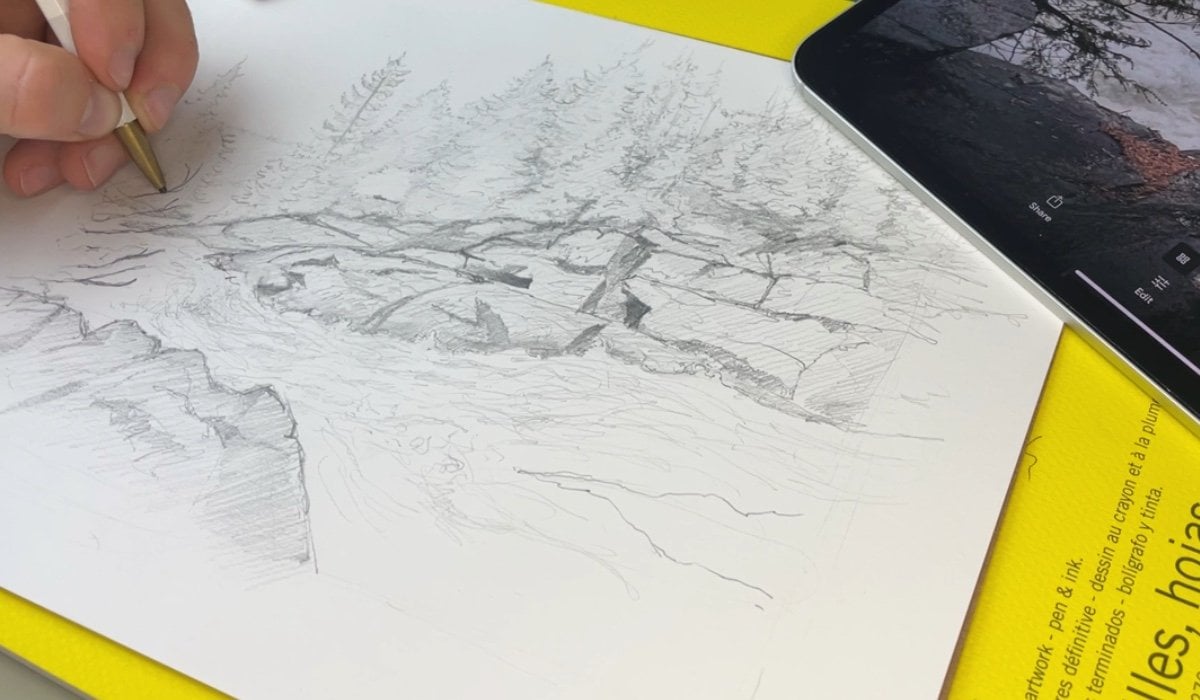
4. Using Pen to Lay Out Your Drawing: Now that we've talked about supplies and you've had a chance to experiment with your
watercolor brushes, let's talk about pen. And specifically, we're going to be developing the composition
of our drawing and the broad outline of the
shapes that are going to be in our drawing
with fine liner pens. So, let's get started. So we're going to create a
small little pen drawing and then layer some simple
watercolors on top of it. In order to do that, we're we're going to
work with framing, and framing is a
really effective way at channeling the viewers eyes, so determining where the
viewer looks in your drawing. We're going to start with
drawing our focal point, which is going to be a
mysterious little castle. But how are we going
to do that first with ink pen is just drawing the top of a rectangle. You'll notice I'm drawing
really lightly here. I have the top of a rectangle focusing on making
sure the sides are straight up and down, and the top is just dotted out. You'll notice that
I did not draw the bottom of the
castle and that's on purpose because
we're going to make it be a little bit
obscured by trees. But now you can add
to it as you wish. I'm adding another
smaller rectangle behind it that still has no bottom. That's very key for drawing
this central little castle. This second little tower, I'm going to draw a conical or a pyramid shaped
roof on top of it. For this main tower up here, I'm going to
make crenelation. How I'm going to do
that is just really small dots downward
with the pen, and I'm connecting every
other dot to make it appear, it's basic, very quintessential
top of a castle. You'll notice that I drew
this fairly small considering the big area of the page. But I find especially if you're drawing something like
this for the first time, it can be important
to start small, so you don't get
intimidated or overwhelmed by the amount of detail you'd have to add or the
color you'll have to add. That being said, you can really experiment with making this
little castle your own. I might add a thinner
tower to this side and maybe a little archway
between these two towers. You'll notice that these
buildings all slant downwards. This is going to
become important in the next step when we add trees. However, for now, you can focus on completing the
tops of your castle. Can be fairly
simple. Don't try to be too ambitious at this point. Just focus on creating a simple little castle and maybe finish it off by
adding some windows. Since we're very far
away from this castle, all we're going to
see are, you know, those vertical
tiny little slits. However, when we
talk about framing, that's how we lay the
elements of composition around the central castle point in order to draw
interest towards it. We're going to
literally frame it with different tree elements. So this is where we're going
to start drawing our trees. I draw the top of a evergreen
tree, for instance, I'm focusing on making it very asymmetrical or I don't
want it to look all alike. I'm going to dot out the
top or a single line here and then focus on
drawing branches downwards. How I'm doing that is by
drawing little curved lines down that center
part of the tree that get roughly bigger
as they go down. Now we're going to add a line
of trees below this castle. And so I'm going to
do the same thing. A central line upwards and then some really small curved
jagged lines downwards. I want these to be slanting upwards in front of the castle. And you'll see how this
obscures the castle, but also kind of makes it look like it's behind the trees. You'll notice that these
are really irregular lines. I'm almost dotting in the
outline of these trees. You'll find a style
that works for you, but don't be afraid
to experiment. The key is to draw really
light and quick lines. Often, the quicker you
draw with fine liner pens, the lighter the lines are. And that's what we're really
going for at this stage. However, you'll
notice that the trees here and the trees
here don't line up. That's on purpose because
we want to use a pathway, a visual pathway to kind of draw our attention
towards the castle. We can now start adding the outline of perhaps
a little river. How I'm doing that is
drawing really light, almost like dots on a diagonal
towards the viewer here. And then on this side,
diagonal the other way, you'll see how these
two lines almost make arrow towards the castle. Below this tree up here, it almost appears like
there's going to be a cliff. We can really use that
to our advantage and firming in the lines here as they come
towards us, the viewer. You'll notice that by
adding this river, it really added to the sense of scale and space in
this little sketch. However, we also want
to add a background. I want to make it a
mountainous scene. And since the trees behind the castle
will be so far away, we're really really doing
just a tiny little bit of dots outlining up and
down pyramids of the tree. Then in the very far background, I'm going to add a
little mountain, a nice sloping triangle upwards, and then a new downward line. You'll notice all the shapes behind the castle
are really vague. They don't connect. They're
not really dark lines, and that's really important. You want it to be a really light faded look to
it to make it look like it's farther away
than the central castle. We can add one more line of trees in order to
add a foreground. A foreground is the area in the drawings, closest
to the viewer. We can now experiment
with adding a little bit more detail
to the trees that we're drawing and they
should also be a little bit bigger than
the trees behind them. I'm doing the same thing
with those really sloping, jaggedy almost dotted out
lines to create this fir tree. The lines don't have to connect. They can be very
jagged and very loose. But the trees that you draw should generally slope downward. If you want, you can even add some trees here in
the middle between this line of trees closer to us and the line of trees
behind the castle. You notice that
these trees don't have a bottom, and
that's on purpose. It makes it easier
for us as artists. But because we're
using watercolor, we can fade out the color of
these trees later to make it appear like they're just fading into mist or into smoke. It's almost like a
stylized approach to drawing and painting, but I think it works
really, really well, and it also concentrates our attention
towards the castle. Up here in this midground, we're going to add
a few more details before we move to watercolor. Specifically, some
vague elements of rock here beside the trees. And those can be really,
really loose and light. The key is you don't want
them to be dark lines. You also don't want them
to be straight lines. We want to give the illusion of detail like there is rock that we can then ink in
with green and brown. And so just towards
the water here, I'm drawing some lines
kind of sloping upwards. You'll see how when
you draw these lines really lightly and angularly, it almost makes it look like they're at the
edge of the river, kind of like a rocky cliff face. You can really experiment
with the way that you draw these lines in order
to make it appear a little bit more
like boulders or small rocks or just jagged
cracks in a rock face. I also want to add just the bottom edge of
this back area of trees. So I'm going to just really, really lightly draw in the
bottom edge there to make it look like this river
continues on past the castle. Now we have a vague
outline of a castle. We have multiple areas of trees, and you notice the river and the trees kind of point us
back towards the castle. The castle is literally
framed by the trees, the mountain, and the
river that runs around it. And that means it's
kind of the focal point or the center of the drawing
that we're going to pay the most attention to. A
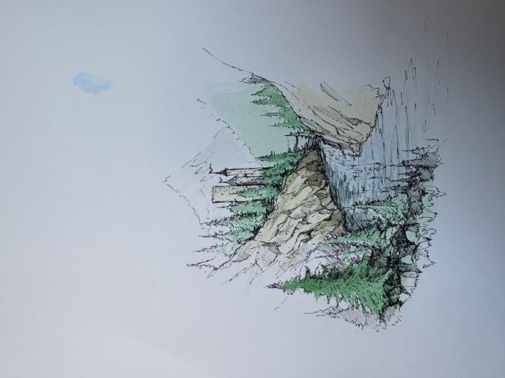
5. Adding The First Layer of Watercolour: Now that we have kind of the
first layer of our drying, we're gonna be switching
to watercolor. So give it a couple minutes maybe for your pen lines to dry, depending on how
much ink you added. And then let's whip
out those watercolors and add some color. We're gonna be doing the
broad strokes first, the trees, the water themselves, and some sun kissed rocks. Now we can switch
over to watercolor. So we're ready to start
adding watercolor, and we're going to start
with a background green. Now, I find the aquafinHokers
green dark is really great for trees and lovely kind
of warm green tones. And that's what we're
going to use here. So grab whatever
brush you're using. I'm using my
Princeton flat shader here, dip it in the water, and you want to grab
a little bit of that warm green and mix
it with a little bit of water until the pigment
itself is pretty diluted. So we have a really, really
light, light green tone. When you have that
really light green tone that should be quite a
faded looking green, we can start with
the background here. How we're going to
do that is really, really lightly adding
green onto the ink. Want to generally follow
the outline of the trees, and I'm starting near
the middle of the page, and that's because
the color will fade as we get out towards
the side of the page. When you start
towards the middle, that means the
darkest little bit of paint on your brush
will be laid down first. And then as you kind
of shade outwards, the paint will fade off your brush as the water
gets laid down on the page. Now, this doesn't
have to be precise, and you can see that
there is a little bit of a more abrupt ending to the
paint, but that's alright. I think that still works in terms of how we're
viewing this scene. We can use the same green now with a little
bit more paint, a little bit less water. To paint in some of
the elements of trees. You'll see now I added a
little bit more paint. I have a little bit less water, and I'm just painting
upwards into the trees. It doesn't really matter if you paint outside
your ink lines. You want to generally keep
inside the lines of the trees, but you'll see that
since we have the ink outline already laid down, it really still appears
to be effective. It appears to still look
like the trees that we've drawn because the watercolor doesn't obscure those
ink lines at all. It's always best to start lighter than you think you
need rather than darker. And so if you find
you haven't laid enough paint down on the page, you can always dip your brush into the paint
and add a little bit more. But I find it's always better to go from light to dark rather than going
too dark initially, because with watercolor,
unlike acrylic ink paints, it's really hard to take
the paint off the page. I've added a couple
lines of trees, and they are a lot more
vibrant than the background. In the same way, I started
more dark in the middle with the middle trees
and then the paint naturally fades a little bit
lighter towards the edge. You can do the same thing now with the trees in the front. Since these trees are a
little bit more detailed, I want to take a little
bit more time with drawing or painting into these shapes that
we've drawn with ink. That's why I'm using the side of the shader brush to ensure that the paint that I'm laying
down on the page kind of follows the lines
that I've drawn. You'll notice that
lovely watercolors like these are really easy to
play with around the page, and I can really kind
of use the side of the brush to bring that paint down from
the top of the tree. Into nice swooping
lines that kind of curve down as the
tree gets bigger. Once I get to the bottom of the tree at the bottom
of where we've drawn, I'm then pressing down a little bit harder on the
brush to smudge the paint into the page to kind of make it fade
towards the bottom. I'm going to replicate
that same tactic with these other trees I've
drawn in the foreground. Once all the trees are done, we can move on to water. And so you don't even
have to clean your brush, but you should switch
to using a blue. I'm using a cobalt
blue from Aquafine, and this blue will be
the base of our river. We'll also use it
for some shading. You want to grab a
really, really light light bit of the blue and
mix it with some water. So you'll see here
I have the blue on the bottom left hand
corner of my easel. I'm bringing some water into
it and mixing it separately. So it creates a really
translucent blue tone. Just like with the trees, you don't want to
start too dark. I'm starting halfway up here
and then adding that blue. It's a very, very light
blue, and that's perfect. That's exactly
what we want here. I have the blue
kind of painted on, and just like our last project, I can kind of fade it out with the side of my shade or
brush towards the bottom. But now we can add in a little bit of the
green we just used. A tiny little bit of
the green can be used now to mix in with that blue. So you'll see when I mix
in a little of the blue, it becomes more of a green blue, kind of distorts both colors. And that can be used with
the side of your shade or brush in a couple
different areas. You know, see, I
have quite a lot of paint and water on my brush, and so I can kind of
dab some of it on paper towel and then mix in that green blue
around the river. We're going to add some shading at the very end of this class. But for now, we can
leave the river to be that lovely
light green and blue and then move on to
adding some detail around the rocks and castle. I
6. Details and Shadows with Watercolour: For the rocks and castle, I'm going to use a yellow ochre. It gives us a lovely,
lovely, summery, sunny tone. When you add water
to it, it really has a lovely vibrant hue, and that's why you want to
be kind of careful that you don't add too much paint. Just a little bit
is great for now. When you get some of that
yellow ochre onto your brush, you can then start adding
some onto the rocks. The same way we started drawing the trees or painting
the trees in the middle, we want to start painting
the rocks towards the water, and that's so that
yellow ochre fades as we draw it up
into the landscape. This fade, I think
is really effective. One, it makes our job
as artists easier. We have to paint less, but it also can be a
really great way of ensuring that it has a natural
border around the drawing, that it fades into white, and it really, I don't know, to me, at least, it feels a
little bit more effective. You can kind of
imagine the trees and rocks that might be
surrounding us here. I'm doing the same thing
on the right hand side, so that yellow ochre is a
little bit darker towards the water and then
fades back into white. If you want to add more
yellow ochre, feel free. It'll be more vibrant color. I prefer this a little bit
more of a faded a faded tone. Now, you can do some
more yellow ochre on the castle as well. Again, you want to err on the
side of painting to light. And you want to make sure
the trees around it are dry. That little dash of color makes the castle look like it's
bathed in some sunlight, but it wouldn't be complete, right, without adding shadow. A really easy way to give us that shadowy tone we want is by blending a little
bit of the blue we used with a little bit
of the yellow ochre. When I add some water, that becomes really muddy, kind of gray blue
gray blue tone, not too pretty, but
it'll be really effective for adding
some shadows. So I've mixed that blue
with a yellow ochre, and I have a tiny little
bit of that on my brush. We're going to see
how that looks. With that darker tone, you can now add some
of that to the rocks. We're imagining
the sun is coming from the left hand
side of the page, so I've added just a little
bit of that shading on the bottom of the rocks
towards the water. I'm using the flat side of
the brush to continue up that shading into the rocks
themselves to create, you know, the feeling
that the slope towards the water and thus
would be a little bit darker. But you notice that these
rocks are darker down here, which means the water
should be shaded as well. So you can see that I mixed
some of the blue with some of the green to create a little
bit of a darker tone. Again, you want to
start lighter and then add darkness later on. But I have that tone. Let's see if it's dark enough,
and I think it is. We can now add a
little bit of shading here along the
side of the rocks. You want to add shading with
the flat side of the brush, and I'm adding these lines down here to make it appear that the sun is hitting the rocks and the
rocks are creating a shadow in the water. This blue green, I think, is so effective at
creating a sense of shadow of darkness and
then making it look sunny, right, when you see the
highlights on the river. You can use that
same combination that blue green to add
shadows to the trees. And so on the right hand
side of the trees back here, I'm adding some of
that blue green to make it look like
they are in shadow, just to the right hand
side of the trees, sloping down towards the rock. You can also do this to
the trees up nearest us. So on the right hand
side, I'm adding some sloping lines of the darker blue green to make it appear like they're
kind of receding into shadow. But at this point, now
we have a lovely castle with trees around it that
kind of frame the castle, as well as some areas
of rock that have shadow and are casting shadow
onto the river itself. I think adding these element of shadow here on the river
is so effective at, you know, adding some
texture, as well. We can see that the
elements of shadow drawn with the side of this Princeton flat shader really make it look like that water texture has come alive. However, you can add
some last details onto the castle itself to
really add some interest. I'm going to be
lazy and just add that blue green that we used for the shadow on the water onto
the roof here of the castle. I'm using just the tip of the brush or the side
of the brush here to make that top castle or top
of the castle shade it in, and then I want to add some shadows onto
the castle itself. I'm going to make
sure that that blue green is watered down quite a bit with a couple
more dabs of water. Then I'm going to dab my brush to make sure I
don't get too much on it. Then I'm going to add some of that blue green to
the castle itself. This central tower here, I added a little bit and then on the right hand side of
this tower up here. You'll see that adding just
that darker blue green to half the castle tower really
makes it appear that that one side is being hit by sun and then the other
side is in shadow. The last thing we have
to do is perhaps add some detail to that
mountain behind the castle, and that's going
to be really easy. All we want to do is grab
a tiny little bit of blue leftover from the other parts of this drawing and make sure
it's quite watered down. Then we're going
to draw or paint in just a little bit into that back castle or
back of the mountain. And you'll see how even just
adding a tiny little bit of blue back here makes it look like part of the
mountain might be in shadow, and the fact that the blue
is not up at the tip of the mountain almost makes it appear like there might
be snow up there. From here, you can add
more shadows as you see fit or other details as well. I'm so excited to see
what details you might add to this lovely castle scene. However, you can see that throughout this drawing process, the watercolor didn't
obscure the ink. Since watercolor is translucent, it gives us a lot of
room to play with and experiment, adding shadows, different colors,
different combinations of colors while still preserving
the details we drew.
7. Using Pen to Highlight Details and Texture: You might have thought we
were done with our ink pens, but surprise, we're
returning to them now. I often find that after
I add some watercolor, I can then kind of
experiment and think more critically about the inclines I've already drawn. Where
can I add more detail? Where can I add more shading?
How can I make the drawing feel even more alive,
vibrant and detailed? That's what we're
going to work on next. We talked about adding
detail in color, we talked about how the
most detailed parts of our drawing are the
parts closest to us. And that's why in this drawing, when I'm going back over it to add a little bit more detail, I'm starting with
the elements of trees closest to the viewer, adding the same outline shape, but multiple times in a
three dimensional way. You'll see how in
this tree shape, I'm mirroring the outside lines in the middle of the tree, making it appear like
these branches kind of recede away around the tree and then are facing
us in the middle. But you'll see how each
line is based off really dotted vague pen line, and that's really what
we want to create here. You don't want to create
long straight lines. You want to create
small sketchy lines. The next spot we're going
to add detail is to the rocks that we painted
over earlier in this lesson. You can see the shadow outlines. We're gonna start with
tracing those with the pen and adding more detail and more
lines to these rocks, as well as some areas
of darker pen shading to add a little bit of interest and realism
to this scene. I don't if you want, you can even go over
the shading you've done with watercolor with your ink pens to create a little bit more
dark and contrast. You can even add
details and rock faces outside of the
area we used watercolor. It can be a really great way to kind of fade out the scene. Another way we can take this
drawing up a level is by adding some texture to the
water with our ink pens. So following the way
we added watercolor, we can add some nice
flowing ink lines that can give you illusion of some waves making this railway
look a little bit choppy. In the same way, we can
add some reflections. So I'm mirroring the way that these trees fall up this
ridge and then very lightly and loosely drawing upside down version
of the castle. But I don't want to draw
straight rigid lines. I just want to draw
the basic outline with very loose light pen lines. I can increase the
level of shading and darkness where the trees kind of cover up part of the water and make the water
darkest near the shore.
8. The End: Thank you so much for drawing
and painting along with me. I'm so excited to see
what you've created. Make sure you post your painting and drawing in the
class project page, and let me know what you
thought of this class and what part of the drawing
or painting process you found most rewarding
and most difficult. Above all, I hope you
continue using these skills. You know, whether
you're a beginner or whether you've been
drawing for a long time, it's by pushing
yourself and, you know, combining mediums in cool ways that we can create
art that we're really proud of and that keeps us coming back to create more art. There are no rules
when it comes to art, and so I'd invite
you to experiment with combining other
mediums, as well. Thank you so much for
drawing along with me, and I hope to see you in more
Skillshare classes as well.
 Sam Gillett, Pen // Pencil // Procreate