Transcripts
1. Introduction : You draw 1 million blades of grass or 100,000 pine needles
on a towering fir tree? It's impossible, and
that's what it can often feel like when you
approach landscape drawing. How do you know which
details to include? And how do you not go crazy
with adding detail after detail and ending up with a scene that's
incredibly complex, overshaded and not composed
very satisfyingly? In this class, I
will go over step by step how I create
landscape sketches. By the end of this class,
not only will we have a beautiful sketch
of a landscape, but you also have some important tools to add to your toolbox. Making you a better artist who's able to observe and perceive the most important details of a scene translating them
onto your final drawing. My name is Sam Giillet. I'm a pen and ink artist
from Ontario, Canada. And I draw a lot with pencil, and I draw a lot of landscapes. And along the way, I've
developed my own style, incorporating the most important details of the photographs and landscapes I observe and
putting those onto the paper, focusing on light
and shadow and line. More intuitive approach
to landscape drawing that doesn't hinge on getting
every single detail, but I find it's a
little bit more enjoyable and a little bit
more inspiring, as well. In this class, we'll
start by going over the basic fundamentals
of pencil drawing. We'll then go over texture and hatching techniques
before turning the page and beginning
our final drawing. Go over a block method of blocking out the most
important shapes in your drawing to really showcase the importance
of composition. We'll then go over adding the rough outlines
of elements within our scene before adding shading and texture
and finally detail. This class is perfect
for beginners who may know how to draw and
may draw a little bit, but want to refine
their drawing style or gain more confidence
with drawing landscapes. Knowing what to
draw is almost as important as knowing how
to draw these scenes. By learning what to focus on and what to focus your time
and energy on with pencil, you'll become a better artist
who's more capable and confident when picking
up these drawing tools. So let's get drawing, and I'll see you in class.
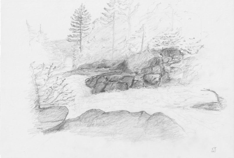
2. Project Video : Your project in this class is drawing a landscape
probably from a photograph. And now, I'm using
a landscape that I took a photograph
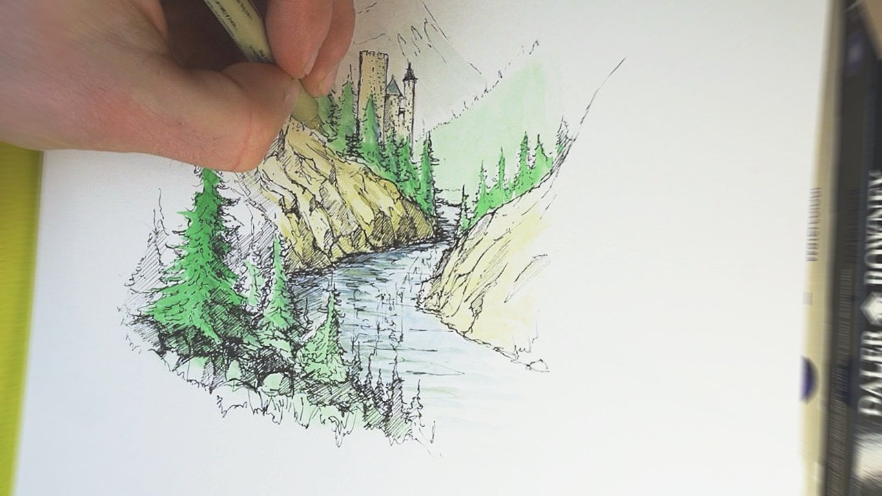
of in about 20:22. I love this scene
because it showcases both the rushing water
of the waterfalls, as well as a lovely
section of trees that have nice dark areas of shading and lighter pine needles right up at the top
of this photograph. You can choose to
either draw this scene with or choose your own photo, maybe of a place that you hold dear or a place that
you'd love to go to. You know, if you
draw your own photo, I'd love to see what you create and what photograph
you choose to draw. So post that in the
class discussion page. You'll also need a
sketchbook and some pencils. Now, if you've taken any
of my skill share classes, you know, I'm not too hung
up on the materials you use. I think drawing and sketching doesn't require
expensive materials, and the best thing you
have to draw with is the thing that you
have closest to you. Being said, in this class, I'm using a Strathmore
mixed media sketchbook. I love the weight of the page, and it's a nice compact size, nine by 12 ". I'm also using a PencoPrime timber mechanical
pencil to draw here. It's equivalent
about two B pencil, so a little bit of a
softer often pencils will have numbers and
letters on the end of them, usually from around eight B, all the way up to about
three or two F or H. Now, these correspond
with the hardness of the graphite in the pencil. Now, the B numbers are
usually softer pencils. When you go to H, it gets a
little bit harder all the way to pencils that are
even in the F range. In this class, it's
best to stick around maybe a two or three B
because that allows you to kind of capture
some of the detail and create strong
distinct lines, while also kind of
turning that pencil sideways and creating
some sections of shading. The regular yellow pencil that so many people have will do
just fine for this class. Now, one more thing, I find
it really useful to have the drawing I'm going to draw up beside me while I'm drawing. I have this up on my iPad, but if you have the photograph you're drawing or the photograph that we're drawing together
up on your phone or computer, that can be a really
great way to allow you to quickly reference
what you're going to be drawing and
reference the shadows and details and textures that
you see in that photograph. Remember, if you want
to draw along with me, the photograph I'm using to draw is attached right to
this class description. If you want more detail
about the supplies, I'm using as well, check
out the class description. I have links to the pencil, mechanical pencil, eraser,
and sketchbooks that I use. And if you want, you can
pick those up or just reference that when
you're looking for art supplies in the future. So we're ready to get started, so I will see you
in the next lesson.
3. Choosing your Landscsape: Knowing how to pick out a scene to draw can
be a little tricky. It's hard to know what
you're looking for and what makes a good
landscape to draw. Let's dig into what
I mean here and pick out the photograph
that you're going to use during this class. So let's talk about what makes a good photograph to draw versus what makes a photograph more difficult or less fun to draw. In the image I'm drawing, we have a few different
elements that work together to make it a fun
and engaging scene to draw. First, we have objects
in the foreground, the area closest to us, the midground, and
the background. This allows us to
experiment with adding different levels of
detail with our pencil. Second, we have some
interesting textures like the forest here
in the background, the water and the rock. And these textures complement
and contrast each other. Since we're not using
color and just pencil, it's important to
have contrasting textures because then
you can really make your drawing dynamic and detailed without having a mass
of space that you have to, you know, add texture to that might end up looking
like a huge blob. For instance, this scene, while it would be a lot
of fun to paint, I would find this a
little bit challenging to draw and maybe not as much fun. That's because most of the scene takes place
in the background. There is some nice elements
here and the trees here. So much of our time
would be spent trying to add texture and shape
to these trees, which is really difficult to do. And personally, I don't enjoy it as much as drawing scenes with, you know, really fleshed out or contrasting shapes and text. As well, since the scene only has a background
and a foreground, we couldn't really
experiment as much with, you know, fading out details as we go further into the scene. Yes, the trees in the front are closer to us and a
little bit more detail. But it isn't as dynamic. As well, this scene doesn't
have a clear focal point. That doesn't mean it's not a great scene to draw or paint, but I prefer drawing
a scene with some interesting or
unusual characteristics. For instance, in the scene
that I'm going to draw here, you can see, you know, interesting movement
of the water, creating some energy through
the middle of our page, as well as this lovely
tall tree that we can experiment with adding detail on that really
anchors the piece, and I think adds a really
strong focal point or an object in drawing I
want people to focus on. That's what makes this scene
really interesting to me. However, everyone
is attracted to different kinds of landscapes or different kinds
of photographs. So please use this
as just a guide and use a photograph of a landscape that really
connects with you. And I find if I'm
emotionally attracted to a place or a place
means a lot to me, I'm more drawn to drawing
it, pardon the pun. In the next lesson,
we're going to talk about observing versus just looking and how that changes how we go
about drawing a scene.
4. Observing Versus Looking : Now, when you're walking
down the street, you're seeing the cars
pass you by or you're seeing the sidewalk and the pedestrians coming towards you, but likely you aren't observing the shadows of the doorways
next to you or the way that the trees far away
across the highway appear a lot lighter and less distinct than the
trees closest to you. Being an artist requires you to hone your observational skills. In this lesson, we're
going to dive into the difference between
looking at a scene and observing a scene and how observational skills can help us become better
landscape sketchers. When I'm approaching
a new drawing of a new landscape like this, I like to make notes. Now, sometimes I do this with a pen and paper or on my iPad. Other times, I just
do it mentally. Specifically, I make
notes about what I see in the scene
I'm looking at. This is a lot different than
just looking at a scene. When I look at this
photo, I see rocks, I see water, I see trees, and that's about it. Observing this scene means first pinpointing the dark areas
and the light areas. Pinpointing dark and light is so important because that's what we're working with in pencil. We can only add
darkness to the page. We can't really
lighten things up. We can only add contrast. And so defining
where the drawing is darkest really helps
us in the future, decide where to add
the most shading. Here, I can see this
area is a little bit darker and probably contains the darkest shadows
in the drawing, as well as this area
of trees to the left. The tree trunks, as well,
are super, super dark, and that means we can use
really strong dark lines to add contrast with
the tree trunks. I can also observe that the
water is the lightest part, and that means we might
include the water last. By including the water
last, we can ensure that there's an appropriate
level of contrast or juxtaposition
with the darkness and the shading on the rocks. Important or
interesting tip that I usually do when I'm looking at a scene is squint my eyes. When you squint your eyes,
you can kind of pick up the most obvious details of the scene or what sticks
out at you the most. When I squint my eyes
at this drawing, what I see is the river and then the outline of the shore
and the trees above it. That really goes to show
the important areas I need to focus on by
ensuring the river has a strong contrasting
shape that kind of sneaks through the middle
of the drawing and that these rocks
and trees are kind of lumped together as
one area of the drawing. I can really pinpoint
what I observe or pinpoint what sticks out to me and replicate
that on the page. However, instead, if I just focus first on the
details such as the details of the rocks here or the pine needles right
here and draw those first, I can end up missing
the bigger picture of how the scene works together. Now, you can make notes about
your scene on a piece of paper right next to
you or just mentally. But having this framework in
mind is a little bit like the opening paragraph
and an essay or a summary of a movie or book. By summarizing the
scene in your mind, thinking about what areas
are the most important, what areas your eyes
are drawn to first, and what areas are
darkest and lightest, you can then kind of
keep that in the back of your mind as you're
drawing and think about, is the tree I'm spending
so much time on? Is that actually the most
important part of the drawing? Or perhaps are
these pine needles that I'm spending
hours drawing in? Are they actually
really important to how I see this scene? Often the answer is no. However, if you think about
the scene as a whole, first, you can then start adding
detail and emphasis on the places your eye
observes first. In order to do that, we need to be adept at shading. And so in the next lesson, we're going to talk
about shading, create a shading reference
guide that you can then use in the rest of
this drawing exercise. So I'll see you in
the next lesson.
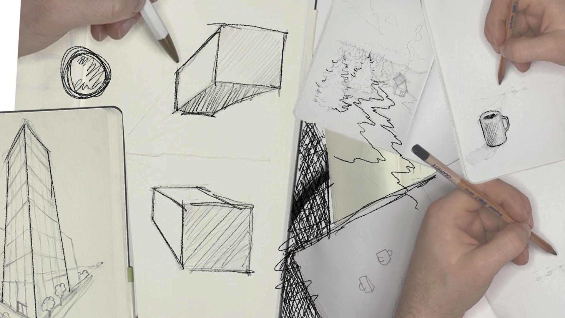
5. Shading Practice : Now, one of the
best things about pencil is that you can
shade really easily. Turning that pencil sideways
and shading is one of the most fun things
that I love to do in art before we hop
into our final sketch. We're going to practice
practice creating a section of different darknesses
of pencil shading to help you when it comes to
drawing our final landscape. We talked about a good
landscape to draw having a broad range of
light and dark shades in it, so we can replicate
those with pencil. But actually ensuring
that we capture that full range of light
and dark hues or shades is kind of tricky, and that's why it's
worth going over this before we dive
into actually creating our drawing to get a feel
and some muscle memory for how to shade light
and super super dark. And you're going to
draw a few boxes. I think it's helpful to
draw about six of those. These are going to be
reference boxes that we're going to practice shading
from dark to light, and then we can
ensure that we use all these shades in
our final drawing. It's a good reference point and also some accountability
to ensure that your drawing has that full or an expansive range of
dark and light shades. You want to start by shading in this far left box almost
as hard as you can. You notice I'm doing that with diagonal shades,
but at this point, you can kind of shade
however you want to with the tip of your
pencil or the very side. And the next lesson, we'll
go over specific techniques for shading and creating texture that we'll then
use in our drawing. Now, the darkness of this box will depend on the
pencil you're using, like we talked about before. You can even go over this again, and you'll see how adding
another layer here with this pencil did actually
make it a little bit darker. You're not going to get
a full black box here, but you want it to
be pretty darn dark. In the next square,
you're going to add a little bit of a lighter tone. Don't worry about
getting these perfectly because you can always go
over and darken them again, once you kind of
compare and contrast. But in the next one over, a
little bit lighter still. You can see how this one isn't isn't kind of noticeably
lighter than this one, so I'm darkening in this
box a little bit more, and then continuing over
to this right hand box. Now this is definitely
easier with a softer pencil that kind of allows more graphite
to get on the page. And I think actually, we
can add one more box here. With much lighter shading. You'll see now that we have
this full spectrum from dark all the way to super light. And you can see that these dark shades in
these light shades are probably represented in
the landscape you're drawing. Using this as a guide, you can kind of
reference back and say, Okay, here is the darkest
area of the drawing, that's where I'm going
to use this shade. Whereas this is
the lightest area, that's where I'll
use this shade. But I want you to
stick with this piece of paper because in
the next lesson, now we'll go op
texture techniques. We're going to replicate
these dark and light shades, but with some different
pencil techniques that we can then apply
to our final sketch. So I'll see you in
the next lesson.
6. Shading Practice Part II : Before we talk about shading, I want to talk about
gripping your pencil and how you position your hand
on the page when you draw. And again, this is
what works for me. So if you find a different
method works best for you, please follow on
your own intuition. First things first. I'm a lefty, so this might appear
a little weird. But I really often I find a neutral wrist position super important when I'm
drawing with pencil or pen. I say neutral, that
means that my wrist is not twisted up or curled over. It's a neutral position. When my wrist is
curled like this, it's really hard
not to put tension on your fingers and tension
on the pencil itself, and it's hard not
to grip it tightly. Likewise, when I'm like this, it's hard to have
the fine control over the pencil itself. If I have a neutral
wrist position, that means my hand is
in line with my wrist, and then I'm just placing
the pencil down on the page. That allows me, I think, to have the most control over where my pencil goes and the grip
that I'm gripping with. You can try this yourself. Try drawing a line with a
neutral wrist position, and then try drawing a line
with a curled wrist position. I find it much harder to control the wine
that I'm drawing. I talked about grip, and grip is the second thing that you
really want to keep in mind. It can be tempting to
grip the pencil hard. However, I find gripping a
pencil loosely allows me to control the depth or the darkness of the
wine I'm drawing. Try drawing a line loosely
and then try drawing one with your grip very tight and see if
there's a difference, see what you like better. Now let's talk about shading and a couple of different techniques
we'll use in this class. Now, this scene is made
up of different textures, and in a couple
lessons from now, we're going to be talking
about how to draw the different textures you
can see in this scene. The water, the rocks, the trees, all those involve
using the pencil to, you know, give the
illusion of detail. However, to add texture or
shading to our drawing, which is so key in
pencil drawing, we need to have
some practice with the shading techniques before we move on to the drawing itself. So you can use the piece
of paper we used for our shading practice
when we went from dark to and now we're going to practice a few different
shading techniques. The most obvious one that I use in most of my
drawings is hatching. And, you know, that's
different than cross hatching, which
we'll talk about next. Hatching involves moving
your pencil back and forth to create a solid
area of gradation of pencil lines that
form a solid area here. You can see that
when I'm hatching this scene here,
I'm shading it in, and I'm using kind of the
side of the graphite nib. That gives us a really
smooth surface. And this might
appear different if you're using a different
hard for example, this HB pencil is a
little bit harder, and this section might
appear a little bit smoother or less textured than my
mechanical pencil there. You can see that I'm using
about the same amount of pressure. But this section, I think is a little bit less grainy
than this section. The grain of the paper
really shows through. And that can be
really useful for talking about texture later. But hatching in with pen often creates
more visible lines, whereas hatching
with pencil often creates more uniform
sections of shading. And you'll notice when
I'm moving my hand here, I'm moving my entire my entire hand with
my fingers together. Instead of just moving my
fingers across the page, the entire hand helps stabilize the lines
that you're making. So practice a little
bit of hatching. Now that you practice a
little bit of hatching, let's practice some
cross hatching, crosshatching is a really
effective way at creating darker shadows or also
texture with pencil. Crosshatching involves creating
a section of lines like this and then hatching
the other way like this. And this is a
really great way of creating depth or detail or making an area of the area you've shaded
appear a little bit darker. You can see that these lines that go the opposite direction, they're perpendicular here, they kind of blend
into each other and make a darker area
of shading on your page. In both cases, you'll notice that we're using
the side of the pencil. I'm a lefty, so it might
be a little bit strange. But you can probably see how resting your pencil on the page like this allows you
to draw with a side. If you compare that with drawing with the
tip of the pencil, it's a lot harder to
get lines that are close together and to shade. Whereas with the
side of the pencil, it's much easier to
create smooth areas of shading on your drawing. But these techniques, cross
hatching and hatching, while they're useful
in our drawing, they're not useful if
you don't kind of gain the confidence with the pen and gain confidence
with the paper. What I mean by that is that
artists can often be kind of furtive or maybe unconfident with how they draw their lines. It might wiggle a little
bit because they're so scared of drawing
the wrong ones, or they might struggle
with the speed of hatching or creating these
lines that are close together. As you gain muscle memory, this will come easier to you. But as well, it's
really helpful to remember that your drawing
does not have to be perfect. And often when you hatch or shade outside the
lines of a shape, for instance, you can really
kind of box those in later. What I mean by that
is that say I am hatching a square here, and I am shading through
the whole thing. You'll notice that
some of the lines I've drawn kind of go
outside the square, but I can kind of correct it, especially with a soft pencil by adding some more
shading overtop here. Drawing with pencil
is an inexact art, I think, and especially
when we're sketching, you should not be worried about shading outside the lines or outside the shapes
that are on our page. One last tip, when
you are shading in this class or drawing
lines in general, it's best to grip
the pencil lightly. Not only will this
prevent you from having a sore hand
and, you know, painful fingers, but it can often mean more confident
lines on the page. If you kind of compare drawing a line with
your hands, you know, really tightly
squeezing the pencil, it's harder to draw lightly, and it's harder to
draw straight lines. Whereas if I'm
gripping it lightly, it's more pleasant for me. It's also much easier to control the darkness of
the line that I'm drawing.
7. Composition : In these next two short lessons, we're going to talk
about composition. And composition is a key part of any kind of art
because that's the way that you lay out objects within your drawing or
painting or sculpture. The way that you
lay them out really defines how we view
these pieces of art. Choosing where you place important objects can really
impact the composition and impact the way that we
perceive the importance of different parts
within our drawing, such as these trees, these rocks, and this river. However, we're stuck
with this angle or the angle that you
have of your landscape. And so we are forced to draw what's in front of us in the way it's laid out in front of us. And now I am a huge proponent of drawing from
your imagination. You just have to look at
my classes to see how much I love drawing
imaginary worlds. But for now, we're
drawing a real landscape, and that means that
the composition of nature is what we're
going to focus on. Often, artists work inwards
rather than outwards. What I mean by that is
that, you know, often kids, especially, can end up drawing from the outside of their scene. You know, maybe drawing
the rocks first or spending a lot of time with a tree down here on
the left corner. But then by the time you place the river
down here, perhaps, and the trees up here, can end up with a drawing that leaves so much
white space up here that the overall
composition is not balanced. In our sketch today, we're going to work
from the inside out. Whether you're drawing my scene or a scene of your own choosing, I'd invite you to focus on placing the interior
objects of the scene, the central points, and then
drawing outwards from there. What can be really
helpful to do that is perhaps sketch yourself in a little bit of a
circle here and then draw yourself a
little frame like I've found it, like I did here. And again, this frame
does not have to be perfect or straight, but it should be
very, very light. And I apologize.
That must be really difficult to see on the camera. However, this frame and this
circle is almost more of a reminder that when we place objects in our scene
and compose this scene, we want to ensure that
we're starting with adding detail and darkness
in the middle and then adding shapes outwards, rather than drawing inwards. This also helps us define where the darkest and lightest
areas of the piece are. If we compose a drawing with all the dark spots out here and all the
light spots in here, the whole drawing can
look like a frame. However, it can be
really effective to ensure we're shading
the most intricately kind of in the middle
in this area of the drawing and then fading or shading out
towards the edges, using the white space around our scene almost like
a natural frame. Now, this might seem a little mystical or hard to
comprehend at this point. However, in the next lesson, we're going to talk about
adding in elements of our scene and building in composition using
a block method. So I'll see you in
the next lesson.
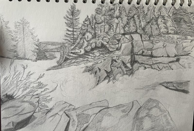
8. Composition Part II: How I usually like to compose drawings is
by using blocks, shapes that kind of define large areas of the drawing that I can then add
detail in later. And this helps me understand if I'm composing the
drawing in the right way. For instance, the rocks
in the foreground, I'm not going to focus on
drawing their outline, but more so their shape. This helps with scale as well. So if the rocks in the
foreground are here, that means there's
another section of rock here and then a section
in the water here. And then the trees,
they kind of curl up through the scene. Like here. And like that. And so you
can see I'm using really, really loose, undetailed shapes to stand in for these different big sections
of the drawing. This helps me see if I
have the scale right, and scale is such a huge
element of composition. For example, if this rock kind of dwarfs everything back here, it might misplace where the
viewer spends time looking. We want to make sure that
the scale of these blocks matches roughly the scale
of the things in our scene. And I see that I have
some things wrong here. For instance, this section of rock should actually
be a little smaller. So I'm going to make it so here. So there's more
emphasis on the water. And then I also want
to add in a shape for the area of
rocky cliff here. And I next want to
kind of pinpoint a focal point or an area of the drawing I think
is pretty important. That's what a focal point is a part of the drawing
that you don't want people to miss that
you kind of want to focus your energy on as well. For example, in this drawing, I think a focal point could be that lovely tall tree
right here in the scene. I'm going to draw in that shape, and that's more of an indication that I'm going to add
more detail later. It's a helpful reminder for me. You'll notice that
the elements in this scene, this
shape of the tree, and the river itself also aid in kind of pointing us towards another
element of composition, and that is the rule of thirds. Talk about this more
in my other class on perspective and
perspective drawing, but the rule of thirds basically stipulates that you can
divide your scene into thirds and on the
intersection of those lines is where elements
of importance should be. Starting to layer drawings
out with a rule of thirds in mind can
be a useful way of ensuring that objects
of importance are in an area that people often look at or their eyes
are drawn towards. Now, in this scene, since
we're drawing from a photo, we don't have much control
over what's there. However, surprise, surprise,
I took this photo, and I tried to get this
tree on the intersection of this upwards
intersection of lines. But these light shapes or
we're going to now return to, as we add shapes and lines that are a little
bit more tree like, a little bit more rock like, and a little bit more
waterle in the next lesson.
9. Adding Lines: When you signed up
for this class, you signed up for a class about sketching realistic landscapes. And now the blocked
in scene we've drawn so far is definitely
not realistic. That's why line is so important because lines with
pencil is how we make the shapes and loose blobs
turn into actual objects. Now, we have the blobs here, and now we're going to
refine some of the outlines. I usually do this by
first pinpointing the most obvious outlines or the most obvious
contrasting shapes. And to me, it's the trees on this left side
of the drawing. So first, I'm going to start
with this lovely, huge tree. I'm going to draw it
in very lightly and then start adding some of
these upward branches. By observing the way that
these branches look, I can see how I can draw
the branches upwards. And starting really lightly. They get a little bit bigger
as they go down the page. They're not uniform, either. You'll see I'm drawing
a sloping line to the right and then jagged
little lines underneath it. Now, remember in the
lesson about observation, where we talked about what
shapes your eye is drawn to. And this strong tree
trunk in the middle is a pretty dark shape
in the photograph. And so I'm able to
flush it in a little bit more by adding
a darker line here. And now we'll go
over and add shading to these shapes later
on in the class. However, for now, we
have this broad outline of this main tree. The tree on the other side
is a little bit more bushy, so I'm making the branches a
little bit closer together. You'll notice when we
talk about line that we're using our eyes to observe where the outline of these trees are and
what we're drawn to first. And that's why I'm not
drawing this full tree because when I look
at this drawing, I only see the outline of the tree beside it once we
get down to the bottom. So I'm adding the
outline of the tree there because this tree almost fades into the
background when it gets lower and lower down
towards the bottom. However, the tree
in front of it, the outline is a little
bit more visible. There's some trees closer to
us with some branches next, and the tops of
them are not super visible in this photograph. And so at this point, I can kind of just fudge
the details a little bit. You can see in the
photo that I took here, the tops of the
trees to the right aren't really visible,
and that's okay. When you're drawing landscapes, you can sometimes kind of fudge reality a little bit
to suit your purposes. This tree here, I can add a
little bit of a top on it, and then I can fade the trees to the
right up into the sky. The fact that the tops of the
trees to the right aren't visible almost gives
us a little bit of a relief because we can focus on the textures down here
and lines down here and fade detail into
the left hand side of the page where this
lovely tree and the gap in the trees and
waterfall is visible. Now that we have this
really prominent silhouette or outline kind
of laid down on the page, let's switch to the
foreground of your drawing. In our drawing here,
the foreground is a really lovely
defined area of rock. And so kind of hinging off
the rough shapes I've drawn, I'm adding in the silhouette
or outline of these rocks. And again, kind of the rough box of our drawing in
the composition lessons, we're kind of abiding
by that and focusing on the objects that kind of
fall within this outline. This foreground rock section
with the outline in it, I can now focus on the
far side of the river and how there's some rocks visible through the
trees down here. And then rocks on the other side of this
rushing waterfall down here. Now, with this outline, because the water is so
bubbly and frothy, I don't want to add a
really dark outline. Instead, I'm just adding
kind of a general, really soft outline that'll really help us convey the
sense of rushing water. You can see that now we have
the outline of the rocks in the foreground and the rocks
in the background here. I'm going to add in the outline of this little section
sliver of rocks to the right and rocks to the left that are visible on the other side of the river. As well, you can see in my image here that there's
a tree to the left. Now this tree is very large, and in the photograph,
I think it takes up a little
bit too much space. And so I'm going to make
it a little bit smaller, but add the outline
of these branches. And when I'm drawing
in these branches, I'm keeping it really, really
light and focusing on it, making irregular little
squiggly branches that, you know, jet out as they
kind of go off the page. We have the most prominent
silhouettes or lines now drawn as well as this tree to the left,
which I forgot about. And now we can focus
on some of the areas with lines or shapes
that are not as obvious. The one that sticks out to
me the most is the area where these rocks become vertical or transition into
a little bit of a cliff. You can see that in the
middle of our drawing here. I'm going to keep
this very light, and this follows
the little blurb or blob we drew in here. You can see that the
shape of these rocks are a little bit more angular than you might expect in nature, and they kind of cut across
the middle of the page. And then the rocks kind of
jet upwards into the trees. Now, this section
is a little bit harder to draw
because it's not as clear of a line or delineation between the rocks and the trees. However, we can add a
little bit more detail than the blob that we drew before. Adding a little bit of a
cliff face to the right. We now have a little bit
more detail in this scene. We have clearly the
outline of trees, rocks, rocks in the foreground, a tree to the left, and what I think is becoming clear is
a river down the middle. The outline of the
scene, however, is not complete without some of the more interior
and vague objects, such as the leaves and
branches of the trees that will be obvious here or some of the lines in
the rocks themselves. So before we start adding
texture or detail, we're going to go a step
further with outlines and drawing the trees and detailing in the
rocks a little bit. So I'll see you in
the next lesson.
10. Adding Lines Part II: Another layer of detail in this drawing means adding some lines to the
bottom of the trees. By, you know, first time adding a brief
outline of the trees, we can then flesh in the
textures in a later lesson. Often people, especially when they talk about
drawing with pencil, it would encourage
you not to draw the outline of certain
objects like trees or rocks in order to focus on the shading to make it a
little bit more realistic. However, I really enjoy
adding the outlines first. It gives me parameters
in which to shade in, and then I can ensure
the shading makes it so the objects don't look
like they just contain, you know, a really dark outline. Here, I see that the trees form some areas of shadow
down at the bottom. And this is part of the drawing
where I encourage you to look at your photo very closely, but don't be worried
about copying line for line or
branch for branch. You can see here that
I'm just drawing a really rough outline of kind of the bottom
of the canopy. Especially when it
comes to scale, this is kind of hard
to do very accurately. But you can convey the general feel of the
drawing without worrying about complete
accuracy or detail to still create a realistic
landscape drawing. If the bottom of the
canopy is around here, I can see down this area
of the drawing, as well, there's a line of rock right in the
bottom of these trees. And a line of shadow
that kind of comes up right before we
hit the cliff face. I can also see that
even though we're not going to draw the
tops of the trees here, there's some lovely darker
tree trunks visible and some cloud space or sky visible behind
the trees themselves. So I'm going to add
in some tree trunks here that will add in texture
and shading in later, and a little bit more of
the bottom of the canopy. I can also add in this
very far background. And that involves a
really light line to show the top of the trees and then a line
down here in the bottom. Notice that it's clear that these are trees in
the background, but since I'm just
doing a flat line, it might not even really look
like trees at this point. But when you add
shading, it becomes obvious by the context
of these other trees up here that this
background area down here is formed with trees. As we add shading, the same thing will
happen with the water. And as we shade these
rocks, for instance, the darkness of the rocks will contrast with the lightness
of the water in front of us, making it clear that
this is a rushing river. When we add texture, that'll add even one more layer of
realism on this scene. In the next few lessons, we're going to be talking about adding texture to your drawing.
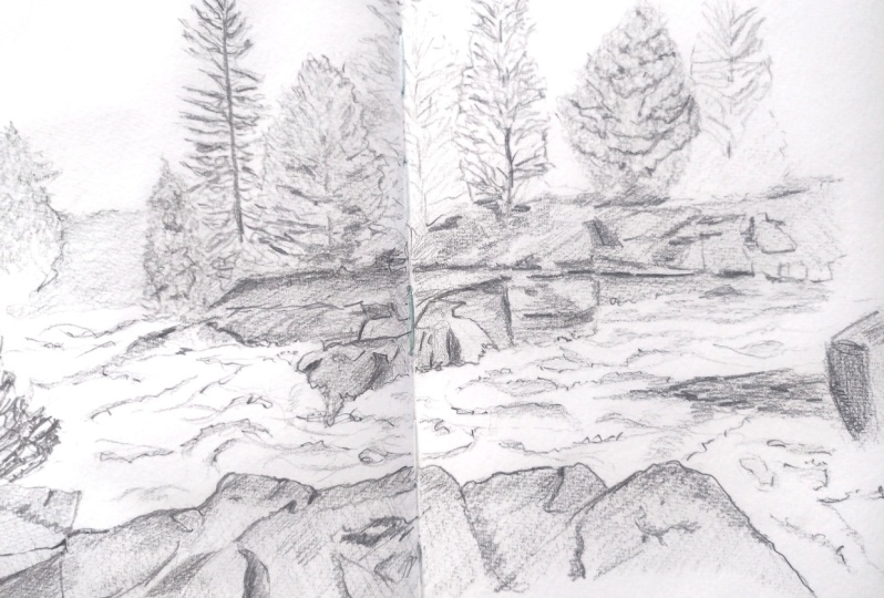
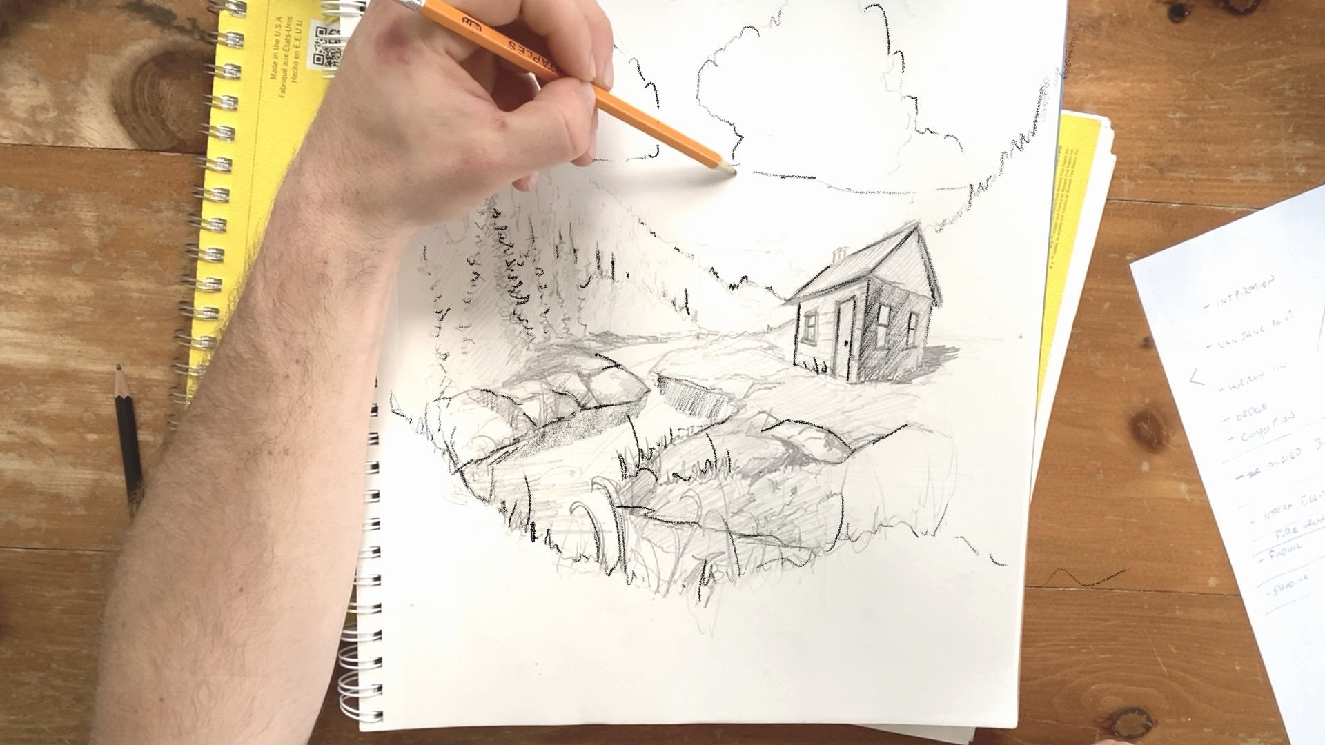
11. Adding Shading : And this lesson, we're going to focus
on shading and light, defining where the light is coming from in this
landscape scene, and then how to translate
that shading onto paper. We have the basic outline of our scene with trees coming
down to the horizon, a horizon line of trees
farther back here, and what looks to be a river and some rocks
here in the foreground. However, it's shading that
really brings a pencil drawing to life because
we can't work with color. So the lights and darks are what makes these objects
appear three dimensional. They're also what makes the background appear
farther away than the foreground and
what allows us to then add texture to add further
detail to our drawing. Before you begin to
shade your drawing, it's important to identify what sort of light
the scene has. In this scene that we're drawing today or
that I'm drawing, you can see that it
has a diffused light. And what that means is that
the sun is not shining super harshly and it's not casting
harsh shadows on the rocks. The shadows are diffused because the light direction is not coming from one specific point. If the sun was right
here in the corner like the classic
kids drawing style, the shadows would be
cast very harshly on the rocks down here and
perhaps down here as well, creating really
firm shadow lines. This can be a really
effective way to create interesting contrast in
a black and white scene. Over, in our scene, since
there is not one light source, the shadows are diffused, meaning it's a little
bit more ambiguous where the shadows start and end. That means we have to be
a little bit more careful about where we add
shading to our drawing. The first thing to
do is to identify the darkest areas of your drawing and the lightest
areas of your drawing. That can help you determine
where to start shading first. I can see that this
bottom tree line, which we just added
some details to in the last lesson is where
the darkest shadows lie. As well, the harsh shadows created by the
highlights on the rocks, created by the glistening water on their surface is
also drawing the eye, creating really
harsh shadows around here and around
here and over here. This sort of blockout method might remind you of what
we did a few lessons ago. And I find it a really
great way to visually kind of remind myself about
where the shadows are. Before I draw them in. We can also see that
there's some shadows in the foreground
of our piece here, cast by a tree kind of
right to the left of us and some harsher shadows down on the trees on this
left hand side, as well. We're not going to worry about shading with
a lot of detail, but we're going to practice
hatching and cross hatching as we add
these shadows in. And like most of this class, it's important to start light before we darken these shadows. I'm going to use that hatching
method we talked about to begin adding some areas of shading on the bottom
of these trees. I'm being very light
here and very sketchy. You can see that I'm
not worrying about adding the details or even being that concerned about
where I'm placing these lines, generally trying to capture the look of underneath
the canopy here, where that canopy, where the
trees kind of meet the rock. And you can see that if you analyzed what I'm
sketching in here, it wouldn't necessarily match the drawing or the photo
that we're drawing, but it gets the general kind of concept of how our eyes
perceive the scene right. And what that means
specifically is that I'm capturing the
general flow of the shadows and the
general kind of direction and size or
scale of the shadows, but not worrying about drawing every single kind of shadow visible through the
tree branches or around each tree base. As we're working our way up to kind of the middle of our scene, I can see that the
shadows extend a little bit farther up into the forest because more of the bottom side of
these trees is visible. And I can kind of extend my
shading up there as well. Here is where having a softer pencil really comes
into play because using a softer pencil allows your
shading or elements of shading to kind of flow together and blend together
a little bit more. We can see that when
we kind of rise up the cliff cliff right here, that some of that cliff face is kind of out in
the light area, but then there's a section of
shading to the right of it, and the shading also
kind of goes up into the tree line to the far
right side of our drawing. Now, you might know or see that some of the places
where I'm shading or where there actually would be
tree branches in our scene. I can see now that in
this area we've shaded. There are some darker spots that I want to kind of accent. So I'm pressing a
little bit harder to shade closer to the rock face to kind of capture where some
of those darker spots are. You'll notice I'm
keeping my lines very short, and very sketchy. Instead of drawing
long shading lines, I'm drawing very short to keep and hopefully blend the
areas of shadow together. Now, this kind of
goes into texture, but you can see that right in
the middle of our drawing, there's a kind of
an empty area left between tree branches that
draws the eye as well. It creates a little bit of a
darker section of shading. And so I'm shading that in, but also trying to
leave little room for what is going to be
tree branches when we add some more
detail and texture. The same goes up here right
on the top of the cliff. You can see that
there's a little bit more of a gaping hole left by the tree branches that we can add a little
bit more shadow into. I love how the shadows
kind of get darker and recede into the murkiness of the forest as they kind
of go up the page here. Now we're going to
add a few sections of shading on the rocks. So we talked about
how some of the rocks are visible in the
foreground and how some of them
create really harsh and strong shadow lines. We can kind of identify where these lines are,
sketch them out first. And then add some sections of dark shading to kind
of create these lines. So we're kind of
viewing the scene. We're kind of viewing the scene through the prism of
light and shadow. You can see how this
kind of determines or changes how you perceive
this natural scene. No longer are we looking at
shapes or lines or textures, we're looking at where the
scene's darkest and lightest. You can see how here right
on the edge of the rock, the shadows are also visible, so we're shading that in. Here. And because we want to keep this composition nice and tight and centered, we're going to fade
that shading out. Now, we have the darkest areas
of our drawing shaded in. But we need to remember
is that our drawing has a super light section right
in the middle, the water. And this water is
going to appear or appears to our eyes to
be almost white, right? There's some gray and green kind of sloshing around in the
middle of these rapids. But compared to the
rocks on either side, it appears very, very light. Because we can't
accurately kind of draw the green tones and
all the frothing water, our hack that we're
going to use is just by shading in
these rocks very lightly because they appear darker than the water
in front of it. So I'm using the hatching
method again here to kind of create a section of rock that falls kind of towards the lightest end of our shading scale that
we worked on earlier. We're going to focus on adding more details to this rock and continuing our shading journey
on this section of rock. But for now, we're just going to color these very lightly. A light light gray. That's going to add
some contrast with the water in front of us. We've colored in the rocks here. But I noticed you can
notice another area a very, very light, a very, very light section
of the page up at the top, which is the sky. We can see how the trees, when we perceive them in
this scene contrast the sky. Even though this green is
not a super dark green, it does kind of appear a lot darker because it's in
front of a light sky. And so we can do the same
thing we did to the rocks, adding a kind of
a coat of shading over top of the tree
shapes that we've drawn. No, we're going to keep
this very, very light. And I'm going to continue with that hatching method really, really lightly kind of
starting at the top of the trees and bringing the shading down
towards the rocks. Now, with all pencil shading, it's important that you start
light and darken in later. You can always lighten
areas of shading, but it's a lot harder to
kind of reverse course and shade or add
lightness afterwards. When I'm bringing
down the shading, I'm not worried so much about
the outline of the trees. However, I can use
hatching to kind of flush out where the trees end
and where they start. See how with shading, we can add some character and definition to
some of these trees. For example, we can
see how this tree down here is a little bit darker than the areas
of foliage above it. And while the outline
of the trees aren't super clear, especially here, we can kind of create
the perception that there is a little
bit of a tree jutting out above it by shading in the area down here a little bit darker
than the tree above. Likewise, in these trees
up here on the tree line, can add some areas of darker shading along this
edge of the tree. They kind of add
some definition to the tree in front of it. Now, you can see that
just like when we drew the outline of the
trees in the first place, I'm not worried about capturing the exact details of the
scene in front of us. More so when you're drawing
specifically with pencil, I find it can be a little
bit more freeing to focus on the general
feel of the scene. And that can mean not
including all the trees here on the top or including the general direction
and flow of the tree line without worrying about drawing the individual
trees themselves. This means the
scene can still be accurate, still be realistic, but not kind of
drive you crazy with the need to capture
every single leaf or every single
tree line just as it's presented in the photo. You can see that even as
we shade these trees in, our eyes are starting to perceive details that
maybe aren't even there. What I mean is that we can
see the general outline of these trees and now
the shading as well. And what I start to
see in the shading is little branches
that might appear to be sticking out through
our hatching or areas of darkness and shadow that make the trees appear more
three dimensional. We talked in the lesson
on composition about drawing outwards rather than
inwards, and specifically, how you can create the drawing in the points
of interest in the middle and fade that outwards to create a composition and a scene that's a little bit more
pleasing to the eye. This becomes really important as we draw this tree line in, and we want to make
sure that we don't add too much detail right
towards the top of our page. We can even fade out the
trees and fade out this area of shading as we head to the
right hand side of the page. When we add texture and further
lines in the next lesson, we'll kind of flesh
out these trees a little bit more and
provide more detail. But as we head to
the right hand side of this page with our shading, we can start to add some more bigger
areas of hatching without worrying about
the tree shapes as much. Letting our shading
kind of fade up into the right without worrying
about the detail. You can see even without some final texture
and final details, the scene is starting
to come to life. We have the trees now clearly and most obviously
trees in the background. We have a river kind of
rushing through the midground, and we have a section of rocks. In the next lesson, I'm
really excited to go through adding shadows
to the rocks, texture, and then texture to the trees, and we'll even try our hand at drawing rapids right through
the middle of our drawing. So I'll see you in
the next lesson.
12. Texture practice : Textures are the backbone
of drawing with pencil. Textures make objects appear lifelike and three dimensional, and that's what we're going
to focus on in this lesson. When we draw the
rock, the water, and the tree textures, we're not looking at the
shapes as such. We're not looking at the fine details or the
individual leaves. We're looking at the shadows and light areas of each texture because those are
what we can draw. To practice texture, you can go back to
your page that has the shading practice and that has the shading
darkness practice. Can first practice these
three main textures before we go about adding
them to our main page. To practice the rocks, we're
going to try to sketch in an area of rock from
this main photograph. And again, obviously, this
does not need to be accurate. We can have this, you know, section of rock here
kind of roughly transposed from the middle
section of rock in our photo. If this is the plane or
section of rock we're drawing, we can then add texture and
detail to make it stand out. And that involves determining where the darkest areas are. We can see how
there's a section of darkness here to
the left hand side, and that continues
kind of up the rock with these really dark
crevices and lines. We're going to
start by shading in these dark crevices
and observing how the tops of the crevices and cracks kind of appear
straight and rigid. Unlike the trees, these
textures involve us creating straight lines that
are a little bit more kind of abrupt
and darkly shaded. I can identify another
area of darkness kind of the middle right hand side of the page and creating
a blocked in square. I'm shading that in as well, as well as up here. Now we can see how there's
some lines that kind of complement these areas
of darkness and shading. So we can add these lines in the rock that kind of
curl over the shape here. You can see that as I'm
adding in those lines, I can then kind of
adjust the outline of the rock itself to
make it appear like it dips down as those rocks the crack kind of
slices through it. And we can do the same up here, adding some jagged outlines on the rock and then some areas of shading as well to
make it look like there's a crack kind of
coming through the rock. As I'm adding in these details, I'm kind of observing
other areas of shadow and trying to draw these
areas in order to give the rock kind of
dimension and kind of stress the cracky abrupt
and geometric nature of these kind of seams of rock that
kind of go through it. I have all the big
areas of shading, and I have an outline
of this rock that is appearing a little bit
more rugged and natural. Now I can add some
really light lines that sort of emulate the really light lines that are running through the rock
that we can see above us. And you can see that by creating this rock in the middle
and this area of rock that I'm not drawing
it painstakingly detailed or drawing
it line for line. Matching nature, I find is
a really hard task to do. Instead, we're trying to
match the general perception, how our eyes view the rock. Now, we'll leave
the water for last, but let's talk about
adding texture to trees. If we take the tree on
the right hand or left hand side of the
page as an example, we can just draw a little
sample outline here, keeping it very small. And then squinting at the tree, it appears to be
a mass of green, not much texture at all. That gives us an
idea of how we can add a base layer
and we've already done this in our main drawing
by shading in this tree. This really involves that
central key to our class, which is observing rather
than just looking, observing where the
darkest areas of the trees are and how these trees
don't follow a formula. Instead, each one is unique
and trying to capture the overall essence
of where they are darkest and lightest is key. This tree, we can see is
made up of an outline, some areas of darkness and lightness and some squiggles
that are horizontal. Darker on the sides, leaving a little bit
of lighter tones and hues in the
middle of the tree. Now, the water is a little bit tricky and we're
going to utilize the white space in our drawing to really capture the
feel of these rapids. Now, this takes a lot of practice and a lot
of patients as well. Feel free to
practice this part a few times before you commit
to the final drawing. If we use the method
we talked about, previously squinting to see
what our eyes perceive. We can see that when you
squint at this water, you can see some areas
that are slightly darker and some areas that
are slightly lighter. We can see how the
flow of water is so important to making
it appear realistic. Now, putting that on the
page is quite difficult, especially when it comes to working with a
medium like pencil, where it's a little
bit hard to capture details and impossible
to capture color. I find when drawing water
and when drawing rapids, especially, it's best to
err on the side of caution. Adding minimal
details to hopefully evoke the texture
without having to draw it in as such and drawing the general flow more than the details or
sections of shading. With this area of water, I want you to practice by
creating some flowing, really, really light lines. Creating these horizontal
lines that kind of follow the flow of
the river can kind of infer or imply that water is there and that this
texture is very flowy and amorphous without having to actually shade in
this area of the drawing. Now, when contrasting with
the darker rocks behind it, I think this water kind of comes in focus a little bit more. You can see how when I added
that section of dark rock, the flowing kind of nature of the water becomes a
little bit more evident. We can add in a few kind
of bits of shading here, but really with the
rapids themselves, we're focusing on how
the surrounding textures kind of contrast the
texture of the water. We're sketching today, which also means that we can be
a little bit more free with details than if we were drawing this in
for a final drawing or, you know, drawing with ink or another more detail
oriented medium. We just want to capture the
overall feel of the water. So you can see how really,
really light squiggly lines that kind of follow
the flow of this river to the left really
do help kind of give the impression of a water and
a kind of frothy texture. I'm kind of playing around with creating some outlines
of the water, too, by bringing the shading
of the rocks next to it down a little bit to create that kind
of frothy kind of bubbling kind of nature of the water to the right
hand side of the page. Now this is a little tricky
and it takes a while to get your own style and develop your own techniques
for creating water, especially when it comes
to creating rapids, which I think might be the
hardest water to draw. Don't beat yourself
up over this. By adding the dark shading of
the rocks beside the water, we can get away with doing minimal texture work on
the water itself, still, I think, giving
the impression of a rocky flowing
section of rapids. Once you practice
these textures or the textures evident
in your own photo, we can then return to
our drawing and add in textures to kind of help finish off this drawing before
we take a step back, review and revise for
our final sketch.
13. Adding texture: We've practiced the textures on a separate piece of paper, and now we can put
them to practice. But before we do, we're going to block out the trees
and the rocks a little bit more to help define when and where to add the
textures we practice. Now, I can explain that in a
little bit more detail here. What I mean is that we've talked about how to add the
textures to trees, but it can be useful to block out the trees to make
them a little bit more distinct to help you determine
where to add the textures. We talked see how
in this drawing, we perceive the trees to be kind of more one
ambiguous shape. It's hard to determine where one tree ends and
where another tree begins. However, to make this a little bit more of an effective sketch, we can help to kind of add
some definition to the trees, even if it's not super accurate to the image
we are looking at. By adding the edges of some trees kind of
in the middle of this kind of big blob
of tree foliage, we can then make it a little
bit easier to add texture. Even if it's not completely
accurate to the scene, I think it does
enhance the realism. Specifically, if I tried to draw that huge expanse of foliage
and texture it in as one, it might end up looking
like a huge blob, a wall of one
dimensional texture. By adding some more definition
to the individual trees, even if we can't see
it in the photo, we can then make the scene work a little bit better as a sketch, allowing us to highlight our
skills as sketchers without trying to capture the beauty of nature one for one
because let's face it, we're not going to
succeed at that. I've added a few outlines
of the trees using the same technique
that we talked about at the beginning of this class. Now that these trees are a
little bit more distinct, I can practice the
texture technique we talked about adding
horizontal lines that kind of are a
little bit lighter in the middle of
the tree and get a little bit darker on the side, accenting the
individual branches. One thing to keep in mind is how these textures should become lighter and less distinct the farther away the trees
are from us, the viewer. And you can tell
that these trees are a little bit
farther away here than these ones here or these trees here
in the background. That means that as we kind of work our way up to the right, we should be adding a
little bit darker lines and adding a little bit
more details to the trees. You can see this horizontal line that kind of swoops
to the left or right and continues sketchly
underneath is really the backbone of how I'm
creating this texture. And beside each tree, you can create a little bit of an area of shadow to kind of showcase the foliage and the depth of the
shadows beneath. As I'm working my way right, I also want to fade out detail as we get to the
top of the scene. That's important because
as we talked about, we want to draw outwards
rather than inwards, and that means fading out detail to keep the viewer's eye
centered in the middle of the page or around
the middle instead of kind of centering detail towards the
edges of the page. Now, I'm referencing back to
the image to make sure I'm capturing the most important or noteworthy details
of the scene. And some of those involve
these large tree trunks here that kind of shoot up
in the middle of the trees. And how they kind
of arise out of an area of shadow in the
middle of the forest. By pinpointing these details and these elements of texture
that are important to add, we can keep the
drawing accurate to the source material to the
scene that we're drawing from without making it unduly difficult or too
intimidating for us to draw. We've kept the main elements
of the scene intact while kind of changing a
little bit of the dressing, the window dressing of the scene or how we see the
trees in order to make it a little bit easier
and I think more fun to draw. As I'm adding this texture, and I'm making sure
to check back on the photo as well to
kind of see if there's another or a couple
areas we can add in more shading or other
lines that are visible. I can see a few more
little spindly trees down here in the foreground
that can try to capture a little bit by
working my shading and texture around to make sure
I'm capturing these small, small details here at the
forefront of the scene. Towards the edge here, I'm fading out the textures as well. And making sure I'm adding those squiggly light
touches of the pencil. What I think is
so powerful about sketching is that if you look at individual 1 " by 1 " part of this drawing without the
rest of the scene beside it, you might not even know
what we're sketching. However, when you zoom
out, you can see how these individual
areas of shading and texture come together to tell the story of the landscape
that we're drawing. It shows how, you know, everything you draw
should be viewed in the context of the bigger scene that you're
trying to draw. That's what's so fun and
liberating about sketching. It's not about the details. It's about how the scene comes together and how
every texture you're drawing really contributes to the whole view of the scene. And I think that changes how I perceive nature in general. Instead of viewing individual
trees or a river or rocks, you can begin to see how these objects in nature come
together to really form a more beautiful picture of the natural environment. H
14. Adding Texture Part II : We have some faint
texture added to the trees and texture
that fades back into the background with the trees near here on the left
hand side and in the very back of the drawing completely untextured
at this point. Now we can focus on the rock. Using the techniques we talked about in the previous lesson, I'm going to start
with this section of rock near the
middle of the page, and I can start by
refining the outline, jutting down some
of the areas of rock a little bit
farther into the rapids. And adding some kind of natural variations in the
outline of these rocks. You can see how if I kind
of refine this rocky shape, I can follow the backline of it and see how there's
some areas where it's a little bit flatter than
I've drawn and areas where there's some crevices
that I can draw in. I often start with these
faint lines or kind of jagged shapes and then detail them in later with
areas of darker shading. You can see how these
rocks, when I kind of observe and do the
squint method, I can see where I need to
add the darkest spots. We already added some shading here on the right hand side. And if I work right to left, I can see that there's some darker slices where the rock is not
exposed to light. And how often these
sections seem to be horizontally or vertically
structured with horizontal, kind of jagged cuts through the rock that I can
kind of add shading in. A little bit farther on,
we have a little bit of a chasm here that
extends all the way back into the background and some flatter areas of
shading beside that. And then we get into
a really nice section of shading here on the left hand side of
this area of rock. And again, just like the trees, I'm not focused on capturing
the exact scale or dimension of these areas of shading because that's really
quite difficult to do. Instead, I'm focusing on the overall perception
of these spots. By keeping the edges of these areas of
texture to be really, really sharp, I can kind of get the feel of this
rock outcropping. Often this means drawing with
the point of your pencil as well to kind of capture those
really harsh, dark lines. As the rocks kind of recede
into the background here, we can add some darker shading. Capturing the underside of
some of those ledges is really important to kind of give the overall feel of the rock. And you can see how there's
some areas where it gets completely black as the rock
kind of recedes into shadow. The same could be
said when we switch to another area of rock. Up on this cliff, we
have the underface of a kind of bulbous
rock section here. And then a jagged area of
shading down beside it. For the rest of
this area of rock, I'm identifying where
the shadows are and adding those shadows in to really make the rock
appear three dimensional. This takes a lot of practice, and don't beat
yourself up if you're struggling to kind of
figure this section of the drawing out by utilizing the skills
we talked about by identifying the shadows
and then adding some other lines and adjusting
the outline of the rocks. You can really
begin to give them some life and give
them some shape, density, and kind of
dimension in the drawing. You can see when I'm adding
the texture of these rocks. I'm also adding some
darker shading in. And this kind of is a
really helpful kind of This arises out of the
multiple layers of detail that we began
adding to this drawing. I can see how these
areas of shadow are the darkest spots
in this drawing and by really accenting or
emphasizing the darkness of them, I can add some really nice
contrast to the drawing, which I think flushes out
the trees and contrasts with the light fluffy texture that we drew in the
trees even more. Now, I haven't captured
the rocks one for one. This is really important for you to note because I think it takes some pressure off
when you're trying to draw these rocks or when you're trying to draw textures in the landscape
photo you've drawn. Instead of trying to draw the exact details in
each section of rock, I tried to get the overall
feel of each section of rock, and that's meant
following the outlines, kind of identifying
and capturing the most obvious and darkest
spots of the texture, and then drawing some of these light texture
lines over top of the rocks to give the impression
or feel of the jagged, natural kind of decay of the rocks as the water
kind of washes over them. However, I'm not too worried
about making sure that every rock I've drawn is
exactly the same scale, dimension, or shape of
the rock in the photo. Instead, I'm focusing
on the overall feel, and that's a really important
element of sketching. I'm fading out these textures to the right hand side
of the page as well. As we talked about,
we want to center the detail in the
middle of the page. If we look at the
foreground rocks, we can really play
with the outline of this texture to give
it some more life. Seeing how the outline really contrasts with the
white of the rapids, we can darken that in
a little bit and add some nice areas of
lighter shading to show how these rocks
are three dimensional. Shading around
these pine needles that are sitting
in the middle of the rock and doing exactly what we did in
the background rock, but with a little
bit more precision. You can see how even
though we're not focusing on doing
this completely correctly or following the curve or shape or shading of the
rock completely correct, we're getting the overall
feel of the rock, using hatching and using lines. To contrast the water even more, I'm going to add another
layer of shading over this texture to really showcase the water's vibrancy and brightness when we
kind of add that in next. We'll do the same
in the background, shading in the rocks
closest to the water, just a little bit more. You can see how
there's elements of rocks down here on the left
hand side of the page that we're detailing in a
little bit less than the rocks up here on the right. By adding some more details
and darker shading up here, we can really make it feel
like the rocks kind of recede away from us
into the distance. The last texture we're
going to work on is water. We'll add in the rushing water before we go back
over this drawing, add a few more details
and decide where we need to darken or lighten lines.
15. Adding Details : In this lesson, we're going to go over some final details. We're going to refine our shading and then
view the drawing at arm's length to see where we might have gone wrong
or what we can improve. First, let's take
out the eraser. Now, I don't use an eraser that much,
and as you can tell, this eraser here that I've
chosen is pretty worn, pretty worn down and pretty old. But I kind of like
the idea of kind of wearing in my eraser over
time and keeping it with me. As you can see, I take this
one around with me when I'm drawing on a trip or traveling, and it's preserving
me pretty well. What we want to capture
here is the way that the water kind of
froths up on the rocks. Now we can kind of exaggerate this for the purposes
of our drawing. But what I'm doing
is just erasing a tiny little bit
of the shadows. And that allows us to then expand the water
upwards to capture some of the way that the water on these rapids is expanding onto the rocks
or frothing upwards. To adding these details, you want to have this
clear section of white. And then I'm just adding
some really squiggly frothing areas of waves that are kind of coming
up onto the rock. There's also a section that we haven't
really touched yet, which is this tree to the left
hand side of the drawing. And again, we don't want
to emphasize this too much because it does kind
of impede our composition, but I think it can be
kind of nice to draw some areas of detail that
are closer to the viewer. These branches are
really dark, and I want to treat them as such. So I'm drawing these
branches outwards. Darker as they kind of
come into the scene and trying to follow the flow
of the branches that I see in this reference photo. After I've drawn these thicker, darker lines and lines that kind of come onto
the river down below, I can then add a little bit of detail here on the
branches themselves, adding some squiggly
lights and shaded in areas of leaves or pine needles. Again, I'm not copying this exactly the same as the
tree that's on the page, but more so trying to capture the overall feel of how these
leaves kind of look and how these branches look as they kind of come onto the
page in front of us. Another section of detail that
we haven't drawn in yet is this rock here and the darker
area of water around it. Now, this rock is a
little tricky to draw because it's right
near the water line. However, I think it's a pretty interesting part of the piece. And so to try to draw this, I'm going to flatten
out the top side of this rock to match how
it looks in my image. Give it a little bit of
shading over the top of it, and then darken in the
shading on the bottom side. As you can see, the side of the rock appears much
darker than the top. Alongside that
darker bottom side, there's some horizontal lines
that kind of come across the rock and a section of shading above it that really contrasts
with what appears to be the reflection on the
side of the rock facing us. Just like I shaded in
the rocks up here, I'm focusing on the
dark areas first and leaving the contrasting
light areas to give it some three
dimensionality. Now, the water around this rock and up near
the cliff is darker, and we want to add that
in to really give more of a sense of detail and
precision to this drawing. This takes a little while
and also is a little tricky. So don't beat yourself up
if you find this difficult. But you can see how
there's an area of the drawing over
here and right here that is a little bit darker and is a little
eddy in the river. And that means an area of water that's a little bit
protected by the flow of the river because
it's blocked by the rock in front of it. Now, we can extend
a little area of shading that's a little bit darker than the
waves we've drawn. Can be extended down the
river just a little tiny bit and flowing up here,
just a little bit as well. And like everything
else in this drawing, we want to kind of fade
out the details and fade out the shading as we go
to the right hand side of the drawing to make
sure that the points of interest are centralized in
the middle of our drawing. Next, we want to revise and deepen the shading
in our drawing. And something that
jumps out at me right away is that I've drawn in a lot of these rocky crevices darker than the areas
beneath the trees. However, when I
look at our image, the sections beneath the
trees do appear just as dark often as the areas of rock and areas of
shading in those rocks. So we did this quite
a few lessons ago, but we want to go over the
area where we've shaded and add some depth
and darkness in now, this applies to your
reference photo as well, whether or not you're
using this photo. You want to go back over
your drawing and identify what areas you could make darker and what areas you
could make lighter. This involves assessing and accurately kind of observing your drawing just like
we observe the photo, identifying if the spectrum of light and dark tones that
you've added to your drawing accurately match the spectrum of light and dark tones that's evident in the photo
that you're using. And here, I can see
how we can make quite a few areas of
trees and areas of shadows in those trees a
little bit darker to more accurately contrast the
rocks in front of us. Right now, the trees
appear pretty faded while the rocks appear very
jagged and dark. I'm going over the lines we've made in the trees to darken them up and also
add more shading. I'd invite you to do this
to your drawing, as well. Where can you add more detail? Where can you add more darkness to make your drawing match
a little bit better? One thing to keep in mind
is that I am a lefty, and if you're a lefty, you know the struggle is real. It's hard not to
smudge your paper, especially when you've
added a lot of shading. One thing I do is
getting another piece of paper or a sticker or
anything to put your palm on. And then you can avoid getting the sections of ink and
graphite on your pand. Now, in the beginning
of the class, we talked about how this
tree on the left is a really interesting
and unique part of this scene that we
want to emphasize. However, it became clear after we do the rocks that it
wasn't really dark enough. It wasn't really
drawing the eye. So you can see that in
this part of the class, I'm darkening in that shape
and the shapes of the trees themselves to really match the rocks and the level of
detail we put in the rocks. This might require adding texture once more over
the trees even though we've already done so or darkening in the texture
you've already added. Remember, the shapes
farthest away from us, like these trees
down here should be fainter, should
have less detail. And that means we can add
detail and texture and shading on the trees up here
without worrying so much about the trees
in the background. You can see that the more that I shade the rocks beside it, the more that the water kind of jumps out at us, the viewer. By going over some
of these areas of rock and adding
more harsh details, I can make the water and the frothy bubbles stand
out a little bit more. I think more
effectively conveying the rushing water around us. You can also really kind
of investigate some of the textures or
sections that you're drawing with a little
bit more detail. I find when I go back over them, I can see that I've missed certain spots of detail
that are really, I think, integral to
how we view the scene, such as the bottom
of these rocks, how they kind of are
clustered together, and then kind of
branch upwards in little jagged split off
lines up the rock face or the way that the rocks to the right are a little bit darker than the
rocks to the left, and how often these
rocks up here have shadow across them as they're covered by
the trees above them.
16. Revising your Drawing : When evaluating if a
drawing is done or not, it can be helpful to kind of go through a little
mental checklist. First, consider the
lights and darks. Are they accurately
reflected in your drawing? That scale of light
and dark tones we talked about
earlier in this class, does your drawing have that full spectrum
of lights and darks? Next, does the lights and
dark areas of your sketch, do they match the reference
photo you're using? For instance, we
talked about earlier in this lesson how the
darkness underneath the trees was far lighter than the dark areas of the
rock and how we needed to adjust those areas
to make it match more accurately and also to
balance the composition. Think about how
you can emphasize different areas of your drawing. So, for example, here,
we've emphasized the river and the rushing water
by shading in these rocks darker to emphasize the
flow of the water and also the fact that the
water is white and contrast the scene cutting through the middle
of our composition. Now, in this scene,
there aren't a lot of, you know, other details,
as in, you know, people buildings or other
elements that we haven't added into the scene
that I think are that important to the
final composition. But, however, I think going over the scene again to see if
there's any details we've missed or any areas we can
add more texture to more effectively convey key elements of the scene can be
really important. The trees in the image
that we're drawing, if you squint are
really defined by these shadows and areas
of light and dark, um, pine branches and bring
that onto the page can be a really valuable way of kind of conveying this
important part of the scene. There are details here in
the foreground we can add, like the moss and lichen
that are on these rocks. You can see how these rocks
here at the foreground have some spots that
are darker and spots that are lighter that have that sort of,
like, growth on them. And we can really
sketch that in as well, adding some really light
areas of detail that I think kind of further instill the idea that this section
of rock is closest to us. We assess the details and
where we can add more details, we can also see if we accurately depicted the scale and
depth of our scene. For instance, the details on this rock and the size of
the rock right in front of us really tells us that it's closest
to us in the scene, whereas the rocks here in the
midground and the trees in the background are less
detailed and farther away, as well as this
area of tree down here and even farther in the background, down
at the very bottom. I love how the
scene kind of fades into the distance
and how the river that kind of rushes
through the middle of it kind of contrasts
the rock so nicely. As you finish off your drawing, it's up to you how much detail or how much time you spend, kind of adding more shading, adding more texture,
adding more shadow.
17. The End : I hope you're satisfied with
the landscape you've drawn, whether it's from a
photograph that you took or from the photograph that
I took of the rushing water, flowing waterfall, and the
trees in the background. As you continue on drawing
landscapes or anything else, I hope you bring these
observational skills with you. Learning how to pick out
the most important details and putting them onto the page is important and I'd say maybe the cornerstone of
drawing realistic scenes. Ing how to draw real life
and real landscape is an incredibly important part of drawing imaginary
scenes, as well. I think these skills will
serve you well in the future, but I'm so excited to
see what you've drawn. So please do not forget to put your project on the project
page of this class. I want to see what you've drawn, and I want to hear your
thoughts about this class and the parts that you found most challenging or most
enjoyable, as well. If you've drawn
your own landscape, I want to hear about
that, as well. What made you choose
that photograph and what do you love about the
landscape you've drawn. Above all else, I hope
you keep sketching. Thanks so much for
taking this class. M
18. BONUS Common Mistakes: As you gain confidence in
drawing realistic landscapes, it's important to
keep in mind some of the most common mistakes
that I see beginner artists making when they try
to translate what they see in the real
world onto the page. The first is not paying
attention to composition. That means starting
in the wrong place. Often, artists will focus
on the details first, and that can mean you spend
a lot of time creating grass in the foreground or
rocks in the foreground, for instance,
without considering how they fit into
the overall scene. This can make scenes appear weighted to one side and uneven. Also, it can mean you
run out of space, and maybe the whole scene
won't fit onto your paper or you accidentally draw
the entire scene on one quadrant of the paper, not using the available
real estate you have. Next, I often see artists
not focusing on creating a full range of shadows and shading
values in their drawing. By having just really, really
light lines or just really, really dark lines, you really miss the essence of
their realistic scene, because when I look at any
photograph or any landscape, there is 99% of the time there is a wide variety of
dark and light shades. By drawing the grass in the foreground with
really dark jagged lines, we miss the entire scope
of the drawing and how this grass to us
actually appears light where the trees
in the background of this photograph appear dark. Lastly, artists can
often be tempted to draw what they think they see and not what they actually see. We see this all the time
in kids art, especially. Kids are really drawn to drawing the stereotypical
shapes that they see. We've all seen the sun
in the uphand corner and a picket fence with a
lovely little house and a bubbly tree
in front of it. Now, that's not what that
scene actually looks like, and that's not what any of the objects within
that scene look like. But it can be tempting to
rely on those stereotypical, much loved shapes because
they're easy to draw. But I find the most dynamic
and realistic landscapes come with you when you
forget about what you think an object like a
tree should look like and instead focus on how you perceive it within the
scene you're drawing. That means focusing on
the shadows that you see, the dominant lines that you
see and treating each object, whether it's a tree, a
rushing river or rocks as separate and unique and giving them the
attention they deserve. Now, with these common
mistakes in mind, we can continue on
with our class. But you can refer
back to this video when you kind of judge your final artwork.
See where you are. I often find I make
these mistakes myself, but keeping these in mind
can be a great way of keeping yourself on track
when you're creating.
 Sam Gillett, Pen // Pencil // Procreate