Transcripts
1. Introduction: Question for you, how would you draw the space that
you're seeing right now? The space behind
me in this room? If you don't know
where to start, this class might be for you. In this class, we're
going to be drawing interior spaces with pencil. You'll learn how to
craft three D drawings of imaginary rooms that
we will design together. Drawing three D spaces is an
incredible way to practice the foundational skills involved with
perspective drawing, but also exercise
in imagination. My name is Sam. I'm a Penning artist
from Ontario, Canada. I've been drawing
for about 15 years, and pencil sketching was the foundation of my
drawing practice. Drawing interior spaces can be an intimidating thing
for artists to tackle. It involves a lot of
perspective drawing, and it's an enclosed boxed in space that we have
to craft ourselves. This class is all about taking
the intimidation out of the equation when it comes
to drawing interior spaces. By the end of this class,
you'll not only have a finished three D sketch
of an imaginary interior, but you also pick
up some valuable tools along the way when it comes to choosing
reference photos, layering light, shadow, and texture into a space,
considering composition, and adding details, and telling the story of an imaginary place through what we find within it. Take you through every
step of the process, and you can draw
along with me or draw your own imaginary
place as well. I'm so excited to see what
we can create together. So grab a cup of coffee, grab a snack, and
let's get sketching.
2. Project Video: If you've taken a
class of mine before, you know that I'm not overly concerned about what
supplies you use. The most important thing
for you to do is to draw, and that means drawing with
whatever you have right now. However, here's a little
bit more info about the pencil and the paper that
I'm using in this class. That can give you a
little bit of an idea of, you know, what sort of supplies to get if you
don't have anything. When choosing a pencil, you want to think about what kind of sketch
you're creating. Are you creating a
more mechanical sketch that revolves around
lines and just shapes, or do you want to add
some shadow and texture? Well, that will determine
what kind of pencil you get. A softer pencil in the B range will get
you darker shading and, you know, lays down more
graphite on the page. Whereas a harder
pencil means that you're laying down less
graphite on the page, and that pushes you into the
H range or even the F range. A HB pencil is right
square in the middle. That's why it is the
most popular one. But you'll find a lot of
artists use a two B pencil, and that's a great
option as well. For this class, use whatever
pencil you have handy. But if you want my
recommendation, I'd say get a two B pencil. I'm using a three B, but a two B will do just fine. It's a nice balance between
dark lines and shading. We also allowing you
to add some details. As far as paper, regular
printer paper will do or any paper that's meant for
drawing and dry mediums. The reason why watercolor paper or sometimes thicker
paper may not be the best is because the
texture of the paper can sometimes distort the lines
that you draw on the page. Or make it more difficult to add small fine details if
the paper is textured. One last thing, we'll
be talking about reference photos for this class. Having your phone or a camera or an iPad or anything
else that you can look at photos on handy, that'll be pretty
useful going forward. With all that said, let's
talk about just that. We'll talk about references
and how to gather inspiration before we
draw our interior scene.
3. Finding References: We're drawing this interior
scene from our imaginations. But the thing is,
even when you're drawing from imagination, it can be useful to have
references that help us and, you know, keep us on a
path towards the end goal. The difficult thing
is how to use references without copying
the things you're seeing. You know, I could
say that a work of literature about hobbits and dwarves and big
mountains and dragons is my reference for
artistic project, but I don't want to copy exactly the wonderful
paintings that have already been created
in that universe. For this class, we're going
to get three references, and you'll have the option of
gathering them yourself or finding them online and using
elements of the references, but not copying
them exactly as we create our own imaginary
interior space. First, we want to ground our interior three D drawing in our real three
dimensional world. That, I mean, we
need a reference for the three D environment, a reference for the structure
of the space we're drawing. My living room and kitchen is
not a very glamorous space, but if I position
myself just right, I can take a photo
of the interior of the space from the same angle that I might want to
draw my scene from. Now, as you can see, I'm taking this angle I'm taking this photo from right
beside the wall, which means it's a tight angle, and it means that I'm kind
of looking into the room. Using this as a reference, I can then structure my imaginary space from
the same vantage point. I think it's a pretty
realistic vantage point because we often don't enter
rooms right from the middle, often doors or hallways kind of shoot us into the
room from an angle. And I think this allows us
to kind of experiment with the composition of our interior space in
a pretty cool way. So, I'm taking this photo. I'm going to have this
handy going forward. Next, I want you to get inspiration for the focal
point of your interior space. Now, a focal point we'll
talk about a little bit more in the next
lesson about composition. But that basically is a main part of your
image or drawing, the thing that you want
people's eyes to focus in on. Right now, my face is the
focal point of this video. I'm arranging things
around my face in order to draw you and your eyeballs
in towards my face. In our drawings, we
want the focal point to be something interesting,
something quirky, something that adds dimension or a unique element to
your interior space. So go online. I love Pinterest for
this or Google Images, or even your own selection
of images as well, and think about what
you might want to make a cool focal
point in your room. A couple of examples
of this could be a really interesting and, you know, unique armchair,
perhaps a fireplace. Maybe it's a balcony with
someone standing on it. Could be a picture on
the wall or in my case, it's going to be a
curved gnarled old tree that's sitting in the corner. Now, I don't think it's a very
structurally sound library or space that I'm building, but I think the tree will add a cool dimension and
I'm going to snap a photo of a tree similar to this one to help when I'm
thinking about texture, when I'm thinking about scale, and when I'm thinking
about drawing the details of this tree in
a three dimensional space. Having this handy
will help me kind of craft that specific
part of the drawing. But again, I'm not copying
this photo exactly. Lastly, I want you to
get a photo or find inspiration for the aesthetic or the decor of your
interior space. Now, this might be the
hardest concept image to find because we want to find one that we don't
want to copy exactly. Instead, we're
taking elements of it and incorporating
it into our space. Specifically, if I want
to make my library, you know, a three
dimensional mysterious, magical medieval library,
I want to find images and paintings or drawings that have elements or motifs that are common in medieval architecture. I don't know that off the
top of my head because I am not living in
the Medieval ages. That's why I need to find
a photo or a drawing or another concept image
that has some aspects of medieval interior design that
I can use in my drawing. And again, I'm not going to
copy these images exactly. I'm just referencing
referencing them for scale, for texture of the
bricks, for instance, or even for what elements
might be around windows, how the windows are
designed, all these things, it can be really useful to have some images that kind
of refer back to the type of space and the time period that you're
hoping to draw from. Combining these reference photos together is really the fun
part of this class because we're going to be
combining them with a healthy dose of your
own creativity as well. In fact, hopefully, mostly
your own creativity. If you want, you can spend
some more time on Pinterest, thinking about other
kind of reference photos you want to bring into
your space or, you know, even if you want
to find photos of specific details
you'd like to add, like a globe or books or a
candle, anything like that. And remember, the key
point here is not to copy. It's to use these elements
or these photos or designs we find to
inspire our own drawings. So, I'll see you in
the next lesson. Well, we talk about composition, composition is an
integral part of our final, interior space. It's how we're going to use
all these inspirations and references and put them together in a way that
really draws us in. So I'll see you in class.
4. Composition: Composition is the way that
a drawing is put together. It's where we put objects on the page,
how we lay them out, how they're oriented,
and how they work together to create a
scene that really draws us in. In interior spaces, this is so important because we
live in interior spaces. You're looking at me
in one right now, and you're probably sitting
in your own interior space. So we're used to the way that interior spaces are composed. That means we're looking at
composition on two levels. On one hand, how
our interior space is composed and formed, and on the other how our
drawing is composed, how the elements in our drawing direct the viewers eyes towards what's important and towards
the middle of the page. Now, composition is
a layered topic and I talk about it in so many of my other skill
shared classes. I've dropped a few
down below where I dig into this in a
little bit more detail. For this class, I want to talk about three main concepts in composition that'll help
drive our drawing forward. First, framing. We want to frame
the focal point and the main parts of our scene. If you think about a frame for a famous painting like
the Mona Lisa, let's say, where the frame does not draw attention away from
the painting itself. In fact, the frame
rectangle draws the eye inwards by
creating a space that contains the main
point of the picture. Similarly, in our drawing, we want to use elements around the outside of our
drawing to draw the eye towards the middle or towards elements within our
three dimensional space. That means we want
to make sure that the frame of our
drawing is contained, that it doesn't have parts of, you know, books kind of hanging off the side
of the page or, you know, bookshelves
that appear to, you know, go too far to
the right or to the left. Instead, we want to have
a neat frame that kind of boxes in the main
part of our drawing. We can create frames
in our thud space, as well with the elements
that we put in them. For instance, here you
can see that I'm framing this castle with leaves around
the outside of the frame. By adding the leaves,
we're box the eye in and direct the eye towards the middle or towards the
focal point, the castle. Like I said, our focal point is going to be the
tree in the middle. We want to think
about how we can make elements around the
outside of our drawing, frame that tree and draw
the viewers eyes inward. What's the focal point in your drawing and
what elements in your interior space
can you lay around the outside of it to
draw the eye inward. Next, let's talk
about leading lines. Drawing an interior
space in perspective, and that gives us a valuable
and unique chance to use leading lines in our drawing to point the eye back
into the scene. Specifically, since we're
drawing a space with depth, you know, we could
walk into the room. We want to draw objects
in the outside of our space that draw
the eye inward by, you know, pointing back
towards that vanishing point. By using the lines
of the top and the bottom of the walls
that point inwards, we can use these lines
almost like arrows, drawing the viewer's eye
deeper into our page. Objects like a table or a
sign or even, you know, a river sneaking back
into the distance can be leading lines that draw
us back into the drawing. And that means it
can be wary about what might be a
leading line without you intending it to be so. I I'm drawing this river
back into the page, we want to make sure
that the focal point might not be standing right at the end of the river or else our e is drawn
back into the page. If there's nothing
at the end, we're kind of left unsatisfied. Leading lines demand resolution at the end of them or something even negative space that allows us to think
of the composition as a nice tight package. Lastly, let's think
about negative space. Now, I talked about framing. Is related to that, but negative space is a
powerful tool to draw attention to details and
spaces within your drawing. By leaving some
areas blank or by leaving areas blank around
the edge of the page, we can draw the viewer's
eye inward by directing the eye towards the darker and more important
sections of the page. Often I find leaving negative space around
the outside of the page a really key ingredient in making the composition
feel balanced. If I draw something
really dark and heavy and large on the outside
of the page, it can often distract from the interior or the focal
point of the image. Instead, leaving
some negative space leaves some questions
about what might be around the edge of our image, but also adds some balance. If we think of our
drawing as a radius, it's drawing the eyes
inwards as opposed to keeping the weight on the
outside of the drawing. Now, those are three
examples of composition and three ways that composition will be used in the
drawing I'm doing. But again, if you want to more deep dive into composition, check out some of the
classes I talk about below. Now, we're ready to dig
into drawing thumbnails. Now, thumbnails
are a really great way to kind of get a feel for a scene before we kind
of take it seriously. And so I will see you
in the next lesson.
5. Framing Your Drawing : Now that we talked about
thumbnail sketches, let's talk a little
bit about perspective. Before we start our scene, we're going to sketch out the
bones or the framework for our drawing before we start to add our focal point and other
details into the scene. What that first
necessitates is for us to kind of lay out the perspective
of our final scene. Now, just like in
the reference photo, I'm going to draw a
little vanishing point here on the right hand
side of our page. Now, if I zoom out a little bit, you can see that this
is not, you know, at the very edge of
the page because we want to still keep the action, the most important parts of our drawing kind of
focused in the middle. If I then draw some
free hand lines out here that generally
kind of reach back towards our vanishing
point and one right here and another up here
and another up here. We can kind of sketch in our imaginary space by first
sketching in that back wall. I often find drawing
that back wall in first allows us to kind of
anchor the composition of our scene because then
we can kind of see right right to the edge of where we're going
to be drawing when it recedes back
into the distance. So I have this square here
at the back of our scene, and now I'm going to kind of
continue lines outwards from that square that all kind of lead back towards
that vanishing point. Now, as you can see,
the lines that we've drawn here on the
right hand side are a much tighter angle
than the left hand side. It's like we're viewing
this room from off center. Now, I think that's
a really actually a viable vantage point to draw from because it's a
little bit more realistic. We don't often view rooms
right from the middle of them. We often enter from the side, or are often viewing
from a little bit below the halfway
line of the room. This means we are viewing
upwards a little bit. We can see the sky or the roof or the ceiling
a little bit easier. But now that we have this
vantage point drawn, we can talk about how
we'd compose this scene. Yes, we're going to
reference what we drew in our thumbnail sketches, but we want to make sure we lay out these elements in a way that directs the viewers' eyes to where we want them to look. That means we wouldn't put the most important
things in our drawing towards the left hand side here or even on the ground here. Instead, we want to
make sure that we have some objects of
interest back here in the drawing because we want
the viewers eyes to kind of scan from the foreground
to the background. This background is where
the crux of our scene lies. If we don't make the
background interesting, then we better have some really interesting elements
that are really huge in the foreground that really
intrigue the viewer. I'm going to say that our tree is going to be
around right here. This ends up being, like,
the middle of the page, and we'll want to have
some nice books or other objects here kind
of flanking the tree, some objects of interest. Those windows we drew, I think they'll be a
great way to kind of lead the eye towards that
tree in the background. I think adding a foreground
element like a table or something like that
could also draw the eye back farther
into the scene. But you'll notice that I'm
not drawing details and I'm not drawing a lot
of shapes right now. In fact, I'm just drawing
the vague outlines of these shapes to kind of frame in the direction
we're heading in. In the next lesson, we can turn these vague outlines
into actual objects. So don't stress too much. Just draw some vague
outlines into your scene, and I'll see you in
the next lesson. A
6. Lines and Shapes Part 1: In the next two lessons, we're going to be drawing a
rough outline of our drawing, starting with a focal point and then layering
in detail as we go. So let's get drawing. When we're thinking about
framing our drawing, we often want to draw the most important or the most
difficult shapes first. And for me, that's going
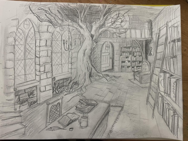
to be the focal point, the twisting tree that is going to be right in the
middle of our drawing. To do this, I'm going
to be drawing first a flat square leading back
towards that vanishing point. And then on either side of it, I'm drawing lines upwards. These lines are going to kind of guide the shape of this tree, making it appear
three dimensional. But you'll see that
I'm then drawing lines in from the left and
right hand side of the tree, adding a nice curve around
the tree trunk roots and extending the tree trunk and the roots outwards
into the room itself. You'll notice that these
are not straight lines. However, the general curve of the roots leads back
towards that vanishing point. It's that general the
trend line that really cues the viewer and lets them know where we are in the
three dimensional space. That's why it's not arts or it's not a
science, it's an art. Creating curved and
three dimensional shapes like this tree gives us some leeway because
the lines are not straight up and down
or straight horizontal. They're curved a
little bit irregular, and that means there's some leeway to make mistakes
with the perspective here. Just like my reference photo, I want to add a nice
curve to this tree and bringing the branches upwards
throughout the room itself. One thing to keep in mind
is that every branch you draw upwards generally
is going to get thinner. That means that
the base should be the thickest part of the tree. And then, generally,
with each new branch, it should get maybe
half or a little bit less than half as thick as
the branch preceding it. As these branches
kind of stretch out into the scene,
they get smaller, as well with the curves of the branches mirroring
each other's side. So this line going up mirrors
the curve coming down. Branching these branches
off each other. You want to make sure that
they're all leading outwards. There's very few right
angles when it comes to how trees grow in the wild, and we want to keep
that in mind when we're extending these
branches outwards, making sure that we limit the harsh or right angles of the branches we
draw and instead, making them curve slightly more, so out after each time
we draw a new branch. Imagine that they're
kind of like a river is a really great
way to think about it. A river kind of forking or creating new forks as
it flows downwards. Now, you'll notice
that I am not too worried with the
three dimensionality of the tree as of yet. We're going to be using
shading and texture later on to give the tree a more
three dimensional look. But for now, I'm really
worried about catching the dimensions and the
overall frame of the tree. That's the really
important part right now. I think this little curve
here that I've added and the branches above
it really adds some character and a unique
element to this tree. I think a little bit more
interesting than one that just goes
straight up and down. This is a medieval or a
magician's little library. So I want to be a
little bit whimsical, a little bit lyrical,
and a little funky. It can take some time and
definitely don't rush this part of the drawing when we're kind of framing in this focal point, it's probably the thing
that'll captivate the most attention when
viewers look at your drawing. So you want to make sure that
you're getting it right. And if that takes a little bit more time than
you expect, that is okay. As you can see in the
bottom of my frame here, I'm referencing my
photo quite a lot, especially when it comes to
natural shapes like trees, it can be really important to be constantly looking back at
what you're trying to draw, making sure that you're catching the scale of the tree itself. But then if I'm thinking
about the other elements that I'm adding to this drawing, we can kind of start branching
out from this focal point, drawing outwards, making
sure that we're centering the detail and our work into
the middle of the frame. But if I'm adding those kind
of horizontal guidelines, we'll add them in afterwards, but I just wanted to
get a general sense of what might be
around the tree. Those are going to be the
bottom sides of the windows, and we'll kind of talk about
those in the next lesson. But for now, we're
kind of focused on finishing off
this tree shape. I'm pretty happy with
how it's looking so far, and I think we're in good
shape to keep going. So in the next lesson, we'll continue framing in the drawing, adding lines and
shapes throughout the rest of this
fantastical library.
7. Lines and Shapes Part 2 : Welcome back. In this second
lines of shapes lesson, we're going to be
adding windows, bookshelves, balconies
to our drawing. And we're still kind of framing in these shapes and lines, not too worried about
texture or detail just yet. Rather, we're just
thinking about the overall kind of
structure of our room. Now I'm drawing these arched
windows and I'm making sure that these two get smaller as they go
back into the page. I started with that guiding
line that leads back towards vanishing point and the top of them lead back towards
a vanishing point too. However, they're a
little bit arched and I sketch a couple times to
get that arch correct. The back of the window or
the sides of the windows recedes back into the
distance a little bit because we're
viewing the windows from the left hand side, which means that the
right hand side of the interior of the
window is visible. The side closest to us isn't because it's obscured by
the outside of the window. Again, these horizontal lines lead back towards
that vanishing point. And the great thing
about drawing a fantastical or
medieval space like this is that we
don't have to worry about drawing the lines
completely straight. You know, it's okay if this
room is a little off kilter. Now we have the windows
kind of framed in, but there's some details to these windows that we
really don't want to miss. This is why having
a reference photo can be really useful, as well. Things like an interior kind of window lip window
edge, window sill. These are really
important things to have, and they make the viewer kind of pay more attention
to the details. We're pretty attuned to the details in our
built environment, but those details can be hard to remember when
we're trying to draw them. That's why having a
reference photo can help us remember the tiny things
we might miss otherwise. Let's add a door in the
back behind the tree because we always need to get out of a room as
well as getting into it. This door can also kind of raise some questions about the
space that we're drawing. I find raising questions is really key thinking
about what's beyond this room and kind of
giving the illusion of more depth and more space
than we have already drawn. Like the windows, we're on
a little bit of an angle, which means that the left
hand side of the interior of the door is going to be visible. We're not going to add
actually door yet, but just after we're done
with kind of the door frame, we can then start thinking about some other details in our space. One thing I really
love in libraries in rooms in general is
rooms that have kind of like a split level or
a balcony that kind of leads around the top of it,
especially in libraries. I think they add such
a cool dimension to the space and kind of an
element of mystery, as well. For this library,
I'm going to do kind of what I see in this reference photo of
the medieval space, drawing a balcony
across the top of the room that's kind
of supported by, I think, in this case, some
kind of curved slots of wood. Drawing those in, and I think it is going to allow
us to add some kind of cool details that otherwise we might not be able
to add into the scene. Now, I want to add
metal posts or sorry, wooden posts throughout
this balcony. And to do that free hand, I
usually start in the middle, and then I divide the
space in half every time I draw a new post
or a new vertical line. And this generally
helps you kind of keep them evenly
spaced because we can kind of gauge halfway between two lines a little
bit better than we can kind of measure
out the lines in our head if we kind of
went from left to right. But you can see here
that I'm kind of adding these vertical
kind of posts into the balcony and kind of creating that kind of vertical
space uptop of this room. We have our balcony up top here, and I'm adding a tiny little
door to the right hand side. But when we're
adding any sort of interior space that's
a little detailed or, you know, has its own purpose, like a balcony or
a little kitchen or even a little reading nook, it can be really
useful to think about the maximum amount of
details that we can add. I think here, adding more of an ornate kind of
frame to the side of the balcony or
the support really adds a nice visual cue
of the background, adds draws some detail or draws the viewer's eye towards
that balcony, as well. And acts as another kind of cue or clue as to the function of the space and who
might have built it. I'm going to add some
bookshelves now, and you'll see I drew
that vertical line down the middle of the
back space here. Now, we're going to add
bookshelves throughout the room, but doing so first on the easiest plane in the room can be a
great way to start. And that's because this
is facing us directly. So we don't need to think
about the perspective here. Instead, we're just drawing
lines horizontally. Across the page, divided
by that middle line. That's because bookshelves are
often divided in this way. Rarely are they across
the entire wall. There's often some
supporting trusses that divide the shelf in half. Now, in the left hand
side of this drawing, we're going to add some
shelves along here as well, but also some space for brick. Now, I'm doing this
the same time as I'm doing the
bookshelves because both of these textures are
fundamentally similar. They're both horizontally based, and they're going to be
across the entire wall, almost like wallpaper
or paint across the walls of our
imaginary interior space. That's why drawing the outline for the bookshelves
and the outline for the brick and stone can be so valuable to do
at the same time. Now I'm drawing these down on either side of the window sill. I think I'm going to
have a nice bookshelf here towards us on
the left hand side. But between the windows and below the window shelves
is going to be stone. A nice curved warm or an
organic shaped stone. It's going to draw the eye
back farther into the scene. And again, this is where
perspective comes into play because we want
the horizontal lines on this wall to lead generally back towards that vanishing
point. Some of them don't. Some of them might,
if you had a ruler, lead a little bit to the
top or a little bit at the bottom but they generally lead back towards that point. And to my eye, they
look pretty good. Now, we're doing the same
thing we did with the balcony by drawing lines halfway and then halfway again
and halfway again, we can more easily
kind of measure out the distance
between these spaces. We want to make sure that
we're drawing lines kind of underneath the branches of our lovely tree in the
corner here, not above it. And you'll notice the lines
and the level of detail I'm adding fade out a little
bit as we go up the page. I think it's really
cool as well, how the texture of
the bookshelves is going to kind of accent and exaggerate the importance
of the tree even more. Having these parallel lines and the books on them
will be a great way to kind of accent the vibe and
the nice size of the tree. Okay. On the right hand
side of our drawing, we're adding some
more bookshelves. And we want to make sure that the bookshelves appear to be layered off the page or
layered off the wall. I mean, so the far left side of the bookshelf here on
the right hand side of the page extends down a little bit farther past the
bottom of the room. The horizontal lines here again, are leading back towards
that vanishing point. Some of them, again, might
be a little bit off kilter, little wobbly, but the general trend line
is what matters here. And layering in objects is a great way to add a sense of depth and dimension
to your scene too. That's why we're adding
a fun little ladder. You know those kind of ladders that people have in libraries. Let you get the books
right at the top. Let's add one of those. And it's curved a little
bit. Curved, it's angled. Now, that's for a couple
of reasons, but primarily, I think it adds a nice frame
to our drawing as well. Kind of boxes in the
back of our drawing and kind of makes it appear
like the back of the drawing, the tree, the
bookshelf at the back, that door is the
main focal point. The runs of this ladder, just like the shelves
on our bookshelf, are leading back into the scene. We are really kind
of doing composition here right in front of
us. Leading back to what? Well, that tree
for one and adding details to the tree is
something we're going to be doing throughout the
rest of this class. But for now, I'm going to
experiment with adding some details like
perhaps a bookshelf that kind of comes
around the tree. Some other interesting
details as well. And I guess just the unexpected is really what makes interior drawings
really interesting. If you draw just a table
and chairs in a blank room, there's nothing really
fun about that. And so even if
you're not drawing the scene that I'm
drawing right here, I'd encourage you to think about what you can do to your scene, to make it your own, to make it unique and to make it fun. And even if that means making
mistakes along the way, I think it's
definitely worth it. I'm adding some stairs to this chair or to this
tree here as well, making them appear to wrap
around the tree leading up to that balcony and darkening in some of these lines as well. But we're going to add one more detail here at
the back of the page, and that's going to be a nice
little curved round window. Matter what you're drawing, even if you're drawing
a different scene, this can be your
chance to think about other sources of
light in your scene, whether it's chandeliers, whether it's a window like this. I really love curved
windows and round windows. I think they're a
little unexpected. They add a little bit of whimsy to this scene, and, you know, when we're thinking
about shape language, I think they evoke some
magical, I guess, elements. I associate them with
Hogwarts or clock towers. And most windows, again, have a little window
sill around them or a little built kind of wooden rim around the
outside of the window. We're going to do that
as well as adding some bookshelves here at
the top in the balcony. What's the point of having
a balcony in the library if there are no books
to find up there? I'm not sure what kind of
books might be at the top, but I would love your
input about what kind of books might be in every
part of this library. Now we are pretty much done the framing
in of our drawing. If we were construction workers, we would now have
painting left and, you know, moving in the
interior design elements. And that's a kind of
what we do from now on. We're going to be
adding some details, some foreground details, but then adding light,
shading and texture. So we're maybe half
done this drawing, and I'm so excited to keep drawing with you. I'll see
you in the next lesson.
8. Details: In this first part, we're
going to be focusing on the windows and then adding some other elements around the tree and finally
laying the groundwork for some final detail sections on the table and on a lovely
chair in the background. For these windows, I'm drawing a vertical line up the middle of them and then recreating the shape of the
windows in double. So drawing two kind of pointed
windows in the middle. And this is really
again, why it's great to have reference photos
because this sort of complicated window design is something that you
have to learn by looking, learn by observing how windows actually look
and how they looked, you know, seven, 800 years ago. That means we have
these arched windows, and then we also have the horizontal slats of the windows that we're
going to add some texture, some diagonal lines to to really give it a
sense of ornate glass. I'm drawing those
diagonal lines, you know, over and over again. They can be pretty
close together. On this left hand window,
they're going to be one size, but then when I go back farther and do that second window, I want to make everything
a little bit smaller, a little bit closer
together because that window is a little
bit farther away, and we'll be viewing it on
more of an extreme angle. Now, one mistake that
artists might make when they're drawing imaginary
places is too much repetition. We want variety, and especially when it comes to
things like windows, you know, bookshelves,
anything else, having some variety in the
shapes and the details can be a really great way
to add some interest and some zest to the
scene that we're drawing. So with this circular window, we're going to do a slightly
different pattern by drawing a smaller
circle inside it and then connecting that
circle to the outside one with some wagon
wheel type spokes. Now, again, don't worry too much about getting these
lines completely straight. We can draw lightly
and then draw over those lines with a
little bit more detail with a little bit more darkness. Down here with the door, we're going to add some variety again. We want this door to
be slightly open. So we're drawing
a horizontal line that goes back a little bit into the drawing and then a vertical line that
leaves a little bit of a gap between the door
frame and the door itself, making it appear
like the door is slightly open, slightly ajar. Now, we're going to
add a little armchair in this back corner of the room. And to do so similarly
to the tree, we're going to draw
a base on the floor. A kind of squashed
diamond type shape. And it's going to
be a little bit angled like this because we're
viewing this on an angle. You can imagine that the base
would actually be a square, but because we're
viewing it from farther away and on an angle, it appears to be
squashed a little bit by the way that we view
the perspective scene. But then drawing vertical lines upwards here and
rounding them off, we can create the edge of the chair before drawing
those lines back into the scene a little
bit and creating the back of this little
arm chair as well. Now, these are complicated
shapes to draw in perspective, and don't worry if you
have to pause this video now or go back and
rewatch how I drew that, so you can draw it, too. All in all, give yourself some time and some
space to kind of practice and also make mistakes with how we draw these objects. You can see that once I'm kind of generally happy
with the shape, I'm erasing some of
those guidelines and darkening in
the lines that kind of generate or the
lines that kind of guide the shape of the
chair that we've drawn. No chair is complete without
a little rug underneath it. And again, I'm allowing
myself to make some mistakes with the
perspective of that rug. Underneath the rug
is when we can start working on some
of the floorboards or the slats that kind of are building or the
broom is built upon. Now, similarly to a lot of the other objects
in this scene, it can be useful to kind of
split up how we draw them, creating larger spaces first, and then dividing them
by half to create a more even spread of
these floorboards. They all, you guessed it, lead back generally towards
that vanishing point. And we're going to
draw them in in this lesson before we add a little bit more
detail later on. Now you'll notice that, again, we're focusing on the
middle of the drawing. We also want to be looking at the textures and the
details we draw critically. And I think these
floorboards that I've drawn need to be a
little bit smaller in order to contrast with
the width and the shape of the bookshelves that
I've drawn behind them. Going to add a little
bit more detail to them and then think a little bit about
the horizontal parts of these windows as well. Now I'm going to be
drawing them in stone too. So drawing some horizontal lines going up those
windows can really add a nice little
bit of detail that we'll worry about later
when we add texture. I realize that when
I'm drawing right now, I'm going back and forth a little bit, might
be hard to follow. But if you focus
on the textures of the floor and the textures
around the windows here, we're in good shape
for the next lesson. We're going to be
adding some details to the front of our drawing, framing it in from
the left hand side at the bottom of our
drawing, as well. But in order to
prepare us to do so, we need to have a
table to draw on. So to draw anything
on this table, we need it to be
three dimensional. We need it to be able to
be carrying some weight. So all I'm going to do is draw a vertical line
downwards and then mirror the right hand side of the table down out of the page. Now, in the next
part of this lesson, we're going to be adding
some details on top of it.
9. Details Part 2 : Now, we know that details
tell the story of a scene. You know, what details
are in front of you on your desk or your table
right now, maybe a snack, maybe your favorite mug, maybe
a magazine that you just stopped reading or maybe
your phone on TikTok. Either way, all the details in the space that we live in
tell the story of who we are. Likewise, we need
to have some more character building details
in our drawing as well. I think this lovely
table in the front is a great place to put
some of those details and also add some
more framing elements that will help with the
composition of our scene. Primarily books. To do so, I'm adding a square, a base like we have so many
times during this class. This base has lines
that go back towards that vanishing point and then
horizontal lines as well. It looks like two
squares on our table. But like the other ctses, these squares are not going
to be squares for long. We're using them as a base for a horizontal or a
spherical shape. So I'm using that
square shape to kind of sketch in the sphere in perspective and then drawing vertical lines upwards
from either side of it. Now, if I replicate
that sphere on the top, we have a nice cylinder, could be a candle,
could be a cup. But it's all about sketching that oval over and over again. Eyes know when the shape
looks correct in perspective. But when we draw it
over and over again, we can kind of refine the angle
or the width of our oval, and it just allows
us to get more comfortable with the
shapes we're drawing. I have to erase that
interior side because I think this is going
to be a candle and we don't want it to
be to see through. Behind it, we've layered
in the shape of a book. Now, drawing vertical lines
upwards from that book allows us to create a shape that is layered behind the candle. These shapes in
relation to each other, add a sense of depth and
variety to this table. I also think we're going
to add another book on top of this book that we've drawn with a slightly
different angle. And you see that when we
have the bottom book, that's a base leading back
towards the vanishing point, the one on top of it can be a little bit askew or
a little bit askance, and it doesn't know, it doesn't matter
as much if it's, you know, oriented in the
right way perspectively. In fact, it looks like
it's been placed on top of that book
in a natural way. We're adding any other
book shapes here, we can also make them in a
little bit of an odd angle. Now, this book, with the base of it kind
of leading away from the vanishing point
might look on first glance like it doesn't
really fit in the scene. But since it's angled the
other way, it adds a sense. Humanizes the scene, I'd say, because when we place
stuff down at a table, we don't necessarily do
so in a tidy manner, or at least I don't often
lay stuff down messily or I don't really worry enough about how my
space is presented. Beside it, I'm going to add a little ink pot and
a little quill pen. I'd invite you to think about the space
that you're drawing, especially when you think
about the foreground or the space closest to us. What details have you added that really tell the
story of the space? Unique elements that
can really add a sense of interest or mystery to
the space we're drawing. Now, we can't sit at a
desk without a chair. So next, we're going
to draw a chair in front of this
collection of objects. And to do so, we're going
to draw two vertical lines. Now, these lines are going to be about halfway up the table, one going up and one a little bit down way
towards us going up as well. Now, the tops of
these lines should generally align so that if
we draw a line across them, that line is
generally going back to you guessed it,
the vanishing point. We can then add a little bit
of depth and a little bit of weight to either
side of the chair, making it appear like maybe it's made of some
spindly kind of metal or wood with some arms that kind of go
underneath the table. Here's where we can
have some fun adding some details to the back of the chair that really tell us, again, about who might
live in this space. I'm going to repeat
some of the motifs or the design cues of the windows
with this little arch, as well as the
diagonal lines coming downwards and the
diagonal lines the other way that almost act as a
little bit of hatching. Maybe this is a wicker chair,
but I think either way, adding some detail to it kind of gives it a nice kind of touch that is a little bit beyond just a straight up and
down wooden slat chair. Before we draw some
books in the foreground, we're going to be
thinking about a rug. We're going to be
thinking about adding some depth to this table. Now, those both elements take place in the
foreground as well. So we want to draw
a horizontal line back towards the
edge of the table. It's going to be a rug that
kind of comes downwards with the line going back towards
that vanishing point, and on it, we're
going to erase some of these wooden slats. Again, this is to
add some variety, some contrasting
shapes to our scene. And these contrasting shapes and the layering of shapes is really what makes
three dimensional interior spaces appear dynamic. Appear interesting
to the viewer. We don't want a vast
expanse of flooring. We want it to be realistic and that means that
there's layered shapes, there's rugs, there's a desk that is nice and
weighty and woody. To do that, we're drawing a vertical line downwards
here on the right hand side of the desk and extending
it out into the foreground. Again, we want these elements to be a little bit
more weighted, a little bit more weighted with detail as they go
into the scene. We don't want to
center the details on the outside of the scene, and you can see that
we've done that here. But to emphasize the focal point in the middle of the
scene even more, we can add some details that
really draw the eye inwards. Now, this sounds like an
oxymoron or a contradiction, but I think you'll
see what I mean. Almost like we're
creating steps here on the left hand side of
the page, but in fact, we're drawing more books, lines that go back towards the vanishing point and
then go vertically upwards. We can layer those as well
to make it appear like it's a stack of books of different lengths and
different widths. These are resting on the
table in front of us. And while they are details, they direct us back into the scene almost
like little arrows. But in order to make these
realistic and compelling, we need to add a few more
details to these books. First, is going to be
drawing the spines or the covers of the
books a little bit farther out than the
edge of the paper, drawing some darker lines
here and curving in the outer edge of the paper a
little bit, some overhangs. And then we're also going to add the texture of the paper itself. See how, even though
these are rectangles, they do kind of point
the eye inwards. They're details, but they
serve the focal point. They're not, you know,
an end to themselves. And I'm fading out
the left hand side of these books even more to really kind of center
the attention inwards. We're going to add some
more horizontal lines in the books to kind of simulate
the texture of pages. We could do this
later, but we might as well do it now we
have momentum here. To do so, we just want
to do some really light, scratchy lines going back
towards that vanishing point. And remember, we want to keep them darker on the
right hand side, kind of fading them out into
the page, towards the left. I love the way that this kind of infers that there's more
to the scene that we just out of reach just
out of our eyesight. And maybe add a little bit of a nice little bookmark
here as well, a nice little Easter egg. Now, one last thing
before we move on to further lessons here after we add some
details to the books, is maybe some lighting
for this room. Just like these books
kind of reach out to the left hand side of the page. We're going to add
a little candebra that we aren't going to be
able to see the top of, but it's going to add
some nice layering and some depth to our page. It might be over top of the focal point,
but that's right. And you'll see what I mean. If I draw a vertical line down
here over the one window, it is obscuring the
focal point, the tree, but I don't think it's going
to take attention away from it because
it's going to be so much smaller, so much lighter. Instead, it just adds
some nice layering. And again, we view three
D spaces in layers. We see objects layered
on one another. And so to have some kind of layering in our space
is super valuable. I'm doing some, you
know, U shapes, making them thinner
as they come towards us and thicker as
they're on either side. The ones towards
us appear to be, you know, thinner,
but in actuality, we're just drawing
them in perspective. And likewise, when we add
some candles on the top here, we're creating a three
dimensional kind of candelabra. You could add some of your own flourishes,
your own details. We're going to use
this throughout the rest of the class as we think about light and shading. Maybe you'll add some
nice texture here, making it appear
like it's a chain. And now I think we're ready to head on and
think about light, think about shading,
think about texture. I'll see you in the next lesson.
10. Adding Light and Shading: The thing about pencil
drawing is that you can layer up detail and shadow
and texture over time. For me, as a lefty, that's something I need to
do because I always end up rubbing off part of my drawing as I'm actually drawing it. But in this final
set of lessons, we're going to be adding
some finishing details. That means adding more
light, more shadow, more detail as we
finish off our drawing. This is an important
step because it involves kind of
taking a step back and looking at what parts of our interior space we
need to add more depth, more detail, and
more shading to. So let's dive in. Now, if
you didn't know already, pencils have a superpower. Especially softer
pencils like two B or three B or four B have
the ability to lay down graphite in a really
soft and gradated way using the side of our pencil. To do so, you'll notice
that I'm gripping my pencil up on the edge
of it, on the end of it, laying it down across the page, and drawing it up and
down quite quickly, it lays down a thicker
and wider layer of graphite on the page. You can try this
out on the back of our drawing here on the edge of the window and on the back side below the
balcony that we've drawn. Paying careful attention to make sure that we don't
go over the tree. We want to keep the tree light, but we're drawing darker shadows on top of our bookshelves. Now, this is before we add the detail of the
books themselves. That's because we're
going to imagine that the light is
coming primarily from the left hand side of
our page, from the windows. That means this
area in the back of our page can be a
little bit in shadow. Not only do the shadows appear more realistic because this
is underneath a balcony, but they also accent the tree, making sure that the tree is the focal point of our drawing. Now, this also
often means kind of re evaluating the darkness
of the lines we've drawn. And that means that up
here in the balcony, I've kind of smudged
the lines off. But in order to contrast the
shapes with the shading, we need to make these
shapes a little darker. So that's what I'm
working on here, making these shapes a
little darker before I add more shading to the top
and on the balcony itself. Now, you can do this, too, as you shade and in between shading different
areas of your page, but making sure that the
lines don't get kind of obscured by the level of shading that we're
putting on the page. I want to make sure this
balcony is nice and dark, as well before I add some more shading
around this window. Now, this window would be a
source of light, as well. So we're leaving
the window light, but we want to add some darker shading to the areas
of our drawing. Similarly, after I've drawn or shaded in the back
wall of our drawing, I'm going to be going over
some of the other lines in this drawing to darken
them in a little bit, making sure that the prominent
and most important shapes have some depth and darkness before I add shading to them. The windows on the
left hand side too and the stones beside them, we want to make sure that
they are fully fleshed out and darker before we add shading or else the
nice shapes that we've drawn might get obscured by
the shading that we add. We've added some shading to the background to the left
hand side of our drawing, and we've darkened in
some lines as well in preparation for the other shading that we are going to do. First part of that is drawing some really dark lines
here behind the back door, making it appear
like this door back here is full of shadow, and who knows what
might be behind it. But the next part that
is quite important is drawing the way that the light will kind of enter
the room here. If the primary light
source is going to be these two windows
on the left hand side, that means that
the sun is shining through them and that means that the shape of
these windows is going to be replicated
on the floor here. Now, this is an exaggerated and accentuated way of
drawing shadows, but it can be
really interesting, I think, in a dynamic
way to draw shadow. So I've kind of
mirrored the shape of these windows on the floor, and then I'm adding
some hatching, some shading using
the side of my pencil on the floor to mirror
that window shape, making it appear like the sun has kind of punched
a hole through the window and made a pattern of the window on
the floor inside. This means that I'm
shading in between these two windows and around
the outside window shapes. Again, this might not
be a realistic way that light actually falls
in interior spaces. Often it's diffused
and it means that the shadows created
are not as harsh. But sometimes, for instance, if there was a
light right outside the window or maybe
direct moonlight, for instance, it would create these really harsh and really
exaggerated window shapes. For our purposes, we can then add some darker
shadows around the shapes of these windows to really accent and add contrast. We're contrasting the shapes
we see in our drawing. You'll notice that the tree
is still not shaded in. That does need to
happen, but for now, we can worry about the windows before we tackle the tree here. When we do, we can think about the way that the tree
is facing the windows. That means that the left hand side of the tree is going to be in light and the right
hand side is in shadow. Even the bottom little
bit here is going to be in shadow because it's
below the window sill, whereas the right hand
side of the tree, kind of mirroring the angle and slant of the tree trunk is going to be bright and
right next to the window. So we're going to be able to
see a lot of the texture, a lot of the brightness
on that tree. Well, talk about texture
later on, but for now, you can think about
how to add kind of harsh dark shadows to the right hand side of
the tree branches and then keeping the
side that is towards the window light and ready
for some lovely texture. Drawing and pencil is
all about layering up detail and layering
up shadow as well. That means this
can be revisiting other areas of our drawing to add darker shadows and to accent the lines
that we've drawn, darkening in those
lines over time. We've added shading
to our drawing. We know where the shadows are and we know where
the highlights are. But as I've said in
previous lessons, drawing is also a practice of redrawing of redrawing
the lines you've drawn and adding darker shadows in certain areas
of your drawing. For the rest of this drawing, I'm going to do just
that going over different areas
of the drawing to darken my lines or add shading, making sure the darkest
areas are facing away from the windows and
the lightest areas are in that highlighted zone. You can either draw
along with me or you can skip ahead
to the next lesson. Happy sketching. Okay.
11. Depth and Realism Through Texture: We've added light, but
we need to add texture. Texture the lifeblood
of a drawing. Without texture, we don't really know what we're looking at. In our drawing of
a medieval space, we can see the texture
here is really important, the texture of the stone. So in this drawing that we've used as a reference
for the balcony, we can also see the
way that they've drawn stone and the way
that that can be a really valuable
addition to our space. Now, again, are
not going to copy their style or their
stone exactly, but we can realize that adding stone can accent
the bookshelves. So before we kind of finish in the bookshelves and
draw the books, which I guess will be the crowning creation
of this drawing, we can think about the
way that we can add a stone texture to the left
hand side of the drawing. Now, that is going to be using those horizontal lines
that we've already drawn. We want to soften the corners. So that means rounding
in the corner slightly, as you can see that
I'm doing here. And then when we get
down to the wall here, drawing vertical lines
kind of spaced out evenly, getting a little bit
smaller, though, as they recede back
into the scene. We want to make sure that
the lines are staggered, because the way that bricks
are laid means that a brick is never laid directly
on top of another brick. The corners of these bricks, however, are also going to
be rounded a little bit, leaving some space in
between them and also giving the sense that this
is a realistic, you know, medieval space, and
they might not have the modern finishing
tools that we have here. Another strategy to try is to vary the shading of the
bricks that you've drawn. I think adding some dark ones, some light ones
can really, again, give the impression that this
was built by real people, that there is some mistakes
with the masonry here or even just add some interest to the pattern of the
bricks as well. Remember, contrasting shapes and variety is really what makes people want to look at our
drawing more and more. Again, as I mentioned
in previous lessons, often in pencil drawing, you can have to draw over the lines you've drawn quite a bit, especially when you
are a lefty like me. And again, here in the middle
between these windows, we can add more of
this stone texture, offsetting the vertical lines
here as we go up the page. We have a lovely stone texture, and now it's time for the
focal point, the tree. When we're drawing
texture on the tree, we want to keep one
thing in mind that the texture is going
to be going up and down, not side to side. That means we want to
replicate the sides of the tree in miniature as we
go up and down the tree. This is how we create
a sense of bark, creating the depth and
variety of bark up the tree. You'll see how these
small little lines that kind of go around the
outside of the tree and lead upwards give the impression of undulating bark
and a gnarled, kind of ancient
vibe to this tree. They're really small,
uneven and irregular lines, but I think they really
do a lot visually, and drawing them darker towards shadow and lighter towards the windows really gives a sense of three dimensionality
to this tree shape. Now, underneath
this little strange little bookshelf that
we've drawn here, the lines will get a
little bit darker. And again, as they go towards the light outside the
windows, they'll be lighter. We can layer on shading
to this tree as well to give it a sense
of scale and depth here. The shading again would be to the right hand side because
that is a side in shadow. But as I mentioned, drawing
is a practice of layering and we've drawn in the tree and we've added
shading to it as well, but we still want it to appear contrasted or we still want
it to pop out of the page. That means adding
another layer of shading behind it to really give it some dark grit in the back of this page to
make the tree pop out. That means going over some
areas we've already shaded, adding darker lines and really making the corners of this
room appear even darker. This can apply to your
focal point as well. Think about how you can
add shading or I can add darkness around the
light parts to really, really highlight the importance
of that focal point. But these shadows
are realistic too, because we know
that if the light is coming in out of the windows, that means that these
corners are obscured by the tree and very little light would be actually reaching them. Now we're going to
work on the floor before we draw some darker
lines in on the windows. Floor texture here,
we really want to focus on the length
of these floorboards. We want to make sure
that they're long. The long kind of character of the floorboards contrasts the short stubby
nature of the stones. And again, it's the contrast, which is the spice of life when it comes to drawing
interior spaces. Since these boards need
to be a little bit short, we still want to make sure
that they appear a little bit longer than the
stones on the walls. That means the cross sections can be a little bit irregular, making sure that it appears like these boards are
kind of hewn together, but they might be irregular or unevenly sized boards here. I think it does draw the eye, and I really like the way that these boards are looking now. It's pretty clear
that they are wood as opposed to the stone
on the left hand side. But there's also wood,
and there's also slats on this door back here. So to draw this texture we're going to do the same thing
we've done on the floor, but a little bit thinner,
a little bit more finely. And we're going to also add some metal kind of hinges
on this door, too. But first, just vertical lines. We don't need to worry
about perspective because this door is almost
facing us directly. Then we're going to draw
some horizontal kind of slats across the door, and that's going to serve
as kind of the hinge. No, you can imagine these
kind of nailed into the rock. I don't know how that
would actually work. But it's gonna be how
the door is held on. And again, it's the
practice of finding some really small details
that add interest, raise questions and tell us more about the people that
might live in this space. Now, in the next lesson, we're going to be tapping off this drawing with the
books themselves, adding some final flourishes and final details before
we call it quits. But for now, before
we're done this lesson, I want you to go back throughout
your drawing and think about what we've talked about in this lesson and the prior one. Specifically, think
about the lines that you might need to redraw or darken in order to add more
contrast to the focal point. As well, think about the areas where you might
need to add more shading in order to add contrast to the focal point or
add more realism. For instance, areas that might
be in shadow or areas you need to lighten up as well, think about the important
lines up here on this window, things that you really
want to highlight areas that you're drawing that
might not be highlighted, how you have them currently. If you want to draw
along with me, keep this video going
or feel free to skip to the next video when we
talk about drawing books, and our drawing is almost done. I'm really liking
how it's looking. I really hope you are liking how your drawing is going as well.
12. The Finishing Details: What is a library without books? It would not be a library. And so we need to add books to our scene before we can say
that we have a final drawing. For you, if you're drawing
a different scene, that might be a different
object or a different texture. But for us, we are going
to work on these books. Now, to do so, we're going
to start with the structure. And so that structure
is going to be repeated vertical lines on all
the shelves we've drawn. On the back of our page, it's easy to see how these lines will work just
straight up and down. Here's where it gets fun to actually make them
look like books, we're going to be adding
some dark shading on the top of each shelf, making sure that we square
off the top of each book, but we make them
irregularly sized. Here's what I mean. You can see that I am
sketching, you know, horizontal lines
downwards, creating some black spaces on the shelves and some
angled spaces as well. But when you kind of
squint or look back, it appears to look like a
bookshelf with books that are different heights
making up the shelf. To make sure that
there is some space, some black space at the top, very rarely are books
taking up the entire shelf. And it's by contrasting different shapes,
different widths, and different thicknesses
of shelf that we create the fully fledged
bookshelf kind of texture. And I guess this is a texture. This isn't a detail, but for
our intents and purposes, this works for this part of
the class because I think it's one of the most important
details of the drawing. It's a clue that tells us about the use of the room and
who might live there. Now, it's all well and good
to do that on a flat space, but how do we add
books in perspective? Well, I'll tell you,
but first let's add a nice book to kind of hinge this side of the scene off of. We're gonna draw a vertical line down and then two
horizontal lines. This book is going to be protruding a little bit
from the bookshelf. The book beside it as well, is going to have a
nice large spine here. We can continue
these vertical lines downward into the page. Like the bookshelf, these lines are repetitive
and they're horizontal. However, unlike the backbookslf, as they get closer to us, they're going to get
farther apart and wider because these objects
appear wider when they get closer to us and
appear smaller or more close together as
they appear farther away. We don't have to
worry as much about the vertical space above the books when we're
drawing to the side. But instead, it's about
creating that overall texture that our eyes now infer that Oh, yeah, we are looking at books. So that inference that's
really important. And adding some depth and dynamism to the
way the books are formed and how they
might protrude from the shelf or
recede into the shelf. That's really important. And we have an
opportunity to draw a little bit more detail on the books that
are closest to us. I'm adding some dark lines here on the bottom or
the top of each shelf, and then sketching inwards to
the right ever so slightly, some small little
triangle type shapes that make it appear like
it's the top of the book, and we're seeing the bottom
of the next shelf up. Now, because those
shelves are above us, we can see the top
or the underside, I guess, of the shelf above. Whereas the shelves below, we don't really see as
much because we perceive just the bottoms of the
books or the books below us. But this shelf right
in front of us, we can create some depth
to the books here, and that's because we can
draw some shapes inwards, some shapes outwards,
making it appear like the books are
protruding off the shelf. Feel free to pause
or feel free to rewind to see exactly
how I drew these lines. It's hard to explain line
by line, each one here. We can copy the dimensions or copy the pattern of the lines I've drawn on this
bookshelf to really capture how you can make
the books appear to be protruding off the shelf. On the shelves above, we're really replicating
that triangle shape, a dark triangle of shading, followed by the vertical
book downwards, making it appear like
these books are maybe unevenly spaced on the shelf. Again, we don't
really have to worry about the detail going back
into the page because we want these books to
kind of fade off as we draw farther away
from the viewer. It's making sure that
the books above us, we can see a little bit
of the underside of the shelf and the books below, we don't really see as much, and that's how we create
the impression or the illusion of
perspective here. Again, making sure that
they get smaller as they go farther
back into the page. I know I'm talking fast and
I'm drawing even faster. If you want to pause this
video, go ahead and pause, work on these books in perspective because I
recognize this might be the hardest part of the
drawing because there's so many things going on
here in perspective. When we're drawing the
ladder, we're just basically firming in the
lines we've already drawn. And again, the adder las adds some lovely depth
to this drawing. It layers overtop the books, and it also angles inwards, directing the eye towards what's important in the drawing. The lines themselves, I think, contrast the rest of
the scene so nicely. I'm adding a few lines to
the right hand side here to just add some shadow against the side
of the bookshelf. Then going over the lines again to figure out what might
need to be changed, what kind details
need to be added. Before we call it quits,
let's focus on the tree. Let's focus on the
rug down below. For the tree, we want to do what we did to
the bookshelves, adding some space above the books and squaring
off the top of them to make it appear
like we've nested these books inside the
tree trunk itself. I don't know what kind of
books it would be put in here. Maybe you have some ideas. But these books are going to add some nice little interest
and a nice unique element. I feel like I say that a lot towards the back of this scene. We're going to do
exactly what we did on the right hand side of the
image on the left hand side, because we need to add some
bookshelves here on the left. Now I recognize
these bookshelves here are almost off the page. They're not super important, but they do lead
the eye backwards, and they also add some nice interest to
the left hand side. I think the drawing would
appear sparse without them. So I'm drawing in the shelves
a little bit more and then layering in the books just like we have done throughout
the rest of the drawing. So vertical spikes, some
vertical rectangles, and then adding some shading, some dark spots
on top to make it appear like the books are
of differing heights. M It's here where we really want to evaluate
the scene critically when we're almost done and think about where we
can add more shading, how we can add more contrast, to make the drawing
pop even more. I think that means darker
shading around the windows. We really want to make
the windows appear like the source of light
in this drawing. That means we need to
shade in this bookshelf, but also maybe add some
more shading around the stonework that we've added and around the tree
at the bottom. And around the areas of the floor that
would be in shadow. So I'm going to go
ahead and shade these areas in and
whatever you're drawing, I'd invite you to
think about areas you can add more
shading as well. It's that full spectrum
of lights and darks, lights and dark lines and
lights and dark shadow that really adds a pop to a drawing. We really need to
capture that here. So go ahead, draw dark and be aggressive in the
way that you add shading, especially to the
areas in harsh shadow. Then we can really call
this drawing finished. Think about other areas of
detail, take some time, go back over and refine the details that you've
added or even add some more. I'm so excited to see
what you come up with. I think I might add a little rug here or finish off the
rug that we've drawn, add some more details
there, and definitely continue on with this shading.
What are you going to do? Well, you can draw along with
me here or if you're done, you can skip to
the final lesson. But I'm going to take
some time to add some more shading
to this drawing before I call it a day and maybe some more details as well. Side note, I love
the way that shading with pencil gets
better over time. You can see this pencil
getting a little softer and the shading getting
softer as well. I still gives me a dark line, but the shading specifically
behind the tree is so soft. I think that adds a lovely
bit of depth to this scene. But even so I'm going to
add more shadows as well. I'll see you in the final
lesson. Happy sketching.
13. The End: Look, that's it. You have an interior space
created by yourself, you know, inspired
by reference photos. But I think it's all your own. And I hope you're proud
of what you've drawn. I also hope that this class has taught you some ways
to think about drawing three dimensional spaces in a
different way and hopefully taking some of the intimidation
out of the equation. The thing is with
pencil drawing, it's a little bit like
playing the piano. It's a foundation for
other instruments. Just like drawing a pencil is a foundation for other mediums. The bones of what we did here, when we talk about composition, when we talk about
layering in detail, and when we talk about light
and shadow and shading, that applies to other mediums, as well, like watercolor, like painting, like drawing
with pen or marker, even. I'm so excited to see
what you created. Before you go, please do not forget to share your
work. I want to see it. I know the other people
taking this class do as well, and leave a review to help
other students find the class. You can find the review
tab right underneath here. Thank you so much for
drawing alongside me today, I hope to see you in other Skillshare
classes in the future. Until then, happy sketching.
 Sam Gillett, Pen // Pencil // Procreate