Transcripts
1. Intro: People think of doodling as
mindless and meaningless, but it's actually one of the smartest things
your brain can do. Studies show us that doodling
helps with retaining information with focus
and with relaxation. It activates the
parts of the brain responsible for imagination
and problem solving and deactivates the
parts of the brain which are over critical or negative. In short, you're not zoning
out, you're zoning in. In this class, we take that instinctive playful energy and that positive mindset and
apply it to urban sketching. I want to show you how
the idea of doodling, finding simplicity
and relaxing into the process can really
help with some of the most complex concepts
in sketching from drawing people to
tackling perspective, all with a fun and exploratory
mindset which really helps you to develop your art and have fun
doing it at the same time. Whether you're brand
new to sketching or just trying to
loosen up your style, doodle urban sketching is
a wonderful place to be.
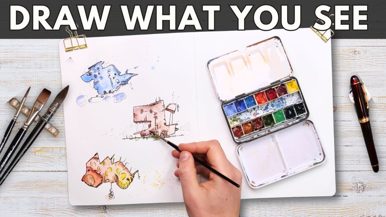
2. Supplies: Do you need to take
part in this class? Well, not a lot is the answer, but you could use an
awful lot if you wanted. The most important thing is
going to be just a bit of curiosity and a willingness
to try things out. If you do that, you'll be
able to pick up any pen, any paper and get an awful
lot out of this class. What I recommend would be some sketching paper or
some watercolor paper. That's paper which
is slightly thicker than your standard letter
paper, for example. Then some pen with
waterproof ink. I like using fine liners because they're normally
archival or waterproof, but I also love my
fountain pen though you do need specialist waterproof
fantam pen ink for that. The next level is to
add a bit of color. Now, this could be
with anything again. My favorite thing to apply
color is watercolors. It's a simple pan of colors and a couple of brushes
and you're good to go. But equally using
watercolor pencils, which I'll show you a little
bit of later in this class, or alcohol markers or other marker pens would
be more than adequate. In fact, they'd be
great for this class. The key is don't feel stuck not taking part because you don't have exactly
what I'm using. That is not the
point of this class. The point of this class is
to show you how you can apply ideas to sketches to
get yourself sketching more.
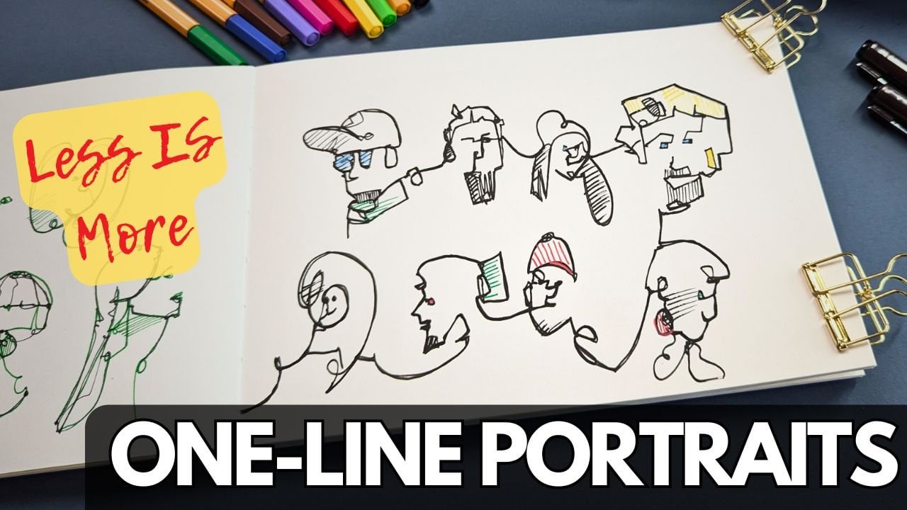
3. Fundamental ideas: Thing about doodles is
that they are instantly recognizable despite
being incredibly simple. That can make us feel foolish if we can't do these
very simple things. But it actually does involve
a little bit of thinking. Being simple is actually
being quite clever. But being clever is actually
quite easy if you know how and that is what
this video is all about. But first, of course, we're going to start
with a little game. For this game, I'm just
going to move over to my new high tech TV area. On this screen which
definitely exists just here, what I'm going to do is
flash up some shapes. The shapes are going to
build up into a thing. The rules of this game
are basically you get, if you guess the thing before I finished building
up my shapes, you get one golden thumbs up, which is the highest honor,
I can only assure you. Let's start by building
up some shapes. First on our wall, we seem
to have some rectangle, little triangle almost
building up in some pyramid. Do we know what's going on yet? There's some shapes
coming towards us now, a little arch underneath. Interesting. Have you got it? It is, of course,
the Eiffel Tower. Now, I suspect many
of you got this and if you didn't get it,
of course, don't worry. These things will be easy for some people and
less so for others. I guess what I want
to test out now is if something more
complex is guessable. Here we have lots of shapes stacking up and
then moving along, almost like sails,
little triangles. By now, you might
be getting this one too and it is, of course. Sydney Opera House.
It's another one which is pretty
recognizable. Don't worry. We're going to look
in a moment at why these are or are not recognizable and ways to make our doodles more
easy to recognize. Now, this one seems
simple, doesn't it? Rectangle, square, square.
But it's a bit generic. Maybe we need something extra. Something to really pinpoint it. What do we have here?
Why, it's a clock. So of course, I live in Britain. Maybe we can work out
that I'm probably doing. Big Ben. Big Ben in the heart
of London, Westminster. Very recognizable, at least
if you live in the UK. Now let's do one more. This one's going to be a
little bit more challenging. What do we have here? I'm not going to
build up the shapes, I'm just showing you altogether. It's actually quite difficult to recognize until you know what it is, and
then it's obvious. But why is this one
so much harder? It is, of course,
the Tanja Mahal, but we're looking from the side. Obvious
when you know it. Now the question that we've
got to answer then is what in all that is
sketchy is going on here? So let's break out our
sketchbooks and we'll do some doodling and work out the principles that
underpin all of this. Now, what we'll do is
we'll work through those same famous
scenes or a couple of them and see if we can sketch them in a way that
makes it work and make sense. The first one we've got
is the Eifel tower, and I'm starting
out with my pencil. I'm being very rough and quick. If this was ink, it
would be very messy and scribbly. We know what it is. But if we do some bolder lines, I would argue it's a lot
more obvious what it is, even though the bolder
lines are much more simple, there's much less of them. That leads us to the question, why, what is going on here? I want to present to
you the ideas here. Of economy and clarity of line. We have clear and simple shapes, and then we have
economy of line. We haven't got tons of
extra lines which are just getting in the way of the
economy of that drawing. That doesn't mean
later on we can't add textures and
interest and things. But if we're looking for
the essence of something, we just want the essence of it. We want that most simple shape, the least thing we can do, which still looks like the thing and that will be very effective. Now, let's do our
big been again. Here we can very quickly build
up our very simple shapes. But again, it's
all a bit generic. Now, if we add the right detail, it goes from being any
old church tower to a giant clock because Big Ben is a very well
known giant clock. Suddenly, our giant clock
could well be Big Ben. What we're now looking at is not just the clarity of line, but also picking out
the right details. We've got economy of line, but adding enough. That
we know what it is. Then let's move on
to the Taj Mahal. Here, we took this scene and we sketched it
from this angle. Actually, it's quite a
difficult sketch, isn't it? There's all sorts of
perspective going on, and we'll get to
perspective with one of the future lessons
in this course, because it's really interesting how we can play with this. But it's not the fact that
it's a difficult sketch that makes it harder
to recognize. It is simply that we're
viewing it from a weird place, not a weird place, but
a different place. What happens if we go
to the normal view? If we just flatten it out, we get that view,
everyone knows. Well, I bet you all would have
recognized this like that. So understanding our
viewpoint is also going to be key in making
it easy to sketch, but also easy to recognize, or you can make it a more
challenging viewpoint, which will make it potentially harder on both of those fronts, but maybe more interesting. There's no rules here.
These are all just ideas to play with and experiment with in the realms
of experimentation. I know that this is doodling your city and doing
urban sketches. But what we will call this
scene is a neolithic city. But it does nonetheless demonstrate a lot of
these principles. How come we can recognize
exactly where this is by drawing three rocks
and a little bit of grass? If you think about why,
it's because this is a well known thing
with clear shapes, little bit of detail showing
it's outside in the grass, just explains what's going on, and we've chosen a
classic viewpoint. Suddenly we have a
very recognizable theme with nothing going on, it's so simple these
same principles can then be taken to
more generic things. We can draw a bus
with simple shapes. It can even be a
bit cartoony and a bit quirky and
it's still a bus. If we make it clear and simple and we pick
the right details, we can draw a dog
with simple shapes. As long as we stick to
those simple ideas, it will look like a dog. We don't have to just do our doodle sketching
of famous things. We can do our doodle sketching of I was going to say
infamous things there. But what I mean is
unfamous things. Things which perhaps
mean something to us or we just think
are quite pretty. We can just simplify them using these key principles that we've talked about
in this video. Your first task just
fill a page like I have. Take a couple of famous things. Google, Eiffel Tower
and you can find your Eiffel Tower image and see how simple
you can make it. Then take a couple of
things which means something to you, your dog, your husband, your breakfast, and see if you can do
exactly the same thing. That is the start, the essence of a good doodle.
4. Playful perspective: So perspective perspective
is a mind bender. It involves the ideas of
making something three D in front of us appear
three D on a flat page. Whilst it's very achievable, it takes a lot of thinking. But my question is,
can't we just doodle? Can't we just make do
and have a bit of fun? I want to show you that you
can play with perspective. In doing so, you'll
probably learn a lot about perspective, but
in the meantime, you can still create
really good lovely doodles which work and look like you're sne and you can have fun with and you can fill up
your sketchbook with. Now, as a very brief
thing about perspective, I don't want to go
into it really at all, but I want to let
you know that there are concepts like
the Horizon line, which we'll touch on when
we talk about people. There are concepts
like vanishing points, which explain where all the
lines of perspective go. One of the things you might
see people doing to practice perspective a lot is
drawing tons of boxes. That's one method people
use to learn perspective. I don't personally
find that useful. That's not saying
it isn't useful, but I prefer to observe
my perspective and just get the lines about
right and see what happens. But we can play with
it further than that. We don't have to actually observe it and get
it exactly right. Let's therefore try ignoring perspective and see
if it's viable. For that, we have this
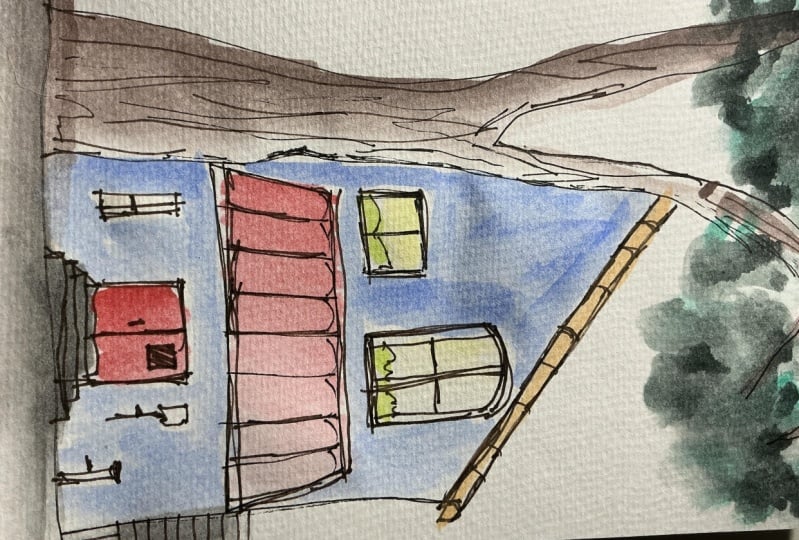
interesting scene from Belgium. Now, take a look
at all the roofs. They're all triangles,
but none of the sides are the same size
as each other in the picture. That's because we're
viewing it from an angle, so perspective has come
and warped everything. But what I'm going to
do and what I would love you to do is
take this photo and imagine that we could
twist it round and we're actually looking at
it, full on, straight on. Then all those
triangles are just nice and simple, triangles. In doing this invention,
we'll get it a bit wrong. But so what? We can
do, we can invent, we can keep it simple and it will still
look like the scene. I'm going to start by building up all those
middle triangles, one on the other, just imagining
how they probably look. If I was 50 meters to the
left taking this photo, then my viewpoint, the whole
scene would look different. It might look exactly like this. I'll then add in a
few of my windows, little details, and we can pick out some of
the other key things. We've got this AwsonTwer
which could be big Ben until we add the right details which make it this tower
instead of Big Ben. And then we can just pick a few other little bits
around the scene and finally, just make some of these
lines a little bolder, adding that clarity of line, the crispness of the shape with a simple scene
working well. Hopefully, we can agree that already this scene
looks like the scene. It isn't in perspective. It's not got all
those funky angles. It's nice and simple. All the verticals are vertical, all the horizontal
lines are horizontal, everything's nice
and 90 degrees. That is the essence
of simplifying perspective, then
we can get playful. Build in some lovely
textures in the water, doodle in some ducks, simple shapes, again,
just having a bit of fun. Maybe we can add some contrast, black in some of the windows,
make it interesting. We take our simple shapes
our clarity of line, our economy of line. And we make it into
something a lot more interesting.
What's the keys here? What are the key
things that we did to simplify this and to
basically ignore perspective? Well, we simplified it. We kept all the vertical
lines vertical, so they go straight up the page. No bending a little bit
of wobble for character, but basically vertical,
they're not leaning. Then all the angles, which we might expect to be
90 degrees are at 90 degrees. All the horizontal
lines stay horizontal, the verticals are vertical. It doesn't literally mean
everything's 90 degrees, these triangles sitting on top, they're never going
to be 90 degrees. But all the walls are 90
degrees, all the doors, all the windows,
nice and simple. Like that, we can make it a quirky fun doodle scene,
changing the perspective. Now, there's always an or or we could do something
different, couldn't we? As an example, this is actually church from St.
Nots in my hometown, where I often sit in this beautiful part of my
town and I can sketch it. It peeks out above these trees and we could explore
any different viewpoint, it will look a bit different. The closer we get, it
will look different. If we move to the right to left, it will look different
and we can be playful. Why do the lines
have to be straight? We can exaggerate, we
can bend perspective, we can warp perspective, bring up those vertical
lines and make them squeeze in in the middle. It's silly. That's fine. It adds character, it's fun, it's making it stylized. And we're allowed to do it. It's doodle. Have a go at these
ideas as well. Just see what happens if
instead of totally simplifying, you ignore the rules. The principle here is
perspective is fluid. Perspective is describing
one single viewpoint of an object in a world
where we could be anywhere. There are infinite
viewpoints and the object could look
in infinite ways. I'll put both of these
references up and you can use these if you would like to join in and see what you
can do to these scenes. Or again, choose
something near you. A couple of churches nearby
perhaps or a quirky pu, even your own house and just
see what you can do sitting, taking a photo with perspective, and then changing it.
5. People: Next up in our series of
things to doodle, are people. I want to open by
just showing you this quirky little
sketch I did of me, my wife, and my mum. This was from a photo where
we taken my mum out for a birthday lunch at a very
lovely and fancy restaurant. My question to you
with this here, is well, firstly, do you
think it's interesting? Perhaps, do you even like it? Finally, does it look like
me on the doodle level, but is it a perfect
oil painting likeness on the next level, if you like. Hopefully, the answers to these questions are,
yes, it's interesting. If you like it or not,
well, that's fine. That's a very personal
subjective thing. I think it looks like us, but it's definitely not
a perfect likeness. It's a doodle likeness using the same ideas we've talked about in the last two lessons. So people are no different. People are still dood
Ddable subjects. Now, the rest of this lesson, I actually want to
talk mostly about how to put people into
a doodle scene. If we're doodling our
city, doodling our town, we probably got people somewhere over there. Away from us. We're not really
making them the focus, but they add an awful lot
to our scene, don't they? They add life, they add
interest, they add verb. Now, to bring us back
to the first lesson, we had the idea of clarity of shape and people are shapes. We can draw very
simple namable shapes, triangle, circles, squares. They are shapes.
We can also find shapes that we can't
name or we could name, but they're not geometric. We could say a kidney bean. That's a shape which
we can replicate. Could also be a triangle
with its nose cut off, which has probably got a name, but not one that I can
immediately think of. But I can put that in my head
and draw it on the page. Now the thing about
these they're all simple shapes and if we connect
them up, we get people. And what we're looking to do is experiment with
these different shapes. Both shapes we can
see in our scenes to bring people together to
make them exist on our page, but also shapes which work
for you and your style. I have a certain style
which I'll show you shortly of how I draw people, and
that's what works for me. It helps me both
reflect me on the page, me and my style, but also the scene I'm trying
to get on the page, it gets the right
essence for me. On the page. There's
a first simple task. Try mixing and matching simple
shapes and quirky shapes, maybe find some photos on
your phone of people and make them tiny little things on your page and just
see how that works. Then we'll move on
to the next idea. I've called these rules, which
is very unfair, isn't it? There's no real rules in
art, but there are rules. There are things
which generally work. So here, one of the key things about getting a scene is that the heads will
all be on a line. This is what I
said, we'll mention the horizon line just briefly. The horizon line is our
eye level in the scene. It goes out all the way across the scene as long
as the scene is flat, and there are a few
other things about it. But the basic principle
is that in that line, everything which
is at head level, so people's heads will
be at head level. The tops of doorways
will be at head levels, some windows will
be at head level. They will all be on a flat line all the
way through our scene. They won't dibble
and dabble around. Hopefully you can get from these doodles I'm
doing now these ideas. As people go back in the scene, their heads are
still on the line. It's just that their feet
get lower and lower as they come towards us because
they're getting bigger because they are
closer to us in our vision. In this scene, you can see,
if I put my pen on my phone, all the heads line
up with my pen. That is because this
is a flat scene, everyone's heads are on that line except the
people sitting down because their heads are below the horizon line because they
are lower than head level. They're not stood up. This is a fun scene. Tons
of people in it. To practice, picking
out simple shapes, picking out key details, making sure we don't scribble. That's the economy of line, and picking out those things which make someone recognizable. Their hairstyle, a rucksack, what their hands are doing. We don't need more
than that and we have our doodle people
building up on our page. Again, I'll leave
you this reference. And have a go or feel free to have a go
at your reference. A few people around a campfire, people walking down the street. Sit in a cafe and just draw from life and
see what happens. The big advantage of learning
to doodle people like this from simple shapes is if
you are outside sketching, you can capture people on the move because you can get the essence of
them by observing, putting into your visual memory the simple shapes which make up that person and getting them on your page in
just a few seconds. That's the art of doodling, the art of sketching.
6. Colours but easy: Now in the scenes we do later, I'm going to use
ink watercolors, which are my favorite
combination really, where we do some ink lines, we splash on some
simple watercolors. Now, to get in the mood and to understand how
simple our colors can be, I've got a little
exercise for you. What I'm going to be doing
is experimenting with one scene and taking
different segments out of it. This is the idea of number one experimenting with
telling your story. If you're out and about,
you'll have the whole world. You have to choose
your your little bit to tell your story
telling your story also comes into one of our
future lessons where we look at how we build up a
page telling our story. But for this one, we'll
take little segments, do little drawings, and
do really simple colors. I'm going to be using
watercolor pencils. Now, if you don't have
watercolor pencils, then you can do a similar
thing with watercolors. You do an ink drawing when
I'm doing a pencil drawing. And then splash on
some colors when I add water or you could
use soluble ink. A normal fountain
pen would often have soluble ink as with
many rollable pens. Or I'm sure you can get
creative with other ideas, crayons and things like that. Now, here, all I'm
doing is using different color of pens to leech time and
drawing our scene. So it's very much like the line work we've been doing so far. Nothing clover, nothing fancy. I'm picking a different
bit each time, because that tells
a different story, it just gives us something
else to focus on. We could do the whole scene. But we can also pick and
choose the bits we want to. That's a pretty valuable
learning point, I think. My choices of colors are
Random, or semi random. I pick colors I liked. But I didn't put much more
thought into it than that. You might also notice I've done a range of in our first
couple of scenes, getting some of those angles in. Then in our final scene, I made it very straight on. I ignored perspective. If you're joining in with me, don't forget to play
the game yourself, play and have fun
with the perspective. Now, the magic is what
happens when we add water. This is simulating what will happen when we add watercolors. All we need the water to do
is activate a little bit of that watercolor pencil to
create the sense of shadow, to create the sense
of some color and to create
variation on the page. What we don't need to
make these interesting is to spend hours and hours making sure there's
color everywhere. Making sure there's
loads of colors. We've got one color for our top two scenes and two
colors for our bottom scene. Yet they're quite cool, or
at least I really like them. Hopefully, like before,
you find them interesting, even if you don't
like them to look at. Lastly, we can actually
do a similar idea with our watercolors. I'm using a size
four brush here. I'm drawing with a
couple of colors, and it works quite
well as an idea. If you don't have
watercolor pencils, you could just do all
of yours like this. What's interesting to me is because I have so
many more choices, I immediately got a little
bit fuzzy with this one, a little bit anxious, started
trying to do too much. I wasn't quite sure of
how to best simplify. That shows in, I
think the quality of what it looks like
when it's finished. Although it's not overdone, it's more overdone
than the others. Just an interesting observation. I think when we come to think
about improving ourselves, recognizing how you're feeling
when you're sketching, as well as the outcome
of how you feel about whatever you sketched
is really important. Useful for me to recognize. I got a bit overwhelmed there. I wonder if that's the case for other people if
you copy my ideas, if you do three
really simple ones and you build into
something more complex. Anyway, have a go
at these ideas, a simple line drawing, very simple colors and see how that adds another
level. To our doodles.
7. Telling your story: And now onto the best
bit telling our story. Here we have the idea of getting onto the page
what's important to us. I want to split this
into two parts. One is what makes art. If I dive into this sketch, you'll notice and you might have noticed in the last
couple of things, I join all the lines up, do it as a bit of
a continuous line. It might break the
line a few times, but I do a lot of
joined up lines. That's part of me. That's
what I enjoy doing. That makes a lot of my
art look like my art. It's worth thinking,
what do you enjoy? When you're doodling,
the point of doodling, I would argue, is to
have a bit of fun, Waste a bit of
time in a positive creative way instead
of stressing or instead of doomscrolling on TikTok or things like that. But to do that and for it to be positive,
you got to enjoy it. I enjoy continuous
lines, so I do them. Put a bit of thought
into that for yourself. What do you enjoy
and do more of it? Doodling is a perfect perfect
way to get into that. Now, the other thing is about what do you
find interesting? What is it that has compelled
you to draw this scene? One of the first steps in that is understanding you're
allowed to make changes. If we look at this reference
from this chart I'm drawing, we'll notice there's
a lot of ironwork. As I don't care. It's not interesting to me. In fact, I do care because I don't want it there in my scene. So I didn't put it in, cut it out, remove it. Ignore it. These
edits are great. They're absolutely
fine. Simplify things, add things in, change things,
play with the perspective. That is all part of
you and your story. Why do you find
this interesting? Make the most of
it. Our memories will often help if
we're inventing things because we can just
take simple ideas from other buildings
and put them in those spaces if we
need to fill in a space because there's
something we've removed. The other thing is
just to be consistent. If you have one window here, do the same window over here. It's a doodle. It's supposed
to be easy to understand. Consistency in the shapes will make the doodle more effective, more freeing, you won't
have to think so much, so you'll be able to
relax a whole lot more. Now the next part of
telling your story is literally perhaps
telling your story. I started my sketchbook
page down in one corner drawing Stonehenge.
Why did I do that? Because these two
pages are going to be the story of me and Tash, my wife and Betty, my dogs
first trip in our campavan. In that, we drove
down to Cornwall, which is in the
southwest of England, very much on the coast,
warm and lovely bit, we drove past Stonehenge,
why not pop it in. We've already drawn it once
and I really like drawing it. Then I picked scenes and
things we saw there, quirky little villages,
lovely farms, which are out in the
Somerset countryside as we stopped overnight. A seagull who stole my chips. Got to get some chips when
you're down in Cornwall. It's one of the rules
about going there. But yeah, mine was stolen, that is certainly a part of
my story of being there. I picked out an Abby, but I didn't draw
the whole Abbey. I'll just draw the very top of it because that's
a bit I thought was interesting and it would
fit in my little page. Then there's our Camper
van, there's Betty. There's me, and
most importantly, there is a pot of coffee cooking up a storm on our Campa van Hb. And altogether, I like this
page, all these pages. This is my story.
These are my memories. Some of them from memory. Some of them from photos I grabbed up on my phone as I
was filling out these pages, and all very simple doodles. The kind of thing I
could do sat on a bus, sat in the park or in front
of the TV with the TV off. Your next challenge
is to have a go, do some simple doodles, tell
your story. Fill up a page. If it's just one
doodle, that's great. Your story might just be
one doodle and it might be the little bits that you
choose to add or remove.
8. Doodle sketching scenes: Aim of this lesson is to doodle sketch some scenes and
to give you the confidence that you can really
fill a sketchbook with whatever you want
and have fun doing it. Here, for example, a range of different scenes are captured
a few of them in my studio, and some of them Planair. Some of them captured
at the seaside and others looking in a mirror
and doing a self portrait. These ideas, doodle
sketching your city, doodle sketching your
town, your life, your environment
is what lets you absolutely fill up
that sketchbook and have a lot of fun doing it. I'd also, as a little side note, encourage you to
be brave and take these ideas outside
when I sketch outside, like here in one of the little villages near Cambridge in the
east of England. But when I take these ideas outside, I don't
change anything. I do the same processes, whether I'm sat down
in a little field, perched on a roadside just to really quickly
capture some linework. The ability to think of your sketching as doodle
sketching as something not scary really lets you the most of those little moments of peace that you
can find in the day. So back to the studio. Now, this is a
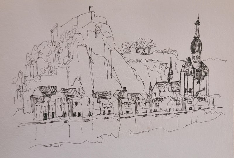
scene from Belgium. It's a remarkable scene,
as well, isn't it? And it looks very scary. It's called Citadel de Dante. But we're going to
make it our own. We're going to make it. Easy. And the
reference for this is, as ever in the class resources.
So do have a go at this. Even if it looks scary, just remember the principles that we've been working towards. So for me, step one,
what am I doing? I'm doing my continuous
line because that, as I talked about previously, is what I enjoy and
is what makes my art. And I'm looking for
really simple shapes. So finding this
interesting citadel, but turning it into a kind of a cube with a triangle circle. And that's all I
need it to be for me to feel happy that I've got this version
of the scene down. We've got some perspective
in this scene. So I'm going to gently
slope my lines, not thinking about perspective, just thinking about what I see. I see the curve of how this kind of bottom line of the houses of the buildings
goes along the page. And I capture that
instead of trying to think of horizon lines
and vanishing points. If it's right, it's
right and if it's wrong, it's wrong, and if
it's fun, it's fun. So that's what I'm focusing on. Do my version. Then we've got things we haven't
really done yet in this. We've got the kind
of natural sort of formations, this big cliff. But look at it. It's a triangle, just a triangle with
a bit of texture. So that's how I focus on it. Put the clear edge
of a triangle in, and then also look at all
the mini shapes within it, these kind of cracks, which show that it's a
nice vertical surface. Got loads of trees behind it. What are they, if not, Bumble little circles with
little sticks. I mean, I could call it a
lollipop shape, couldn't I? But I'm just doodling what I think makes a good
version of this scene, doodling it to, you know, make it feel about right, not perfect, but make
it feel about right. Coming along, I
felt like I should bring out some of these
roofs a little more. That's exactly what I did,
repeating that shape. And that's something
we talked about before as well, being consistent. It's very hard to pick
out all the windows and all the roofs and all the
small shapes in this scene. We kind of know
they're there, and as long as we're consistent, the viewer will understand
what they're supposed to be. If I made all the windows
different heights and different sizes and
different shapes, it would get very confusing. So I kept it really simple,
same with the roofs. And then it's about
just working out, Why don't we have that clarity? Where do we want to bring out the clarity of shape
a little bit more? That helps it feel like a
more economical, simple line. So doing some bolder
lines just to make that work and adding a few bits of shadow
and things like that. Are all little scratchy bits of hatching and more textures, things which just provide
a tiny bit more detail. We're then into kind of
making it a bit of fun, like we did before in one
of our previous scenes, which is also from Belgium, adding some textures
into the water, for example, and then
finishing it off. By just remembering, there's actually a bit of
background to the citadel, and it's amazing
how easy it is to forget these kind of
things, isn't it? We can get so focused on our little bit that
we forget something really obvious that we've not yet got to. I think that's it. This is a doodle, so don't
spend too long on it. Keep it really simple and
just try and do less, and you'll be amazed
at what happens. The same is going to be really
important in our colors. So I'm using watercolors. I'm using a half
inch flat brush, and I'm looking and
thinking, right. What's the effect
that I'm after? We've got these
various colors going through the buildings. But
do I need all of them? Or can I just get the feeling of them by letting my
colors do just enough. Lots of water, simple
bright colors, picking out these ideas of
lots of different yellows, almost pinks, reds and other
things going on like that. It's really tempting, isn't it? To keep going and keep
going and keep going. But I'm going to encourage you for the purposes
of this class to do just enough and then put your brush
down and just move on. And that's exactly
what I'm gonna do. I think this is just enough, and we'll get out
another funky scene. Now, this one is from
the Isle of Wight. And it's a pretty standard feeling British town
scene, isn't it? But there's also an awful
lot going on in there. So I'm going to
remember my principles. What do I find interesting? Well, this church. Can I see all the details
in this church? No, so I'll keep
it really simple. Also, if I wanted to
invent some stuff, it looks a bit
like all the other churches I've shown you today, so I could just invent things
from my memories of those. Then as we come sort of forward towards us in the scene,
it's quite confusing. Even if we look at the photo, it's quite confusing to work
out exactly what's a roof, what's a window,
what's, you know, all these other bits of buildings just
getting in the way. So I remember I got flustered in one of my
previous scenes, didn't I? Sew. I need to just
take it gently, really simplify
it, and just draw those simple shapes
that I can see. And then it will either
work or it won't if I've kept it simple,
it'll probably work. So I'm finding what I can see isn't the roofs very easily, but it's the kind
of shop fronts, the bits of the
building facing us. I'll start with
those. Then I like these sort of the line of that pavement,
so I add that in. And then we've got this
really obvious silhouette, so we can add that in. I have drawn a couple of the roofs in the
middle of all of this. I quite like what they're
doing, but they're not perfect. And I think if I try and
correct them too much, they'll be losing that
clarity of shape, losing that economy of line. So instead, I'm going to think about those little details which make this
scene, this scene. That's all these funny
windows stacking up. It's the chimneys going
back into the distance. And it's also the bits I
can see that are working. So I'm going to improve
the clarity of line and make those lines feel
more economical again. A little bit of an increase in the weight of the line just
by going over them gently. We don't want to
do this too much because it will become scribbly, which is what we're
trying to avoid. But we can do it just
enough and then move on. I also really like
this lamppost. I've moved it over a little bit and made it a feature
of the scene. Again, these are the things which you may or may not enjoy. If you enjoy them, though,
just experiment with ways that you can
take the bits that you enjoy about sketching, about looking at the world
and pop them into your scene. Something we haven't
talked a huge amount about in this class is hatching. But here I'm using
it again, like in the last scene to kind
of simplify areas. And like that, we've got
plenty of our doodly ink. I've got my feel on the page
with that continuous line, and it's time to do just
enough with our colors. I love the kind of pink which is glowing
through this scene. So that's what I'm trying
to make something of. Yeah. Letting the colors flow around, move
around a little bit, and we end up with not
doing a huge amount, but getting the scene to kind of glow and feel interesting, which is what I found interesting about the
scene in the first place. Now, that brings
us to a question. What's the best thing
about a sketchbook? Well, it's not static. We don't sort of just do it, leave it, and never
look at it again. And we can use that
to remember that we can do less because like now, we can always come back
and do a bit more later. So here we can see
as watercolors do, they dry a little bit flatter, a little bit less opaque, a little bit less impressive. So I can come back to my scenes and using
a smaller brush, add some more intense colors. I can pick out the
bits which are working and continue to
sort of tell my story, adapting to whatever happened
with my loose approach to the colors and just making
a little bit more mine, a little bit more of
my fun on the page. Take this opportunity, as well, go make yourself
a cup of coffee, have a relax for a few
minutes, go for a walk, and then come back, having done very little
in the first part, and do a little bit more now. To finish, I might like
to add a bit of text. Here, I've just written
scenes from somewhere. When I wrote it, it
felt very poetic, but maybe it's a bit trite, but you might sketch something important to
you and write something important to you or a couple of learning points from your
sketch, for example.
9. Framing and composition: As part of this class,
I asked you guys on Skillshare for some
questions to tackle. And the first question we
have is from Nita who says, What about deciding what to include and not in
terms of framing? I can see so much more
than will fit on my paper. And to tackle this, let's take this challenging, broad scene with loads
and loads going on. Now, how do we decide
what to actually include? Well, one option, and I think my favorite option is just to
try some small thumbnails. We've experimented with
doing little thumbnails, little parts of a scene. And this is how I would suggest if you're ever not
sure about your composition, just go for it on a small
scrap of paper or on a sort of part of your
sketchbook where you're just going to experiment
and see what happens. So here I'm doing my thing, my story, my style with
a continuous line. We're seeing what happens
and how it feels at the end. We discover little bits that we just might not have
seen and we also end up leaving things out that then we can recognize
are a bit unimportant. No, it's not the most scientific
answer to that question, but it's a good starting point. There are, of course, some
other ideas we can try. So we're going to
cover those as well as answering a couple of
other questions on the way. Janet says, how
do I know what to include in my sketch and
what level of detail? Well, just as a little
aside here, example, I looked over this side of
the image and I thought, I don't really like that very
much. So I've cut it out. So one part of what to include and not is what
do you find interesting? I find these houses in the
middle quite interesting. So perhaps if we just
zoom in on that, that's all I need to include, and that will also
help inform my frame. What is actually
interesting and what do I not want in my scene at all. Here a really, really
small thumbnail, and I can see how that
feels as a composition. And what we get is the
idea that it's alright, but it needs something extra. And for me, that
something extra I refer to as a framing element. So if I make this tree a
little bit bolder on the edge, hopefully, you can
see what I mean. This frame, this sort of
asymmetric object which sits on the side of our scene pushes in and it feels like
a framing element. It feels like the
end of the scene. And I always try and include
something like this, something like a framing
element in all of my scenes. And very often, that
will be a tree, could be a house, it could be a river, and it could be a literal frame that you draw around your scene, just finish off the composition. Now, with that in mind, let's just try another
version of our scene. So here we're thinking again,
what should we include? What shouldn't we include? What should we think about
in the level of detail? How do we make our
composition work? And in all of this, basically, what I'm going to say
is just try things out. Again, I can stick with my
reliable framing element. I think that really does
sell a composition. But other than that,
exploring, finding out, trying things out and
looking and saying, when you've done your
thumbnails, which is best? There's no right
answer, but there might be a right answer for
you in your style, and you'll only find it out
for a bit of experimentation.
10. Imagination and memory: So we don't always
want to sketch from a traditional
reference photo at home. And Deb has asked this question. What about sketching
imaginary places for times you can't go anywhere? Would this class work?
And I would say, yes. I'll show you three different
solutions for sketching from home when you're
not just using a photo from your
phone as an example. And the first two are indeed
sketching imaginary places. Because the ideas here are
actually exactly what I do use to doodle sketch
from my imagination. If I'm sat in front of the TV, sat on a bus, then
what do we do? Well, we focus on clarity of line and simple shapes,
quirky perspective. And you can kind of just
build up an idea of a scene. It's important to take your time and also the first
few times you do it, it will be more difficult
than after you've done it a few times
and gained confidence. When we're sketching
from imagination, as well, it's important to
recognize that actually, a lot of this isn't
really imagination rather than connecting the dots, connecting the lines
between previous ideas. We're not inventing
a totally new type of human civilization
on our page. Putting ideas we
have in our memory, in our visual memory, in our sort of past sketching
experience onto the page. Perhaps there's a new
set of connections, a new way of
interpreting the whole. But most of us,
most of the time, if we're sketching
from our imagination, are really sketching from combined memories
and experience. That said, to make this easier, I find it really important
to follow my process. So first, I did light and loose lines getting
those shapes. Then I'm adding a bit of boldness to the shapes
which are working. That lets me be flexible. If my shapes went wrong
at the beginning, I can correct them now with
a slightly bolder line. And that I think is really
valuable when you're doing something a bit different
for the first time perhaps, or even just something
that I personally find a bit more challenging sketching from nothing on a
totally blank page. And that neatly cunningly leads us on to our next
option, making a splash. So here, what I'm going to do is wet my page
with a big brush, I'm just dabbing
a bit of water on then into that water,
we had some pigment. Here I'm using some acrylic ink, but we could use
other kinds of ink, India ink or just good old,
beautiful watercolors. The point here is not
to be too intentional, so I'm just splattering around, not making it too rich, not doing too much, and then we wait a few minutes
to let it dry. When it's dried, we come
back and we respond. So we look, see
what has happened, find the edges of that splash. And within that, we
might find houses. We might find trees.
We might find people. This has got endless
possibilities, and where one person here, I'm purposely trying to build up an urban scene. But
look at that shape. Could it have been
a dragon's snout, even as I draw
these windows here? I almost looks like a
dragon's eye, doesn't it? Maybe? Maybe that's what
I should have drawn. But all we're doing
is responding, playing around, seeing
what happens if we again, use ideas from our experiences, our memories, but
in a playful way, connecting the
dots in a new way. We can expand beyond the splash. I'm going to add a litt
church tower above my splash. But we're being triggered,
being initiated, being started, and kept going by having something
on our page already. So again, I like this as a really relaxing way to sketch from my imagination
and sketch at home. Equally, you can take
these splashes outside. So here we have an example where I've made
a couple of splashes, and I've actually gone
outside, gone into my town to one of my
favorite sketching spots. And I'm building up my ink
on top of these splashes around these splashes and
finding a scene which is real. And it's really
relaxing way to do it. So you can use these
ideas inside and outside from your imagination or
blending the two together. And what a lovely
place to sit at day. What a lovely thing to do
just to use your imagination, your creativity in a
slightly different way, but still doing the same
kind of thing we enjoy. Now, next, final option, not for your imagination, but you can take a virtual walk. Now, this might be scrolling through some photos
of a favorite place. Finding here, I've got
some drone footage of some allotments
very near my house. That would be quite a
fun sketch, wouldn't it? But it's not a literal walk. I haven't literally
left the house. Or we go on Google street view. So here I am going to drop
myself into Trafalgar Square. Now, the first view we
get there pretty rubbish. Overcast, weird,
trucks everywhere. Oh, great. And now
trying to find somewhere good to sketch from bit like we're
walking around. This bus is in our way, so let's get out of
the way of that. And here, look at this. That is a good view. So now I can do some urban
sketching from home, having literally just found
a nicely framed view. You can turn around. We get another really
interesting famous view. So there you go.
Yet another way to sketch from home
using the same ideas.
11. Still lifes and social scenes: In this lesson, we're going
to cunningly link still life and awkward social
situations together because Aisha's asked a
very good question do you have polite
strategies for extricating yourself
from conversations when people want to talk to you about what you're sketching? Whilst we have this
question from Sharon, how do you set up
a still life from sort of mundane
household objects? Well, we're going to
start with that second question and move
on to the first. So, tips for still life. So the first thing is that, yes, mundane household objects are great sketching
opportunities. Often I'll pick something
important to me like my coffee making apparatus, perhaps a bunch of flowers, but usually connected
by a theme. Here, we have coffee things. But we also want to consider
physical connection, not just sort of
meaningful connection. Notice here, we have a
gap. They're not touching. So if we draw our shapes, they won't be
touching on our page. But what we want is a bit
of overlap because then we start to get relationships
between our objects. And relationships allow
us to start to explore shadow to start to explore
and move things around. It just leaves the page feeling
less empty, less bland. Next, we want depth and height. So we have objects at different distances
from us in the scene. If we achieve these
simple ideas, we've got a scene with depth, we've got a scene with lots of connected objects, it will work. But you can also play
with complex objects. Here, actually, what
I'm going to sketch, are my headphones because the headphones themselves have lots of overlapping shapes. You could actually argue if you put them on a
table in front of you, they even have depth, and there's lots of shadows
and there's lots of textures. So, as well as doing still live, setting them up, and spending
time arranging them, you could also just
pick a couple of rather more complex
objects and see what happens if you draw those and fill up a page with
lots of different objects, lots of different doodles, a bit like we did in some
of the previous lessons. Here, the focus, again,
is simple shapes. I'm doing my continuous line, which makes it feel a
little more energetic, a little bit more chaotic, dare I say, but hopefully
picking out the right details, and they're getting
enough clarity to make it sort of feel
like what they are. Now, with these bold
lines and hatching, we can explore the shadows. This is a lot of what creates
the depth of the scene. It's the shadows
which make an object three D and even connect
an object to a surface. So through explaining
the shadows that the object is
casting on that surface. What we can see just here. So suddenly the objects
are no longer floating. We can also add lines
into the surface. So here I'm actually drawing my sketchbook and the clip
holding my sketchbook, which again, shows that the
headphones are not floating. And that's an important part
of generating a still life. Having some kind
of horizontal line running through the
scene just shows that the sort of context of your still life isn't
magically floating. It also gives you sort of fun to experiment adding just little
bits of the background. So here, I'm trying to be
very meta, very next level, and I'm drawing the
drawings of what are in my sketchbook on the drawing of my sketchbook, which
is very confusing. But I think quite fun. I sort of feel like it's
working quite well here. You can get the
idea that this is a sketchbook full of
different drawings, different doodles with
my headphones out on it. And again, approached in a very similar way to
our urban doodles. Now, how are we possibly linking those headphones and still life to awkward social situations? Well, if you're
anything like me, you quite enjoy
scenes like this. This is a famous village, Lowes Slaughter,
in the Cotswood. But I'm here really
early in the winter. So it's empty. And so we can just be
ourselves and sketch. But very often, there's
a lot of life and fun to be gained from being
around people, as well. And very often, the really interesting scenes have
got a lot of people suddenly the accessible
interesting scenes or the famous ones like
our Eiffel Tower. And that means instead of being sat in the quiet with
no one to disturb you, you'll have people
walking in front blocking your view or even
chatting to you. Now, the first thing, I
think is a challenge when we get spoken to when
people approach us is a confidence issue. We don't feel like an artist, but I would argue
you're all artists. You're someone who
sketches, who draws, who interprets the world and creates their
experience on a page. So you are an
artist, and you have the right to feel that
way about yourself. Even with all the confidence
in the world, though, sometimes we just don't
want to be disturbed, and this is where a big pair of headphones comes in handy. Nothing says, I can't hear you. If you talk to me,
I won't respond, but I'm not being impolite, like a big pair of headphones. Now, sometimes people will
still try to talk to you. And if that's the case, and I really don't
want to be disturbed, I'll just say, thank you. Really kind of you
and look back down at my page and hope that they
understand what I'm saying.
12. Final thoughts: Thank you so much
for joining in. That is the end of this class. What I would love
you to do though, is not end your sketching here. Do some sketching,
fill up some pages, take ideas from this class, and take a photo, pop them up in the class resources
and projects gallery. It's amazing to be el to see what everyone has
done and to take different ideas from each other as well because
these galleries, if we fill them up, if we do our little bit to fill up the
galleries in these classes, they become really
inspirational as well. You've enjoyed this,
leave a review. It means the world and
it really helps spread the word about a
class you enjoyed. Last but not least,
stay in touch. Find me on the Internet. Google Toby sketch Loos or
check out Sketchloos dot CdK. Most importantly, thank
you for sketching.
 Toby Haseler, Urban Sketcher, Continuous Lines