Transcripts
1. Intro: Today, we're turning
a cluttered desk or a busy shelf into inspiration
for our latest work of art. By learning to draw
everyday objects with some interest and a little
bit of fun on the page, we can suddenly find, well, inspiration everywhere,
inspiration all over our house. I'm going to show you a four
step process for sketching, thinking about objects, and making them really interesting. And in doing this,
we're going to build up a page full of, well, interesting
objects, funnily enough. My name is Toby, known
as Toby Sketch Loos. And this kind of loose
and creative application of sketching techniques is
just what I really enjoy, what I try and teach and
share as often as possible. This is supposed to be a
really accessible class for anyone to dive in,
have a bit of fun, start sketching, whether you are trying to
enhance your skills or just do something
positive and creative today. Well, you will find this
class useful and enjoyable. So with that, let's
start sketching.
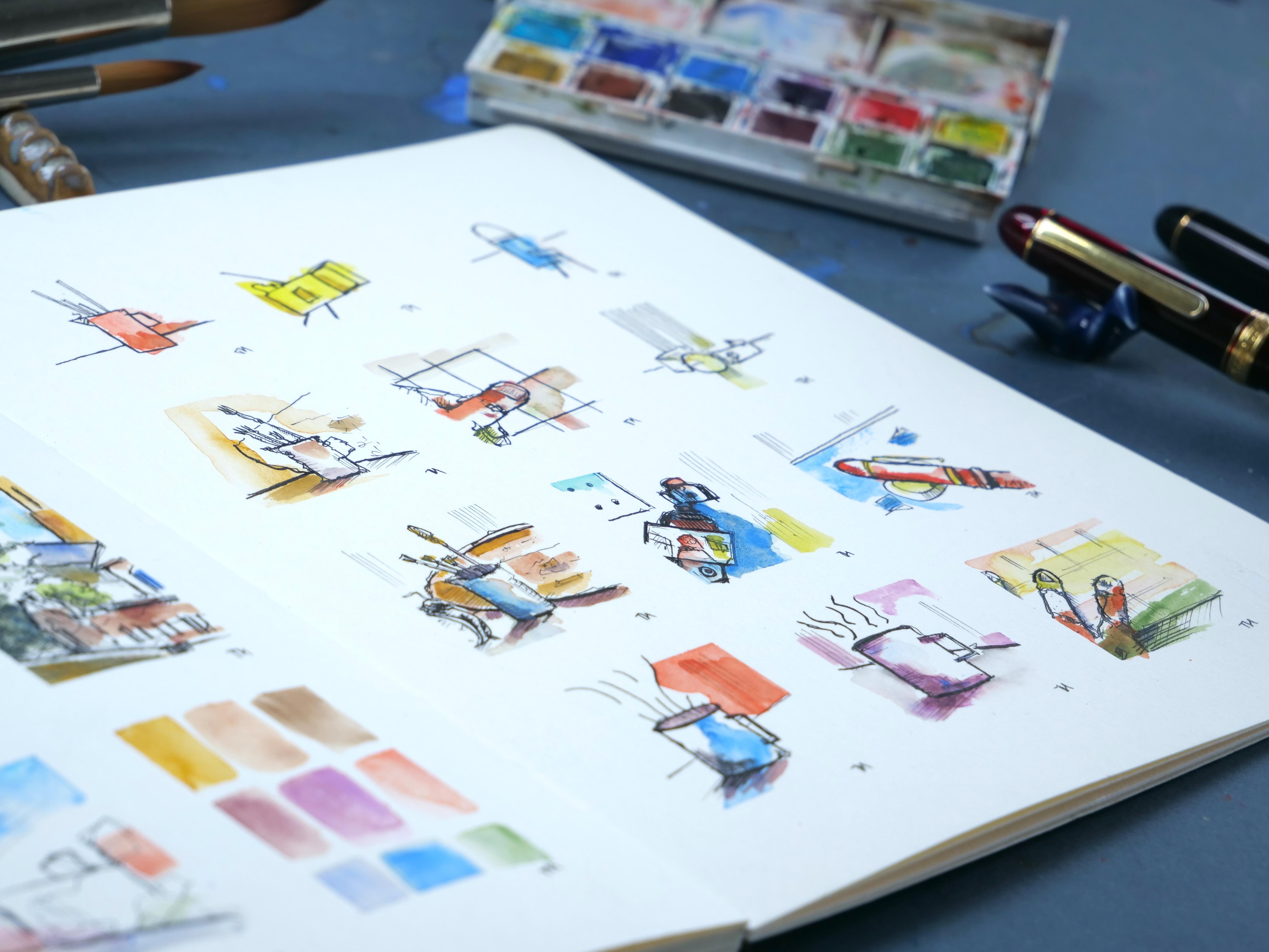
2. Supplies and prep: This is everything
that you will need to kind of take part to get the most out of
what we're doing today. I've got a sketchbook with some slightly thicker
sketching paper in it. I'd suggest sketching
paper because that would let us put some
colors on towards the end. But it doesn't have to
be super special paper. You can see I use this
for quick doodles, as well as bigger
sort of paintings. Something which you're just
happy to have a play in is often the way you will end
up being the most creative. Within the sketchbook, we're
going to be using a pen. Now, I've got my fine liner
with a very fine nib, and I'm going to use that
for most of my sketching. But you could also use a
fine liner, for example. You could even use
something like a sharpie. You could use a brush
pen or anything else, which makes a black
inky mark on a page. The focus of our sketching
today is mostly going to be in those inky stages. But at the end, we'll
pop on some color, and in doing so, we'll just create something
fun like these. These are little anscapes,
not everyday objects, but we'll bring our objects to life with some
simple watercolor. That, well, a set of watercolors and some kind of brush doesn't have to be as
enormous as my brush, but some kind of
brush will be ideal. And that's everything you need. Now, the last thing
that I'm going to do is actually prepare my
sketchbook a little bit. For that, I'm going to clip it so that it stays
nice and flat. I'm going to sort of
pick my sketching page, which is going to
be this one, so it's close to my
pens and things. I go take some masking
tape or some washi tape. And then all I'm doing,
I'm just going to give myself a little bit of a sort of grid system to work with in. Now, the advantage of a little grid system is that when we take
off all this tape, you'll just be amazed at
how our little doodles, even the very simple
things we start with, can turn into rather
lovely works of art. It's the space, the framing
that this tape will give us, which will allow that to happen. So, if you've got
some washy tape or somethin masking
tape or even if you just draw out some
lines on your page, now is the time to do that. And with our page prepared,
I'm just going to move my colors out of the way for
the next couple of lessons, and we're going to focus on
using our pen and looking at the stages of drawing or developing or drawing of
really simple objects. If you would like to join
in with my exact objects, the references are available
to download below. Otherwise, I'll see
you in the next video.
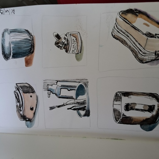
3. Shapes: What is our starting
point? Well, I have this chaotic desk of rather
fascinating objects. I wish this was my
desk, but it's not. It's a photo I
found to work from. But within that, we have
loads and loads of, well, objects, and that
can get overwhelming. So what we're going to do
is going to focus down on one object at a time. The object that I'm spotting, which feels most appropriate, is the kind of milk jug
with some brushes in. So I'm going to zoom in on
that and start in the top left so we can progress
through a journey of sketches. Now, first thing to do
is really simplify. So that's what this tiny little sketch is
going to be about. Really simplifying. So, what have we got
we've got shapes. And the shapes we got are the
jug, which is a rectangle. We've got the sort of
triangle of the nose. We've got a sort of
semicircle of the handle, and we've got these
rectangles of various sizes, various lengths and
widths coming out. As an extra touch, just
for any still life. Look, this is floating, but if you draw a sort of horizontal or slightly angled
line across the middle, that is how our jug is
suddenly sitting on the table. And that's all I want you to do. Find a couple more
objects perhaps in white photo or just
sitting in front of you and draw them
as simple shapes. And don't forget
there are things all around us that
we can sketch. So for my next couple, I'm just going to sketch
my foam and my microphone. So we're going to approach these two little sketches
in exactly the same way. My firm turns into a series of very simple geometric figures, as do the sort of
knuckles and the fingers, which you can see just
peeking out from either side. Then my microphone, which
is just off to my left, is, again, nice and simple. This time, less
geometric at the top, more of a sort of a hemisphere, half a circle, but simple
shapes underneath. And like that, we've already got three of our objects sketched. But I agree. They're very
simple, aren't they? They're very, very simple in
how we've displayed them. So in the next lesson,
we're going to explore the same objects and
add some little magic.
4. Textures: Now to add that
little bit of magic. So we have our really simple objects,
but we're missing something. Let's have a look at
our milk jug again. It's got that kind of grimy, slightly rusty texture to it. Those brushes, they're
sticking out at angles. They're not perfectly
rigid rectangles. They've got fluffy
bits at the end. So now we're going to
do our shapes again. But we're going to inject
character into those lines. So, what we'll do? We'll just go first
with that jug, and we've got all that kind of rugged line which we
might get from the rust. There's a little lip to our
rectangle. Bring that down. And then we find that there's a little
kind of shadow here, so we'll make that line a little bit bolder to replicate that. This handle's not
so simple, is it? So let's just make it a little bit more of an interesting
geometric shape. Then we can come and
add in the brushes, and we find that they've
got little wobbles and they got these kind of
fluffy bits at the end. Little wobble, fluffy
bits at the end. And this other
one's much bigger, so I can really
represent that by exaggerating the proportions
as well. Don't forget. We've got this kind
of background, but maybe this time, why don't we add a little bit of something extra
into that background? So we've got this kind
of chopping board, which just sits
behind everything. Kind of a smooth
structure this time. We'll get that coming along, like so, and then our horizontal line
can angle into that. And it's a little bit
more interesting. Does one extra thing
for this step, though. I kind of mentioned
looking at the shadows. What I want to do is look
a little more closely at the shadows and apply
some very fine marks. So this time, we're
going to really go right. Where's the shadow? We've got shadow on the
triangle, which is the nose. We've got shadow coming
round on the jug itself. And all of this is
adding not just shadow. But it's adding
interest and texture. The brushes are all quite dark. I don't know if
they're in shadow, but their handles are
certainly black, aren't they? And then we do see some shadows going up on the metallic bits. And this chopping board's
kind of got lines within it. It's
got a little knot. So we can just add these little extra
tiny considerations, which give us something
else to think about. Finally, we can invent a little bit of
shadow on the ground. And that's another
way of preventing objects from floating
if they have a little shadow connecting
them to the ground. And now I'm going to do the same with a couple
of other objects? So firstly, let's have a
look at my thumb again. It's always nice to
repeat objects because it gives you that chance to well, rediscover them to build on
your previous experience. And really building up experience of sketching
different things is how you improve. As we can see, the shapes
here are exactly the same, but I'm taking a much
looser approach. The lines are more wobbly. There's more fun in them. I'm also taking care to think about the light and the
dark, the hatching. And by thinking about
all these little things, we end up with more
detail, as well. My fingernails have appeared on the little fingers underneath. Adding a bit of context. So this is me drawing
in the washi tape. That's what that
hatch background is, I think, adds a heap of fun. Next, I'm going to find
some different shapes. And just looking down in the very bottom of
our lovely photo, our lovely desk,
we've got this watch, and I thought this was an interesting and
different challenge. And as much as repeating
objects is really useful, so is trying new things. It's all about that balance. Here, you can see, again, simple approach to shakes, trying to get the
feel of that bottle or wooden structure
in the background, and also a simple horizon line. All of the ideas are the same, even though the object
has dramatically changed. So there we go.
Couple more objects. A little bit more interesting, a little bit more context. What on Earth could
the final step be? Well, come to the next video, and we'll see what we're adding.
5. Context: So next up, we have this kind
of interest on the page, but one thing we're missing
is actually perspective. And perspective is,
unfortunately, in everything. But all it means is just being aware that often objects don't appear so
flat or so simple. And we'll just dive straight in and I'll show you
exactly what I mean. Now, if we look at our milk jug, we actually don't have
a rectangle, do we? What we have is
we have ellipses. So it's a rectangle with
that lovely texture. But the top and the
bottom are curved. And that is because, well, it's a cylindrical object, yes, but the direction of the curve is because we
are looking down on it. We know we're looking
down on it because we can kind of see inside it, can't we? We can see at the
top another shape. That's our ellipse
or our kind of oval. The same our little triangle has actually got a little
triangle just behind it. That, again, is part of our three D nature of
what we're seeing. And that's what
perspective is all about. So we can now kind
of do the same. Again, I'm being lighter
with my pen because that's going to let me do one extra little thing in
this stage, as well. But we'll get to
that in a moment. First, see if we can find
with our lighter marks, find perhaps more subtlety and just explore these brushes
again in a different way. I might just change the angle a little
bit of one of them, so it feels a bit different. Let's see how that
feels. You see, it's sort of sticking
up more than I've done. Probably similar to
this one, isn't it? Behind us, we've got our
chopping board back. I'm going to get that in. And
bring that around. Like so. And why don't we
add just the edge of this interesting
alarm clock, as well? Because this has got
shapes a lot more complex. So we've got the
kind of top of it, which is just a little
edge of a rectangle. It's got this little
bauble on the side. It's got an oval with a
little bit of perspective. That's the curve underneath. Then we're catching the edge. All these circles. And because we've
got the edge, look, we've also got this circle which kind doesn't exactly track the other circle, does it? It kind of comes
in under the side. That, again, that
is the perspective. Lastly, we got the feet. We
can only see one of them. And then we just got a
little bit of our kind of details to pop in. Let's continue now
with our shadows, and we can sort of reaffirm
the shape of an object by using hatching which
matches its form. So for a curved structure, we match those curves with
little curved hatching lines. It's also a vertical structure, so we can do cross
hatching with verticals. Popping a horizon line
back here, as well. The shadow on the
ground is flat. It's a horizontal object, the ground, the table. So we do flat hatching. And this is quite an
interesting chopping board in that it's actually
fairly flat, but it's got a lot of texture. So perhaps this time, again, like before, but this time, a little bit more, we can just see what happens if we add more. If we really, like,
look and find some representative
textures and also just find a bit more of those shadows which
are sitting around it. Now, that's everything
we did before, just a little bit more
and using a finer line. And the final step then is
to use a bolder line to reinforce important places
and places with shadow. So here, just a little
slightly bolder line, and you get a strong feeling of that shadow or a bolder
line here and it can disconnect these two objects because a bold line just
separates things out nicely. This clock is a little
bit in the foreground, so we will just make it
generally quite bold. It's also black. So I'm going to apply
a lot more hatching, even blocking in with the ink
to get that kind of feel. Anything else we might do? Well, look, these brushes need a little bit of
love, don't they? And just to accentuate
their vertical nature, having a strong vertical line, again, it's a simple thing
which can really, really help. Anything else?
Well, look, we can even add some vertical
hatching on the wall behind, and that just shows
us that we're dealing with a
vertical structure. So we added a
couple more bits of interest of interesting
things there. And we can kind of play with the same ideas with our
other squares as well. And time again for a
little change, this time, I'm actually going to draw the camera that's filming my face. So if you look at the
top left of the screen, you'll see me making lots of intermittent eye contact as I'm there looking
for the shapes, again, of this very awkwardly
shaped and angled object. But we keep all of our
principles to mind. We make it nice and simple. We focus on shapes,
then characters, then building up shadow, and soon enough, it
kind of comes to life. A little bit of
old line on top of a complex object can
actually make it make sense. All those little scratchy
marks which didn't quite work, but they fade into the distance. All the ones which
did work, brilliant. Now they are properly
in the foreground and they feel just so
much more important. Here I also tried some
really dark areas, some really bold shadow. I'm not sure if it's my
favorite thing or not, really, but I'm glad
I gave it a go. These little squares are
all about experimenting. Now, something I love drawing, and that is my pen. So I have my pen in my hand. I have another of the same pen, very greedy, I know, but
it's lying on the desk. I just thought I would try that. Again, it's at a funny angle. It's got interesting
bits of gold trim, lots of reflections and
it sat on this sort of awkwardly shaped pen rest. It's actually a chopstick rest, but I use it as a pen rest. Adding a bit of context, the little ink splatters on
my desk and things like that. And suddenly we have
another couple of wonderful little
doodles filling up our squares using
exactly the same ideas. And there you go. Three
more little sketches, everyday objects sitting
in front of me or from someone else's
very exciting desk. And yeah, they're pretty cool, and you can see this journey as we build up the complexity.
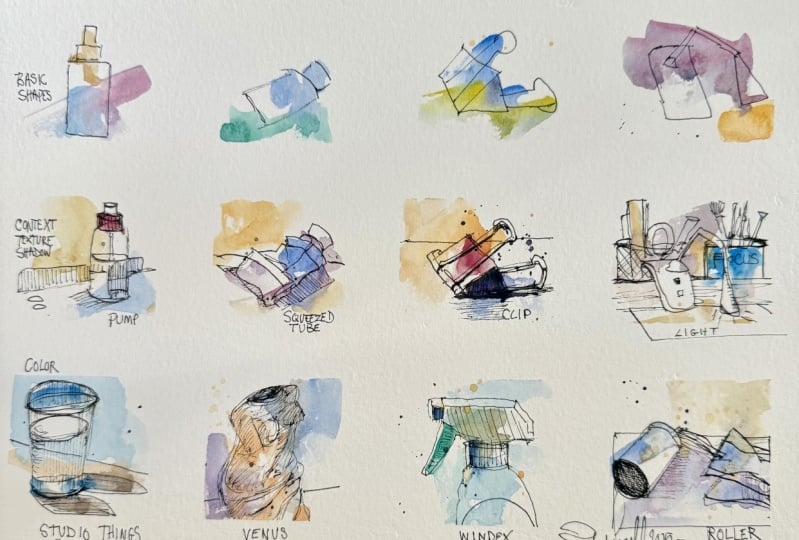
6. Colours One: Now, for the last step, I'm going to draw the same nice and simple object three times. It's actually going
to be my coffee mug, because I want to explore
colors in this step. And it's useful
when we're starting to explore something
more complex like adding color that we keep the rest of
it really simple. But having done that,
you'll be able to fill up the rest of them with
color if you'd like. So my coffee mug, well, one of my favorite
things to sketch, by the way, Remember, it's got a bit of perspective. So we've got those curves.
We've got simple shapes. We can add a little
bit of fun to it with some drama in the lines. We can find a bit of darkness, our horizon line, which I'm going to steeply
angle this time. And then we can just
begin to both solidify, but also add that
kind of hatching, which helps with
the form as well. And there we go, one
coffee mug done. And I'm going to repeat the
same idea in this next one, but we'll change a little bit. I'm going to give us a
different viewpoint, something different to try out. So here, you see how this is curving up and this one down. That's 'cause we're looking
at it sort of straight on. Instead of being
looking down on it, we're looking at
the middle of it. It's level with us.
Similar light and dark. I'll just move some of this
hatching around a little bit, again, to try different things
out and to see what works. What's really
interesting for me. And then why don't we angle
this line down the other way? Why not? And we can have some vertical
stuff coming, as well. And I said I was going
to do the same thing three times, but why not? Let's do some fingers
for the last one. So we'll have two fingers like, so focusing on the kind
of shapes, the textures, the wibbly wobbly nature of something as
complicated as fingers, getting that kind of good enough approach and
having fun with it. You go. This time, we got loads of textures we
could get really stuck into. Got the kind of little
pin pointy bits. We've got the smoother nails, and we got shadow, as well. Often a lot of shadow coming through in
something like a finger. Then I put it on my book, so let's have my
book we're sitting underneath as that
kind of context, that interest that makes sure that we don't just have
something really bland. Now, the purpose of doing three different objects
in different ways is that I wanted to
reassure you that colors aren't that important and they can just enhance things. They can just be really fun. So here, I've got a tissue. I've got a water brush,
and this is a brush which I squeeze it.
Water will come out. And that's hard to control, and that's kind of the point, 'cause what I'm going to do
is I'm gonna pick a color. Gonna pick a color I like.
This is cerulean blue. And I'm going to
paint paint the mug. Revolutionary stuff, I know. But I'm not going to
paint the whole mug. I'm going to kind of
squish it out like that. Do you see how I've
sort of applied the paint within
the mug and let it, like, come outside a little bit. Ambitious stuff, I know. I was just popping my washi tape had lifted up a little bit, and having that crisp
line is really nice. So I'm hoping that I've popped that washi
tape down, as well. Now, along with that tiny
bit of painting in the mug, I'm gonna paint something
next to the mug, as well. So let's pick another
colour I like. I love this red vermilion. I'm gonna kind of
paint next to the mug. I don't need to fill
the whole background, but I will bring it neatly to that separation line between the vertical and the horizontal, the back and the table. So two colors, and
I promise you, they'll look pretty cool
when we take off the tape. Next, let's do
something different. So here I've got a little
bit of ultramarine violet, a bit more of a moody color. So now instead of trying
to lift everything, I'm just going to try being
a bit more gentle and going, Look, where have I hatched? Where have I applied
some shadow? Maybe all my color is
going to do is help a little bit with the light
and dark in the scene. So I can just gradually add bits of color to build up that
sense of light and dark. So a little bit more trying to get a kind of thicker layer in places to suggest
variety in that shadow. And then maybe we should
just do sort of little bits fairly random areas
as well, little bits. Why don't we hint
at the blue mug? Why don't we just
hint at a tiny hint? Little playful hint there of that. That blue mug, as well. Now, last one, what
are we going to do? Why don't we complicate
a little bit more with a few different colors. And this time, they
just kind of kind of come across the page. We'll have some yellow,
little bit of green. Just needs to be
nice and watery, so it doesn't can see
that was a bit thick. It's going to
overtake the lines. I want the lines to
be really visible. And then one more color, something a bit more contrasty. Maybe we could bring
that red back again. Might be interesting, so we'll pick a little
bit of my red. Plenty of water.
We'll get that as a little line here, and here. So at no point have I Have I actually painted the objects? I've just applied
little dabs of paint. Near them and around them. And we can continue through
the rest of our page, doing this kind of
less is more approach. And so let's do exactly that. We'll dance around the page, putting some fun colors
in different places, trying different things out, and just see what works for
you and what doesn't. Some of them will be
really successful. And often, actually, I'd be interested to hear
if you find the same, perhaps leave a discussion
if you think the same. But the most effective
ones of these, which I did, had the least
amount of color on them. And there's something
about that simplicity, which can be just,
like, really wonderful. Now, one thing we do need to do is wait for these to dry now. So I'll be back
in a few moments, or perhaps ten or 15 minutes, and we'll see what
they look like.
7. Colours Two: Have now our dry page. The last little thing is to apply slight bit depth
to the colors in places. Now, we don't need to
do a huge amount here. What we might just do is
say, look, this board, maybe we could enhance this shadow with
another little layer. This time using a bit of ochre. Maybe we can enhance the shadow in general, using a little mix. I've got a mix of my
Cerleian blue and a little bit familiar
to make a deep, shadowy color, I might add a darker blue in there as well till we get something
a bit more neutral. There we go. And now we can kind of enhance the general feel of
the shadow, as well. We can do that in a
couple of places. So just taking a
little bit more time over things which make it feel more three D,
something like that. Obviously a bit
call it creative. It's definitely
abstract, isn't it? Here, maybe we
want to pick out a bit more of the shape of this camera with a tiny
bit of a second color. In other places, we might be kind of content with the
simplicity of what's going on. I quite like, for
example, these ones, much more simple,
maybe a tiny bit of shadow and kind of
leave it there. As an extra finishing touch, you might find some lines benefit from going
over them again. You got to be careful here to
avoid areas which are wet. So if you need to let
your page dry again, then let your page dry again. Otherwise, you get a very bold line like I've got just here. But if you're more
sensible than me, you'll manage to kind of find and move around
those wet areas. Or you can be more
patient than me and just wait for it to fully dry. Over here, a little bit of
an extra bold line here. Okay. And now we're gonna
let everything dry, and we're gonna move
to the moment of magic in the very final lesson.
8. Final Touches: And we're in the
final final stage, aren't we? And what
do we have to do? Well, we have to undo
all of our little tape. Trying to remember which
order we put it on in. This moment really is
a little bit of magic. I think it's okay
to call it that cause as you take off the tape, suddenly you get space around
all of your paintings. And that space works wonders
with ink and watercolor. But we're not finished yet. With that space, we are a
little bit more perspective. So we can go back in now
with a page completely dry. We can apply a few
extra bold marks. We can work more carefully
into some of the colors and where they're
either too rich, not rich enough, not
got enough shape or another just minor thing we want to fiddle around with. Well, this is the moment
to do that fiddling. So don't just consider it totally done yet
if you don't want to. Do take a little
while to look around your painting and see what
you might do to enhance it. One key tip, less is more. If we just work and
work and work, yes, we can do that, but we'll
probably overwork it. If we hold back and do just
enough or not quite enough, then actually the result will normally be quite wonderful. And with these, you can keep
going and going and fiddling and fiddling and just
playing and exploring, filling up more pages
and maybe doing more complex scenes or even landscapes or urban
sketching like this. Now, if you've enjoyed this, please do share with
me your versions. You can share it
in the chat up on Patrion and let me
know how it went. Your support really means a lot. And I guess I'll see you in the next one when we'll
do some more sketching.
 Toby Haseler, Urban Sketcher, Continuous Lines