Transcripts
1. Introduction: Hi, this is Michelle West
with Aprosae for your class: Do it yourself
branding: what is it and what do you need to do? We're going to cover
what branding is and what you need to do to
brand your business, non-profit, side
hustle, whatever you're marketing or promoting to others to be involved with. You'll not only learn how
to assess what you're already doing to see if it's
effective branding or not but you'll also
be given tools to develop basic brand
standards that will ensure you present yourself with a clear and consistent
brand every time. And the great thing
is you don't need any previous experience
with branding, but if you do, this class will
only increase your skills. I've been the head of marketing
for over two decades for everything from a
non-profit organization to a for profit
company to a university. In every organization, I've
been tasked with branding or rebranding the
organizations across all marketing efforts
and communications. I've found that by focusing
on the following things, you too can create
a powerful brand that motivates others to get involved with what you're doing. You'll learn about what branding
is and why you need it. The three types of branding, defining your basic
brand standards, which will also be
our class project, what full brand standards are, how messaging statements
define and communicate your brand and managing your brand so you always
have a consistent message. What I'm really excited about, is that you'll
learn how all this applies to your
marketing venture. Whether you're a hobbyist, sole proprietor, small
business, or non-profit, you'll learn what you're
currently doing with branding, what you need to start doing, and how to do that. And through your class project, you'll walk away with your very own basic
brand standards guide. This will set you up for branding consistently
and effectively. Here's one last and
very important note for the rest of the class. From here on out, instead
of listing all the types of people and entities that
this class applies to, like hobbyists, creatives,
sole proprietors, small businesses,
and non-profits, I'll just say you're
marketing venture. So please remember that what we're about to
cover applies to everything from a side
hustle to a corporation. Now, we're ready for
the first topic: What in the world
is branding anyway?
2. What Is Branding?: Branding is the use of a distinctive design
and culture of a name, symbol, or any
other feature that identifies a seller's
products and or services. In simple terms, your brand
is the look you portray and the feel people have as
they experience your brand. If we're not intentional and coordinated about our branding, people can get mixed messages
about what we represent. Your look is generally all the visual things
you show your audiences. These you have more
control over than the feel people have when
they experience your brand because the feel
is generated by people's impressions negative
and positive that they get from all the
interactions they hear about and personally
have with your brand. If we're not intentional
about branding, then people can get
mixed communications and mixed opinions about
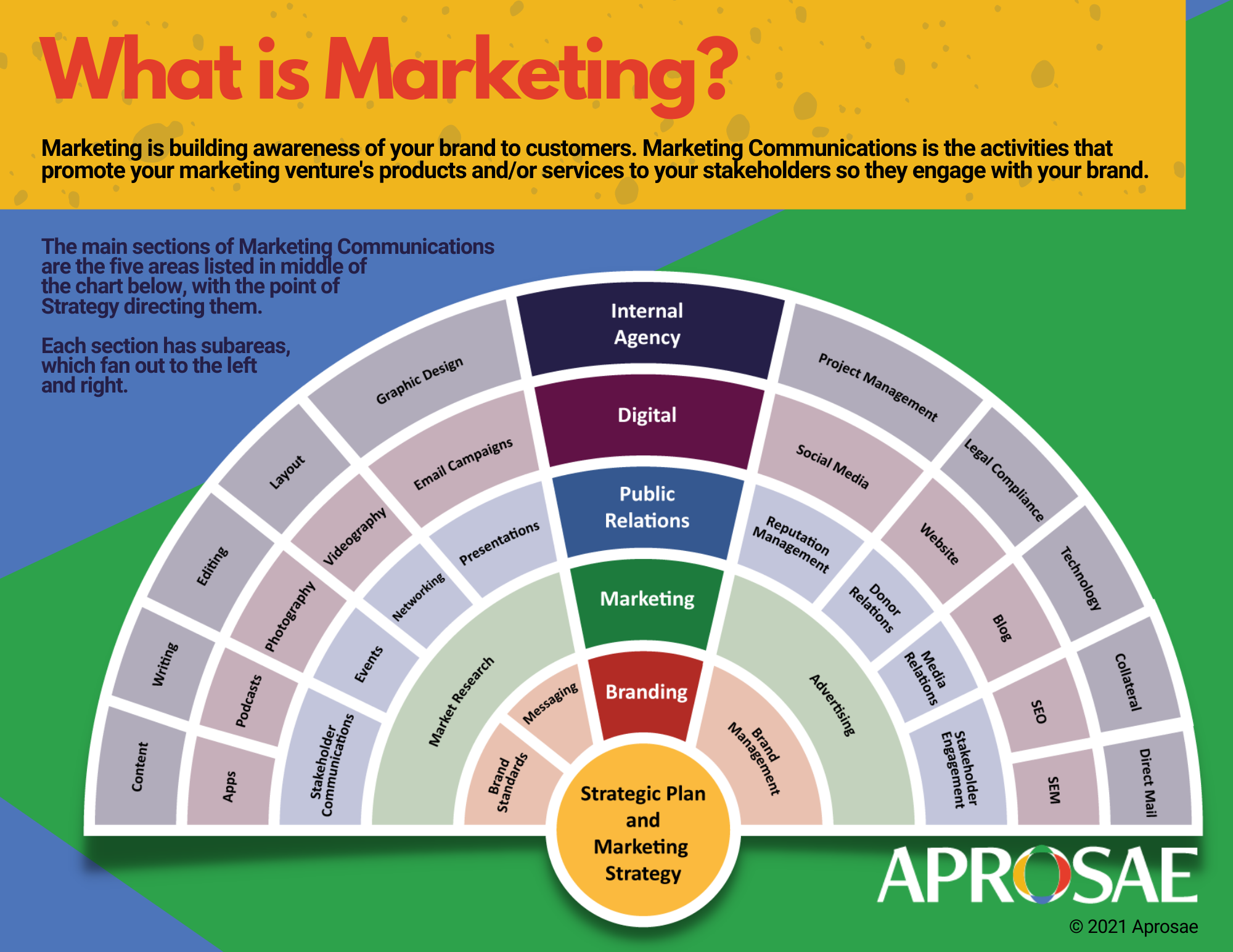
what we're all about. Branding is part of the larger picture of
marketing communications. It's important to understand the broader world that
branding is a part of. Marketing communications
has five main sections, one of which is branding. Here's a chart that shows that, which you can
download a PDF of it in the project section
of this class. The exclamation mark
that's in the center of this chart contains the
five sections of marketing. And fanning out to the left and right are the sub areas
for each section. But notice the yellow point
on the exclamation mark. That's the conductor. The strategic plan and marketing strategy
of the organization. Branding is the section
that's right above strategy, because it too is foundational to doing the
other sections of marketing, public relations, digital,
and internal agency. And branding is comprised
of three main sub-areas. Brand standards, messaging,
and brand management. But before we dive into
these three main sub-areas, let's take a deeper look at the three types of
branding so you can determine which one best suits your marketing
venture's needs.
3. What Are The 3 Types of Branding?: It's important to understand
the three types of branding, so you can intentionally choose the one that best
fits your marketing venture. Though you might only have one
brand right now as you expand and develop more
programs and or business lines, you'll be forced to brand those. Having the understanding of the different types of branding now will set you up for
making the right decisions then. The three types of branding we'll look
at are branded house, house of brands,
and hybrid house. Branded house is when
all business lines or programs are branded
under the parent brand. Let's look at a beautiful
example of this taken from the
fedex.com website. Every single business
line they have is branded based under
the parent brand. There's no question
what company owns each line because the same
logo, the same colors, and the same fonts are used consistently when they market
any of their lines, they are essentially
building brand awareness for the parent brand of
FedEx every time. Going to the house of brands, you have your parent brand, but under that brand you have
totally separate brands. Let's look at the Mars company. Here's a screenshot from
their website, mars.com. Most people know some of
the brands that Mars owns, but they have no idea that
Mars is the parent company. Like M&M candies. Mars owns them. But Mars also owns
Banfield Pet Hospital and some pet food lines. Mars also owns
ethnic food lines, such as tasty bite Indian food. These are all totally
separate brands, some vastly unrelated
to each other, that most don't even
know Mars owns. And that's due to branding each business
linesseparately. The last branding type
is the hybrid house. Coca-cola is a great example. And here's a screenshot from their website,
Coca-Cola.com. Coca-cola is the parent brand. And they have a Coca-Cola drink that's identical to their brand. But they start to
differentiate from that parent brand
with Diet Coke, which is represented
by the square in our flowchart because it's
blue like the parent brand, but it's different,
represented by the square. There are also brands that
are totally different, like the green triangle
of simply orange or the yellow diamond
of Honest Tea. Brand usually use the house of brands or the hybrid house types
of branding because of things like mergers
and acquisitions. This is because the
parent company acquires a brand that has a strong
identity and it would hurt sales if they were to lose that customer loyalty
and brand identity. It can also be because companies want to market a
product or service differently than
the parent brand for a variety of reasons. For example, if you have two or more products or services that are in
different industries, have different goals and have different audiences
you're marketing to, it could make sense
to brand each one separately because when
you market the one, you won't be hitting the
audiences for the other. Like in the Mars example of banfield Pet Hospital and
tasty bite Indian food. Having banfield Pet Hospital and banfield Indian food, Or having tasty
bite Pet Hospital with tasty bite Indian food would not make for
good branding. Which branding type
are you already using, or do you want to use? I'd suggest that unless you have a very compelling reason to
market your products and or services under separate brands that you use the
branded house model. Building brand
awareness costs a ton of money, time, and resources. So unless you have a huge, and I mean, huge
marketing budget, it's very challenging to
raise awareness of one brand, not to mention more than one. Those are the types of branding. Branded house, house of
brands, and hybrid house. Whether you're a hobbyist, sole proprietor, small
business or non-profit we're now going to
learn about how your class project will help you define your brand for whatever
your marketing venture is.
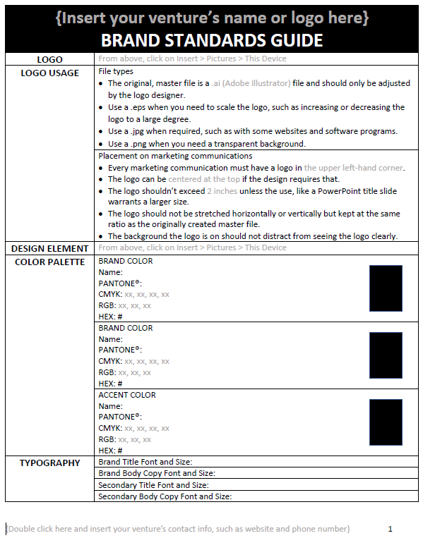
4. Class Project: Creating Brand Standards: Our class project
is going to provide you with what you
need to know to define the basics of what
your brand is, your logo, how it's to be used, and design elements
that you want, as well as colors and the fonts that will
represent your brand. If these aren't
defined before you start branding and
marketing your venture, It's like wanting
to demolition something and using any
tool you grab first, you might get the job done, but it won't be done
as efficiently and correctly as you need it to be. And it could just
cause a big mess too. Starting with the next lesson, we're going to dive into the
file for your class project that's under the projects and resources tab of this class. Please go there
and open the file titled Word doc of
brand standards guide. The first column lists which brand standard
we're addressing. And the second column
is where you'll define that brand standard to
your specifications. To help get you there, we'll go over what each
brand standard is and how to decide what you want it
to look and feel like. This way you'll be
applying what you learn along the way so
that by lesson eight, you'll know what
you need to know to have basic brand
standards that will direct your communications in a consistent and
professional way. So let's begin with
an overview of what basic brand standards are. And customize this black
and white guide to represent your more
colorful brand.
5. Creating Brand Standards: Overview: Brand standards define
the things you need to present a consistent
image about who you are. Like all sub-areas of branding, brand standards are a
foundational and critical need for any marketing of
a product or service. Brand standards can
be basic or full. Let's start with basic
brand standards. They are what your logo is, how it's to be properly used. Design elements, a
color palette that defines what colors can be used in your brand's
marketing efforts. and which fonts represent
your brand, also known as typography. Basic brand standards are
usually things that you put together for staff so they know how to
create materials and communications
that all look like they've come from
your organization and communicate
the same message. Three of the big reasons
I've seen brand standards be important to have defined for any size of a marketing venture are first, you
might be thinking, I'm the owner, marketer and janitor for my
marketing venture. This doesn't apply to me. But if you now or will ever work with a vendor like a printer
or marketing agency they will also need
to know these things. And all you'll have to do is give them your
brand standards. Second, even or especially if you have one person
who has decided these things and knows
all of this in their head if that person leaves
your marketing venture so does that knowledge. Lastly, when, say there
are two people in a marketing venture and
they disagree on how a marketing communications
should look or be written it's a lot easier to settle
the disagreement by having the published brand
standards settle the score instead of varying opinions
being stated back-and-forth. Now, you're going to define your basic brand standards
in your class project so please get that file ready. On the header of your
brand standards guide, please type in your
marketing venture's name or logo where indicated. And here's a side note for
your marketing venture's name. Please make sure
you're consistent with what name you refer
to your venture as. Take Coca Cola or Federal
Express for instance. They're big enough to shorten their name to Coke and FedEx. Sometimes these
shortened versions are due to customers usage. Other times the company
markets a shortened version. Either way, they have the marketing budget
to make this work. But for those who aren't
part of the Fortune 500, the marketing ventures
named shouldn't be too long or customers will
likely shorten it. One of my clients had this problem when I
started working with them. They started their organization with a very long business name. Then they started marketing
a shortened version and made it their DBA
doing business as name. But then their stakeholders
started using an acronym to reference them because the
DBA was still pretty long. On their website and
social media platforms they had their first
long official name and their DBA name and their
acronym sprinkled all over. Even when I searched on
Google for the three names, results only came up
for two of the three. You can probably see the confusion that
needed to be fixed. We had to choose one name and we chose the acronym that
was the people's choice. Then we had to scour every
marketing communication digitally and in print to standardize their
name everywhere. And we had to retrain staff
to not only use the acronym, then we had to have an external marketing
campaign to make sure everyone in the community
knew of this change. I want to save you this trouble. Please make sure you
use the same name all the time and make
sure it's not so long that people are going to create a shortened version that you'll have to chase after
as long as your marketing venture exists. With that being said, To finish customizing the header for your marketing venture, you can right-click on the large black rectangle
of the header and choose the main color
that represents your brand by clicking on the bucket and
choosing the color. If you don't have
your main color pinned down yet, we'll get there. So you can come
back to doing this after you select that
color for your brand. Now we're ready to get to your
logo and design elements.
6. Creating Brand Standards: Logo and Design Elements: The next thing to enter on
your guide is your logo. If you already have
your logo established, click in the cell
to the right of the word logo and follow the
instructions in that cell. If you don't have a logo or are considering
rebranding your logo, please be careful when hiring someone to create
a logo for you. If the only thing they do in their business is create logos, and they don't work with putting that logo into marketing
communications of all kinds you could wind up
with a logo that doesn't work well across print, TV, radio, web, and so on. For example, with one client I had, I had to recreate their
brand for this reason. They purchased a
very cool logo from an online service
that specializes exclusively in creating logos. But when we went to put their logo on forms
they use with their clients all
the intricacies and colors of this very cool
logo when looking at it blown up on their
computer screen, suddenly became
unnoticeable when it was significantly
reduced in size for a form that was printed
in black and white. You couldn't make
out their venture's name. The color gradients, which are gradual blending of various colors that
were in the logo, looked like a blob
when we had to reduce it in black and
white for the form. So logos should be
created so that they're recognizable
across all mediums. As a result, logos
are generally very simple and your
creativity can come out with the design elements and placement of other
visuals like photographs. All that to say, please find someone who
understands all this if you're creating
a logo anew or rebranding what
you already have. If you find your existing
logo has these problems you can re-brand while keeping your brand looking very similar
to what it's always been. A good graphic designer well-versed in a variety of
marketing communications or a marketing agency is worth the one time investment to create a logo that will work for you not against you. Moving on is detailing things about your logo and its usage. This is important because some people could
stretch your logo, put it on a psychedelic
yellow background that clashes with
your branded colors, and so much more misuse. I've added some
general instructions on your brand standards guide that pertain to
most marketing ventures. So you can read through
those two sections of how to use different
file types you might have your logo in and how to place the logo on
marketing materials. You should modify
those instructions to fit your marketing
venture and add others you want to note.
The grayed out text in these two sections
are likely going to be what you want to
review at a bare minimum. There's a spot for any design elements you
use for your brand. Having some design
elements are very useful, so you can use them in various marketing materials to have consistency and variety. For example, let's
take this sample logo. Instead of using an o in
there Branded name of cloth. They could use a design
element for the letter O. Or they could use a design element by the
side of their logo's name, otherwise known as a logotype. Here are examples of how
that marketing venture could use this design element in
different communications. You can even take
elements out of the design element to
add variety to a piece like this piece here
that has half of the design element that's
had its color reduced from 100% to 25%. By consistently using
these design elements, but adding some variety to
them like colors and size, people start getting that
faint recognition of your brand no matter what marketing material they look at. Speaking of colors,
Let's move on now to defining your
brand's color palette.
7. Creating Brand Standards: Color Palette: Your color palette is the
colors that are allowed to be used in your marketing
materials and communications. But it's important to understand first that it's very unwise to just choose colors you might like and hope those colors
look good together. You might like the combination, but if your goal is to create color combinations that are
pleasing to everyone who you want to get involved
with what your marketing then relying on the color
wheel is the safest bet. The color wheel is
guided by color theory, which is the science and
art of how to use color. Let's dig deeper into
what this all means. Since color theory is based
on research and is accepted industry-wide as a guide for
how to use colors together. It's important to stick
to this if you're not a seasoned graphic designer. Now, in a few instances, I have seen some artists and designers veer from what
color theory dictates, and they have pulled it off. But they're usually very
seasoned and unusually gifted at applying color combinations. If this isn't you, then the color wheel can be your trusted guide on how to
choose colors for your brand that will be harmonious
and generally accepted by the people
you're trying to reach. A color wheel is a
circle of colors that show their relationships
to one another. You can buy one of these at
an arts and crafts store. And here is my favorite one. It has a spinning wheel with windows on top of the
color wheel itself, and it shows the colors
that best match together. Or you can search for images
for color wheels online. And here's another option. You can find this at an arts
and crafts store as well. But what's great about it
is that it folds out and it has all kinds of color combinations already
spelled out for you. Let's go into how to
use the color wheel to find what colors you can
choose for your brand. On your brand
standards guide file, you'll see under the color
palette section that there are brand colors and accent colors. Your brand colors are usually
represented in your logo. If your logo has just one color, then you can add that color
as one of your brand colors. I'd suggest having at least
one more brand color. And the safest bet for
identifying your second color is to look at the color wheel and choose its complimentary color. For example, blue's
complimentary color is orange, red is green, purple
is yellow, and so on. And make sure to notice that
if you have a deep blue, the complimentary orange would generally be a deep orange. But if you want
three brand colors then the color wheel could
dictate this for you as well. The color wheel has three color combinations that are called either analogous, which is three colors in
a row on the color wheel. Split complimentary,
which is when one of the complimentary
colors is split by each color on
either side of it. Or a triad color scheme, where the three
colors are equally spaced away from each
other on the color wheel. And if you want four brand colors, you can also use the
color wheel and look at the tetrad combinations
dictated there. I wouldn't suggest having
more than four brand colors, but you can have accent colors, which we'll cover next. You'll notice on your
brand standards guide, there's a cell for you to define an accent color or
more if you want, by adding another row and
copying the template provided. Accent colors aren't used as the dominant color in
marketing materials, but are subtly used here and there to add visual
variety and appeal. If you have only two colors
as your brand colors, then you could look at the tetrad combination
of colors on the color wheel and choose the other two as your accent colors. If you have three or
four brand colors, then you could do an
online search for color palette generator and put in the brand color
or colors you've chosen, and then choose from the
palettes they generate. As you can tell, a lot
goes into choosing colors. So just like with logo creation, the one time investment of
having a graphic designer who regularly applies
their designs to marketing materials, or
a marketing agency, can help you determine which colors are
best for your brand. Whoever you hire should
ask you questions like, who are you trying to reach, and then help guide you to colors that will
resonate with them. For example, if you have a side hustle that helps people invest money
in the stock market and your logo is royal blue you generally wouldn't choose a fluorescent
orange since people generally want more
calm colors that promote trustworthiness
when they're handing over their
hard-earned money to someone to manage. But if you want to
do it yourself, the color wheel and online color palette generators can guide
you to make wise choices. When you've chosen your
brand and or accent colors now you're ready to add them to your brand standards guide. Let's walk through an
example of doing this. Let's say you want blue
as your brand color, but you don't have
a particular one. So you right-click on the black box in the
first brand color cell. You click on the bucket
that says Fill under it. Then click on more fill colors. You click on the blue
you want to use, and click on the Custom Tab. You can slide the
bar up and down to make the blue
lighter or darker. And you also now are
given the RGB amounts, which is short for
red, green, blue. And it tells you the amount of each color that's needed
to make that blue. You then plug those
numbers into your guide. You're also given the hex code, which is what you'll
use many times on your website and
online platforms. You can, if you want to
convert this color to CMYK, which stands for cyan
or blue, magenta, yellow and black
and or pantone. But only certain print jobs on certain presses will
use CMYK and or Pantone so you're probably fine
with having a printer or designer give you
these conversions if you ever need them. Now click Ok. You'll have your brand
colors color swatch. You can name that
color if you want, like electric blue or your marketing venture's
name then blue. You can do the rest with any other brand and
or accent colors. If you don't have
enough cells or rows, then just right-click in the
cell you want to duplicate. Click on Insert above or below, and then copy and paste
the content that's in the cell you
want to duplicate. To delete cells or rows
that you don't want right-click on the
cell, click Delete, then delete rows, and you'll
have it all cleaned up. As a side note, if this is a lot of information and if
working in Word is new, don't worry. Unless you've
had previous experience with Word and or marketing
and or graphic design, this brief overview could be like drinking from a firehose and require further study on the points that you
need more training on. Next up is typography, which is what fonts
you're going to use.
8. Creating Brand Standards: Typography: When choosing the fonts you'll
be using for your brand the top two things you'll
want to keep in mind are that the fonts are
legible and appealing. Regarding legibility,
you'll want a font where the individual characters or letters are easily
distinguishable. Regarding appealing, this
is subjective and what your audience prefers should
determine what's appealing, not what you think is
appealing to them. We'll go over how
to figure out what your customers like
later in this lesson. On your brand standards guide, there are spots for you to choose your brand
font for titles, and then for body copy, which is things like paragraphs
and photograph captions. These are the fonts you'll
use consistently in all your marketing materials so people recognize your
brand more readily. The secondary fonts for titles and body
copy are optional. Some like to have variety. And so you can choose a
secondary font that can be used when you want some
diversity in your design. Tertiary or a third choice of fonts can also
be chosen if you have something like
a large newsletter that has variety
in its design. In my professional opinion, secondary and tertiary fonts should be used
judiciously though, as they can dilute people's
ability to recognize your brand in the sea of other marketing materials
competing for their interests. While there are numerous
types of fonts, such as serif, sans, serif, script, and decorative, which are also called
display fonts. Script and decorative
aren't typically, good for using as a core font
for your brand. That's because they don't
pass the legibility and universally appealing tests
like san-serif and serif do. Then when deciding between the other two font
types that are left, serif and sans serif, sans serif is the
most favorable nowadays, Let's
look at each type. Serif fonts have decorative
strokes off of the letter. One of the most
popular that you might have heard of is
Times New Roman. While this particular
font was used extensively one to
two decades ago, it's waned in its
use and is still a very good and
acceptable choice for a brand font
if you prefer it. Sans serif fonts don't have decorative strokes and are generally considered
more modern and legible. These are the types of fonts I'd personally suggest you use for your brand body copy font
with a point size of 12, minimum. While going larger than 12 can look unappealing it's important to note that if you're working
with those who have low vision or
if you want to be compliant with low
vision standards, 14 point is the recommended
font size for print. Most people with low vision
use screen readers or can increase the text when
accessing digital materials. Also, sans serif fonts are the recommended type of font
for low vision readers, as it's the most
legible for them. Script fonts look like
cursive or handwritten text. These can be used when the
size of the font is fixed in one piece of marketing material and only for titles
and headings. For example, if you were to use a script font for
your business card, it's not going to pass the
legibility tests for everyone. But if you use it on a
flyer for a heading, and that flyer is
only going to be distributed online and in print where people will see the font as large as
you have intended, then it's okay. For this reason, I'd suggest only using script fonts when
you can ensure that the font will stay
large enough for legibility and when
it fits the design. For example, if you're a wedding planner and your customers are
almost all women who prefer intricate
and soft designs then an ornate script might fit. But you wouldn't
use a script font if you were selling hand
tools for the man cave, you might use a font that's
a bit industrial looking, which would be an example
of our next type of font, decorative, also known
as display fonts. Decorative fonts are a type of font that has a ton of variety. It can be three-dimensional,
artistic, ornamental, and so, so many other things.
As its name denotes, they are to be used as decorative for
titles and headings only not for body copy or text. And as with script fonts, they should only be
used when the font size is fixed as a larger point size, which might be 16
points and above, depending on the font, so that it remains legible. If you're using script
or decorative fonts, I'd suggest being very selective in how and
where you use them. If you have a large newsletter
that has 16 or more pages, then you could use a different
decorative or script font for each spread, which is the two pages facing each other when you lay
the newsletter flat. But if you have a
one-page flyer, a tri-fold brochure,
or even a website it's best to choose only
one font for the titles, and in my opinion, a serif or sans-serif font. Unless you use a well-trained and experienced graphic designer, using too many fonts in one publication can look
amateurish and unappealing. If you're doing the design
for your materials, I'd stick to your
brand fonts to ensure that it looks professional
and appealing to all. Unless you have a
graphic designer who can give you feedback on your use of multiple fonts in a publication, for instance. As you play with different
font combinations and get professional feedback
on what you've chosen you'll be training
your eye to design in a more and more aesthetically
pleasing way for all. And remember when any of us,
who aren't trained and experienced as graphic
designers, create materials we're usually going to
be proud of what we create and when we present our creation to our
friends and family a lot of them may
not have the eye or the forthrightness to tell us it's not designed to
the professional standard we're aiming for our brand to be. One good way to determine
what your audience or customers like is to narrow down which fonts you're
choosing between and give them samples of those fonts in marketing materials
for their feedback. Submitting these to them online through a Google
form for instance, will ensure you get the
most honest opinions. When you get, ideally
around a dozen reviews, you can see if there's
a clear winner. If people like all of them, then you can choose
your favorite. If this is all too
complicated for you then I'd suggest just choosing
a sans serif font, like Arial Black
or Calibri bold, 16 point for titles. And
Arial or Calibri, 12 point for body copy
and calling it good. These are pretty safe bets and available in most word processing programs
and website builders. Now, let's fill out the typography section of
your brand standards guide. If you have fonts
already chosen for your brand that are legible and appealing
to your customer base then put those down. If you don't, you
might want to look at fonts in Microsoft
Word by going to home. Then click on the dropdown arrow where the fonts are chosen. And scroll down
to see which font or fonts you want to consider. It's okay if you want to spend time selecting and
getting feedback, you can come back later
to fill this section out. Congratulations, now
you have what you need to implement your
basic brand standards. If you want to dig
deeper into the topic of brand standards by learning what full brand
standards entail, please continue to
the next lesson. Otherwise, the lesson after
that is all about messaging, which is foundational to
any marketing venture.
9. What Are Full Brand Standards?: While we're not going to develop full brand standards
in this class, I want you to be aware of what they entail in
case the growth of your marketing venture
needs these things after you start using
basic brand standards. If you have more than one person creating marketing
materials for you, even if that's one staff
person and a marketing agency. Full brand standards could benefit your marketing
venture because they will guide those people to create materials that are
consistent with each others. Like with basic brand standards once you make the
onetime investment of expanding to full
brand standards, they will stay with you for the life of your
marketing venture and will just need
to be revised if certain items or sections require updating
for some reason. Full brand standards contain everything that basic
brand standards do but usually add
messaging statements and editorial style guide. Let's look at both of
these in greater detail. Messaging statements communicate
to your customers about your brand in
succinct statements that you can use in
your marketing efforts. Our next lesson covers
these in more detail. An editorial style
guide details a lot and we'll go into seven of the
common sections in this guide. The first one is voice and tone. Voice and tone are how
you want to communicate externally to your customers and other interested parties. Questions to ask yourself to get to what you want
your voice to be would be ones like, what person or perspective are you going to use in
writing and speaking? First-person, which is I/we, second, which is you, or third, which is he, she, it, they. Questions to ask yourself to get to what you want
your tone to be would be, are you going to speak
directly with humor in your writing or aim for a high level of discretion and professionalism, or
something else. The next question
to ask yourself is about the second section of
your editorial style guide, which is which style
guide will you be using? Style guides are
external resources that you can access in
print or digitally to ensure that you're writing and formatting are in line with commonly accepted
norms for English and communications for your
branding and marketing efforts. The one guide that all
marketing folks agree upon, especially the media, is the AP or Associated
Press Stylebook. Yet this guide doesn't go into the nitty-gritty of all needs like style guides do. So, some add another style
guide to fill in those gaps. Some of the more
popular style guides are ones you might recognize
from high school or college. Such as the APA, American Psychological
Association manual, Chicago Manual of Style, or MLA, Modern Language Association
Handbook. In business some prefer the Gregg
Reference Manual because many find
it to be one of the easiest for staff to use since it's created more for
business than the others. If you choose to not follow the style guide or
guides in certain areas, you would detail
what you do instead in this section of your
editorial style guide. For example, some
guides might not specifically spell
out how you want to write certain
things like when to underline to not be confused
with hyperlinks. Another example is do you always add a comma
before the word And in a list of
three or more items? Or how do you address
gender neutral language? Any judgment calls
on topics like these and others
that you would make, you would add those to
your full brand standards. The third section of your
editorial style guide addresses acronyms and jargon. If you use any acronyms
in your venture or words that only people in your venture or industry
would usually understand these would be spelled out and
described in this section. The fourth section of your
editorial style guide details any references to
your brand's name or names. For example, Federal
Express may say that the primary
or first reference to their business should
be Federal Express. Yet they may allow for a
secondary reference of FedEx. It could also detail
whether they call their other lines of
business programs, departments, divisions,
or something else. Visual design standards are the next section of your
editorial style guide. These visual design
standards could include guidelines on how you format
or layout publications, what graphic design
styles you follow, how you treat or use digital assets like
photographs and videos, and what consistent design
templates you use for social media posts and
email campaigns and more. These guidelines are
important to use because when your brochure
is in a rack with many others, you only get a split-second to touch that customer
with your brand. If you're consistent with your branding and
designing of materials, then they'll identify who you are in that split second glance. The sixth section of your
editorial style guide addresses how you handle
intellectual property or IP law. How you acquire and use writing, photographs,
illustrations, videos, and other things
so that you're in compliance with IP law and respecting the ownership of
the creator of those assets. This likely will also include any releases or waivers
that are needed. Crisis communications
guidelines are the last section of your
editorial style guide. If you're marketing
venture is large enough and visible enough and could have a degree of bad press or liability associated with i,. like a medical care business or caring for vulnerable
populations, then you'd note who
gets contacted when, who handles what response, guidelines for interacting
with the media and more. When you have more
than one person creating marketing materials, full brand standards bring those people
together by enabling them to be on the same page so everything is communicated
consistently. It also sets an
external standard that ends subjective calls on how things should be created while allowing for a certain
level of creativity. Next, let's take a look at what messaging is and how
it impacts branding.
10. What Is Messaging?: Messaging is what you communicate to your
customers about your brand. Like branding, the way we message
or communicate to our customers is not just what
we say and how we say it, but it's also the experience
and feelings that customer has as a result
of our communication. Messaging should focus on the
benefits to the customer. By creating messaging
statements, you'll know how to
communicate these benefits in a succinct and
persuasive way. And you might already have some of these
messaging statements. For example, if you're marketing venture has
a strategic plan, you'll likely have
your mission and vision statements already done. So what are these
messaging statements? Let's look at this
visual to understand how messaging statements define
and communicate your brand. This visual depicts the
process of building a house, which is similar to how
you can build your brand. You start with a blueprint and end up with an open
house or open business. You start with your
mission statement. A mission statement
is about today, what an organization's
overall goal is and how it achieves that. In other words, this is the
blueprint for your brand. It tells what you're doing
to reach your goals. An example of this is Google's mission
statement for 2022 our company mission is to organize the world's
information and make it universally
accessible and useful. Next is core values. These are the principles
that guide an organizations actions and are embraced by employees to create
a common culture. Another way to say this
is core values lay the foundation for all efforts you take in your
marketing venture. Core values can be
either one word or two to three-word
phrases like innovation, trust, passion,
quality, and teamwork. Or they can be sentences. Here are some examples from
Google's core values in 2020. Focus on the user and
all else will follow. It's best to do one thing
really, really well. The need for information
crosses all borders. You can be serious
without a suit. Great, just isn't good enough. Brand pillars can take some
research to come up with because you have to learn what differentiates your
marketing venture from your competitors
and what benefits your customer feels and
thinks that you provide them. In other words,
brand pillars frame and finish the brand
you're creating. They state what
makes your customers choose you instead
of your competitors, and highlight what you have
to offer your customers. These are more for internal use, so you and or your staff
can use this information to drive your decisions and
craft your communications. A vision statement
is about the future, the dream of what an
organization wants to become. Another way of saying this is it's the final product
you're working towards. An example of this from
Coca-Cola in 2022 is our vision is to craft the brands and choice
of drinks that people love to refresh
them in body and spirit. And done in ways that create a more sustainable business and better shared future that makes a difference
in people's lives, communities, and our planet. A big, hairy, audacious goal, or bhag, is a clear,
ambitious, compelling, and measurable target that
can be used to determine when your marketing
venture has fulfilled its vision statement or met its ultimate
goal for existing. A good bhag example is from Amazon. When they once said, every book ever printed
in any language, all available in less
than 60 seconds. That's clear,
ambitious, compelling. And one of the most
things people miss: Measurable. A value proposition answers why a customer
should engage with your brand over a
competitor and what benefits they get
from your brand. It's a derivative of the brand pillars you
use internally in the form of a statement
that can be used externally for
marketing purposes. Another way to say this is that your value proposition
communicates to your customers why they should buy and what they're going
to get from your brand. Examples of value propositions
that have been used in the past are uber says: get there, your day
belongs to you. Lyft says: rides in minutes. Target, expect more, pay less. Walmart, save
money, live better. Dollar Shave Club, a great
shave for a few bucks a month. And those are the messaging
statements I've found are important
to note for branding. Even if you're marketing
venture is just you these things can
be very useful to define whether you
communicate in person, in writing, or some other way. You can accurately
and succinctly communicate why people should
engage with your brand. You will not only be articulate, but you'll convey
trustworthiness and the confidence that these
statements provide. Now we're ready to talk about how to take what you've learned and put it into practice
by managing your brand.
11. How Do I Manage My Brand?: The last sub area of branding is brand management. While brand management can be
more complex than this if you have at least
one person who ensures that your brand
standards and messaging are represented on all
marketing efforts that are distributed to anyone outside
your marketing venture, then you already have
a brand manager. But it, anyone can create
marketing materials or communications and choose your own colors, for instance, and write whatever and
however they want, then it'll make your brand even stronger to learn about
brand management. So, what exactly is a brand manager? A brand manager reviews anything that's distributed
to people outside your marketing venture
to ensure that branding and other
things aren't missing. If you have more than one person in your marketing venture, it's always helpful to share
your brand standards with that person and have them serve as your
second set of eyes. If you do all the branding and marketing for your venture, than it's helpful
to have someone else look at your
marketing materials and ask them to tell you
what they get out of it. If they don't tell you what
you're expecting to hear, then that gives you help on what to revise to make
it more effective. A brand manager doesn't
change content, but makes sure that the brand
standards are consistent, that there aren't
any spelling errors. And that it makes sense
to an external audience. It's important to
set up expectations early so that your
brand manager isn't disappointed when
their suggestions aren't implemented
and the people creating the material don't feel threatened by someone
else's critique. Another aspect of brand
management is making sure that your existing materials all look like they've come
from the same place. This is called a
brand discovery. If you're new to creating
marketing materials, then you can start by making
sure that everything that's created is in compliance
with your brand standards. Then in about a year or two, depending on how
much you create, you'll want to do
this brand discovery. Yet if you've been creating materials and are just
now getting your brand defined than this brand
discovery should be done as soon as you have your brand standards in place. This is how a brand
discovery works. Lay all your digital
and print materials on a table or a floor if you don't have a
table large enough. What kinds of things should
you include in this? Anything that does or should
have your logo on it. Letterhead, social
media accounts, website, emails,
brochures, flyers, PowerPoint presentations,
advertisements, press releases, and anything else that promotes your marketing venture to people outside
your organization. While you could also put it all
in a PowerPoint, I advise printing everything and laying it all out together so you can see it in one eyeshot versus flipping
through a PowerPoint, trying to remember
what you saw last. By seeing it in one eye shot, you'll be able to get to
the reason you're doing this brand discovery in the first place - to
see what's off-brand. And when you've laid
everything out, those things that
are off-brand will usually stand out
like a sore thumb. You'll also notice
which pieces don't jive with the design or
style that you prefer. For example, if you've chosen to represent a soft and comforting
feel for your brand, and you see a flyer that has a shockingly yellow
background with red text, that piece will be
screaming to you to pick it up and put it in the
pile that needs rebranding. Look through the pile that needs adjusting to your
brand standards and prioritize which ones need
to be done first to last and then you can plan to start adjusting them one by one
until they're all done. After you've picked out all the pieces that
need adjusting, then what's left
is a second pile that's your
established portfolio of marketing materials to use. As you adjust the pieces
that need rebranding, you can add those
revised pieces to your branded portfolio of
items approved for use. Now, if you happen to find that all your pieces fit
your brand standards, then you have the easiest
brand discovery process ever and your branded portfolio is established with no
other steps needed. The last aspect of brand
management we're going to cover is that the design of a brand might need to
be refreshed every two to five years depending
on your budget and industry. And when I say refreshed, it's more like adding a
design element here or there and giving your brochure
a little facelift. It's not changing
your brand standards. The reason to add a
little facelift to your marketing
materials is so that you don't start to look dated. Think of hairstyles. Very few people from
the seventies keep a winged haircut because they want to look
fresh and current. It's the same with
graphic design of your marketing materials. For example,
throughout the years, I've seen icons
come in and out of style with businesses
marketing materials. I've seen dark
backgrounds favored only to be casted
out for lighter ones. With hairstyles, clothing
and marketing materials, there are trends and you'll
look more credible if you represent what's
current in your design. Usually non-profits can
get away with five years. As can more conservative
industries like finance. People offering
products or services to youth can't get away
with five years, because in five years, that can be an eternity for
design trends with youth. So think about what industry you're in and who
you're marketing to and gauge when you'll refresh
your brand's design or style. Congratulations, you've learned
about what branding is, what the three types of
branding are, created basic brand standards, learned what full brand standards are, as well as what messaging is, and how to manage your brand. Now, let's look at the
last lesson to discover what you can do now
with what you've learned.
12. What's Next?: Now that you know what
branding is and how to define your brand and how to use
it in a consistent way, what's next? Well, you have several options. First, I'd suggest taking your basic brand standards and distributing them to any vendor, volunteer, or employee who's involved in marketing efforts. And if you feel that
brand standards are needed or you want help
creating messaging statements, please let me know. And if I get enough interest, I'll do classes on those two. Then I would elect
a brand manager. If you're the only person
in your marketing venture, then try to find
a person who's a marketing professional
or someone who has an eye for Marketing and
show them your materials before you finalize them for distribution to
external audiences. This person is just a
second set of eyes. So tell them what
you're looking for and then let them review
what you've created. Next, you can perform a brand discovery. Invite
your brand manager, your second set of eyes, and even your clients or
customers to get their feedback. After that, when you have your
pile that needs adjusting, you can prioritize and start
adjusting the first one. And last but
certainly not least, please post your brand
standards guide class project. I'd love to see what you've done and give
feedback if you want. So please let me
know if you have any questions and
I'll get back to you. If you haven't already, please check out our
other classes and follow us so you'll know when
we've posted new ones. Were planning on more
marketing related classes like social media strategy, advertising plans,
creating publications, getting earned media,
and much more. Whatever you do with branding, please remember you can't do it all in a day, nor should you. So congratulations on
taking your first step to understanding what
branding is so you can increase awareness of your brand and keep a consistent message and image out there for your clients and
customers to experience. Remember we're here to
help get you there. Please post your brand standards guide so we can
give you feedback and so you'll be one step closer to where you want to be.
 Aprosae - Michelle West, Training / Consulting / Speaking