Transcripts
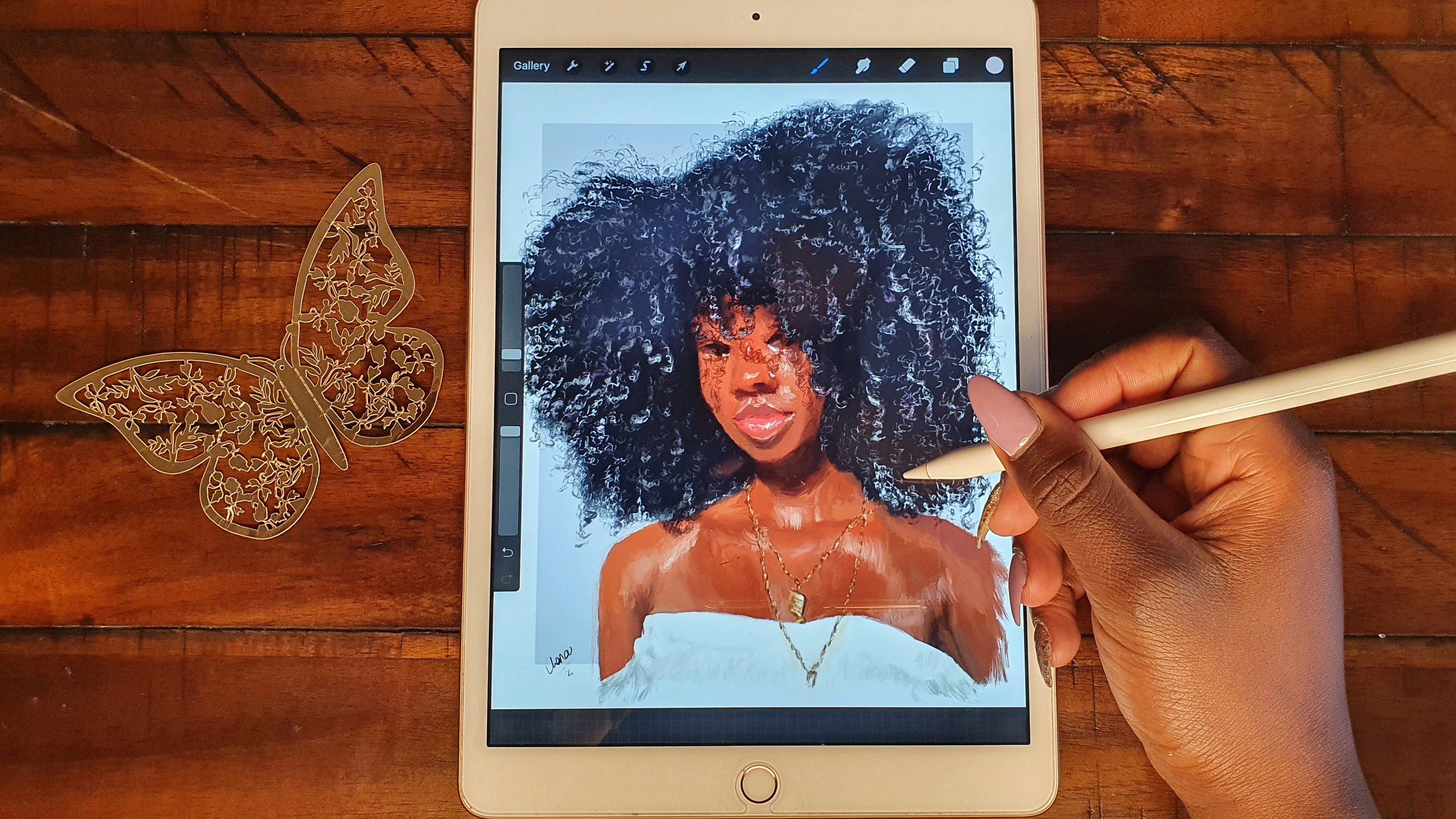
1. Introduction: As an Art teacher, one of the things
that the kids that I teach ask me the most about, is how to draw realistic faces and make them look
like actual faces, not just circles and stick figures as they used
to drawing in school. I remember the
fascination that I had in drawing and replicating pieces of my loved
ones and people that I saw on the Internet when
I first started drawing. But knowing where to start and wanting to do it are
two separate things. Hi, my name is Jenna, an artist from Nairobi, Kenya. I'm an almost full-time artist and I spend my time
either teaching, drawing my own art and selling it or running my
other businesses. In order to tackle the
question on how to draw faces, I decided for us to split it all into small, understandable
bite-able chunks. That means we're going to
start by learning how to draw the eye and then move on to
other features of the face. Because I think
by knowing how to render the individual features, then we can later on learn
how to bring them all together and make
them look realistic. This class is Part 1 in a two-part series on how to
draw realistic looking eyes. In this class, we're
going to be using the soft airbrush to
render those eyes while in the second class
we're going to be using digital
traditional brushes, if I may put it like that. Such as drawing a realistic eye using watercolor brushes or drawing a realistic eye using pastel brushes or
an oil paint brush. That is what we're going to be covering in the second class, as well as the eye facing
different directions. I do have a class up already for anyone who is a complete
beginner to Procreate. If you're a beginner
and would like to learn the tools, tips, and tricks to Procreate before
jumping into this class, feel free to check out that class before
you come back here. But still in this class, I shall be explaining what I'm doing and why I'm
doing what I'm doing. You don't necessarily
need to take that class before coming into this one. If you've ever been interested
in learning how to draw faces and in particular
while using digital mediums, welcome, and let's start
off with the class. [MUSIC]
2. Materials and Class Project: Since in this class we shall
be using digital mediums, the materials needed
are very few. All you'll need is an iPad
that can support Procreate, as well as an Apple
pen or any stylus that is able to
draw on the iPad. For the brushes that we're
going to use in this class, we are going to be using
the soft airbrush, a modification of it that I
downloaded off the internet. But if you can't
access that one, you can always use the
soft airbrush that is available under the
brushes section. For the class project, I'd like you to
follow along with the demonstrations that I'm
going to be showing you. Then, once you're done, please post them in the
class project section. If you need to slow down
the video so that you can understand the steps that I'm taking please feel
free to do so. All the resources as well as other reference images
that you can use to just practice on your own can be found under the
resources section. You can also find my
Procreate files there. You can import the files
into Procreate and see all the different
layers that I had and also, observe the different
colors that I use as I was painting my two eyes. Now I feel like we're ready
to get into the class itself. See you in the next lesson on the theory of how to draw eyes.
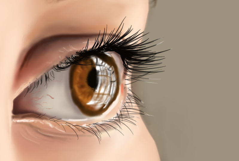
3. Basic Theory Part 1: [MUSIC] Now I'd like us
to start talking about the theory around eyes. I find that eyes are
something that artists usually put it to be quite prominent when they
are making paintings. You make the eyelids the
focal point of your painting. That's by maybe making the
iris really colorful or including highlights or maybe by making the pupil
really, really big. It's really not necessarily that both eyes are made
into the focal point, it can just be one eye is
made into the focal point, and the one eye is usually
in the face at a 3/4 view. That one eye that is in
this other direction, is really need to be the
focal point of the painting. Other than the eye, the other part that's
usually made to be the focal point is usually
the mouth, and for the mouth, you can generally
make the lips to be maybe not as
realistic as they are in real life by including the highlights or making
the lips really huge. For the eye being
the focal point, the best example is looking
at Disney characters. [MUSIC] When you look
at Disney characters, let's just start with
this cute guy right here. You'll see that the
eyes are made to be really, really big and the
pupils are really, really big. That's usually the best
example that I can think of. Even right here is this Elsa. No, this is Rapunzel. Even in the old cartoons,
eyes are always really big. Let us now move on to
expressions and eyes. Because eyes are one of the most important
ways on how you get the emotions that somebody has behind their
eyes inside their head. It's always expressed
on their faces unless the person has a
really great poker face. It all goes together with
the eyebrows, the wrinkles, the skin around the eye, and the actual size
of the eye-opening. Let's put it like that because now we're
going to talk about it more in-depth right
now as we move forward. Starting with this
first eye, you can see that this person, let me create a new layer, has a neutral expression, there are no wrinkles
other than for old age, there are no excessive
wrinkles around the eye. The eyelid is covering
the iris quite a bit, which is normal in real life, not excessively covering
it too low or too high. Of course, with the eyes closed, you only be able to
see the eyelid and the wrinkles of the
eyelid or the top. There are also different
lid, eyelid situations. Somebody can have a monolid, a hooded lid, or these lids that you're
seeing right here. I'm going to show you
different examples of those different lids, and that's also evident with the eyes being opened and
also the eyes closed. This of course is with the eyes looking towards the left side. Then these ones with the eyes
looking towards the right. One thing I want you to note
is that for feminine faces, they don't really have a very strong nose
bridge right here. You're going to be able
to see a lot more of the other eye that is in
shadow on this other end. Plus when we're going to check
out the masculine pieces, that this other eye is
covered a lot more so you're not able to see it
that much in the 3/4 view. Now, these last three are just a small example of how
eye expressions come in. You remember I told you that there are three
things to look at. Number 1, the eyebrows. Number 2, the eye opening. Number 3, the wrinkling of
the skin around the eye. You can tell that in this
first one right here, the person looks either
angry or worried, of course, if we
could see the mouth, we could also be able to make
a more accurate judgment because the mouth also
usually has lots of wrinkling around it and also the downturning or upturning of the mouth gives us that person's
expressions and emotions. You can see here that the eye is being covered a lot more
by the top lid right here, it's covering the
iris quite a bit. Then the direction of the eyebrows are up-tied
towards the center, which shows that distress. Then you can notice also the
wrinkling between the eyes. You can see this wrinkling
between the eyes right here. Now in this one, even
without me saying anything, you can guess that the
person is likely happy because you can
see the wrinkling towards the end right here. That is from when the mouth is smiling
right here at the bottom, you can see it's going to push
up the cheeks right here. That is why there's always wrinkling towards the
sides right here. Now that's just a happy face. Then lastly, this is, let's say more of surprised. You can see that
there's wrinkling towards the top of the eyebrows. Then also the opening to the
eye is really, really big. We can see more of the white
of the eye right here. Even in some cases, you can almost see the
white of the eye at the top of the eye right there. Now, before we move on
maybe to the next one, let me just also
mention something like the reflections of the eye and they're very
evidenced right here, you can see the reflection of the light. I've just covered
it with a color. They're always reflections
on the eyeball itself. It's not only on the iris, the reflections are also always
on the whites of the eye, which are truly white. They can also be right here let me zoom in
quite a bit fast. They will also be quite here
at the bottom of the eye. That is because the
eyes are quite teary, so that's the reflection from
the light around us and it makes this whole section
to be quite outstanding. If I were to use a white
color, just to emphasize, you'll see reflections here on the pupil on the
iris themselves. Then they'll also be some
reflection right here. This is just an
exaggeration also at the center towards the
inner corner of the eye. Then here also on this next one, you will see the reflection
on the whites of the eye, and the whites of the eye
are called the sclera. We're going to go into that
in just a few minutes. That reflection is
usually at the top, especially if the eye
is completely open. Now this one, you can tell that the lighting in this
other painting, in this photograph, you can tell that the lighting
comes from the bottom. That is why the reflection
is right here at the bottom. Same here. The reflection is right
here at the bottom. That reflection isn't usually bright white but of course, in many paintings, you'll find that artists,
including myself, they usually use a really
bright color to make it stand out a lot more like in those Disney paintings that I've just shown you right now. But then again, remember that if that highlight is going
towards the shadowed area, and this top part is
always the shadowed area, even though I've colored it right now with white just
to make it stand out, that whole top part is
really a shadowed area. That's highlighted
right there in the shadowed area is not
going to be a bright white. Please make that highlight match the value of that section. Make it a grayish color. You'll notice that in my
paintings, most of them, I will use a grayish
color for my highlights, and only at peak top
of the highlights, that's when I'll
use a bright white. Otherwise, I always
use some shades of gray to draw
in my highlights. I'm just going to slightly
mention for a male. Remember what I talked about
when it comes to females, they have a very delicate
nose ridge line. For the male right here you
can see that it's way more prominent and you can see
much of this iris here. Again that is just
a generalization. In some cases, the nose
line will be a lot gentler, but this is just
a generalization. Then of course, the eyebrows are also normally really bushy. I am jealous of that, but
anyway, [LAUGHTER] that aside, and you will find that most of the time they will
not use a lot of contrast when it comes
to their eyelashes. The eyelashes are not
usually the focus of a painting and are normally exaggerated when it comes to a meal but of course, for a woman, you'd
make them really long. [MUSIC] These are terms that are used mostly in the beauty industry to
describe how eyes look like. But it's not something
that you need to necessarily keep in your
mind as you're drawing eyes. Just don't try to categorize it, but just notice the
different features and differences between different eyes right here. Because you can notice that they are a few differences between
all these different eyes, and of particular importance
I want us to look at these monolid eyes and
the hooded eyes because, for monolid eyes, you will
find that they don't have a prominent crease
compare it with this almond eye where there's a prominent crease right
here at the eyelid. For the monolid eyes, the crease will not
be that prominent you can even contrast between these two eyes, the
left, and the right. The crease which
means the color, the crease here for the left eye is practically nonexistent. Then here on the
right eye, there is a little bit of a crease, but that's just the point
for monolid eyes that crease is interiorly
there that much, and you do find those eyes
to be really beautiful. For the hooded eyes, you'll
find that the crease is it almost overlaps
with the eye. It almost covers the eye such that will not see this
crease right here. Let me use a brighter color. That crease will
be somewhere here, and it's covered by the
eyelashes right here. That crease will be quite low. That's something I'd
like us to take note of when it comes to
different kinds of eyes. Maybe lastly again, close-set
versus wide-set eyes. The distance between
the two eyes is usually the length of just one eye. It means that if I were to cut, you will find that
the distance between these two eyes if I
had cut it exactly, it's just now that
it's going to be like one island between
those two eyes. But you will find
that for some eyes, that distance is
a lot bigger than just one eye or it can be a
lot smaller than one eye. But generally, it's just the distance
of one eye. [MUSIC]
4. Basic Theory Part 2: [MUSIC] It's really
very hard to consider the eye alone without
considering its relation to the nose here on
the side and also the cheeks here at the
bottom and the forehead here at the
top because each and every part of the face works in conjunction
with the other part. But right now since
we're starting off just by drawing each and
every feature by itself, then later on we're
going to talk about the relationship between all these different
features and how to now bring them together to
construct a harmonious face or whichever face because most faces are not
symmetrical in real life. If we were to start by labeling this picture right
here, of course, this is the eyebrow, then here there is the eyelid, and of course there
is the flap here of the lid right here. Then you'll find that
this inner white part in quotes of the eye
is called the sclera, then you have the colored part, which can range in
colors from green to actually jet black is the iris, then the black inner part
is called the pupil, then lastly, this inner part
is called the tear duct. The sclera of the eye is
never really white as much as in cartoons it's usually indicated as white or
as you're drawing, you'd be tempted to
make it to be white. Most of the times,
it can be tinted either towards the red or
the oranges right here. You select a desaturated red, a grayish color right here. Then it can go more towards the darker side or more
towards the lighter side, as even indicated
by this drawing. You can see this
side and this side, they're both different
shades of ''white''. Then when it comes
to the iris itself, let me use a dark color anyway. If the iris itself is green, you'll find that
the ring around it is a really dark ring. You can see that
this inner part is lighter green than the ring
around it is really dark. It makes it stand
out a lot more. Then of course,
for this reference image that I have selected, it's composed of
different colors and different shades of
those different colors. The inner section is a lot
more orange right there, and it is actually
quite deep going towards the reddish
section right there. When you're painting
it, you layer so many different layers of
different colors or with different transparencies
to indicate the beauty of the eye itself because it has so much beauty, and those different
colors interact to create now that focal point
that I was talking about. When it comes to highlights, it's very evident in
this photo right here. There's really a highlight
here and that highlight will also still exist within
the shadow itself. It usually cuts quite across, even up to the iris
section right there. Feel free to exaggerate
the highlight to make the eye that you're drawing to pop a lot more and
to stand out more. That highlight also exists
here at the bottom. For this photo, that highlight, I think, it was taken
outside at the sun. Even this highlight
at the bottom can be extended right here to show the teariness of the eye right
there. Then what else? That highlight, if
you're, of course, continuing the skin around it and depending on the
lighting situation, that highlight shall
also exist right here on the top of the lid and right here on the
brow bone right there, because that's where even
when people put on makeup, that's where they
put the highlight. This is a personal preference. I usually include
a highlight right here at the inner
corner of the eye, and then depending on the
resolution of your photo, you could also include
the highlight right here at the bottom lash line, there are usually some
highlights which are related to these ones at the eye
itself on the inside. You can include the
highlight right there. That's why as kids
we used to draw the eye like a cycle by itself because when you
consider the eye in relation to
everything around it, with the brow and everything, it's usually considered
to be a circle. If you were to start
with a circle like that and then let's say for example we are
drawing the left eye, you would start with the
inner tear duct corner, which is something like that, and then it moves on up. This is just a rough example of how an eye would look like. To move on up like
that to the peak, and then now move on
to the side like that. Then now when it comes
to now the bottom lid, it's usually quite asymmetrical, this side now going
to be shorter, then it moves and closes off to the other
side right there. Of course something like that. Then here at the inner corner, that's where your tear
duct is going to be. Then if we're now
to draw the iris, the iris is usually in the
normal neutral situation. The iris is going to be
covered by the top lid. You won't see the full
iris unless of course, maybe the person is
excited or surprised. Then in the middle, I'm going to have the pupil. Then we have to also
indicate the top lid. The top lid is going to
come something like that. Then of course, the amount
of shadowing shall depend on the lighting situation
that we are considering. Then we're going to have
also the bottom lid, which also goes with
the shape of the eye , something like that. Then right here, we're
going to have now the brow. Of course, the shape of the
brow itself is going to be dependent on the person. If it's more of a feminine face, more of a masculine
face, dependent on that. Then one thing that I want
you to note is that there is a bulge when you are
drawing the bulge of the lid, because remember that this fold is where the skin is going
to be bunching up together. If you are now to
bring in color, this line right here is going to be very dark right here
to indicate the shadow, and then this dark shadow fades out as you move
towards the outside. Also again here, it fades out as you move
towards the outside. That's why I'm drawing
these lines right here to remind you that there is going to
be a graduation of shading as you are shading. You're drawing, coming out from the crease of the eye all the way outwards
here, right here. This whole section
of the sclera and the iris is going to be in shadow from the top
lid right here. This line is not going to exist. This is just to remind
you that there is going to be a shadow
area at this point. Then here at the bottom, at the point where the
eyeball meets the bottom lid, there is always a
highlight right there. Then one thing to
indicate that there is always a thickness to
the bottom lid right here. There's always a
thickness to it. Depending on the
angle that we're looking at the top lid at, there is always a thickness
to the top lid over here. Of course, the angle at which we're
looking at the eye is going to now be dependent on how much of that thickness we
are going to be able to see. That means the point at
which the bottom lashes attach on is this
section right here. It's not this inner section
that meets the eyeball. It's this outer section of the thickness
of the bottom lid. The point at which
the top lashes attach is this
section right here. Of course, this other party is the one that is in
contact with the eyeball. Just to draw the
eyelashes like that, is this top part because there is a thickness to
the lid right there. Then there is
always a highlight, also somewhere here
at the tear duct. The tear duct is always
going to be very dark and fleshy and reddish, but there is always a little bit of a
highlight right here. Then here are the shadow area. You also always
find a highlight, but as much as it
is a shadow area, you will find a
highlight that runs. No, depending on the
direction of the light, either the direction
is going to be this side or this side or front top, depending,
doesn't matter. But now this is in a
neutral situation. You're going to find that
there is a highlight that just runs like here. It's going to cut across
to the pupil a little bit. You can always add your own
other little highlights, but just try to make it
as realistic as possible. Then again, over here
for the bottom lid, there is going to
be a curvature to the bulge of the bottom
lid because this right here is a crease before now it moves on to the
cheek section. Because now this is
going to be a cheek. Remember, this is
where your nose is. Then there's going to be a
relation between the eyebrow here to the bridge of
the nose, right there. But we're going to talk about
this relationship between the eyebrows and the eyes
and the nose later on. But just remember that your nose is going to be
right here and your forehead, to the top right here. There's always a highlight
here at the brow bone, it's the section
that people usually put highlighter whenever
they applying makeup. There's going to be a
highlight right here. If the highlight is here
there is also going to be a highlight here at the top lid, at this crease,
it's just going to be another highlight right here. For the bottom lid, you're going to see
little highlights between the, what are they? The little lashes over here. You're going to see
some white highlights. If we go back to this one, to this example right here, you can actually see
those highlights. I've been pointing
them out before, right here between the
lashes of the bottom lid. When it comes to
drawing the lashes. I'm just going to show
you a quick example of how I usually draw them. I usually always
use the studio pen because the lashes
usually have a T bar. They start thick and then they become really thin
towards the end. You can see it's
thick right here and thinner towards the end. You can see thick and thin. Whichever brush you're using, remember to indicate that tip. Select another brush
to show that example. Don't just make it to be a straight line in
and out like that. There's always that
tipper towards the end. Basically, now that is the
theory behind the eyes. Now if I were to look at the
eye towards the side view, maybe the eye facing
in this direction. Now that is when
you're really going to be able to see
the curvature of the eyeball itself because
this is how it's going to be, of course, going like that. This is just a generalization. You're going to see
this protrusion of the eyeball right there. Then the iris is going
to be right here. But the pupil is going to
be not here at the end, but here at the middle. This is quite a big pupil. Then you're now going to be
able to see the protrusion of the top lid right there and the protrusion of the
bottom lid right there. Moving on to the
crease right there. Then maybe even to the
eyebrow right there. The news reach nose line
is going to be right here moving on upwards. That way you can be able to see the curvature of the eyeball. Can be way more curved
with less curve. But note where the pupil is, it's not right at the end, it's here at the middle. I urge you to go
with your friend and try to look at
their eyes facing different directions to
see how the position of their pupil changes according to the direction that
they're looking at. Now we have covered most of the theory behind drain eyes, and the best way
to actually now be able to truly understand what we have talked about is just by actually getting into
the class and drawing different examples of
different eyes so that we can see all the different things that I have been talking about, about the curvature
of the eye and the shadows in the eye and
the highlights in the eye. The best place to get these
examples for me is always from Pinterest
because there you can find so many different
reference images. Now, once we are done with this, if you're ready, let's move
on now to the next part, which we're going
to now start with a class demonstration
by sketching it out. [MUSIC]
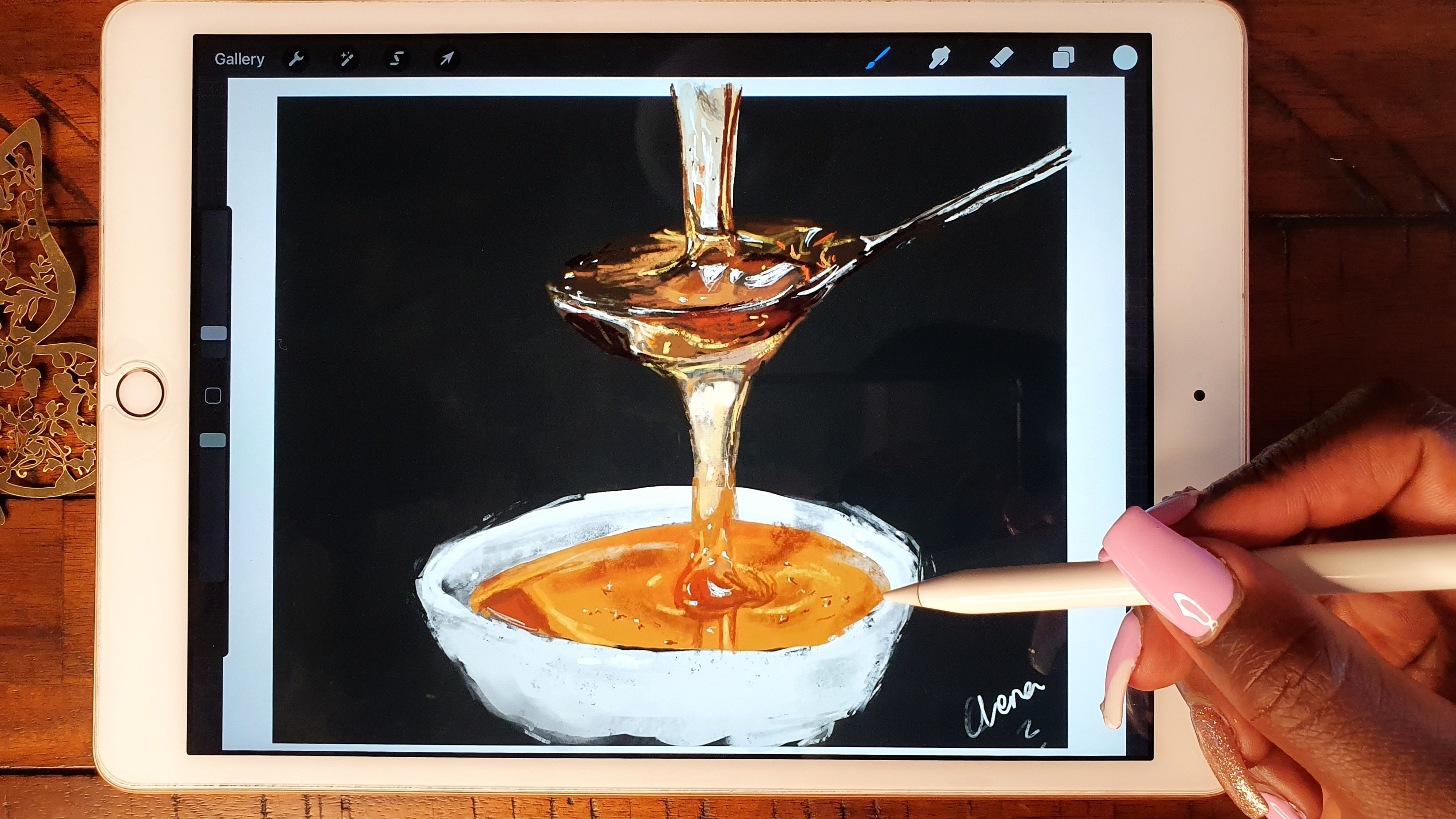
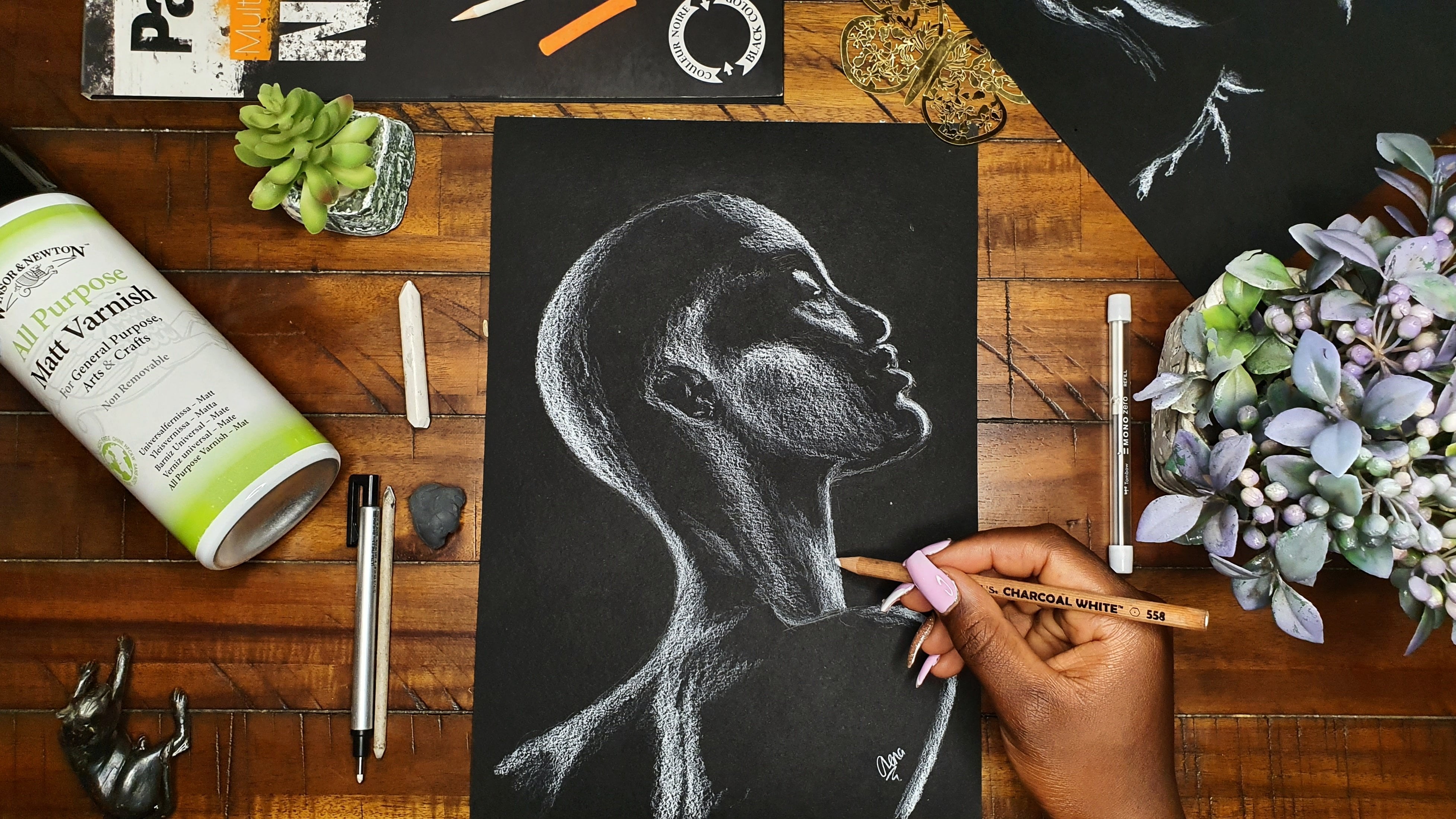
5. First Demonstration: The Sketch: Now let's get into the
first demonstration. For both this and the
second demonstration, we're going to be
using the brush that I mentioned before, the soft airbrush. While in the next class, the Part 2 and how to draw eyes, that's when we're
going to introduce different brushes that have traditional effects
like watercolor brushes, oil brushes and stuff like that. If you're ready for
that, let's now get into the first
demonstration. What I always do is first of all click
on create a new Canvas, but there's this Canvas that
I've been using for a while. That is, the dimensions are 10 inches by 10
inches and 300 DPI. I've already pre-saved
it under my list of available pre-saved Canvasses
on the top right corner. Next, we're going to import
our reference image. I already saved my
reference images into my photo gallery, so I just import them. Then, I'm going to now
select my sketching brush. This is the brush
that I downloaded for free off the internet and I shall also link to
where I downloaded it from. I always use this bright
red color to sketch out. The way I'd advise
you to look at the sketch whenever you're sketching is to be free with it. You can sketch a small or
as big as you want to. Because either way,
I like resizing my sketch to fit the canvas in the way
that I'd like it to be. Don't be confined to make
it too big or too small, that can always be
changed later on. What matters is to
just try and get the sketch to be as accurate as possible to the
reference image. Now the accuracy sometimes doesn't come off as true to the reference
image as you'd want it to be, but I find that to
be because once you add in the colors
and the shading, that's enabled to
put the features exactly where they're
supposed to be. I like to approach paintings as sculptures and you shall see that as we go ahead
further within the class. Make sure that you include all the major
details for the eye. For example, put in the
inner corner of the iris. You can even sketch in
where the pupil is. I didn't do that
because, as I said, I like sculpting my paintings so that I'll put in
the pupil later on. Sometimes you find that
when you put the pupil at a spot where it's not
supposed to be and then the eye seems to be looking in a direction that does not
match the reference image. If you would like to access the same sketch
that I've done, you shall find it in under
the class resources section, and you can use the same
sketch and just import it into your Procreate Canvas and paint directly onto
it or from it rather, instead of sketching
it yourself. But still, I'd prefer and
I would encourage you to sketch it out
yourself so that you can also get in
some good practice. Now you've seen that
I've just resized my sketch to fit the Canvas the way I
want it to be for now. I shall still end up
resizing the Canvas later on and copying off some
bits and pieces later on.
6. First Layer Of Colour: [MUSIC] Now let's
move on to putting the first layer of color. After we're done with the
sketch we're going to create a new layer and this is where now we're going
to paint the skin. You're going to see how
I'm going to be arranging my layers as we go along. The brush that we're going
to use for this class specifically is
the soft airbrush. Now, this is again a modification
of the soft airbrush. If you don't want to download it you can also always find it under the airbrush
section of the brushes. [MUSIC] Now when it comes to the skin color
that you're going to pick, you saw me testing out
some swatches faster wall because I wanted to
judge by comparison to see which color closely matches the general look of the skin
of our reference image. We don't need to get all the different colors
of the skin first of all. We just need to get a general
color that shall paint all over then later on now start sculpting and
adding the shadows, highlights, and
other little bits and pieces to make it
look all life-like. [MUSIC] Once you're done with adding the base coat
of color for the skin, create a new layer
where we're going to now paint the eye. When it comes to the
organization of layers you'll see me switching
the layers around because remember
whichever layer is on top always covers
whatever is below. For now for the eye I'm going to start by painting the sclera. Yes, you can see that
right now the layer I have put it on top but
later on you'll see me moving it below the
skin layer so that I can be free with my painting
of that part of the sclera. Now, the sclera is basically the white of the eye but the white of the eye
are never white, they are always tinted. Now, if you look specifically at our reference image you
can see that it's tinted a little bit to the
pinkish, grayish side. Next up we're going
to draw the iris. Create a new layer for the iris, don't draw it on the same
layer as the sclera, just so that you can be
able to easily paint. That's the advantage of
digital art as I said before. Take advantage of all
the little things that you can get from it which is like creating new layers. It makes it easier to
arrange your work, to paint without painting over, move around your layers to arrangement that
works for you. In the end I settled for the inner layer that you
can see on my screen. For the iris use
the same approach as we used for the skin. Start by placing a large
base color which is blue basically for this
reference image then now later on we shall add in the highlights and the darks. Depending on which layer is on top and which layer is below the upper you might need to do a little bit of erasing
and cleaning up of edges. That's something that you
shall see me doing as I go along switching
from layer to layer. [MUSIC] After I was done with the iris the next step
was to draw now the pupil. The pupil again I decided to put it on its own different layer. You should also do the same. [MUSIC] Pupil is
basically supposed to be a dark black but you can also choose like a
really dark blue, not necessarily a deep
dark black. [MUSIC]
7. Shading The Skin: Next up, we're going to move on to shading the skin and making it look a little
bit more realistic. After drawing the iris, I went back to the skin and
decided to start bringing in some shadows and highlights to make it look a lot
more 3-dimensional. Thereby picking a
light pink color from the classic color
selection section. That light pink color is what
we're going to use to add some shadow to the inner
corner of the eye. You notice that the
reference image shows her skin or his skin. We can't really be sure to as having very many
different colors. It's not just one base color, which is the difference
between cartoons and realism. Especially if you're
going for something that looks a lot more realistic, you'll need to use
not just one color, but mix so many
different colors. Blues, pinks, purples,
yellows, oranges, everything. The goodness of digital art is especially if you use
the classic section, which is what I love using, is that you can hone it down to the hue of color
that you need. Whether it's leaning
towards orange, leaning towards purple,
leaning towards blue, and also for the brightness,
you can also just use the slider to adjust the
brightness of the color. Then again, use the slider, which is still there available to adjust the saturation of the color of the
color that you need. When it comes to the top lid, it's a combination of so
many different colors. Like you can see,
the overhanging skin above the fold of
the lid is a little bit tinged orange-brown and
just below the crease itself. It's a bit bluish-purple, pink, so you mix all those
colors as you paint. This is why for this class, I did not give a color
palette that you should pick from. It's because it's a combination of so
many different colors when you're drawing
realistically. It's not like the
previous classes where I would be able to give you a set swatch color palette. Keep on refining the skin and selecting colors just
by using the slider. As you can see me
sliding with my pen, selecting different hues, tint, saturations until you find what matches with what you can see on the reference image. Again, remember that what you can see on the
reference image doesn't have to be just
one color that you've selected and laid it on thickly, you can always layer colors
by varying the pressure with your pen to create the look
that you're looking for. If you want to create a smooth edge and transition
between different colors, try to use less pressure with your pen as you are painting so that you can be able to smoothly transition
between the two colors. The easy hack is always to
use the smudge tool and you'll find me using it once in a while as I'm painting here. But you can always
avoid using it if you want to avoid using it just by varying the
pressure of your pen. That can also be done by
color-picking really along that edge of the transition
of color so that you can be able to blend
the two colors together.
8. Shading The Iris and Sclera: It's now time to start
shading the iris and the sclera to make
the painting start to come together, and bringing some shadows and highlights
to put those areas. Now, next step was
to move back to the pupil of the eye and try to define it more after we've laid down some basic
colors on the skin. The first step was to add now the dark ring of color
that surrounds the iris. For that you can use a really deep dark, bluish,
greenish color. Doesn't have to exactly match what you can see
in the reference image. Remember, you can
just interchange between the different layers
to refine your edges, especially if your pupil and the sclera are
on different layers. You need to refine the
edge to make it blend more, and still to be very
distinct from each other. [MUSIC] Remember for
the first step, we just laid a layer of blue color and they said about later I'm going
to add shadows, and now this is a step that
we're taking right now. I'm layering different hues of blues and greens onto
the iris to bring in some variation and
visual interests to the eye because it's not
just a clean blue color. [MUSIC] Now, I went back to the sclera and started adding a lot more colors into
the edge of the eye, starting with the right
edge of the eye using a light pink color because that's how it is
in the reference image. [MUSIC] Pressure control is very important when
you're drawing digitally, and they think also with
most other mediums, because that's how
you vary the look of what you want to get
from your painting. [MUSIC] For the left
inner corner of the eye, I used the same color that
is at the crease of the eye, which could say it is like
a more dark purple color, and you can use
pressure again to make the deep inner corner
to be way darker than the areas where it's fading out towards the bulging
center of the eye. [MUSIC] Now that's how
you make the eye look 3D by carving out the colors, making the outer
corners be really dark, and then when it comes
towards the bulge, the center of the eye and make it lighter because that's
how eyes looked like. Looking at the reference image
has either at the center, when the whites of the
eyes are going towards the iris it becomes way lighter
than the outer corners. [MUSIC] At the inner crease
of the eye towards the left, we used the red color, the same red color we use when we're sketching
to just use it lightly and layer that
fleshy section of the eye. [MUSIC] Feel free to always
use the color picking tool to lay down the color that you need at whichever
section that it is. [MUSIC] One thing that you should
always try to make sure that you're doing is drawing
on the correct layer. Because sometimes
you find that you bleed down so much color, but it's on the wrong layer and then now you
end up having to erase everything or working
around that mistake, which could end up being
very time consuming. When it comes to the right
section of the sclera, I used a light blue color, which actually tends to add gray to round out the
white of the eye. Because as I said before, it's not a flat white color, and towards the top lid and the bottom lid they'll be
a little bit of a shadow, then again, a little
bit of a highlight. Now use those colors to round it out and make it look
more three-dimensional. [MUSIC] Something that makes paintings stand out a lot is giving them a
lot of contrast, so don't be afraid
to go too dark. I don't really believe
there's something as way too dark
or way too light, as long as there's a good balance between
the darks and the lights. For the pupil of the eye and
the outer ring of the eye, go as dark as you need to go, just to make it stand
out more. [MUSIC]
9. Adding Details To The Iris: [MUSIC] After the
previous lesson, I think it's now
time to start adding details and highlights
to the iris because that's what makes the
eye look realistic. Those reflections
from the environment around the person who
is the reference image, whether they're being
photographed or whether it is like a life drawing. At this point, I started
adding now the patterns within the iris itself. For that I used a really
light blue but not a white, because we shall still use a white later on to add the
brightest highlights. Right now it's just to carve out the tiny little details of the pretty patterns
within the iris. [MUSIC] Use really light
pressure as you're doing this. Again, the other alternative to the light
pressure is to lower the opacity of your brush if you can't vary the pressure
using your hand itself. [MUSIC] Once I've added the little light patterns, I now create a new layer beneath the light layer of
those patterns. Now I add dark patterns to
the iris, and to the pupil. [MUSIC] Again, what's happening here is just
using very light pressure and the opacity of my brush
is not at 100 percent. Our aim is to make it such that when somebody
looks at the painting, they can see as if there are
so many different layers to the eye itself. It's like it's somebody
who's sculpted it and had a plan when they're
going into the painting. [MUSIC] Again, created another layer even on top of the highlights to add the reflection that
is within the highlights. You can see that when you
look at the reference image, it's like there was a window to our right of the reference image and it's being
reflected into the eye. Remember when you're
drawing that window, that reflection of
the window to curve those lines the way
the eye curves. That is what also
gives the illusion of an actual
three-dimensional eye. To create those lines, I'm just using the
same dark blue color that was used on
the lower layers. We want it to look
all harmonious. If you'd like to find
all the different layers that I've used in my painting, please check the class
reference section so that you can see all
the separate layers that I used and use as
many layers as you want as you need
for your painting. I'm still adding more details
to the pupil of the eye. After I was done
with this point, that's when the eye stopped
looking too much like a cartoon [LAUGHTER] and started looking
like an actual eye. That's the beauty of highlights and darks,
as I said before. Don't be afraid to push them
as much as you need to push them as long as you have
a balanced between them. Your painting doesn't look
too dark or too light. In the next lesson,
we're going to now add more details to the
skin to render it a lot more because the skin
needs a lot of work especially if you
have decided not to use the smudge tool. You have to take the time to continually
select colors, and blend between the
different color changes because the skin is
just not one color as I've already
mentioned before. If you're ready, let's move on to the next
lesson. [MUSIC]
10. Adding More Skin Details: [MUSIC] As you keep going along, you'll find that
you need to make even more edits and add
different colors to the sclera. [MUSIC] For example, to make the iris of the eye's timed out, I added a little bit of a lighter peach color
just at the rim of the sclera itself
for it boarders with the iris so that that dark of the iris
could stand out more. They still went back to the
sclera again and added way more darks where the lid
overlaps with the eye, just so that I can
also make that flap, that flap of the lid, because even in real life, you'll find that the lid
casts a shadow to the sclera, to the eyeball
itself to make now that boundary stand out more. [MUSIC] When you go
back now to the skin, keep adding shadows to the lid of the eye and even
to the lower eyelid, define the section
where the eyelashes grow from the lower lid
and from the upper lid. [MUSIC] This is why
doing studies is important because
when you do studies, that's when you can notice
that there is an actual gap. There is little gap between the eyeball and this bottle
where the lower lashes grow. That's strip of skin, is a little bit lighter than the spot where the
actual eyelashes grow. Make sure that you
define that section, add a little bit of shadow, and make that
intersection a little bit lighter because
that's what makes it look even more realistic. Same goes to the upper eyelid, you'll notice that
there is a strip of skin between the eyeball itself, like that little thickness
between the eyeball itself and where the actual eyelashes grow and it's a little bit
lighter than the section, the spots where the
eyelashes grow themselves so try to include that as
well as your painting. [MUSIC] The skin needs a lot of rendering to make it look
smooth and three-dimensional. As you can use the sketch is still there to guide us and it does make everything look a
little bit strange as of now, but it still reminds you of other things that
you need to add, like for example
you'd need to add still the folds of the
skin below the eye, and even above the eye, you can see that a little splashes of color that are
indicative of freckles, you can add them if you'd like. As I go along, you'll see that I'm also going to
add them to my skin. [MUSIC] When painting skin, let me see when painting
with this brush in general, you will rarely need to have your brush at full
opacity at 100 percent. You'll mostly have it playing at around 60 percent, 70 percent, sometimes going down
even to 20 percent, just so that you can be able to really blend the
colors together. As I mentioned before, feel free to use a smudge
tool whenever you need to. But as we go ahead in the next class that
I'm going to be posting, we're not going to be using
the smudge tool at all. So just have fun for now. [MUSIC] What defines
the bulge of the fold of the lid is making sure that the crease
of the lid is really dark. Then there is a strip of highlight which is not
necessarily white, white, but there's a strip of
highlight now before you get to the where the
eyelashes grew from the lid. That's what defines and makes it look like there is some
curvature to the lid of the eye, to that fold of skin. Same goes to the
top lid when it's carving from the crease itself, you need to make that color blend seamlessly from
the crease itself. [MUSIC] I'll emphasize that when it comes to the
drawing of the skin, please take advantage of the classic section for the color picking
so that you can be able to easily use the slider to choose the color that you
need for this game. If you see that the skin is, or even if it's the
sclera or something else, it's tending towards white, use the brightness slider to finesse and find the
exact color that you need. If it's tending
towards a certain hue, use that slider to get
the hue that you need. You will never really get this one color
that you're going to use for the entire section of skin or whatever it may be, you'll really need to
mix colors and that is why this practice is
important even before we latter on go
into classes on how to draw actual portraits without using any color picking tool for different
skin tones. [MUSIC]
11. Eyebrows: Now, it's time to move on to maybe my best part which
is adding eyebrows. I have a belief that
eyebrows make a woman. It's always strange
to you see somebody who you're used to
seeing having eyebrows, not have that eyebrow. Let's now bring those features into place. As you go along. Just make sure you remember to label your layers so that
if you ever need to go back again and see where you drew what and figure
out what was where it's simpler for you to do that. Now, our whole image looks
a little bit like an alien. Now, the next step
we're going to do is to add the eyebrows and then
later on the eyelashes. To do that, we're
going to create our layer for the eyebrows
then we're going to pick a dark brown color that's
tinted a little bit red. But then again, you
could also use a color that's tinting towards orange, that's not unlike
a lighter brown. You can also use that. I'm going also to lower
my opacity again, as well as the size of the
brush and then I will just use short strokes of the brush to
draw the tiny little hairs. There are so many different
ways to draw the eyebrows, and this is just one
method and you'll see different methods in some of the other paintings
that we're going to do. For the first layer of "hair", I'm using very light pressure. Then now the second
layer for the "hair", I'm using more pressure. You're going to see the
hair is becoming darker and darker as we add
more and more layers, that is I'm going to be using a darker color
later on as well as more pressure with my pen to make the eyebrow to
be way more thick. The person in the reference
image has bushy eyebrows, which I am very jealous
of I have to say. We're going to try and
imitate that by layering so many different layers
of hair so to speak. Remember to draw the hairs in the direction in which
the hair is growing. Do not just paint it in
any which way or use squiggly lines because the hair is growing in a
particular direction. It grows up towards the
inner corner of the eye. Then, when it goes towards
the outer edge of the eye, it starts leaning
towards the right, so grows up towards the right, up towards the right and you'll
see me later on trying to correct because you can see
the lower parts of the eye, the hairs on the eyebrow, are little bit to straight
so I'm going to end up using an eraser, later on, to
weed them out a little bit. You'll notice that the
hairs in the eyebrow also have a little bit of
reflection from the light so we're going to also still use a light color to draw
some indications of hair that has light
reflecting off of them.
12. Eyelashes: [MUSIC] Now after the eyebrows, let's move on to the
other important part, which is adding eyelashes. The eyelashes are going to be on their own separate layer. For that I'm going to
use a dark bluish color. I love using the studio pen from the calligraphy section
to draw the eyelashes. [MUSIC] To draw the eyelashes, just use small shot
flicks with your pen. Note the direction in which the eyelashes are
growing towards, the curve along with the
curvature of the eye itself. Then that again also
still gives the illusion of your painting looking
all three-dimensional. Remember to use less pressure on your pen as you're
flicking outwards because the hair becomes more fine and thin towards the ends
of the hairs themselves. [MUSIC] Note the point at which the eyelash is
attached to the lid. It's not on the intersection
of the thickness of the lid. It's on the outer section. Remember when I
was talking about that thickness of
the lid itself? So, note where you're attaching the eyelash to the lid itself. For the lower eyelid, use a lot less pressure because the hairs there are very fine. You could lower the opacity a lot more if you'd
like to do that. Again, note where you're attaching the
eyelashes to the lid. For the eyelashes towards
the inner corner of the eye, they are way more fine so use a lot less pressure
when you're drawing them. You'll also notice
that the eyelashes have some reflection
from the light. To indicate that reflection, what I decided to do for
this painting in particular, was to create a clipping mask. Then to use a lighter color on that clipping mask
to change some of the eyelashes to
a lighter color. You'll see me doing
that right now. I've already created
a clipping mask. I'm just using a light
color and painting on top of some of those eyelashes to indicate that reflection
from the light. Instead of doing this, you
could also just create another layer on top of
this eyelash layer and use now this light color to add a few light-colored eyelashes. However, the goodness of the clipping mask is if
you find out later on, you decide later on that
you do not like the look of the eyelashes the way
you've done them now, you could just easily delete the layer of the modification to the eyelashes without affecting anything that was
originally painted. [MUSIC]
13. Final Highlights: We're now approaching the
final bits of this class. In this lesson are
going to be adding the final highlights to the eye, and even
some highlights to the skin to make it
look all glossy. [MUSIC] What's remaining is just to add more
highlights, and to refine the skin a lot more, and
maybe to refine the eyebrows. [MUSIC] Now I'm adding highlights to the
sclera and even also maybe more highlights
to the iris of the eye. I'm taking a bright white color, but I want it to
tend towards blue. I'm making sure that I'm
on the blue section. Then I'm adding those
highlights to the sclera. There's going to be
a highlight along the lower rim of the eyeball, that shows like the
eye is a little bit teary and reflecting light, as well as more
highlights maybe on the edges around the iris
on the sclera itself. You can add different
random highlights, even towards the inner corner of the eye and the outer
corner of the eye. [MUSIC] If you feel like you've made the highlight
to be a little bit too much just lower the
opacity of your brush. [MUSIC] Note that I also
toggle the visibility of the sketch layer to
make it not visible anymore because at this point we are done with the painting. We don't need the
sketch anymore, and it would just be confusing. After you've removed the sketch, you can now see if
you need also again, to add anything or
to remove anything. [MUSIC] For this
painting the brush that we basically used for everything was the soft
airbrush and well, other than the eyelash brush, which was the studio pen, but you could also use a soft
airbrush for the eyelashes. I just find it easier to
use a studio pen. [MUSIC].
14. Second Demonstration: The Sketch: [MUSIC] For this
second demonstration, we're basically going to be
using the same brushes as we used for the first
demonstration. Because as I said, they're the simplest and most commonly
used brushes I'd think. So make sure you import
your reference image. For the next reference image, I chose this one. Then just resize it
and move it off to the side away from everything. Create your sketch
layer, label it, and pick the sketching brushes that you're going to be using with the red color
and get to sketching. Again, as I mentioned before, do not really worry
about the placement, we shall still end up cropping our painting to the size
that we want it to be like. So for this, I want
you to look at the relationship between shapes. Do not think of it
as an eye or as the curve of a head
that is in profile. [LAUGHTER] Just look
at the shapes there. Like if it is a curved
line or letter S, a gradual S, oval or a
circle or a straight line. Just look at it like that
and look at the relationship between different lines
as we are sketching. Here's the easiest way
to draw to be honest, rather than cramming
different formulas as to how certain things look. Yes, there might be
general formulas, but the best way to draw
even for a beginner is always just look at
the relationships between different shapes. Look at the negative
spaces besides the shapes, look at the angles at which the different lines intersect
with each other and that helps you to draw
pretty accurately without needing to use any
measuring tools just by using your eye. [MUSIC] For this painting,
for this pause in particular, you need to note
also the shape that the eyeball makes when it
is turned off to the side. You can now really notice
the bulge of the eyeball beneath the lids
and you can notice the bulge of the
lids over the eye. You can even see the lower lid traveling behind the eye because the lower eyelid in
particular can see the bulge towards
the back and also for the top lid you
can notice that. So that's why I chose
this pause because it can help you to
do the observations and note how the eye looks when it's looking
in different directions. [MUSIC] I can speculate that the most difficult part
for this painting in particular shall be
getting the size, shape, direction of the
iris and the pupil correct. So do not worry
about that so much. The way that are
going to be able to be sure about how we are placed it is once we add the shading as I mentioned
in the first demonstration. That's the best way to
know whether you've placed things correctly because your eye will instinctively note and know if something is off. [MUSIC] Do not be too hard
on yourself and try to be loose and remove
all preconceptions of how something is
supposed to look. That's how you're
going to be able to see whether you've
made a mistake, whether something
needs to be moved, tweaked a little bit or not. I keep on moving, tweaking
a lot when I'm sketching. That's how you see
I don't really use straight lines once. I just use multiple
lines as I'm sketching, and then I end up erasing
the lines that I don't need. Because by using
those multiple lines, I can tell which one is
where it's supposed to be and which one is where
it's not supposed to be. [MUSIC] After done
with the sketch, we're just going
to crop everything to the shape that we want. [MUSIC] Next up we
shall be laying down the first layer of color, just as we did with the
previous demonstration. [MUSIC]
15. First Layer Of Colour: Create a new layer.
Now this time, we'll need a background as
well as the skin layer. Create both of them. [MUSIC] Then now add
the background color, which seems to be tinted
a little bit orange but towards gray, once you lay down a
color and you see that it's not what you need, you can always just tweak it. I noticed that I painted the background on
the wrong layer, it was an easy thing to change. You just change the
labeling that had put down. The layer for the
background should be below the layer for the skin. You'll see me moving the layer
of the sketch to the top because the sketch layer
should always be at the top, not below any other paint layer, otherwise you want to be
able to see the sketch. For the skin, again,
as usual just pick the base color that you can see generally
runs across the skin. For this one, I
wanted you to be a little bit tinted towards the red section. A bit red. It's not really tinted
towards the orange, but it's tinted a
little bit red. You'll see me changing colors a little bit until I find a color that I
really, really want. I decided to change the
color because at first I thought that I had selected
a color that was accurate, but I saw that it was
a little bit too red, so I push it a little bit
towards the orange side. Then I found that
to be a little bit more accurate to the
reference image. [MUSIC] After laying
down the base color, now you can start adding the highlights and
the highlights again, just by using the slider
for the brightness. Just push the color towards
the white section a lot more and you'll be able
to find the lighter section, the lighter version of it. For the areas of the skin that were a little bit more red, I just push the
hue slider towards the pink-reddish section and
selected that pinkish hue. Then added that pink
to the areas that have a little bit more blood
like the fold of the lid, the top of the lid towards
the inner corner at the nose, and also the bottom fold
of the lid. [MUSIC] Again, when it comes to
defining the crease of the lid, you can take a darker color. This one was pushing
towards the red again. Take a darker
version of the red, use the slider to easily hone down on the
color that you need. Sometimes you might find
that you pick a color, but it's not the right color. But that can easily be
modified or walked around by playing around
with the pressure of your pen or even the
opacity of that pen. [MUSIC] You can try and carve
out the shape of the skin, of the face as well by using the different
values of color. For example, the
side of the face, the eyebrow ridge towards
the right is much lighter than the inner section
towards the nose, the inner corner of the eye. That also gives that illusion that three-dimensional ness to the eye and to the painting. This session may
take a lot longer than it seems to be
taking for me here, I have sped up the videos marginally to be a little bit faster than what it
took me in real-time. In real-time, each
painting took me around, the first painting
took me two hours and the second one took me
one hour 15 minutes. It depends on the
brush that I'm using. Different brushes
have different levels of technicalities to them. Specifically, if you're
not taking advantage of using the smudge tool
and just blending the colors by color picking and varying the
pressure of your brush. You might find that the
painting takes a lot longer than you
expect it to take. [MUSIC] For Caucasian skin tone, you'll find that the
colors of the skin are on the pinkish orange side, but the value is much brighter than the one for
the darker skin tones. The value is way pushed towards the white section than to
add the darker section. This is specifically when it
comes to digital painting, which I'll also
do an example for darker skin tones in the
next class and you'll be able to see how the color is selected for darker
skin tones. [MUSIC]
16. Painting The Iris and Sclera: Now it's time to start working on the iris and the sclera, putting in some of
those shadows and the base colors, and some
more underlying colors. Now when you're done to
some degree with the skin, you can now move
on to the sclera, create a layer for that, and then select a grayish
color for the sclera. It's not bright white so for the sclera in
this reference image, I push the slider towards the orange section, and then
lower the brightness of it. Note that you might need to go back to different layers and erase so that they do not
overlap with the lower layers. For example the lower layer
of the sclera or of the iris, you need to erase the skin
so that it doesn't overlap with those two lower layers. [MUSIC] Then I
colored the sclera all over with that
color and then of course later on I'm
going to add more darks and more lights to it. It's just the way we
painted the skin tone. You might need to change around the colors are true
picking a lot, so if that's the case also, you can use my Procreate files to see the colors that
I used in my painting. Just import the files into your Procreate
app and then you'll be able to go to the
different layers, and see the different colors that
are used on each layer. [MUSIC] Another hack is
also just by looking at the section that I'm
on when it comes to the color selection tool and use the same selection
that I have done. After I was done with the
base color for the sclera, I then moved on to the iris. For the iris I took the base color to be
just a brown color, color it all over then
later on we'll add the different patterns
to the iris itself. [MUSIC] I decided then to refine the shape
of the iris more, which meant that I needed
to refine the sclera as well as the round
shape of the iris. [MUSIC] Then after that, next was to work on the iris
itself and they started by putting the dark ring of
dark brown on the outside, as well as at the top
of the iris itself, which indicates the shadow
from the top lid of the eye. You can go in whichever
format that you want. You could start by
refining the sclera or by defining the iris so defining the skin completely
to completion. I like jumping from
section to section and moving in whichever format that honestly calls to me
according to the painting. [MUSIC] I then added another layer on top of the
sclera to add the pupil. For the pupil, I
used the dark brown, almost black color
for the pupil. Now again, remember I said that it might look a lot strange, very strange when you add
the pupils right now. Looks like an alien eye, but once we add in the shadows and the highlights
you're going to be able to see how the eye looks a
lot more three-dimensional. Just trust the process
as you're painting. [MUSIC] The inner corner of the
eye is always quite red, fleshy so you can use that pink, fleshy color and make sure that the outermost corners are
darker than the inner sections. That just makes it look
realistic to real life. [MUSIC] Then next add also the shading to the sclera. Remember that the top lid shall cast a shadow onto the sclera so you need to make the top part of the sclera a lot darker. [MUSIC] If you ever find that
you've pushed the color to be a little bit too dark, a section shouldn't be as
dark as you've need it, you can always take
a lighter version of that color and paint on
top or use an eraser. But I do prefer using
a lighter version of that color just to paint over
it to soften the effect. [MUSIC] For this eyeball, you'll see tiny little veins on the eyeball itself
on the sclera. You can add those little veins later on or even at this
point, if you'd like, though sometimes it's
much better to add such tiny details at the end so that you don't end up
painting over them, though I know I added my
details right now. [MUSIC]
17. Shading The Skin: Now in this lesson, we're going
to start shading the skin. Making it look more realistic. After I worked on the
sclera a little bit, I decided to jump
back to the skin and define the skin a lot more. Especially the top lid
and the bottom lid, they needed a lot of work. So you will see me jumping to those sections a lot
of times and then once I'm tired of working
on them I go on to other parts because
I like bringing the painting to completion harmoniously, if I
can put it like that. I wouldn't like to
bring the iris to full rendering
completion and then the skin still looks
a little bit meh. That's just my own preference.
18. Refining The Iris: [MUSIC] I took a darker
brown color, and continued to add more
patterns to the iris itself. The same approach that
we used when we were drawing the first demonstration. You just need to use
different colors to add the visual
interests to the eye. By using mid brown, a really light honey brown, and then a darker brown, and layering those all together, then later on adding
the highlights on top and the darker
shadows on top. That's what makes it
very, very interesting. [MUSIC] At this point now I'm adding the
highlight to the eye. The highlights as usual, it's added on its
own separate layer. [MUSIC] I started by adding that highlights all
over the right side of the eyeball of the iris itself. Then I'll add more layers on top and dim down that highlight, add different reflections from the environment
around the first one. [MUSIC] It makes it really easy when you think of the steps as
separated like this, using the layers rather than painting everything
just on one layer, which is what is done when
you're painting traditionally. But why not to take advantage of the tools that you have when
you are painting digitally. Like now at this
point, I'm moving onto another layer on top of this
bright white highlights. For this, I'm using the
brown that was used beneath so that I can carve in the reflections, and also
add some different sections. I shall still use
our grayish color. Some other sections, I'll
use a dark brown color to carve in those reflections. [MUSIC] The key is to make
everything look harmonious. Don't use colors that are not supposed to be
at those sections. Of course, when it
comes to photographs, the cameras really do not capture the beauty that
our actual eyes see. So you can use some
artistic license to change the
colors that are on, that you can see in
the reference image. Sometimes you've
seen on skin there's this ash white reflection
in photographs. You can choose not to indicate that ash
white reflection, but even though you
are not copying the reference image directly and you're using your
own artistic license. Try to make everything look
as harmonious as possible. [MUSIC] These patterns that I'm adding to the reflection
of the eye are being added by varying the pressure
that I'm using with my pen. Even though the
color might be the same or different,
it doesn't matter. But that variation
is achieved by varying the pressure that is
applied by my pen. [MUSIC]
19. Adding More Skin Details: [MUSIC] Again, I've
jumped back to the skin to render it more. I have to admit without adding the eyebrows and eyelashes, everything looks
very alien like. You have to, again, still trust the process. [MUSIC] Note what I meant by the thickness of the lid because we're painting something that is very up-close, you have to take note
of such small details. Indicate the thickness of the
lead, and that is suggested rather by the
different colors as the direction of the
skin folds change. Make sure that you keep that in mind and indicate
that as you're painting. [MUSIC] Feel free to slow down my videos
as much as you need to and repeat
them as much as you need to that you
are able to get down the colors exactly
as they're supposed to be, and to get
what I am doing. [MUSIC] Always remember to go
back and label your layers. That's something that
I always forget to do. I am trying to make it
into a habit. [MUSIC]
20. Eyebrows: Now I've created a
layout for the eyebrows. I'm doing the same process as I did for the first demonstration. I'm not showing you anything
different right now. Just starting by adding the first layer of
hair in quotes. That's just a light layer. I'm not using a lot of
pressure with my brush or rather with my pen
as I'm painting them, even the opacity you
can see is quite low. You remember the direction in
which the hair is growing. I'm using a brown color because the eyebrows on this
person aren't that dark. [MUSIC] Now I've
raised up the opacity a little bit and I made the color a little bit darker but still brown, not dark black. Now I'm adding the second
layer of hair to the eyebrow. Since the person is a little
bit tilted in profile, you can see the extension of the eyebrow off the
edge of the face so you can make your eyebrow hairs protrude a little bit off
the edge of the face. [MUSIC] As I mentioned before, in the next class in part
two of how to draw eyes. I'm going to show you
a different approach to drawing eyebrows, which can be considered to be a little bit easier
than this one. But for now I'd like
you to learn how to use this approach when it comes
to drawing of eyebrows. [MUSIC] Sometimes you find artists have brushes
of how to draw. How would I put it?
Sometimes you find artists have brushes that have stumping patterns of
eyebrows and eyelashes, which are good
when you're saving time, when you're painting. But when it comes to
actually learning, I find the best
approach is to learn how to do it the harder way before you go to
the easier method. [MUSIC] Remember, the little fine hairs at the edges will be
a little bit lighter. You can use the
clipping layer method to make some of those hairs lighter or just add
another layer and draw those little hairs
with that lighter color, which is what I did for
this demonstration. [MUSIC] In the next lesson, we're going to be adding
in the eyelashes. I'm sure it's going
to now transform from alien eye to maybe
realistic eye. [MUSIC]
21. Eyelashes: [MUSIC] Next up I've created now a layer for the eyelashes. Again, I'm going to be using the studio pen for
the eyelashes. Brilliant pen when
you want to draw eyelashes, and I'll
explain why I'm using it in this
painting while in other paintings I might not use the studio pen for
the eyelashes. [MUSIC]. These eyelashes, since the person is
looking off to the side, you'll find that the
eyelashes look really, really thick, a thick
band towards the right. Make sure that you do indicate
that as you're painting. Again note where the eyelashes
are attaching to the lid. [MUSIC] Take your time
with this because after you add in the eyelashes, you're going to also notice other edits that
you're going to need to do around the lids
themselves on the skin layer. It's a whole iterative process because by adding some details, you end up seeing some mistakes, or rather not really mistakes, but more renderings
that you need to do to different sections. [MUSIC]. For some of the eyelashes, you'll need to lower the opacity of your brush a lot
more and that's specifically particularly
for the lower lashes. They're much thinner and finer. The opacity of your brush
needs to be much lower. [MUSIC]. Take as much
time as you need to place the eyelashes in
the direction that they're supposed to be placed
because any wrong placement will make the eye look
quite off centered. [MUSIC]. Next I added a clipping
mask and started to try and add some highlights
to the eyelashes. You can see I changed
the brush back to one of the other
brushes I was using before and then played around with the
colors that I would use for the highlights. [MUSIC]. With a
clipping mask color will only go to the
places which have paint on the lower layer below. If you want to learn more
about clipping masks, please feel free to watch the beginner intro class to procreate that
had already posted, but in general, you can see the demonstration on
how clipping mask come in handy when you're painting in this
demonstration. [MUSIC].
22. Final Rendering: [MUSIC] We are
approaching the end of this second demonstration. It's now time to add in the final details
rendering to our painting. Again, please note that you are painting might need
different edits from mine. Try to see what
needs to be added or what needs to be removed and
do that as we finish up. Once I added the eyelashes, I noticed that my top lid on the intersection of the top lid and even
for the lower lid, I needed to add a
lot more definition and shading to them. Now that's what you can see
me adding at this point. On the skin itself as well, it needed a lot more
highlights from the reflection of the
environment around the past one. I use the brighter
color to add in that reflection
on the lower lid. Take note of the places, the spots where you're
adding that reflection because if you add it
at the wrong spot, the look of the painting shall be thrown
off a little bit. I went back again to
the clipping mask and added some highlights
to the eyelashes. Make sure that at this
point you've hidden off your sketch layer because
you don't need it anymore. We are approaching
the final sections. After that, I needed to go
back to my skin layer and add some more shadow
to the top lid. To make it not look as strange as it was
looking at this point. I also noticed that I needed to add a lot more darkness to my eyelashes to make them
look way more thicker, and also true to form with
the form of this eye. You'll need that after
I added the shadow to the intersection of the top lid, the eye clicked into place. Of course, as an
artist, sometimes you feel like the painting is never complete and you can keep on playing with it over
and over again, but sometimes you have to
pull yourself back and leave it before you end up
running it again. I cropped the
painting a little bit more and then
again, went back to adding more highlights to the eyelids and to
the pupil of the eye. Now at this point, I'm
using that brighter white. At this point, I wanted to add some shadow at the edge
of the face that was blending off with a background
because even I noticed on the reference image there was that indication of shadow
at the edge of the face. I think that was a reflection, that was the indication
from the hair. I added that, then blend
it out a little bit. I did use the Smudge
tool for this. At this point, you are basically
done with your painting. Sign it. We're done with the second
demonstration. [MUSIC]
23. Final Thoughts: Now we've come to the
end of this class. I'm so glad that
you decided to take this class, and I hope
that you've learned something out of it because I had a lot of fun making it and I always have fun doing this small little studies
during my free time. Please feel free to post
what you've created in the class project section
because it gives me so much joy to see the
creativity that people have and how their
paintings come up. I'm sure your fellow students
will also get a lot of motivation to paint when they
see what you come up with. If you ever want to see what I'm up to or painting in real life, you can always follow
me on Instagram and see everything that
is going on there. I hope you're looking
forward to part 2 where we are going to be using
the different brushes that I mentioned to render
realistic looking eyes. Those eyes shall have
a traditional look to them because the brushes
that we're going to be using are actual
traditional brushes, such as the watercolor
brush or the pastel brush. I can't wait to see you in my
next class, and stay safe.
 Chena, Artist