Transcripts
1. Introduction: What makes a striking portrait? Is it realism? Is it capturing the perfect colors? Is it spending over 20 hours on a drawing or getting thousands of likes on Instagram? Not quite. At the heart of an eye-catching portrait lies contrast, and that can be done with just one color and a few confidence strokes. Hi, I'm Chena, an artist from Nairobi, Kenya. Ever since I was a little girl, I've always been fascinated by faces. I wanted to illustrate those that I found to be interesting and beautiful, but struggled for so long with portraits that looked flat, dull, and lifeless. That was until I discovered the key to vibrancy, using value to bring out contrasting faces. In this class, you will learn how to create dynamic portraits with just one tool, a white charcoal pencil. Out of all the mediums that I work with, charcoal is one of my favorites. It's not time consuming and it really forces you to focus on the lights and shadows, because that's what makes your artwork look three-dimensional. But how do you get a value range out of just one pencil? With charcoal, we vary the pressure of our pencil and use different learning methods in order to achieve different values. I have to warn you though, using white charcoal challenges us to think about value differently. Usually the white of the paper represent the highlights, while the dark of your pencil represents the shadows. Using black paper flips this on its head, with a black paper now being your shadow and the white pencil bringing in the highlights. Working in this inverse way really helps you to understand how to work with values. For your class project, you'll create your very own striking charcoal portrait from a reference of choice. This class is perfect for beginners or any illustrators who want to bring life and drama into their art. I've started this class, so you can practice before getting to your final piece. You'll learn how to see values, how to create a value range, and the basics of portraiture in our two practice lessons. Essentially, all faces can be broken down into basic shapes and themes. By illustrating the light bouncing off these screens and the shadows created by it, we can give our artwork a lot of dimension. Finally, we'll cover three different methods you can use to create your final portrait. One, a simple transfer method, two, a freehand method, and three, the more systematic Loomis method. Feel free to practice all three or to pick one to go with, depending on your disposition and ambitions. By the end of this class, you'll not only have a compelling portrait, but you'll also walk away with the confidence to harness light and shadow for drama and impact in your artwork, and you'll probably end up loving charcoal as much as I do. Let's get started.
2. Class Project: I know that in the introduction I mentioned something about a class project. But what is our class project going to be? For your class project, I'd like you to pick one reference image from the Pinterest board that I created, and I have it linked down in the class resources section. I'd like you to go there and pick a face that speaks to you. Then I'd like you to pick one of the three methods that I'm going to be speaking about in this class. Then use that to illustrate that piece that you've selected. Personally, I'm always attracted to faces that are interesting. I was talking to someone about these Pinterest faces, pretty faces, big eyes, big lips, all that. I'm not normally attracted so much to drawing those kinds of faces. I'm more attracted to the interesting faces with wrinkles and stories to tell. I think it would be even better if you just didn't do one face, maybe do two or seven faces, do as many faces as you'd like with all the different methods. Just so that you can get even more and more familiarized with how to use black paper and white charcoal. Because I know that this is a new medium that not many people have explored before. As you're drawing, feel free to take progress photos and post them in the class project section. In case you have any questions, you can always post them in the discussion section and I'll be sure to get back to you. Once you're done with your many creations, feel free to also post them still in the class project section so that we can all see what you've come up with. I can see what you've learned and what you've come up with. Next up we're going to talk about all the materials that you are going to need for this class.
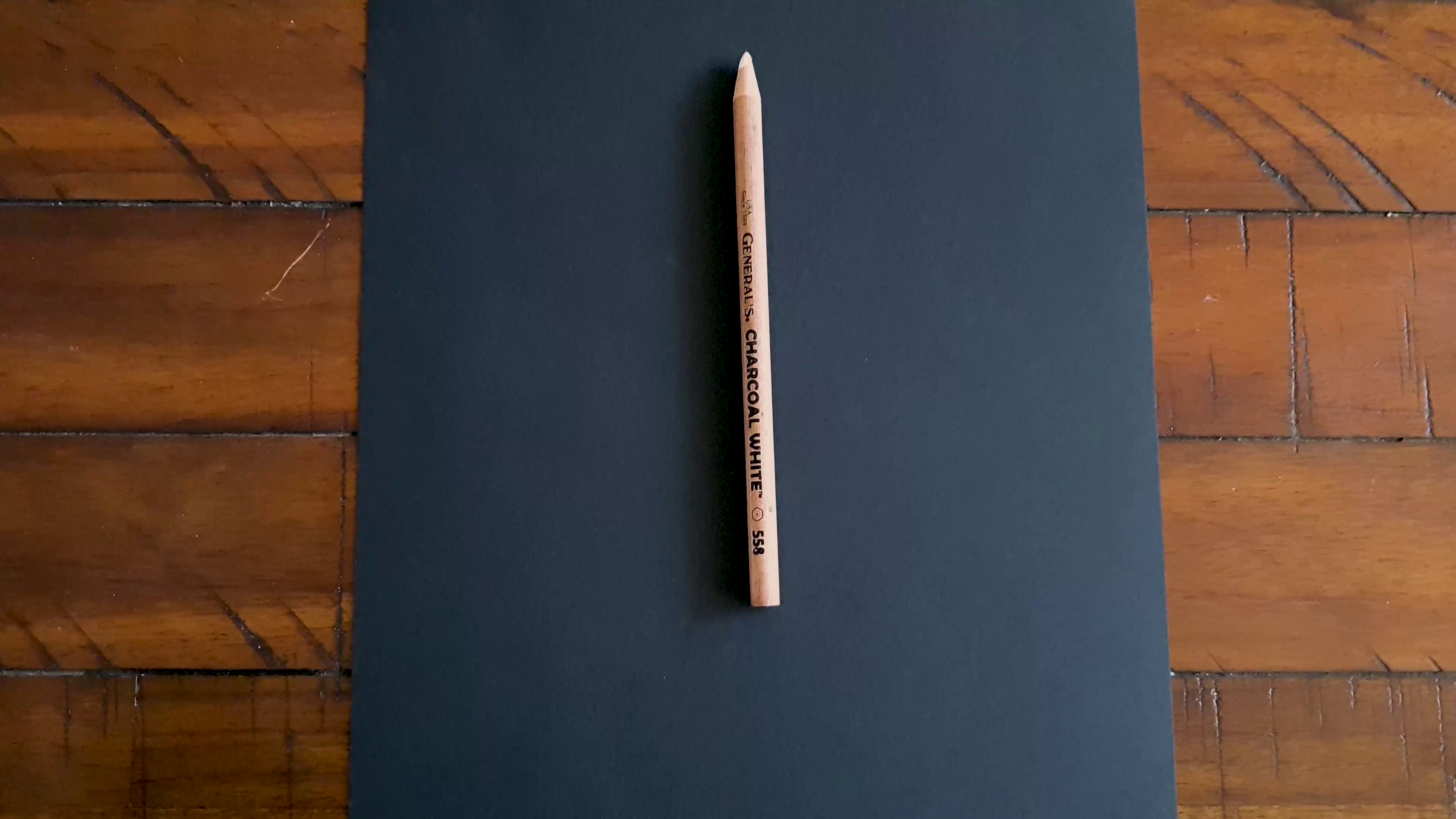
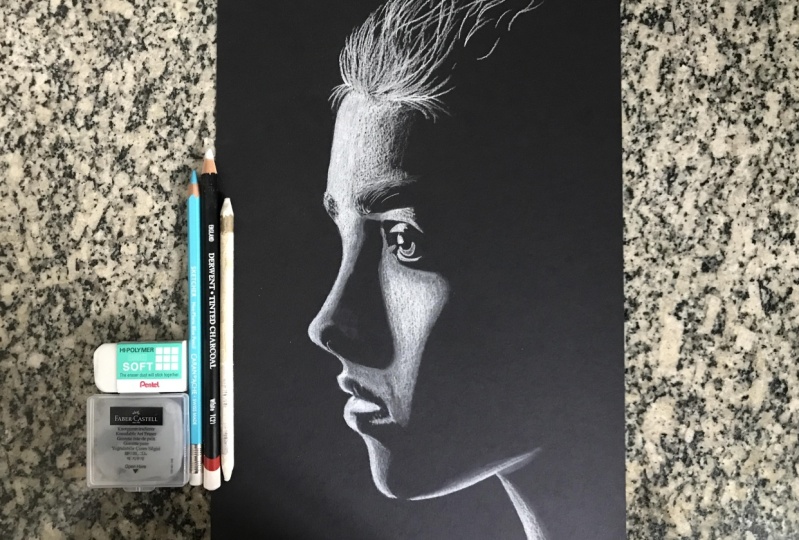
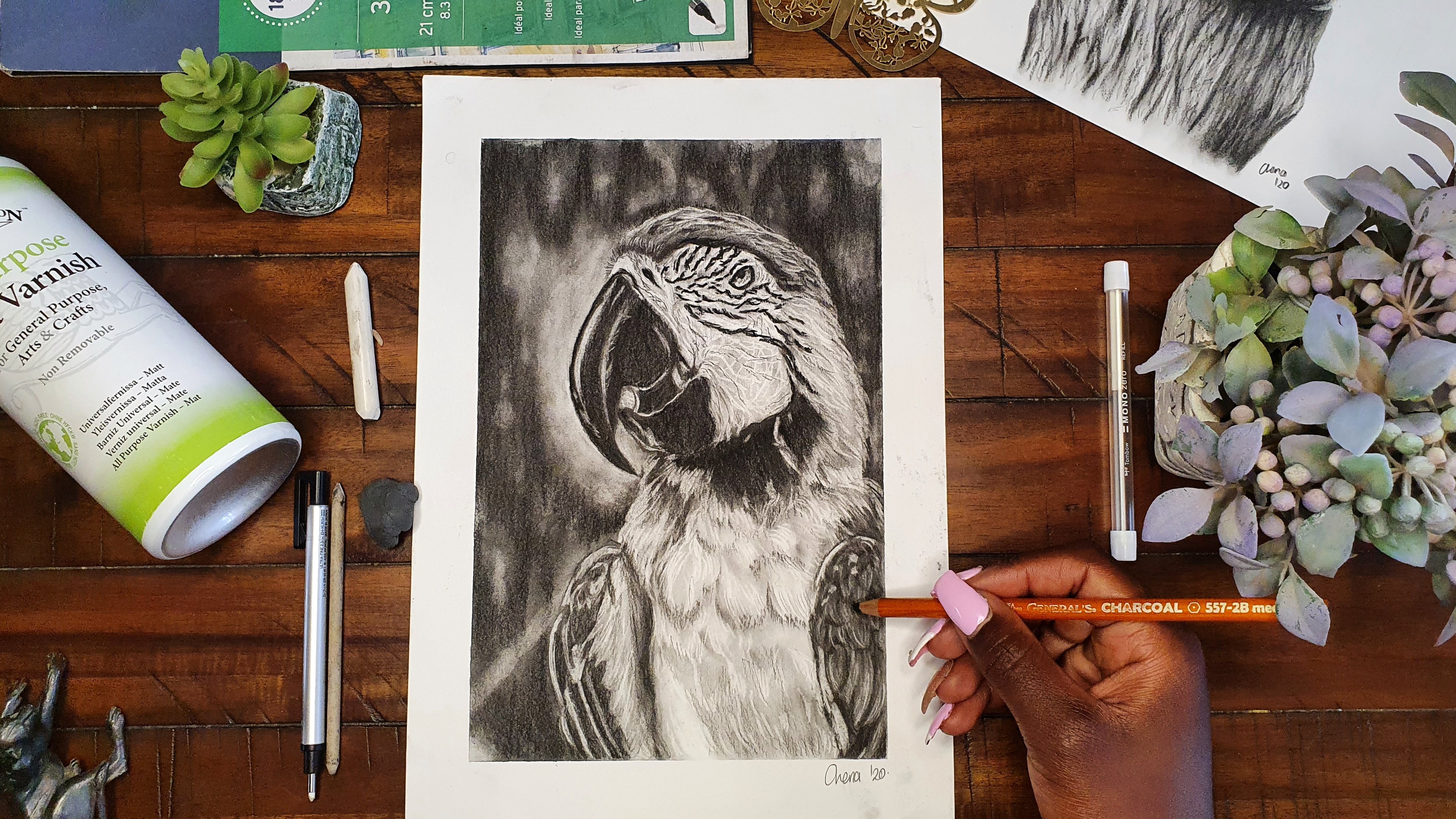
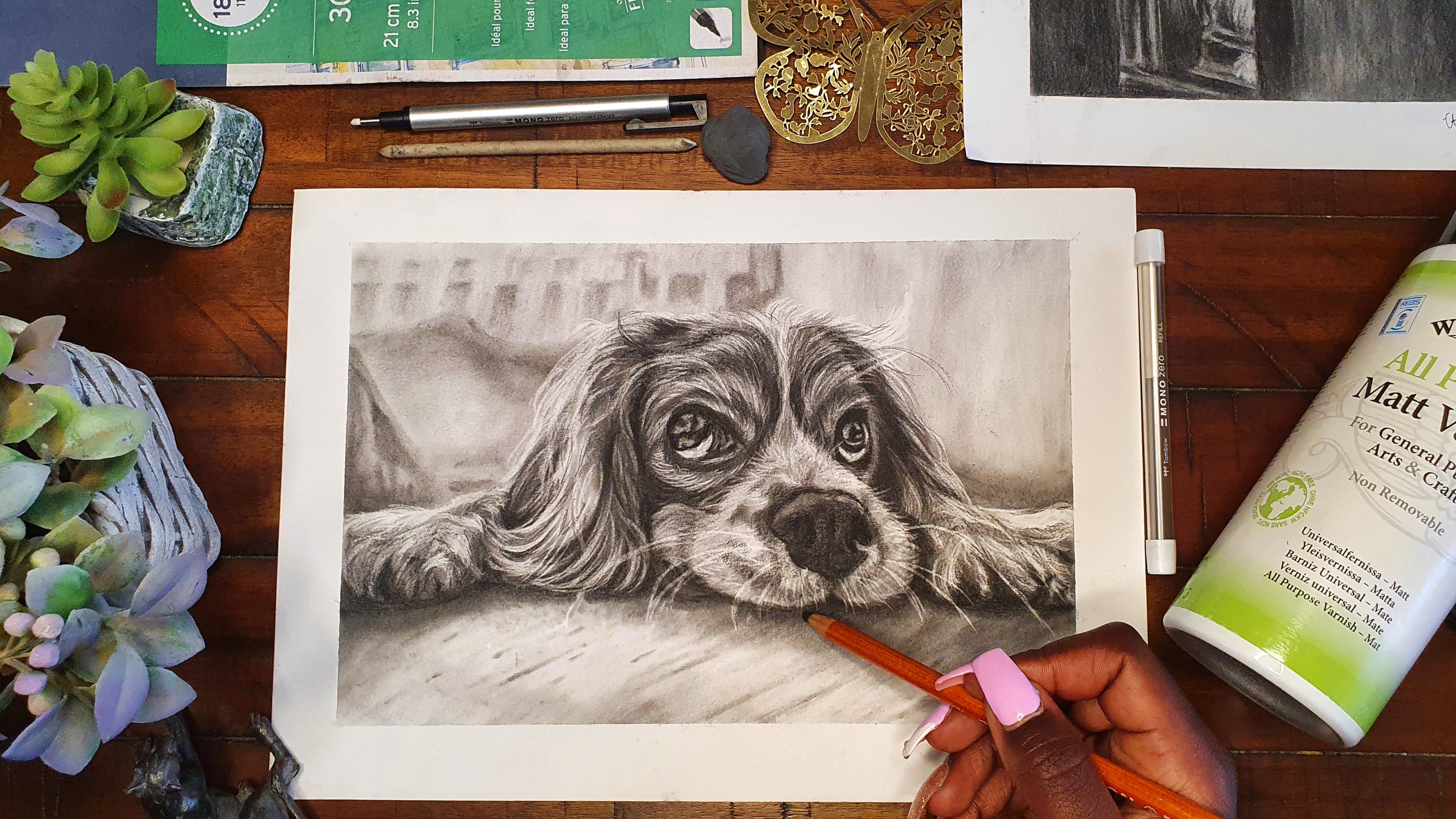
3. Materials : It's time to talk about the materials that you'll need. First of all, you'll need some black paper. I chose to use the Clairefontaine brand, which is the one which is most easily available in my country. Don't feel obliged to use the same type of paper. Just use whichever type of black paper that you find the most easily available wherever you are. One thing that I'd like you to just look out for, is to make sure that the paper is a little bit thick, so that when you're drawing on it, you don't end up tearing through the paper or in you are erasing something, you also don't end up tearing through the paper. Mine for example, is 250 grams per meter squared, which means it is like a medium, heavy paper. The next thing that you'll need is some white charcoal pencils. I choose to use this white charcoal pencil. It is from General, and you can get it with a pack of three black charcoal pencils with this one white charcoal pencil and a kneaded eraser, value for money. If in case you cannot access these, you can also use a charcoal stick. In case you can't find these two or these brands, just use whichever type of white charcoal that you can find easily available. Moving on, another thing that is really good to have are some blending tools. Over here, I have a round brush and a blending stump. Either of these two are really good to use depending on the kind of look that you want to have on your drawing. The next thing that you'll need are some types of erasers. I use two types, which is a kneaded eraser and the other one is a pointed eraser. My kneaded eraser has been with me through a lot, that's the good thing about them, they are pretty much indestructible. It's good to have this one, it's really easy to lift up charcoal dust with it. Then for the pointed eraser it's a really good one in order to just get in the fine details and go there to get the shadow that you want. Because remember, the shadow comes from our black paper. The next thing that you'll need is some printer paper, which will have two uses. The first use of the white printer paper is for you to print out your reference image, especially when you're following the fast demonstration method, which is the transfer method. It will require to print out your reference image. Then now transfer that reference image onto your black paper and I will show you how. If you're using that method, you also need a printer, but you don't need to have necessarily in your house, you can just go and print that reference image elsewhere, then come back with that reference image. The second use of this white painter paper, is just to protect your drawing from your palm as you're drawing. Because remember with charcoal, just as soon as you just swipe on top of the drawing, you spread the charcoal dust everywhere and you don't want to erase all the hard work that you've done. Finally, not necessarily a need, but it would be good to have some type of fixative or vanish to protect your final drawing once you're done. I choose to use this Winsor and Newton all purpose matt vanish to protect my drawings because as I've said before, it's really easy to smudge a charcoal drawing. All you need to remember when using this is to spray it a well ventilated area because its fumes are pretty strong. Now after covering all the materials that we'll need, let's get into the nitty-gritties and talk about how to pick a good reference.
4. Picking A Good Reference Image: Time to get started on the lesson on how to pick a good reference. When drawing portraits on black paper, it's important to choose a reference that has a good striking balance of contrast. In order to have this good striking balance of contrast, the most important thing is a lighting scenario of the subject when the reference image is taken. To illustrate this, we're going to be checking out this website that is really good at illustrating the different lighting scenarios that can be done when you are photographing a subject. It has different kinds of subjects, though of course they are not looking too realistic. But it's just good to illustrate because the faces of the subject still show the different planes of the face. We're going to make the background be black because, of course for this class we are going to be using black paper. Now we can just simulate different kinds of lighting scenarios by using the arrows at the bottom and moving the light from side to side. Now this illustrates how a face would look in different lighting scenarios. Of course, you can see that a good striking balance of shadows and highlights gives the best striking portrait. You can move the light up and down and even add multiple different lights to see how your reference would be lit from different angles. I wanted to show you this so that even if you have a face that you'd like to draw but you do not have the lighting scenario that you would ideally like, you can always come to this website and reference the lighting scenario that you have in mind, and then just translate the different shadows and highlights to the face of the subject that you want to draw. There are two websites that I use the most to get my reference images, and that's usually Pinterest as well as Pexels. Pinterest gives you photos that have been uploaded by different users and then you can use those to reference and draw them just for practice. But then on the other hand, Pexel gives you copyright-free images that you can use for your artwork and even end up selling later on. Starting first of all with this first one, where of course you can see that she's being lit from different directions with both blue and red, if you end up editing that photograph and lowering the saturation, you will see the different kinds of striking shadows that you can get. Of course, you're also going to get some images which are already in black and white. That is ideal. But the good thing is that with different softwares, you can just use to edit those photos, lower the saturation and have the different black and white shadows and just get a good balance that gives you the contrast that you need. Also going over to Pexels, you can also do the same thing. This type striking portraits or lighting portraits, and then you're going to see different kinds of lighting scenarios. Remember that the best kind of reference image is one that gives you a good striking balance of highlights and shadows. If we're to contrast these two images over here on my screen, you can see that the one on the left is a little bit too bright and doesn't give a good balance of shadows and highlights. It's mostly oil highlights, which could work if you're drawing on white paper. But when it comes to drawing on black paper, remember that the highlights are going to be the white charcoal pencil so it'd be good to have a reference image that has that balance of shadows and highlights like the one on the left. Other examples of bad reference images are images that are too brightly lit. Remember that you can still end up using them by still referencing back to the website we talked about in the beginning and seeing the different shadows that would be lit on the planes of the face. But of course, as a beginner, that would be a little bit too much work and even I myself don't prefer to do that all the time. I hope that from this lesson you've learned how to pick the good reference images from the bad ones. Now we're going to move to the next lesson, which is how to prepare your reference image.
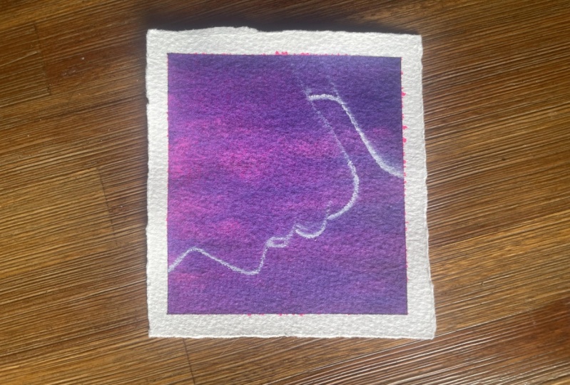
5. Preparing Your Reference Image: Now on to the next one, which is how to prepare your reference image. I decided to make work so much easier for us by creating a Pinterest board with hundreds of good reference images that have the good striking balance of contrast that we talked about. The good thing is that when you click on one image, it still brings up more suggested images that have the same mood and lighting scenario. The link to this Pinterest board can be found in the Class Resources section. I'm going to show you a few examples on how you can edit and prepare your reference images, ready for drawing. Indicate that you're picking a reference image that is colored. The best thing that you can do first of all, is just go to your editing software and just lower the saturation, then play with the other settings to come up with a good striking balance of highlights and shadows. Remember that it's up to you to use your artistic license to edit the photos to the balance that you like. In this scenario, when we are drawing on the black paper, we're going to be using the negative space in the middle, that just shows the outline of the person. Now instead of drawing the person themselves and shading in the person, we shade out the outline of the person on the outside. Now here are a few more examples that are just similar in the execution where you just draw the exterior and leave the hint of the person on the interior. Now onto the second example. In the case that you are actually drawing a person who is lit, like you can see the skin tone and everything, still you go through the same process of lowering the saturation of the photo, and then playing around with the balance of the shadows and the highlights. Moving on to the third example, where the reference image is lit by dual lighting, like in this case she's lit by both pink and blue light. In this case, you can either choose to draw the blue, or choose to draw the pink, and here is a short demonstration on how you would do that. I chose to draw the blue and focus on the blue when it came to her body. So that just give me the highlights on her body. Then in order to get the strong outline on the back, I decided to do the trick that we talked about in the first example, which is focusing on the negative space to be her body, so that way you just shade the outline of the background. This short demonstration shows you how you can end up with a really good portrait in the end. At this point, I hope you've been able to follow along on how to prepare a reference, and now we're going to move on to the next lesson, which is learning how to see values.
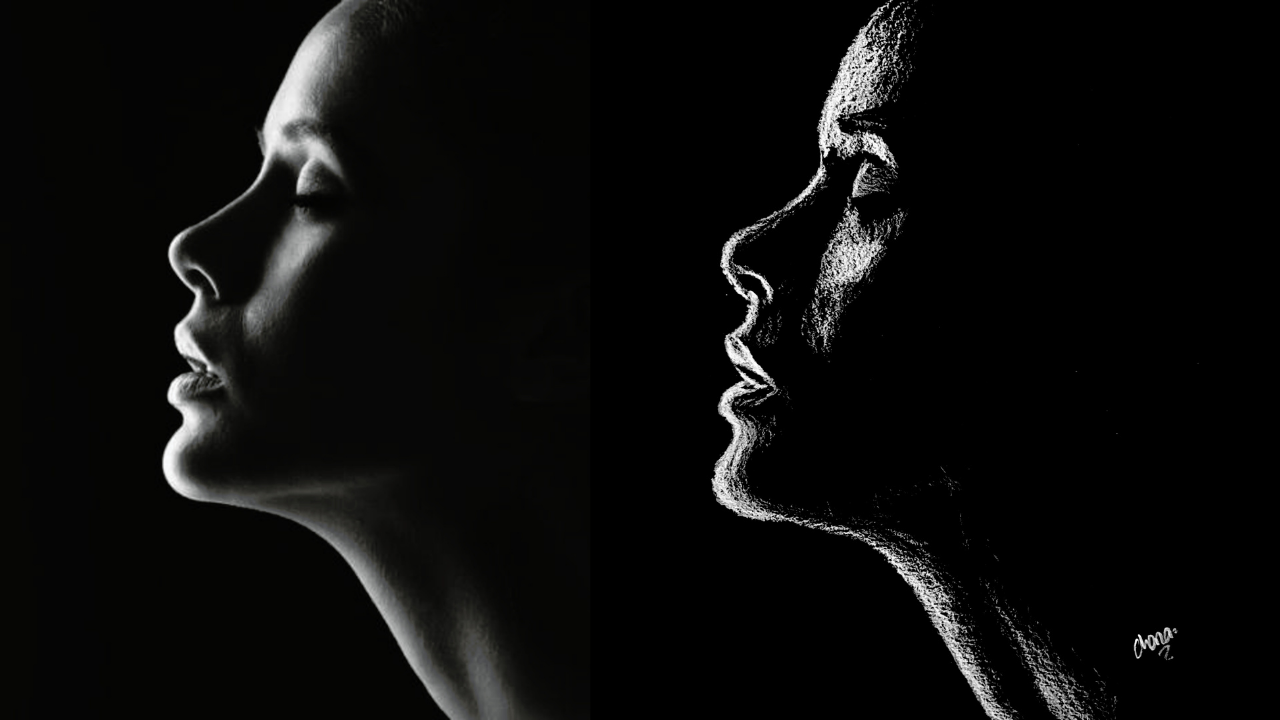
6. Learning To See Value: Welcome to this lesson. Because now we're getting started on learning how to see values. Value is the lightness or darkness of a color. This can be seen both in the actual saturated colors, as well as on abbreviated scale from black to white. I'd like us to start by looking at this famous painting by Claude Monet. You can see that he used value to create a really nice striking balanced in his painting. Just looking at the saturated photo first of all, you can see that the sides of the roof that face the sun, are much lighter in value in comparison to the other side that is in shadow. Now we're going to edit this painting to lower the saturation so that we can actually see the values, because they still exist even when we remove the aspect of color. It's really evident to see the side of the huts in shadow versus the side that faces the sun. I'd like you to pause the video a little bit at this point. Guess or rather tell me which of these colors of the rainbow that you think, if you were to lower the saturation completely, which of them has the lightest value and which of them has the deepest darkest value? I wonder what your answer as were, because once we lower the saturation, you can see that yellow has the lightest value and indigo has the deepest darkest value. Of course, these aren't the only colors that exist in nature, but this just gives you another example on how value exists in everything. Now we're going to look at value in portraits. I got this beautiful image of this model Adut Akech. We're going to first of all of course, lower the saturation and change it to grayscale. You can see the different values that exist on her face from the hair to the different planes on her face. Even the contrast between her face and the background. The best way to see value is by squinting. To illustrate this, I decided to apply a blur on this reference image. Now you can see the values much more clearer. Since it's like we have squinted. You can see the highlights in her hair and the different values that exist on her hands, her chest, her neck, her face, and the darker spots which are her hair, and even some splotches in the background. If ever in doubt, just squint. Value can also be used to indicate distance. Of course, in this class we're not going to be talking about landscapes. But I still wanted to mention this because I think it's really interesting. In this reference image where we can see that mountains that are feeding away into the background. If we compare the value of the color of the mountains that are closer to us versus those that are further away, you can see that the value of the colors that are closer to us tend towards black, while the ones which are further away tend toward white. Same goes to this second reference image, the mountain that are close to us, if we're to select color from them. The colors over there tend towards black because they're closer to us than those that are far away, tend towards white. Value can also be used to draw the eye to our central focal point in a painting. This is a painting that I did a while back. The difference in value between the rose and the dark background automatically guide the viewer's eye straight to the point where I wanted them to look. Now after all this preliminary work, we're going to move on to the next lesson, which is some value practice.
7. Value Practice: Now it's time for some value practice. We can't have talked all about values without at least doing a little bit of practice so that I can know that you've understood everything that we've talked about in the previous lesson, and so that you may be able to get the skills that you're going to apply in your own projects and even in your own drawings in the future. When it comes to putting down value using a white charcoal pencil, the approach that you use is just a little bit different from the normal black charcoal or even a graphite pencil that you'd use during the normal drawing process. First of all, the biggest difference that you're going to notice is that the medium on which we draw on has to be a toned piece of paper. You can't draw white on white, meaning that you cannot use a white charcoal pencil on a white piece of paper because there will be no contrast. We wouldn't be able to see anything. Most of the time, artists use toned paper, like black, sepia, gray, just something that has a little bit of color so that the white charcoal pencil can have a little bit of contrast once you put it down on the paper. I'm sure that you might be a little bit familiar with the traditional value scale, which usually shows the transition of color from black going all the way through gray onto now the white color. These values are normally really evident when it comes to black and white photographs and artwork, as we talked about in the previous lesson. But now moving on to this kind of medium that we're using this time round, which is white charcoal. There is a little bit of a variation because as you can be able to tell, you are not really going to be moving your scale from black to white. We're going to be moving from the bold white color and varying it down, up to a level where the color of the paper shows through. Now like for example in this class where we're using black paper as a medium on which we are drawing on, the color moves from a bold white color and fades down, up to a point where the black of the paper peeks through. We're going to do a few exercises that show the values that you can get with a white charcoal pencil. A template of the worksheet that I'm using right now can be found in the class resources section. The first method involves using variable pressure with the pencil. I'd arguably say that it is the simplest method to use, and also the laziest because it just involves you using a lot of pressure on one side of the rectangle. Then as you move on to the other side, use less and less pressure. This method is one that I use quite a bit when I'm drawing, even when I'm drawing using a black charcoal pencil, because it's really easy to do. You just make sure that in the places where you want the color to be more bold and daring, you put a lot of pressure with your pencil, and then in the other areas where you don't want a lot of color down there, you just use less pressure. Now, the second method involves using multiple layers, like adding multiple layers of the same pressure down onto the paper. I'd say that this method, I normally use it a lot more when I'm painting or other drawing using colored pencils, because it allows you to layer more and more color onto the paper. You just start with a light layer of color onto the paper, then you keep on building more and more on top up to the point that you are satisfied with the amount of color that you've put down. The third method involves the lifting of the charcoal dust off the paper. I'd possible say that the biggest disadvantage to this method is that you'll need a kneaded eraser in order to do this method, but then again, the greatest advantage to it is that you can do it at any point, at any time, and it allows you to go back, or rather to pull back when you've made a mistake and laid down a little bit too much charcoal dust. I do this mostly in the cases where I want to make some really nice patterns in the background, or as I mentioned before, during the times that I've made a mistake and laid down too much color. All that you need is just your kneaded eraser. The next method is one that might not be as simple to do and is one that I usually use mostly when I'm using black charcoal pencil. But also I just want to show it and give it as an example over here because it can also be done with white charcoal pencil. It involves the spreading of the charcoal dust once you've already laid down a block of color onto the paper. One thing that I have noticed, maybe it's because of the brand or charcoal pencil that I'm using is that the white charcoal dust spreads a lot less in comparison to the charcoal dust of black charcoal pencil. This exercise is simple to perform, I just like you to lay down an event block of color on both sides of the rectangle, then use your soft round brush to drag the charcoal dust onto the center areas. You'll notice that the center of the block, you'll have a soft even layer of light color. But then now the disadvantage is that you might have a really rough, hard, harsh transition from the strong block of color that you first lay down, moving on to the center part of the block. Now the last little exercise that I'd like you to do is by doing a crosshatching method where you keep on laying consecutive layers of crosshatching. Crosshatching just means that you draw lines going in a certain direction, then layer again on top of that with lines going in the other direction. You just keep on layering more and more lines over the block. But every time you stop a little bit farther from the right side of the rectangle. The consecutive layers will just leave you with a really nice gradation and transition of color from a strong layer of color towards the left, and then it just goes decreasing as you move towards the right. At the end of this exercise, I'm pretty sure you have these five blocks of value skills using your charcoal pencil. I'm also really curious to see how yours have come up at this point. We shall be incorporating some of these methods as we're going to be doing some practice portraits later on. I'd like also to know which one you find to be the most convenient for you to use as you're drawing. Now we're done with this lesson and we're going to move on to the basics of portraits.
8. The Basics Of Portraits: Now we're going to get started on the next lesson, which is the basics of portraits. If you remove all the features from a face of a person who is facing you head-on, you will notice that the shape of the face resembles that of an egg. I would say that the shape of the face is ideally like the shape of an egg. Of course, this may vary according to the different features that a person may have from their cheekbones to the shape of their chin, but generally, you'll see that the shape of the face is that of an oval or like that of an egg. Each and every face has dimensions, though it may vary from person to person. Again, looking at the shape of the female's head, in my illustration, if you look at the measurement from the chin to the nose, the nose to the brow line, and the brow line to the hairline, you'll find that all those measurements are roughly equal, and they seem to be a third each of a whole. Again, these measurements may vary from ethnicity to ethnicity and from face to face, but generally, those are the dimensions of the different features of the face. Another dimension that can be used to place the features is measuring from the outer edge of the nose and going up to the inner corner of the eye. Most of the times those two features line up. Another measurement that can be used to measure the face is the distance between the eyes. The distance between the eyes can be taken to be an eye width. Another measurement that can be used is that for placing the mouth. The distance from the nose to the center of the mouth, to the beginning of the chin, to the end of the chin, are each normally taken to be a third of a whole. There are so many other measurements that can be taken under the Loomis method to draw a face, but these are the major ones that we can talk about this time. Now, when it comes to drawing a face, the first step that I usually do is to draw a circle. After drawing the cycle, I divide it into quarters. Then a third of the way from the top of the circle and a third of the way from the bottom of the circle, I draw a line. Those distances after drawing those lines should be equal, and then I will take that same distance and put it at the bottom part to mark where the end of the chin is. Once I've done all of this, you'll be able to see that the top line shows where the hairline is, the next line shows where the brow line or the eye line is, the next line shows where the nose should be, and the next line shows the bottom of the chin. Once you've done that, you can now just start basically putting where the features are. As I've said, this varies from face to face, and you need to keep on looking at your reference image. It's always good to use a reference when you're drawing as this will help you to practice. I know that I've just covered the basics of portraits, but these same dimensions and rules apply even when the face is turned to a different direction, just that the different dimensions will now change a little bit depending on the perspective. I hope that I've been able to explain it as clearly as possible. I also hope that you've been able to understand at least the basics of portraits. In case you'd like to expand your knowledge and to learn more about the theory behind drawing faces and portraits, you'll be able to find some resources linked in the class resources section. There you'll find some really good books as well as videos that even helped me as I started along in my drawing journey. I hope you're ready, now we are going to get into the practical bit, which is now the first example.
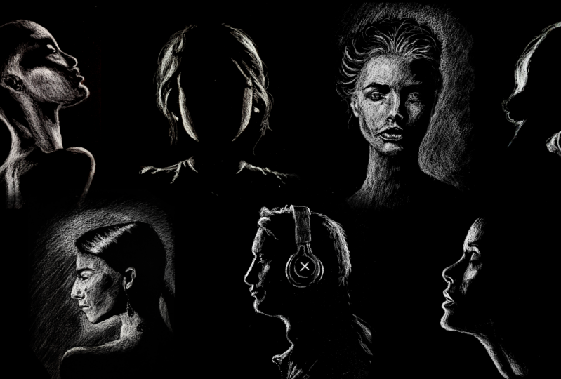
9. Transfer Method: Part One: Now after all that theory, we're going to get into the first practical bit of this class or rather the second bit after the value practice, which is now going to be the transfer method of drawing portraits on black paper. The transfer method is what I consider to be the easiest method. This is because it helps you out in placing all the features, therefore, as you draw all your dimensions and placement of the features are correct, so you end up with the most realistic looking final image. What you do is that you first print out your reference image on a blank sheet of paper. After printing it out, flip it on to the backside, then shade the paper with a white charcoal pencil. Do this in the case that you're drawing on black paper or toned paper. If you were drawing on white paper, we'd shade the back of the reference image with a black charcoal pencil. Once you're done shading the back of your reference image, carefully flip over the reference image and place it on the black sheet of paper on which you're going to be drawing. Then using your pencil, draw around the reference image and what will happen is that the white charcoal that you put on the back of that sheet of paper shall end up transferring onto the black sheet of paper that we are drawing on. Once you lift it up, this is how it's going to look like. Now all you need to do is just to use your eraser, in this case, I used a kneaded eraser to pick up any white charcoal that went to a place that it's not supposed to be. In the end, you normally end up already with the outline of the person. This can be done with any type of portrait and sometimes when I have so many commissions that I need to finish, it's the method that I use so that can just place the features, then start on the difficult though fun part, which is shading. In this lesson, I'm going to be showing you two different examples and for this first example, we are simply drawing the silhouette of the woman who is lit from behind. It's a really simple portrait to do. All you need to do is suggest shade around her. Then I'd like you to add any special details that you'd want. You can add some flyaway hairs, you can add in a little bit of lighting on her chest, even a little bit of lighting on her nose. Be creative with it. By the same time, if you'd like, you can just stick to the reference image and draw faithfully to it. The fun thing about charcoal is that you can be so loose with it and end up with such a beautiful drawing in the end. Take note of where I'm holding my charcoal pencil. I'm not holding it right at the bottom close to the nib but I'm holding it more towards the end. That allows me to be more loose with my pencil strokes. This first portrait was so fast to do and so simple to do and took me around 10 minutes maximum to be done with drawing it. This particular reference image can be found in the class resources section but the Pinterest board that I talked about in the beginning that has all our reference images, has so many other ones that look like this. I'm really curious to see see you come up with. Feel free to post what you come up with in the class project section.
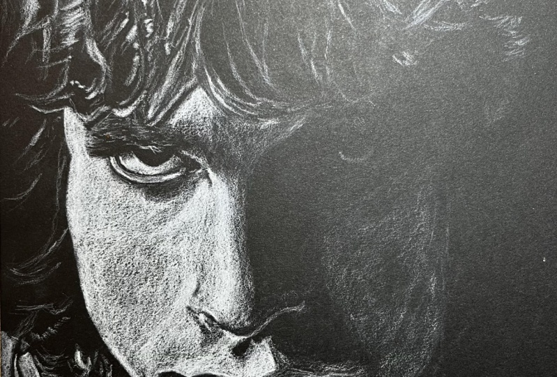
10. Transfer Method: Part Two: Now moving on to the second example. For the second example, we start off the same way with the transfer method possible by shading the back of the paper, carefully placing the paper on our black sheet of paper on which we're going to be drawing, then drawing out the features of the image carefully so that now the white charcoal pencil can transfer onto our black paper. I selected this to be our second example because it's a little bit more complex, not just drawing the outline of a person, but it has a lot more shading to be done. Again, note how I am holding my pencil. I started off at the bottom part, at the neck. What I do is that I just shade consecutive light layers of charcoal, and then when I want to have a really bright highlight, I just press a little bit more. The best way to do this is just by laying consecutive layers of charcoal onto the paper. When you want a brighter highlight, just press a little bit more, but just start out by laying more and more layers and eventually you will end up with the kind of highlights that you need. I then moved up towards the lips. You'll notice that there are patches of highlight on her lips, and then there're other areas which are in shadow. For the areas that are in shadow, you just draw around those paths. Don't lay down any charcoal pencil at those points. But the good thing is that if you lay a charcoal pencil where you don't need it to be, you just use your kneaded eraser or your pointed eraser to remove the charcoal from that point. Slowly move up along the nose. Remember to draw around the nostril because that point will be a dark point without any charcoal. Some areas will just have a hint of white charcoal, like at the bridge of her nose. Then when we go up to her forehead, we put more consecutive layers of charcoal over there because the forehead will be a lot more in highlight from the light. Note that I'm also drawing around the eyebrow to leave the eyebrow in shadow, and that gives the suggestion of the eyebrow. For the eyelid, I just draw the highlight at the top of the eyelid, then the highlight fades as it goes towards the sides. Next we should highlight on her cheek. Again, it's just done by building up consecutive layers of white charcoal. There'll be some points on the cheek that have a very bright highlight compared to other points. Just remember, it's a process of building up the highlights. This is quite different from drawing on white paper, where we build up the shadows. As long as you get used to this difference, it just becomes easy and really fun to draw because I have so much fun when I draw with white charcoal. Fun fact, I never tried to draw with white chocolate until the beginning of this year because before, I just used to use white paper, and once I started, I was such a convert. Once you're done with the drawings, it's always good to put in your signature because I'm sure you're pretty proud of what you came up with. Now we're done with this first example. I wonder how yours looks at this point. Feel free to post what you've come up with in the class project section because I'm also really curious to know what you come up with, and I'm sure even your fellow students are really curious to see what you've been able to come up with. Now we're going to move on to the next lesson, which is just a tiny bit more hard in comparison to the transfer method, which is the freehand method of drawing portraits on black paper.
11. Freehand Method: Part One: Now, in comparison to the transfer method, this freehand method is going to seem to be a little bit daunting. But just remember the basics of portraits that we talked about in the other lesson. Now we're just going to apply it step-by-step and trust me, it's not as difficult as you may think it is. For this freehand method, it requires you to have a pretty steady hand because you're not necessarily going to be drawing the construction lines that we talked about in the Loomis method. All that you'll be doing is just drawing the outline of the face. For this lesson, I'd advise you to pick up a really simple reference image if you're using this method, one that just gives you the outline of the face either from the side profile or from the front. Again, I'm going to be showing you two different examples. I have to admit I really loved how the first example came out in the end. For this first one, our reference image seemed to be lit from the left side and the right side, but towards the back. I started just by laying down consecutive layers of highlight on the sides of the cheeks and then on the extreme edges of the cheeks, I just use a lot more pressure to put in a brighter highlight. Then I moved up to the hair. For the hair, you just use long loose strokes with your pencil, again holding your pencil towards the end. Then for the areas on the hair that have a brighter highlight, just use more pressure or layer more consecutive layers of the charcoal until it reaches a highlight that you want. When I moved over to the left side of the drawing, I do not want to smudge the areas that I had already drawn. In order to prevent smudging, just take a blank sheet of paper and place your palm on it so that you do not end up smudging what you've drawn already with your palm. Remember to create brighter highlights. Just use more pressure. This portrait just gives an illusion, a slight hint of a face. It's such an interesting one to draw because whoever you show it to, they can immediately tell that it's a person that you've drawn. Then again, remember you cannot see any feature, so I find that to be extremely interesting. It gives such a strong portrait in the end. Moving down to the clothing, just shade out the pulls of the layers of clothing. It doesn't have to exactly match the reference image. Just draw out highlights some places the highlight to be really strong and some places just to put a little bit of highlight. This one is quite a short one to finish and in about 10 minutes I was done with it. If you'd like to do this exact same one, the reference image as usual can be found in the Class Resources section. You can add in some features that were not even there in the reference image, like adding in some flyaway hairs in the background. As always, once you're done, remember to sign your drawing.
12. Freehand Method: Part Two: Next let's move on to the second example. For this second example, I decided to pick a dual lit portrait like the ones I was talking about during the introduction. The first step, of course, was to draw out the outline of the face. Remember this one is in profile. With a freehand method, it can be a little bit tricky and it requires you to do a lot of observation of your reference image. It really helps with your observational skills. One trick that I found that really helps me when it comes to the freehand method is drawing multiple lines over a certain area. For example, when I was drawing out the forehead, I drew multiple lines with my pencil. Then in the end I erased the other ones which I didn't think fit well with the outline of the face and left the line that was more true to the reference image. All these methods require a lot of practice and with time you become better and better at it. To start off, I decided first of all to shut out the orange light, which was mostly on the edges of the face. Starting off at the neck again with consecutive layers of highlight. Then moving up on the chin and the lips. Remember, I'm just drawing fast of all out the orange lighting only leaving away the blue. In areas where you want a more subtle highlight, just use less pressure with your pencil. Then on areas where you want a deeper, bolder highlight, use more pressure with your pencil. If the freehand method turns out not be for you, always feel free to use maybe the transfer method or the Loomis method. As I said, more resources on the Loomis method can be found in the class resources section. For all of these, you just need to practice and try to draw different pieces from different angles. When we move on to the left side of the head, I again picked up my blank white sheet of paper to avoid any smudging. Then I just started laying down the highlight on that side. The areas that had a brighter highlight, I just use more pressure. Then I fitted the highlight as I went towards the middle of the head to even give the illusion of it being a rounded head. That's how the illusion of shape is normally made. In the case of black people, just by putting more highlights in some areas and feeding it towards the center. The opposite applies when it comes to drawing on white paper. You put in more shadows on some areas and then repeat it out when it goes to different areas. The next step was inputting the highlights on her back. The person in our reference image has such a well-muscled back. We just put in some areas with a bright highlight and some areas with just a little bit of highlight to show the ridges on her back. Stay true to the reference image and remember to just vary your pressure. If you ever go too bright with the highlight, you can always use your kneaded eraser to pick up that charcoal dust and make it a little bit more subtle. Next just moving on to her other shoulder. On a side note, I really admire such photography because it really exposes the different ridges and muscles on our bodies and I find that to be so beautiful. Looking at our reference image here, she does seem to have such a dancer's body, so long and live yet really strong. The funny thing about using white charcoal is that you can end up finishing your portraits really fast, much faster than you'd really expected, but then the final image that you come up with is so beautiful. This was the final result without drawing any of the blue light. If you're up for the challenge, we can move on and try to shade in now the blue light, we see how we can more define the face of the person. If you notice the front part where the ear should be, because it is not defined, looks like she's wearing a sock or a mask over her head and it doesn't look too three-dimensional, because we cannot see the jaw line and the ear. If you're up for it, let's pick up our pencil and continue to shade in now the blue light. For this, I'd advise you to maybe use some measurement or even just use the transfer method just so that you can be able to place the location of the jawline accurately. It'll require you to have a lot of good observational skills. Remember that's what I said, and I really want us to challenge ourselves in this class. Even though your final image does not look as good as it does in the reference image, that's how you get better by practicing and practicing. I know I've said that so many times during this class, but I'm trying to say that to remind myself that practice really does make you become better. Remember, don't practice the wrong thing. Practice the right thing so that now you can enforce those good rules or portraits and pieces in your mind. Shading in the blue light, it just added to the cheekbone. Then I also know we just moved down to the side of her neck. Using consecutive layers at the areas where I wanted a brighter highlight, I just put more of the white charcoal pencil. For this class, I decided to leave out the jewelry that she had in her ear, but then again drawing that one would be pretty easy, because all that you need to do is just shade out the bright highlights that are on the earrings. At whatever stage that you left your drawing, that's pretty good. That's why in the beginning I said when it comes to do a lighting, you can choose to just shade out one color and you'll still end up with quite a good drawing in that end. At this point, you're done and remember to sign your drawing. Again, at the end of this, I'm still really curious to see what you've been able to come up with and don't worry if in case it doesn't look like what you expected it to look like. Of course it takes practice for somebody to be able to become better. Even I myself I'm still practicing and learning as I move along with each consecutive drawing that I make. Feel free to post what you've come up with in the class project section. Next, we move on to the next lesson which is drawing using the Loomis method.
13. Loomis Method : For this next lesson, we're going to be using a construction method, which is the Loomis method that we talked about earlier on. It is more reliable than using the freehand method because it enables you to place the features exactly where they're supposed to be. I'm going to attach a photo of our reference image with the construction lines drawn on top so that you can see these lines that I was drawing over here. Because I was drawing on black paper, it can be a little bit difficult for it to show up on camera. If you want to see the exact lines that I was doing, please check out the attached image in the class resources section. I would advise you to start out fast by practicing drawing such pieces in your sketchbook, just so that you can be used to drawing the faces using the Loomis method. Practice first of all on your sketchbook before you move on to drawing large-scale over here. Don't be too much in a hurry to get started using this method. You can always keep on using the transfer method as you keep on practicing in your sketchbook until you're confident enough. But then again, also remember that even if you make a mistake in drawing large scale, you can always use eraser to erase out where you put the picture wrong until you find the exact place where you're supposed to put it. Take as much time as you need with the sketch because the sketch is what determines how your final drawing will look like. I took about 15 minutes to draw out my sketch. You can also draw out the shapes of the shadows on the face and on the neck so that you can remember those spots. Then once you're done, erase out the construction line that we had drawn in the beginning. You can also use your needed eraser to pick up a little bit of the extra graphite because the graphite is going to be a little bit shiny on your paper. The good thing is that you can also continue erasing the graphite as we go along. Starting off, unfortunately for a few minutes, my overhead shot did not record what I was doing. But from the side angle shot, you can see that I was just laying a light layer of charcoal on the cheek down to the chin and over the nose, just as we talked about in the beginning, that you lay down consecutive light layers of charcoal. That's what I did. Just laid down a light layer of charcoal and avoided the areas that are in shadow. Then I also continued to lay down that light layer of charcoal all over her face. Then in order to define her hair, I decided to shade out the background towards the right. I just laid down a light layer of charcoal on the background and you shall see this more clearly when we switch over to the overhead shot. All that I continued to do was just to lay down the light layers of charcoal on her cheek. Wherever I saw a brighter highlight, like along the bridge of her nose, I'd use a little bit more pressure. Then also at the philtrum of the lips and at the top of the lips, just a little bit more pressure at those points. Thankfully, we're back to now the overhead shot. As you can see, what I was just saying before was that I laid down a light layer of charcoal on her cheek, her forehead, over her nose, over her chin, and to the right side of the background so that we can end up defining her hair later on. I shall expound more on that. I started laying more and more layers where I needed a brighter highlight. This was over her left cheek. I just use more and more layers. Even on her forehead towards the left. Sometimes I use more pressure with my pencil to make a brighter highlight. I don't know if you've noticed, but this portrait is a lot more complexly lit compared to all the other ones that we've done before. It will take you a lot more time in comparison to the other ones. I'd like you just to remember to be patient as you're drawing and to have fun with all the layers that you're going to end up laying down. It's really fun because you are like a sculptor just sculpting out the different features on the piece. I then now shaded out her left ear. Some areas on the ear had a brighter highlight and that just defined the shape of the ear. Then I drew out the highlight at the top of her eyelid. That highlight also helps you to define the shape of the brows. Remember, just like in one of the other portraits that we did, we're going to leave out the eyebrows without any highlight on them. That's going to even define the shape of the brows. Her bottom lip also had some highlights, so some areas you just draw a stronger highlight and some areas just a light bit of highlight. As for her hair you can define it the way you want. The thing that we're going to do in the end is using the negative space, especially towards the right and the top part of her head to define the shape of the hair. That means we are going to shade out the background and then the black shape that remains in the middle defines out the shape of her hair, and also even the shape of her face towards the right side. That's a really cool trick that you can use to just give the illusion of peace by using the negative space to your advantage. For the hair some places I use a lot of pressure with my pencil and then some areas I just use a little bit of pressure because it's like we are drawing out the hairs that were highlighted by the light and then leaving some areas in darkness because those areas are not hit by the light. You can even add more hairs than are in the reference image and put in some flyaways as well. Never feel afraid to go back into your drawing and adding more highlights in areas that you hadn't finished working on. Like for my drawing, I wasn't yet really done with the cheeks and with their forehead, and you'll see me adding more and more highlight as we go along. As for the eye, the one thing that I'd see that makes the drawing finally look complete is normally adding the highlight in the eyes because the eyes are normally quite glossy. Once you add in that bright highlight, it gives the drawing life and the drawing ends up popping. It's actually normally one of my favorite things to do. Remember to vary the pressure of your pencil when it comes to drawing the whites of the eye. Next, moving down to the chin and the shoulder. I just use light pressure, and then again as before, as always, varied the pressure with my pencil to add in more of a highlight. Now, this is why I said that we needed to do some value practice before we started. Have you noticed how many different techniques that we've used so far? Then in order to define the shape of the chin, I just use my pointed eraser to erase a little bit along the edge of the chin so that there's a little bit of a separation between the face and the neck. Then now I decided to use also my kneaded eraser to pick up some of that charcoal dust to make a gradual transition in the background with the white that we've drawn in before. That's another technique that we talked about in the beginning. If you feel like you've put in too much of a highlight, just pick up your kneaded or pointed eraser and pick up that charcoal dust. Continue to layer the charcoal layers. Maybe your drawing might need different edits from mine. Maybe yours already has too much or just enough charcoal. If you don't need to keep on layering, do not do that. There is also such a thing as overworking and sometimes someone can go overboard, drawing over and over and over again. Like at this point in the background, I went overboard and you'll see me in a few minutes picking up my kneaded eraser to remove some of that charcoal dust in order to soften out the background, and even along the chest. I'm really curious to see how your drawing looks at this point. Please feel free to even post a process photo of your portrait at this point. Once you're done, as always, remember to sign your drawing and feel really proud of what you've done. This Loomis method can be applied to any portrait, any lighting scenario on any paper. Because as long as you just know the foundations, the basics, the rules that we talked about in the previous lesson, you just apply it to whichever scenario that you have in mind or from your reference image. Feel free to post whatever you've been able to come up with in the class project section and I can't wait to see what you come up with.
14. Sealing Your Drawing: After all the hard work, all the good work that you've done drawing all those portraits, no matter how many they have been, it would be such a shame for you to end up destroying them just by the flick of a finger. I'd really love to illustrate this because the thing about charcoal is that it is very easily smudged. Remember how I was using a white piece of paper to just protect my drawing from my palm as I was drawing. The way to avoid this is by using a varnish at the end to protect your work, which is sometimes called a fixative. In my country, what I could get is this Winsor and Newton All Purpose Matt Varnish, which I normally use to seal in my drawings in the end. What it does is it creates somewhat of an impenetrable layer that protects all the charcoal, all the hard work that you've done before from all the pesky fingers or even flies and dust that could end up affecting and destroying your drawing. What you do in order to protect your drawing is first of all go to a well ventilated area because this spray has such a strong scent to it. Hold your drawing at arm's length and then spray an even layer over your whole drawing. Once you're done, just lay them out to dry and it will take around five minutes for them to be fully dry. Remember not forget them overnight outside because they might end up getting rained on or having dust blown on them, which is something that I've done quite a lot of times with my drawings. I always forget to bring them in after spraying them. Now I'm so sad to say, but we are at the end of this class. Let's move on to the final lesson, which is my final thoughts.
15. Final Thoughts: Now, sad to see, we've come to the end of this class. I really hope that you've enjoyed learning and drawing along with me through everything that you've talked about when it comes to charcoal on black paper. We started off with how to pick a good striking reference image, moved on to talking about value, and finally, even covered different methods that you can use to draw your own portrait. I hope that you've learnt a lot and that the skills that you've collected are those that you can apply in your future artwork and drawings. Whether it is of a portrait, a still life, a landscape, whatever it may be. Please remember to post whatever you've come up with in the class project section so that we may see and even give feedback on what you've come up with. In case you have any questions, feel free to list them in the discussion section, and I'll be sure to get back to you. In case you decide to post what you've come up with on Instagram, feel free to tag me until the #strikingwhitecharcoal. Finally, consider leaving me a review so that I may know how you found the class, and consider pulling my Skillshare profile so that you may get updates on new classes and projects later on. I hope you've enjoyed, and see you in a future class.
 Chena, Artist