Transcripts
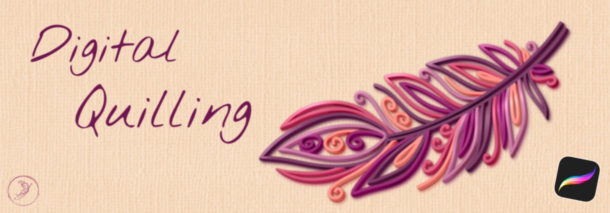
1. Introduction: Paper killing has gone digital. No more need to worry
about paper strips, glue, tweezers, or sore fingers. When you want to create
beautiful three D artwork in this unique style. Join me in class to
learn how to create realistic three D digital
killing in procreate. In this class, you're going to learn the basic techniques for creating three D Digital
Quill art in procreate. Then we'll work through
a full design together. Once you complete the
main part of this class, you'll be able to take what
you've learned and create your own unique
artwork that you can share via e mail
or social media.
2. Resources: Let's take a quick look
at all the resources I've provided for you in this course and where you can find them. 0. When you get to the
resource page for this course, this is what you will see. This button right here
will take you out to drop box where you can download the feather template
if you want to use that. The guide to the
quilling shapes and the procreate color palette that I'm going to use for
the sample project. If you want to do a
different project or you just want
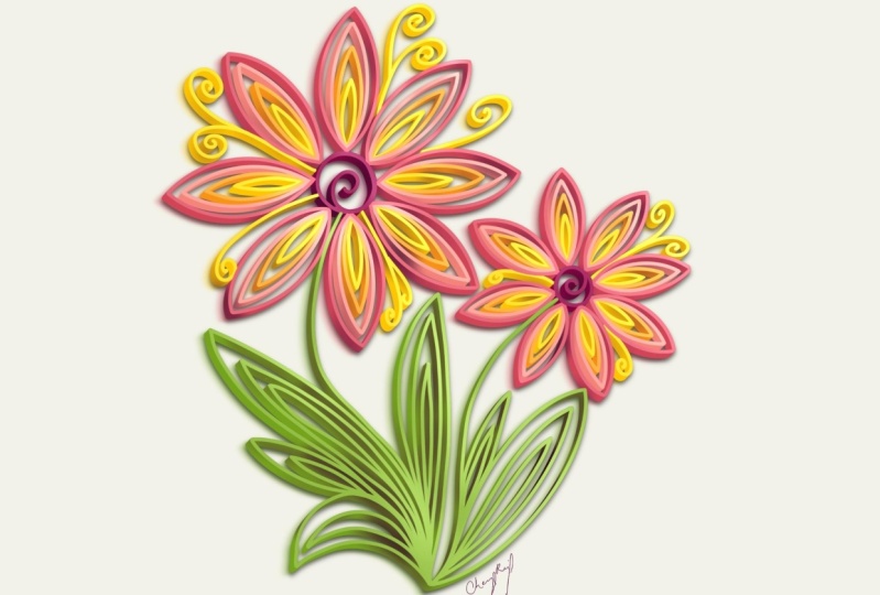
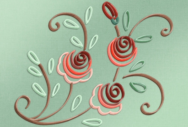
some inspiration later on I've put together a curated Pinter is
board for our course. This has a wide variety
of projects on here. You never want to
directly copy someone. Of course, this will give
you a lot of inspiration for the different types of digital quilling pieces that
you can create. Everything from typography
to food, to animals. Depending on your skill level and what you're
comfortable with, you can get more simple designs, or you can do a little
bit more detail. You can do more
traditional shapes like this or more of the on edge
paper quilling we're going to talk about later
where you have more open ****** and you're
almost painting with the paper free to
just go through here, take a look and see what inspires you for
your next project. The other thing that's
available on this page is the digital quill brush set for procreate that
I've put together. In this brush set, we have both sets of brushes that
I'm going to be talking about in this course for two different methods
for doing digital quill. All you need to do
is just fill out your name and e mail
address and those will get sent to you automatically as we go through the process. I'm also going to tell
you which built in procreate brushes could
be used for this as well, but this is a free set that I'm including for our students. In the next, we're going to learn about the
course project.
3. Class Project: Quilling is an art form that I fell in love with years ago. And I've done quite a lot of it. But over the years since being a professional designer and
using my hands all day, I found that I just couldn't do the fine motor using the
tweezers and scissors and all of that stuff for
more than about an hour at a time before I started
really having a lot of pain. And this was really frustrating and sad for me because
I love this art form. I think it's so unique and fun. And I really wanted to find
a way that I could do this with less pain and
even less mess. And do it really anytime
anywhere that I wanted. After a lot of trial and error, I figured out a way to
digitally quill in procreate. And that's what we're going
to learn this course. The project that we're
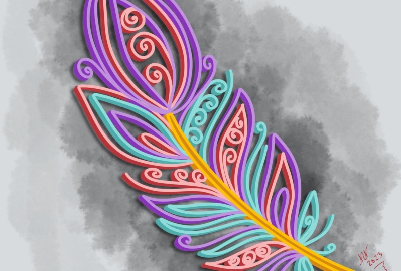
going to do together is to digitally quill a feather. I chose this project
because it's fairly easy, but the results
look like you spent a ton of time on it and
you can get a simple, or as intricate as you want. So it's suitable
for all levels from beginner to more
advanced artists. I provided a basic template for you to use as
a sketching layer, or you can totally create your own feather design as well.
4. Quilling History: In this video, I'm
going to give you a brief overview of
traditional paper quilling. We need to know where we've been and what we're
trying to replicate. Before we do this digitally, I'll go over some of the
basic quilling shapes. You have a resource for
that as well in your kit. Then I'll talk about on edge paper quill and another
hybrid form of this art, which is called paper graphics. Paper quill, also
known as paper fill, is an intricate art form
that involves rolling and shaping strips of paper
into various designs. Its history dates back to the Renaissance
period in Europe, when nuns and monks
used gilded edges of books to create decorative designs
resembling scroll work. Technique evolved over time, gaining popularity in the
18th and 19th centuries as a leisure activity for affluent women
who would use it to create ornate designs
for greeting cards, jewelry, and home decor. During the Victorian era, paper quilling gained
prominence as a popular craft. The term quill originated
from the use of bird feathers or quills
to roll the paper strips. Modern paper quilling involves
various techniques and tools that make it
more accessible to a wide range of enthusiasts. Quillers around the world
create intricate designs, including flowers, animals,
abstract patterns, and more by manipulating
strips of paper, usually from one eighth to a four inch wide,
but sometimes wider. Modern tools have
replaced actual quills, but many artists use
only their hands or find other ways to
form shapes from paper. Today's artists continue to push the boundaries
of the craft, incorporating it into
mixed media projects, sculptures, and
even digital art. With its rich history
and ongoing innovation, paper Quill remains a
captivating expression of creativity and craftsmanship. The most basic shapes
and quilling are the tight coil and
the loose coil. These are used in creating
many of the other by pinching, stretching, or combining them. Some of the most common
include the tear drop, petal, marquise, heart triangle,
square, and star. There are also
several varieties of scrolls that are commonly
used in quilling designs on edge
paper quilling and the broader term of
paper graphics is often associated with
artists like Julia Brodskya. This is a distinctive style within the broader
realm of paper quill. Often these pieces
feature more scrolls and negative space than
traditional quillingwever. They can also have
other elements and shapes incorporated, such as typography, paper
cut elements and layers, and even three D
paper sculptures. This new modern style of quilling encourages
experimentation, pushes the boundaries
of paper quilling and creates visually stunning pieces that capture the imagination.
5. DigiQuill Process: In this video, I'm going
to give you an overview of the basic digital
quilling technique. There are two main
methods that I've found. I'm going to go over
both of them with you, the pros and cons, and tell you which one I prefer and why. Traditional quill
generally starts with a tight or loose coil and then pinches the paper to
form a bunch of other shapes. I've provided this guide
to you if you want to do digital quill in a
more traditional style. I created all of these with the techniques that we're
going to learn in this course. There are two main methods for doing digital quilling
in procreate. The first method
is actually to use some three D strips and these I've provided for you
in the class resources. There's two different
kinds here, there's three D strips
and the specialty ones, I want to show you
the difference. This digi Quill full strip
is a two color brush. If we were just to use
it as it is right now, you can see there's one color on the top and one on the side. That's definitely
not what we want. We need to set both of these to purple and make the
second one darker. That's going to be the side of our paper strip just like that. It's nice that it has the
paper strip shading built in. But you do need to remember to have dual colors every
time you use the brush. These specialty ones actually have a paper texture built in. However, because of the
way the brushes are built, they are going to be a little
bit see through at the top. They're not going to
be solid like this. We took this one
and drew a strip. You can see it has this
really nice texture to it, but if we put a
background color here, you're actually going to
see that come through, whereas you're not on this one. Both of these give a pretty
nice three D effect. But I feel like they're a
little bit more time consuming, a little bit less forgiving than the alternate method
that I'm going to show you. I have some examples of some basic coiling shapes that
I've made with these brushes. Just to show you the difference, let's take a look at those. These were made with
that three D brush. I always start out my quiling
process with a sketch, then we would go over
that on a new layer with the brush and add highlights and shadows on
another layer after that. This is an example
of domed brush, which gives you a
little bit less offset on your paper shadow. If you want to make something
that looks more like this, I feel like this process is a little bit more labor intensive and a little
bit less forgiving. Let's take a look
at this other set of brushes Gives you
definitely a different feel, having this open at the top, if that's something that
you like and you're going to have a
white background, then this would work fine. You can get some
really nice open coils using these brushes. I have three sizes
in your kit here. There's thin, medium, and thick, and then there's paper
roll right here. That's what these are showing. But the method that
we're going to learn for this
course that I really like ends up giving
us this effect. It's a lot easier to make
updates and changes. I feel like this is the most effective way
to do this technique. We're going to start
with a sketch, we're going to color over that, we're going to add
the three D effect, and then add our
shadows and highlights. Let's go back to
our other canvas and we will walk
through this technique for the digital coiling
technique that I'm going to recommend and
teach in this course. We're going to use some
of the brushes from my digital coiling set that
you can get in the resources. However, you can do this with built in procreate
brushes as well. You can use basic
monoline brushes and basic pencil brushes, as well as the air
brush from procreate. For all of this, again, I usually start out
with a sketch just so I know approximately
where my design is going to go for super
basic things like this, it's not quite as necessary, but especially if you're
doing more intricate designs, you're definitely going
to want to have a sketch. Then we're going to
put a new layer on top of that drop down the opacity of our sketch by tapping this
little n right here. On our new layer, we're going to choose the first
color that we want. I've provided a
color palette for you for a class that we're
going to use for this one, I'm just going to grab something from my grape vine palette. Maybe this dark purple. I'm going to use my digit
quill outline brush. It's a basic monoline
brush and I've turned up the stream line and
stabilization quite a bit. So it gives you nice,
really smooth lines. You can see I'm hardly having
to try to keep that smooth. And I'm going to make this
a perfect circle by holding my pencil at the end and
then tapping my finger down. When I'm going to switch to a new color or some other line that's going to cross over, I'm going to add a new layer. It's going to make it really
easy to keep this clean. Let's go with a little
bit lighter purple here. I'm going to drop this
new layer behind. Let's make this big curve here. Two finger tap to undo. I actually want to cross over this so I can get
the clean line. Then I'm just going
to take my eraser. If I tap and hold the eraser, I'm going to erase
with that same brush. And then I can just come right over here
and clean that up. Add another new layer underneath right between my sketch
and that lighter purple. I'm going to go even a little
bit lighter and fill in these last two curves
crossing over. Grab my eraser and just clean
up these ends you want. You can chop off the ends of your paper so it looks a little bit more like actual
paper strips. All right, once you've
got your color on there, you can go ahead and turn
your sketch layer off. Come over to this checkbox
and just tap on that. Then what we're going
to do is actually make a copy of all of our colors here, so
they're all on one layer. I'd like to hold onto
these so I have them as a back up in case I want
to make any changes later. Let's turn off our background
color for the moment. We're going to take
three fingers and swipe down copy all, turn our background back on. We're going to group
all of these by swiping to the right
tapping group. Then I'm just going
to hide that. We're going to make a
new layer at the top. Swipe down with three
fingers and paste. Now we have all of our
lines on one layer. We're going to duplicate
this by swiping to the left. I'm going to rename these, this one is going to be Talk, this one is going to be Side. Now all we're going to
do is we're going to make a bunch of
copies of this side. We're always going to
duplicate the bottom one so that we don't
degrade our image. Then we're just going to
start nudging that over. And that's how
we're going to make the side of our paper strips. How many copies of this
you make and how far you slide them is going to determine
the width of your paper. Let's come up to
this first copy. Come over to your
transform tool. I like to just use
the tap method to nudge these two or
three pixels at a time. Let's tap twice, just off
of this bottom left corner. Tap, tap. It doesn't look like
we've done very much, but we're going to
do this for all of these duplicates that we've
made. That one we did twice. This one we're going
to do four times 1234. This one we're going to
do 6123456 and so on. After you've done
three or four of them, come on up to this top layer. We're going to come to
our Adjustments menu. That's your magic wand, tap hue, saturation, and brightness. You may want to zoom in
a little bit so you can see we're going to take
the saturation down to about 45% the
brightness up to about 55. Now you can see we're starting
to get that separation. You can adjust that a
little bit more or less, depending on what look you want. I'm going to continue
this process right now that's as
thick as my paper is. Generally I go about eight to
ten copies, sometimes more. It just depends on the
look that you want, but this is the general process. Once you are happy with
how thick your paper is, you can pinch these
all together, everything that says side, and then we're ready to move on to shadows and highlights. We're going to add two
layers above the side. You can rename them
shadows and highlights. Generally, I keep
highlights on the top. When we actually go
through our designs, there's going to be a
little bit of clean up we'll do before this step, but that's easier to show you in the actual design for shadows. We're going to change this
b***d mode by tapping on the N. We're going to change that
to Overlay for highlights. We're going to
change this to add. Now on the shadow layer, we're going to come
to our color palette and tap on either gray, dark gray, or black. I'm going to grab the
digital shader brush. You could also use just the
air brush from procreate. You're basically going to come
in and add shadows on any, depending on where you think
your lights coming from, but those shadows would fall. Because we have these
layers separated, it's really easy to just
add shadows to the side. Nothing is happening
on the top layers, Then highlights go up here. We're going to actually go ahead and do a clipping mask as well. So none of these go
outside of the lines. For highlights, we're
going to switch to white and do those
opposite of the shadows, wherever that light's
going to hit. That's a really
quick run through of the general technique for digital quilling that we're
going to use in this course. In the next video, we're
going to go through setting up our canvas and some
more best practices.
6. Setup and Best Practices: This video will cover some
basic set up for your file and the best practices
that I have found in creating digital
quilling artwork. Let's go ahead and
set up our canvas. Come over to the plus icon. Choose new canvas, you can
use any size that you'd like. I'm going to go ahead and just
use a square for this one. As far as best practices
for digital quilling, want to generally distill your ideas down into a more
basic version of them. Because you're going to
be having thick lines, you want to have
more basic shapes. This, of course, depends on how thick of paper you want to use as far as how much
detail goes into them. You can see this is
a little bit more of a dense piece with
some thinner paper, something like the sham rock has a few less pieces of quill paper and some
more open space. Some of it depends on
the look that you want, but you just need
to think about that as you're deciding
on your design. Whichever method you're using, whether you're using
the monoline brush from my quillingseet or
you're actually going to use one of the three D
brushes I've included. You want to choose the
thickness of it based on the size of the paper you want
to end up with at the end. If I choose a really
thin size on my brush, that's not going to work
very well for my paper. I'm going to want
to choose something that's a little bit thicker, so that is the edge of my paper. The same thing goes
for if you're going to use the three D brushes as well. The thicker you make them, the thicker that paper
is going to appear. In the next video, we're
going to talk about how to actually sketch
out your designs.
7. Sketching: For digital quilling, I always recommend doing a sketch
first so you know how you want to lay out your design before you start putting
a lot of time and effort into making it
three D. For this course, we're going to be working on a digital quill
feather together. I provided a template for you in the class resource kit, but
you don't have to use it. You could also just draw out your sketch freehand as well. If you really are not
into the feather. You can of course, draw your own design as well if
you need some inspiration. I've included a link to a Pinterest inspiration board
in the class resource kit. I've included a sketching pencil in the digital cooling set. Or you can also use
just a regular pencil from the procreate
built in brushes. If you want to follow along
with this course project, you can import the
feather template from the course resources. Come over to the wrench, that's your actions menu. Insert a file or a photo, depending on where you saved it. That will import into your canvas and you can
make adjustments to this size and the direction,
anything that you'd like. Then you're going to come
over to your layers, tap on this n here, and we're going to drop
that opacity down. About 30% is usually
pretty good. You could also just draw your feather or whatever
else, free hand. You just want to
have a rough idea of your strips are going to go and what shapes you want to have. That's an option as well. Once your sketch is done
and you're happy with that, drop that opacity down, and we're going to add a
new layer right above this. And this is where we're
going to start outlining and getting our digital
coiling artwork done. In the next video,
we're going to start outlining our design
and adding some color.
8. Outlines: Now that you've
completed your sketch, in this video we're
going to move on to actually outlining our
digital quilling design. Okay, it's time to start outlining and drawing our
digital quilling feather. You can use this color
palette that I've provided for you or
choose your own. We're going to use the digital
quill outlining brush. Or you can also use
the monoline brush. From the procreate in
the calligraphy set, you can get some nice curves in procreate by just holding
your pencil at the end. If you don't like that,
you can always two finger tap to undo, then try it again. You can edit that
arc by just sliding these little nodes as
we're going along. Anytime you change color or you're going to cross
over another line, I recommend doing that on another layer so you can keep these edges really
nice and clean. I'm going to take
my eraser and just chop off these edges so they look more like the edge
of a piece of paper. And then I'm going
to add a new layer. Generally add the new
layers underneath. It's going to give you a
better b***ding effect. And then I'm going to
continue this color. For things that come to a point, you can either
leave them rounded like this or you can
add a little bit of extra come in and just touch that up with your
eraser on a smaller size, give it a nicer point. The nice thing about
having this on its own layer is I can clean this up right here without affecting those
lines underneath. I'm going to go through and add everything that I think
I want in this color, and then we'll go
on to the next one. How you spread out your
colors is totally up to you. I like the look of
having the colors mixed up a little bit and then having some gradients
within them. I'm going to go to a little
bit of a lighter color here. Once I'm done with everything
on the same color, I can actually pinch those
together and rename this. Here's a pro tip. I recommend renaming your layers as
you go to stay organized. Dark magenta, I think
is something like that, that new layer underneath
for this lighter color. Then I can come in here and add a little bit of a
lighter shade inside of it. Once you get a few
of these going, that gradient starts
to look really nice. Color is totally subjective, though It's up to you what
color scheme you want to use. You don't have to follow this template or even
your own sketch exactly. It's more to give you a layout, to give you the overall
shape of what you're doing. If you accidentally undo, you can redo with three fingers. We're going to go through and add a few more colors in here. And then I will stop the
video and get it all cleaned up and show you the next step. One thing I like to do in my color palettes is
add an accent color. We're going to use this coral here and put this
in a few key spots. As you can see, I'm not
100% following my sketch. Some things aren't
fitting quite as well, but that's part of the fun
of this is just going with the flow and evolving
it as you go. And you can make changes and
decide what look you like. At this point, I'm going
to turn my sketch off so I can get a better feel
for how this is looking. I'm going to come over here
to my sketch layer and just hit that checkbox. All right. I think this is
looking pretty good. I'm going to go ahead and
clean up this coral layer. And then in the next video, we're going to work on
that three D effect.
9. DigiQuill 3D Effect: If you chose to use one of the three D brushes included
in the course resource kit, you can actually
skip this lesson. We're going to be doing the
other method in this one to create the three D
paper strip effect. Everyone else, let's
jump right in. Once you've got your
coiling design, how you like it with
all of the colors, we are going to move on
to making this three D. I'm going to just get rid of my sketch because I don't need it anymore. Then we're going to group
all of our outlines. Tap on one of them and swipe to the right to
select all of them. Choose group. I'm
just going to rename this back up because that's what these are for in case I want
to make any changes later. We're going to come to
our background layer and turn that off temporarily. We want to only be able
to see our outlines. Take three fingers and swipe
down, choose Copy All. Then we can go ahead
and close this group. Turn the background back on
and turn this group off. We need to add a new layer. Then we're going to paste
what we just copied. Three fingers, swipe
down and paste. Now we have all of our outlines grouped together on one layer. We are going to make
a copy of this by swiping to the left and
choosing duplicate. Then we're going to rename
these top and side, just like we did in
the technique video. Now we need to make a bunch of copies of the side and start nudging them over until we get the desired thickness
of our paper. We always want to make sure
that we are duplicating the bottom one so we don't
get any image degradation. Let's start with our
first copy here. Come over to the transform
tool. That's your arrow. You might need to
shrink your canvas just a little bit so you
can see this edge. And we're just going to tap two times off of this
bottom left corner. That's going to
nudge it this way, just a couple of pixels. It doesn't look
like it did much, but we're going
to do that adding to every time to
each of these sides. And I like to rename these as I go, so I know
that I've done it. That one got four. She might
be easier to rename these. How many? I'm moving
them. Let's do that. Okay? This one's going
to get moved six times. Okay? Once you've done
three or four of these, we're going to select
our top layer. Zoom in a bit so we can
see what we're doing. We're going to come
up to our magic wand, to our Adjustments menu. Go to Hue, Saturation,
and Brightness. And we're going to take
our saturation down to about 45 and our
brightness up to about 55. Again, you can play
with these and see how much contrast you want. Depending on the color
palette you use, you may want a little
bit more or less. I'm actually going to
take this brightness up maybe to 57, 58. Just a little bit more contrast. And this is going to
give you the difference between the side of
your paper and the top. Then we're just
going to continue this process with the
rest of these sides. I just want to make sure that
you're always tapping in pretty much the same spot in the same direction
for all of these. All right, so that was
eight copies of this, let me see that is I think
that's looking pretty good. You can do more or
less depending on how thick you want your
paper at this point. I'm just going to
pinch all of my sides together until I'm left
with just one side. In the next video, we're
going to do a little bit of clean up and some final
details on our artwork.
10. Final Details: In this video, we're
going to do a little bit of clean up work on our
art if you need it, and then add some extra details to take it to the next level. If you've used one of
the three D brushes, this section will be a
little bit different for you because you won't have
the same layers that we do. You can still follow
along, however, and add your own
clipping mask layers to add shadows and highlights
to your paper strips. Depending on how thick
you made your paper, how many copies of
the side you made, we will have a little
bit of clean up work to do in order to make this
look more realistic. You can see we have
some jagged edges here. We have some bleed through some tips of the points
that we need to clean up. That's what we're
going to do now. We're going to be alternating between this top layer
and the side layer. Depending on what we need
to fill in for this, I'm going to use this digital
touch up brush again. You could use the monoline brush from procreate if you need to. I'm going to start
on the side layer because generally where I find most of the clean
up needs to happen. But if you're trying
to cover something up or change the color
and it's not working, it may be because it's
actually on the top layer, you may need to switch back and forth. It's pretty simple. You're just going to
use your finger and color sample and
then just come in, make sure your brush
is small enough. Just put a nice
clean line there. That's what we're going
to do for these edges in spots like this where we
have some bleed through, we're going to color
sample then just go over that so it's actually
the right color right here. You can see I'm
trying to go over this but it's not working because this is actually
on the top layer. I'm going to switch layers. Now, I can paint over that, make sure I switch back to the side For these ones where
the strips are meeting. You just want to use
your best judgment on how far over that
strip needs to be. That looks pretty good. One other thing you may notice as you're going
through and doing clean up is some of these extra colors on the edge from where
things have moved. Sometimes easier to see this. If you change the background
to a shade of gray, you can see I have a little
bit of extra pink here. Then we're just going to take the eraser and clean those up. And you may need to swap between layers to make
sure you get it all. I'm just going to go through and get all of this
cleanup work done, then we're going to move
on to some final details. Now we've got this
all cleaned up, we can work on adding some
final details to our artwork. Going to start out by adding
some shadows to this, we want to think about where
your light is coming from. For this, we're going to have our light coming
from the top right, which means we're going to cast shadows to the bottom left. Let's come to our layers and add a new layer right on
top of this side. Tap on that layer and
make it a clipping mask. We're going to change
the b***d mode of this layer by tapping on the N and changing
it to overlay. Now we want our brush color to be either black or dark gray. For this, we're going
to use the Digu shader. You could also use
the soft brush from the procreate
airbrushing set. For this brush, I have the
opacity set at about 60% We're just going to think about where the shadows would be if the
paper edges are touching. Where those shadows
are going to be cast, if there's any tight
corners, things like that. And then you can just come
in here and paint those in. Some of these edges are going
to be a little bit darker. You can see this brush, it's just darkening the shade of the paper that's
already there. It's not adding solid black
on it, which is really nice. Some of these areas that
are tucked in here like this would have more shadow. And these edges
that are touching you can add a really nice effect just with this one brush. It is pressure sensitive. The harder you push, the more
shadow you're going to be adding in between here is going to have a lot more
shadow because it's narrow. To go through and add a
bunch of shadows here. And then we'll come
back for the next step. Now we're going to
add some highlights to the top layer here. We're going to add a
new layer above that, make it a clipping mask. We're going to change
this b***d mode to add. Let's make our brush color white or it can be a really
pale yellow as well. We're going to choose our dig quill highlighter brush again. You could also use that soft
airbrush and we're just going to come in and
go where we think the light is going to be
hitting the tops of these. I have my opacity way
down on this brush because I like to do it
really incrementally, but you can adjust that and play with it however you like. This is looking pretty good. Nice And three D. One thing that's missing is if
this was actually paper, it would be casting a shadow. We're going to add
two effects for that. We're going to come to our
layer that's called side. We're going to
duplicate this twice. Swipe to the left si the first one we're
going to rename shadow. The second one we're
going to rename Glow on our shadow layer. We're going to come up to hue
saturation. And brightness. We're going to take that
brightness all the way down, we're basically turning it
black for our glow layer. We're going to come
to our adjustments. We're going to go
to motion blur. Now we want to drag this in the same way that
the paper was going. How much you do is up to you how much of that color
shadow we're going to see. Let's start with eight or
9% and see how that does. Click your transform tool. Zoom in a little bit, then we're going to just nudge
this down a little bit. It's really strong right now. We're going to adjust
this. Just want to get the right direction here. All right. That
looks pretty good. We're going to come back
to our adjustments. Go to Gaussian blur,
slide to the right. To blur that, that color bleed out a little bit as if it's casting a
color on the page. If it's too strong, you can adjust the
opacity of that layer. Tap on this little n, take
it down a little bit, then this is our
actual drop shadow. We're just going to
nudge this one by tapping like we did before.
It doesn't take much. You can see we're
already getting a little bit of that
black showing through there and we're just going to blur this
one ever so slightly. Adjustments gambler, just so we don't have a
harsh black line there. Maybe three or 4% is enough. And again, we're going to take
the opacity down maybe 60, 65% and now you have a finished
digital quillin piece. In the next lesson, we're
going to talk about how you can export and
share your artwork.
11. Sharing Your Art: You did it, you made your
own digital quilling art. I am so proud of you. I'm so excited to see what you made and now you can share it
with the rest of the world. In this video, we're
going to walk through how to export your
design and share it, whether that's on e mail, social media, or actually
even getting it printed. Now that you have some beautiful
digital cooling artwork, you're going to
want to share it. To do that, we're going to
come up here to the wrench. This is our Actions menu. Come to share. And
you're probably going to want to share it as
either a J peg or a PNG. Once you've exported your art, you can share it on Social. Make sure you tag me. You
can E mail it to someone. You can even get it
printed if you want. Make sure that if you know you're going to print something, you do it at a high enough
quality from the beginning.
12. Thank You: I hope you found that helpful. I love showing people how to combine creativity
and technology. If you enjoyed this class, I would appreciate
it if you took just a couple minutes to
leave me a teacher review. I cannot wait to see the digital cooling artwork that you're going to make
using this technique. So make sure that
you share it with us in the project area
of this class.
 Laurie Russell, Digital Artist | Illustrator | Educator