Transcripts
1. Course Introduction: Hello everyone. Welcome to
my skills class number four. I'm super, super
excited to teach this course in digital painting. And with a combination of starting with my
traditional drawing, which I did in my third skill, short class where I
drew Frida Carlo, I drew Freed a Colo and
a front facing view using pencils and I did
it in a realistic way. Now that course is going to lead into my brand new
one where we're going to do some digital
painting using procreate. All you're going to
need is your ipad and your Apple pencil. We only need few
materials to get things started before we get started, my name is Ivan
Florentino Ramirez. I graduated from California
State University Fullerton, and I have experience
in acrylic painting, oil painting, digital art, portrait drawing, and
watercolor painting as well. However, with my courses, I love injecting
phantom meaning. We're going to learn through
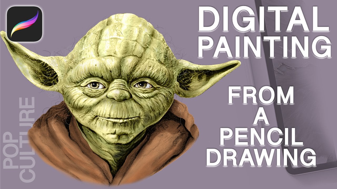
the world of pop culture. And with this class, we're going to be
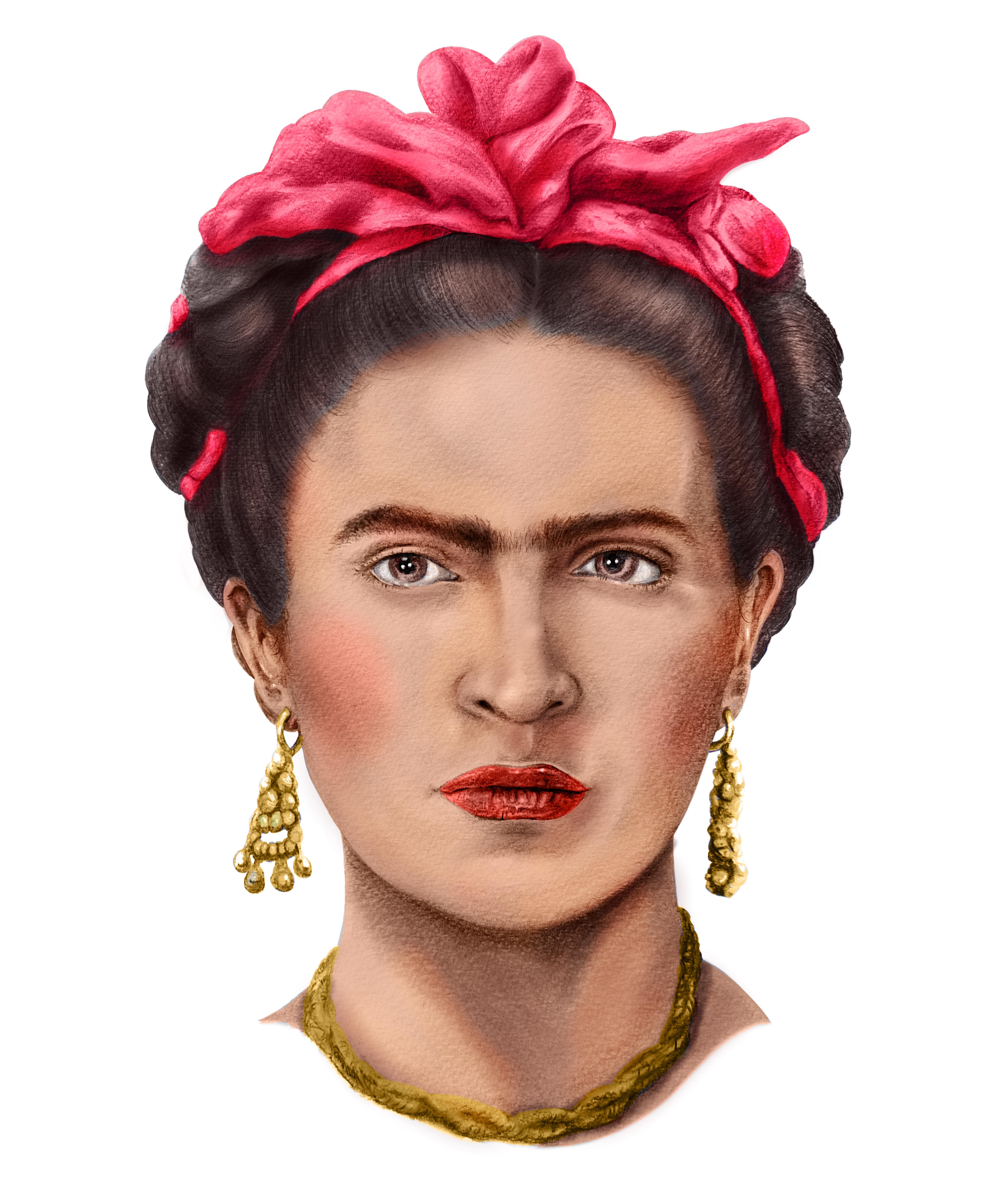
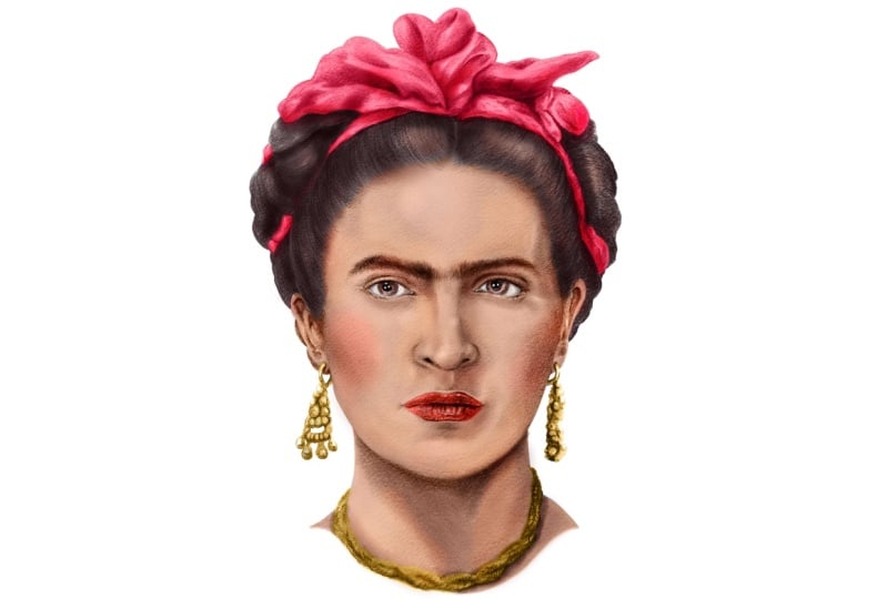
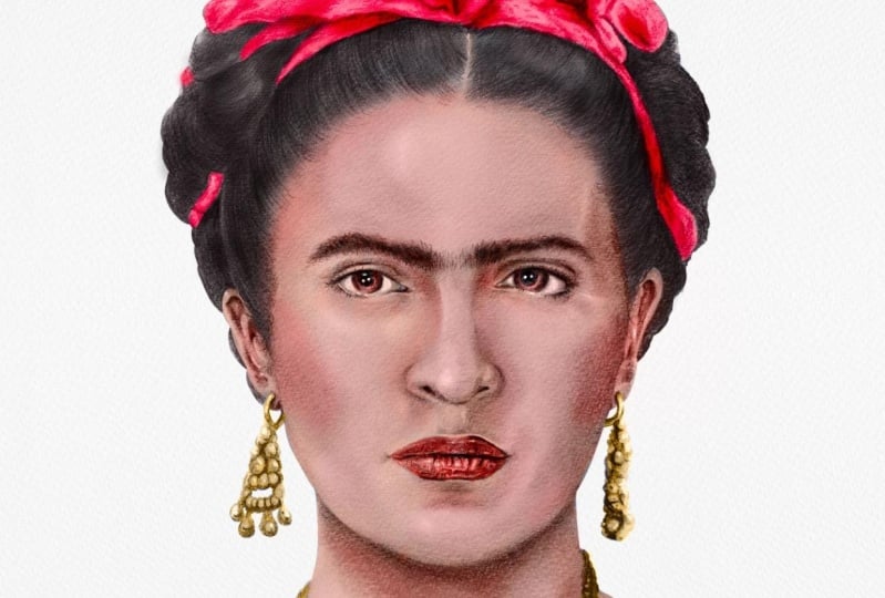
coloring Frida Colo, the iconic Mexican painter. We will learn digital painting through the layers of procreate, how to choose skin textures, skin tones, everything
from shadows and contrast, painting the hair, her
bow, her iconic unibrow. But we're going to make
it as simple as possible. And I believe if
we learn through phantom and things that we love, things that we know and not
do everything by the books, keeping things
from being boring, we will have a lot more fun and learn even more
while we're doing it. Get that ipad ready,
your Apple pencil, your reference photo, and let's get into some
digital painting.
2. Project Summary: Before we get started,
here is a course summary. We only need a few things to get our digital
painting started. Now this is an optional item, but this is a two
finger artists glove. This makes it easy
to glide on top of the ipad without
leaving smudges. And makes it a lot seamless, less oils on the
glass of the ipad. And I truly recommend
this, but it is optional, but once you use it, it makes things a lot easier
when drawing. And one of the most important, I do have a download for
the reference photo for Frida Lo just like when we used it for my third
skill shirt class. This will make it easy
for us to color pick our colors and for zooming in and out when we want to
see all of her details. First, we need our Apple pencil. I happen to have the
Apple pencil two, but you can use the
Apple pencil one. You need an ipad Pro
that runs procreate. If you've never
heard of procreate, it's a powerful tool used
for digital painting that's compatible with the ipad
and the apple pencil. And they work perfectly
together and make it very easy for anyone to start
digitally painting or drawing. It's a great way to learn how to digitally paint, digitally draw, because it's super
easy to correct mistakes and find
different styles, Digital styles that mimic real world traditional
mediums like pencils, inking pens, acrylic and
oil paint, and many more. And in this course,
because I did start off with my traditional drawing,
which was in pencil, I took a picture of it, which you can do it any way you like, even with your
iphone or a camera. Send it to your ipad, duplicate it, make new layers. And we are literally drawing and painting on top of our
traditional photo. And that way we retain
our realistic drawing. Make the traditional
coloring super easy and still have
a realistic look. I'm going to show you that using layers will make things
easier for us to erase. To correct any mistakes, we will create
layers for just her skin color, her skin tone, a separate layer
for just her hair, a separate layer for things
like shadows, highlights. And for one reason, because
we have so much choices, we're going to experiment with different brushes and
see how it turns out. And I promise you, if
you follow my steps, this is going to
be the easiest and a beginner friendly course
into digital painting. So if you would like
to start off by taking my course eye drawing for a Colo in pencil, you
can do that as well. Or just start right here. I hope you're excited as
I am to blend traditional and digital together
and let's get started.
3. Base Color : So for step number one, I like to go ahead and multiply and make duplicate layers. So that I'm able to work on different layers and not mess
up the original drawing. And what I like to do
is play around with the different types of
layers like opacity, the multiply layer,
the color layer, and also the screen layer. Because I want to go ahead and preserve the
underdrawing that I did. And this is actually going
to make it easier for us, because when you
choose the right one, for example, I chose
a multiply layer. The color that you choose goes right on top of the
original drawing. And what it does is it blends
in perfectly while keeping the underdrawing intact and keeps all the details
that we need. And it makes it look like a
traditional drawing that you did with color pencils
or any type of coloring. Because this is a
digital coloring, it makes it easier
on us because I am able to keep my black
and white version. And while I do and create
a digital color version, what I went ahead and
did with the skin, hair, and bow was to create a large shape for each
one and then just go ahead and drag and drop the color and create
a solid color for it. And this makes it easier
for us to then go ahead and go into individual parts with a different layer as well, and different colors
to add shadows, lights, and also
mid tones as well. For Frida's skin tone, skin tone that was more
of a rosy peach color. And more on that later
where I can actually choose the exact color
from my reference photo. But here I just wanted
to choose something that resembles closely
to her skin tone. I chose a solid pen
brush because I do want this to
be a solid shape. What you see here is I made a complete shape
around her neck, her face, and around her ears. And I just drag drop
exact same color with the apple pencil
right onto that shape. But just remember
that the shape has to be closed or else it will
fill the entire canvas. If it's not closed, I went ahead and filled
in a bit of her neck. I made sure to close the
shape and fill it in. This is the same thing
you would use in a paint bucket tool for things like Photoshop and
Illustrator as well. But with the ipad and
this procreate app, it's just easy to
drag and drop colors. Now I'm going to zoom all
the way in as much as I can, reduce my pen size
and use my eraser and start erasing everything
inside her eyeball and Iris. Remember to stay in
that same skin layer even with just this alone. This is a very quick process if you know what you're doing by just putting her skin tone on top of my original
traditional drawing. Things that are actually coming along with things
looking realistic. Because my drawing
was so strong, originally we are going
to experiment with different type of filters
to see which one looks the best so that it can blend in perfectly and
have that realistic look. Now for this step, I chose a soft airbrushed paint
brush for my eraser. And this way it has more of a softer erasing
effect on the edges. And look how it's blending
into her hair line. I don't want a harsh outline. And this is going to
help us seamlessly blend the hair roots and
the skin later on when we do color
her hair and her bow. And when we go in a bit more with when it comes to
color tones in her skin. Again, because we're
working in layers, this helps us experiment with what's going
to look the best. If we go into our layer section, there's going to be a letter right next to the
checkmark area. And this is just
the abbreviation for what type of
filter you have on. There's things like
multiply, dark color, linear burn, things like normal screen color,
overlay, soft light. There's just so many layers
for you to choose from. I'm just going through this
just so you can see what the differences are
and how it affects what you have as a layer on top and
what you have beneath. This will vary for what
you are going for. In this course, I'm
going for something realistic while preserving
the traditional drawing. What I found that
works the best for me is using the
color blend mode. This one you can find almost
all the way at the bottom, second to last, right
next to luminosity. And what was funny is out of
all of them that I tried, this one worked the best. But I actually wanted
to see why exactly. So I went online, went onto
the procreate section, typed in color, blend
mode definitions. And here's what I found. I went onto the procreate
Help.com area and I went into the blend modes here
on the interface. This makes it very easy to
find what I was looking for. I went all the way to the
bottom and this explains every single one of the
blend mode options that you have and what
works best for you. As I tried all of them, I noticed that the best one for me was the color option and
I wanted to see why. And it defines it as color
preserves the luminosity of the base layer while adopting the hue and saturation
of the blend layer. This makes it ideal for
coloring monochromatic images. For example, if creating a fully shaded character
portrait in gray scale, use color layer over the
top to make it full color. And that is exactly what
my drawing is originally, because it was all
in full scale pencil with gray and black tones. It perfectly, seamlessly
blends in together. And I was not expecting that, but I noticed that
it worked the best. This makes perfect sense
now because I want to get the most accurate color possible for her skin tone. I have my reference photo in another layer and I made it small on the bottom
left hand side. What's cool about this program
is that I can zoom in. And if you place and hold your finger on any part
of your reference photo, you can copy the exact
color that you want. In this case, I decided to
copy the exact color for her bow and put that on a different layer as
you can see right here. You can move it left and right, and there's a circle
that shows up with a transparent look with the exact color that you're searching for as
soon as you let go, that's the color
that you choose. Very simple. I'm bringing up the Frida Colo reference
photos side by side so that we can see how accurately the colors
are coming along. This is one of the
coolest things about procreate and digital painting
is the experimentation. Hopefully, as you're following
along in this first step, you're choosing the color that looks the best and
closest to you, because we're still using our observational skills
while using this type of technology to help
us take some of the guessing out when it
comes to choosing colors. When it comes to her bow, I'm working the exact same way, like we did with her skin tone. We are using shapes. Think
of it as a puzzle piece. I'm going to trace
all the way around the bow that's wrapped around her entire
part of her hair, Closing the shape
and dragging and dropping the color like a photo bucket until
it fills it up. Because we are working
with a base layer, a solid color first. Before we do any other details, any other hues of that
same type of red. So take your time and outline
the bow with your pencil. And again, I'm using
the monoline brush pen. This is a solid pen that
helps with blocking in color. For the following step, let's do the exact same
thing for her lips. Choose one of the best colors. And I'm thinking a middle
range red works the best. Because we can eventually
add a darker red and some highlights and middle tones at the end of our course lesson. It's easier to begin with a middle based color than
a darker or lighter one. So that we can see where
we're working with. And again, dragon
drop the color. And if it looks like
it's not the right one, take your time and
experiment with different colors and use your
best judgment as an artist. Try different hues of red, different pinks, even
magentas as well. And if it looks like
it's too bright, tone it down and
use a darker color. Now for our last
step in this lesson, we are coloring her hair. Now Frida has jet black hair. If we choose something in
between, a darker gray, not too light, because we
don't want it to seem like she has gray hair work
on a different layer. And again, we're going to
trace all the way around, close the shape, and
drag and drop the color. And because we're using that
color blend mode option, it preserves our under drawing. And we are literally
more than halfway done. It almost looks complete, but we do need a few
more details that I'm going to explain in the
last section of this course. Notice how it looks
like before I change it into the color
blend option mode. It looks like a solid piece of a puzzle, Solid black color. You can just see how much
of a difference it makes. This is a great way
as an artist to see sections of hair as shapes. We can section them off and make it easier for ourselves when we are coloring or when we're
drawing hair as well. If you do need to adjust and erase any of these
shapes that you created, it's easier to use
the erase option with the monoline brush so you
can get a clean outline. We are done with our lesson one.
4. Airbrushing: Now one of the last steps
I like to do is go back to my reference photo and go ahead and zoom in really close to it. And then make a brand
new layer right on top of all of the existing
layers that we have. This way I'm able to create small details like the
blush in her cheeks, the highlights in her lips, and then also the small
highlights in the iris, some parts of the forehead, and just small details, for example, in the sheen in some of the strands
of hair and bow. And also some of the
undershadows of the neck, underneath the
eye, the eyebrows, and also the hair
and bow as well, as I continue to
refine her hair and where the edges where her
hair meet against the scalp, I made sure it's
a very clean look with a seamless transition
from skin to hair. Then I move on to the eyes. Her eyes are a darker brown
and I zoom all the way in and choose the
monoline brush to get a solid color around
those irises. The eyes are so small you can just fill it in
using your pencil. You save yourself a lot of
time by using the drag and drop feature on larger
shapes and smaller ones. Just fill them in like you would do when you're
drawing normally. Then I'm moving on to her
jewelry and accessories. One thing I forgot to mention, when I'm choosing a color like you see right here
with her jewelry, I'm going something
closer towards a yellow and something
gold looking. When you choose a color
here in procreate, you have the option to also
make the color vibrant. There's a lot of tones you
can choose on your top right. And this is your
artistic choice. In order for the
colors to stand out, I'm going for something
a lot more vibrant. And again, you can
fix that later on if it looks like it's
a little too bright, too dull, or not
realistic enough. But again, I'm going
for a base color first because these
are intricate designs. I'm just going in with my pencil and filling
it in manually. And I'm sizing up my brush
up and down as needed. One of the cool
things I like about procreate is that you
can definitely see how a great under drawing
that already has shadows and light
bring out the colors. For example, you can see
the shadows right here where the gold and all
these pearls interact. By just adding that color in, it already gives the
illusion of a darker yellow, even though we've only
used on solid color. This is a style
of painting known as monochrome under painting, where we use colors that are opaque and apply
them right on top. And this is perfect
for flesh tones. In traditional painting, we are applying this method
into our digital painting. This is why it's fun
to experiment with procreate and digital
painting because not only is this going to help us visually see how colors work, but also it's going to help
us when we want to use traditional colors like painting and color pencil as well. To finish off her necklace, I trace the entire thing and
drop the color right in. This is the layer that I'm using for her eyes and her jewelry. And the blush in
her cheek bones. And for the most part, all of the airbrushing that
looks like it's makeup. Again, you can use several
layers for individual parts. For example, you can
do one for the eyes. You can do one for
just the blush and areas just so that it's
easier for you to control. But I suggest you do one just for the airbrushing that we're going to use
for her makeup. Like her cheek bones
right here where I selected a pink or it's
more of a warm pink, I created an entire
different layer and I'm using a soft airbrush. And the reason for this is that obviously we want
this to be subtle. And as you can see, I'm experimenting with the
different type of color blends. They are not working. I know that I'm going to have
to play around with the opacity as well by
turning it down to sometimes, even at the lowest 10% 20 or 30, and see how it looks. Again, it's easier to try on
top of all of the layers and use a soft airbrush
pen trying out different warm oranges
and peach colors. And don't forget the amount of pressure you apply
to your pencil. Directly on the ipad also helps determine how dark or light
the color value will be. As you can see here,
this one gives it a nice hint of blush
to her cheek bones. And I'm playing around
with my sizes as well and using it for
the makeup that she would have underneath
the eyebrows and her eyelids as well. If you zoom in, just like all air to medium
skin tone colors, there's always going
to be some areas that are catching the light
and absorbing the light. For example, the ear lobes, the chin, underneath the mouth, some of the nose area around the nostrils and the tip of
the nose where there is. And the light tends to go
through the more you'll see where we'll need to add a
bit more of that red color. And you can also be
subtle with this as well. Now I found this color tone
chart on line and it's just another helpful
chart to see how skin varies when
light is touching it. And if you look at a
reference photo with Rita, you can see that her pigments
comprise of oranges, light browns, pinks,
hints of rose, and everything in between. Now let's move on to our
shadows and highlights.
5. Highlights & Shadows: Now in this part of the lesson, I decided to combine both shadows and
highlights in one video. For that reason, I
wanted to show you how in this particular
digital painting, I didn't use much highlights, but instead focused
more on the shadows, which bring out a lot
more of her skin tones. Now this is how it looks when I finally
completed everything, just so you guys can see the entirety of how
complex it can look, but without really
going so deep, when you combine all those
layers into one and see the final outcome in its
entirety, here it is. Compared to the reference photo, what you want to do is
create a different layer on the topmost part of
all of the layers. Choose a lighter skin
tone, closer to white, but something in
between her peach color and the base color that
you used for her skin. And use a soft airbrush
and start going in circles with maybe an
opacity of below 50. I think I have it at around 40% Start creating
highlights where you can see it in her
reference photo. For example, on the left
side of her forehead, her some of the bridge of
the nose and her cheek bone. And as you can
see, it looks like the lights coming
from the top right. These lighter areas are
nothing too complicated, but if you do need to erase, make sure you erase with a
soft airbrush to keep it from having such a striking contrast between light and dark. We can fix that all the way at the end when it comes
to the details. Now let's move on
to these shadows. Now let's create another
layer for the shadows by themselves to look up the definition for the
blend mode to use, we're going to use
the multiply layer. And the reason for this is this mode multiplies
the luminosity of the base color
by the blend color. The result is an overall darker
and more intense effect. Multiply produces
different levels of darkening depending on the
luminosity of the blend layer. Multiply is perfect
for darkening images or creating shadows. And this is why this works
perfectly for what we're doing for creating cast
shadows for a human face. Drawing a human head
and blending in with a human skin tone
while preserving the luminosity of
our chosen color. This in turn, will bring out those pigments
inside skin colors to resemble as much as we
can to a lifelike result. If you don't get it right
the first time and if it looks a little
off, it's okay. It took me a long time to experiment with
different brushes, different transparencies,
and different layers. This is one of the reasons
I created this course. To make it as
simple as possible. However, just have fun playing around with
these colors as well. Your desired result depends on your observation on
how much you want to push that three dimensional
look in the end. Also notice the amount
of pressure also has a result in the
intensity of the color. The lighter you
press down against the screen and
your apple pencil, the more subtle of a
result you'll get. You can also fix all
of these type of settings with every single
brush if you like as well. But for the most part, if
you lower your opacity, there are 2 bars to your left, one for the size of the pen
and one for the opacity. That should be enough to have different degrees of contrast where we want our shadows to be created and our mid tones. I have already
noticed where I might have to line up some areas. For example, right
underneath the left side of her neck area might
be a little too dark. So I'm going to be softening
and lightening that up and see how that
result will look like. Now, with the same chosen, I'm going right into everything that will
create a subtle shadow. I'm just sizing everything down right underneath and
in between her eyelids, her eyebrows right
underneath the eyes, but not enough to
give it dark circles. But also around the nostrils, the bridge of the nose, the cupid bow area,
and around her lips. By checking the reference photo, this is where these
shadows are being created. Where the light is
bouncing off and even going into her unibrow and eyebrows to
darken those as well. If you notice, I'm
always zooming in and out to see how it
looks from far away. Because when you are
zoomed in so close, sometimes you need to see
those details from afar. Just like when you're
drawing traditional, if you're focused on one area, too much other areas might be ignored and
might be neglected. When we're so focused
on just one area, you can even play around with the opacity of the entire layer, if that also helps with a
more of a seamless blend. If we move to our layer
with our red bow, we'll be using the same
technique in order to get those deeper
shadows that we need. By going underneath
where the shadows lay, you can see that
dimension coming out, those lifelike layers where
we know the sun is hitting, creating those deeper
shadows, creating layers. And just giving us an overall
depth in value as well. You can already see in its entirety how it
affects the bow, how it affects realism when it comes to color and
drawing the human face. Now, one of my
favorite techniques to also use is called
the smudge tool. You'll notice this on the
upper right of the tool bar, right in between the
brush and the eraser, you'll see the little
finger and what it does, it's exactly what
it's named after. It smudges anything that
you rub against it, for example, at the root of her hair and where
the skin lies. I want it to look
like a seamless blend where you can see the
skin underneath the hair. Again, you can choose
the exact same brushes that you would use
the smudge tool. And I lower the opacity to below 40% This way it has a seamless blend right
into her hair and skin. Because I do want a
smooth transition from where the root of the
hair start from the scalp, usually where those
baby hairs lay. They usually tend
to be thin and we can still see the
skin underneath. It might take some
time to get used to that tactical feel between the
ipad and the apple pencil, as there isn't much of a grit, just like you would when you feel paper in between
pencil strokes. But the more you practice, the more you'll get to see
how it feels when you use your sides of the
pencil versus when you're drawing directly above. One of the last things
that I like to do, when I feel like I
have the nice balance between mid tones, the shadows, the cast shadows. I go for the eraser with a soft airbrush and start
very delicately and lightly erasing
around certain areas just to make sure I have a perfectly blended
skin tone that I want. Now, one of the
things I forgot to mention is the way that you position your pencil
just like you would do when you're doing
a traditional drawing. For example, use strokes that go with the facial
features of Frida. For example, since we're
coloring her face, use a curved motion
when you're going down or up in a curved motion
around the cheeks, the chin, and around
the forehead. Instead of doing straight lines. This will also help with
rounding things out and having things from looking so flat and give it more of a three
dimensional look. As you're erasing shadows and things like the blush and
anything around your face, you'll get a feel for
how things should look. You can go as soft as you
want or as dark as you want. You'll start to see when
things look a little bit more natural or just a little off. For example, right underneath her nose and to the right
side of her upper lip. It looks a little too harsh, so I'll be softening
that up as well. I'm going layer by layer and
just softening the look of the shadows so it has a
more of a believable look. And nothing looks super harsh except for areas where
they are obviously darker. For the most part, I
left the neck alone, but I did soften a little bit of the nostril area to the left. Our shadows tend to be darker on the right side because our light is coming
in from the left. Also, I try to avoid having
any type of dark circles. I soften that up as well. Again, go back and forth and make things
darker as you please, like I did back here with
the hair underneath the bow. If you're satisfied
with this step, let's move on to
our next lesson.
6. Face Details: Okay everyone. We made it to the final part of our lesson. This one I like to call
the facial details. Now for the most
part we are done. However, if we want to
take an extra step and make this even more detailed and push
things even further, we're going to have
to zoom all the way into specific areas and make a few more layers just to try out
different textures, different brushes and bring
things out even more. This is the equivalent of taking your time in a
traditional drawing with a sharpened pencil and going in for things
like eyelashes, eyebrow hair, and just
small imperfections just to bring out the
lifelike nature of skin. And in this case, a bit more
detail in the skin color. A bit more of straight hairs sticking out in imperfect areas, in darkening shadows,
certain highlights, maybe adding a few
wrinkles here. And there really does
complete the look of realism that we're
going for Saming. Now in this small section, I did a time lapse
just so you guys can see how I'm cleaning
up curves J, They looked a little wobbly, wonky and not straight enough. It was right next
to her hair and the boat area where I felt like the color was bleeding
a little too much. Obviously, when I
wasn't zoomed in, it kind of bled
through the hair area. And the great thing, again, is that because we were
working in layers, I can take my time and neatly cut out and erase with
the monoline brush. Makes it really simple to keep those outer edges as
clean as possible. And this is a part where
we do not want to use any softened air brush because that would
look a little weird. We want something extremely
tight, extremely crisp. And you'll also notice
where the gray under drawing is kind of
bleeding out as well. Where I didn't color it enough, I'll be cleaning up those areas. And also getting a
pencil brush and zooming into her baby hair area where the root of her hair lies. And just adding some
straight hairs just to give it a bit more
of a realistic look. A few strand of hairs make things imperfect and
more believable. What you might also want
to experiment with on another layer is using
a hair brush tool. And procreate has one where
the brush has a hair texture. And you might be
able to get away with using the opacity at a lower intensity and adding some hairs here and there and checking to see if
that looks natural or not. But that's something
that you can experiment with yourself. Another thing that
you can play around with is her eyebrow darkness. And also adding a
few stray hairs that don't look so perfect and darkening things just
to see how they look. If it looks a little too off, obviously you can lower the opacity or just
completely erase it. But just subtle
imperfections like that will bring out other
facial features like the eyelashes and more of
that human touch that we add when we want to
have that realism when we're drawing faces. And again, you can
zoom in and focus on areas that you feel
need more time. Zoom into your reference
photo as well. Maybe zooming into her lips and adding a bit more shadows, a bit more wrinkles,
but without aging her, and also adding some
highlights where needed, I went ahead and added more
shadows that aren't so thick around her neck area and her accessories,
like her necklace. I mean, racing as I go. Just experimenting, tones and I think we are completely done. We finished our first digital
painting of a human figure. I'll leave you guys with
this full time lapse video. And thank you so much for following with me
and taking my course on digitally painting Frida Colo. And don't forget to upload this into the project
file of this course. Let's move on to
my final thoughts.
7. Final Thoughts: What did you think of
our digital painting of Frida Lo and using a
traditional base to do so, we used a black and white
monochromatic drawing, or our underpainting, and we use digital colors right on top. This helped speed up our
entire coloring process. Once again, we learned through
the world of pop culture. We drew the iconic
Mexican painter, Frida Calo, she is known
for her iconic Unibrow. We learned the basics of digital painting
by using layers, procreate, made it
super easy for us to experiment with
brushes, textures, because it made it simple for us to experiment with opacity and different colors while
learning the harmony when it comes to making things
look realistic, using our olservational skills and choosing the right color, our right skin tone. And using our artistic instinct in order to push it
as far as we want. When it comes to three
dimension and believability, I had so much fun teaching my first digital
painting course. And there's more to come. And don't forget every single tip skill that we learned here. You can apply this
to your own artwork. There's going to be
more traditional and digital combination videos
in the near future. And don't forget to upload it in the project section
of this course. Thank you guys so
much for watching and I'll see you
in the next one.
 IVAN RAMIREZ, Artist, Painter & Youtuber