Transcripts
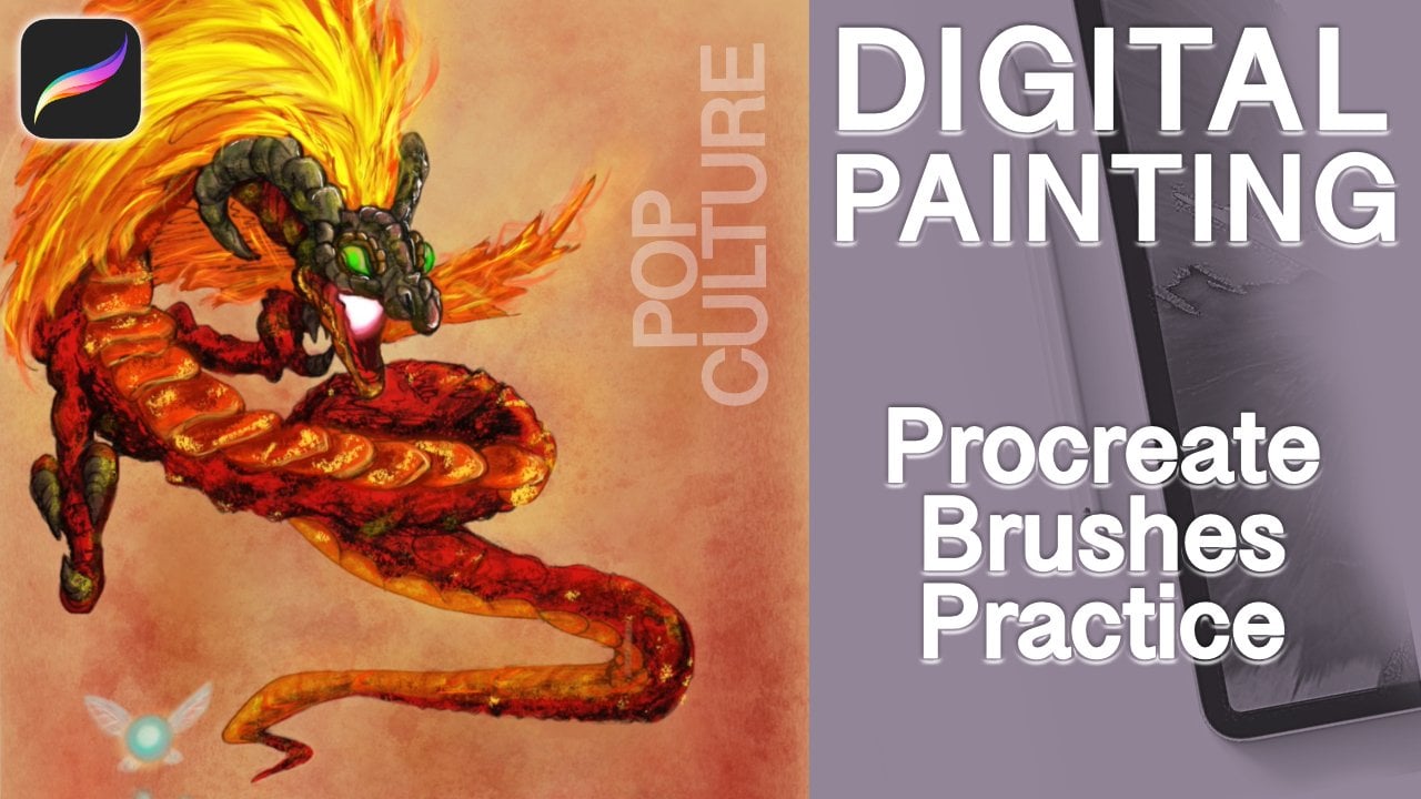
1. Course Introduction: Hello everyone. My name is Ivan Florentino Ramirez and I am back with my skillshare
class number five. This is my second digital
painting course using procreate and we're using my traditional
drawing that I did, a Yoda as a base for us
to color our drawing. I'm using my black and white, monochrome drawing that
I did in pencil and we are drawing on top
of it using procreate. And if you haven't already
taken my first class, which I drew Yoda using pencil, that'll be a great jumping
off point if you want to continue from that and now
onto digital painting. So we'll be combining both traditional and digital
into this course. Having graduated from California State
University Fullerton, I have experience in both
traditional digital painting in both acrylic and oil. In both drawing
the human figure, life studies drawing, and
life painting as well. I know as artists
sometimes it is intimidating to start something new, start something fresh. And one of the reasons I created this course was to
use both phantom meaning pop culture
in my classes in order to learn and
have fun while doing it. We're going to take all the
boring things out of the way, And we're not going to
do things by the books, and we're just
going to go for it. With these courses, I
decided to use pop culture, meaning we're going
to be drawing yoda, we're going to
digitally paint him. And we're going to
have a fun approach. Instead of going by the books and doing things the boring way, I'm going to be showing you
all the tips and tricks that I've learned using
Procreate with the ipad, Pro Apple pencil two. So we can create this
digital painting in the easiest way possible. And the best part is you can
apply this to your own work. So hopefully you're ready to
take on this course with me. Make sure you have
all your materials ready and let's get started.
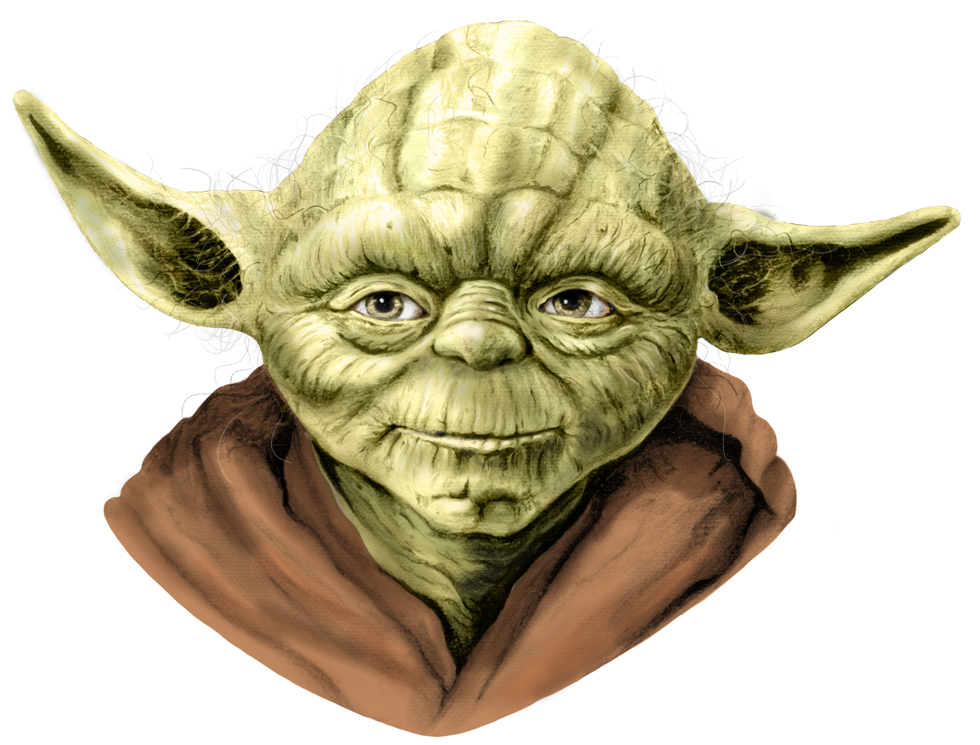
2. Project Summary: Let's briefly go what we're going to be doing
in this course. One of the first
steps is I do have a download folder with the
original Yoda that I drew, which you can
download yourself in order to practice this
digital painting. And I also have the
reference photo of the Yoda that I used when
I originally drew this. And now it's in full color. So we're going to be able
to pick our colors using the program with the easy
color picker that it has. I'll teach you how
to import the image, remove the unnecessary
background that we do not need so that we can have
a clean cut out drawing. I'll show you how to
create our base colors and use layers in order
to use our foundation, which is our monochrome
under drawing. In order to help us
speed up the process, we're still going
to make sure we have a realistic drawing, even though this is
a fantasy drawing, because most of the work was done with the shadows
that I created. In our pencil drawing, we'll be using
different color layers and also some shadow
layers, high light layers, and build everything
together using transparency methods,
opacity tools, so that we can bring
everything together and have a full color image with
half of the work done. Because we started off in
our traditional drawing, I'll be showing you different methods on how to approach this, get everything ready,
and let's begin.
3. Importing Images: Hello everyone. Hello. Hello. We're going to be drawing
or digitally painting Yoda. And this is actually from
my skills class number one. All you need is your ipad. Ipad Pro, your Apple pencil
or Apple pencil two. I happen to have
Apple pencil two. I highly recommend one of these artists gloves
for digital painting. They're super cheap. You
can find these on Amazon. They are super easy to keep
your glass cleaned and easy to move around without
smudging your ipad screen, which is pretty
useful and helpful. One of the first things
that we're going to do is show my canvas. If you go up to the wrench
up here to your left, next to the gallery,
the dimensions. And this is what I have
for the dimensions, but you can actually
use whatever you like, but I highly recommend
you have the DPI at 300. The resolution can be
as high as possible. We want this to look super
clean and not blurry at all. You can make your pixels and height width as
high as you want. But just remember that
the higher the pixels, the less layers that you'll get. This one, the maximum
I have is 25 layers, which is enough for
what we're going to do. To get started, I'm going to
show you guys how to import the drawing that I'm
going to have for you guys in the download
section of this course. So it's going to be a black
and white pencil yoda with a PNG background and
our reference photo. Let's go ahead and import
our reference photo here. And it's going to
be the same way on how to do the
drawing as well. We're going to go to the wrench, we're going to go to Add and
we're going to insert photo. So I have my Yoda right here just to show you guys you can resize
it as big as you want. I'm going to keep it
as small as I can, keep it in the corner. And I'll show you
the reason why. Just to let you guys know every time you insert something, it's going to be in its
own separate layer. Here it is. Now I'm
going to show you guys how to use this as another
reference photo as well. You go to the wrench, go to
canvas, you go to reference. What this does is again, you select that same one. It will always be on top
of all of your images. You can resize it here. Now this is just if
you want to have it as a reference source
outside of your canvas, it's just an extra
resource for you to see if the
colors are perfect. It's just another handy way of having your
reference photo here, besides this one right here on our actual layers that we have, our ipad and
everything prepared. Let's move on to the
beginning of the lesson.
4. Background Removal: Okay, so we're going to turn off this reference
photo for now. We don't need that just yet for. One of our first steps
that we're going to do is show you how to
delete your background. I'm going to show you
guys how it looks like right before I do
the cut out of yoda. This is a rough cut of
how Yoda looks like. With the pencil drying, it's a very quick cut
out of the white space. This is how it looks like
when it's completely clean. Another extra step
is adding back the hair and this is
how it looks like, and this is the one
that I have available for you guys in the
download folder, A high resolution
PNG where you can digitally paint on top of if you've never done
the original drawing. In my skillshare
class number one, I'm going to show you
how to do a quick cut of some of the areas just in case you've
never done it before. I'm going to show you, you
can even use recent look. It's right here.
Monoline. Your eraser is going to be this
brush. Monoline brush. Make sure the opacity is at 100% This is the one we're at. We're going to zoom
all the way in. And you can literally start
deleting things we do not need as simple as that. I'm going to show
you how to erase large areas to speed
the process up. I'm going to show you how to do a clean rounded erasing if
I hold it all the way here, if I don't let go, I have
an easy way of doing a perfectly lined
rounded eraser. If I use an airbrushing,
for example, this hard brush is
one of my favorites, depending on your size. This is actually a perfect
one to erase big sections. I'm going to show you
so it's easier to see. I press and hold and do a
curved line and don't let go. It as in a perfect curve, you can stretch,
pull, and stretch. You can easily turn our drawing. This is easy to keep an eye on. The entire drawing,
perfectly erases any curve. That's how you delete big
areas that we do not need. Again, I'm doing
this very quickly, but you can take your time
in any of your drawings, in any of your
procreate drawings. This is how we can easily erase unneeded
background images. If we want something to
be a clean cut PN G, where we can easily draw
on top of this step. You don't have to, but I like using this
because we're going to use something called
Alpha lock later on. Alpha lock is going to
be our best friend. When we're digitally
painting again, hold it, we can easily
erase clean cut curves. So see how easy that was
Now if you take your time, this is how it's
going to look like. I'm going to leave you with
procreates time lapse feature and zooming all the way into my drawing and this
is where I took my time to start cutting
things out around his neck, the cloth that Yoda has, making sure the lines are as
clean and crisp as possible. Going around the ears, the top of his forehead. So that we can eventually have a clean cut drawing
with no background. There's a reason for this that I'll explain more
in the next lesson, which I'm going to
be using alpha lock. And eventually we'll be drawing more hairs around his ears, on the top of his head,
in separate layers. Again, remember to resize your pencil brushes to get
into the tight, tight areas. This step you can
take as long as you like if you're satisfied
with the outcome. Let's move on to
the next lesson.
5. Drawing Hair: Now I'm going to
show you how to do some hair details right on top because we do not have
time to go through around every hair on the
original drawing. We're going to just
draw right on top, this is a closer look. We're going to add
a few strands of hair to make this super detailed and add in things that just makes
it easier for us instead of racing through
those strands of hair. Now I'm going to go to
my layers section and turn the background color back
on, which is just a white. You can easily see how we're
going to draw our hairs. I'm going to draw ya hair, this is how it looks
like without and with. Go on to your brush
section up here. If we go to the
sketching section, it's going to mimic
realistic pencil strokes because this is how
we originally drew our yodo using pencil. Let's just try The one of my favorites is
a technical pencil. Let's see how that looks like. Make sure we get some
dark gray somewhere in between to mimic a pencil. The harder you hold your pencil, the more pressure you put on the screen, the
darker it becomes. But just look at how it
actually mimics hair. Just to show you
how it looks like, remember using your two
fingers as previous strokes? This is to undo
your paint strokes. We're just going to
add a few hairs. We can turn back our image
that we had down here and we can actually see our reference photo and just start adding some
hairs just like this. He has a lot of white hairs
coming from his sides, cider burns and around his head, and almost very bald. Again, you can take
your artistic eye and see how much you
want to do this, how much you want to add. You don't have to add much, but as much as
you're comfortable with to make sure it
stands out from the black, we're going to add
some white hairs and you'll see how it stands out because we do need that
contrast with the white. Now this is just
extra detail that this drawing happens to
be missing was the hair. Again, the reason
for this step is because during our
background removal lesson, we were not going to waste our time erasing through
every strand of hair. We wanted to work
smarter and not harder, and this is one way to do so.
6. Contrast Adjustments: We are going to enhance the shadows by going to our adjustment
section on the top left. In the adjustments areas
we have hue saturation, color balance curves,
gradient map. There's so many
things to work with. If we go to hue and saturation down here in
the brightness section, we can play around with making
things darker or brighter. This is actually perfect
for making something like a vector of almost like a solid silhouette
of this entire drawing. We'll just keep it
at 50, 50 for now, saturation, that's
usually with colors. Since there's no color,
it won't have any effect. Okay, here's one of the coolest
things about adjustments. We're going to play
around with hue and saturation, especially
the brightness. If you go to this small area in the small arrow right here, if we press that, you can do the entire layer or
just your pencil. This is how it looks like
with the entire layer. That's not what we want.
Press two fingers to go back. Go to your pencil. We're going to use, we're going to try out
this soft airbrush and see how it looks like. If we move our
brightness down to maybe 30% what it's doing is just using your brush and doing areas that we want those shadows to be a
little bit deeper than normal. To make sure that we have a nice contrast between
light and dark. If we turn on our
reference photo, the floating reference
option helps you have the image floating
around the entire canvas, and so you can freely look at it and make
adjustments as needed. Go back to adjustments and look at his
shadows in his ears, his eyes, under his
neck and his mouth. We're going to darken
those just a bit more Using the soft airbrush, go and look at every part
that has a deep shadow. One of the reasons I like using the soft airbrush pencil is that it has a
nice balance between opacity so that it
goes right on top of our drawing without making
any type of harsh lines. We're bringing out those
deep shadows that we want, because these are solid, solid black shadows where
light cannot come in. Look how easy it is to make
these lighter or darker. We're going to do a nice
balance and not go overboard. That is how you
intensify shadows in a nice subtle way into our original traditional
pencil drawing. You can do that the
exact same way into our yota that has no background. I'll get into why we cut out our background so
that we can use something called alpha lock later
on in our next step, that'll be step two where, where we're going to start
using our base colors. Now we are done with
our first steps.
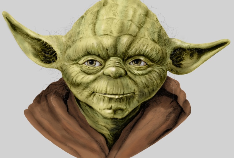
7. Base Color: Hello everyone. Welcome
to step number two. We're going to be
coloring our base colors. One of the important
things to always do is do a duplicate of the drawing that you're going
to draw on top of. Just in case we mess up, all you have to do is slide
your pencil to the left on this rectangle here to
your left and hit Duplicate. Go to the bottom one. If we go to the swipe left, we can lock it just in
case it'll be safe. We're not going to
mess that one up. There are several
ways of approaching, making a base color that's
going to go on top of yoda. There's different ways
of approaching this. I'm going to show
you a few here. Alpha lock normally
is turned off, so I'm going to show you what
happens without alpha lock being turned on first. Remember the reference
photo we inserted? We can select the exact color we need from our
reference photo and use it for our digital
painting with your finger. You go over the color
you want to select. You can even drag without
lifting your finger. I'm going to use something
right in the middle, although this looks very brown. We're going to make
it a bit more into a green that we all know for
Yoda as soon as I let go, this is the color
that is selected. Luckily because we have
this color section, I like using classic because you can choose something that's
close to what we chose. I'm going to add a
bit more green to it, so I'm going to slice
this to the right, move this a bit higher to give us more of a medium base green. And see how that looks like. I'm going to use a soft
air brush for this, just to show you how it looks like without Alpha
lock turned on. Let's just say we're
trying to paint this, look what happens without it. You'll always go out of
your intended outline. And it's going to
take a long time for us to stay in here, resize this every now and then, try and stay in the middle. We can do that, but we're not going to waste
our time doing that. It takes way too long to do so. If we turn on alpha lock, it prevents us from painting
over our intended image. But remember, the
image has to be solid. Here we go again. If we were to paint
on top of this, I'm going to reduce my opacity just so you
can can see and look. Even if I try and
draw, it won't let me. Alpha lock saves me and
prevents me from doing so. Alpha lock is a saver
if it won't going to paint directly on top of Yoda, that's just one way. If we were going to draw
directly on top of this layer, that's one way of coloring. But we're not going to do that. We are going to
instead use layers. Imagine this almost
as tracing paper, we're drawing on
top of one another. I'm going to show
you the way that I like to do this and
an extra easy way. If we were to draw our
base color for yoda, we are going to have to
take the longer way, which what I like to do
is use a monoline brush. If we go to our recent, it's going to be right here. We're going to make a
layer on top of this. We'll make one more layer, and here's what
we're going to do. We're basically going to
trace this with our color. And I know that it does, it is going to take
time to do this, but I wanted to show you this
way versus the easy way, because not all drawings
are going to be the same. That's why we, this
is why we cut out the background originally so that I can show you
how to save time. But again, there's always different situations
that call for different ways of
coloring things. I'm just going to show you
two different methods. This is another one. As long as our shape is closed, there's no open areas, our shape is completely closed. If we click and hold the color, we're going to drop and drag. And that's how you
fill our base color. I'm going to show you how
it looks like on top. Now this is the beauty of
using layers in procreate, we can experiment If we hit the little end that you see
on the right side next to the check mark I normally the one that works the best is
the multiply layer. Sometimes overlay
is also perfect. We're going to see which
one works for our drawing, this is why it's perfect to experiment digital painting
allows us to do that. We're going to try a
different green just to see if that fits a bit better. And remember, you can keep on
trying this as much as you like and see which
green looks the best. I'm going to try
overlay might work, multiply, and again you can even the opacity and
see if that helps as well. We're going to try
overlay for now. Now here's the thing
that I forgot to do. Since his coat is
actually brown, let's start erasing something. We're going to go to
our eraser hard brush. We're going to at least to the point of his neck area and start doing all
of our base colors. Now this is a long
way, you'll be racing, but I know there's other ways
of cutting and deleting, and we'll do that later
on if we need to. Okay, so there's one way
of making a base color. Now I'm going to show
you our second method. I'm going to duplicate
our layer again. I'm going to make this
back into normal. Here is a faster way. If we go to our adjustment
section appear, turn the brightness
all the way down. And there we go, boom, we made a silhouette. And all we have to do
is drag our color. And there we go,
that's the easiest way to do a base silhouette. All you have to do is do that, and that's how we create our first base
color. Very simple. I wanted to show you two methods because
it's always going to depend on your drawing and
what you're trying to achieve. So we tried overlay for this one and this one,
we tried to color. So either way works, now we're going to get our
eraser again and the eyes, because his eyes are not green. There you go. We literally, this is the only base color
we need for this step. The last steps will just be
playing around with details, shadows, and some highlights. If we create one more layer, if we go underneath, we're going to add
that sweater back in with the monoline brush. Select our image. And select that
brown that we like. Again, we're going to do
a quick outline of this. Or again, you can use the silhouette one
that we did earlier. I'm just trying to show you different methods of doing this. We want to drag our color
and it is filled again. Let's go to, I think color is going to be
our best one for now. But we can also try, maybe multiply will be
better for this one. Multiply doesn't
look good for this. Instead, color works the best. There you go. Were more
than halfway done, we already did our base
colors by just using that green and brown,
erasing the eyeballs. And look at that. Now let's move on
to our next step.
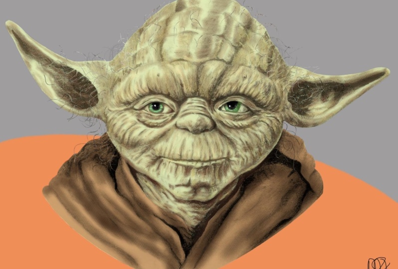
8. Color Tones: Okay, for this part
of the lesson, we're going to make
another layer. This is what I like to
call my detailed color, lighter color tone
variation layer. Let's turn on that hair layer that we did all the
way in the beginning. You can do this at any
step that you like. I just wanted to
show you that from the beginning because
everything is going to be separated
into layers. You can see the difference
without the hair and with I'm putting this at the very top because we're not going to mess
around with that anymore. Maybe till the very end. We're going to finish
coloring his eyes, his pupils, and I'm
going to choose a green. That's as accurate as possible. I'm going to use a soft brush we can play around with. But I think we're going
to be using the color one again because color intensifies the layer of our
original drawing. Again, because we used a black and white
monochrome drawing, that's why we're using
layers just like that. That was super simple because
our original drawing, the shadows that we created with our pencil is doing the
entire work for us, fat in entertainment fame. All that work we created with our drawing that's complete. Now I'm going to go for
the darkest that I can. Just to add a bit more from the shadow of the upper lid is creating a
shadow right there. Let's add a little bit of
white to his eyeball area. There's a little bit of orange, a little bit of brown in
there of a tan color. Let's see what it does. We're
going to go subtle with it. Not too much entertainment,
because again, we can see if it
looks a little off, we don't have to add it at all, or we can be very
subtle with it. We're going to go for a bit of a light gray for the
white part of his eyes. And there you go. We did
all the entire base colors. Yoda tends to have
different greens, Browns in his skin tones. So we'll choose
something like this. Let's see how that works
for us if we make it darker because we want a
variation in skin tone. And I know this is
a high fantasy, more of a reptile color. And you know what, we
might even have to create a different layer just
to play around with that. Because again, this is
just our base color and that alone is going
to make things look flat. If we don't play around with, if I use the darkest green, you can start adding a
variation of greens as well. We're going to go around
his cheeks, his eyeballs, underneath the lids of his eyes, because we want to have a
variation in greens, grays. And we're going to
add some of that brown back in as well, but I feel like that's going
to be in a separate layer. So by even adding
this type of a dark, dark green, we're getting
some variation in that much needed
tone of his skin. Okay, so we're going
to open a new layer, so we won't mess around with
this. Again experiment. This time we're going to
use a normal layer and reduce the opacity just to see how it looks like
when we overlay something. This time I want to play
around with shadows. We're going to use a
different type of a green and go in the cheek area and just
make it really dark. I'm going to move him to the
left, just so you can see. I'm going to work on
this side of the face, this one. Let's see
if multiply, okay? So this is going to be perfect. Multiply is going to help
us with our shadows. So we're going to
reduce the opacity, let's reduce the capacity to 50. And let's see how
that works for us. And look at that. We're creating
shadows that are subtle. And we're going to go
underneath the eyelids, anywhere that you see where
there is a deep shadow and see what happens
when I darken it. It's a little too much. So we're going to actually play around with darker color. Doesn't work. You multiply is going
to be our best choice in just a bit. In one
of our last layers, we're going to use a
brush that's a bit more of a textured detail brush to add some of that skin tone, that rough skin, to make
sure that this air brush isn't looking so
soft entertainment. But as long as we
add some type of shadow in the areas
that it needs, it's going to give us that
three D look that we do need, that we do want for
painting realistically, even if it's a fantasy
style drawing.
9. Making Skin Textures: So let's play around with the brown coat that he
has in our same layer. Again, look at how it deepens that rich brown for
more of that shadow. I'll be moving my
reference photo every now and then just to
make sure I can actually see. Again, we'll be adding
textures in a bit. I'm just trying to get the
rough shadows that we have back here and again, keep things from
looking so flat. We're going to even
add lighter tones of brown because this is
where the light is hitting. Let's see how that looks like. We're going to make
it a little lighter. We're going to have an
entire highlight layer in a little bit as well. Okay, so we're going
to create a new layer. Okay, if we go into our material
section of our brushes, there's going to be
different types of skin, rough skin, zombie
skin, old skin. Let's see if old skin will
give us some texture. If we don't go overboard just to see if it helps out with
the realism of the skin, let's do this brown and see
how that works out for us. We're going to make
it a bit bigger, reduce the opacity, so
it isn't so intense. Again, we're going
to play around with maybe doing
a multiply layer. Let's see how that looks like. I'm going to use this sparingly just so you won't overdo it. I just wanted to give
us some texture. Not so much I am making this a bit more green than what it was
in the reference photo, but this is just a
great jumping off point to use the green that
you want for your yoda. This skin is actually
looking pretty cool so far. Now for the last
part of this lesson, we are going to make
our highlight section. We're going to keep
this normal and see how that works for us. We're going to go
and look at his nose in any area that has highlights. I'm going to make this
as white as possible and sparingly start adding a bit in these white
areas where the sun, where our light is hitting
his head and his face. Again, because our
under drawing, our black and white monochrome drawing has all of the details. It's easy to follow. So I'm going with in between or actually on top of the wrinkles
that he has, his nose, some part of the eyelids, his eyebrow area, anywhere
where the light is hitting. So we can zoom into
our reference photo, his lips have a lock. We're going to do that as well. And look at the
difference that it makes when we add
that to the lip area. If we add these wrinkles again, you can take as much
time as you want to see how much you can push the details because he has so much wrinkles. Obviously, you do not
have to do all of them. As long as we do some
suggestion in some of these wrinkles in his forehead and everywhere around
his entire face, it gives the illusion
everywhere else. Because we also don't
want to go overboard because we will
probably lose some of that softness and some of that if we go overboard
with the highlights in this same layer, you could even play around
with the shadows. You can make a separate layer, but because I know
where the shadows are, you can play around with that or make a completely
different layer. I'm adding some of these
shadows back underneath his lips and intensifying areas that also need to
stand out a bit more. Again, you can try
different brushes. I'm going to go for something. I've noticed that
the charcoal section has some good ones like this. Carbon stick is a great one for rough looking type of skin. As long as I reduce the opacity, that'll probably help us from going a little
bit too much. I'm going to turn on the
background just so it's easier to see what
we have so far. I'm going to turn
on and off a lot of these layers just so you
can see them individually. So that's how it looks like
without anything turned on. There you go. We completed our
digital painting of Yoda using layers in procreate. This is one of my
favorite methods when you have a traditional drawing
underneath as the base. Because we're not
starting from scratch, we are using
traditional to digital.
10. Final Thoughts: So we are here at the
end of our course. How did everyone do? I had so much fun teaching
this course. Entertainment. This is my second
digital painting course. I had so much fun
going all the way back to my skillshare
class number one. I've been enjoying combining
my traditional pencil drawing and transferring it over to procreate in order to
digitally paint this. Not only do we have a
black and white version, now we can experiment with coloring and procreate
allowed us to do so. We tried out different layers, different color, blend modes. It was easy to correct mistakes, play around with different
brushes, different textures. And it was one of
those things that traditional color pencils are painting doesn't really allow
us to do so on the fly. And this is why I love combining both methods into this course. Don't forget to upload
your drawing in the upload section
of this course. Thank you so much for watching and see you in the next course. Bye bye.
 IVAN RAMIREZ, Artist, Painter & Youtuber