Transcripts
1. DigitalPaintingIII part00of17: hello and welcome everybody to digital painting. Three. I'm Mark Obuchi, and I want to thank you for purchasing this video in this lesson. We'll look at some very important big questions that I think every painter should have in mind when they work. These big questions will funnel us into smaller questions, which, as you'll see, will make a huge impact on how we apply our fundamentals in any painting style in order to come out with. The strongest possible work will start by going over all this with some lessons and painting breakdowns. And then we'll do a couple paintings together from start to finish. So I'm looking forward to this. Let's get started.
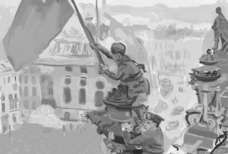
2. DigitalPaintingIII part01of17: So if Digital Painting three is based on questions, let's start asking some big questions. And here's the 1st 1 What is a painter's primary job? Let's think for a second, because the answer might not be immediately obvious. Now we're not gonna just cop out and say a painter's primary job is to paint pictures that's too glib. Let's peel that back a layer and posit that a painter's primary job is to communicate a message. Now we'll look at various messages in a moment, but for now, let's move on with the questions. So next question. If it's a painter's job to communicate a message, what is the communicators primary job to that I would answer simply to edit? Okay, following this stream of thought. What is an editor dio? And my answer to that is an editor prepares material for consumption by eliminating all non essential elements. Okay, and one final question for now to bring us full circle. Why do we need to edit my answer? There is we need to edit, because everything other than the essential information confuses our message. And this right here is what I think is the heart of art or because we're all painters. Probably. It's the heart of painting. Just for fun. Let's quickly deconstruct this painting by Norman Rockwell because I think it brilliantly sums all this up. This painting is about an artist delivering a message. The audience in this picture is captivated by the artists message of that shadow puppet of a dog on the wall. It's very clear that they're looking not at the artist, doing funny things with his hands. They're looking at that dog shape, the shadow on the wall. That dog is this artist's message. Now what makes this picture brilliance, in my opinion, is there is a second audience here, which is us. And Rockwell's message to us is not the dog shadow. It's that artist creating the dog shadow and totally capturing his audience with it. I hate to use a tired Internet MIM, but this is our exception. A message within a message and what's so cool to me is how Rockwell has edited this picture in order to communicate this multilayered message. There are two primary areas of editing that are really interesting to me. The first is this bit of space that Rockwell has completely eliminated, obviously, human bodies do not float in space like this. But Rockwell has edited his reality to be so, and what that does on a pictorial level is it keeps the audience together as one unit, they act together. I would suggest to you that if Rockwell had done something like this and made the artist body like come down, you know, as it would in real life, it would begin to flatten the picture. And as a result, we would begin to lose this important relationship that the audience is separate from the artist. By doing this bit of painting, I have literally connected the audience with the artist, like visually, and that disrupts the message just a little bit. It's not totally gone, but it's less clear. The essential information is that these air to independent elements to the message. So Rockwell has employed editing to make them literally separate. The other bit of editing that I enjoy is how Rockwell has made it clear that the audience is looking at this shadow. First of all, can you see the embedded triangle that exists here? We will explore triangles a lot, and throughout this video, but angled shapes are very important in art because they're very good at directing the I again. I'll get into this later, but for now, just noticed this embedded triangle. Also notice how the shadow, which I mentioned earlier the Shadow, is what they're looking at. Notice how Rocco has made the shadow extend past the cropping of the picture. That editorial choice calls a special attention to the shadow. And because of this kind of embedded triangle, it makes it clear that the audience is looking there as a quick visual experiment. I wanted to see what would happen to the painting if I modified it to this. I think this is probably how most of us would have painted this. We probably would have not thought to do this kind of weird cropping, and we probably wouldn't miss. And again, the message, I think is still there. But it's weakened. You notice that in the original Rockwell, the shadow feels very special, something toe look at, and because of that embedded triangle and the fact that we have an audience there, we get it. The audience is looking at that shadow when I do this. Suddenly the shadow is almost equal to the artist's hands in terms of like visual importance and message importance. And as a result, we is the I mean, we're smart people. We can still get it, but it's just a bit less clear. And I don't know, maybe you don't agree with me, but this is how I see it. Of course, a lot of art is subjective like this, but because this is my lesson, we will explore. You know how I think of these things, and the way I think of them is totally based on feedback. I've gotten as a professional artist for 10 plus years now, and things have extracted from having audiences constantly evaluating my work. That's the nature of being a professional artist. So anyway, let's take one more look at this whole message thing with another example. In this example, I want to call attention to a problem that most of us have, and I have some evidence to support that statement because I've taught hundreds of students over the years. I've also been a student myself. I'm still a student still growing as an artist, and this is something I noticed more often than not. So we have the word square in this example. This is gonna be our intended message. You know, I'm an artist, and my message to the audience is going to be square now. You're probably saying, Oh, that's very easy. All I got to do is draw a nice square and boom, we've communicated this message of square to the audience, and it seems very simple in this example. However, symbolically speaking here, most of us would not arrive at this clear message right away. Most of us on first attempt would probably do something like this. It's kind of a square, and I'm sad to say that most of us would probably let our work pass like this. It's much more rare to see someone who makes this kind of haphazard statement and then realizes that they should edit it to this. And my whole contention here is there is an important difference between this message and this message, and that difference lies in clarity, or it's related to the questions we asked ourselves a moment ago. The non essential elements need to be removed from this message so that it becomes clearer . The message on the left is close. That kind of says Square. But the message on the right undoubtably says Square and all it takes to get from here to Here is a little bit of editing. You know, I have to just rework the way that I was communicating. The message I'm editing this is Ah, I have my raw first draft down there and I'm just editing it. I'm shaping it. I'm taking out the unnecessary and making sure that what's left is the essential information that says Square. Now I have a clear message. I think that the vast majority of people are not capable of crafting a perfectly clear message right away. We need to edit. It's part of the creative process. Writers have no problem admitting this. No novelist writes a novel from the first word to the last word, and then hits publish. There is a hefty editing process in writing, and oftentimes that editing is done by someone else who has fresh eyes on the project. However, when it comes to painting, a lot of the seem to turn a blind eye to this, and I'll tell you right now, as a teacher and as an artist who's failed many times myself, the number one problem we all face is that we allow unnecessary elements to get into the work and we obscure our message. And because we are all communicators here, digital painting three will focus on maintaining a clear message by using the fundamentals to constantly evaluates and edit our work.
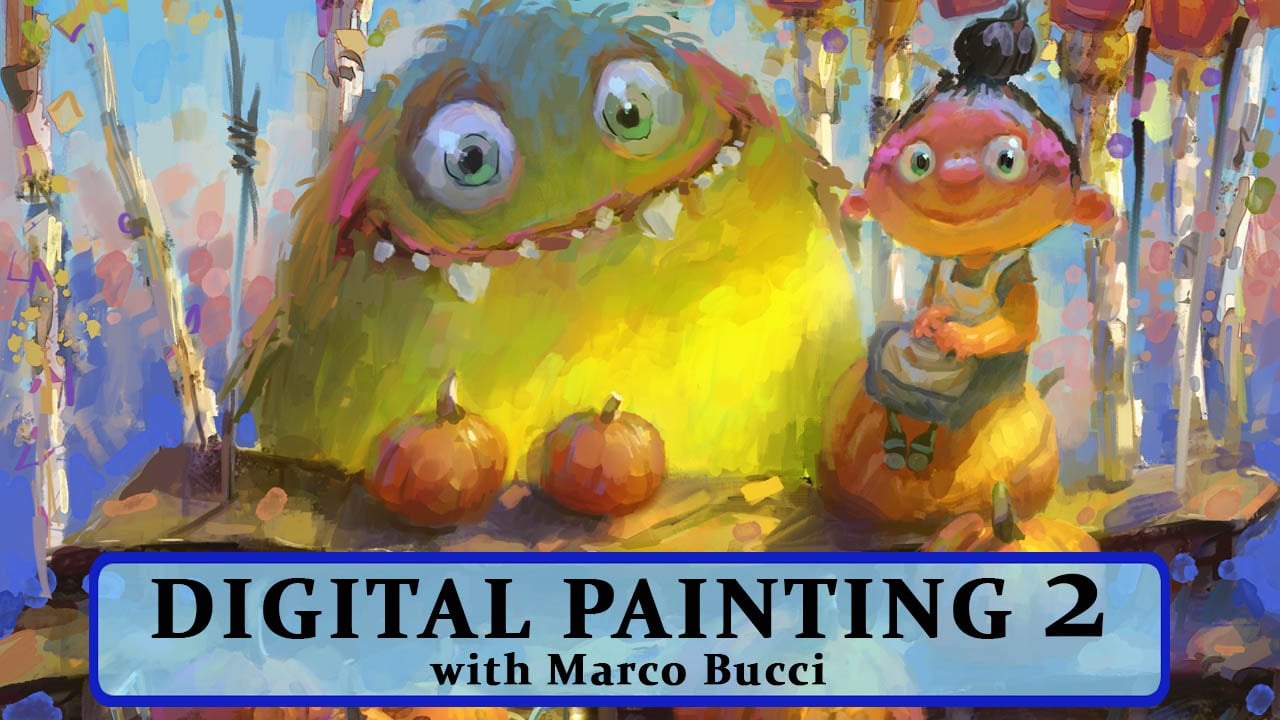
3. DigitalPaintingIII part02of17: in this section will go behind the scenes a bit, and I'll show you my kind of cognitive workflow that I use when I paint. It all starts with another question. In fact, it's the most important question. And that question is, what is the message? Why am I sitting here painting today? What am I trying to say now? I just want to say this is not a law. You don't have to have this in mind right away. For example, if you're just looking to build skills and photo shop, say you you don't need to know what your message is. You can just go and just try different brushes and different tools and and see what you come up with. That's a great way to learn, actually. But when you are an illustrator or you're working for a client to your working for yourself or whatever it is and you want to produce something that you're going to show to the world in some meaningful way, this is a question you really should ask yourself, because it gives you a path on which to travel. And that's what I'm going to show you right now. I'm gonna show you how having the answer to this question in mind funnels you towards the answers to many smaller questions. And to do this exercise, I will use one of my own paintings. This will work well for this example because it's a pretty straightforward image, but there still are many, many elements in the frame. When I painted this image, I had a message in mind right from the start. And actually, it's pretty much the same message I have with all of my green monster paintings. Idyllic childhood. These two words drive this entire painting. This painting needs to evoke emotions of that time in all of our lives when even normal mundane things are interesting and even magical. So I'm gonna put that right at the top of our little brainstorming document here, and I'm just gonna branch off of this. I think the next thing I really want to think about is the focal point. The focal point is, uh, the thing you're looking at in the painting and the focal point is obvious. It's the monster and the kids. So I'm just gonna go here. I think something of equal importance to the monster and the kid is the rain. So this is the focal point. These two elements are going to do most of the work in delivering this message. Okay, so this is already leading us to an image. I could just take this as it exists now and paint a monster and a kid in the rain on just a white background, and it would probably work. Now, I didn't do that because I thought there were ways of enhancing my message in the background with the other elements. So anything else that I write down here is going to be background, or maybe a better term is secondary to the focal point. So let's see, we have some background people. We have some streetlamps. We've got buildings to complete the environment as well as some trees. Now, that's a lot of things that potentially will choke our message. They will. They have the risk of overtaking the message because if I overdid any of these elements, they would start fighting with the focal point, which would then fight with the message. So my strategy for prioritizing these in a way that doesn't fight with my message is I'm gonna link them scale them down just for visual reference, because this is essentially what we're doing in importance. Were scaling them down in order of importance. Throw roughly, equally important, maybe the building's air a little bit more importantly, that a little bigger streetlamps or somewhere in there. But they are less important than the monster in the kid and the rain. And you know the big players up here. So I'm grouping these very close together on purpose, and they all have kind of a small size, which represents their level of importance in relation to the message. In fact, I'll just draw a ring around all of these, just so we understand that none of those items should jump out and become overly important . And just to be clear, the size of the words relates to the relative degree of importance they have in the picture , not the literal size that they are in the frame, like there's a pretty big building that takes up almost the whole frame in the painting. Yet just by looking at this picture, you can see that the building is less important than the monster in the kid, and that's the next step. Will take in our brainstorming cloud how we can use fundamentals of painting in conjunction with our desired message. In my opinion, there are four major painting fundamentals that you have to know your way around if you want to have your work look professional. And this is largely what this video is all about. All these questions were asking. They are all funneling us into these fundamentals. We haven't talked about them yet. We've only talked about like the larger let's call him philosophical questions about a painting. Now we're going to turn those philosophical things into practical solutions, and we do that again with the fundamentals. Now there are four fundamentals, in my opinion. This is this. Mileage will vary depending on who you're speaking, Teoh. But I adhere to this. In all of my work, number one is shapes. Now, when I say shapes, I literally mean shapes like boxes, triangles, circles, you know, political shapes. Maybe maybe you can have seeker of s curves and straits determine shapes all of those shapes make your painting. So let's take a look. I mean an obvious one. The green monster is a circle. I mean, he's not a perfect circle, but it's a circular shape. The mouth is also very circular again. It's a bit of a deformed circle, but it's a circle nonetheless. And also the eyes are circular. That monster is based on circles, and this is no art revelation. I mean, Mickey Mouse is based on circles, and he was drawn in the twenties. Circles are very friendly shapes. That's just how we interpret them. And a good example of how all of those questions we asked a moment ago relate to the fundamentals. You'll notice that in this painting, the monster character is the only area more or less where you see circles. Now I know that there are circular things like this table is kind of circular, and there are some rounds round marks elsewhere. But this is the only obvious circle shape in the whole picture that really helps the monster be part of the focal point. It's not the only thing that's doing it, cause there are other fundamentals that I haven't even talked about yet. But just right there monsters the focal point. Okay, I'm gonna make him special with a shape that is different from everything else. The kid also has some circles in the face. The kid is less circular, although he is made of relatively round shapes. But you know the head can be a circular thing as well. So you know, you kind of have this like double circle thing happening, and this helps visually link them. You notice that in the background I have more angular shapes, like the umbrellas or angular, the background. People are also very angular. Even this tree makes a triangle shape and that kind of an embedded triangle. The awning is not a triangle, but it's not a circle that's more of this kind of political boxy shape. These are things that I'm very conscious about when I paint and and for those, maybe who don't have a whole lot of experience in painting. If you're watching this, these are the things that are invisible to viewers. You know, a viewer, a non artist or maybe a beginner artist does not look at a painting. And Seo look, there's one circle shape. They're in no circle shapes here. It's invisible. It's like how a magician understands the trick based on what the audience cannot see. This is behind the magic trick stuff. Okay, so that is just one area of fundamentals relating to these questions that we're asking the next fundamental, in my opinion, is values, and I'm sure everyone knows what values are. It's the gray scale from white, down to black. Values are also incredibly useful for giving your painting a visual hierarchy again, where the focal point is the top of that hierarchy and you go down systematically from there. Here's this painting turned into grayscale values only, and what you can see is I have put the most value contrast where the focal point is. This area where the monster meets the wall is the highest value contrast, meaning the difference between light and dark. In this area there, the largest degree of differences there. You will not find as much contrast up here. For example, even though there's very light values up there, you notice the whole thing is fairly light, so it kind of washes away. No pun intended washes away into the background. Even these people there are. There is some contrast here, of course, but the way the people contrast with the background is not nearly as great as the way the monster does. This is a simple way of using fundamental ideas to manipulate your picture so that your focal point reads and the important things come forward not only the monster but the kid. The kid is also forming Ah, high contrast pattern with the background. One thing I like to do it a kind of workshop, my own images. I brought up a brightness contrast thing. I like to click, use legacy and just increase. Just play with these sliders and you should notice your focal point really popping out like this high contrast area. You know it's literally now White against Black Photo shop is showing me where the highest contrast is. And again it's the most dramatic in the monster and kid, the focal point area. They form very light values against very dark values, essentially now, bringing this back to full contrast. Obviously, it's no longer white against black, but we know just by that quick experiment with the brightness contrast, we know that the highest contrast exists there. It's a good way to check your work now. You don't always have to put the lightest against the darkest with the focal point. I will explore other ways of doing this. This is just one way, and it's a very common way, and it's very reliable to it works over and over. I mean, John Singer Sargent made his portrait living doing that So good exercise might be. Go look at your favorite paintings and see how many of them employed this tactic as part of their ability to communicate a focal point and therefore a message to you. And remember a few minutes ago when I said I probably didn't even need these things like, I could just use those three things to communicate a focal point and just put them on a white background? Well, I have done exactly that. You look at these paintings. Let's start with this one. It's just that it's the monster and the kid again. It's the same thing. I'm revealing my lack of depth here. No, it's the same thing. It's just I don't need a background. You just don't I mean, ignore those two lines. I don't need a background. The messages. This this friendship is like undying friendship, and like this again, idyllic childhood also is part of this. The Green monster really captures that for me. the focal point is the girl giving this her monster friend a big hug. That's what this picture is about. That's the message, and I don't need a background. This doesn't need to happen in the girl's bedroom or in a garden or in front of a house. It doesn't need that. I determined that a white background would be Justus effective. If anything, it amplifies the message because the characters they literally the only thing in the picture this hour one is also I consider it also like that. That background is essentially a white background notice that it's extremely blurry. There is absolutely no detail back there. It's just this overall wash of light. It implies that there is a forest background, but fundamentally, there's nothing about the background that is pulling any attention at all away from the owls. In fact, let's turn this painting to gray scale and then bring up our brightness contrast, and we'll do that same thing. What we have is the owls are dark shapes reading over light. It's not perfect. It's not pixel perfect, but you get the idea like the eyes of the whites of the eyes pop out his light shapes. We're gonna talk about big, medium, small shapes later on in this digital painting. Three lesson. But, you know, you get the overall impression of how this composition is built, and this is what I think about when I paint in fact, in my c g. M A classes, I spend the entire first week on just this concept. Simple values, simple shapes, simple contrast. I get students to deconstruct pictures and you know all the stuff that comes with a longer , longer class. But this is really one of the biggest things that separates an amateur artists from a professional on ability to control the picture on this elemental or maybe just a fundamental level. We still have to fundamentals to go. But now that we're back here, let's just keep examining this a bit. A new area of contrast that is very subdued is so Here's a tree and here's a wall, and here's an awning. The three different materials, three different objects, are meeting in this place. But you notice I've kept the contrast very low between them. It would be, in my opinion, a very large mistake if this awning were lighter. If I did. If it were like this, this would be a very larger steak, I think, because it would start distracting all of a sudden. Now, there is equal contrast here as there is down here. Something I've just made more contrast up there. So what? I did you notice that the awning is still being lit by light in this? This shape is a lighter shape. That shape blends in with the lighter sky. So I've arranged my lighting. Sorry, I've arranged my composition to complement my lighting. So I've put the light there, which happens to blend into the lights here. And then I've arranged it. So this area, the monster in the kid, are lights against a dark wall. You see, this has to be arrived at with editing getting back to that square example, I started this whole thing with your initial ideas, or sometimes that wobbly square. And then you can see potential in it. And then you have to refine it and refine the message and refine these fundamentals to support your message again. This is what makes an artist professional, not the ability to render detail. I mean, that's a small part, but it's this fundamental stuff. It's the opposite of detail. It's the stuff that goes on underneath the surface. I call this attention to detail, although when I say detail, I don't mean little bricks and stuff. In fact, if you look at the bricks in this painting, they're very much implied. I have not sat there and rendered the bricks. I've implied them, but they are They are much less important. That leads me to my third fundamental, which is edges. Okay, what is an edge? Withdraw little diagram, same three values. Let me just still those in on edge is the transition between shapes. So I have this set up here. Now. What I've got right now in this area is three shapes that have hard edges between them. You saw me just draw those with a pencil brush and my pencil brush makes pretty hard edges . So I've got hard edges here Now. If I wanted to soften that, I can use a smudge tool, for example, and I can soften that edge between the It's no longer a hard edges. It's a medium soft edge. I can soften it even more and make it an even softer edge. and now we can see a comparison. This edge is different than that edge. This is soft. This is hard. That is a fundamental relationship of the marks you put on your canvas. Edges happen everywhere. Even if you're unconscious of them, edges will happen. In fact, if you are unconscious of your edges, chances are your edges will be completely thrown out of whack because they won't appear to have any hierarchy. Now, when I think of edges, I bring them into three major categories. Hard edges, soft edges and lost edges. Further modify these little swatches. So I show you how I represent all those. We already have a hard edge here on the left and a soft edge here. Now let's modify this edge so it's even softer, and I'll get my smudge tool out again. I love this much tools ability to modify edges and you'll see me use it a lot in this video as I start painting. So I'm just I'm softening this edge even more than this one, so this edge on the right is gonna be even softer. You can still see the where that kind of where the two shapes meet you can still get a sense for generally what the shape is, but the edge is much softer. Now, on the very right, I'm gonna do what's called a lost edge and the lost edges, where you cannot tell where the shape ends and the other shape begins. And so just put a generous helping of smudge tool in here. And here we go have tapered it off in such a way that you can't even tell you could not draw definitive line where one shape ends and the other begins, It just filters out indefinitely into this cloud of darkness. In this case, you will want to represent all of those edges in your painting, and they, too, are very much related to these big questions of what is my message? What's the focal point? What's the hierarchy of importance in the objects in my painting? Edges are another way to denote that to visually communicate to the viewer, and again it works based on contrast. Remember when I say the word contrast, I don't just mean light and dark. That's one form of contrast. In this case, I'm gonna talk about contrast of edges using hard edges, soft edges and lost edges contrasting between them. So in this painting you'll notice where the monster meets the background in the focal point area will use the same focal point. Look at the kids hand. Look at the kids head. Look at the monster's head in light, where the light and dark is areas I showed you before notice that these edges are pretty hard, not hard everywhere, but pretty hard. In fact, you can even count some of the hairs right there. But you notice you cannot count the hairs there. This is softer because I don't want I don't need to show you the entire silhouette. I can just show you part of the monster. And again, we're smart people. Our brains can fill in the rest. So I'm showing you some hard edges here. Some critical hard edges, like the highlights in the eyes. The kid's hand is a very hard edged shape. And then, you know, as I get further away, away from my focal point towards the edge of the canvas, you know. So I'm softening those edges now. I'm softening them also with value, because these values are closer. That also visually creates a softer edge. But not only that. I'm using, uh, this smudge tool in this case to soften that area and lose it. You notice that down here just to bring back that monster so he doesn't totally get lost in shadows. I am using a hard edge there again, Aziz. Well, as high value contrast, some using two kinds of contrasts value and head to bring this area out. Same trick is happening up here. This tree is close and value to the wall, which, almost by default, makes softer edges. But again, I'm also using this smudge tool to soften those shapes. Now look at the people. Remember, the people are less important than the monster. We determine this earlier look at their edges. There, medium soft again. You know the words soft edge. There is a range of soft edges. This is like some kind of medium soft edge that the people have, and you notice where they meet the ground. It's very soft, if not lost, like there's a person right there. Look at where that person meets the ground. It just it's lost. It bleeds in. I couldn't tell you where that person's feet are. It doesn't matter to my message, so it's better t edit it out. Remember our definition of editing, removing the unnecessary? I don't need to know where that person's foot is, so I'll use a lost EJ. I don't need to know where that lamp meets the sidewalk, so I'll use a lost EJ. I don't even need to know where the monsters feet meet the ground, so I will use a lost edge. What I cannot afford to lose, though, is this. This is so critical, the monster in the kid popping out. This is where their facial expressions lie. So this cannot be lost, because if I put a lost edge there, I would lose it. I lose my message. It's it's really that simple. In theory, I mean, in practice, the hard part of painting is that all of these fundamentals compound one on top of the other, like individually and intellectually. This is very easy to understand. I'm sure fifth grader could watch this video and and be keeping up so far. But it's one thing to think about it and a whole other thing to do it, Which is why I hope after you watch these videos that you really go out there and try it yourself because just knowing about it doesn't doesn't necessarily mean you'll be able to do it. That takes practice. Okay, let's look at the buildings again. I said earlier that the buildings are not as important as the monster in the kid. The first thing I did, I've implied that there's a street here, but it's just lost. Everything is lost. The trees air lost into the sky, the buildings or lost into the sky. The lampposts are lost into the buildings which are lost into the sky. This whole area is just a swath of lost edges. I mean, this lamppost is a is harder, and this lamppost is harder but softer than that one. And this lamppost is harder than those two. So you're always dealing in these hierarchies and sub hierarchies. Losing all these edges ensures that I have nothing there that's going to distract the audience. I have left the hardest edges in this area to the umbrellas because the umbrellas air part of my message. And I haven't talked about this yet. I just have this idea that it would be cool to contrast the kid in the monster having fun in the rain and the stereotypical boring adults, you know, using reindeer to get out of the rain. So there's a fundamental, you know, storytelling difference there. And to highlight that I'm using edges. So these umbrellas make the hardest edges in this area. But they're not as hard as this. So you know, this is number one. This is number two because that matches the importance of them. In terms of this story, I don't necessarily need these umbrella people here. I think the painting still works without them. However, I do think that they add to the message, but they're not as important as this. So I stepped them back both in terms of value, contrast and edge contrast and also shapes they make shapes that are different from the focal points you can see I'm using all of these fundamentals so far in concert, and they're all edited to serve my focal point and my message
4. DigitalPaintingIII part03of17: OK, The fourth fundamental is the one that everyone gets excited about and it is color. In fact, I'm going to add another word to alter this. It's actually color temperature is what the fundamental is, and there's a key difference when I say the word color. I think the image that comes to lock people's minds is the Photoshopped color picker and where you're choosing colors. One of the biggest questions I get asked as a teacher over my 10 years, plus of teaching his students, asking me, How do I know which color to use as if there is, you know, a nor gained color for every object. But that's actually not true. The question is kind of skewed. It's kind of my duties a teacher to correct anyone asking that question by pointing them in the more appropriate path. And that path is color temperature. Now, when we think of color temperature, all of a sudden, all of these colors are void. It doesn't matter. All we have to do is shift our focus now in comparing one color against another because watch this, let me sample the color here and put this color in a swatch there. Let me sample another color and put that color in a swatch. Now I can ask you which color is warmer. Well, all of us are probably gonna answer that one, right, because it's warmer. It's just stereotypically warmer. You know, when we think of warms, we think of oranges and reds and things like that. Yellows on that one is way closer to the oranges, reds and yellows. Then this one. This is a cooler color. Now, how about this? This color versus this color, which one's warmer once again, I would say the one on the left is warmer now. The difference between these two is less than the difference between these two. But the relationship is the same. In both cases, the one on the left is warmer than the one on the right All of a sudden, now we're having a more sophisticated conversation about color because we can take any color combination and arrange them. Okay, so I'm just taking more colors from this painting and filling them in here just to represent the entire painting in these abstract color swatches. And what we can do now is the exact same operation just on a larger scale. So let me just take this color box and pull it up. Not that we need to know where the any of these colors are. I just need to show you this as a visual representation. Now, I'll ask you the same question. Which colors are the warmest out of all of these, you know, which picked the color is that of the warmest Well, I think that one is the warmest. I think that one is also among the warmest. This one, this one, this one and maybe even this, like greenish yellow is pretty warm. I would say those are the warmest Now let's Ah, let's go to the coolest. I'll put a blue dot What are the coolest ones? This one? This one again? I'm picking the color just stereotypically. What? The colors that are the most blew. This one? Yeah, that's probably about it. Okay, just putting those two families side by side. It should be very clear. The difference between warm and cool And again, this is this should be nothing new. We all learn in grade school about generic, stereotypical warm vs cool colors. And that's all I did the warm colors are the ones that are closest to orange and orange, and reds and stuff and yellows, stereotypically warm colors. And then the cool side are the colors that are most represented in the blues and purples and things like this in the color wheel. It's this side of the color wheel is the warm side, and you can also dip into some some of these reds here. And then the cooler side is is you know the furthest away from it is this area just these air, stereotypical warm vs cool colors. So if I sample my warm colors, you know, just look where the hue is up the reds, this one very warm right in the heart of the oranges. This one, it's Ah, you know it looks greenish, but it's still very much in this area of warmth and this color here. Same thing very orange, and then this one. This is probably the coldest of the warms, but still classified as warm cause. It's so influenced by Reddit's very reddish pink. So I would call all those warm. Now you can go down a further rabbit hole and categorize them in and of themselves, like which one is the most warm, but let's not even do that yet. Let's go down to the cools, the cools Well, look at them. They're in the blues Very easy to make. This consideration of warmers is cool, right? And this is Step one in a sophisticated conversation about color. First identifying the large groups of warm vs. Cool. The other thing I want to point out while I'm here is notice how every one of these colors the saturation saturation, meaning this scale. All of these colors have like a medium or higher degree of saturation. Zai sample through all these, even this one is which is probably the greatest one is still right in the middle there somewhere close to the middle. Anyway, these this, you know, they sample through them all noticed that saturation is pretty high, especially as we get into the blues. The saturation is quite high. This is what's responsible for the big difference between our warm vs, Cool's first the hue and second, the saturation. There's a big difference between this color and this color, so any color that is separated by that much distance both in hue and saturation, are the first things to note in any painting. It's the probably the most obvious colors to categorize the's big differences of warm vs. Cool now going back to our original chart. I had more colors in there and look what happens when we sample these colors. Suddenly are saturation starts going away? This one is very de saturated, meaning it's very close to this perfect digital gray. Here I can sample through some more of these again. This one is read in the Hugh, but very gray and saturation, this one another cover here, very gray and saturation. You know, all of these colors that I left behind are what I call neutrals. Now. A neutral is a color that is a bit ambiguous. Whether it's warmer, cool. It's Maurin, the well neutral category, and neutrals air always these graves. Now you can have any color on the spectrum, and it can be turned neutral by its level of saturation. You de saturate any color to to a certain degree, it becomes a neutral, and this is the next step in our color conversation. Here, the overall big statements of warm vs cool the first chart we made. They account for the most obvious colors in the painting, but it's the presence of neutrals that give both of those categories, meaning because they bridge the gap between them. Neutrals, in my opinion, are the hardest part of color to understand and to paint because they account for the most subtle kinds of colors. For instance, if I painted this purple neutral up against this greenish neutral, there is not a whole lot of difference between those. If I asked you now which one is warmer or cooler? Well, now I think we might get some disagreements happening here because the colors are very close together, not nearly as obvious. This is why neutrals are hard to work with because you have to develop an eye for their subtlety. But we can look at this painting now, and I can show you how I have approached this system of using big warm vs Cools and the subtler neutrals. And once again, this all relates back to our big question. What is the message? And then what's the focal point? We already know it's the monster and the kid, so it should come as no surprise that the warmest colors are concentrated in the focal point right in the same spot as the shapes and edges and value differences. It's all there. The warms air there, too. And the entire rest of the peace in general is much cooler to various degrees. Now we'll talk about that in a second as well. But first I want to point out that there are also some pretty warm colors up there. And I did that just for a bit of logical consistency. Obviously, this scene is lit with this warm lamplight, right? Thes lamp lights are yellow, so it was very logical from an art direction standpoint, toe light these guys with this warm yellow lamplight. But it would probably look a bit artificial if I didn't also touch some of this awning here . So what this is doing? It's a bit of a calculated risk where I'm also using some very warm colors there. However, if you remember from a few minutes ago, I diminished this area in value and edge. So even though I'm using some higher contrast warm versus schools in this area, I think the most contrast is still pumped in here. And you know this being warm does lend to a bit of realistic lighting. I mean, we would expect the light to hit other objects, not just the monster. So I think it's OK. While we're on this topic of this awning here. You notice, though, as the awning continues this way, it gets more neutral. This area is not nearly the same amount of warm Vs. Cool contrast is this area. I've already talked about how I've blended this area with values and edges. I'm doing the same thing with with color temperature. In contrast, the coldest colors are kind of around the corners of the painting. Like I see a lot of blues, um, up in the top part, going into the sky down the side here and there are some color notes of blues in the pavement, like the sidewalk area in this area here, this area here I kind of pushed the blues out to the sides to almost use color as a way of vignette ing the peace now in the middle area of the piece. That's not the focal point. I have the neutrals, and these neutrals kind of bridge the warms and cools. If you look at the bricks behind the monster, this area right in here. Look at the wide variety of neutrals being used here again. Member. This color chart from earlier How many neutrals we had. We'll look at all them in the bricks. If I bring in the sampler here, I can just start sampling these neutrals. So here's one. Here's another one, this neutral red, another neutral blue on a neutral red. See if we could get some different hues in here. Uh, here's here's one that's more that color is coming into. The orange is a little more but still neutral, so I can put a whole lot of color in these bricks without actually having them jump out too much. There are some colors like that. This color example right here is like not a neutral. That's a pretty warm color, but you know, it's only in this little small spot, so it's OK, and it's right next to it are neutral blues, so I'm kind of taming it down with covers that are next to it as well. Then if you look at the very corner, you'll see neutral. Like I said, it's cooler here. So my neutrals, air shifting and towards the blues and scions and stuff like that. Another thing that I think is important to note is this idea of local color because a lot of students will will over adhere to local color. I just want to make a case for why local color is not very important and why I can actually harm you. Look at this area in here. Remember earlier I said that I emerged this area together in importance by way of values being close together and also edges being pretty soft. I'm doing the same with color temperature. This is a tree, these air bricks and this is an awning. Those air, three different materials, three different local colors. But you notice I am just like with values and edges. I am merging them together in color temperature as well. There isn't a whole lot of difference If I may just bring back in my color picker if I start sampling. So these are the break. Look at the color picker and just listen to what I'm saying while you look at this right now I'm sampling bricks and right now I'm sampling tree. You notice that there is not a whole lot of difference like you. If you're looking at the color picker as I'm doing this, you wouldn't know. It's not like it's not like the trees all of a sudden turn green and the bricks off a sudden turn orange. But that's exactly how I see a lot of students pain. They over adhere to, um, or let's call it child like view of local color. You know, like a tree is brown leaves are green. Grass is green bricks or red. Uh, that is very counterproductive, because suddenly you're painting will start looking very patchy when you over here to these local colors. I am making the case for a whole different line of questioning, which is this whole thing about message and focal point and letting those things determine where you place your color temperatures. And this is also how you can keep your color. Looking very cohesive and consistent is by using the same kinds of Hughes just with different temperatures throughout your painting. Let's sample this piece of brick right here. This is a neutral blue, like I pointed out earlier. Well, that neutral blue is being amplified by this blue, which is not a neutral to same. Hewitt just no longer neutral. This is one small example of the same color identity being used in two different temperatures in the painting. This is happening everywhere. For example, the yellows, like the yellows in the monster and the yellows in the awning, are also echoed in subtler, cooler neutrals in the sky. The sky is filled with neutral warms these. This is how you can carry color throughout a painting you notice in this doorway area here , the neutrals are getting a little more intense by sample those. They're kind of popping away from neutral territory and getting a little warmer. And it's kind of no surprise that those warmer neutrals, let's call them, are nearest to the monster. It's kind of a smooth transition out, and indeed the whole There's a whole color transition here from really warm yellows. Just look at it just visually warm yellows in the monster, going into like a slightly more neutral oranges that we just looked at going into even more neutral oranges and purples. And now we're starting to even get some cooler neutrals in there where I'm pointing right now, and then we get into, like, bluer stuff. So there's this whole passage of color as well as passages of shapes and edges and values. So this hopefully has given you a bit of an overview as to how the painting fundamentals. In other words, the practical parts of painting really relate to these more artistic or philosophical questions that we asked ourselves earlier. Now let's get into some actual painting demonstrations so we can put all this to use. And I'll talk much more about topics like how local color factors into light temperature and all these little things we face when we paint. But I think it's important again. Toe have this higher level overview first, as it will really control how your work reaches your audience.
5. DigitalPaintingIII part04of17: So now that we've done a long winded breakdown, I wanted to take a look at just a few more paintings and just kind of go through him a little quicker, using the tools that we've established so far. Now I chose these three because they have slightly different styles and they have different uses of the fundamentals like that. I'm not organizing them in the same way each time, but they all. I think I'll have a strong focal point, and I I think they're all successful. For that reason, um, the two paintings on the right are just personal pieces that, you know I do on off hours. The one on the left is a professional painting I did for Disney for the upcoming Ah Nutcracker movie. Well, upcoming, depending on when you're watching, this comes out Christmas 2018. All right, so let's look at let's look at this bottom right one first. This painting is very clear as to what it's about. The message here is well, I titled this painting. I think the message is what I titled this painting on that is never for gotten. That's what the message is here. Obviously, it's an old woman visiting who I imagine is her deceased husband. That's how I thought about when I was painting it. So, you know, that sends kind of a nim ocean rippling through you. And I knew just kind of following that gut feeling that this exchange right here had to be really specific in order to evoke that kind of sense of sweetness. So you know, things like where where she is looking kind of down. Um, the way that her arm is holding her cane all the little body language is extremely important here to get the emotional response that I felt it was appropriate for annulled early woman visiting her deceased husband. The reason I'm speaking about that so much is that strong emotional content enabled me to focus my efforts entirely here in the focal point. And look what I did in the background. It's literally blurred with photo shops. Um, I used the eyes, the lens blur for that. So I painted the way did that was I painted a cemetery kind of very loosely, and I just blurt it. I didn't paint any detail back there. Just some big overall color notes. Some big overall shapes blurted out, and I kept this and focus. I even blurred out the tree behind her, and as a result, there's, ah, heavy load of contrast in edges. Here, look at the sharp edges on the tombstone, but like the grave marker and sharp edges on her hair again, just like with the monster before you can, you can almost count individual hairs here, um, in parts not not inside the form, but where the where the silhouette is, which is what counts. Because that's where we determine the overall shape. You can almost count some hairs there are, you know, her body is basically made up of hard edges. There's also this just this very subtle rhythm of, you know, two boxes, kind of like that that are kind of touching down here. That's just a design that I came up with. You know, instead of having them totally static like this, I angled them together. I use angles a lot in my work, and I think a lot of artists do, because there they have a direction to them, and there's just something you can. You could be very dramatic with them or very subtle with um, anyway, so that's what I That's really all that's happening here. Oh, and one more thing. The color temperature. Very simple. It's warms here and cools everywhere else. That's the idea. I almost think of these fundamentals is like Think of them like soldiers and you are the commander and you're sending these fundamentals into battle, and they have a singular goal to accomplish. If you can align all these soldiers together, you can have them all work for you towards one common goal in this case that, you know, bringing up the message, which is what we're talking about here, the message or the focal point of this exchange right here. So I'm using edges and color temperature and contrast all toward the same goal. And the thing I love about thinking this way is you can really paint anything like the picture you're painting doesn't change the fundamentals of shape, design or contrast, design or edge design. They're fundamentals because they don't change. Okay, so let's move over to the Disney panting here. The message in this one was actually dictated to me by the executives at Disney because I was doing an illustration job for them The idea here is that Clara, the main character of the show, is looking for somebody to help her with something. And she's so caught up in that goal that she's ignoring this whole party that's being held at this grand hall. So as an illustrator, I had that as my kind of one sentence thing to latch onto Main character Not Interested in Big Party That's what this illustration is on, like a message level. You know, when I was painting this, I kind of diluted it down to that. And I did that by isolating the main character through various degrees of noise. In my state noise, I mean activity. The crowd forms areas of greater activity. Like if you look at this unit here, this whole area of the crowd, which takes up a good you know, quarter of the illustration, they kind of merged together as one unit, just like the Norman Rockwell audience did earlier. Those three heads we looked at, that's what I thought of when I was painting this, that the unit thing. You can also see units of crowd action happening here in the back. You can see more of an isolated unit there and then also another unit there, and they're all different. They're all designed differently. Different amounts of people, different shapes, different actions just to keep it interesting. Now the focal point, which is clear of the girl here she is on her own, She's isolated from the crowd literally, and she's isolated from the crowd. In contrast is well, you notice that her silhouette is extremely clear. She makes a clean read over that background. I've purposely still awaited her, even at the expense of what's behind her. You noticed that just like again, the Norman Rockwell artist we looked at. I'm kind of severing these figures with just atmosphere. I I was pretty confident we didn't need to see exactly where this guy's feet were, because they were unfortunately intersecting with Clara's head. So I just cut it off with exaggerated atmosphere. Also noticed. I designed this bit of the crowd to leave a good amount of space so that Clara can really read her silhouette can really pop out. You can also look at contrast of details that the first time I mentioned the word detail, I don't like the word detail because people get fixated on it. Details. Just one of those Cherries on top that you can dio. In this case, Clara simply has the most detail. If we zoom in a little bit, we can compare Claris face with the faces of these dancers here. Notice the dancers. Air very indicated. I haven't painted eyes or nose Israeli. I've just given them general planes of the head, almost as if this were like a sculpture that was a work in progress. Let's less finished. But then Clara's very finished. This is not a work in progress painting. This is a finish in this style. I mean, is it possible to get even more detailed? Sure, but I think in this particular style I was able to keep clear at this level of finish, which is still a pretty high level of finish, I think versus these figures, which are a much lower level of finish, like Look at these strokes, that air just completely unb lended. I mean, they're just choppy, but next to something more finished, we have context just like her silhouette. Her silhouette is very complete, very designed. I agonized over every little part of it, you know, making sure that these little undulations of her dress were well designed and not repetitive. All that stuff is also a part of detail. Or maybe you might call it like I did before attention to detail their to subtly different things, I think, and that kind of attention to detail allows this area behind claret to get more lost. They were willing to accept lost information as an audience, so long as there is a lot of, you know, found information elsewhere. And I like to dial that into my focal point, which makes sense, right? I want you to notice Clara the challenge when painting this, because it's a it's a more realistic looking painting was that I had to make sure that I was balancing this this level of detail throughout the entire picture like I didn't want. There's a lot of stuff going on in these windows, but I wanted to look cool, but I don't want it to distract from the focal point. And when you're painting in this style, which again I'm calling it more realistic, you can decide whether that's true or not, but you still want to find ways of controlling exactly how much information every little area gets because everything is not equal. Remember that if I gave everything equal treatment well, nothing would be important. And as a result, the painting would fall flat and the message would be lost because everything would be clamoring for your attention. If you look at the crowd in the background, it's Ah, it's just like this woman's dress, but it's even worse. It's like they're they're not even people back there. They're just they're just shapes. You notice I put the most effort into designing this woman here, you see that she makes a very clear silhouette. It's very clear that it's a woman wearing a dress, whereas this is just literally a mess. The the reason that it, that is it's really cool. This psychological trick you can play the audience only needs one thing, and then you we extrapolate from that and fill everything else in. So if the audience knows that this is a woman wearing a dress, we kind of Canfield in that these air other people wearing, you know, formal dress and I handled other areas of this painting that way to like these sub areas that are not part of the focal point. Like this big, bustling area we looked at earlier, You notice that these two figures, who are they're connected to this bustling area, But they stand out as being more more finished, more rendered, let's say, and they give the viewer the necessary context to understand this area, which is much more abstract. You know, if we zoom in here, you can see that I didn't kill myself with the rendering a whole lot of information here because I knew that if I did that, first of all, it would distract from the focal point, which is way over here. But, um, you know, I'm using this idea of, like, sub. I've heard people call it micro composition, where you know this area is given context by by these two that come out of the crowd and silhouette. You notice the guy's arm kind of literally ties them back in with this because the values and shapes are connected, there's a there's a flow to it, and this is how you can manage paintings that are supposed to look more realistic and have a more I don't know if this is photo realistic, it's it's heightened from a photograph, but it definitely doesn't look as cartoony as as this one does. So I'm calling it more realistic. I'm not exactly sure what else to call it. Um, all right, So then the last one was this one. And I think actually, this is the most complex in terms of its composition because this one doesn't have a singular focal point. You know, in these two, we had this area, and then we had this area as the singular focal point. This one. It's more of a focal area, which is totally okay to do. And the focal area is like this middle section, basically where the there's two waterfalls is this waterfall and then this waterfall. I wanted this area to be the focal area, and the way I designed that was I tried to go for this kind of angled circle composition. See, this is this wedge shape that's connected by light. And if I just do a quick contrast adjustment first, let me take away the color. And then if I just goto contrast, brightness, contrast uh, you can see that I'm using a just a simple underlying design where this V shape of dark kind of vignettes, the whole picture leading us into, you know, the V shape of light. And then within that there's another angled shape that is, you know, causing the light values to kind of circle it. And because it's a waterfall and waterfalls have motion to them. Like I you know, I used to go back to the original. I used soft edges to evoke a sense of motion in that water. Hopefully, your eye follows the motion as well as the light values and kind of circles around the focal area. That was my intention here. You know all these ideas air not set in stone. There's there's no rule book that says, Oh, if you're painting a waterfall, do it this way It just a thought that I had in terms of the underlying structure of the picture based on my focal point. Now in this, in this painting, there's no real message. The message is just look how cool this is. That's the message. You don't always need some profound message. This one had more of, ah, in my mind, a profound message. This message to me is Trudeau life. There's something about there's something that should ring true emotionally on this one. So this painting has, like, you know Ah, a bit of a more meaningful backbone to it. This painting is in line with that. I mean, it's It's also a kind of a human moment that we can all kind of relate to, but maybe a little bit less impactful than this one. Whereas this painting again, this painting is just something cool, which is again totally fine. You, you're the painter. You if something. If you think something is cool, you can do a painting just for that, and you can arrange your focal point to show off the coolness. You know, I think forests are beautiful because of all the colors and values and lights and shadows in them. And to me, that's just it's cool to look at their beautiful. Maybe yesterday say they were beautiful instead of cool. So I arranged my values to highlight that you noticed that there's also a waterfall here, but it's it's much darker. It just doesn't cause much attention to itself. There's more interesting value patterns here, like this little shaft of light is a special element that, you know, is a little bit of detail that kind of draws your eye in. There's also some smaller light shapes here, so there's a nice you know, pattern of smaller shape. There's a nice little bit of light there. There's a shaft of light, their patterns that air, you know, making this area more interesting than, say, you know, this area or this area. And then also, like I pointed out earlier, this whole side area is just dark, even though there are multiple trees there and foliage and plants and rocks. I've merged them all together, so they act as a unit on. In this case, it's a unit that I don't want you to look at too much. I just want you to look past all those darks and direct you into this kind of circling area . And hopefully your eye continues to circle around. There's one last picture. I want to show you this one here and in this one. I use this as an experiment. I actually reversed every piece of advice. I just told you guys I am. I reversed it here because in this case, I didn't want you to see the focal point right away. You've probably noticed that by now this is Nocera to the original vampire. But he, you know, I wanted this to be a surprise. He's shrouded in darkness When you first look at this painting, especially if you zoom out like when you look at this, you look in the light, right, because that's where the most contrast is So all the things that I did here to guide your eye to a focal point, I did the same thing here but to psych you out. I want you to look there, but then find nothing and just like a horror movie, you see nothing. And then when you least expect it, the monster pops out. So I tried to arrange my composition in such a way that mimicked, you know, like a horror movie film language. I thought that was an interesting way of staging this. You know, scary. No sir. Active character. You also noticed I'm doing the same thing with, like, a level of detail. He is very unfinished. It's it's very sketchy and unfinished. His shape is pretty determined, but you know, there's certainly no rendering going on, whereas in this area, even though it is a quick sketches. This was just a fast painting, but there's mawr attention to detail and more little minute color shifts and, you know, materials being shown in the in the fake focal point area. Let's call it, you know, in any other painting you would want to put your focal point right here. You probably put your character here being lit by this nice light. But, you know, in this case, I reversed it. Anyway, I think by now you guys get a sense for what this composition part is all about and how you can use the fundamentals to answer these bigger questions about your message and, you know, filtering down your focal point and so forth. So let's finally open a blank canvas and start painting.
6. DigitalPaintingIII part05of17: So before we get into the feature presentation of digital painting three I wanted to share with you guys a method of study that I've been doing lately that I think really helps train your fundamentals if we bring up that fundamentals list that we had earlier. We have four fundamentals here, and I've listed those in order of importance. In my opinion, Shapes is the most important. Values is right up close to that. That edge is number three and then color temperature number four. They're all very important. But if I had to list them, I would Liston like that. This exercise only focuses on the 1st 2 shapes and values. And I want to show you here how just arranging shapes and values can give you a photographic result. And I'm using photographic as the goal here because many of us think that photographs and realistic painting requires a lot of detail. Actually, it doesn't. It just requires good shapes and good values. So what I'd like to do is I like to take these old timey photos. World War Two is a great resource to pull from. There's so much photography from that, and a lot of interesting subjects to just visually speaking. And the thing I like about old photographs is the grain is so pronounced that the grain obscures a lot of the detail, and it leaves behind just big shapes and overall values. But it still looks photographic, so we can learn quite a bit about our fundamentals by studying from photographs like this. There is a lot going on in this photo. Look at all those people. Look at all those windows. Now, one unfortunate thing about this photo, that airplane right in the middle that's sitting on the water it doesn't quite read. So I'm going to remove that and just pretend like there are only boats there. But other than that, this is a beautiful arrangement of shapes that looks very photographic, very realistic, and I will show you how to study from this in a way that targets your shapes and your values. So the first thing I want to do is show you how I set up the canvas, because I do want to paint underneath film grain in order to kind of keep me focused on big shapes and big values. So I made a new canvas 1000 pixels wide. And what I'm gonna do is I'm gonna fill it with maybe just something slightly off white, something like that. And then on a new layer, I will fill this layer with white, said it to multiply, and then I'll go to Filter. Uh, where is it? Filter noise. Add noise, and I'll just use a value like this. Hit. Okay to that. Um, And then I will control t and scale that noise up quite a bit to give me just something some kind of thicker noise. Then maybe just sharpen it up. Filter sharpened, sharpened more. Okay, that's good. And now I will leave this layer alone. In fact, I should name it film grain, and you can take down the opacity, maybe start around like 40% somewhere in here. And then the paint layer will be this layer here. I will paint just on this one layer. So when you see me paint, I'm not going to show you my layers. But just so you know, I'm only painting on this one layer. In fact, probably don't even need this. You could just paint on this layer, but I like to have a layer here just so I can erase it and get back to my blank canvas color. All right, so let's go ahead and get started with this. See that brush I'm using? That is the chalky brush that I've provided with. The purchase of this video is one of my favorite brushes. It's very boring, though. It's just a straight ahead Shockey Square brush. I am going to use that one brush for this whole exercise. The reason I love it so much is it's very easy to control. It doesn't make crazy breast strokes. There's a bit of an edge to it, a bit of ah, texture to it. But you know, nothing crazy. Uh, so what I'm doing, I'm just building up a pattern of shapes. That's what pictures boiled down to again. Remember our 1st 2 fundamentals, shapes and then values. That's what pictures air made from at their most elemental route, their most binary route. A picture is made of shapes and values. Every time you change a value, you make a new shape. So I am currently building up a shape mosaic, a little pattern of shapes on this canvas with different shapes and different values and that's all this picture is going to be made of. And you'll see. I will arrive at a photo of photographic effect in this is sped up double time. By the way, eso this painting took me a boat 35 to 40 minutes and real time. You're going to see it in about 20 minutes. So all I'm doing right now is just building shapes. And I am not going to do anything more special than this in this entire process. So see those chimneys? They kind of break up the rooftop shapes that gets me to my next fundamental about picture building. You're always trying to break up shapes, pictures, air made of big, medium and small shapes. I like to categorize them in just those three. So in this picture, the sky see that sky just basically a white shape. That's a big shape. Also, the water is generally a big shape of white. See the rooftops Those I would call medium size shapes, and I've put them in first because those medium shapes lay over the big shape of the sky nicely, and those rooftops break up that big sky. They add interest to an otherwise boring area. So I started there. It was it was an area that I could draw the easiest, and I kind of like to start their on my pictures. Whatever area is the easiest to draw, I'll start there because I'm more likely to get it right. I'm not going to start the boats or the people yet. Those are a little harder. Those air, smaller shapes, little more intricate. Where's the rooftops? Air Nice. Just geometric political shapes. Nothing difficult about them. So start there and you notice another thing I'm doing in this exercise. And this is partly credit to the photo because old photographs really compressed detail. I am compressing the amount of values I'm using. I'm not using all these little shifts of value, just a few values. I'm not limiting myself to a specific number, but as much as possible. I'm trying to group my values together, so you see those rooftops that air in the upper third there where I started. I group those into just one value. Pretty much those rooftops bleed together into just one value. That's another good thing about old photographs. Is they because they have compressed values objects bleed into each other, like the white walls in this photograph bleed into each other. They bleed into the sky. The trees bleed into each other, the trees being darker values. They also bleed into each other. It helps you focus, and this is again why I like to use these old photographs. This bleeding effect really helps you focus on combining your shapes into larger statements when I say that one of the biggest areas that will trip you up as a student and and and a professional to just professionals know to watch out for this. But we will always be tempted to paint the literal subject matter. For example, each individual window, each individual chimney, each individual tree because we know in real life that those things exist. But in a painting, when you're thinking about your fundamentals, there is no fundamental that says you have to paint trees. There is no tree fundamental. It's shapes. Every object in your painting is a shape and a value. They go hand in hand every time you change the value. You're also changing the shape. So that's why I'm focusing just on the 1st 2 Um, so there is no tree. If you look at those trees on the right, the right half of this painting all those trees, there's probably like 50 trees in real life. I'm representing it just with one shape. That's a bit of a messy shape right now. I will refine it as I go. Same with those rooftops where I'm painting right now. Those were two medium sized shapes that I just blended together into one shape, and now I've added some chimneys and little details on them. Not really details, but little smaller shapes that break up even further break up the medium size shape. So I'm just adding this again. It's like a mosaic Reminds me of mosaic art, a mosaic pattern of shapes here, this house, the shed structure on painting. Right now, this is another medium size shape, which further breaks down into this shape, which is a darker shape, still, medium size shape, and then the rooftop that's left behind is another medium size shape, just a lighter value. So that house is made of two shaves, maybe, actually, three. If you count the little door way. I just painted eso again. These these old timey photographs really lend themselves well to being broken down into a visual kind of a visual library, a visual language that is just dependent on simple shapes and simple values. That's why use them. You you don't have to use photos that are old timing. I just recommend it because it's easier to break them down. You can use a perfectly, you know, modern HD photo, but you're gonna have to doom or crunching mentally to break it down to this simple thing. I like these photos because it the photograph kind of meets you halfway. The photograph itself, just by the limited technology is simplified. Now, I haven't talked about edges yet, And if you remember, I'm not using edge is another way of saying that is I'm Onley using one kind of edge this kind of the natural edge that this brush gives me There are going to be a couple of softer edges in the water when I go to paint that. But in general I'm essentially just using the naturally crisp edge that this brush gives me just by default. And ah, again, my effort here is to focus just on shapes and values because I think These are the most important fundamentals, and I will be talking about these more in our feature presentation, which will come up right after this. Um, this is what a pictures made of again. So, like that boat shape, See how careful I am with that shape? Um, it has to be simple and elegant. Um, my one of my teachers was Morgan y Sling, and he really drilled this idea of. He called them beautiful shapes in Morgan Wife slings language. When we look at a painting we want, we want the artists to have done the simplification for us. So we, as a viewer, can just take it in and taken this these beautiful, pre designed shapes. It's almost like the shapes have been pre digested for us, the artist's job is not to show the viewers. Something incredibly complex is to boil the shapes down until, like Morgan Weiss and called it like turning a novel into a poem. We want to take these shapes and simplify them down to just their most beautiful essence and beautiful essences, an artsy fartsy term that I hate. But just to dig into a little bit, it's just the simplest version of that shaped like See those people I'm painting now. They're just boxes. I just skipped ahead a little bit. Sorry, my screen recorder of crashed at that moment, but it's okay. I didn't paint that much. The people are just boxes, those air. Just the simplest possible versions of those shapes. And what's cool is you can see a photographic effects starting to happen on the canvas here , and the shapes are just simple. They're the most simple shapes I can come up with. The more skilled I get is a painter. Where that translates into my painting is my ability to simplify, not my ability to paint. Complicated is my ability to simplify and specifically my ability to simplify complicated things down to simple shapes. Again, think of the poetry analogy. The better you get, the more you will be able to say with less. That's what a poem is. Fewer words saying more and painting is just the same. So here I'm just working on just some smaller shapes now, like that little area under the rooftops. Light shadows, um, still trying to maintain a hard edge, though, like I'm not trying to be all blend the or tricky. This is a very workman like I feel like I have a lunch pail in my hand when I'm painting this, there's nothing tricky about this. There's nothing technique. E. There's no special digital brushes. There's no special filters or layers. It's just honest shapes. And this, again is where I think you can really benefit from studying like this, because it will force you to Onley care about your shaves. Or it may be a better way to say that it forced you to be accountable for your shapes. Because you're shapes and your values are all you have. You can't hide behind tricky brushstrokes and like cool custom brushes. That's not what that's not, what painting is about. Not that there's no place for those you'll see in the feature presentation. I will use all kinds of brushes, all kinds of fancy brushes, but I don't ever want you to think that the brush is what makes the painting the shapes and values make the painting. Then the brush is just the flavor, you know, it's the flavor you put on top of it the way you want your audience to experience your painting. You know that's the the added element you can use with brushwork and fancy edges and stuff like that. So that, you know, I just wanted to show you this to show you how important these fundamentals are in this particular painting. Because this is just a study. I'm not really thinking about my message. I am thinking about the overall value arrangement and presenting this picture in a clear way. You know, something that's similar to a photograph, but because this is a study and primarily an exercise in skill building, I don't have to think so much about a message. I'm not trying to communicate to the world here. I'm only showing you this because I think it's integral to your development. I'm not going to, uh, you know, I'm not gonna put this in an art book or something. This is just for me. These are great as warm ups or taking breaks from bigger jobs there just for you as an individual painter to build your skills. It's like repetitions, lifting weights in the gym or something you're not. You don't go to the gym to compete or to show off. You do it to build your own strength, right? That's what these are. So we don't have to think about all those bigger philosophical questions. The beauty of this is I have limited the question to just to what? What is the shape? What is the value? That's it. Just two simple questions that will drive a very photo graphic painting. And I think that's pretty cool. Anyway, um, all I'm doing here, I'm just refining things, adding some smaller shapes. I like to start my pictures with the big and medium shapes, because again they're the easiest things for me to draw. Your mileage may vary you. You might start with the smaller shapes that's completely up to you. There's no rule there. I like to start with the things that are the easiest to draw. The things I'm most likely to get right and big and medium shapes is that for me and then also the big and medium shapes. They seem to reveal to me where the small shapes need to go like those people, not the ones in the boats, but the ones on the shore. Those are very small shapes. You notice I have not drawn a single person. I've just drawn a bunch of boxes with a few different values. There's like a dark value of a medium gray value in a light value just to mimic, like white shirts and dark pants and stuff. You know, hints of light and shadow, but they look like people. Not again, not because I've drawn people, but because I've simplified them into that binary language of a painting, which is shapes and values. That's where we're at here, that this whole painting is just a arrangements of shapes and values and designed well now designed. Remember, I talked about beautiful shapes a few minutes ago. That's what design is. You're designing your shapes to be the most ideal version of this shape. So if the shape is like almost a square making a square, if the shape is almost triangular, make a triangular without rooftop of the building. Don't get caught in. Morgan Weismann called them roadmap shapes. Think of a roadmap that shaped kind of meanders everywhere on a road map, right? Don't do that. A lot of people do that, thinking it's complex and cool and detailed, but you see, I'm zooming out of the picture here. If you have an overly complex shape and you zoom out. It's not gonna read because your pictures too small zooming out is a great way to test the robustness of your shapes. Because when you zoom out, you can on Leigh read simple shapes. And I would contend that actually, when we see a picture, even a large picture, our brains process it like this first, our were were very visual people. Of course, I want to say that you already know this. We process visuals extremely quickly. Think of like if you can, you can spot your friend walking down the street from 50 yards away. You know it's your friend because you know that person's face so well. You don't need to see the details of their nostrils or how maney eyelashes they have. You just see the general shapes of their head from 50 yards away, and you're like, Oh, that's my friend Josh. Like you just know, um, a picture like this is the same. We know exactly what this picture is because of the simplicity of the shapes, how well have been able to reduce them and again, studying from an old timey photograph is really good because again, the photograph kind of does that for you. To a degree, that is also why I'm painting underneath that film grain layer. The film Green Layer is just an added kind of protection against detail because the film grain obscures the pixels. If I try to paint detail, it'll look bad anyway because the film grain is blocking me from getting into, like, tiny pixel data or something. So I have to, you know, it just added benefit on added insurance policy that I stick to the larger shapes. And even when I say larger shapes, even the small shapes are still pretty sizable, right? Like there's no microscopic, you know, pixel level shapes like the smallest shape in this painting. Maybe one of the windows, one of the people, those air still noticeably sized, like I've designed them to be very present. Another great piece of advice I got from one of my first teacher is not a painting teacher . He was like a design, like a cartoon design teacher, he said. If you're going to put a shape in your drawing, you might as well make it noticeable. Don't try and like, draw this hair thin shape that no one's going to see because you're just gonna cloud up your drawing and muddy it up. If you're gonna put a shape in, spend the time to design it. And again, this is a fault. I see in a lot of the student work that I get in my classes, and this is no fault of the students I did. I made the same mistakes when I was first. Starting out is that people don't like to be. Or maybe I should say it's difficult to be held accountable for every shape because it's so easy to make a shape. All you gotta do is push your brush down on the tablet once, and you've made a shape takes a millisecond to do that. So a lot of us, you know, just do that 1000 times and we've made 1000 shapes. That, and maybe only 10 of those shapes are nicely drawn. This again. This exercise is there to be a little bit more responsible to gain a little bit more responsibility for the marks you put on the page because, as you can see, you conjugate the reason again. I like to use foot photographic finishes for this exercise is because you have a criteria by which to judge it. And that is if it looks photographic. You've probably done a good job. Um, but photographic in, you know, in a big kind of shape sense. Whereas in my own work, cause I'm sure if you've seen my work online, you know this my I don't try and go for photographic effects. In my own illustration, I go for a caricatured, cartoony, illustrative effect. And that is, in my opinion, more difficult because the success or failure of it, like the ins and outs of the design that depends on you. It depends on my own aesthetics. There's no real world comparison for that monster in the rain painting. I can't compare it to a photograph. It's not a photo, so it's harder to develop the visual language by which to evaluate it, whereas with a photograph, all you have to do is get close to the photo, and you can gauge your success that way. That's why I like using this technique or this approach where the goal is to get photographic but limited Onley two shapes and values as a means to do that. So here, you know, just putting in small shapes, the end of the pain at the end of any painting. For me, both this study and my own personal illustration is a refinement in the small shapes. It's like a jigsaw puzzle. It almost is a literal jigsaw puzzle where you're fitting shapes together and, you know, just like a jigsaw puzzle. The beginning you get like the big information, the obvious stuff, like a lot of people started the corners because it's easier to get those pieces to fit because you know you can limit your options that way. That's why I start with the bigger shapes because it's there more limited. There's less I can do with them. So I start there and then, just like a dude with a jigsaw painting, I end with smaller shapes because now I have a place for all of them. I know where these little chimneys go. I know where I need to break up certain patterns, and at this point I'm not even really looking at the photograph any more. I am a little bit I don't want to stray too much, but you know the design of those little chimneys. It does not depend on what the photograph tells me for that I can look at my own painting at this point and say like, Okay, I need a bit more break up here a bit less here, and that's the process that I am at now. So again, going into the people here, just breaking it up with some smaller shapes, finding a pattern that's interesting. You know, thinking about your shapes is being just abstract shapes is great because you can think about patterns that are interesting. For example, are my do I have any big shapes that are just too bland in my wasting space in the composition, and right now I actually am. If you look at the right where that big tree is, that's kind of just a empty space where I'm not doing anything worthwhile there. So I will break that up later on. In this process, it'll probably be coming up in just a minute. That shape is to empty, but on the left side of this picture, I think there's a nice break up, like of the all those little windows that break up the bigger medium size shapes of the rooftops in the walls. Those those windows air great small shapes that just break up the bigger shapes. And there's nothing complex. There's no detail about it. They're just squares, rectangles that. But they serve a greater purpose. The goal of a window, for example, In this painting, the goal of the window is not to look like a cool window. The goal is that it's a small shape that breaks up a bigger shape, and in this way you develop a pattern that is interesting just like a jigsaw puzzle. Although in a jigsaw puzzle, this is where my metaphor breaks down because a jigsaw puzzle all the shapes of the same, like every puzzle, pieces roughly the same shape the same size for sure, right, that's not true. And painting and painting. You want all your jigsaw puzzle shapes to be different sizes. You want some big shapes, some medium shapes and some small shapes, and a great order that works is just have a few big shapes, like in this painting, it's the sky, the water, um, maybe some of the trees on the right, just some big shapes, and then you have a few more medium shapes in this painting, like the rooftops, make nice medium size shapes, and there are more of them. The walls also make medium shapes, and there are more of them. And then you even multiply that even more into the small shapes. The small shapes. You can have tons of them. The people, um, some of the boats make small shapes. Also, some of the boats make medium size shapes to, but the small shapes the windows. These things get scattered throughout the painting in a way that just adds it's almost like putting pepper on a meal or something. All these little things that you just Sprinkle over the top toe. Add that last bit of interest if you've seen my YouTube channel. I did a video on travel sketching where I broke this down in that video as well, and you can see my travel sketches that I do in my sketchbook, which is not what this video is about. But I do it the same way I look at real life, and I try and break real life down into just big, medium small shapes. I do too real life in my sketchbook. Exactly what I'm doing in this study here, but because a lot of us are digital painters on And, you know, I know a lot of people either don't want to go outside and paint or, you know, maybe don't have the materials or whatever you could. You could basically exercise the same discipline with this kind of study. Although I do. While I'm on my tangent here and on my high horse, I do recommend going outdoors with a sketchbook and doing this kind of study outdoors because nature won't give you a nice, simplified photograph. You have to simplify everything yourself. So I think this study is This method of study is great. But then, for the more advanced people watching this, I really recommend if you haven't already get outdoors and try doing a study like this outdoors on your own without photography, it'll just drill your skills to even a greater degree. All right, so you can see how much you can do with just shapes and values. You know, there are So I mentioned earlier. There are a couple soft edges in here. If you look at the water near the area around painting now, you can see, there's a bit of softness as the water transitions from from a lighter value into a slightly darker value. That's, Ah, a bit of soft edges there. I kind of cheated. I don't I didn't need that. But yeah, I felt like I might as well do it. There's no rules, right? You can. You can add a few bells and whistles if you want, but that's the only area in this painting room using a soft edges just in the water a little bit. That's because water is not a solid form. Oh, here I am breaking up. Remember I said earlier that this this area of the painting was very boring and unused. So here I am, noticing that at the end of the process, and I'm breaking it up to a degree that I think is tasteful and fits with the picture, I do like that. That area is more open because I don't want the whole picture to be equally busy. I like that the business is on the left, the left half, but I do want a bit of dizziness, you know, in that right half area. So I'm just, you know, adding a couple shapes here, and they're taking a cue from some of the shapes I see in the photograph while also being free to design my own shapes in based on my own taste. At this point, I'm in such of the refinement stage that I can change things here and there to suit the picture. But just like that, guys that let's call this study finished I think this is a good representation of how you can build your skills, how I build my skills or one of the ways I build them anyway. And just to quickly compare the study we just did with my previous study. They're both very concerned with shapes and values as their first and foremost requirement . But where today's study was Onley concerned with that in the previous in the study, you see on the bottom there I went ahead and added some more varieties of edge. You can see a few more soft edges mingling in with the hard edges, and then I also went in and over laid some textures to experiment with that. Anyway, I find this kind of study to be really beneficial for your picture building skills and speaking of that. Let's now get into digital painting threes Feature presentation. I'm excited to take you through the entire creative process from start to finish on a painting will bring back all those big questions we dealt with earlier, and I'll show you how I use this process to produce a painting straight out of my imagination with minimal reference.
7. DigitalPaintingIII part06of17: Okay, let's dive right in. Over the next four ish hours will be doing a painting from scratch. I start with a moderately sized canvas, eight by 10 at about 150 dp I It doesn't give you a lot. It's not quite print rez, and the reason I like starting smaller than print rez is because Photoshopped just acts faster, especially since I'm screen recording. That slows things down, too. But I used, you know, I use big, broad brush strokes at first, and you can even see some of these brush strokes are lacking a bit, and I really don't like any lag at all, So I minimize it as much as I can with a small canvas. Um, you see my pixels there, and what I'll do is I will up prez as I work. So throughout this demonstration you will see me uprise this canvas to its final eight by 10 at 300 dp I resolution. But for now what I'm doing, I just I'm killing the white of the canvas and I'm kind of laying down, um, sort of a broad spectrum of color that I will work into. I like to get just a bunch of colors, Slap dashed on the canvas at first to give me a starting point. Now I will talk to you about what it is I'm painting in just a second. But just it's important. While I'm doing this stage, I'm just being from being an abstract artist, I'm not actually painting anything right now. I'm just putting down some material that I will build from. If that makes sense, you don't have to do this. The reason I like doing this, though, we'll see. As the painting progresses, I'll come back to this idea of the usefulness of laying this stuff in early. You'll see that it actually helps inform the painting as I go now. This is a good bridge into what am I painting? And that's a good question. I actually don't quite know yet. I didn't plan anything beyond a simple idea, and and my idea in recording this was I wanted to show you my process. This is my honest process. I usually don't do a lot of thumbnails, and I know that might sound like a bad idea and sometimes it is. I will do thumbnail sometimes, but in this case, especially when it's a personal painting, and I'm not under the pressure of clients or deadlines. I am just going to do the entire process on one canvas. So the idea that the bare bones idea that I had in mind was a pet cemetery this is going to be a pet cemetery, and I think there's gonna be the focal point. Will be a kid not sure yet if it's a boy or girl. But kid visiting, Um Ah, dead pet and which is a kind of a sad idea, but I want to explore it in a way that's not too sad. I want to do it in a way that is somehow promise happy or promising or beautiful or or all of those things at once. I don't want it to be like the funeral picture you just saw in the last section with the old lady and the in her deceased husband. I don't want that. I want it to be more of ah child like, sort of beautiful thing, and I don't know how I'm gonna pull that off yet. We'll see how it goes. I'm just re sizing the campus. I realized that I want to try this thing where there's a strong diagonal in the composition which you could kind to see. There's a diagonal going from upper rights to lower left. And I thought ah, vertical composition would help that diagonal be even more diagonal because there's more room for it. So I changed it again. No plan. I have no plan. But what I do have in lieu of a plan, I have all these questions that I've been asking myself and we've been looking at throughout this video. So I've already I've already given you the bare bones idea, the whole pet cemetery visitor thing. So I have now. I don't quite know very eloquently what my messages yet, like, I couldn't say my message in one nice, cohesive sentence. Yet I'm going to discover it as I work and ah, you know, remember that this is art and you can discover it as you go. You don't have to be so clinical with your approach now in digital painting, to if you guys have seen digital painting to I mapped out amore clinical approach where I did a color key. I did some thumbnails and then I executed on those, and I didn't really deviate. And that's totally fine in digital painting. Three. I wanted to show you I should back up in digital painting one. I did a concept sketch without planning at all. This one is in the middle. I've I've given you guys like the pretext of like the questions we ask ourselves and I will narrate. You know, I'll start narrating very soon. Hear how I you know, the questions that are going through my head and how I'm answering them in order to kind of reach a middle ground between digital painting one and digital painting to its partially planned but not planned all the way. The thing that's totally unplanned in this painting is the composition. I have no idea what the composition will be and if it will work now, at this stage in the painting, we have a composition starting. I'm not sure if you guys can see it yet, but I can because I have it in my head as I paint. I've discovered it so far. There is a diagonal, and that diagonal is going to be a hillside. You can kind of see. I hope you can see the diagonal hill. It's the lower kind of half of the painting right now. Then there is going to be a house which you can kind of see the rooftop of. And this is I'm painting sky behind the rooftop right now just to give you some context. Um, that house will be sitting on the hill and in my head, it's ah, it's the owner of the pet cemetery. This is like a little commercial pet cemetery that someone owns and and, you know, people come here and they bury their pets here, this beautiful little countryside area that I will be hoping to paint. That's what's in my head Now again, I have not done any planning, not than any thumb nailing. So I I'm creating as I go. I'm narrating this after the fact. Of course I'm not painting and narrating at the same time, so you know, right now, as I speak to you now I know what it is I'm painting. But I'm gonna narrate the process as though it were live. And I didn't know because that's how it actually happened as I was creating this visually. So I'm constructing this house and I'm not really using reference for it. I I do. I mean, the reference I'm using for it is in my brain. I live in southern Germany, live in Bavaria, and there are these all this beautiful, these beautiful houses. I love Bavarian construction. If you're unfamiliar with it, just google it. There's it's just the shape of the roofs, these really steep roof slopes, the way they do the woodworking versus I don't know what the materialist. It's almost like a stucco material, and then there's would over late in certain parts, these patterns they put into the wood is just beautiful here and that this painting is certainly inspired by you know, my my time. Ah, here in Germany. So that's that's where this is coming from. And if I ever run into problems with the drawing of the house, I will just google Bavarian architecture and I'll look up some stuff. But at this stage, I try and I try not to bog myself down with reference, because just human nature usually tells you to copy reference. Like if I looked at a Bavarian house on Google, I would probably try and copy that house is just human nature. Or at the very least I would have to fight to not copy it. And then then I'm fighting with something that's not even my painting. So I like to just go in like raw and just see what's in my brain first. And usually usually there's actually Maurin my brain than I give myself credit for. And this is I think it's true for a lot of people. If you're, ah, diligent study, er, when I say study, I mean, if you're outside with a sketchbook a lot like I am, these things stay with you. The shapes you paint outdoors, they stay with you if you're sketching them, if you don't sketch outdoors, you're probably gonna need a lot of reference because you just won't have it. You just won't remember that you can't just look at real life and remember it. You have to draw it. It's like taking notes or something in a lecture. That's how you remember things with good note taking. That's what a sketchbook is to me is just note taking. So, um, I want to talk about process here a little bit more. You notice that I'm I'm not really sketching in a haphazard way. You're seeing this just slightly sped up, by the way, just slightly. It it you probably won't even notice the speed up, but it shortens the lecture for a short is this demo from six hours to four hours, which I think is useful in a way that it's really invisible, like it is sped up just 150%. So I'm not giving you some like YouTube super fast sped up video here. But what I want to say is, despite the slight speed up, you notice I'm working very methodically. I'm not just like sketching in nonsense other than what I did in the beginning. But at this stage I'm drawing. I'm doing a drawing just in color, and the thing that that does for me is it gives me like solidity and structure early, and I will try and work within that structure in digital painting one. I did not do this. I did the opposite. I just slap, dashed everything in and had a mess and then visual painting. One was largely a process of finding the order within that chaos, and I came up with a picture ultimately, but the and that technique is fun. If you just want to go in and do like a morning warm up or just just see what's in your brain in an abstract level, that's that's cool. You can do that. This one, though, because I had this pet cemetery idea and I have an emotional resonance inside me. You know, the boy. There's, I think it's gonna be a turn out to be a boy. Ah, boys visiting his old pet dog. There's an emotional sadness there. And because I have these starting points that our emotions and you know the form ings of a message, the early stages of a message I want Teoh try and direct my drawing here in a way that is a little bit more predictable. So now I'm I'm sure by now you can see where the houses you can see the hill. There are no grave markers yet. Um, I'm just I'm establishing the scene. And so now there's this question that comes up a lot with with the students I have and my other classes about backgrounds. A lot of people are afraid of backgrounds and a much quite sure why. But a lot of people will do like a character and then, like they don't know what to do in the background And my advice When I get asked, that question is, try not to think of the two as separate things. I mean, yes, if you're like, let's say you're a character designer, then maybe in your case, you should do The character is like the like main focal point, just right in the middle of the campus, and then just put some abstract stuff behind the character just to show off the character. However, this is not, uh, this is an illustration. This is both a background and a character. They have to mingle in a way that is, you know, cohesive like it can't just be a a character with a background as a secondary thought. This is one seen as if this were a frame of a movie or something. So what I like to dio and this is just me. You know, your mileage may vary on this. I like to establish the scene kind of from back to front, usually so I like to look at because I'm a plane air painter. I paint outside a lot. I have very strong opinions about how light should look. How are. Maybe I should say I have strong opinions and tastes. I've refined my taste over the years of of what I think is beautiful light that put it that way. So what I'm painting right now is what I think is going to look like beautiful light. And I'm just showing some forms that are easy to draw. Like a house is pretty easy to draw. There's not a whole lot of drawing complexity in a house, especially one from this angle. It is not even a lot of perspective on it. In this, in this angle you're looking at like the side of the house here, mostly so I am using my my strengths, which is, in my case, outdoor painting to capture the bearer essence of light. In this scene. First and again I will. I'm doing that because having some kind of structure there will help me progress with structure. If you're watching this and you're better with characters, by all means, start with the character. It's funny in this painting. I actually don't start the character for like an hour. I do or maybe even more. I probably do Ah, Sol at least an hour of painting before that character even shows up, which is a risk for sure. That's a risk because the character is my focal point. There's gonna be one character in the scene. The boy visiting his his dog. Um, that character is going to be the focal point. Now, at this point of the painting. I know this. I know that's my focal point. If you remember the first breakdown we did in the beginning of this digital painting three video. We talked about your message and then write down from that was focal point because your focal point communicates your message first and foremost, right. Everything I'm painting now is the supporting cast. None of this is the focal point, and again it's a bit risky because, you know, you might argue that one spending so much time on this and I don't even know if it's gonna work. And that's definitely true. But I find a bit of exhilaration, to be honest in this approach, where I don't quite know if it's gonna work, but at the same time im investing myself in the picture just the same. So I'm almost like digging myself into a hole, and I'm gonna look forward to seeing if I can get myself out of it. And again, that whole is I know that my focal point is gonna be the boy visiting a dog them over the grave marker of a dog anyway. But he's not. Not even in the picture yet. So we'll see how it goes. Now. You'll notice, though I'm leaving room for a potential focal point. And that area is the lower third, where it's just like generic grass right now. Um and, you know, it's a big, open area, that lower hat, lower third of the painting. I will put the focal point there, and I definitely have that in my mind. So even as I am, you know, indulging in this background in the back of my mind. Well, in the front of my mind, I'm like, OK, I know I don't have a focal point yet, but in the back, my mind I'm like that Focal points gonna go somewhere at the bottom. So I'm just gonna make a mental note to myself to leave that area open because I'm thinking about that next question, which is contrast, the focal point needs contrast to be readable. So the I'm leaving a lot of empty space which the boy and the grave marker will take up with, you know, with with, uh detail or maybe not detail, but more shapes. The boy in the grave will break up that empty space with activity. That's a better way of saying it. Activity versus non activity. So right now, the bottom third of this painting is very non active, and I'm doing that on purpose, and I will make it active later. For a focal point. You notice what I'm painting now? The house thes trees that are kind of casting dappled light onto the building dappled shadows onto the building. This area is very busy right now, and this is okay. Because currently, like, if you looked at this painting right now, what I'm painting here is now the current focal point. I will change it later, but what I'm doing is I'm setting myself for a certain read where I'm gonna have a lot of noise in that upper left quadrant of the painting. Um and that all that noise is going to translate to. I'm gonna put a bunch of grave markers there. I'm gonna put a bunch of trees and shadows and like grass and a whole bunch of stuff, and that's what it's gonna be. It's gonna be a whole bunch of stuff that is going to contrast against, um, more open focal point. So I'm building in this contrast early, and this is where these questions are really a lifesaver. If I didn't have these questions in mind, I would just be creating aimlessly here, and I would probably lead to disaster if I did that. But because I have that system of questions that we looked at all, let me just talk about this. This is something I shot myself in a tent I was in. I was in this big convention. There was a beautiful sunny day outside and was a white tent. And I'm just doing a bit of cheating here. I love those patterns of trees, and I'm using it almost like a shadow texture map. It's gonna hit to multiply mode, scale it down, and, um, just find ah, position for it. I don't I'm not gonna use photos for this painting other than this. I just wanted to see if this I just wanted to use this texture. To be honest, I hadn't had a chance to use it yet. I just shot it a few weeks ago, so I'm just erasing out. I just wanted to throw the shadow pattern over that rooftop, and that's pretty cool. Ah, and you notice that it doesn't quite jive with the hand painted shadows that are on the wall beneath it. But over the course of this painting, I will make those to work together. Yeah, that layer is now flattened down. It was set to multiply mode. It's flattened down now and getting back to those questions that I paused on a moment ago, if I didn't have those in mind, I would It would lead to disaster, most likely. But now that I do have them in mind again, what I'm doing is I'm almost doing this process of thumb nailing and illustrating on the same canvas. Um, and I find that thrilling and rewarding, um, and engaging because you don't know if it's gonna work. So you're interested in exploring, which is what thumbnails are great for anyway. Like, you know, I've been. I don't know if maybe you guys have never been in this situation. But for me, something happens when I do. Extensive thumb nailing is I get. Once I have the thumbnail worked out and I'm doing the final. I'm bored because I'm like, Well, I've already done the creative work and now I'm just, like, executing and for me, for my personality, that it just feels un rewarding and boring, even if the final painting benefits as a result, which it often does, because if you do good planning, you know you'll reap the rewards of that. But the painting process is boring to me, and and when im bored, because I paint very in a very brushy way. When I'm bored, it shows in my work because I'm less interested in, like putting all this stuff in it like the brushwork and all these little color varieties, which I will talk about. Don't worry, I'll talk about all that. Um, so I've developed a process over the years, has taken me years to develop this because it's it's hard to do it in a way that's reliable , but I do this process where I kind of exploring thumbnail and illustrate all in one process on one canvas. That's why I start with a smaller canvas and up president. I haven't upraised anything yet, and I probably should do that any any minute now. You'll see me go up there. Is that I'll let you know when I do that. Um, but, you know, you can see I'm painting pretty small brush strokes. I'm working into the texture of this wall or the beginnings of it. And working at the shadow pattern that the dappled, the dappled shadows, the trees air casting onto the wall. I'm enjoying these little small things that, um maybe another artist would advise you to wait to the end to dio. I'm kind of doing it in the beginning. Now I don't I'm not suggesting that you overhaul your workflow to do this. Feel free to try it. Please try it. But the only thing that saving me here is these questions that are in the back of my mind that we've looked at in this video. I know that everything I'm indulging in here is actually going to be secondary in my message. Those trees are not integral to my message. Those trees are integral to a beautiful picture, I think, because they know the cast let nice shadows there. They're gonna make for nice colors and ice forms and nice shapes. That's all nice. But in terms of what's important, my message those trees and that house is really actually secondary or tertiary players. And I'm well aware of this is this is where these questions can save you because one of the biggest questions you have to answer when you're in illustrator or an artist this is the classic question that I'm sure we've all been asked. How do you know when the painting is finished? Well, it's easy, actually. If you have this hierarchy of questions in mind, it's when you've effectively communicated your message. That's when the paintings finished. Anything you do after that point is like cherry on top start icing on the cake kind of thing. Um, once that messages communicated, your done, your job is done, and I will get to a point in this painting where that job is done. But I still keep going, not because I don't think I'm finished, but because I'm just I'm just like I'm just enjoying like the little areas that I could make sweeter here and there. You'll see all that developers. I go anyway. What I'm doing now, I'm playing with, uh, some architectures, like as if there's a bit of a hole cut into the roof there and that it's like this fancy balcony. So I'm putting in some like balcony railings here. I actually end up discarding this, and this is again. This is the one of the pitfalls of not thumb. Nailing is you will have much more room for error because you don't know what should be in your picture. That's what thumbnails good for is it kind of dictates that or at least informs it to a degree, that is, you know, actionable. But in this case here, I'm flipping the thing upside down for composition. You know, I will. I will definitely paint things in and then erased them or paintings in and then move them. Because again, this is a giants exploration on on one canvas, 11 process everything wrapped into one process. Now, in my earlier days of painting, I've been painting for about 18 years. By the way, if anyone's wondering, I didn't I couldn't paint like this like this one. Big process? Um, probably for the first, like, 10 years. Because I would I would just become too overwhelmed. I would have to do my thumbnails first. But again, digital painting, too, was about that process in this one. I wanted to show how these questions can support, you know, um, or free creating process like this. Um, but now again, I find it the most enjoyable. So just working on the architecture of that house and the cool thing here is everything. I am drawing again because it's based on some kind of structure. And it's not like some loose Messi speed painting that I have to then correct later. Because this is based on a solid drawing. Um, I won't have to correct it that much later. I could move things around here and there like that. That balcony I painted I actually end up getting rid of that. You'll see it in a moment I don't like. I think it's too busy, so I got rid of it. But because my drawing is based on a solid structure, I can kind of go with it a little bit, and I can rely on it. Remember, Richard Schmidt has some great advice. Richard Schmid, famous oil painter. He's a known for his plane air paintings. If you haven't heard the name Richard Schmidt, definitely look into him. He has it. He had some advice in one of his his lessons that he said never knowingly leave anything wrong on your canvas. And the reason he said, that is because if you leave something wrong on your canvas, it will inspire Mawr wrong decisions like a little domino effect. Because you're going, You always were gonna make decisions based on what's visible on your canvas, right? So that's why I'm being very diligent in my drawing. For example, in this house, I'm trying to get the structure of that house close to final. I can change a few things here and there, but it's It's going to be close, because in this process, in this particular painting process, I can't afford to have too many things be potentially wrong. Now you know, right and wrong. And art is a weird those air weird terms because there often isn't a right and wrong. Richard. What Richard Smith was referring to when he said wrong is you know, things like perspective, for example, things you can actually verify the structure of a house you know well that how is actually stand up in real life? Oh, there I am. I'm putting back the I called up in earlier save version of the photo and are the painting . I'm just putting back that more simple roof because the reason is because I don't want to put too many shapes up there. And I also felt like that nice dappled shadow that I copy and pasted in earlier. That's beautiful. It's a beautiful shape, thanks to that photograph I took and it's good enough. It's it's it's it sits there. It holds its place. Um, I don't need to ADM or to that area. I think it's busy enough, and I don't and you know it's busy enough while still being readable. It'll serve the purpose later, when that focal point comes in, the boy in the grave marker of the dog that will. The area that I've painted there will support it nicely. I think again, I'm speaking to you guys from experience here a little bit, and but I'm encouraging you to use this process of this question, this question asking process in your work because that's honestly, that's how I said this earlier. But that's how I'm able to pull it off on. I'm sure it will work for you, too, to a degree. And you might find you might find in a whole new world of processes waiting to be discovered in your work if you attack it with a few of these bigger answers in mind First, um, if you and again for those who've seen digital painting one. If you have no answers and no and you don't even intend on addressing those questions, you can still paint. But you're gonna have Teoh like make a mess first and then work into that mess and find something in that mess. Um, whereas in this painting I did make a mess right at the start, but I immediately started carving into it and carving riel things out of it. There's this Internet trend that's mom. Sure, you've heard of. It's called Speed Painting, and I'm not really a fan of it. I think there are certain artists who can really do it well, but the thing I don't like about speed painting is it encourages, Um, it encourages, like, half made decisions where people will paint something. And it's like it's like that square message earlier where, instead of being a nice, refined message, it's that wobbly square to me. When I see speed paintings being posted on social media and stuff, it always just think of that wobbly square. It's like, Well, if only this artist gave up the whole speed painting thing and like, spent another five hours on it. This could have been a really cool picture, but because of speed painting entails you for some reason, you paint in half hour. I'm not sure why the whole speed things super important, but maybe it's cool to produce a picture in half hour, but you do it at great expense, and that is the expense of a clear message. And while you might have some cool brushwork and some cool lights and colors in there, ultimately, if you want to turn pro and work for clients who have who need a large degree of reliability from you as their hired artist, um, it's it's something beyond just speed painting. You need to have these these ideas in mind of what it is You're trying to communicate with the audience and remember, doesn't have to be something profound. Um, in this case, I'm going for an emotion, for sure. But it doesn't have Teoh like remember, you can. Your message can be just a cool picture. I'm adjusting the cropping right now, by the way, I think I need a little more space on the left. And I could afford to give up some space on the right again. I'm exploring. I'm doing this whole composing thing thumbnail ideas and finished illustration all in one shot. So re cropping is part of that process to sometimes I dramatically re crop even if remember , earlier in the painting I re cropped it, it was it started off as a horizontal composition. And early on, I realized I should actually re crop that to a vertical composition. All those things are fair game when you when you don't do like a thumb nailing stage. So getting back to the whole message being like you could have a message that just is a cool thing. The reason I'm not doing that in this one is I wanted to really explore like storytelling with you guys s. I wanted to choose some kind of resident emotion that really demands that. I tell this story properly when you're painting just something that's cool, you can get away with, like things being slightly out of place and stuff. But when it comes to communicating an emotion with a picture like you've really gotta have your fit, your elements in the right place and the answers to these questions very determined or outside emotion just will go away. It's the first thing that will go away in a picture if it's not planned. Well, no one will really quite know what to make of it. So one thing I do I use my wife is a testing point because it's hard because if you know exactly what you're painting your actually the worst audience for it because you know what you should be feeling. Um, so if you can get other opinions on it, I really recommend it. I'll let you know when I'm at that point in this painting. Right now. I would not show this painting to anyone. It's way too early. There's there's really nothing there basically right now. I mean, there are things there but there's no message there. There's no there's no reason for this picture to exist, other than there's maybe a little a few pretty elements forming. But I'm going for something, hopefully a little bit more meaningful than simply pretty. I'm gonna try and go for that emotion. Like I said, the prettiness is that it's going to support it and thats gonna be nice. And the reason I'm starting there is because this is where I really have the most practice because I go, I go outside and paint a lot. If you've seen my free videos on YouTube, you've seen how I go outside and paint in my sketchbook. I have a lot of practice and capturing pretty things. So for me, this is the part of the process that I know I can get right easily. The storytelling part, that's that's the hard part again. This is where most people fail. As I said in the beginning of this whole video, most people fail in the message part in the communication of their idea. That's the hard part. So I'm kind of I'm easing my way into those waters, if you will, and then doing so by getting things down that I know I'm more likely to get right. Remember Richard Smith advice Never knowingly leave anything wrong on your canvas. So I'm putting down the things I know. I can probably get close to being right just moving the shadow in a little bit. I felt it was taking up too much of the wall. Now that I see more of that house forming and ah, let's ah, end our first section here and we will continue this illustration in the next video.
8. DigitalPaintingIII part07of17: So at this point in the process, I've got things relatively laid in, and I want to show you something. I do that maybe it's a digital cheat, but totally digital cheat. I try to see what Photoshopped can give me for free. So I like to try auto contrast and auto color under the image menu there, and what I'll do is on making you layer. In this case, I'll make two new layers. One layer gets auto contrast. The other layer gets auto color. They both started his duplicates of the original painting, and then when I'll dio, I like, I like elements of both by themselves. They don't look that good that they're overdone, but I like elements of both. So what I'll do is I'll give both of them a layer mask and set that layer mask to black. And then what I'm doing here, I'm just getting an airbrush with a white color, and I'm painting white into their layer masks, respectively. And what that does is that makes them show through, um, onto the the original painting underneath. So I'm just using. I'm just improvising here. I can't really tell you exactly what I'm looking for sometimes photo shops. Auto color auto contrast does not give me anything that I want, and I'll just not do this step at all or I'll discard it. But in this case, there's a couple of things like usually what happens to me is as I'm laying in things like this, things tend to be overly green or overly read, or I tend to, I don't know. It's just a personal weakness or something. When I'm painting digitally, things tend to lean overall toe one color side, like one color family and photo shops. Auto settings help offset that. And again, I don't use it all. I don't use it wholesale. I use Thea Layer masks to do that, but you noticed by now it's are already flattened down. I've made the decision, and I'm moving on eso. Speaking of layers, I only use layers when I am, like modifying something large like that auto color and auto contrast. Or maybe later on you'll see when I'm adding, Ah, if I'm adding an element that might not work out, and I have to paint over something big, I'll put it on the layer. But when I'm happy with my layers. In general, I flatten them down to just one or maybe just a couple layers. But as we'll see later, I'll have a few more layers here. But I don't like to get bogged down in layers. First of all, because I'm just not smart enough, I I accidentally paint into the wrong wear literally all the time. It will happen in this demo. You'll see it. I'll try and remember to point it out. But also when I paint on multiple layers, it disables me from using one of my favorite Photoshopped tools, which is the smudge tool. This much tool works best on just one layer. There is an option with this much to where you can sample multiple layers, but it really boggs it down. Anyway. I'm not using this much tool now. Right now, I'm just using one of my brushes, the brush tool box I have on the right that's called Brush Box. It's a plug in. I think it's only $7. I really recommend it, although I hear that the newest Photoshopped has it built in by default, so you might not even need it anymore. Also, I just wanted to quickly mention those those really crazy textured brushes I was using at the very beginning of this painting. Those those pattern brushes those air from Kyle Brush, which is also a free resource with your subscription to Photoshop. Kyle Brushes half tone kit where the those air from the half tone kit so you can get those for free. They're not included in the brush box and halftime kit is not included with digital painting three because they are licensed by Adobe. But if you have a subscription, you can you can get them without any additional payments. Anyway, I'm still just getting the house toe work. You'll notice that at this point, we're about an hour into the painting. When you calculate the slight speed up that's going on in the video recording here, I'm probably starting to get a little bit worried about my focal point, because at this point I'm starting to hide from it, which is something that happens to me a lot to when I work this way. I'm getting so caught up and interested, I guess, in that house, which is cool like I love. I mean, I love architecture, and I love drawing stuff, architectural stuff and lights and shadows. I mean, that's that's why I'm a painter. I love painting light and shadow, but I have to remind myself at some point that this picture is supposed to communicate a message. It's not just supposed to be pretty lights and shadows and colors, so I will have Teoh get something in about that focal point. You could see me not painting anything right now. I'm thinking about it. I'm thinking about how to proceed him. I go. Can I just work on one small area and not have to deal with the focal point? That's the hard part again. The hardest part of painting is editing and communicating your message and all those big questions that go into it. Um, editing is not easy. And at this point at this point, what I'm doing is I've kind of, like, edited all there is to add it. And this is just playing with textures here. I'm I'm doing nonsense. Guys, don't Don't look at what I'm doing here. This is bad. I am skirt. I'm hiding from the real problem, which is I really should be getting to my focal point, but maybe This is a good time to talk about color and light and shadow on a more fundamental like technical level. Think about your light source as the first thing that will give you a clue as to what the color temperature will be. I know that was a mouthful. Let me break that down with your light source, which in this case, is the son. Your light source only has one temperature. So a son is very warm and we talked about warms and cools before. Don't think about the color of the sun like don't think about that. Just think about the temperature. The sun is a very warm light. It I don't know if it's yellow or orange. It can change depending on the time of day. I mean, we all know that the sun gets redder in the evening and in the morning it changes. It can go from reds, toe oranges to yellows and everyone between. But overall, the sun is a very warm temperature. That means that everything that sun hits, I am going to ballpark those colors in the warms. Now, please believe me when I tell you, I don't know exactly which colors I'm choosing like that blue I'm painting with right now. I don't know what blue that is. All I know is that it's a very cold Well, it is a pretty cold color, not a very cold color. It's it's pretty cold, and you remember from our fundamental conversation earlier in this video, it's all about comparison. The comparison aspect frees me from knowing exactly what kind of color it is, you know exactly which blew It is it doesn't. It literally doesn't matter, and therefore I don't care. All I need to know is how much warmer or cooler is that color based on what's what else is in the frame and also based on the light source. So getting back to the temperature of the light, the sun is a very warm light, so everything it hits, I'm going to ball. Park it in the warms. Let's look at the wall. Let the wall of the house that's led by sun. That's a white wall. So the first thing I want to think about is that's local color, in this case, the local color, just white. It's like a white stucco wall so white doesn't have any local color it. It's void of local color. Like snow, for instance, there's no color of snow is just white. That means that if you shine a light source onto white, um, it's going to adopt pretty much verbatim the color of the light source. So you notice in my wall I didn't just choose one color, but I chose a bunch of different warm colors to kind of give me a ah weaving of warmth in there. So I've got warm oranges. I've got warm yellows, even have some warm greens, Um, in that wall, like neutral, warm. Remember the walls white, so I can't just color it pure orange, cause then it would look like an orange wall. So I'm respecting the local color of that wall, which is white, and I'm adding warmth to it. So that's what you're doing. You're adding the light temperature to the local color, so let's look at the grass. Now. Let's look at the grass in sunlight cause the grass is broken up in both sunlight and shadow, So look at the grass in sunlight. We're talking about some light right now. The grass local color is well, it's green every every child knows that grass is green, but that's just the starting point. Now I have to factor in the temperature of my sunlight. It's the same thing. The sun is warm, so I am going to paint those greens closer to the warms, closer to the yellows, closer to the oranges. I'm not gonna have too many blue greens in the sunlit grass because the blue green is too cold because, you know, we all know blues a cold color. So why would I go up to the blues? I just wouldn't do that. That's not how nature works. This is how this is why you really should get outdoors with a sketchbook, because this is where all that raw information is. So when I'm painting, if I were painting outdoors with real pain, what I would do is I would like I have a few greens on my palette, right, But I would literally mix green with yellow. Or if I don't have green woman on my palette, I would mix blue and yellow to make green, but I would just make sure I have more yellow in that mix. So the green hovers on the yellow area because It's lit by a warm sun, and you know those warm colors are yellows and oranges and reds, so I will slant the color to be closer to the warms. Now let's look at the shadows. Oh, wait. Before we do that, go back to the grass in light, just like the wall you notice. I didn't just pick one warm green. There are a generous helping of different kinds of warm greens. There are greens that look pretty green. There are orangey greens. There are, you know, brownish greens. There's a tapestry of color being built there, and I will consolidate that Maura's I paint. Right now. It's a little too choppy. They're a little too much, too many variations, and that's not good. But it's OK for a block. And I haven't touched the grass in light that much yet. So this is just giving me almost like an option. I'm giving myself various directions of warm green to go in, and then later on, like I said, I'll consolidate it down. I still will keep my color variations, but they won't be as broad as this will be more designed. Okay, now let's talk about Shadow a shadow is simply the absence of the light. So if the light is warm and the shadow does not have, that war might Well, what is that? What does that leave you? It leaves you with cooler. The shadows are gonna look cooler. So and now that's part one. Also, the shadows air going to be influenced by what's called bounce light Bounce light is the lights that comes from the sun and then bounces off objects in the scene and and bounces back onto other objects. So, for instance, in the sunlight that son is going to bounce off the grass and then adopted greenish color exes bouncing off the grass and then bounce right back up into the shadows. So let's look at the shadow on the wall. Can you see how there are some greens in there? That's because of that exact thing. I'm imitating the fact that the sun is bouncing off the grass, going back up into the shadow on the wall, so I'm using a green. I'm also using a colder color because there's no reason the shadows would be orangey because there's there's nothing to guide them to oranges. There's no sunlight. The sunlight is what guides things to oranges and yellows In the absence of sun, I'm going to be much cooler than that. So I'm sampling within colder colors. You can also see some purples in the shadow again. We're looking at the shadow on the wall of the main house. There, you know the shadow cast by those trees. Can you see the purples and blues in that shadow as well as the greens? Those purples and blues air there because the sky is a big influencer of shadow, color and the sky, and this painting is a beautiful blue day. It's like artificially blue. I've made the sky like bluer than any sky I've ever seen, but those colors are gonna bounce right back up into my shadows. So again it's a tapestry. It's a weaving of color. It's not just one color, not in a natural painting like this. Um, it za weaving because the cup, the light in shadow comes from many places again. It's bouncing up from the grass. It's coming down from the sky Later on, I'll put some actually see if I can put some warmth into the shadow. I'll explain why later on When I do it, I'll show you why I'm doing that. But right now, my block in is like I have two camps. Ah, warm camp and a cool camp. And you know, all my shadows are all my lights and shadows are the lights on the warm camp, the shadows in the cool camp. Let's look at the shadows on the grass just to complete this part of the color conversation . I'm sure we'll get back to it As the painting progresses. Look at the shadows on the grass. They are what I would consider a cooler green. If you look at the hue strip in Photoshop, you can see it there. Green is very expansive. Green is a big strip of potential color on one side of green, we have the yellows, which is where I've put my sunlight greens on the other side of green. We have like the turquoise greens and the blue greens, and that's where I'm aiming my shadow greens. Eso again to families warm and cool. And again, the reason the green is cool and shadows the same reason. It's cool on the wall because the sun is not hitting those shadow greens so they become cooler and I'll be dipping into, you know, the blue area of green to get that. It's really that simple when you break it down, break light down into its basic things. The thing that will trip you up, though, is the question I mentioned before. And it's one of the most often ask questions I receive as a teacher is like, you know, students asking, What color do I use? But that's not again. That's not the right question to ask. Unfortunately, because there is no right color, it's only context. There is only warm vs cool in every painting. Okay, so I have some reference here. I Googled Pet Cemetery. Of course, we have the obligatory Stephen King stuff in there, which is a good novel if you never read it. Pet cemetery, fun book. Anyway, um, I'm just looking to see, like, because I've actually never been to a pet cemetery. I'm I'm looking for like what they look like. Do they have special grave markers? I like that one. That's kind of cute, Like they're, you know, oddly shaped. I think I'll take some inspiration from that. Um, honestly, I thought there'd be more like dog bone shapes or like, you know, carvings and stuff like that sign. I realized my illustration should have a sign as well. I would also like this. The hearts I will use inspiration that that's a doghouse. That's cool. I'm definitely gonna use that. So you just googling ideas. I'm not gonna use any of these photos verbatim because they don't match my perspective. They don't match my lighting, but I will use the ideas again. Like I said, I've never I've never been to a pet cemetery. So I don't know, like I want to know what really life has first, and then maybe I can caricature it or take the best ideas from life. Here's me implementing an idea right away that the idea of, ah, a sign the most basic things like, you know, a business should have a sign on the front. I never thought of that until now. So that's gonna be a pet like a dog some. But I think this will be a dog cemetery, by the way, Um, instead of a pet cemetery, I'm realizing that just now in this process as I looked at those photographs because of the dog. I like the icon of a dog bone. I think that's so understandable at a glance. So I think I will use I will make this into a dog cemetery and Aiken. That way I can use dog bones everywhere and make it very clear what this is. If I had different animals, I think maybe be a little less clear. And the message here has nothing to do with how many animals are buried here. That doesn't that's in material, doesn't matter. So I'll just simplify down, added out the unnecessary and just turned it into one animal for this sense, for the sake of clarity. But of course, right now I'm not 10 not doing that. I'm going back to the trees. I bounce around when I paint all the time, and largely it's because and I do this when I paint from life. I do this all the time. No matter what I'm painting, Um, I'm the opposite of tunnel vision. Sometimes it's a problem, but most of the time it benefits the whole picture, because this is exactly what I'm doing. I'm building up the whole picture at once. Also notices that the first time I've ever zoomed into the photo. I think first time I'm zooming in and we're well over an hour into the painting in real time. Anyway, The reason I don't zoom in is the same reason that I don't work on one area and get tunnel vision is because if you do that, if you work on one area or you zoom in too much, all of a sudden you just sever your connection with the whole painting and you no longer can judge it. And I need to be like the arbiter of the composition. Here, composition is more than just toe. One area composition is everything you know. That's it's the how you compose the picture with all its elements or how you design it. Design and composition it mean the same thing to me. So the way that the picture is designed or composed is of utmost importance, way more important than how cool that tree looks or how cool that rooftop looks. By itself. It's the composition. In fact, it's actually the opposite. If your composition is good, you can get away with actually just indicating other things. You don't have to paint everything to a finish. You can get away with tons of indication and lost edges and loose brush strokes if your design is good. And we looked at that earlier in this video with that rate monster in the rain painting about how that design worked and how it enabled me to, you know, lose all kinds of edges. I'm doing just the same thing here in this one. There are going to be a lot of lost edges in right now in the upper left quadrant. Like where the back of the house is. There's like it looks like a roof of a garage back there that was like a tower in the background. Um, the house kind of merges into trees and merges into sky and merges into clouds. There's a lot of lost nous going on back there, just like also like Thea Nutcracker painting before where I was literally losing that guy's torso with atmosphere. I'm doing the same thing here because I well know by now that that is the opposite of the focal point. That's literally the background I don't need. I don't care if the viewer I should actually say I don't want to the viewer to fixate there , so I will give them no reason, Teoh. Maybe that's a good way of saying it. Find the places where you don't want your viewer to look and then give them reason to not look there, which is losing edges and stuff. If you If you have tons of information and detail well, guess what? They're gonna look there, and if that's not where you want them to look, then you have failed as a communicator. So and as an editor, as a result. Anyway, working on that dog, son, I'm just deciding. I erased what I had there before, just deciding what shape it should be. This is a fence that I'm thinking might be good, Although, um, I don't know. I think what's happening here. I'm not too enthused about it. It's creating, like localized, small shapes. I feel like I'm over doing that. One area just by including that fence now when I'm finally doing is I'm getting a little worried here. I'm like, OK, I need to know roughly where my focal point kid is gonna be, and you can see I'm not even trying to paint the kid. I'm just trying to get. I am seeing how you know how big, How small. Where should it? Where should it go? I know it's in this area, but I got to find it, and I just need to know for my own edification here because, you know, I'm invested in this painting here. I don't want to start again. I'd like to know where that kid's gonna go, and it's It's at this point where I'm finally conceding to myself that I am running away from the problem and let's let's start solving it. And you notice that when I do start solving this problem, I do it with the least amount of commitment possible. That kid, I have not committed to that the drawing of that kid at all. It's the opposite of what I did in the background where I kind of did commit to some of that with the focal point is the focal point. This is the This is the message. This is gonna be the communicator of my message, this focal point. Um, I need Teoh. I need to think about it in literally the broad strokes first and make the important decisions. You know where it goes how big it is. And then I will start thinking about how that kid is posed and you know the theme, minute body language that will. That will be important but not important. Yet right now, its composition, that's important, the placement of things. The only reason I was able to be so confident with my background was because I left that foreground very open. And I know that my foreground will be simpler. So the kid really reads and my background would be more complex. So things kind of merged together, and you might think that complexity will be what draws the eye. That's actually not true. I'm keeping the value contrast in the background. Closer. You notice those trees they kind of merge with shadows in low contrast and soft edges, if not lost edges. That keeps that background acting as a unit again, Um, and the foreground where the kid is, that will be very high contrast to pop him out. Oh, starting to get some the grave markers in there using the lasso tool because obviously these grave markers are made of rock or stone or something, and that's going to be naturally, harder edged than the trees. So instead of painting it with a brush, I will paint it with the well. I'll start determining the shape with the lasso tool like this or the political tool, and then I'll just grab a brush and start brushing it in. And then I will adjust the edge from there, so I'll start with a really like, pixel hard edge, which contrasts nicely of to the soft edges behind it. But then I will soften its. I don't want pixel hard edges for everything. So this is just a textured brush putting in stuff. I will include a lot of these brushes with digital painting. Three, I'm sure undoubtably you've seen the file. Now, by the time you're watching this, and it's just some of the brushes that I used in this painting you notice in brush box. There I have that folders called favorites or faves. Those are the brushes I use every day. I'm a professional painter in pain every day. Um, those are my go to brushes, and most of them are actually quite boring. Most them are just very predictable, like chalky brushes, and you'll have those in your brush pack as well, but some of them are more interesting. Some of them have some, like noise and some variety to them. But I use those sparingly. Here's this much tool. So I like that I like to use a flat edged smudge tool like a like a palette knife. Almost. And the reason I like that is because I can carve with it. Carving or chiseling reminds me of sculpture, which I also do in my off time, but also reminds me of my oil painting training, which was also done with with large flat brushes. Because when you train oil painting or any traditional painting, really, but especially oil painting, like classical training, you learn a lot about planes and, like sculpting things in two dimensions with planes. And, um, yeah, I like flat brushes for that reason. But what I'm doing now, I'm actually using a airbrush, and I look at this, I'm putting in some warms. I talked about this earlier in this section of the video where I would say later on I was gonna put in some warms into the shadow. Now this might fly in the face of what I said about warmers in school because earlier I said that I wanted cool colors in my shadow. And that's all still true. Don't worry. I'm not going back on my word here. But one thing that happens with light. Like I said earlier, it bounces right so that sunlight is so warm. I'm exaggerating it to be very warm and that someone's gonna bounce off the grass, gonna bounce off the wall. There's gonna be a lot of sun warm sunlight bouncing around there. So what, I'm gonna dio on the edges of the shadow that are closest to the light. So again the edges of the shadow that are closest to the light. I'm gonna get a little bit of warmth in there just to imitate, son, that's bouncing and kind of bleeding itself into the shadow. I don't quite know, like, scientifically what's happening here, but I've painted from life for years, and I'm sure you've noticed this too. On a very warm, hot, sunny like when the sun is very warm and the sun is also bouncing off warm things, you can also you can find some of those warm tones in the shadow like evolving out of the cools. You notice and leave like, let's call it the heart of the shadow, the shadow shadow on the wall. We're looking at the shadow on the wall in the heart of that shadow, closest to the trees closest to the closest to the other shadows. I've kept those shadows still very cold, very cool in comparison to the sunlight because there's no way this son would be able to balance all the way in there. That's gonna be more lit by like the skylight and stuff. But the sun, that's the the shadow that's closest to the sun. I think there would be some bounced sunlight, you know, permeating that area of shadow because I also think like that wall is not a perfect mirror . That wall is made of stucco, which is textured, right, So ah ah, sunray would bounce like all these millions of trillions of sun rays would be bouncing off those little textures and mingling around in that area where the sun meets shadow. So I warmed it up a bit. Now, to be fair, I exaggerated it in real life. I don't think you'll see it that colorful. I'm exaggerating, pulling from nature. Um, that's why we study outdoors. For those of you who have never painted outdoors, I swear it's the best thing you can do for your skills. It will be hard at first. You will feel like an amateur out there. If you've never painted from life, it's different. I don't know. I can't quite describe it. But painting digitally versus painting outdoors. They are very different things, but it's the best thing you'll do because you'll start noticing how light works from the source from nature. And you'll, you know, over the years you will develop this library want. Explain what I just did with that layers yet, layer I'm painting on right now. It's got an effects channel on it. Not sure somehow that was wasn't recorded. Somehow, in general, you're seeing every brush stroke, but I think on that one I might have accidentally cut it out anyway. But no worries. All it is is a stroke layer. I used the effects stroke and the stroke is set to three pixels, and it's a said. It sets a multiply, so what that does is it puts a three pixel line around every brush stroke on that layer, and I'm using that layer to paint like these little plants and stuff vegetation that's growing in the grassy shadow area. And you know why? Why am I doing that? Just for a bit of texture? You don't have to do that. Of course. I just was. I discovered one day that, um, just looking around in real life, I noticed that plants and stuff have a lot of like linear detail on them. And, ah, lot of times it's around the edge like there's this, like nature does this certain plants leaves. I have, like what looks like lines around the edge. So I discovered that using Photoshopped stroke tool helps in painting leafy vegetation I don't use. It is a formula. You'll notice all paint plenty of leafy vegetation in this painting without that, but it helps add variety of texture, just like I'm adding varieties of edge and, of course, varieties of values and varieties of shapes. When you're playing with texture, you want to add varieties of texture. So, you know, in the very beginning of this painting, you saw me overload the canvas with those Kyle brush half tone brushes, and then now I'm softening those with like more smudgy strokes and all kinds of different textures. So here's another little digital cheat. I Googled. I can remember how I googled that, but I Googled something. Found that piece of clip art probably Googled dog bone clip art. And, um, I'm using that as a starting point for the sign because I realized in if this were seen in real life, the sign would probably be like machines like this and not hand done. So I decided to use, like, weird, like, perfect clip art like that Teoh start me off. But then I deleted all the black shapes and whatever Photoshopped left me with. I'm kind of using as a starting point for a drawing. So I am adding my own brush language to this. I would never just leave it as pasted clip art that would completely cheap in the picture. So I will make it look hand painted. But, you know, based on a template that was nice and worked out for me again, bit of cheating. I'm not ashamed of that at all. I could have could have hand drawn this if I wanted to, but I thought this would be a bit faster. Um you know, photo bashing is a is a thing that seems to be very popular these days, especially in concept art I where I work as a concept artist sometimes, although I've left that field mawr these days. I'm more of an illustrator these days because illustration allows me to like indulgent painting, which is really what I at heart. I'm a painter. I'm not a concept or at heart. I'd like concept art, and I love coming up with my own concepts, so I like to do it. But I find that I'm never satisfied. If I only do concept art, I need to like, get in there and and work out like, you know, intricate patterns of light and shadow and color and, like bring my stuff up to an illustrative finish. And more and more these days, concept art is is not that that's maybe a whole other conversation. There's a YouTube video I watch called concept. Art is dead. I think if you guys want to learn more about, but that it's a cool video and it's not nearly as dire is the title of sounds comes. A dart, of course, is not dead. It's just It's just not illustration, and this is what I'm doing. Here is an illustration. I've been doing a lot of Children's books lately, so Children's books are great because they really drill your ability to tell a story. Visually. That's what a Children's book is. It's it's a It's a whole portfolio of visual storytelling, and the text will you know, Children's book doesn't have much text, so the text will be this like a general sort of idea of what the scene is. But then, in the illustration, you have to extrapolated, put all this subtlety, all the acting of the characters, you know, the compositions got to really sell your message. And, ah, I know more and more the older I get, the more I enjoy that process rather than, you know, coming up with a concept for a movie that's to me not as exciting, but that's just me. So let's move on to let's get back to the actual painting. Sorry about that tangent. And speaking of tangents, there's a bit of a tangent happening here in the very top of the picture where the top of the frame is, you can see my building the roof of the building is touching it. I've just doomed in now, but that's something I will address later on. I know it's there, this point in the painting. I'm aware of it. Part of me likes it. I like seeing if I could just break traditional rules like that. But I will, I think, adjust it later anyway. I'm focusing on something more important now, which is I'm starting to make my grave markers a little less generic and a little more in line with this idea of a pet cemetery or a dog cemetery. So I thought maybe someone would have a ah grave marker in the shape of a dog bone. And because I have other dog bones in the picture, this will read. I think if this were the only dog bone I had, it wouldn't read. It's not clear enough, but because I have other dog bones like the one on the sign, and put even more in as we go, Um, I think this will be a nice little mice, little detail, a little visual storytelling detail that different people can afford different grave markers, which is true in real life when we actually bury people. You know, it depends on how rich you are in olden days. That would get you a burial plot or not. These days we tend tohave burial plots for most of us. But you know, certainly some people have, like, you know, really elaborate ones. And some people just have more humble ones, and I think I'll do the same thing here. You notice I already put in that heart, which I was inspired by from that pet cemetery photograph. I looked at just adding some of that dappled light shining in from the behind the trees just to make this element cohesive with the rest. If there's dappled light on the wall, there should be dappled light on the grass, which, actually currently there is not. But I will put that in later, and they're also it would be dappled light on the grave markers and dappled light to me, the way that I talked about this in digital painting to how I have a hard time painting dappled light, and I still do because it requires you to break up your shapes in a way that is not, um, that in a way that's random because the sun shining through that those trees is very random , right? But we, as humans are human. Nature wants to break shapes up randomly like we will make. Despite your best efforts, we will make you know, patterns like square patterns or things like that. And, uh, I do my best to break that up. What I'm doing here about an airbrush set to overlay mode, and I'm just adding a bit more warmth in the light. So we talked about earlier about warm light school shadows. Well, I wanted to make that more clear in this picture, so I had an airbrush that's overlay, and I had a nice, bright warm color, and I brushed it in. That just gives me a bit more separation of warm and cool. I also brushed in a bit of a lighter value to just a bit lighter to make the light and shadow pop out more as well. Anyway, back Teoh back to the dappled shadow thing. One of the solutions that I found is to make sure you choose which family gets the bigger shape, light or shadow. Sometimes dappled light will create thin shadows with more dappled lights and other times, the dappled light will create larger shadows with thinner and more scant areas of light. This is the ladder there. It's mostly in shadow, with just little spots of light coming through and on a composition level. Those spots make for interesting small shapes, so the overall shadow shape is like a medium size shape than those small spots of light. Make for some very interesting breakup of that shape, just like we talked about in the previous demo repainted that photograph and these plants that I'm putting in now, these air also small shapes that break up the notice. I'm still a wedding. I'm putting them up against a silhouette of the house. That's because the plants are darker local values, you know, leafy greens, air pretty dark and value they break up in this case Ah, larger shape of the white wall of the house. This is always what you want to be thinking of when you're painting is how can you arrange your shapes in a way that is interesting and what is interesting. Well, I'm not sure I'm kind of still working on that myself, but I think it's something that's more natural and less rigid. So you know you want to break up your shapes in a way that's not feeling like a pattern. Or at least it's a pattern that's very unpredictable. Yeah, I think
9. DigitalPaintingIII part08of17: So it's start this one off by uprising. Just image size, go into inches or actually, maybe pixels and just add a few 100 pixels to the image and you see how my DP I set ridiculously high like 29,000 or whatever it was. I'm just doing that to demonstrate that dp I is not what holds the data. The pixels hold the data. DP. I just tells the printer how many pixels to assign per inch. Anyway, I'm flipping the canvas around you notice how I flip a lot horizontally left to right. That just helps me keep fresh eyes on this painting. That's another important thing when it comes to composition because we're so used to the shapes were putting down. Um, it's very hard to keep an honest outlook on your composition. I think it's easy to judge other things like how well things were drawn or, you know, the colors. I think that's easier to judge. But when it comes to the effectiveness of your composition, I find that flipping the canvas gives you kind of the fresh outlook that you so desperately need. The other thing I do is I wait. I closed the image. I go for a walk and come back, or I will always make sure that there's at least one night's sleep between the start and the finish of a painting. I mean, unless I'm under some crazy deadline. But this particular picture was done over the course of three days, so two nights sleep in between, which really helped me get a fresh outlook on things. I also do things like I send. I export the painting in progress and I send it to my iPad. I just look at it on iPad or an iPhone or BlackBerry. Whatever smartphone you have, look at it smaller, Bigger. All of these things should probably zoom out a little bit as well. You notice I paint. I do most of the painting at at zoomed out view like this. Sometimes we'll even zoom out way further and paint even more zoomed out just to make sure I'm looking at my big shapes because it's the big statements, those relationships of things that really matter, you know, thinking of our object hierarchy from earlier in this lesson, like how important is that house to the message? And in this case, I'm building up a storytelling world that's pretty complex, like I know my focal points not there yet, but the message is kind of like a life goes on thing. I'm starting to boil it down like a kid visiting, you know, to him like a dead relative, pets, her family and anyone who has pets knows that. So the kid is visiting a dead relative just happens to be a dog, But life goes on in life. There's something beautiful about that simple truth, and that's prompting me to paint a beautiful sunny day. It be maybe a little stereotypical of me to paint a very dreary, stormy day. I could have done that, but it would have altered the message. So I think at this point, I'm going for this. Life goes on kind of thing, even though we all face hardships and tragedies even as kids, we face it. In fact, most of us learn very early about truths like death, and oftentimes the pets can be our first experience with that. So that's where this is coming from, but not from a morose place. I wanted to be you again that life goes on thing and and that is a beautiful thing to me. So I will direct my background with, like, you know, beautiful sunlight, beautiful colors and things like that on. Then I could get down from there, so that would be the next most important thing. So remember the monster in the rain I had rain as like a key part of the message will miss the sun. The sunny day is a key is the equal is the equivalent of the rain. In this case, I'm just flipping it. Sunny Day is a big part of my message. And then stepping down from that you we have, you know, the house That's important enough to be at least somewhat visibly important because after all, they are the owners of this pet cemetery. So I'm kind of it's kind of important to the story that this is not just some random field . This is a, you know, commercially cared for. Ah, and tended yard, Even though it might not look like that right now, I will make this you know more in line with what say town by laws in terms of long care. I will clean this up a little bit as I go right now, though, you know, the quality of the lawn is not nearly as important as making sure that my overall pattern of shape is good. My pattern of values is nice. Also notice I'm not using too many values later on. I'm not sure when I do it, but at some point soon I will make a color correction layer that reduces this picture to black and white and high contrast. I use that as a way of testing my shape pattern and my value scheme. Probably do that once I start dealing with the focal point a little more. At this point, I'm thinking about this, like value pattern. Like remember the photo study we just did. That was all about values and shapes. I'm thinking about the lessons I've learned from that in this panting. I'm just But it's in my brain. I'm not. I haven't actually done any thumbnails would be very viable to start this picture as if it were a World War two photo study. You know, just get your shapes and values in first and see what you can do to compose a picture at first on. Then you know, and then start getting into the color and stuff. You could totally work that way. And, you know, I've already explained why I'm not doing that in this case. So I'm working on the architecture info. It's it's funny. There is a glaring mistake in that. In the drawing of that house, I'm sure you've seen it. Or maybe you haven't but give it a look. You have that house a look and see if you can answer this question, what is the glaring mistake in the drawing of that house? Or maybe she the painting of that house? Because there is one and I'm not sure when I fix it, but at some point I clue in and almost slap myself in the face for for having that in there for so long. But anyway, I'll get back to it when I when I get back to it, just putting in some lighter parts of the sky. And speaking of the sky, we haven't talked about that part yet. It's very simple and very soft. Ah, lot of students make their skies way too hard edged, and I'm not quite sure why. I think it's because Sky's tend to look important So we give it hard edges for some reason . But skies are very soft. They're so far away. Eso just keep things soft and this overall Grady INTs of color. And you know, if you're if you have clouds, make sure you also play with soft edges and those clouds too often times and clouds. The light could be hard. The shadow could be soft. I'm getting my texture map again. This giving it a quick level adjustment. And I'm gonna try and paste this over the grass and see if it can do anything for me as a starting point. I were in the house earlier. I kind of left it alone. It's like almost exactly the photograph, but in this case, I just want to use it as a starting point. So I will rotate it and skew it into perspective. Said it to multiply mode, Then just go distort. I just right clicked on the selection and went to distort, and I'm kind of matching the perspective of the ground plane with this shadow, and I'm only interested in the area where I'm not interested in the areas that are already in shadow. I'm interested in the areas that you can see up the front where it's casting those nice dappled shadows onto the grass. So I I just used the warp tool just right, click and click warp. I just warped it to match the geometry of that terrain a little bit more, and I don't know what I'm just exploring its on the layer. So I will pick something that might look good. And here's a layer mask. I just made a layer mask in the paint black and then, which makes nothing show through, just like it did before. With the auto contrast thing Auto color. I'm painting white back into the layer mask, and I'm just revealing the shadow map in certain parts. And, you know, I'll just play with this a little bit. I'm indecisive here. I admit. I don't quite know what I'm looking for. I'm looking for value break up big, medium small shapes, values, right? I'm using my shadows to break up the grass plane, but I don't quite know what's gonna look good yet, and part part of that are a big part of that is because my focal points not there, and we're starting to get laughable. how How much I'm running away from my focal point here. This is not uncommon when I paint in this method. If I did, um, or a method where I thumbnail things out well, I've are. Then I will have answered that question in the thumbnails, but because this is more of a exploratory, all in one process, I'm kind of doing the thumb nailing as I go. And this is part of that. You know, this is part of what I consider like a process of thumb nailing. Where is this shadow pattern? The shape that makes is important to the pattern. So I'm spending time with it, and then when I'm happy or when I think I'm happy, I will merge it down, commit to my decision and move on. And that is the number one discipline of painting like this. Commit to your decision and move on. So that's starting to feel pretty good. Just that it looks like it's shadow cast by trees and ah, here. I think I'm just gonna grab a small section of through the shadows. They're soft and harder shadows in this photograph, grab the slightly harder shadows of the tree and give it a quick levels adjustments, so it overlays nicely into our painting. And then I'll see if there's any room for this anywhere. I'll start with the background first set, set the most. Set the mode to multiply, just who move it around like how it's hitting that sign. I might go back there just just moving around, seeing if there's any potential for shape breakup. So I'm going back to that sign. I really like the way that that pattern throws itself over the sign. So again, make a layer mask, said the black and then paint white. So you Onley reveal it in the area that you want Teoh. And then when I Since I have that layer, I will move it around again. I've got one layer on the sign, and then this is a duplicated layer that I'm trying to position elsewhere. So go back to the grass that I don't think I was quite done finding a shadow pattern on that grass that I was happy with. So let's just see if this harder edged shadow can do anything for us here. Not quite sure. Um, I'll end up painting over a lot of this anyway with more grave markers and stuff. So this is just kind of setting the stage here. You could almost think of your value patterns as being like you're a designer for a stage and you're you're building an empty stage on top of which your actors will go and you know , you you don't want toe position, your set pieces so that they crowd the middle of the stage because that's where the audience is gonna be looking. That's where your main characters gonna go now, in a painting, you're not necessarily going to be looking in the middle like you wouldn't in a stage for the most time. Most part. But you're gonna be looking you. The theory of center stage still applies to an illustration. In this case, center stage is gonna be near the on the bottom third. But I always in making sure throughout this entire process that I'm not crowding my center stage, which again in this painting is that bottom area, because that's where the kids going to go. Earlier in this illustration, you saw me block in a really crude not even a drawing of a kid, just a blob that represented where that kid is going to go. I have that layer. You can see that I still have that layer just hidden at the top. I don't wanna have that layer, you know, actually visit books. It's terribly ugly. And I just needed it to make sure that I had enough visual headroom visual space for for a shape down there. And now that I know I do, I know where the kids gonna go. I still have it in mind. You know, even though we're like, two hours into this painting now, in real time ice and I still haven't touched my focal point, I know where it's going to go. So here's something important. I'm thinking about that dog house grave marker which I thought was supercute and definitely has a place in this illustration. So putting it in, obviously it it, too, will be hit by dappled light and shadow. So I'm trying to work on this is the roof area, so the roof will have some light coming onto it. And, you know, it's think of light and shadow temperatures, right. The roof is a kind of a neutral warm, and the shadows are in the neutral cool range and the reason they're neutrals because that grave marker is made with white stone. So there's no reason for white to get either very warm or very cool, because white, it's it's can only go so far while still being a white object. So I'm using neutral, warms and neutral cools there. It's, um, you know, it's always that factoring of what's the local color. And then how do you modify that local color to be in tune with the light temperature that's influencing it? Um, and just while I'm on that topic, local color is weaker than the light temperature. The light temperature will beat out later. It'll be more powerful than local color, so local colors just your starting point. So you know, if grass is green, well, that's a good starting point. But then the more important decision is, well, how warm is it going to get with warm sunlight? Or if it's a cool light, like an overcast day, or if it's in shadow? How cool is it going to get? And those decisions how warm or cool is gonna get those or what are really gonna influence your color choices again? I really recommend going outside and looking at this. Go outside and look at a very simple subject. You're going to go in a flat, grassy field on a sunny day with like a tree casting a shadow. And just look at these temperatures yourself. And if you can bring some watercolors with you or bring some pastels or, you know or even your iPad with with the painting program loaded up, see if you can capture the relationship of temperatures on a very simple subject. A lot of people, when they go doors and paint, they make the mistake of biting off more than they can chew. And trust me, I've been there a 1,000,000 times. You know, people go for these Grand Street scenes with a 1,000,000 cars in it. Don't do that. Just pick something dead simple, something that you think would be too easy because trust me, it won't be. Nothing will be too easy. Pick something simple a draw and try and get those temperatures right, and you'll see your urine for a world of discovery. If you have not been out there yet, it's, Ah, the most amazing part of being an artist at least in my opinion, is observing these temperatures at play in real life, and then the next part of that wondrous exploration is putting them into illustrations and having your work out of your imagination feel like real light. That's that's how this stuff is learned. There's no formulas for it. You might think of warm and cool is a formula, but it's not because they're so their infinite amounts of varieties of warm and cool. Because I showed you with with neutrals, all of a sudden you have opened up like a whole other world of small, subtle relationships of warm and cool, and you know you can. You can construct your painting entirely of neutrals, or you could do what I'm doing here and what I did in my green monster painting. I have neutrals, but then I also have on either side of that, you know, warm colors that are more noticeably warm, like the rich greens in the grass, for example, and then also cools that are more noticeably cool, like some of the rich blues in the shadow, especially look at the shadow on the grass, like the grassy hill here, look, look how blue those greens air getting Look how violet to those greens air getting there, not green at all. They're blues and violets, but they still look like grass and shadow. And it's not. And and again this gets back to my thing about local color. Local color always loses to the influence of the light. In this case is the influence of the shadow, which is still, you know, I consider that part of the lights equation. Um, is it being influenced by the blues and purples in the shadow again? Why is it blue and purple welcomes getting daylight from the sky, and that sky is mixing in with those greens? And because the temperature of the light winds over local color, it's, ah, those those greens or being dominated into, you know, appearing purple and blue. But they're neutral purple, though they're not like screaming purple. And this is you have to play with this, this idea of you know how neutral versus how, how cold. There's no formula for that. I can't tell you when to use a neutral versus when not to. It's just boils down to your observation of things. You can use photos to to observe this, of course, but really life is better because it's your own two eyes observing the rial life raw material and interpreting it for yourself. Where is a photograph your removed by the camera, your experiences removed cause you're looking at a picture and not standing out there and also, depending on the professional level of the photo, um, it can change wildly like, you know, if you just go in, snap a photo with your iPhone. It's not going to capture the wide variety of temperature that you'll actually see with your eyes. And when I'm painting here is not what a iPhone photo would look like. I'm painting what it would actually look like in real life, and that's that comes from experience. So, you know, I'm I have videos on my YouTube channel, which are free that go into this topic a little more. I have videos about you know how the light in shadow works. That's why I'm not fixated on it here because the information is literally free on my YouTube channel. So there's no point repeating myself. I'd rather have digital painting. Three be about, You know, these big questions and how it can channel us into a painting, and then, if you're more interested in in topics of color temperature, please go to my YouTube channel. In fact, the video I recommend if you haven't seen it, there's a video call to using color in your paintings. You can go into my video archive on my you tube page and you'll find it there. Also Episode five of my 10 Minutes to better painting Siri's talks about overall ideas of color harmony, which are very much in line with exactly what I'm doing in this painting. So you know, I'll keep talking about color and stuff. But for more technical breakdowns, Utkan check out those more directed videos. I also teach a class at C G M A. Or at least I do at the time of this recording. It's called The Art of Color and Light, and it's eight weeks about nothing but color and light. And even in eight weeks, I have a hard time getting to everything. And that's, um, you know, it's eight weeks where each week has a two hour lecture, and each week we kind of look at a different subject of light. What these videos air great for is applied fundamentals. And of course, I'm doing my best to fill in the gaps of you know how and why I'm using these different temperatures. But really, this is the nature of this video. This is a great forum for applied fundamentals, which you actually don't get so much in the CGM a class. I mean, I definitely demos there, but I don't really do many full paintings. So this is a good This is a good place to get these full painting demonstrations where we can, you know, actually see the process applied in a, you know, in an actual studio situation and over the course of many hours, So I would like to direct your attention back to the problem with the house. I'm about to fix it. It's right in this little area here. Can have you spotted it? Yet? Here comes just that. That is a wall that's in shadow. And I had it in light. I made a critical error there or it was an error, and Richard Schmidt would have smacked me silly because I knowing Well, actually, I guess I unknowingly left it wrong. I didn't know that it was wrong until I spotted it right there. So that's OK. It was an innocent mistake. But yeah, that wall is in shadow and I had it in light, and it was as a result, it was screwing up the whole geometry of that house. So just that one brush stroke really fixed. Like a world of drawing in a world of lighting. It's amazing. All of a sudden I see so much more depth in that area. And also, if you see that were the awning is where the front entrance will be. There's a nice little patch of light there indicating, you know, even more structure to the house and stuff. So that was a critical fix right there, and I just did it in literally one brush stroke. Anyway, we are still working away at our non focal point things. I'm still running away and hiding from the problem that I probably should be focused on. But don't worry, we'll get in there, I guess. The nice part, though, is when we do get to the focal point, we'll really have a strong, you know, backing for us, and we'll really start to be able to see exactly how that focal point is working within the context of the rest of the picture. The opposite problem happens if you did, if you know, if I did start with just the character. Sure, I maybe would have a nice character, but I have no idea of the context. And because this is an illustration, this is not a character design. It's also not a layout. It's on a background. It's both. It's an illustration which combines both. You need both in there and you got to start somewhere, right? So you need to start with the character or start with the background. But no matter which way you choose, you'll eventually be faced with the problem of like, how do those two things interface together? And that's where I am actually doing quite a bit of that work now. And when I put the character in, I will have all this work. I did well all of a sudden payoff, and I will have ah, really nice relationship of character to background, and I'm for sure, I'll have to adjust things I know well in advance that nothing I pain here is final. I'm trying to get as close to final as I can. Like when it comes to editing, Um, I I want to. Of course, I want to edit this whole video. The intro of this video stipulates the importance of editing, but I don't want to edit things that I could otherwise get right from the start, like there's no reason to have a bad drawing of a house. If you can just draw good house now, the size of that house might have to change. But why would you scribble in something that's out of perspective when you could just take a little time? In my opinion is take a little time and dropped correctly, and then you don't have to edit that stuff cause that's the kind of editing you can avoid. Obviously, you don't want to just edit for the sake of editing. You want to edit this stuff that you need to guide you towards a clear message. You don't have to be bogged down with, like basic editing of perspective and values and stuff. So I'm you know, I have approached this picture in such a way that everything so far has been very considered, which means that if things do need to change its because that it's because that they don't adhere with the message, not because they're technically poorly done. So you know, when it comes editing, just just be aware of like the level you're editing on. Not that editing perspective is bad. I mean, if you have to edit perspective, you do it. I just try and get that stuff correct as early as I can. All right, let's move on in the next video.
10. DigitalPaintingIII part09of17: Okay, So what I'm going to begin doing in this stage of the illustration is, I'm noticing I have a bunch of small shapes developing into a pattern. We already looked at the small shapes that are shining through the trees onto the wall. Those are very obvious shapes. It almost looks like a bunch of fireflies or something, these little obvious shapes of light. Now it's a problem or a potential problem if I only had them congregating in that area. So what I'm going to do right now and what I'm working on is finding other areas of the background to continue that pattern. Now it's important to note that it doesn't matter what the object is if it's a piece of light or a piece of grass or Ah, shadow or you name it. It could be anything any physical thing. But it's a small shape. So, like right now I'm painting little small shadows. Before that, I was paying little small pieces of light on the rock that small. Those small shapes build up into a pattern of shape, just like we talked about in the photo study we did earlier. How everything is you can think of it as a pattern like those little people in that study were a pattern of small shapes. That's when thinking of here. Now, there are no people in this picture. Not yet, anyway. But, um, the small shapes were there nonetheless in the form of like I said, dap it lights and little shadows and you see what I'm doing here? I'm adding little, um, What you call those Danny and not Danny lines, but those little fluffy things that you you pick up and blow. I don't know what they're called. I'm adding those with the airbrush, uh, any little thing Aiken Dio that will allow me to make small shapes. I'm trying to maximize that because I'm really at a part in this background Now we're my pattern. My vowed my value and shape pattern big, medium, small shapes with different values. It's starting to look pretty good. And when I say good, I mean interesting, it's it's holding my interest. Ah, again, this word interesting. It's hard to define what that means. I think again it just means unpredictable. It's not a no obvious pattern. It's something I've arrived at over time anyway. So now I'm moving on from that for now, again jumping back and forth through the process, just adding a little dog bone engraving on this tombstone. It's a bit of a tangent again. I've touched the left edge of the tombstone with that dog bone that's not good. Tangents air One thing, by the way, speaking of like design formulas and how there are none tangents or the one thing you should probably always avoid if you ever have a tangent, attention again is when one thing touches another thing, like that Dog bone was touching the side of the gravestone. Notice how I added a little more gravestone on the left, just so the dog one was no longer touching it. That's the way you know. That's how you fix your tangents, is you just add either add or subtract space, so there's a bit of an overlap, and they don't touch exactly tangents flattened things. That's why because in real life, you know, think of, think of walking around in real life. It's a three dimensional environment, so we're always conscious of one thing being in front of or behind another thing, right? That's how three dimensional life works But in a painting it's two D. You don't have that natural sense of dimension. So two things touching it becomes unclear where they are in two dimensional space. So all you got to do is just make sure you don't have to things touching. Exactly. Always have them overlap, you know. So if you look at the grave markers in the background, they overlap the wall behind them. They're, you know, in front of the wall very clearly. That's how you indicate space. It's one of the waste indicate space, especially in a picture like this, where there's minimal linear perspective. There's some linear perspective in this picture, but in this hilltop area, this hilltop is organic perspective. There's no linear, but there's no grid to follow. So I'm using a heavy dose of overlaps to make sure that these things read, you know, putting plants in front of grave markers, putting one grave marker in front of another one grave markers in front of the wall. I have them on a layer. I just flattened the layer because I was happy with it. I had them on a layer before because that wasn't sure if I was gonna work yet. You know, those air heavy part of the painting. So I had the model era. Sorry, I didn't mention that, but I flattened down now some happy with where it's going and I don't if I have a layer Oh , here, look at this. Here finally comes the focal point, and this is on a new layer to because I'm really unsure about this. I know it's supposed to be there somewhere, but I have no idea The body language of the boy. I have no idea how, you know. Obviously, that needs to be a new grave marker there for his particular dog. There's gonna be an extra one in the foreground. I don't know how big that's gonna be. Don't quite know where it's going to go. So it's really important that I put this on a layer like right now I'm kind of painting him . You can kind of see his head. There may be a blue shirt, and I'm kind of painting him as if he's standing, indicating where his hand might be. Oh, you know where his legs are now? I have no idea. Have to explore it again. I'm thumb nailing and illustrating in one canvas are on one canvas in one go. One big process. So this is this is where layers really come in handy. I probably wouldn't do no, not probably. I would not do it this way if this were a traditional illustration, because he can't do this with acrylic er, watercolor oil. So I can draw and compose and revise, and it's all on the same campus. That's why one of the reasons digital painting really has taken over the illustration market kind of drawing. The boy now is if he's kneeling. And I like that, Um, I'm trying to think about acting on Mom. Maybe not at. Maybe acting is the wrong word. I'm trying to think about emotional content and how emotions drive your posture. You know, actors tune into that, but they pretend I'm trying to imagine if it were riel like if I were visiting a loved one , you know, I would probably want my body to be close. So you know what? That feeling of closeness I'm having him lean or kneeling on the grass, and I think that's a good choice. And I will for sure. I will further modify the pose in major ways and also minute ways as I go to get that body language really, really tight and everything about it communicating again. That's something I'll arrive at in time. Try not to draw that. I try not to get it down right away. I leave room for exploration. This is the grave marker that I'm putting in now. Obviously, it's the top plane is gonna be lit by that nice, bright sun, and the side that's facing the boy will be in shadow, so I'm blocking that in a little bit. It's a bit too light right now, though it's hard to read. It's too light, all dark in that down at some point soon, but just blocking things in also blocking, blocking in What's around it. One way you can help set off shapes is by putting darker shapes beside it. So, you know, trying to put a few darker plants, maybe beside the stone of the grave marker there toe, maybe help offset it and help punch it out. We notice overall, look where the boy is. Look where the area he is in its a light area, and the boy is reading dark over light. So I've made a critical value pattern decision there. The boys gonna be dark over light. I actually made that decision long ago when I left that area open in light. And, you know, I left it light so I can paint darker. So I made that decision before. Now I'm just kind of following through on it. So I'm always, uh these questions that we've been talking talking about, you know, what's the focal point? And then in the language of fundamentals, how do I need to arrange my shapes? So the contrast plays into my favour. Well, I just like I mentioned, I leave. I left that area light so I can go in there and have tons room to go darker and the grass behind the boys very light. And in fact, I'll probably even punch it out. So it's even lighter, and that'll give me just a lot of value room. Ah, headroom. Maybe you might say to play with with darker values, because I don't want I don't want the boy to be like super dark. He's still the boys still lit by the sun, right? He's not in shadow. So when I say dark. I don't necessarily mean, mean shadow. It could dark might mean shadow. But in this case, the boys just darker, locally like his, his flesh tone his his clothing, his hair. They're slightly darker than the grass in terms of local value. So I you know, since the grass is light, I have effectively staged. I've set the stage using our stage metaphor earlier. I've set the stage so that he can read on top of that. But like I always dio going back to something completely different in this case, the little staircase that would lead up to the entrance of that house. The boy is sitting there on his own layer, so that's good. I can paint behind him, and the boy will remain on a layer for this whole illustration because he's so important. And I for sure will want to scale him either up or down. Not quite sure yet. Ah, you know, just play with the position, see how moving and rotating and you know, relighting. The layer affects the composition. It's all about composition. So, you know, as an illustrator, we have to deal with composition as its own entity. And what I mean by that is we know, like, let's say this was an assignment for ah publisher or something, and they say we want a boy at a gravestone. Okay, well, that we know we have to draw Boyd a gravestone, but it's up. But the publisher does not tell you how to compose it. So just having the boy and the picture is not enough, right? As an artist, we have as artists we have to know. Okay, there's a boy in the picture. Great. I can use my skills to draw, boy. But where does he go and how does he read? Um, that majorly majorly affects the picture and it affects it emotionally to we're going to We're actually going to go through a whirlwind of emotions on that boy as I decide how exactly he should read in in terms of my message, my desired message. You'll see. I take a few missteps and then I correct it a za far as I'm concerned, their missteps and then corrections. But you know, we'll see. We'll see the thought process that happens on him. But I still even though I've started with my focal point finally I'm still working in that background. Um, this is the area of arts that is inexplicable. Really. I can't tell you why anyone area needs attention. It's just my eyes dart around the picture. I've kind of trained myself to think this way. I'm never get tunnel vision. It's one of the behind the scenes kind of things that you should train yourself on. Eso never get tunnel vision into one area. We talked about this earlier. Never zoom in for too long because that's a great way to get television. Because, you know, you literally can't see the rest of the painting. I stay zoomed out and my eyes were always dart darting around the picture. So and you know, that translates to where my my brushes moving all around the picture, from the left to the right, top to the bottom. I always do that, and the whole picture just gets built up together, built up together, and you know, not that everything has to be built up equally. That background right now is much more finished than the boys, so I've definitely spent most of my energy building up the background. But it's not done yet, and I reached a point where that boy really needed to get in there. I probably should have put him in earlier, to be fair. But because I have all those question answers to those questions in my head in terms of my message in my focal point, I could really put him in whenever I wanted because I had a spot reserved for him. It's like making a dinner reservation. You know your table's gonna be available at 8 p.m. So you don't have to get there early. It's gonna be available for you. Um, and that's how I think about this process, thinking about it ahead of time. So right now I'm just working on continuing the light pattern on the grass. I'm realizing that the walkway is maybe not the best idea. So I'm adding more grasses as if it's a little more overgrown, like the field is starting to seep into the walkway. It just felt a little too manicured before and, um, artificial in terms of the illustration, I want there to be some nice maybe some patio stones there and you know, grass growing through the cracks, which is adds a bit of realism to the peace. It will also allow me on a composition level to put some nice soft edges in that area. But I don't really want the I don't really want the audience to look at the path. I want the path to be there on a story level, and but it's very low in importance on my hierarchy of things that have to do with my focal point in my message. That path is just incidental. It's how that boy walked to the tooth of the grave marker. But visually, it's like way in the corner of the picture, right? You never really want your audience to be fixated on the corners of your picture. That's just a dangerous place to be. You can turn that on its head and do it on purpose, but in this case, I don't want the audience to look in the corners. So I'm going to make a decision to bring the grass kind of into that area and instead of having it so clean and that's all in favor of the message, right? All kind of filters back up to that. So I'm just playing with some texture and notice. I made a new layer with a, uh, the effects. And it's just another stroke effect. Same thing, and you notice when I paint on that layer, it just puts a little too pixel stroke to pixel line right around the shape that I'm making . In this case, because I'm painting stones, I don't know. I just felt like a hard edge would help offset the stone from the softer grass. And then I can. Then what I'll probably do is, ah, flatten everything down and then work right over top of it. So the stroke effect later, I will flatten it down. So you know so it's committed, and then I will just paint over it as normal because if I paint anything on that layer now , it will always have that stroke effect, and I don't want it. Always have it eventually want to go over it with normal brush strokes, so I'll have to flatten it down at some point now. It was earlier talking about the small shapes and how the small shapes make patterns, and I never I forgot to mention about the big and medium size shapes. Those to me, though, are a little less interesting because they are more solid. It's easier to t, in my opinion, to design the big and medium shapes because there are just fewer of them in this case, the big shapes in the picture. I would consider, like the grass, like the grass in light, to be a fairly big shape overall, Um, you know some of the trees and lights that wall around that wall is kind of going into a medium size shape because the wall is broken up by light and shadow. So I would say those are two medium size shapes. Um, there's a kind of an overall big shape of shadow to the left of the house on the left of the house. Kind of bleeds into the kind of trees behind the house, and it bleeds into the driveway That's like a big shape to me. Big shape of dark. And, yes, there are other colors in that shape, but value wise values. What I'm looking at, notice how value wise, the shadow of the house, the shadow of what's behind the house and the shadow of like the walkway of the driveway. They're very close in value. What that does it kind of melts in tow one shape and becomes its own unit. Like like we talked about with Rockwell painting. Like we talked about in the photo study. I wanted that area to act as a big shape unit because I don't want you to look. They're so a simple big shape in this case of dark value will help all those elements come together and kind of read as one digested and pre digested element. It's a big mistake in a very common mistake for the illustrator to kind of make a meal out of everything. And then the audience just gets over fed and as they have to digest everything, and there's just way too much in a painting to start. Painting is way too small oven object to support all those things. One of my teachers, Scott Christenson, Amazing plane air Painter. He talked about paintings as having like a weight limit, almost like there's a certain amount of weight that a painting convey rare, and you overload that with too many shapes, Um, and too much detail and too many hard edges. If you do that, you're painting won't be able to bear the weight of it and your viewer will feel that as a result, in terms of the viewer, they simply won't get the message. That's what it translates to. They just won't get the message, the look of your painting and get confused with all this stuff. They won't get confused like consciously, but they'll look you're painting to be like, uh, okay, cool. And then the move on like this all happens very quickly again. It's not a conscious reaction, but if you have all your stuff organized, your painting immediately reads like the viewer. Kind of the viewer will know where to look because you've curated them properly to the focal point. And the viewer needs this. We ought. We always need this. There's never an excuse to have a painting that's not designed for you to look at the focal point. And right now, where I'm at now, I'm not there yet. Just so everyone. So just so I'm clear my painting is not perfectly clear yet. I'm not. I haven't arrived at that perfect square message yet. I'm at the wobbly square right now. I'm editing see me turning on and off layers to see what they're doing. Um, and you know, I'm erasing out because I think I had a bit of a too large of a shadow shape it needs. It needed to be broken up on. I just I can't tell you why. I think that is just It's an instinct there. There is a part of art that's instinctual and determining what interests you and what you think will interest someone else in terms of pattern, that's that's personal. I can't there's nothing. There's no rulebook on that. I've just re cropped the image ever so slightly just to lose a bit of the tangent at the top of the picture. Earlier, I mentioned that the roof of the house was touching the top. It still is touching the top, but I think now there's just enough of, Ah, overlap there that you get that it's ah, done on purpose. It's you know, it's cropped out before it was a little bit questionable and also I could use the space on the ground. Now you notice I didn't just I didn't add any pixels to the picture like I didn't crop it by making the canvas taller because I really want this to be an eight by 10 print, which is something you have to factor in when you paint as well. Because a lot of the times I'm painting for as my as my Job is an illustrator and painting for books or I'm painting for the screen, which has a certain resolution. Oh, I'm painting for YouTube or whatever it is. I'm used to the fact that I'm always painting for a specific output, and in this case I'm praying for prints. I want this to be an eight by 10 print, so I have to stick with an eight by 10 canvas, which is why I began with an eight by 10 canvas. And whenever I crop it, I'm never adding pixels to the left or right or top or bottom. I'm always just offsetting the image within that within those dimensions. But you know, if you're just painting for the Internet, your painting for social media or or for your portfolio, you can. You don't don't need to be stuck to eight by 10 or nine by 12 or a five or a six. Whatever size you don't have to be stuck to those you can. You can do whatever you want on a lot of my pictures are also free form like that, putting a little cool, more cool colors into the shadows there, thinking that light would be bouncing up from the grass, causing a green kind of cool shadow to mix in with the purple shadow. That's currently they're gonna say Purple shadow. It's a neutral purple. It's purplish, it's another. It's one of the ways I learned. Color is the adding the word ish to the end of the color purple ish. It's not purple, purple, it's purplish. And you know, if you've never mixed traditional pigment, get out just by some water colored by a cheap, dry watercolor set and just you don't have to paint with it, just mixed color with it. And, like, for example, talking about purple, grab a pure, pure wash of purple watercolor and it's gonna be purple right. If you get purple just direct from the tube, it'll look very purple, But now take that same purple and add a little bit. Not a lot, but at a little bit of orange to it and see what happens. What's gonna happen is because those colors are very complimentary or close to being complimentary the little bit of orange is going to dilute or, um, infect my article on my old art directors had a great word for this. Infiltrate, I think, I think, was the word she used. The orange is gonna infiltrate the purple and make it a greater purple. So it went from pure purple two purple ish. All right, let's continue this in the next video.
11. DigitalPaintingIII part10of17: at this point in the illustration, I need to audit might work. So I'm making a few adjustment layers. This one sets a black and white, putting it on the top layer and then making another adjustment layer is set to ah brightness contrast and I will do to this. What we were doing in the earlier demos were in the earlier breakdowns where I was showing you some of the the value patterns using high contrast. So I'm doing that to my own illustration here, and I will. And those two layers in conjunction will help me get a sort of a fundamental look at what my pictures doing. I put that in a folder, and I called its auditor, and I will leave that folder on top of my painting as I progress, because it's really important Teoh to be able to look at it. We're gonna talk about that more in just a second. What I'm doing here, though, is something different. I'm doing a bit of color correction to the actual painting I noticed when I was looking at some de saturated colors. I liked some of them and I felt my painting was starting to look a little oversaturated, so I'm color correcting it down. Now, I'm not going to use all of this, so I'm gonna do my usual trick where I just adjust the color a little bit and I will group these two effects into a folder, put a layer mask on the folder and switch it to black. So nothing, nothing comes through and then grab my airbrush set toe white and paint white airbrush into that black layer mask, which will reveal my color correction layers. So I like the darker value there, and I like how to bit de saturated. Um, I'm just brushing and ever so softly, bringing some dark values into the tree area. I love when I can get a fresh look at my picture. And, you know, just doing a quick adjustment in photo shop is a great way to do it. And oftentimes what happens to me is I don't like all of it, but I like some of it. So this is a good way of incorporating just some of it into the areas you like using the layer mask technique, the layer mask. But you saw me click on it. It's accessible at the bottom, it's that it's the button. To the right of the effects button is the layer mask button. And then later on, once I'm happy with everything I will. I'll flatten everything down. But not yet. I do keep that that a color correction layer there for a little while because it was a pretty drastic adjustment here. I'm finally darkening the shadow of that grave marker, and, um, I started to realize that I got a few layers here and I'm wondering about flattening them. So there we go. Flatten that down. I don't like having too many options. I'm not good at handling that kind of thing. There is. I'm just turning on and off my color correction, seeing what it's doing, making sure I'm happy with it, that I'm not that I didn't get over excited about something new. It's so easy to like, See a change, and just because it's so new, you get excited about it. But it actually is not good. Eso That's why I'm keeping it as a layer for now because I know psychologically the trick that can be played on me here so and I'm not gonna get fooled by initial excitement. Some believe that on the layer, that's the layers of good for for me, some some illustrators like layer like they like to put every little thing on a layer, and that's totally fine again. The approach you take is completely personal. If you are someone who loves having all everything on layers, you could move anything around. Please go ahead and do that, that the process you use or I should say you can use any process so long as you are thinking about these big overall questions. These overall questions is not so much a process. It's more of like an ethos that it's it's something you can adhere to in any of your work. Doesn't matter. The style, adding a better resolution here doesn't matter the style or anything like that going back to 300 dp I here just to see how many inches in just tall it is. So just to go back to d P i. D P. I is dots per inch or PP I. It's the same thing pixels per inch. They mean the same thing pixels per inch or dots per inch. Tell the printer how many pixels to give to each inch. So if you have a picture that's 3000 pixels tall and it's at 300 d p. I, then the printer will give every inch 300 pixels. So it's simple math from their 300 times. 10 is 3000. So if your picture is 3000 pixels tall and using 300 pixels per inch, you're gonna have a 10 inch tall print. Um, that's all it is, but the data is contained in the pixels. So if I switch this picture to 150 dp I and still had it at 3000 pixels tall Well, and I pushed print from that. Well, now the printer is going to only use 150 pixels for every inch, and as a result, because it's only using 150 pixels, it's going to print larger because it has more pixels to spread out over more inches. However, 300 d p. I is the kind of go to standard. We've kind of just agreed that 300 d. P. I is what looks best on the page. It's just how Maney pixels needs to be in an inch for us to accept that the fact that it looks good, um, you can print your pictures 150 d p i and get a larger picture as a result. But it just won't look is crisp because 150 pixels has the printer will stretch those pixels larger to fill up the inch right. Whereas if you have 300 pixels per inch, well, now you're gonna have some nice small pixels and you have a lot of just dense information as a result, going any higher than 300 BP. I like 600 BP. I, um, doesn't seem to make a noticeable or appreciable difference. I've had some clients request pictures that 400 dp I and I honestly couldn't tell the difference. I saw the book in print and like, Well, I might as well just have done this at 300 bp I and you know, the extra resolution was unnecessary. So if you want, if you're confused by this first of all, feel free to email me and I will do try and do another, uh, trying to a better job of explaining it. But if you're confused by all this and you don't even want to deal with it. Just start your canvas at eight by 10 at 300 dp i eight by 10 inches at 300 g p I and you're good. You don't have to touch anything, but because I understand how this works, Technically, it's actually not very hard if you just do some tests like just do a little math and do some tests with various prints. Um, this was one of my assignments, by the way, in university, I went to film school and we were learning about photo shot. We had a little photo shop class and one of the big lessons was how DP I work. So I had to have this explain to me at first, too, and it's a little confusing at first, but I only got to know, Is that pixels? Or what matters? If you have 3000 pixels, then that's what the D. P I is gonna look at. It's gonna distribute those 3000 pixels according to how many dots parents you say. Like let's say you had Let's say you set your printer to one DP I you set your file to one DP I and you have 3000 pixels. Well, now your picture is gonna now your pictures gonna print 3000 inches tall because it's only using one pixel per inch. But you can imagine one pixel branch is gonna look brutal. It's not gonna look good at all, but you'll have a picture that's 3000 inches tall, and that's pretty cool. So it's always balance between how many pixels you do need per inch toe have a satisfying result. And again, 300 d. P. I is what the industry standard is, although if you're printing like really large format posters, it's, ah, you can go a little smaller. It depends on the output anyway, you condone. I'll stop on this on this litany of technical stuff you can read up on more on your own. Or if you, if you're truly be funneled by it all, just feel free email meal. I'll explain it even further. All right, so we are. Ah, we're back to the painting. I'm looking that I'm adding a few grass blades in here and the way I deal with detail like certainly that's detail the way I deal with that. First of all, is you notice? I didn't. I wasn't really painting grass blades before. And if I was painting grass blades, it was just incidental from bigger brushes and textured brushes. But now I'm actually painting like targeted grass blades, and I'm putting them in this where the silhouette is like where one object meets another. So where the grass meets the patio stones? In this case, the silhouettes is where you can define texture a lot. So you notice I didn't paint grass blades, and I will not paint grass blades in like the main body of the grass. This reminds me when I was showing you that other funeral, that other graveyard picture with the woman and I talked about her hair's. Remember how her hairs were accountable on the silhouette part of her head, but not inside her head. It's the same thing with this grass. The grass blades start to be become visible where the grass meets the patio stones inside the grass. It's just needs to be a big patch of green, and you can change your color temperature in there, for sure. But in general is just a big patch of color and value. It's the silhouette where you can maximize the usefulness of texture. And that's something you can do with any furry object. Hair grass. Ah, fluff. You know, you name it those kinds of textures Air Great. In the silhouette area, I did the same thing to my green monster painting. The 1st 1 we broke down the the silhouette. The hairs were focused around the silhouette and inside the monster. If you just go back to that painting inside the monster, there was just They were larger patches of texture. They weren't hairs. If you find yourself painting individual hairs, just just stop. Just stop yourself and say, Okay, is there Ah, more economical way to do this? Not that there's never any dependent. That also depends on the style you want, Teoh. In a painterly painting like this, individual hairs everywhere will destroy it because it's no longer painterly. You know, painterly implies big brush strokes and even details are still painted with fairly big brush strokes. You know, I certainly am not going to zoom in and start painting, you know, hair like pixel wide hairs that's just would defeat the whole purpose. It would work against me, but there are some Artiles where that's very appropriate. Although if that's your art style, I'm not sure why you're watching this. Although I guess these fundamentals are universal. And and these, you know, these approaches that we take you can apply to any style. So I guess it all works in the end. I'm really not doing anything interesting here. I'm starting to slow down in this painting, this painting was always a slow process. I never rushed through anything, but at this point, I'm really slowing down and just I'm adding little color temperature differences to these These patio stones. Those patio stones are a good example of neutrals. There are neutral oranges meeting neutral purples, meeting neutral aqua colors, meeting neutral greens. I can see all those neutrals in those patio stones and the reason that neutrals air So Great member. Earlier, I was talking about purplish neutrals being the ish part. The reason neutrals and purplish in orangish colors are great. As we looked at in the in the previous breakdown. They're very close together in temperature, so they emerge very well. They live together very well. If you had just a blindingly bright purple next to a blindingly bright yellow. Those two things don't work very well together. The too loud. They're both very loud, like they're both like screaming voices in a room you don't know which one to listen to. But when you have neutrals again, look at the patio stones for a good example of neutrals mingling together. It's no longer shouting voices. It's whispering voices, and those whispers can effectively fade themselves into the background. That's why neutrals air so useful you can look at it in this view. See the dog bone, the dog bone gravestone, the one behind the doghouse. Look at all the little neutrals mingling there. I see bluer neutrals or redder neutrals, Pinker, neutrals. They're all mingling together, but in a way, because their little whispering voices, they work together. And but the I. R. I detects very subtle changes, though those changes in temperature, even though they're subtle there, are I really responds to them, and the reason that is is because that's how nature works. When you're outside painting, you will gain a great appreciation for the subtlety of color and the subtlety of one temperature reading, slightly warmer or slightly cooler against another one and that that's where the color that's where a color professional is like. That's where professional color use is in those subtle differences. You know, anyone can just pick paint the shape and color it bright purple or bright red. It's the neutrals. And again, getting outside is one of the best ways to do this. And hopefully in this, you know, in this digital painting three video, I've giving you a bit of context for how neutrals can work together and why they're important. If you look at the grass in shadow, I'm just painting some flowers. By the way, this, um, you know, go wild roses or something. But look above the doghouse where the grass is in shadow. Look at all those neutrals. Neutral purples, neutral greens, neutral oranges in the shadow of the grass. Those air all their, um you know, those are all very controlled, meaning they're all purposely kept close together. I'm controlling the difference between them in a very subtle way because I don't want that . I could have just painted the grass shadow like just purple, like purplish I should say I could have done that and it still would have looked like a grass and shadow. But because I'm a painter and I love color, I want to mingle. These thes whispering voices thes subtle color temperatures, so I'll use subtle oranges and subtle purples. You know, purplish color. Zoran just colors, greenish colors. They're all close to gray. Those they all mingled together in the same in the same room, there, whispering together instead of shouting the more shouting colors air like you know, the grass in light overall, is a pretty loud color, but it's also a very big shape, right, so it makes sense. It's a bigger shape. I can have it shout a little more, Um, and it can. It's also a light value, which, you know Ah well, values a bit different, but you can also think of values linked to color in this in what we talked about earlier. Because I have sunlight, the sunlight comes with a warm temperature. So whatever grasses being hit by son is going to be warmer green and a brighter green to. So I will design my light in such a way that I'll make the most out of that loud color, you know. So I know that that green grasses is like pretty green. There's a lot of Kromah and that sunlit green grass. So I'll just design my lighting so that the sun, like, makes a big shape of grass in light and that will allow me to have such strong color in a in a larger shape. That makes sense. Sometimes. It doesn't make sense to me, either, by the way, I experiment with these things all the time. Um, you know, I'm constantly adjusting things here. Speaking of adjustments, here comes a face finally in our boy character, and I'm going for this like sad but not over the top. Sad currently, like he's, I don't know in thought, maybe. And you can do that just with two simple eyeballs and ah, couple eyebrows. You don't need anything more special than that. You don't need detail, just a couple of shapes. This is where character design knowledge really pays off. I've taken, you know, I guess I work is kind of a character designer, not for films or anything, but when I do my own illustrations for books, I have to design the characters, too. Um, you know, you learn as a character designer the economy of just simple shapes in the face and how that really lends emotional content. That's a bit beyond the scope of digital painting. Three, Unfortunately, but also I'm not a character design teacher by profession. There are other people that you can look out for that, in fact, one person I really recommend. If you just want to check out some character design stuff, look up spots studios and especially an artist named Sergio Pablos. He was a character designer. Disney has since branched off to start his own studio, and I believe they're putting out at the time of this recording. They're working on a feature called Klaus and it looks amazing. And Sergio Pablos is just a fantastic character designer and animator. He designed tant or the elephant and Tarzan. Um, Dr Doppler, I think, is his name in a treasure planet. And he's got some his his view two pages again, a spa studios on YouTube and you can check it out. Okay, so you see that? You know, I'm turning on my auditor layer and I'm just evaluating my value pattern. Just seeing what's it is I'm making kind of looking underneath the hood of my own illustration and just seeing what it's doing. And you know, every time I do that, I notice what's nicely organized and what's not. And again, that's all personal taste. I can't tell you what the rule book is on, what's nice and what's not. It has to come with experience and experience as a viewer and as a creator. You know, im my taste leads me to design certain kinds of shapes, and but you are different from me. You will have to come up with your own language, but it comes from like like I said, experience. But also like just looking at the artists that you like. I'm noticing this picture is shamelessly Ah, lot like a Studio Ghibli painting. I'm a huge fan of Kazuo Oga. He used the lead background painter at Studio Ghibli. I don't know if he still is or if he's retired. I know he's an older gentleman, but look at the guys amazing. I don't like it's probably one of the best painters I've ever seen. Just his method of capturing nature is just so honest and beautiful and but painterly, and I, you know, again a much ashamed to admit I've been looking at his work a lot lately. So at the time of recording this painting, just you know, that influence has come through as well. So I think this painting is influenced by the two things living in Bavaria. As I talked about way at the beginning of this demo and Kazuo Oga. So two different influences, one nature and one human and looking at other artists is again invaluable because other artists have figured out things that you will want to incorporate into your own work. And also, there are things that other artists do that you might not want to put in your work. So no artist, I don't think you should model yourself after anyone. Any one person, 100%. I think you should try and aim for, um, a distribution of influences. But don't forget nature. Though Riel life needs to be part of it. Because riel life, your interpretation of real life is by definition, unique because you're a unique person. So don't always just look at what other artists have done. Also remember that your own interpretation is not only necessary actually, not only valid but necessary. Ah, lot of artists for some reason discount themselves and think that while there's better artists than me out there, so there opinions should weigh more than mine. That's poisonous wave. That's a poisonous way of thinking. I'm not the best artists in the world. No one is. But I'm certainly not. And but I still have conviction in my own ideas when it comes to what I think beautiful light looks like because I've painted enough light from life. I've also lived enough days where I think I have an opinion that counts. Um, you know, it's informed to some degree by doing it a lot by painting a lot and failing a lot to be honest and failing a lot succeeding sometimes Hopefully, you know, as you as you gain experience, the rate of success starts increasing over the rate of failure. But when you first start, it will be failing way more than you succeed, especially when it comes to That's true. You know what painting outdoors. It's also true with illustration in the studio like I'm doing here like digital painting in my studio. You will, um, probably produced more failures that that the start depending on what level you're at, You know, some some of you watching this will be beginners. And if that's the case, just be prepared to fail a lot. That's okay. You'll learn every little every single time. And also, it's not actually that black and white, because sometimes you're you have an illustration that you know is like 10% success for 40% success and the rest of it failure. And you have to be the one to account for all those. You have to look at your finished illustration and say, Okay, where does this work and where does it not work? And and then the next step is Why? Why does it not work? And that's where other artists can come into the conversation. You can say, Oh, this doesn't work because it's not. As I know, the lights and shadows aren't just punchy, as as you know, Norman Rockwell or whatever it is. That's where you can compare you know, your statement of light and shadow to another artist statement of light and shadow, whose work he really like. And, you know, for me a lot of those artists were well, because you woke, I've already said. But before him Sergeant. I stay rock wall a lot because Rockwell was a big one for me. Still is a big one J Sea Lion Decker Huge Zorn Saraya You know the trilogy of painters Sergeant Zoran Saraya Those three I like a lot of Martin modern artists to like Jeremy licking I love Scott Christenson Morgan y sling There's way too many to list s so I'm going to stop here But there's just so many Richard Schmidt have already mentioned you can look at so many examples of good art Oh, here's some cheating, uh, liquefy Photoshopped tool just instead of redrawing it, I'll just you know, I like what I have. I just want to adjust it slightly. So I go to the liquefy thing and this is where ah, having it on a layer is nice. It okay and you know nothing. Major just made the eyes a bit bigger, directed the eyeballs a little bit, going back in and adjusting the silhouette of the head. I thought there was a little too football ish and yet liquefies nice for that. I use liquefy all the time. Actually, I'm surprised I hadn't brought it up before. Now is that. I think I was the first time I used liquefied this whole, this whole demo. But yeah, it's nice because you can draw something and then just modify it. Of course, on paper you'd have to erase it and redraw it. And that's fine, too. There are times when I'll also do that, but liquefies interesting to see how your shapes could be moulded around, and it's amazes all. It still amazes me how just the slightest change in shape makes such a difference in meaning like it's it's incredible how subtle the language of shapes is. It's almost intimidating because if you're you know, when you're starting off on a new project and you haven't figured out any of the shapes yet and you know how impactful all those little shapes can be. It's almost daunting, like, Oh, I got a design, all that, but you know, slowly but surely you get there anyway. You can see the boys posture starting to happen. Now it's very clear that he's kneeling with the he's got both knees on the pressed against the grass, and I haven't figured out exactly how his leg is working. His his distant leg. Um I have to figure that out. But I do like how his like nearest to us. I like how that leg is working. You ever seen a kid, Neil? They don't kneel like adults. They kind of splay their legs out like sideways in this really awkward looking pose. I'm going for that. I'll eventually dial it in a little bit more than I have now, but you can see my method of drawing this boy. I didn't do a line drawing just like the background didn't do a line drawing. I'm drawing with shapes of value and color on that's important. I still call it drawing, though, because after all, drawing is just a bunch of shapes, right? You drive with lines, you're still drawing a bunch of shapes. I'm just drawing with big shapes of value, and also, we know with some edges, like his legs have very soft edges. That just means I haven't worked it out yet, but I have a general like ghost like idea of where those shapes are ghosted. The men and I can continue to sculpt them and refine them from there. Also, this drawing this way you can see how quickly I'm able to edit that arm, for instance, because I haven't committed myself to a line drawing really like this. I'm starting to think about again. Back to the acting part, the emotional part. What is that boy going to be doing? Is again. Is he gonna be touching the rock like, Is it the dog's name that's on the the grave? And he's touching it. Or maybe that's to adult like maybe he's giving it off, giving, putting a flower like laying a flower there. I think that's what I had in mind at first was laying a flower by it. You know, maybe the maybe this company that has the pet cemetery would have flowers. That's a common thing that that cemeteries do. And maybe their parents bought some flowers, and he's laying them there. But that was my thought right away. You'll see. It changes, though, as I go to something I think that I think is better. But you notice I have not drawn anything in his handy excite. I haven't really thought about it fully, so I just have his arm extended, their it's handless, no hand put that all in later, but I don't need a hand to work out the body language for now. So I'll just work on the expression Exactly how his eyes were drawn, how his eyebrows go. I've got this kind of ah, remorseful look on his face, which to me, is something that I will get to later. But there's something wrong with that, and I haven't figured it out yet. In this in this part of the painting, um, you'll see. I change it later. And maybe you can ask yourself now why I might not like a remorseful thing. Remember what my message, waas life goes on and and why this remorseful face might not be the best to sell that We'll get back to this when I start changing it. But for now, just think about it. Ask yourself what you might do here. Maybe you would keep their a martial face. I'm not sure, but you'll see what we do a little what I do a little bit later. So now you know, I worked on the boy for a few solid minutes there, which for me is a long time. I got tired of it, so I'm going back to the rest of the painting Remembering to hit Save by the way just I notice I just hit Save their one thing I do is I put I mapped Control s to my tablet So save is just a click of a button away And you know, because we all work on tablets that we know that the button on the tablet is super close to where you're painting at all times. So my muscles are just programmed to push that button Always. I have certainly lost enough work. Teoh you No, I will not be made the fool again. I've lost too much work for that. It's painful doing a quick resize there. I'm currently at nine inches tall at 300 d. P. I. Or is it it might be slightly under 300 BP. I actually but I'm getting to Ah, pretty good place with my resolution. I'm almost that full print. Ray's here, and I like I also like those little increments because you don't have to rely on Photoshopped to upper as everything because because I paint over over the whole image. Always every time I operas, I definitely lose a bit of Christmas because that's just the nature of uprising. But I also him then painting into those areas with fresh brushwork. So I'm never always Chris, spinning up things and sharpening up things by way of continuing, continuing to paint into them. So this method works for me. If I did, if I, like, did the background in, like, one stage and then upraised in, uh, present. A president never touched that background. Then this approach Charlie wouldn't work because my background would get to fuzzy over time . But again, because I'm always touching up these areas, always working into the entire painting. I'm never done with anyone area before any other area. It all gets finished at the same time that insurers that when I OPerez, I can still put new you resolution into every area because I'm always painting over things . Paintings, though unlike photographs, paintings do lend themselves to uprising. Photo shop is quite good at uprising paintings, photographs, not so much photographs get fuzzy real quick, but a painting, because the painting is made of bigger swatches of color photo shops, algorithms have a simpler task of figuring out what colors you know should be where he is now. That's what that's what uprising is when you make something larger, Resolution Photo Shop is filling in the information that it thinks should be there. And obviously Photoshopped is, ah, is it as a computer program? It doesn't know. It's certainly not an artist. So with photos, it has really hard times. Photos were full of pixel level detail, but a painting like this there's so many broad brushstrokes that Photoshopped really has an easier task of filling it in. So that's another reason I like working painterly technical reason. It actually is beneficial. I cannot breast higher without suffering the consequences, adding, I'm changing the boy's arm yet again. I'm thinking that if he is, if he truly loves this dog, both arms would be going. And here's a critical decision like this. I have changed my mind from a flower to a dog bowl like he's feeding his dog. Uh, that would be the boys memory. I think I'm just imagining this real life scenario. He he would have grown up feeding his dog and maybe his parents let him feed the dog all the time, and he wants to continue that tradition. I mean, it's a bit sad, but this is storytelling I'm trying to get to Ah, I'm trying to get to the heart of an emotion here, and that has to be done with acting. And I and I thought the dog bowl was a nice revelation there instead of a flower, because the flower is more of a human thing, like you put flowers on a human grave. Maybe it and I'm sure you could do it with a dog, too. But I remember I was in Scotland and there's this famous dog. Disney made a movie about him. I can't remember the name on, and I'm too lazy to look it up. But there's this famous dog buried in Scotland, and people bring sticks to that dog's grave, and I have walked past it and it's full of sticks, which I thought was adorable. So I think part of that real life experience came back to me subconsciously when I thought of that dog bowl. You know, instead of putting flowers put, put something that a dog would care about sticks or, in this case, ah, bowl full of food. I haven't put the food in the bull yet. I will. I'll do that later. But now that I have that you know, now that I've captured that idea, I'm happy, and I could just leave it alone for a bit. I can let it air out. Take it. I don't have to paint the dog bullets there. I can see it. I could feel it on that will inform the rest of this illustration. I was really happy with that revelation, cause it really felt like a true character moment. You know, if this moment we're in a movie and at this point, I'm starting to get my message is starting to happen. Starting to actually be at the level where I can actually show someone this piece? Not yet. It's not there yet. Um, I don't think a viewer would really interpret that as a dog bowl just yet. I have to render it more so I'm putting in some highlights because, you know, dog bulls are usually made of metal, and that's very reflective. So is gonna reflect these tight little sun spots. Also, I'm thinking about the color of the dog bowl to make it contrast against the background. So it's very dark, so it read dark over light and you'll see through. You know, as I progressed through here, I will take great pains in figuring out exactly how the positive and negative shapes work in that area. I will agonize over that, and I'll go back and forth because this little dog bowl with his hands and that tombstone or the grave marker is critical. That's the most. This is the most critical area of the painting, specifically where that dog bowl is in relation to the shadow of the the grave marker in relation to the boy's hands in relation to the grass in light. This confluence of shapes and values is critical up. Utmost critical, um, putting in some light color to help sell that It's a bowl, you know, getting that lips in there and with an obvious lighter value, just basically designing the dog bull so that it suits my purposes. And I wanted that clear ellipse to give the viewer visual clue that it's ah, you know that it's a bull shape. So let's continue with this newfound momentum in the next video
12. DigitalPaintingIII part11of17: all right. I want to take you guys on a quick little side trip to show you kind of what's going on in my head as I paint. Now, I've already talked about my value pattern a lot. The thing I want to do is just take my, um, my illustration and just show you on a very basic level, what it is that's happening on a level of pure abstraction here, much like we did in our breakdown. I'm just gonna choose a few simple values here. I'm gonna break my painting down according to how I'm thinking about thes shapes. Um, so you know, the shadow is just a dark shadow in composition speak. So I'm just going to make it all dark. The grave markers are light, uh, slightly lighter little specks of value that over over top of that in the grass. Also, this I'm basically painting something to match What's going on in my head. That makes sense. So the grass is just a light shape the boys a dark shape. I'm not thinking about drawing or detail. I'm just thinking straight value pattern. This tombstone that he's looking at is also a dark shape reading over light and there was negative space here. Currently, our illustration is looking something like this. Let me just this whole part of this is just a white light shape. Okay? This is really what we're dealing with on a design level, on a design level, not important what the literal objects are, it's just important with shapes are this is why we did that. World War Two photo. Now, even in that photo, we were fairly literal, with shapes that was painting boats and houses and stuff even though I was reducing them pretty dramatically. But I still had, you know, we still had, like, you know, elements in there that were representational. In this breakdown, this breakdown is very much non representational, and I'm breaking it down to a level that is represented. That shows you how I'm thinking. OK, that's That's the best I can say it. I can get rid of these light blocks because these these steps or just light values over dar that the kid reads dark on top of. So this is really what I'm looking at in my internal editing system, uh, that I always employ when I'm painting otherwise known as my brain. And you know, we can all do this when we work. Or you can do this as a physical study like I'm doing now. This is okay. This value pattern has certain interesting designs. One thing I'm noticing, um, there is a There's a diagonal rhythm to it. Remember spring some color back here real quick. There's a diagonal element to it. This shadow shape from the house is a diagonal meeting that shape the houses, break it up or the house breaks it up. There are three different values. They're sort of a light, medium gray and dark. This shadow pattern is also adding to the diagonal aspect. Now, also, think about a focal on a focal point level. Should just headed this out. This house here on a focal point level. Yeah, it's more like that again. It doesn't matter what the objects are, just the the, uh the patterns they make. If I wanted to be specific, I could get in little thes little specks. The's designing specks of small shapes. When I say designing specs, I mean the small shapes that also very much contribute to the design. So these small shapes are also a big part of what's going on here. These bushes are small, dark shapes. Now, on a design level, the kid is reading very clearly dark over light. I've kept the lawn area, at least at this point in the illustration. I'm developing the lawn area to be that center stage area that he will read against and all of my more intricate patterns, like all my noises concentrated up here and it's kind of group together. You can see that in this. In this version of the illustration, this is how I'm thinking about it. Um, even though I have reduced the contrast, this is what's happening kind of psychologically. This whole area is kind of working together as a unit of close together values, leaving behind the lightest or the most contrast here, you know, and even these areas here, these air these air bigger shapes and in this area to not distract you. There's really nothing competing with this level of contrast. Of course, I should be a little more diligent and make just cleaner designs here. The boy again is just a dark shape. Now you can do these kinds of studies in your sketchbook or open up a digital campus and do it like, for example, let me just make another canvas will just make it roughly about as wide. And then this 10 fill it with just a white color on this one. Let's try something else. I wanted to try and replicate my drawing. Eso. It's like here house the house is Where's the bottom of the house? There. Bottom of the hill is there, and it goes up to there. These these studies you can do very quickly. I wonder what happened. What would happen if I did this? Well, let's see. Let's see. Let's put the grass completely in shadow here. What happens if I did this and altered my value pattern in a way, that is. But there's changes completely what to do. This is if there is a big shadow being cast something like this here. So now, um, these grave markers would be light over dark instead of dark over light. Roughly get them in the same spot so you can quickly devise different ways of getting your picture to read with this simple approach, maybe trying to figure out what I would do in the background here. Maybe this would be dark like this would be in shadow now. And this is interesting to, um the boy. Now, the boy could either still be dark me drum a little bit better. The boy could still be dark, and the grave marker could be dark. And that's maybe one way to do it. And this way we have. We've divided our picture almost in half, which is maybe not the best idea. You probably heard advice to not divide your pictures and half like this, but maybe to offset the half nous, maybe we could actually have our boy reading light as if and not not that light will be shining on him. But there would be he would just be lighter local local colors. Like if I made his shirt whites or something. And he read as a light shape over top of dark. And then we could have a really strong ah, cash shadow or something. Not sure exactly how this would work with light with actual light. But, you know, on a design level, I wonder how this could work. Maybe he'd be casting his own shadow on there. That maybe there'd be Maybe there'd be some kind of like dappled light here that's making small patterns of shapes instead of the light coming in. You know, this way, like it is in our our actual painting, maybe the lights coming in this way causing the, you know, small patterns of light to go like this. And maybe then you know the thing in light. Maybe this tombstone is really, really bright in light. And our pattern as a result, light and shadow like this Maybe it's more like that. You notice I'm I'm not doing any drawing like I'm not doing a good drawing right now. I'm just thinking about my patterns of values and we can see we've We've got to read here that's valid like this could work, Is it? It changes. It changes the presentation, though, which which can also change the message. And in this case, I had thought about something like this before I started. But just in my head, you know, I kind of map these things out of my head because they're so simple. The more you have experience with doing sketches like this, the more you can just think of them. I thought maybe it wouldn't work so much. Maybe this be some bushes here to cause that, um, yeah, you know, But this could work. I just don't think this would be it as interesting. Of course, I haven't dealt with, um, this stuff in the background, but we can break up, See this big white shape. We can maybe break up that shape with smaller things, smaller little elements of the house and just, uh, things that make the pattern a little bit less predictable. A little more interesting. Something like this. This is a very plausible way of doing it. Um, and I guess my point with this little side trip, guys, is that you can do this stage as a thumbnail. You don't need to do it digitally either. In fact, I recommend doing your sketchbook. Grab a pencil or a pen, a few markers and just let let them fly. Like do a few sketches, do doom or than this, and see what you can do about about bringing different patterns into your composition and try different things. Some of you might even look at this 2nd 1 and like it battery, maybe. Think it's more promising. I don't know that's the point. You can you can try different things, or you could do what I'm doing here, which is Stop your illustration halfway through. Bring it into a separate canvas and photo shop, and do these like surgical operations to it. Try and see what it is you're creating on an abstract level and then change it. See if you can alter your message by changing these basic relationships of your shapes. In this case, these are like these are just like the World War Two photo study I did earlier, just even more crude versions. But at the heart of them is still this idea of shape, design and shape. You know a lot Minton in categorization of big, medium, small and, you know all in service of your presentation. And you know, you'll probably stumble upon really good ideas this way anyway. Enough for that side trip. Let's get back to the main illustration.
13. DigitalPaintingIII part12of17: so we will begin now, adding some food into the dog bull. I've made a new layer with that same stroke effect on it. And just with a round brush, I'll just start dotting in some dog food. Um, this needs to be simple, because the challenge here is the dog bulls. Very a very small object in the context of this painting. So it's got to be pretty clear what that is very quickly. So I'm just using some just obvious shapes, just circle shapes and maybe even too many of them there right now. I probably overdone it already, but I will. I will look into that as we progress. You notice I'm doing. I'm getting tunnel vision, though, which is bad. I am zoomed into the boy. And I have no idea no conception of how this works with the rest of the picture. Um, on a value level on a shape level on a readability level, I like when I'm zoomed in like this. I like how the boy is drawn. I get that ellipse right on the arm. That be nice. Um, I like how the boy is looking, so I'm sure. And because and because I was painting zoomed out until now, I have a general sense that it'll probably look OK, but the subtlety, the subtlety I will need to evaluate once again when I'm zoomed out. I'm just adding, Ah, bit of drawing, testing out a mouth on him. His head is tilted down enough that I could probably get away with no mouth, but that might look weird. So I'm putting in a mouth and then that. But when I put in the mouth, that really changes the face like the emotion. So I gotta be very careful. Cartoon faces are so economical with the shapes like there's not a whole lot of detail on them. Eso you every little curve. Every little shape affects the emotional output of that design, and I don't like the mouth now, but it's OK. It's it's there, you know. It's a starting point. We'll probably get rid of it and try something else. Make it bigger, make it smaller. Well, it's pretty small. Now. Get rid of it completely. Move it. You know you can do so much with with these designs, and I'm never, you know, when it comes to my focal point like the human characters in my painting. I'm almost I almost never get them right the first time. And that's fine. I'm not trying to I I know this, that I know it's better to go in iterations. You put in a you you guys saw how I started this. I started with just the most basic of Marx. And he was like a blob of circles. Originally member that when I first tried the general boy shape, he was nowhere close to this. But I had had this space that he occupies. Now I am going in and figuring out pose. And now what I'm doing now is I'm actually figured out some color stuff putting in some, you know, blue in the eye that might reflect that might reflect the sky a little bit. You know, the whites of the eyes air reflective. And I'm playing that up because his eyes are so big, they're cartoony. I'm thinking maybe it be nice if they actually reflected some of the blue sky. It kind of makes the boy part of the environment is moving, you know, adjusting that he's on a layer so I can make those quick adjustments select to sleeve. Move it around. And this is Ah, it's just the thing I use for. This is a new emotional kind of bell that has to ring. It just has to feel right. This is where we're all on equal footing. I think it doesn't matter how many years you've been painting or how good you are drawing. We all know what emotions feel like. We're all born with equal aptitude. I mean, ideally, we're all born with equal aptitude emotionally. And I just use that I use my gut instinct. Does that boy feel right and going back to my audit layer, you know, to figure out how that patterns working just to, you know, just to see fading I don't know why I'm saying it like that, but just that noticed the grass starting to act as one unit. Now, it was kind of broken up before I'm starting to like how that grass is acting as one unit silhouette ing the boy in front of it anyway. Yes. So the emotional quality, you know, just getting in some You're testing my color correct layer. I'm probably thinking about flattening down that color correct layer. Now that's been there for a long time. I'm definitely I've definitely decided to go with it, so you might as well flatten it down once you've decided. Now, when it comes to working for a client, that's when your layers can get a little bit more intense than this. Because a client you never know. Like for this I'm my own client. I know If I don't want to revise something, I can flatten it and be free to do that. But when you're working for a client, you never know what they're going to get back to you with. So when you know what I'm doing that I will keep things on on layers a little bit more. But I still will try and keep it. Like I probably would keep my background on just one layer so I can use my favorite smudge tool and things like that. But, you know, certainly I'd probably have, like maybe the tombstones on a layer. The boy for sure on a layer. Um, yeah, that's probably it. And then yeah, I'd only have maybe a couple more layers in this. I wouldn't have anything crazy. My pst Zehr Very bare. They're not interesting to look at on again. That probably is thanks to my oil painting training in traditional media training watercolor oil because you know, they just have 11 piece of paper, one layer. Yes, so the emotional stuff. I just use my gut instinct. If that boy feels right to me, then I take it as a sign that it's That's right. But this is also where you use a test audience to look at your work, like at some point in the near future, I will show my wife this painting, and I will really gauge her reaction because I need her. Teoh. In this case, I need my wife to look at this and feel the emotion of that boy. If that does not come through that my message is not is not there. That boy is integral to it. It's so it's got to feel it's gonna feel somber but promising. Remember, the life goes on is integral to this message, so it's but But life goes on, has a bit of implies, a bit of sadness. Like you. You only say life goes on when you've suffered some kind of hurt, right? That's why the expression exist is to kind of pick you up and keep you going. So there is sadness, but there's also happiness. So I want the picture to have both. So you know when when I when I eventually show this to somebody as a test audience, I want them to look at it and get and just feel both. And, you know, I will look at someone's face when they look at my work. Um, you know, when I'm specifically using a test audience that's in the room with me, I don't look at my pay. I don't look at my painting. I look at them looking at my painting, and oftentimes, when it comes to people's reactions, just adjusting some contrast on the boy right now, when it comes to people's reactions, you can they won't be able to vocalize. It's in words, but you, as an artist, should develop the skill of reading someone's reaction. I do this a lot when I'm playing air painting outdoors, too. Now, when I'm paying plane are painting. Obviously you're not dealing with heavy content like this. You're just painting a nice street scene. However, uh, people, when they walk by and a Z. You can imagine when people see a painter painting, everyone stops toe. Look, I take that as an opportunity to gather information and gather feedback about my work. If people's eyes light up when I'm painting, I know that I'm doing a good job of communicating a focal point. If people glancing my painting and then immediately glance away and walk by, chances are I have not. I have No, I've done something that does not capture their attention. Things like this, like this. Like see this little negative space I'm designing. I'm moving the bowl to get negative space, um, moving the food, which is on its own layer Right now. I'm just doing that. See that little negative space to the right of the dog bull before the grave marker starts ? That is what I'm getting here. That's important, that that's the shape I want at least right now. Um, I think it helps silhouette the dog bowl. Before the dog was merged in with shadows of the of the grave marker, and it was a little too close in value. I think he would. You would ask, you'd be asking too much of the audience to be able to read it right away. I really want that dog bowl to be readable very quickly, so I'm giving it more contrast. And that's why I did that. And I will. And I told you guys earlier I will agonize over that area. I'm not done yet. This is just the start of the agony and even, you know, when I finished the painting, I still don't know if it's if it's exactly right. He you just never know. This is where again where test audiences come in. Yeah, so when I'm painting outdoors, I look at people's reactions. And if people, you know, like I said, if their eyes light up Kansas, I have done a good job in arranging my values in a way that works like negative space. Part of that the break up of big, medium small shapes is part of that. This is what people respond to when they look at a picture. They don't they don't look at the actual subject yet that that takes a little bit of time. Like I say, a little bit time. I still mean milliseconds, but the very first millisecond is devoted to shapes and I've read all kinds of theories about this is a survival instinct we've developed over time. You know, we've evolved with, you know, surviving in the forest and things like this that we're very good at detecting, you know, patterns of shapes. I'm not here to weigh in on that, but I do know for sure that when we look at a picture, we don't respond to the content of the picture on a literal level. First, we respond to this shapes first. I've just seen so much proof of that. You know, it's anecdotal, I know. But I've just seen so much proof of that with, you know, audiences looking at my work. And when I have come up with a pattern that I think is right and they respond to it, I know that I'm onto something like psychological there. So I do my best in my own art training. Now, when I'm practicing my work, you know, practicing, drawing and painting. I spend great deals of time on that overall shape design thing. You know, the pattern of lights and darks, you know, throughout the painting, the abstract pattern. And then once you have a nice abstract pattern, you can apply any subject to it, you know, whatever you think. Whatever subject you think fits that pattern and different subjects. You know, the same subject can be communicated with different patterns, and that's where that's where every artist is different. Here's my little grass. Brush it just a brush that gives me four or five grass blades for the price of one. Don't overdo this, though. I I'm not a huge fan of tricky like technique e brushes like that because they have such a autumn obvious footprint. That or a fingerprint or whatever that it's very obvious when you're over using it because it makes the same stroke every time these brushes air like stamps that you stamp down on your canvas 100 times. And if you make 100 stamps, the sameness is going to be evident to the viewer. And I don't want sameness. That's an art killer, so I will, you know sameness equals predictability, and predictability is the art killer. So I will put a few brushstrokes in, and that's why I have a ton of those custom brushes. Um, I will share the brushes that come with this video are the ones that I used in the panting , like some of the ones I use, the main ones. These brushes I've I've collected over the years from I think this particular brush kit you see on the screen now is the eight ends on a kit, which you can get off gum road so I can't, you know. Obviously I can't resell his own his brushes, but you can get them fairly easily. I'll give you guys the brushes that I that I made or that I have edited and who knows I might be accidentally also sharing some brushes I downloaded from other artists. I can't remember where I where I get half these brushes, but that's my brush boxes so cool you can just collect them in easily, you know, sort sore doble folders and just experiment. I have no idea what half those brushes do, by the way. No idea I haven't I have not tested all of them yet. My digital brushwork techniques video that I have available on my store talks a lot more about that. Brushwork, to me, though, is not a fundamental and therefore not quite in the scope of our discussion here I think about Russia. Brushes is simply a means to making big, medium, small shapes, and that's the fundamental. That's the important part. The actual brushstrokes you use. My advice on a high level overview is just try and make them unpredictable. Try and not make them the same. Try and add enough variety that the audience has kept guessing. You know, visually, this is cool. This is a bird brush, but I'm using it as a smudge tool, and it's making these. It doesn't look like birds anymore. It looks like little sprigs of grass or something, and again, don't want to overdo it. You overdo anything, it's Ah, you give yourself away. You just want you want these things to sit in a in the background, and I don't mean the physical background. I mean, like the mental background you don't want. You don't want your brushwork to be the thing that people notice. You want your message to be noticed first, and then your brushwork. So there's this multi tiered level, and again, this is where students will have. And when I say students, I also mean me. Um, I'm still a student. Of course, I mentioned this earlier. But you know, the only the only thing that separates a professional artist from a student is that a professional artist simply has a bunch of these fundamentals sorted in a hierarchy. You know, I have an idea now, from years of painting and years of getting feedback and criticism, I kind of know what the most important thing is. And that's what this video is largely about. Like the message is the most important thing. I know that. So I know that, like, you know, an individual brushstroke is way less important in an individual detail, individual textures way less important than the message. So a professional artist simply has thes hierarchies embedded in their work. The boy's face. Somehow it looks like he's crying all of a sudden. I at some point added in some bright highlights on the bottom rim of his eye, and it looks like tears reflecting the light, and I'm going to go with it for a little while, and I'm going to see how it sits emotionally with me. Um, it's interesting, but I have I will eventually have a big problem with it, and I will tell you what that problem is later. Let's do a little guessing game again. Still little one of those guessing games together. Can you find or can you predict why I might have a problem with the crying boy? Just imagine what might be the problem with that. I will have my own answer for you later on. What I'm doing now is I have a multiply brush. And I thought maybe the grave marker would be casting a shadow on his face. Maybe so I tried it. Um, I was not smart enough to put this on a layer because I eventually don't like it, and I have to paint painted out. Um, I think it just breaks up his face too much in value in a way that does not serve my message at all. It just confuses things. He almost you almost look at it and be like, Why is this face bruised or something? And that's the last thing you want. If a shadow looks like a bruise, that's no good. That's currently what's happening. But I haven't figured that out yet. I just put it in and I thought I was on clever, but I will Ah, you know, audit that decision a little later. That's everything to you can make these decisions go off and paint somewhere else and then come back to it and see if it works. Don't don't trap yourself into thinking you have to have all the answers right away. You can come back to something with fresh eyes. You can literally go to bed and sleep for eight hours and then come back. Take a walk or go outside and do a sketch. Do something else. Switched to a different art project. You know, go make dinner or something like that. Get away from it in any way you can and then come back to it and then you. And then in this case, I'll find out that Oh, I just look, it looks like I've painted a kid who's abused at home, and that's no good. So fix that later. I might keep some of that shadow, though we'll see. Sometimes it's a matter of softening the edge, so the edges not so hard like See this this grave marker and painting. Look at all those colors, but they're not screaming colors right there. They're neutrals. There is neutral purple. They're purple ish is a purplish is there's a word for you orangish greenish. You know, these little these all these little cool colors, and I mean cool temperature colors that are mingling together. Now there are some warmer cools, like there are some oranges in there, but they're not screaming hot oranges. Those oranges air cooled down there brought closer to the greens and blues by going into the greys, getting closer to gray in the in my video YouTube video using color in your paintings. That's the video title I mentioned earlier. I talked more about this, uh, this effective, graying down colors. I call it a warp zone, like one color. When you gray down a color, it gets closer to every other color because every color has gray in common. So the closer you get to gray, the closer you are to every other color, so you can use gray is like a war zone. That's what I'm doing in this grave marker. I'm warping between oranges and blues and purples, and who knows what else I'm because they're close to gray. I can warp from one cover to the next. If those colors were more saturated, I could not warp because it's too far the too far away again. My YouTube video using color in your paintings will be like supplemental viewing here. If you want to learn more about that, I'm sorry that, you know, I just feel like I'd be repetitive if I put all of that also in this video. I don't want Teoh, you know, do anything where I'm like competing with my own content. I'd rather use my other content as supplemental material to, you know, to boost what I'm talking about rather than be repetitive. Getting harder, though, as I have been putting up more content lately trying to do monthly YouTube stuff trying to put more videos available on my store, it's getting hard to not repeat myself, so hopefully, hopefully I'll be able to keep doing it. But you know, just through teaching students a lot, I've I noticed where people have it have trouble, and I try and focus my content on the most troublesome areas. You know, when I use feedback from my own students, Teoh kind of be like a bit of a beacon there to guide me into lessons that I might not otherwise have figured out. So anyway, look at all the small tweaking I'm doing to the boy here. I notice I've lost the mouth completely. I might put that back in later, but I wasn't happy with with how it looks. So I got rid of it. That's the other. That's the other option you have. You know, as a designer, if something's not working in your picture, you have a few options. You can make it bigger or smaller or move it around or you can delete it. Remember, editing is taking out the unnecessary. If something is not working, maybe it's just unnecessary and you can delete it. Ah, lot of students again. Speaking of my teaching experience, a lot of students don't seem to realize that deleting something is an option. Instead, they were. They kind of like stubbornly wrestle with things and, you know, where is? It's easy for someone else to step in and say, you know, why are you even wrestling with that? Just deleted. It's almost that maxim. The work smarter, not harder. If I ask yourself how things air supporting your message and if they don't need to be there in a hierarchy of importance. Just delete them. You know, I've done that already in this picture. Remember before when I first started it, this was a pet cemetery. I mean, still is, but it's specifically a dog cemetery. Now, I deleted information that I didn't need. I didn't need this to be multiple animals, so I just deleted all that. Just went with dog. Um, those kinds of decisions happen across the map. What I'm doing here, I'm just continuing to render my dog bowl. It's looking pretty good. Probably. Yes, I'm using a bit of a shadow like the grave marker is casting a shadow onto the bull, which seems realistic enough. I'm still it still reads. I still got that nice bit of negative space on the right. That's saving me here. That that bit of negative space is still a wedding. The dog bull, the negative space both on the right and the left. You notice that the boy's hand on the left his right hand are but are left is not intersecting with his knee. There's a bit of negative space where his knee between his knee and his hand that's helping the silhouette. That's a character design thing. You know, using negative space to get your poses to read, and you can apply that to composition to so all these little things you learn from different disciplines. Character designed to light in shadow training to color theory. Although I'm not a big fan of color theory, I just think warm, cool, just warm, cool, coupled with understanding how nature arranges temperatures like how sunlight is warm, overcast light is cool. Those are just too small examples. The light bulbs in your house or probably warm and just seeing, you know, seeing how those temperatures play with the objects that they're illuminating. I started to soften the shadow on the kids face there for a moment I'm starting to. I started to notice the bruising effect on his face. I also don't think there would be a shadow on his face. He's kind of positioned in a way that I think his whole face would be lit by son. I haven't changed it enough yet, but I'll continue to change that is going into his hair, adding just a couple of brighter. You call him highlights, I guess. Just little hairs that pick out the light, not individual hairs, though, Um, but just clumps of hair, clumps of hair that have the same direction, that air catching the light. And, you know, the only zooming in I'll do in this painting for extended periods of time is on the boy because he again he is delivering the message. He's the most important part of the painting. Without this boy, this painting would be very different. It would still be a pretty background. Here's another doing my clip art thing. Found a nice dog bowl with some clip art on it, and I'll just select it out, save you the time. I'll just headed out to the part where I'm selecting, pasted in and tweak it just like I did with Signer Liro. I'll put it on the bull and then do all kinds of adjustments on it. Teoh to make it fit her. Right now it's way too light that balls and shadow. So here I'm just using bevel bevel in and Boss, I'm using a reverse bevel so it looks like it cuts into the bowl, which I will set up right now. There goes looks like it's cutting into the bull now. Like it Zen engraving so that's nice Hit, Okay. And then, you know, definitely have to adjust its value. Probably just go into hue saturation in a moment. Get the area hue saturation. Just darken it down. So it's part of the shadow of the bowl. Just adjust its color a little bit. Give it a bit of a greenness getting bounced, like bounce light up from the grass and, uh, tweak the bevel in Boss a little bit. And then once I'm happy, all you know duplicated around a few times and flatten it down. So just fiddling around with those settings. Probably too much now. But here I'll just start duplicating it and making ah pattern like, you know, footprints on the bowl or something. And this is nice. You know, this is important, because if anyone out there doesn't understand that that's a dog bowl. Well, this will just help push them over the edge a little bit and, you know, make it even more clear that it's a dog bowl. And again, this bull is tricky because it's such a small shape in the overall picture. Um, that I need to kind of go over the top a little bit and make it really clear what it is like that this illustration would fail. If someone said, What's he holding? That would be a failure, that that's no good. It's okay if someone takes a moment to realize that it's a dog cemetery. I'm OK with that. It's It's very clear that he's visiting a grave that's very clear, and I think that will intrigue the viewer enough to be like, Oh, is it a maybe his grandmother be like, Oh, no, it's a dog bowl So it's almost like because the dog bowls is so small and it's not, it's it's hidden in the story a little bit that it's a pet cemetery. I think it's cool toe have, like it, be very clear that he's visiting someone who's passed away. That's very clear. That needs to be very clear right away. But then when you find me, but then it takes you a moment to find out who he's visiting, and then it's a bit of a surprise. I kind of like that. That's that's the way this picture is shaping up and you know those moments of revelation as you look at this picture will. We'll give you. We'll let you know if your message is working or not. But again, I don't think I am a good judge of that. I have to show someone else this picture and see their reaction Onda throughout at some point. This painting I don't think I did it just yet, But again, I called my wife into the room and I just said here I just showed her the picture on the screen. I didn't say anything, but I just watched her and a gauge her reaction and thankfully, her when she did look at it, which she didn't see it yet. It happened later, but her reaction was exactly what I was going for. She she first said it was It was funny who she was like, Uh 00 no, is she kind of had that stage stages of revelation and they happened. It happened kind of in real time, like I just imitated for you there, and I knew I was on the right track when when she did that. My wife's very honest. If things aren't working, she'll be like, uh, I have no idea what's going on, and that happens sometimes. Anyway, Right now the boy is still appearing to be on the verge of tears. Or maybe in the process of crying, I haven't haven't really decided whether or not I like that yet. And again, I'll remind you were playing a little guessing game. I have a problem with that. And I'm leaving it up to you for now to mull over in your own brain. What? What that problem might be and I will expound on it later. Now I'm just tweaking the form. I'm not thinking about emotion right now. I'm just thinking about form that. How is that light gonna hit the guy's nose? You know, the I've turned the left the left side of his face there the boys right, but are left into shadow because, you know, the sun is directional. The sun is coming from the upper right. And I kind of forgot about that when I blocked him in. So I made his face more in shadow. I'm just tweaking the no shape. This angle of his face is difficult to get the nose looking right. I think I'm gonna need a mouth in there, because without the mouth, just something about the eyes and knows that I don't know. It's just not sitting right with me. So again, I'm using the feeling like an emotional resonance. It's not sitting right. I think I need a mouth to really give context to the expression on his face. But we'll see what I do with that later. I can't remember when I put that in. You know, these this illustration was probably a six hour illustration from start to finish. And you know, you can mess around with a lot in six hours, so I can always remember when I do things. And when I discover things, it's really cool. This year. Process played back, though this is unique for me, I don't know. I don't often record my paintings anyway. Let's stop here and I'll see you in the next section.
14. DigitalPaintingIII part13of17: Okay, so I Googled kid drawing of dog. So I thought that one of the things maybe these kids would do is they visit their their pets is they would put drawings of them on the ah on their burial site, which I thought was another nice character. Thing s Oh, I can't draw like a kid, I think, um, adults drawing that an adult imitation of a kid's drawing is sorely lacking. We think that kids are just messy, but they're not. Kids have, ah distinct visual language, and I cannot imitate it. I just I'm not good and I can't do it. I've never met an artist who could do it. Kids just have a kid line. So I stole kid drawing from Google and let's let's put it in here. And what I'm doing now is I'm putting in like a piece of paper, like maybe it's a laminated piece of paper that that he's stuck on there from a previous visit. Maybe, and some is putting it on there, and I will paste in the drawing of a dog. I just went through him and pick the one I like best, and I'm just fiddling around with this piece of paper here, for some reason, probably add some wear and tear. I think when I first started painting this, there we go. I chose that one. I figured it was a nice clear drawing. It'll be obvious that it's a dog, even when I shrink it down to fit on that piece of paper. So I'm doing the same thing I did with my shadow texture map. I just, um, skewing it just right Click when you hit control T right Click and use the skew tool and just get it right in perspective and you know you can warp it the same process. Do all kinds of stuff to it. Get it to sit there. I'm probably gonna erase the name of the dog because it doesn't read just confusing. It looks like a like a thought bubble, and I don't like that it's confusing, so I will erase that. I I think originally I thought of this is being like a piece of paper that might be taped onto the rock to the tombstone. But then I thought to myself, Well, that doesn't make sense, because if it rains, it's gonna be washed away But if it's laminated, then it would stay for a little while. So I thought maybe I would indicate some highlights. You see me doing it now. Just some highlights. Elimination is shiny plastic material, so that would maybe reflect some. Just some light kept some highlights. We'll keep working on that, That textural. Here we go. Just maybe some plastic edges of the plastic wrinkling in or something just basically work at it until it looks like it's Ah, drawing that's encased in plastic. I thought that might work. And then, of course, if I add that idea to one tombstone, I'll probably want to do it to some other ones, too, because other kids would see that other kids air doing drawings and they would. They would do their own drawing some putting in like, I don't know, something that tax the drawing onto the rock. I imagine these tombstones were made of rock or something like this. Maybe they're being maybe they get sold inside the house. I think about the back story a lot when I paint and that helps me. It helps inform what I do paint like one of the things I have not addressed yet is how did this kid get here today? I mean, you know, I imagine that he doesn't live next door. I don't want it to look like he lives at the cemetery. I wanted to look like he has traveled here to pay a visit to his old dog. And how do you do that? Well, he would have his parents drive him, so I haven't done anything about that yet. But I will have to address that. Maybe I need to put a car in the background. Maybe I even need to show his parents. Never really occurred to me to have his parents in the picture. Um, and it's about at this point in the illustration where I thought of that. Anyway, I'm not doing that now. Obviously, I'm drawing a sun. I'm trying imitate like a kid's drawing of a son. Maybe I could get away with imitating a little bit of my own kid drawing over top of a real kids drawing. Yeah, kids just have a way with shapes, that is I mean, it doesn't make sense, but in its own way, it's beautiful. Like I love how those dogs legs. Look, I really enjoy kids drawings, not because I think they look professional, but because they just have a confidence about them. It's like if you ask a kid, there's a story I heard once and I can't I can't remember where I heard it from so I can't give credit. But the story was like a little girl was in class and, you know, they were all drawing. And the teacher asked each kid what they're drawing. And the teacher asked, like of some kids like, What are you drawing? Oh, I'm drawing a picture of my dog and teacher asked, What are you drawing? Oh, I'm drawing a picture of my mom and the teacher. Ask the next kid. What are you drawing? The kid says. I'm drawing a picture of God and the teachers like, Well, you can't do that. No one knows what God looks like, and the girl said, Well, they will in a minute, and it's that kind of confidence that a kid has. They have, like total command over their art and their not self conscious like we are as adults, and I just there's something about that that I'm obsessed by, and it's I think it's a new uncap chewable. I don't think you can be that kind of You can have that kind of confidence as an adult, because if you do, you're just kind of nuts because you know that we know that the if the failings of each other, like we know we have failings. And if you're just blindly confident, I just don't trust you anymore as an adult. But as a child, it's completely endearing. And I just love the difference that one of the fundamental differences I noticed between adults and Children, especially when it comes to art, noticed. I'm aging the drawing a little bit, pretending like it's got I don't know, mildew or stains growth, you know that I'm imagine, like that drawing has been there for a while. Maybe he put that drawing there on his last visit, and you know it's still there, but it's kind of weathering away. So anyway, I think about this. Is these back stories all the time? I think about the parents that how the kid got there, obviously, that's how I arrived at thes solution of the dog Bull, rather than a traditional flower, is thinking about what what would a real kid do? And then within that, you know, how would the kid's body language be like, you know, getting down on his knees like that's what a. Well, that kid looks about six years old to me, that that's how little kids like that play. They get down on their knees there like one with the floor, like a kid doesn't care about sitting on a dirty floor. And, you know, a kid would totally just get right down in there where as an adult, if if this if that kid were an adult visiting the dog, I think I think an adult would lean over and not get on their knees. Also, cause we're higher off the ground for us, it's easier to lean. So anyway, here's that car coming in the direct result of me pondering these story elements, you might think it's overkill thinking about leaning versus kneeling, but I don't think so. I think all of this leads to character and character is what we love in stories like, you know, think of your favorite movies. It's the characters that drive that movie, you know, you just think of think of your favorite movies. The story. You might love this story, for sure, but the story is inseparable from the character, like the characters drive the story, and a good story will ultimately have good characters. So I, you know. And when you, when you think about when you listen to, like Pixar animators talk or any writer of any good story. Uh, like Stephen King, for example, they always talk about characters and and what the characters feeling and what the characters thinking and what's the physicality of the character and that leads them to the acting of the character. Of course, a writer doesn't so much have to deal with that quite as much as an animator does. But you know, all of these disciplines matter. All of these thoughts, I should say matter in your craft. So don't just draw like a generic boy. That's the mark of an amateur, someone who just draws the first idea that comes to their mind. It's usually the most generic answer, so that's you know, I I definitely put amateur stuff on there first. Then I tweak it. I just try and get it to a point where it's very personal anyway. this car is pretty self explanatory. Just the front of a car, Um, you know, implying that the boy had a mode of transportation to get here. And then, of course, once I started painting the car, Obviously the kid is not the driver. Obviously, it's his parents eso i then thought about. I think the first thought I had was just leaving it as just a car and like as if the parents were in the car. But it's too unclear I would have to paint little miniature heads in that car, and that, just to me, is not the right call. So eventually I will paint the parents standing outside the car. And at this point, though, I'm wondering if I'm going to add parents. That's pretty major. That's a pretty major story element, and that this painting is not about the parents. The parents can't infect my focal point, and if I paint them to importantly, they will risk my focal point. Theyll jeopardize my focal point, and I don't want that. So the car is OK. The car is the car is fairly important, but it's distant enough that it's kind of bleeds into the background you notice I'm using values that kind of link it with shadows behind it. And I'm The car is like in a general area of shadows. So it's, you know, it's dark. It doesn't call attention to itself. I will move it around a bit. I've got it on the layer right now like I always do when I'm trying something new like this . Probably flatten it down later. And, um, I will try and lose some more of the edges of that car just so I don't call too much attention to it and therefore make it too important for its own good, which links directly back to my focal point, which links directly back to my message. Right. Um, this painting would be unfit. This painting is going to be unfinished until I figure this part out. I talked earlier about you know, how do you know when you're painting is finished? Well, it's when all of these little elements are in their correct hierarchy. That's the best way of saying it. You have all those at these elements in your painting. The house, the grass, the car, the sign, the boy. They have a hierarchy. We've talked at length about this. Your painting is finished when all of those elements are in their correct hierarchy. And of course, you did note their hierarchy with the fundamentals. Soft edges high contrast, low contrast, big shape, medium shapes, small shape in the color temperature and they all linked together. We've already discussed how they link together. They all linked together. This is when you know you're painting, is on track or not. And also, when you know when you're painting is finished or not, is when all of those links in the chain are good and the chain is complete. A car looks a little too special to me right now. Uh, which makes sense, cause I painted it. I kind of zoomed in. And as I was painting, and as a result, I got fixated on the car. But I'm looking back when I zoom out, and I have to remind myself that this illustration is not about that car. That car is a back story. It's a subtle layer of story, Um, and and I don't want to take away from my focal point. I think it's okay. Like I don't think I'm completely ruining anything right now, but I do think that car is a little bit too punchy and it needs to be brought back. Um, this is just an overall change. I want to dio duplicate the layers. I don't lose, you know, case I want to go back. I just want to pull out this house a little bit all through the construction of it on a grander scale. And I also had a little bit of empty space on the left where the sky is some filling that empty space with trees and stuff, just using the warp tool and the distort tool to bring it, I think. Earlier I said I used the skew tool. It's actually distort tool. Sorry about that. They both do similar things, though. Anyway, I'm just filling in the information I'm missing. First, I'll paint on a layer underneath it, so I'm Onley, filling in the gaps and not painting over what I've worked on already. So is filling in the gaps with nearby, like neighbouring colors, and then I will paint over top of that and fill it in. I just I just thought the house might have a nicer shape, I guess if it came outward a little bit there. So the bit of an extra shadow underneath the boards. You know, all these little changes you do can sometimes be just feelings you have. Like, maybe we look better if I made this little tweak. These are the things that make every artist different. Every everyone ticks differently. And I thought that, you know, this is just one of those areas where you know, Is it necessary that I change this? No. Oh, I'm adding now I'm adding a down sport which is obviously a very essential bit of architecture. However, I don't like it because it fractures my nice, clear shape of the wall. I've now fractured it. I've turned it into a medium shape in a small shape that that downspout bisected the house in a way that I don't like. I do like the the adjustment added before, but I'm erasing the down spout that didn't like that again. Why didn't I like it? Like I said, it bisected the nice medium shape of the wall into a medium shape and a small shape. And I didn't did not like that pattern and nothing to do with the downspout itself. I think the spout is a good idea. The spout is very realistic, but those shapes are more important. And it was, in my opinion, compromising my shape pattern. So you get rid of it, edit out the unnecessary, the spout. You know, if if I want to make an argument for a spout, I'll just it's on the other side of the house. You can't see it from here. It's still there. You just can't see it. That's totally valid, you know you are. You are the arbiter of your own worlds, and, uh, you can decide these things. If this illustration absolutely needed a spout for its message, well, then I would actually spend time on working on it, because it would be essential at that point. But it's certainly not here, so I will erase it these days. Erasing the thing is my go to solution. I love getting rid of things in a picture. And then I asked myself, Can the picture work without it? If I need it back, I'll bring it back and alter it. But are racing things these days my first edit. Anyway, let's continue this in the next video
15. DigitalPaintingIII part14of17: So I'm finally merging down my color correction layer. Um, I'm committing it. I'm so emerging all that down. And then it also has to be merged with the kid layer on a separate layer. So I'm just doing a bit of technical stuff here. I have Teoh Link have to make sure this layer is linked just to the kids. So I'm just filling in the appropriate layer. Mask information about this. If you want more of explanation about layer masks, feel free to email me. I don't want to dwell on this kind of technical thing too much. Essentially, I'm just making sure the layer masks are only affecting the kid by using a clipping mask. A clipping mask is a layer option where the layer on Lee affects the layer below it so you can put like, uh, any like a hue saturation, for example, adjustment layer and then use a clipping mask. And it'll only Hugh saturate affect the layer Beneath. It just is a quick overview, and now I'm right back into painting with the fresh, freshly committed cover correction layer, which makes me happy. I always enjoy the feeling of committing to something makes me feel like I no longer have to bear a burden on my shoulders of choices. I don't like having too many choices. It's a part of my attitude in general when I have. When I'm booking vacations, I I just quikbook. I don't research too much. I just know I want to go. When I book something, my wife's the opposite, she agonizes over. It was a good quality. I think, over every all the reviews and looks at every little bit. And ah, it's interesting dynamic. Usually I let her do things because I think she arrives at some better solutions when it comes to booking vacations where I just kind of wing it. It works in art, though, winging it like that and committing to something early on and not having too many layers. That does play into your favor in art, because art is at its best. I think an exploration and giving yourself too many choices in art kind of counter acts the idea of exploration. So, you know, while choices in real life could be a good thing, and weighing choices like when you're going on vacation can be a very good thing in painting. Sometimes it can work against you because you're no longer exploring you are like weighing options. And I don't know, there's just something about that that's that stunts forward momentum. So I like to, you know, I like to do it in a way that's a little bit more risky. I don't if it's risky. I mean, this is digital painting. There is no risk here. I can erase any point, any part at any time. I can move things. I really don't think digital painting is all that risky. You know, if you if you want risk, try watercolor. That's that's a risky medium, because what you put down, you can't change it like I mean, you can change it a little bit, but what you put down is what you put down in water color, and you have to go with it. In fact, I think that's one of the best disciplines you confined in art you can get. You can learn it through watercolor, Even if watercolors, not your desired medium, the discipline you gain with watercolor is just invaluable. The idea of putting a mark down and moving forward and putting another mark down in relation to that 1st 1 and moving forward than putting 1/3 1 down on moving forward and so on. There's just something so, um, instructive about that, that I recommend watercolor specifically. For that reason, I recommend traditional painting in general, just getting just getting your mixing real pigment as a posted digital pixels. They are very different things oftentimes are the brushes we use. Like when we mix. Pigment can be additive, whereas pigment is subtracted. Meeting like a few mix on orange into a blue. The orange will subtract from the blue or is with digital. It doesn't quite work that way. I know there are raps out there that simulate this more think like art. Rage was an old app that did that, and even Carell Painter does a better job at that. But you know, nothing that I've seen has has matched pigment, and that's okay. I don't think Digital's job is to match pigment. Digital is its own thing, and I love it. I'm painting with it right now. I love digital, but I find digital is at its best when it's this is just my opinion. When it's driven by traditional values, I say values. I don't mean light and dark. I mean, just traditional values, the things you learn when painting traditionally the things that are important. Um and I love it because it helps me just not be so technical. I find that students who learn specifically with digital, which is more and more common these days cause like kids, are growing up with digital painting. You know, I was born in the early eighties, so for me, digital painting didn't come into the forefront until I was like, you know, in my early twenties. So by then, and even then I didn't get into it until I was, like 24 25. So, you know, I had I had a good helping of a few years of just traditional stuff. Whereas kids, now it's like the computer is ubiquitous. The tool is everywhere, and I think that the danger of getting into art just digitally is it's hard to gain an appreciation for certain things like things like decision making. Because the computer you can alleviate the fear of decision making by just putting things on layers. Um, that's good in one case, but it's also bad because it you don't develop that skill. Or maybe it's more like a muscle or a confidence thing. You don't develop it because you always have options, and as a result, you can kind of like water down your pictures because they don't have that clear direction to them. I could be wrong, though. I mean, I've I've also seen artists who just trained digitally who are amazing. So maybe maybe I just think traditional painting has a place, I guess is what I'm saying. I don't think it's the be all end all. There is my pattern. It's starting to really, really work now. I think if you go back, you know, re watch this video, which I recommend you do, because there's a lot of information in it. You notice that when I first put that auditor layer, my pattern wasn't quite working yet. It was messy. A little bit, uh, you can judge it for yourself, but now it's starting tohave a nice, clear punch to it like that. Look at that. You just see it even in color. Look at the grass in lights. It makes a very clear shape, even though there's a bunch of different colors in there and different edges and stuff. The grass in light in general makes a nice clear shape. And before it wasn't it was. It was. It was the wobbly square version of my message. Now it's the you know, I've got that clear shape, a decisive shape, you know, a bold shape. I've given the audience something very intentional, and that's ideally what the whole painting should be. Your whole value pattern, every part, every little shadow, every little light. Every edge should be intentional. Not to say that there's no room for sketching illness and accidents. There absolutely is room for the for all those things, but you have to be accountable for them. So if you put if you just sketch 100 random brush strokes, you can do that. But then you have to be accountable for it. So if you sketch 100 random brushstrokes, you probably won't hit the bull's eye with every all 100 of them. You might hit the bull's eye with 32 of them and then the other 68. That math checks out right? 30 Thursday. Yeah, the other 68 of them need to be edited or addressed or deleted or, you know, changed in some way. Which is why you know, which is why I work very methodically on these paintings when I'm illustrating If if you've watched digital painting one and you seen me do the more slapdash approach, I definitely think there's a place for that. And that place is when you want to just explore something with, like, no risk. But when I'm doing a painting that I really want to communicate a story with, the painting needs to. I need to be accountable for all these little decisions were in digital painting one. I could just randomly throw garbage on the canvas and let it guide me because I was just in for the ride. Then that painting is like a roller coaster ride. Okay, adjusting the boy's expression a little bit. And maybe I should get into Yeah, let's get into why, I don't think that boy's expression was right. I'm adding a mouth here also. Okay, so the reason is we know that the passing of a dog or a pet is sad. We know that this scene is sad. It has a bit of melancholy to it. We know that so having the boy's expression not deliver any new information, I thought was a bit of a cop out. I want the boy to be feeling I want the boy to be projecting my message, which is Life goes on. So I want the boy to be remembering his old friend but not crying about it, because the crying is redundant. It's also not quite the most subtle bit of acting. I remember this story. I think I'll commute. I'll explain this a little better. There was another story I heard. I don't This is a true story, but I heard this story once, and it's stuck with me about a performer in a in a Play, a musical, and the performer was singing. This very actually was an audition. It was an audition, and the performer was auditioning by singing this very emotional song. So the performers on stage and she is singing the song, and the song is so emotional it brings her to tears as she is singing it. She starts crying, and that's how emotional it was for her. But the first thing the judge did was kicked her off. The show fired her says. Nope, don't want you, Thanks and the personal, like why, like I was so emotionally invested and the and the judge said, It's me who has to feel the emotions, not you. And that is why the kids crying was overdone is because I was telling you how to feel, and I was. The kid is not the person who has to be crying. And if anyone's crying, which is used crying his example, I want you the audience to feel the crying, not the kid. The kid has to be communicating. The greater message of life goes on. I want the kid to be ahead of the audience a little bit emotionally. Showing the kid crying was the obvious choice. I want to show you how the kid is dealing with that emotion, not how he is. Experiencing that emotion right in the moment is a subtle difference there. Anyway, While I've been talking about that, I've been getting an airbrush on overlay mode and dumping all kinds of warm light into the shadows for the reason I talked about earlier. It's the sun that's bouncing up, bouncing off the grass, bouncing off the walls and just bringing some warmth into the otherwise cool shadows. And this again, this is something that sunlight does. Also over the overlay brushes is nice. I like overlay mode, although I think now I'm just on normal mode, back to regular brushes. Overlays nice. It just like gently pushes your colors. I also use linear dodge a lot. Linear dodges good for painting light. It's almost like a glow. It's good for glows. Good for overall passages of light and overlay is good for glazing, um, slightly different. You can obviously play with them and see which ones you like. I know some people who, you know, just use overlay. Don't use linear dodge, but I like to use different ones. Another soft light is also good. I don't think I use soft light in this video at all. But soft light is another good one for just glazing colors. Anyway. Just doing some housekeeping here, cleaning up the sign a little bit, um, debating on how much border of the sign tohave, You know, it's not that this sign is not the prettiest part of the painting. I admit it, but it's also not the most integral to the message, so it's OK you can have. You can also, you know, have elements of your painting. Be less finished and even less quality, like you can get away with less in areas that are, you know, less integral to your focal point and your message. All right, so where I'm dealing with, just a bit of just negative space behind the boy member of the boy reads dark over light. He is a general dark shape in general, reading over top of a light shape. So I like to adjust the negative space around the boy to make sure that it's a clean read and that clean read is important incredibly important in this case because, you know, this is where I want you to look. But now I'm not doing that now. I'm just, ah, editing little things. This is where this is the part of the painting where things really slow down and, ah, you know, you can get a bit boring watching it. Probably too. But this is where this is. This is you know, remember I talked about speed painting before. This is the part that speed painting, I think ignores is this subtle tweak. Like what? Look what I'm doing right now is I'm moving his eyeball a little bit. His his left eye ball are right to look more at the tombstone and less at the food. Such a subtle tweaks, but it's part of the body language, and this is something that I find that is best arrived at just with time. Give your illustrations time to breathe a little bit and give yourself Give yourself time to react to them again. I mentioned earlier. I go to bed, you know, at night and I wake up in the morning and look at it sometimes all, you know, look at it and then not paint. Just look at it and just, you know, sit with it for a while and see what is See what the illustration is saying on, like, an emotional level and see how all those questions we ask ourselves or getting answered. Because at this point in the painting, I'm starting to to get to the end game. Not there yet, but I'm starting to think like OK, when am I gonna be finished with this? You know I gotta move on at some point. What am I gonna be done with this and again. The answer to that question is when your messages communicated. But now I'm dealing with all these little decisions, like you know, where his eyeball is looking. This is something that I could not do just a few hours ago. But now I'm at the point where I have to deal with that and to leave it at the block in level like to leave it where it was on. Your first try to me is a little bit, um, irresponsible. As as an illustrator like, you don't just want to assume that your first passes, right? You want to go back in and tweak it, and sometimes your first pass will be right. But you can only know that if you try something else and evaluate it and also what that process does for you. You know the willingness to try something else and evaluate it. It actually makes your instincts sharper, because the more you try something else and evaluated, the more you get in tune with, like your own tendencies. Like I every and every illustrator has this because we're all human, we have a tendency to make certain decisions, you know, a tendency to move a certain way like we all have. Ah, we all have mannerisms, right? Like in our real life, day to day actions. We have those same things, you know, invested in our painting to and they will come to the fore whether you know about it or not , like the way that the shapes you make. Everyone has a certain kind of shape that they make based on the way there hand moves. And you have to you should be aware of you know, your tendencies. And then with that, what that allows you to do It feeds into the editing process where, if you know, you make a certain shape that this let's say you're certain you're shapes are always skewed to the left if you know that you can edit it, or maybe you can spend the time to fix it. But in general, like I know that I have a tendency of make making certain shapes, and I can't really describe to you what it is. Not as simple is like the shape skewed to the left. It's there just a visual style to the shapes that I naturally make, and sometimes that's good. But Sometimes it's too similar, and I will have to stop and edit it and, you know, change it. Um, instead of trying to re program my own brain, which can prove impossible, I'll just, you know, let the shapes kind of fall where they may at first. And then I'll add it it This is where again, I don't mean to rail on speed, panting or anything, but this is where the's quick paintings that people seem to value so much really fall short . I think there's a place for quick sketching and, you know, just exploration just on the fly. But then this whole editing thing this calls into question all new kinds of subtlety and minutia and, you know, getting into the trenches with your illustration a little bit and, you know, getting the most possible emotion out of this boy, for instance. I really like where this this face is headed. She sees two eyebrows there. They're not pointed up equally. They're different. The one on the left or his right is like a little bit less of an angle than the one on the right or his left. I like that. That's something I arrived at over time. My first few passes did not have that. It was more on the nose. It was like a more obvious statement. This is more subtle, and these are things that you just arrive out over time. And, you know, if this video, if you take away anything here, it's just the encouragement. I would hope it's the encouragement to spend some time with these considerations. Like these questions you ask yourself. And you know, the all the subtle ways you can communicate your message in your focal point and all the editing that goes into it and being willing to maybe spend the time to edit that maybe you didn't before again. Everyone here is different. Like, you know, you might be watching this, and maybe this is not used to it all. Or maybe you're watching this and you're like, Wow, I really you know, I haven't really done this before and have not tried to take an illustration to this level of refinement. I want to say refinement. I don't mean detail that might be a method of refinement on. Certainly there is detail in this painting, but you know, you can see those bushes and plans that I painted there. There's really nothing detailed about them. They're just small shapes, just small shapes that offset larger shapes. That's it. That, to me is the greatest extent of detail I ever am interested in painting even that realistic Disney painting earlier, the one with The Nutcracker one. It looked detailed. Kind of. It looked more detail than this. Maybe, but it was just small shapes, like I never went in there and, like, you know, rendered silk highlights on the dress or anything like that. Excuse that Pinterest noticed. I don't know what it turn those off. Sure, if I looked into it, I could figure it out anyway. So that's what I'm doing here, this small in this part of the painting Small shape adjustment, adding leaves of these bushes, adding shadows, adding colors, you know, im I've migrated away from the boy character, and I'm dealing now with the whole other part of illustration. This is no surprise to you by now, of course, because I've been talking about this the whole time. I always I'm jumping around. I'm always refining the whole painting at once, bringing everything up like it's like a giant rising tide or something, just bringing up every boat all at once. And then at some point I'll have to make that critical decision and say, This is finished? Not yet, but at some point I'll have to just stop myself. And that's the hard part of this method of painting. Because nothing is like fully rendered, there's no I can't use that as a barometer for when I'm finished. I have to decide based on how well I'm communicating my message. But it's a very reliable way to work, though you know, because there comes a time when no matter you know you can. Sure, you can still add detail. You can still add various refinements, but there comes a time when there the you're getting less return for your investment with your work, like the time you're putting into your work means less. And when that happens, I know him. I'm getting to the point where I'm almost done, and also I look at you know, I always go back to like big, medium small shapes, and when that pattern cannot get any better, like when that pattern is interesting through and through and there's no there's nothing I feel that's dragging it down and stuff like that. I know I'm close to a finish then as well. And I'm getting to that point with the value pattern, value patterns, looking good, especially with my auditor layer. When I turn that on, I'm enjoying that pattern of gray scale that that's existing there and that that means a lot to me when I paint. Just seeing that pattern, I don't necessarily need the auditor layer. I'm showing. I don't use it all the time. I'm showing it to you here just for something you can use, but I really recommend. Don't get caught with Don't get caught up in digital tricks, digital checks and digital readouts. Trust your eyes, too, because your eyes are way more sensitive than anything Photoshopped can dio. All right, so let's continue to refine this in the next video
16. DigitalPaintingIII part15of17: So I'm starting to think about thes parent figures that need to be here, So I've decided that I don't want them to just sit in the car. That's too unclear. You wouldn't notice them, but at the same time, that car was positioned in such a place that I need room for the parents. I don't want to have the parents like overlap the car to the extent that the that the car becomes unreadable. I like that painting of the car, but it's in the wrong place. So unfortunately, I had it emerged, so I can't. I don't have it on a layer, so I just cut it out of the painting, moving it over and letting it be cropped off. That's a very intentional decision when you crop something out of your painting. I'm also doing this, by the way, in the top of the painting with the top of the roof. You know this is nice, because now the top of the roof is cropped off and that side of the cars cropped off, so it's you can tell that these decisions are on purpose. I'm doing them more than once. Um, when you crop something out, you are implying that your world continues beyond the frame, and that is a subtle indication to the viewer that what you're painting is not an illustration, but it's riel. Just it's subtle. It's a subtle trick. It's not, You know, not the only thing you're doing. Obviously, you know the way you render light and shadow implies that, too. But, you know, cross your cropping can be just a subtle little push to the viewer that, hey, this this world continues beyond the frame. It's a little nudge to them, so I'm just, Ah, moved that car. Got the little textured brush here that I discovered randomly. And now that I've discovered that brush randomly, I've literally never used this brush before. Guys, never. I discovered it randomly in my brush stack there, and I'm just dotting it around the painting to see it seems to make nice like we'd like shapes, which would totally be appropriate in this painting. They're a little hard edged. I could either. I noticed I have him on a layer just because it's a bit of a risk. I could blur that layer a little bit and soften them that way. But I'm only I'm not gonna do that. I'm only gonna put a couple of brushstrokes down a couple more anyway, and then just flatten it. It's okay. A couple hard brushstrokes here and they're not gonna make or break this. So I'm back down, you know, I flatten it down. Notice my car layer is, you know, on its own layer now. And I will. I thought I was gonna paint the parents in. Looks like I'm not. I'm going back to the boy, modifying the pattern of his shirt he's got I've got this, like red stripe designed to his shirts. I thought I'd continue that at the bottom. Also, that line that I just put in the Baathist red stripe of the bottom of his shirt kind of helps the viewer with reading the perspective of his shirt. Same with sleeves. You noticed those red stripes are designed around his sleeves to indicate the perspective of the sleeve. That's a drawing thing. I learned way back in. Oh, when I first started figure drawing in like 2001. My drawing teacher taught me, you know, to use cross contours so you draw like an arm as a cylinder like a cylindrical object, and you cross contour the arm by drawing a line that wraps around the arm as if it were an elastic band wrapping around the arm and in figure drawing. And like fundamental figure drawing, doing that increases the illusion of form and dimension and depth, and also your understanding of form to If you can draw these cross contours and you can totally port that idea over to character design, try and put in cross contours. Now there's a YouTube comment. You guys spot that trying to edit those out of the video, but I guess I missed that one anyway, um, putting cross contours into your work just something I learned way back many, many years ago and still use it today. These ideas of art that are just fundamental, you know, to the art no word fundamental should not be confused with the word easy or basic or, you know, things like that fundamental means, like irreducible. What is the thing that that you cannot edit out? We've talked about editing as erasing or getting rid of the ah the unnecessary right? Well, fundamentals, by definition, are the necessary. That's what you need. So, like big, medium, small shapes. You need that If you don't have that, your picture is not gonna be good. It's not gonna be interesting and therefore not good, in my opinion, you know? Ah, combination of hard and soft edges. Now this condemn penned on style. There are some styles, like, you know, Scotty Young or something where it's just hard edges, not style. And that's okay. But in a painterly style like this, you need hard, you know, hard and soft edges and everything in between hard, soft and lost. I should say you need that for this style. It's irreducible. You cannot get around it. What I don't need so much is like, you know, ah, detail on the railing of the stair. That's not a fundamental. That's just something I could get rid of. That that is reducible. So these fundamentals are where you should aim your study if you're if you're a new student . Watching this and feeling like this kind of painting is a little bit over your head right now. It doesn't have to be. All you gotta do is just drill your fundamentals. And then when you watch me paint like this. You'll understand what I'm doing. I put in the video description that visual painting three. That these air applied fundamentals. If you were looking for more descriptions of, like the ins and outs of certain fundamentals again, you can check my YouTube channel, which is free. I've got a bunch of stuff. Their digital painting, too, has a slight break down a little more in depth breakdown about how color temperatures work with light. I've talked about it here, but digital paying, too, has like a little demonstration of it. And, um, you know, other than that I have, Yeah, those those were my more most of training materials. Are you tube and then digital painting, too, has some extra stuff as well. You know, uh, I'll do my best to continue to put out information about this stuff on my store and on YouTube. If you guys have any suggestions for me, if there's something like glaring that you think I'm leaving out of this, I'm trying not to. But if there's something that I'm, you know, obviously missing that I'm not aware of, feel free to send me an email and tell me that you've watched this and you know, you hope that I can cover you know, x or Y material and in some future video, And I will be I'm always happy to read that kind of feedback because as a teacher, I like I said I pulled from my students in terms of what I should do videos about because, I don't know, I don't know what people struggle with, like, I know what I have struggled with, and that is part of how I determine what videos to make. But, you know, without student feedback, I really don't know what people are actively struggling with. Anyway, what I'm doing now is I'm putting another piece of paper against another tombstone to carry this idea of these drawings. And I like that, you know, carrying an idea instead of just having one iteration of something, have multiple copies of it. And I'm talking about literal copies. But an idea. The idea of this drawing being appended to the tombstone instead of having just one have another one is that old Bob Ross thing. Every tree needs a friend. Every little idea needs a friend like that dog bone. There are multiple dog bones in this picture. It helps kind of tie your conceptual ideas together when you have more than one. Remember earlier I was talking about the tangents. I cropped out the picture at the top and cropped out the car at the side. That was an idea that was repeated more than once it in first to the viewer, subtly that, you know. Hey, I meant to do this. This is a design element that you should take seriously, like these dog bones are clearly design elements. That's very clear. But when it comes to the cropping, maybe that was less clear. But because because I cropped up the picture, I should say I cropped out objects in the picture more than once. It becomes intentional all of a sudden, anyway, that drawing in the background. I'm not gonna go Google kids drawing. It's way too far away. I don't actually want there to be a readable drawing on that page, cause it's not the focal point. So you can see I've made a clear distinction of hierarchy that the main dog, the main tombstone, has a readable dog drawing the tombstone behind. It does not. That is a decision that needs to be made, and that's that's represent representational, of all the decisions that we've been making so far, these hierarchies of decision that you make. So I'm as usual, flipping to a whole other part of this canvas. The foreground, the foreground hasn't gotten much love from me lately, and I'm wondering why I'm like, Well, it's an important part. It's kind of the biggest part of the painting. It's not important to my my message, but it does frame the focal point, like that dark patch of shadow frames the focal point. You know, it's a dark shape that the idea is that you look past this dark shapes. I'm not gonna put too much detail there. That's another mistake you can possibly make is because this is the closest thing to the camera. You might think you're gonna put a lot of detail there, But no, don't think about it that way. I think about your go back to the focal point. This is not the focal point, so it doesn't need as much clarity as the focal point. The focal point needs to be the most resolved thing. This is not the focal point, so it's gonna be less resolved. I still need to resolve it to a degree where it's not just noise, though, like it is close enough to the camera. Unfortunately, and I say unfortunately because it means I got to get in there and start figuring out leaves. And trust me, that's one of the worst things I can't. I just can't stand leaves. They're so annoying. They have such intricate perspective and patterns and textures, and there's just so much to get lost in with leaves. The trees in the background were easy because those are just chuck blobs of chunky values. That's easy. These leaves upfront those air harder because I actually have to get into individual leaves and I hate doing that. So I'm doing my best to keep the edges. Software I can, too, merges many leaves as possible, but you notice this leaf I'm painting right now. It's kind of a hero leaf. It's the leaf that gives context to every other leaf, just like I did with the dancers in that Disney painting, those two dancers that stuck out of the crowd, they gave context to the other. The larger group that's exact same thing. That's happening here. One leave for one or two leaves, break away from the larger silhouette and give context. So you know, you work smarter, not harder. I duplicated the layer. Well, first of all, I was painting on the wrong layers, painting those leaves on the kid layer. But I duplicated it out and, um, the active duplicating It added some contrast which I actually liked. So I kept that. Now I'm just merging it down into the background. Just excuse me. Why futz with these layers? All right. Registering it. So it's good. And then I'll emerge that down, maybe decrease the opacity a little bit and finally emerge it down. So I don't have to think about it. So you can see when I turn on and off the kid layer, you can see all the little other areas that are not the kid that I should not that should not be painted on that layer. Like I said earlier, I paint on the wrong layer all the time. I just cannot. I can't fix that. I can't help it. I don't know what it is. I just I'm such a one layer painter that, uh, you know digital layers. I've been doing this for so many years, and I still can't wrap my head around keeping things on layer. That's frustrating. I wish there was some kind of, like, electrical voltage device I could hook up to my arm that shocks me every time I put Rush trucks on the wrong layer. If someone can invent that, I will be at your first customer. Eso yeah, just I'm really not doing anything new for the entire rest of this illustration. Well, actually, no, it's untrue. The parents still need to come in. The parents are the the only major element that's missing and at this point, actually know what ideo I keep a little notebook. I keep a notebook on me almost at all times. Sometimes I forget it, but I keep a notebook with me little pocket sized notebook, and I just write down things ideas. If I hear an interesting quote or an interesting idea, or maybe I think of something that I don't want to forget, I just write it down in a notebook and I have that notebook at my desk when I'm working and I write down things about the illustration here I have my notebook here, you can hear me rushing through the pages. This notebook says Move car behind rail to make room for parents. Now I actually went the opposite way, and I moved the car instead of behind the rail. Moved the car to the left. I wrote this note before I did that. Another one thing was from earlier needs steps. See those steps I put in leading up to some of the tombstones? That was Ah, note I wrote in my notebook. I wrote down shoes as in fixed the boys shoes, which have already done. I wrote down BG. I don't even know what I meant by that. Oh, here's one house pullout overall. Remember when I pulled out the house? I selected that house. That was a note I wrote down. So what I do is I look at my painting like first thing in the morning. I look at my painting or maybe before I go to bed that night. Look at the painting and I write notes like Like I'm an art director, giving myself revisions. Another note, and this is relevant to what we just did. Another note says, Keep those big F G plants, F g. Meaning foreground. Keep those big foreground plants. And that's a note that I directly applied just now as I worked on those foreground plans. Those foreground plants, by the way, were accidental. I didn't really mean. I mean, before I addressed them here. I didn't mean to paint them. They were just a byproduct of the messy brushwork I put down. But just like in digital painting one where I started seeing shapes and forms and designs, the my random brushwork led me to see bushes in that area, and I wrote a note to myself to keep them. And I wrote a bunch of these notes, you know, like I said before bed. So when I wake up in the morning, I didn't forget them. Basic human nature, right? We forget things, and writing things down is one of the best tools I discovered, and I shameful to say. I I only discovered it like a few years ago. I only started keeping notebooks a couple years ago, and I wish I wish I had done this my whole life. I I wish I had a journal from when I was 16 years old, and I would love to go back and see how my brain works. You know, when I was 16 and maybe I'm sure I hope that I'm a better person now. But I'm sure there were thoughts I had back then that we're just a product of who I was then, and I wish I had record of that. That's why I keep a notebook now, though, is to keep a record of thoughts. But also, you know, it's cool to look back on notebooks like from a year ago and just see what kind of things you were thinking about cause you'll forget, right? There's so many notes that you'll forget. I write notes about painting because as a painting teacher, I'm always looking for new lessons. I write little notes about potential lessons and just little point form things. All these things remind me of, like the hierarchy of, you know, that we've talked about with painting. You know, what's the message? These these notebook notes that I make to myself are are all potential messages that are waiting to be explored. I'm just adding the sharpened more filter to those patio stones. Just one pass of it. By the way, you could double up on that ad, you know, sharpened more and then go back and sharpened more again. I think I did that on the wall earlier on the Stones. I just did one pass, and it just Crispin's it up a little bit. There's another main upward Crispin's, but ah, you know, just getting a little bit more bang for your buck out of the brushwork that's there with sharp and more. There are other sharpened filters like Smart Sharpen is another one on sharp mask. I'm not really sure, technically what these differences are, but the sharp and more filter doesn't bring up a dialog box, which means I can do it faster. I don't Teoh have the extra clicks of, you know, dealing with the dialogue box. Just hit, sharpened more, let Photoshopped do its thing and then move on. So now I'm just working into the background. I haven't given much attention to that background garage. I think it's a garage or, I don't know, maybe it's a smaller house or a neighboring house. I'm not quite sure it doesn't really matter. It's very low on the list of importance in terms of the objects in my painting. You know, it's right up there with, like, the background buildings in my rainy day picture. It's it's very low in importance, but it's there, and it needs some kind of addressing. So I figured I just do something generic like Give it a window, give it something that says House and a window, as you know, was my go to thing. Um, this is the opposite of what I did with the boy with the boy. I didn't just go to my go to solutions. I iterated it. I tried something. And then I refined it and I found something better, and I found something better. You know, the dog of the flower turned into a dog bull and the kids crying expression turned into more of a hopeful expression or like understanding expression. Where is in this background house? I don't care about that. I just need something that says House. So I put a window there and that's that's okay, because this is a background element that I know is not important and just the opposite. If I gave that background element importance like I did with the boy, well, it would start fighting with the boy. I don't want that, so I will give it minimal consideration. Also, soft edges and low contrast and all those things working in concert together. Just playing with some interesting color varieties. Shadows. I'm realizing. I will realize at some point that there are trees nearby like there's, you know, there are trees just above that house's roof that would be casting dappled shadows onto it . And I currently don't have those. I should pay a little bit of detention there because that's something that I think could help bring the painting together. You know, I have dappled shadows and other areas of the painting. Might as well continue that idea again. This idea of doing things more than once having dappled shadows appear in more than just one area gives the image, cohesion and design sense, and it makes the audience intrinsically understand that you meant to do this. You always want your paintings toe, have that feeling of intention like like I that you meant to do these marks. This is how you can get away with really painterly stuff and have it look finished. So here's those dappled shadows that I mentioned putting him in now, just not nearly as interesting as I did on the house, just just basic basic shapes. But you want the audience to know that you thought about everything, and that's a level of design that just takes time. You know, you think of your favorite movies of your favorite video games, your favorite novels. Probably They have a sense that the artist or author has thought of everything like you relate, you read Lord of the Rings or you watch the movies. It's that they're just so intricately designed. Um, that it's you know that you know you're in good hands when you watch it because you know that the creator, the filmmaker the author has the artist has thought of everything, and as a result, you, the viewer, could just enjoy it. You don't you don't have to feel like you have to look for errors, and that's okay. I'm enlarging the boy here because speaking of refinement and overlaps from where we talked about overlaps what I did there. If you see me undo it and redo it, the boy's head now overlaps the steps behind him. That's a just a fundamental decision that leads to more depth. That's all that what that was. I didn't I did not make the boy bigger because I thought he was too small. It's not what I did that for. I did it so he could overlap the stairs without that. Without that overlap, the image was just a little flatter. Wasn't flat with those flatter and, ah, by having the boy overlapped the stairs. I've introduced depth. That's it. Now I'm going back and agonizing over these shapes against little tweaks. Little tweaks, Um, making sure that the dog bowl is not tangentially hitting that shadow. Right now. There's a tangent. The dog, the bottom of a dog wall, is forming a tangent with shadow of the tombstone and changing it. Now I'm making more of a T intersection with that negative space, making sure the dog bowl kind of goes into the shadow a bit. But not a lot. You know, I'm just tweaking it, tweaking it to my liking. There's no rules here. I'm just getting it to a point where I think the reed is good and tangents or bad. I've already talked about that. They flatten things. Glenville Poo is another drawing teacher. He was my teacher was a student of land Valpo. And so I learned the Ville Poo system of figure drawing and basic construction really recommend Glenville. Pu is a drawing teacher. He's great. You can find him on New Master's Academy. He's got some classes there. Villa who talks about T intersections, which have everything to do with tangents instead of having something directly line up with something like a tangent. Just give it a T intersection. So if you see where that dog bowl intersex little's, that little slice of, ah, negative space to the right side of the dog bowl see how it's a T intersection instead of a tangent? Yeah, that's that's what I was doing there. I'll do that. You know, I'll apply that throughout, like where the boy's head overlaps the steps. It's a very clear intersection and make you know you can't see it. Now I've scrolled over, but his head makes a clear like T intersection with steps. When I resized him, though, because it's on a layer, I unintentionally created some hard edges that I'm just painting out now and we're looking pretty good, like you can really see, my decisions are getting smaller and smaller. I'm not dealing with Yeah, like right now I'm literally looking for something to dio now I can't remember. I think the parents that the idea of the parents had occurred to me at this point, but I just haven't tackled yet. I'm making the boy's mouth bigger. I talked about that already, like making the most of your shapes. I don't want the boy's mouth to be hidden. It's got to be clear that his mouth is there and that it's open, almost as though he's talking like Maybe he's saying here, boy or something, I don't know what he's saying. Thankfully, don't have to deal with that because there's no sound in this illustration, But maybe I do have to deal with it. Maybe it would be helpful to know what he's saying. I admit that I had never actually thought of that, but I did think of the fact that he's talking to his old friend even though the dog can't hear him. Hey is talking to saying something. Maybe something that he would have said to him when he was alive, maybe his name or something. Who knows but just it adds to that sweetness, I think, and it makes the audience kind of pulls the audience heartstrings a little bit because I am . I mean, I'm kind of exploiting the fact that we're all we all are like Children in the face of tragedy. We're none of us here is beyond sadness, and but I don't want the picture to feel exploitative in that way. But, you know, you gotta be careful when you're dealing with these emotions that you don't. You don't hit the audience over the head with them. It's a careful. That's why that's why didn't make the kid crying. If I made the kid crying, it's too. I don't know there's something and knowing about that, I don't know how else to describe it to you. But by making the kid more may be happy about it like he's come to terms with it. There's something optimistic about that. Maybe, and I like that. And of course, I can only deal with those kinds of decisions when my fundamentals air working like, you know, my lighten shadows, working, the value patterns, working all the stuff that we do is painters, all that stuff is now working. I'm even though I'm you know, correcting. I'm actually adding a window there. Using it to show some perspective as well is that you know, the window has a certain vanishing point that it's adhering to, you know, all those fundamentals air working in this picture by now. If I had fundamental trouble with this picture at this point, that would be bad, because that would imply that I wasn't thinking properly. I want to make sure that those fundamental problems are solved well before now you know where we are 5.5 hours into this painting now which and this paintings about a six hour painting. So you know, it's it's not beneficial at this point to still be dealing with fundamental issues, like if my perspective was wrong or, you know, if my light and shadow wasn't worked out yet, that at this point could be a problem. So But, you know, that's also may be specific to, you know, each artist. Maybe some artists don't mind leaving fundamental problems toe later, but I like to solve them. Like I said, I like to leave the editing process for, like, the emotional stuff like the message stuff and have my editing be surrounding that I don't like so much toe have my editing being bogged down with, Like I'll related to language like if you I remember reading, I think was Stephen King was saying he doesn't like his editor to be bogged down with, like, grammar. You don't want your editor to have to fix your sentence structure. That's not a good use of an editor. The editor needs to have fresh eyes over the whole project. So I do that myself here I don't wanna be bogged down with, like editing perspective or bad shapes. I'll do my best, just like structuring a good sentence like grammar. I'll do my best to put that visual grammar in and make sure it's correct to make sure my visual sentences air good, so to speak. Get the shapes in that get shapes and that look good. Get, get, get designs in that are well drawn. Make sure you do all that stuff. Do your due diligence. But, um, and then that will free you up later to focus your editing on like the bigger questions like, what is the message? All right, so we are getting close guys, but ah, we're not done yet and we will continue in the next section
17. DigitalPaintingIII part16of17: let's deal with these pesky parents shall way. So I made a new layer called it Parents try and keep my painting on one layer here and not deviate from this Eso just gonna be a mom and a dad in in the distance watching their son letting letting their son have the moment and not stealing the show Both boat in two ways not stealing the show from him and also not stealing the show from us because these parents are totally an afterthought, and I need them to just hold their place like they're part of the car. And in order of importance, those parents are part of the car, so I'm certainly not gonna be painting in faces just like I never I didn't paint a license plate on that car. I'm also not gonna paint faces. I think the mother characters on the left, and I think so, like, b e think she'll, like, be really feeling like a sweet emotion and maybe leaning her head on the father father will be on the right. His head is way too big right now, But I'm just block. I'm just trying to find the visual language for these characters, really not even characters. They're just elements that are in the background that happened to be humans. But right now they're proportions are all out of whack. It's hard. It's actually difficult to draw small people like people in the distance, because you have to get the proportions are weird. We're not used to drawing human proportions in great distance like this. Um, so usually what I do is I always make the head's too big, and I've shrunk them down there. Now they're looking a little bit better than looking more like adult humans. I think adults were like eight heads high. If you guys have heard of like the head of the head measurement, you measure the length of the head from top to bottom and multiply that down the body. Human adults are like eight heads high. His kids are like four or six or something like that. I can't remember. But cartoons are obviously different, so they're on a layer. I'll scale them or move them forward a bit, move them back, just trying to find their correct place and in depth. I think they're flip the canvas will help you get a fresh eye on it. I think they're a little bit big now. I'll play with that. They're on, you know, That's why I have them on a layer and also figure out how they're being lit Teoh because they have them standing in that pool of light. So there has to be some kind of light on them, and I do want to call attention to them a little bit. I want them to pop out from the background a little bit, just like the car does. I don't want them to get lost. I need the audience to know that those were the kids parents, and it helps the storytelling, I think, because it, you know, gives a little back story of how they got there that day. You know, you can see the car, and now you can see the parents and they also provide a little bit of acting. Like I said, they're they're standing back in order to let their son, you know, do his thing. I'm thinking, maybe, um, I actually thought that maybe they would have another dog on a leash. As if the family, you know, got a new dog. I decided not to do that, though I thought it would be a little bit counter to my message, although it would add, you know, maybe not. It would add to the life goes on thing. But I decided that maybe it having another dog in there would just be unnecessary, I guess. And you know me. I like to edit out the unnecessary. That's the process we're dealing with here. I'm trying having the father's arm B Ah, just, you know, holding his hip. You're resting on his hip, I should say, but that looks a little too impatient. Looks like he's being impatient to me. So I will get rid of that decision. Also sped up the process of painting a little bit here. It was a little too boring to watch it real time. This is just sped up two times, so it's not a big deal. You're still seeing every breastroke re sizing, only all here we got leaning the mom in that helps a lot, meaning the head and even more again, this is those air people back there. So people we have to deal with their emotions. You don't want to just have people just standing straight up and down. People don't do that. You know, that's another helpful thing I learned early on when it came to drawing is take a sketchbook outside and just draw people like in real life as they're just loitering around . You noticed that people don't stand straight up and down. Everyone's got their weight on one side or they're doing some minute action like maybe they're, you know, leaning over to buy a coffee or putting their hands in their pockets and leaning a certain way. Or if they're on their phone, they're leading a certain way. Um, it's very, very rare to see someone just standing there even more rare, to see two people in a row just standing there like straight up and down. I mean, standing straight up and down. So you always give, try and inject a little bit of movement in there. Teoh, You know, in this case, have the mom. I really feel like she's feeling this moment like she's watching this sweet moment happening, and she's reacting back there. But that's, um, you know, in order of importance, it's not nearly as important as the actual scene with the boy. So, you know, notice what I'm doing. I'm really using soft, very soft edges. I'm not rendering faces or details at all. I put a couple of dots where the father's eyes would be. You see, he's got a bit of a tilt to the head as if he's engaging the mother. You see that the mother is leaning on him and the father is kind of looking toward the mother. That's the extent of my, you know, acting that I'm gonna put in to those characters and their holding hands. So that's another element of acting that keeps them together. His parents. It's amazing how many little elements you put in to tell a story, and every little thing you can I find you can tell a story with every little thing. The father's leg is way out of perspective. He's not. I don't want him to look like he's walking. They're just They're just standing there, standing stationary in one spot. Um, so I'll make sure I check my perspective there on the feet, and this is this is better. Now I'm painting what's around them, giving them a bit of bounce light, a bit of warm bounce light, maybe coming up into the shadows of the car and light passing behind them to help silhouette them just a little bit not I don't want to give them a ton of contrast. This reminds me of the umbrella people in the rain illustration. Member We talked a lot about that, about how they had softer edges and lost edges. And, you know, they weren't nearly as important as the monster and the kid. This is exactly the same these parents are are to These parents are to the boy, as the umbrella people were to the monster and the kid. So I stepped them back with all the fundamentals. And, um, you looking all right? I'll try some adjustments. Maybe a little bit bright. I don't know. We'll see how that sits. I might do some adjusting later. Yeah, scale it down. That always helps in, you know, in terms of pushing something back both back in space and also back in order of importance in the starting to look okay, that that's that's feeling better. To me, that feels right. I don't I don't think they're stealing the show at all, but they're very clearly they're just the same. A little bit of lights, maybe on one of the legs. Maybe they are walking forward a little bit. I don't know. Um, it looks like they're just taking very small steps forward as if they let the boy out of the car like a minute ago. And you know, now, one minute later, they have gotten out of the car and they're you know, they're going to slowly go and and see what he's up to and join in on this moment. That could be a whole other illustration. The parents joining in with the boy. That'd be a whole other message. A whole other focal point, a whole other value consideration here. I'm scaling down the head. Remember, I said, I've always make the head's too big on distant figures. Scale it down. Just dealing with the bit of a light pattern, letting colors bleed, you know, letting the red of the skin tone is bleed into the shirt. Very soft edges, lost edges like you can't tell where their pants and shirts begin and end. It's pretty lost, especially on the mother. It's very lost. Got a bit of a belt belt line on the father. Just Teoh help No, I thought it might be appropriate, but you can see, you know, I know I'm spending a lot of time talking about those small little parts of the painting, but, you know, they're important. They add to this story. They had to, you know, the back story, I guess. And this is this is story telling, you know, this is where painting really gets fun for me because it's it's like design meets writing almost. It's like you're giving the audience something Tiu sink their teeth into. Not only is it a pretty picture, hopefully it is, but it's also something they can read into. And I enjoyed when I told you guys earlier I showed my wife this illustration. I really enjoyed her reaction, and I was pleased that she I was reading it in stages. I showed it to her actually before the parents were introduced, but by that point, the message was still there. Although the kid, I don't think the kid had this particular expression. Hopefully, this new expression on the kid gives the painting a bit of a happier vibe, even though it's somber for sure. It's somber, you know, Like I said, life goes on is often introduced in somber settings. But I want there to be a hopefulness to this, and this is where your own personality comes in. You know, painting. I can't member who said this, but someone said that every painting you do is a self portrait. Might've been Richard Schmidt, actually. But if someone said that every painting you do is a self portrait and that's I think that's totally true and it's good. It's a good piece of advice. Teoh know that you are painting like your painting, I should say, is an extension of who you are and everyone's different. So you're paying is gonna be different. If you painted this scene, you might handle it completely differently. But what I am hoping for is that because we're all human beings and they all experience emotion, we all experience similar or the same emotions that this will. This will speak to everybody, you know. Everyone can look at this, and I understand what's going on. Even if you would do the picture differently. As an artist, you can still understand the emotion here. This is why films and stories work. This is why anyone everyone can see like the Iron Giant to be brought to tears by it. Because the emotions in that movie are universal. We're all the same being when it comes to that. We might come from different backgrounds, different genders, different races, different experiences, everything different upbringings. But, um, our ability to experience emotions is the same. And to me, that's also a profound thing that that even exists the similarity of emotion and it makes you know, make stories possible. And I know that I've I'm talking about things that are beyond fundamentals. Now I'm not talking about the fundamentals anymore, and that's honestly, because I feel like I've exhausted my ability to talk about the fundamentals in this picture. I feel like the beginning of this workshop was heavy on, you know, application of fundamentals. And now that we're getting to the end of the illustration, I want I wanted to make sure I get into these back into the philosophical side of things. I feel like you start an illustration there, and you also end in illustration there and in the middle, you deal with all your fundamentals. The fundamentals to me are not necessarily the interesting part of painting. They're interesting in the sense that those air where your skills are, like if you want to be a painter, you have to be good with the fundamentals. But when it comes to you was an artist, that's where you are. You have to get. You have to engage with these bigger questions. If you don't, major paintings will never progress beyond the life drawing classroom. You might be able to pull off a good portrait or a good figure drawing. But if you want your work to speak to an audience, which I very much do, you know how I make a living as an illustrator and how I get hired by studios. You know what makes someone hire me over someone else? It's It's your ability to deliver a potent message. You know, that's where painters like Norman Rockwell are incredible. Or maybe a more modern example. Like someone like Peter December. Just his ability to communicate is so strong Peter de Sevres can emotionally move someone with like a line and said, It's amazing. He's a master. And even though my work doesn't really look like his, there's I apply what I learned from looking at Peter Dsm's work into my own, you know, visual language. All right, so one last one of the last things I want to do to this before we call it a day Corbett, call it Finished ism This foreground, these foreground bushes. Now that I've painted them, I have unfortunately done that that human thing where I've made the shape way too basic and obvious. You see how those bushes kind of make a straight diagonal line That is very unnatural. And I'm kicking myself here because I like the way the leaves air painted. But I hate the shape that that group makes. So the first thing I'm gonna do is break up the negative space a little bit by adding some lights, you know, pretending like I can see through those bushes a little more and adding break up that way. So it's not such a chunky block of dark value. So let's step one. I'm just speeding through this process. Just this leaf editing process a little bit, a little bit faster here, just toe. There's such small shapes, and you'll see how I'm I'll start adjusting things in a moment. This is frustrating. I got myself into a trap right at the end, and that's no good. But I think just a little bit of offsetting will be enough. So I've slowed down my speed up a little bit here, and I'm as usual, even when I'm fixing a problem. Still going into other areas of the painting, adding or rocks you right there. I'm adding another rock, those little steps that are on the lawn adding a little bit. Just another one there, kind of cut off near the boy, which is a bit unnatural, having a bit of shadow to this one. All these little things you do at the end. They take so long like there's so many little things that that really slow the process down at the end. But this is actually good indicator that you are at the end when you're like just answering these small questions on This is one of the things I I do. I I used like as a natural kind of timer on my illustrations. Like what? I'm doing this. I know that I know that I've exhausted the bigger questions. That's good if the fact that the bigger questions we're all kind of accounted for that's great news. But sometimes you know these little small things you can just cause you to suffer and turmoil, trying to select it out and maybe move the whole layer a little bit. Just offset that. That's not bad. But I'm gonna undo that because I don't quite like it enough. And this get this actually gives me the inspiration to try something else on. You'll see that in a second, but I'm just adjusting some of the light against the tombstone. Just a little bit more tweaks, little more more tweaks. This is where you know it's hard to pry yourself away from from an illustration because so many things you can always dok. So here we go. I am going to use the liquefy tool again and just offset the straight line just to give it just something something different. Make it make it neither more curved. Or maybe I could start by doing this and then paint over it. Give it some kind of organic look. So even that's better that things were looking, I I accidentally duplicated the painting. Their things were looking a little bit more organic now so you can see as I go before and after. It's definitely better after it still has, like a curvy you know, path to it. But I think it's less obvious now. Now that I've got the negative space, you know, you can see through the leaves, which is believable. It's how it actually would work. And, um, you know, there is that there's a duplicated grass thing. You see those two blades of grass that are coming out that the same angle. Can you guys see that? I let that out later. Not sure if I caught it in the recording, but I did catch it later on, you'll see it because I have provided the final the final J peg with this with this class, so you can, you know, you can compare. I might have I don't know, actually, at the time of this recording, I have not edited that final J pick. But I might make small edits to it, but nothing that nothing you will be missing here. You've seen the honest entire process. So we're coming to an end here. Let's just do one final video where we will go over the last thing I do, which is like some overall color correction. So I will see you for one final time in the last video
18. DigitalPaintingIII part17of17: Okay, so the last thing I'm going to do to this painting before I call it finished is just a little bit of color correction. So over top of everything, I'm gonna grab a vibrance filter, and I'm just gonna just the put it off screen here. So doesn't inter sect with anything? Okay, so just the vibrance. Now let me roof it. So you know, vibrance is it adds saturation, but it does it in a I don't know. It doesn't do it evenly, which is nice. So I don't know what the algorithm actually does, but I'm gonna increase this a little bit and be careful that I don't overdo anything. Just that Maybe it really roofs the sky and the grass. I think maybe it takes the more saturated things and increases those proportionally. We'll increase it a bit. Maybe something in the 30 range looks good Now, saturation increases everything equally. So I got to be very careful of saturation. But I do want to bring out just a little bit more saturation in this illustration. So maybe, like, plus five or something. Nice thing about having this on a layer is you can switch it on and off like this. And yeah, that's that's giving me roughly what I want. The next layer I'm gonna do is a, uh, exposure layer. And with this one, we can crank the exposure. And again, I don't like it all the way across everything but a little bit of exposure. Something like that. Maybe, um And then I will. Let's get the Gamma, which is essentially another way of adding contrast. Let's do this. And we will close both of those. And I like to zoom out and just turn them on and off. You can see that it's just punching it forward a little bit. I think I like my vibrance like wholesale. I don't want to change the vibrance at all. I like it. Uh, and then the the exposure that was causing the wall to blow out. See this? When I turn it off, we have nice, evenly exposed the wall. Think of a photograph is like, nicely exposed. When I turn it on, it's over exposed. I don't like that, but I do like some of what it's doing to the grass into the tombstones. So what I'm gonna dio is control. I flip my layer mask to black. And then I will just grow up to my airbrush is here and get a white brush Just brush in. So everything I'm brushing in, I'm adding the effect. So I like it on the in the grave markers here. Like I said, it just punches them out a little bit. It also increases the chroma just a little bit more now, do I like it anywhere else? I'm making brush strokes and then undoing them. No, I think that's probably it a little bit on the roofs there. Yeah, that's probably it. Let's see, Maybe a touch on the shadow on the wall. It just adds a nice bit of bounce light illumination to that. Maybe down the slope here will hit that a little bit as well. Now, the kid, I don't think the kid needs anything, so leave him alone. May be some of the the grass behind him. Oh, this is a good place to also add a black and white filter. Here it is. And what I'm doing now, see, this is actually not the best read out. You know, sometimes a better way to do that is to miss delete this in a colorful painting. A better way to do it is to just switch it all the gray scale. Uh, okay, yeah, it's different. I'm basically now looking for how the kid reads against the background. Is that silhouette clear? I'm gonna say, yes, it's It's quite clear. It's good. I like the dog bowl. Things were okay here. Let's go back into color. It's click off on and off for exposure and maybe added this down a little bit. Let's go back and forth with it a little bit. Check our vibrance again. I like to buy. I like the vibrance. Overall, it's flipped the canvas. It's actually flip it vertically just to see what's going on here. The nice thing about flipping things vertically is you just get a sense for the abstract, uh, the value design. You know, this stuff that we're looking at gives you a sense for your pattern. I'm noticing there's Yeah, I enjoy the pattern. There's a nice, like direction to it. These diagonals, mostly just for the first time, noticing these clouds are also kind of adding this diagonal direction that complements the grass and then this straight building really helps break up the diagnosed with a nice, solid straight. Also, this dark shadow behind it in the background is also kind of a straight. So you have these, like to, you know, there's a rectangle there of lights and a rectangle there of dark and a rectangle. They're of medium. I like that. It's just, you know, it asked the pattern. And then there's these diagonals that we've talked about forming, like, you know, the main center stage area. Quote, case. Let's put that off and, uh, go back flipping horizontal. The other thing I have to do is decide of the final orientation of this picture. But I think I'm gonna keep it like this. This is the way I started it. And that looks the best to me. Might tweaked the kid a little bit on his cheek. There just, uh, looks like he's got a slightly slight, puffy cheek. Almost. They don't like that tweaking the drawing a little bit more. I'll just let me just edit this out. You guys, this is boring stuff here. Okay, we're getting there now. Also adding a little bit more lower lip. I realized his lip was a bit cut off you due to perspective, you definitely see some of the skin on the lower lip, not just a black mouth. So I'm adding that as well. This is This is a fine tooth comb phase. What? We've already been in the fine tooth comb phase. This is the super fine tooth comb phase zoomed in more than ever have. But I don't want I also don't want to get trapped in zoomed in mode too much again. It's a form of tunnel vision. Just now I'm just tweaking the silhouette a little bit, just adjusting the sweeping curve of his cheek. And I don't need it to be perfect, but something better than what? Waas? Okay, there we go. I'm noticing there's this, like, double line effect, his brow here and the decrease of his eyelid. There are making the same direction of stroke twice, and I don't like that from a design point of view, so I will modify that. He's all These are the things that really matter. Before you call an illustration finished and especially for me, I'm recording this workshop like usually I can go. I feel free to go back to my paintings and tweak them, you know, week later. But in this case, I'm releasing this workshop to you guys, and I want to make sure that I show you, you know, all the stages. And I still might tweak this illustration after this workshop is released. I mean, I won't change anything, major, but these little areas that I'm working on right now, I might, uh, might look at this in a week and say, Oh, I missed this area and just tweak something. See this negative space here with some Let's just grab a brush and tweak that just to get a nice flowy curve to it. Good. Good bit Hopes. A bit of a nicer shape to the arm. It's not bad. It's thin it out a little bit here. Okay, Good stuff there. Maybe that's really make the most of this out of this negative space here. And the negative space in the dog will give that one last check. It's looking pretty good. You know, when you zoomed in, you can see all these brush strokes, and I gotta force myself to not overly edit these. That's okay. Like I really like you see the arm here is the other. Is this like, invisible? Like a ghost like stroke? I'm gonna leave that in. I don't mind that, Um it adds to a painterly feel. I don't mind that at all. What I do mind, though, is to make sure that these negative spaces are are good, Like right here. It's just clean this a little bit most right? I think, folks, we are at the end of this thing and we can call it finish. Let's put a little bit reflect. Reflected light on the top of his shoe. Greenish reflected light may be coming in from the environment. There was already reflected light there. I'm just making it a little greener and the very last thing we should do, and I apologize. This really slipped my mind. I had always had this in mind, but just in the throes of recording, I forgot this dog drawing that I totally stole off Google. You probably should. We should probably change this to a point where it's no longer plagiarism. Let's look at this. So I think what I'll dio make a new layer over top of the dog layer and I'll just put it. I'll fill it with or all paint in like a generic sort of paper color sampling from what I had before. And I will set that layer. Teoh just opacity down a bit, almost like a sheet of vellum than, ah, layer on top of that, let's just get in there and kind of trace, um, the drawing, but at our own, you know, make it clear that it's not, you know, someone else's work. So I'm just But I really like the flavor of like, a kid's drawing, and I'm doing my best just to, like, accept the very first strokes ideo, which is pretty much, you know, in line with You know, how a child seems to draw. They draw one line and like, it's perfect. So let's do that. And, um, basically just get ourselves out of danger when it comes to any potential. You know, angry parents going after us. I liked the addition I had earlier of the the Harness. Let's keep that and maybe let's put a smile. Yeah, that looks a little weird. Okay, like the big nose and now it's just a race are vellum, Layer wrote. Because I like the added some grass before. Let's just keep that instead of redrawing it, let's just erase it back in. It's the little things, you know, especially like if this were just a personal piece, I'm sure it wouldn't matter. But, you know, if this were an illustration project, I certainly would not want to run the risk of getting in trouble by using anyone else's work. So now the dog drawing the original kids drawing is serving as inspiration and not, you know, not the actual art that I'm physically using on the piece. Just 11 or two more brush strokes in here to get rid of the original tale drawing and spring back. Just a couple of highlights on the paper. Just this is all housekeeping stuff. I find that the end of illustrations eyes like this kind of housekeeping just making sure that you know every little little thing. That would be way too mundane to deal with this earlier, because there are more important questions earlier, Right, um that are more thematically relevant. But at the end, this is where you sweep the floors before you lock up for the night and call it done is gonna turn up the a pass ity on the new paper layer that covers up the original dog drawing . And let's just flatten that down to make sure we're only using my new drawing. And just like that, I think we are done. I want to thank you for joining me through this process. It's been quite a few hours of work, and I hope that what we've looked at will help you in your own illustration. You know things you can apply right away that will boost your confidence and also the quality of your work. Feel free to leave feedback on the store or email me feedback. I'm always receptive to that kind of thing. I will see you in a future workshop, hopefully and until then, happy painting.
 Marco Bucci, Professional illustrator & teacher