Transcripts
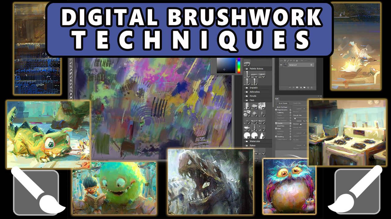
1. DigitalPaintingI part1of: welcome everybody to digital painting one. I am Marco ButI and I have absolutely no idea what I'm doing. I'm starting a canvas right now, which is completely arbitrary dimensions. I don't know why I chose those numbers, but I chose a high enough resolution that will allow me to print this thing if I choose to . Typically anything in the realm of 2000 pixels in the widest dimension is something. Is something good to start with In terms of print quality, you might get an eight by 10 print out of it. Um, this, like I say, is, um is tough for me because I don't know what it is I'm painting. I'm starting completely abstract. Lee, I have done absolutely no planning for this, and that's on purpose. That is not meet chancing out on the production of this video. If you want to see something more planned, check out digital painting too. Whereas I plan fairly meticulously what I'm doing this one on purpose. I dove in completely naked, and, um and we're just going to see if I can get myself out. Um, it's a big process, and I'm recording this narration after the painting There's no way. I simply I'm not good enough to to talk and paint like this at the same time. So I split up the process. So you're hearing my my thoughts after the fact, but I will try and get myself back into the mindset of when I started, but as a bit of a spoiler. Ah, you're about to hop on a roller coaster, and nothing I do is sacred in here. In this painting, you will see major changes. Um, you know, I'm assuming you've already seen the title screen or some form of the finish painting. You'll know right away that Ah ah, lot of what I do with the in various stages of this pain and gets changed. And that's kind of the spirit of this painting. Really. Um, I guess of painting like this is the fact that you, um the control is divvied up between the painter and the painting. Uh, it's never in control. Actually, you know, it is more often in control of the painting than than than yourself is the painter. I'm just putting down some shapes right now, and the goal of which is to inspire me in terms of some kind of visual thing that I can latch onto and really what? That boils down to his big shapes. I need to put down some kind of shape that makes me think of something. You know, it's kind of like the war shock test or something. I've put down a few blobs, You know, you can start with compositional marks, things that lead your eye through a painting. I don't really do that so much as I try and put down a shape that makes me think of a physical thing like, Oh, that looks like a ah sky. Or are that looks like a building on I'm doing right now. It looks like I'm putting a building in a distant sky. Um, the light value, obviously that I'm painting now being the sky and then I'm leaving behind a negative shape are just say I'm leaving behind a positive shape of what looks to me like some kind of building structure. Uh, I'm I'm going with that. You know, I'm grasping at straws here, so if whatever I can latch onto, I will use and I will ride it until it wears out its usefulness. Ah, as many things in this painting do. This painting starts in one particular way and ends in a very different way, and what it is is testament to the process of creating something new. You know, I think if you if you try and recreate something you've seen before, you're doing yourself a bit of an injustice because you already know the answer. If you're trying to recreate a landscape like from Lord of the Rings or something, well, that's good. Maybe, is a study, but it doesn't help you as a creative person. And in fact it almost will stunt your growth because because, like I say, someone else has already come up with the answer you tend to. You tend to get caught up too much in the in a sense of right versus wrong, whereas painting or I should say, coming up with something new there, there literally is no right versus wrong. At this point, there's no such thing as a wrong brushstroke. There's no such thing as a mistake. There's also no such thing as a correct brush stroke because I have no preconception as to what this is gonna be. It's It's scary painting this way. It feels like walking a tightrope. Um, because you you have absolutely no idea what you're supposed to be doing. So how can you perform? It's It's kind of this weird thing that I only have ever encountered in art where you can dive into something just with the knowledge that you have the skills a za painter like the craftsmanship element I've done, you know, paintings before I know that I have been able to paint before, so I'm just gonna rely on that, I guess Experience points. I'm going to rely on that as a way to assuage my fears here and get me through this process . And I'm going to trust myself in the sense that when things come up, as they do every second of this process, I will be able to have the wherewithal to recognize what's happening in an objective way and respond. And that doesn't mean I will avoid mistakes. Okay, Mistakes should you should just eliminate from your vocabulary when you're doing this kind of thing. Well, you're learning to paint or when you're, you know, even when you're experienced painter painting. Um, you know, actually, I was just thinking about this today I was thinking that what defines ah 11 of the things that defines amore experienced painter is the outlook on making a mistake in the sense that there is there are no mistakes. You can only do things and then respond to them what I just did there, by the way, I went to image auto color. I like to do this early on, because sometimes I find myself painting in one predominant color like the paintings getting to yellow or to green or something. Auto color in photo shop just helps meet, have a wider pallet, so I don't fall into such a limited palate right away. But on the notion of not making mistakes or anything, just don't worry about it. Just don't think of anything as being possibly a mistake because there's no context yet. You know, I think mistakes or something that stigmatized, especially in school, where we learned that mistakes are bad and I think just the opposite is true now. When when it comes to painting, I think there are such things, mistakes in real life, you know, I think you can make mistake by lying to somebody That's probably a mistake. But in painting there are There are no mistakes because you can always fix something I shouldn't even say fix. You can always redirect something. You can always make something bend to your will If your will is What's you deem is correct . Ah, you can always let the painting dictate to you. What? What you thought was a mistake is actually maybe something that painting wants to dio. And, um it's a tough kind of court to strike sometimes because it all depends on you know, your mood that day. Your You know, this ethereal thing of the mood you're coming in with, ah, versus what you hope, Teoh come out of the process. On that note, I have learned to expect nothing from the process. I let the process kind of guide me. And once I see something worth going for, maybe I'll step in with a little more authority. But right now what I'm doing right now, it looks like I'm trying to paint. It looks like, you know, silly me is trying to dictate Looks like I've got this landscape going and some of these things do stay. But you'll see that this is largely a process. This is the crop tool. By the way. I'm just cropping. Ah, you know nothing. Nothing is sacred. Everything's malleable. You'll see that time Time again is this goes on. This is largely a process of discovering gems and throwing out the coals. Ah, you're just discover. I'm trying to discover interesting, iconic, unique things that I happen to accidentally create. And then I will let them guide me as I continue to paint this painting. That's why I say sometimes the painting tells you what it wants cause sometimes the shapes you make when you're painting off the cuff like this. Sometimes the shapes you make are quite unexpected. And because of that unexpectedness, they're not guided by previous decisions you've made. Or you can almost trick yourself. When you make these surprise shapes the spontaneous shapes you can trick yourself and create something that you didn't know you had in you. You know, it's like that. That rock well, what looks like a rock to me on the left There. This is something that I was born right of the beginnings, kind of one of the first strokes I made. I didn't know I was painting a rock at the time, and when I cropped the canvas and I stretched out the pixels, I made that rock longer and I didn't mean to make it longer. It was just part of the process, the creative process. But I'm I am looking at it now, and I'm like, That's kind of a cool shape. It's got this jutting diagonal arch that thing to it. There's something about that that I like, and I have kind of. I've started with a cash shadow. You can see it's casting a shadow over the landscape, and at this point in the painting, there's something there that I like. I'm trying to play off that. I'm trying to think of that rock as being quite large and everything else in the painting being demeaning, diminutive ties based on that, Um, you know, I'm I've got thes slight vertical structures on the what looks like grass beneath it that I will start playing up and I won't tell you again. I don't want to get ahead of myself trying to stay in the moment here, but I'm liking this rock shape, and what I'm doing now is I'm trying to play some light and shadow on it. I've got a yellow sky, a very warm sky in the background, which is indicative of, well, a A fantasy world. We don't very often see yellow skies, Um, or it could be just a caricature of, say, a warm horizon that I'm just expanding that warmth to encompass the whole sky. So what that means to me is there's a very warm light on this planet, or whatever it is that I'm painting. There's a very warm light here, which means that anything that gets hit by light is going to get a warmer color. That's why I'm painting with these deep plum reds, which are contrast ing temperature wise against the bluer dark tones. It's very classic lighting situation where you have warm lights and cooler shadows. So I'm just working on this also interesting thing that I have in the background. It looks like this mountain, um, kind of carved into the landscape. Almost. It looks like it looks like a handmade mountain is what that looks like to me, and that's kind of interesting, too. It looks like maybe these whoever lives here likes to sculpt rocks, likes to sculpt their landscape. It's kind of an early thought that I'm clinging to, and I'm, you know, court. Look at that. I'm really trying to sculpt this landscape in the background, to be completely unnatural. I don't want toe look like nature created these shapes. I wanted to look. I want to start telling a story about who you know what might exist in this world, and it comes down to characters on and telling a story is something that really, really guides me my personal creative compass. When it comes to painting, the sooner I can latch on, do some kind of story. The more ideas seem to flow naturally because story for me, I do consider myself a storyteller. Uh, just I'm not a writer. I tell stories with pictures. You know, that's what that's what some painters do. Um, you can choose to use your paintings as vehicles for storytelling, and that's what I am doing with this one. So the and again what I do with visual painting to my other video class, I'm trying to tell a story, and stories usually involve characters. Not always, but but usually they involve characters. So in this one, I'm trying to find something in the landscape, as I mentioned, that is evocative of something that characters do. You know. You don't have to see a character in the painting in order for the painting to have the influence of character driven story. In fact, sometimes the best paintings, storytelling, pings, don't have people in them or don't have characters. But there's, you know, there's port Insee in the painting like portentous sort of things and the paying that make you think, you know, how is this? How is this? How does this exist? You know, look at the clues, the visual clues here that lead you to think all these cool things That is kind of what I'm going for here. So, you know, this is real time. This is not sped up. I do move fairly quick. I let the brush kind of have ah, deliberate fast pace at the beginning, I try not to get locked down into any one section. So that's why you'll see the whole painting. All four corners of this painting get built up at virtually the same speed. At least my intention is to build them up equally. I'm putting in what is starting to look like a house structure on the right there. And so I'm staying on the right for a little bit just to get that house structure, you know, established. And when I say established, I mean established to me as the painter. I don't This is not This is certainly not the stage where I would show anyone this painting . You know what? This is just I'm still it's It's very much in the incubation stages. Early incubation stage is this is this painting is about three hours and 20 minutes, uh, from front to back. So, you know, we're only, what, 15 minutes in right now. So we're at the very early stages. This is painting is in its infancy. And, um, I'm finding shapes. So that house notice I put that in took me a minute or two. And now I'm moving on, moving on to the background. That's established. I'm I'm trying to maybe temper that warm sky with something cooler. Maybe this guy goes from a warm top to a cool bottom. Uh, this is ah, airbrush set to overlay mode, giving that just getting the value in the background lighter and also the temperature warmer to two things. The lighter value gives me headroom For modeling in the foreground is the foregone is gonna be a bit darker or at least right now it is so the lighter value in the background, it just separates the planes. It gives the background and identity as the background. I'm relegating its values up and then, by definition, that relegates the four rounds values darker. So it gives me kind of this virtual headroom cropping again, giving myself more canvas than I just select those pixels and dragged them out just so I'm not painting over white, and then I will I will continue to paint. Um, I'm kind of arriving at a sort of a widescreen sort of cinema resolution here, as you can see him scaling down, sort of like a 235 sort of thing. I don't really care what my actual dimensions are. I'm just saying it. I'm reminded of film here. So again, there it is, Select the pixels scale them out, and as a by product of that, that rock gets a little more interesting. It's it's interesting when it stretches out like that. These are things that you may not do just with a paintbrush, but when I stretch pixels out like that, not only does it give me a wider rock, but it also gives me these stretched out pixel look. But the Photoshopped, the software, the algorithm of scaling is giving me those stretched pixels on the left and right of this painting. And it's kind of it's kind of interesting. There's something they're interesting doesn't mean right. Okay, interesting just means notable. It's something I'm gonna take stock of and I will act accordingly and what that means, what act accordingly means changes from day to day. You know, I'm a different person today than I was yesterday, and then I will be tomorrow. And what that means for this painting is this painting is me today. You know, if I I look back at the paintings I did in 2010 and, you know, while I still like some of them and others I don't like anymore, um, I What's most interesting to me is the decisions I made then and looking at those paintings . Now I think to myself, you know, I just wouldn't make those two same decisions today. I would do this differently. Or, you know, I really liked how I did this one thing back five years ago. I've kind of changed the way I think about this thing. I don't know what what it is, you know, maybe, for example, how I paint clouds or something. The shapes I see in the skies that the type of edges I see in the background, I might say, You know, I've changed my thinking on that. And when you look back on your paintings from the past, it's kind of a little time capsule into your own brain. And ah, that's why I am an advocate of painting off the cuff like this. Absolutely no planning. And please believe me when I say I did not plan anything in this video, I I thought of, you know, before I sat down to paint on this day, I I might have thought of things that I liked, like in terms of I like graveyards and you'll see there's already a few gravestone shapes, but I didn't do any photo research. I didn't do any thumb nailing off camera. Nothing was done off camera. I just kind of dove in. So this is Ah, as honest a portrayal of my processes. I can give you my my raw process. Now, of course, I I am a professional illustrator. I work for clients. That's how I make my living. And I tell you one thing, I would not advise this method for working for clients because you just don't know what you're gonna come up with. As you can see it, go back and look at the title card. Look how different that picture is compared to what I'm painting. Now you can see some similarities. You can see what stayed. But, you know, look at the differences. There are far more differences from now to the final than there are similarities. And that's that's exhilarating to me that makes me feel alive as I paint, knowing that I'm fairly cognizant of the notion that what I'm doing right now is not going to be the end of it. Might be it very well might be. I mean, some paintings go fairly unchanged. They follow amore linear path from beginning to end. I'm actually pretty happy about the fact that this is not one of them. This one gets cropped many times. I've already cropped this thing about three times. And when I say crop, that also means expanding its edges, right? Not just cropping in. Um, this thing has been cropped already a few times. Gonna be cropped a hell of a lot more times. Excuse me, Um, and ah, and it goes through many different design ideas in terms off. Ah, the things that are in the painting, the physical things. Like, right now, for example, it looks like I'm painting a tree. And that's certainly what I'm thinking of as I paint that thing and I'm trying. I'm trying to think of ways compositionally the reason I'm painting these trees. I'm trying to think compositionally of how to frame this thing. Ah, composition is maybe equivalent to storytelling in terms of its importance. Um, of course, composition is kind of everything in a picture. It's the way we read it. So just trying to collect my thoughts on that composition is the way in. It's the door to the painting. It's ah, it gives the painting a cure. A curated look. Um, like, think of a curator in a museum guiding you through the museum. I want the composition to be my curator in this painting. And again, I have no formulas for For that there are no formulas for composition. There are no answers. There are only some guidelines that you can do. And you know one thing I'm I've deployed already is dark four round light background. That is a compositional thing as well. A sort of, ah, realistic observation of how life works. But compositionally is more important where the foreground plane is dark, which silhouettes itself from a lighter background. That is a compositional choice that makes this painting clear to understand, but also in competition. You think silhouettes, you know, Is there something I can do that breaks up the blankness? The boring nous of a sky like that? So a tree is sort of a number one thing to cling on to, to break a silhouette there Really nice, you know, obviously trees or something. We all know what they look like. Ah, so there, there the rife with ripe for design choices. You know, we can design a tree in so many ways, and it will still read as a tree because we're so used to seeing trees. You know, everyone in the world has seen a tree, so trees are very useful. Rocks are also quite useful. Um, which is why so many landscapes have rocks and trees. They're kind of, you know, you ubiquitous sort of item that you can always draw upon. Um so you can kind of see these grave markers coming in here. That's a concept that I have at this point. I'm thinking that this maybe is the burial, maybe a burial site for what looks to be a vertical city in the background. So I've got this sort of play of opposites. Is horizontal burial ground with a vertical city. That's kind of cool, the duality sort of thing. Ah, that is another. I wouldn't say compositional idea. It's more of a storytelling or creative idea that is, you know, very common. Just pairing two opposites against themselves. Ah, that is something that you can do in so many ways. You can pit, you know, week things against strong things and how you know you can think of any variation of weak versus strong Beit shape or people's personalities or whatever it is. You can just pick two opposites and pair them vertical versus horizontal or diagonal versus horizontal. Say anything you know, name something named two opposite things and put them in the same painting. And that is a good starting point for interest. So that's kind of what my idea is here. I'm thinking about how this river is meandering through the landscape in an interesting way and, ah, you know, not to give any spoilers. But all of this goes away later. I don't go with. I guess the only thing that I that sort of stays is the water, but it no longer becomes a river. Changes in the rock kind of stays and, of course, the background landscape. But they're you know, they're right. Now I'm right now. What I'm struggling to do is I'm struggling to find my footing in terms of getting a focus for this thing. I need there to be some reason some kind of take away from the audience perspective. Like when the When the When a person looks at this picture, I want them to be able to think very clearly and quickly what that painting is about. Like what did you just see? If you showed this painting to someone like that, took it away or they saw this painting from across the room. What is it? A painting off? Is it a painting of cemetery? Is it a painting of a A futuristic landscape? Is it a painting of an alien planet? What is it? This is concept art. This is this is actually a great way to approach concept art because it it allows you to dive into your brain relatively in a raw sort of way. You can kind of sift through the files of your brain without knowing what you're looking for. And what that does is it gives you a sense of discovery. You say, Hey, I didn't know this file was here. And that file might be exactly what you need. Or at least it can guide the conversation in ways that you have no idea. I'm pulling up all sorts of this is exposure. Before I was in, I think you saturation. I'm just trying, Teoh. I'm just trying to keep the process fresh and not get stagnant or mired in technicalities too soon. I don't want to commit to any vision too soon. So photo ops tools like switching the color up, you know, image, adjust you'll find all sorts of color tools like levels is a good one, Hue saturation. I often use auto color auto contrast just to help. Just give Photoshopped the opportunity to surprise me, which then facilitates the opportunities to surprise myself because I will react to what Photoshopped does, which is a nice thing you can do digitally that you know, I can't really do. Traditionally, I guess the closest analog in traditional would be ah, maybe just throwing some paint, like literally throwing some paint on the canvas and allowing that to inform the painting. And again, that is incumbent on you to not think of it as being mistakes or no mistakes. I'm developing that gravestone. Grave marker idea. I've got that sort of island. Ah, aero shape in the middle. It's interesting. I kind of like those gravestones. I've always enjoyed the shapes of in graveyards. I just find just those jutting stone shapes those like arrow shapes of graves to be just interesting. I don't know they're there. I'm not sure I'd call it beautiful. I just think they're interesting. Maybe interesting is beautiful. I don't know, but, um, I like that. So I'm putting it in this one and again. It's what it's going to start causing, though, and it already is starting to cause it. It's related to what I just said. It's causing a bit of tension in terms of competing focal points, cause I've also got that super interesting background. Um, and this This is where this house I'm doing now is very old fashioned. That's a very, you know, Victorian sort of looking house. It's starting to be anyway, and that is in direct opposition to the background. Now that is kind of interesting. Pairing old with new there's there's classic opposites old versus new Um, but you, when you do something like that, you have to be cognizant of the fact that its potential you the one potential pitfall, is to create too many opposites. Right now, I've got old versus new horizontal versus vertical versus diagonal. That rock is very diagonal, so I've got a lot of raw material that I'm throwing down. But what's nice about this stage is this is the stage for raw material. I am not at a stage yet where I feel like I need to where I feel it's prudent to make decisions right now it's prudent is to generate more raw material. Think of yourself as, Ah you know, maybe a novelist who's just brain dumping on the page, coming up with characters and situations. And there's nothing. There's nothing at this stage that you can judge yet. And I mean that, quite literally. I don't know what's good yet. Now there is a part of the process that will start reviewing that it will start. Well, it only start revealing it once you are willing to make decisions. But, um and I'm just What I'm doing now is I'm starting to understand that that background shape looks like a village. Looks like sort of, ah, vertical village. Sort of a caricature of, say, like, *** with Canada and Italy or something which I've been to and I have painted, um, you know, thes towns built on mountains. I'm kind of caricaturing that idea. I don't mean it to look like Singletary, but I am using the idea of all these little rooftops poking out of ah cliff like landscape . I I've always loved that to me is another interesting thing when you have human constructions on on top of just raw nature. And so what? Those sort of turquoise shapes are those air rooftops catching the light and that that is something that's pretty cool. I got that spatter brush that I I used to throw down texture again, like my previous example of sort of spring real paint on a canvas, which I do traditionally all the time. This is a sort of the closest digital brush I have to mimic that. And then I I'm using this smudge tool right now, which is a great tool for finding varieties of edge and also drawing with. I draw with this much tool as well, so I paint with this much tool maybe 50% of the time, which is a lot. That's quite a sizable amount of time to be painting with a such an indefinite Tulloch's a smudge tool, but what I love about this month's tools it creates varieties of edge within the same brush stroke, the just like real life, real pain. The first few the first bit of the stroke you put down is has hard edges because you're putting your brushes loaded with pain. But as the brush loses its paint, it just starts smearing what's there? Think of it as an alla prima oil painting where you're smearing the wet oil paint. That's what the smudge tool is like. And because I do paint in oils a lot. Ah, to me, that is a very special is a very natural way of putting down paint. Ironically, it's probably Photoshopped Best brush, in my opinion, and it's not even really a brush. At least it's not in the brush menu. S O I. I, you know, quantify a lot of my style, I guess, are the look I again in my paintings. A lot of it is attributed to that smudge tool. And, you know, again, I think it's something that programmers didn't even intend for. So I'm just building up. You see, what I'm doing now is I've made a few decisions. I've made a decision to go with this graveyard thing, So I'm painting up these grave markers with the hopeful thought that they might be, you know, the solved to this painting solve meeting again. I'm looking for the reason I'm painting this. What is this painting about? And I'm thinking that a it's a graveyard, so let's paint some grave markers right. I'm also noticing this cool rock, so I wanted Teoh. I want to make a bigger statement with it, so I just literally selected it and I'm dragging it out to where I think it might go. Just shy of half way through the painting. I try not to ever let anything be halfway in the painting, so I extended that rock just short of halfway, but a little more than 1/3. I'm just I want that rock to really be a predominant piece of this composition. It's such a strong shape that it it is the thing that's getting attention, so why not, you know, push it, push the thing that you know. It's kind of a good thing to think of. Push the things that are catching your attention and let everything else go away and you'll find the things that are catching your attention are often are oftentimes enough to carry the painting. It's actually easier to overdo a painting to give it too much to bear than it is to under do a painting. You could do a painting of the simplest subjects, and you will find that it's actually quite easy to carry an entire painting with just a singular focus. And actually, you probably should look to do that because I think of it like a conversation. Think of painting like something you're talking about. If you're talking about a 1,000,000 things, it's hard to know what to take away from that conversation. Ah, but if you're talking about one thing and you're focused, it's easy, and you can apply that almost directly to painting. And ah, like I say, the hard part about this kind of approach is not only do you not know physically what you're painting, I don't know. You know the landscape and painting or the cemetery. I don't know what it is I'm painting, but I also don't know what the focus what I'm trying to say about that thing. So it's like a dual pronged problem. What am I trying to paint and what am I trying to say about it? So that is, that is where planning comes in handy, as you can see in digital painting to where I do a lot more planning. But in this one I'm purposely not planning. I'm throwing myself into the deep end, and I'm trying to use all my faculties to solve all these layered problems. And ah, it's it's fun. It's exhilarating. It's scary all at the same time, and I find my best work comes out of that environment. So I've rambled on a bit, not really doing anything much here. That is the airbrush set on linear dodge mode. It's kind of Ah my my light brush. It's paints light for free. Totally a digital trick. Good tool to have in your arsenal, though just a. You can set any brush to linear dodge. Just use the menu in the top left Photo in your photo shops file menu. Any brush could be sets a linear dodge. Or you can make a new layer and golden your dodge. Oh, just on layers. Some of you might be wondering why you haven't seen my layers window. That's cause I'm painting on one layer, and most of the time I will paint on one layer. Whenever I do start a new layer, I will drag that layers window into view, and you can see that I'm painting on another layer and then I will flatten it and be back toe one layer painting on one layer is beneficial to this particular approach because it it keeps you focused on the task at hand, which is coming up with a creative solution to things. Creating layers, I often think, can be a really a hitch in your process because you start falling in love with layers. You start not wanting to adjust them or you start being precious with them, thinking that that layers air final ideas. Here's the first thing to die in this painting. This idea of that bridge I It was segregating the composition too much. It was creating too much interest. The bridge itself was not interesting to me, and it was breaking up. What the things that are interesting. It was taking focus away. It was fighting the things that are interesting. So I killed it. And again, that's why working on one layer is nice, because you can just paint right over things. I mean, at the end of the day, this digital environment is the most forgiving artistic medium in existence. Maybe right down, right alongside, Ah, consummate to the pen and paper where you can literally go right over things. You can rip things out, paint over them, re redo it without any pain in traditional. It's a lot harder to do this because you have to physically paint over something. Or maybe Jess. Oh, something out. And and in doing so, you create a bit of a mess. It's tougher to do that with digital US digital painters, air riel. Lucky, because our medium could not be more accommodating to to the creative process. And it's actually, I recommend everyone paint digitally. Even if you're a hard core traditional purist, try painting digitally just to see what it's like. Toe have, ah, full reign of your creative process at at your fingertips. Umm you'll it facilitates the ability to explore your mind a little more freely than I think traditional does. Um, I'm a little biased because I actually started My actually started my learning with digital , and then I went back to traditional. I learned digital painting for I'd say about a year I had not done any traditional paintings. Um, I started learning digitally, and then I went to oil. I I kind of wanted something that I could hold in my hand. I wanted a physical painting that I could hold in frame and sell or whatever it is, and that led me to study with the oil pain. And then I fell in love with oil paint and stop paying digitally for a while. And then I married the two back together. And you know, these days, I I'm equally painting digitally digital mediums as much as I do in Ah, you know, in traditional media, I kind of spend my time equally in both realms and the processes of both feed into each other, and I and I really approach both the same way. And I recommend that for your learning. If if those of you are watching those of you who are watching this who are newer to painting, I would say that digital is great and you should paint digitally. But you should not let it preclude you from painting traditionally, because you are doing yourself a major disservice if you don't paint. Traditionally, um, even though digital is the production tool of choice for sure, productive digital is the way of the day. You should work digitally in production because it's so easy to change your mind and do revisions. It's that it's the most friendly medium, Um, and most studios will require you to work digitally. But, ah, if you don't pair that learning with traditional media, you're doing yourself an injustice. There, there go those trees dead painted over. I've made that decision, I think, in the early stages, the I've actually I'm making more decisions as to what should not be there as to what should be there, extending that shadow being cast by that rock. I think more and more that rock is the most interesting thing in this painting right now, right next to the background landscape. So what I'm doing now is, I'm thinking, Well, if there's one diagonal rock, let's do the Bob Ross thing and give it a friend and give it another vertical rock a little
2. DigitalPaintingI part2of: so continuing on here, just starting to work into that second rock There it's It is close. Enoughto have a notable light and shadow shape. Generally speaking, the further back you go in space, the more compressed your values get So up close, you're gonna have ah, lot of room between light and shadow, as you can see between you know, where the baraka's casting a shadow over the grass. Pretty big difference between light and shadow, right? I'm letting my my dark school quite dark, which allows my lights to be quite dark Still, Rex, I have a lot of headroom, but a lot of contrast there versus in the back of the very background with that town there's very little room for contrast. I will work up more contrast than that then that's currently there. But I'm building up to it and building up to whatever building up to color, building up to contrast, building up to composition and story and is something I do. I purposely leave myself room in all avenues to build up, like right now, what I'm doing here in this little left area is I'm actually building in some color. I'm just building in little patches of that green, which will play over top of the under painting. I'm using a brush, a watercolor inspired brush that really allows me Teoh to paint. It doesn't lay down opaque strokes. I mean, even if I'm pressing really hard on the tablet, it doesn't give me in a pick stroke. It's got this really elaborate sort of tapered edge. What's the edges? Or more opaque and the middle is more transparent. It's really interesting how that brush works I didn't make. It is part of that Kyle's real watercolor. Um, you know, I purchase that brush set, so I, unfortunately can't share it because it would be piracy. But if you want it, go search. Call Israel watercolor. I highly recommend it. I mean, I can remember how much I paid for. It was maybe $20. Maybe it's worth it. I highly recommend it. I use I use those brushes all the time. In fact, you can see three of them saved under my favorites. There I have my tool list. You can see favor. The only reason I put that is because the tool presets window is listed alphabetically, so I don't wanna have to just scroll for disparate brush names the whole time. So I have him listed his favorite, then all the brushes that aren't listed his favor. I barely use them. So you can see my favor list is I don't I didn't count them, but it might be 20 brushes, maybe 25 brushes, and they're all similar. And even within my favorites, I have, like, maybe 45 actual favorites that I always use. And in this painting, you you'll see them all like this watercolor brush. I use the flat watercolor brush. I used the stippling brush, which is kind of just a Harry brush and a few others. Okay, so what's going on now is I wanted to try a compositional thing. And this I think I'm doing on a layer. I should show you the layers in the second. This is just a one other layer added on top. This is something I'm trying here, where I'm noticing that this painting is having this vertical tendon. Sorry. A diagonal tendency. The rock is diagonal. The background villages kind of diagonal. Yes. So there's always What I'm doing now is, um I'm just going into that image, adjust variations. I'll get back to the diagonal thing the second. That's image adjust variations. Photo shop just gives you some different options of your painting. So I picked the more green, and then what I do is, um, I put a layer mask on it. Invert that so it doesn't show anything through. And then, using using any brush, you can paint into that layer mask so paint white into the layer mask. You can see how you're you can reveal that adjustment. So I'm revealing the greener thing by painting white into my layer mask. And I'm using an airbrush right now because of the nice soft edges. It's barely noticeable, but you can actually do Ah more hard effect. With different brush. You can use any brush. So, for example, I'll use the I'll pick another brush here, this hard brush, and you can see it kind of stamping down some of that green. And I like that effect. I like hard brushes because they're very decisive, you know, they make your decisions look bold and powerful. There's nothing worse than a painting that's just nude. Aled to death and the artists you kind of see the artist is afraid of showing you any bold strokes. They Ah, here she wants to just show you blended strokes. I like. I'm much more in favor of boldness. There's the layer mask, by the way. So that's on and off and then I will flatten it down. Don't get precious with your layers. Flatten it down. Continue working. Remember, there are no mistakes. If you can convince yourself there are no mistakes or maybe not. Convince yourself. But put yourself in the mindset of that. Ah, you will not be afraid of flattening or layers. You won't be afraid of painting on one layer. So now I'm just working into that gravestone area. Oh, back to what I was saying about the diagonal. Um, I noticed this painting had a diagonal tendency. The rock, the background village thing, kind of leaning diagonal. Um, even the rocket, the houses sitting on on the right is kind of diagonal. So those trees I'm like, let's just play that up to its max. Let's turn up the volume on the diagonal thing and have these diagonal trees, which would help the alien worlds feel and also help this diagonal themed composition so I will probably put in more trees than that. I kind of did a few, then backed off again. I think I just I build things up like I say, So I'll build up that to about the diagonal theme as well. Um, I'm drinking some tea while I record. This is my My throat is all dry from all the talking. I hope I hope it doesn't doesn't get annoying. I always work with a coffee or a tea or water. I always have something to drink when I'm painting. My desk is full of empty water bottles that I have toe remind myself toe. Bring to the recycling bin every few days. Empty coffee cups. Sometimes it gets pretty messy. If I'm facing a deadline, my desk will be, Ah, we'll have more coffee cups than then. Space for painting. I tend to keep my studio space pretty sacred, like it's just me. I don't share this space with anyone. The rest of the where I live is shared, but but I live with my fiance here, but I I tend to keep my studio space just for me, and it's kind of a sort of a tacit everyone. A tacit acknowledgement from on my fiancee's end that she doesn't come up here either, because she knows that this is Ah, you know, she knows my mindset when I'm working and when I'm not working, I'm not in this room. I keep this room completely, I guess Sacred again for four. The head space I need to be in to paint. I can't really paint and talk to someone intelligent with any degree of intelligence. At the same time, I need to be focused. So a big part s so you know, I'm laying in these diagonal trees and, um, I don't think they lost too long because, well, I think it's a good idea in theory, like it's thematically good. But there's something about it. Two things one is. I think it's a bit contrived. There's something contrived about it, like wire trees growing out of that rock. I don't think it's a good idea to put trees like that much interest in the top left corner of this painting again. The one that that's my biggest folly here with this idea is it's too demanding for attention in two localized in area. Now, I could there ago, I put I could put more trees around and really emphasize this diagonal thing. And for sure, I'm doing this on a layer. Um, because it's hard to erase this. I mean, you have to kind of work backwards to erase this stuff if it weren't on the layer. But, you know, I tried out, and this particular idea pretty soon becomes it becomes obvious that it's not the right way to go, so I will abandon it. But you know what's interesting to look back at here is how you know how much I give it a shot. You know, I give it an honest shot, because when I when I first have the idea, I never know if it's gonna work. I mean, a lot of this You will oftentimes surprise yourself with ideas. You don't think you're gonna work or you hadn't even considered. But they hit you and you try it. And hey, you know, that looks really good. In this case, this is not one of them s o. Those will go away soon. But like I'd say about failure, there's no such thing as failure. Just cause that idea doesn't work. It doesn't mean it's a failed idea, because what it does is it sparks a conversation, a visual conversation with you as the painter and the painting as sort of the subject that you're dealing with here, um, these diagonal trees, they let you see the painting from a different angle from, you know, different light is shed upon this painting. Now I understand it a little bit more, and just because this idea is not the right thing for it, I gained a bit of understanding about where I'm going because I chose not to go somewhere that narrows the field for where I can go. Does that make sense? So discovering, discovering this? Ah, no. These pathways that you can take in a painting is equally important as actually painting the finishing brush strokes. I think this is, I think, the most helpful part of watching my process or watching any painters process. As you gain experience in painting, I think it's it becomes more and more interesting. The approach the artist takes not so much the technique. I mean, when I was a beginner, a painting, I would really hound, um, artists whom I liked for their techniques I say, like, how? What steps did you take to paint this and I would want, like, literal steps like, I I would want someone to reply to my emails saying, Or I would hope they would reply, saying, I use this brush I use, you know, these colors. And here's why I was looking for an answer book, basically like we all do. It's human nature. I think we all have that kind of. We all want someone to put limits on art because that helps us learn it. If there's strict limits on it, right, if you can do this and you cannot do that, that helps you learn. It's easy to learn that stuff, but of course that's not the case with art. You could do anything. Um, you can approach any painting any way you want. It depends on your temperament. Depends on your personality. So I had I had some nice artists reply to me. You know, how many 12 years ago. Then I first started painting Um and ah ah, lot of them. The common denominator that I was not so pleased to find was that everyone told me that in a way, I was asking the wrong question. They didn't say that that tersely, but they would say essentially, like you change your process. The more experience you get, you know it's not, You know, they would answer me. I don't paint any one way. Here's a few tips and they would tell me things about, you know, values like Don't Maxima. Don't work up to your values, you know, start on gray and then build your values first and maybe glaze color. They would give me some basic advice that we've all learned, probably by now, from art school and stuff like that, or or even just on the Internet. If you don't go to art school, um, and I would ah, of course, I would buy videos from any painter who would publish them. I'd buy videos, mostly digital painters at the time was like I said, I started digital and, um, I would I kind of miss the whole approach thing. I would just kind of think of what they did is the answer. You know, I remember I watched. I can't remember where the artist was, but I would watch a DVD and then I would literally try and do his exact steps in Photoshop from my painting, thinking that was the way to do it. Um, and then I would kind of be dismayed when my results weren't as good as Hiss and I and I would think to myself. Well, I followed. I did the exact same steps. Why is my not as good? Ah, and of course, the answer is because it's the hidden ingredient is experience. And, um, with experience comes mainly decision making, like you were able to navigate this complex field of the fundamentals painting. I consider the fundamentals of painting to be drawing edges values in color, although in a better order, I would say, drawing value edges and then color. That's kind of my four fundamentals of painting. And, um, when you paint like what you're watching me do right now is you're watching me make decisions on all of those fundamentals all at once, and I can't explain to you what the decisions are because there's far too many going on at any one time. I could just do my best to kind of have passionately jump around with my narration here and say, I'm doing this and doing that But what? I can't do it. I can't explain my instincts. I know Painter can do that. What I'm doing now, By the way, as I selected out those shadows, the shadow shapes underneath the roofs and the hard edges. Speaking of edges, the hard edges amongst those soft edges are really popping out. Look how much That's areas popping now. And this this right here might be the first time in this painting where I think to myself. Yeah, this is something worth exploring. This is cool. That hill village thing looks really cool. It's something I, you know, haven't quite seen this it aeration of a hilltop village before. Eso Once I know that, then I'll probably start making decisions to kill other things that are competing with it. Remember about the singular focus that seems worthy of our focus for this painting over the trees over the graveyard. You know, I'm trying. What I'm trying to do now is I'm trying to maximize any visual interest. I'm trying to cast a shadow as if maybe clouds air casting diagonal shadows, Still keeping that diagonal theme I'm just using ah, brush on multiply. Or maybe it's a layer on multiply mode. I end up not going with it, but, um, it's worth a shot. The reason I don't think those shadows work is because they slice up the otherwise nice light shape back there. Excuse me? The shape of the mountain, when that gets to sliced up, like with those shadows, it becomes, um it actually becomes less bold and less interesting. Or I should say it becomes more interesting, therefore, less effective when I say interest in the sense of painting kind of I kind of use the word interesting in two different ways. Here, I should clarify when I say interest in a painting. I mean, anything that attracts your eye is what I call interest. Whereas, um so, for example, those shadows that I just got rid of, um, they were to Technically there were two Interesting because they attracted my eye too much when I was So when I vs When I say interest in real life, like things I'm interested in or things that look interesting, that is a positive thing. So just to clarify my my verb ege there, if there's certain words you can't say when you paint like you can't say the word cool because my referring to cool like vernacular cool or my preferring to cool colors. I get into that conundrum all the time, especially when I'm painting. Ah, what? I'm doing actual class stuff like a real live classes because, you know, I say the word cool did all the time like we all dio and I have to check myself say no. I mean cool temperature, not cool. Not that's cool, man. Anyway, I'm using this. Ah, rake brush and the rake brush. I think this is the first time I've brought it out all session. The rake brush actually becomes something of, ah, iconic brush for this one. It gives me this look that I end up really, really using the rake brushes simply just 45 various circular strokes in one brush. So it kind of gives you this free hatching. Look, you know, I guess I suppose you could do it with just a single brush and start hatching, but the rate brush does it for you. And in real life, I actually own a rake brush. In real life. It's ah, it's his cool rubber brush with four prongs. Looks like a rubber fork and you load some paint on it. And you can paint like this ray key effect. So we're just cropping again, adding a little to the top and sacrificing a little at the bottom. I want to, um, I'm thinking about showing with top of that mountain. I'm thinking it's too close to being a tangent. My say tangent what a tangent is when something in two dimensions touches touches something else. So, for example, the top of that mountain was really close to just touching the top of the canvas. See, like in two dimensions in the Y axis. Those two things were touching is usually not a good idea to have things touch like that. Tangents happen everywhere they will. They will creep into your work regardless of how diligent you are in eradicating them. They will creep in. And of course, it's your job as an artist, Teoh to notice them and then to exterminate. There is never a good tangent. In fact, on artist who turned tangents upside down was Essure, who used tangents to create his incredible illusions. A lot of those air based on tricking your brain via two dimensional tangents, leading your brain to conclude three dimensional information. So interesting use of tendons. But, you know, we all know Asher's worker. Hopefully, um, the power of miss the power that tangents have to mislead. You know, there's no more obvious example than there's no more powerful example than his work. So if your goal is not to create an aloo a a weird three d illusion, then you should avoid tangents. I'll try and them point out, if I ever see another tangent here, all points it out. Notice how careless I was with that canvas resize. You know, when I skewed the canvas pixels to cover the top, I skew the top of that house. I skewed the trees. It's just in the spirit of blocking in. You know, I talk about this a little more in a digital painting, too, but, um, I'm always in the spirit of a block in. I never want my work to. I never want my my painting stage to get past the block in, because once I get past the block in, if I ever think I've got passive lock and I think, oh, now I now I have to put the finishing brush strokes on these, these elusive finishing strokes that are supposed to look so good and all that does it stunts the painting, it it. It blocks me mentally because it's too. It just seems too important a task. And every brush stroke seems to to weigh a lot more at that point. And, you know, you just stunt yourself. You stymie your hold, your own progress. So I'm always in The phase of this is just a giant, elaborate block in. That's all it is my brushstrokes that I'm putting down now, like the character of the brushstrokes. They don't change those brush strokes are they look like that now and they look like that later. The only thing that changes is I have I will be accruing more, drawing more drawing decisions, more compositional decisions, more texture stuff, you know, the varieties of edge, all these things I'll be gaining as I go. So that is what makes the painting look more finished. Not detail, not finishing brushstrokes. So what I'm doing now? I just selected the tomb, the grave markers, and I'm just trying to lighten. I'm trying to get a little more contrast out of them. I'm starting to actually doubt that those gravestones are good idea. It has not occurred to me yet that those gravestones may potentially be not a good idea. There's something about them that just they don't work. Um, I'm at the stage now where I've put in enough painting. You know, we're an hour into this illustration. I've put enough painting into those grave markers that they really should be working. Like if they're gonna work, they really should be working. But what I'm finding is that other things are working. I kind of started this painting. Mainly. Those graves kind of happened pretty quick, flipping the campus vertically. I'm I'm trying to look at this painting more abstractly to see what it is. Is there something here color wise or shape wise or composition wise, that is, you know, working better. I'm still in this diagonal thing. You'll notice when I foot the canvas. How important those diagonals all of a sudden became like. I can see them a lot more clearly. And that's because when you flip the painting, um, in any direction like this, look how Look how much those diagnose pop out at, you know, does that work on you guys. It worked on me. Or I didn't notice how strongly those diagonals were affecting the peace until I flipped it . And flipping the painting is a technique you should all be doing. It just helps you trick your brain into seeing your painting for the first time, kind of seeing it with fresh eyes and certain things that you didn't clue into before all of a sudden become real obvious. And those diagonals being the case in point on this one I didn't realize how much those diagonals were dictating this kind of a spirit of this painting. Like I knew they were kind of thematic, but wow, I didn't know they were this strong at this point. I'm not addressing it yet. I'm working on that house, but, ah, I will soon draw the conclusion that those diagonals they just got to go there. They're not help. They're not helping in any way another crop. Another crop does Anyone doing a crop count might be my sixth or seventh time cropping, and they're just minor minor changes, right? Minor crops. I'm trying to notice it. Notice I'm sacrificing Maurin Mawr that that grave area every time. Right? Deciding how much of that house to cut off more rock you Hopefully you can really see the ah, the discovery process play out in front of you. This is again. Like I said in the beginning, I didn't plan any of this stuff. This is me discovering what is worthwhile in this painting. What ideas am I going to give myself that are you know, Germaine to this cool landscape? Um, not everything you dio is going to be a unique gem. You know, you got to be self aware enough and scrupulous over your own work. This is another ah, overlay brush. You can see it sets overlay up at the top left there you can set any brush to any painting mode overlays. Nice. It's well, overlays a good word for it. It kind of takes the color you that you have and it glazes almost. It kind of gives it this light glaze and it kind of directs every color in your painting toward the painting that your overlaying with I really find overlay useful. The blending modes I find most useful are linear dodge for lights. Already talked about that a little bit overlay. So I just use now and I'll use overlay a whole lot during this painting, and the 3rd 1 is multiply. Multiply is strictly darkening. Brush out here, go the trees goodbye and notice it because I didn't put those on a layer. I have to manually paint over them. But you know what? That's a good thing, because what it's doing is it's allowing me to, because I have to do it this way. I'm making. It'll end up making me make shapes that I probably wouldn't have made otherwise. I'm noticing. I'm using this blocky brush. It's called it an oil texture brush. It's ah, it's a flat brush. Reminds me of oil paints. It looks like it's going on thick. For some reason, it reminds me of thick in Pasto paint, and it's got this square shape and what that square shaped does it. It gives that really bold, decisive look that I was talking about earlier. This is the furthest away from blended as you can get there. It's the opposite of blended. It's it's the's big square shapes, and you kind of think of it like laying a mosaic or something. One little square next to the next to each other to define form. And my favorite paintings are the ones that do this, the ones that employ just bold brushstrokes. But still, with the intimate knowledge of edges and color and value and drawing. You can do all that with really brash brushstrokes you don't need. Um, you know, you don't need to blend your life away on a painting. So painting up those trees I have I'm moving a little slowly here because I I have to kind of say to myself like, OK, really, is this really what we're doing? And then once I say yes, that's really what we're doing, I get rid of it and I don't look back. I really try not to look back. Um, it is pretty rare that I want to go back on a decision if I'm and I usually can predict when a decision will be difficulty and that's when I'll employ like a layer, right. And to be honest, those diagonal trees probably should have been on a layer, But I guess they weren't. I forgot about that. I think I was just too cocky. I was so sure that they would work, which is fine. That's that's not a mistake member. No mistakes. I now see the painting from a different perspective. Also, Like I said, I you know that that process of eliminating those trees made me get that square oil brush. Oh, and you'll see that brush also becomes a staple of this picture. The rake brush and that flat oil brush kind of become a bit of ah, savior. For this painting, they become iconic. They create the iconic strokes that the final painting has, and later on I'll show you a painting. That kind of reminds me of this 11 that painting I've done in the past, where I kind of really explored this blocky technique to its well, not to its maximum. But, you know, I I really pushed it, and I'll show you that a little later. But I'm really liking the cloud shapes that I discovered by accident via painting out those trees. It's their slightly darker than the sky and cooler, but what's interesting about those cloud shapes is they look, they live bluish right? They look bluish gray. Once you'll see me sample those colors later. They're actually anything but blue. There actually is still in the orange family. They're just grade down, creating a subtle relationship of warm vs cool yellows in the background. So what I did just there. I selected it. Feathered the selection, which gives it soft edges. Just bringing it up. I'm trying. Teoh compressed this composition. I just I I'm having trouble with the graveyard area. I don't quite know what the problem is like, Why I'm bumping against it. I don't quite know. All I know is that something's not working. So my first solution is I don't draw the conclusion right away that I should kill it. So I have put a lot of time into it. And like any of us, once you put time into something, you start getting a little. You start falling in love with it, you know, on you can't think of yourself living without it. So that's the stage. I mean, now I'm thinking on maybe maybe I just need to reduce its importance by limiting its physical space, you know, by compressing the campus a bit, and yet that helps a little bit. What that does is because there's less space for the graveyard. It helps us move past it a little bit. Maybe our eyes kind of moving up via the tree via the rock and seeing more of the distant landscape. That's cool. That's Cano is a step forward, but ultimately I'm actually looking forward to the point in time, Right? Decided to kill it. I can't remember when exactly that happens, but ultimately I do discover that the graveyard is just a competing idea. It's not the thing, and it's cool. I love painting like this because you get to discover each little paintings, the thing that makes the painting tick. You know that the thing that makes the idea readable and what makes it unique to someone else and, you know, as a concept artist, maybe doing concepts for a film or for your own ideas or whatever. The whole point of being a concept artist is to come up with a novel concept. You don't want to be derivative. You don't want to come up with something that someone else has done because then you're not being creative, Then you're just sort of copying your aping someone's idea. Ah, and it is possible to Franken Design, which is take a little from artist A a little from artists. Be a little from artists, see, and then combine them all together and come up with what will fool some people is creative . But anyone in the know we'll be able to spot that and actually know what? Those trees, those diagonal trees. I'm not sure if I mentioned this before. I've seen those before. I've seen them somewhere. I don't know where, but I know you know, I follow Follow a lot of artists on the online. I've seen someone do that, and it was It was a great idea when they did it. But when I'm doing it, I'm feeling a little dirty about it. I feel like I you know, I didn't intend to steal it. I did it Honestly. I saw the, you know, the verdict, the diagonal things, why I went at it, you know, with a pure heart there. But it ah, it started feeling derivative to me. And once that taste is in my mouth, I got to get rid of it. So I'm really glad those trees were gone because they just they just were not doing anything for anybody but but because I just because I explored it? A. I feel like I gave him a fair shot. But be the diagonal tree thing. You know, there might be a concept in the future where that is the thing that makes the painting tick . And if I do it, I'll have to remember to do it in a way that is my own. You know, just cause an artist has done it doesn't mean that I can't do it. Of course, there's a Every idea is kind of been done in the just variations of ideas that have been done. But if you do something that someone else has done, all you gotta do is make sure that it's your own personal way of doing it, which by definition will be unique and not a copy, not some derivative conclusion from someone else. I'm just sculpting this rock a little bit. I'm thinking that it needs to be more interesting. I have really like it's bold shape. It's becoming kind of Germaine to this painting, this idea of this rock, but ah e, I just feel like it needs a little more important so that I'm trying to maybe put a rock in the background that again, just like I had the second rock in the on the right. Now I'm trying to put another rock on the left. When things come in threes, it's kind of nice, I think. I think that goes away, though again, it's all in the name of composition for the most part, and to expand a little more in composition. What is it I'm looking for in composition? What? I'm looking for a way to move your eye through this painting, and there are many ways to do it a whole myriad of ways to do that. You know, there are certain tried and true ways like you can go s curve, see curves You can just use contrast and have something super contrast against other areas that are less contrast in your I will just bang. We'll just go there. There's so many ways to do it. Um, I tend to be in favor of the pathway idea, and I I talk a lot more about that in digital painting to I kind of break that down a little more. But in this painting, I'm trying to find I'm trying to settle on the path that our eyes gonna take. And again, I do like this diagonal thing that is creating a direction. That's a word I haven't used yet. It's a good word direction. It's creating a direction for this painting notice. When I put in these little crackles and little dips and values in the rock, I'm doing it in this diagonal sense, and that's on purpose. That's me trying to further make just ring more use out of that diagonal idea. And that, to me, is more important than same. Modeling that rock I don't The rock is modeled enough. It's got a basic light and shadow. Um, you don't need to over model it the You know, the more you work on the painting, the more of these little brush strokes will add up. And there is, um, killing. I'm killing that background rock in favor of some more sky. You know, finding a composition is something that will make or break your work, and it's it's I consider composition to actually be in advanced topic because there's no real way toe learn it other than gaining intuition, Um, you have to feel your way to a composition. You sure you can take classes. But, um, at the end of the day, composition is uniquely a personal thing where you say, like value use or learning to draw, that's personal to. But you can teach that. You know, I can teach you how to draw in perspective. I can teach you how to draw a nose or on. I can teach you all these elements and putting them together is an art. I can't teach you that, but I But I can break it down. Worse composition. I can only give you a best. I can only give you abstract ideas like your eye needs to flow through the painting. Well, that's great. But how do you do that? Well, it depends on your painting. Like you know. What is it? You want to be important? The best I can say with composition is it relies on what needs to be important. And that's, you know, that relates to what I've been talking about with the idea. The thing that makes the painting tick. What is that thing? The sooner you can define that thing that you're painting that the subject in with the subject, what you're talking about, the sooner you can define that. Chances are, the sooner you can also find a composition that best serves that that should be maybe the best thing I can say about composition again. The sooner you can find what it is you're talking about in terms visually, the sooner you can find the devices to lead the viewer's eye there so more and more. Look what I'm doing now. I'm painting in another background village thing and painting in the rock formation, and I'm getting rid of that, finally getting rid of that last semblance of that diagonal tree, which which was on my campus for far too long. Ah, it was cutting off a huge part of this painting. So I'm I spent a little too long and, uh, getting rid of that. But finally it's going away and and the painting is all of a sudden starting to breathe a little bit. With those trees gone, those trees were just choking the painting. Um, so what? Those trees gone are almost gone. The painting is starting to breathe again, and that makes me feel good. It makes me feel like, OK, I can I can work a little bit on this that you know, those trees are not, you know, making me make me feel like I'm finished the painting before I It almost feels like the trees were making me not able to do anything because they were just so pervasive. Now, with that gone, the painting has breathing room and therefore I can breathe a little easier to. I feel like I'm having fun again. And ah, I mentioned this in my other videos a lot, but having fun is, I mean, that's the goal, right? That's why we do this. You're kind of playing God with shapes and values and color. That's got to be fun. If it's not fun, why you doing it? If you're not having fun painting, I use that as a barometer for my success. Really? If I'm not having fun, then either I have to find out how to have fun again with this painting or I just give up on it, you know, movie. The move to the next painting. There's no shame in giving up on an idea that happens to me all the time. You start something and, uh, just is not working after, say, an hour and 1/2 is just not working. Just give up, give up, save,
3. DigitalPaintingI part3of: Let's take a quick break from the painting and talk about Photoshopped brushes and how to have some fun making marks with them. I've got a basic sort of you, I hear just showing you the main main three windows that I use well, four, if you include the canvas windows that I use when I paint. So over here we've got our trusty tools box. Um, the canvas, obviously the floating color picker, which I prefer over this one. I do use this one. Every now and then you'll see it come up, but the floating ones so nice because, well, it's there all the time. It's small, It's compact. It kind of slides. I kind of slot in the corner here, and it's perfect. You can also click the box here to to bring up the floating one. I have to bring up the more official one on, then on the right. I've got my brush lists. Now. Don't get scared when you see all these brushes. I use about 10% of these brushes. Uh, this is kind of looking like an unkempt walk in closet This brush list here. The reason for that is just you know over the years, I collect brushes, and I'm very bad with deleting them. I'm not that fastidious with my brush collection here keeping it clean. But I do know what I like to use, and you can see that I've labeled them as, ah favor, as in favorite. So everything with favor is pretty much what I use on on a day to day basis. This, by the way, is the tool presets window if you go up to ah, window, which is off the screen right now. But if you at the top and say window, you can see right here this is the windows, the window menu. Just go to tool presets at the bottom, and that will bring up this tool presets window. And I like to load brushes here because it's, ah, it's all you know. It's a floating docking panel. It's it's always on my screen. I can move it around my interface, and I just prefer it over the brushes window, which, if is, you know, windows brush, which brings up this window which actually don't usually have active. I I hide this window. You can also load brushes up in here. I choose not to. So you will rarely see this window. Um, gonna bring that back away from the screen here. Now, um, before anyone asks, I will share some of these brushes. I can't share all of them because some of them are commercial. And I've purchased them, such as thes thes Kyle riel. Watercolor brushes. If you just searched that on Google, you can find that brush set. It cost me. I can't remember. Might have been 10 $15. Something very cheap. Um, and I do recommend them, and you'll see why in a moment. So let's look at the brushes that I've got on deck here. Okay, let's start with maybe the most common when you'll see me Use which, well, there is maybe not the most common, but this is stippled. Brush here is a good one. It makes these kind of your basic oil painting brush. You know, this is kind of ah, poor man's oil painting brush. There's nothing overly special about it. You can see its shape, its simulated hairs. Um, it just kind of looks nice. You can you can get a bit of ah, you know, feathered edge to it. A sort of tapered edge that is organic looking. Of course, nothing is actually organic, its digital. But that's the whole point is to try and make it as organic as possible, at least the way I paint. That's kind of my first goal. If it looks to digital, I'm out. I don't want that. Um so stippled stippled to is the same brush just with a little noise on it, a little texture applied to it. You can see that the strokes go down almost more like with a granular type. Look to it a little more spotty that can work. You can compare them on the screen to different kind of looks with the same brush. All that is, by the way. And this is where I will bring up the brush window. This is the staple to brush. Whenever you have a brush activated, this brush window updates with its settings. Um, I've turned on this dual brush on also texture and in the texture of it set to color burn. And I just chose this kind of rock texture. You can choose your different textures here. This is not necessarily a how to video. Okay, this is more of a tools that I use video. OK, but creating brushes and photoshopped is surprisingly easy. You can just, you know, load up a brush set like photo shops dry media set, which is where I like to start often and just start playing around with different brushes and literally a lot of these brushes air made by just me fooling around and doing some painting. I don't even know often what settings I have on these. I just kind of save them if I like them. Okay. Moving on here? Uh, I have another brush that's very similar called this dry media, and this is straight out of the box dry media brush. I've done nothing to modify this. Um, this is straight out of photo shops. Dry media brush set. Okay, this is interesting. Similar to the stippling brush. It's just got some, you know, basic jagged edges and non digital nous going on. If you go to high rise with it, you can see it. Sort of digitizing. You can sort of see the repetition, the pixels repeating themselves, which is what a Photoshopped brush is. It's a stamp. Think of a stamp that's being applied hundreds of times as you drag the brush. That's what a Photoshopped brush is. So you know, some of these brushes kind of betray themselves as digital. The higher as you get with them. Um, this one here is a secret weapon of mine that I used to use. Ah, lot more than I do now, but I will use it. My friend Elena made this brush, which is why it's called the Eleanor Brush. And she's allowed me to use it commercially. And, you know, I use this a lot. It creates these. I don't know how you call it, maybe charcoal like, but with weird subtractions from it, you know? Ah, I really like it. Has this this chop shape? You see this shape this minute maid let choppy shape. I really like when it lays down like that. You can see there. It kind of did this triangular shape. Uh, this brush is nice. It's it's, you know, you'll find it in my brush set that I include with these videos and yeah, it just makes them It just makes some nice marks. It can be used high rez as well as lower as I like to But when you get to arrest, sometimes it's to square. But again, it's all up to your personal taste. I do like to make just random marks with it, like just touch it to the canvas a lot and a Sometimes I undo as well when I do that, if I don't get what I want. But sometimes it puts down these like, really interesting, like slash e marks like that, and it just gives the painting just some unexpected texture and again gets away from it. Looking digital, I want things to look as though it were done on a canvas with a riel brush with real pain. Anyway, that's that brush. I'm not gonna go through all these in this video because I honestly, even though they're labeled favorite, I actually don't use all of them. Still, um, another one. I use this old would brush. This is left over from the old studio job I had. It's very textured, and it is. I don't even know how that person made this, but it leaves behind these little dots, and the dots seem to evolve as you paint. Can you see that is really cool? And again, this is beyond my knowledge of brush making. I did not make this brush Studio gave it to me and I still use it. I use it for toe lay down sort of thicker areas of texture which I then can work into. In fact, while we're at this sort of juncture juncture, let me show you how I work into this. I use a different tool. Sometimes I use this smudge tool, which is this tool right here. And the smudge tool is excellent because it is maybe the best way in Photoshopped to simulate pigments, blending with each other and mixing with each other so I can put down this stroke and you can see it's taking the pixels that are on the canvas and ah, really letting them blend and bleed in all these interesting ways. Um, I've turned on you can't see this, but just if you click on the brush tool above you is the finger painting right above my window. Here is a finger painting option that is clicked on by Default is off. Make sure you click that on because what that does is it takes my color. So if I let me just pick a really obvious color like this. It will one stroke, it'll paint with it, and then it'll taper off its tapering off as you go down. So I do a quick stroke or dragon and do a lot of painting. You can see how it really applies it right away when you first put it down, like on the onset of the brush stroke. But then it loses its pigment as it goes, just like a riel paintbrush for, you know, has physical paint on it. It's gonna unload that as soon as you put your brush down, and then it's just gonna start smearing What's there if you're working in oils or, you know, a medium that smears and this is, Ah, excellent, excellent tool for working into these textured areas so you can play with this texture that I put down with my old would brush, and I can now kind of work into it, painting over it, smudging it, blending it, whatever you want to call it, preserving some of that texture but adding a you know a whole different kind of texture, which is this oil painterly texture, and that's the smudge tool. Okay, this one again right here. I'm to go back to my brush now and let's look at this oil brush. Speaking of oil paint, this is a another stab at an oil brushes. Just a different variety. This one looks, you know, again there's nothing real special about it. But it gives me yet another choice of texture. And you can see as I'm building up this abstract canvas here this abstract painting that I am doing just by accident as I demonstrate these brushes to you guys. How interesting. Some of the textures are starting to look when they play off each other. This doesn't look digital, at least not entirely digital. It looks it kind of looks interesting. And this is a fun exercise. I often tell students to do this, and no one ever does it. But I do it. Just play with abstract canvases and just make these little silly paintings like this where you're not trying to paint anything. Really? You're just enjoying the medium of digital paint. And you are trying to see what these brushes conduced for you. Okay, Just you try it. Spend 10 minutes in the morning before you get to work. and try working on something like this. Okay, You know, just to conclude that point, the reason you do that is of course, it gives you sort of ah, lay of the land. If you know a sense of what you can do in this sort of digital sandbox that is endless and you have to it's up to you to kind of determine the limits within which you want to work or else, or else you'll just be toiling around forever. So doing these little abstract paintings is quite fun. Like I love this oil brush. How it if I do this hard brush stroke, it tapers. Sometimes it's hard to get it, but the hair has kind of become more apparent. Um, just it is this feeling that I will use in my actual paintings. And I discover that, you know, in this abstract field here, Okay, what's another brush? Let's look at some scatter brushes and texture brushes. Um, this one here spatter it just, you know, you're de facto sort of spatter brush. Nothing too special. In fact, sometimes I don't like to use this brush, but it does what it does if we scroll down a little bit. This platter brush is interesting, Um, because it creates when my opinion is a very realistic looking spatter. I paint traditionally Ah, lot, and I do spatter techniques. Traditionally, I'll take a brush and just rub the hairs and it, you know, it sprays the paint on the canvas, and this brush really looks like it's really to me. I love the way that looks. And again you could get the smudge tool just tended for a second. Get this much tool and work back into that and get these really interesting push and pulls in different edges and all this cool stuff. Okay, so that's that splatter brush. You'll see me use that a lot. Um, this This is another version of a spider brushes called salt, and this is part of the Kyle's real watercolor brushes. I just renamed it, so it's in my favorites list. This is the salt brush and what it does. It's subtle. Hopefully, you can see those subtle strokes of white paint going down must switch to a more effective color. Maybe dark red or something. Yeah, you can see how that's goes down, and it's the reason it's called salt because if you ever worked with wet media and you have a wash on your canvas for your paper and then you dump salt on it, it kind of prepare makes the water move and propels it one way and, you know, just makes it flow in a whole weird way and drives with these really cool, heavy, wet edges. That's what the salt brushes trying Teoh imitate with this, and it does actually a fairly good job again. It's a brush that looks very organic and riel, and I use it for that reason. Great for adding texture, unexpected texture. Um, I do have a round brush, although I don't use the round brush that often. I'm gonna go down to this round with wet edges. What? What edges mean is, if you turn on in the brush window, wet edges, let me turn it off. Look at this preview down here. When I turn it off, it is a basic round brush. When you turn what edges on, it gives the outline of the brush stroke, this darker contour, and the reason it's called wet edges again, a reference toe. Wet media. When you put down a wash. The pigment tends to gather at the exterior sides of the wash of the like the borders of the wash, and it dries darker on the borders. And this brush simulates that. So again, you can see in this red brushstroke how the edges are a little bit darker. It's very subtle. Zoom in a little bit. Can you see? The edge of that red brushstroke is a little bit darker around the edge and a little bit more transparent on the inside. That's Ah, you know, a Photoshopped trick that comes right in the box. It's, ah, something I use a lot, and I really love this wet edges brush. I have one more here. Just quickly, the wet edges multiply. This is just set to multiply mode. Get explain. Layer modes mawr later. But what multiply basically is that darkens things. So Aiken dark in pixels with the wedge brush and those who are savvy with watercolor again , we'll know that that's how watercolor works when you put a ah wash down your darkening and staining the paper so you can only go darker with watercolor. And this brush sort of simulates that approach to painting. So That's why digitalis so great. Because you can mix and match all these different techniques that you well, that I've learned from traditional. And if you've come from a traditional background, you'll find that you kind of have new appreciation appreciation for these digital tools. Um, OK, so we're actually almost done here. I don't have many more than I like to use. Let's look at this flat angled brush. Um, well, let's look at flat first. The flat is very simple. It's a flat brush. Nothing very exciting about it. Flat angled is set to move directionally with my brush stroke, so it's almost like a calligraphy brush. The way I turn that on is, um, you go in here and just go in shape dynamics, and you can change the angle. Jitter. Set it to Penn pressure, and that's what that does. And essentially, calligraphy is maybe the best way to describe it. Spelled my name. I don't have good calligraphy. Sorry, but you can see how the edges kind of taper can. It just creates these kind of almost a ziff. I'm using a fountain pen to do this. It's great for line work. It simulates. I use it as a pencil. Sometimes if I'm drawing, um, it just simulates wrist movement are no, not really simulates. It tracks your wrist. Movement quite well simulates the look of ink going down from a pen nib with all different angles and thicknesses. I really love this angled brush. I'll use it both small like I was just doing and large to get it. I I often paint plants and greenery with this. It's got a very nice taper for that kind of thing, So undoubtedly, you'll see me using that a lot. Um, let's see here those air pretty much my weapons of choice. I don't even though you'll see many more favorites over the sea, there's one more this watercolor flat. And again, this is part of the Kyle's real watercolor set. Watercolor flat is very similar to round wet edges, but it's Mawr organic. The round wet edges is a simple digital brush around brush that has what edges. But with this one, you can really see the difference. Its shape is more interesting. It's It loads up the pigment on one side of the stroke, a little more than the other side. It's not robotic It's not totally even like most digital stuff is that's what gives Digital away is its evenness. Um, it has, like, a propensity to just do everything equal across all fields. Where is this brush? The creators really gone. This Kyle, I guess, has really gone out of his way to ah, create a really interesting looking brushstroke that that again to me doesn't look digital . Any brush can look digital if it's the only one you use. Okay, let me put that caveat out there right now. If you only use one brush the your I will detect or the viewers, I will detect that sameness and sameness equals boring. That's ah rule for not just painting, but for everything in life. Same equals boring. And you don't want the same look to your brushwork across the whole painting. That's why have all these brushes again. I don't really use any of these down here. I have Ah, every Maybe now and then I'll use one. But if I use one, I will explain it to you. But for the most part, this is what I use. Now the just to conclude this the other tools I use that are not brush related. I often use the lasso tool, and this one draws, Um, point by point shapes. I pushed enter to close the shape, and then what I often do is often go into hue saturation, which is an image adjust hue saturation. And in this box, I can, you know, just adjust brightness or lightness saturation. Hugh, you know you can do any photo shop, um, algorithm within this shape, and you'll see in my painting sometimes all select a big shape and just make a large change in my selection. If I do that again, let me show you. I'm just going to go back into ah hue saturation. Just make this darker a little bit. Okay, so I've made it darker, and what that has done is it's made that selection darker, but it's done silver again very digitally. It's given me all the same edge. It's got this really repetitive hard edge the whole way through which, to me is often undesirable, unless I'm doing some kind of super graphic art. But in this case, I'm not again. Grab the smudge tool, start working into it, and you can really get interesting varieties now all of a sudden that digital hard edges looking more organic because it has variety. It's not the same anymore, and variety is key. Now this window here that is popping up. I haven't done that yet at all in this whole video, um, is the floating color picker, which I use all the time. I should have talked about this at the beginning when I was talking about color pickers, but I use this all the time. It's got this really awkward shortcuts to get to its all shift the right mouse button. I don't know who came up with that system. Probably some genius programmer who doesn't actually use used the software to paint. But it is. It is a genius tool, so credit where credit's due there and again It why it's so good is because it floats over your cursor wherever your cursor is. It floats right over it and, uh, hopes, and it allows you to make quick color changes. And this tool is a little nicer for color picking because you can really see which color you're getting. Whereas in this one, because it's so small, it's often a ballpark. Guess so. I'll use different color picker tools for different times. And the panting will say, If I want to be really specific about a color, I will often bring up this the mother ship of color pickers. Whereas if I'm just painting real quick, I'll maybe do this one or this one. You know, you'll see all different kinds and look at this cool abstract painting. I just did. I didn't even try to make any specific kind of effects. I just amusing varieties of brush varieties of technique. Um, and you can really make a fun little thing. Here's a chalk brush that I will use Sometimes it's basically a flat brush with a bit of texture on its edge. Fund strokes you can do with this. And, um, you know, while I'm while I'm here doing this abstract painting, I'm now kind of invested in it. I want toe. I want to maybe spend a little more time analyzing what I'm doing here and vary the edges. Vary the shapes and you'll see me applying this abstract method of thinking in my actual painting. Okay, this this abstract field of color I I've created is, uh is something I take very seriously. Excuse me. Something I take very seriously in my actual paintings. And you you will see fields of abstraction next to something that looks a little more resolved, and they both complement each other. So those are my tools. I keep seeing a few more than I'll show you. This is oil texture. It's a very flat brush stroke. Um, it's got a little bit more sharpness to the hairs of the brush. Almost is almost as if the brushes like frozen or something, and it's just laying it down. Rio flat almost like I'm painting with a broom or something like a bristle broom. That's what it reminds me of this one school you can actually tap, that you can hear my brush tapping and you get this cool, bristly effect is the word that comes to my head right now. Bristles. Okay, rake. Here's a fun one. You see why I call them all favorites? Because I I just go to them. Randomly. Rake is well, it creates this rake like stroke. It's great for really what rake is just the round brush. You can see the stamp icon as I hover on my campus. It's just a few circles and again photo shops, brushes air like a stamp that just gets repeated over and over, so close to each other that you can't your I cannot discern one stamp from the next. So this is just stamping circles, and it gives you this cool, linear rake effect, and it's great for breaking edges. Sisi. Look at this area right here. I can break that edge of that green and make it more interesting. Make it less sane. Therefore, more interesting. Um, it's easy to overdo this brush. It's easy, all of a sudden for your whole campus toe. Have this kind of rakes look, so you know, I'll be very careful. I often overdo this and then have to either undo Or better yet, I'll just grab this much tool, which is my favorite tool for breaking things up and just work into the raked areas. So this little you know, intro to tools has really ah turned into sort of a psychological assessment of how I like to paint, and that's pretty cool. So I think I'll end it there and let's move on
4. DigitalPaintingI part4of: So working into that background again, I'm still, um, still massaging the second rock idea. Giving it a chance at some point will occur to me that that that, too, is choking the painting. Ah, the painting. It just gives it more than it can bear. Um, I took a workshop with Scott Christenson, awesome landscape painter, and he talked a lot about making decisions based on what the painting convey rare. Like, Can it bear a shape like that second rock in that particular spot? Could it bear those diagonal trees and no, for the trees it couldn't bear it with. The trees were too overpowering for this painting. They those trees might have a spot in a different image, like I said, but in this image, they just it just couldn't bear it too much. And again, I'll say it again. Paintings usually convey rare less than you think, and they can live just fine with less. We tend to wanna really lay the hammer down with paintings and just be like dominating over them. We want more, more, more like more stuff in this painting. But if you can back off of that and be a little more passive with it and let the painting kind of tell you what it wants. You'll find that you really don't need to, you know, overdo things, or you'll find that your statements can be made more simple. Fewer brushstrokes, fewer shapes. Maybe not so much fewer brushstrokes. It doesn't matter how much brushstrokes use it matters that shape they're creating, seen all use it. I'll use a lot of brushstrokes, right, but, for example, the shape of that rock Right now I'm crying, creating one shape to define that face of that rock. I'll use 100 brush strokes to do it, but it's just with contributing to one shape. So reduce the amount of shapes I'm flipping on campus, and again, I'm starting to like this. Read um, it's finally starting to have that open, airy feel. It's starting to feel like a cool concept in which just makes me happy that that's the feeling that's the elixir. That's the feeling I'm going for. I want I want this painting to make me happy when I'm painting it, and if I can do that, the painting you just your you, you bottle that happiness in the painting. It sounds artsy fartsy, but that's how it works. If I'm having fun 100% of the 99% of the time, the viewer enjoys it as well. You know, that's also a testament to the skills you build up. You know, I was having fun 10 years ago painting, but my paintings weren't very good because I was still in the formative stages and I still learned. I'm still learning today, of course, but I haven't. I have ah, built up bit of knowledge that I know that if I'm doing something I like, chances are it's gonna be a decent painting. Um, so I'm getting rid of that rock. Finally, I want I The decision I made that motivated that is a compositional one is kind of a story story, attic idea, compositional idea. I realized that the distant Mountain Village thing is mawr interesting. Visually, it's more sorry. Conceptually, it's more interesting to look at than the rock Waas. That rock was just just a diagonal rock. There's nothing special about it, but that village has something special because it has a story. There's something there. I want to know more about it, so let's maximize its effect. Of course, you can overdo that If I painted everything like a village like that, it be maybe overdone. But in this painting, I think what I want to do is Ah, it's become more clear to me that I want the background of this painting to be that village area and the rest of the painting to be on elaborate lead in to that village. Um, you know, if the villages near center, it's not exact center again, I'm trying avoid dead center if it's but it's near center, and what that means is, it's going to assume a bit of importance because because it is near the middle and there, you know, the tendency for I is to go near the middle. It's kind of unavoidable unless you really try hard not to. Chances are, your viewer will look to the middle. Um, so because it's there, let's you know, let's make the painting about that. So in this case, let's let's put another one in the background with its own little rooftop things. Of course, they will be closer in value for the background one than the foreground, one that just gives it depth by definition because our eyes are used to seeing values a certain way. We all see the same values in real life, right? Doesn't matter, doesn't matter where we live. Even if you're color blind, you will see the same values. And ah, there are laws to how values work and one of them is in the more distance you have, the closer your values get. So shadows are closer. Toe lights, also the entire key of your value. Their value ranges pitched up, so there's, you know, the darks in the background. If you see the shadows in the background, those are very light. If I painted the that value, the shadow value in the background, if I painted that value in the foreground, it would look really light. But in the background it looks like a shadow, and that's value control. It's another fundamental drawing value edges in color. In that order, the drawing, meaning drawing, is all encompassing its composition, its shape, you know, the shape of the rock, the shape of the rooftops, shape of the house, shape of the the river, shape of the brushstrokes, that's all. Drawing, drawing is everything on. And then, of course, when you draw something in paint, you assign value to its value is close. It's very close to drawing. It goes hand in hand with drawing. You can't in painting. You can't have drawing without value, so value is up there. Some people would put values number one I put drawing his number one, but they're very close. So I'm just because I now have all this new area toe work with at the bottom here. I'm just kind of figuring out I think there would be mawr convergence of action near the bottom. You know, maybe, as you get up top, there's fewer little rooftops. Maybe that's just how this culture builds, which seems to be natural. Seems to make sense seems to be expected. Um, even though it is an alien concept with with any alien concept, you still want expected things, you know, think like the design in Star Wars or something. You know where they're literally aliens running around. But the designs feel familiar, like it feels like you can step into the the Millennium Falcon and pilot it. You know, it feels familiar enough. Nothing is completely alien, you know, even Geek er's alien for Ah, Ridley Scott's film Alien has human qualities, right? It's got That's a bipedal creature. We we can understand what what's going on. The face hugger That was pretty cool. That was is certainly nowhere near human. But it was. It looked. It had a spider like thing. So, you know, designs always come from things that we experienced in real life. I had a friend once, kind of concluded its initiative interesting thought, philosophical thought. He concluded that we actually aren't capable of creativity. Humans are not capable of creativity. And what he said was the most were capable of is taking our experiences and combining them in novel ways. And I thought that was kind of ah Stewart sort of way to look at things. It's kind of bleak thinking we don't have the capacity for creativity. I'm not sure if I agree with that as a blanket statement, but it is interesting about what we're doing here is just taking our life experience and combining it in a way that you know someone else wouldn't because we you know, I am the only me in the world and you are the only you so we don't lead identical lives. And therefore the things that I think are important are different in the things you think are important just based on life experience. And we bring that to her art. So I thought that was pretty cool and has never left me. My friend said this years ago, now, maybe 10 years ago, and it has never left me, and I I always think that he's right about. It's the experience that we bring to these paintings, and we just combine them in different ways, which is what creates our art that, you know, at the end of the day, I want my art and I want the art that I look at. I wanted to speak to the person who created it. I don't like it when on artist tries to look like another artist, or if when I catch myself trying to look like someone else, because by definition that's no longer you. It's no longer that person. I want to look at a painting or read a novel or a short story or a poem or listen to a piece of music, and I want to gain insight into who the creator is. I want to know who the artist is and you get it through any means. Brushstrokes, colors, ideas like there's so many. There's so many ways for that, for that identity to leak through the cracks. Um, you know, first glance, this is a cool, futuristic, colorful painting. But look more deeply and you can see what brushes I'm using the edges. You know, my philosophy of edges and color and pallets and composition. All those things lead back to me like a trail of bread crumbs. And, ah, you know, the best compliment that I could ever get as an artist is when someone's sees a painting that I've done and knows it's mine because they see me in it. And that, to me, is what that tells me is I'm onto something good. There's something about it. I'm hitting a chord that I want to hit, and it's not something you can do consciously. That's not something that develops consciously. It's like style. It's It's something that just comes with experience. It just comes with experience. You need to do painting after painting. Failing helps. Success helps. You know everything in between. You need frustrating days. You need successful days you need prodigious moments and dry moments, and all of these things will help contribute to who you are. Oh, here we go. I have decided to pull the plug on the thing that I thought was most important at the beginning, the graveyard. And look at what it does once that's gone. Look what happens all of a sudden that's no longer there to compete for your attention. And now the concept is becoming mawr yet again, Maura, about that background and that rock that diagonal rock, which I'm eyes still there, of course, is kind of providing a bit of, ah, secondary focal point. You can you can have different focal points in the painting again. It depends on what the painting convey rare, right? I'm deciding and you might disagree. You might agree. I don't know. I'm deciding for now that this painting kin bear both things that can bear the background thing as well as that rock. What I will reconsider later, or maybe soon, is the house that's on the left that has not improved in the last hour. It has just kind of sat there like a sore thumb, you know, insisting on being there. Ah, I will. I will probably pull the plug on that soon as well. Just realizing that it's just two incongruous with everything else. So I'm just cleaning up the that little river around, kind of looking like it's now becoming a moat around that area in the background, which kind of helps one thing. Perspective. Eyes to remember. Drawing is a drawing tip. The further you get in distance, the more horizontal your strokes should get in the distance. There's very little room for diagonals, so in the foreground, if you look at the shadow cast by that rock, that could be. Diagonal is pretty close to us. But the second you get further back, like where the background village is starting to to be. Those strokes are very horizontal, you know. Look at the grass, Look at the water, very things of horizontal that helps influence the depth. I'm just trying to lay in maybe a bit of ah, darker reflection from from the landscape onto the water, which might, which might help. It's such a vertical structure, so if you also a pair it with the vertical reflection, it might actually give the painting and nice sort of, you know, big vertical shape through the middle, set off by the horse by the diagonal shape of the rock. So just working away here, just kind of trying little marks here and there. Probably not very helpful what I'm doing right now, To be honest, sometimes I just let the brush move around randomly what I'm thinking, I'll just put Ah, I'm just trying to break up the water a little bit with you know, that randomness that water has. When you have that undulating sort of surface, it's very unpredictable. What catches light and what catches shadow? What Kansas reflection? It's It's a tough surface. You can't pin down water. Tow one thing. Oh, I had that. All that on a layer. I did. I forgot to mention that. Sorry about that, because it was such a big change. I wanted to see it and compare it. But as you can see right there, I've flattened the layers. I have committed to the change and we're gonna move forward from here. You I'm doing here is I'm carving a little sort of staircase into the rock, and I'm starting to think of the utility of that rocket. In terms of this story of this world, it's such a prominent thing that I think the people who live here would use it for something. It would be like, uh, like, maybe something they would dive off of, or something into the water or may I don't know. But Stairs carved into Iraq is kind of a cool thing. And again, it's something we've all seen from from life. You know, if you've traveled anywhere, sort of exotic. Jacqui today again is a good one. You've seen steps carved into rocks, so it's kind of it's not a big leap of imagination to, ah, to put that in there and have someone buy it. You know that the leap of imagination would be the distant town with those rooftops. Or maybe they don't look like rooftops to you. Maybe they look like something else. To me, they look like shelters of some kind, you know, inside of which maybe there's maybe their little board bores of little holes beneath the rooftops that people are caved into a much you're not quite sure how that works. If if this were fister, an actual design for a book or a movie or something. I would have to really look into the actual design of how these people live there. But that's not the point of this painting. This painting is Justin image. Okay, here we go. The biggest change. I've completely cropped out that house. Well, not completely. It's still there, but it's, you know, 1/16 of what it waas the painting. I just decided that that painting was not about that house anymore. I am. This got cut from my recording software, but I also extended the canvas down a little bit and did my scale trick, right? Just selected the pixels at the bottom and scaled them down. And what that did was it actually gave me some perspective. It gave the the image some perspective to it. It's got that sort of distorted lens effect down at the bottom, sowing a crop a little more, give myself a little more vertical room, get rid that house a little more. And what I'm doing is is what I'm doing now is I'm I'm I'm pushing. Actually, I'm creating more space closer to the camera, and I'm really enjoying that distorted lens effect that justice happening for free when I scale the painting, that's kind of cool. So what I'm doing is I'm creating MAWR things closer to the camera. There's more of a foreground plane now, Ah, which gives the background more depth. If you just compare this cropping to what it was 30 seconds ago, the background looked a whole lot closer before. Now it looks farther. It looks like you have to travel a little bit farther to get there, and that's gonna open up opportunities, which you'll see in a moment. But I'm I'm really enjoying this new, highly perspective ized cropping. It's giving the it's giving the I a little bit more fun to go into the picture. And now that I have that, I'm you know I have other ideas. Let's create maybe a bridge that connects this ah, stairwell rock to the opposite landscape. This is actually something that I think I end up actually getting rid of in the end. But for now, I thought it be a cool idea. Have kind of sort of this land bound bridge. I'm trying their them trying some railings on the rock as if this was some kind of passive , you know, just like a pathway. Maybe like the kids walk to school this way or something. And they have to go through this path. Something mundane like that can still really help drive a story. You know, stories, air Based on believability, especially visual storytelling like this. You can't communicate a ton of alien concepts again. The one alien concept is the village. Other than that, my story. I want my story to be very accessible. So you know, a pathway. A walkway is it can still pretend story. Is it just some trees? If I felt like, uh, the horizontal tree idea started the diagonal tree idea never came to fruition that got killed that But I did like the idea of trees in this landscape. It helps rhyme with the vertical structure in the background to have vertical trees. So I'm adding a few of these trees to either side. If it's kind of weird, if you only had treats toe one side, you'd have to have a really big motivation for that. So at a few trees. But also the composition principle you might want to adhere to is, if you're adding something like trees, don't add them equally on both sides you're painting, or else you'll have what I call the goalpost. Effect the goal. Post effect meaning like you have to what looked like goalpost to equally weighted vertical posts on either side of your painting. We're isn't here about more trees on the right, fewer trees on the left, and it kind of helps, gives it a bit of balance, but still feels, you know, a little, a little asymmetrical. The shape I'm playing with right here is ah, boat. I'm thinking about a boat, a boat travelling into the painting from off frame, so I'll let the boat be cut off by the frame, cutting off things in your pictures. I'm doing this on a layer. As you can see, I can drive that layer around. Ah, having things cut off of your canvas is a useful compositional tool, or I guess I guess it's a compositional tool. It sort of makes you want to think that this world extends beyond the frame, so cutting things off is actually a helpful thing, and you'll find that I end up not cutting off this boat. But then I end up putting in a different boat that does get cut off. Also, the house, the the remains of the house that is still that is still there on the left. That is something interesting. It's if, you know, I would never have painted it like that. But because I've cropped it like that, I kind of like it. It looks like there's more off the frame that's kind of begging to be seen. This is kind of up for grabs up for debate. If you like this or not, if you like things just barely hanging onto the frame like that, usually it's a compositional faux pas. To do that, to have something like that house just barely and frame because the whole idea is if it's gonna be in frame, we should kind of know what it is. Um, I don't know it. I wouldn't say I'm breaking a rule here, but I'm definitely exploring lesser traveled territory by having that house just be ever so slightly in frame. But you know, there are no rules to composition. I like it. I like that barely off the frame thing. Cutting off things off the frame is something I do a lot. I'll do it with characters to. I'm fond of putting Ah, character's head right up top of the frame and the frame slices the character's head right at the scalp. I like that technique. It there's something about that creates tension. Um, someone at a comic convention once called me out on it. She was looking at my work on my table, and I had I think I had two paintings where the characters heads were cut off, and she asked, like Why you? Why do you cut off the character's head? So the effect didn't work on her. She didn't like it, but for the most part, I think it works. Composition, Just like art, is a very personal thing. And what you think works is more based on feel than anything else. Putting in a few warmer tones into the water. Well, just help get rid of the overall sort of local Crayola blue color. I definitely am noticing another trend, though, in this painting, and that the painting is very warm in the top kind of top half right now, and cool in the bottom warning. Very, very post re warm colors in the top, cold cars in the bottom, you know you got that nice yellow sky which has stayed from the beginning. That's something else that stayed from the beginning that we yellow sky. It's actually gotten more yellow. And even those clouds, even though those clouds appear cooler, there's still quite warm. That was a sale that I just erased. The boat originally had a sale attempt at a sale, but it obscured too much of the painting, so I got rid of it. So the boat I'm thinking is gonna have these rowers. I've really loved the idea. I love the shapes that those like dragon boats make. When you see a Viking ships and you see a lot of rowers, I always like that image. So I'm gonna have ah ors sticking out of the halls of this boat just working on that bridge idea, just adding a few punctuated ah marks for where the boards would be of that bridge. It's a very pretty precarious bridge. I wouldn't want to climb that thing, which is important. You know. You want your stuff in your paintings to be accessible, like you don't want things to look toe look impossible. So if I want that to be a bridge. It has to look like a functional bridge, you know which right now it doesn't right now. Maybe it's kind of cool, because it's cutting the negative shape in a way that might be pleasing from a design standpoint. But you wanna have, ah, function to So what I'm doing now is because that boat shape is in its it's cutting into the shadow shape of the rock. So I want to make sure that the shadow can live with the boat. Just shape wise, right? It doesn't matter that it's a shadow versus a boat. What it is and ultimately are two shapes and your shape design has to live independently of the physical objects that they create. You know the shapes need to live. They need to not intersect each other. They not the need not to have tangents. All of these things you've noticed, I'm trying to silhouette the boat around a lighter blue water, and that involves me editing that shadow shape. And you know, I'm I'm not done yet. I'll just try something and then reevaluate again, always trying to keep this block in mentality, and you'll notice that I'm fairly zoomed out of this painting. I'm you know, 20. If you look at the percent there 2026% that's very zoomed out. This painting is again around 2000 pixels tall. Yet I am quite zoomed out. I'm only seeing 26% of it. And what that's doing is, even though I'm not seeing every pixel, it's it's What is more important is I'm seeing the whole composition. I'm seeing the whole painting. So the marks you put down they have. They bear on everything else. Like I said earlier, Um, what can the painting bear? So if you're painting zoomed in, you're really doing yourself. You're blinding yourself. You're doing yourself an injustice because you are no longer aware of what the painting can or can't bear because you're too zoomed in. You're gonna be doing this micro compositional thing, which is there's a time and a place for it. But for me, that time in places right at the end world, maybe zoom in and dial in a few things. But most of my time, at least 90% of my time is spent painting zoomed out like this. Now that helps with this particular style, this particular painterly style. So there's my layer. I have been working on another layer which was originally intended just for the boat. But I ended up painting a lot of other stuff on that layer as well. Turning layers often on easy trick Teoh Compare anyway, this style of painting facilitates me. Painting zoomed out like this because I don't want detailed little finicky brushstrokes. I want big brush strokes. So painting zoomed out forces me to use larger strokes here. I'm just painting a bit of light in the background. I've got my linear dodge airbrush and you notice the colors you choose when you have an airbrush like that are actually quite dark when you're using linear dodge mode. I'm trying to punch out the light in the background. I want the light to really be fun and bright back there and then the foreground again reinforcing the silhouette idea. I'm just This is just me reinforcing idea, an idea I had earlier. Ah, that's another thing that happens when you paint like this is Sometimes your ideas get compromised as you go. And what is a good idea when it's compromised, all of a sudden looks starts to look muddy. So you have to remind yourself what you're good ideas were, and then bring them back. Reinforce them. I've got my linear dodge brush out still painting warmth into that background, but it's also light. So it's this warm light that I'm reinforcing in the background. So now I'm starting to get a stronger color statement in this thing. The the background is looking quite warm. Some I'm just uprising the painting a little bit. I lost a bit of resolution as I cropped. So bring it back is no problem. Photo shops real good at inter plating paintings. Zooming out like this helps just gauge the readability, almost as though you're looking at the painting from across the room. Does it? Does it read? Does it look fun? You know, when you zoom out, you may not be able to tell what everything is, but do the shapes themselves have a language that's just fun to look at and does? The color statement is that fun? And this painting is certainly starting to, you know, toe look interesting in a fun way. Um, you know, divorced from the subject matter. It's just the colors and shapes are starting toe, you know, intermingle and rhyme with themselves. There's a language here that's being developed, and that just takes time. You know, this is stuff that again I did not plan for. I'm discovering it, and that is exhilarating thing. To discover a picture as you go, I'm creating these leaves and look how badly I'm doing this. I'm I've created a pattern with with these leaves that is just terrible is just human nature. I deal with this a lot more on digital painting to talk about dappled shadows and painting leaves. It's hard for me to do this to paint random, so I have a brush, which I really should have using right now that paints randomness. In fact, I think I'll probably go grab that brush now. Well, maybe not. I'll get it later. It's sort of a triangle triangular brush that paints these random triangles that I can then morph into kind of anything. I want some selecting that boat. I just cut and pasted it, and ah, it's what's on the layer now. And I'm realizing that I want that boat to be shaped differently in positions differently so that this is the distort filter. If you push control T and then right click and say Distort, you'll get this distort tool. I'm just trying to get this boat into the frame a little more. There's something about cutting it off that wasn't working for me. I'm still considering cutting it off, but just having it Maurin frame so in the background is filled, filled a basic blue and then I'll, you know, paint into it. Yeah, just ah, sort of back filling the the background area that was cut out. I'll probably have the boat intercept that area as well, so I don't have to be too diligent with what I paint. I just I just didn't want to see a flat color like that. Overall, the water is kind of the messiest thing in this painting right now. I haven't I haven't arrived at how to design that water surface. In an interesting way, I I like the shadow area of rock, and I like some of the vertical reflections that are being cast in the water. Um, but overall, it's a bit messy. I've got, like, spatter brush is there that are just too raw. The boat will help because the boat will eat up some of that water space and add interest and pull your eye away. But even though I'm pulling your eye away from the water, I still want the water to look nice, because if the viewer ever looks at, you know how I've painted that water. I still wanted to look nice water stuff again. Like I said, it's not one thing it's you got reflections and light and shadow and the local blue of the water. It's it's a tough thing to paint. What I do like, though, is that overall sort of splitting. It's not quite a split in half. It's more of a split in 1/4 mayor. Third, maybe, where the top third is that really warm, punchy color that's over. That's then compared to the bottom third or the bottom 2/3 which is a darker, colder blue. I really like that. Even the rock is more based on blue colors than it is on warm colors, but you can see at the top of the rock I have warm colors spilling over it, and that's a result of sort of the light in the background, kind of enveloping the rock and giving it, lending it. It's warm colors at the top, which kind of helps transition the rock into the sky just to have that rock. Adopt some of the skies, colors, those flags that I painted. I never mentioned those flags yet at the top. Those are interesting because they point, they quite literally point your eye to the focal point. Flags are a useful tool for that. It also suggests wind. It suggests weather conditions. This actually the you know, the way I've painted this water just by accident looks windy. It looks like the water is very uneven today, and that's a cool thing. It looks like there's a bit of wind in this painting that that's something that, honestly, is an accident. I don't even think I don't even know if I've noticed that when I'm actually painting this. I notice it now and I go with it later. But I actually think I temper some of that down, but so I'm working on the boat because this boat is now in frame completely. I need to Ah, I need to make it look nice. I need to make it work, so I'm just doing some basic rendering. I'm isolating. I'm really drawing it. I'm isolating the top plane of the hall and, ah, I'm, you know, giving it a lighter value because it would be, ah, it would definitely get a letter value. I'm kind of painting over this nebulous dark shape for the boat. That's a decent way of doing it. You can put you can block your stuff in with a big, dark shape and then just paint form up from dark. Um, that's tricky, sometimes, because sometimes when you do that, it yields a result that's overall to dark. But because that boat is supposed to be dark because it's in the foreground, I don't want it competing for light. Um, painting up from a very dark shape is actually OK. It's a technique. It's an approach that works for the boat. Just slice that boat in half and moving it. You know, anything goes in digital, make use of the tools you have. I used to feel guilty when I do stuff like this, I would think like I can't do this in two D. But you really you can you know, people cut up drawings and, uh, you know, my one of my teachers used to. Ah, yet for a revision, he would just draw on a post it note he would put a post it note over his drawing and then draw on the Post it note like a layer and Photoshopped. So by the end of the day, his drawing would have, like three posted notes on it in different areas, which kind of amended those areas, and he would tape them on or just post them on. You know, he also just sometimes just tape another blank sheet of white paper over top, and then when you scan it and painted, you know, you clean it up, you clean up those tape marks. And his original drawing was this Frankenstein paper thing. It was kind of cool. It's like layers in real life. Um, so because of those rowers, I wanted the water surface to be disturbed and get that sort of white wake effect, and I'll play that up right now. It's just hinted at that boat needs. Ah, you know, that boat is all of a sudden, the new kid in town, and he needs some care to ah to fit in. Flip the painting as something I haven't done enough, I don't think. But that's okay. So there's my layer. Flatten it down. I like it. Let's go with it again. Flipping the painting is, Ah, something you could get used to. You can really get used to seeing your painting flipped, so I'll try not toe burn myself out when it comes to flipping the painting. Flip it a lot in the beginning, and then I'll not flip it for a while. And then when I flip it again, which I just did Ah, it helps me see the painting with fresh eyes again. And what's good is I'm not seeing any unintentional mistakes here, or I shouldn't say mistake unintentional compositional things. I remember when I flipped it before with those with those horizontal. I keep saying horizontal diagonal trees when I, all of a sudden I'm like, Wow, those diagonal trees air really dying? Remember that? Uh, that was a surprise and unwanted surprise. Now I don't have any unwanted surprises. Are there fewer of them? I definitely see is still a little bit of that diagonal hanging on. It's a subtle diagonal. If you look at the background village, it's kind of diagonal going from left to right, the trees and the flags or diagonal. But that's OK. The rockets diagnosed. But that's OK because it's subtle. It's giving it a subtle tension, subtle motion with that diagonal nature. That's OK. A little bit is fine. But before Howman, it was. Ah, it looked like I was drunk and had my head tilted to one side, and I was painting it that way. That was just no good. It's amazing. It's amazing what happens psychologically. When you paint, you can convince yourself that something looks good and then you wake up the next morning and it looks terrible and you're just wondering to yourself what the heck happened. How did you not see that? And that's something that comes with experience. Is is factoring in time for those kinds of discoveries because it's not like the more skilled you get, the MAWR correct decisions you make right off the bat. Sometimes that's true, but more for me. My experience has been the more experience I get, the more I'm aware of my tendencies and my tendencies never really seem to change. Like I tend to, you know, paint when I paint digitally. I tend to favour one color. You know, I talked about that a little bit of the beginning, where things start looking overall to read. It's a tendency I have. I tend to paint to read a lot, so I'll check myself. I have checks in baton balances in place in my process. That helped me avoid that. So it's it's it's less that I'm trying to make that tendency go away. I mean, that's one way of doing it. But more. I've kind of accepted that. I just have that tendency. So better to just work around it, you know? So here I'm actually zooming in a little bit while I'm doing it is I'm I saw this little mark there. It looked like a figure. So let's actually make a figure. Maybe he's holding a flag. Maybe it's kind of like a salute sort of thing. Maybe this is a some kind of ah royal entourage or, ah, a royal welcome of some kind of an official City Hall Welcome. I don't know something that that has that kind of story, though, so I'll probably put another figure behind that one. Maybe on either side of the staircase. But while I'm zoomed in, yo
5. DigitalPaintingI part5of: So at this point, I'll probably want to start putting in the other figure. I find that it's if you know if you have an idea going that relies on, you know, a few repetitions, like a figure. Ah, and it needs another figure. Might as well put them put everything in at once because these ideas act as as units, you know. So I'm implying that other figure in the background, and I'll keep working on it. But, um, even though I am quite sporadic with, you know, I'll work on one area, then go to another area. I do try and get ideas in enough that they can identify themselves as ideas. So to make that a little more clear, for example, these figures I want them to start reading, you know, pretty quickly, even even in block in. And I'm not talking about detail, but I want the idea of figures to be there so that I can zoom out again and evaluated. I think before, when I, when I laid in that first figure, actually didn't think of having two figures there, So that's why laid in one and then, of course, when I evaluated it felt a little empty, and he needed another one. Um, but it still stands to the point of Put your ideas down enough so that you can recognize them as the artist, not not necessarily that you can show someone else you can use short hands in your painting . You know, like if you're putting trees in an area, you can still put it just a few scribbles that kind of represent trees. And then when you zoom out, you can understand what your idea is, you know and evaluate, because the most important part of painting like this, or really any kind of painting, but especially painting completely from nothing like this is the ability for you to evaluate what's working and what's not. It's very easy to to paint in such a way that precludes you from evaluating it, because it's too loose or its two roughed in, You know, for me I had toe, it took me a while. That may be a number of years, but to find to find out just what it is that I need down on the canvas to help me evaluate where I'm going, you know, it really has nothing to do with a finish like it's. It's actually much easier for me to arrive at a finish because I arrive in a finish when I just have when I really feel like I can't add anything else like when the idea is just completely there, which may sound like an abstract thing, but it's something I can feel. But what's actually harder for me is knowing what I need to evaluate. What if the idea is good or not? And let me just talk about this for a second. Wallets here. See that blocky? This is This is a painting I did where I really tried to focus on creating a painting with just blocks of color like a like a mosaic, like a painting painterly version of a mosaic. And this one was literally done as blocks of color. Um, I'll zoom in on that so you can kind of see the mentality again. It's very similar styles what I'm doing in my other painting. Very rough, very loose. But I really was conscious of those blocks of painting. I think I just used one or two brushes for this, and I tried to accomplish as much as I could with big, chunky colors. And I'm I'm showing you this because that's the mentality I'm in in this painting, even though I'm not literally doing all those chunky brushstrokes, I am trying to keep that sense of overall boldness and clarity, and you can see it a lot in the in the shapes. If you look around at the various shapes like Look at the clouds, for example, you can see that chunky nous being really an integral part of how those clouds air painted same with the village in the background, saying, with the rock in the trees, the leaves, these air, all kind of chunked things. If you look at where the house that is now cropped off, if you look at the cliff, the houses standing on you can really see those choppy sort of brushstrokes, those chunky brushstrokes and I really like that look, it's got a confidence to it and kind of a charisma that is really unmatched by anything else. Like if you try and blend that it goes away. If you blend it, you are aiming for something different, and that's fine. You can aim for anything you want, but what I'm aiming for is that sense of confidence. I want someone to look at this and instinctively get a sense that, you know, yeah, this this artist, whoever painted this knew what he was doing. Um, that's what that's what I would want to do. I think other artists, definitely like, unequivocally can see that consents that when another artist knows what they're doing on artist consents that a non artist may not be able to quite sense that because they don't know the craft, so they might not know what they're looking at. But they will get a sense of clarity from looking at your picture when you're confident, Um, and so you know, I think it it serves everybody when when an artist can really be confident about his or her work. And for me with that, you know, boils down to is direct brushstrokes. I referenced the painter John Singer Sargent a lot, and lots of painters referenced him because he was just incredible with the brevity of his brush stroke. Accomplishing more with less was really the name of the game when it comes to sergeants paintings and if you haven't seen his work again, his name is John Singer Sargent. And that's Sergeant Spelled s a r g e N t. Um, he was a portrait painter. He lived in the early 20th century, and, uh, he painted in the Victorian era. He painted a lot of, ah, overly dressed people, frilly dresses, a lot of ah koo Truman's scattered around. But that is a visual treat for the painter. And he he just had this this, like aplomb about his painting. That was undeniable. And his skills as a draftsman made him able to put these really direct brushstrokes down like he would paint ah ha a finger with one brush stroke. But it would look perfectly right. You know, it was not like some lazily painted finger like hastily painted thing. Anyway, you've probably seen Sergeant, if you're watching this video, I'm assuming you you you know who sergeant is Not that I'm any way comparable to him. I'm just saying that if you like painting, you probably like Sergeant Sergeant was the one who I mean I was He was one of my earliest obsessions when it came to painting. So I I recognized the confidence in his work, and it's something that influences me. You know, I kind of go about it my own way. Um, I don't want my work, Toto look like sergeants. But I do want my work to embody the same spirit that his does. And I think you'll find a lot of painters say the same thing. So I'm working into that cliff again, but I'm still preserving the chunky quality. So it's not like when I'm progressing through the painting that I'm getting smaller and smaller with my breast drugs and getting more detailed. It's not that it's just that I'm My goal is refinement over shapes, so I still want to use the same method of speaking the same broad brushwork. I'm still speaking the same language visually, but I am just refining the things that I'm saying. You know, I'm I'm dialing in on a shape, honing in on it, adding a few color notes to it, Um, which I've got this sort of turquoise e green selected and you'll see I'm just putting it in areas that I really have no reason for. I can't tell you why I'm putting it in those areas. It's just instinct. It's something I feel can help that color. I based on my experience with color, that particular green helps tie things together. I don't know why. It's just a feeling. Some some things folks you just an artist can't cannot teach. Ah, instinct is one of them. And, ah, instinct is something you need to develop in your learning. And it's something that I continue to develop in my learning. You know, I watched videos of other artists all the time. Um, my most recent purchases are watercolor videos by Joseph's Buck Fitch. He's a watercolor artist to whom whose work I just adore. I think he's got all those qualities that I was just talking about with Sergeant. And all the qualities have been talking about in general with decision making, with composition and mark making and color, a composition, all that stuff things painter Josephs of Bucks, which really has all those he's. He works exclusively with watercolor, and I own. I think I might own all of his DVDs except one, and they're not cheap either. But I'm a big fan of his, and I like to see how other artists whose work I like, how they work. How do they approach their problems because the one thing that's cool about, um knowing a thing or two about painting like I'm sure we all dio you can look at another artist work. And what you can do is you can see what's unstated like. You can tell what the challenges are, whereas if you're if you're a beginner, let's just say your you've just begun painting and you're watching me paint this. What you're not seeing is you're not really, I guess not appreciating. You're not appreciating the difficulty of the task because you haven't tried it yourself. It's like, You know, you can watch Michael Jordan play basketball, but if you don't play basketball yourself, you don't fully get an appreciation for his skill. And that describes me. I'm not a basketball player when I watch Michael Jordan like I know he's good, but I don't quite know why he's good. Like, what is it exactly? That makes him so good? Whereas if you play basketball, you can probably say, Well, this is what makes him good A B and C so relating back to art. If you are an experienced painter or a painter with some experience, you can appreciate the difficulties that go into a painting. So when I watch a guy like Joseph's Buck vich paint plainer, he paints outdoors. He paints playing there because I've painted a lot of playing air. I know what the difficulties are. I don't need him to explain them to me. What I'm interested in are his answers, how he approaches, solving those problems. So I think this video and videos by other artists are really useful. No matter what your particular level is, you know you could be a professional or you could be an amateur just with some painting experience. I think what really is valuable about videos like this Ah, is watching the artists solve approach and solve problems, which is also why I really don't like it when I see those sped up videos like that or comment on YouTube. And I've done those videos myself. Um, I know it's a YouTube thing. I mean, no one's gonna or it's more rare to sit through our long YouTube video or or three hour long YouTube video. You just want to kind of get in and out with those. But what they kind of undercut is they? The illusion is that the artist has all the answers because it's sped up. So you just kind of see the painting whipped by in 10 minutes, whereas really, the artist took, you know, three hours in coming up with all the answers. And you know, this paint this video is testament to that. How many times have I changed my mind? How many times have I cropped this painting? Ah, found things that worked versus things that didn't work. You know, that's the name. That's what happened in this painting. That's the story of this painting is things that work versus things that don't and a big part of the process was identifying those things. Um, same with my digital painting to video. It's a little more streamlined there because I did do some planning for those who haven't seen it. But even, you know, my planning notwithstanding, in that video, I still change a lot of things, and it's all in the same name of getting through the process and using the process to help you find what works and what doesn't. So all that rambling to say that Ah, well, I don't even know what I was trying to say. there might have been a good point or two in there. Oh, by the way, if you want to check out, Joseph is the Buck Fitch. It's ah well, you everyone knows how to spell Joseph, but his last name is spelt zed. Be you, K V. I see he's Croatian lives in Australia. But Croatian born and Ah yeah, just phenomenal. Maybe the best watercolor artist I've ever seen. And I rarely use words like best. All right. I rarely use the two words best and artists back to back, but ah, man, his work is just undeniably good. How do you recommend it? It kind of just embodies confidence. Same with the sergeant Sergeant says another. One of the artists were I might use the word best in front of his name, too. But of course, that's all personal opinion there. There are a lot of artists who deserve that kind of moniker and the most weakened dio. Of course, you would be remiss if you ever described yourself as the best. And I think if anyone does think of themselves as the best, really, they're probably not an artist at all. I don't think a true painter a true artist can would even have the ability to think that their work is the best, because that is the opposite of the creative spirit. They create a spirit, by its very definition, thinks that there are always things to learn and you always can improve. And that's what makes art fun for me is ah, you know, always improving. I mean, part of that is self motivated. Part of that is is me just opening up a blank canvas in the morning and painting and seeing what happens like I did with this one. Um, other times you get you get your ass kicked by other artists who, you know, I have follow a lot of artists on Facebook and they post their paintings. And I'm like, Man, that's a good painting. I wish I thought of that. Like, why didn't I think of that? And it has this effect on me where I'm so happy to have seen someone else do something that I think is really awesome. And that motivates me in my own work. So I'm flipping the canvas here, flipping it upside down again. It helps you understand the abstract nous of your painting because the literal Mrs Lost when it's upside down, you get a sense for what's working on an abstract design level. So I really like the whole warm vs Cool thing, really warm up top or bottom now and cold where the water is. I really like that simple statement. It's a bold statement. It's also light values versus dark values, light in the background, dark in the foreground. Um, that's really working for me. And the painting is also starting to have the level of saturation in its colors and level of contrast that is going to that is gonna be there in the end. You know, it's starting to get to the point where I wouldn't say the word finished yet, but I would say like the statement is nearly nearing completion. It just needs a little bit of love and care in certain areas like that boat. Of course, the boat is nowhere near finished. The boat needs rowers. For one, it needs people in there. The boat also needs more, more guest definition in like exactly how maney oars air sticking out of that thing where they intersecting the water. All that stuff. I am a little too scared of approaching that problem right now, though, because it's the largest problem that remains in this painting. But I'm at a point in this painting where I can kind of rest on my laurels a little bit. As bad as that is to say, I can kind of just noodle around and, you know, at a little bit of color temperature here, spatter this spatter brush here and there. And I kind of have fun with just the pure painting process. But at some point I will have to be honest with myself and say, OK, you know, what is this painting missing? What's the hard work, the heavy lifting that needs to be done still, And at that point, I will, you know, come up with the answer that well, it's the boat that needs to be finished because everything else everything minus the boat is kind of ah, looking pretty good, like almost done. I think the trees on the right are starting to have an interesting statement to them. I like those those leaves that are separated from their branches. I think that's something that I can play up, Um, whether or not I'm trying to simulate leaves blowing in the wind. Or maybe I'm just trying to create energy with the way I'm drawing foliage. Not sure, but it looks cool, so I can I can probably go with it. This is a sharpen filter. The smart sharpen filter again. A little bit of a digital trick. But what happens with these brushes is brushes are tied to a certain resolution. Brushes are bit map based, meaning they all brushes are are a stamped that photo shop stamps over and over again to make a brushstroke. And the stamp is a file like a picture file. And that picture has a resolution just like my painting has a resolution. So ah, the lower resolution, your brush, the more picks Aly and blurry it gets when you use it on a large scale canvas like this. Um, So what I do is I just counteracted with a simple ah smart sharpen filter. Or you can use the UN sharp mask filter Anything works just to give the painting a bit of kind of regained some of the sharpness that you otherwise would have with these brushes. If the painting we're a little lower rez So here I am working on the boat. I think the real issue with the boat is not what I'm working on now. What I'm really doing is I'm dancing around the issue of adding people to that boat. The boat needs people, and that's always a scary thing for me painting, not painting people, but painting people on a small scale. Like obviously, the people that go in that boat are gonna be pretty tiny. You know, the context of this painting, um, so and that's that's a weakness of mine. I, I admit, is painting tiny people and making them look like they have personalities and poses my people. I mean, painting those two centuries on the rock. Those were easy cause they aren't supposed to have personality because they're standing like at attention, right? But the people in the boat they're supposed to do, they're going to look like hopefully, they're gonna look like they're working hard to row that thing, and it's tough. It's because you have so so few so little room to work with a small person. It's tough to get emotion in them. Craig Mullins is a master at that, uh, another painter whom you should all be aware of. Craig Mullins, www dot good brush dot com Um, he's a master of many things, but one of the things that I note from his work is he's so good at putting little figures in his work that look like they're riel. Like they they look like he photographed a person actually, in that that action. But it doesn't look like a photo Looks like a painting and his his brush strokes air. So ah, well chosen. So I anyway, that is a task that still lays ahead of me. But of course I'm skirting around the painting, putting in ancillary details like, uh, I don't even really know what I'm doing here. Maybe emphasizing some of the shadows. I think I have the multiple. Yeah, the multiply brushes out that multiply brush mimics watercolor, meaning it lays a color over top of what's already there and, like stains the canvas. That's really what watercolor does. It lays itself on top of things transparently. Ah, and it darkens. Watercolor can only darken What's there? So what I'm doing now is I'm I created this shaft of light that I figured that because there's so much light in the background. I don't want to ruin it by bringing that same quality of light into the foreground. But if there is like sun shining, there is really no reason why the sun wouldn't be hitting some of the foreground. And because I have this this new thing, this boat that is going to be interesting, I don't want to hide it in silhouette. I want some of it to be in light and that will. I think, if I do it tastefully will help tie the composition together. It won't. It won't be so literally cut between light and shadow between light up top and dark in the bottom. I think if I bring a little bit of that light onto the boat, it will help relate the boat to the background just by hitting it with the same quality of light. Whether or not that's true, I don't know. I mean, that's why we're painting. This is to find out if we're if we're right or not. But I think just you know, from my experience of painting, it is generally a good idea to echo some of the colors that are coming from your light source into, you know, other areas of the painting. It just helps tie things together. So I'm just noodling around, You know, the boat is also close enough to the viewer that it ah, it demands a bit of attention to detail in terms of what materials it's made of. Eso would, For example, I want to make sure I'm doing some kind of a diligence in rendering what the wood is interacting with the light. I want to render like not necessarily each individual board. I don't want to be Ah, I don't want to go into that level of granularity with my detail. It just wouldn't fit with this style. But I do want to say okay, if this is would would interact with light in this way, you know? Therefore, I need thes certain colors to be there. That's what I'm interested in as far as the wood texture goes. But of course, I've had ventured away from that and painting the water. I think what I'm doing here is I'm noticing, and I mentioned this before. There are a few too many shapes in that water. A few too many brush strokes. So what I'm doing is I'm interested in simplifying, really just taking the same kind of colors and values that air there, just kind of averaging them together and creating larger shapes, therefore reducing the amounts of kind of the amount of clout that that particular area is having. I don't want you to look at the water and get stuck there because there's too many details . I want the water just to more or less. Read is a flat surface that you just can kind of get past and get to the more important stuff, which is I kinda have these these three pronged thing that the boat, the rock in the background and they're kind of making this triangle together. This path is leading you one from the other. Notice how the boat is pointing to the rock that's also done on purpose. I think it might have been an accidental choice when I made it at first, or at least an instinctive choice, and now I'm recognizing it that the boat points to the rock, which points to the background. So it's kind of this pathway, this sort of ping pong ing pathway that your eye takes, I'm bouncing you around from one thing to the next. And, you know, that creates sort of a fun curation of this painting, which is, Ah, you know, backed up by the fund colors and the fun drawing so fun is really the key to this. That was supposed to be a joke. Okay, I'm putting in figures and ah, like I usually try and do when I block in figures is well, I blocked them in. I'm painting them with as few shapes as possible. Usually with a small figure. It helps to get the head and then the upper torso working. And then from there, the legs in this case that you don't even really see the legs because they're gonna be sitting. But just the head and upper torso will give you a whole world of information as to what that character is doing. But also what their stature is like, how they're built. Are they? Are they small with a large? Um, it gives you an indication of what their action is like, the direction in which they're moving. So in this case, I've got them leaning over. I'm picturing like dragon boat rowers or something, and they're all kind of rowing in unison. So I've kind of got them all leaning forward in the same way. Um, and that's just accomplished by the head and upper torso. So the head and then like the shoulders in a bit of the chest, or in this case, the back we don't you know, we're seeing them from the back. And then what I'll do from there is I'm putting some light onto them, and I'm just trying to be a sparing with it as possible, like the light would hit. Obviously, the light is coming in from the right, going to the left, so that gives me the answer as to what side the light sources on. That's easy. Ah, and then from there, it's just a matter of just picking and choosing just the right area to hit with your light . And that will give you that, you know, readability. You'd be amazed at how much your brain fills in, how much your brain wants to fill in that that's what our brains do. Our brains, by definition, they by nature, I should say they fill in information. If you if you have ever tried to do any research on Ah, like how the brain works in real life. Our eyes actually don't see that much. We see our at least the brain doesn't account for everything. The eye sees much exactly how it works, but the brain makes up a large part of how we interact with reality. It's not. Our eyes is actually our mind. That's why optical illusions work and magicians tricks work because our brain is actually creating a reality that's false. It's amazing how easy it is to trick the brain. That's how optical illusions work. So you know, part of your skill set is an artist is knowing how to exploit that and knowing what to feed the brain so it sees are so it invents. The rest were kind of like you can think of your painting is a elaborate cue card for the brain. You're showing it something, and it draws conclusions based on what it sees. That's how we can get away with not painting every detail. This is what makes painting possible. If we were robots, maybe painting like this wouldn't be possible, cause a robot would want to see everything literally would want to see like a photographic version of this or maybe a dimensional version before it made sense of it. Whereas, as you know, humans, we, ah, we want to extrapolate and making use of our brains. Tendency to do that in my mind just makes the painting more fun because it feels like you're participating in the painting. I mean, that's kind of a cliche having the viewer participate in the painting, but it's very, really, like that's what's happening. You're you are understanding how the mind works and you are catering to it. So I always wonder, and this is might sound trite or silly. But I always wonder if, like a dog or a cat can look at a painting and understand what what's happening. I really am interested in knowing if that's tour false like if you know I have cats. If my cat looks at this painting and recognizes it as a boat and water, somehow I think that that wouldn't be the case. The cat wouldn't know what it is looking at anyway. I'm spending way too long on that point, but it is something that I think about. Fortunately, cats aren't our target audience, so I'm using this much tool to get these water shapes. You know when the water gets kicked up by the oars. This much tool is the perfect tool for that because it creates all sorts of edges. And if water is famous, for one thing, it's, ah, the varied edges that it has. So this much tools a good tool of choice for that. And then, of course, if everything's looking too soft and smudgy, just get a harder brush and paint over paint into that statement with a harder brush and you'll really get some really intricate edges and really, ah, interesting edges as well and varied edges. You know, variety is key. I'm not sure if I ever put it this simply yet. Variety is the key, getting hard and soft and short and long and curved and straight and varieties you might hear it called Contrast. Iain McCaig called it. Contrast is the secret to life. In one of his videos, he said that, um, I'm just saying the same thing. I'm just using different terminology. I'm saying variety get variety into your painting. And again, however, that looks to you. Is it a variety and edge or form or light shadow. You can have variety and all these things and that will drive. It will give your painting a life that just makes it look believable. Not so much, really. I mean, I don't want anyone to look at this painting and think it's riel. I don't want it to look like a Hollywood film like we look at Star Wars in theaters and think it looks really I don't want that. I want this to look like a concept of something that's believable. I want you to look at this painting and say, Oh, that's really cool. That kind of spurs my imagination to think of this and this and this That's what I want. I want you to have fun looking at this. I want it to be an imaginary place, an imaginary environment that is more believable rather than riel. You know, if I if I were interested in making something look photographically Rio, I would beam or visual effects artists or a three D artists or something. But that's not my primary interest. I love all those disciplines. In fact, I actually started My very first ambition as an artist was to be a visual effects guy. I wanted to be a composite er back when I was 16 years old. That was my first thing, Um, but now that's changed. Now and now I enjoy painting like this, and every now and then I'll have the inclination to do a photo realistic rendering. But whenever and I have done them, I don't really show them online because I don't want it to define my work. But whenever I do a photo realistic rendering, I always feel kind of empty after, like is, I don't know. It's weird, something on fulfilling about it, to me, just to me. I'm not saying the art is unfulfilling. I'm just saying to me, It's not what it just gets my motors running. Ah, yes. So putting in, even though I said I wouldn't render every board I am putting in the suggestion of boards that make up the hall of that boat, I'm using the fade tool for those wondering what that is. You put a breastroke down that's hard like that. Then control shift F brings up the fade tool, and you can fade out your last moves. If you put down a brushstroke than fade, you can actually dial in the opacity of that brush strokes A pretty interesting tool. It only works on your last action. So if you put to brush strokes down, it owned the fatal will only work on the previous brushstroke. So? So sometimes I will put down one brush stroke and then fade it. I do that all the time. Actually, you'll see that fade dialog box a lot. I probably should have talked about that earlier. So the water that's in light is gonna get a warmer temperature. Okay. In Ah, essentially, it's very simple formula. If the light is warm like the sunlight is everything it hits is going to adopt a warmer temperature war as if the light is cool like it is in shadow. Or like on an overcast day, Everything the light hits is going adopt a cooler temperature. I talk more detail about this in digital painting to where I break down. I kind of paused for a little bit, just like I did when I paused to show you my brushes. I pause for a bit and talk about kind of color and light. 101 So for those interested, check out digital painting to for that, but in this one, I just wanted to focus more on the painting. Ah, so the foreground area is in a cooler light because it's in shadow. So if you have a light that's warm like the sun might, or in this painting a very warm sun because the sunlight is not hitting the foreground just by definition, it's going to be cooler cause the warm sun is not influencing it. So it's not like the color is cool in the shadow because it's cool. It's cooler because it's lacking the warmth. Does that make sense? You have to kind of reverse. You're thinking about that. Earlier, I talked about the rake brush kind of becoming a defining sort of iconic brush of this painting. Here's where I'm starting to. You really use that. I'm using it in those rooftops on. I really love the rake brush because it creates this broken color. Rather, that's probably my only brush that creates this broken color. And I love how broken color works, kind of psychologically or visually, and I'm very in a way that's kind of like See what? How much trying to say this. Remember how I talked about, um, be painting in large brush strokes, kind of spurring your brain to fill in the gaps while painting and broken color helps your It just has that similar effect. Just on a color level, it's hard to describe the Impressionists really were the first to kind of really exploit this and discover it. But painting. If you see all those rake brushstrokes, your brain, just your eye or your brain, I don't know what it is anymore. You you want to connect them, but the artist hasn't it. It's kind of a tease. The artist hasn't connected them for you, but the artist has done everything except connect them, and that makes your brain just click those puzzle pieces together. And that's to me is just a rejuvenating experience from a viewer standpoint is when the painting conduce that so that break brush kind of gives me a really great tool. Teoh. Pull that off Now. If you painted the whole painting with that rate brush, it would look mundane and boring and overdone because you just have way too many little break strokes. But if you know, used used in just the right amount like used judiciously. I think the rake brush is a really nice tool, and I'll make my brush is available for download. They should be available off the website. But if for some reason you have trouble or you don't see them, just contact me, you know, provide you with most of these brushes. I can provide you with the ones that I made myself. I can't. I can't give you the watercolor ones cause I bought those. But, you know, based on the name of them, you can google it up yourself and purchase them too. Notice also that I I'm zoomed in. Now the rake brush kind of forces you to zoom in a bit. It's hard to really evaluate what that brushstroke looks like when you're zoomed out because photo shop is losing the pixels. That's what happens when you zoom out. Photo shop is eliminating some pixels to show you the zoomed out version. So when you're zoomed and I'm seeing this painting 1 to 1, I think I'm in close to 100% right now. Um, it's hard for me to see that percentage reading, but I'm recording this, but zoom in to 100% and you can see every pixel and ah, that is that is crucial for certain effects. But in general I like to paint and zoomed out like this or is usually my paintings at, like 30% zoomed out or something for 30% zoomed. And I should say, just in from reinforcing those dark shapes at the side of the canvas, they're ago with a big airbrush, just putting in some darker shapes of the side. It kind of helps kind of give the painting of like a vignette ID look. It's easy to overdo that, so be careful, but I find that having the value just be a bit darker near the edges, even imperceptibly darker, it helps the I. It helps direct the eye into the painting, whereas if you have equal intensity all around the four corners, your painting, it's kind of it flattens your painting. It's ah, it's more of a mood thing than anything else. It is almost something you don't really notice, but you feel it. It feels flatter, so if you just darken the edges, it's a cheap trick. But I do it, and almost every one of my paintings really, even without knowing it's something that I just intrinsically do instinctively do it. It's just something that crops up over and over, and it doesn't always have to be done with the airbrush. I mean, you can find new and novel ways of darkening your corners like maybe you have, ah, a subject in your corner of the painting that's darker and you dark in your painting by that.
6. DigitalPaintingI part6of7: There was something I was thinking about earlier today, and it has to do with finishing a painting and kind of poking a hole in the elation, feeling that you might think you have when you finish a painting. I remember that I used to always think that finishing a painting was some like thing to be exalted, like some courageous thing. And it felt so good at the end and how actually realized. Now it's it's quite the opposite. Finishing a painting is something that you kind of sneak up on rather than all of a sudden you're painting turns from unfinished to finished. That is such a gradual process that it's almost impossible to tell when you've graduated from one thing to the next um, for for me, what happens is when I've put the last brushstroke on a painting. I can't quite describe it, but there's something it's like a It's like a bell rings or something. There's something that goes off that says this painting is done. You know there's nothing more to dio. And well, of course, I could always put more brush strokes on the painting. I could always get my smudge tool and put little color notes everywhere, and I can do that. But there's something in my head that just kind of goes off like a little bell and says, That's it. You know, you don't have to do anything else. And that's something that I guess I've cultivated over time, like a intuition as to whether whether or not the paintings finished. But my overall goal here are starting. My overall point is that you're painting doesn't go from like this unfinished state to a ready finished state. It doesn't do that. A tease it doesn't do that doesn't like it, certainly crossing the finish line. It happens over time. So where I'm at now, the effect of this painting like the the effect, meaning the thing it does to you when you look at it, the effect this painting has, that's kind of it's there. The effect is they're all Aiken do now. I'm at the stage now where I guess you might call us a finishing stage where I'm saying the question I'm asking myself is okay, The effect is there and it's working. I like the read it's It's a successful read. In my opinion, what can I do to plus it. You know, it's like if you were writing a novel or something, it's a good draft if the story works. But what can you do? Maybe the character conduce this at this point and like, which will heighten the tension here. You know, I'm trying to find little things that I can do in the storytelling of the piece. Or maybe in just the color, whatever it is, I'm tryingto just rake through the whole piece and see what it is that I can do to just heighten the read in subtle ways like a Just a few seconds ago, I extended a shadow that's cast by the rock. I extended that shadow to go to the left of the boat. Can you see that? How the shadow the boat kind of pierces the shadow? That is such a minor decision that would would have been inappropriate for me to make, you know an hour ago that it was. It would have been too premature to make that decision an hour ago, but now it's very appropriate to make decisions like that little small decisions on shapes and these are things that people will totally take for granted. When they look at your painting, even other artists who know the process will take for granted. Probably the fact that that rocks shadow. You know, the boat pierces the shadow like at the last eighth of the shadow. That if that is something that is so immaterial to the painting. Yet it's a decision that I had to make, you know, I try not to let anything in the painting happy, I guess. I guess some certain things happen by accident. But I try and never let them stay by accident. Like whatever stays in the painting is very much judged by me. Um And then, you know, it goes through this whole crucible of tests and trials. And, you know, I look at the painting with fresh eyes and the things that stay in the painting. It's a very conscious decision that I've made. Um, even if they happen to be created by accident, you know, I definitely want to foster some of that the accidental creation. And then and then I will rein things in and guide them, but the painting relating back to how I started this point, um the finished effect of this painting is already there. I actually do add one more major element to this painting between now and and when it's finished. But, ah, even that major element it's not. It doesn't radically change the read of the painting. The painting still reads, Ah, as this overall thing, and it's it's crucial to keep in mind the bigness of the read meaning. What is like? What's the selling point of this panting like of this painting? Where a house, How would you sell it? What are you going to say to a client to sell this house? Um, and the Miss painting It's back to what I've been saying before will warm up top cold at the bottom. The top say, third, is this these nice warm, punchy yellows and oranges and stuff a few greens to offset it. And then the bottom is kind of these cold colors and darker colors. Um, and with the boat kind of the light on the boat, kind of being a nice little rhyme with what's up top that is the overall. You know, if you were to zoom out of this painting, Rita, you were to look at it from across the room. That is what the selling feature would be. That is what would draw someone's attention to it and make them want to look at it. Okay, that's the selling feature, and those selling features have to be maybe not have to, but are usually best served large. Those air those air big overall things if you're selling feature is like a little piece of detail on the hall of that boat. Well, your paintings probably not going to do very well, because most people aren't gonna look at the detail right away. And when I say right away, I mean people's the way people's site works. It happens in milliseconds. You know, when someone looks at a painting before they even understand what they're looking at, their brain is parsing it out. You know, we're looking at the big things, and this is why the overall selling feature is usually best when it's large, because that is what our brains notice First, you know, when someone looks at this painting, they're going to really see that punchy yellow light stuff in the background, um, popping out over this darker foreground. That is what is going to draw them from across the room. I mean, um, if you're ever in galleries, really take a look at how they're curated. I've used the word curated before in this video, and it's specifically a reference to art galleries because art galleries spend. I mean, it's their lifeblood. They spent a great deal of time understanding or trying to best curate the work around the room in such a way that is going to a draw you to the certain works but also guide you through it in a way that feels natural. And so when I say curation in a painting, that's what I mean. I'm trying to guide you through this painting in a natural way, and I don't want I don't want you to bump against anything. So right now I'm putting some details or not really details, but I'm putting some more information into those boat figures, those rowing figures, because once you're I does get to them. I don't want you to be confused as to what their bodies look like. I don't want toe lose their bodies into the boat. I want their bodies to be there. Of course, their bodies are completely secondary to the overall idea of the boat. So the boat is the main thing. And then if you choose to look a little deeper, you can notice those figures and you can count. There's there's clearly six of them, and I think I have a few hours at a place. I don't know if I Hopefully I fix that. But there are six rowers, you know. They're all leaning over together in unison like they're really trying to row. And actually, that inspires I mentioned. There's one major thing I still add to this, that those poses actually inspire the thing that I'm going to add later. Um, so you know, it's all about this orchestration from big to small, the selling point being the biggest thing. That light versus warmers, Cool light versus dark thing. Um, and then from there we stepped down a notch. And what's the next step? Maybe it's that that diagonal rock that is kind of really interesting to look at. Maybe that's the next selling point notice. It's also a very large piece of the painting. Um, there are many things I can't quite predict exactly what it is that will draw someone to it , but I can do my best to, you know, maybe four. Someone's hand and kind of make them look. And I do that like I say, with big, with big ideas, big shapes, big colors that you know, even if you're even if you're using a more subdued palette. I'm not saying you have to use bright, punchy colors if you're using a more subdued palette than maybe you rely more on value contrast to get the big idea to read. Um, you know, look at any good concept artist and you will see this type of thinking in their work. And again, it's it's invisible unless you're really looking for it because, generally speaking, especially especially a non artist. If you're looking at a painting, you just You're just looking at the picture. You're just saying, Oh, cool, that's a cool painting. But as an artist, it's part of our job to understand what it is that's eliciting that response like, why is something cool? And it's, you know, it's not enough to just say, Oh, it's a cool concepts that that's not enough because that doesn't describe anything. Um, and that's too subjective. Like, what is it about this concept that makes it look nice to you. Like what is it? And for me, like repeating myself now. But it's all about the big Read and then moving down the line, making sure everything is kind of in order planning for the future of this painting. You know, like once I let this painting out into the world, I'm not here to explain it, even though, ironically, I am here to explain it to you right now. But you know, generally speaking, when you do a painting, you're not there to explain it to anyone. The painting needs to speak for itself, and so it's incumbent on you as the artist to understand what it is that you're trying to say with this painting, and that plays also into letting the painting tell you what it needs. It's Ah, often the case where you start with something like an idea. You'll have an idea for something, but the second you start painting it all of a sudden, that idea either doesn't work as well as you thought it would, or it just is coming out differently on the actual physical canvas than you thought. And that's very normal that used to just, um, distract me or disappoint me for a while when my ideas wouldn't come out as I had planned them. And for some reason, I think the temptation is to believe that, like a good artist can just set out to do exactly what he or she thinks like I have. A great artist would have a great idea, go out, execute it and posted. And it does really well or something. Or that artist gets hired by the best companies or something. That's that is just not true. That's not how it works. I've you know, I've talked to many successful artists. Many of my friends are good artists. None of them. None of them seemed to really set out with one idea and come out with the exact same idea. Ideas are always in flux, and they should be. That's how an idea stays alive. That's like the heartbeat of an idea is it always changes Now. What you can do is you can you can like, plan a theme or something like if if your if your goal is to paint a futuristic city while that can stay. But exactly how that city looks the intricacies of that idea. That is something you should be very open to finding on the fly, improvising with discovering as you go. That's what being creative is is discovery. You can't plan for everything. Um, I'm not sure if I have recommend. I think in my other video I recommended Ah, Ed Catmull is Book Creativity Inc. Ed Catmull is one of the founders of Pixar and that book I have. Ah, actually, I have the audiobook for that one. I've listened to it at least three times. I find it so fascinating. How Pixar, one of the most revered animation studios on the planet. It's incredible to hear what goes on behind the scenes there in terms of their creative discovery of their stories at the book is very candid in the sense that Ed Catmull really talks about the process. Their films go through from conception to production and and how things change. And you know that some of the some of the nightmares that happen you know, total re rewrites and stuff, but also like the little just the minor things like how they facilitate healthy environment of creativity and to avoid stagnation. Because at Pixar an idea will be in production for four years. Like a film takes them four years. Imagine how easy it would be to get bored of your idea. In four years, you have to constantly be in the mode of creation. Which is why I talk about in this painting, which is only three hours. But I talk about constantly being in a block in phase, like a block in mentality where I always feel I never feel too precious with anything. I always feel that at a turn of a turn of a hat, I can erase anything, paint over anything and you know, I hopefully I've proven that method in this video where I have literally gone from one idea of like that graveyard to a completely different idea. You know what? I don't miss that graveyard at all. I think the graveyard idea is cool for a different painting. But I think what I've got here is way more fun is way better. It suits this idea like there's something about this idea that feels cohesive, Like, to me, it feels like every part of this painting belongs together. You know, I don't really see anything is being, um, you know, out of context, I guess the one thing that I kind of love it the last eighth of the house that's left there . I have so many times in this painting I'm like, I should just get rid of that and just make it sky. Or, you know, I can put another backgrounds village there, but there's something about it I don't know. There's something just devious about it that I like that I've kept in that little eighth of the house. I think I talked about cropping things earlier. Um, the diagonal rock on a story level to me is reading a little bit. I'm kind of spoiling this a little bit. Is reading to me like a finish line. And when I had that thought, I don't think I've had that thought yet when I'm actually painting this, But when I have that thought that it looks like a finish line, I then make a change and I realize, Oh, they're here here ago. I realize, Oh, they're having a boat race. It's a race, and that's the finish line. So what does the race need? Well, I need another boat. I need opponents um so this is going to be another boat. And it's kind of funny how I time that with my narration, like I say, I'm narrating this after the fact I'm not good enough to speak coherently and paint at the same time. I originally started recording this with that as my goal. Actually, it started with a different painting, not this one. But I wanted to try and narrate and paint at the same time. And, you know, I could speak words, but my words were completely unintelligible, like my ideas were unintelligible. I was stammering and I was going slow both in speech and in painting, and it just was not, was not good. Everything was suffering. So I stopped that painting, threw it out, and, um, started this one instead where I painted without, you know, without speaking. I think it's much better now. I can really articulate my thoughts. Of course, if anyone has any questions like if I think I'm addressing everything here. But if anyone has any questions about anything, feel free. Email me. My addresses is listed on the website. Um, I'm open to discussions about you know, anything I happen to have missed. Or if you have any other questions about, you know, something that's different from what I'm doing here. Feel free toe, drop me a line and we can have a conversation. Speaking about the creative process is one of my favorite things to do just cause I find it so fascinating. Which is also why I recommend at Cat Most book again. It's called Creativity Inc. It's it's awesome. Like I say, I've listened to it at least three times, and it's amazing. For those who don't know who Ed Catmull is, he's actually responsible for a lot of innovation in the field of computer graphics that we all kind of take for granted. Take for granted now mostly in three D graphics. But that still boils down to, ah to two D as well. I mean three D graphics, largely as we know. It wouldn't be possible without what he contributed. And of course, all that stuff motivates concept artists like me to paint. So thanks to hats off to Ed Catmull, Um, so this boat is on another layer, just like anything that's, you know, at this point, anything like this is a little bit more risky eso put it on another layer. It's not so much the risk, though. It's just that I don't want toe paint. I've spent so much time refining the look of the water, even though it's still pretty messy. I don't want toe kind of brazenly paint over that only to then change my mind at this late stage. I mean, we're almost three hours into this painting. I do think some of the brushwork that's there is final or good enough to be final. And I, you know, I just don't feel like having to repaint that. It wouldn't be fun the second time. So put on a layer. I mean, not that I have to apologize for using layers, right? I mean, use as many layers as you want. But my personal process, like I say, is I usually only will employ different layers when you know they're large areas like this boat that goes over top of already established painting. And, of course, compositionally. Look at how I'm positioning that boat. I'm trying to create more of that compositional flow where that boat that first boat points toward it points into the picture. It almost points right to the background, but really what it's trying to do. At least what I'm hoping it does is it can lead you into the painting. It kind of points toward the second boat, and because they're both the same shapes like they're both those boat holes, your brain will kind of chunk them together. And those two will kind of act as one sort of element that will lead you to the rock and then the rock leading you to the background. That's kind of my hope. So everything kind of bounces off each other. And again, that is, um, speaking of big ideas, that is a big idea. Just like the big idea of color. The warm vs Cool thing composition is always your big idea. In fact, composition, the way you move someone's eye through the painting is probably your most valuable asset in painting. I find that the diff one of the biggest like most salient differences between an amateur and a professional, is composition. A lot of amateurs know how to render. Okay, there's a lot of like with digital painting. Learning how to render is actually quite an easy task. Rendering is not rendering is what impresses beginners. You know when as you get more advanced, rendering is not the thing that impresses anyone. Um, but rendering is, you know what makes things look like it has form that is actually quite an easy skill. Unlike this scale of artistic skill, rendering is not high on the list. Um, what is high on the list is composition. Composition is tough. Composition is because it's ethereal. It's it's Ah, it's not something you can nail down. Where is rendering you? Can you can nail that down? You can. You know, rendering is like math. That's why that's why three D program three D Software's literally use math to render things rendering is not. I'm not going to say it's not artistic it is, but it doesn't really require all that much. Um, like creativity. I guess it is creative, but it's not ah, high on the scale of requiring creativity. What requires creativity is composition subject matter, although it's not required a subject matter. You can be boring there, too, but ah, and still have good paintings or you're not boring. But you can be like derivative with your subject matter and still paint it well and painted . Interestingly, Um, you know, like painters who paint fruit like fruit still lives. Look at Ah, I mean a fruit. Still, life is the oldest, most derivative of subject matter ever. Yet there are painters to do it really well. Look up, Daniel Keys. He's a fine artist. Oil painter, beautiful, beautiful. Still lives. Yet I wouldn't really say he's breaking the mold creatively in terms of his subject matter , but his paintings air beautiful. And that's where he's being creative in the way he says it. His compositions, you know, the way he composes his paintings. Um, Richard Schmidt is another painter. Daniel Keys reminds me a lot of Richard Schmidt, um, committed and being another one of my painting heroes. Schmidt is largely a plane air painter, is also a figurative painter, and, um, again, his subjects are not the most inventive. But it's the way he paints them the way he expresses them. Everything from composition to color, too. Uh, edges. Schmidt is a master of edges. If you want to look at paintings that show a wide variety of edge, hard, soft, lost edges, Look at Richard Richard Schmidt. He'll kind of, ah, melt your mind that way with edges and Daniel Keys is kind of takes off in his tradition. So all these inspirations air out there. I'm sure you have your own inspirations. Um, no artist works in a vacuum. As the saying goes, Everyone needs to look up to somebody or not even look up. I mean, you start by looking up to people, but then it's no longer. Hopefully, you got to a point where you're not really looking up to anyone. Um, and that's not in a a conceited way. It just You look at people as peers, but everyone's got their own voice, right? So the way someone chooses to express something will be different from you just because you're not them and they're not you. And, you know, it's totally possible to appreciate what someone's doing, even if it's not your goal to replicate it. You know, I don't I. My paintings don't look anything like Sebastian Kruger's paintings, but I love Sebastian Krueger's work, and I love looking at his paintings and kind of studying how he achieves those effects. Um, if you can see his work in person is even better, but it's really cool toe you know, look at other artists, and it's I think it's a healthy thing to get to the point where you're not so much looking up to them and like revere ing them. But just looking at them is like being other sources of creativity and other sources of ideas that you may not might not have ever thought of. That's that's what I get out of other artists now is is just a different outlook on the process and outlook on Look on life, really the way they what they say in their paintings. Um, you know, I they make you feel different emotions. I mean, when I was younger, I would look up, look at artists and be like I'll never be that good. That is kind of a temptation when you're when you're starting. But now it's not really a question of being that good. It's not my desire to be like someone else. It's it's really what my desire now is as like an art consumer is to just try and get as many things in my brain is possible. I mentioned earlier. If I mentioned this, I read a lot and my goal with reading is the same thing I want to get as many types of books into my brain is possible. Fiction, nonfiction, biographies, all types of fiction. Literary fiction, genre fiction. You know, fantasy or any any, you know, literary stuff, poems, anything you can get into your brain. To me, it's just like food. It's it's Ah, it's like being like eating nutritious food or something. It's kind of an obsession that I have with with art is, um, trying to just get a a broad sense of what's out there. And with this faras reading goes, I find a really stark relation between words on a page and colors on a painting. Or, like, you know, forms and values on a painting, you know, you can paint with words. It's a beautiful thing when you have a good author who can really string his words together or her words together and give you a picture. It I don't even really read for story anymore, sometimes ideo, but it's not. The story is actually not the most important thing to me. It's just the way the author can make me feel with the words on the page, which is why poetry is so cool because that's poetry's goal is to paint pictures with words and good prose could do that to Anyway, This is not a reading video. So let's get back to the painting. I've got the layer. I, of course, in my bad habit. I've paint other things on that layer, so I'm just cropping up the boat, pasting back onto its own layer, which will then allow me to move it independently. Yeah, my bad habit is to when I make a new layer, I forget that I've made that layer. Oh, So what I'm doing now is I'm just putting a little piece of vellum over top of this and I'm just showing you composition. I'm showing you how this flow is working in my head kind of how I described it earlier from there to there to there up there and notice It's this this s curvy thing. It's this sort of nice flow. It's not like a jagged path. It's a nice, almost equal. The path has like, four equal points, and that's something that I'm really, really keen on in developing in the work, and that is something that you have to constantly re establishes you pain because the temptation is when you paint because there's so many things that will take your attention away from composition like you know, rendering or little color notes. It's very easy to stray from your big compositional idea eso whenever you're. Whenever you're adding things to your painting, try and stop and say, What is this doing? Compositionally? Because that's the most important thing. Composition is so funny, cause composition is so abstract you can't see it. I mean, you can see it, but it's not calling your attention. It's not a a visual thing, like Light is. For example, composition is something that you are editorializing. You are, um, contriving it. By definition, composition is contrived because I'm putting something in a frame. Nature is, nature is devoid of composition. There's no composition outside. You might find little micro compositions, but you might say, Oh, what a photographer's do. Well, photographers compose within their frame. Nature doesn't offer you compositions. Nature gives you raw material and then you composed from that, which is why painting from life is so critical and I have a video on that on the website sketchbook painting from life where you step outside with a sketchbook and capture life in your sketchbook. Compose it in from real life. Um, composition is this contrived thing that you try and do without it seeming contrived. You know there are. There are ways there are sometimes where a composition just looks cliche or contrived. I can't really describe it. It's hard to describe it, but you know, you'll know when you see it. Just compositions that are used over and over, um, tend to be noticeable. The more experience you get as an artist, the more you'll find certain tried and true formulas. And if you allow yourself to derive your work from that, then you're really weakening it. You're not really adding anything to the conversation, and a good artist will notice that stuff. Um, yeah, So I'm I've determined that my second vote works compositionally, and now I'm just tweaking the figures. You noticed that one dude was too low, so I selected him out painting in the gaps. Um, the figures in the foreground need to be a little bit more refined than the figures in the second boat. Um, just a little bit, not much. And notice how I've got that this I'm trying again. It's my weakness. I'm trying to get the slightest sense of anatomy into their backs. I do a lot of life drawing. I taught life drawing for many years. I know a little bit, you know about anatomy. Have studied that stuff. I continue to study it. Maybe not as much as I should. Now. I no longer teach life drawing, but the years that I did, I would teach anatomy, you know, every semester, and I'd really go over all parts of the body. So knowing what muscles exist in the bone, how they wrap onto the bones and how those things move is an important skill. I think a temptation in painting, especially digitally, where you can just stay home. But the temptation and painting is too. Ah, ignore Thean at a anatomical study, and that's really to your detriment. Because anatomy informs so much with 11 or two brush strokes on these rowers, Aiken suggest, you know, I can suggest shoulder blades or Aiken suggest the trapezius muscle. You know, I can do all these things with just a few strokes, and that's not it's not really skill. It's just it's just knowledge. It's just knowing what goes in there. The human body is really complex, and if you ever, um, are determined to paint the human body in any of your work, your stuff will not look good unless you know anatomy. And that's just a fact. Because if you don't know anatomy, the unfortunate reality is you won't know what you're missing. You might think you can paint an arm just by painting a stick that comes out of a shoulder , but if you don't know, you know how the tricep works. How the bicep works. The deltoid, you know, forearm, the elbow joint. You won't get those things right. There's just too much to screw up and you will screw almost everything up unless you know what it is you're painting. That's why old sculptures like Michelangelo's David they're still so impressive because the knowledge that went into them is just so exquisite. And you can really learn from those old masters like Rodin. Um, just beautiful stuff. So working from sculptures actually great studying from good sculpture because it's a perfect model because it doesn't move. So if you get a good sculpture like Save Michelangelo's David For example, um, you can really learn a lot about anatomy from drawing that pose. So life drawing important go life drawing It helps, even if you even if you can't quite see the link between drawing naked people on a stage. And this particular painting, it does help, even when im not painting people the well. What the other thing life drawing fosters is a sense of confidence with your medium. So if you work in whatever medium charcoal pencil pen content, whatever, UM, you'll learn how to move your hand. And that is another critical part of art. Because a big part of this is mark making and you know, your every stroke I do. I'm making a mark with it, right? And those marks have to be, at least in my estimation, have to be confident. And I want my marks to be characteristic to me, and I've talked about that before, too. You know those rake brushes that is marks that I think are pleasing toe look at and also fun for me to paint with all those things. Life drawing teaches. You don't need an art teacher. You are your own art teacher and actually more accurately. Experience is your art teacher. Um, all you have to do is show up. Just show up, go to life drawing class. Try try to go. You know, once a week, every week don't miss a week. I did that for years and years. I would always go. Thursday night was my life drawing night, and then that was set in stone. I would always go every Thursday and then, um, whenever I could I would go other days, too, And, you know, those other days change. At the beginning, I was so obsessed, I'd go four times a week, five times a week, and then I got burned out a little bit of that, and I, you know, pare it down to three times a week and then something. Some weeks was just one time. And then when I was teaching, it was two times a week. So, you know, you're as long as you're showing up routinely. And then when you're not life drawing, you know, when I wasn't in the classroom, I was painting like this. I was learning painting and digital painting, and, you know, traditional painting and stuff like that. Um, as long as you're just keeping that art muscle getting it worked out, Um, you will improve. There's there's really no way not to improve if you're diligently working. So it's just practice. I think it's human nature to try and find solutions or like answers to things like I did in the past. Um, it's just something we're all tempted to dio like, I think I think maybe school teaches us that, like, you know, math has an answer there. The question you are asked in a math question. There is a answer to that, but ah, in art, there's not an art. It's, um you can get tips. You can get guidelines from people principles to learn. But until you figure out what it is you want to say, um, you're not really gonna be able to express yourself, and therefore you won't really be a good artist until you just put in the hours, put in the time learning how to move your hand, learning values and color and all these things. So hopefully this video just it's not so much that I hope to teach you how to paint with one video like this. It's that I hope to inspire you and maybe clarify the path ahead. And, um, it's in, You know, hopefully this video will work no matter what level you're at. If you're a beginner, you have you. Actually, it's easier if you're a beginner because you have so much ahead of you, just pick a direction and go. And chances are you won't be wrong if you're an experienced painter watching this, um, you really have. You have a harder choice ahead of you, ironically, because you have to look at your own work with an objective eye, and it is very difficult to dio and you have to ask yourself an important question. Where am I weak and then patch those gaps. That's hard to do. I That's where I met. I have to do this myself. I have to ask myself, what am I not good at and then fix it? Um, this year it was I talked about hands earlier with hand poses. This year I realized that my drawing of hands is not as good as I'd like it to be. I'm not. I just don't seem to understand them to the level that makes them completely natural to me . My hands are always slightly a little stiff, a little derivative. I repeat the same poses. So I decided that I wanted to just get better drawing hands like my hands were fine. I can draw hand in different poses, but it just wasn't as natural as you know, other parts. So I was working on hands, diving into anatomy books, drawing gestures, copying other drawings of hands that you know from artists who I think are really good, like, you know, milk call or something, and just trying and tons of other artists and just trying to just get myself up to speed with drawing hands. Feet is another one feeder, notoriously difficult, done a bunch of feet studies, Um, and then where you're less week like, I think I think I'm stronger with color than I am with,
7. DigitalPaintingI part7of7: I haven't talked much about what I'm actually painting because, as you can see, it's just little things. I'm just kind of going over notice. I spent quite a deal of time with that background, just just getting a few extra like punches in my background. Just, you know, it's the mark making its It's not. I'm not changing the location of those rooftops or anything or the shapes. I'm just looking at those little micro areas notice times. I'm zoomed in a little bit. I'm looking at all these little micro areas, letting my eyes bounce around the painting and just adding things just to sweeten it. Just sweetening. Usually for me, that means little color notes. What I'm particular doing, What I was just doing a moment ago, I was putting slightly grey or tones in those rocks here. I'm actually making a fairly major change. I'm putting some light in this area. It looked a little too un undefined, a little distracting because everything else was defined around it. So just getting that area to be a little more defined, So it looks like part of the base of that big mountain sculpted mountain thing. Um, you know little color notes here. I'm fixing the silhouette of that figure just carved away. So his like, armor plated dress thing is, you know, pops out of the background before it was blending in. That's a very minor drawing adjustment that is, you know, it's just gonna push the read of the painting ever so slightly forward, and that is that that is the goal. Here I am, looking at the timeline. I'm three hours and 15 minutes into this painting. The painting only goes, there's only 10 minutes left. I think it's about a 3.5 hour, three hours and 25 minute painting. So these last 10 minutes are really just concerned with this lout, this type of thing. And when I'm at the stage in the actual painting process, I'm fully aware of it. I'm fully aware that I'm ready to put a close to this because everything else is working to my liking like the picture is working. You know, I talked about that, you know, maybe 45 minutes ago. The picture is working. It's now just those little things. Little micro areas zoom in a little bit. Allow yourself to zoom in and make small changes. You know, when you zoom in, think of it as the changes you make also has to be zoomed in. You can't make big changes when you're zoomed in cause you can't see the whole picture the size of the paint. The size of the change you make should be proportional to the amount of zoom you have. I just made that up. Now I kind of like it. Um, maybe I'll poke some holes in that theory later. But for now, it seems to fit. Actually, one thing that I do add still is, um, I realized that the trees on the left are looking kind of skimpy, So I think I add a few more leaves there. That is still one fairly major change that I still make. We'll see when that happens because, like I say, it is only maybe 10 minutes left in this demo. But even though this is a demo, it is a finished demo. This is a painting that I'd be happy with if even if I weren't recording it, I was not trying to be fast, you know, sometimes with demos, you can't do finish works because you're especially when they're live. You're worried more about keeping the students engaged than you know, painting. Sometimes it's boring to watch, and you're worried about putting students to sleep. Um, but in this case, because I recorded it first, and I'm speaking over it after I was able to do a painting that I liked in and of itself. If I weren't recording this painting, I still would like it. I might put it on my website or something, or posted on a blogger or whatever it is you want to dio. I like this painting, and I'm looking forward to sharing it. I think it's got a nice, punchy fun read to it. I I just drew some leaf shapes in kind of blowing in the wind. Almost those flags just make it look like there's wind, so why not have leaves see the leaves? It looks like they've been blowing off the trees, and it looks like they're blowing to the right. That's something that I'm just I'm kind of just discovering now, and I want to make use of them. I talked about the wind idea before, but I don't think I ever applied the wind idea to the leaves before just now. But back zoomed out. You know, I never try and zoom in for too long, because then I'll lose sight of the whole again. So zoom out. See what? What catches your eye? I'm noticing. There's some, you know, little patches of water that needs some smoothing over. So the smudge tool is a good tool for that. The airbrush here I noticed that that yellow that light is kind of stark against the darks of the shadows. And one thing that happens in real life. If you have, like, a dark shadow and then have a bright light right next to it, that light will kind of bleed and glow into the shadow a little bit. Not really like I'm not talking about reflected light I'm talking about like a visible phenomenon called like Blue Thing is called Bloom. You'll see it in photography a lot where the lens will take a bright light and blur it and bloom it like a flower blooming on that light will cause an airbrush is the best tool for it, but it will cause this soft like a mission of light that kind of suffuses itself into another area. If you ever played the video game Riven from 1997 I love love. That game problem is probably my favorite game of all time. I'm not a gamer, so I'm not up to date with current games. But back in the nineties, I was, and Riven is my all time favorite game ever made and what I love about Riven while many things. But graphically, what I love is they created this bloom rendering tool. It was made just for them for that game, and what it did is it took their light, which you know 1997 graphics. Digital lighting was kind of harsh. It kind of was, like on or off, sort of look too hard. But they took this bloom tool and were able to take their lights and kind of blow them out a little bit. And it just gave riven this beautiful natural look kind of a photographic look, but also a natural look. Bloom happens mostly on camera, but it also happens to our naked eyes, too, Um, or most commonly, look at a street light at night, and that light will be blurry. It'll bloom itself out a little bit, even to your eyes. If you take a photo with it, it'll really be blooming. But that's a kind of effect that you can put into your your work is. Use it sparingly, though, are outside a look, digital and contrived. But I used it at the boat. You know where that the light is hitting the boat. There's a slight bloom effect there just ever so slightly, making the water a bit lighter around it. It's totally a to D effect. It's not a three D effect putting back some of these trees on the right. When I painted them out, I painted them out for good reason. I wanted to. I wanted to put that background village in there, but I realized that I let it felt a little blank. So let's put a few trees back in there. This is again a pretty cool part of the creative process where those trees were there before I lost them. And then I realized I wanted them back. But I want them back at this stage of the painting. They weren't good before, but the idea was right for later. Eso you know, paint them back. Of course, they would have some of their own leaves and that, you know, that ties things together from trees on the left to trees on the right. Notice I'm using fewer trees on the right just because I don't want the composition to have that goal. Post e effect. I want it to be slightly, um, not off balance, but asymmetrical. So putting fewer trees on the right will work, and it will make the world's feel cohesive. You know, there's trees in the trees growing out of this landscape, So why wouldn't there be trees on the right as well? Would be a contrivance. Maybe if there weren't street on the right. This is vibrance. Something I do at the end notice. It's just a sottile subtle punch of color. Um, that's partially because the monitor I'm working on, I'm working on a sin. Teak. The noose Antique. The 27 q Wage D. I don't know what it is. The new one. Um, it's a great, beautiful, great piece of technology, but it's a it's slightly slightly saturated, I noticed, compared to say, more other LCDs like you'd find in like an office building. My sincere is more saturated. So just something I do when I paint well am aware of it. So I'll maybe pick colors that are slightly more saturated. But, um, if ever my paintings look gray on other monitors and, of course, I have a dual monitor system here that you can't see, obviously. But I look at my paintings on my just a boring you know, $200 LCD screen that would mimic what most of the world has. I look at my paintings on the I'm Not Screen, just drag it up there. And if the painting is looking a little dull, the vibrance filter is is good to help make the painting look more accessible on other screens. I know I could play with the color settings for my sin teak, and I did a little bit. But I'm I'm so used to this process that, you know it's fine. So, you know, we're almost done here a few minutes to go where we've been on the home stretch for about 10 minutes. Now this is like the I don't know you. Maybe you heard this expression before where it's always the last 5% that makes or breaks, you can get 95% of the way. But if you don't take it home, that last 5% something is missing. And Ah, this is that last 5%. So anyway, what I'm doing here, I've decided to be done. Um, I duplicate the painting. I closed the original, so I don't lose it. I'm going to shrink it. I shrink the painting down to a you know, Internet friendly resolutions, 800 pixels. I choose the sharper version, which is good for the stature of good for reduction. As it says there, it just makes it just makes it look sharper when it's reduced. That's what I'm working on. A copy. And then, you know, there you go. There's the painting. One for one. I had a great time painting this fun time talking about it, and I really hope you guys were able to get some information out of it. And something you can apply in your own work. I will see you next time
 Marco Bucci, Professional illustrator & teacher