Transcripts
1. Intro: Hi, do you want to color your art digitally, but you're not sure where to start. Do you want to give some extra dash of color to your art? Then this class will guide you. You're going to learn everything there is to know about digital coloring. Doesn't matter what software you're using. I'll show you where you can find a new scholars schemes, how to apply them to your arts and even make your own. Not only that, but you'll get downloadable coloring pages that you can use for hands on practice. At the end of this class, you'll be able to color your art digitally from scratch, including giving it some shadows and highlights for increased depth and details. And this isn't just a theory class. You'll be following me right along in the videos, choosing and painting your own art as an assignment. So I am ready to make your artwork pop with beautiful colors. Then I'll see you in the class. And remember, keep on drawing.
2. References & Resources: Hello and welcome. Now before starting to color anything at all, we gotta take a few steps back. A lot of times we jump right in and just start coloring with whatever color we feel like, which is perfectly okay, but it's good to plan things beforehand. You can always speak your own colors, but if you're having some difficulty in combining colors or just have no idea what to use it to moments. I wanted to give you some ideas and handy resources. So first we have coolers.com. This website will generate random palettes for you. So simply press to generate button or your Spacebar on the keyboard and it will give you another one. I find that this is a really fun challenge. Instead of picking colors, you use random palettes and figure out how to use each color in colors. You're usually given five colors, but you can limit it for less colors if you want. And there's also a bunch of options here that you can play with. So I highly recommend exploring it and having some fun. Other than colors. You can also find some random palettes on Pinterest. It won't generate palettes for you like in coolers. But if you search for color palettes here, you'll find a bunch of them. I do have an inspiration board on there, and I have saved dead a lot of pilots that inspire me and sometimes I use them in my own works. Now if you already have a vague idea of at least one color to use, you can use Peloton.com. This is a very handy tool where you pick a color or more and play with different skins. You can go with a monochromatic scheme, triadic, complimentary, and so on. Not only that, but depending on the base colors you chose, peloton will generate some palettes based on that. Finally, you can use some color scheme. There's quite a few color schemes that you can choose from. First, we have the monochromatic, where you only use one color. But one thing to notice here is that inside one color, you have multiple tones. For example, if I go here on Peloton and choose a blue, you'll see that I have quite a lot of options. So this is an example of how a monochromatic scheme could look like. Next, we have complimentary. So here you choose colors that are opposed to each other on the wheel, like this. Then we have analogous, you work with colors that are adjacent to each other on the wheel. So here's an example, triadic, where it uses colors that are evenly distant from each other on the color wheel, split complimentary. So you choose one color, look at the complimentary, but instead of picking it splitted and use the two colors adjacent to it, like so. And finally, we have the tragic. Here we have two pairs of opposing colors. There's two ways that you can go about it. We have the square and the rectangle to try this. Now some of these are easier to work in others, but generally the more colors you have to work with, the more difficult it is to balance them. So I usually recommend to use a monochromatic complimentary scheme at the beginning. But of course, see what works best for you and experiment with different schemes as much as you want. All right, this is it for this video. And you got a bunch of places to find interesting colors to use on your works now. So let's go for the next step, what to call it. So follow me to the next video.
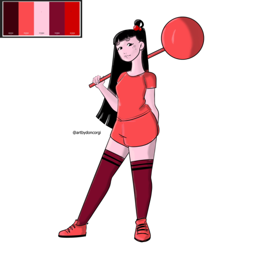
3. The Best Way To Practice: Hi, and welcome back. So we just went over several places and ways to choose some colors. Now, we got to choose where to add them. If coloring is a thing you really want to focus right now, coloring books are a great way to improve and practice your coloring skills. Now for that purpose, Here's a mini coloring book from me that you can download their street different drawings, some more simple than others for you to add color to. Now, you can choose one and coloring it throughout the class, or just color all of them. It's totally up to you. You can also use the coloring book that you own, scan it to your device, or even use your own drawings. The important thing here is for you to have fun. So for me, I think I'm going to use the scanning girl since I've already used her as an example a lot. So now with this part out of the way, let's go and choose our colors. So I will see you in the next video.
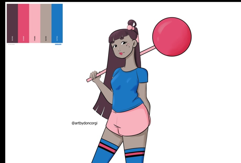
4. Choose Your Colors: All right, welcome back. Now that we chose what to color, it's time to choose a pallets. We went over a lot of resources to help us choose some nice colors. So you can use one of those and pick your colors through it. I'm going to use schoolers since I really enjoy using some random palettes. So just to explore all your options and once you find a good combination of colors, get them ready to use. You can either take a print screen or just save the image to your device. So now that we have everything we need, it's time to start coloring. So follow me to the next video.
5. Adding Base Colors: All right, So here we are, and it's time to add the base colors to our drawing. So the first thing we're going to do is open a drawing as well as our color. So I'm going to go over here. I'm using clips to do here, but it's always the same process in almost any software lead to go File Open. And I have here two files. So I have a PNG file and the JPEG file writes going to be opening all of them. But I do recommend using a PNG file when coloring any kind of line notes. So just select the file you want to open and then click open. So here we go. So as you can see, we have here the PNG and the thing about PNGs that you can have a transparent background. And that's what's happening right here. So as you can see, only the lines are here. I don't have any kind of background, so this makes it easier because now I can just create a new layer below it and add any background that I want. It will also make it easier to start adding colors. So I'm just going to grab here my colors. I'm going to copy them and paste them. There they are. So what we're going to do is we have here, the first layer is our line art. I'm going to create a layer below the line art. And then when my print book buckets, I can start adding colors just like this. Right? Very simple. However, if you have a JPEG, one thing you'll notice is that you do have the line not together with the background, with a solid background rights we have here, the white as the background. And it's a bit different if you want to add color, for example, if I do add a color and the knitted and I go here, grab my brush and start coloring. You don't see anything, right? Because it's below this layer. Same thing. If I go above and I start coloring here, it won't go, it will go above the line so you stop seeing the lines, right? So one thing we can do is create a layer above your image. Set that goal over here and set that layer to multiply. And now, if I color, as you can see, we still see our lines. So this is a way you can do it. But if you're using the colon pages I gave you, you will have both a JPEG and PNG, and I do recommend using the PNG. So with this out of the way, how to color or how to add color in most software. So I'm going to show you here three different softwares. But remember, even if I'm not mentioning one of them here that you might use, it's going to be very similar. So one thing you can do is like I talked about, you can pick up your paint bucket here if you're on clips to you, remember to select this option here referred to other layers. So what happens is even if I'm using a completely empty layer, the paint bucket will have my lines into account. So when I have my paint bucket selected here and I start adding color, it won't go out the lines as you can see, I can add color to whatever I want and it won't go out of the lines. You can also use your own brush, a brush that you like, and start adding colors as you want. So something like this. It is a bit slower, but it works as well. For example, for me, I do use a mix of both, so I use the paint bucket to fill in the bigger spaces. And then when I'm done, I'll go in and feel the places that the paint bucket missed. Right? So very simple. Let's say you're using Photoshop for example. I have here, I have my character opens here as well. As you can see, I have the line out, a solid background, and then I have here a layer with my colors. So again, we're going to do the same thing, right? We're going to create a layer below our lines. And now if we want to use the paint bucket, we're going to go here, select the paint bucket tool. And now let's say I'm going to use it right. There we go. As you can see, it will fill the whole document and we don't want that, right. We don't want that to happen. So what you have to do here is something very similar as we do in Eclipse tool use. So we're going to take this two options here, at least is two. So all layers and continuous. And now if I go in with my paint bucket, it will feel in inside the lines. So you need to have both of these selected. For example, if I tick off all layers, same thing happens. The whole file is going to be colored. And same thing here. If I have all layers on and contiguous of it happens the same thing. So you want to have both of them active, and then you can start adding some colors. So as you can see here, I added color to the shorts and it added color to a bit of the hair as well. So this happens mostly if you don't have all the lines perfectly closed, the software want realize that those are two completely different shapes and places and new tool paint as long as the lines are enclosed. So this is something if you're using your own drawings, this is something to pay attention to, to be sure that all your lines are close, otherwise these will happen. So another place I'm going to show you, and it's a very simple way to color, is Procreate, but it's very simple to add color to procreate. And it's one of the things that are like the best. It's how quick and easy it is to do. So as you can see, I have here my line art. I'm using a PNG here, so I have a transparent background. And you can see here that it doesn't have any background. My background is from the file itself. So what are we going to do here is add a layer, bring that layer below our line out just like we did in Photoshop and Clip Studio. And now the very important thing to do is go over to our line art layer and select over here reference. Then select the layer below. That's where our colors are going to be. Now I'm going to select here Hannon color, since I kinda forgot to bring my color palettes To Procreate, but that's fine. So I'm going to be, let's say a blue. And now all you have to do is come up to the color here, hold it and drag it to wherever you want. So let's say I want the blue here and ask the color, they're going to drag it over here, and there we go. So since it has my line art as reference, is going to add the colors inside the lines. Really important for you to have this added as reference because so let me go over here and tick off reference. And now greg, my blue over here. So as you can see, it will add color to everything. So don't forget if you see that this is happening. Be sure to come over here and check if you have the reference option active. And you are mostly then again, sometimes you might have some places where it's going to miss. Like you can see here, images, peculiar color, and you can fill it in with your brochure again. It's a bit similar to using the paint bucket and a brush. So back here in Clip Studio, I showed you a very simple way for you to add color. I think this is the quickest way to do it. But of course there are other methods. For example, a lot of people will like to use the lasso tool, then grab the paint bucket and add color to the place that they want. So this is also an option and I do recommend you to explore this. You can also use this Lasso Tool methods in Photoshop or any other software of your choice? Personally, I think that using the Paint Bucket, be sure that you have the refer other layers, option active, and then just grab our paint bucket and start adding some colors like I'm doing right now. So I have my color palette, right? I'm going to be picking colors and just have some fun here starting to distribute the colors through out my drawing. So as you can see, it's missing some spots here and there, but that's fine. I will fix that later on when I decide where I want every color. And one thing that I want you to remember is specially for having quite a lot of colors to choose from. You should be careful to how much do you use each color. For example, you shouldn't use all the colors in the same quantity. You should be one that is going to be the primary color, and then all the others you're going to use less. So for example, as you can see, I have this pinkish tone right now is taking most of my drawing. And I'm only going to use this darker red for the head. I'm not going to use it anywhere else. And even if you have the five colors here, I might even not want to use all of them. So I'm just going to go over and test things out, see what I like, what I don't like. This is all a process and you don't need to stick with the first combination you do, you can do something else if you prefer. So I'm going to try and use all the colors I have. So as you can see, I'm using here all the colors in my palette, but you'll notice that I'm using some colors more than others. I'm trying to balance things here so as to not have too many colors are appearing and kinda hurting the viewer when looking at it. So I think this is kind of balanced here. Remember, if you think that five colors is a bit too overwhelming for you, try to limit your color palette even more. Use some color scheme that usually doesn't go much farther than three or four colors. I do recommend using maybe two or three colors at the beginning because it makes your life a little bit easier. It's easier to balance the colors and to not get confused and overwhelmed by them. Right now, this is, it's just adding some base colors. And next we're going to start adding some shadows and see how that works. So I will see you in the next video.
6. Painting Shadows: So welcome back. Here we have all the base colors in my character, in my drawing. As you can see, I use the paint bucket and then they went with the approach to feel everything that the paint bucket missed. And now what we're going to do is add some shadows. Now, of course, you might want to leave your drawing just as it is with only by scholars. That's totally okay and it's all a matter of taste and preference. But if you want to add some more detail and depth to your drawings, adding some shadows will help that immensely. So first things first, we're going to prepare our documents to add our shadows. I have here my line art right? And below, we have delayed with the best scholars. So the first thing you might want to do is name your layers. So I'm going to create here a layer between my line art and my best scholars. So as you can see, I named this one by scholars. I'm going to change this one to y naught. And now my new one is going to be called shadows. Now this isn't super important to do, but it's good to have your document organized because let's say you have an illustration that takes up to 15, 30, 50 layers. I know you can have a lot of layers in your documents and it'll be users to find everything if you have your layers names. So try to get used to the edit tool, really helping you should tend to use a lot of layers. Let's prepare our layer here. So what I like to do, I can go just write n, right? I'm going to just grab me. Just going to grab my brush, pick up the scholar, and choose a darker tone of it so I can just go in and start adding shallows, right? But as you can see, how easily go out of the lines. So there's a way to avoid this. And what we're going to do here is includes two different clips. So you have this icon right here. So we have our layers and we have a bunch of buttons here. So we're going to go to this middle line here to the first icon, which is called Clip 2 layer below. And we're going to activate that. So as you can see when an active weights to have this pink bar on the side of your layers. So you know that this option is activated. So what this is going to do is it's going to be connected the layer below, so to our base colors. And what happens here is if I go in and draw some shadows, it won't go out of bounds. So my shadows layer is going to have into account my base colors. And since my base colors are not going out of the lines, then it won't have that into account. I can paint as much as I want out of the lines, any Tuan show anything. Now, if I deactivate this button here. You will see that I am actually calling outside of it. But once activated again, it won't show. So this is just to make it a little bit easier for you to add your colors without worrying the lines and going out of your lights. Now you can do the exact same thing in Photoshop for example. So let me open it here. So as you can see, I added some colors very loosely. I didn't fix anything because I just wanted to show you how the clipping works in here. It's very similar as in Clips Studio. So again, I have here my base colors and my line art. And I'm going to create a layer between both of those. So here we are. I'm going to name it shadows again. And now if I grabbed my brush and start painting, you'll see that the same happens, right? If I'm not careful, I'm going to go out of my lines and I don't want that to happen. So what we're doing here is we right-click on our shadows layer and select Create, clipping mask. So we have this arrow here in our shadows layer indicated at is connected to our base colors. So now if I go in and I start painting, you'll see that it doesn't go beyond the lines. It is the exact same thing in Clip Studio. Now if you want to know a very quick shortcut to do this, so I'm going to go here and release clipping mask. And now you can do the same thing without having to right-click and go to the specific option. You can very easily press Alt on your keyboard and then move your mouse hover your mouse between your shadows and base columns. And once you see this icon appear, this arrow, you're going to click it. And there we go, clipping mask on again. So this is just a shortcut to make things a bit quicker. But if you're in Photoshop, you'll also have your document ready to start adding our shadows. So going to procreate again. And if you want to add shadows and they'll want to go out of your lines. You have a very similar options like in Photoshop and clips to use. So just adds a layer on top of your base colors. Tap the layer using for the shadows and then choose clipping mask. As you can see, it's exact same name as in Photoshop. It has the same kind of icon over there. And now this layer is referring to the layer below. So now, if I go over here, choose a darker tone for my shadows, I can start adding my shadows and it won't go out of the lines. As you can see, it's very similar to both Photoshop and clips to steward you're so there's not many difference here. The way you're going to add shadows here is mostly the same as if you're using any other drawing software. So most drawing softwares that are really aimed for drawing and painting, we'll probably have this option. But if you don't have the Clipping Mask option, it's totally fine. You'll just have to be careful to not go out of your lines. And if you go just grab your eraser and erase everything that goes out of your lines. You'll just take a bit more time, but it's totally fine. And this is something that you don't really need it. So now that this is out of the way, we have our documents prepared to add your SSH or shadows. Now it's time to add them. So the first thing we're going to think about this. What colors are we going to use? And a common mistake that beginner artists do, and I used to do the same, is to use grace. A lot of times we look at the picture and we see the shadows that are cast on the person or the object. And it seems like it's great, right? So this is something that we might do when adding shallow is pick up a gray color and start adding some shadows, sometimes adding some opacity. And there we have our shadows. But I do recommend for you to avoid this unless you're doing something in black and white or in tons of gray. I also for you to avoid using grays and blacks as shadows. Instead of that. Look at the colors you already have as your base colors. Pick them and now choose a darker tone. You can go as dark as you want. It all depends on how much contrast you want in your drawing. But as you can see, it looks much better if I pick a darker tone of the original color that I used, then just going with some gray and adding some opacity. So if you look at this one or this one, what do you prefer? Personally? I think that this looks much better. It's a bit more balanced and I'm not adding a whole new color to the drawing. This is something to take into account. So with that out of the way, there are lots of ways that you can add shadows to your character. And I'm going to show you two ways, two different ways to do this. So the first one is, like I said before, I can go over here and I will pick the color that I want for the shadows. So I've picked my original color and I'm going to go over my color wheel and I'm going to choose something that I like. And then I can start adding my shadows, right? This is a way that you can do this. Now with this method where you choose your own shadows, you have a bit more freedom Over the colors that you're using. You can use something softer or you can go with something really, really strong to show a lot of contrast. You have a lot of freedom here and control over how hard are your shallows. Now the second method, and I feel that this can be easier, especially at the beginning. And it's the kind of method that I use most of the times. So I have my shadows, I have the clipping mask on it. And I'm going over here to my blending modes. And instead of normal, I'm going to pick, Multiply. Now, here on opacity, I'm going to go and choose about 50% of opacity. There we go. When you do this, all you have to do is pick one of your base colors and you can start painting right away. So it will automatically give me a darker tone on the original column. So now when I go to my opacity here, I can go for higher values, are lower values depending on how strong I want my shadows to be. So this can be a simpler method and an easier method so you don't have to think more about colors. You're just picking the colors that you already have and you add them to where you want. Now, again. This is something you have in most softwares, these blending modes, all drying softwares that are aimed for drawing will have this. So you can do this in Photoshop, you can do this in procreate, and probably in any other software, just look for your blending options and select Multiply. Now, after choosing a method, we can start adding our shadows, right? We can start painting them. But where are we going to paint them? So this is a time where you'll have to decide on the light source. So look at your drawing and think where do you want the light to come from? So let's say you want to light to come from this side. Now that means that the shadows are going to be casted on this side, right? If my light is coming from the left, all shadows are going to be casted on the opposite side of our light source. Now this is the general rule. It's always good to think about the light source before starting adding shadows. Just so don't get confused as you go. So let's see our light source coming from another place. So if it's comes from here, then that means every shadow is going to be guests, mostly on the bottom part of our character, right? So for example, here we're going to have some shadows on the shin. We're going to have specially have some shadows underneath the shin. Guessing here on the neck, Same thing here below our shirt. You're going to, it's going to guess some shallows into our shorts. Same thing on our legs. The shorts are going to pass some shadows into our legs. So just go with it. Think about things in 3D, because even though you're drawing in 2D, the body still has some three-dimensionality, right? It's going to have some perspective there. And that is shown through your shallows final lamp or a flashlight on your phone. And take photos of yourself, for example, or find folders with many light sources and see how the light will behave and how the shadows will behave depending on where the light source is. Another thing to have into account is how strong or how close is the light to your character. If the lightest farther away, you'll have softer shadows like we have just right here. However, if the light is very close and it's very strong, you'll have some harder shadows and you'll see them more. This is where you can decide better on how soft or how strong you want your shadows to be, is all about experimenting and see what looks best or how you prefer to go about it. I'm going to just to fast forward this a little bit, adding my own shadows because you don't need to see me during 15 or half an hour adding some shadows. You already know how to do this, prepare your documents, see what method you prefer experimental lot and have fun adding our shadows. When you're done. Follow me to the next video. We're going to start adding some highlights.
7. Details And Highlights: Hello and welcome back. So far, we've added base colors and then shadows to our character. And again, we can leave it just as it is from having just by scholars to shadows. As you can see, it added quite a lot of depth and our character pops up a bit more just with Edward, very, very simple shadows here. As you can see, I've used the multiply methods to add my shadows. And I'm very happy with the results. But we can add something more, rights, and it's time to add some highlights. For that, we're going to again add another layer on top of our shadows. And we can call it. This part doesn't really need anything too special like we did with the shadows or even with our base colors. So you can do it how ever you prefer it in any kind of software. We're just going to have a new layer and draw on that layer. So to add the highlights, we're going to go and check our light source. Again. I chose my light source to come from the left. My shadows are going to be on the right with highlights wherever it's going to be on the same side as the light source. So the light is going to be shining in, reflected in our character, right, where it comes from. So that means that when I come here, all my lights, let me just pick here another color are going to be on the right side, on the opposite side of my shadows, right? So after checking our light source and knowing where our highlights are going to be, we want to know what color are we going to use for this, right? So again, I will recommend just like with shadows, I recommend avoiding the grace and the plagues unless you are using those colors in your drawing. Same thing here. I will recommend avoiding the white to add your highlights. It's not a terrible color to use, but in general, it looks much more balanced. If again, you pick the color you already have and choose a lighter tone. Just like this. Now again, you can go as lighter or darker as you want depending on how strong you want your highlights to be. So when that's done, when you've decided on the colors you want to use for highlights, you want to decide where are we going to add your highlights. So in general, you're going to add highlights preferably on things that tend to shine the light. So for example, if you want the lips of your character to be fairly close, See, you want to add some highlights. So let's go over here. Bic, lighter tone and add some highlights. Now, of course, you can exaggerate as much as you want. I like to go very mild with it's very soft. But you already can see some difference from having some highlights and not having anything at all. It's already pops up the lips a bit more, right? I will also go in and add highlights to things that have shining materials. So for example, if you have metals in your drawing, if you have some plastics, any other kind of material that reflects light to lots, I would go in and add highlights to it. So for example here, the hair accessories are plastic and I want to add some highlights. I'm going to pick this color again and add to my lollipop here. The lollipops usually have that plastic wrapper around. So I'm going to add something here. So it's very cartoony as you can see and you can go as simple or as detailed as you want with your highlights. So see, what do you want the light to reflect on? For example, clothing is something that I kind of avoid, but this is a bit of a preference. I don't add highlights, the clothing and less. Some material that reflects light a lot. You can also go in and add some highlights to the skin just to make your character pop up a bit more. You can add as much or as less highlights as you want. It all depends on the style you're going for. A watch you like. So as always, I do recommend for you to experiment as much as you can. Have fun. Remember that the whole idea of drawing is to have fun with it. So to have some fun, enjoy the whole process, and try out different things and see what you like the best. So this is it for this video. Follow me to the next one. We're going to talk about your assignments.
8. Assignment - Your Turn!: Hello and welcome back. Now that we went over every step of coloring, It's time for your assignments, like we talked about before, use one of the coloring pages that I've provided you or use one of your own. Go through all the steps that we talked about, relative videos. And when you're done, feel free to share your colored work. I'll be looking forward to see it. Remember to have fun, and I will see you on the next video.
9. Conclusion: Welcome back and congratulations. You've learned about calling your lineup one step at a time. All the way from Bates scholars to shadows and even highlights, as well as having a bunch of new resources where you can get different palettes or different color schemes. So be sure to practice this process as many times as you can until it get the hang of it. And if you enjoyed the class, it will make my day. If you could give it a review. I really appreciated. And as always, keep on drawing.
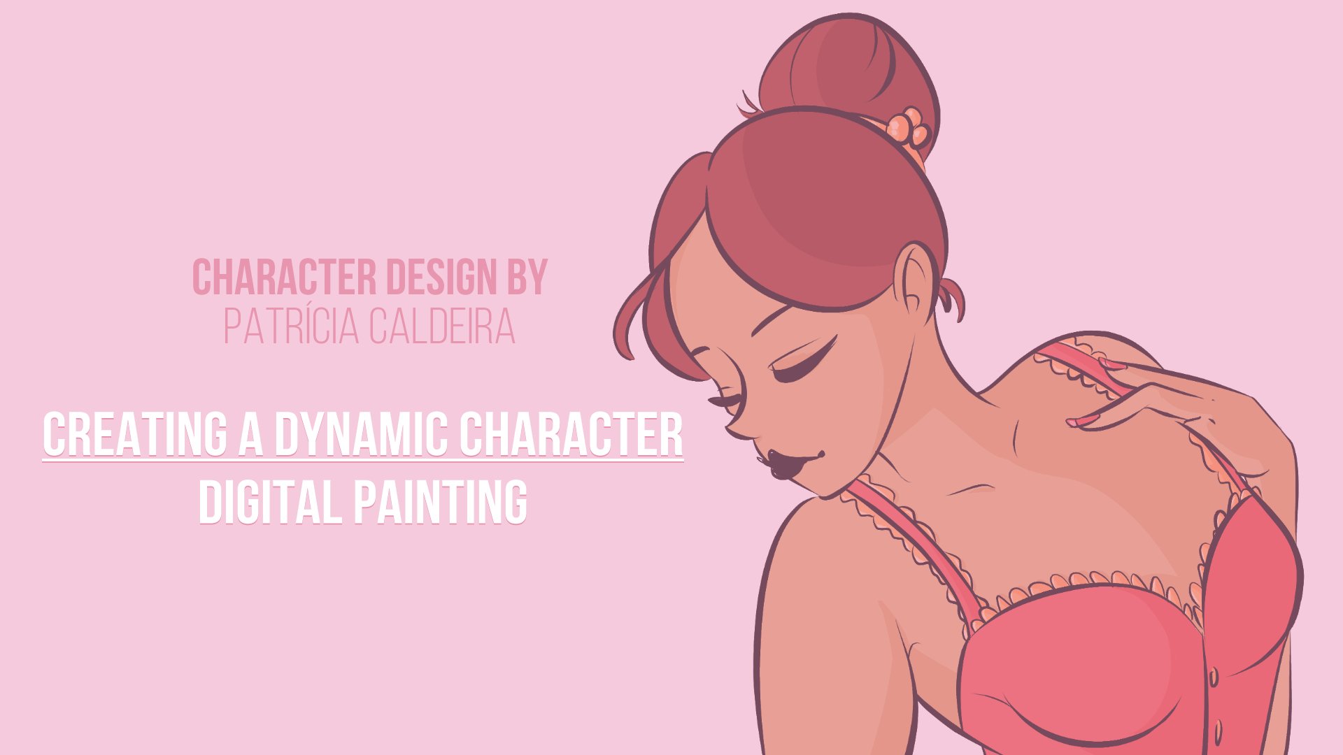
 Patricia Caldeira, Illustrator | Digital Artist | Designer