Transcripts
1. Welcome: Hey there and welcome. My name is Adi Purdila. I am a web designer and developer
and this class is about designing a one-page
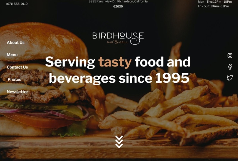
restaurant website in Figma. This is what we'll be creating. It's a simple website for a fictional restaurant called
Birdhouse Bar and Grill. Among other things, it features a nice food menu section,
a menu navigation, Instagram photo gallery, a
contact form with a map, and also a newsletter
sign-up area. Now, by taking this class, you'll learn two things, UI/UX design and Figma. In terms of UX design, you'll learn how to
read a project brief and based on it,
create wireframes. But we'll also discuss
information architecture or how we structure the
content in the webpage. Then it's onto the user
interface or UI design. Here, you will
learn how to define the typography so it
matches the type of website you're
designing and how to pick appropriate colors and apply them to various elements. You'll learn how to use the eight point system
for spacing and sizing. So you'll never have to
guess what values to use for margin padding,
width, or height. You'll also learn how to
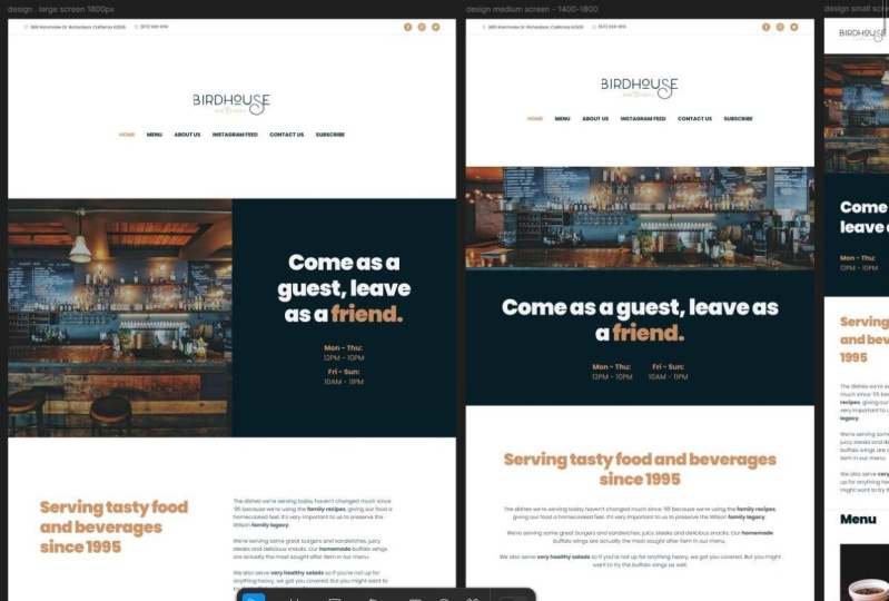
create responsive designs. We'll initially design
for large screens and then create versions
for medium and small. While this is happening, you're also learning how to
use Figma for website design. Of course, you'll learn the basics like
working with frames, text, colors, shapes, pages,
and keyboard shortcuts. But also you'll get a taste of the more advanced features. You'll learn how to
use auto layout for alignment and moving
elements around very easily. You'll also learn about the various resizing
modes in Figma like Hug contents or Fill container and when you should
use each one. There is also a class
project available so you can follow along and
apply the theory. All in all, I think
this class is perfect for beginners
because I'll go through every single step of the
process from wireframing to designing responsive
versions of the website. So I look forward to
seeing you in class. In the first lesson,
we'll talk about the class project. Coming up.
2. The Class Project: I think that you can't
properly learn something simply by reading the theory
you need to practice. That's why this class has
a project you can make. You can also call it
homework or assignment. Those assignments and
those something like this, using the provided
project brief, design a one-page website for a restaurant called
Birdhouse Bar and Grill. You can use whatever
software you want, but I'll be working in Figma and I recommend you do the same. Now in this class, I'll be doing the
exact same assignment. I'll be using the
same project brief. I'll discuss it with you. I'll create some
wireframes and then I'll design the one-page website. Then it's up to you
to do the same. You can follow my steps exactly, or you can draw some
inspiration from what I'm doing and create your own
version of the project. The choice is really yours. To get started with
this class project, there are actually a few
steps you need to take. Step 1 is to download
the class resources. Now, in the class description, you'll find the links to
download these files. In here, we have the fictional logo in SVG format for Birdhouse
Bar and Grill. We have a project
brief that basically details everything
we need to know about the website design
that we're going to do. Then we have a PDF for all the resources that I'll
be using in this class. Here you'll find links to
the finished Figma file. You will find a link or links to all the stock photos that
I've used in the design. Finally, some links
for the icons. I'll be using the Bootstrap
Icons and also the Typefaces. Then as a bonus, there are also some useful
links added here, links to Figma and some other
tools that we'll be using. First thing you do
before starting this class is to
download the resources. Step 2 is creating a Figma account and if
you have one already, then feel free to skip
to step number 3. But if you don't, you need an account
to work in Figma. Because at its core
Figma is browser-based, so any file that you create needs to be
linked to an account. Creating one is really simple. You go to figma.com and you
can click either this button or this button to take you to
the screen creation window. Here you can sign up with
an email or password or with your Google
account if you have one. It's a really simple process. It's also totally free to
create a Figma account. Go ahead and do that right now. Now, I said that creating
a Figma account is free, and using Figma is also
free but up to a point, you see there are some
advanced features that you only get on the Figma professional and Figma
organization plans, things like unlimited files, unlimited version
history, team libraries. These will not be available on this starter plan,
which is free. However, as a beginner, if you're just getting started, the free plan is
more than enough, so this is the one I
recommend you get. Step 3, which is optional is to duplicate my finished
design file. Let me explain why
this is optional. For this class, I recommend you start with a blank canvas and work alongside me by
watching the class videos. Anything that I do, you will do as well on your end. I think this is a
great way to learn. However, if you would
like to work separately, maybe create your own version of the project and use my
design as a reference, then you might want to
duplicate my finished design. Here's how you can do that. You will start by opening
the resources PDF file. On the second page, you will find the link that
says Website Design by Adi. You will click that and that's going to open
it in your browser. You need to make sure
that you are logged in. Now, by default, you will see that this version of the
website is read-only. You can click on
elements so you can select them, find distances, and also explore
various properties here for the selected element. But one thing you
cannot do is edit this document because it's the master file that
I shared with you. That's why for you, it's read-only, only I
I'm able to edit that. Now, you might be
tempted to click this button that says ask to edit and that's just
going to send me a notification
about your request. It's just going to
tell me that you're asking for editing
permissions on this document and I cannot give
those to you because this document needs to be
accessible to everyone. Instead, what do you
need to do in order to edit this
document is to click this drop-down link here
and select duplicate to your drafts and now Figma tells us that the file has been
duplicated to your drafts. If we go back under
drafts in your account, you should have the file. Now you can close
this and you can open the file in your drafts. Notice it says copyright here. But the only difference
is this file is now editable so you
can select the text, you can delete, you can
rearrange elements, you can do whatever you want. In the end, this is your own
copy of the document and not the original file that is linked here
in the resources PDF. I repeat, make sure to duplicate the file if you want to
have editing access to it. Now, I get it. Not everyone is comfortable showing their work
to other people. However, for this class, I highly encourage
you to show us your finished design by uploading it to the
project gallery. Two reasons for that. Number 1, you will get feedback from me or
from other students, of course if you want that. That can prove to
be very helpful. Number 2, you will encourage others to post their projects and that's always a good thing. Please take my recommendation
and do show us your finished
design by uploading it to the project gallery. Finally, please remember
that I'm here to help you, no matter what questions
you might have about this class or about
web design in general, post them in the
discussion area. I answer each and everyone and I guarantee that whatever
problem you might have, we'll get to the bottom of it. With that said, I look forward to seeing you in the next lesson where we'll have a quick
look at the project brief, understand what it is that
the client is asking us, and also we'll discuss some wireframing
basics. See you there.
3. Figma 2025 Update: What’s Changed: Hey, everyone, this is
Adi from the future. This bonus video is here to
help you navigate some of the changes Figma has gone through since I first
recorded this class. A few years ago, Figma looked a little different,
and since then, it's received several updates to both its functionality and more noticeably
to its interface. So if your screen
doesn't look quite like mine in these
lessons, don't worry. Let's quickly look at what's changed so you can follow
along without any confusion. And just to be clear, this class is still
completely relevant today. The core concepts
haven't changed, only the way Figma presents
some of its tools. We'll start with the
most noticeable change, and that's the new UI
or the UI redesign. This is called UI three at
the time of this recording. And one of the things you might notice right away is that
the tool bar has now moved from the top where it used to be to the bottom right here. So essentially, we have the same tools that
we did before, except maybe for the section. I think this was added
in the recent years. We still have the main line, polygon, rectangle tools
that we're used to. We have the Pen tool, text tool. We have a couple
of new tools here, like the annotation
and measurement. These were added recently. We have some AI tools that are available via this
action menu right here. And recently FGMA also introduced Figma draw
and also Dev mode, which is aimed at developers, but those aren't really
important for this video. Another change is the fact
that we can now collapse these two sidebars by clicking right here on this
minimize UI button. This will essentially give you more space to
play around with. And you can click
that button again to show the left and
the right side bar. We now also have an option to collapse layers by
clicking this button here. So if you have layers opened, that's a very quick way
of collapsing everything. And most of the changes actually happened in the right side
bar in the inspector. So let me quickly go over
a few of those with you. And you'll see that
the right side bar now looks a little bit different
than in my videos. The alignment controls are positioned a little
bit differently now we have some options here that are related
to variables, which is another
feature that was introduced in recent years. The Boolean operations were moved in this menu right here, and I think probably
the biggest change was made to auto layout. So the auto layout panel
now looks like this. It was much simpler
in previous years, but now it's layout has changed. It has a few extra
features, like, for example, this grid mode
that was introduced recently. We now have the ability to
set the width and the height of a specific element to
either fixed or hug contents, which will basically resize that element to fit
its child elements. Fill container will
basically expand that to fill the entire
available space. We also have an option to add minimum and maximum
width or heights, and also variables are
now included here. Mostly, some of these
elements are moved around like this
alignment selector here, the space or the gap between items is now
positioned here. And for every numeric
value that you see here, you also have the option
to apply variables now. Speaking of variables, I
don't think I've used those in any of my previous classes because these are
relatively new, but those can be
accessed if you click outside or click
anywhere on your Canvas and just going to the
variables section here. And variables are
basically a way to store reusable values like
numbers, colors, even text. And out of all of these, I think the main
change you need to pay closer attention to is the
change to the auto layout, because I think that's
the most out of date. Now, it's much more
powerful than, say, the auto layout
from 2020 or 2022, but it works exactly
the same way, so you don't need to
worry about that. So don't worry if your screen
looks different than mine. The tools are still
there, and you'll be able to complete the
class project regardless. Now, let's get
back to the class.
4. Wireframing Basics: Before we even think
about typography, colors or layout, we need
to do a bit of prep work. This consists of two things, understanding the project brief and creating a wire frame. We don't just open Figma
and start designing, that's a mistake that
a lot of people make. The design should be
based on the content, not the other way round. We don't just create the design and then
make the content fit, instead, we create the content and then we design around that. That's a much better approach. To create the content, let's have a look at
the project brief and understand what the client is asking
of us as designers. Then in the project brief, let's start with
the first section, and that talks to us
about the restaurants, Birdhouse Bar and Grill. We have a general
description here, it basically tells us that
it's a family owned business, opened in '95, and currently it's being run by the original owners son
called Robert Wilson. Birdhouse Bar and Grill is a small establishment where
you can get a cold beer, you can get some delicious food, and they also deliver. There are a few key points
we need to remember. We have the
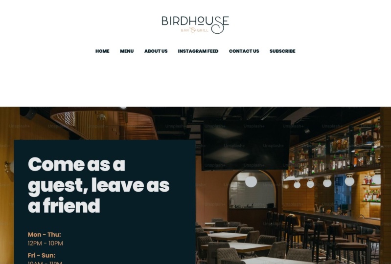
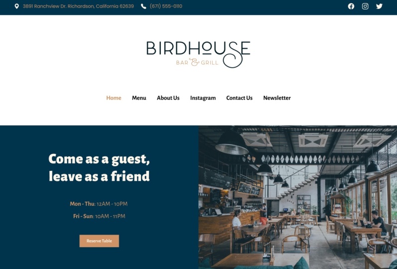
restaurant name here, the location and phone number, the motto which is
come as a guest, tell you as a friend. The description of services, serving tasty food and
beverages since '95, and also the business hours. Moving on, we can find
the page structure. Remember this is a
one-page website, so we need to fit all of the
content in a single page. In no particular order, the structure goes like this. We need a food menu, a section with information
about the restaurant, some photos from Instagram, a contact form, a
newsletter form, and also the client wants us to display the motto
somewhere in the page. Then the project brief also describes each section
in more detail. Then we get to the
menu description. This is actually the
food menu description. This is something that we can actually put in the website, probably somewhere before
the actual food menu items because it's pretty
well-written. Then we have the menu contents. The menu basically
has five categories. We have stakes,
and for each one, we have the dish name, the price and also its contents. Then we have burgers
and sandwiches, quickies, and then salads. This is all the content that we need to place in the
food menu section. It's not a lot, but it's definitely
going to require some creative use of space if we want to fit this whole
thing in one page. Then finally, after
the food menu, we have some design
guidelines which we don't really care
about at this point because we are not at the
UI design stage just yet. We're going to save
this for later. But, yeah, that's the project brief that
we get to work with. The nice thing about
this is that it contains all the content that we need
to place on the website, all the copy is there, the descriptions, the
location, phone number, model, everything is laid
out nicely in here, so all we have to
do when creating the wireframes is
just copy and paste. Now that we know what
the project is about, we can go ahead and create a content based on
the information we received and we'll create
this content as a wireframe. A wireframe is a low
fidelity representation of the final product, and its purpose is to display the final content
of the project. Think of it like a sketch, something you would draw
on a piece of paper. In a wireframe, you're not worried
about layout, colors, typography, spacing or
anything like that; it's just a brute sketch. However, what you do need to worry about is the content, because that needs to be in
its roughly the final form. You can make small tweaks
to the content later on, but I would say 95 percent, it needs to be in the
final form because you're designing around that content. You can think of a wireframe like a skeleton or a foundation. Once you have that, you can start building on it, you can start adding the
outer layers, color, typography, spacing, sizing,
all of that good stuff. It's really simple to
create wireframes. As I said, they're
just brute sketches, so the cheapest option
is pen and paper. However, if you prefer
to work digitally, then there are dedicated
apps for that. One of the most popular tools
is Balsamiq Wireframes. This is super simple to use, because it has a library of pre-made components you
can just drag and drop. However, it is a paid app, so if you're not creating
wireframes regularly, it might not be
worth it for you. There are, of course, other wireframing
apps you can use, but personally and
this is what I recommend to you as
well, I use Figma. Two reasons for that. Number 1, it's easy. Figma is my tool of
choice for UI design, so I'm very familiar with it. That means I work
very fast in it, and creating something as simple as a wireframe is just a breeze. Number 2, it's convenient. This is the most
important for me, because after I
create the wireframe, I make a copy of it and base my final design on that copy. That means I don't
have to recreate all those elements if I were
using a different software. Because I'm working in the same software in
Figma, it's all there. All the elements that I
created in the wireframe, I just duplicate them and I
start editing those directly. This is a tremendous time-saver, and you'll see just how easy it is later on in this class. You can create the
wireframes however you want, but I recommend you
do that in Figma. Now, let's do a quick recap. Always start a project by understanding
the project brief. Wireframes are low
fidelity representations of the final product. A wireframe should contain roughly the final
version of the content. For your convenience,
create a wireframes in the same software
you'll be using to create the final design. We have the project brief, we know what a wireframe
is and how to create one, let's get to work. In the next lesson,
we'll start wireframing the header and hero sections.
5. Wireframing: The Header & Hero Section: Quick note before we begin, wireframing is a
pretty simple process, and it usually goes pretty fast. However, in this class, I will cover wireframing in five lessons because I want to explain the process in as
much detail as possible, and I don't want to make
just one super long lesson. That's why in each of
these five videos, we'll only cover one or
two sections at a time. With that said, let's start with the header and hero sections. Let's begin by
logging into Figma, and creating a new design file. I'm going to place my file
inside the Drafts folder, and this is what I
recommend to you as well, because when you're creating
files inside your Drafts, you can have as many pages, and as many files as you want, you're not restricted
to a certain number. If you were to
create teams here, and organize your
files like that, you will need to purchase one of the other plans in Figma. But, if you want to create
as many files as you want, go ahead and create
them in Drafts. Let's click "New Design File", and we're going to call this, Birdhouse Restaurant Website, and let's rename the
first page to Wireframes. Here, grab the Frame Tool or
press "F" on the keyboard, you can also access it from
here and draw a frame, and make that frame
1,800 pixels in width. Let's zoom out a little bit, you can zoom in or out by clicking this button
and selecting an option, or you can hold down
Command or Alt, and using your mouse
scroll wheel, up and down, to zoom in and zoom out, so let's call this
frame Wireframe. Let's also set a height to, let's say 3,000 pixels, for now, to make it taller. Then, let's open
our project brief, and let's scroll down
to the page structure, and think about what we
should put inside the header. Now typically, a
website header contains some brand identification,
like logo. It also contains the
navigation menu, and it can also contain
maybe contact information, or social media icons. In our case, we'll use, logo, navigation menu, and
social media icons. Let's start with the logo, we can grab it from
the Class Resources, simply click and drag, and where it says
Selection Colors, let's make everything black because remember, in wireframe, we're not interested in
any color whatsoever, so we'll just use
black, white, and gray. Now to make it easier for us to align different
elements in the page, we're going to use
something called guides. For that we need to first
display the rulers, it's these two on the top
and on the left of the page. You can do that by going "Shift R" to toggle their visibility, or you can go into the "Menu", under "View", "Rulers". With the rulers visible, we can simply click
and drag like this, to create a guide. Normally Figma
displays the position of the guide right here, but for some reason, sometimes it bugs out, and it doesn't display it, and if you want to
position the ruler at a certain distance
from the edges, one quick way would be to just make this the desired size, let's say 120, and then click and
drag the ruler until it snaps in
place, just like this. Now this ruler is positioned at 120 pixels from the edge, we can do the same here, drag another ruler like so, and we're good to go, we can
now delete this rectangle. Now, let's take our logo, align it with the ruler, and we can move on. Let's see about the
navigation menu. According to the project brief, this is the page structure, and we're going to create navigation menu
items based on this. Let's start with
the link for Home, let's use Helvetica as a font, you can of course use
whatever font you want, but for a Wireframe, I recommend something neutral, like Helvetica or Roboto. Let's make this 20 pixels, and then, Command
D to duplicate, and then click while
holding down "Shift", to maintain the same
horizontal position, this one will be Menu. Same thing, "Command D, "Shift", click and drag, let's make this, About us, and what
else do we have? Instagram contact
and newsletter. We can also hold down
"Shift", and "Option", to duplicate an item
just like this, so we're going to say
here, Instagram Feed. Do that again, Contact Us, and again for the
newsletter form, let's call this
section Subscribe. Now we can take these, "Command G" to group them up. You can also go to "Object", "Group Selection", so
it's Command G on a Mac, Control G on a PC. Then let's see about
the social media icons, and we're going to use
three classic icons, and we're going to display
icons for Instagram, Facebook, and Twitter. For the icons, I'll open up the Iconset app, this is one of my favorite apps, it works on both
macOS and Windows, and it's free, and it's an app that you
can use to organize icons, and I have a bunch of different
icon sets added here, and it's really simple. All I got to do is click and drag into
my design software, and that just grabs the icon. But let's go ahead and
search for Facebook, Instagram, and I'm using the icons from the
"Bootstrap Icon" set, drag that there,
and also Twitter. Let's do that. Now let's
minimize that bit, let's make these icons
a little bit bigger. In Figma, you can click this icon that says
Constrain Proportions, and that will make sure that whatever value you
enter for the width, and height will be replicated
on the other measurements, so let's make these 32. If I were to change the size
without this button clicked, all it will only change
the width or the height. Let's do 32 by 32 and
also here, again, 32. Now, let's group these up. Again I'm not worried about the distance
between these two, I'm doing my best to
create equal distance, but as far as the actual number, that's going to be taken care of when we get to the
actual design stage, so again, "Command G"
to group these up, and I'm going to
align this like so. I can even take all of these, and use the alignment
tools in Figma, where it says Align
Vertical Centers, click this, and then with
all of these three selected, "Command G" again, and this will be our header. Next, let's see
about the hero area. Now typically, a hero area contains the main
headline for a product. It also contains
a call to action, and usually some media, a video, an image,
maybe an illustration. But since our website is
a little bit different, it's a website for a restaurant, we're not actually
selling one product, so in the hero area, because it's one of the
first thing a visitor sees, we're going to place a
few different elements. We're going to place the
motto of the restaurant, we're going to place
the business hours, and then maybe some
contact information, and an image of sorts, maybe an image from
inside the restaurant, that could work pretty well. Let's start with the image, I'm going to grab
the "Rectangle Tool" or R on the keyboard, and I'm just going to draw
a rectangle like this, and this will act as a placeholder image
in our Wireframe. Next, let's see about the motto, we can go back to
the project brief, under key points, we can find the model, so let's copy this from here, T for "Text Tool",
paste that in. Now let's make this
a little bit bigger, let's say 70, and let's make it bold. At any time with a
text field selected, I can grab one of the sides, and resize it like so, and then I can position it. Let's also add the
location, why not? Let's make this
20 pixels, again, regular, and then
duplicate this one, let's add the phone number, and then the business hours. We'll just copy those
from the project brief, "Option Shift" to
duplicate this, double-click to enter edit mode, and then copy and paste. Let's fix this a
little bit here, and let's also add a descriptive text that
says Business Hours, and let's make this bold. Now we can take this, group it, and we can take both of these, and align them like so. As you can see, we're
going very fast here, we don't care about
what fonts we're using, we don't care about colors, spacing, sizing, none of that. Our goal right now is just to place the content
in the Wireframe. Will this be the final form? Most likely, no. We can even move certain elements to other
sections, for example, if we don't like the fact
that the address and phone number is in the hero area we can
move it somewhere else, maybe in the header somehow, or maybe we can even create
a top bar right here, in the final design. But for the wireframe, we can position it in
the header, no problem. If you were following along, then it's your turn to wireframe the header
and hero section. Once you do that, we're
ready to move on to the food menu, that's coming up.
6. Wireframing: The Food Menu: The next section on our
list is the food menu. Let's have a look at
the project brief and see what kind of content
we need to create for it. Let's go to the page
structure section of the project brief, where we see a bit
more details about the various page sections
we need to create. Under the menu, the food menu, we can see that the client
would like us to display the restaurant menu in a very simple and easy
way to navigate and read, and if possible, also show
the menu description. We do have the menu description. If we scroll down here, it's this one, so we can just go ahead and copy it right now. Then we'll also keep
this handy because we're going to reference the menu contents as
we're moving forward. Then let's go back to Figma and let's actually do
just a little bit of clean-up here I'm going to
select all of these elements, Command G to group them up, so that is our hero area
that we created previously, now, let's take care
of the menu section. For that, I can actually
duplicate this section. Command D on a mac
to duplicate it, because I want to start with
the food menu description. Maybe I'm going to
use some sort here. We'll see when we get
to the design part, but I'm going to keep
roughly the same structure. Here I'm actually going to place the menu description that we just got from
the project brief. Let me just resize this,
something like that. For a title, we can actually go back to the project brief, and I remember we
had some description for the food they were serving or some
description of services, and it's this one right
here that says serving, tasting food and
beverages since 1995. Let's use that as a
title for this section. Let's make this actually
a little bit smaller, let's go with 48 pixels,
something like that. Let's move this up. Let's group everything and that's going to be the
food menu description. Now, let's see about
the actual food menu. If you remember from
the project brief, the client would like
to display the menu in a very simple and easy
way to navigate and read. Then by looking at
the actual menu, we can see that it's split
up in a few categories. We have stakes, we
have burgers and sandwiches, quickies and salads. Basically five, if you count burgers and sandwiches as
separate categories. But in the menu here, they're bundled as one category. One way we could do
this like right off the bat is with a
tab controller. Because the tab
control or a tab is a pattern that allows us to display large
amounts of content, like a menu in a relatively
short amount of space. We could use tabs for each
of these four categories and the content of each tab will be the corresponding menu items. Let's go ahead and do that, let me just copy
this piece of text here let's align it like so. We're going to call this menu. Here under the text controls, I'm going to set
it to auto width. Then let's create the tab
links for the menu categories. I'm going to duplicate this. Let's make this 21 pixels. The first category
is what sticks. Let's duplicate that. This next one is
burgers and sandwiches. Let's just copy and paste, duplicate again hold
down shift while dragging to constrain the
movement to one axis. Next one is what? Quickies. Finally, salads. Great. Now let's assume
that we're going to open up the tabs with stakes
being the active one. Let's select these three, and let's switch from
bold to regular. Just to highlight the fact that this is the active tab control,
it doesn't really matter. We can make this one bold
and this one irregular. We don't even know if
we're going to use tabs when we create
the actual design. This is just an idea. Let's actually assume that yes, we have the quickies selected
and we would like to display some items
from quickies. Let's go ahead and do that. Instead, buffalo wings, let's grab the rectangle
tool or R on the keyboard, and let's create an image placeholder,
something like this. It doesn't have to be exact. Then I'm going to
paste in the text here and then the contents. Again, I don't really care
about spacing or sizing, it's just a brute sketch. I think may be the
price should be listed separately. Let's do that. That's a quick wireframe
of one item in the menu, let's go ahead and
group this up. Command D to
duplicate, then shift, drag, something like this, and let's do that again. Let's align it like so and
let's do the other ones. So sweet chili dogs,
let's do that. That was $6 and then french fries
$3, let's copy this. That's one idea of how we can represent this entire
menu in our page. We have tabs that will represent the four categories
of food menu items. Then each tab contains
the appropriate items. In the wireframe would
just display a sample. We don't go through every
single menu content. That's a waste of time. We can do that later when
we get to the design part. If we're using tabs like this, we don't even need to add all of the content because that's going to
be hidden anyway, that's happening on the
development side of things. On the other hand, if
we are not going to use a tab control like this, and instead we choose to display the entire food menu
content then, yes, the final design will include all the content that
is listed here. But we'll cross that
bridge when we get to it. For now, in terms
of wireframing, this is more than enough. Finally, let's go ahead and
select all of these elements. Command G to group everything and now we have a nice
food menu description, then the actual food menu. Now it's time to practice. Go ahead and create the food
menu part in your version of the wireframe so we can
move on with the class. If you've done that already, that's awesome, it means
we're making progress. Now let's cover the about
and Instagram sections.
7. Wireframing: The About and Instagram Sections: If you remember,
the project brief stated that we need
a section with information about
the restaurant and another one with
Instagram photos. Let's go ahead and
create those right now. Let's open our project brief and we're actually
going to scroll back up where we see some details about the two sections that
we need to create. About us, the client says that we would like to show
a small description of what our restaurant
is and perhaps show a picture or two of
inside the restaurant. Here we basically have a title about us or
about the restaurant, text description and maybe
one or two pictures, images. Then photos from Instagram. We need to display
some pictures, Instagram photos, and
then a follow button. Cool. Let's go back to the General description and we're actually going to use a
lot of the texts from here, from the brief for that, let's go ahead and copy this bit we'll just reuse the elements because it's
going to go a lot faster. For this section, we're
basically going to call it about Birdhouse Bar and Grill. Here we're going to have
one or two pictures. It really depends. We
can do it like this. Maybe we'll have two
pictures side-by-side, we'll see and as
for the text here, well, let's copy and paste. That's the text that
we're going to use. That's the About section. I guess we can move this up a little bit. It
doesn't really matter. This is just the
perfectionist in me wasting time to be honest. We can select this group up and we're done with
the About section. Now let's see about
the Instagram. Before we do that, let's
select the parent frame. See how we've reached
almost the bottom part, the bottom edge, so let's resize this so we have a lot more
room to work with. Let's use 5,000 pixels here. Great. Now let's see about
the Instagram photos. right that, let's copy
this element here. By the way, here's a
quick tip when working with elements that are
inside groups or frames. Notice that because
this is a group, when I hover on a certain
element and click, it selects the group, and to select a specific
element from the group, I can double-click and
enter inside the group. You can see that I
went from selecting Group 13 to selecting Group 12. If I double-click again, I go into Group 6
and so on and so forth until I get to the
element that I want. For example, if I don't
have anything selected, to select for example, this image, I can double-click, double-click again,
and then just traverse all the tree structure to get to the element I want. But there's actually a
faster way I can hold down Command on a Mac, I think on a PC it's Control. I hold down Command and I hover on the element that
I want to select and I can just click it right away
and it selects it through all of the tree structure that I have here in
the layers panel. Regardless how
deeply it's nested, I can just hold down Command, click it, and I can
select it like that. It's super simple. Now, for the Instagram section, let's Command-click
this item to select it. Command C to copy it. I'm going to click outside, then paste and let's call
these photos from Instagram. Let's also select
this rectangle. Command C, click outside Command V. Sometimes that just gets
pasted in the same place, but you can move it around, and let's create
the photo section. Again. I'm just
going to eyeball it, something like this
Command D to duplicate. Then we can select
these three and go here in the Inspector where
it says More options. I can distribute
horizontal spacing. That's going to
create an equal space between these two items. Is that the final
amount of space? Definitely not. But for a wireframe, it's going to do just fine. We have one row
with three photos. Let's duplicate this. Drag it down to create
the second row. Then just select all of these Command G
to group them up, so it's easier for us to move them if we need to and in Figma, Command Z works the
same way for undo. If you want to undo a change, you just do Command
or Control Z, just like with any other app. If you remember, the
project brief also said something about a Follow button. Let's go ahead and add that one. Let's grab the text tool. Click. We're going
to say follow us. Let's do 21 pixels bold. Let's also grab an
Instagram icon. Let's select the
parent element here, Command C to copy. I'd select this
Command V to paste it here and let's align
this in the middle, something like this, and then with the rectangle
tool or R on the keyboard, let's draw like a
button background. Notice this is currently on top of our text and Instagram icon. To move it further back in the layer panel we can
click and drag it like so, or we can use Command and left square bracket to
move it down one time, two times, three times. Then we can use
the right bracket to go in the other direction. Command left bracket
to send it backwards, Command right square bracket
to send it forwards. That's an easy way to
manipulate the order of elements or the order
of layers in Figma. With that done, let's select these three Command G and just, let's align it like this. Notice Figma is very helpful
with alignment because it gives us all these guides and Smart Guides that tells us that, "Hey, your element is nicely aligned with the other elements surrounding it,"
which is pretty cool. Now, let's select
these three elements. Command G to group
them up and with that, the Instagram section is done. All right then. As usual, this is practice time, so if you haven't created the About and
Instagram sections, go ahead and do it. Once you do that, it's time to move on to the contact area.
8. Wireframing: The Contact Form: Well, we're almost
done a Wireframing. There are just two more
sections we need to create and the first one
is The Contact Form. To get started, we'll first take a look at the
project brief. Under the contact form, the client asks us to create a form that people
can use to send messages or make reservations
and they also want a map that pinpoints
the location. Let's go ahead and do that. I'm going to scroll up
and I'm going to copy this section because that has a structure that we can use. I'm going to just
paste it in like so. Let's call this contact. Let's make this text a
little bit smaller, like 48. I'm actually going to keep these three elements because
it's a contact section, it makes sense that the address, phone number, and business
hours are present here as well not just in the hero area. We're going to have
this, this, and this. We're going to have a map here. Let's make this a
little bit bigger, maybe to differentiate
it from the rest, we can make it a
little bit darker, and why not add a text
inside that says map. Notice how rough the sketch is, it's just whatever texts, its just unstyled text on
top of gray backgrounds. That's the beauty
of a wireframe, we don't have to pay attention
to details like this. It's just a fast way of
placing the content. We know what we
should design for. Finally, the last
thing here is to create a contact form. For that, lets actually ungroup this and we'll group
it again later. Let's create a rectangle. That's going to be
the forum field, something like this and
then the text inside, let's say name, group that up. We're going to keep
this super simple. We're going to ask
for an email address. We're going to ask
for a phone number, and we're going to ask for the actual message and of course this needs
to be a bit bigger, like so and at the very end, we need a button. We actually created
a button here. Let's grab that, and
let's paste it here. Let's delete the icon and lets choose the text
to send message. I can make the
button larger if we want and that's just an
insignificant detail. Then we can grab all of these
command G to group them up and then we can
take all of this, command G it again
to group it up, so now it's one group
that we can move around freely and with that, the contact form or the
contact area is done. We displayed a title, we displayed a restaurant
address, phone number, business hours, a contact
form as the client requested, and also a map. This is a placeholder for a map, but the final design
will have a map. Then time to practice. As I said, we're almost
done wireframing. Go ahead and create the contact area so
you're up-to-date on your version of the wireframe and then you'll be
ready to move on. Next up and the final area that we need to
wireframe is the footer.
9. Wireframing: The Footer: We've reached the final
wireframing lesson where we'll take care of
the footer. Let's go. When it comes to the footer, we don't have an exact
direction from the client, but usually the footer
contains information that doesn't really belong
anywhere else in the page. One thing that we haven't
added to our page thus far is a newsletter form and the footer is actually
a perfect place for that. So we're going to add
the newsletter form, but also some other typical content that you will find in a footer like
copyright information. We'll also add the
logo once again. This is the type of content that you usually
find in a footer. You can also add
navigation links, if that's what you want. You can add a Back
to Top button. It really depends
on the website. You can make it as complex
or as simple as you want, but in our case we're going
to keep it super simple. Let's start with this
newsletter form. Once again, I'm
going to increase the size of our frame to, let's say, 6,000 pixels, that should give us
enough space here. Let's start by
copying this text, and while we're at it, we might as well just
make it auto width. This one as well. Now let's see, do we
have others? Yes, we do. When you're setting
a fixed width on a piece of text like this, it just means that whenever you add more text than
the boundaries, it just overflows
to the next line. But if you were to
set it to auto width, that will not overflow
on a separate line. Instead, it will just resize and increase its width to
fit all of its contents. For titles like this, it's more than fine to
set it to auto width. When it comes to
paragraphs like this one, for example, where
you want the text to stop at a specific point, then of course, you can set it to auto height, which means it has
a fixed width and its height is dictated
by its contents. But on stuff like
this which is titles, you can set it to auto
width, no problem. Unless, of course, the
title is very long, in which case, you might want
to set it to auto height. But then let's take care
of the newsletter form. Here we're going to say, 'Subscribe to our newsletter'. Let's also grab one of these text elements and let's
make it about this big. Inside, we're going to add a
subtitle that says 'Sign up for our newsletter
to learn about news and special events'. Then we're going to have
a simple form here, and because we already created a form in the Contact area, let's go ahead and copy those two elements,
bring them outside. Let's change the text
here to subscribe. Group this up, move it up, and then select group, and that's our newsletter
subscription form. Now, for the rest of the footer, it's super simple to do. We're going to add
a copyright text that says Copyright 2021
Birdhouse Bar & Grill. All rights reserved. Let's make those
21 pixels to match the rest of our text and
this should be 21 as well. Not that it matters too much but it's just something
we can do right now. Twenty-one here. Let's see, these are
all 21, so we're good. Then we can just align
this right here, and then we can go
back to the top. We can grab the logo, and then scroll back
down, paste it in. We can make the
logo a little bit smaller in the wireframe. So then that's the
footer section. Let's select all of this
group and then we can select the parent frame and
just resize it like so. With that, our
wireframe is now done. Of course, it's black and white, you might think that, "Oh,
this looks terrible." Well, of course it looks
terrible, it's a sketch. It doesn't have our
final typography, our final colors,
our final spacing, sizing, none of that. The wireframe is
simply a sketch, and it's purpose, as I've been saying in
the previous lessons, is to present the content. We do that in a
very rough manner, because it allows us
to work very fast. When we get to the
design, of course, we'll take each section and we'll start
adding the fonts, the colors, we'll align
elements differently, we'll decide, do we want to
use these icons or maybe not? Maybe we don't want
to use icons at all. We'll see when we get
to the design part. But for now, this is
our finished wireframe. As you're probably
used to by now, it's time to practice. If you've been working
alongside me then you should have a completed wireframe. If not, go ahead and
do that right now so you're ready to move
on with the class. Now, since we
finished wireframing, let's do a quick recap of
the last five lessons. Wireframing is like sketching, and you can do it digitally
or with pen and paper. In a wireframe, you can use
whatever fonts you want, but I recommend neutral ones
like Helvetica or Roboto. A wireframe should be
created in grayscale. Colors don't belong in
this stage of the process. Spacing and sizing is
not final at this point, so don't try to make your
wireframe pixel perfect, it's a waste of time. With that out of the way we can start the actual design process, and we'll begin by
defining the typography.
10. Defining the Typography: In this lesson, we're officially starting the design process. We do that by first
defining the typography. That means the
typeface or typefaces. We'll be using the type scale
and the letter spacing, the font weights, the
line heights, and so on. Now we start like this
because in a typical webpage, the majority of content is text. The typography will have
the biggest visual impact. Plus, I find it really
easy to work like this because it's
simplifies the workflow. Sure, you can make changes
to the typography later on, but tackling this first gives you a solid
foundation to build on. When choosing the typefaces
for a project like this, there are several
factors to consider. While this is a topic
that will be actually suitable for an
entire separate class because there's so
much to talk about, I'm going to try to
simplify the process and explain basically
my choices. I believe it all boils
down to the purpose of the design and the feeling that you want
to convey to the visitors. The easiest way to start is
to figure out the tone or the mood of the website
you want to design. Is it casual or more formal? Is it more serious or
more on the playful side? Once you answer that question, you'll have a much
clearer direction. Then to discover
the tone and mood of the website we're
trying to create, let's have a closer look
at the project brief. If you remember from
the previous lessons, right at the end we have
some design guidelines. Now is the perfect
time to look at these. The client wants us to design
a modern looking website. Notice the word modern. This is a key piece
of information. Even if it's a family
owned business open all the way back in '95, the owners would like us to adapt and keep up with
the modern times. They also want the
website to look friendly and not very chic. They're not one of those high-end, super
expensive restaurants. Notice the keywords here, friendly, not very chic. The design must appeal to
younger and older people alike. Based on this, we can
start forming an opinion on what typefaces we should use. There are two major categories
we can choose from. We have serifs and sans serifs. Let me show you what
both look like. For that I'll open Google Fonts, which is one of the
best services we have currently for
getting quality fonts. For example, Playfair Display. Now, I think we're all familiar
with this type of font. The category is called the serif because of these right here. These decorations that
you see on the letters, these are called serifs. This is how fonts look
like in the beginning. These are considered to
be more classic fonts. In contrast, if we look
at some sans serif fonts, which basically means
without serifs, and let's search
for some of those, for example Roboto, you'll notice that
on the sans serifs, we don't have those decorations anymore on the characters. These are more geometric, they're more modern
looking because they don't share those characteristics
with the serif fonts. Then as a general guideline, when you're trying to decide between serifs and sans serifs, you should remember
the following; sans serifs, for example Roboto, are more modern and
they are more friendly, they're more casual, they are more geometric looking. Serifs on the other hand, like the ones I showed
you previously, are more on the serious side. They're more classical,
they're more elegant, and they evoke
different feelings. You would use a serif font
in website that you want to convey elegance or look
more serious, let's call it. If you want a more playful
or modern looking website then you would go
for a sans serif, like the one I'm
showing you here. That's in a nutshell. As I said, this topic would probably be suited
for an entire class, but for now I just want to give you a very condensed version. Then based on what I
just said and based on the design guidelines
provided to us, because the client wants a
modern looking website and he wants the website to look
friendly and not very chic, we can immediately make a
choice regarding the typeface. We'll be using a
sans serif typeface. The one that I chose
for this project is called Poppins.
Let me just show you. This one right here is
available for free from Google Fonts and this
is what it looks like. There are a couple of
reasons why I chose Poppins. First of all, it's a sans serif. It's modern looking, it's very friendly, but also, and these are
very important things, it looks very well
on large sizes, like this, but also
in smaller sizes. For example, this, we can use it for
both body text, but also for
headings, for titles. The second reason is that
it has a wide range of styles or weights
to choose from. It goes from thin, which looks like this, all the way to black, which looks like this. Being a versatile
font and having all these options in terms of font weight makes
it very useful, especially on websites
where we'll use a single typeface
like we have here. Another reason is, of course, the fact that it's free to use. Every font from Google
Fonts is free to use even in commercial projects,
which is fantastic. It means our client doesn't
have to pay for a font. Finally, Poppins also does really well in terms of
legibility and readability. These are all factors that
you do need to consider when choosing a typeface
for your project. To sum it up, I'll be using Poppins for the entire website, so a single typeface. But you might be drawn
to something else. It's totally fine
if you want to use a different typeface for
your version of the project. I do recommend you use
Google Fonts because it's a free service and you'll find loads of high-quality
fonts in here. But if you are looking for an alternative
and you're using, for example, the
Adobe Creative Cloud, you can use Adobe Fonts. This can be accessed
at fonts.adobe.com, and here you can
browse all the fonts. You can filter them by
classification properties, tags. You can search for just geometric fonts and it's going to give
you all of these. You can even find Poppins
right here on Adobe Fonts. This is another great resource, but this is not free, while Google Fonts is free. It really depends on you and what do you
think will look best. But for this project, I'm going to be using Poppins. Now that we know what
typeface we'll be using, let's go ahead and apply it to our design along with all the other typographic
characteristics, like line-height, font size, font weight, and so on. In Figma, let's go to pages. Create a new page. We can call this design, just so we have some
separation between the wireframes and
the final design. Let's copy the wireframe and let's paste that
in our new page. Now we have a nice copy and
we'll be working on this one. Then let's start by calling
this large screens. Don't worry about this
name too much right now, it's just there to
give us an indication of the size of the screen. Now the first thing we'll
do is to select all of the text elements and change their font family to Poppins. Of course, you need to have this installed on your system, so if you don't
it's really easy. You can just open the fonts in Google Fonts and then you just click on "Download Family." It's going to give you
all the font files, which you can then
install on your system. I won't go over that because I assume you know how
to install a font. Once you install Poppins, let's go back to Figma. If you're working in
the browser you might not see the font
right away here, in which case you would need to refresh or reload the page. Then let's select this element. Here's a quick
tip, you can go to Edit and select all
with the same font. That's going to select
all the elements that are using Helvetica and we're going to change
to Poppins just like that. Let's see, we still
need the headings. These are using Helvetica bold, so they were not
selected as well. But let's do that now. I'll select all
with the same font. Let's change those to Poppins, and let's see if we have
anything else that was left out. I'm just holding down
command and selecting every text element
just to make sure that it uses the
correct typeface. As you can see in the Inspector, they are all using Poppins. Of course, you can also
visually see this, but I prefer to just make
sure it's a simple process. Poppins, Poppins, Poppins. What about these? Correct. Poppins. It
seems we got all of them. That's Step 1, changing
the font family. Next up, let's work
on the font sizes, and this is where a
type scale comes in. Here's the thing, whenever
you're deciding on which font size to use
for your design project, there are two ways to do it. One is to eyeball
it and say, okay, well, maybe this one
will look better, a little bit bigger. This one maybe a little
bit smaller like 46. But the thing with
this approach is that it can take quite a long time. Instead, what I
recommend you do is use a type scale and a type scale
looks something like this. I'm going to open a
tool called type scale, and a scale always starts
with a base size and a ratio. It goes something like this. You start with the
base size and you multiply that with the ratio, and you get another
step in the scale. You take that value, you multiply it with
the scale or the ratio, and you get the
next step and the next and the next
and the next you can even add as many
steps as you want. As you can see, this is
like a progression of font sizes from large to
small or from small to large. That's what a type
scale is basically. Because you're
doing it this way, you don't have to guess
the font sizes anymore. They're all laid out
nicely for you based on this initial
size and the ratio. Depending on the ratio, your scale will look like this
or like this or like this. The bigger the scale, the bigger the contrast between
each step in the scale. On a major third
a ratio of 1.250, we have a relatively
small contrast between this size and this size, or between this
size and this size. But if we go to golden ratio, then we have a much
bigger difference between this size and this size, between this and this, and so on and so forth. At this point you can just use this tool which
I highly recommend, I use it all the time. You You use it to create
your own type scale. This is going to give you exactly the font
sizes that you need. For our project, I know for sure that I want to start with a 21 pixel base size. This is the size
of the body text. This is the size of a normal
paragraph, basically. I want a bigger font
size than normal. In a browser, typically, the base font size is 16 pixels, so 21 is a little bit
bigger than that. But I'm doing that
intentionally because I want the text to be readable. If you remember from
the project brief, under the design guidelines, our design must appeal to
younger and older people alike. Older people will
definitely appreciate a larger font size because
they can read more easily. That's why I'm choosing to start the type
scale at 21 pixels. Now, we must decide on the scale or ratio that
we're going to be using. I think for this
type of project, the perfect fourth ratio of
1.333 will be exactly what we need because we do have a bit of contrast between each
step in the scale, but it's not exaggerated like for example,
the golden ratio. This is way too much. For this type of design for what we're doing
in this project, I think perfect fourth is
giving us all we need. Then, once we settled
on the base font size and the scale and we got our typographic
scale figured out, we can go back to Figma and
we can create another page, and I usually call this assets. Here, I usually have my logo. But also I like to
create a frame that shows all of the font sizes and line heights will be using. This is just going to make my
job a lot easier later on. Let's create a frame. The size doesn't really matter. I'm just going to
start with a piece of text that's going to say 21/, let's say 32 for now, and I'll explain what these numbers do in
just a little bit. Twenty-one pixels is
my base font size. It's this one right here. What I do is I actually
make the text 21. I'm going to be using Poppins as well to display this
because it's going to give me a chance to see how text looks like with my
chosen typeface. But I'm going to
be using regular, and then the second value
is the line height. Now here's the cool
thing about Figma, it automatically
calculates the line height for me based on a predefined ratio and the line height is the
height of one line of text. For example, if I have a
textile one here and I say, hello, this is a
multi-line text. Let's set this to auto height. Notice that when I select
an element or a word, the selection will give me the exact height of
that line of text. If I were to change
this from 32-48, that selection, that
line height will now be bigger compared
to this line height, which is still set to 32 pixels. This is important because line height affects readability. You don't want a line
height that's too small. For example, if I were to set a line height
of eight pixels, this would be too small. You just can't read the text because the lines of texts
will overlap one another. What if I make this 52 pixels? Well, this is too
long or too big. The text is not really
readable right now. Instead, you've got to
choose a line height that's suitable
for the font size. On 21 pixels, if I were
to delete this value, Figma will automatically
calculate a line height for me, in which case it would be 32. For 21 pixels, a 32 pixels
line height is very good, so I'm going to keep it at that. Next, let's duplicate this and determine the
next font size, which in our case is 27.99. Let's round this off to 28. In here, I'm going to say 28. Let's also change it here. For line height, Figma calculates this at 42. I'm going to set 40 on this one. Some of these measurements
are related to the eight point system that I'm using for spacing and sizing. There's a separate
lesson for that and you're going to
see that very soon. But for now, any line height that I'm using will be a
multiple of eight. In my case, Figma
recommended 42, but I chose 40. Next, let's duplicate
this value. The next font size is 37. Let's go 37. Also we're going to change
the line height here, and you'll see in just a little
bit why this is so handy. For 37 pixels, Figma recommends 56 pixels
as a line height, but I'm going to be using
48, just like that. Next, we have 50 pixels
font size, like this. Let's see. For line height, Figma recommends 75, but
I'm going to be using 64. Like so. Let's keep going. Sixty-six pixels. For line-height,
Figma recommends 99. I'm going to bring this
slightly down to 80. We're going to have 66 and 80. This is 64 for line height, I forgot to change that. I think we need one more, and that's going to be
for the larger titles. Let's see, 88. So 88 font size, and for line height, I'm going to round
this off to 104, which is also a
multiple of eight. Now let's put this here, 104. Cool. Also we started at 21
pixels and moved up. But we might also need smaller
font sizes than 21 pixels. Let's do one step lower and the tool also
gives us a lower values, and in our case it's 15.75. Let's round it off to 16. I will have 16 pixels, 24 pixels line height. This is correct, so
I'll say 16 and 24. With that, we now have
the final type scale. The font sizes are 16, 21, 28, 37, 50, 66, and 88. Right next to each font size, we have the line height which will be applied
to each element. Then with this in place, let's go ahead and apply these typographic
characteristics to our design. Just to make it easier for us, we can copy this frame into our design just so we have these values right there
when we need them. Let's start with the menu
and select all of these. here we're going
to use 21 Poppins. I think we'll go for black
because it looks pretty good, and also I think uppercase. To access additional
options for text, just click on this element
and go under letter case, choose this one, uppercase. Now we can move them around
a little bit just like that. Then we have the menu items
taken care of, 21 pixels. Let's also add the
correct line height, which is 32, like so, and we can move on. Let's actually tackle all
of the headings right now. This one, this is easy.
It's a heading 1. We'll also be using the black font weight
and for font size, it's 88, its this one here, and 104 for line height. Of course, when we do that, we might need to move around
some of these elements because they have a
much bigger font sizes. Let's see about this one. For this, we'll use a slightly
smaller size like this, but also the black font
weight, 66 and 80. Also on the headings, I want to reduce
the letter spacing a little bit and I'm going
to say minus three percent. This just brings the letter
a bit closer together. I feel this looks a lot better for this particular
typeface for Poppins. I'm going to do the
same for the heading 1. If we're going to call it
that, minus three percent. That's heading 1, basically. This is heading 2. Let's also move this up. This one, this will
also be a heading 2 and here's what you
can do in Figma pro tip. You can select the
text elements. You can right-click,
copy paste as, you you can copy the properties. Then you can select
another one, right-click, copy paste as and
paste properties. Or you can use the
keyboard shortcuts. That's going to receive exactly
the same styling as this. Pretty cool. Let's see
about the other headings. Let's select this,
let's also select this one and this one. We're going to right-click,
Paste properties. Good. For this one, we're actually going to go one
size lower and one side is lower according to
our type scale is 50. Or we can go two sizes
lower and go for 37, so 37 font size, 48 line height. Let's do that, 37, 48, also black, also minus three percent. Great. That's all the
headings taken care of. Now, let's see about
the rest of the text. Let's select the big paragraphs. This one, this one, and this one, and this one. Let's add a font
size of 21 pixels, which is the base font size and 32 pixels as a line height. We're going to keep the
font weight at regular. Also for this one, because it's in the footer, I want to give it a bit
of a different style. I'm going to make it 16 pixels
and 24 pixels line height, again, based on our type scale. What else? Let's make sure these have the correct settings. Let's go 21, 32. Then these 21, 32. By the way, we might change some of these
typographic properties as we're progressing
with our design. Right now it's
basically a foundation. Let's move on to these. These are actually the
titles or the dish titles, and maybe we want to give
them a bit more importance. I'm going to increase the
font size by one step here. Instead of 21 we'll use 28. We'll select these three. We'll say 28 and 40 and
also minus three percent, and we're going to use Poppins bold this time because black, I want to reserve it
for the big headings. I think for this
type of content, bold would work a lot better. For these I'm going
to keep 21 pixels. Let's do the line height
and for these as well. This one is already set. This one, 21, 32. What else do we have? We have these, we should also have the
32 pixels line height. We also have these, which should be 21 and 32. This one is correct. This one, let's update
as well, 21 32. This one is 16 and 24. That should be it. Let me actually show you
the difference between our original wireframe and the first iteration
of our design after we applied the typography. Of course, it looks
like a mess right now because there's not enough
room between elements. Let's actually go and
fix that real quick. Just let's set some
more breathing room here, something like that. Maybe make this a bit smaller. Move this down. You
see the difference. This is the wireframe. This is where we started, and this is the first step in the design process
setting the typography. See how much of a
difference it makes. Because as I was saying, the majority of content in a webpage is
represented by text. By changing the typography, you will make the
biggest visual impact. That's all we'll be
doing in terms of typography for the time being. Now, it's time for
a quick recap. When designing a website, start with the typography. Before you pick a typeface, define the tone and mood of
the website you're designing. Use sans-serif typefaces
for more modern, casual, or
minimalistic websites. Use a serif typefaces for more elegant or
serious websites. Now that you know the
basics of working with typography and picking
the right typefaces, go ahead and do that. If you want, you can choose a totally different typeface for your version of the project. I explained why I chose Poppins, but you should choose
whatever you feel would work best for the type of
website we're designing. Now, what's next? Well, next we work with color
and we're going to create the color palette for this project and we'll do
that in the next lesson.
11. Picking Colors: Working with color
is fun and it can definitely transform a design, hopefully in a good way. But it can also ruin one. If you're using too many colors
or simply the wrong ones, a good design will just go
down the drain, so to speak. Let me show you the colors that I'll be using for this project, why I picked them
and also show you a few helpful tools for
working with color. For me, it all started
with the logo. Because immediately
when I saw it, and when I saw this
brownish orange, I knew that I wanted to
use that for an accent. Here in the Assets folder, let's also call this type scale. Let's create a new frame. We'll call it colors. By the way, pro-tip
with a frame selected, you can press Command
R or it's probably Control R on Windows
to enter rename mode. Or you can just double-click
in the layer panel, or you can double-click right here and rename it like that. With the colors, what I usually do is
I draw a rectangle or a circle like this and
just paste in that color. This is what we'll be
using for the accent. A couple of very good reasons, one is that it matches the logo, so it matches the
brand very well. But also it's very close
to the color orange, which is between
brown and yellow. Yellow stands for happiness, joy and it's also an attention getter,
an attention grabber. Brown is a more serious
and imposing color and it represents
stability and wisdom. The combination of
these two, I think, works really well for
this type of website, but also for the brand itself. Because if we remember, this is a family owned
business that's opened in '95. While they're also looking
to be modern and friendly, they also want to preserve
some of that legacy as we can see from this
general description. It's a family owned business. I think overall
for this project, this will make a
great accent color. An accent color means a
color that we're going to be using sparingly, here and there on certain
elements to highlight them. Also, it has a great contrast on white
and on a dark background. Speaking of contrast, this is something you
should always consider because using colors with a very low contrast will be very bad in terms
of accessibility, people with visual
impairment will not be able to distinguish
between those colors, so you're making it
harder for them. That's why whenever you are choosing the colors
for your project, make sure they have
good contrast. There are several ways to check. In macOS, there is
an app that sits in the menu bar, that's
called Contrast. It's really simple to use. You can simply pick one color and then
pick the other color, and anything that's above
Double A is okay to use. The Apple also tell
you if it fails, like it does here, so it means this color sitting on a light gray background like this will not
have enough contrast, but setting on a
white background like this will have
sufficient contrast. You can even check it against
darker backgrounds and you'll see that we do
have good contrast. There are also ways to
check this on the web. If you don't want to
pay for this app, or maybe you're using
Windows and you don't have this app available, you can simply do a Google
search for contrast checker and you can find this one
from WebAIM, and here again, you can paste the values or manually pick them and
it's going to give you the ratio right here and also some some which
are very helpful. Now, to complement
this accent color, we're going to talk
about the black colors or the color that I'll
be using for the text. That color is this one, 081E26 which looks
something like this. Now, this color is
a very dark blue. Notice the hue is this one. It's a very nice blue
color, which by the way, blue is a compliment of orange so they work
really well together. But also I toned it down a lot because I
want to use it for text. Another tip that I can give
you here is that whenever you are defining the
colors for your text, stay away from pure black. That's going to be too harsh, it's going to contrast way too much with the rest of your page. Instead, use a gray or mixing a little bit of the color with that gray like we
did for this example. We're using 081E26, which is gray mixed with blue. I think these two together
will form a really nice pair. Again, this color
contrasts really well with white or with other colors
that we might use it with. The two colors that we'll
be using are this one, D9366 and 081E26. This is the accent,
this is the black. I call it black even though it's not technically
black 100 percent, but it's much easier
to refer to it as the black color because that's what we'll
be using for text, for various borders, backgrounds
and stuff like that. Now that I showed you the two
colors that I'll be using, let's go ahead and apply
them to the design. I'm going to start by selecting this color
right here, the black. Let's go to our design, we'll actually
duplicate this element. In Figma, this is
super simple to do. Whenever you are
selecting a group of elements like I did here. In the inspector, you'll get something called
selection colors. This basically shows you all the colors that are
being used in the design. Because we worked with just
black, white, and gray, I can click on the field with the black color and
just paste in the new value. That's going to set
or replace pure black with this color on all the
elements at the same time. Now, as you can see, we are using the updated color. How easy is that? That's one of the reasons
I just love Figma, it also added that
color to the menu, to the icons, everything. One thing that I'll
do here is change the borrowing grill back
to their axon color. For that, it can be
a little bit tricky. We're just going to select
these individually. We'll go back to assets, we'll grab this color, and then back to the
design and use that. Great. That's all we'll do
with color at this point, because other changes will be made as we're progressing
with our design. We might decide that maybe this paragraph needs to be
a little bit toned down, in which case, we might change the color opacity to 80
percent or 70 percent. But that's not something
that we can do right now. That's happening later
when we start creating the layouts and seeing how we arrange elements and how
we space elements support. For now, adding
the text color and the accent color to the
logo is more than enough, and this gives us
a very strong base that we can build on. Now when working with color, you can simply pick
the ones that you think will look best, an that's totally fine. But there are certain tools that can help you with this task. There I say, make
it more precise. I'm going to show you a
couple of these tools, which by the way I use
on a regular basis. The first one is Adobe color. This is a great way to discover color palettes by
going to the Explorer tab. If you're feeling uninspired, maybe you're looking to create something
with golden green. You can search for golden green or whatever term you
want and you will find color palettes that
match that criteria. You can download these
as JPEG if you're using the Creative Cloud suite, then you can add them
to your library, or you can open this and
copy each individual color. Or you can copy them as CSS directly or XML or SAS or RSS. This is a very handy tool, but you can also create
your own color palettes. For example, if I were to
select my accent color, I will go to Adobe color, then I would paste it
right here in the middle, where I have the
base color arrow. Based on the harmony, I can have different
combinations. This is analog and
you can actually see where each color
is on the color wheel. This is a monochromatic, different variations
of the same color, but with more white or
more black added to them. You have triad, complimentary,
split complimentary. There are a bunch of harmony
rules you can choose from. But doing this allows
you to discover and create color palettes
for your project. For example, under complimentary
or split complementary, see that the orange
color that's at the basis of our accent is
complimentary with blue. For your own project, you can pick that one for the
background or this one and just play around with the
lightness of the color. This one. This really gives you a lot of freedom and it makes
your job a lot easier. The next app is
called ColorSnapper. This is something that
I've been using for a very long time on a Mac. Unfortunately, it
doesn't work on Windows. But ColorSnapper allows
you to basically display a color picker like this
that you can use to pick colors from anywhere
on your screen. That's going to be copied automatically to your clipboard. You can also see the
color history here. I can choose from
various formats. All in all, it's a great app. If you're using a Mac and
you're working with color, a lot of the times, I would highly
recommend this one. An alternative also
for Mac is Sip. This is a bit more complex, because it also gives you the option to save
certain color palettes. It's a bit more advanced, but this is also
again, just for Mac. If you're using Windows, you can install the
power toys application, and that also has a
color picker integrated. It doesn't work as
well as these two, but it's a start. If you're using Windows, you can benefit from
the same functionality. Another tool that I use when
I'm working in Windows, for example, is
colorcontrast.cc. This is a contrast
checker on the web, and it does exactly
the same thing as this one in the sense
that it shows you the contrast between
two colors and whether or not it
passes the tests. But this one is free and it's accessible from
any operating system. Finally, this is the app that I was telling
you about earlier. But again, this
is for Mac, only. Pick colors carefully. They can make or break a design. Don't use too many colors. To keep things simple pick a
color for the text and one for accenting certain elements
like buttons or links. If picking more than two colors, make sure they work
well together. Now the colors are in, and we've just completed another huge task in the process of
designing this website. You will see that once
the typography is set, and you have applied some colors to the text or some of the
elements in the website, then you're going to have a much easier time
completing the design. Now as usual is
time to practice. Go ahead and select and apply the colors for your
version of the design. Once you do that,
we're ready to move on to spacing and sizing. For that we're actually going to use something the
eight-point system. I've been using it
for a long time and it's so useful to me, it really eliminates
the guesswork when it comes to spacing
and sizing elements. Let me tell you more about
that in the next lesson.
12. Working with the 8pt System: The eight-point system is
going to make our lives a lot easier because we're
going to use it for spacing and sizing. This is something that a lot
of people struggle with. I mean, when creating a design, how wide or tall or should
you make an element? What margin or padding
should you add to a button? For example, do you
just eyeball it? Or is there some
standard you can use? Well, that's the power of
the eight-point system. It creates a standardized set of sizes where each item
is a multiple of eight, for example, 16, 24, 32, 48, and so on. Now you don't have to
guess anymore because every value is a
multiple of eight. you don't even need to
remember the full value. We can remember the multiplier. For example, on a button, you could apply a
padding of 16 pixels, top and bottom, and 32
pixels left and right. Instead of remembering
these values, you can simply remember
the multiplier two for top and bottom, four, for left and right, so two times eight and four times eight. The examples can go on and on. The point is, this system is simple and it makes
your job easier. Because all the
spacing and sizing is based on the same number, you'll have a lot more
consistency between elements. Now you might ask me, well, why eight, why not five or ten? Well, I think the number
eight is engraved in our consciousness
because we're working with computers a lot. the multiples of
eight in 16, 24, 32, 120, 256, 512. They're all very common
numbers used in IT. Now 32 gigs of RAM, 512 gigs of storage, 1024 pixels as a screen width. The examples can go on and on. The point is the number eight and its multiples are
very easy to remember. Another very good reason
is that eight scales up to a whole number even when using certain
frictional multipliers. For example, 8 times
1.25 equals 10, 8 times 1.5 equals
12, and so on. Now, obviously, you can use whatever number you
want as a base, you can use three or
you can use seven. The idea is, you would use
multiples of that number. But I think using
eight is much simpler because we will remember those multiplier values or those multiples much easier
for the number eight. Now, let me quickly
show you how I will use this eight-point
system in this design. Let me duplicate
this once more and give you one or two examples of where I'll be using the
eight-point system. One of them is right
here in the menu. The distance between
each menu item will be a multiple of eight. What I will do is simply
use the same distance. In my case, it's probably
going to be around maybe 32 or 48. It really depends on
the final design. For now, let's just
use 32 pixels. I have 32 here. I have 32 here. I'm going to show
you a simpler way of doing this, but for now, just for demonstration purpose, I'm going to do it manually. You can press
Option, by the way, and hover on a specific
element to see the distance between
what you have selected and that element. I'm just holding
down shift to select these and then just
using the arrow keys. I'm moving this left and right. I can also press Shift
and use arrow keys to do that in increments of 10 pixels instead of one pixel. There we go. That's 32 pixels. That's one example of where I would use the
eight-point system. Same goes for these
elements here. These icons are positioned
26 pixels apart, but maybe I want them
to be 24 pixels. Again, that's a
multiple of eight. What about vertically? Well, the same thing applies. Maybe I want to have a
distance between this heading to this
text of 32 pixels. I'm just going to move
this down and now, I have 32 pixels. What about between
this and this? Maybe I want eight pixels there. Between these two,
maybe I want 16 pixels, again, multiples of eight. Maybe I want this to be like so. Because I'm using 32
pixels as a line-height, I'm keeping the
same system going. I think now you
can understand why I redefined the line
heights like this. If you look 24, 32, 40, 48, 64, all of these line heights
are multiples of eight. Even before getting
to the design part, I was still using that eight-point system when
defining the topography. Speaking of typography,
the font sizes don't necessarily need to
be multiples of eight. What's important to maintain a proper vertical rhythm is that the line heights are
multiples of eight. As I was saying, I've been
doing it for a long time and it always produces
good results. Well, at least I consider
them to be good results. I highly recommend
you do the same. We'll keep applying
the eight-point system as we're designing more
and more elements. For now, I just showed you two, three implementations
or examples of where we might
use that system. But I think these should
give you a pretty good idea. Also, since we're on the
topic of heights for images, we can make these
multiples of eight. Although in case of images, it's a bit trickier
because you should also consider an aspect ratio. But generally speaking, when you want to set a fixed
height for an image, you might as well just set
it as a multiple of eight. In my case here, the image would be 480 pixels. Now before we wrap things up, just one final mention. If you're finding that
multiples of eight are too big sometimes for certain sizes or distances between elements, then feel free to use
multiples of four. That gives you a granular, more tighter control over
how things look like. But for example, let's say that the 32 pixels is too much, is too big of a distance
between these two manual items. The previous multiple
of eight would be 24. But 24 might be too small, in which case, you
can compromise. You can go with 28, and 28 is actually
a multiple of four. If that looks good, then great. Go ahead and use that. Even though it's called
the eight-point system, it doesn't mean that
every distance, every measurement needs to
be a multiple of eight. You can bend the rules a little bit if it doesn't look right. Using a multiple
of four is often the right solution for
those types of situations. Now let's do a quick recap. The eight-point system creates a standardized set of sizes where each size
is a multiple of eight. These sizes can be applied to any spacing or sizing aspect. For example, margin, padding, line-height, width,
height, and so on. We use the number
eight because it and its multiples are very
well-known and easy to remember. The number eight
also scales up to a whole number even when using certain
fractional multipliers. For example, 1.5. With the eight-point
system explained, we're ready to move on. But before we do that, I want to talk to you
about auto layout. This is one of the biggest and most important
features in Figma. I absolutely love it. I use it all the time
and I'm also going to be using it heavily
in this project, and I recommend you do as well. Now, being such a big feature, I wanted to dedicate
a lesson to it. I'm doing that
because I want you to learn the basics of working with layout before we jump back
into the design process. I think that's going to help you tremendously as we're
moving forward. In the next lesson,
I'm going to show you the basics of working with
oral layout in Figma. If you're already comfortable
using this feature, then feel free to
skip to lesson 13.
13. A Quick Introduction to Figma Auto Layout: I think auto-layout is the
greatest feature in Figma. It's so powerful and so helpful that I just could
not work without it. In a nutshell, auto-layout
allows you to create dynamic layouts in
frames and components. These layouts will shrink or expand as the content
inside changes. You can also use some pretty advanced
alignment on those layouts. To give you a simple
example with auto layout, you can create a button
that automatically resizes when the text
inside it changes. You can also add padding that
button, which is fantastic. Let me give you a quick tour
on how to use auto layout so you'll be more prepared
for the upcoming lessons. Let's start with
something simple. Let's create two rectangles, one One, one smaller. One thing you need to understand right at the beginning is that auto-layout only
works on frames. You cannot have a group of
elements with auto layout. You can apply auto
layout to that group, but it will automatically
be converted to a frame. To add auto-layout,
you can simply select the elements that you want to include in
your auto layout. In my case, let's
select these two. There are several ways
to add auto-layout. You can right-click and
select Add Auto-layout, or you can press "Shift A"
as a keyboard shortcut, or you can go to the Menu
object, Add Auto-layout. Alternatively, if the object you selected is a
frame, for example, I selected this mainframe here, you also have an option to add auto-layout from the
inspector either by clicking this button or
just by clicking here. But for now, let's focus
on these two elements. I'm going to select them,
Shift A, to add auto-layout. This automatically
created a frame with those two elements. Of course this is
a nested frame. This is something
you can do in Figma. You can have one frame inside of another frame and
that's perfectly fine. As you can see, this frame now contains these two rectangles. In the Inspector, you can see that auto layout
is active in this frame. Then based on the arrangement or the position of those
elements on your Canvas, Figma automatically
assigns a direction. In my case, it's horizontal. But I can always switch
to a vertical direction. The cool thing is regardless
of the direction, each element is interchangeable. I can change this position
using the arrow keys or by changing the
element's position in the layers panel. As you can see, by changing the position or order
of the elements, they actually maintain
the alignment and distance between
elements that I have set for that frame. That is just fantastic. I showed you changing
the direction. They can do that with this
toggle here in the Inspector. You can also change the
spacing between the elements by going with the mouse cursor, clicking, and going like this, or you can enter
a value manually. That's going to ensure that I always have 240 pixels
between these elements. I can add a third element. For example, let's say I want to add a circle inside my frame. I can just click and
drag to add my circle. As you can see, the
frame automatically resized to accommodate
the new element. That new element
is now positioned 240 pixels from the other two. Of course if I
change this to 120, the frame automatically
resizes. How cool is that? Now apart from being able to add a fixed
spacing between elements, you can also add a
padding inside the frame. For example, with
the frame selected, I can add a fill color. Let's say I want to add
something like this. Then I can add a padding. I can say something
like 32 pixels. This will add 32 pixels of
padding inside my main frame. But I can go even further and click the button
that says alignment and padding and I can individually change the padding
for each side; top, right, bottom, and left. Let's say, for example, I
want the 32 on the top, but maybe 64 on the right side, maybe 48 on the bottom, and maybe 16 on the left side. Right now this element has four different padding
values added to it. You have a very high degree of control over how
this looks like. Now changing the values
like this will set the property value here to mixed because you have
a mixed set of values, but you can always overwrite that behavior by entering
a value manually. Let's say I want 32 pixels back. That's going to apply
it to all four sides. Another very interesting
fact about auto-layout is that you can align elements
in a variety of ways. By default the elements are aligned to the top
and to the left, but I can align
them in the middle. That becomes more apparent if I set a fixed width on my frame. This is [NOISE] the
default behavior top-left, but this is top center. I can align them top right. If I'm going to
add a fixed width to my frame or a fixed height, excuse me, I can also align them to the
middle like this. I can align them center-center, center-left, and then I can
align them to the bottom. It's super simple
and very intuitive, and also very powerful. Apart from the
alignment options, we also have some item
distribution options, two of them in fact, packed and space between. Packed is the option that
we use when we want to have a fixed spacing
between items. Right now we have 120 pixels, so the items are placed one next to each other with
120 pixels in-between. But I can also select
space between. This will set the spacing
between items to auto, which means the
items will take up all the available space of the parent frame and the spacing between them is
automatically calculated. Right now we are at 471 pixels, but if I make this smaller the spacing
between them also changes. That's pretty cool. This, of course, works in
both directions. If I'm going to
change to vertical, you will see that
those items are now spaced vertically instead of horizontally and
the distribution remains the same, space between. While I'm in space between, I I also align
elements a little bit differently than before because the spacing between them is now automatically calculated, but I can still align them to the left, the middle, right, or if the direction
is horizontal, I can align them top,
middle, or bottom. That's space between. At any point, I can switch between
space between unpacked and also work
on the alignment. This is very handy for a
lot of different use cases. For example, I can have a list of items
as a navigation menu. Let's say Home, About, Contact. I can select these three, and I can do Shift A
to add Auto Layout. This automatically
aligns them like so. I can also set the
spacing between them, let's say 32 pixels. Now, regardless of the
contents of each text item, Auto Layout will always
ensure that the alignment is correct and also the spacing
between items is correct. I don't have to manually realign elements every
time I make a change. I can also grab one
of the items and change its position simply
by using the arrow keys. How cool is this? Do I want to make this menu vertical instead of horizontal? I just change the
direction here. Of course, I can also use the Up or Down arrow keys to change the order
of those elements. Another very common use case for oral layout is
creating a button. Let's say we have a piece of text that we want to
turn into a button. Well, with this I can, of course, add Auto Layout. This will automatically
set a default spacing of 10 pixels and a
padding of 10 pixels. I can add a fill
color to the frame. Let's say I want
to make it blue. Let's say I want to make
this text white, maybe bold. Then with my frame selected, I can go ahead and
change the padding. Let's say I want 32 pixels top, and bottom, 64 pixels
left and right. Maybe I want to add rounded corners and
make it a pale button. The beauty of this
is I can change this text to whatever I want and the button will
automatically resize. I can even go to my icon set
app and drag an icon in. Let's say I want to add
this alarm-fill icon. I can click and drag that
icon in my Canvas and then, of course, I can drag it
inside my Auto Layout frame. Then let's make this
button or this icon, excuse me, 32 pixels, and then I can select my
frame and I can choose to align everything in
the center like this. I can choose to
change its color to white and I can choose the
distance between items, let's say 16 pixels. Maybe this is too large, let's make it 24 pixels. Or maybe it's too small, let's make it 128 pixels. You'll see that regardless
of the size of the element because I have set the
alignment to be on the middle, the text and the icon are
always properly aligned. Let's go back to 24 here. Also, I can always change
the message or the text inside the button and the button will
automatically resize. The distance between
the text and the icon will always stay
exactly the same. If I want, I can always
change the position. Maybe I want the button to be on the left instead
of on the right. All of that is
happening super easily without any tinkering
on my part. Meaning I don't have to
manually reposition elements. I just press a key. It's really that simple. These are just two use
cases for Auto Layout. This is super powerful and
as you'll see in this class, there are a lot of
different ways to use it and I highly recommend you learn how to use this feature
because it will just come in handy and save
you a lot of time. Oh, and did I mention
that you can nest frames with Auto Layout inside other frames
with Auto Layout? For example, I can
grab this icon and I can place it inside
this menu frame. Let's change its color
so we can see it better. But let's say I wanted to be bundled up with
the About Us link. What I can do is I can
select this and this. I can do Shift A to create another frame with Auto Layout and I can choose the
direction to horizontal, maybe add some proper spacing
between the elements, align everything in the middle. Maybe a bit less spacing here and maybe I want to make
this a bit smaller. Now, we have the mainframe, which has Auto Layout, but inside that, I have an additional frame
also with Auto Layout. This can go to as
many levels as you want so you can nest
as deeply as you want. These are just the basics of
working with Auto Layout. As I was saying, I think this is the most important
feature in Figma. It's one of the
biggest reasons I use Figma on a daily
basis for UI design. I highly encourage you
to play around with it, learn everything there
is to learn about it, and once it becomes
second nature to you, you will build layouts
so much faster in Figma. Now let's do a quick recap. Auto Layout allows you to create dynamic layouts in
frames and components. These layouts will
automatically shrink or expand as the content changes. Auto Layout provides
advanced alignment and content
distribution options. With Auto Layout, you can set individual padding to the
parent element as well as a set distance between all the child elements
in that parent. Auto Layout works in both horizontal and in
vertical modes. Well, I hope you now have a
much better understanding of how Auto Layout works and why it's such an
important feature. I believe that you'll have a much easier and enjoyable time working in Figma once you've
mastered this feature, so don't forget to practice. I only showed you some basic
examples and use cases. But go ahead and play
around with this on your own and I think you'll get
the hang within no time. Now, we've been doing a bit
of designing here in there by adding colors and
setting up the topography. But now it's time to
really get into it. We're going to break
up the page into smaller sections
and we're going to handle one section
at a time basically, and we're going to start
in the next lesson with the site header.
I'll see you there.
14. Site Header: When designing a
website like this, I always start at the top
and work my way down. The first section
we're going to tackle is the site header. In the wireframe, this
contains the logo, navigation menu and
the social icons. Now, before we start, quick note, the wireframe
is there as a guide. Its purpose is to
show us the content. However, on the final design, it's perfectly fine to ignore the layout of the
wireframe and it's perfectly fine to rearrange the elements so they make the most sense for
the final design. You'll see exactly what I mean by that in
just a little bit. Let's get started. I'll be working on a
copy of our wireframe, but the most recent one that has the typography changes
applied and also the colors. As you can see here, we
applied that 081826 color. Just to make things a
little bit simpler for us, let's go ahead and
define two color styles. I didn't talk about this before, but they're really easy to understand and they go
something like this. Whenever you are using a
color that you're planning to reuse in multiple places, it's a good idea to
create a color style. You do that by selecting an element and going
to the color section, clicking on Style, and then creating a style by
clicking the plus button. Let's call this black. Right now instead of
displaying the color section, it just displays black, and I can do the same for
the rest of the elements. Instead of using 081826, I can click here and
I can choose black, and here is the cool part. Now, when I click
outside of my frames, so if I click on the canvas, I can see all my
color styles here and I can click on Edit, and I can change
it's properties, and all the elements
that are using that color style will
automatically get updated. That is super cool. Now, let me just put
that color back. To change the
hard-coded color value to the color style that I just created
in the entire page, I can just select
the entire page, and whenever I see 081826, I can click this and
I can choose black. Now all the elements in
my page that we're using, that hard-coded value
are now using black. This is going to make
it super simple for me to change the color if I decide at some point I
don't like it anymore, or I need to make small
adjustments to it. This is a super
fast way to do it. Let's also create a color
style for this color, D09366, and we're going
to call this Accent. Awesome. Now let's see
about the site header. To make it a lot
easier for us to work, we're going to use auto layout. The first place we're going
to add auto layout is actually the parent frame. Here's how we'll do that. We'll select it, we'll go to auto layout, we'll click it. We'll make sure the
direction is vertical, and we're going to set
the spacing between items at 240 pixels, and also I'm going to
set the padding to zero. You'll see why in
just a little bit. I'm also going to
set a fixed width on this frame to 1800 pixels. I'm going to change the
alignment to middle, so everything is nicely
aligned in the middle. Because all of the
child elements of this parent frame
are inside groups, they are nicely
organized, aligned, and positioned at exactly
240 pixels from each other. This is exactly what I want. This is going to make it
super simple for us to work, because if at some
point I decided, okay, I want to swap the positions
of these two elements, I can just select it and move it wherever I want in the page. Look how easy this is. Maybe I want the menu to
be at the top of the page, well, I can just move it
like this. Pretty cool. But now let's turn our
attention to the header. By default, this
is the structure that we added in the wireframe. But this is like a typical
structure for a header, and I don't really
want to do that. I want something a bit more special for this
restaurant website. Instead, I'm going to select it, and currently this is a group, but I can always turn it into
a frame with auto layout. I can just click here. I can make it vertical. I can align everything
in the center like this, and I can set the spacing
between the items to 64 pixels. That looks pretty
good. Now, we're going to call this header. Let's see about the logo. This is 80 pixels in height. I think I'm going to keep it at that size because it
looks pretty good, and if you're wondering
why 80 pixels? Why 240 pixels here? Well, these are all
multiples of eight. I'm using the 8 point system, so if you miss that lesson, go back and watch it, then you'll understand why. Now, we were talking
about the logo, our 80 pixels in height. I think this is a
pretty good size. I'm setting it at 64 pixels
from the navigation menu. Since we're on the
navigation menu, let's also rename
this as nav menu, and let's also turn this into
a frame with auto layout, and let's make sure that we have proper spacing
between these items. Let me actually zoom
in here a little bit. I think I want a
little bit more, maybe 48 pixels like that, so they're a bit further
apart. That looks pretty good. Now, what I don't like is
the position of these icons. They look out of
place below the menu. What I can do instead is place them somewhere else in my page. It doesn't matter if the original wireframe said that they need to be
next to the menu. In the final design, I can make any change I want as long as I keep
the same content, but I can take that content and rearrange it as I see fit. That's exactly what
I'm going to do here. I'm going to take this, which I'm going to
call social icons, and also add an
auto layout to it. I'm going to command X. I'm just going to "Command
V" to paste it in my page. Now, because my entire
frame uses auto layout, this was placed
right at the bottom and I want it at the very top, so I'm just going
to move it like so. Now, after some zooming in, I now have my social icons frame positioned
right at the top. But I'm probably going to place these somewhere
on the right side, which means I have some free space right here on the
left, and the top-left. I can use that space to add some maybe useful information. What about if we
add the address and the phone number for the restaurant that's
at the very top. It's easy to see
and it's actually a pretty good use of space adding contact
information right there. What we'll do is we'll
create a top bar which will contain
this information, the address, phone number, and also the social icons. Then with the social
icons frame selected, I can add auto-layout to it again to create
a parent frame. I can "Shift A" again to
create another frame. Notice Frame 1 now
contains social icons. Let's call this frame top bar. Top bar will just
drag it's sides to make it full width or we can actually set its
width manually from here, we can set it to 1,800 pixels. But here's a quick tip for you. Cd resizing option here that's now available inside the
frame with auto-layout. Right now, it's set
to fixed width. But we can also change
it to hug contents, which will make the frame
as large as its contents. Or I can choose
"Fill Container". This will make it as large as the available space
in the parent container, which in my case
it's the main frame. I realize this might seem a bit too complicated right now, but it's not really. Let me try to explain
it a bit further. We have our main frame
called Large screens. This is our webpage. Inside my webpage, let me actually collapse some of these groups so you can
understand a little bit better, inside my main frame, we have two children, header and top bar. Top bar has auto-layout, and inside top bar we have
the social icons frame, which also has auto-layout. Now, I have set the top
bar to fill the container. This means its width will be 100 percent of its
parent container. The parent container
is Large screens, which is 1,800 pixels. You will notice that if
I'm going to re-size the parents screen or the
parent frame to 1,645, my Top bar will also be 1,645 because it's set
to fill the container. I hope that makes a
little bit more sense. I'm sure as you're playing
around with these features, you will start to understand
them a lot better. Then I said that
we're going to add these two elements
inside our top bar. If you want to place elements directly into a frame
with auto layout, you can simply select that frame and you can
just paste those in. Now, let's change the
direction to horizontal. Because I want these to be
displayed in a single line. I'm also going to change
the height to hug contents. This will make top bar as
tall as the content inside. Now I want the icons to
be on the right side, and sometimes Figma has a
strange bug where if you play around with
the resizing here, this one on the
horizontal bugs out. In which case, you need
to re-select some of these elements like
in this situation. We just went from hug
contents to fill container to re-size this top
bar accordingly. I'm going to use a nice feature
here, space distribution. I'm going to change this
from packed to space between because I
want to display the icons at the very far edge here on the right side and
the text on the left side. Using space between, Figma will automatically set the spacing between
each item to be equal. Let's also align these
to the center, like so. For now, let's get rid of that padding of 10
pixels, we don't need it. Instead, we'll use 24
pixels padding on the top, 24 on the bottom, and also, I'm going to set a padding
left and right to 64 pixels. Now, we have 64 pixels
here and 64 pixels here, the distance between the
elements and the edges. Also, if you remember, we actually set these
guides to 120 pixels. But we're going
to change that so that they are at 128 pixels. Since this is at 120, I'm going to do 1, 2, 3, 4, 5, 6, 7, 8, so 128. Using the arrow keys, I'm going to nudge
this to the left, 1, 2, 3, 4, 5, 6, 7, 8. Also, I'm going to create
a new guide at 64 pixels, which is here and here. Normally, the value of these guides will be shown
right here on the ruler, or the position of the guides
will be shown on the ruler. But for some reason, Figma is bugging out
on me right now. I'm not sure why, but typically, you can see that value right
next to the guide here, but we can do without
that for now. Now, I want to make this
text a little bit smaller, so I'm going to
select both of these. I'm going to use 16 pixels. We also need to change
the line height. If we reference our Assets page, we can see that on 16 pixels, we need to use 24 pixels
as a line height. We'll go back to our design with those two
elements selected, change the line height to 24. Now, I would also like to
add some icons to this text. Maybe an icon of a
map pin to this one, and an icon with a
phone for this one. I think it's just going to make things a bit more interesting. For that, I'll open
my icon setup, where I have all
of my SVG icons. We're going to use an icon sets that's called
Bootstrap icons, and you'll also find the link to that in the resources PDF file. This is the set Bootstrap icons. Let's search for map pin, which looks something like this. Maybe location. No, maybe just pin. Let's see if we can find
some different icons. Maybe something with
geography, geo-alt. I think this would
work just fine, so I'm just going
to copy that and paste it in right here. The size is correct, 16 by 16, but I want to bundle
this with the text. I'm going to select both
the icon and the text. Press "Shift-A" to
add another frame with auto layout that only
contains these two elements. I'm going to make sure it's aligned like so in the middle. I want the text to
be on the right. I'm going to set the spacing
to eight pixels, like so. I also want to use a slightly muted color for
the icon, around 50 percent. Two ways we can do that, we can either change the opacity of the
layer to 50 percent, or we can create a new color style that has the color opacity
set to 50 percent. It's really up to you. I think this is actually
a little bit easier setting the opacity on the layer because if you change
the underlying color, the opacity will
remain the same. I'm just going to
do that, 50 percent using the black color. Let's do the same for the other texts,
which is this one. I'm just going to
search for phone icon, and I'm going to use this
one that says telephone. Same deal, I'm going to
copy and paste this in, and I went ahead and of
course change the width, height to 16 opacity, 50 percent color to black. Now, I'm going to
do the same thing I did to the other text. Select text and icon, Shift-A, make sure the spacing
is eight pixels, align them in the middle, and have the text set
on the right side. Now, also, I would like these two elements to be a part of the same group, so with them selected, Shift-A again to create
another auto-layout frame. I'm going to set the
distance between them to 32 pixels, just like that. Now, I also want to add a small border separator at
the bottom of this top bar. Let me actually Shift-R
to hide those guides. so we can see what we're doing. With the top bar selected, I can simply go to Stroke, click to add, I'm going to use black. I'm going to choose outside. Actually, the black here
is a little bit too much. We need to lower its opacity, so we can detach the style, change its opacity
to 15 percent. Now, if we want, if we know we're going to reuse this color someplace else, we can create a
color style for it. Let's actually click the
"Plus" and call it Black 15. Fifteen stands for
15 percent opacity. Now, you have both methods for working with a full color
and a color with opacity. Here on the icon, we added the opacity
to the layer, while here, we added the
opacity to the color. You can see that you
can use both methods. It really depends on
what you want to do. Finally, let us see
about these icons. They're a bit too big right now, so let's resize
them to 24 pixels. The Facebook one
didn't get the update. Also, the Instagram icon
is a little bit crooked. Sometimes, Figma does
this with some SVG icons, so let me just fix
that really quick. I just used a fresh copy of the icon to
replace the old one. These are also icons from
the Bootstrap icon set. As you can see here, the Instagram icon
looks correct. Also, let's go ahead and
change the distance here, or the spacing between
items from 24 to 32. I think this will look
a little bit better. Let's make sure the colors
are correct, and they are. I think we are done. That is now our top
bar and site header. Because we used auto-layout, they are correctly positioned. The header is now
centered in the page. The logo is correctly positioned away from
the navigation menu. We also moved some content from the hero area
to this top bar, which, by the way, the top
bar now behaves like this. See how when I'm
resizing the page, the top bar also resizes, and the elements automatically
reposition themselves? That's super cool. That's the power of auto-layout and the various resizing
options we have in Figma. Then, top bar, site header, check. Now, it's your turn to
create the site header. if you've been working
alongside me, then great. It means it's already done. If you haven't, go ahead
and watch the video again. Pause it if necessary. If there's something that you don't understand or
you have a question, just start a new
discussion down below, and I'll help out
anyway that I can. With that said, let's move on to the next section in our design, which is the hero
area. Coming up.
15. Hero Section: The Hero section is a
very important part of a website because it's one of the first things a visitor sees. Usually, it contains a title and some description of the service or product that's
being presented, and some sort to action, buy now, try for free, subscribe, and so on. Our Hero area is a bit
more simple because of the nature of the
website we're designing. Let's get to it. Based on the wireframe
that we created, this is our Hero section. In here we have the motto of the restaurant
which is come as a guest, leave is a friend
and we also have the business hours and
then some sort of image. Let's start with the actual
image and you'll find links to all of the stock
imagery I used for this project in the
resources PDF file so go ahead and download
those from there or use your own photos. But for me, for this section, I'm going to use a picture that shows the restaurant basically. Obviously, this is a
fictional restaurant but the picture
that I'm going to use can be seen as the
interior of the restaurant. With this shape selected, remember this is just
a simple rectangle, I can go to Fill and
instead of a "Solid" color, I can choose an "Image." I can click this button, and in the Class
Resources folder, I actually downloaded the image that I'm going to
use from Unsplash. I'm just going to select that. If you want, you can play around with some of the image editing
options here in Figma. For me, I'm just going
to leave it as is. The only thing that
I'm going to do to it is add an overlay color. For that, I can add
another fill, like so. For color, I'm going to
use the "Black" 081826. I'm going to use that instead of the pure black color
and I'm going to add an opacity of 25
percent, like that. Now, I want this Hero section
to act as a separator between the top side of the website and the
rest of the content. A good way to do that is to make this section full
width so it's going to take up the entire
width of the page. Currently, this is a group, that's how we created
it when we made the wireframe but let's
turn it into a frame width. You guessed it, auto layout. Let's click this
button and let's set its resizing to "Fill Container" so that it
takes up the entire width. Now, I want the image to be positioned on the
left so I'm going to select it and just use the
left arrow key to move it. I'm also going to set its
width to "Fill Container." Now I'm going to select
this other element, and I'm also going to set its
width to "Fill Container." That way, both of these
elements will take up exactly half the amount
of available space. But there's also a
gap between these. I don't want that so
I'm going to select the frame that has Auto Layout, and I'm going to
set the spacing to zero, just like that. Now also, I'm going to
change the height of this image to 960 pixels. Because I'm using the image as a background on this shape, the moment I resize the shape, the image background
will reposition itself automatically to fill
out the entire shape. Awesome. Now, let's see about
this section right here. Before we move on, let's actually
rename this to Hero. Let's rename this to Image, and let's rename this
to Hero Content. With the second frame selected, let's set its height
to also be "Fill Container" and let's also add auto-layout to it because I want to center this content. I want to also add some
padding, so let's do that. Auto-layout, make
sure it's vertical. I'm going to change
the spacing between items to 64 pixels, and then I'm going to change
its alignment to center, center, just like that. Also, I'm going to add 128 pixels of padding
on the left and right. Then I'm going to
select this piece of text and I'm going to set its
resizing to "Hug Contents." Actually, vertically
it should be "Hug Contents" but horizontally it
should be "Fill Container." It only goes or it only
fills the available space. Now you might be
wondering, well, why doesn't it resize to
fill this entire box? Well, that's because we added that padding remember, 128. You'll see that now
if we, for example, remove the padding, the text will fill the entire
available space but we actually want
to use that padding. Final thing to do here is
to center align the text. Now let's also select the Hero content frame and
fill it with our black color. Then we can select our
entire text and we can detach the color style
and use our own color. I'm also going to make this frame a little
bit transparent, 95 percent, just so the
white is not too harsh. I just lower the opacity
a little bit so that it blends just a tiny
bit with the background. Then finally, we still have the business hours
to take care of. Let's use the "Accent"
color for that, and there are actually a few changes that we
need to make here. First of all, I don't
really think we need to use the words business hours
because it's pretty self-explanatory that
this is a schedule, and then I'm going to
separate these two elements. First of all, place them on different rows,
and second of all, I'm going to select
this element or that piece of text and
cut it from there. I'm going to set an "Auto
Width" to that bit. I'm going to align
it in the middle, and then I'm going
to duplicate it, command D. Then
I'm going to paste in the texts that I cut earlier. Now I'm going to
select both of these, shift A, to create
another frame with them, and I'm going to set
the distance between or spacing between
them to 16 pixels, and I'm going to make sure they are aligned in the middle. Now the text here
is a little bit too small compared to
the big title above. Currently, I'm using
21 pixels but I want something a bit
bigger than that. Let's go back to assets. Let's see, the next
available size based on our type
scale is 28 font size, 40 line height. Let's do that. Select both of these, 28 and 40 and finally, let's select the first row of each text box and we're
going to make it "Bold." Same thing for this, "Bold," and that should be it. That is our Hero area. Now of course, if I'm
going to resize my screen, see how the image also resizes
and the text also resizes while still being center-aligned
in this black box? So to speak. That is the power of Figma's auto-layout
and resizing options. Pretty cool. This is what we have so far and I
did this on purpose. I kept the original wireframes
and I've named the steps. You can see the difference between the original
wireframe to when we first added our
typography to where we added some of the colors
to the final design. This is where we started, and this is where
we are right now. See what kind of
difference you can make in a design just by applying
the proper typography, some colors, and some well-thought-out spacing
and sizing for elements? Just to make sure everything
is still aligned properly, we can bring up the
guides and we can check whether or not our elements are aligned
properly and they are. As you can see, because
we used padding of 128 pixels here in the
parent frame for the Hero, this text is positioned exactly at 128 pixels from the edge, which is exactly what we want. As usual, now it's your turn to practice and create
the Hero section. You can do it in your own way, you don't have to replicate
exactly what I do. If you don't like the colors
or the fonts that I chose, go ahead and change them. Use a different layout, don't be afraid to experiment. In this class, I'm showing you my way of doing
things but obviously, that's not the only way
and I would love to see some variations of
my original design. With that said, it's also
perfectly fine to replicate my steps exactly because
you're learning, you're getting
accustomed to using Figma for your design and
that's a huge win as well. With that said, let's move on to the menu description
section. That's coming up.
16. Food Menu Description: The menu description
section has the role of describing the
menu in a few words. To get the look that we want, we're going to use
a few nested frames with auto layout.
Let me show you. This is the section that we're going to
tackle in this lesson, and based on the wireframe, we have a title, the description
itself, and an image. This is optional. As I
was saying previously, the wireframe is there
to serve as a guide, and our final design
doesn't necessarily need to use the same layout. With that in mind, looking at the stuff that we designed so far and the
stuff that's ahead of us, the menu section, I
don't really think we need this image right here. Instead, I'm just going
to keep it simple and just use the title and the text. But because this is
not a very long text, and we have all this
free space here, we're going to place these
two elements side-by-side, so the title on the left, the text on the right. With that in mind, let's select the containing group and let's call it Food Menu Description. Because this is a group, let's turn it into a frame
by adding auto layout. Let's change the
direction to horizontal. Actually, let's ungroup
these two groups, and let's set the fixed width to fill container on
these two elements. Also, let's use fill container
on the parent element. This way, both of
these elements take up exactly half the available
space. That's pretty good. Now, also, I would like this guide to serve as
a boundary for the texts. Basically, this text
needs to start here, and this text needs to end here. To do that is very simple. We'll select the parent frame
and we'll add some padding. We'll say 128 and 128. I really like the fact
that this text here starts on exactly the same line that divides this hero area. But what I don't like is the
fact that this text is too close or the title is too
close to my main text. To fix that, I want to add some padding to the
right side of this text. Obviously, I cannot
do that by default, I need to add auto-layout. Let's do that with the
title selected, Shift A, to place it in a frame
that has auto layout, and by default, Figma adds 10 pixels of
spacing and padding, but I want to remove that. Instead, just add 128 pixels of padding
to the right side. Now, this actually created
an unexpected behavior where this element pushed
the text to the side. I don't want that because I want this text to align with this
middle line right here. That's happening because
when we added that frame, it automatically changed its re-sizing mode
to hub contents, but we don't want this, we want fill container. Also, we need to go
and select the text inside and select fill
container from here. Now we have the
parent frame that has the 128 pixel padding
and then the text, which is set to fill container, and it fills its container up
until that 128 pixel mark, because we have that padding. By using some nested
auto-layout frames, we managed to get the
look that we want. Also, I would like to make some changes to this
text because currently, we have too many empty lines, and also the color
is a little bit off. It's using, of course, our black color, but I want something
a bit more muted. For most of the
paragraphs in our design, we're going to use a
black 75 percent opacity. As I showed you in
a previous lesson, you can do with
this in two ways. You can either change the
layer opacity to 75 percent, or you can change the
opacity of the color. Let's go ahead and do that. I'm doing it to
show you both ways, you can pick whatever you're
most comfortable with. The first thing we need to do is because we're using
a color style, we need to detach, and then change
the color opacity, and then create a
new color style, just like we created black 15. Now we're going to
create black 75. Now we have the
black 75 color style available if we want to
use it someplace else. Also, let's make this look
a bit more interesting by adding some right padding just like we did for this text, because I have the
feeling that this text might be a little bit too
long for this section. With the text selected, Shift A, to add auto-layout, remove the default
spacing and padding, add the 128 pixel
padding on the right, and make sure that the
parent frame is set to fill container and also the text inside is set
to fill container. Now, the text still aligns with that middle line we
created in the hero, but also, it has a nice separation here
on the right side. Finally, to make this
look even better, let's change the
color of this title from black to accent. I think this just ties
everything up really nicely. Following this will be our menu. But actually, to add another degree of separation
between these two sections, let's go ahead and add
what is called in CSS, a horizontal rule, is basically a separating line. I'm going to grab the
line tool or press L on the keyboard and just
click and drag a line. It doesn't really matter what
size it is because we can set it to fill the
container like so. As for the stroke color, I can choose black 15. It shares the exact same style with the line that we
created here in the top bar. Now, we have the food
menu description created. If we grab the screen and
just start resizing it, you'll see that
the text sections both resize accordingly,
which is great. Now it's time to practice. Go ahead and create the menu description if you
haven't done that already. Out of curiosity, did you
have any problems so far? Any techniques that you didn't understand, maybe, remember, you always have the
option to leave me a message in the
discussion area, and I'll help out
any way that I can. Moving on, we're
getting to one of the more complex
sections of our design, which is the food menu. Let's go ahead and
tackle that next.
17. Food Menu for Steaks: As I was saying previously, the food menu section is one of the more complex
parts of our design. Not technically complex,
but in terms of the content because it's the largest section in the page, and that's why we're splitting
it up in three parts. In this first part, we're tackling the menu
for steaks. Let's go. Now coming back to
our design in Figma, we can see that according
to the wireframe, the menu section
should have a title. Then we have the
menu categories, steaks, burgers, and sandwiches, quickies and salads,
presented as tablings. When we click on one
of these tablings, we reveal a tab contents
as the actual dishes. Now, even though I used
tabs in the wireframe, I'm not going to use them
in the final design. A couple of reasons for that. In my opinion, using
tabs is fine when you have content that's
similar in size. In our case, if we look
at the project brief, we can see that the menu is very different in size from
category to category. We have 1, 2, 3, 4, 5 items in stakes. We have 1, 2, 3, 4, 5, 6, 7, 8 in burgers and sandwiches. We only have three
here in quickies, and we have four in salads. I think displaying
this information in a tab control will look
a little bit weird. Plus, this is a
one-page website and I want to keep things super
simple and flowing. I don't want to introduce a complex pattern
like a tab control. Instead, I'm just
going to display the whole menu at once. We're going to have one category and we're going to list all the dishes from
that category, and then under that, the next category and
so on and so forth. Then, let's begin by taking
care of the stakes menu. The first thing I'll do
is select this group, and I'm going to shift A to change it into a
frame with auto layout, and I'm going to change the
direction to a vertical, and I'm going to set the width or the resizing options
to fill container. I'm also going to set
a spacing between items of 128 pixels. Then let's move some
elements around. We have the menu, and then the first one
we'll do is steaks. I'll actually go ahead
and delete the rest of the sections and
also delete some of this content because
we're not using the tab control in the end. I'm going to recreate most of these elements
as I see fit. I'm going to start by
adding the correct typography to the
category title. Stakes, let's go back to assets. I'm going to be using
this size right here, 37 font size 48 line-height. Back here, 37 and 48. I'm going to set the
font-weight to block and also minus three pixels
on the letter spacing. Also, in the original wireframe, I chose to display an
image for each dish. Now, I don't think I'm
going to go that route for the final design
because we're going to have too many images. Here, it made sense
because we were only displaying dishes from a
specific category at a time. It was fine to have 2, 3, 4, 5 pictures of dishes
from that category. But in the final design, because we're showing
all the dishes, I think that's just crowd
the webpage too much. Instead what I'll
do is I'll display one image per dish categories. One image for steaks, one
representative image, one image for burgers
and sandwiches, one for salads,
one for quickies. I'm actually going to
move that image up or above the title. Let's see. Do we have this in
a group? We do. Let's actually move
this out like so. Now let's talk about layout. While I have this selected, let's actually add that image. I'm going to go to Fill, I'm going to change from
solid to Image, choose Image. I went ahead and downloaded
all the images that you'll find in the resources
PDF file. Let's see. I'm going to be
using a nice image, this one, for example, it's a nice image of a steak. Let's use that, and for now, we're good to go. Obviously we can resize
this image as we see fit. But now let's talk about layout, because it would be very easy to just add some padding
to this section so that the content nicely aligns with these guides I
have setup right here. But sometimes it's a
good idea to break up the layout a little bit
and do something unexpected. If we scroll down the page, we can see how things are aligned according
to these guides. Here they're aligned as well. But to make it more interesting, as I said every now and then, just break up the
layout a little bit and do something unexpected. That's what we'll do here. We'll actually push
this content to the right by a fair amount. The menu will be aligned on
the right side of the page. Then to do that, let's do some cleaning up first. We're going to call
this food menu. This is like the main section, and then I'm going to
select these elements inside shift A for auto-layout, and I'm going to set that it's
resizing to fill container so it resizes to the full
width of its parent. Now let's push the content
to the right by adding some padding left on this frame, which we're going
to call stakes. For that, I'm going to go
right here and I'm going to add some padding and 260 or 240 is a
little bit too small. Let's go with 560 pixels. That should be, I
think pretty good. I can also drag a guide to 560 just to make sure that whatever items I align
the same way in the future, they will be properly
aligned to the same guide. Now, let's take this image, let's make it fill container, so it goes the rest of
the remaining space. Let's set its width
to 640 pixels. Again, I'm using the
eight point system for sizing elements. Then we have the title. Then we'll start displaying
the actual dishes. But before that, I want to add a small thing to
this title here, just to make it look
more like a separator. For that, just like
a decorative touch, I'm going to draw a rectangle, and I'm going to make
it 128 pixels by 4. For fill, I'm going
to use black. Now I'm going to take this
and the stakes menu shift A to create another
frame with auto layout, set its direction to horizontal. Make sure elements
are aligned to the center and set the
spacing between items to 32. Just like that. Now, let's
see about the food items. First, let's see the title. This is using the correct
typographic styles because I've already set those, but I'm not really
sure about this text. Instead of regular why
not make it italic. Also let's change to black, 75 for the color. This, the price, let's see bold and let's change its color to the
accent instead of black. Now let's take this, let's turn it into a
frame with auto layout, and let's set its
spacing between items to 32 pixels, just like that. That's good. Now let's
start populating. Let's call this dish. Let's start populating with the actual content for stakes. We have this. [NOISE] We have the contents, and we also have the price 29. Great. Now, I'm also going to change the resizing options for the title and the dish contents to
be fill container, and I'm going to set the dish to be fill
container as well. It takes up all the
available space. I'm doing this because
eventually I'm going to be using two columns
in this section. Each of those
columns will take up exactly half of the
available space. But for now, everything
looks in order here. Let's actually
duplicate the dish. Let's see exactly
how many dishes we have for steaks, so 1, 2, 3, 4, 5, so we need four more. Duplicate that's 2, 3, 4, and 5. Now, it's simply a matter of
using the correct content, just like that. Now, obviously because we have a lot of space
to work with here, let's separate this
content in two columns. The first column will
have three items, the second column
will have two items. Here's how we're
going to do this. We have the steaks parent, which contains the dishes, but also the title, the image here, and
the menu title. Let's actually
separate the dishes and put them in their own frame. We're going to call that dishes. Again, we have
auto-layout applied here. But instead of 128
pixels of spacing, I'm going to use
64, so half that. Now, to separate
these in two columns, it's actually very simple. We're going to select
the first three. We're going to do Shift A. We're going to call them
column 1 and the other two, Shift A column 2. Now, I'm going to take
the dishes parent, and I'm going to switch the
direction to horizontal, and I'm going to make sure it's size is set to
fill containers, so it only goes up to here. Next, I'm also going to
select column 1 and column 2 and set their resizing
to fill container. That's going to
allow them to take each exactly half of
the available space. Let's make this space between these columns a
little bit bigger. Right now is 64 pixels, but I can choose dishes, and I can increase
this to 128, and then, finally, I can select each dish and change it's resizing
to fill container, and do the same for these. However, notice
that the text here goes beyond my guides.
I don't want that. I want everything to
be nicely contained within this guide
and this guide. The text here should
end at this guide. It's actually really easy to do because we're working
with auto-layout. We have the dishes parent frame and I can simply add a
padding right of 128 pixels. That will add the padding
in this area right here. Then the two columns will take
up the rest of the space, and they will have equal widths. Pretty cool. See how
powerful auto-layout is. It allows you to create relatively complex
layouts with ease. Then the last thing I
wanted to do here is add some separating
lines between each dish. To do that, I'm going
to target the columns, and I'm going to use
the line tool or L on the keyboard and simply
draw a line like this. I'm going to set it's
resizing to fill container. The stroke is going to be black. Maybe just black not black 75. But I want to make it dotted, just like you can see this
dotted blue line here. I think dotted would
look a lot better. Then we'll open the
advanced stroke settings, and I'm going to select dash 2, 2, and then this thing
for the dash gap, let's see how it looks like. That's pretty good.
But I think I might go for a more muted color. I'm going to keep the black, but I'm going to lower the
layer opacity to 50 percent. I think that looks pretty good. Now, it's just a
matter of duplicating this one more time and moving it below the second item to separate the second
and the third item. Then let's copy this once and go to column
2 paste that in, move it up so that it separates the first and the second
item in the second column. With that, we've just finished the menu section for steaks. As you saw, we took a
different approach. We broke up the layout by moving all of this content to the right side of the page, and we also did something
completely different to what we initially sketched up
in our wire-frame. Instead of using tabs, we decided to display the
entire menu content at once. That's why we decided
to organize and display each dish under
it's own category. Also, instead of displaying
an image for each dish, we are displaying a representative image
for each category. This is the results so far. As you're used to by now, this is the time for
you to practice. Go ahead and create the steak's
section in the food menu. Once you've done
that, we can move on. Now, I do realize that I used auto-layout pretty
heavily in this lesson, and I use it to create
some layouts that might be a little bit more difficult
for you to comprehend, especially if you're
a beginner in Figma. But re-watch the lesson if
you didn't understand it. If you still don't
understand what I did there, just drop me a line in
the discussion area, and I'll do my best to help out. Now, by creating the steak menu, we actually did most
of the work for the other food menu subsections
because all we have to do now is copy paste the steaks elements and just
replace the content. It's really simple. Next step, let's take care of
the burgers and sandwiches. Coming up.
18. Food Menu for Burgers and Sandwhiches: For the other
sections of the menu, we can just copy paste the menu for steaks and
change the content. There's no point in recreating those sections
over and over again. Let's go ahead and do that, I'll also show you the
solution I picked for the food menu
navigation. Let's go. First things first, let's copy and paste the steaks menu, so let's duplicate that, and because it's still
inside the food menu, it's just going to be
pasted further down. It's going to be nicely aligned. Everything is done
automatically for me. Notice that as I'm
working on this page and creating elements and adding and duplicating
and stuff, the page, my main frame
just resizes itself, and all the elements are pushed down accordingly
while maintaining, of course, the same distance
or spacing of 240 pixels. That's because, if
you remember we added auto layout to our main frame. Everything is done
automatically for us. Now, for this section, let's actually call it
Burgers and Sandwiches. First thing, let's
delete this menu title. Let's change the image, Let's choose this one. Great. Let's change the name, and for that let's actually
open the project brief. We have burgers and sandwiches. Awesome. Now, let's update
the content in here. Let's see, we have, I believe eight, so 1, 2, 3, 4, 1, 2, 3, 4, so we have eight items, four on each column. Let's go ahead and
duplicate this dish, and also duplicate one of the separators and
put it in-between, and then let's duplicate
this once and twice, and then just place the
separators in the correct places. Now, it's simply a matter of copy paste from our project
brief to our design. Let's go ahead and
speed up this process. We're done copy-pasting, the content from
our project brief into our finished design. Now, in the intro
to this lesson, I mentioned something about
a food menu navigation. I think that is a pretty
important feature to add because this is quite a
tall section, the menu. It would help to have some navigation that
would allow us to click and automatically scroll to certain categories
like steaks, burgers and sandwiches and the other ones that
we're going to add. Since we have all this
whitespace on the left side, let's go ahead and use
that for a menu that's going to scroll as
the page scrolls, so it's going to
be a fixed menu. For this design, I think the burgers
and sandwiches section is going to be a
good place to house it. Then we're going to do a
couple of changes here. We're going to
wrap this frame in another frame with auto layout. "Shift" "A" again,
and this is going to be burgers and sandwiches. Let's rename this to burgers
and sandwiches content. Let's remove the spacing and
padding that we added here. For this one, we're
actually going to remove the padding that we
added to the left because we're going to
add another section. Then let's start by adding
some text inside this frame, and we'll start with the steaks. Let's cut that and add it exactly in the parent
frame. Just like that. Then we'll wrap this in another
frame with auto layout, which we're going to call
food menu now for navigation. Here's what we'll do,
Burgers and sandwiches. This section will, of course, be
horizontal direction. Let's set a spacing
of 128 between items. Then let's select
the main section, and all we're going to do is set it's resizing to Fill container. Then let's select
the main frame again and re-choose Fill container from the drop-down menu
instead of fixed width. This is something that you'll have to do every now and then. When you're in a re-packaging, re-framing other frames, with auto layout, sometimes Figma
will automatically switch from Fill
container to Fixed width. So just keep on our eye
on that to make sure that you're not
breaking your layouts. Now also, I would like this navigation to
start from here. From this guide,
which is at 128. Let's select the food menu. For now, let's set
the spacing to zero, padding to zero, and let's add a left
padding of 128. That's very good. Then also, I'm going to re-size the
food menu section so that my main section aligns
properly with the others. In which case, my navigation
is now 432 pixels, and it's a Fixed width. Now I can select the text and I can set it
to Fill container, and I can duplicate that
text three more times. While I'm at it, let's make sure my
direction is set vertical. This is again, another
thing to keep an eye on. Sometimes when you're
changing the direction in an auto layout
frame, the resizing, will switch from Fixed
to Hug contents, in which case you will
need to reset that value. Also let's set the
height to Hug contents. Let's also select all
this text and set the height to Hug contents and the width to Fill container. Now we should be good to go. Let's replace the text here with the actual
names of the sections. So burgers and sandwiches, we had what quickies and salads. The idea here is that
this menu will be fixed. Once I get to the actual menu, as I'm scrolling down, this menu will stay
in the same place. That's really easy to do in CSS, but because we're dealing
with the design part, right now we're just
going to place it here, attached to this second section. Now, let's make this look
a little bit prettier. Let's assume that we are
navigating to this section, to burgers and sandwiches, and we need a way
to make the menu highlight this specific
section we're at. For that, it's
really easy to do, we can just change the color
of this section to accent. Then the rest, we'll just set them to black. Let's also make it a
little bit more airy, so to speak, by adding some spacing between
all of these items. Let's also add like
a line to this item, so that it matches the
line we added here. Actually realized that I used the wrong method
for creating this. Or actually it's not wrong, this is one way of doing
it with a rectangle, but you can also
do it with a line. I'm going to show you
both ways right now. But before we do that, let me actually set some rounded
corners on this element. It's not just a plain bar, it has a nice rounded corners, just a minor detail. Let's do the same
here, eight pixels. Let's do roughly the
same thing here. But I'm going to be using
a line element instead, just to show you a different
option of doing it. Using the L, or line tool, I'm just going to draw a line
that's 48 pixels in width. I'm going to set its
stroke thickness to four. From here, I'm going
to choose Round. It starts round
and it ends round. Also, I'm going to change
the color to accent. Now, we can take the
line and this text, Shift A to create a new frame, change direction, set
resizing to Fill container. Also, let's move the line
to display it first. Let's align everything
in the middle, like so. Let's change the distance
between this to 16 pixels. Two problems with this layout. First of all, the text
is a little bit too big. It goes beyond the edges
of my parent frame here. Second of all, even
though on paper this line is correctly aligned with
the text, visually it's not. That happens because of
the height of the text. We have a lot more space here on the top
than on the bottom. The text is not
perfectly aligned visually inside its line. That's why we also have
this misalignment. But this is actually
really easy to fix. We just have to
push this element down a couple of pixels. Normally, this would
be pretty easy to do. But because we're working
with auto layout, and we're automatically
aligning elements, the only way to
move this element down is by adding padding to it. The only way to do that is
by applying auto-layout. Shift A, to create a frame
with just this element, reset the spacing and padding, and just add a padding top of, let's say, four pixels. That's just going to push it
down slightly so that now visually it's aligned
with the text. Now, what do we do about this
situation where the text overflows our food
menu navigation? Because remember, we
decided to add a spacing of 128 pixels to be consistent
with the other spacing. We could make it smaller
but I don't want that. I want this exact
space. Let's see. Inside this frame, we have
the text and the line. The text currently is
set to Fixed width. But let's set it
to Fill container. That will automatically
resize the text, so that it fits within the boundaries of
its parent frame. But now the text is displayed on two
lines, which is fine. But now the line doesn't match. What we're going to
do is select this, and instead of aligning
to the middle, we'll align it to the top. Then we'll select the
actual line frame and change its top padding. Let's try 16. Maybe a bit more,18. I'm doing that until the line visually aligns
with these two words. Now, we've fixed the navigation. Of course, when this
website is being developed, the developer can write the necessary CSS
and JavaScript to apply this active style to the other sections as
we're scrolling to them. For example, if I was on
the real website right now, if I were scrolling
back up to steaks, then this menu would be aligned with this
area with steaks. The highlighted menu
item would be this one, instead of this one. I hope that makes sense. But yeah, with that, we've finished the second
section of our menu. Hopefully, everything is going well on your end
and you're making progress with your version of the design or the class project. If you're not working alongside me and you just
prefer to watch the class, then I guess that's
fine as well, but I do recommend the exercise. I do recommend the practice. It's just going to allow you to level up your
skills and learn how to work in Figma
a lot faster than just by relying on the theory. Now, we created two
sections on the menu. We just have to rinse and
repeat to create the other two. Let's do that in
the next lesson.
19. Food Menu for Quickies and Salads: We are almost at the finish
line with the food menu, we just need to
create the sections for quickies and salads. Let's do that right now. Let's begin by duplicating the steaks frame because it has the correct layout
without the menu navigation. So simply Command D to duplicate it and I'm
just going to move it down under the burgers
and sandwiches category. You got to love AutoLayout. It's super simple. This is going to be four
quickies, like that. Let's change the background
image to the wings. In terms of content, we have just three items. We're going to have two
on the first column. Let's delete this and this, and this, and this, so two and one. Then it's simply a matter
of replacing the content. Those are the quickies. Now, let's select this
section and let's rename it. Let's duplicate it, and we're going to create
the section for salads. Let's replace the image
here as well with this one. Then inside, we have four items, so let's duplicate this one and let's also place one of
those separators in-between. Now, let's rinse and repeat. That's it, super simple. Just by copy and pasting the initial section
we created for steaks and just
changing an image, a title, and the actual dishes, we were able to complete the food menu along
with its navigation. This is what we have so far. Let's take a quick look at the
page so far at our design. We have the top bar, the header, the hero area, and then the food
menu description, and then the actual food menu. I think this makes a
little bit more sense for this website to have the menu laid out like
this all at once, instead of using tabs like we initially discussed in
the wire-framing stage. What's next? Well, next is practice from you. You saw that we've
just completed the largest section in the page, which is the food menu. Even though in the
beginning it might seem daunting because of
all that content, in the end, you saw
that it was super simple because of AutoLayout. That made our job a lot easier. With that said, I
hope you're following along and that you've completed your version of the
food menu for your design. When you're done and when
you're ready to move on, let's take care of the about
section, that's coming up.
20. About Section: All right, let's take care
of the About section. This is pretty simple to do
and it will use a layout that's very similar to the
Hero section. Let's go. Based on the wireframe, this is the structure
of the About page. We have a title, the descriptive text and
then one or two images. Now, looking at the design
using a bird's-eye view, I would like to create
some separation between the menu section and
the rest of the website. This About section
actually gives me a great opportunity to
do that because I can use a layout that's very similar to this one and I
think that's going to achieve the separation
quite nicely because we're going to have
an image which is one of the, let's call it requirements
for the About section. But also we're using this dark background and
that's going to serve as a nice visual separator between the sections on the top and the
ones at the bottom. Let's go ahead and
duplicate the Hero section. Using the arrow keys, I'm just going to move
it into position under the Menu section and
I'm going to rename it to "About us." Now, let's zoom in. There are a couple of changes
that we need to do here. First of all, the image, I'm going to move it to the
right side and I'm going to change it to something else. Let's see what kind of
images we have here. I think this could
work very well. Let's use that. Also, the content in here
also needs to change. I'm going to use this text. I'm just going to paste that in. Let's actually use
the accent color. There's actually a
little typo here. With that, I can
delete this bit. I'm also going to delete
this frame because I'm going to take this text
and paste it in here. Let's use white. But also, I'm not going to be
using pure white. I'm going to be using
white 95 percent opacity just like I did here
in the Hero section. Because I don't want that
contrast to be too harsh. So let's go with 95 percent. For the text, we can
actually go with 90 percent. I think that's going
to blend in even better with the background. I think we have one too
many empty lines here, so let's get rid of that. Also if I bring up the guides, we can see that we're not exactly aligning this correctly. So if we go to the hero content, we are using 128
and 128 padding. That's correct. But I'm guessing these
two have a fixed width, so let's switch them
to fill container. Now, they are nicely
aligned with our guide and we are good to go. That's the about section. Now we can simply
delete the split. We're ready to move on. Now of course it's
your time to practice. So go ahead and create your About section
and when you do that, we're ready to move on
to the Instagram photos. That's coming up in
the next lesson.
21. Instagram Section: The Instagram
section is basically one large image gallery. This actually gives me a great opportunity to show you how to work with images and auto-layout in a way
that allows those images to resize accordingly when you change the size of the gallery. Let's go. Let's see what we
have based on our wireframe. We have the title, a button for Instagram follow, and then some images. The first thing we'll do here
is we're going to turn this into a frame with auto-layout. But actually first, let me get
rid of this row of images. Let me just do a Shift A to add auto-layout to these
three future images, and then I'll do a
Shift A on these two. Finally, let's ungroup this. Just a bit of cleanup really. Let's call this image
gallery, but actually, let's turn it into a frame
first with auto-layout and call it Instagram,
actually Instagram photos. Next, let's bring up
the guides to make sure we're properly
aligning everything. I'm going to set its width
to a fill container. Let's add 128 padding
on the left and right. Then frame at 10 and frame 11, they will both be set
to fill container. Let's start with the text here. Let's set the color
of this two accent. Then let's select
the parent frame. Instead of setting
a fixed spacing between these two items, let's go ahead and set the item distribution
to space between. Because we only have two items, one of them will be sent to
the left of the element, one to the right of the element. Also, let's align
everything in the middle. Next, let's work on this
button because right now, it is ugly, so Then first things first, the text Poppins, bold, 21, 32, black. That's correct. The text is as it should be. Let's update this
icon because it's using a slightly
bugged-out version of the Instagram icon. Let's copy this. By the way, you can move around
the Canvas like this by holding down space on your keyboard until your
cursor turns into a hand, and then you can just click
and drag to move around. Then let's paste that in. Then let's get rid
of this background because we'll create our own background by turning this into an auto-layout frame. We're actually not going
to use a background, we're going to use a stroke. We're going to set it to
black, one pixel inside. Perfect. Now let's
add some padding. I think around 24 pixels
would be appropriate. Let's set 16 pixel spacing
between the text and the icon. Let's align both of these
in the middle like so. That's our button, super-simple. Next, let's see
about the images. But actually, let's increase the space between the title
and the actual images. Right now, it's a random number. We need to set that at 128, just like that by setting the spacing on the parent frame, so then the images. All three will be used as backgrounds for
these rectangles. I think this is the correct
way of using them for something like this in Figma because as the shape resizes, the background will
reposition and resize itself. You will always see a
portion of the image. With the parent frame selected, actually, I made a mistake here. The images will actually
go from edge to edge, they will not have this
128-pixel padding like the text. But I actually applied that padding right here on
the parent elements. Let's remove that. Instead, we're
going to add it to this top frame here, 128, 128. This allows me to set
the image container to go from edge to edge
using fill container. Then each individual image
will be set to fill container. Also, let me remove
the spacing here. Actually, let's set that
to 0 and set it to packed. Like that. Now the images, let's set them to fill containers
so they will each take up exactly a third of
the available space. Now, you probably can't see that very well because
they're all gray. Let's add some images to them. Let's change the fill
color from solid to image. Let's see what kind of images
we're going to use here. Maybe this one. The important thing here
is that you would set the images to fill here. Not fit crop or tile, make sure they are set to fill. Finally, let's do
the third image. Let's add this one.
Now Let's also change their height to 480
pixels, just like that. That is our first row of images. Let's duplicate it, row 2. Let's actually shift these into a new frame called images. Here, we'll just
remove the spacing. Now, let's just
change the images. Use that and here, where we're going to
use maybe that one. Here, by the way, you
can also double-click. This is a shortcut, so you
can double-click an image to open up this dialog window. Why not this one? By using images like
these as backgrounds, we can now take this page
and watch what happens. Oops. That was not as
dramatic as I thought. Let's change this
to fill container. Fill container. Now
we should be good. Now also, changed the
rows to fill container. This should be all set
to fill container. As I was saying, now if you grab the screen and you
start resizing it, you'll see that those images
will re-size as well. Of course, they will
have the same height because that's how they're set right now as a fixed height. But in terms of width, the actual shapes, the rectangles will
change their width. The images because they
are set as backgrounds, well, we can only see
certain parts of them, which is exactly the
behavior that you would get, or you can get on
a real website. Now let's just bring this
back to where it was. That is the Instagram section. With the Instagram section done, we're actually
getting really close to finishing our design now. We just have two
more sections to complete and then we can move on to the responsive
design part of the class. But for now, let's see
about those two sections. The first one is the contact, and in the next lesson, we'll handle the contact header and sidebar. See you there.
22. Contact Header and Sidebar: It's time to create
the contact section, and because it's a bit
bigger than usual, I'll split it up into parts. In this lesson, we'll create its header and
sidebar. Let's begin. Let's take a look at the layout we created
during wireframing. We can see that we have a title, we have a map, the address, phone number, business hours, and then
the actual contact form. Now, just earlier, I said that in this lesson
we're going to create the contact section
header and sidebar. This is what I'm thinking, I'm going to be using a layout similar to the one of the menu. I'm going to have the
contact title here, I'm going to have the map here, and the contact form here, and on the sidebar where I
placed the navigation menu, we're going to have
the other information; the address, the phone number, and the business hours. To make things a
lot easier for us, let's go ahead and
duplicate this section. I'm going to copy
it, and I'm going to select my main frame and I'm going to paste it in and then just move it up like so. Also let me bring in that title or actually I
can bring it in from here, cut it from there, and paste it right
there in that frame. Where it says contact let's make sure the spacing is correct, 128 there and then 128 there, and we can delete this one. I can take the contact form and I can paste that in here, we'll deal with that later. Then instead of the
navigation menu here, I'm going to grab the
contact information, cut them from there, and I'm going to paste
them right here. Then I'm just going to
get rid of these items. Now, a couple of things
we need to do here. First of all, let's change
this image to an actual map. For that, you could grab a
picture of a map from the web, but Figma has a plugin
that's called Mapsicle. Let's go ahead and do
a quick browse for that. Let's install it. Great. Now let's go
back to our Figma file, and what we'll do is we'll
select this rectangle, we'll open the plugin. By the way, you just saw me use the QuickFind
functionality in Figma, you can access that by using
command and backslash. Then you can type
names of plugins, various commands, in Figma
it's very easy to access. We're going to look at
keyboard shortcuts. Let's see. Where it says quick actions, you'll find the
keyboard shortcut for your operating system. Then let's open Mapsicle. Let's create a random map here, it doesn't really matter. Something like this maybe. We'll just create the map here, and that's going
to place it right there as a background
image, and we're done. Let's also get rid of this title we don't
need it right now. Let's turn our attention
to the sidebar. Now, I actually want the sidebar to be aligned
with my contact form. That means we're
going to have to do some changes to our frames here. Let's take a look
at the structure. We're going to
call this contact, and then we have a frame here, let's call this sidebar. Let's call this content. We have the sidebar here, and the content here. How about we do this, we take the sidebar
and we group it up with the contact form, which is Group 23. Let's see. We'll take group 23, we'll move it outside. We can actually delete this section here
we don't need it. Let's see, we'll
take this and this, we'll create a new frame
with the two of them, and we're going to change
the direction to vertical. Let's change the height
here to hug contents. Now let's select the content, change the height to
hug, and frame 16. Now we're getting somewhere. Let's move the
contact up, like so. This should be placed
to the left like so. Let's bring up the
guides just to make sure we're doing
things properly. Now, let's select the content, and let's set the fill or the
resizing as fill container. Let's add a padding
left of 560 pixels. Cool. Now this section is
properly aligned with this. Moving forward, the contact form is
also properly aligned, and this is also
properly aligned. Now we are getting somewhere. Now to make this contact
information section a little bit more interesting, how about we use icons like
we did here in the top bar? We can actually copy this information
and paste it below, so we don't recreate
those icons. Let's select the sidebar frame, let's paste and let's bring
up the guides yet again. Let's set this to vertical. We have one item, second item. Let's set these as Fill
container and then we'll select the actual container and set this to fill container. Let's see why is this text
not behaving properly? Container, there we go. Let's copy this element, we're going to use it to
add the business hours. We're going to say
Monday to Thursday, 12:00 PM to 10:00 PM, and Friday to Sunday, 10:00 AM to 11:00 PM. Great. Now let's actually
change the color of these icons to accent and I think 100 percent
on the opacity. Let's do the same for this one. For this one, for the third, we actually have to
pick another icon. Let's open the eye concept app again to pick
a different color. While we're waiting on that, let's actually change
the opacity or detects the opacity on this
text to black 75. There we go. Now
that that's opened, let's search for a clock in
our Bootstrap icons set. Let's grab this one and replace the existing
icon, just like this. We'll delete the
old one and we'll also make the icons
a little bit bigger. Currently they're 16 by 16, but I want them to be 24 by 24. Actually, one thing that I
don't like here is that they are aligned in the center with texts that
spans on two rows. I want them to be
aligned at the top. Let's go ahead and change
that here and here. But obviously now they are not
visually aligned properly. What we need to do is apply
the same technique that we used when we created
the menu up here. Remember, we added some top padding to this line by wrapping it with a
frame with auto-layout. Let's go ahead and
do the same here. What we need to do
is wrap it with another frame by adding
auto-layout. Shift A. A strange thing happened here because this was
already a frame. See the icon. By adding auto layout, this will align
these two elements in a certain direction, and we don't want that. A couple of different
ways to get past this we can right-click and
go frame selection. We created a frame on top of it. We wrapped it in another frame. In which case, here
we can simply do Shift A on this frame
to add auto-layout, and then we can add the
amount of padding we want. Let's say maybe
like four or two. Let's see what looks best. I think two would be
the appropriate amount, and we'll do the
same for this icon. Right-click frame
selection, Shift A to add auto-layout and then
let's see four or two. I think that looks pretty good. Also, remember how I said that every now and then we
need to break the layout. Well, that's something
we can do here as well. First of all, let me get
rid of see elements. This entire group
should be gone. To break the layout a little, how about we align
the text width? This guide, we'll align
the icons with this guide. That should be interesting. To do that, let's
see what we got. We have a frame with
128 left padding. Let's switch that to 64. Now we have to push the text
to align with this guide. How do we do that? It's actually pretty simple. The distance between here
and here is 64 pixels. What we do is we
calculate the size of the icon and we add the
rest as right padding. That's going to push
the text to the right, or because this is a frame and we're using
spacing between items, I can just increase the spacing there until we
get to the correct number. I think this is actually
the easiest way to do that. Let's go 40. It really depends. I think 40 is actually
the correct amount. Let's do the same here, 40 and here, great. Now, everything is
properly aligned. Exactly how I want it. Icons with this guide, text with this guide
and then the header, map and contact form is
aligned with this guide, which is exactly the same
thing we did for the menu. That wasn't pretty hard, was it? Right now the only
thing remaining to do here is the contact form. Well, hopefully your design
process is going smoothly and that you are making progress on your
version of the website. If you've finished the contact section
header and sidebar, we're ready to move on
to the contact form, which we'll finish up in the next lesson.
I'll see you there.
23. Contact Form: It's time to work on
the contact form, and believe it or not, designing forms is one of my favorite things
to do because I just don't like the default
appearance of forms on the web. I always try to make them look
better and be more usable. Let me show you how I
would design this form. First of all, we need
a title for this form. Let's grab some text, and I'm going to go right
here under the form group. You know what, let's actually first change this from
a group to a frame, so ''Shift A'' to
add auto-layout, and let's change the spacing here to 32, that should do it. We'll play around with
this layer if we need to increase the
padding or whatnot, but let's call this, send us a message. Let's go Poppins 21, 32, bold, and just use black here. Now for the actual form fields, here's what I'm thinking, instead of a field with
a solid background, let's move the label
a bit further up, and then we'll have
the field value. Then we'll have just a
small one-pixel line as a border to separate
the field from the others. It's going to look
something like this. Let's first take
care of the line, we'll fill it with black and
we'll go 50 percent opacity. Let's change the group to
a frame with auto-layout, and let's re-select the border and change it to fill container, and also change this
to fill container. Let's set the inner spacing
of the items to 16. This is the field value, so it should be 21, 32 regular and black, and let's also duplicate
it to create the label. For this, we'll use
a much smaller text, and the smallest we
defined here as 16, 24, so 16 font size,
24 line-height. Let's do that, so 16, 24. Let's call this your name. Let's actually put
some values in here. Let's reduce the
opacity of this text, let's use black, 75. I'm thinking maybe some
letter-spacing minus 3 percent just to make it look a little bit different
from the text under it, and that's one of our fields. Now, to make things
easier for us, let's just duplicate
this frame 1, 2, 3 more times. Here, we're going to
have your email address. Let's add my email address here. Then what else? The phone
number. Let's do this. Obviously, this is not
my real phone number, and here it's going
to be your message. Let's change the message,
something like that. Finally, we just need
to delete these. Let's actually change
the button as well. We actually created
a nice button here, we can just copy that, and we can paste it in. We just have to remove the
icon, change the texts. We can set the resizing to fill container
and we can actually change the alignment as well
so the text is centered. One thing that I actually want
to change is the spacing, I think 32 is a bit too low, so 64 pixels should
do the trick. Also, I would like to limit how wide this form really is. For that, let's see what
our options are here. We have a frame that is
actually set to hug contents. Now, what happens if I
set it to fill container. It's going to increase its size. Then we have this frame which we can set
to fill container, and then we can take the
initial frame and we can add a padding to the right side, let's say 560, which is exactly the same amount of
padding that we used here. To push the map and the menu
contents from the left edge. I think that looks pretty good. The only change here, let's make this text
fill container, and I think the rest should
just fall into place. Let's change this
to fill container, and let's change this as well. That's pretty much it. The contact section
is now complete. Previously, we created the header with the
title and the map, and the sidebar which
contains contact information. In this lesson, we
created the contact form. If you've been following along, then I hope your contact
section is complete as well, and if it isn't, then go ahead and create
it so we can move on. Now, just looking at our page, we can see that the
only unpolished parts are the newsletter
and footer sections. Let's take care of those next.
24. Newsletter and Footer: Newsletter and footer, these are the last two sections in our website that we
haven't designed yet. Let's go ahead and do
that right now and finish this website
design. Let's go. First, let's actually
take care of the footer because it's the
easiest thing to do. I'm going to select this entire group and
I'm going to call it newsletter and
footer and of course, Shift A to use auto-layout. Let's change the spacing
between items to 128. Let's align everything
in the middle and ofcourse let's make this
fill the container. Also, let's add a 128 padding
on the bottom so that the distance between this
section and the bottom is the same as between this section
and the newsletter form. Now just by looking
at this layout, I'm not sure the logo
fits in here because I see this as a very
clean-looking section, so I don't think we
should use the logo. Even though we used it
in the wireframing. But as I've been saying the
wireframe is just a guide. We can alter layouts, we can remove
certain elements if, of course, they're not critical, like very important content. But the logo here is mainly
for aesthetic reasons. So I'm just going to go ahead
and delete that and let's also ungroup this piece of text. For the text let's use black 75, 16, 24 that's correct. We already set this typography. Now with the footer done let's see about this
newsletter sign-up. First I'm going to
take this group, turn it into a frame, let's call it
newsletter content, and let's add a fill
color as black, and let's make it fill
the available space. Let's remove the spacing here and let's set
a top padding and a bottom padding of 128 pixels and let's also align the content
to the middle. Now let's make this text white
and also this text white. I think around 90%
should do a trick. So 90% opacity and instead of having two
separate elements here, how about we just combine
it into a single one. We're going to say, subscribe to our newsletter for news and special events and now we
can delete this bit so then with these two selected actually let's
turn them into a frame. Let's add some spacing, 64 pixels should do the trick. Maybe 95% opacity for this text because it's a heading on a dark
background and if I remember correctly in
the hero where we also have a heading on a dark
background we used 95% opacity. So it's just about keeping
things consistent. Then instead of
these two fields, how about we use the ones
that we created here. So let's copy this one. Let's paste that in. Let's actually delete this
and also we need a button. Let's paste that in as well. Obviously, we can't
see right now anything because it's all dark. So black color on black color. Let's actually select both of these and Shift A to add them in their
own separate frame. Let's go ahead and
change the colors. Instead of black let's
unlink the colors from here. Let's use white. That's better. Now let's change the
direction of this frame to horizontal and let's change the text inside the
button to subscribe. Then let's change the
resizing to hug contents. The text here is fill container. This frame has a
fixed width so how about we set it to
also fill container. Let's actually move the button
there and let's set this as hug contents and actually I think a fixed width
for this would be better. How about we make this
640 pixels in width. That should be plenty of space
for an email address and let's actually make
this fill container so it fits the
available space there. That should do it. Let's
see about the button here. We have a bit of a misalignment. The button is aligned at the
top with the frame element. How about we align them
at the bottom like so. I think that looks
much better because we have a clear
continuation in-between this line here or the stroke
or the border of the button. That should be our
newsletter and footer. So then, let's see
where we started. This is the original
wireframe and then we started adding some
typography properties by changing the font family, the font sizes, and
also line-heights, letter spacings, font
weights, and so on. Then we added a bit of color and then this is
what we ended up with. Let me actually hide this. We started with each section and we created the
top menu header, then we moved on to
the hero section, food menu description, we created the food menu along with a food
menu navigation, and then we got to
the about section, the Instagram image gallery, and then the contact and
finally in this lesson, we created the subscription
form and the footer and that is our finished design
or at least my version of it. I hope you finished
your design as well. I hope you didn't
have any problems so far, and hopefully, you learned something useful
in this class so far. Now, as I've been saying
throughout this class, I do recommend you
work alongside me and create your own version
of the project. Also, I recommend
you post that in the class project gallery because other people
can see what you did, and if you want I can also
give you some feedback. Now at this point, you might be tempted
to call it a day and send the design to your
client or your developer, but the job is not yet done because one aspect that
is neglected by a lot of people is
responsive design or how will your design look
on various screen sizes? Well, I want to tell you more about that in the next lesson.
25. Design for Medium Screens: What's up with a
responsive web design? I'm sure most of you have
heard this term before, but just in case you haven't, let me give you a quick guide. Responsive design is the
practice of making a website or a web app respond to the user's
behavior and environment. In other words, responsive
design ensures that that website or web app will be usable on any screen size, platform, or device orientation. Here's an example. Let's take
the website of figma.com. Currently, I'm using
the screen here, that's 1920 by 1080. A typical desktop screen. And on the size, this is how the Figma
website looks like. But as soon as we start
shrinking the browser window to simulate how the
website would look like on a smaller device, you will start
seeing some changes. Like for example, now some of these images have
become full width. If we go even further, you will see the menu disappear, turning into one of these
flyout or drop-down menus, and if we go even further, you will see images are starting
to automatically resize. Text is starting to get
smaller, like for example, on this heading,
and even smaller. The entire website will adapt its layout
and its topography so that it still
looks good and it's usable on smaller screen sizes. That's what a responsive
web design is all about. It's making sure that
you design or create one version of your
website that's going to look great no matter
the environment. So is it displayed on a large
desktop screen like this? Or maybe it's on a landscape
or a tablet and portrait, or maybe even a smartphone. That layout needs to adapt. I hope that makes sense and
that you understand why responsive web design is such an important aspect
of any website or web app. Now, the design we made
is for large screens. We started with a relatively
normal screen size, but now we need to
make sure it looks just as good on smaller screens. To do that will make small
changes to various elements. These changes range from
modifying position and size to even hiding certain
elements and showing others. Now, let's create the
responsive design for medium screens. Because these are
relatively small screens, we need to make quite a
few changes. Let's begin. The first thing I'll
do in Figma is to duplicate the frame
called large screens and I'm going to rename
it to medium screens. To determine what changes
you need to make, you need to determine at what
point changes are needed. When is the layout small enough so that it requires
us to make changes? What I'll do is simply resize the parent frame and because
we're using auto layout and for the entire frame and all the different elements in our design are built
with auto layout, this makes it super
simple for us because it's really easy to see the elements move
in real-time as I'm auto-resizing
this main frame. When I get to a point where
I can clearly see that, okay, something is wrong with the layout and we need
to make some changes. Well, that's when
we'll make the change. From my testing, I've found that around 1400 pixels is where we need to add what's
called a breakpoint. That's just a point where we need to start making changes. The layout that we created
here for large screens, this is 1800 pixels. This frame should
contain a layout that's suitable for devices with widths between
1400 and 1800 pixels. I hope that makes sense. Just to make things a
little bit clearer, let's rename this to 1800 plus. This layout will be using it for screen sizes of 1800
pixels and more. The medium screens, we'll be using them
for 1400-1800. The reason I chose 1400 is that, for example, in the hero, this text is starting to get just a little
bit too cramped. I'm basically displaying two, three words per row, and that's not good enough
for readability purposes. Also, this section here, it looks a little bit too noisy. Let's look at the
other elements. The menu. This layout here where we offset
the menu contents. It works pretty well
on the larger screen, but here, not so much. I would much rather use
the available space here. Because again, the text is starting to get
a little bit too short and so the page will get really long and
I want to avoid that. Also, we'll probably stay
away from this menu, we'll probably hide it
completely on medium screens. Let's see what else we have. Here is another issue
with this layout. We have a lot of text here, but the page is
now much smaller, so I don't have that
upper and bottom padding that I have here. The text touches the edges here, so I want to fix that as well. The Instagram
photos, they shrunk. Of course, they got
smaller in terms of width, but now they are a bit too tall. Ideally, I want to keep a
ratio between width and height close to something that I have here on the large screens. We need to make these
a little less tall. Then is the contact section. Again now this map looks out of place because it's
a weird ratio. I want to make this full width. The form could be a bit smaller. Remember, previously
we added a lot of right padding here because we had a lot
of room to work with, but here, that padding still exists and
we need to get rid of it. It's changes like this that define a
responsive web design. It's going through the various screen
widths and seeing what works and what doesn't work on that particular width and
making the necessary changes. With this frame set
at 1400 pixels, let's start making changes and
we'll start with the hero. To fix this issue where the text here
doesn't have enough width, we're going to change the
direction of the hero elements. Right now it's set horizontal. Let's change it to vertical
so that the image is on the top and the content
is on the bottom. Let's, first of all, change the width of the image or the resizing to be
filled containers so it fills the available space. Then in here, let's also
bring up the guides. I'm going to keep
the same guides of 64 pixels and 128 pixels, but also we have some guides
outside of our frame here, but because we resize that
we can no longer see them. Let's actually create some
new guides. Let's see. We're going to place them
right here and another one, so this is at 64 pixels
from the edge and this one. Let's see if I can
do it visually. If we do a quick
measurement here, it's 67. But we can actually do
a simple calculation, so 1400 minus 128, that's 1272. Now we know that this guide is exactly 128 pixels
from the edge. We're going to use
those to make sure that we're aligning
elements properly. Now, let's select
this hero content. This is still set to
vertical, which is fine. It's what we want, but let's add a bit more padding on the top and the bottom. The lateral padding
is just what we need, 128, but on the top, I'm going to add 96 and again, 96 on the bottom. Let's also make sure
that this is set to hug contents so that it resizes
along with its content. Also, because we have all
of this horizontal space, let's turn this
one-column layout for the business hours
into two columns. This is a frame
with auto layout. That's fine. Let's just
change this direction. Let's set a gap between
these two columns to 64. Let's just make sure that these are set
correctly, align center. That's good. Also, this guide here that we use previously to align
the menu content, well, we don't need it anymore. You can just select it, and when it's blue,
hit "Delete". That's the first change that we made as soon as we didn't have enough room to vertically
display this information, horizontally display
this information, we changed to a
vertical fashion. Now, the text is displayed
nicely on two rows. It's much easier to read
than what we had before. Next, let's see
about the section, the food menu description. In this screen size, there is not enough room to display both
of these elements side-by-side because
the heading text just gets too small, and it's the same problem
that we had here. It's broken up into many lines
and it's harder to read, plus, it doesn't look very good. So the obvious solution is to display title above text under. Instead of side-by-side, they
are going to be stacked. For that though, we need to make a couple of changes
because here we have frames nested within
frames because we had a bit of a complicated layout here with a lot of
paddings added. The first thing we'll do is
select the parent frame, change its layout
direction to vertical, set the spacing
between items to, let's say, 64 pixels. Then we're going to
select each one, each element and ungroup
to get rid of the frame. Then we'll change
the resizing to fill container and hug contents. Do the same for this,
fill containers. Horizontally it fills all
the available space and also vertically hug contents. So it's only as tall as its contents. That
looks pretty good. But this text is
probably a bit too long. How about we add some
extra padding on this side so that both the texts and the title are
just a bit shorter. This actually improves the
readability of the text. We'll select the parent frame again and for the padding right, let's add something
a little bit bigger, something like 400 or
maybe something smaller. How about 360? Or something that
looks good to you. For me 360 does the job, so I'm just going to
keep it like that. Now, before we move on, let's actually do another
change for this layout, because as the screen
width gets smaller, obviously the content will
get longer or taller. On a smaller device you will
have to scroll a lot more. Therefore, just so
we don't make this into a super long webpage. Let's actually reduce the
space between elements. If you remember, on
the large screens, we used 240 pixels. We did that by applying
240 as spacing between items on the main frame, which has auto layout. On medium screens, let's decrease that value
a little bit, something like maybe 160. That looks a bit better. Maybe something a bit bigger, 176, that could work as well. Already you can see
that by doing that, we've actually gained a
lot of space vertically. Plus, you don't need
like tons and tons of whitespace on
a smaller screen. It works just fine here
on the large screen, but as the screen gets
smaller and smaller, we need to preserve
that vertical space. Now, let's move on. So far we made the hero and we made this food menu description. Let's see about the actual menu. First things first, let's
get rid of this navigation. We don't need it,
and let's select the burgers and sandwiches
section, and let's say, I want to align the image with this guide here
and the text as well, but I want only the image to go the full length of the
page on the right side. To do that, let's see, we'll select the main
frame and then we'll go here and we'll add
128 padding left. That should be it. The rest of the content is still properly aligned because we have the the padding set from
the previous design. That looks good. Let's take
care of the other sections. Let's see, steaks, let's go 128, like so, quickies, 128, and salads, one. Great. That looks good. Now, let's move on to
the about section, and we'll do something
similar to the hero where we'll stack the image
and the text content. Let's select the frame, change the layout
direction to vertical. Let's move the image up, let's change to fill container. I'm going to keep the
same height of 480, and this section, I'm going
to set it to fill container, hug contents, and I'm going
to change the padding top, bottom to 96, the same value that we used for
the hero section. Notice the image got
considerably smaller right now. That's because I need to
set this to a fixed height. The overall content or frame needs to be set to
hug contents like so. That's the about section, let's move on. Instagram photos. The only change
that will make here is on the height
of these images. Right now there are 480 but
let's change this to 400. That should give us a much better ratio
of width to height. Next, let's see about
the contact form. Here things are a very simple, we need to align this and
the map with our guide, and we need to make this
form be full width. Since I have selected this, let's actually change
this value to 128. You got to love hollow layout, because the form frame
was using fill container, it just filled up all the available space
and the available space just got bigger
because we removed a large chunk of that padding. Now, let's say about
these elements. Here, let's just
change this to 128, and we're good to go. Finally, let us take care
of this section here. The newsletter
content, and here, we don't actually need to
do anything because this still looks good
on medium screens. You might make it
full width so that it fits between this
guide and this guide. But personally I don't
think it needs any change, so I'll just leave it like that. We will need to
make some changes when we get to the
small screens, but on the medium, this looks just fine. Let's do a quick recap
of what we did in this lesson in terms of
responsive web design, and I'm actually going to
show these side-by-side, so you can see the
changes that we made. First of all, we decreased the spacing between
items in the mainframe. We had 240 here, we went with 176, I believe. Then we changed the hero from this horizontal layout
to a vertical one, and we changed the business
hours from a vertical to a horizontal layout
just to make the most out of the available space. We also change this section
from horizontal to vertical. We changed the menu by first removing the menu
navigation and then to also removing that big
offset we had on the left side. Now, everything aligns properly. What else? Let's move on. We also changed
the about section. Just like we did with the hero, we went from a horizontal
to a vertical layout. Then on the Instagram section, we changed the height of
the photos from 480 to 400. Then on the contact form, we of course made the
map bigger or appear bigger by aligning
it with the guides. We also made the
contact form take up the whole available space by changing or lowering the
padding that we have set here. That is our responsive design
version for medium screens. As you're used to by
now, time to practice. So go ahead and create
the responsive design for the medium screens for obviously your version
of the design. Once you're done, we
can move on because we're actually on
the final stretch. We're really close to
the finishing line, but we still need to take
care of the small screens or how the website will look
like on smaller screens. These requires the
biggest amount of changes because of
the size of that screen. Let's take care of that
in the next lesson.
26. Design for Small Screens: Changing the Type Scale: When it comes to adjusting
the design for small screens, there are quite a few
things we need to do. We need to change the
font sizes, the layout, and also introduce a new element in the form of an overlay menu. That's why we're going to split the small screen adjustments
in three lessons. In this one, we'll take
care of the font sizes. Let's go. First of all, let's go back to Figma and
duplicate the medium screens, design and rename it
to small screens. The range that
we're going for is just under 1,400 pixels. Any change that will make
to this layout will be applied on screens that
are 1,400 pixels or lower. To see some of those changes, let's actually
resize the screen to a size that's typical for a small screen like a smartphone or
something like that. Let's go for something
like 540 pixels, which is a pretty,
pretty small size. As you can see on this size, we have a lot of stuff to do. Elements are just overlapping. We don't have enough room for the navigation menu
text is just too big. The menu looks all weird. We have a lot of things to do. But actually, let's
make this just a little bit bigger so that we still have access to
some of these elements. It's just going to make
it easier for us to work. Now, as I was saying
in this lesson, we'll take care
of the font sizes because here's the thing. On a small screen, you shouldn't really
use the same font sizes that you are using
on a large screen. Because on a large screen
you have plenty of room. You have plenty of
screen, real estate, but on a small screen, that's not the case. One of the methods you can use to make sure all of your content fits and is displayed
properly is to reduce the font sizes. If you remember from
the topography lesson, we used a type scale. We use this one with a
21-pixel base font size. If I remember correctly, it was a perfect fourth. Let's see if the
font sizes match, 88, 66, 50. This one was base 21 ratio 1, 3, 3, 3. Now, what I like to do for
smaller screens is to keep the same base font size but change the ratio
because look what happens when you change the
ratio to just one step lower. The font sizes get
lower as well, especially the large ones, the heading one's,
the heading two's. I think this is a great way of controlling the typography
in a responsive website. On small screens, you
just make the font smaller by changing
the type scale. Then let's duplicate this frame. Let's make some
room for it here. Let's actually call
this type scale for small screens and above. Let's call this type
scale, for small screens. This will be base
21, so 21 pixels. This is the starting point, but for the scale, we're going to use this
1.250 or major third. Let's rename this as well. Now let's go ahead and
change the font sizes here. Let's see, we have
21 pixels as a base, we'll keep the 16 as a step-down
in the scale, so 1624. But on the larger font sizes, we have the following 26. Then 33, 41, 51, and 64. Now, I'll go ahead and change the font sizes here
as well, so 26. While I'm at it, I'm also going to change
the line heights. Let's keep this at 40, 33. Let's set this to 48. This is 41. If you're wondering
why I'm deleting that line height value and
setting it to auto, well, when it's on auto,
and I click it, Figma automatically
calculates it for me based on a preset ratio. I can use that value of
62 or I can add my own. In this case, I think I'm
just going to add my own, so I we'll probably go with 56. While I'm at it, I'm also going to
update the text here. Next one is 51. Let's change this to 72. Finally this one is 64, and let's change it to 80 for
the line-height like that. Now that we have the
new sizes in place, let's go ahead and
apply them to our page, and to make it a
bit easier for me, I'm just going to
take a screenshot of these values and I'm going
to pin it to my screen. Something like that. Let's switch over to our
design for the small screens. By the way, if you're wondering
how I'm able to do this, it's an app in macOS
called Clean Shot. Let's see about the topography. Basically what we
need to do here is change the old value
with the new value. Now that I say that, I think we also need to know what the old values
were all about. Let's take a screenshot
of this as well. Let's also pin the screenshots, so let's get it a
bit organized here. I can also resize these. I'm going to have the old value and then the new
values right here. Now let's go through the design and change
these values accordingly. This text here, this is
16 it stays the same. The navigation 21,
it stays the same. This one, 88,104, this is the H1. Let's change it to 64 and 80. This is 28 and 40. Let's see Position 3 here. We need to change it for
26 and 40, like that. Next 66, 80, that's an H2. Let's change it to 51, 72. Like so. This is a paragraph, so it stays the same. This and since we're at it, this is again 66, 80. We need to change it for 51, 72. Like so. This one is using
the style so 37, 48. Number 4 here on the list. We need to change it with 33, 70 or 48, so 33. This one and this, let's actually
select all of these. I'm just holding down Command and Shift to select
all of these elements. These are using 28, 40. Number 3 here, let's
replace with 26, 40. We're not going to
bother with these, but we still need. Let's select this
style Copy Properties. Select this, and this, and this, paste properties
to apply the new font sizes. Now, let's select both
these and this and change these two, 51, 72. This is regular text, keeps the same
style. This as well. This one, 51,72 as well there, and the rest should be pretty much the same
except maybe this one. 37,48, let's change
it to 33, 48. That should be it. As a quick recap, what we did here was using
a different type scale. Now we can actually get
rid of these screenshots. We changed from using
a ratio of 1.333, to a ratio of 1.250, which actually made
the font sizes smaller on small screens. Based on these new values, we just went ahead selected
all the text elements and we changed the font
sizes where we needed to. This, as you can already see, it's had a big impact on the
overall size of our page. Because even though this
is much smaller than this, it's almost equal in height. Of course it will get bigger or taller because we'll start
stacking some elements. But every little bit helps. Changing the topography or the font sizes on small screens is definitely something that I
highly recommend. Now it's your turn to change
the type scale and apply the new font sizes to your
version of the design. If you've done that already, great, you're ready to move on. But if you haven't, you should
go ahead and do it right now so that we're on the same level in terms
of the progress with our design and also make sure you understand
why we're doing this. I tried to explain it the
best as I could in the video. But if you still don't
understand why we need to make these changes in a
responsive design. Then a drop me a line
in the discussion area and I'll try and explain
it some other way. Now, when you're ready, I'll see you in the next
lesson where we'll change the layout of our website
on small screens.
27. Design for Small Screens: Changing the Layout: The next step for
adapting or design to small screens is to
change the layout, and the biggest change
here is moving everything to a one column layout. Because of the screen size, it's rarely the case where you can fit two columns of contents. That's why when you open
a website on your phone, typically, you will
see that everything is stacked one on top of the
other in a single column. Let's go ahead and
do that as well. Let's start from the top. Because we're dealing
with small screens, notice that as we're getting to a smaller and smaller size,
these elements overlap. Let's do something smart here and get rid of this
area completely, and instead move it in its
own overlay container, which we'll create
in the next lesson. Basically, I want to
replace this content with the logo and a small
icon for the menu, and the idea is, when we click that menu icon, we'll get a pop-up or
some overlay container displaying the menu and also this information that
we're removing from here, because here's a quick tip, when you're creating
responsive designs or responsive versions
for your layout, it's okay to remove
certain elements, but most of the time, you'll want to bring those back, especially critical elements
like the navigation. In our case here, on a very small screen, the navigation is too long, so we'll remove it
from this layout, but we'll add it later in a separate element which
will open on demand. Let's go ahead and do that. I'm going to remove this. I'm also going to copy the
logo and remove this bit. I'm actually going
to rename this to, well, actually, we can keep
it as top bar. It's fine. I'm going to paste in the logo, but I'm going to
make it smaller. Let's change its height to 48 pixels, something like that. This should be
good enough height for a small screen
like a smartphone. You can still see
the logo clearly, but it doesn't take
up too much space. Let's then move it to that side. Let's get rid of these elements. Also, let's add one more icon here to
serve as our menu icon, and I'm going to open up
the icon set up again, and I'm going to search for
List under bootstrap icon. This is the one that
we're going to use. Let's go ahead and add it to
our page. Just like that. I just pasted it in with
the top bar selected, and I also changed the
size to 32 pixels. Now I can simply remove
the social icons. We're not going to
need them right now, and also I made sure that our navigation is
using the black color. By doing that, I make sure that even on the smallest of screens, we still get a good
layout for our header. Now, a couple of changes here. First of all, the
padding, top and bottom, let's increase that a little bit because now we just
have a single element. Let's also remove this guide because we're not going
to use it anymore, and let's also
ungroup this element, the hero with the top bar so that we get rid of
this gap in-between them. Let's just shift A and let's
call it header and hero, and let's completely remove
the spacing between them. Let's move on. Let's select the main
frame and change the spacing between
items from 176 to 128, like that, and as you can see, we have some very weird
stuff going on here. I actually wonder why this
is turned upside down. It's so weird. Let's flip it. But we'll get to that
in just a little bit. Let's make this fill container. Let's make this fill container, and let's make this
fill container like so. Let's resize it to about there. Now, let's see about
this hero area. We can actually
increase the size of this image to about 480. Something like this, and as far as this section goes, Let's set height-wise to be hug contents and let's
check out the hero content, where I'm going to change
the left and right padding to 64 pixels. That's going to properly
align with this guide. This is going to have
the exact same space to the left and to the right. These two will be the same, but will also align
everything to the left, like so, and this will make sure it's aligned to the left. It just makes more
sense like this on a small screen so that everything is nicely
aligned to the left. Let's also select these two, align them to the left like so, and I guess if we want to
save a bit more space, we can change the
padding here to 64. It's going to be 64 all around. It's really up to you. I think still 96, looks good because this is
a pretty important section, and I don't want it
to look too crammed, but as I said, it's up to you. That's the hero. It's very, very simple changes. As you can see now, if we re-size even to a
very small size, it still looks pretty good. Let's see about this, the food menu description. First of all, let's change to hug contents, fill container. Make sure we change the
paddings here to 64. This is turned
upside down again. Probably some bug in Figma. Let's flip it back, and that should be it. For this one, we just
change the padding. Next. Let's see about the menu, and the biggest change
for the menu here will be that we'll stack or we'll use a
single column layout because right now
on two columns, as you can see, the text is
a little bit too crammed. It's a little bit too short
for proper readability. Let's go ahead and do that. First, I'll select the food menu and let's actually change the distance between
the items or the spacing to 96 just to be a bit more cautious with
the space that we're using. Then on the steaks, let's also change this
to 96 and this to 64, and then on the dishes, notice that we have one
column and two columns. Well, we don't
need that anymore, so let's ungroup, and let's ungroup
column 2 as well. Now the dishes will just be displayed one
stacked on top of the other. Now let's actually make a
couple of changes here. We must also add a padding
to the right side. I think we have a little bit too much distance in
between the dishes. How about we change it to 64, something like that.
That looks pretty good. We can try and complicate
this a little bit further by creating separate
spacings between the steak title and
the first item. But I think this looks
just fine as it is. I'm probably just going to
resize this image to be 480 because it was a little bit too tall.
That looks pretty good. Let's do that on the
other sections as well. 96, spacing here, 64, and 64 padding left
and padding right. Then we also have the content, let's change that, and then for the dishes, we also have column
1 and column 2. Let's go ahead and Ungroup
and Ungroup as well, and then under dishes, let's make sure everything
is set to vertical. How contents on the parent. 64 pixels, padding on the right. 64 pixels distance
in-between these, and then each dish actually needs to
go the full length. Why isn't it doing
that? Let's see. Let's change this to 480. Burgers and sandwiches, this is where we
applied 64 and 64, and then the content doesn't have any padding. That's correct, and
then the dishes, that's where the extra
padding was coming from. That's the second menu section. Let's do the same
for the others, exactly the same thing, 96, 64, and 64. Then dishes again, we have them in columns, so let's ungroup direction
set to vertical, hug contents 64
in-between zero here, and that should be
it for this section, and finally, for salads, let's ditch the columns. I want to select the main item. Let's use 96 there and 64, and 64 here on the right, and let's change this
image to 480 in height. Did we change this one? No, we didn't. Let's do that now, and I think that's about it. Almost. We are actually missing
some of these separators. Let me go back up and see
exactly what we're missing. Because remember when
we were using columns, the last element in a column didn't have
a separator under it. Obviously, when we got
rid of the columns, some of these elements are
left without a separator. Let's just duplicate and position the separator
where it needs to. Let's see, I need
another one here. For quickies, we
need another one, and for salads, we need one more like that. Now, we have actually
some extra space here. Let's see what
that is all about. This is the food menu, and it's set to hug contents. One of it's contents
is too large. Let's see which one.
Salads? Salads is actually set to hug contents so it's not that. Quickies? All of them are
set to hug contents but still is probably in salads. Let's see, yeah,
the dishes here. Fixed height instead
of hug content. So let's change that and everything is
where it should be. There's a typo here.
That's the menu. We just went from two columns on medium
screens to one column on the smaller screens and we
also changed the height of the images and we
also played around with different paddings or
spacing between elements. Now, let's move on, we are very close
to finishing this. The about section. Here actually, I don't think we
need to do anything. I'll keep the same image size, spacing is correct, or actually, no, on the hero content we'll change the padding
here from 128 to 64. Now, it's properly aligning. Next, let's see photos
from Instagram. This is a bit trickier. First of all, let's select
this, change the padding, and that's where we start, and then we'll change the direction from
horizontal to vertical. Let's change the
distribution to packed, align everything to the left. Let's change to hug
contents and let's set a distance or spacing
between items of 64. Let's also make this
button full-width , so fill container. Let's align everything in the middle and we're good to go. Let's also reduce the space between the photo
gallery and the title. Instead of 128, we'll set 96, and instead of
three-column layout, which might not be usable
at certain widths, let's do a two-column layout. But actually this one, it should be set to fill
container like that. Two-column layout for the photos instead of three columns. Let's see how we can do that. We have some images and they're organized in rows.
It's pretty simple. We just need to
duplicate one row, and just move the images around. I'm going to delete,
or actually, I'm going to move this
one from Row 1 to Row 2, and I'm going to delete this
one and delete this one, and now we should
have distinct images. Now, delete this one as well, and now we should be good. Also, let's change the
height of these images to 240 pixels, like so. This is a much more
appropriate layout for a small screen. Then, let's move on to contact. Let's change the
spacing here to 96. This is well, let's
change the padding to 64. If you want you can
also add 64 here. If you don't want the
map to go full width, in my case, I think
I'll just ignore that. Also, let's make the map
a little bit smaller 480, and let's see what we can do
about these two elements. How about we move
this sidebar to the top right here and let's get rid of that
padding right there, and let's set its sizing
to fill container. Let's actually add a padding
of 64 pixels on the right so that when we resize it
or resize the parent, we still have some space
left here on the right side. Let's make sure spacing
is correct and it is. Let's actually select this
frame and let's change the spacing between the icon and the text to something
a little better, like 32, like so. So then we have the map
and then the contact form. Let's add some padding to
the left and to the right. Let's change the spacing to 96, and now that I see it, we don't actually
need two frames here. We just need to make sure
the spacing is correct, but we can subgroup
this and just have the one frame to which we'll
set as filled container 64, padding 64 again, and that should be it
for the contact section, and finally, let's see about
the footer and newsletter. First of all, the
footer should be set to fill the
entire container, and let's actually place it in a frame so I can
add some padding to it, 64, 64. Let's set that to fill container
and make sure the text is aligned to the left, and then for the newsletter, let's change the top and
bottom padding to 96, and then the framing side, let's change it to
fill container. Let's add some
padding here to 64, and let's see our text. It fills the container,
so that's good. But this one, the form doesn't. So how about we make that
one fill the container and then let's see this one the input must also
fill the container. The button it's set
to hug contents, so it's only going
to be as large as the text inside
it but the input, it can grow or it can shrink so I'm going to set
that as fill container. Now, if I re-size the screen, this is the behavior that it has which is exactly
what we want. Finally here on the footer, we have some distances or some spacing that is a bit too big so let's change that to 96, and 96 for this, and that's it. That's all of the layout
changes will make to the responsive version of the
website on small screens. Let's take a quicker look at what we did compared
to the medium screens. First of all, we removed the
top bar where actually we replaced its contents with
the logo and a menu icon. We got rid of these elements, the address, social media icons, and navigation, but we'll add those later in another form. We merged these elements here so the header
with the hero area, we left-aligned pretty much
all the elements in the page. We also decreased the
spacing between items on a global level or on the
top level from 176-128. Then we also changed
the menu a little bit. We went from two columns for the menu items
to one column. We also made the images a
little bit smaller in height, and also globally
we went from having a 128-pixel spacing
between the items and the left and right edge to a 64-pixel distance or spacing, and this just allows the content to grow
a little bit more horizontally so it's
going to take up usually a little bit
less space vertically. We did the same for
the about section. On the photos for
Instagram section, we actually stacked the
title and the follow button, and we migrated from a three-column layout to a two-column layout
for the photo gallery. Then on the contact, we actually moved
some elements around. We took the sidebar
from here and we moved it above the map. We also made the contact
form be full width, and then we applied some
smart resizing options to the subscribe form
so that it resizes automatically depending on the screen size, and that's it. Now, it's your turn. Go ahead and create the
responsive version for small screens so that we
are on the same page. Now, you just saw that
by changing the layout, we actually got rid of some pretty important
elements in our design, like the address,
the social icons, and the navigation
that's the big one. So we need a way to add them back so they're
accessible to the user. Will do that with
an overlay menu and that's coming up
in the next lesson.
28. Design for Small Screens: Creating the Overlay Menu: It's amazing that you made
it this far, Lesson 27. It's been a long journey, but we're almost
at the end of it. All I have to do now is create the overlay menu for the small
screens, and we're done. Let's go ahead and do that. This is going to be a
really simple task and the overlay menu is basically a container
that's going to be displayed when we click
this Menu icon on small screens
because we've hidden the navigation and
all this information, we need a way to put it back so it's accessible
to the user. When we click this button, we'll simply just
slide down a container that contains all
these information. Let's create a new frame here, it doesn't matter what size, just make it around, I don't know, 600 pixels maybe. Just keep it under 1,400 pixels. Then let's name this small
screens, modal/overlay menu. Let's copy the top
bar, we'll need that. Let's also apply an auto layout to this frame so that
it's set to Hug contents. Let's remove the spacing there. Then what do we need to display? Well, we need basically these. We need the social icons
so let's start with those. We also need the
menu navigation so copy that and let's paste it in. The navigation should go first, the social icons next, and these will be
at the very end. Here's how we're
going to do that. First of all, let's
select these three, I should say and "Shift A"
to create another frame. Let's add a 96 pixel
spacing between them. Let's set the padding to
64, something like that. Let's set resizing on this
element to Fill container. Then let's select the Menu, change its direction
to vertical, and let's set that one
to Fill container. Next, let's select these icons. Actually because we're designing
here for small screens where you will most likely use your finger to tap on elements, let's increase the size
of the icons to 32 by 32. Then with it selected, let's set resizing
to Fill container. Let's change the distribution
to Space between so they're nicely displayed
with an equal amount of space between them. Finally, let's select this bit let's make it vertical as well, 32 pixels looks pretty good, set it to Fill container, and that should be it. Let's not forget to
change the icon here so instead of the menu icon, let's display an x. Going back to our icon set up, let's see, do I have
an x here for close? We should and we do. We'll grab this x here
and we'll paste it in. Let's make sure our color is black and also it looks
a little bit smaller compared to the
menu icon so let's slightly increase its size to
40 pixels, just like that. Let's remove that and I think
we should be good to go. Let's test for
responsiveness if we re-size this, no, something's wrong. This should be set
to Fill container. Now it's displaying properly. Let's see, also these should
be set to Fill container, this as well, and
the parent frame. Now they should also re-size, but they don't so what
is happening here? Why aren't those resizing? Let's see, Frame 27, 64 pixels, Fill container,
so that's correct. This is Frame 3 and this
is set to Fill container. We have an additional
frame inside, so let's set that Fill
container. That's good. Now everything should look the way it's supposed to. That's the overlay menu, it contains information
that is very important to the usability of our website like
the navigation. It's accessible only on small screens when we
click the Menu icon. This is actually
something that a lot of people neglect when
they're designing, they are just going
to put this Menu icon here and they're going to send their design
to the developer, but the developer doesn't know
what happens when I click this Menu icon because if you
haven't designed the model, the overlay menu, whatever
you want to call it, the developer
doesn't know what to put in it or how it
should look like. So when you're creating
responsive versions for your website and you are
handling the small screens, make sure you're also designing
for any elements that might appear after
a user interaction like clicking a button, will that open some
kind of elements, a window, a modal? If it does, make sure your
design accounts for it. Then let's do one final recap to see where we started
and where we ended up. We started with the wire-frame. That's just a low fidelity
representation of the design. Then we started the
design process by adding typography, some colors, and then we created the final
design for large screens, is the one that you
can see right here. Then of course we
had to account for smaller screens and
medium screens. On each of these, we made various changes. We moved elements, we
made them smaller, we changed the font sizes. We went from two
columns to one column. We went from
horizontal layouts to vertical layouts and
so on and so forth. By doing this, we're making
sure that our design looks great on
every screen size. Well congrats, I assume you finished the design as
well and you now have a complete one-page restaurant
website design along with all the necessary adaptations to small and medium
screen sizes. Job well done and
as I was saying, it's been a long journey, but also hopefully a very informative one for you and that you learned
something useful. Now, please check out the conclusion lesson for
my ending thoughts and also an announcement that you might be interested
in. I'll see you there.
29. The Epic Conclusion: You've finished the class, big congrats and many
thanks for having the patience of going
through 28 lessons. Now, you might be wondering
what you should do next. First of all, you should
work on the class project. If you've been
working alongside me as you're watching the
class, that's awesome. But if you haven't, I think you should really do the class projects so watch it again and try and follow
my lead, so to speak. If I'm taking care of one
other sections in the design, go ahead and do that as well
until you get the hang of it and you'll get a lot more
comfortable working in Figma. The idea here is
to just practice. Secondly, I encourage
you to post your design in the
class project gallery. As you can see from my
other Figma design classes, a lot of students submitted their work in the
project gallery and I offered feedback for
anyone who wanted that. I think this is a great way
to learn because you get to practice and immediately
know what you can improve. There were also projects that required very little to
no feedback from me. They were that good and I'm not talking about exact
copies of my work. I'm referring to projects
that were based on my work, but they had their own style which made me super
happy to see. They also showed
me a different way of looking at a
project like this, which was fantastic for
me as an instructor. I recommend you do the same. Go ahead and post your project, even if you don't feel
like it's good enough, even if you're just a beginner because we're all
beginners at some point. Now, I would like to
invite you to check out my other classes here on Skillshare and at the
time of this recording, I actually have another Figma
design class published. It's similar to this
one but shorter, and it also covers a
different type of design. You can make a landing
page to be more precise. I used a slightly different
workflow on that one so if you want to explore more options on how to
work more efficiently, you might want to check
out that class as well. Also, depending on when
you're watching this video, I might have even more classes
published on Skillshare so make sure to check out my profile to see everything
that I have published. Now, during this class, I've been teasing you
a little bit about an announcement that I was going to make in the conclusion, so here it is. My next Skillshare class
will be about coding the birdhouse restaurant website that we designed in this class. This class is about designing. The next one will
be about coding that design using HTML,
CSS, and JavaScript. Cool. I hope you're as excited as I am
about the new class and I'll share more details as I get closer
to completing it. Make sure you follow me here on Skillshare as well as
on my social media. With that said, it's time to
say many thanks for watching this class and I look forward to seeing
you in the next one. Take care and be safe. I'm already signing out.
 Adi Purdila, UI/UX Designer, Framer Developer, Educator