Transcripts
1. Introduction: Do you want to
illustrate books but get stuck on drawing more
complicated environments? How many ways can
you draw a tree? Can you illustrate
different times of the day? Drawing landscapes and complete
environments is a skill that every successful picture book illustrator needs
in their toolbox. I've created this
class designing outdoor scenes for
picture books to teach you elements of design and how they relate to
illustrating picture books. By the time you're
through with the lessons, you'll know how to
create a focal point in your illustration and how to
balance your composition. You'll know what point
of view to illustrate from and how to light your scene for a maximum
emotional effect. You'll learn how to use color, value and saturation to draw attention to or
to unify an area. And how and when to take artistic license in
your illustrations. By the end of the class,
you'll have drawn a set of thumbnails to figure out
a compelling composition, and then you tweak it, and in the end,
you'll have a great, complete picture book
illustration that you can use in your
dummy or portfolio. Hi, I'm Mirka, and I'm an award winning author
and illustrator, and I've worked with
publishers big and small to create a range of books going anywhere from
graphic novels to picture books and
nonfiction and fiction. I'm passionate about kids
books and love sharing what I've learned
along the years as an author and an illustrator. This class is the
first one in three on how to create environments
for picture books. This class does all
the heavy lifting, talking about compositions
and principles of design, and we concentrate on
drawing outdoor scenes. The next two classes
will cover how to draw scenes underwater and
how to do indoor scenes. This class is great
for beginners who want to get into picture
book illustration, and it also works
for intermediate illustrators who
might still feel a little bit wobbly on creating environments for their
characters to live in. So do you want to illustrate
amazing environments? Grab your pencils and let's go.
2. Class Project: Thanks for joining
in this class on designing outdoor spaces
for picture books. In this class, we'll spend
a little bit of time in the beginning to go over
basic design principles, and then we'll get to the practical part in the class where I'll give you the tools to start building the
perfect environment for your book
characters to exist in. I think basic design principles
that we'll talk about in this class will work on any kind of an environment that you're
going to be designing. That could be a city scene, a landscape with rolling hills, it could be an underwater
scene or even outer space. What story you're trying to tell is going to be the
jumping off point, and then you start building the environment from
there bit by bit so that it's going to support the story in your
characters interact. I'm going to be using the folk story of
the Little Red Hen as the example for this class for all the exercises that
I'm going to be doing. The text is provided for you in the resources section below so that if you are unfamiliar
with the story, you can read it from there
and use it for reference, or if you have your own story, feel free to grab that. It doesn't matter what
story you work on for the effectiveness of the exercises that we're
going to be doing. Don't forget to
post the thumbnails from your exercises in the class gallery below
as you go through the there are many
exercises in this class, and they all are
kind of short and they build up on
top of each other. So feel free to post, you know, either ones from the
beginning or the end or make a collage out of all of them to show your progress
that you've made. I can't wait to see
what you come up with. So let's get to our first
video and talk about creating focal point and
contrast in your illustration.
3. Create A Focal Point: So design principles
are kind of like the foundation and
the framing of house. So they're like the
underlying structure that tells us how the space
is going to be organized, how much space we
have, you know, where different rooms are and how everything kind
of works in the house. In a similar way, we kind of have a frame for a picture book where we have the size of
the picture book, and we have the text
in it and the text and the the actual size
of the book will give us some framing and it is
a frame to work within, but then also the design
principles will be things that will frame your composition within the confines of the book. And in the same way as when you're done with
the framing in a house, it gets covered up by, you know, layers of plywood
and speckling and paint, wallpaper, and then you put furniture and all your
stuff in the house. And then you don't notice the structure of
the house anymore. You just kind of notice all the stuff inside of the house. And so in the same way when you're designing
your picture book, um, when you're designing
your picture book pages, if you have good basic
design on your pages, they're going to look nice, they're going to look
balanced, they're going to be pleasing to read. And so the design of
your pages kind of goes unnoticed until
you have bad design. And that's, you know,
in a house where you're going to bump your head on on a wall that's too low or in the wrong spot or you're going
to stumble in the stairs. And in the same way, if you have a badly designed picture
book illustration, that's going to catch somebody's
eye and then it's going to be distracting for the reader when they're
trying to enjoy your book. And while design principles are universal and they can be
used in any kind of art, I'm going to try
to relate them how they specifically apply for
picture book illustration. Then really quickly, I will use the word
composition a lot. And what I mean with that
is how the elements of your picture are arranged within the space that
you have available. First, let's talk about contrast and creating a focal point
in your illustration. Elements that are in opposition
to each other will create contrast and will lead our eye into the focal point
of our composition. So we read from left to right
and then top to bottom. And as you're looking at
the examples in this class, and as you're working on your own compositions
and exercises, try to be aware of how the illustration is
composed to lead your e. And so there's many
different ways that we can lead an eye
within a composition. And so one of the
ways that we can lead the I is by line weight. And so if we had items
in our composition, and so we have a
light line weight, and then we have doesn't even have to be a
different size, and then we have a
dark line weight. The area with the
biggest contrast with a different line weight is which is going to draw your eye. Another way that you can
lead the eye is with shapes, and so let's say you could have a whole bunch of
trees over here, it's the same thing, which
one is the odd one out. And so if you have
a whole bunch of angular shape and then
you have a square shape, even if the shape
could even be hiding, behind somewhere over there, that difference in
the angles and then having a round shape is going to draw your eye
to the round shape, or it could be
exactly the opposite. So anything where
it's an opposite. So the opposite
of this would be, I could have a whole bunch of circular round shapes and then wherever there's a jagged
shape that would stick out. And so let's think that we have some grass over the ear and we could add
some texture to it. Viger. And so now we have all this texture in here and wherever we
don't have texture, that's where our
eye is going to go. Or you could even do that with even simpler texture wherever
there's an open spot, now you can see that
I've kind of created a pathway over here. And so that's another
way to create a focal point and to lead the
eye within a composition. Then another way that you can add a focal
point is by contrast. So let's say we have
a dark surrounding and so we can add a higher
contrast like this. And so, obviously, if we
have a high contrast area, so this would be our
high contrast area. And then we add
something over here, that's immediately
going to draw our eye, or we're going to
have kind of a gray, and there's going to be let's say we have some
leaves over here. And so everything is
kind of gray scale, but then all of a
sudden and then we've got a character
standing over here in the sunshine that's just
going to create because this is where the
highest contrast is in our illustration, that's where our
eye is going to go. And the same works very
much for saturation. And so the same illustration
could be done colors. There we go. And then the opposite of green
is going to be a red. Then obviously, our red item is going to
stick out like a sore thumb. Let's say we have
leaves over here. So this is just saturation. So this is very low saturated, and then we have
our main character is a very highly
saturated caterpillar, and it's even got some eyeballs. And so now we have high contrast and low saturated and
a high saturated area. And so that will catch our eye. And so let's look at our
example of line weight first. And so in this illustration,
we have darker, thicker lines in and more saturated lines on the front over here, on
everything over here. And then if you look behind
at these trees over here, and even at this
house over here, there are lines everywhere
over here, too, but they are just much thinner and they're
much more lighter. And that creates
a sense of depth. So that's kind of an example
of some line weight. And then I wanted
to show an example of having different shapes,
jagged versus smooth. And so we have all these trees, as you can see over here, and
then we have a round shape. And not only do we have all the sharp shapes
and then a round shape, but we have other things
that are helping our eye. So we talked about the
lines moving our eye. So you can see all these
are almost like arrows. Pointing us this way. And then we had the texture
versus no texture. So we have all this stuff black and white,
things going on over here, and then we have big open space that kind of frames
our circle over here. So it is really obvious that, you know, this is our
focal point over here. And then we talked about
texture over here, the houses create this texture, and then we have no texture here in this white area and so we have high contrast
area over here that is then leading our eye. It makes a very natural
progression for our eye to notice this
and then we move here with our animals as they're
taking their tree to the boat and leaving
the overcrowded city. Then I wanted to
talk about value with the highest contrast
being the focal point. And so this is
kind of similar as that first illustration we
looked at with the trees. And so we have high contrast, high saturation
going on over here, in the foreground, which
is our focal point. And then the city that's in the background is all kind of pastel colors,
all very light. And so it's not natural colors, and, you know, it also kind of melts in with the
green over here. And so all of this just becomes kind of one area that
fades into the back. Um, and then this pops
nicely for us on the top. And then we talked
about saturation, and so we have high saturation, low saturation, a very obvious, a very obvious play with
that to create focal point. And then this is a
little bit more subtle, but also really interesting. And so here we have the
character is afraid of heights. And so we have everything that is on the bottom
is kind of gray scale, and then we have everything
that's kind of fun, exciting, happening at the top. And so you can see, you know, how he is scared and depressed, being afraid of heights compared to how his life
used to be before. And so that's kind of
a fun illustration. And then we talked about
lines and converging. And so this was a very
obvious example of that. Everything is pointing
towards our main character. The text reads, and the
stone was a throne. And so we have this link over here sitting on the stone
as if it was a throne, and then everything else
is pointing right to it. And so this is a little bit more subtle with all the lines. And so our main
characters are over here. We have kind of muted browns, but then over here, we
have brightest red, yellow, we have blue, green, we have kind of a nice
spattering of color over here, and then everything all of our lines kind of
converge over there. And we also have all these wolves kind of moving this way. Everything kind of comes
to a point over here, which is our focal
point in this one. So sometimes we want
our readers to go on a little bit of a journey before they get to a destination. And so this could be with maps. Or when we're talking
about kind of physical or emotional journeys. And so over here
in this picture, you can see that, you know, when we first look at
this illustration, we notice this first. We have a high contrast
area over here, and we kind of follow the road, and then we get to the actual destination
where the person has moved. And then if we look at
this next illustrate. So here's the book. And so if we look at
this next illustration, what you probably
or at least what I notice first is kind of
this area over here. We have a high contrast area
with lots of little texture, and then we have
this white stick, and there's actually people with red clothes on over here. And so you might
either kind of notice all this first and I
notice kind of this, and then I go back
over here because there's a lot of details
going on over here. But as you're
noticing everything, you finally notice this little
character that's sitting at the top of it here and um and this is kind of like the
turning point in the book where the main character has been very angry and has been
very frustrated. And now, this is kind
of the turning point in the book where he's starting to think
about what he's done. And so it kind of reflects
as we're looking at this, we're noticing everything
that he's collected. And so that's kind of like I feel like like a symbol
of his mental journey. And so that's that book. And then another kind
of category in that is these Where's Waldo
type Sikh and Fine books. And so here's one that we
looked at just a minute ago. We have character over here, but basically the whole
idea is to confuse, and then you have to look where the characters in the book are. And then here's
just another one. This is a book of There's
poems on each page. And then, but it
also is Sk and Find. And so over here, there is no focal point kind
of on purpose, and what we're supposed to do is our eyes wonder you know, through the picture
as we are, you know, the kids will look
at the picture while they're being
read the poetry, and then at the end they can find all the
different things. And so there's
different purposes for all and just being aware of the different ways that
you can lead your eye and make people look at
things faster or slower. Um, that'll make it more interesting for them to kind of look
through the book. And so you might
have a book where you want things to
progress faster and you want people to kind of notice things or
understand things faster. And then there might be
times where you want a reader's eye to
kind of journey through a picture and take
a little bit more time. And so just be
aware that you have the ability to do both
of those. All right. And now that we've looked at all these really
exciting examples, let's talk about balancing different elements out
in the next video.
4. Balance in Composition: In the last video,
we talked about creating contrast
and focal points. And in this video,
we'll talk a little bit about creating balance
in your illustration. So when we're talking
about balance, we're usually talking
about how we're placing elements onto the page in kind of a visually
pleasing way. So everything seems to kind
of play together nicely. And some people have kind
of a better innate sense of doing this and some people struggle with it a
little bit more. And if you're just in
the beginning stages of learning how to
illustrate picture books, what I recommend highly is finding a critique
group for yourself. So being in a critique group is kind of like a
two way street. So on one hand, you're breaking
down somebody else's work and you're figuring out what's not working with it and
giving feedback on it. And then that way you are, um, you're honing all of your own sensibilities to figure out what's not working in somebody else's
work and then that way you can look
at your own work a little bit more objectively and with more of a critical eye. Then you're giving
feedback on one hand, but then you are getting feedback from another
person on another hand. And so when you're
working on your piece, you might not always notice
that something is wrong, and having somebody else
look at it, oftentimes, they can pick things
out, you know, things that are not
balanced or things that things that's
not working out. And then that way you're getting good feedback and you're able
to make your work better. And so I recommend
for you to get into a critique group in one way or another if you are
not already in one. If you don't know how to
get into a critique group, you can post that question in the discussion section below, and I'll give you some pointers
over there. All right. But back to talking about balance and the
point of this class. So you create balance with all the different
elements that we talked about in the
previous lesson. So that could be shapes,
value, and detail. And in general, when we're
talking about design, design can either be
symmetrical where or, you know, a classic example, if you
have a tree or a butterfly, and so a symmetrical
design would be where both sides are pretty
much even or the same. And then an asymmetrical
design would be where the two
sides are different. So let's say I have a you know, tree over here, and then there's some rolling
hills and whatnot. So most of the time, I
want to say, you know, 95 or actually more, probably 99% of the time. The designs and picture books or illustrations are
going to be asymmetrical, and we get a better
visual rhythm. You know, it's more interesting. With symmetrical
design, oftentimes, it can be a little bit boring. But we'll talk about symmetrical composition here in a minute. And so then I really quickly just wanted to talk
about different types of elements that you can use to balance your composition out. And so you could either
think about this as, like, a you know, seesaw. But since we're talking about
picture book illustrations, I will draw little. We can think about
these as a square, and then there's two sides. And by the way, the
symmetrical compositions, it can be either, you
know, right or left. It could either, you know,
it could be up or down, or it could be even
diagonal or radio. Radio would be, you know, like if you think about
a snowflake and then everyone's going to be
symmetrical all the way around. And so getting back
to our balance. And so the first
thing between balance is we could create we
could have an item that's, you know, between
light and dark. And so if we have
something that's a very, very dark item, then
having a light item, this seems a little bit
having the same size, it would feel like this side is not quite balanced
with the other side. And so then if we create an
object, something like that, then it might feel it would be a little
bit more balanced, and I feel like visually
maybe something like that. And so now we'd have the two
sides balanced over there. Then another way
that we can have things balanced
could be saturation. And so then we're
dealing with color. So let's say, if well, let's just go with green since that's what
we have over here. So if we have something that's
very highly saturated and then something that's
much less saturated. In general, the side that's
much more highly saturated, it could even be a
little bit darker. This is going to
draw our eye more. And so in the same way, if you have something that's
more or less saturated, then you either want more of those items or you
want it to be bigger, like in this instance, or you want the things to
be more complicated. So whatever it might be just to create a visual balance
between the two. So maybe there's
something like that. Then another example, what
we can do is we can do size, and so obviously, it's going to feel a lot heavier than compared to
something that's very small. But then if you have many
items that are small, then you can visually, you know, have the same
weight as on the other side. And you could also do
it with a variation. So let's say I have
one piece over here, and then instead of
it being the size, it could also just be size
variation or variation of textures or it could be
variation of shapes or it could be variation of
saturation, whatever. So I'm just going to
do variation in sizes. And so we could have
something like that. So now I have kind
of a big middle or big small and medium
sized one over here, and then we have a
big lump over there. So that could be a different way to create balance between different sides or different
parts of your illustration. And then we can
also have variation in the complexity
of your shapes. And so you could have
a very simple shape, and then you could have a
very complicated shape, and then whatever is
more complicated, you know, that has more
visual weight to it. And so then that area can
be much more smaller. So before we talk about
symmetrical designs in picture book illustration, I wanted to really
quickly just talk about focal points or some good places to place your object of focus
in your illustration. Would obviously be in the middle or one of the
places would be in the middle. But a lot of times, if you stick your main focal point in
the middle of the page, it can be a little bit boring. So a lot of times it's
nicer to put it on a third. So you've probably
heard about the rule of thirds or the golden ratio. And so the golden ratio is
it's this kind of spiral, where it goes and elements get, you know, elements get
dissected smaller and smaller. But what I find easier
to think about is just dividing your picture
plane into thirds. And a lot of times when you're
looking at illustration, you'll find the most important pieces in
that illustration, so it can be either vertical,
it can be horizontal. And most of the
time, you'll find the most important pieces in that illustration to be
in one of these points. And placing it off center, a little bit off to one of these corners makes in
general for a little bit more of a more interesting and more exciting composition. And so when you're working
on your composition, I want you to think
about different ways of creating kind of balance
and harmony in it, and then not only in just
the general composition, but also it with,
like, items in it. So just one example that I could give you
really quick would be, let's say I'm working
on a little landscape and everything's, you
know, looking great. There's some clouds in the
sky and the sun shining down. You know, and then so these are all different
elements in there. And then but then if you have, let's say I'm building
a house over here, and it's got a door. And then but then
all of a sudden, if I'm starting to do a window, and it's got a teeny tiny
little roof in it or let's say, one of the walls is all wonky
or something like that, And, you know, and
so in this one, I'm trying to draw a house, but, you know, things are quite
not in proportionate. Things are not very well
visually organized in it. And so we have an imbalance between the roof and
the building itself. And so not only
think about items in the way that you organize
them in your composition, but also think about
individual items in your composition if they're a little bit more complicated
to make sure that they are balanced, as well. And another example, let's say if I was drawing
a tree over here, it would look weird
if I had a huge tree, and then let's say that
it just had a teeny, tiny little trunk of the
tree or something like that, or if you had two
items and then they were they were not very well
balanced with each other. So let's say I had
a house over here. And so let's say this is
our nice balanced house, but then my character
is a bunny rabbit. And then my bunny rabbit is
this big next to my house, then these two items are
not really great balance because how is this bunny going to, you know, live
in that house? And so just think
about, you know, balance and composition and balancing different elements
in your composition out. And so all these are kind
of the main points that I wanted to talk about balance. And then I wanted to show some examples of
symmetrical compositions. Like I said, we get a lot of
asymmetrical compositions on almost all the illustrations
that we're looking at in this class are
going to be asymmetrical. But I have a selection
of books that have symmetrical compositions
and I want to just talk about when to use those and when they're going to be effective in your
picturebook design.
5. Balance Examples: So in general, when we think about something
being symmetrical, we might think that it is something that's
kind of boring. It has an even rhythm, and it's kind of used to show that something is
very proper and grounded. But when you sparingly,
we can use it to kind of heighten the
emotional drama in a book. So let's look at a few
examples over here. So in this book,
The Little House. Oh, and by the way,
a lot of times book covers may be symmetrical. A lot of times they'll have a character or
something on them. And so this kind of
excludes book covers. There's a lot more
symmetrical book covers than there are inside
illustrations, so these are just a
couple of illustrations. And so the book cover is
symmetrical over here. But then when we look at the illustrations on
most of these pages, you'll notice that, you know, starting from this page, it's
kind of very symmetrical. And so as the seasons
are changing, the composition is very similar. And with this one, we have the same compost or it's a
symmetrical composition. It's the same composition
on each page. And when we have this kind of similar thing that's
going through every page, we notice what changes. And so, you know, over here, we're noticing the
seasons change. H one. And then you'll notice when
they start building the city, even between here, it's
still kind of symmetrical, where even though, you know, this has, you know,
the text kind of balances out the top over here, but, you know, if you
put them together, they're still fairly
symmetrical over here. And so that's a good
example of also balancing, where it's almost symmetrical. So we have, you know, this
part that matches this part, but then obviously this part needs to be balanced
out with something. And so the text kind
of balances out. And so that's one
example of that. And then we have this book. It's a little bit
of an older book, but you see the whole
spread is symmetrical. A lot of the pages are, you know, very symmetrical. And this is basically
one of those kind of seek and find books where there is something different on each spread has something
that you're supposed to find. And so that's one example. And so over here, we have the two pages. It's pretty symmetrical. We
have a big main character. We have two lamp posts, and we have these
people going this way. These people
going that way. You know, we have
bicycles and things, and then we have the
orange character, which kind of pokes out. And then we have a very symmetrical
composition over here, symmetrical composition
over here, you know, only just a couple of little
things with the birds, and then the main character is obviously the focal
point over here. And as we go along, let's see when he goes off. And so you'll see lots of, again, symmetrical
compositions. So when we get then to the part where he
finally breaks free, then you notice, you know, the difference
between the two sides of the story where we have this very even symmetrical,
everything is boring, and then he goes out into the nature where
everything is, you know, much more exciting and it's
green and there's colors, you know, even the sun is
on this side of the page. And so there's a nice buildup where everything was boring on this side of
the book to then, where he goes wild and he
goes out into the nature. And so that's one way to use
symmetrical compositions. And then I just wanted
to show really quick this spread from
Scarty Squirrel. I don't have this
book on me right now, but here's a picture
from Scarty Squirrel, and you can see we
also have a very symmetrical
composition over here, and it's the story of
a squirrel who's very scared and he wants
everything to be very structured and very safe. And so the symmetrical
composition supports that, the only thing that's kind
of changing is we have these two elements that
balance each other out. So this one's bigger
and it's brighter, but this one has text, and it has more detail. And so these two
things kind of balance each other out over
here on both sides. And it's getting us into the story of where something's starting
to happen from here. And then we can have
two illustrations that are symmetrical on
the page, and over here, we notice the one thing that's changed is the
kids looking out, and we know that something's about to happen on this spread. What can you do? And this is
a brilliant book by the way, it's Met the Dollards
Sarah Pennypecker and Danielle Salmieri
and then lastly, I have book by John
Klassen and Mac Barnett, and John lassen, he does a lot of these symmetrical
illustrations. They're very kind of deadpan. And the illustrations can be symmetrical
from page to page, or they can be very
similar from page to page. And then the only thing like
in the meet the dollars, the only thing that's kind
of changing in there, it's just the direction
eyes or, you know, something very little changes, which then creates the
humor in the book. So, for example, over here, we have a very
symmetrical composition, but, you know, we
keep noticing that they keep missing these diamonds that they're digging forth. And then we have this spread over here where
they spread out. And so over here, you know, they've just missed this big. They just missed that diamond. They missed this amen
and then, hey, like, let's split up to
improve our chances. And then they go
their different ways, and now they're
missing this one. And between this
page and this page, you can see these two spreads are also symmetrical just
between each other's. And then the humor is in
what they're missing. Hopefully that gives
you some ideas on where symmetrical
compositions might be helpful in your book
Illustration journey and also ideas on how to balance
your composition out. And in the next video,
we'll talk about creating movement in
your illustrations.
6. Movement, Variety & Unity in Compositions: In this video, we're going
to talk about movement and how lines and elements in your illustration move
the eye through it. And so the first
way to move the eye through an illustration is
with pattern and repetition. So when we're talking
about patterns, we can talk about just something that's a repeating object. And in the same way as we
talked before, if there's one, that's a little bit
different than that's one that our eye
immediately goes to. Or if we're repeating, you know, this is
also repeating, but we can repeat an
object in this case, lines, and that will catch our
eye and have it follow it. And in a similar way,
repeated elements. So obviously, repeated
elements over here, but repeated elements in the
way that you repeat them, creates rhythm in the piece. And so if you're
thinking about a forest or something else, you might have elements
that are all like that. And you could think
about the rhythm and the way that you
read this could be, you know, very dum,
dum, dum, dump. But if you have but you could have objects
all over the place. And now all of a sudden, it's still, you know, lines. But now, if you think about
how this would sound, it's 22, two, two, two, two or something
similar to that. And so we have a
very much more of a chaotic rhythm
between these two, and you could even
think, you know, anytime in the same
way as over here, as you're creating dum, dum, dum, dum, d, dum dum, you know, and so you just
changing some things a little bit can change the way that you read
the illustration. Then let's talk about variety, creating variety in
your illustration. So you can create variety
with different colors. And so obviously having different colored objects in your illustration is going
to create variety in it. They could be the same shapes, but having different
kinds of colors in your illustration
will create variety. And then in the same
vein, obviously, we have colors,
different shapes, but having different shapes. So you could have a
some skinny rectangles, and then all of a sudden
you have some circle and an oval and then
maybe a triangle. And now that's creating
ity in our piece. We can also create briti
with different values. And so values was
between light and dark. And so now we've
created ity with value, and then in the same
way with texture, we can create variety
with texture. So let's say we have a couple of different balls over here. One can have stripes, one can have dots. And then, let's say, one can have a check
pattern in it. And now we have variety
within textures. And so, you know, if
you're illustrating, this could also be something where let's
say we have some grass, and then we have a little
character over here. Let's say it's a bunny. And so then we can create a texture for the grass with
a bunch of lines on it, and then we can create more
of a fur pattern for it. And so it's still kind of lines, but now the lines are
lined up differently. And so then we have more of a fur pattern over there.
It's very small, I know. And then different ways
that we can create unity. And so in the same
way that we can create variety with
all these things, we can create unity with
the same thing, as well. And so if we have a bunch of
different kinds of objects, let's make this big again. So we have different
colored objects. And so now we've
created the grouping. And so with all these other different colors
going on over here, with everything that's colored, those pieces kind of
belong into one grouping. And so we've created
unity with color, and then we can create
unity with the pattern. So that's kind of similar to
what we were doing above. So we can create. So let's see, were
doing some grass. And so now we have a
unified area that's on the outside and then a space that sticks out in
the middle of it. And then we can create, you know, repetition
and pattern. And then we can create unity
by grouping items together. And so that's very similar
to what we did right here. And so it can be whatever color. But let's say, um, if we just put them, put all these characters
close together over here. Now, all these things
look like they go together because
they're all grouped. And so now we've
created unity between these pieces over here by
grouping them close together, and so they're in close
proximity to each other. And so these pieces would
seem like a unified group. And then, lastly, continuation. And so this is what we were also kind of
talking about earlier, where there will be two elements kind of
continue each other. And so let's say we have
a flight of something, and so we have a ball over here. And so now we have a
continuation of this going here, and we're imagining the
ball going over there. Or it could be other elements. Sometimes, you know, can you
could have characters hands. And so if I had let's say this character's
moving this way, and so let's say
it's also holding its dress and then even the legs are going this
way or something like that. And then you could have
motion lines or you could have other elements
in the illustration. That all connect your
character so that it's looking it's creating a
movement going one way. One way or over another. And then, you know,
there could even be a table or something else over
here or another character, so that we just visually create a line going this way
for our character. And we'll look at some examples
over there in a minute. So lastly, I want to talk about adding different sized objects
into your illustrations. I know I've talked about this in making picture book
dummies before. And so with that one, what I'm talking about
is creating objects. So if this is a landscape, creating objects
that are, you know, big, so maybe we've got
bushes in the front. And then let's say we've
got landscape over here, and then we've got some trees or something clouds in the sky. And then
we've got a horse. So now we've got some kind of small, medium, large objects. In here and maybe there's
a fence or something. And so just creating
some different places for your eyes to look
at and so having big and small and
medium sized items in your illustration makes
them more interesting to look at rather than everything being kind of the same size. And so, next, let's look
at examples of all these. Alright, so we got a huge
stack of books over here. And so let's look at
some of those elements. And so, over here, have unity that's been created by
kind of a unified pattern. We have similar colors
on the whole page. Even between, you know, the two halves of the page, this is kind of a yellowish tone in the same way as the lemurs. And then the only thing
that we're looking for is which lemur is looking down. And so pattern with unity
and we've got pattern. And because there's no kind
of central focal point, our eye, it's like that you can find our I is
now kind of wandering. There's not really
any focal point, so our eye is just kind of jumping around and
going all over the place trying to find the item that we're
trying to search for. And so that's that book. And then we have kind of lines that are creating
movement for the eye. So over here, we have
these concentric circles that are all kind of
moving towards the middle. And so that's
creating this sense of kind of chaos or, you know, like the Oh, as
he's falling and, you know, he's mentally, you
know, kind of spiraling. And so that's a great
example of that. And then over here, you can with if you look
at these lines, they're creating, you
know, that effect of ding, you know, right, as he
comes up with this idea. And so we have a very
kind of symmetrical, in a way, composition
between these two. But then what's happening around the character is kind of what's really
changing over here. And so that's creepy carrots. And then over here,
we have repetition. We want things to be boring, so everything is gray, boom, boom, boom, boom, what
we were talking about. And then we have
our main character looking very upset over here. Mmm. And then when
we get to the wild, where he's going crazy, now there is
everything is still, you can see that
he's using very kind of geometric shapes over here. So things are still
there's still rhythm. But now instead of
everything being straight, we have big, you know, I talked about the small,
medium, large elements. So we have large elements like this big grass, a big tree. Big areas of water, and then we have
medium sized elements. And we also talked about
grouping with color. Even though there's a lot
of elements over here, everything is kind of green, and so there's kind
of a unity and harmony in the way
that the colors are. And then the way that we're
popping our main character out is we talked about
high contrast before. There's high contrast over here. He's inside of kind
of a big shape. And look, the shape
is also creating kind of arrows pointing towards
our main character. And so there's all
these visual devices that the illustrator is
using in this illustration. And so this is Mr.
Tiger Goes Wild. And then talking
about the lines. And so over here,
this illustration is talking about the text says, Here, cars rush, crowds collect. Etsy says, This is
not our rhythm. And so this is where, you know, they live in the city. They don't like it.
It feels chaotic. It doesn't feel
like they're home. And so you can see
that echoed here in this illustration where we have lots of movements
with the people. Things are not, you know, in the previous picture, we had a city, but everything
was very, very up and down. Over here, everything
is all jumbled up. We have you know, a highway scene
looking straight down. We have a scene into a tunnel. Like I said, we have cars. And so we get this idea of the hustle and bustle of
the city in this one. And so that's a great
way of creating this kind of chaotic rhythm with all these different
lines and everything. There's kind of nothing
straight up and down. Everything is very diagonal and moving at all
these different ways. And so we can kind of
hear the city from there.
7. Movement, Variety & Unity Examples: But that's not. And then we talked about
patterns and textures. And so this is by
Brendan Wenzel, and I feel like
his illustrations are always almost pulsating to me in the way that he creates a lot of kind of texture
with his mark making, and some of this is collage. And so over here, we have all these kind of jagged
lines. We have all these dots. So the stone was rough, and so we have kind
of a slippery slug that's very kind of
smooth, and, you know, the lines are kind of
going very smooth lines, and then we have the
that's got spatters, it's got texture, and it's
got all these jagged edges. And then we have it. So it was rough. And then the stone was smooth. And now we're contrasting
the texture in the porcupine with the now we've zoomed
out from the rock, and now for a porcupine, the rock might feel smooth. And so that's a
really fun contrast between these two
pages and creating texture and contrast between the character and the main character of this
book, that's the Rock. And then I wanted to talk
about for this book, I love this is sweep
illustrated by Yulia Aarda. And we are creating kind
of visual our eyes. We're drawing the eyes kind
of diagonally first this way. You know, the text
echoes it very well. We have this almost
like dot, dot, dot. We're following
the eye this way. Then the eye follows this way, and we're following
these people over here, and the eye goes this way
and the text goes with it. And so that's a great kind of visual way to move
our eye on diagonals. And then in this one, you
can also create rhythm and movement not just within a page illustration in
itself or spread in itself, but also between spreads. And so I wanted to show a
couple of examples of that. And so over here, this is one of my books,
how the forest feels. And with this one, there's
a segment about water, and I wanted to
create this kind of a wave texture with the water. And so over here, the
text helps with it. And so we start with the
white kind of section in between with the
lines going this way and the lines over
here going this way. And then on the next
page, you know, we obviously have the waves in the water and then the
text as we follow it. And then on the last page on the last segment in this one. So we are moving, and now
we're moving, you know, up and they are climbing
onto a rock under a tree. And there's a rain cloud. And so not only did we
have the wave pattern of the three spreads going from
one spread to the next, and in this spread,
we can see the way the rain is illustrated with the lines kind
of on a diagonal. And the characters
running this way, we can see the
rain almost, like, pushing our characters under the tree where they're now kind of safe from
the rain where they're, you know, putting
their shoes back on. And so that's one way of going from one
spread to another. And then in the same way in
this book, my friend Earth. In the same way we
have wind over here. And so this spread,
the wind blows, and it's talking
about fierce autumn winds sweeping limbs of trees. And then we still have the winds going and
things floating to the ground, and then all of a
sudden, the snow comes, and then it's whisper silent. And so we had these two spreads where we had wind coming
and things are moving, and you can see all these
visual lines with everything kind of moving around over here until now
we're very silent. And there's still some
elements of, you know, almost like little
dots of things moving, but now all of a
sudden we're still everything is kind of lumps and circular and kind of
more quiet elements on the page than
surrounded by white. And so that's kind of
like another segment of the way the Illustrator has used and then everybody's
eyes are closed too. Used movements and lines
in repetition and rhythm. And then over here, I wanted
to just look at a couple of illustration where we
have those kinds of implied lines within
an illustration. And so over here, we have kind of the visual lines coming. And then we have
these two characters that are looking up over here. So we have almost like an
X, and then it's going. We have these elements
going out over here. And so it's really great
where it's coming. And then there's, like,
this explosion as we see the bus going on the page.
And so I love that one. Oh, and also with this one, we looked at that illustration
before over here. So creating unity, we
have a unity created for the background over
here where it's not too busy because everything
is similar colors. There's less variety
between the values in here. Everything is just
kind of very light. And so that enables us to pop the background
elements and make the, you know, give us a focal
point for the illustration. And then over here,
kind of similar, we have kind of like a triangle
composition over here. And so over here, and the big, small and large elements, also. So these are kind of
our main characters, and you can see the illustrator has left a big open
area around them. And then as our eye moves, you can see that
these characters are looking up over here. At this squirrel,
and then we have our eye kind of moves
from there down the tree, and we see this squirrel
who's looking back over here. So it's kind of nicely moving our eye
between the tree and having this tree
over here kind of keeps us from moving that way. So we're visually
kind of staying in this area and kind of our eyes are wandering
around the illustration. And then over here, there was a gonna show another spread. For example, over here, so
we were talking about big, small, big medium and small. So we have very big,
kind of open visual areas over here with
the sky and the grass. And then we have some
busier areas over here, and having this texture and the color creates a
unity kind of for this area. So instead of being
super busy with all the separate leaves over
here, we kind of have, like, this unified area of this grass that we then have our main
characters over there. And then the same way, we have this line that takes
us visually over here. Then this tree takes
us back over here, and then it points us back
to our main character. So we're creating a
nice visual circle so our eyes don't fall
off the page over here. And then we talked
about, you know, the dot dot dot lines. So this is a very, you know, obvious example of that where
we want our eye to follow. And so over here, obviously, our eye is going to follow, and then we notice all
these little details as we go along over here. This was Gingerbread
Man Loose at the zoo. And then, same thing
with Beco by Dan Santat. He's also created a visual line for a dot dot dot line
for our main characters, and he's illustrated
our main character multiple times over here as he kind of goes
through the scene. And then I wanted
to talk about this. This is in this story, it's talking about this village, and everything is kind of
very proper over there. Everything has its own place. So you can notice everything is very vertical,
very horizontal. Everything is very kind
of structured over there. And then we're creating unity for all the so there's a lot of business kind of
going on over here. There's a lot of different
patterns and things, but everything is light blue. So we're creating kind of nice unity for the
background elements, then the castle
that's important. Has more color to it, and then the most
important element, we follow our eye over here, and then everything's
pointing us up to our main character
who's over here. And so that's just kind of fun. So there's a lot of pattern
going on, a lot of pattern. If you look at the trees
in the background. They're not maybe as
traditional of trees, but they all kind of have the same kind
of texture to them. And so that way, they kind
of and they're also lighter, and so they kind of go fall into the background
a little bit more. So that's kind of fun. And
then I wanted to kind of look at and so this is Bear and
Wolf by Danielle Salmi. And I wanted to look at
just several illustrations through this book just to kind of look at all the
different ways that he's chosen to all
the different kind of scenes and the devices that
he's using to compose. And so over here, we have
very straight trees, but then if you look at the
line that these trees make, it makes kind of a
V shape right here. And then we have
the main character, and we can see his eyes
looking at the bear. And we have also receding, so we have big
things in the front, and then things are receding into smaller in the background. And then we were talking
about the visual lines. And so we have all of our
lines pointing this way. The owl has a lot of
texture, so it sticks out, and the owl is also looking
down at our main characters, and we have a nice open area
around the main characters. And then we were talking about
texture versus no texture. So we have all this
texture area over here, no texture in the
circle in the middle. Also very symmetrical. And then we see our main
characters over here. And so they stick out
like a sore thumb through everything that's
kind of this very even, even regular texture
with all the trees. And it gives us this great
sense of depth and space, the way that it's illustrated. And so we have some
bigger things over here, and it kind of recedes
as we go in the back. Then we have kind of
a really busy scene where this is kind of
their scene of wonder. And so over here, if
you look, you know, all the other pages in
this book are fairly, you know, muted colors. But then we have this big
kind of rainbow scene, which is this
experience that they have together, which
is kind of fun. And so everything is so there's
a pattern over here with all these different colors as the fishes are kind
of swimming around. And then we have
repetition. We have rhythm. We can see how the, you know, we have visual lines, so everything is pointing our eyes towards the
horizon over here. The main character
is drawn many times, so it gives us this
idea of time passing as he's going and looking for the
caribou in the wintertime. Um, so there's a lot of
really fun designs over here. And then, lastly,
this is the queen in the Cave by Yulia
Sarda and you can see that the illustrations
over here are a little bit more detailed than in the other books that
we've looked at. And you can see there's
a little bit more text. And if you compare
these illustrations to maybe some of the other
illustrations we've looked at, this book, you can see,
it's maybe illustrated for a slightly older audience than some of the other
ones that we've looked at. It's a little bit more
of a sophisticated illustration style than
some of the other ones. And so over here again, we have kind of these upright nettles, and you can see this kind of path that they're
climbing over here. And so there's really
fun designs over here. And so over here, they're marching to the beat of
the drum, and you can see, with the flowers on
the top and the way that everybody's moving and the way everything
is very up and down, you can almost hear them and the beat of the drum as
they're walking down the hill. And they're kind of traveling into this kind of
underworld place. And so, where we had
organization and very, like, an even drumbeat, now we have kind of chaos. And so, over here,
it literally says, My sisters beat
loudly on the drums. And then over here, their
hearts are beating wildly. And so now they're
kind of running. And so we have much more of a chaotic scene with
colors and textures and, you know, these little
bursts of yellow. And instead of
doing a horizontal, we're now going on a diagonal. Our characters are running, and we have this big open space, which then encourages us to turn the page and see
where they're going. No. And then I'm just this is the last piece
I'm showing over here. We have also kind of a very
symmetrical design over here. They finally kind of get to this underground kingdom,
you could say, and then we have the
main character and then, like, her underground
counterpart, and they meet each other,
and you can see, you know, her and her sisters over here, and then and then the, you know, characters over here. And you can see the
bugs on the top, and then we have this
element of these trumpeting. You know, you can
almost hear the music over here with the trumpeting of the little I guess you could
say insects over here. And so we have this
nice tension between the two sides as they meet
each other for the first time. And so, hopefully,
this has given you some ideas on the way that you can use design elements
for your illustrations. In the next brief video, we'll talk about shapes and
how they convey feelings.
8. Shapes = Feelings: Shapes convey feelings. We went into this pretty deeply in the character design class. And so if you want to kind of do a deeper dive
into this subject, pop into that class and check
out that video segment. And so over here, we're going to gloss over it a
little bit faster. And when we're talking
about shapes in design, in general, when we have round, kind of oval circular shapes, those convey kind of softness, ease, happiness, safety,
you know, like with moms. And so, you know, that could be if our
tree is very round. Then if we have square
and rectangular shapes, that's something that's
very kind of rigid and grounded and organized. And so for that
one, not only does the canopy could be rectangular, but also the tree branches
could be rectangular. And then, lastly, we have triangular or
kind of jagged shapes, and those ones
could convey scary or something being kind of
dangerous or off kilter. And so I drew kind of a dark little jaggedy
tree over there. And while shapes in nature kind of are generally
the shape they are, like trees or houses or rocks, but you can still think
about elements within those shapes or within those items that you could
maybe tweak a little bit. Like maybe like said, the branches could be a little
bit more square or angled. Maybe can it be a little
bit more pointy or sharp? And so there's still ways that you can either design
elements or that you can combine
elements to create any of these kind of general
shapes in your composition. So in our story that
we're going to be talking about within the context of this class, which
is the Little Red hen, think about how the house that little red hen lives
in would be different, for example, like a
wicked witch's house. Like, how would the shape
language be different between those two
different houses? And then as some very
obvious examples of trees, since that's what we're
talking about over here, I just wanted to show you
three examples of trees. And so we have very
rounded shapes of trees, and this book is
about Mother Earth, and it's all positive and happy and kind of
warm fuzzy feelings. And so we have these very rounded shapes
for trees in this one. Then we have, again, Mr. Tiger goes wild. Here we have very angular,
very rectangular trees. And so it still kind of goes with the houses that
are in the city, even though he's in the wild. But, you know, especially
in this illustration, now he's kind of upset. He's unhappy and, you
know, it's raining. And so with that kind of
flattening of his mood, I think it's great to
have these kind of flat angular trees
with that, too. And in this everything in
the world that Peter Brown creates over here is very kind of shape oriented,
as you can tell. And then lastly, we
have this illustration from ulasarda from the
queen in the cave. And we have this illustration where they're thinking about going into a cave
and it's a little bit dangerous and
they're not quite sure. And so you can see the
shape language over here. We have very jagged shapes
of all the flowers. We have the jagged
shapes of the leaves. You know, it's almost like little teeth on the
edges over there. There's things seeping out, and then we have a big black
element in the middle. And so we're able
to create this kind of a circular it's
a circular design, but there's all these
elements that kind of hint at some danger that
might be coming up ahead. And so, just kind of
quickly to sum up, just think about how you can
change little details in your composition to hint at different feelings
in there, too. And I wanted to include this book in this
section because I think it does a really great job of conveying that danger. And so in this book,
we have a little ghost who is kind of scared
of everything. And in the beginning, the
ghost is very, very scared. And so we have all these. We
have a lot of pointy things. Everything's very
sharp. And then we have this little hole, and so he's very worried about what's going to
come out of this hole, and we can see a little hint that maybe the thing that
lives in that hole might not be as scary as what
the little Ghost thinks. And so not only do we have all these pointy objects and they're pointing
towards here, but they're also pointing us in as we read from, you know, top to bottom and left to right, they're also pointing us down this way so that
we turn the page. And then as we turn the page, now we have this
character that pops out. And so in kind of
like the next section that he's wondering
what's happening, we still have these
triangular trees, but now they're not
quite as scary anymore. They're quite a lot smaller. And now we have this element of this journey
going on over here. We have much more rounded
shapes now in between. So the circles, round
shapes got a lot bigger, and triangular shapes, scary
shapes got a lot smaller. We're also looking at colored. And so over here,
red, pink, you know, colors of danger, yellow, and now all of a sudden, much more happier colors. And then as we get to
the end over here, let's see. Now we
get to the end. So you can also see it was
the arrows pointing this way. Shapes, and now we're kind of
opening up into this area. And now the triangular
dangerous shapes fall away, and now we have this
party that's happening, and now the ghost isn't
going to be afraid anymore. There's kind of nothing for the ghost to be afraid of anymore. And so you can see this kind of going from, you
know, one, two, three, as the danger keeps getting less and less
in each illustration. And we go from having a lot of pointy things and
sharp things and dangerous colors to now having all this happiness
going on over here. So I think this is also a
great great lesson on design. Um, from Bob Shea. And in the next video,
we'll talk about creating depth perception
in your illustrations.
9. Creating Depth: This video, we'll go
over depth perception. We went over this
in the picture book layouts class a
little bit in detail, but I wanted to cover
it in this class, too, because we are going to be using the same principles once we get to our exercises a little
bit further down the road. And so we have visual
devices that create the perception that something
is either near or far. And so to make something
look like it's close, I've made a list over here. It is usually darker, it's higher in contrast. There's more details to it. So imagine if you're looking
at somebody close up, you can see their eyeglasses, you can see their
eyes in their mouth. Poka dots on their clothes, but if they're 100 yards
from you, you know, the farther they go,
the less details about that person you're
going to be able to see. They're going to
be more saturated. And this one, if you're kind of doing sometimes you see it in illustrations and sometimes you don't when we look at nature, if we look at mountains
that are far away, though anything that's
super far away, we get the atmospheric effect where things are going to
colors are going to be looking less saturated and they're going to be
lighter because there's molecules in the air that are impending so that we
can't see that far away. And so sometimes you notice it and sometimes you don't a lot of illustrators use that
even in illustrations that don't have really long
kind of depth in them. I just wanted to contrast compare and contrast
these two illustrations. And so here, we
have a landscape, and in this illustration, we have, you know, there's a sky and
there's mountains and these things are you know, if we think about physicality, these things are
pretty far away, you know, hundreds of yards, and then we have things
that are close up. But there's not much of things or even these
trees over here. And, you know, the saturation, the lightness compared
to, you know, the trees up, you know,
between over here, there's not a huge difference. Things are still fairly
kind of the same. You know, maybe some of
the lines are a little bit lighter compared to
what we have over here. And so there's not
a huge difference in lightness or saturation. But then when we compare it to this illustration from
the bunnies on the bus, it's a fairly short distance. You know, this is probably
not even 100 yards or maybe right around there, where the furthest
buildings are, but there's a big
difference between what's in the back and
what's in the front. And so I just wanted you to be aware that
even though these are these are some devices that you can use to create a perception of death
in your illustration, they're not necessarily hard rules that you have to stick to. They are just devices and
tools that you can use. Alright. And so,
details saturation. And then when something is
lower on the picture plane, and that makes it closer. And then obviously if it's
closer, then it's larger. It looks larger to our eyes. And so in the same vein, to make something look
like it's far away, it's going to be
lighter in color, lower contrast, less details, less saturation, it's going to be higher on
the picture plane, like, comparing these two, and it's going to be
smaller, of course. And so these are kind
of our basic tools. And then on top of that, we also have layering. And what I mean with layering is if you have your
picture plane right here, and let's say we have
a person, right here. Think of this as a scene like in a theater play or something.
And so we have layering. Alright, so there's
a tree over here, and then maybe there's
another tree over here, but I'm layering things and things are kind of in
front of each other. But now that I'm
layering things, that also makes things
go further out. And it can be very, very simple. So I don't even have to use any other device than
just something like this. So these are all kind
of the same height. They're on the same
picture plane. There's no difference
in saturation or color. So even just adding layering will create
an illusion of depth. And so I just wanted to
use this illustration as an example so we can see two trees in
this illustration. So we have this
tree in the front. We have a tree in
the back over here. And so we can see the layering
effect. We have a tree. We have a house, and then a
tree is behind over here. This is darker. It's more saturated. It's
got more details. Then we have this tree
back behind over here, which is very much lighter. It's very wispy and
it's behind everything. It's lower on the picture plane, higher
on the picture plane. And so those are all the different devices
that I'm creating a perception of depth in this
part of the illustration. And hopefully that'll
explain a lot of the different tools that
you can use to create a perception of depth
in your illustration. And in the next video,
we will actually get into our first exercise.
I'll see you there.
10. Exercise 1: 5 Thumbnails: Now we've talked and gone over a lot of the design
principles and elements that you use to create order and focus in your piece. And that's all very
general advice, and it applies to pretty much any illustration that
you were working on. And so let's put pedal to the metal and actually
design something. And so while it feels
like this might be a little or it might be a
little overwhelming with all the things that
we just talked about and all the principles
and all the options, I do want to assure you
that it does get easier, and as you illustrate more, you start developing
a language in the same way as when you're
writing with your hand, you have a distinctive script. Your handwriting looks
like you're handwriting. In the same way when
you're illustrating, your illustrations will end up looking like you eventually
the more that you do it. And so you can look at any
established illustrator, great examples,
current Illustrators like Dan Santa, Lewin Fam. If you look at
their illustration. They have a very specific
way that they draw people, that they draw landscapes, you know, that they
just draw everything. And you can go in a bookstore and you can
scan a shelf of books, and you'll be able to pick out, Oh, that artist did that, that illustrator did
that because they have a specific way
of illustrating. They have a specific shape
language that they use. And so in that sense, in the beginning, you have
to make a lot of decisions, but then once those
decisions are made, you can kind of lean on those in the same way that handwriting becomes automatic after a while. You don't have to
think about, you know, is there a curve at the
end of the H or whatever. It'll get easier, and
it'll get more automatic, and then you don't have to make as many decisions anymore. And so let's get to our
actual first exercise. And so we are going
to as I said earlier, we're going to be using the
story of the Little Red hen. And so in the story of
the Little Red hen, there are some side characters, and it's usually, you know, either a cat or a dog
or a pig or a mouse. But basically, all you can make them whatever animals or
even people if you want. And the gist of it is that all those
animals are very lazy. And so the little Redhead she
wants to plant the wheat, and then she asks, you know, anybody want to do that
or help me with it? Everybody she goes to says,
No, I don't want to do it. I'm doing something else. And so she says, Well, I'm
going to do it then. And then she goes, anybody want to collect the
wheat from the field? And then everybody says, No, and then she ends up
collecting the wheat. And so she ends up doing
all the different steps herself in collecting the wheat and making the wheat into flour and then
baking the bread. And then when it comes time
to actually eat the bread, now all of a sudden, all these lazy other
characters want to eat it. But then the little red hen
gets the best last word, and she ends up eating
the bread herself. In some stories, she shares it. She wants to bake the
bread for her chicks, and then she shares
it with her chicks, but not with all the
other characters who kept kind of sliding
her through the story. So I picked a very
simple passage from this book or
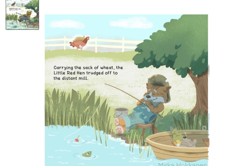
from the story. The passage reads, carrying
the sack of wheat, the little red hen trudged
off to the distant mill. And so at this point,
the little red hen has harvested all the wheat, and she's got it
in a little sack and she's carrying
it to the mill. And so for this exercise, we'll start with creating
five different thumbnails, and they'll be, you know,
make them fairly small. If you're drawing
on actual paper, make them pretty small,
maybe about an inch. By inch or something like that. They can be horizontal.
They can be vertical. If I'm thinking
about this passage, I'm thinking that it probably wouldn't be a full
spread illustration, but if you have
your heart set on making a horizontal
illustration out of it, feel free to make
it horizontal, too. And then just draw
out five squares or rectangles that you
want to work inside. And then I want you to think
about kind of internally, kind of rummage around, think about think
about this scene and what the organization
of the space could be. Think about it as a scene
in, like, a theater. So, will you have something
in the foreground? Will you have something
in the middle ground, something in the background? Maybe you'll have small,
medium large objects in there. But I don't want you to
spend a ton of time. We're not doing any
kind of details. They're just going to be
very, very loose sketches. And so what I want you to do at this point is just
after this video, I want you to take a pause in the class and do your
five thumbnail sketches. Spend maybe ten, 15
minutes on them, no more than that, and then move on to the next video after that.
11. Point of View: Alright, so hopefully you have
your five thumbnails done. In this video, we'll talk about camera angle and choosing
your point of view. So some of the obvious
points of view are going to be where the camera is
looking from above, down below, and those kinds of
scenes are great for story openings to set
a story where you're kind of showing the environment that the character lives in or showing the passage of time
or showing a big feeling. And so I wanted to show a
couple of examples of those. And so over here, we have the picture from
the Gingerbread Man, and it's showing in these kinds of pictures where you're
showing passage of time, oftentimes the
character is shown multiple times in
the illustration, and this is kind of
looking down at the zoo. Then we have this piece over here from the bear and the wolf. By Danielle Calmi
and in this one, we also have kind of
a big expensive view, and we're talking
about feelings. And then this is from Good night Good night
Construction Site. And over here, this is in the
very beginning of the book, and we're getting a scene of what we're what the book
is basically about. So we've got all the
characters in this book, and we're shown
kind of a big scene of the construction site. And then this is from
Up high with Matt Hunt. And this one this is kind of
in the middle of the book. They are going into a park. They're moving from
one place to another. And so this is kind of giving us an idea of where our
characters are moving into. Then probably the
most common point of view is the middle ground. And this is kind of
what I think of, like, the theater view, where we
are kind of at eye level. We're at the same
level or close to being on the same level
as our characters. And that makes us feel like
we are part of the action. We are moving with
our character. We're kind of one
with our character, and we're participating
in what's happening. And so if we take pretty much
any of these other books, let's see if we flip just one page,
backwards or forwards. And a lot of these, we'll
notice that, you know, even though it's kind of
a picture of up on high, but we're still kind of at the same level with the character. Let's go this way and
over here, same thing. Now we're at the level
of our character, and we're kind of looking
at everything over there. As we move from here, we are now at the
level of our trucks, and we're looking at our, you know, construction vehicles, and we're looking at the
same eye level is them, and we're in the
action with them. And let's see what
happens over here. So over here, we actually
have a scene looking down. Let's see what's going on over here. This is also looking down. So it's a little bit more
unconventional over here. And so here we're kind
of kind of a close up but looking at
our characters. So there's a lot of kind
of interesting points of view over here over here. We've got the same thing, theater kind of setup. We're at the same level
with our characters. When we are looking
at a close up, then oftentimes
illustrators will use close ups to kind
of that gets us, like, into the mind
of the character. We're really close
to the character, and we can feel like we're feeling the same
things with them. Then we also have looking
at something kind of down, and so looking at it from kind of below and looking
at it straight up. And so that one can
kind of give us, like, a sense of wonder or a
feeling of being small. There's a great
example in this book. As we see this character, we're down very close to him, and we're looking up,
and we can kind of see that he's not happy and
he's feeling very small. Even says it in the text as he's looking at his dad in
this big, busy building. And then also In this one, this one is kind of
for that scary feeling we're feeling very small. We're at the level
of this kitty cat, and then we're looking
up at this big, big house that's looking
a little bit scary, and, you know, text obviously reads haunted on the other side. And so, you know, it's given us a little
bit of a scary vibe on then kind of the last one
is extreme points of view. And so this one could
be, for example, if it's straight from above
or straight from below or things where things
are very distorted. So kind of like what
we were looking at with this over here, things are fairly distorted. And so those kinds of
views often add drama. They add variety into
our illustration, and they can also highlight a moment if you're thinking that we're moving closer to
something that's like a bump, bump, bomb and then you show something really big at the end. And so they can be used as almost like punctuation
in your illustration. And so I just want you to kind of be aware
that instead of always drawing something kind of that theater point of
view with everything the same distance from you to think that maybe you could
move the camera further. Can you move it up?
Can you move it or can you move it closer? Can
you move it up or down? And how can you change it so that you're not showing us
the same point of view, every spread that we're
looking at in your book? And then I wanted to just
look at a book as an example. So I wanted to look at Beakle
as one example of this. And when we look at Beakle, the way that we're
starting is most of the views in this book are going to be kind
of fairly pulled back. We're going to see a
lot of background, and we're not really
close to our character. Some of them are
more from above. Some of them might be from
about the same level, but everything is
kind of pulled back. As you notice in the beginning. And so everything
is kind of hap. So in the book, you know, everything is kind
of happening to our character or happening
around our character, but, you know, our character has not kind of
found their person. They haven't found their spot. And so we're really, you know, here, we're under the
water looking up, but we're still pulled
kind of far back, even, you know, all the way in this one. Eagles over here. And then we get a
little bit closer, but still not super close. We're still showing a lot
of kind of environment, a lot of things going around. And then when the kind of the change happens in the book still
everything far away. But now he meets this girl
who's going to be his person. He's this girl's
imaginary character. And now all of a sudden, we're up close and we're personal, and these two
characters are going to build their relationship. So all of a sudden, they're big. They're in the middle
of everything. You know, it's all about
these two characters. We don't have a lot
of backgrounds. And so these two it's, you know, these two characters are building their relationship. And then now they have their relationship and they've
gotten to know each other, and now they get ready
to add other people, you know, kind of, like,
into their network. And so now we pull
the camera back out. And so I think this is a really great kind
of lesson on point of view and a camera
angle and how you know, this is one device that Dance
ATAT is using to give us, you know, show us
this emotional story that this character
is going through. And I'm not saying that
this is the only way that he could have illustrated
or drawn this story, but, you know, it just adds great effectiveness
into his storytelling. So whenever you're looking at books and studying books and
looking at illustrations, don't just study
one illustration because when we're
illustrating books, we're illustrating
a whole story. We're illustrating, you know, several spreads and
pages all at once. Look at how the story
flows as a whole. A lot of times, what
I'll do is I'll take photos of every spread, and then I'll squish
make everything small and put them on one page, you know, like one document. So that way I can look
at everything together. I can kind of look
at it and see, like, how are things moving
from one page to another? How is it, you know, a spread, and then some spot
illustrations, and then maybe half a spread
or something like that. How are the illustrations
kind of sprinkled out? Kind of points of
view? What kind of color language is
the illustrator using? What kind of designs? Like, where's the focal
point in each illustration? You know, is there
some kind of flow from one spread to another? And so there's so many
things that you can pick apart and so many things that you can learn
from researching other illustrators and how
they've illustrated books. And so, you know, I talked earlier about
being in a critique another great way to learn is to study what other successful
illustrators have done. Try to look at recent
illustrators and then use ideas from their books and their illustrations to
then carry over to yours. And then talking about these
extreme points of view and regular I just wanted
to take the folk story of Jack and the
Beanstock and just do a really quick illustration of how the point of view
changes the story. So if we're talking
about just our regular, you know, your middle ground, we might have Jack is over here, and then he's just planted
This is the ground, and he's just
planted a beanstalk. Whoa, it's really big. Maybe he's looking
up at it, you know? And his mouth is
open or whatever, and we've got leaves
going on over here. But this isn't really
exciting, is it? And maybe he's got a house over here or
something like that. And yes, this is how
we could illustrate a scene in Jack and
the beanstalck. But then you can think
about if we take, you know, one of those extreme
points of view. So could we maybe if we wanted to think
about, Oh, my goodness, how amazing this beanstalck is, and so it could be really thick, and then it can
get progressively small until it dwindles
down almost to nothing. And we have big
leaves over here. Let's see, they're going to get smaller and smaller and
smaller and smaller. And then we have
little Jack over here, just super tiny looking
up at the beanstalck. And then we kind of are in the shoes of the giant,
and we're looking down. And he's, you know,
he's this teeny, tiny, puny little ant that's
underneath over there. Or then could we be in Jack's shoes and
Jack is over here, maybe he's looking
up and he's amazed. And then we'll have
beanstock over here. And then it's kind
of the same thing, but now we're in Jack's shoes. And now it's really big over here, but
now he's looking up, and maybe it's completely disappearing into the over here. And so now we're looking at, you know, Jack's
point of view, and we're looking up at the tree, and how does that change our emotion when we
change that point of view in all these three pictures of imagine being the viewer
and being in Jack's shoes. So over here, where Jack and things are looking
amazing over here, Jack is looking
puny, and over here, we're just getting kind of
your average everyday view. That doesn't uh, you know, it's not really, you
know, this or that. And so think about
how your camera angle can change your feelings
about the illustration. And so now for kind
of the exercise, what I want you to
do is I want you to draw five more
thumbnail squares.
12. Exercise 2: 5 More Thumbnails: So now for kind of the exercise, what I want you to
do is I want you to draw five more
thumbnail squares. So we have five
thumbnails already. Now we're going to add
five thumbnails more, and now think about the point
of view and think about, is there any way that you can tweak the point of
view just for fun. Just try a high point of view, low point of view, you know,
close up point of view, and see if there's anything that you can do or maybe make it a map where little red
hen is going through. To the distant male and see if there is something else
that you can bring to this illustration by
changing the point trying a different point of view in
five additional thumbnails. And so you can pause
the class over here, do your five thumbnails. Again, don't spend a
ton of time on this. They're going to be very small, about an inch by inch
or something like that. Maybe ten, 15 minutes, and then move on
to the next video where we're going to
talk about lighting.
13. Lighting Your Scene: Okay, so let's talk
about lighting. So lighting can add
a lot to your piece. Some manuscripts will be very specific with what time of the day or what time of
the year it might be, and some manuscripts might
leave it completely open. And then it's up to you as an illustrator to decide
what time of the day, what time of the year the
events in the book happen. And when you're thinking about making adjustments
to an illustration, the different times of the day will change the way
lighting looks. And so I made kind of
some general notes about the way lighting is. So when we have something that's happening in the morning or an event that's
happening in the morning, usually the lighting
is kind of cool. You know, you kind of
think about, like, cool, hazy, light blues, cool shadows. And because the sun
is still kind of low, you either if the sun is
still behind, you know, the horizon line, then
you have no shadows, or then if it's just coming up, there's going to
be long shadows. Then if we're thinking about just during the
daytime in sunlight, the sun is high,
usually up above us. And so we get kind
of short shadows, so the shadows are not long. They're kind of
directly underneath us or they're kind of short. They don't go far away
from the main body. And then usually I have the light coming down as
yellow or sometimes I do blue, too, and usually the
shadows are blue. And then on a rainy day, a lot of times because the
sun is behind the cloud, so we don't really
have direct sunlight, so the shadows are
a little bit more blurry or there might
not be shadows. The colors are a
lot more muted and it'll be cooler tones
than what you get. And the reason why we
get cool tones and more muted tone is because
wherever there is sun, we see a full spectrum of light, but where there is no light, we see less colors, and we see less contrast. And so everything
will be muted and less saturated the less
sunlight that we have. And so then when we have sunset, sun is low, then we
have long shadows. We got more purple light
and then warm shadows. And then when we are all the way at nighttime and
the sun has set, then we usually have kind
of purples and blues, and we have very low saturation,
almost no saturation. You'll see a lot of
illustrators will just use shades of
blue and purple. And then there's
no shadows unless you have a moon or some
sort of a source of light, and then you have the shadow
will be cast by whatever, or you might have multiple
sources of light, and then you'll have to figure out how to do multiple shadows. So these rules are kind
of like the basics that I use to create
different times of day. And then not only do you have to create the time of the day and then the lighting and
the shadows to go with it, but then also think about remember we talked
about the foreground in the middle ground
on the background, how creating lights
and darks within that space within the depth of your space also makes sense. And so I made just
three little thumbnails over here with a very
simple landscape. And so over here
we have, you know, the foreground is
the lightest we have the middle ground is
kind of the medium lit part, and then the background
is the darkest. Over here, foreground darkest, middle ground is the lightest. And then over here we have the background is the lightest, and it gets progressively
darker as you come forward. And so you can think
about how each of these lighting scenarios might affect the scene that
you're working on. Usually we see something
about like what we have over here where we have things that are
closer kind of dark, and then it gets lighter
as you go further out with things most lit being in the middle ground
where our characters are. But sometimes it might be
interesting to have maybe there is something in
the background that's good and bad or evil and good. And so maybe, you know, if you're in the dark, maybe you could be sad or it could be something
not good happening. And then where the light part is, that's where the hope is. So there's symbolism
with light and dark. And so when you're
lighting, you're scene, just be mindful of where the
lights and the darks are. And then, um, before we
look at those examples, I just made a simple little
chicken illustration that I wanted to
look at with you. And so with this one, we just have a chicken,
and it's walking. We have a white background, and it's just kind of plain colors. And so let's change this to
different times of the day. And so the first
scenario I created was, if we have a nice sunny day. And so if we have
a nice sunny day, then we were talking
about having those warmer kind of
where sunlit areas, and then we have cooler shadows. And I've done that very
simply with two different, um, two different
layers over here. And so I have the sunlight, which I did draw
with the blue color, but I used the I
used the divide, which then makes it lighter
color on my illustration. And then for the shadow, I used also kind of
the same blue color, and then that just
adds some shadows. And I added some more
specific shadows that are a little bit darker in places where I get cast shadows. And so that would give us a nice feeling of a
sunny day, right? And so then we talked
about having rain. So I created kind of a rainy sky in the background over here. And then we've got
what we talked about. So I've got some rain
drops over here. I have some blue. So this blue, see how everything especially
right here is saturated. Oops. And when
this is turned on, now it's less saturated. So I'm bringing saturation down. We have less sunlight,
and then I'm adding a multiply
layer of blues. And these ones, you
could you know, if you wanted a
really gloomy day, or it could be maybe this is towards the end of
the day, it's darker. Maybe it's more during the sun. You know, depends
on the sun, you can adjust these
different layers. And then I just have a little
bit more extra shadows. Remember we talked about having kind of blurry or
more softer shadows. I've added some softer shadows over here for the rainy day. And then we have our sunset. And so we have a beautiful
sun setting over here, turning on the sunset over here. And so here I have a couple
of different layers. I have just a general
overlay of a pink. That just creates kind of tones all the colors in in my layers to be
more of a pink color. Then I have this is
just all my highlights. That's just a normal layer. And then I have some of a little bit more of the
extra highlights. Over here. And then I have two
different shadow layers, just adding a little bit
extra death in there. So this one was the first
shadow layer that I created, and it's kind of
orange orange colors, warm colors, and it's
a little bit messy, but you kind of get the points, so we're getting longer shadows. And then I added just those extra extra
higher shadows to make it a little bit more silhouetted
as we're looking at it. And so this is our sunset. And then lastly, we
have a nighttime scene. So I've created a nice
little starry sky over here. And then for our character, this is what it could look like. So I have two
different blue layers. One is a blue layer
that is just toning. It's basically making
everything a shade of blue. So you could turn it
all the way over here, and it could be blue or purple, but, you know, it'll tone all your colors to a blue color. And so we'll keep that
somewhere over there. And then I have a blue layer
that's on multiply that, you know, I don't want
it to be too dark. You want there to be contrast in your nighttime scene, too. So you want to be able to the reader to read
your nighttime scene. And then there is I have I felt like this white apron was still a little
bit too contrasty, so I made a contrast layer to bring down the contrast
just a little bit. It doesn't have to
maybe be, so A. And then a lot of times when we are thinking
about nighttime Sky, you just want to
make sure that you have contrast in your piece. So I also created this to
make more of a silhouette. So now we have the things that are in the
foreground are dark, and they're silhouetted against the night sky and kind of, you know, technically, I guess the moon could be shining
or something like that. And so these are just some different options
that you can play with when you are creating scenes that are happening at different
times of the day. And then we'll look at some
examples really quick. So let's look at some
examples in lighting. And so for this book, what I had to do was the
text in this book goes all the way from sun from dawn in the morning
until sunset at night. And so in the first picture, we have the sun rising and
we have very cool colors. And then from there, I decided we're moving to
kind of warm colors, daytime colors, more saturated. And then when there's
a storm brewing, the colors start
getting desaturated. We have a very dark
scene with the storm, and then the storm passes, and then we get to our
sunset with the colors dimming until we get all the way down to
the end of the night. And if you compare the sunset, where we have warm colors, then we have kind of cooler
colors for the sunrise. And so I just wanted there to be a difference between the two. Then in this next book, I just wanted to show a daytime scene, so you can see over
here how there's these beautiful,
saturated colors. Everything is very warm. We have some shadows
and everything is, you know, very bright
and colorful over here. And then we get to
the scene where it's wintertime and things are a lot more they're
still colorful, but everything is a little
bit cooler and blues. And then if we compare just even this building
with itself over here, you can see how much more warmer and yellow it is over
here compared to over here. And then this is just
another example of a sunset. We have some warm kind of purply shadows going
down this way. We have long shadows being cast down this way and
from all the trees. Oh. And I was also going to show we have a piece where there's a lot of rain and they're running
from the rain, so you can see a lot of kind of very darker color muted
colors over here, and then a little bit more
where we get you know, a lot of times when it rains, everything looks a
little bit more vibrant. So we have the yellows
are kind of vibrant, but everywhere
where we see sky or some muted colors or blues, then all those are still kind of muted and more blued out. Then we have Good night Good
night construction site. And for this one, we have this sunset scene that's
all purples and pinks. And then compare it with a nighttime scene,
which is all blues, and there is some more
saturated yellows, but, you know, it's fairly little and everything else is
kind of cool colors. In this one, and then the same
thing happening over here, we have a nighttime
that's mostly just blues, and we get a little bit of
warm for where the fire is, and then we get a cast shadow from the moon with the dragon. And then this book, in general, has pretty muted
colors, anyways. But if you compare
this daytime scene, it's mostly kind of yellows
and reds and browns, and then we have
the nighttime scene where it's more blues. And there's a fun
contrast in this book 10 Minutes to Bed
Little Unicorns Christmas with illustrations
by Chris Chatterton. And so the front
end pages are all, you know, warm colors, and then we have the
nighttime scene, which is purples and blues. And so there's a fun contrast between the two in the way
that they're illustrated. And then, lastly, this book happens at nighttime.
BokharuNs you. And with this one, you
have all these um, blues and cool colors
in the background. We have warm colors,
not super saturated, but still saturated
enough that we really have this
foreground pop and then the background seed. And so it is a nighttime scene, but compared to some of the
other ones we looked at, we are still getting
some nice colors. And this whole book
happens at nighttime. And so if you're doing a
whole book in the nighttime, then it is nice to add
some extra colors in there and do pops of different
things because otherwise, I don't know how many
kids would want to just read a book that's just
all blue and purple, and there's nothing kind
of exciting to look at. And so Um, with this one, Sir Shu has done a really
great job with adding these fun pops of
color and making even though everything
happens at nighttime, it's just a really pleasant book to look at as far as
the color scheme goes. And we'll move on to the third exercise in the next video.
14. Exercise 3: 5 More Thumbnails: So for our next
exercise in our class, what I want you
to do is you have ten thumbnails that
you've created so far. I wanted you to
pick your favorite thumbnail that you've worked on, and then I want you to make five variations of
that one thumbnail. And you can start they can
still be small and just use blotches of color and start kind of figuring out
where is your foreground, background, middle ground,
what's going to be light, what's going to be dark, and then think about
some color schemes. So I want you to
make another you can take your favorite piece
and then copy it five times if you're working
digitally or if you're working if you're just working
out with pencil and paper, we're working very, very small, so you can just redraw the same composition five
times and then think about coloring and shading and lighting those five thumbnails and make five variations of it. Alright, so over here, I've done my different values, and I've tried to alter, put things that are in the
front, make them darker, make the front dark, make the middle ground darker, front lighter, just trying
different ways of lighting, and also kind of
thinking in my head, about time of day and seasons
and things like that. And so basically,
this is kind of happening towards
the end of summer, but not quite like fall yet. This is kind of
harvest time where the little red chicken
has gotten the wheat. And so I figured now she's got the wheat and
she's going off to the mill. So I figured it's not
a good time to make it like a nighttime scene
or anything like that. So I figured it would be a daytime scene for her to go to the mill and
then come back. And so I really liked kind of these two sketches over here. I liked having this light
area kind of frame the cats. And then I had the
option of, you know, one side where I have darker for the lake and one where it's a little bit lighter. And so I thought I would play with that a little bit and add a little bit of just color. And so these are really messy. They didn't take me very long. And I was just
trying a couple of different things with colors, and it's actually nicer
to kind of look at these small and then
look at the colors. And so there's one. So I feel like with
the middle one, the the water is just a
little bit too saturated. It's sticking out too much. And so I like this one where
we kind of have same color, but then after doing this one, I was still thinking
how much I like this light area behind the
cat character over here. So I made a different
one, you know, basically, kind of copy of this
where I lightened the water and then lightened the the grass behind the
chicken and I thought, you know, one of these two on the edges might be the one that I go with
final illustration. And so here you can see a
little bit of the process of coming up with some different ideas and then
picking one that you like, and then testing out
some lighting ideas. And you kind of never know
where you're going to get until you start
testing these things out. If I was just going with
my first or second idea, this illustration would have
ended very differently. And so you can pause the video and work
on your exercises, and then we come
back to the class, and then we will
talk about levels of abstraction and taking artistic liberties
in the next video.
15. Artistic Liberties: Level of Abstraction: So I have this
kind of section in the class that's titled
Artistic Liberties. And in this section, what I wanted to
talk about is how we take references that
are all around us. We might be looking
at references for trees or nature or buildings, whatever you're drawing
in your illustrations, and how you take that reference and how do you translate it into
an illustration. So I have two
examples over here. I have a picture that I took this morning on a walk
down into the woods. And if you look closely, you might be able to
notice that there's a little path, and if you keep, the path kind of goes over here, and then there's a clearing and, you know, trees all around. Over here and it's going a
little bit of an uphill. But when we're looking at when
I'm walking down the path, it's easy for me
to judge distance. It's easy for me to
see where the path is. But a lot of times when
I'm looking at a photo, everything gets really jumbled up because we're just looking at a two
dimensional object. Same thing over here. This is just a screenshot from Helsinki, and you can see that, you know, when you're looking
at it, there's every single brick
on the street. There's all the bricks
on the buildings. There's all these details
in the buildings. And so the photos from both locations are
really, really busy. And so it's a great skill to learn how to start
simplifying those things, especially when
we're working for smaller children who are still learning how to visually
decipher images, illustrations. And so we want to be able to kind of simplify
the elements down in our illustrations so that somebody who's younger
can understand that they're looking
at a tree or they're looking at grass or,
you know, a mountain. And so let's put these
away for just a minute. And just look at some examples. So, we also talked
about levels of abstraction in our
character design class, and we talked about, you know, we can in this case,
we're looking at trees. You can have the
simplest, you know, t being basically a stick
in a circle on the top, a person, it might
be stick character. And then at the other kind
of end of that spectrum, we have a photograph of a person or a
photograph of a tree, and then that's a
very, very specific representation of a
tree or a person. So one end, it's
a very abstract. It's almost like a concept
of a person and a tree, and then the photograph
of a person or a tree. And then everything in illustration kind of falls
somewhere in between. So there's not really a rule
that says you have to draw trees like this in
children's book illustration or characters like this in
children's book illustration. And so these are just some examples that
I wanted to show you on doing different
kinds of elements. And so looking at kind of
the most abstracted things, we have some very simplified. They're not even natural colors. These trees over here, they're basically just kind of shapes. Same thing over here. This is almost more looks
like a leaf to me. There's several different trees. Also not realistic colors. And then we have these
abstracted trees over here. Some of them look a little bit more like trees than others. This is actually a
piece of, you know, some sort of patterned fabric
or paper that's been cut up into the shape of a
tree to make this tree. And then this one's more there's a little
bit of shading on it, but it's basically a flat color, and then it just has
some dots in it. And so many different
ways to abstract a tree. And then when we
start kind of going from there and getting a
little bit more realistic, we have a couple of trees over here that have really
heavy outlines, and so this tree has
some curly, you know, lines in it or these lines could just as well be
actually in water, but they're in a tree, and we have a fir tree in the back that has
some dots in it, and same thing with the bark. And then we have
a tree over here, and over here, all the leaves are actually kind of drawn out. And it's kind of flattened out and very kind of
designer looking. But if you also look
at the way that the characters are drawn with the way that
the trees are drawn, just whenever you're doing
your character designs, make sure that the characters fit the environment that
you're drawing them in. So you're not doing
realistic looking or realistic looking characters, but then you're doing, you know, stick trees for them to
go with unless there's kind of a point that you're trying to make or it's something very specific where it
needs to look like that. Um, always make sure that
the environments and the characters that you're
making go well together, that they have kind of like the same level of abstraction. Then we had this one was from
Mr. Tiger with Peter Brown, and we have a very also very
kind of abstracted tree that doesn't have any outlines, but it's also kind of
very regular shapes. You can see other palm
trees in the background, and there's all these look
like little kind of snowflake, but they're in the nature. So I guess you could think that there may be bushes
or something. So there's very abstract. And then the bottom
layer over here or bottom line is a
little bit more kind of naturalistic looking
trees, perhaps. But this one is still
very designery. Everything, you know, has kind
of a specific look to it. You can see that not all
the leaves are drawn. Some of them are drawn, and
they have these kind of it makes it look kind of
like these rounded shapes. Then we have this one. This is from era Brosko's book, and this one is getting a little bit more
natural looking. This one is you can see it's just paint strokes and
it's got some lines in it, but we're starting
to get kind of some more natural looking shapes. And then this one is
very loosely painted, but it gives us kind of
it has nice energy in it, and it's very loose,
and it's been scanned into a
book illustration. And so these two are
definitely hand painted, probably these ones,
and then hand painted, and some of the
other ones might be a little bit more digital. And then lastly, we have
this tree over here. That's a lot more kind
of realistic still, it's not a photograph of a tree, but you can, all the leaves
have been drawn on it. There's a lot of
details on the trunk. And so that just gives you some ideas of how you
could be drawing trees. Then let's look at I had
some rocks as ideas for you. So in its most general thing, we have a flat plain shape. It doesn't even need to
have an outline around it, but this one has
a black outline, and then it has extra little
lines inside and some dots. Then we have these
mountains that are illustrated with almost
these kind of diamond shapes, and you can see that
the colors are going kind of from darker and they get lighter towards
the top where they have these snow
topped mountains. So very abstracted
mountains over here. And then we have this is from the same illustration
where that tree was. We have rocks in the
kind of water over here, and you can see that, you know, it's just a curve with some curved lines inside over there. And then everything
on the bottom, most of them are kind of
a flat color that has some sort of spatters
on the inside. On all of them, this is
from Mr. Tiger Goes Wild. And so they're fairly similar. Some of them have
more shadows or kind of different looking
shadows than the other ones. And this one has a
little bit more of a complex spattering on it, and then it's got
the little line from where the snail has gone. So just some ideas for rocks, they can literally
be a flat area of color or they can have
some texture on it. And then lastly, I just put
some pictures of buildings. And if you're doing buildings, like we looked at that
photo just a minute ago, there's a lot of there's a
lot of details in this photo. There's every single brick
on every single detail. Over here, all these ledges go out and they have structure
and they have dimensionality. And so when you are drawing, your illustrations of houses, you have to decide
whether you're going to add all those details in or
are you going to simplify. And so here's just a
couple of examples. These are all fairly abstracted. And what I was
trying to say about the bricks is you don't necessarily have to
draw every single ops, every single brick,
like over here, you can you can kind of show us that it's
a brick wall by drawing some of the bricks in
and having variations in color and then leaving some
of the background empty. But a lot of these examples, it kind of depends
on your style. This style is a little bit
more three dimensional, and it's a little
bit more realistic, whereas in some of these other styles are a
little bit more flatter. And so then the drawing is a little bit
more flatter, too. And so over here, we have at least a little bit of
variety in the bricks, and we have some dots in it, and these ones are very
sketchy lines over here, and these ones are
not even even. And then this part is actually
just collaged on top. It's a photograph
from brick wall that has been cut and
pasted over here. And then this is an
illustration from Christian Robinson's book, Leo. And you can see that they're
very simplified shapes. It's all collaged,
cut out that then has a little bit of drawing with just one color on the top. And then we have these ones. So depending on your
illustration style, the buildings don't even
have to kind of line up. And so you can see these
are a little bit wonky and things don't quite
match up in their little wobbly wobbly and some of the details are
there and some of the details are
not, for example. So these two buildings exist on the same page
in the illustration, and you can see that
over here we have a little bit of shading
for the building. But then if you or, like, the sides of the
windows, but over here, the sides of the windows
have literally just been drawn in with
kind of a red line. Um, and so that just gives you
some ideas that, you know, every time you draw a building, you don't have to, you know, have a panic attack
thinking that you have to exactly draw what you see. You can take some artistic
liberties and simplify things. And I split this video into
two, and in the next video, we'll look at a
few more examples before we get into
the next exercise.
16. Levels of Abstraction: Examples: Alright, so I just wanted
to look at a couple of different examples of some
architectural element. So in this one, we have
some outdoor scenes, and you can see over here that a lot of the details
have been drawn. And so this illustration is a little bit busy
when you look at it, but the illustrator is creating a nice contrast with
having this big cat, which is going to be
our main character. So in this illustration, we're contrasting that
this is the cat, and the cat has a
very busy life. And so we're giving the idea of business with the textures and all the details that are
going on in the background. And then for this book, I just wanted to talk about
that flat illustration style. And so over here,
everything is very flat. It doesn't look super
three dimensional. And so it is just a choice that you can make
with illustration. So things don't have a lot of you notice that there's
not a lot of shading. Everything is just kind of flat. It's got pretty heavy outlines. And so everything
there's just a lot of texture and everything is
kind of equally wonky or, you know, things
are tilted and not quite drawn in
perspective over here. And then we have this book. And I just wanted
to show the outside how fun this illustration is. So we have everything over here. There's no outlines over here, but everything has been
it's digitally drawn, so it's fairly easy to get things fairly upright
and straight. And then we have
this great building with all these
different colors on it. And one more thing that
I wanted to highlight with taking those artistic
liberties is with this book, if you think about, you know, windows on buildings and each window and then
there's, you know, a little bit of room
above, you know, up to the ceiling
and below that goes down to the floor where you're
supposed to be standing. And so if you think about this building right
here where the ceiling, if you think about just looking at this window, like, Okay, the floor where this person is standing would
probably be around here. The ceiling would probably
be somewhere over here, but Lewin has added made
the windows really big, so we get all this kind
of fun character in this building rather than having a big building with a lot
of empty space on it, and then small little windows, like we usually in buildings, she's able to add
a lot more kind of interest and detail
into the illustrations. So this page kind
of the same thing. And so if you think
where she would be standing or he
would be standing, his feet would be over here. And then we can also look
at the city map over here, and we have this fun
curve of the road, and it goes
underneath over here, but it's a library book, so I quite get it all the way open. But you can just see
everything's a little bit wonky. It's not super straight,
and we have these lovely, kind of big details
on the houses. And obviously, color palette is very muted and kind of a
simplified color palette. And so that way, we notice
all the characters and all the fun little
details that are going on in this illustration. And you can look at all the different devices
that the illustrator has used to kind of create this scene and make it
interesting to look at. And then there's just a couple. I just wanted to show kind
of two landscape books. These are with watercolors. This might, I think, might
have some guashes in it, too. So we also have a building
over here that's blobby, brush strokes,
simplified brush jokes, especially with everything
else that's around it. The tree over here in
the background is just, you know, blobs and
sticks or lines. And then, for example, we have this illustration over here
where they're in the garden, and it's really just layers of green paint or kind
of blobs of green paint, and there's kind
of nothing super detailed in there when then we contrast that to Jason
Chin's illustrations where they're
extremely detailed, and they're very
realistic looking. And so when I was talking
about the photographs, these are very specific
to the location. And there are some areas which are nice where we have so much
detail going on over here, it's always nice to have
an area where the eye can rest in both of
these illustrations. So we have a lot of details
going on over here. And so just some very different
ways of illustrating, and there is no I want
to stress that there's no right or wrong
way of doing this. When you are working on outdoor scenes where you
have a lot of depth, you can consolidate details in the landscape into
larger shapes as far as kind of tone
and value so that it's easier to read the
image from far away. And so in this image, we
do have a lot of detail. We have, you know, all the
little details in the car. We have all the little
details up here. But then as we're
moving further out, things get kind of consolidated. And instead of drawing every single leaf all the way
down to the back over here, Jason has consolidated
this whole area into just one unified strip
similarity of the mark making. And so if we look at what's going on with the
girl, we have high contrast. We have the colors, and
we have actual letters, and so our eyes are
drawn over here. And even so we do have a lot of things going on
over here, too. But if you look at the
type of mark making, you could say in some ways that it's more boring that
it's more repetitive. And so there's more
of even rhythm, and it doesn't draw your eye to it as much because we've kind of seen one
part we've seen it all, whereas over here, there's a lot of different a
lot of differences, a lot of contrasting colors. And so this calls for our eyes
to wander and look around over here a lot longer than what our eyes need
to look at over here. So this could apply for if
you're drawing buildings, if you're drawing tree,
whatever it might be, you could still have details in the background as
long as they're kind of repetitive and
they're kind of all within the same
tonal and value range. And then that way,
they're not taking our attention away from
where we want the main. Focus of our illustration to be. And in the next video, we will continue
with our exercises, and we'll start adding a little
bit more color and detail to the sketch that we were working on in the last exercise.
17. Exercise 4: Full Size Sketch: Okay, for this next exercise, what I want you to
do is you worked on, if you haven't done
any color sketches yet, then don't worry. Pick one of these
black and white ones or kind of the grayscale ones. And for myself, I'm kind
of torn between these two. I think I'm going to
start with this one. And so I'm going
to copy this one. And put it onto its own
little canvas over here. And I'm going to blow it up. And so take your little sketch and blow it up a
little bit bigger. And in my case, I'm going to now
sketch on top of it. So for this exercise, what I want you to do
is I want you to take your favorite sketch from the previous exercise
and put it on a different canvas or start a new piece of paper
and blow it up bigger, so it's closer to the final size illustration that
you want to create. And then what I
want you to work on is adding some more details
and adding more colors to it. It doesn't have to be
your final artwork, but I want you to start making it closer to the
final and starting to hone in some details and getting it closer
to a final sketch. Okay.
18. Artistic Liberties: Creating Organization: When we move around spaces, whether it be
indoors or outdoors, we perceive
organization in them. Even when things are kind of chaotic or when things are busy, like you're in the
forest and there's lots of leaves or you're
in a busy garage, you may not think about it, but you are not
perceiving every leaf in a tree or every brick in a
house all at the same time. And so our eyes and
our mind are able to focus on whatever
we're looking at and then everything else
that's kind of, you know, outside of our main
focus of vision, we can see that
there's things there, but we are not concentrating on everything all
at the same time. Now when you compare
that to a photograph, the photograph will
capture everything that's before our eyes
exactly the way it is. So the photograph will show every single leaf,
every single brick, every single you know, whatever it might be
that is in your space. And another way that taking a photograph or looking at
reference photos changes our experience is if you've ever been outdoors
and you've looked at this beautiful giant moon at night or an airplane in the sky, and then you go and you
take a picture of it, and in the picture, the moon is you know, a size
of a pin prick. It's so teeny, tiny, and it's not your
experience at all. In this segment, we already talked about a
little bit before, but I wanted to kind
of go over how you can change things in your
reference photos or from what is actually going on
outside to make it work for your illustration and to add more of a kind
of a feeling in it, add more of a focal point in it, and make it easier for somebody
to read the illustration. And so some of the different
ways that we can do this is by we can change
the objects shot size. So as I just said, you know, if you take a
photograph of the moon, it's always teeny, tiny. But if you look
at illustrations, most of the time, the moon is kind of big in the
sky over there. And so we can
change object size. A lot of times I will change the sizes of trees
or it could even be individual things within objects like we talked about the sizes of windows earlier within
a side of a building. And so you feel free
to take liberties as long as everything
still kind of works and looks, you know, realistic. Feel free to take
liberties with that. Another thing that you can
change is the details in it, as we said earlier, we when you take a photograph
or when you focus on it, there are individual
leaves on a tree, but when we're doing
an illustration, we don't need to draw
every single blade of grass and leaf on the tree. And so you can either add list details or take details away to make things
more legible. And in the same way, when
we talk about silhouette, if you think about the
way that a tree is, you know, it's very complicated. There's all the
edges and leaves, and there's holes in it and, you know, things that are
in front and back behind. And in the same way, you can simplify silhouettes
of things if things are too complicated and they take up too much attention in
your illustration. Feel free to simplify
silhouettes. And talking about the grouping, you can kind of lump
things together. So instead of drawing
individual trees in the forest, you can meld
everything together. And make it into
one cohesive area in your illustration instead
of all individual trees. And then you can also create elements in your illustration. And so if you're
looking at photo of a forest or it could be the
beach or somebody's house, there might be total chaos in the way things are organized. And so what you can do
is once you figure out where your focal point
is in that illustration, you can make everything work
towards that focal point. And so you can
create visual lines. You can move things
around to make them point or make them go away. You can use colors, textures, all those things that we talked
about in the beginning of the class to simplify and create visual organization
in that space in order to make it more legible and more
pleasing to look at. And so I have this photo that we looked
at a little bit earlier, and so it is this
photo of path in the forest that goes back
behind into a clearing. And I know it's a
little bit hard to see, but there's actually kind
of a little tree over here. There's another little tree, so they create this archway
almost that you can go through if you look at
the how they're lined up. They're not actually
lined up perfectly. So this side is a little
bit closer to us, and this one is a little
bit further away. And then there's other
trees over there. And so then what we can do is when we create our
own illustration in it, we will look for different
ways to simplify it and make it more legible
so it's not so chaotic. And first, if you can
either work with pencil, you can either work with
lines and draw things or if you feel more comfortable in just
starting with colors, you could also start blocking colors out and kind of
figure things out that way. And we can do a
little bit of both. And so over here, I've just
put some questions to ask, so think about where your
point of focus is and then think about how you can
make all the elements in your illustration to
work towards that focus. How can you create a foreground middle ground and a
background in it? Is there a way to simplify
shape, simplify colors? Do you need to maybe change
colors in your illustrations? We'll talk about that
in the next video, and then you can
also change the size of things and move
objects around, like trees or whatnot. And so we don't have to stay
true to this illustration. And so let's see. We have a little bit it
kind of goes this way, and then it goes a
little bit this way. So we'll do something like this. And then it kind of disappears, something something
kind of like this. And then I know there's
kind of a clearing that I want to create over here, and so this is kind of where
our road is going to go. And then I can create bushes. And so I'm still
kind of designing. I know that there's going to
be I want there to be trees, so I might create just kind of a tree line
in general over here, maybe there's some openings. And then I know there's
going to be trees, also. So I'm just adding
kind of my own trees. I am referencing here, but I'm also kind of doing
my own drawing over here. So my tree trunks are
going to be a little bit thicker and I don't want to do I don't want
to do too symmetrical. And then if I want to do this kind of archway
and create that, I don't know if that's
going to add or detract, but maybe the archway
goes above over here, so maybe I'll add a little bit. And so I'm kind of feeling
my way around over here. And my first sketches are
always kind of messy. I know it's not
looking like much yet because it's all a
little chaotic still, but I'm just trying
to start starting to work on creating some detail. I'm seeing some layering
going on in there. And then when I start actually, if we start adding some colors, so this is kind of
the general way that I want things to feel. Then I can start adding
some colors in here, grab a bigger, some
sort of a bigger brush. It's nice to start
with a big brush and just start
blocking in color. I could even add some extra if there's some
sun spotting in there. I don't want to get too
complicated with it. And then we'll start
adding some Brush. And now I would decide, do I want to have my foreground lighter or my
background lighter? I know there's really
light stuff in the back. So maybe I want this to
be the brightest spot. And then I'm going to make it progressively darker
as I'm coming. It's going to be darker
on the sides over here, wherever we don't get
any of the leaves. If you're interested
in my process, I've kept this process video in here of me working
on this piece. There might be
things that you're interested in learning from it, and if you don't want
to see the process, you can skip to the very end to see what the final
piece looks like. And in the next
video, we'll move on to our last exercise
for the class.
19. Artistic Liberties: Colors: Colors are something that we respond to on an
emotional level. And when working on
an illustration, you don't always have to have
the colors of the items or objects in the illustration exactly as they are in nature. Sometimes tweaking colors or using unnatural colors in
your illustration can be a great way to either simplify your illustration or tie different objects in your
illustration together, or it could also
be a design choice that then helps to
affect the emotion, to either make things more dull or to heighten
emotions at certain times. And so let's look at
some examples of those. So in this book,
my friend Earth, we have most of
the illustrations, they don't have natural colors, but they do have colors
that lean towards nature. And so, for example,
on this spread, it says, so it's
about mother nature, and so she's always kind of big, and then we have these kind of wide landscapes in this book. And so we are talking
about filling streams, flowing mountains, fields, and rivers and then to the sea. And so we have mountains
drawn over here, and you can see just the
design as far as design goes, the mountains are
just these kind of very even looking bumps. We know mountains don't look
like that in natural world. And then also, we there's all these design
elements in here like dots or different
kinds of lines. And, you know, obviously
that's not in nature, but the illustrator uses those as kind of design
elements throughout the book. And then the colors
are not supernatural. But if you look at this
illustration as a whole, you'll notice that everything
kind of with the way that the colors are
everything kind of flows together really well, and then it's easy to spot
our main character over here. And you'll notice that on
every page in the book, the colors might not
be supernatural. This is snow, but it's
kind of pinkish color. And then we have almost
like an orangish, reddish color or a
mountain over there. She uses kind of a
wide color palette, but everything is muted tones, and there's a lot of
unnatural colors in between. And so you'll notice
that even though the colors are not
all supernatural, they lean towards how
they are in nature, but it's kind of a
limited color palette, and she uses the same colors kind of repeatedly
through the book. And so it creates kind
of a feeling and kind of a unity within the
different spreads of the book. Then we have this book that we've already looked
at a couple of times. And so we have a daytime scene where everything is lighter. And then we have this
fun nighttime scene. And through this whole book, the Illustrator mostly uses blues and kind of
primary colors. You'll notice a
lot of these books will use a lot of
primary colors. And so we're using
red, yellow, and blue. There's a little bit of kind of purples and a little bit of
greens in the background, but it's mostly
those main colors, and it creates this
nice background for then when the main dragon
comes who's big and red, he really kind of pops out with all the other colors,
we can see it. And some of the other spreads. And there's red elsewhere
in the book, too, but you notice there's
not really there's barely any hints of green or purple
or anything like that. And so it's just really nice, kind of a limited color palette
that we see in this book. And then we have creepy carrots. And then with this one, we're basically just
using gray tones and then the oranges and a little bit of
yellow for the eyes. And it has this great film noir feeling
and all the illustrations. There's grainy, like,
old time horror movies, and then we just have a little pop up color for the carrots. And so it makes for really effective storytelling
in this one. And then we have this book, Good night Everyone
by Chris Cotton. And so he has a whole
series of these books, and they all have very limited, very unnatural color palettes. And so over here, it is It says Sun is going down
and everyone is sleepy, and we do have kind
of blues and purples, but everything is very kind
of bright neon colors. And we have those all
through the book, we have this one
spread where we have some greens and some oranges. But most of the spreads
in this book are extremely bright colors
and darker colors, and everything is
this kind of collage, paper cut, very
simplified shapes. And I think when you're using these very simplified
shape language, the bright colors work
really well with that. And so that's a design
choice for him. And then we have this book. It's called Last stop
on Reindeer Express by Carl James Motford. And with this one, we also
have very unnatural colors. So it kind of goes through
all these different phases, and so we have a lot of
red and kind of green. And then we go
through the portal, and then we have all
these kind of greens and yellows and kind of warm greens. And then we get to the city, and it's all kind
of these crazy reds again and very bright. And then we get to
his father's place, and then we get, a different
color scheme again. So you can see that, you know, not only the colors
are fairly unnatural, but also there's a very distinctive design
language going on over here. Lots of very angular designs
and shapes and patterns. For example, over
here, instead of doing black outlines and
black windows, we have light colors used for the details
in the building. And the buildings are
basically just a box of color, a section of buildings. We have red, and then behind it, we have a green
section of buildings that have a little bit
of texture on them. So really interesting
design choices in this one, and then we'll look
at a few more. Um, we've got Hagasaurus
with Chris Chatterton, and in here, we are using
color to change the mood. So Hagiaurs is
getting very upset. He's very sad. So we have this
blue background over here, and the Illustrator hasn't done more than just
given us a little bit of a suggestion of
a background and then otherwise, it's just clean. And then when he gets hug, then all of a sudden
everything's better, and you can see the difference
in the colors over here. And same thing, there's
no background except for just a little bit
of suggestion that they have some trees around them with the leaves on the top, but then the whole background
is is yellow on this one. So you can use
colors for emotions. And then with this one, we have a creature of habit who's this kind
of imaginary creature. And in this we have a lot of I guess you could say
surprising design choices. Everything kind
of goes together. There's a lot of
different textures. You can see the sky is
pink instead of blue. There's just a pattern
on the pineapples. We have pink and dark
red leaves over here. And then we had this other scene where we have white
sky, pink clouds. And again, we have
all different kinds of colors of plants. And then we have a scene
that happens in the water, and there's some
textures in the water and talking about interesting design choices and
thinking about, you know, out of box viewpoints. So the text says, instead of
saying hello to the fish, he went for a swim with them. And in each page, the main character
is kind of horrified at what this visitor is doing. And so, but what
a fun way we see the reflection, the
feet, only the feet, and then we see
the reflection of the main character as the
little guys going for a swim and the fish are just indicated with very
simplified shapes over here. And then if we look at
John Klausin's book, most of his books have a very, very limited color palette. And so if we flip
through this one, it's mostly just
everything is very muted. Everything is very brown if we flip through it really quick. The diamonds are all kind of
colors of brown and pink, and then it's just getting darker whenever
they fall asleep. And then when we get
to the other side, you know, everything is
back to the browns again. We earlier talked about he has this kind of dead pan humor. Everything is very symmetrical, and the limited color palette works really well with his artistic kind of
simplified style. A we also looked at
the night owl earlier, and a lot of
illustrators do blue and yellow are kind of the
main colors for this book. And so you'll see
on this spread, almost everything is kind
of just a tone of yellow. And we were talking about,
you know, designing a space. So we have a foreground over here with our little main
character owl and see how he's created a cloud to go around the owl to really kind of spotlight
him over there. Then we have this dark
area with the knights, and they have very low contrast. I don't know what the
color the horses are. They're just kind of a dark,
almost a black, gray color. And then we have our very, very light background. Over there. And then as we
looked at earlier, then when we get to
the night scenes, everything is just
shades of blue over there except for
just some pops of yellow. And in a very similar way, we have Good night Good
night construction site with Tom Lichtenheld, and all of this illustration, it's mostly red and
yellow and blue. And so there's a really
great contrast on most of the pages between the yellow for the daytime and then the
blue for the nighttime. And so it has the section
for each truck and, you know, what they're
doing during the daytime. And then they go to sleep, and then the next pad is yellow, and then the next one is blue. And instead of having a
white color for the pages, all the pages have this kind
of yellow tone to them. So it's a very kind of you could say two tone book over here. And so that's another
way to design a book. And then we looked
at this one earlier the Bo Crew Needs
you by Surchalu. And with this one, all
the colors were kind of those greens and blues
and some purples, and then most pages have some pops of orange
and pink on them. It is kind of a
limited color palette, but it still feels
nice and colorful with just the bright pops that are placed on top of
the more cooler colors. And so there's some nice
design choices over here. And then we'll look
at two more books, and we have being home by
Mikaela god, illustrated. And so in this one,
you'll see that the cover is very pink already, and it's got these silhouettes
of some characters on it. And you'll notice that pink is kind of a unifying color through all the
different spreads. So it's used as
almost like you could say an accent color
on each page. Some pages have more,
some pages have less, and we'll just kind
of skip around just to look at a
couple of spreads. This page over here where we
have these flashes of color, and then the text is pink, and then we have the characters are all silhouetted
in pink over here, and we see their journey
as they get home. And then this is an
interior scene, but again, you can see pops of pink as they go as everything goes
all throughout here. And you'll notice in this
spread, it's an outdoor scene. We've got some trees. There's grass, but
you'll notice that pretty much everything
in the nature, we have tree trunks over here, but everything is just different
shades values of green. And then we have this kind
of busy table in the front, and then the pops of pink containing all
the people over here. And so there's kind
of a fun there's a vibrancy putting these
really bright pinks and greens next to each other. And so it's a fun choice that the Illustrator
has made for this book. And then this one is the
City tree by Lorena Alvarez, and this one's a little bit more sophisticated maybe with
the color palettes. It's not quite as noticeable
as in the last ones. And in this book, we
get a lot of kind of purples and pinks are
kind of the undertones, and then we looked earlier
at the different seasons. And so as we get we have the
same, basically background, but with every season, she's changing the tones just a little bit to change
for the seasons. So in the spring, it's kind of a brighter colors and a lot of pinks
going on in here. We're also getting a lot
of details everywhere. We have the background
is very plain, and the buildings are drawn, but they're not super
super detailed. But then we have the
tree, and, you know, these plants, all
these other details are really kind of the
life force in this book. And so she's put a
lot of effort into drawing a lot of the leaves
and all the illustrations. And so in the summertime, we get it's still kind of the same, but we're getting a lot more warmer tones, kind of oranges. And then we get into the fall, and you can see it
gets a lot cooler. Even just this
building right here, if we look at all these
three different pages, we have kind of a light
pink for the spring. We have yellowish, orangish
color for the summer, and now we get to fall,
and it's this cold, cool, pink and purple. And then we get to the
winter, and then, again, you'll notice that it turns much cooler and a
little bit more gray. And so we have the same tree, but just the tones change according to
the different years. And so kind of it's a
little bit more subtle, but it makes for a great effect when we're
reading the book. So let's jump into
the next video, which is going to be
another exercise video, and it'll be the last exercise before we finish this class.
20. Exercise 5: Final Illustration: Okay, so let's get into our
last exercise for the class. So you should have been working on this
illustration up until now, and hopefully you've added a little bit of color in there. You've figured out kind of where different elements are and how you want the final
illustration to look. And we just talked about all the different liberties that you can take
as an illustrator, tweaking sizes of things, tweaking colors, moving
for better placement. And so I want you to just
take a look and make any adjustments that
might be needed. Do you want to
change any colors? Could a different color of some sort add more
emotional intensity? And then if there's not,
then you can continue with this and start working
on your final illustration. And so add some shadows, if you want to add
shadows and just finalize and kind of make
everything look nice. And then for the Class
Projects gallery, this phase right now before you start
working on it is also a great one to post into the gallery to ask for
any kind of feedback. Ask for a critique for it. You can ask me. You can ask, you know, other students
to critique it. And that way, other people,
like I said earlier, when other people look
at your illustration, they might find some places where it might be a
good idea to tweak it. And then that way, you might get some fun feedback that might be helpful for you before you move on to the
final illustration. For myself, I
usually try to be on Skillshare at least once
every two to three days, maybe in the summertime,
a little bit less, but I usually reply to everybody's posts within
a couple of days. And so you'll be able to
get feedback pretty fast, at least from me in the class. Thanks for following along. I can't wait to see the
illustrations that you create. Don't forget to post them
in the gallery below, and I'll see you
in the next video, and we'll summarize
what we talked about in this class and talk
about some next steps. I'll see you there.
21. Encouragement & Final Thoughts: This might seem like a lot of work to put into
one illustration. In some ways, you're
right, making great illustrations
is a lot of work. But on the other hand, a lot of the decision making will get streamlined
the more you work. So if you're thinking
about illustrating books as a whole, it's going to be a lot of illustrations and
it's a lot of work. But at the same time, you are trying to be consistent
within the book. And so the way that you draw grass or the way
that you draw trees, a lot of those individual
decisions that we were making for this
one illustration, you make that decision once, and then it's going to continue and be the same for
the whole book. You also won't be
making full spread or full page illustrations
for the whole book. You're going to have some spot illustrations
and some vignettes, where you're going to be putting a lot less background into it. And so when you think
about it like that, it does go a lot faster
when you're working on multiple illustrations that are all part of a bigger group. To me, the thumbnailing phase is the most lengthiest and
kind of the hardest part of creating a
picture book that's the time when I spend the most amount of time just
brainstorming and trying to come up with the
different spreads and how the illustrations are going to go from one spread to another. I'm thinking about compositions. I'm starting to think
about color palette. And so that's kind of where the bulk of the decision
making is going to be. And once I finally get into the spot of working on
the final illustration, that's when things
all the decisions have kind of been made already, and so everything is
really fun and it goes a lot faster than in the beginning phases where
I'm making all the decisions. And so with that, I
hope that you have enjoyed this class
and you feel inspired and you feel empowered
with lots of new tools in your toolbox to start creating amazing illustrations
for picture books. If you love the class,
it's really fast to leave reviews on Skillshare. You can just go down below, and it's just a
click of the stars. You can write a couple of
words if you feel like it, but even just giving
it stars helps. I highly encourage
you to post some of your work in the project
section down below. It's a great way to ask for
feedback not only from me, but other students in the class, and it's a place where
you could maybe even ask for people to be
in a critique group. It's an encouragement for
everybody in the class when class projects are uploaded to see what other
people have done. I'm usually on Skillshare, if not every day,
every couple of days, and I'm always coming back and commenting and looking at
what students have posted, and I love seeing you work. If you're posting your
pieces on social media, feel free to tag me at Mica Hookin or at Mica
Draws on Instagram, and I love to come and
comment and like your pieces. Have a whole series of
picture book related classes, and this is just one of them. This one will be followed by one that talks about creating
interior scenes. But there's classes on
creating characters, how to draw consistently, how to create dummies
for picture books, and doing research
for picture books. And all those are really helpful if you are new to picture book illustration and trying to figure out how to get
your foot in the door. You can see my work on
my website at merca.com, and I look forward to seeing
you in future classes. Thanks so much, and I'll see
you in the next one. Bye.
 Mirka Hokkanen, Illustrator/Author/Printmaker/Educator