Transcripts
1. Overview and download the template: Welcome to the amazing world
of photo shop and packaging. I'm Chris Baron, Adobe certified instructor
and entrepreneur. We all love photo shop for
photo editing and retouching, but I've also used it to build
a healthy food brand from this blank template to this design to this
Bron packaging. And it's amazing to see it from photoshop into your own hands, your own creation,
your own work, from your display, into the real world and on
shelves everywhere. And by the end of this series, you're going to have your own
design and your own style. The great thing about knowing
photo shop is that you can use it to boost sales
through a great design. This packaging helped me get to $80,000 in sales per month, and I couldn't have done
it without photo shop. My experience doesn't stop here. I've used photoshop to create fliers for all sorts
of promotions, business cards for
my sales agents, labels of all sorts for
my oatmeal products, bands for online
ads of all sorts. And this is how I've built
my brand through photo shop, and you can do the same thing. Now, to get started, please download this
template that you have attached and open
it in photoshop. I'm going to be using
the latest version at the time of this recording, but you can use any
recent CC version. This is how the file looks like. Okay. Now, use Control Zero, that's command zero on the Mac to fit the project to UL screen. And when you want to zoom in, use z to activate the Zoom tool. Click a few times and
you're going to get closer. Now, if you want to move from side to side, panning around, hold the space bar key, and your cursor is going to
change to this hand icon. This means we can pan around. Click hold and drag. You can find all of these
hot keys in your workbook, so please make sure you
download it and check it out. One final thing before we go. To rotate our view, we're going to hit R. It's this icon here in the tool bar. You can rotate manually, like so and notice how
the angle changes, or you can use the
options bar and put in a certain value,
S 90 degrees. Or if you want to flip
it the other way around, you can also use a
negative value, S -90. Okay. Let's recap. Control Z though to fit the entire project
to your screen. Hit Z for the Zoom tool and
click a few times to zoom in. You may also hold your click
and move from side to side. This zooms you in or zooms
you out. Okay, awesome. Now, hold the space bar key, click hold and drag
to move around. This is called panning around. Okay. Finally, we can rotate out view by hitting R. And then it's a matter of
rotating manually or by putting in a
certain value up top. And with that, let's continue.
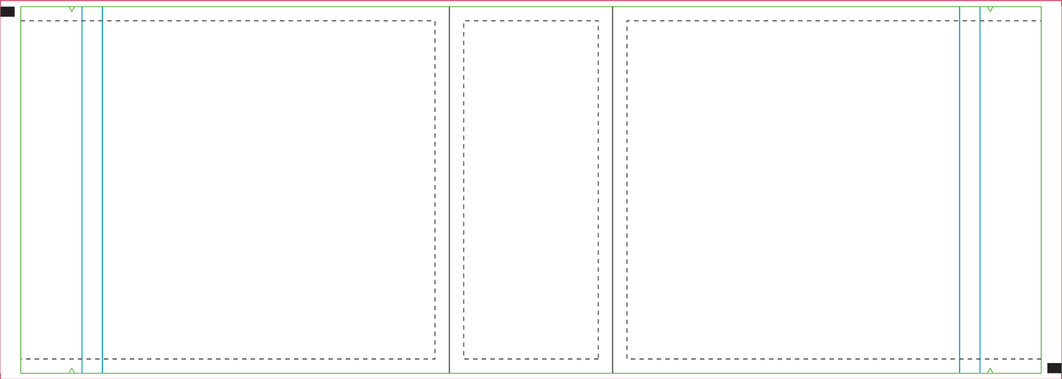
2. Explore the template and technical specifications: Welcome back. We have this
template opened in polvo shop, but where did it come from and how are we
supposed to use it. Let's take a step by step. Whenbodys going to
print something, you should reach out to
various printing companies. They're going to give
you all the details, including this template. This is quite important because every company has
certain bag sizes, layouts, requirements,
and so on. In some cases, they
may even give you a manual on how to
actually use the template. In this case, the center of the project makes up
the bottom of the bag. And that's because this is a bag that stands up on its own. On either side, you have
the front and the back. In my hands, this is the bottom. So this is the central part. And then obviously the front and then the back.
Okay, great stuff. Now, moving on, in this
specific template, these blue lines tell us
where the zip lock is placed. Now, this is a resealable bag. So right here, you can reseal
it in this specific area. Now, in this template,
it's clearly marked, so you don't have to
include any details, any graphics over that line. The green line marks
the bleed area. In short, that part is
going to get cut off, so you don't want to include anything important in that area. And the dotted line shows
you the creases that will naturally form
when the bag is filled. Remember, every project, every company printing
company that is, may have a different template, so it's best to ask. Next, we're working on
the actual printing size, and you can check that out
if you use Alt Control. That's option Command I, if you're using a Mac. Change your unit of measurement and see if this makes sense. Finally, we're working in
CMY K eight bit depth, 300 pixels per inch. Okay. All standard stuff. Now, could you
potentially work in Adobe Illustrator?
Sure, of course. But as long as you're using the company's template
at a one to one size, you're good to go.
Let's get to work. First of all, go to
the top right side of the photo shop and click here next to the blue
Share button from this list, choose Essentials. In case it's not looking right, click again and this time,
choose reset essentials. And now we're both on the
same page. One more step. Go to the top menu to window. From here, choose character. This will help us
style our text. And speaking of style, let's reset all of these
settings from this panel. Please, click on this
very small icon here. From this list, choose
reset character. And now you should see Myriad
Pro regular 12 pixels. And now we're all set up
and we can get to work.
3. Set up the content: Welcome back. Let's
add the content. Feel free to work along
on your second viewing. The first time around,
just sit back and understand the thought
process and what's going on. Then rewind and work along and pause as
often as you need to. If you can't manage, you have the template with all the content laid out in case you want
to start from there. The first thing that we're going to do is we're going to flip it. Hit R and rotate it 90 degrees. Put that value in the
options bar at the top. Okay, now, zoom in, if needed, use the Z key for that, and then let's start
adding some text. Hit T for the type tool. Click, and now let's
paste content. Everything is right
here in this note pad. Now, when you're
done, you can use the numerical enter on
your keyboard to finish. Or you can use the checkmark
from the top right side. You might have noticed that the regular enter key will
send you to the next line. So again, numerical
enter to finish, and then the regular one
to move you underneath. Of course, this has to
be flipped as well. And that's quite easy
to do. Hit control T. Okay, move to a corner, say the top right side and
look for this specific symbol. This means you can rotate it whole shift to get
a precise angle. In that case, we
want 90 degrees. Well, -90 degrees, but yeah. Okay, good stuff.
This is now flipped. Now, with this layer selected, you'll notice that
it's a bit too small. Use this part of the
character panel to resize it. We want something generous. Let's say 60 pixels. Now, we're not styling
it at this point, but we want to be able to see it at a reasonable Zoom level. So I'm going to keep
copy pasting my content, and I'm going to zoom to it. It's the exact same thing
over and over again. I'm just going to make
copies with Control J. That's command on the mac and then simply
replace the text. Now, you may ask what should the packaging
contain, right? What do we have to add? Well, in most cases, you can ask your client, or you can simply look at similar packaging
for the inspiration. Now you're going to
notice that just about everyone has certain
things like ingredients, nutritional info, the
products weight, and so on. These are mandatory things and they are different laws
in different countries. So it's best that you do
some research on your own. Simply shop around,
go to a supermarket, and you're going to
see what's what. Most of these things
are quite common. What I can tell you is that laying everything
out is essential. We need to give a sense of how much content we
have to work with. Based on that, we can
decide on a style, on what graphics we
can use, and so on. Here's something to note. When you have large
pieces of content, you may want to use
paragraph text. So far, we've used point text, which is just what happens when you click and you start typing. So that's point text, but we can click and drag to confine our text
to a specific area. This is called paragraph text, and this helps us stay within the templates bounds and
quickly set up a style. This has to be flipped as well, but it's not a problem. When you're using
paragraph text, you can resize its
bounding box by activating the type tool and using any
corner handle, just like so. Make it so it fits
the space better. Exactly like that. Good job. Now, again, I'm
going to zoom ahead, and I'm going to show
you something else. This is the barcode. This is something
we do have to add. It's mandatory for all products, and the clients should
help you with it. It's not something that you
can come up with on your own. Drag it inside photo shop, and you may want to resize it. Okay. The position doesn't
matter at this stage, but make sure you constantly
zoom in and then zoom out with control zero to get
a better sense of things. Now, here's why we're
constantly zooming out. You wouldn't want this barcode to be half of the width
of the bag, right? But you wouldn't want
it too small either. So it has to be balanced. When you're done resizing it, obviously, use the enal
key, the regular ruin. But if you ever want to
change of mind, again, use control T, that's
coman t on the mac, to resize it a bit more. I'm happy with it, so I'm
going to just continue. So, fast food, let me
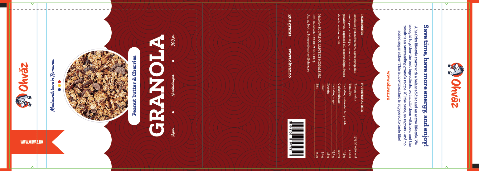
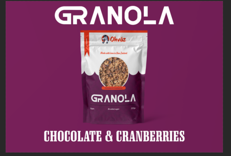
show you the end result. This is all the content that's supposed to
be on this bag. We have the product's
name, the flavor, a few things about it being
vegan and no added sugar, a slogan of sorts, a short story about the company, and then ingredients,
nutritional info, and a few other bits
for legal reasons. This is our starting point. You have this template attached in case you want to
pick it up from here. Let's take a quick break.
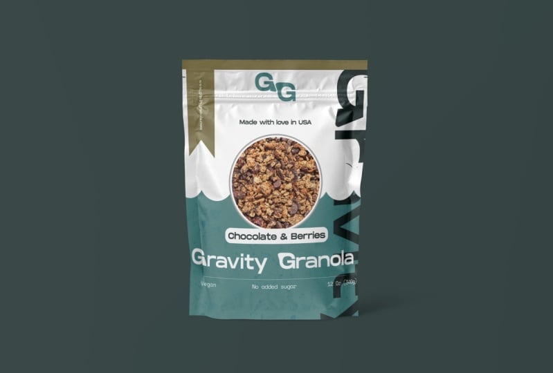
4. Find inspiration on Behance or in the real world: Welcome back. We have our
raw version of our design, and it's time to choose a style. But that to happen, we
need some inspiration, and we're going to
use two sources. So real products
and then be hands. In terms of products, you will be able to get paid samples from various companies. These are eager to show
off what they can do. You'll find the
world of designs, styles, materials in
all shapes and sizes. This really gets you have
creative juices flowing, and it's a great way
to see how a design translates from your computer
screen to the real world. Being able to touch
them is a big deal. You can also check out the text component
in terms of sizing, how it relates to other parts. Look for differences in
weight, size, and style. You're going to notice there's an art and laying out a lot of content in a way where
it looks nice to look at. But if you don't
want to get paid samples from printing
companies, you can do this. Browse around in your
local supermarket and find packaging
that draws you in. When that happens, think about what makes that design special. Why did it stand out? Is it the color, the contrast,
the beautiful typeface? Is it the combination
of all of those things? Maybe it's the artwork or
the box has a funny shape. Make a note of all of that
and then have a look on the shelves and see other brands that don't stand out as much. Ask yourself this. Why
do you feel drawn to one design while other ones
leave you uninterested. Maybe they're too busy. Maybe the colors are
a bit washed out. Maybe the style is
a bit outdated. There's a lot to think about. Spend enough time on it and
ask yourself these questions. But let's switch to
the web, be hands.net, Adobes gallery, a fantastic
source of inspiration. Use the search bar and
type in packaging. You could go for something
a bit more specific like granola packaging
or serial packaging, but I like to explore. And that's the whole point. We're not looking
to copy something. No, far from it. We're looking for ideas, color palettes, typefaces
that stand out. And from all of these designs, you're bound to see a few of them that are going to
make a big impression. Now, when you're designing
something for the company, you got to make sure
that the vibe matches. It's best that you visit the website and you make
a note of their identity. For example, in this case, notice the bright orange, the ample use of white and
the very light shade of pink. The happy mascot and the logo. Now, all of these
are quite important. Make a note of all
of these things and have a chat with the client. See what he wants.
Back to be hands, as you explore these entries, you're going to want
to save some of them. Click here to the
side of this design, and you're going to
get that option. You're going to
create a mood board, which simply means a bunch of entries that will act
as your inspiration. Let me quickly show you mine. You're going to see
vibrant colors, big, beautiful fonts, and a few
illustrations here and there. Most of these are quite modern. They feature vibrant colors
and have a strong contrast. So we can start
to get a sense of how the project
should look like, lots of white, strong font, bright and saturated colors, and some type of imagery. But I'm also taking into account all the other products from
this particular brand, all the jars of chia pudding, lemonade, and so on. Because that have so many
different types of products, I need to choose a style that can work well across the board. That's why
illustrations are out. Develop simply too
many products. So overall, I think
we've narrowed it down. Now, it's your turn. Please set up a mood
board of your own. Have a good look on behalf and save at least five
to six entries. At the end of this series, you should have two designs. So you're going to have a
replica of my own design, but also a totally different
one with your own style. So that's why you need
your own mood board. Go ahead and set it up and
we can continue after that. Have fun with it and spend at least 20 minutes
on it. Thank you.
5. Start playing with fonts: Welcome back. You have this PSD attached in case you want to
work along from this point. We have loads of text
that needs tiling. Now, the best approach
is to use Adobe Fonts, my go to source in
terms of typography. Here, I suggest you
click on Browse fonts and have a good look through the vast buffet
of font families. This is a place
where you need to spend at least 15 minutes. Use this sample field and type in something
from your project. Granola is the name
of the product. It should be front and
center. So type that in. It's very likely that
you may want to use the filters from the left
side to narrow things down. When you see something
that you like, it's actually quite easy to use. So click on that specific
font, and inside it, you're going to see a switch, and you have to flip it, and
that's going to be that. That's how you activate the
typeface from Adobe fonts. After a few seconds,
you're going to get a prompt from your
creative cloud app, saying that you have that phone synced and it's ready to go. Now, I'm going to leave you
to explore it on your own, but please remember,
there's no right choice. There's no correct choice. You have to try them
out one by one and decide after everything
is nice and tidy. In this case, I'm going to use a typeface that's
called Zilla slab, which is already used by my
company in loads of places. It's not available
on Adobe fonts, but you can download it full
free from Google Fonts. And if you're using
a Windows machine, all you have to do is copy paste it and see Windows fonts. Okay. Now, let's go
back and photo shop, and let's start with
granola. Select that. Through the character panel, we can change it from Myriad Pro to Zilla slab.
Just type that in. Now, in terms of weight,
let's make it bold. As for the size, this
is nowhere big enough. So let's bump it up
to say 200. Why 200? Well, that's not
the final value. It's a starting point. It's a fine tuning
process where we're going to change things based on how they look like
on off screen. For the flavor, let's go
with Zilla slab again, bold. But this time about
70 pixels so. Now, let's pause and think why this specific size and
why this specific order? Well, if you think about it, it's the natural order, the product's name
and then the flavor. People will initially read
what type of product this is, in this case, it's granola, and then what flavor it is. Afterwards, no added sugar, vegan, and its weight. Well, those really can't compete in terms of
importance, right. Those are always going to
be lower on the totem pole. This is officially
called hierarchy. Basically, you style your text depending on who's the
biggest fish in the pond. Then you work your way down. So this helps guide
the viewers attention. You want them to read your
design in a certain way, not exactly from left to right, but in a more
controlled fashion. And you can achieve that
through your styling, through your sizing.
Okay, to sum it up. So based on that importance, we're going to choose
specific styling, a specific size
and weight. Okay. Now, back to the front
of the packaging, I want to make sure that
this is all centered. So let's do the following. Let's reset all view. So hit R and have
a look at the top. Click here on reset
view. Okay, great. Now within landscape
mode, select a font, say granola, and let's assume that this is
off centered, right? Something dramatic, like so. Now, say that we want to
place it back in the center. Now, the easiest way
of doing that is this, hit control A that's
command A on a mac. And then with the
move to active and this layout selected
in the layouts panel, we can use the alignment tools. This is the one that we're looking for in this
specific case. And just like that, this
is perfectly centered. I'll quickly go through
the motions and transform every single text layer and I'm going to
guide you through it. It's all based on
the same principle I previously
described hierarchy. So everything has to be
styled based on that, based on the importance. There's no specific guide, the likes of, I don't know, titles should be 200 pixels. Descriptions should be
50 pixels, and so on. There's no such guide. Every type face is different. 200 may be huge for
some type faces, or it actually may be
quite a low value. So just to be clear, there are no specific sizes that
you have to follow. Now, on the back, the story
is set to 50 pixels regular. But the title above it, this should be shown
in 90 pixels in bold. And I think that
this feels right. It feels natural. The link. This is an e commerce
company first and fomost. So we need to make it stand out. Hence why this is set
to 60 pixels bold. As for the ingredients
underneath and all of that text, I would say 40 pixels regular. And that's what the
titles for those areas, the same 40 pixels, but they should
be shown in bold, so a different weight
and use all caps. This is how you enable it. The weight, same thing. 60 pixels in bold to
mirror the one from above. So here's the complete font
sizing for this stage. Feel free to pause or check
out the PSD in this form. But now, let's take a break.
6. Adding details that make a difference: Welcome back. The project
is starting to catch shape, but it's time to
add some details that will add up and
make a difference. Add the logo on both
sides of the project. But I think that the top makes
the most amount of sense. So I'm going to place it there. This is where we can use the
guidelines to help us out. Simply drag the logo inside and resize it if you
feel it's needed. You can always enter three
transfer mode by using control T. Then have a
look at the options bar. Here, W stands for the
width and H height. In case the unit of
measurement isn't right, right click and change
it to whatever you want. For example, I'm going
to go with pixels. I'm looking for something
like 580 by say 200. As long as the chain
icon is pressed, once you update
one of the values, the other one is
going to follow suit. Okay, we need to center it, but I don't want to get
confused by this perspective. So let's hit R and
reset out view. Okay. This is going to
make our lives easier. Next, get the
rectangular MkolKM. This is it right here, adjust
your zoom level as needed, and then draw out a box like so. With using these
guides to help us out. If you don't get it right on your foot go, no
worries about it. Use control D to deselect. That's command D on a mac, D from D select. Okay, now, try it again. Switch to the move tool and sent up the logo with these
alignment tools. Okay, please do the
same on the other side. I'm going to quickly go
through the motions. Just remember to rotate the
logo so it makes sense. Okay, great stuff. When you're ready, we can
move on to the next detail. And that's to add a photo
of the actual product. Some bags feature a window,
a transparent part. But I'm going to use
a photo in this case. You have it attached.
So all you have to do is just drag it
inside the project. Make sure that it's centered
by using the same tools. The fun thing about it
is that you can easily replace this photo with
another one, and here's how. You have this layer
selected the photo. Well, just drag in another
photo from your computer. Let's say this one that I have prepared and put it above it, both in the layers panel, but also on the canvas
itself. Okay, great stuff. Resize it if needed, a enter, and then you're going to
use this magic hot key, and that's Alt Control G. That's option Command G. And that's it. Now your new photo is
inserted in the old one. So again, you simply drag in another photo above the old one, both in the layers panel, but on the Canvas as well. Then you're going
to head enter to exit free transform mode. And then finally, you're going to use the magic hot
key. What is it? Alt Control G. But what
about that white board up? Here's how you can
add it back in. Please, select the original
image. It's this one here. Next, click on this FX
icon and enable a stroke. Set it to pure white
100% opacity normal. These are quite basic settings. What's important is
this bed right here. Set it to outside, and let's go for the
generous value like 20. Nothing is happening
because it's just white on white. No worries. Click on this plus
symbol next to. This will add another
effect on top of it. Now, to get that nice outer rim, we'll select the bottom stroke. So that's the bottom one. Changes color from pure
white to maybe a light gray. You still won't be
able to see it because it has the same 20 pixel size. But now we can bump it
up to say 22 pixels. So it's a bit larger. And here, that is on the canvas. So the top it stroke 20 is at the top and
the bottom 1 gray, 22 pixels at the bottom. Be sure to try this out. Now, let's see what
else we can do. I saw loads of examples on be
hands of fund combinations. I figure it's best that we
try something out ourselves. So I chose a type
phase called alkaline. This is where I
decided to use it right underneath the
main title vegan, no added sugar, and the weight. Now, the size of this
font, 50 pixels. And then one more
time at the top, for the slogan made
with love in Romania. I really think it adds
a bit of character. It's something interesting,
but it's not overwhelming. It's not over stylized. Next, I decided I want a
bit of color at the top. So grab the rectangle tool, ku, and draw one out. B generous with it. The excess that's outside
the canvas doesn't matter. To change its color, double
click its umbnail Okay. Now, let's sample that
orange from the logo. You can easily pick it up
like so with just one click. Awesome. There we go. Now, this part will
be teared away. We know that, but still it makes it look
nice on the shelves. Okay. Now, how far over the
green line should we go? To decide that, we need to find the guideline layer
and raise it up. This has to be at the top of the layers panel at all times. So raise it up. We can lower the capacity from the
top of the layers panel. S to about 50% or so. And now we can play with it. So I'm thinking maybe 30 pixels
or so. Here's my advice. You can move it so it
touches the line, like so. And now you can
hold shift and tap your ado keys three
times for 30 pixels. So that's one, two, three, each tap ten pixels, three in total, 30 pixels. Okay, repeat on
the other side and then raise the
opacity back to 100%. Now, I'm moving quite fast, but you can always check the
workbook for all the steps, plus you have this PSD
attached and you can start working from
any point. Thank you. Let's have a quick break.
7. Create a ribbon with the pen tool: Welcome back. You have
this file attached in case you want to work
along from this point. We need to add a
few more details. First of all, make sure
you have your view reset. Then we're going to
do the following. Grab the pen to W
hot key P. Check the options bar at the top and change the drop down to shape. This is super important. Notice my adult settings here. Pause, if you need to. Okay. Now, let's zoom in quite a lot to the link
next to the logo. Now, follow my lead to
create a nice ribbon. Click here to set
your first point somewhere inside the
orange rectangle. Then we're going to
set another one here. But before I'll click,
I'm going to hold shift. This will give us
a straight line. Okay. Good work.
Now, we're going to move about here and click
for the third time, and I'll shape is
starting to show up. Okay. Now, let's go here and
click again. Good stuff. Now, let's bring it home by
clicking on the orange bar, but hold shift once more to get a perfectly
straight line. All that's left is to go
back to the original point. Okay. So when you go
over the initial point, you should see a very small
circle next to the cursor. Click, and that's it.
We have our ribbon. Now, the shape isn't perfect, but it's a great way to learn about the direct selection tool. The hot key is A, the direct selection tool. But please pay attention here. We're looking for
the white arrow, not the black one.
These work differently. If you see all of these points, please hit enter once. Okay, that's going to hide them. Now, we have to make
an adjustment, right? Okay, let's use control that's command auto Mac to
activate our rulers. Now, drag one out from the
left side and move it to about this part here where the edge sticks
out a bit more. Now, you're going to feel
that it's going to stick. And that's because these guides are magnetic, so to speak. Photoshop will nudge
you into place. Okay. Now, drag another one from the top and move it somewhere near the
middle of the shape. Again, photoshop will
show you the way. It's going to nudge you there. It's hard to describe, but you're going to
feel it in your mouse. And now with the direct
selection to a active, again, the white arrow, let's select this point like so. Drag a box around it. Next, whole shift, and move it so it touches the
guide, just like that. Okay, let's do this again
with the other one. So drag out a box to select the Sankar point.
Okay, great stuff. Now, move it into
place, and we're done. We could correct the
left side as well, but there's no need for that because we're going
to make it orange. So double click it stubnil
to do exactly that. Sample the color
from the canvas, and we should be good to go. Just in case the link
doesn't show up, you may want to have a
look in the layers panel. Okay. Remember, the
text has to be on top. Rename this layer to ribbon, so it's a bit easier to find. So again, the text should be
above it. But you know what? I actually looked for
the different type face, and I settled on this
one called Bebas. I'm going to use it in
its bold form, 60 pixels. As for the color, pod white. To be honest, I
tried Zilla slab, I tried alkaline, but they
didn't stand out enough. So that's why I
opted for the Bebas. Now, to sent this text inside
the ribbon kills my track. So with this layer selected
in the layers panel, I'm going to activate
the Marquee tool hockey. Now, drag out a
box like this one. So without the edges
of the ribbon. Okay, now switch
to the move tool, hot keV, and then we can
use the alignment tools. And this is how you're going
to get a perfect result. So let's recap. Use the pen tool in shape mode. Hole shift, if you
want a straight line. Then activate the rules
with control R and drag out two guides to help you make the ribbon
pixel perfect. Get the direct selection
tool, hockey A, the white arrow, hit Enter to hide all the anchor
points if needed. Then draw out a box to
select one single point. Then move it as needed, with your mouse or
through your do keys. Finally, center the text with the Marquee tool,
drag out a box, select the text layer, activate the move tool, and then click on
the alignment tools, and that's basically it. When you're done, you can use
Control R to hide the rule loves and then control
semicolon to hide the guides. Again, you have all of this
attached in the workbook. Great work so far. Let's
continue with our project.
8. Use patterns to add detail: Welcome back. Our
design looks okay, but it doesn't have any
serious color in it. Let's change that. First of all, let's click here on
this NG looking icon. At the top of this list, you're going to
find solid color. And that's exactly what
we're going to use. Please make sure that this is the very last layer
in the layouts panel. We don't need the background, so please feel
free to remove it. Okay, right. Now, we
can easily change the background color by double clicking here
on its thumbnail. Let me go for the deep red, a burgundy to really
make it stand out. And that's pretty good. But it's really not enough
detail for the beautiful bag. So let's add a bit of
character to a pattern. File up your browser and use Google to search for
subtle patterns. This specific website
has loads of them, and you can easily spend a few hours going
through this gallery. Here's how you can create and
use a pattern in Photoshop. First of all, hit
the download button, and you're going
to get a PNG file. Save this on your computer. Next, file a photo shop and
open that PNG with Control O. That's Commando on a Mac. Okay, now, go to the
top menu to edit. From here, move down
to define pattern. Okay, click it, and we're
going to get a pop up. Call it anything you'd
like and hit okay. And now it's saved, and we need to apply it. Here's how I like to work. Select the color
field that we've just added and hit
this FX button. Yep, you've guessed it. We're going to use
a pattern overlay. Now, my settings
are quite standard, but click here to select the new pattern that
we've just saved. Here it is. It's the
last one and the list. Now, at this point,
it's a method of finding the right angle
and the right scale. There's no set formula here. It's what looks best to you. Play around with it
until you're happy. But of course, you should test at least five
or six patterns. And of course, you
can always double click the layer and change
the color once again. Okay, let's do this
one more time. This time, though, we're
going to import a pattern through a file with
a dot PAT extension. This is how you can quickly
load up a photo shop pattern. In short, if you
use a path file, you can skip saving the PNG and creating a
pattern from scratch. Photo shop is simply
going to load it up and you'll have it
available in no time at all. So that's the advantage
of using a dot PAT file. Now, let's go back to
our colored thin layer. And let's test it out. Now, for the settings, I think the scale could
be set to about 70 or so. But again, you can just play with it and see what
looks best to you. The issue is this pattern
is not transparent. It's not C two. While
we could fix that, this is a great chance to
show off blending modes. Change that from this drop down, from normal, change
it to multiply. The blend mode changes how this overlay effect is being applied to the
layer underneath. Now, to really see what's what, hit okay and play around with the color fill and
see what looks great. Again, there's no
set formula here. You have to constantly
adjust the color, the pattern, the scale, and see what looks nice. For me, overall, this
is looking lovely. But of course, the black
text doesn't work. Well, here's a great tip. At the top of the layers panel, you're going to
see this t symbol. If you click it, you'll
filter out your layers panel, so it will only show
you your text layers. So scroll all the way down
and click on the last one. Move to the top of
the layers panel, whole shift and click
on the first one. And now you've
selected all of them, which is great
because we can use the catt panel to
change everything, all the text layers in one
single click, just like that. This is fast and
super efficient. Now, the contrast is bold. It's powerful. It's really making the text stand
out, and I love that. Make sure you click
on this red circle to disable the filter. Okay. Now, click on any layer to deselect
all of those other ones. Now, this is catching shape, but I think it's a
bit too much red. Plus the logo doesn't look
all that right to be honest. Based on the mood board
and the company's website, I think I'm going to
add a bit of white. Grab the rectangle tool
and zoom out quite a lot. Add a big one, no
specific size in mind, just something that's
generous, something like that. That covers about
half of the photo. Now, you may need to
bring it lower down in the layers panel.
That's a given though. Okay, now, double click it
and make it pure white. The thing is, we do have a slogan that's
currently being hidden. Move the shape to
easily find it. Now, in terms of color, we could make it the same red, but I think I would
rather stick with blue, the blue them the
logo to be precise. Now, your choice, though, see what looks best to you. Now, this straight
line is a bit boring. It's a bit too sharp for my
taste. So let's do this. Grab the ellipse tool, hot key. But the Ellipse tool is actually underneath
the rectangle tool. So click and hold to activate
it. Okay, great stuff. Now, let's add a circle, click drag and hold shift
to get a perfect circle. No specific size in mind,
something like this. Let's place it here
at the bottom. Okay, now we're going to
make a bunch of copies. Hold the Alt key. That's the option
key on the Mac, and now click hold shift
and drag out a copy. Place it about here. Now, we're going to repeat
this process a bunch of times. While I work in the background, let me explain shift helps us move the shape
in a straight line, and Alt simply makes a copy. So that's why we
use Al ten shift. We are going to need quite
a lot of circles here. Take your time with it.
There's no specific number. Just go through the motions. Now, with the last one set, go to the layers panel, whole shift, and then
select the first one. So select all of
the circle layers. Okay. Now, switch the move tool, and we're going to use
this specific tool from the alignment tools. We're going to distribute them. Now, just in case you're
not happy with thel, you can remove one
or several of them, then move the last
one to the edge, select all of them again, and use the same command
to distribute once again. Does that make sense?
I really hope it does. If not, go through the motions and you'll
see what's what. Now, just one more
thing before we go. Now, with all of them selected, let's use Control E.
That's command on a mac. So this will merge them
into a single shape layer. So that's control E. And now it's super
easy to change their color though I actually
want it to be pud white. And this is much more like it. We're nearly there. Let's
take a quick break.
9. Improve text legibility: Welcome back. The design
is going very well, but we still have a few
things to button up. For example, the flip
side of the bag, the same circles, which
I like to call clouds. Now, before that, though, let's select the
slogan and check the colored code.
Well, you know what? I think we need to go for the
slightly different shade, something a bit
richer, more vibrant. Something maybe like this. Now, you don't have to use
the same colored code, but if you want a
perfect replica, check the workbook for
this exact color code. Now I'm going to select it
and use Control C to copy it. Next, I'm going to
grab these three text layers all at once. If you can't manage with
control shift clicking, you can always do
them one at a time, or just use the layers panel. Okay. I'm going to paste my colored code to make
them that vibrant blue. Now, let's make a copy of the white background
and those clouds. Select both of them and hold Alton Shift to drag out a copy. Now, place this copy to the right so the clouds
touch the orange bar. We have to flip this around, but luckily, photo shop
has this exact feature. Now, hit Control T, but we won't be resizing it. Actually, right click and from this list, choose
flip horizontally. And that's spot on. That's exactly what we wanted. Make sure you zoom in and you line up
everything correctly. Okay, this is awesome. What else can we do? Well, the main title isn't big enough with my
taste. So select it. And from the character panel, we're going to enable the
all caps transformation. It's this button here. This is the first thing people are going to notice, right? So, we do have to
make a standout. All right. It's
better, but let's actually increase the
size to say two eight. Type it in and hit. And
overall, this is much better. The flavor needs a bit of umph. So let's do this. Get the
rectangle tool and add one in. Don't hit you without checking the tool bar because
you may actually use the ellipse tool from
the previous part where we added those
circles, those clouds. Okay. No specific size in mind, just a shape like so. From the properties panel, you may need to scroll
down to find this area. We want a rounded rectangle. So click on any of
these icons and drag. We want a very large value. Beautiful, a rounded rectangle. Now, make sure this is placed
underneath the text layer. And now let's set the colors. The flavor needs to use
the same vibrant blue. As for the rectangle,
pure white, of course, to really make it stand out. Contrast is essential. When you're ready,
select both of them and make sure
they're above the photo. We want to partially cover it, but only slightly. One tip. In case you don't like
the size of the angle, use control T. Then hold alt
and shift as you re size. This is looking great. Now, Epane Dad, move things around just a
bit here and there. Don't be afraid to play
with your arrangement. For example, the title
is now much bigger. So let's move vegan to one side, like so, and then 300
grams to the other side. Symmetry is key. So make sure you go for that. Okay, let's get
the line to wall, which is next to the rectangle
and ellipse to walls. Okay. From the options bar, change the way to for pixels. Now we can add that line
starting from this position, whole shift all the
way to the other side. We could add guides, but I'm happy to keep
things moving along. Find tune if needed, and remember to take
your time with it. Don't rush. I'm also
going to do this. I'm going to draw a
few small circles underneath the slogan, and those will
represent my country. I'm going to use the colors
of the Romanian flag. I have the color codes prepared. So while I work in
the background, let me tell you
about the importance of aligning things correctly. It's essential that you use the alignment tools
as much as possible. Any difference in spacing, any item that's slightly offset, that's going to
be a big problem. If you want something centered, make sure you use all
of photoshops tools. For example, for these circles, I'm going to group
them with control G, command G on a MAC and I'm going to center
them correctly. Okay, great stuff. Take your time and move
things around if needed, especially the photo
and the flavor. Things are bound to be moved
around from time to time. Okay, this is looking good. Now, let's flip this around
and have a look at the back. Here, make sure
that the sizing is exactly like the one
shown in the workbook. To make the text easier to read, please select all of them, and we'll change the leading. Or if you're the web developer, that's called the line height. This is the part
in the character panel that we're looking for. Type pen 70. And this makes the text so
much more easier to read. If you want to move
things around, this is the time to do so. Just go around the move stuff. But one thing, don't go too close to the edges
of the template. Let's take a moment and the
range of thing correctly. This means selecting text layers and using the alignment tools. Move the link a bit
lower down as well, so we get that airy feeling. One thing that I haven't
mentioned, text alignment. By default, it's set
to left align text, but in this case, we
want it centered. If the layer is selected, hit T for the type tool and
you can change its alignment from the options bar from
left to center text. Great stuff. Now we can align it one more
time just to be sure. The nutritional table also needs more leading.
So let's handle that. It's a given that we may
have to move a few things, the barcode, the weight, a few things here and there. So go for it. Don't rush. Okay, let's use
the line tool once again with the weight
set to one pixel, and this is for the
nutritional table. There's nothing all
that complicated. So I'm just going
to skip ahead and I'm going to show
you the end result. It's just a bunch of lines. Overall, this is it. This is how it's looking like. And it's quite nice. It's modern, clean, and vibrant. All the paragraph
text layers really come in handy because
we need to resize these boxes and
always make sure that the title in all caps is
properly aligned with the text. Now, if possible, please stay
away from the dotted line. That's the danger zone, and we want to avoid that. Something like this works well. Maybe we should move the
weight of the product and add the link once again
just for good measure. This is to balance
the design out. It's not mandatory,
but it's a nice touch. One final thing. Let's
change the alignment for the nutritional values from left to line to right to line. This makes much more sense. And overall, this is
looking fantastic.
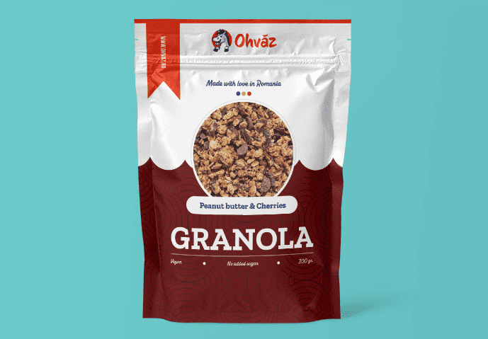
10. How to use mock ups & make variations: Welcome back. We have our
first version of our design, but our work is not done. See, it's quite hard to tell how this is
going to look like, especially since we
have to flip it, rotate it, change
a view, and so on. So here's how you can get a
better sense of your designs. Two mark ups. Now, a mark up helps you see a
design in context. You have this PSD attached, and in most mark ups, you're going to get
a generic look that you have to replace
with your own design. In the layers panel, dig through it and find the smart object that
you have to use. In most cases, it's
quite obvious, and the layer name should say something like place
of design here. To use a mock up, you have to double click the smart
objects thumbnail. This is going to bring you into a new temporary project
that's called the PSB. Here, all that you
have to do is bring in your design above
this default one. Here's how you can do that. Now, the easiest
way is to export your design and then drag
it into the other tab. But let me show you a
different technique, something a bit special. So first of all, please
hide the template layer. We don't want to include
that in the markup. Next, select the highest
visible layer in the project. That's this one
here. Next, you're going to love this hot key. It's all the modified
keys and E. So Ald Control Shift E. You may want to use
both hands for that. So A ld Control Shift E. Option
Command Shift E on a Mac. This creates a copy of
your entire project, and it places it on a new layer, and you can see it here. Trouble is we only want the
front. No wordiesthough. Zoom out quite a
lot and switch to the Marquee to all Hot K. Now, make a selection like so. Though you won't
really know where the front ends and where
the bottom begins, but that's totally
fine. No Wordies. Okay, to make a copy of
this area, use Control J. Command J on a Mac. Apparently, nothing
has happened, but check the layers panel. This is the front of our design. Okay, from the Canvas, click on it and drag it into
the new tab, into the PSB. Let go just about anywhere. Now, you're going to notice
it has to be rotated. Use control T for that. You can type in 90 degrees in your options bar if you
want to move faster. Just in case the design
doesn't perfectly fit, which is bound to happen. You may need to repeat
the selection with the marquee tool and make
it maybe taller or wider, but just use control
T to fix it. When you're ready,
hit control to save this temporary project and close it off by
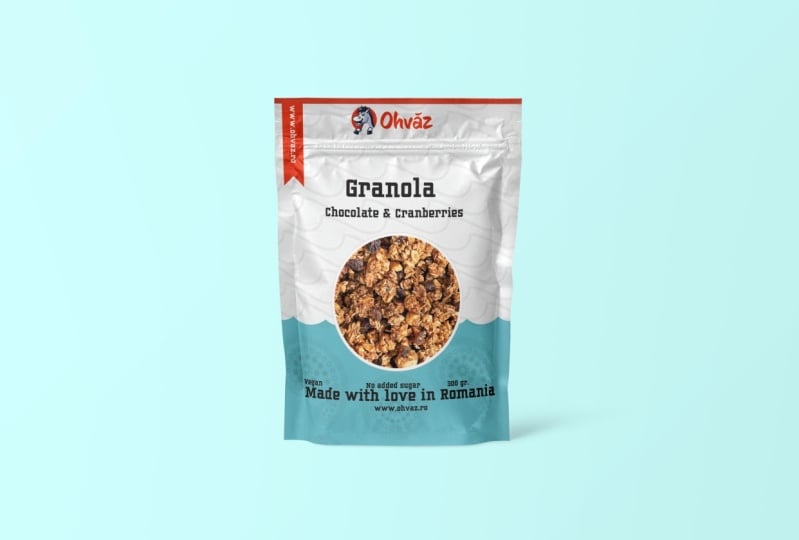
hitting the X symbol. Okay. Now, in the MCA PSD, you're going to see your
design. This is it. And now you get a
better sense of things, your proportions of how the fonts interact with
each other and so on. But we've not done yet. Let's do a quick variation. First of all, let's
remove both of these layers from the
top of the layers panel. You can hide them
or delete them. Those are copies, and
we don't need them. Then control, click the color
fill layer to select that. Okay. Now, click on the Yenang symbol to add
an adjustment layer. From this list, we're looking
for hue and saturation. In the properties panel, you're going to get
a bunch of controls. Please enable colored eyes. Now, increase the saturation to the max and play with the hue. Purple, blue, green. See whatever looks
nice in your eyes. You can change the lightness
for the different vibe. The sky is the limit. Now, I'll quickly
replace the photo, flavor, and various details like the ingredients and so on. Now, while I work
in the background, I hope that you can see
the value of a mock up. Trouble is great mock
ups are hard to come by. The best ones are
the paid resource. Free ones are pretty
terrible in most cases. Okay, now that I have
this new version, I'm going to select the
highest visible layer, then all control shift. Beautiful. We now have a copy. Switch to the Marquee
Tool, Hockey M, make a big selection that covers the front of the design,
the front of the bag. Use Control J to make
a copy of that part. And move it inside the mock up. Again, remember, double
click the smart object. Save it, close it, and we can see the different
one in just a few seconds. And basically, that's
how you use a mock up, and that's how you can use a hue saturation
adjustment layer to quickly explore
a new direction. And overall, this is how you
try out different colors, fonts, arrangements, and you can make a decision in context. You won't get it right
on your first try. It may take you ten, 15 times until you're
happy with it, but you have to go through
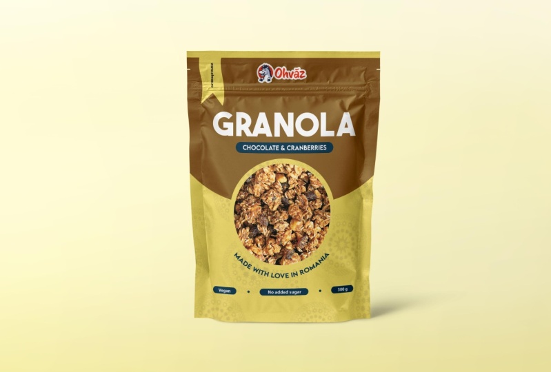
these steps with patients. Okay, this is it.
This is our design. I'm super happy with it. Now, I did make
some small edits. Let me show you. I made
the ribbon a bit wider. I added these three dots between
these three text layers. These are just small circles, and I played with the fun size
here and there just a bit. But yeah, overall,
this is our design.
11. Do a print test: Welcome back. We
have our design, a realistic markup, and we use lots of awesome
photoshop techniques. Before we move on
to the next step, let me tell you that you
have to trust the process. You will have to
go through lots of changes until you find
that perfect combination, that fun pairing,
that looks fantastic, that color palette,
that specific photo. It's not really a puzzle
that suddenly clicks. It's a lot of trial and error, and you have to manage
your expectations. For example, I decided on 280 for the size of
the title, right? But maybe it would
have been better at 290. But maybe 250. Do you know what's the best
way to decide that size? Try it out, see it in a mark up and then export
that mark up as a PNG. And you're going to end up with a folder with several versions. Take a few days, sleep on it, have a walk, and then do
a few more variations. And after the while,
you'll begin to eliminate certain combinations and you'll get closer to one
specific version. This is called an
iterative process, iterative version after version. You're inching your
weight toward success. But you have to trust the process and go
through the motions. Do we love using all control
shift E, make a copy? No. Then the Marquee
tool and then opening and closing tabs,
using smart objects. It's a hassle, right? That's not exactly
creative or exciting. But again, it's part
of the process, and you have to respect that. But let's say that
you put the work in. You've made 20 versions, and you're happy with maybe three or four of
them. What's next? A print test. This
is where you ask the printing company to send you a sheet with a bunch
of your designs. You won't actually get bags
for technical reasons, but you're going to get a
big sheet like this one. Here you get to see how
the colors look like in your hand in natural light underneath a light
bulb and so on. So it's best you try out
different font sizes, different colors, and so on. For example, we chose
40 pixels for the body. But maybe that's too small. Well, the print test
reveals everything. So it's best that you make a version with 50
pixels as well. Maybe even 60 pixels and
didn't see them in your hand. It's a lot of work, to be
honest. A lot of versions. But as long as you're
comfortable with photo shop, you're going to be just fine. Now, print tests aren't free. They're gonna cost
you about 100 bucks, but it's money well spent. This is how you can decide if your saturation is on point, if the color is
bright enough, right? What if your contrast
really pops, right? Now, to sum it up, make a lot of versions and
keep the best ones. And then with those best ones, send them to the
printing company and get a printing
sheet, a print test. Have a good look at it and
see what version looks best. And of course, you can jump
back into photo shop and do minor touch ups if
needed. And that's it. You're on your way to being
shown on shelves everywhere. Or at least you had fun with it. You have a new piece
for your portfolio, and you learned quite a lot. I'm going to see
you in a second.
12. The power of beautiful packaging: Welcome back. I hope you
had fun with this project. Now it's your turn to
do your own version. Choose different
colors, patterns, pawns, photos, the works. Play with it and see
what you can do. Show me something new. Make up a brand of your own. Switch up the logo,
switch up the slogan. The important thing is
you have fun with it and you show me a mock up
with your own version. More than just having fun, you can supercharge a brand. In my case through this
beautiful packaging, I got picked up by the largest hypermarket
chain in Romania. That's 150 stores,
and it's been great. My company grew
leaps and bounds. And how did I get into those stores through
awesome packaging, great branding, and well, to be honest, photo shop. I spent a lot of time doing exactly what I showed
you here in this series, and I came up with loads of
designs for my own company. O grew month over month. We're still quite
small, but this year, we're going to do $1
million in revenue, and I couldn't have done
it without photo shop. The takeaway is that being a designer is really
like a superpower. You can take a company
that's hurting for sales, apply some photoshop magic, and see sales go to the roof. Now, you have to realize the
magic is in your fingertips. Sure, we can make
means in photoshop. We can retouch photos. We can do wallpapers
and all of that jazz. Sure, fun projects. But don't sleep on packaging. You can have a major impact. Just reach out to various brands and show them your ideas. You might get a project,
but more than that, you might see your designs across hundreds of stores
across the country, maybe even the world. Now, that's something
to be proud of. Again, please send me your
version for this project. I'm excited to see it.
This is Chris Barn. It's been a pleasure
to teach you and I hope to see you in
another course of mine. Take care and remember
to have fun with it.
 Chris Barin, Certified Photoshop Expert