Transcripts
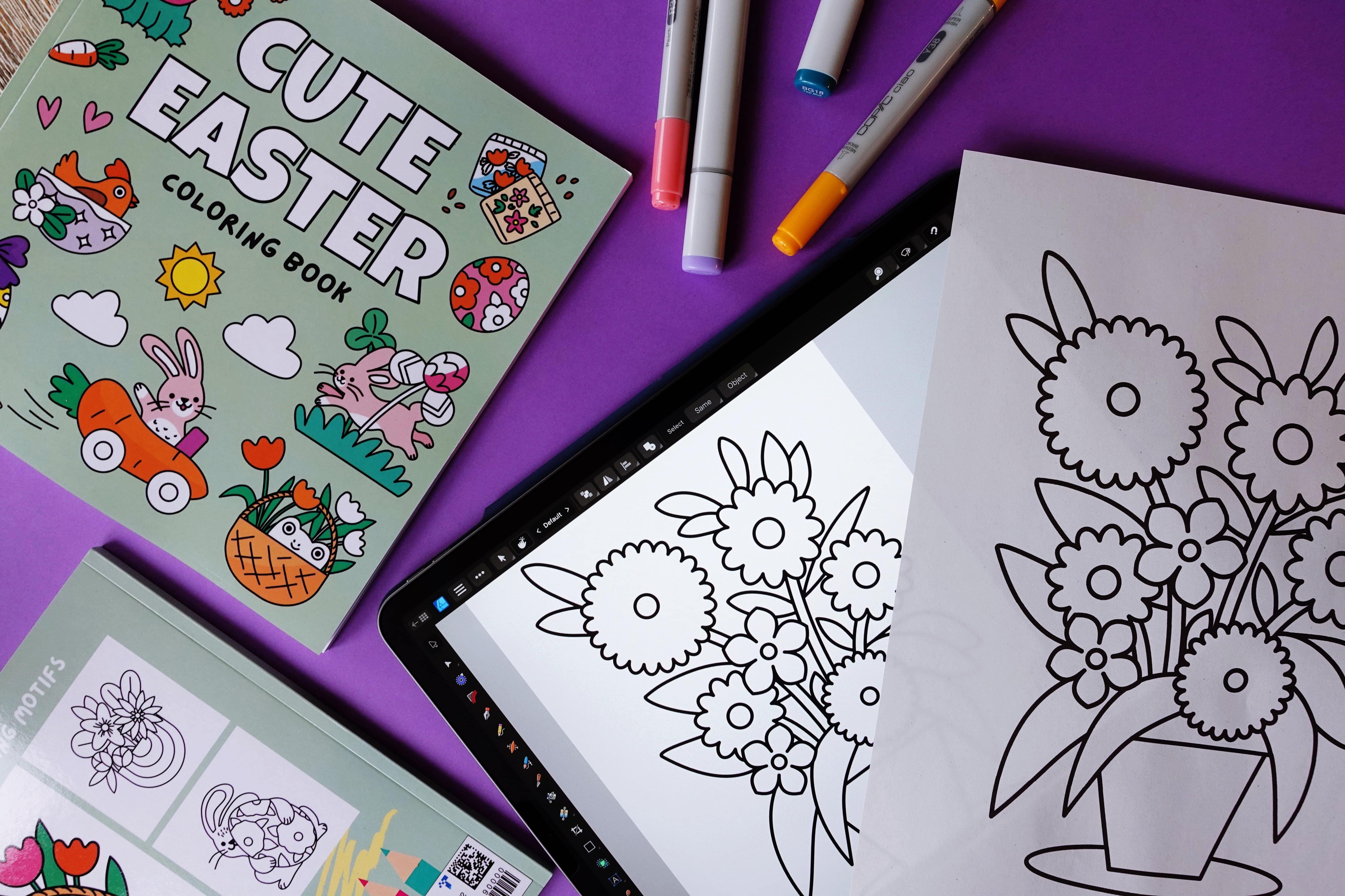
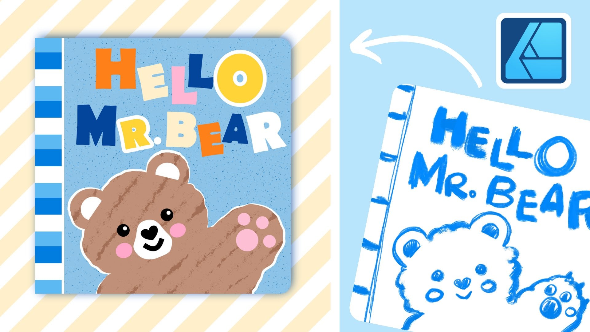
1. Design a Coloring Page in Affinity Designer: Let's create a cute spring
inspired coloring page right here in affinity
designer on the iPad. This is a fun and
relaxing project to get you into that
springtime mood. I will walk you
through step by step, all set up to be print friendly
and perfect for coloring. We will discuss other
coloring pages, production tips, such as choosing the right
black for your project. So keep watching.
Let's get started. O.
2. Your Coloring Page Project: Before we jump into drawing, I just wanted to share a little about why I create
these coloring pages. I actually started designing
them for my daughter. She really loves to color, and making pages just
for her has been such a sweet and fun creative
outlet for both of us. Over time, I realized that these simple cute designs
also resonate with adults, especially those looking for
a relaxing creative break. So now I also offer my
coloring pages on Etsy and I've even self published a full coloring
book on Amazon KDP. So as of April 2025, two of my coloring books are published on Amazon.
I'm really proud. If you're curious
about how I prepare these designs for printing
or for publishing, let me know in the comments
if you're watching on YouTube or in the discussions
section on Skillshare. I'd be really happy to make a tutorial about
Affinity Publisher, for example, because this is where I set up my entire
publishing project, or I could create a mini course about setting up your
coloring book for Amazon KDP publishing as well. All right. Let's talk about what we
will be making today. We are going to create
a simple floral themed coloring page that is perfect for both
kids and adults. I will be working in affinity
designer on the iPad, but if you're using the
desktop version of affinity, you can totally follow along because everything I'll be
doing works the same way. The final piece will be a clean, black and white line drawing, print friendly, and
it's going to be sized for US letter dimensions. I will be talking about
the dimensions that you can choose from
later on so that we can make sure together
that it's ready to use in your own printables or even
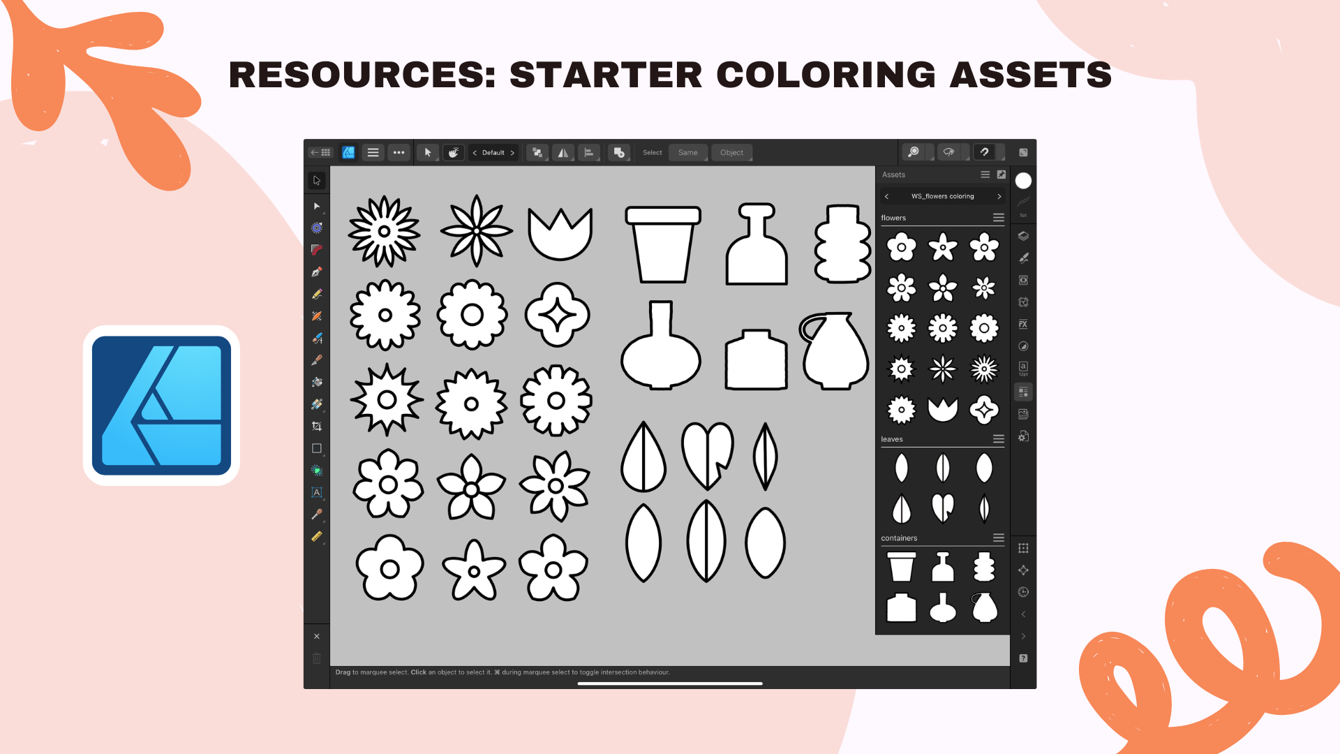
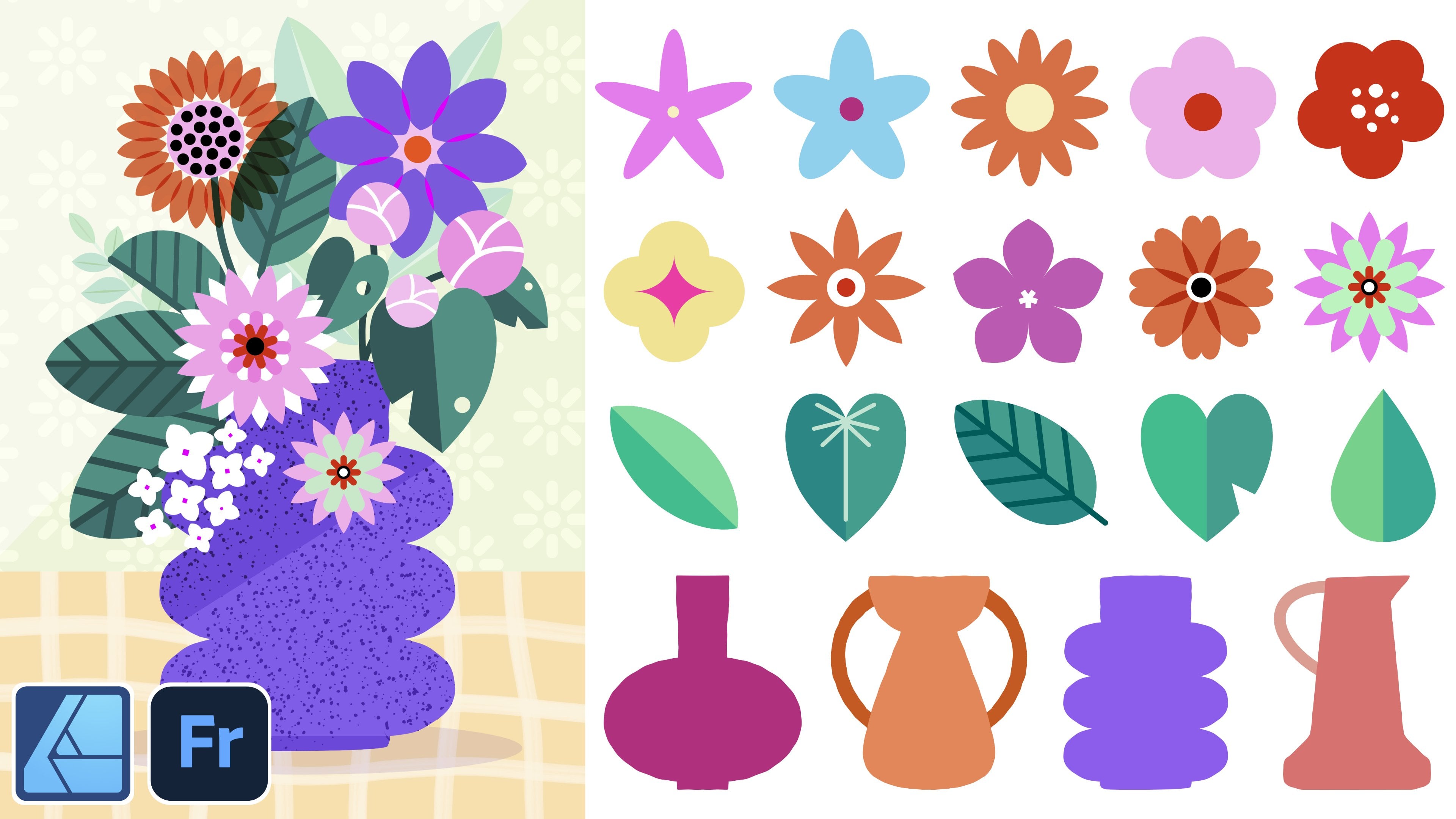
in a coloring book project. Also, I will be
sharing ready made floral vector assets set perfect for building
your own coloring pages. It's going to be available
exclusively with my paid Substack subscribers and over on Skillshare if
you're watching there. If you would like to play with those vector assets and
speed up your process, be sure to check them out. I also have two other
courses about vector assets, assets one, and assets two, and they're all packed
with information about what are assets and why I love creating them
and repurposing them.
3. New Document Setup: Now let's get started
by setting up our new document in
Affinity Designer. I already have my favorite
dimension saved up, but I will show you how to set things up completely
from scratch. First, you open the app and you will land on the home screen, which is the so
called Live docs. From here, you tap the
plus New button in the top left corner of
the screen to create a new document and
then new document. Now we can also see
a few presets here. If you don't have those exact dimensions
saved up already, you can select any preset that you can see on your screen, and we will adjust it together. So first, we will change
the document units to inches from this
menu over here. I recommend that for coloring
pages for printing out, you either go with
the A four format, which is by the way already in the presets menu or
the US letter format. This is what we will
be doing together. That's why I am selecting
8.5 " with by 11 " height, and then we keep the 300 DPI. Now, even though this is just
black and white artwork, I like to keep the
whole document at the CMYK color format, which is print friendly,
so I'm changing it from RGB to CMYK. For this document,
we don't create any artboards and
also no margins or no bleed is necessary, so we just leave it as it
is, and then we hit Okay. You should now see a
clean white artboard in front of you perfect for building our springtime
coloring page. So now, when we go
back to our home page, we see our new coloring
page document. And then the upper
right corner of this document shows
us our dimensions. So we see 8.5 by 11 ", and then we can
also see that it's correctly in the
CMYK color format. You may also want to save it by selecting Save As from
the Hamburger menu three horizontal lines
and then give it a name and save it either to your Cloud storage or
to your device storage. This will be your document. You're going to be
working in here. Now I wanted to show you my own exercise sheet that I
prepared for this tutorial, but you can continue in your
newly created document. A practical tip if you're
a licensing artist, the elements of the
coloring page that we'll be creating can be also colored in, and then you can repurpose it to showcase everything
in your portfolio. For example, I was
able to repurpose the coloring pages
work that I've done to use in my
agency portfolio. So here you can see my
agency portfolio website, and actually recently, it actually attracted
new client work. You can also pre prepare, so to say your vector acids first or whatever elements you would like to build
your composition with, if you already have them made
because you've been working with vector acids
before, for example, then you can just prepare them by placing them on the
side of your canvas, and then you can build
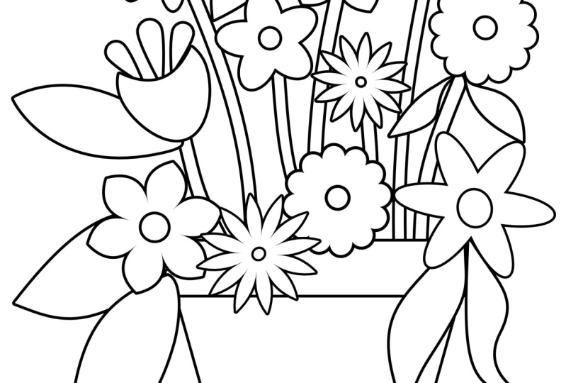
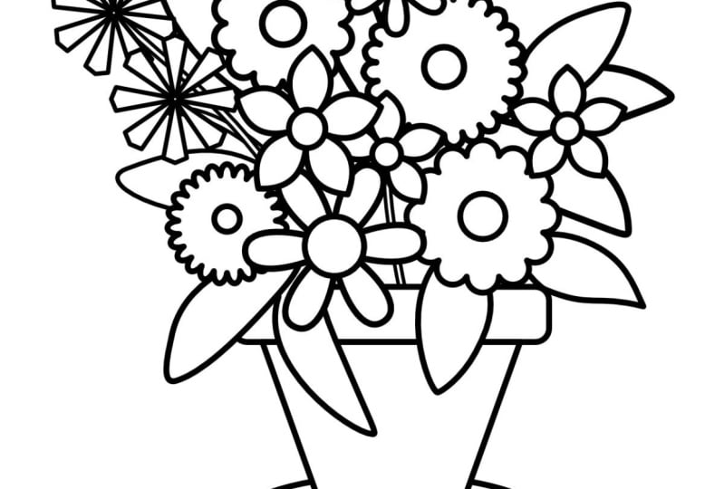
your coloring page. Real in a matter of seconds, it's going to be super fast. Over here, I have some
finished examples of floral compositions, flowers in flower
pots for you to see cute floral compositions
made in just a few seconds. But of course, we
will be creating in this tutorial our composition
completely from scratch. Again, a reminder, these
assets are available for my paid Substack subscribers as the thank you and of course, for my Skillshare students, they're available under class
resources for download. Feel free to play
with them and use them in your compositions. Okay. For now, let me
switch the assets off and also the colored artwork examples.
I can also switch it off. But actually, these
are, by the way, super handy just for you to see to have them later on in
your interface if you would like to color in your new compositions in
really just a matter of seconds by simply sampling the colors from something that you already created before. And in this way, you can keep your color
palette consistent. And you can see
here how fast and easy this coloring in is. Okay, but for now, we're going to switch these off. Now, let me also place this finished composition here to the side as my reference, and we will be drawing something
very similar together.
4. Linework & Color Settings (CMYK blacks): Let's first draw our container, so our flower pot. I will be using
simple vector shapes. Right now, by default, we are in the designer persona. You can see that small
blue affinity logo at the top left corner, and this is where all your
vector tools basically live. Now, we tap the rectangle
tool from the left toolbar. You might see a shape
like a circle or a triangle if a different
one was selected last time. So just tap it to bring up all the shape tools and then choose the rounded rectangle. Next, draw a horizontal
rounded rectangle. This will be the top
of our flower pot. And before we move on, let's make sure that our shapes have the right
stroke and fill settings. That means the outline
and the inside color. This is really super
important for coloring pages. So we get those clean
printable black outlines with a white background. Now, having still this
first shape selected, we opened the color studio, and that's the little circle
icon from the right toolbar. It shows both your fill
and stroke colors. So the full circle
is the fill circle, the inside color, the top one, and it has to be set to white. I am using the CMYK sliders, so you have to select
it from the menu. And with true white
for the color, all the sliders here are
positioned at the left extreme. So the numbers show 0% all over. Then we tap the stroke circle, the one underneath the circle
with the empty inside. This is our outline and we need to set it,
of course, to black. To make sure it's pure black, we go again to our CMYK
sliders and we set K, which is our black to 100
and the other sliders. Sine and magenta yellow
are set to zero, and that gives us
a true black line. This is called pure K black as you're only using
the black ink. The letter K stands
for key black. Which is ideal for
coloring pages. It avoids over inking and keeps lines very
sharp and clean. So it's also the most
print printer friendly, and it's what most
print shops expect. If all CMYK sliders
are set to 100, so we have Sion magenta, yellow, and key black set to 100, you are using what is
called rich black. And for coloring pages,
that's not ideal. Your printer tries to
mix all four inks to create an ultra deep
black in this case, and that causes too much
ink to be laid down, which can cause some problems. For example, it can bleed slightly if your paper is a
little bit cheaper or porous. That's why it's better to
stick to the true black. Next, we set the
stroke to five points. In my experience, five points is the sweet spot
for coloring pages. And we can take a look
at my coloring book. Okay, so this is
what it looks like. It is bold enough to print well and easy to color
inside the lines. But if you prefer your
lines a little bit thinner, feel free to modify
this to your needs. Now that we've set our stroke to five points black
and fill to white, the good news is that
affinity designer will remember those settings for the next shapes that you draw. Let's continue and draw
the flower pot shape. Select trapezoid shape
from the rectangle tool. Then from the move tool, we can flip it vertically. On the layers panel,
we make sure it is under the top of the flower pot. You can keep using the
move tool to adjust the sizes of those elements to make them bigger or a
little bit thinner, basically to your liking. Then we can group it. Next, we select
the Ellipse tool, and we can draw a little
saucer for underneath. And we also make sure to
drag this new saucer element underneath and make sure also that is within
our flower pot group. You can also double check if everything is perfectly centered by selecting all the layers that belong to this one element. And then from the Move tool, we go to the alignment options
and we tap align center.
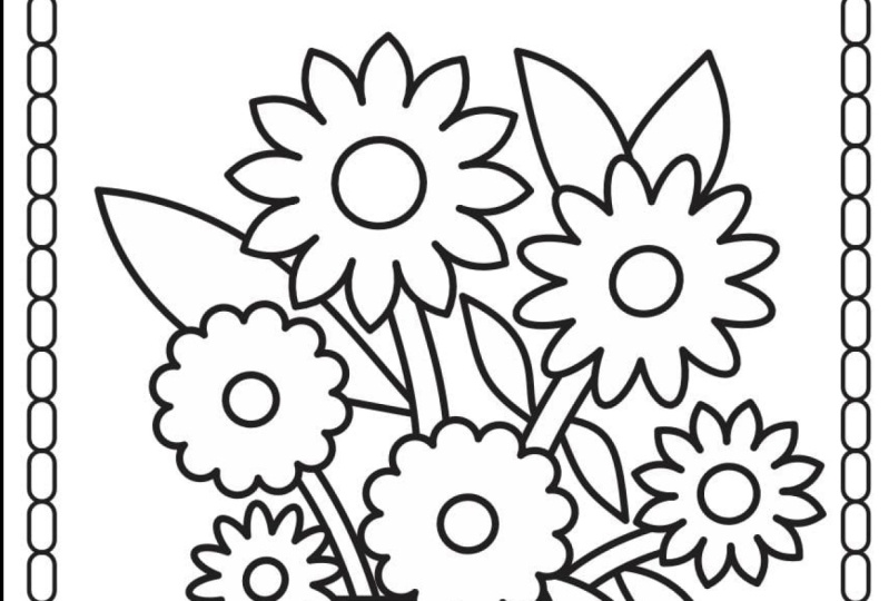
5. Easy Vector Flowers: Now let's start
creating our flowers. We will keep it very simple by using the rectangle
tool further. These vector shapes are
super versatile and they can help us build really cute stylized flowers
very quickly. We tap the rectangle tool again and we select the Cloud tool. Now you can draw a
bubble like shape and hold one finger on the iPad screen to
keep its proportions. You see this little red dot, I can help you modify
your shape further. Those will be our petals. You can also change
the number of petals of those bubbles from
the contextual menu above. You can input a different
number under bubbles, but I like 12, so I'm
going to keep it as it is. Next, we can draw a perfect circle using
the ellipse shape, holding one finger on the screen to keep it as a perfect circle. I select both shapes
from the layers panel. We can go to the move
tool, alignment tool, and then we select
a line center, a line middle, and then
we group everything. Now we have our first
flower which we can resize. Just make sure the size is friendly for
coloring purposes. So you don't want
anything that is a little bit too tiny and
therefore hard for coloring. We can make super quick copies on the iPad by
selecting our flower. Then two fingers on the
screen move and release, and we have a super quick copy. That's one of my most favorite iPad gestures for affinity. Now, this copy flower,
we can also resize it, maybe make it bigger, and
rotate it a little bit, so it's not identical, and you can create as many
copies of this flower as you want before we create
another flower shape. Now let's try something else. We will recycle one
copy of this flower, then we can go to the petal
shape to the cloud shape. And we will change this time the number of bubbles
and experiment a bit. Let's see if we would
like to have less, fewer petals or maybe a little bit more
petals on this new flower. I like more bubbles, so I like more petals and I think
it will be fun to color. I will also make the inside
of this flower a little bit smaller so that it differs a bit more
from the first flower. I have magnetic
snapping on so that the guiding lines will confirm for me that the circle
is exactly in the middle. I don't have to use the
alignment tool every time. I can just follow
the guiding lines if magnetic snapping is on. This flower is already
grouped and now I can make copies if I want to. Cool. Let's create one
more flower shape, but this time we will
be using the **** tool. You can find the **** tool
above the Cloud tool. Start drawing and
hold one finger on the screen of your iPad to
maintain the proportions. And now, this is
where the fun begins. The cook tool in
infinity designer is a really great way
to create unique, spiky starl shapes
for flower petals. By default, the cog will
have multiple points. So you can also see
those red points that will allow you to adjust
this shape even further. For example, we can
make this middle smaller or we can totally change the shape of our petals by manipulating the rest
of the outside red dots. I highly recommend that you experiment with
this shape on your own. I'm going to also adjust
the number of teeth. That's a funny name
on this shape, perhaps to the
classic five petals. Alright. This is lovely. I think it differs enough
from the other flowers. Next, use the move
tool to place it in your composition
and to resize it. One finger on the screen
to keep the proportions. And two fingers on the screen
to create quick copies. If you would like to
learn how to make all kinds of complex
shapes like that, you could consider taking my very extensive botanical
master class course, Affinity and Fresco together, which is close to 6 hours long, so we cover even more in there.
6. Expand Stroke: Okay, let me show you
a really neat trick on how to draw our flower
stems in a very efficient way. So first, let's group all our flowers and
keep our layers tidy. Now position yourself underneath
the flower pot group. Then we go to the pencil tool. And now let's check the
contextual menu above together. So Autoclose is off because we will be just drawing a line and it's not
a closed shape. So Autoclos has to be off. We select only use line. There is no fill, and I am
using the rope stabilizer. Then we draw a few flower
stems in the back. You can always increase the stabilization
here on the left, which will basically make your lines even smoother
and less wonky. I usually have it at
around 2030 and not more. I think this is enough, and
then we draw a few stems. We select all of them
in the layers panel. We go to the stroke studio, and we start increasing
the width of our stroke till you get the
stem thickness that you like. Okay, I like this one, and now we're still
keeping the selection. You're not deselecting anything. We go to the three dots menu above and you select
Expand Stroke. And now our shapes are a curve, and they can have
both stroke and fill. So we need to readjust them
again from the color studio. Fill is white. And of course, we make sure we have
our true black. Next, we readjust
the stroke with back to five points or whatever points
you've chosen before. And we group all the stems
together right away. Take a look at the
entire composition again and see if you need to reposition your flowers so that the lines don't
cross in a weird way. Remember, it's a coloring page. It has to be easy to color. So try to avoid any
weird tiny gaps.
7. Pencil Tool Leaves: Okay, we are nearly done. Let's draw a few leaves. Now, I would like
to have some leaves to be behind the flowers, but also in front
of the flower pot, just like in this previous
composition that you see here. Let's go to the pencil tool again and make our test shape. This time, I am turning
the auto clothes on. Clothes near is fine, so we
have to close our shape. We keep the stroke settings
and we also have to fill on. So we have those two icons
that need to be activated, and you can recognize
that they're on because their
backgrounds are black. If they are deselected,
this black background turns to a bit of a gray. I'm also keeping some
rope stabilization on, but you can also deselect your stabilization and
draw more free hand. And now we can
draw a few leaves. So when you start drawing, you will see that auto
close will show you like red selection when you're getting close enough
to close your shape. And then the shape kind of auto snaps together and
closes itself by default. If you don't like the
shapes that you created, you can always go back by tapping two fingers
once on the screen. So the gesture is the
same, like for Procreate. Okay. Now I want a few leaves
behind everything else. But let's group those
front leaves first, and then we position ourselves
underneath all the flower stems and we start drawing
our extra background leaves. Now at this stage, you can draw as many leaves as you want, but you have to make sure that the overall composition is readable and appropriate
for coloring, especially if it's for kids. I shouldn't be overly
busy because kids might mistake where a leaf is
actually finishing, so to say. So in case you would still
like to modify something, the best way to go about it is to switch to the node tool. Which is underneath
the move tool and then you can see if you need
to correct anything. For example, we
can polish it off by getting rid of any
small gaps that are awkward for coloring and we
make sure that the shapes are recognizable so that both adults and kids will know
where to color. When you're using the node tool, you just tap on the line of the shape and the nodes
will show up and you can adjust the entire
path of your shape or you can adjust the
nodes and their handles. I also like to switch
to the move tool, tab given shapes and
also resize them, maybe rotate them differently. Basically, I'm trying to fix my composition and to make it more legible, easier to read. Coloring pages have to be kind of appropriate for
your target age group, and they also have to have
enough white coloring space. So as you're
designing your pages, some things to
consider is, again, your line thickness and how busy your composition will be and how much white coloring
space it will have. You can zoom in and zoom out
to see how it looks overall. Then when you're done with the
leaps, you can group them. And then we group everything. So all the elements
of our coloring page. From the move tool, we
can place the design in the middle of the page and also scale it up or
down if necessary. I usually make it a little
bit bigger so that it really kind of fills
up the entire page, but I'm also leaving
enough space on the edges. In my document, I have other
elements around my canvas, so I will clip it from
the preview mode in the upper right corner so that I can only see my
coloring page design. What you see here
on your canvas, this is what will be exported. I
8. Export & Share: Now let's wrap things up and get your artwork ready for
printing or sharing. First, you have to take a moment to double check your design, adjust any shapes or strokes if needed to make everything
look clean and balanced. This is, for
example, the time to rotate things or to resize them. Before we export, let's
save your document. To do that, go back
to the homepage. And then Hamburger menu, three horizontal lines
on the document, and you click Save. Now it's time to
export your design. We go back to our document, and then in the
upper left corner, we select the Hamburger menu, and we tap Export. Over here, we have a few
file format options, but we will choose
PDF as our format. PDF is perfect for
coloring pages, since it preserves
vector quality, meaning your artwork will print very sharp and
crisp at any size. So we keep here PDF for print, and then we select share. And I like to save my coloring
pages to my iPad storage, but you can also save
it your Cloud storage, for example, dropbox
so for me personally, I go ahead and I
select safe two files. Next, you can choose
your device destination and you hit Save. If you want to share
your coloring page digitally or sell it online, you might want to export
it as a PNG or JPEG. Just make sure to select at least 300 DPI for
high quality images, you know, when you're
creating your document, or you could even go for 400, at least 300 DPI. This is especially
important if you plan to sell it
on platforms like EtS as customers will want
the best quality printout. Now, your floral coloring page is ready to be printed,
shared or sold. Let's see how it will print. Dada, there it is. So I think it looks great
and it's ready to color. So I think my daughter will really enjoy
coloring it tonight. Now, you've created
successfully a beautiful, print friendly coloring page that is perfect for
both kids and adults. Thank you so much for
taking this class with me. I hope you enjoyed creating your floral coloring page and that you found the
techniques helpful and fun. If you enjoy this class, don't forget to follow
me on Skillshare and consider leaving
a class review. Be sure to share your projects in the
class project gallery. I would love to see
what you create. In your project, you can also
tell us a little bit more. Did you create your
coloring page as part of a bigger
coloring book project? Maybe you would like
to include your Amazon or at SlinkO maybe you
created it for a loved one. Maybe you also have a child and you wanted to create
something fun for them. As always, if you
have any questions or you need feedback, feel free to ask
in the discussion section here on Skillshare. Okay, I'm going to finish now and go to color a little bit, so I will see you in my next
class. Bye bye. Thank you.
 Weronika Salach, Art with MAGIC