Transcripts
1. Intro: Hello, everyone. My name is Clarence. On this class, you're going to learn how to create this exact posture. But with the same techniques, you will be able to create similar postures like these ones. We will start by getting the resource is and then moved to for a shop to start editing, you're going to learn about adjustment layers, filters, Grady ins and other tools that you can use to create cool postures. By the end of this course, you will be able to transform any picture into a colorful, illustrative style. For this course, you will need only photo shop, so make sure to enroll and see the whole class.
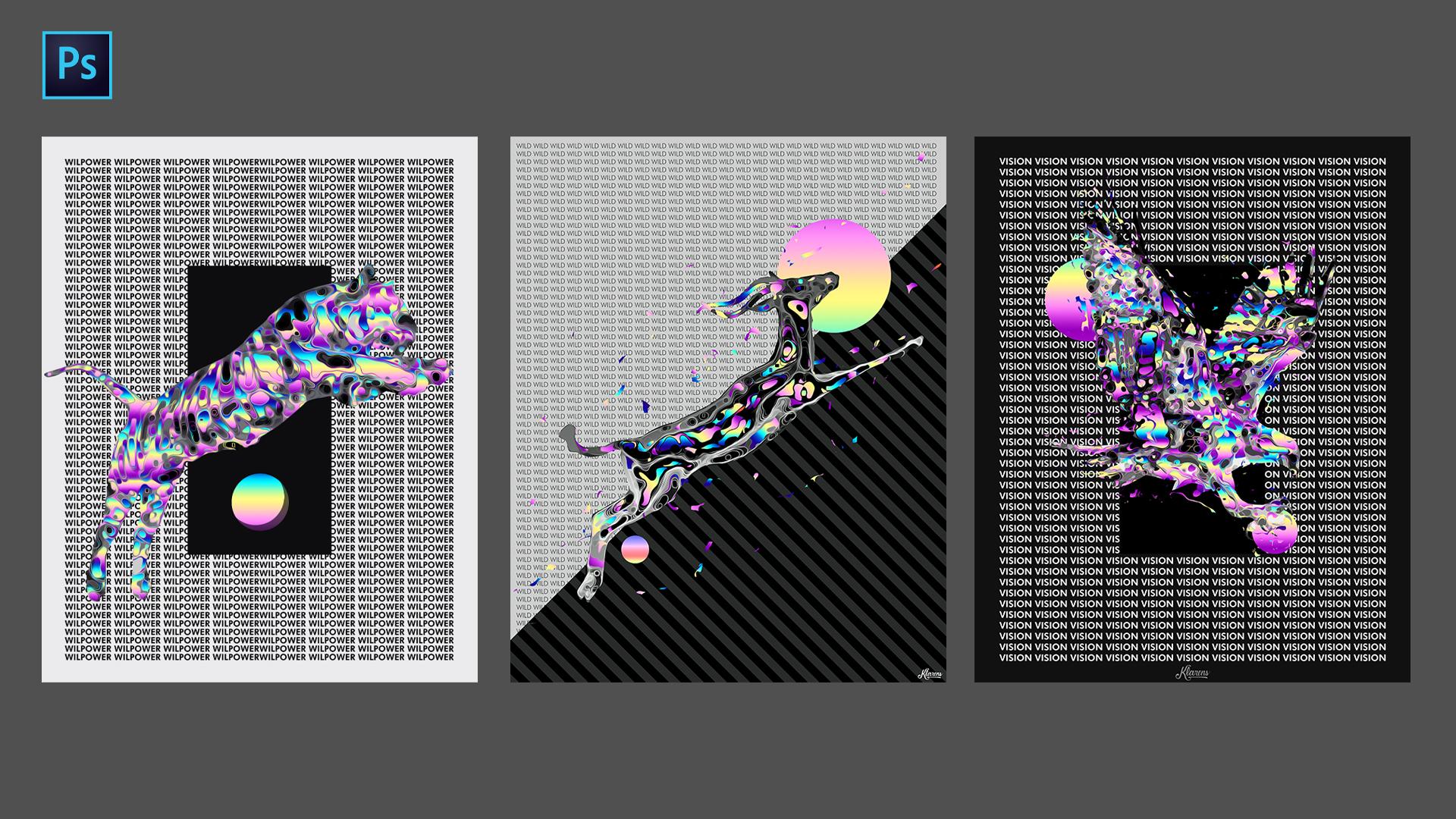
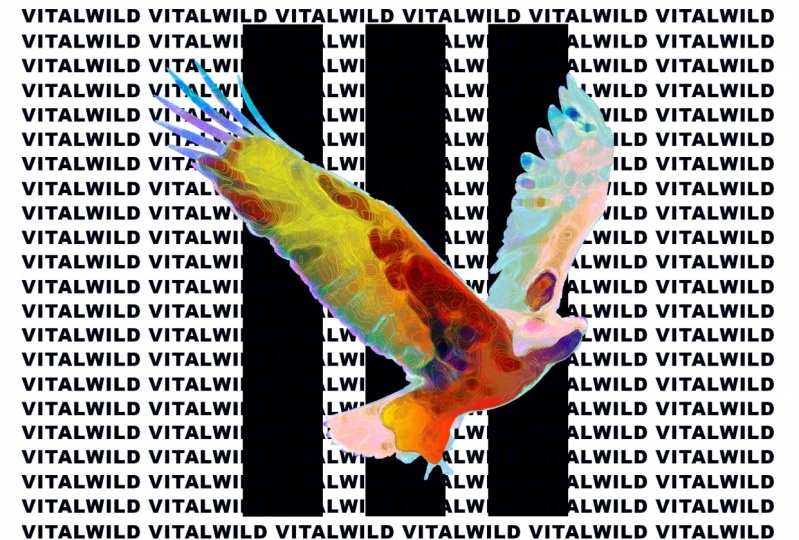
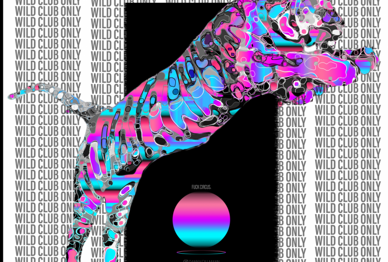
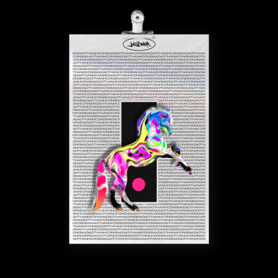
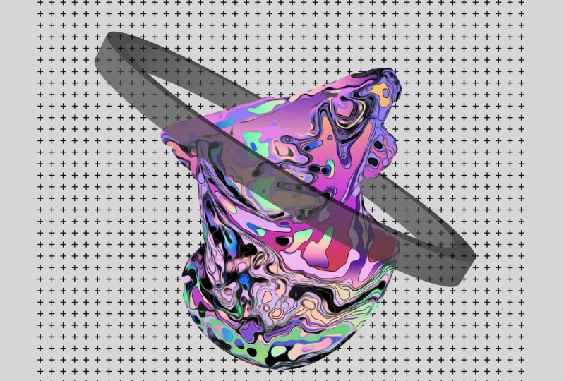
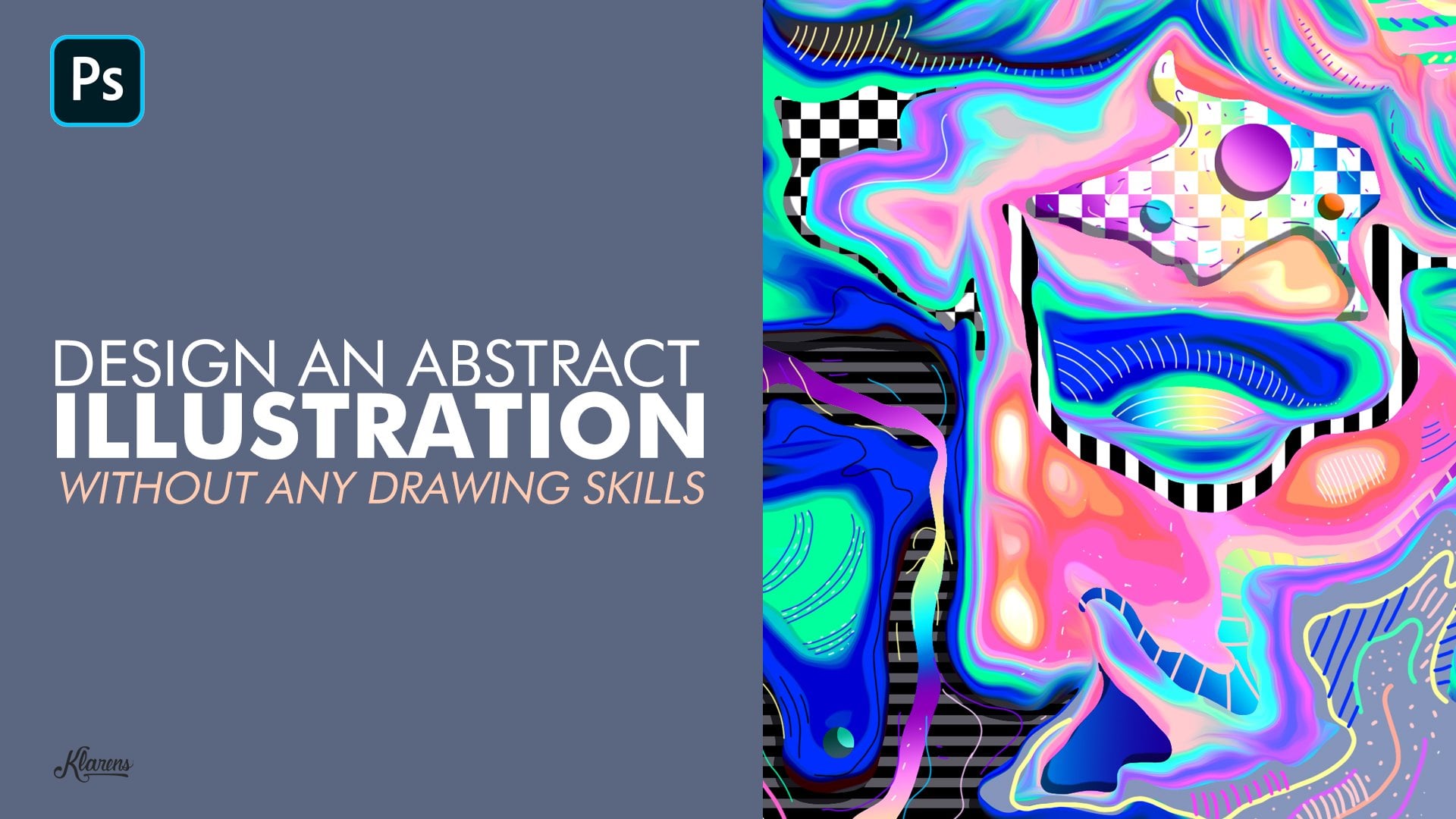
2. Resources: Hey guys. So here's an artwork similar to the one that we're going to create on off course. I think that we need Teoh search for first. It's the like that for a reference. And, uh, if you already have the image, you don't have to see this video. You can go on the 2nd 1 but for imagery sources, basically, I search on three websites. One is unspool ash like you can just search for Tiger in our case and you have known copyrighted images you can scroll down and see that image that you like on its the need off the kind of poster that you want to create also the same thing with the backs us just that tiger and, uh, just go down and see what image you want to choose. Andi also, you have debian tart. I think this is really helpful because you can also find PNG images s. I just searched Tiger PNG, and ah, you go to this section and goto resource Onda. Uh, if you scroll down, I think you can find up PNG images. Yeah, I like this one right here. I think I think it's the one that I used for my artwork. Yep. I just Sorry. First, the image you can download it and use it for for your Ah, buster. But anyway, if you download a new image with the background, I'll just, uh I'll show you how to remove the background. See? And now let's ah, move on the second video.
3. Remove the Background: case, and now we're in a photo shop, and the first thing that we need to do is just create a new document. Usually I go with this size for thousands. Five thousands resolutions haven't to color Mulder, GB on da click create Andi. I'm going toe upload the image that I just downloaded on. I'm going to use this image, but I just downloaded this one just in case you haven't image with the background, so I can just show you how to remove the backgrounds on going toe. Copy this so select added copy on it based on a command control vite on. Basically, you have, ah, a lot off options to remove the background, but usually I go with a pan tool, but you also have the quick selection to like. It selects the area that are similar to each other, but still it's not really accurate, and the the edges are kind off blurry. Let's say they're not really good soul. I always use ah, mental, basically, how this works. I'll just show you the basics of how it works. I'm not going to remove the background of all the image, So here's a mental you click on a point on to create curves because we need to follow the path of the tiger. In this case, you click and hold on drag to great things kind of curves on. Click on another point on you can drag two Great the Save that You on on pick you, for example. But I'm holding it so I can create some curves when you have this kind of direct direction and like, it's difficult to to follow a certain path. You can just hold old key and click on this square blue safe, and it will remove believed this kind off direction. And you could just keep going the on the direction you want. So yeah, these are kind of like the basic techniques. Let's help you toe have of good experience with hand tools and use it effectively. Um, while you go through the old shape off the thing, I'm just doing it through the fastest you can see. I would work some just doing this. I can close the path. So when you finish the whole thing and so means they can see better, um, you just click where you started and as you can see there's a kind of circle. So this means that you just closed the path and you can right Click makes election. This would be zero. Think OK, on. Make sure you are on the layer that you're where you are. Moving to the background thought from command control C command Control V. And as you can see, it creates a new layer. Onda Uh, yeah removed the background. So this is how it works If you have ah, image with background but just gave that in this case, I just downloaded this image without background. So yeah, I'm going to delete the whole thing, just based it on. Uh, if you remember, the tiger was from the other side. So to do that, you just goto addict, transform and flip horizontal. I'm going toe re skill This if you have the latest follow shop ah, version it will keep the proportions. But if you have an older versions, you have toe hold safe, so it keeps the proportions off the off the image. So, yeah, we can just, uh, face a great background. It always no good. You know, in a gray background, the poster, always the kind of professional outside. So, yeah, now that we put the tiger on the image and I show you how to remove the background now we're going to apply some effects. Something tigers. So, yes, you in the next video.
4. Adustment Layers: Okay, welcome back. And as I said, no, I'm going to work with the adjustments off the image so we can get this kind of result. And, ah, first I'm just going toe. Apply some adjustment layers like brightness, contrast, curves. And you separation on this is going to help us to apply a filter and get this kind of shape so we can then apply Grady in ST. So let's just go with the brightness and contrast on. Make sure you apply the clipping mask. So it means that when you see this arrow, it means that you're applying the A filter or the adjustment there on the on the layer below, which is the tiger in this case. So I'm just going to do some like, small changes, and I can always, uh, changes and try it, increase the brightness or decrease it on. You know, let's do the curves on the under curves that basically this is the the adjustment layer that is going to help us to get some color highlights. So it's I think it's the most important adjustments in this, uh, tutorial to achieve this kind off pastor. So you have the RGB red green and blue on. You have this diagnosed straight line on. If you click on a point, create this kind of square shape that you can drag and it effects the image you can click on any point and it will create this kind of squares on and basically just click and create these kind off curves and see how it effects the the image. The goal here is just to get a cool of colors are highlights from the from the image on. Usually I don't have a certain pattern that I follow. I just drag this up and down until I'm satisfied with the colors that I get. So I just did the Argentine. I'm going to red, green and blue and do the same thing. Yeah. Now we can, uh, fly consideration adjustment just so you can see if we can get any better very use in. So yeah, I'm just going to go with at this one. You haven't been changes. I just change the separation. So and now we can group the whole thing. So So we can select the layer above, and you can hold shift, click the layer below so you select them all on and just click on this icon right years. You can group them Onda. We can make a couple this group by holding Old Key and Dragon is up on. I'm going toe Right Creek and merged group so I can have this as well, Mayor. So it's easier for me toe apply filter on it or do other adjustments. But I still have the group just in case I need to make any changes. Eso And now we're going to apply the filter to create this kind off wavy shapes, so see on the next video.
5. Filters: Okay, so now I'm going to work with a filter to create the wavy shapes on the The first thing that I do is go toe filter on the filter gallery on Under the artistic folder. I used this pain Dobbs filter. It's going to zoom out. You can see how it affects the image. And as you can see, there are too many. Ah, wavy shapes sound. It looks really bad. So, um, I found a way to improve that to decrease the wavy shapes. So the first step to do that is just decrease the sharpness, the breast size, it's fifties. Okay. And make sure the brush type is sparkle on. Displayed this kind of blurry effect on the the shapes become more wavy out. See, So you just think OK, on, uh, now, the next thing to do first, I'm just going to make a copy of this again. So I'm just holding old key and dragging up on the next thing that I'm going to do is go to filter gallery again, actually, on dsi how that feel their effects, the whole thing's. And I'm going to use the sharpness. Yes, as you're going to see Now we have less wavy shapes, but still Ah, we're not there yet, so I'm just going to cancel this. And, uh, I found a way to make this better. So go to image adjustments on pasta. Rise on. You can play around with the level I think. Level seven. Usually it's good. Seven or eight? Yeah, I'm going with eight. So quick. Okay, First, I'm going to cancel this. Just zoom in so you can see better how it effects the limits. So, Buster, rise. Yes. You're going to see it Kind off decreases the radiant colors. Um, yeah, it helps with with a filter that I'm going to apply. So now let's go to filter it's of gallery on that C Yes. Again, as you're going to see now, there are less wavy shapes, and it looks more like an illustrative style, so I can just increase the sharpness now to see the wave shapes better. Uh, yeah, I think it's good enough. So I'm just going toe click. OK, on, uh, get the image. So that's a mouth. And yes. And now that we did this kind of illustration did you tell the we're going toe? Apply the great aunt in certain shapes like we did on this is so see, on the next day,
6. Gradients: Hey, welcome back. So now, as I said, the next step is to apply the radiance to the shapes on DA. How you do that is just go to some act color range. Andi, you make sure that the select says the assemble sampled colors. You don't want to go to the other options. So to sample colors on DA pick a color, for example, just click on it and up Make sure the fuzziness is zero. Because if you increase it, it will select even other colors that are similar toe pink in this case, so we don't wander that we just want this specific color. So click OK, creating new layer on duh goto great and tool on da fly a Grady int. I'll also show you how to create a Grady int. So I'll just supply the radiant here and, uh, tell you about out. Create one. So to create the Grady in, just go to the great and tool and you can start from this default radiant on. Basically, you just click on each of the colors and change them for example on the red one become the red color and you can pick something from here, for example. Usually how we create, Um, my graders, I just get her on the reference that has colors threat really, like on just place that year and picked the colors that I like the most from that specific picture. So, yeah, for example, just here on, uh, click on the yellow one. Pick another color and you do the same thing with, uh, the old colors and to save it, you just think new and it will appear. Um uh, down here. So, yeah, I'm using this Grady int on. If you want to use the same grade Ian's, I'll just create a new earlier and apply these ingredients so you can screen shot this and use it as a reference to pick the colors from the ingredient so you can screenshot thing. Okay, I'm going to leave that on. Uh, basically, what I'm doing now is just against select colorings. And now let's pick another color. I just think from this that yellow car year, wasn't it 0% simple collar. Speak. Okay. Create a new earlier goto radiant on that short cut short, Casper ingredient is G on. You can hold safe to create a straight line. Radium. Yeah, just a lie. I'm going to do the same thing with other shapes. Until I did, I do enough shapes and the rest of it will be black and white like in this case. So I selected, uh, some shave supply ingredients, and the rest I just converted that black and white. So I'm going to speed up now in just select shapes and apply great in state. Okay, so now that we apply the radiant we're going toe apply the black and white effect on the, uh, like the part that we didn't apply the Grady int. And then we're going to apply a filter so we can kind of avoid this kind of pixelated shapes, and then we're going to work with the composition, So see in the next video
7. Contrast, Smooth: Okay, so first we can group the's on layers when we apply the radiance. Okay, so you can click on the layer below. Hold shift, Click on the layer above Onda. Click on the group icon on Uh, now you can apply a black and white adjustment Lee, here and again, we apply the layer create clipping mask. And how this black and white thing works is you have these colors with the levels and basically, if you decrease the level off the red, it will make the rats darker on the same thing goes with the other colors. So you can just, uh, play around with the levels and see, like, how contrast you want to create on If it's like, not dark enough, you can go to boost oration. I'm going to decrease like places above the black and white adjustment on you can decrease the lightness. So, yeah, now I'm going toe fix this kind of pixelated shapes. So a way to do that is by first I'm going to group the whole thing so I can copy it and I can convert into one layer Is the right click merged group. Let's just select this on to fix that. You goto filter style eyes oil paint on. Do you increase all these levels on? You don't have to check the lighting. Some people use that, but, uh, I don't think it's the right effect for this kind of illustrations. So I unchecked the lighting? Yeah. Okay. As you can see, it creates more snow, old shapes, So this I'll fix that. Okay, Now we're going to work with the composition and finalize this posture. Soc on the next video.
8. Composition: Okay, so now I'm going to work with a composition. And as I said earlier, I've already created something similar to what I'm doing now. So ah, here's the the example that I showed you before, So I'm just going to copy this and based it just so I can have it as a reference on DA I'm going to make this bigger because this is the image that I export for instagram Andi. Ah, yeah, I'm just going to baste it. So basically, I'll do I think the size of the tiger is okay. Examine having this is as a reference, I'll just do the same thing on I just need to create a new layer to apply a gray background . I think when you do something that has a lot of details like this image that that we have Ah, it's good to have Ah, simple background. So after we do the simple background, I'm just going toe uncheck it for the moment so I can create a new layer. Onda do the these kind off rectangular shape. Yeah, just ah, to have a simple composition with similar with simple geometric shapes. Andi again, I'll just choose the scullery. Okay, on go to the pain back, pain back a tool and apply the color on the next thing is Ah, just creating your layer. I'm just going to zoom in so I can create the shar circle shape with the elliptical market tool, you can hold shift so you can create a regular shape regular perfect circle on DA again. I'm going to great in tool and I'll just pick a radiant okay, And let's apply the Grady int on a Z going to see here. There is this kind of ah three D thing with a shadow with inner shadow. So way to do that, I'll show you now just going to position it first on the position it above the basic geometric shapes and right click on the circle layer planning option. And you just need to quote ah to the inner shadow. So go on that. And here is the angle that represents who are like the angle of the light. You can change the distance. The choke thing. I don't know. This makes it kind of blurry or not the size. Um, yeah, I think that's fine. And you can also change their positive I think it's OK. Yeah, You can just play around with this and see what it's better Sell. Click. OK, Andi. Yeah, I'm looking that there are these kind off edges, so I'll fix it later. But for now, I'm just going to work with the typography so uncheck there's just so I can see what I did on the basically I just I used one word using that to refund. So I'm going to the type tool Onda again, we had to refund just, uh, type something amusing The word willpower. Since it matches the tiger animal and, ah, using the black color, you can go here for all the text. Ah, settings. I'll just search for another rough Ah, fund. So something that is the heavy one right here. Yeah, Andi, on this option right here. You cannot change the space between letters here. You can change the size of the, uh of the word off the fund. So I'm just going to copy this now. Quick space and the taste it on. I can click on this. Ah, line left line Text Seiken planet here on, uh, basically I'm just going to copy and faced the text on. I'm trying toe. Make it the same as the example that I showed you there is on the background. So I think I need to make smaller. Yeah, okay. And ah, now I'm just going toe. Copy the whole thing, Control. See? Click Cantor Control De Andi. I'm going to check the background. Maybe a congested quiz. The A positives. I can still have the kind of orientation. And as you can see, that there is not a lot off space between car the Rose. So fix that again. Go to the space. So the setting here, Andi, you can use this option to increase the space between letters. Um, yeah. Now, I'm just going to copy all these and feel the whole background with typography case, and I can increase that positive on. Uh, let's see. Now, I'm just going to finalize the posture by ah, doing some adjustments, collars and fixed the edges. So see, in the next video
9. Finalize: Okay, So this is the last video to finalize the poster. And I just wanted to say that if you have enjoyed this tutorial till now, I would appreciate a good review. And I would like to see your products to on on the description. Make sure to put your instagram account to so so I can share it and tag you. Andi. Yeah. Now I'm going to tow Finalize this. First I just click on the the text layers. So click on it and I can click on the control command control on the keyboard to and click on the layer below on the background so I can use this. Align horizontal centers and align ah, vertical centers just to make sure that the text is in the center. Andi. Yeah. Ah, as I said, to fix the the edges that look kind of blurry or pixelated, I'm just going to use pan tool that, um so I'm just going to toe so men and use a pencil. I'm going to speed this up but out Suggest if you have the same problem out. Suggested to use the pento because because it looks Ah, it looks better. It looks more like an illustration. So yes, this will fix other problems. I'll just be this up now. Que Sonam? Just going to close the path. Right? Click, Make selection. Click OK on. Who's going to zoom out sick and see? Better to shape that I created on I can just click Ah Control Ah, a copy like to copy and pays the thing But you can also do the mask layer of their master. Just click on it, Onda, As you can see it Ah creates ah the shape based on the the shape of the pen tool that we created. So as you can see, it's much better now. And if you make people's details it looks really good. You just have to fix this one. So, uh, I'm just going to use pen tool really fast here. Okay, make selection. Click OK, and make sure you're on the layer mask and you can just supply Ah, black color to it on DA. It deletes it on. The thing about the layer mask is that if you change your mind about something, you can always just for example, use the brush tool. Um, let's make a size. He used white color on click on it. It will un delete the thing because, as you can see, here it is black and white. White collar represents layer. The black collar represents the thing that you deleted on it. So, yeah, now that we made the details look better, we can just work with the final adjustments. Like you have all the adjustments here. We can work with brightness and contrast. I just suggested just to play around a little bit with them, just to see, uh, how it looks. And, ah, also the hue saturation. You can change it. See what colors you like more the situation. I'll just keep it simple. Also, there is the color balance that I usually use. But, uh, on this one, I want to use it family because, ah, if you increase the green or whatever color you can see that it affects the background, it makes it, for example, on this one, it makes kind of blue on. I don't want that. I want to keep a gray background, so maybe I'll just add that just a little bit. So Ah, yeah, I think that's it for for this posture. I hope you enjoyed it. And ah, as I said, you can post your your, um, projects. Ah, on Make sure you add your instagram name on doll so you can DME for for anything that you didn't understand. I'll try to explain everything. Um, yeah. Thank you for watching. And we'll see on the next class. Bye.
 Klarens Malluta, Visual Artist