Transcripts
1. Introduction: [MUSIC] Creative block,
we've all been there. Finding inspiration can be
a huge challenge and that infamous white page can discourage us from
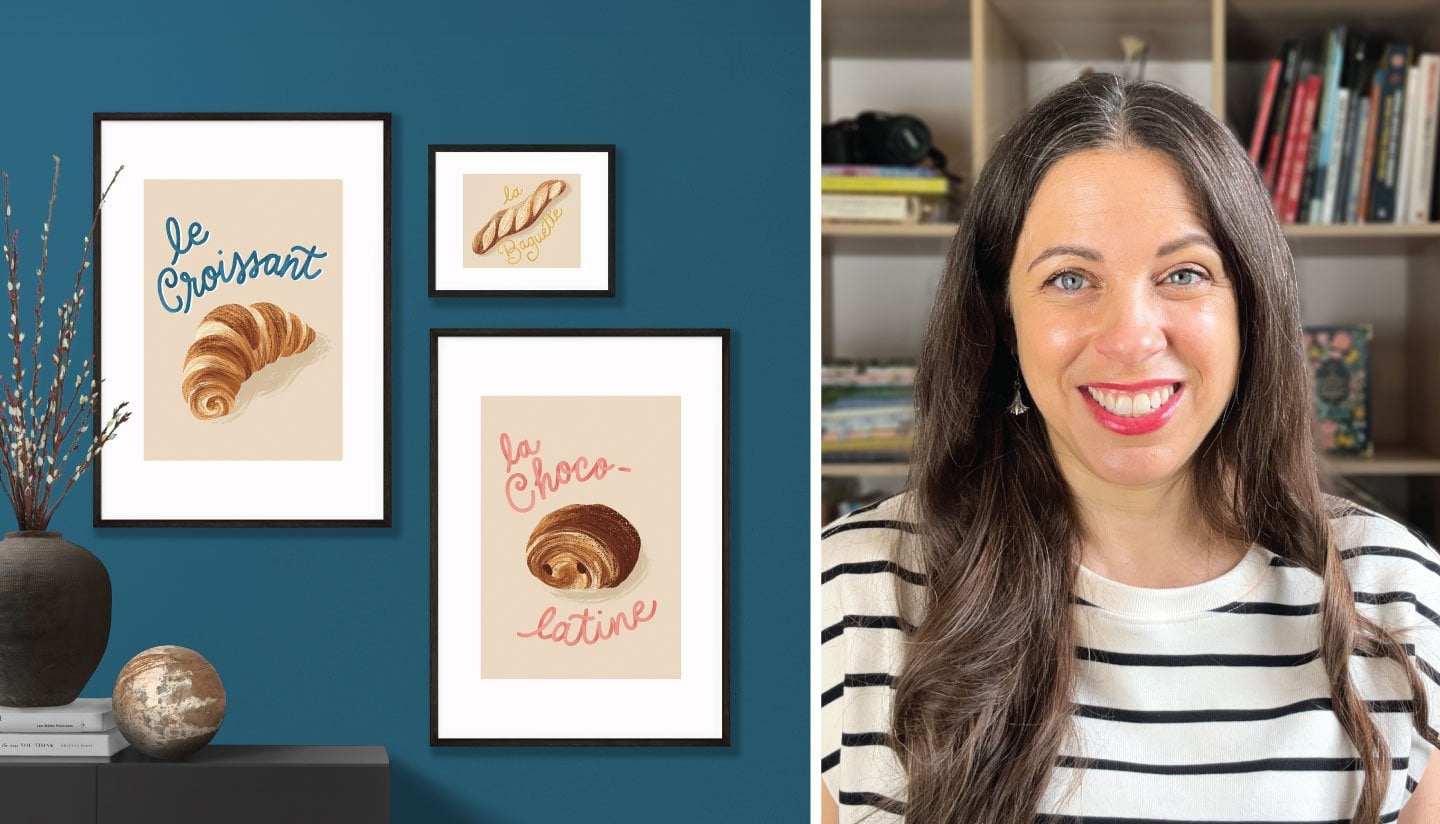
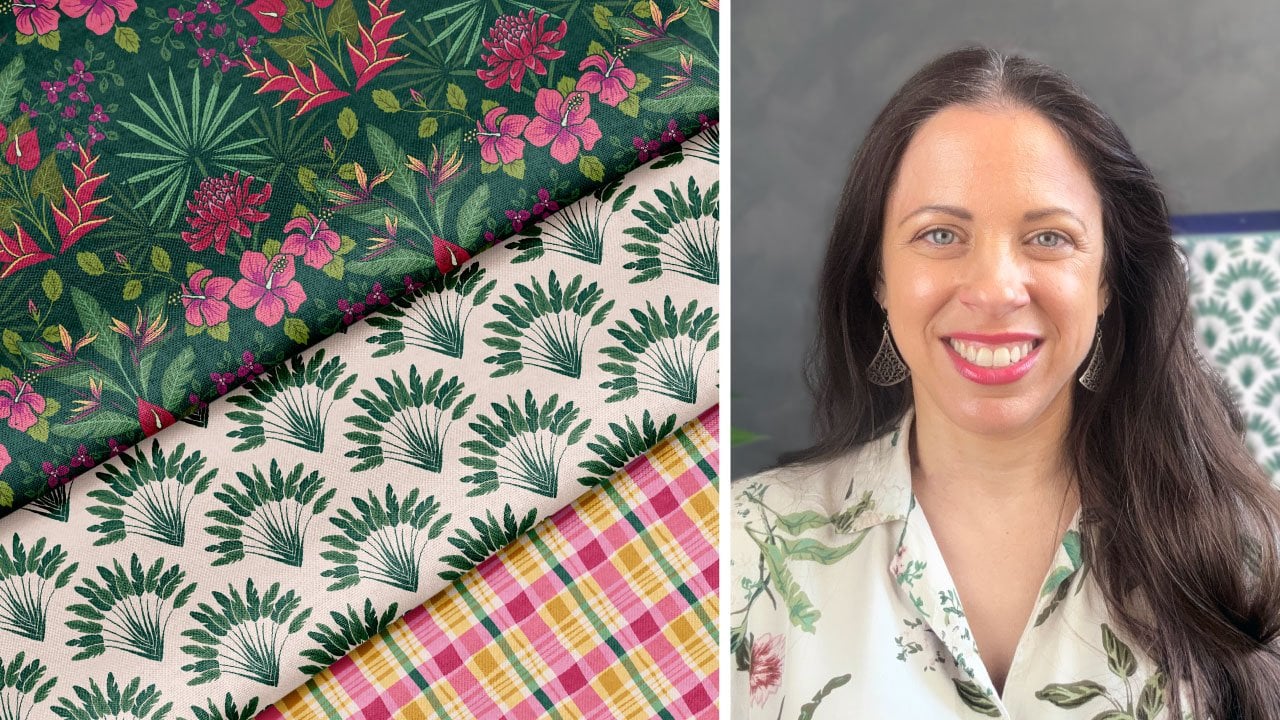
even getting started. Hi, I'm Jamie Alexander, a surface designer and
illustrator in Toulouse, France. As a licensing artist with a background in graphic design, I've had the pleasure of seeing my designs on a variety of products out in the world
through partners like Target, Trader Joe's,
Disney, and Minted. Greeting cards are one of my
favorite things to design. They are a heartfelt, emotional way of connecting for both sender and recipient. As the designer, it is
the best feeling to know that people connected
thanks to one of my cards. I'm often asked about the
inspiration behind my work. I'm so excited to teach
this class because I know how it feels to be confronted
by the blank canvas. In this class, I'm
going to share my tried and true
tips for getting your creative
juices flowing from real sources of inspiration
in your everyday life. Next, I'll guide you through
the process of refining your inspiration into a beautiful and salable
illustrated greeting card. I'll also provide insight into my sketching process and the steps I take to
achieve a finished design. By the end of this course, you'll have vanquished the
dreaded white page and created an inspired greeting
card to offer a loved one, share on social media, add to your portfolio or
even pitch to a company. You can also apply these skills to other forms of illustration, like surface pattern design. While this class is suitable for students of all
levels of experience, I will be working in
Procreate and Illustrator, and some knowledge of these
programs could be helpful. As a mom to five-year-old
with twins on the way, I know it's not always easy
to find time to create, but spending even
just a few minutes a day is enough to progress. I can't wait to see
what you create. Let's get started. [MUSIC]
2. Class Project: [MUSIC] Lack of inspiration is a discouraging obstacle
to creativity. Over the years, I've wasted countless hours waiting for inspiration to
fall from the sky. Often, entire days
or weeks would go by without creating anything. When I became a mom, I no
longer had this luxury. I needed to carve out
pockets of time and be productive with the
little time that I had. I realized that
inspiration would not simply knock at my door. I had to be proactive
and go out and find it. Surprisingly, I
didn't have to go very far beyond my
own front door. In this class, we'll go
on and inspiration quest together and use it to create
an inspired greeting card. This project will
bolster your skills in seven ways which
I will detail in our following lessons:
techniques for finding inspiration from
your everyday surroundings, the makings of a truly
great greeting card, how to explore your
inspiration with thumbnail sketches and
narrow down your ideas, setting up your canvas in Procreate, illustrating
your card, finding a great color
palette, and finally, the finishing touches, which include adding text and
exporting your design. Our class project
consists of two parts. Part 1 is the inspiration
gathering stage. Choose one of the
inspiration techniques that we will explore in the
next lesson together. Make sure to take plenty
of notes and photos. Next, you will create some preliminary sketches
and narrow down your ideas. Post your sketches, photos, and notes in the
project gallery. Part 2 is the final design. With your favorite
thumbnail sketch, work on refining and
creating your final project. Incorporate your color
palette and your text. Post your design in
the project gallery. Here are the materials that
I recommend for this class. For the inspiration
phase of a project, I recommend a camera, a smartphone would do, and pencil and paper
for sketches and notes. For the creation process, personally I'll
be using an iPad, Apple Pencil, and
the Procreate app. I'll then be finishing up in Adobe Illustrator
on my computer. In our next lesson, we'll be exploring my favorite
techniques for finding inspiration so we can design an amazing
greeting card together. You ready? Let's go. [MUSIC]
3. Techniques for Finding Inspiration: [MUSIC] Occasionally,
inspiration does seem to fall from the sky, like a gift. I love it when that happens, but let's be honest, those gifts are few
and far between and our time is just too
precious to wait around. Today, we're going
to make our own luck and find inspiration
in our surroundings. I'm going to share a few
of my favorite techniques to get those creative
juices flowing. Number 1, reflect on
current events and issues. Are there any issues
or causes that you feel passionately about? If you feel strongly about
the message of your art, your audience will also
perceive it that way. My best-selling holiday card is the result of overcoming
a major creative block. I was so distraught by
the political upheaval in the US over the past
few years, that I had no idea how I would ever
be able to get into the festive spirit
necessary to create a Christmas card, so I didn't. The state of the
world wasn't giving me much to feel jolly about, so I imagined the world I dream of as a Christmas message
to the world I live in now. I embraced what I
was feeling and managed to create something that really resonated with
a lot of people. I was surprised actually by the number of people who
reached out to me on social media because they had
bought or received one of my cards and identified
with its message. My second technique
is brainstorming. Do not underestimate
this technique. Grab a notebook and let it flow. Practice free association, and jot down anything
that comes to mind. List words, images, feelings, anything you want to elicit. My brainstorm sessions are
often a jumbled web of words and sketches that don't make sense
to anybody but me. This card was for a
company that specifically asked for a non-floral
thank you card. If you know my work, you'll
know that florals make an appearance and
nearly everything I do, so this card was
a stretch for me. I started by brainstorming different ways to
say, thank you. From there I jotted
down ideas that came to mind when I thought
of those expressions. The expression deepest
thanks really jumped out at me and immediately I started thinking about
things that are deep, like the ocean. There it was. My idea for an underwater
themed thank you card with cute little sea creatures
was born [LAUGHTER] and never would have come to me had I not
been brainstorming. Keeping a notebook handy
or using the notes app on your phone is great
for public transport, waiting rooms or
anywhere you find yourself with a
few idle moments. The more you do it, the more agile your
creative mind will become. Also, do hold onto
your brainstorm lists, they may serve a purpose
further down the road. Number 3, get some
outside perspective. This is another great
method to find inspiration. Don't hesitate to find someone who might have valuable
perspective to offer. Listen to their thoughts
or their ideas. You can even pull your
social media following, your friends, or directly
interview someone, write down what they tell you. This can propel your inspiration in an unexpected direction. When designing
cars for people of differing backgrounds or faiths, I always try to ask
for their input. This card is for Eid al-Fitr, which is the end of Ramadan. While I was familiar with certain iconography
associated with this holiday, I decided to chat with
a friend who celebrates about his favorite traditions
and he mentioned Maamoul, a delicious date-filled cookie
that is often passed around with coffee whenever a wave of guests arrives
during the holiday. His description of the
ornate coffee pot and cups, the laughter and
joy of receiving family and friends,
and the concept of light in the darkness
really struck a chord with me and
led to this design. Without his input to inspire me, I never would've created it. It turned out to be one
of my favorite designs. Number 4, take a walk. The final technique
seems simple, but it's so effective. Getting a change of
scenery is one of my favorite ways to
find inspiration. Take some pictures, sketch, and write down some
notes about the details, colors, and textures
that speak to you. Head to a nearby park, take a stroll downtown, or even just walk around
your neighborhood. I created this pattern based on the streets
of Toulouse where I live and for those
of you who don't live in a place that
you find inspiring, beauty is everywhere if you
keep an eye out for it. For example, I've created
designs inspired by wild flowers growing out of a ditch along a busy
industrial highway. I wanted to add that online resources like
Pinterest are really great for giving insight about the kind
of art that you're drawn to and the type of art
that you want to make. I love creating mood boards to get inspired for
various projects. However, I want to
extend this advice, especially to people who
plan on selling their work. You should never base
your sketches or designs on other people's
drawings, photos, or work. My best advice for those of
you who need to draw from reference photos is to exercise caution and source
your own photos. That way your work belongs
to you and you alone. Even though I went
to art school, I still struggle
with drawing hands, I often rely on
reference photos. For these cards, which
feature lots of hands, I actually photographed
my own hands in these positions and
drew from my photos. I could even trace
them if I wanted to because they're my images. If you need to draw a giraffe, try looking at several
photos of giraffes, but then draw it from memory
in a simplified style. If you really count on using a reference photo for a
more detailed illustration, I would recommend
taking a trip to the zoo and photographing
that giraffe yourself, or at the very least, consulting images that
are royalty free. This way you have
complete ownership of your design from
start to finish, and no one can claim otherwise. There we have it, a few of my favorite techniques
to find inspiration. Of course, these are only a few ideas to
get the ball rolling. Any of these techniques
are effective and easy to accomplish without wandering
too far from home. I also encourage you to find other techniques
that work for you. The more you create, the more you'll get
to know yourself, your style, and the best way
to unleash your creativity. In my experience, the
inspiration flows more readily if I'm
creating regularly, even if only for a
few minutes each day. Now it's your turn, try one of these techniques,
take some photos, write down some ideas
and I'll see you in the next lesson where we'll discuss what makes a
great greeting card.
4. What Makes a Great Greeting Card?: Over the past few years, I've been fortunate
enough to work with retail partners and have my greeting cards sold
throughout the US. Here are a few tips
that I've picked up over the years which are helpful to consider
if you hope to sell your greeting
cards in stores. Categories. In my experience, birthday cards sell the most. Followed by Christmas
and Mother's Day cards. Valentine's Day
and sympathy cards are also pretty high
sellers for me. Design. Greeting cards in
stores are most commonly A7, which is around five
by seven inches and should be vertical with either the copy or
some element of interest positioned in the
top third of the card. When on the rack in a store, this is the part of the card
that will be visible and it needs to signal what the card
is about and who it's for. Also, make sure that the copy is well integrated
into the image. The message is equally as
important as the illustration, and it should not look
like the text was simply placed on the
card as an afterthought. Try to make it a part of the composition from
the very beginning. With greeting cards, one
size does not fit all. It's important to consider the relationship between the
sender and the recipient. Human relationships are complex. Let's imagine Father's Day. Not everyone has the same
relationship with their father. Some would prefer to offer
a mushy, affectionate, greatest dad in the world card while others might prefer humor. Some others might have a
more strained relationship and would prefer a
more generic message to commemorate the day. Consider familiar
iconography and colors. It may be boring, but using familiar iconography
helps cards to sell. Check out the card
aisle and you'll probably see a lot of boats, anchors, golf, neckties, and mountains for men's birthday and Father's Day. I picked up on this and incorporated mountains into
this Father's Day card, which I designed with
my husband in mind. He loves hiking
in the mountains. For female birthday
and Mother's Day, expect to see a lot of birds, florals, tea, and
breakfast themes. Here's a Mother's
Day card that I created using some florals. For Christmas, as
cliche as it may be. You'll see a lot of reindeer, Santa's, arctic animals,
and nutcrackers. Even if you decide to put a
new spin on a holiday card, I strongly encourage you to incorporate the color
red for Christmas, or at least a color that will
read as red, like coral. For a new baby card, I would avoid dark colors and
stick to a light palette. I love moody color palettes, and I've tried to design night-time theme baby cards and have never had
success with them. I guess most people
are not like me. They associate babies
with pale pastel colors. Of course, rules were
made to be broken. It is totally possible to achieve success
without doing this. But in my experience,
it often helps. A great color palette
goes a long way. Your color palette should suit the tone of your design and incorporate the right balance of bright colors and neutrals. Bonus. You can't go wrong
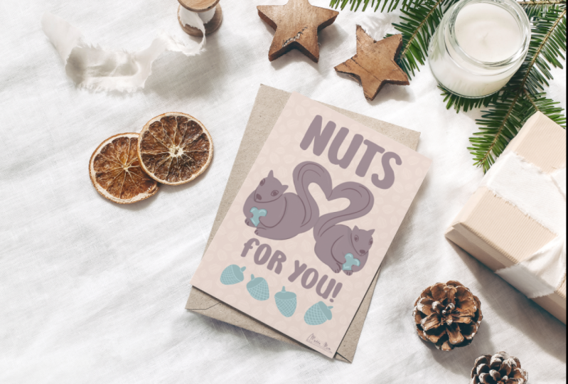
with cats and dogs. This goes without saying, but people with cats and dogs are in love
with their pets. This is one of my most
successful cards of all time. It was sold for two consecutive years at
a major retail store. It's a Mother's Day card
inspired by my cat that reads, "You are the cat's meow
and a perfect mom." It is not my most
beautiful illustration, nor was it a super
original idea. I didn't spend much time on it. I've created tons of
cards that I feel are much more amazing and
worthy of attention, than this card has received. What does this card
have that they don't? A cat. It's that's simple. You can come up with the most
amazing idea in the world and sometimes a
cat or a dog with a birthday hat is going to
completely steal the show. If you can't beat
them, join them. [LAUGHTER] I hope this
information was helpful. Have you gone on your
inspiration quest yet? Grab those photos and notes
because in the next lesson, we're going to get into the
sketching process and turn that raw inspiration
into a brilliant idea.
5. The Sketching Process: [MUSIC] Hello again.
First of all, I want to congratulate
you for getting this far. By now, you've reignited
your creative spark and have found some great sources of inspiration from
your everyday life. It's time to tap into that
inspiration and get sketching. The sketching process is
where my imagination takes flight and ideas really
start to take shape. Thumbnail sketches
are instrumental in getting your
creativity flowing. What's a thumbnail sketch? Thumbnail sketches are small, rough drawings that serve as the beginning stages of
a larger illustration. When I was in art school, I always wanted to
bypass this step, because I was so impatient
to just get on with my idea. I would dive into
the final project and end up spending lots of time and effort on something that lacked a
strong composition. I quickly began to
understand why my teachers insisted on the thumbnail
sketch phase for my project. It's important not
to skip this step, because the last thing you
want is to spend a lot of time on an illustration if you haven't planned
out the composition. Because you don't spend much
time on a thumbnail sketch, you won't sweat it if you don't love what
you came up with. They are not going to be
beautiful works of art, so the pressure is off. Because you're
literally spending a few moments on each sketch, the fear of making bad
art is also diminished. Also, don't be tempted to act on the first thumbnail
sketch that you create. Often the act of drawing several thumbnails acts
as a great warm-up. My best ideas often
don't turn up until I've completed
several thumbnails. Let's shoot for 8-10. Also, if you don't end
up using an idea today, keep them for another day. When creating your thumbnails, I recommend using a
one-to-one ratio, which means the same proportion
as your final design. That way all you
need to do is just enlarge to the larger scale once everything is planned out. For a five by seven card design, you can make your thumbnails
at 1.25 by 1.75 inches. In the Projects
and Resources tab, you can download a template for thumbnail sketches that
I created for you. You can either print it out or use it directly in Procreate. In my template, there
is a rectangle for your card and a space
to write your copy. You can start with either
the image or the copy first. Sometimes one just comes
naturally before the other. Remember to give extra interest to that top third
of your design. I'm ready to create
my thumbnails. I've decided to create
a birthday card since they are the most
popular type of greeting card. I combined a few inspiration
techniques here. I did some brainstorming with
expressions that have to do with having fun,
cake, parties, etc. I also talked to my sister, who is younger and
way cooler than me. She and her friends love modern
birthday cards that have to do with festive cocktails
or clinking glasses, house plants, and
of course, dogs. [LAUGHTER] They
also love receiving beautiful cards that could
be framed as a work of art. I'm not going to think too much. I'm not going to worry
about making bad art. I'm just going to let
those ideas flow. Ready to sketch with
me? Here we go. [MUSIC] I've completed my
thumbnail sketches. The first one is a coffee
themed birthday card. It says, "Sending a latte
love on your birthday." This one is inspired
by Marie Antoinette. It says, "Let them eat cake." This one is a unicorn
with a party hat. I used some curved text, it says, "Hope your
day is magical." This next one is a birthday cocktail with a
slice of cake on the rim. I'm playing on the expression, "You can't have your
cake and eat it too." My version says, "You can have your cake and drink it too." I like this one. This one is playing on the house plant trend that we're seeing a lot
of these days. It says, "Hope your birthday
is unbe LEAF able." This one is a flower garden
with a watering can. I'm framing the text
with the flowers. It says, "have a
blooming birthday." Remember what I said about cats and dogs in the
previous lesson? This one says, "Let's PAWty." This is a fairy
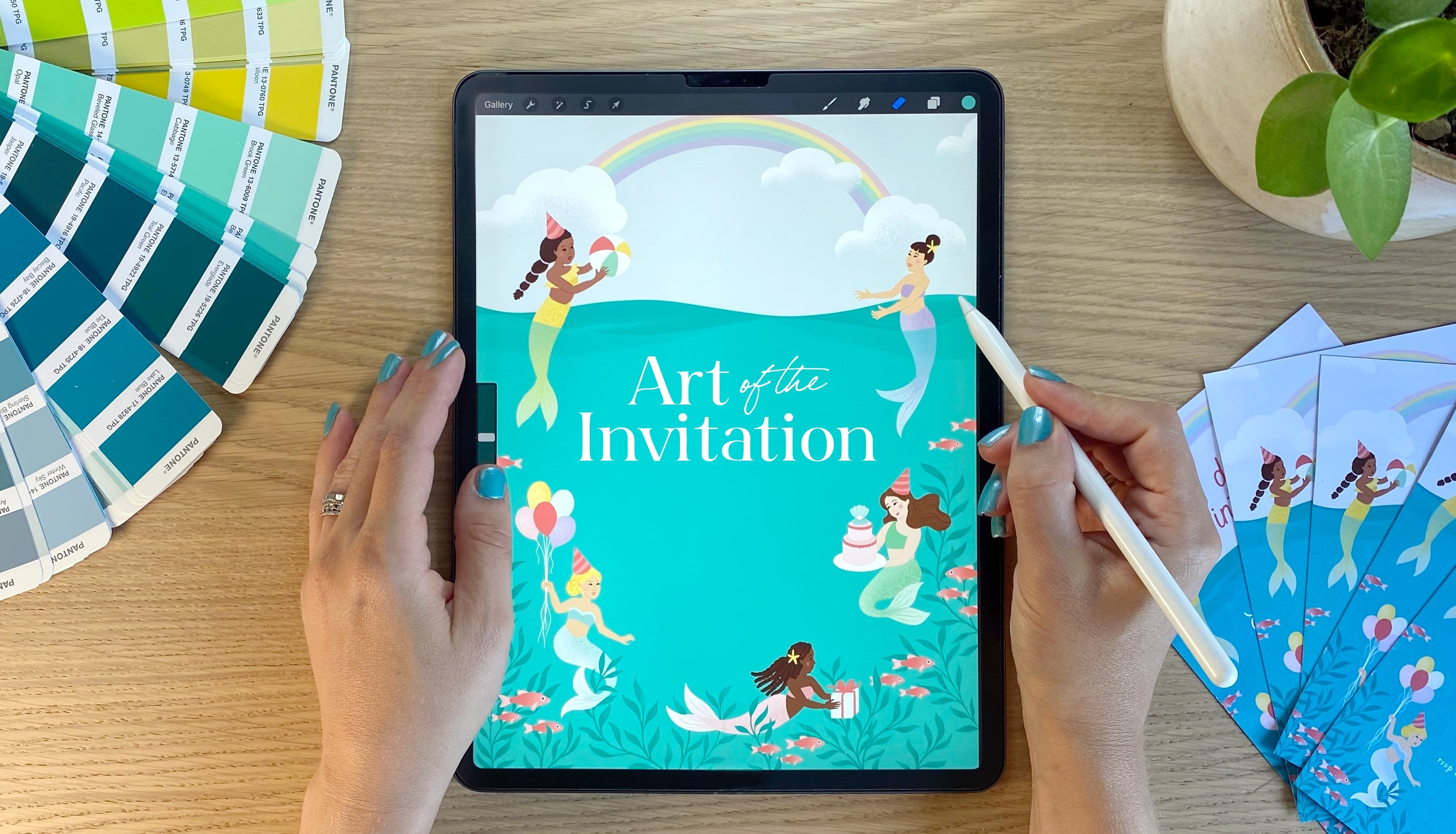
tale themed card. It has Rapunzel in her tower, and it says, "Let your hair
down, it's your birthday." This one is a beautiful
mermaid riding a whale. It says, "Have a
WHALE of a birthday." Finally, this one has a peacock with some
little presents, "May your birthday be colorful." There's a few ideas that
I like more than others, and I think I'm going to
move forward with this one. I feel like I can have
a lot of fun with the colors and incorporate some floral elements which are part of my signature style. Now I invite you to think about an occasion for
your greeting card. Download my thumbnail
sketch template and create 8-10
thumbnail sketches. Post them in the project
gallery along with any inspiration photos or notes that you'd like to share, so I can leave you
some feedback. Let us know which idea you're
going to move forward with. In the next lesson, I'll show you how I set up
my canvas in Procreate, so I can transform my humble thumbnail sketch
into a finished work of art.
6. Setting up your Canvas in Procreate: Now that we've got our sketches, it's time to set up our
canvas in Procreate, and illustrate our card. I'm going to start
by opening Procreate and clicking the plus sign at the top right-hand
corner of the screen. I'm going to click
on "New Canvas." On the screen, I'm going to select inches at the
bottom of the screen. Then I'm going to specify
5.25 inches as the width and 7.25 inches as the height. Even though our finished
card will measure five by seven
inches when folded, I'm leaving enough space on the edges to allow
for a full bleed. A bleed means that
the printed image extends all the way to
the edge of the paper. That the margins or white border is trimmed off by leaving an extra one of an
inch on each side of the design will be able to
accommodate that bleed. Next, I will set a
minimum of 300 DPI, which stands for dots per inch, the industry standard
for printing. But personally, I
double that amount and I put 600 DPI
in case I ever want to enlarge that illustration
for other purposes, I'm going to quickly click
on the color profile to make sure that
CMYK is selected. CMYK stands for cyan, magenta, yellow, and black, and they are the colors
of the printing process which uses dots of ink
to make up the image. There are some
printers who use RGB, which stands for red,
green, and blue. It's often used for web and
computer monitor color. But it's very easy to
convert the color profile later if that's necessary
for you, looks good. Let's click on "Create." Now we've got our canvas. I've created a few templates
to guide us in Procreate so that we can see
where the card will be trimmed for
that full bleed. Go ahead and download
them in the projects, and resources tab and
save them to your iPad. Right now, we're going
to use the template entitled card front template. There it is. I'm going to click
"Fit to Canvas" at the very bottom here. Now I'll click that arrow. There we go. Now in the Layers menu, I'm going to name
this layer guides. Since it's a PNG file,
it's transparent. We're going to build our
design underneath this layer. We can toggle it on and off so we can see what the finished
design will look like. Let's grab that thumbnail
sketch you've selected. If you drew it on paper, just take a photo
with your smartphone and import the
image to your iPad. Since I created my thumbnail
sketches on my iPad, I'm just going to
return to that sketch and use the selection
tool at the top. I'm going to select rectangle
here at the bottom. I'm going to draw
a rectangle around the sketch that I've
chosen to illustrate. Then I'm going to
click on the wrench, which is the Actions
menu, and click "Copy." Now I'm going to return
to my card document. I'm going to add a new layer and return to the Actions
menu and click on "Paste." There's our sketch. Let's resize it so it
looks good on the canvas. I'm going to rename
this layer sketch, and drag it below
our guide layer. Just hold your finger
or Apple pencil down on the layer and drag it. I'm also going to take
down the opacity. I can do this by going to the sketch layer in
the Layers menu, tapping it with two fingers, and sliding my finger to
the left on the screen. The layer, will not be
visible in the final drawing, but like the guides layer, it will help us to complete
our final illustration. I'll leave you to it. Start creating your Canvas. Import your templates and
your thumbnail sketch. I'll see you in the next lesson where we'll start
illustrating your card.
7. Illustrating Your Card: Welcome back. Now that we've set up our Canvas in procreate, we're finally ready to
illustrate our card. I'm in our card documents
and I'm going to add a new layer above the sketch layer and
call it drawing. I'm now going to start
recreating my thumbnail sketch. It is totally fine to keep
it loose at this point. I'm going to use
the dry ink brush in the inking brush library. My goal is to create a line
drawing of the composition. Make sure you draw
some guides or allow some space for where you
want your copy to appear. You want to make sure
that your copy is seamlessly integrated
into the composition. Remember also that there
should be some copy or an element of interest in that top third of your design. You can toggle the card
front template on and off to make sure the important elements
fall within the safe zone. I'm going to start
illustrating my card. I've got my thumbnail
sketch here, and I'm going to take down
the opacity by tapping with two fingers on its layer and sliding my
finger to the left. Now I'm going to return
to the drawing layer. I'm going to take advantage of a neat feature on procreate, which is called
the drawing guide. I'm just going to click on the "Wrench" icon at
the upper top left. That's the actions menu. I'm going to click on "Canvas." Now, I'm going to toggle on the button that
says Drawing Guide, and from there, I'm going to click on "Edit Drawing Guide." I'm going to select
the button on the lower right-hand
corner that says symmetry. Now as you can see, everything I draw
will be replicated on the left side of my Canvas. This is also going to help
me draw my martini glass. It can also help draw
symmetrical guides. If you want to place some
curved texts, for example. Notice on my layers
palette that it says "Assisted on this
particular layer." If you want to turn off
the Drawing Assist, simply click on the
layer and toggle off where it says
drawing assist. Now when I draw, it will no longer mirror
the image on the left. Now, full disclosure,
I'm a slow drawer and I really admire the
artists to give classes and who can
draw so quickly. But unfortunately,
I'm not one of them. I'm someone who needs
to constantly refine, erase, and ponder my decisions. If you're like me and need
to draw or redraw this layer several times before
you're happy, that's perfectly fine. I'm going to finish
this line drawing now. Here is my finished drawing. I've toggled off
the sketch layer since I don't need it anymore. Now it's your turn to
illustrate your card. Remember to start by recreating your thumbnail sketch in
a separate drawing layer. I would recommend
achieving a drawing that you're happy with before
moving on to color. In the next lesson, we'll learn how to
create a color palette.
8. Choosing a Color Palette: [MUSIC] Now that we've
created our illustration, it's time to dream up a color
palette for your design. I'm going to briefly
touch on one of my favorite methods
of choosing color, which is using a photo. In my experience, finding
a color palette is something that gets easier and becomes more
intuitive with time. I can definitely
see a difference in my color choices in my
earlier work compared to now. I find that I tend to gravitate towards certain colors
time and time again. I also often choose to revisit older designs and give them new life by re-imagining
their color palettes. Sometimes a change of color is all you need to
elevate your design. For example, this
Valentine's design uses some very traditional
and realistic colors. It didn't really get the
attention that I was hoping for. I ended up modifying it into a kid's classroom
Valentine with a brighter, more whimsical color palette, and I found it received
a lot more engagement. When it comes to color, my biggest piece of advice
is to use a limited palette. It adds sophistication,
simplicity, and impact to your work. It may seem limiting, but it's actually artistically
freeing because it means fewer decisions to make
while you're illustrating. It's also easier to modify
into multiple color ways. I try to focus on five or six colors
in my color palette, and I make sure to include
at least one light, one dark, a few mid tones, and some accent color
that really pops. It's always a good
idea to include neutrals and white as well. For today's color palette, I'm thinking I want
to establish a fun, feminine mood for this
birthday cocktail card. I'm going to use
this photo I took at the botanical
gardens near my house. I find that mother
nature is truly the best source of
color palettes. I often gravitate toward
flowers or landscapes, and I find that the colors are just so naturally harmonious. I really love these
vibrant peonies here. I see a nice
assortment of lights, darks, mid tones, and accent
colors to choose from. I could totally imagine a sweet slice of birthday
cake with these colors. I'm going to import the
image into Procreate by creating a new canvas and
clicking the wrench icon. Insert a photo and selecting
my image from the library. Now, if we click here once on the Modify
button on the left side, this little circle will appear. If you hover the circle around, it will take on the
color from the image. When you see a color
that you like, simply release and
you'll see that color appear in the color disk in the upper right-hand
corner here. I'm going to select a thick brush from
my brushes palette. I'm going to use the
Bardot blobby brush from Bardot brushes
basic toolkit. But you can use
whatever you like. I'm going to take
up the brush size, and I'm going to draw
a little circle here. I'm going to click
on the Modify button again and select another color. Add it to the color disk and
draw another little circle. I'm just going to repeat this step and choose at
least a dozen colors, making sure I include lights, darks, mid tones, and
accent colors to pop. I think I've got a
nice selection here, and I'm going to narrow it
down to five or six favorites. I'm liking these colors here. I see a nice selection of darks, lights and mid tones
and accent colors. I'm just going to
start a new layer and lay those colors out
together, like this. I just like to check
that the values of my colors aren't too close. What can happen when two
colors are similar in value is that they vibrate or look blurry when placed
next to each other. If that happens,
I know I need to slightly adjust the
color by making it a bit lighter or darker until it no longer vibrates
next to the other color. It's looking good to me. I'm going to create a
new palette here in Procreate so that I can return to it anytime
I want in the future. I'm going to click the color
menu on the upper right, click on "Palettes", and then I'm going to click the plus sign to
create a new palette. I'm going to give it a name. I'll call it Greeting
card projects. Now if I click this
Modify button here, this circle will appear. Wherever I click, it
will pick up the color. If I head back to our new color palettes
here and click once, you'll see that the color is now appearing in the palette. I'm going to repeat that with the other colors that
I've selected, and voila. Now that I've established
my color palette, I'm just going to start
coloring my image. If I click the color
disk on the upper right, you'll see that I've established
my color palette here. I'm going to start by choosing a background color
from my palette. Maybe this made pink
color to start with. I can always change it later. I will just go to
the background layer here and add the color like so. Now I'm going to lay down colors and draw under
my drawing layer. I'm going to take down the
opacity of my drawing layer so that I can see what
I'm doing underneath. I'm going to be using the studio pen from
the inking palette. I really like a smooth
line in my illustrations. I'm going to draw the shape
of each elements and fill them in with color by dragging the selective color
from the disk here. I would suggest starting a new layer for each
color that you use, that will make modification
easier in the future. Also, certain manufacturers
that I've worked with, have requested the
illustration file with layers. So I would avoid merging all of your layers
together for this reason. I'll start with the glass here. I'll use the Drawing Assist tool again to get that symmetry. Now I'm going to fill
it in with color. Now if you want to change
the color of a layer, you can select the color that you want to apply to that layer. Go to the layer of the
illustration you want to recolor and click "Alpha Lock". Then I will click
the layer again and select "Fill Layer". Now, everything on that
layer should be that color. I'm going to go ahead and color the rest of
my illustration. Remember, it's important just to start getting the colors down and you can always
tweak them later. [MUSIC] Now, it's your turn. Grab a photo that you love, perhaps one from the
inspiration phase of our design project, and create your own
limited color palette with five or six colors. Remember to include
lights, darks, and mid tones, and
some accent color. Now, color your
illustration and I'll see you in the next lesson
for the finishing touches.
9. Finishing Touches: We're almost there now. Our illustration is complete and it's time to add
the finishing touches. I'm going to export
my illustration to my computer and finish
up in Adobe Illustrator. While Illustrator is
what I prefer to use, you may prefer to use
another design program, and that is totally fine. I'm going to click on the wrench icon and
click on "Share". Here, you have your choice on what kind of file you
would like to export. If I create a flat illustration with no texture or gradients, I'm usually happy with the
export quality of PNG or JPEG. However, if I have included
textural elements, I find that the color and
texture is better preserved when I select the TIFF format. Since my design today has
some of that texture, I'll be selecting the
TIFF format today. I'm just going to air-drop
it over to my computer now. Now, I'm on my computer and I'm going to open
up Adobe Illustrator and create a new
document that is 10 inches wide and
seven inches tall. I'm going to select the
landscape orientation. For the bleed, we'll
enter 0.125 inches, that's an eighth of an inch
trimmed off each side. If you go to the Projects and
Resources tab of our class, you can download a template that I've created
for you of the front and back of the greeting card called templates_FULLCARD.png. You can use that in whatever
program you prefer. I'm going to place it now
on my Illustrator artboard and make sure that it is vertically and
horizontally aligned. Then I'm going to lock that
layer into place and add a new layer underneath where I'll place my design
for the front of my card. I'll use those template
guides to align that design. Now, you can see that the design overlaps the fold of the card, so I'm just going to create a clipping mask by
clicking shortcut M and drawing a rectangle
that is even with the fold line over
the cover of my card. Selecting both that rectangle and the illustration
and going to "Object", and then "Clipping
mask" and "Make". Now, it fits nicely
in that space and we're going to have a
nice bleed on the edges. Now, I'm just going
to add some text. I want to emphasize the
words cake and drink. I'll press the shortcut T
to access the type tool, draw a rectangle and
type in my text, and then play around with size, font, and color until I'm happy. I'm liking this text layout now. Now, it's important
to remember to make sure that the text
falls well within the green safe zone
lines in the template so that it doesn't
get trimmed off. I'm happy with this. For the back of the card, I'm just going to add
a background color by drawing a rectangle and also my logo to the bottom. I'll press the
shortcut I to access the eye dropper tool
and grab a color directly from my
illustration for the logo. If you have a surface
pattern handy, you can also add that to
decorate the back of your card. Looking good. I'm going to go to the
Layers menu and toggle off the template so
that it doesn't print. Now, I'll save my file as a PDF. On my Mac, I will press
Shift Command S to Save As and choose PDF as my format. In the next window, I'm going to go to "Marks and
bleeds" and make sure that trim marks and use document
bleed settings are selected. I'm going to save the PDF. I'm going to go ahead
now and open that PDF and there we have our design
that's ready to print. As you can see,
there are crop marks in place where we can
trim for that bleed. I've printed out my design
and trimmed off the edges, and there we have it, our finished card ready to
make its way out in the world. Just a little aside, if you are working with a manufacturer or
print-on-demand site, they most likely have their
own set of guidelines or template that they will
want you to adhere to. Some may prefer that you submit each face of the card
in a separate file. I have simply explained one way to easily print out
your card at home. Remember, post your finished design
in the project gallery. I can't wait to see your
finished greeting card.
10. Final Thoughts: [MUSIC] Thank you so
much for embarking on this creative
journey with me. I want to congratulate you
for reaching the end of this class and defeating
creative block. Well, until next time, that is, let's be honest, it still happens to the best of
us from time-to-time. If and when the blank canvas
strikes again, however, I hope you'll feel equipped
with the arsenal of tools we've discussed in this
class to rise above it. In addition to the easy and effective
inspiration techniques that can be applied to
any artistic discipline, we've covered what goes into the making of a
great greeting card, the importance of
thumbnail sketches and fleshing out your inspiration
into great ideas, and the illustration process; how to pick a stunning and
limited color palette, and the finishing touches
to a greeting card. Greeting card design is fun, rewarding, and
potentially profitable. On a human level, you
can't beat the feeling you get from bringing people
together with one of your cards. On a financial level, they are also a great way to
boost your design income. Whether you plan
to gift your card, add it to a portfolio, sell to customers, or
pitch to a company, I hope my class has
been helpful to you. If there's one thing I
hope you take away from this class is that the
more work you create, the more you'll be able
to get to know yourself, your style, and the best methods for unleashing
your creativity. Inspiration is not
a finite resource. In the words of Maya Angelou, you can't use up creativity. The more you use,
the more you have. I'm so excited to see your class projects and
give you my feedback. If you haven't already, please post your
thumbnail sketches and final card design in
the project gallery. If you have any
questions for me, don't hesitate to post on the discussions
page of this class. Also, if you enjoyed this class, I'd love it if you would
leave a review and please hit the follow
button by my name. Finally, if you'd like to download my free
inspiration guide for designers, head to
jamiealexander.net/guide. Sharing this creative journey
with you is an inspiration. I can't wait to see what
you create. [MUSIC]
 Jamie Alexander, Surface Designer & Illustrator