Transcripts
1. Introduction: Want to turn your
artwork into a product that people actually
use every single day. In this class we'll turn
your artwork into something beautifully functional and
totally sellable, a calendar. Hi, I'm Jamie Alexander, and I'm a surface designer and Illustrator living in
the South of France. You may have seen some of
my collaborations with companies like Target, Minted, Trader Joe's, Disney, Hawthorn Supply
Company, and Samsung. I also have an Etsy shop where I sell my
original artwork. Walk calendars are by
far, my best seller. People turn to platforms like Etsy to find calendar designs that reflect their styles,
passions or aesthetics. Artwork crafted by a real
artist has a thoughtful, intentional quality that mass produced supermarket
calendars just can't match. Selling your calendars online is an evergreen income source. Dates can be refreshed and the calendar can be
sold every year. Making a calendar is also
the ideal opportunity to strengthen your portfolio with a cohesive collection
of illustrations. Creating and collections
will help develop your signature style
and make your art instantly more
licensable to companies. It also encourages faster, easier content creation and can even expand into multiple
revenue streams. In this class, I'll
guide you through my process of creating a beautifully
illustrated calendar. Together, we'll do some
research and niche down to a specific theme to set your work apart from
the competition, establish a cohesive style to use across your
illustrations, sketch out ideas and
illustrate our artwork. I'll also show you how I lay out my monthly grids and export
my artwork for print, working with Print-On-Demand and drop shipping companies that can link directly to your
website or at C shop, taking away the stress of
logistics of printing and shipping so that you can focus on what you do best,
creating artwork. I'll share my process of
creating listing photos, using ads, and promoting my
calendars on social media. By the end of this
class, you'll have created a captivating
calendar to sell online. Give as a gift and take your
portfolio to the next level. I can't wait to share
just how flexible, profitable and fun creating
a calendar can be, whether it's for
your online shop, your licensing
portfolio or both. You'll also be able to leverage this collection onto other
products like art prints, greeting cards,
notebooks, and more. This class is designed for
students who already have a basic understanding of Procreate for the iPad
and Adobe Illustrator. Get ready to design
your best year ever. I'll see you in class.
2. Class Project: I'm so excited to show you how I create and sell my calendars. In this glass, we'll create a cohesive collection of illustrations for a
12 month calendar, monthly grids, and
a beautiful cover. In the project gallery, you have the option of
submitting a single month page, a few pages or a
complete calendar, whatever fits with your
schedule and creative flow. After explaining the
benefits of designing and collections and
specifically for calendars, I will guide you through
the following seven steps. Number one, brainstorming
and research, niche down on your theme. Number two, thumbnail sketches for your future illustrations. Number three, establishing
cohesive color palettes, style, and linework. Number four, the Illustration
and inking process. Number five, laying
out your monthly grid. Number six, uploading to a Print-On-Demand drop
shipping website. Number seven, creating and
promoting your Etsy listing. I'll also give you
ideas for how to leverage your calendar art
across other products. Here are the materials that
you will need for this class. Personally, I will be working
with Procreate on my iPad, and I'll be handling
the grid layout in Adobe Illustrator
on my computer. I have also created
a template for the thumbnail sketch
process that you can either print out or use
directly in Procreate. Additionally, I have created Adobe Illustrator grids to
facilitate the layout process. These files are available in the class download resources. Finally, as a bonus created especially for Skillshare
students taking this class, I have created a calendar
creation workbook that you can either print out or
use directly in Procreate. You can record your
ideas, research, thumbnail sketches,
and strategies for sales and marketing. You can grab this download at alexander.net slash Calendar. In the next lesson,
we'll explore why creating a calendar
can be a game changer for your creative business. I.
3. Why Create a Calendar?: Okay, first things first, why create a
Print-On-Demand calendar? Well, calendars are a smart, versatile way to
showcase your artwork and grow your creative
business. Here's why. Number one, they're profitable. Calendars are popular gifts and top selling items
year after year. I don't know about you, but I am so over the generic landscapes, cute pets and motivational
quote calendars that I find in the supermarket that feels so bland
and impersonal. There are plenty of people out there who are looking
for something more, a design that really relates to their personal interests,
hobbies and aesthetics. That's why they turn to
online platforms like Etsy, which caters to buyers
seeking unique, meaningful and artist
driven designs. Number two, they allow you to boost your collection
making skills. Creating a calendar is a great
way to practice creating a cohesive collection for your portfolio or
products to sell. Work that demonstrates a
consistent style gives your portfolio so much more
impact than a one off design. Number three, you can reuse your calendar artwork
across multiple products, like greeting cards, posters, art prints, stickers,
notebooks, and more. Don't work more. Work smarter. The artwork for most
of my calendars has been adapted into Wall
art and greeting cards. Number four, they're the
perfect opportunity to revive existing artwork that you already have lying around. It may just need to be recolored or tweaked a
little for a fresh look. If you have several
unrelated pieces, you can simply recolor them
with a unified palette, and they will instantly seem
like they belong together. Two of my calendars were
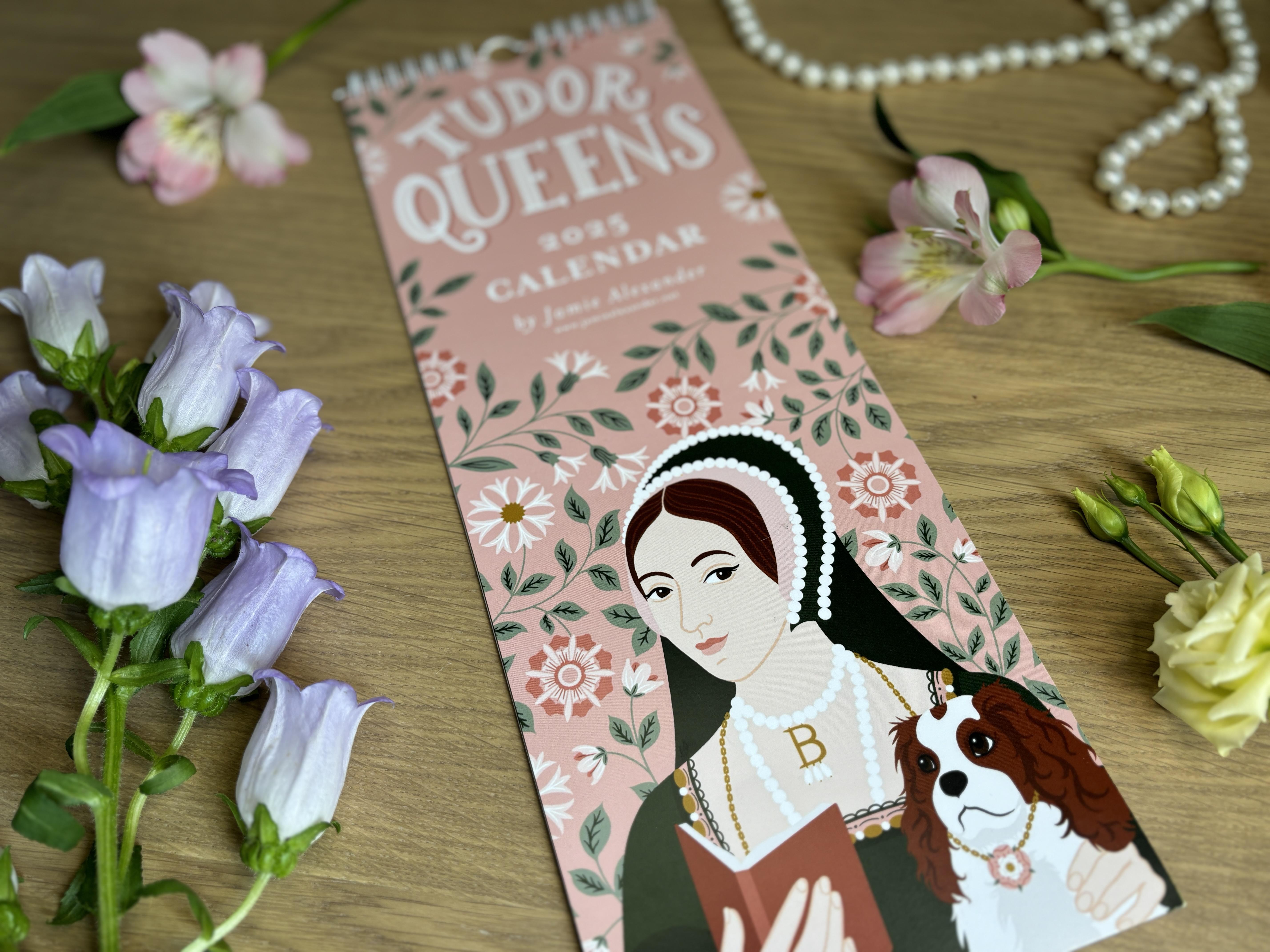
actually other things first. My Tudor Queen's
calendar started off as one illustration
for an art print for my sister's
birthday present. We're both huge history geeks, and she really
loves Anne Boleyn. I then decided to illustrate the other five wives of Henry eighth as an art print series. Only then did I make them into a calendar as they already
had six months completed. I decided to alternate
the portraits of the six queens with hand letter depictions of
their personal mottos, and that made up 12 images. Because I used the
same color palette across the 12 illustrations, you would never know they didn't actually start off
as a calendar. Number five, you can earn
money year after year. Once your calendar is created, you can reuse it every year simply by refreshing the dates. Also, there are a
lot of people who like to buy academic calendars, which run from August to July. So update those dates again, and you can sell your
calendars twice a year. Number six, with Print-On-Demand
drop shipping companies, once you upload your product, it links directly to your
Etsy shop or your website. It handles printing,
shipping and fulfillment so that you don't have to worry about
all those details. I know that personally, one of the things that kept
me from opening my Etsy shop years ago was
the dread of printing, packaging, and multiple trips per week to the
local post office. Learning about drop
shipping was the moment I realized I could finally sell
my art without the stress. I could focus on designing and let someone else
handle the rest. In short, calendars are
a portfolio boosting, income generating and
creatively rewarding way to share your artwork
with the world. In the next lesson,
we'll discuss why research and
niche down matter, and then we'll pick the perfect
theme for our calendar.
4. Finding Your Niche: Welcome back. Before
you start designing, it's really important to choose a clear theme
for your calendar. A well defined theme
sometimes called a niche can help your calendar
stand out from the crowd. While mainstream ideas
like generic landscapes or motivational quotes may feel safe, they're
heavily competitive. Focusing on a niche
allows you to reach a dedicated audience
who is actively searching for something
specific and unique. Okay, so check out
these calendars that I've designed
and sold on Etsy. Which one do you think
is my best seller? Now, I would have
assumed it was this one. Zodiac signs are super trending and popular, but guess what? It's definitely selling, but it's currently in third place, even with multiple listings
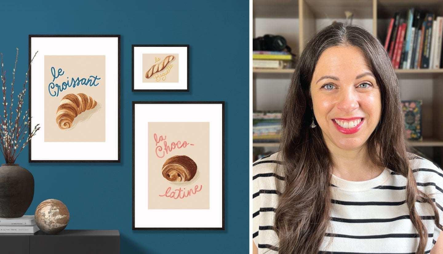
on Etsy and running Etsy ads. What do you think my
second highest seller is? It's the French bakery. I'm selling pretty well, and I'm also using Etsy ads
to boost its performance. So first place goes to my Tutor Queen's calendar by
a long shot. Why is that? This calendar features the
six wives of King Henry eighth complete with the
royal hand lettered mottos. And, yes, I even
included their pets. It's perfect for history
lovers, dog lovers, teachers, fans of Tudor era, TV shows, movies, and
even the hit musical. So now the average person
probably could not name all six queens off
the top of their head. And that's exactly why this theme is so niche
and so successful. Despite being a
highly specialized, it's been my highest
selling calendar, and the fandom is so dedicated that I don't even
have to advertise for it. It finds its audience
on Etsy naturally. And that's the beauty of Etsy. There are so many people, myself included, I must admit, with geeky or highly
specific interests, and they're all searching
for unique gifts and products you just can't
find anywhere else. Using tools to research
your theme, ENC and Everb. I personally like
to browse Etsy, Pintris and other online platforms
to see what's trending. When you're choosing
a theme, it's not just about
what looks pretty. It's also about finding
a theme that people are searching for without diving
into a super crowded market. And that's where tools like
ENC and Everb come in. EAC is a research tool that helps you to see
what's trending on Etsy. You can check how often people search for
certain keywords, how competitive a category is, and even get ideas for related keywords you might
not have thought of. This is super useful for making sure your calendar
theme has an audience. Start by searching for your
main idea like tutors or French bakery or
zodiac signs and check the search volume to see how many people are
looking for it each month. Then look at the competition. If there are thousands, thousands of listings,
it's probably too crowded. But if no one is
searching for it, there may not be a market. The sweet spot is
really a theme with moderate search volume
and lower competition. It shows that
there's an audience, but there's still
room to stand out. You can also explore
related keywords to find variations of your theme and check
trend graphs to see if interest is steady
or simply seasonal. This research helps to ensure
that your calendar theme is unique in demand
and ready to sell. Everb focuses on Etsy analytics. You can see which products
are selling well, how many sales a
listing is getting, and you can even get insight
into pricing and demand. Basically, it gives you a peek behind the curtain
of Etsy marketplace. So you can spot niches that are popular but not oversaturated. It shows you real sales data, pricing and competition
for listings, and it gives you insight into
what's actually selling. You can also explore
related listings to spot popular variations
or gaps in the market, which could help you
to refine your theme. By using Everb, you'll know whether your calendar
idea has an audience, how much competition exists, and what kind of sales
potential it might have. So you can make smart, informed decisions before
you even start designing. Using these tools together can help you pick a theme
that's in demand, unique and still
has room to shine, rather than jumping into a heavily saturated category where your calendar
might get lost. Both ERNk and Everb are
free with basic options, and they also have paid versions if you want
to go more in depth. Personally, I have not
used the paid versions, but I may give it a
try in the future. Pro tip. Use these tools early before you
start designing. It saves you time
and it helps you focus on a theme that
can actually sell. How to research your
themes, Browse Etsy, Pinterest, and other online platforms to see
what's trending. Use tools like ERNk and Everb to check search popularity
and competition. Look for areas with
high interest, but low competition so
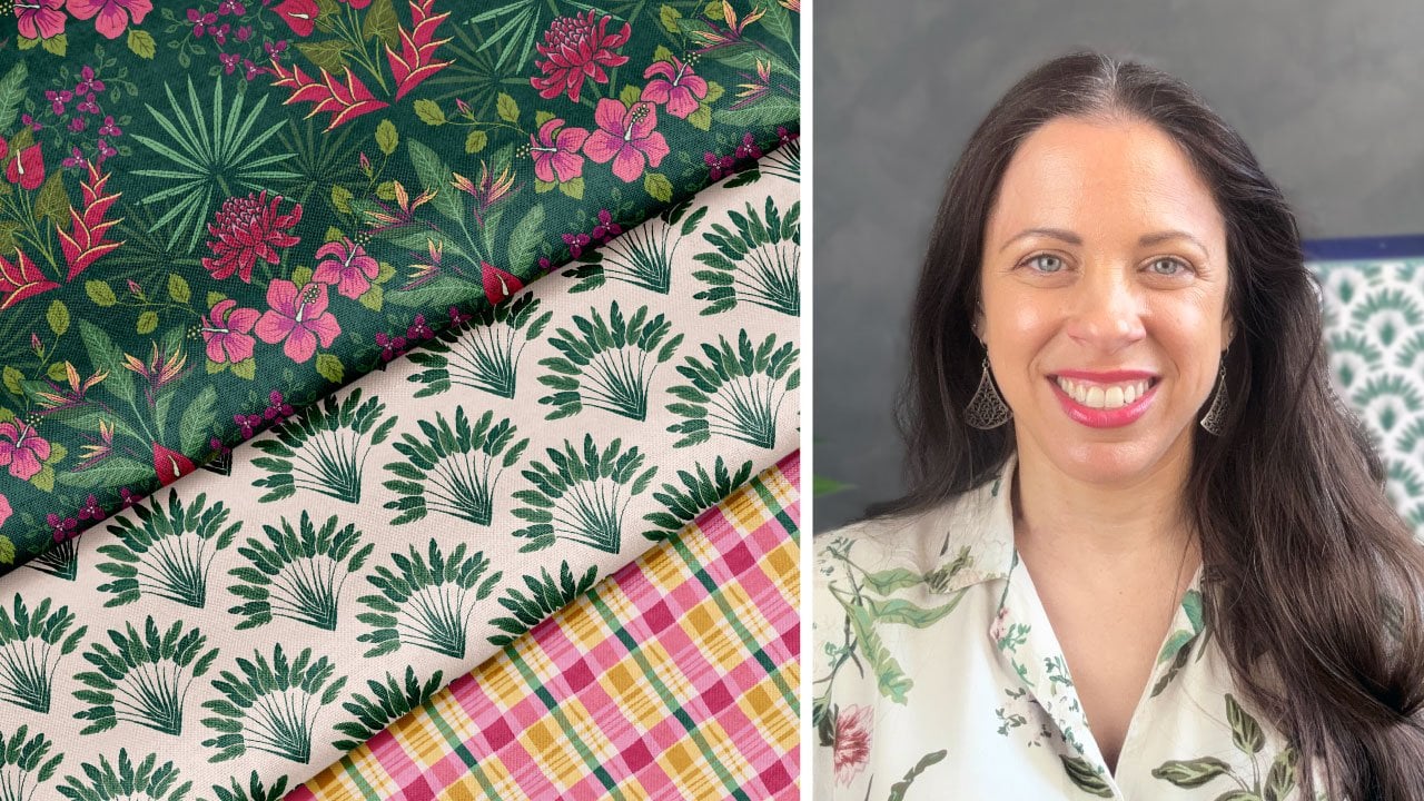
your calendar can shine. Inspiration ideas. So here are some fun niche
directions you could explore. Landmarks or famous monuments
from a specific city, you could even go
with your local town. Botanicals, birth flowers or seasonal plants are
always trending. Just find a way to
make them stand out as this market may be
a bit more saturated. To make my Zodiac
calendar stand out, I added the birth flower
to each illustration. Seasonal cocktails, food, desserts or produce are
definitely a fun option. My French bakery is getting
a lot of love at the moment, and I think I will be
revisiting the food theme in my next calendar.
Historical themes. So historical and
mythological references attract a lot of devoted fans, as I have learned with my
Tudor Queen's calendar. Art styles, cultural
motifs like art nouveau, art deco, and the Baroque styles are also currently
having a moment. Hand drawn or stylized
illustrations are also currently
highly trending. I think people are
really gravitating towards hand drawn
art or art with a human touch because of the preponderance of AI
generated images at the moment. You could do something
really simple and purposely wonky and throw
in some hand lettering. Self care, mindfulness
and wellness is also a smart category
appealing to people looking for calm,
inspiration and motivation. Also allow me to restate
my tried and true mantra. You Can't go wrong
with dogs and cats. Just don't make a general
dog or cat calendar, though. Give them some sort of niche. What about Parisian cats or
dogs engaging in self care? Okay, so now it's your turn. Do some research, save
your inspiration, maybe make a mood board. Think about what will make
your calendar unique, memorable and appealing
to your audience. The goal is to stand out, but not to directly compete with the most common categories. Don't be afraid to
get a little geeky. In the next lesson,
we'll strategize the layout and illustrations
of your future calendar.
5. Illustration Strategy and Grid Layout: Welcome back. By now, you should have chosen the
theme of your calendar. I know you're probably
itching to start drawing, but first, we need to make a strategy for how to
approach this collection. Our calendar will have 12 pages
of designs and one cover. You need to decide
on the workflow that is the most doable. You may decide to
make one illustration per month or perhaps
one per week. Or perhaps you're the
type to buckle down and throw yourself into the
whole collection all at once. Personally, I prefer the
latter strategy because once I've developed the style and the treatment of the
first few illustrations, I get really into the groove, and the others seem to
follow more easily. If I interrupted the
momentum between designs, I think I would have
trouble finding the motivation to dive
back into that project. Perhaps you have
existing artwork that you'd like to repurpose, and if that's the case, that
should speed up the process. Now, something to remember
about calendars is that a month can have 28, 29, 30 or 31 days, and those days may fall
over a span of four, five or six weeks. That means that the
layout of your calendar should accommodate
months that have four, five or six rows of boxes, which obviously have
different heights and will probably affect how much room you have left for
your illustration. Since I want to reuse my
calendars in the years to come, I want to make sure
that the illustrations will all be the same size and be able to work with a layout of four or five or six
weeks in my grid. It helps if I use a solid
background color or a full bleed
background that can be expanded as needed if I need
to adjust the illustration. If I make a larger illustration with a grid that's
only four weeks, what will I do in
the future when that month spans over
five or six weeks? It's better to plan accordingly now and be smart with your
layout for the future. We also need to consider
the dimensions. I've experimented
with a few POD sites, and my preference for calendar
printing is by far gelato. Therefore, I have
to base my layouts on their calendar measurements. Now, they have a lot
of options available, but my current favorite
is the ledger size, which is 11 by 16.5 " for my
North American customers, and a three paper size for my European and rest of
the world customers. This size gives you the most
room to write in the boxes, and the size is really nice for showcasing your work of art. However, I have experimented with their extra
long format as well, which worked best for my Tudor
Queen's portrait layout. Whatever company you
decide to print with, it's important to consider their product dimensions when
deciding on your layout. You can decide how much
space to devote to art and also how much to devote
to the grid for the dates. You could play with these
proportions personally, I opt for the 50 50 option because people have
room to write, but also have a good
view of the artwork. You can also be clever and skill the artwork
so that it can be cut and framed as an art print after
the calendar is used. So right now, I'm
logged into Glato, which is my print on demand
and drop shipping site, and I'm looking for
their ledger template, which measures 11 by 16.5 ". Now, Glato offers
the calendar dates already in their
template, but honestly, it's worth the extra
effort to design your own grid so that it beautifully harmonizes
with your illustration. Now, there are many
ways to do this, but I've become quite the
Illustrator girl due to my years designing cards for minted and making
patterns for fabric. So using Illustrator just feels kind of second
nature to me right now. I'm going to open
Illustrator and hit Command N to open
a new document. I'll set the dimensions to
11 " wide and 16.5 " tall. Portrait mode, CMYK mode. Okay, so now I'm going to
establish some guidelines to avoid any objects getting too close to the edge
of the page here. Now, Glato usually prints
with a full bleed, and sometimes the page trimming
is not perfectly precise. So I'm going to play it safe, and I'm going to make
a half inch border and make sure that nothing
falls outside that zone. Since my document is 11
" wide and 16.5 " tall, I'm going to subtract an inch from the
width and the height. I'll use the shortcut M to
activate the rectangle tool and specify 10 " wide
and 15.5 " tall. So now I'll go to my alignment panel and center
this box vertically and horizontally so that I know that everything must be constrained
in this zone here. Now I'll just create some
guides by going to view rulers. I'm going to pull
down some guides to mark these margins
that we've created. Now I can delete this box. Next, I want to
use the shortcut M to draw a rectangle that marks the halfway
point of my page. I'll make it 11 "
wide and 8.25 " tall, and I'm going to align it
with the bottom of the page. Then I'll drag another guide, and I'll mark the
midpoint here below which I plan to place
my calendar grid. Okay, so now I can
delete this box. These guides here will not be visible in
the printed design. You can turn them on and
off as you need them. So you can see I plan to put my illustration above
and my grid down below. Now, for my grid, I need a plan for four, five or six weeks. So inside these margins, I have 10 " of width, and I want to exploit
all of those 10 ". And then in terms of height, I want to leave enough room for the month name and
the days of the week. So I think I'm going to
make each box let's see, 10/7 is 1.428 5 ". Let's round that to 1.43 ", and we'll make
each box 1 " tall. That should leave us with a
bit of room for six weeks, as well as a month name
and days of the week. Okay, so I'm going to
hit shortcut M to make a rectangle 1.43 "
wide and 1 " tall. I'm going to fill it
with white for now, and I'm going to give it a
black outline temporarily. I'll have it placed right up against that left margin here. Now I'm going to
duplicate it by holding the shift and option
buttons at the same time and slowly dragging the
rectangle until you see it turn pink when it snaps or intersects with
the first rectangle. Now release, and I want
you to hit Command D to duplicate the action five more times so
that we have three, four, five, six,
seven boxes across. See how that perfectly
fills the space. Okay, now I'm going to
select all seven boxes, and I'm going to repeat the
maneuver of holding Shift and command at the same
time and this time, drag everything down until they intersect and snap into place. Now, I want you to hit
Command D and duplicate that row until we have
six rows of seven boxes. Great. So now you
can just adjust the placement for the boxes if you want it higher or lower. Now, this is a personal
preference of mine, but I don't care
much for the boxed in look on my calendar. I would much prefer to make
this lines instead of boxes. I think it would feel
a lot more elegant. So I'm just going
to select all of these boxes and hit Command G to group
them as one object. And next, I'm going to make their outline stroke
a very light color. And next, I'm going to
hit P for the Pen tool, and I'm going to
hold the shift key down as I draw a line. I'm going to line it
up with the grid I created and just lay
those lines down on top. To duplicate the line, I draw it down while holding Shift and option
at the same time, and I hit Command D to
duplicate as needed. In the stroke panel, I
can choose the weight of the stroke and add a
rounded cap to those lines. And now I'll delete the original grid boxes since
I don't need them anymore. To finish, I'm going to draw a cream colored rectangle box that will sit behind
the grid lines. Okay? I'll go to object
arrange and send to back. Okay. Okay, so now it's time to put the
name of the month. I'll hit shortcut T
for the type tool, and I'll write the name
of the month right here. So, I'm a December baby, so I'm going to start
with my birth month. You can choose the typeface, size, and style that you prefer. Okay, so I will
center and justify the text and then center
and align it about here. I'm going to adjust the
tracking a little bit. There. I think I'm at
size 15 with this font, but that will most likely change once I add my
artwork and illustration. Okay, so now it's time for the numbers and the
days in our grid. I'm going to hit T for text and draw a little box
here for the week names. So now, in the USA, we typically have a Sunday
start for our calendars. And in France, where I live now, and in most other
countries of the world, I believe, they tend to
favor a Monday start. It's really up to you
which you'd like to do. And since old habits die hard, I'll always feel a bit more accustomed to a Sunday
start calendar. Plus, most of my customers are based in the US
or North America, so that's what I'm
going to do today. I'll type the letter
S for Sunday, and I'll arrange it in centered position above my
first box in my grid here. Okay, that looks nice, and now I'm going to
drag it over while holding down Command and
option at the same time. And I'll hit
Duplicate until it's been duplicated above each
of the seven columns. Now I will go in and fill in the correct letter
for each week. So we've got Sunday, Monday, Tuesday, Wednesday, Thursday,
Friday and Saturday. Okay. And now we'll place
the numbers. Same idea. I'll hit T for the type box shortcut and draw
my little box here. And type in a two digit number so that I know the
width will be okay. I'll just make it
number ten for now. I'll place it where I think it will look nice in the grid. And now I know the boxes of
my grid are 1.43 " wide. So I will select that
little number box and go to object, transform, and move. I'll select 1.43
" horizontal and zero vertical, and then copy. The number will have been
copied over to the right. So now what? You got it. We got to hit Command D to duplicate until the entire row
is filled with the number. Now, select the whole
row of numbers, and again, go to object,
transform and move. This time we want to move
the whole line down. So put zero for horizontal
and 1 " vertical, and then hit Copy. That entire row should
now be copied down. We can hit Command D a few more times to fill
up your six weeks. Okay, so now, of course, you need to go in manually and put the correct
number for each day. I personally look at the
calendar on my iPhone and double and triple
check to make sure I haven't made any
mistakes in the numbers. Remember that
you'll have to redo the numbers for every
month of your calendar. But now that we have this
nifty little template, it should be very quick
and easy for you. So now you can shuffle things
around a bit as needed. You can save it as a
template for six weeks. And now, we can delete
a row of our grid. So you'll have to adjust the background color rectangle and delete the bottom
horizontal line. S. And now resave it as your five week template. Okay, and now we'll repeat that process again by adjusting the background box again and deleting one more
horizontal line, and now we'll adjust it
so that it looks nice in the space and we'll resave it
as our four week template. What I like to do is export
these three templates as PNGs and then use them as guides when I'm working on my
illustrations in Procreate. Okay, now it's your turn. You can create your
Illustrator template with your own stylistic
decisions for typeface, grid proportions,
and whether you prefer a Sunday or Monday start. Save your three
templates for four, five, and six week months. Export them as PNGs to use as guides when we
illustrate and Procreate. If you like, I have also
included Illustrator files for these three templates
that I've created today for four,
five and six weeks. They're available in the
course download section. You will need to
edit the typeface, the name of the
month, and the days. In the next lesson, we'll plan our calendar illustrations with preliminary sketches
and form a strategy for making 12 cohesive
yet distinct parts of a collection. No
6. Preliminary Sketches and Creating a Cohesive Collection: Wow. Alright, now that we've tackled the
boring grid layout, it's time to dive into
the fun part drawing. Before I illustrate
each individual month, there is an essential
step that I cannot skip thumbnail sketches. Thumbnail sketches are small, quick drawings used to
plan out a composition, layout or design of a piece before you create
the final artwork. Think of it as brainstorming. Thumbnail sketches are small and quick with simplified shapes. When I do thumbnail sketches, I'm focusing on
the basic shapes, placement and composition,
but not the details. Thumbnail sketches are
very low commitment. Because you're only spending 30 seconds to a minute
on each sketch, you won't feel bad if you
don't like the results. You'll simply make another variation in the
blink of an eye. These exploratory sketches
will give you a chance to experiment with your layout,
balance, and proportion. You can also use
these sketches as color studies to test out the color palette
that you plan to use. Since this is a collection, I will be keeping
in mind the sense of consistency and cohesiveness. I want each image to
feel unique and fresh, but I also want them to
feel connected and unified. Setting these guidelines will reduce decision fatigue and
speed up your workflow. To achieve this, I'm going
to consider a few things. Number one, theme. We've
already talked about this, but obviously the theme is the central idea that
ties your series of designs together so that it feels intentional
and not random. For example, seasonal
cocktails, holiday cats, French cheeses, historical
heroines, et cetera. Number two, establishing
a color palette. Nothing creates unity
in a collection of images like a common
color palette. If you're planning to use existing illustrations
in your collection, but feel like they don't
really go together, the first thing I would
suggest is recoloring them with the same
limited color palette. I tend to favor a limited
palette because it actually simplifies my process when I no longer have to
think about color. A limited palette of five or six colors,
including light, dark, midtone, and accent colors is a wonderful way to really tie your illustrations together. If you'd like to see
my technique for choosing a beautiful,
limited color palette, you may enjoy my other
Skillshare class designing a greeting card using inspiration from
your everyday life. In that class, I show my
favorite technique for developing an impactful
color palette from a photo. So with this calendar, you can see that I've used
similar shades of pinks, reds, light greens
and dark greens. While I varied the
background color, the images all seem unique and yet part
of the same family. Here is another example with
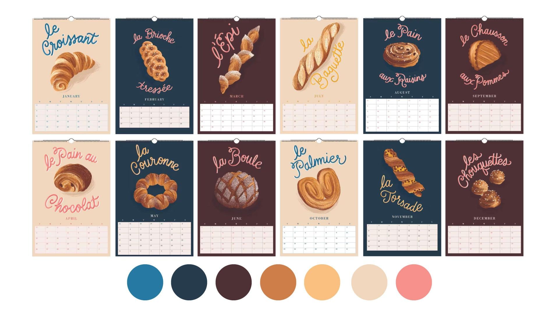
my French bakery calendar. You can see that I have
a unified color palette. To add interest, I've alternated
the background colors and text colors while remaining in the
established color palette. Number three, define your
line style and brush work. Whether you prefer your
lines to be a bit sketchy, clean or painterly, I would
pick a style and stick to it. Your linework,
whether it's thin, medium or bold, should
also be consistent. Save the presets for any of the digital brushes that
you're using in Procreate. As you can see, my queens and the hand lettered quotes all
have a similar line quality. There isn't one with
super thick lines while the other has thin lines. They all look as though
they were crafted by the same hand,
which is the case. Number four, repeating elements. Repeating elements
function as a sort of visual glue that helps to tie
your collection together. This can be subtle recurring
elements like patterns, motifs, textures, or borders. In my signs of the
Zodiac calendar, you can see that
I have repeating elements that tie
everything together, the constellation of
stars in the background, the little banner
at the bottom with the hand letter name
of each Zodiac sign. And these surrounding
floral elements. Since these are birth flowers, they are all different
and yet presented in that similar style of framing the principal
elements of the design. Number five, typography
and lettering. Consistency is also established not only in the typefaces you
use in your calendar grid, but in your illustration itself. I think that calendars are the perfect opportunity to
practice my hand lettering. And as you can see, using
a similar style, weight, and color of lettering will create that unity
across the images. It's also very trendy
to incorporate hand lettering into
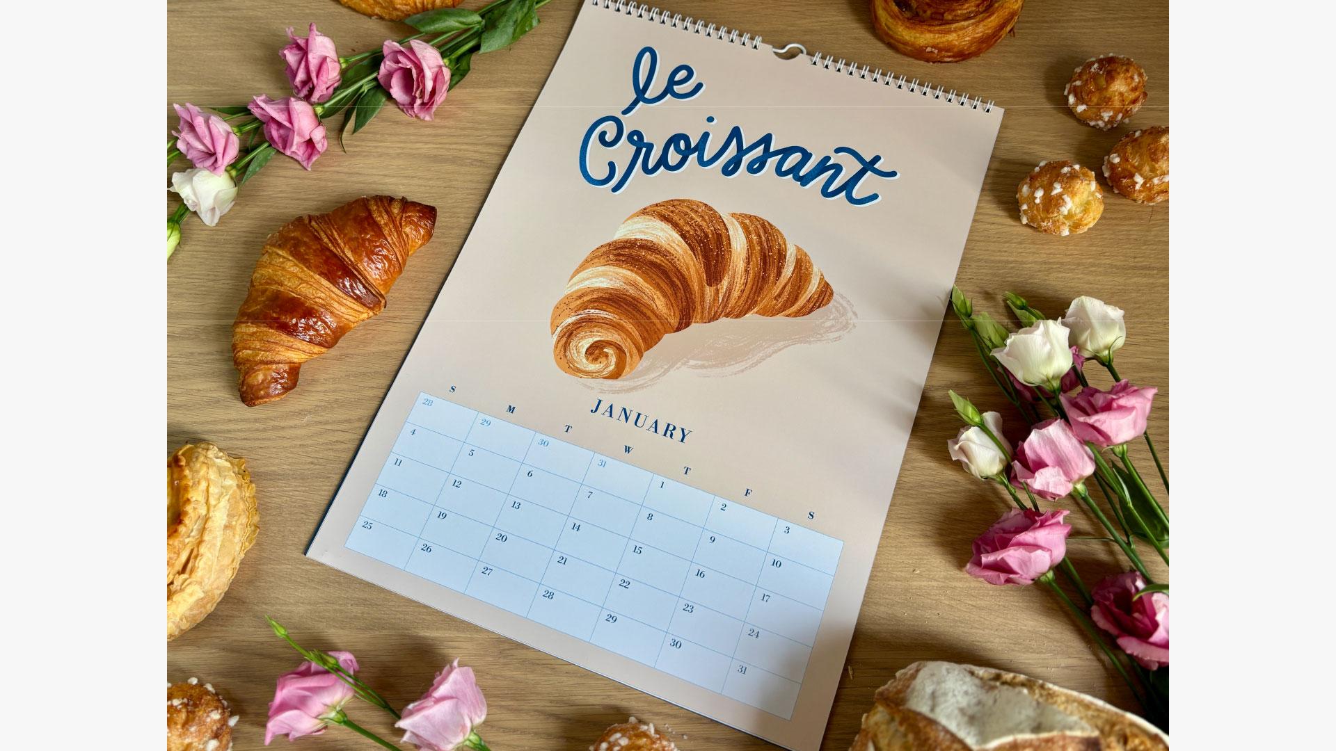
the illustration as part of the composition. In my French bakery calendar, I have hand lettered each of
these breakfast pastries in a similar script with a bit of a three D
treatment and shading. Here in my Zodiac calendar, you can see the same lettering
style for each design. And for my Tudor
Queen's calendar, you can see hand lettering
every other month. You can also see
how the mottos and names of each queen
have similar styles. And this is further
strengthened, of course, by my limited color
palette that I've chosen. In the course
downloads, you'll find my 12 month calendar thumbnail
sketch planner here. Which you can
either use directly in procreate or print out. It gives you a space
with rectangles that are the same proportions
as the 11 by 16.5 inch calendar so that you can sketch out and
color your calendar year. Remember that each
month may span four or five or six weeks and that this will vary
from year to year. Personally, I prefer to
illustrate in the top half of the calendar to avoid
modifying that each time. I'd rather stick to modifying just the dates in
the grid each time. You can, of course, choose how you'd like to tackle
this project. I do see a lot of
talented calendar artists who prefer to fill any free space with their illustrated image
whenever possible. It's really up to the
artist's preference. So I'm ready to get sketching. I'm going to open Procreate, and I'm going to
create a new canvas. So my thumbnail sketch
template is printable, so it measures 11 by 8.5 ". I'll personally draw
directly in Procreate, so I'll just make my canvas
11 " wide and 8.5 " tall. I'll select CMYK for color mode, although it doesn't matter much because this is not
our final artwork. Out of habit, I tend to
work directly in CMYK mode, since most of the
partners that I work with request artwork files in CMYK. And I'll hit Create. Okay. I'm going to click the wrench icon and then add
and then insert a photo. Okay, so there it is. Now I will click
Fit to Canvas at the bottom here. Eh voila. So now I'm going to create
a new layer to sketch on. For sketches, I
typically go to the inking set and just
use the dry ink brush, which comes with Procreate. I'm going to just quickly
sketch out my ideas. I wanted to create a
unique feminine spin on the 12 signs of the Zodiac, incorporating some
consistent elements like star constellations, birth flowers, and some sort
of banner at the bottom. Also, remember how I mentioned leveraging your artwork
onto several products? I am adding another
layer to my sketches. I want to reuse these
illustrations on greeting cards. I think that Zodiac
birthday cards would be an amazing gift. You may notice in the
template that I've included a vertical rectangle. That rectangle is proportionate to a five by seven
greeting card. So if you plan on designing
greeting cards later, make sure that the
essential parts of the artwork fall within
that green rectangle. Anything outside of
it would be cut off in the greeting card but
visible in the calendar. If you don't plan on creating greeting cards with
your calendar artwork, feel free to disregard
these lines that I've made. Okay, I'll let you
watch me work as I finish up my
thumbnail sketches. An Okay, so here we have my
thumbnail sketches of my signs of the
Zodiac calendar. You can see that I also
colored them in very roughly to get an idea of
what colors I'm going to use. Obviously, this is likely
to change as the artwork evolves during the
illustration process. I always think it's nice to have some sort of
a starting point, even if I end up changing
a lot in the future. Now, when you create your final illustration in Procreate, try to put similarly
colored elements on the same layer to make
recoloring an easy process. You can see that they all have a full bleed, solid
colored background. This solid colored
background will extend behind my calendar grid, and this will also
be helpful for resizing the illustration for my five by seven inch cards. In my sketches, you can
see that each design has a unique illustration to
reflect the sign of the Zodiac. And again, I have included a few recurring elements
in each illustration, like the little
banner at the bottom, the star constellations, and
the floral component which represents the birth flower for each star sign. So
now it's your turn. Download the thumbdae
sketch template and sketch out your
12 months of ideas. Remember to plan for the
cohesiveness and visual glue. This is an intuitive process. Don't spend too long
on each sketch. Just let it flow. And if you don't like something,
just make more. Since you're only spending like 30 seconds to a minute
on each sketch, it's no great loss if
you make some bad ones. Lay down some rough color, and it will give you a starting point for your collection, even if you end up
making changes later. In the next lesson, we'll begin our final illustrations
for our calendar.
7. Final Illustrations and Inking Your Artwork: Yes. Welcome back. Now that you've prepared
your thumbnail sketches, you have a rough idea of how
your calendar will look. It's time to start inking
our final artwork. Alright, let's
start illustrating. Like I said, I'm
a December baby, so I'm going to start
with my birth month. First, we'll create
our Procreate Canvas. I'm going to make it 11
" wide and 16.5 " tall, just like the calendar
size on Glato. For color profile,
I will select CMYK, since I know that lato
likes calendar art to be submitted as a CMYK JPEG. I'm going to name it December, and I will hit Create. Now is the time to grab the four or five or
six week templates that you've designed
for Lesson three. In the course downloads, I've also included
the template that I made if you'd prefer
to use that one. You can find it in the
course download section. It's called Final
Illustrations Template. Let's click on the wrench icon and then add so that
we can insert a photo. There it is. And now I
will click Fit to Canvas. You can see that the
template has guidelines for the proportion of the five
by seven greeting card. So if you're planning
artwork for both, we can keep that in mind. Okay, I'm going to return to my previous thumbnail
sketch canvas and go to the layer with
the sketches on it. I'm going to tap
it and hit Copy. Now I'll return to my
final Illustration Canvas and click on the actions icon. I'll hit Copy. And now we
have the thumbnail sketches. So I'm going to just zoom in on my December sketch and get
rid of everything else. On the thumbnail sketch layer, I'll take the opacity down, and now I'll create a new
layer on top of that, and I'm going to create my
drawing on top of the sketch. I do my sketches with
the dry ink brush. Okay, I'm going to
let you watch me work on my final illustration. Okay, so here's my final
illustration for Sagittarius. It's not perfect, but I'm not
going for super realistic. I'm going for more of a
whimsical, hand drawn style. So I'm going to turn off the thumbnail sketch layer now
since I no longer need it. And now it's time
to ink my artwork. To do that, I'm going to
create a new layer for each color that I
use so that I can make changes easily
if necessary. I want a slightly textured hand drawn effect
for my collection, so I'll probably be sticking with the dry
ink brush to color in my shapes rather than just dropping color in
with solid color blocks. For shading, I'll be using the realistic gouache
set by Liz Kohler Brown. Okay, I'll let you watch
me work for a while. Wow. Okay, so here is my ink illustration. I'm going to make sure that my sketch layer is turned off. And as I create
more illustrations and compare them side by side, I may need to make some changes. But for now, I'm
pretty happy with it. I'll go to the actions icon, click on Share and export this illustration as a
TIFFle to my computer. In my opinion, TIF files preserve image quality
and textures the best. And here are my final
12 illustrations. I just repeated
that step 12 times. I had been planning to alternate
color every four months, black, cream, green, blue, black, cream green, blue. But as the illustrations and the details and the
colors evolved, I ended up using
those four colors, but not alternating them
in any particular way. I just chose what suited the illustration
best. That's okay. I'm probably the only person
who's going to notice that. Now, creating a collection
can be a daunting task, but I find that once you get past the first few
illustrations, you really develop a flow where each image becomes
easier than the last. Because you have a system
and a common color palette, line and texture
and general style, you will work within
these constraints instead of venturing
out elsewhere. This will keep you more on task and will make your
path forward more clear. In restricting yourself,
you will eliminate the unnecessary distractions and focus on the quality
of your artwork. And as I said before, I
am more inclined to do a deep dive and just do the
illustrations all at once. But again, depending on your schedule and
your preference, you may choose to aim
for something that's more doable for your
personal rhythm. You could opt for
one illustration per week or one per month. Personally, I spent
about a month concentrating on this calendar. Not a solid month, but a
few hours here and there. Since I'm a mom to three
young kids and also have several ongoing projects and responsibilities, I
did what I could. I tend to work in a lot of detail and in a
maximalist style, so my illustrations tend
to take a bit longer. A less detailed calendar could probably be achieved in a
much shorter amount of time. So don't hesitate to come up with something
really simple. So now it's your
turn. Start small, choose your favorite month, maybe your birthday,
and complete your first illustration
and ink your design. When you're ready and at the
rhythm of your choosing, complete the rest of
your 12 calendar images. So this is not a race. You do what works best for you. In our next lesson, we'll add the artwork to our
calendar template. See you there.
8. Putting it all Together: Wow. Hello again. It's time to place
our artwork into our calendar template
in Adobe Illustrator. I've got the template that we created in Lesson three here, and I'm going to
use the shortcut to place my TIF file and arrange
it behind everything. I'll use the align
tool to make sure it's perfectly centered
vertically and horizontally. Now I'm going to
edit the month name and the dates in
the calendar grid. I usually have my
phone next to me with the calendar app
open so that I can see which days fall where and also how many weeks
are in the month. I can see here that December
of this coming year will fall over five weeks, which is why I've used
my five week template. Going to select the month name as well as the days of the week and using the shortcut I to
activate the eyedropper tool, I'm going to select a pretty contrasting color
directly from my illustration, and that will become
the color for my text. Same for the numbers on my grid. As you can see, I've
included the days from the previous and upcoming months that fall in Week
one and Week five. And to differentiate, I
like to make those dates a slightly different lighter
or more muted color. Some people prefer just to
delete those boxes altogether. So it's really just your
personal preference. For the grid background, I find that customers prefer
as light a background as possible to make their
writing easier to read. So I usually go very light
with the grid background. I usually opt for a
nice cream color or maybe a lighter value of one of the colors
from the illustration. I've also decided to add a little extra detail
to this calendar. Zodiac signs don't correspond exactly to each
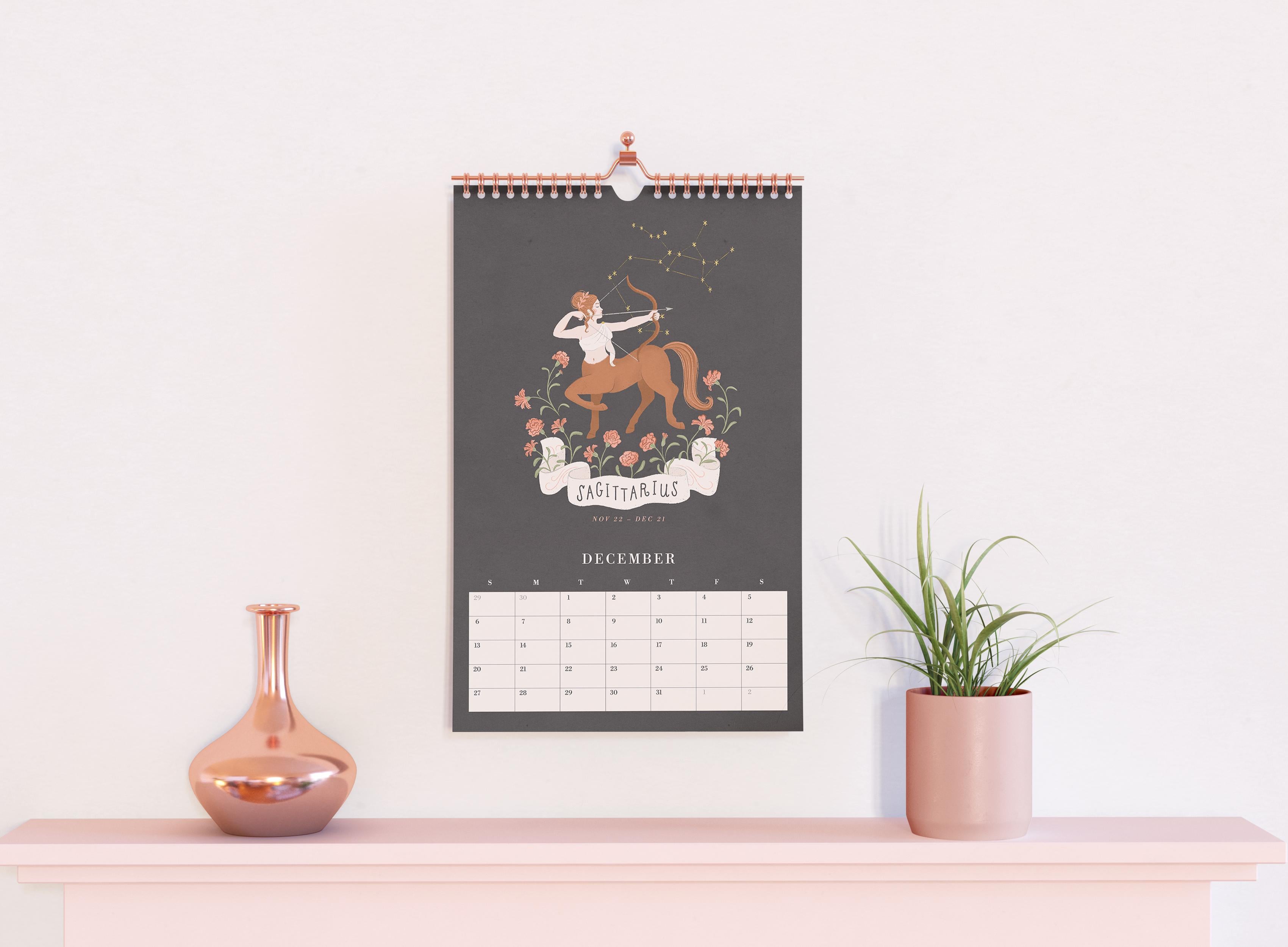
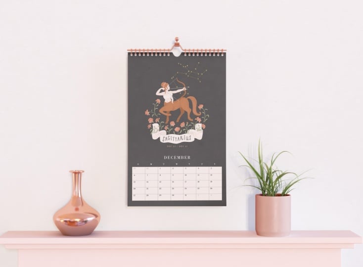
month. They overlap. And so Sagittarius runs from November 23 through December 21. I want to show that I'm
aware of this before all the die hard Zodiac
lovers come for me. So I've decided to
note the beginning and end dates in a discrete
italicized typeface, just here beneath
the illustration. Okay, I like the way
this is looking. First of all, I'm going to save the Illustrator file
as December and the year so that I can
make future changes in coming years or perhaps
in the month of August, if I want to make an
academic calendar. Next, I'm going to
export it for print, so I'll go to File, Export As. And now I'm going to name
it December and the year. I'm going to choose JPEG as the format where it
says use artboards, I'm going to make sure
that this is clicked on. Okay, so now I'll click Export. And here I'm going to
select CMYK because I know lato prefers calendar
files in CMYK mode. I'm going to select
maximum quality, and I'm going to precise
300 dots per inch, 300 DPI. Okay, so let's
check our file now. We have our file.
It's ready to go. I'm going to do this 11 more times with the remaining
months of the calendar. I will always check my
calendar app on the phone to verify which template I should be using
for each month. Make sure you check and
double check these dates. You don't want to have a mistake that gets through to print. My most common mistake is to skip a number or to
repeat a number, so I like to go through it
all at the time of creation and one more time for good measure before I
send it off to print. Okay, so I've got my
12 calendar months in their templates ready to go. I've saved them both as modifiable Illustrator
files and also as CMYK hi res JPEGs so that I can upload
it to print on demand sites. Now, one final piece of advice if you plan to sell
your calendar internationally, I suggest taking a moment
and resizing your artwork for the EU rest of the
world calendar proportions. Let's say you're
based in the USA, but you also want to
sell your calendars in the UK or anywhere else
in the rest of the world. The drop shipping
companies typically differ in terms of
product dimensions. So Glato, the drop
shipper that I use, has the ledger size for
the USA and Canada, but for the European Union
and the rest of the world, the calendar is size A three, which is 11.7 by 16.5 ". So slightly wider
than the US version. What I like to do once
the USA files are completed is make a new
Illustrator document and size it for 11.7 by 16.5 " and copy paste the
Illustrator art into it. I know that if I try to upload my USA art for the
European calendar size, it might cut off some details, or the margins will
look a bit weird. Depending on your artwork, you may not need to redo it. Maybe you have large enough
margins and it looks okay. Personally, I've already
tested it on this calendar, and I know that my
calendar needs to be resized for the Europe size in order for it to look right. So as you can see,
I'm just creating a new Illustrator
document, size A three, CMYK mode, and I'm going to grab the American
artwork that I created, and I'm going to just
copy and paste it. And I'm going to move things around slightly
until it looks good, and then I will save it, and I'm going to include
EU in the file name, and I'm going to
export it to print the same way that I did
for the USA art files. I usually have a folder for
the North American files and another folder for the EU
or rest of the world files. It's really up to you
how you want to do it. But personally, I think
it's worth the extra step because you'll
have extra customers. So now it's your turn. Place your artwork
in your template and edit the dates and colors and any other
details that you wish. Next, save your file and export
a JPEG version for print. If you plan to offer
your calendar in two versions for customers in North America and the
rest of the world, take a few minutes to resize your artwork
for the A three size. In the next lesson,
we'll give our calendar an irresistible cover that
your customers will be unable to resist. Oh
9. Creating a Cover: Me. Okay, it's time to
finish up our calendar. I usually wait until my calendar art is completely
done before this step of the process because I will most certainly
use it on my cover. So here's my philosophy
on the cover. You don't want to give away all the surprises
inside the calendar, but you definitely want
to give them a taste. I typically use one
representative image, which is my biggest showstopper, or I make a sort of
collage of several images. For my Tudor Queen's calendar, I had this very narrow format. And because of this, my composition options
were very limited. So I selected one portrait of the queen that
I thought was the most representational
of the collection and would attract
the most attention, which, in my opinion,
was Anne Boleyn with her Cavalier King
Charles Dog and her iconic Be pearl necklace. It was the first image that I created for the
collection and is, in my opinion, the
most beautiful. Anne Bollin also sparks more of reaction than
the other wives of Henry eighth due
to her impact on history and her rather
scandalous reputation. I extended the pattern of
florals in the background, and I hand lettered the title. For the year or any
other remaining text, I added that
Illustrator so that I could easily modify
it from year to year. So for my Zodiac calendar, I duplicated all of
my illustrations, and I merged them down so
they were only one layer, and I turned off their
background color. I then copy pasted several of them to create
a sort of border, and I left the center
open to place the text. Once I was happy with
the arrangement, I hand lettered the title
in the middle here. Then I brought it
into Illustrator to place the remaining text
that you see right here. And this way, I can modify the year and any other
information in the years to come. It's a very similar composition to my French bakery
calendar cover. You can see I've
done the same thing. I arranged a sort of collage
of some of the images, and the text goes in the center. For me, the cover comes together pretty intuitively
and pretty quickly. I rarely spend much time on them since all the hard
work is already done. I like to keep the title simple and indicative of what the
theme of the calendar is. The shorter the words, the more readable the cover
will be from across the room. I like to indicate
the year, my name, and also provide my website so that people can find
out more about me. Now, in a perfect world, I would create a back
cover design and give a preview of all 12 months and perhaps a little artist bio. But unfortunately,
the back cover needs to be left
blank with Glato, which is the drop shipper that I'm currently working with. Okay, so now it's your turn. Create a cover for
your calendar. You can't go wrong with using your favorite image
from your calendar, or you may opt to
include several images. Don't forget to give your
calendar a simple title that gives a clear idea of the
theme to your audience. And remember to add
any additional text, and Illustrator and export
it as a CMYK HiRes JPEG, just like our calendar pages. You plan to make two
versions of the calendar for the USA and Canada and for the EU and the
rest of the world, make sure you also
resize your cover art. In our next lesson, I'll show you how I upload my calendar to a Print-On-Demand site that
links directly to Mies shop.
10. Uploading to Print on Demand and Etsy Listing Creation: Welcome back. With our files now polished and ready to go, it's time to upload them to a Print-On-Demand drop shipper site and let them take care of the printing and
shipping automatically. A drop shipper is a service that handles
printing, packaging, and shipping your
products directly to your customers so that you don't have to manage
the inventory. I've had the pleasure
or lack thereof in certain cases of working with several drop shippers
over the past few years. Some of them are fantastic, and others have been
disappointing to say the least. For calendars, I do
find that Glato has consistently
beautiful quality in terms of accurate
color and paper stock. The color looks just
like what I see on my iPad when I'm
creating the illustration. Also important is their
customer service. With drop shipping, some hiccups may come with the territory, things like printing defects or items that get lost in transit. Oh, occasionally, I've had
customers reach out sending me photos with problems such
as misaligned printing, where the pages aren't
trimmed correctly. Sometimes scratched photos. One time they appropriately
beheaded my Tudor queens and also detached pages where the wire binding
didn't go through. When these issues have arisen, I have always been satisfied with Glato's customer service. They have always been really
quick to respond to issues in the chat box on their
website or via email, unlike some of their competitors
that I've worked with. They usually respond
within a few minutes, and sometimes it may take a few hours during peak
seasons like Christmas, and they're usually
very quick to send replacements
for any problems. So here I am on Glato's website. I'm preparing to
upload my calendar. Glato is one of several drop
shipping companies that can sync directly with
your Etsy or your website, and it's pretty easy to do that. My Etsy is already
linked up with Glato, so I'm just going to go
to the product catalog, and I'm going to
select calendars. You can choose
between shipping to the USA and Canada or Europe
and the rest of the world. The orders are printed and
shipped with local partners. They have single sided and
double sided printing, as you can see. I'm going to select the
double sided printing option, and I'm going to
start by choosing the US Canada shipping option, which means that those
calendars will be printed and shipped somewhere from a drop
shipper in North America. Now, look over here where
it says shipping from. Make sure United States
is selected here. Otherwise, you won't be able to continue to the next step. If you want to make a calendar destined for the European Union
or the rest of the world, you'll have to select the
EU version of the calendar. Okay, I'll stick with the
US version right now. I'm going to add to store, and I'm going to click
on my Etsy shop here, and now I'm going to choose
the size for my calendar. You can see it's proposing
the tall skinny format, but I want the ledger format, which is 11 by 16.5 ". So I'm going to
click on that one. And now you'll
notice that you can use their existing grid, and they offer a variety of pre designed grids
that you can choose from. If you really think that
it's inconvenient to go through the process of
building the grid yourself, you don't have to feel guilty about using one of the
grids that are on here. Personally, I just prefer having more control
over the design, colors, fonts, and
look and feel, which is why I
create my own grid. But you do you. So we have this mock up
here of the calendar, and below, you can see
each month of the year. I'm going to select
everything on each page, and I'm going to hit
Delete to start with. Let's just get rid of everything and start with a clean slate. Now, I'm going to click on the file icon on the left here, and I'm going to grab the JPEGs of the folder on my desktop
and select them all, and I'm going to drag
them right into Glato. I'm going to start
with my cover image, and I'm just going to drag it right over here to
the first page. So now I'm going to click
on the next page and add January by dragging the
image over to the template. Okay, so now February, I'm just going to
drag it on over. And I'm going to keep doing
that for all 12 months. Yeah. Now, the last page
is plain white. There's nothing that
we can do here, so we're just going
to leave that alone. So now I'm going to click
through each page to make sure I didn't make any
mistakes in the month order. Okay, it looks good to me. I'm going to click on
preview here to check it out. Okay, it looks great. I'm going to click on
Continue to mockups, and it's going to offer
you a series of mockups. You even have the option of
generating some AI ones, although I think that that is a paid feature of Glato which
I don't currently have. I personally only
use these mock ups temporarily just for the
time it takes me to order a sample of my calendar
and to take my own photos because real photographs make a much bigger impact
on an Etsy listing. Now, that being
said, I have made a few sales from my listings
using mock up images, but I still prefer to take my
own photos for my listings. Okay, so I'll select as many as I can of
these free mockups. I think ten is the limit, and I'm just going to
click Continue to Details. So you can see it's generated a title and some
descriptive text, and I have no intention
of using any of that. I will change all of that once
it's on the Etsy platform. I don't usually worry about
how it looks on Glato. I just use lato for
uploading the images. So don't worry about the
text or the tags right now. We'll deal with that on
the Etsy end of things. Okay, and make sure
you don't click Show Product to store visitors. Otherwise, it will be live for your Etsy customers before
you're ready for it to be. Okay, so now you can
set the price and whether or not you want
to offer free shipping. Etsy tends to favor listings
that offer free shipping. So make sure you
factor that into your price if free shipping is something that
you want to offer. Glato also tells us what
the trending prices are. So if you want to make it easy, you can just follow
what they're proposing. I'm going to click on
Include shipping costs in the profit calculation, and then I'll put
the trending price, which is 31 21 at the moment. And I can see here what my
profit will be after printing, and the shipping costs have been deducted from my earnings. So if I sell my calendar for
$31, including shipping, I'm earning about $16, which is a 51% profit,
so not too bad. So now I'm going to click
Continue to Review, and I'm going to hit Publish. So now you can see
it loading here, and now it says it's been published to the drafts
folder in my Etsy shop. That means that it's on Etsy, but not visible to
my customers yet. So now I'm going to
the Etsy website, and I'm going to
click on my listing. You can see that I
have one draft here, which is the Glato calendar
we've just prepared. I'm going to click there and
I'm going to open it up, and you can see
the mock up images have been transferred over. So right now I'm not
worried about modifying the title or description
or tags or any of that. I want to create the option
of multiple variants so that I can sell
this calendar both in North America and
the rest of the world. Because the two calendars have slightly different
dimensions and are shipped from
different countries, we need to do this
one extra step. Now, if you only wish to sell your calendar in one
of these locations, you don't need to do
this extra step here, but I personally prefer to do a little bit of gymnastics
here so that I can maximize my earnings
for offering my product in as many places
in the world as possible. So I'm going to scroll
down to variations here. I'm going to create my own and
add two custom variations. For name, I will put
shipping location. In under options, I will write
US Canada and click Add. Then I'll add another option and write the rest of the world, and then done and apply. Now, save your
Etsy draft listing at the bottom of the page. Next, I'm going to
return to my Glato page, which is still open, and
I'm going to view my store. I'm going to have to change my synchronization
location before connecting the USA listing and the EU listing to M E shop. I'm going to click on store
and click on MEE shop here. And then at the top of the page, I'm going to click Settings and now I have to scroll down to where it says synchronization, and I need to click
on the option that says Update stock
availability automatically. Then I can choose the region
option which will appear. So I will select North America and continue back
to my store page. At the top of the page, I'm going to hit Sync Products now. It may take a
moment, but it will process the new Etsy listings. See right here in red, it shows the two
unconnected variants. So now I'm going to click
on Connect Product, and I'm going to have to
connect the product now. I'm going to connect calendars
and USA Canada option. Oh, you might be a little mad at me right now because
I'm going to make you redo the calendar that we just placed in Glato earlier. You're probably thinking, why is she doing it in
this roundabout way? And it was to show you how to create the listing
for one location. So you could also start
by creating Etsy listing first and then connecting
it to Glato hitting sync, and then you can
upload your USA Canada calendar once instead of twice. Another reason why I'm doing this in a kind of roundabout way is because if you start by building the listing
directly in Etsy, it's going to ask you a lot of questions about the
listing to get started, and you can bypass
all of that if you start directly in Glato. I'll quickly select
the ledger option, and I'm going to delete everything that's on the
pages just like before. At any rate, this will give us some much needed practice
at using Gilato. The more you do this, of
course, the faster you'll go. Now, I'm going to drag
the artwork that I've already uploaded to
Glato onto the template. And let's just run
through and make sure that all of the months are in the right order
and looking good. Okay, so we'll continue
to mockups next. Okay, so now we can see the variants
available to connect. We're going to go to
shipping option USA Canada, and we're going to
select the gelato item. Okay, so there it is. So you can see that the
European item is not available because we
haven't made it yet. We can't do anything
about that right now, so let's just hit
Continue to prices. Make sure your price is set, make sure you factor
in the free shipping if you wanted to offer that. And then up above,
click Publish. Okay, so you can see it
updating right here. And now we can see the USA version is
connected and looking good, but the EU Rest of
the World version is still not connected. So first, we need to go and
switch our store settings. So to do that, we
need to head back to our store, go to settings. And this time, we're going to select Rest of the
World as the region. We're going to
click Save and now we'll return to our stores page, and we'll select our Etsy shop. Okay, so click Connect now. We're going to go
to calendars and click on EU Rest of the World. I'm going to select the A
three version of the calendar, which is the closest in
size to the ledger version, which we used for the
North American calendar. Okay, so I'm going to now
click Add variant Design. Guess what we're
going to do now. That's right. We've got to delete everything
on every page. Okay, so we're deleting
everything, everything's gone. And now I'm going to
click on the files. And for this part, you
may have opted to create separate JPEG files that are
scaled to the A three size, which is 11.7 " by 16.5 ". So slightly wider
than the USA version. It really depends on
your preferences. Since I tested the art beforehand and saw that some details were
getting cut off, namely the stars, I
took the extra step of resizing the artwork for
the EU A three size. So I'm going to drag
those images from my computer into Glato and I'm going to do
just as I did before. I'm going to drag them
onto their correct pages. Okay, so I will
check to make sure everything is in the right
order and looking good. And now I'll hit Connect, and I'll skip the mock up, and I'll just keep
the same price as the other calendar,
and I'll hit Done. It's processing now. Okay, so now we can see both versions of the
calendar are connected. So now we can have one listing
for both shipping options. So this is great
because your customer can select their
shipping preference. I learned this technique from the amazing fellow
Skillshare teacher Liz Kohler Brown very recently. And before that, I had been
making separate listings for my North American and rest
of the world calendars. This got really confusing
as people who didn't read the descriptions would
order from the wrong region, and I would have to connect to Glato and manually adjust
all of their orders. So this extra maneuver should
be a huge timesaver for me, and I'm looking forward
to seeing the results. At this time, I'm
also going to place an order for a sample of
my calendar so that I can get a good idea of
what my customers will receive and also to take
some listing photos. So now it's your turn. Get
your calendar uploaded to the Print-On-Demand
drop shipper of your Choice and sync
it with your Etsy. If you're so inclined, create variants for North America and the rest of the
world by changing the region in your store
settings on gelato. In our next lesson, we'll
finish up our Etsy listing, add some amazing product photos, and talk about our description, keywords, and advertising.
11. Product Photos and Finalizing Your Etsy Listing: We're almost there.
We just need to finish up and publish
our Etsy listing. When it comes to
creating your Etsy, your title description, and keywords are your main tool
for getting discovered. Start with a clear
descriptive title that tells shoppers exactly what your product is and include the main keywords that
someone might search for. For a calendar, I
would probably include the year and wall calendar as the first part of the title and then add some descriptive words. So I'm going to put something
like 2026 wall calendar, zodiac signs, birth flowers, astrology, celestial home
decor, gift for her. Now, Etsy has recently announced
that it prefers shorter, more succinct titles, but it doesn't appear to be penalizing the longer titles just yet. So when in doubt, I would opt to create a few listings
of the same calendar, but I would vary the
thumbnail image, vary the title, and use different keywords to see
where I have the best results. In your description, you can go beyond just describing
the product. Explain the materials,
the size, use, and story behind it so that buyers can connect
with your work. Sprinkle your keywords naturally throughout
your description, but don't overstuff them either. Finally, use Etsy's
tags and attributes to include additional search
terms and variations. You get 13 tags, which we may also call keywords. I urge you to use them
all. Use several words. You can get up to 20
characters per tag. So things like 2026 wall
calendar or Zodiac wall art or Illustrated wall art, Celestial art, gift
for her horoscope art. Remember, you can
use resources like ERNk or EverB for ideas
for your keywords. The idea is to think
like a shopper. What words would you
type to find your item? This combination of
a precise title, detailed description, and thoughtful keywords will help your listing to show up in searches and convert
browsers into buyers. Another key to your Etsy listing success is
your photography. As I mentioned in
the last lesson, Impersonal generated
mock ups are often overlooked in favor of the authentic photos
of the actual product. Whenever possible, I
like to order a sample, not only just to check
the quality of the item, but also to use it in
my listing photos. For styling, I usually pick a few little props
that complement the theme of my calendar with my Tudor Queen's
calendar, for example, I found a strand of fake pearls
from a Halloween costume, and I bought a few
beautiful flowers from the local florist, and both of those added
a real tutor feel. For my French bakery calendar, being in France
meant that I could buy all the pastries
that I had illustrated, plus a few fresh flowers, making it probably the tastiest photo
shoot I've ever done. And then we have the
Zodiac calendar. And for this one, I aimed
for a more mystical vibe. So I used a candle.
I used a strand of star shaped LED lights
and some flowers. I like to set up my flat
lays near a window, and I take advantage of the
beautiful natural light. And if needed, I add
another light source. I personally shoot
everything with my iPhone, so you really don't need
any fancy equipment to get professional
looking results. You're unable to buy flowers
or props, no worries. You can use things that you already have around the house. Pens, pencils, a
small house plant, maybe a decorative paperweight. That's all you need to
bring your photos to life. The key is just to
make the scene feel intentional and connected
to your product. For the photos themselves, Etsy currently favors
a four to three ratio. For your thumbnail image, which is the cover
image of your listing, and the first image
people will see, I recommend zooming in, so your calendar is taking up like 80 to 90% of your photo. Even if that means
cropping part of it off focus on the illustration
as much as possible. Try to imagine a square in the very center of
your rectangle, which will contain the
focal point of your photo, where the image is concentrated, so that nothing
gets cut off when the thumbnails are
cropped on Etsy. Etsy now allows up to
20 listing photos. I personally like to show several photos of various
images like the cover, one picturing my hand
writing on the calendar. In addition to the photos, I like to include a
few slides that share information about the calendar and about me as the artist. I create these slides
in Illustrator, and I use a four to
three landscape format, which matches the
proportions of my photo, and it gives me a
consistent look in the gallery for my listing. I also like to download the mock up images
that lato makes, and I like to create two slides, each one showcasing six
months of the calendar. I also include some peeks
at my design process and some photos of myself to emphasize that my artwork
is made by a real artist. It's not AI generated
or mass produced. Finally, I like to list
the monthly themes, giving viewers a quick overview of what to expect
in the calendar. Last but not least, I include a 15 second video of my hands flipping
through the calendar. Etsy listings with videos have higher engagement
and visibility, so it's worth it to include one. The video must be 3-15 seconds long and will have no audio
once uploaded to Etsy. Now, it took me more
than 15 seconds to flip through my calendar, so I just use some video
software to speed it up a bit. While I'm filming and
photographing my work, I always make sure to
capture some vertical shots, both photo and
video so that I can create content for social
media at the same time. These are perfect
for Instagram reels, stories or Pinterest pins. I usually plan a whole series of posts to promote the launch of a new calendar with behind the scenes glimpses
of my process, carousels of illustrations
and progress or flat lays, a cover reveal and a
first flip through. I definitely get a little geeky with some of the mise en sine. For my Tudor queens, I filmed myself hanging
it on the stone wall. I live in a historic house. So I really thought that that stonewall evoked
some Tudor vibes. For my French bakery calendar, I captured myself
sampling the pastries, very cheeky and very theme. And for my Zodiac calendar, I added footage of
myself lighting a candle to create a
mystical atmosphere. Doing this helps
your calendar to feel alive and tell a story, and it really makes your
social media promotion so much more engaging. Now I'm going to
upload my images and my 15 second video
to Etsy listing. You'll notice that I've chosen one of the monthly pages of the calendar as my main
photo and thumbnail, not the actual cover
of the calendar. That's intentional.
I want shoppers to immediately see what they'll actually be looking at all year. And most of the time,
people don't display or pay much attention to the cover
once the calendar is hung. Your thumbnail image should
be bold and vibrant and full of bright accent colors that really stand out
in search results. As I mentioned earlier, I do like to create
multiple listings for the same calendar and test which thumbnail
performs the best. In my own experiments, thumbnails showing inside pages consistently
outperform those that show only the cover art. Displaying the
interior imagery helps customers connect with
the artwork right away, and that usually leads to
more clicks and more sales. Once your photos, video, and thumbnails are in place
and your listing is live, the next step is getting it
in front of more shoppers. One way to boost visibility, especially during a launch or seasonal period is
by using Etsy ads. To run Etsy ads, you would go to shop manager, then marketing and Etsy ads. And you can set a daily budget. You can start small, $1-5
per day, if you like. I recommend focusing
your Etsy ads on just a few listings that
you want to advertise, usually one or two
best sellers or seasonal items and
see how it goes. If you decide to use Etsy ads, remember that they're not a
set it and forget it tool. You need to watch
them consistently and pay close
attention to your ROI. Check your ads to see
which listings get clicks and sales and
adjust accordingly. Pause underperforming ads,
tweak your images or titles, and increase your budget
for ones that work well. Remember, ads work best
when your listings already have great photos,
titles and descriptions. Alright, so now it's your turn. Order a sample of your calendar, take some beautiful
product photos, and a 15 second video. Add a few peeks at your process and some facts about
you as an artist. Upload everything on Etsy. Once you've filled
out your title, description, and keywords, you can hit Publish and start sharing your
listing with the world. Don't forget to test
different thumbnails, track what performs best, and refine as you go. I can't wait to see your
calendar live on Etsy.
12. Expanding Your Calendar Art into a Product Line: Wow. You've created a
beautiful calendar. Congratulations. But this
is just the beginning. Your calendar artwork has far more potential than
a single product. With a bit of smart planning, you can turn one
body of work into an entire collection and
multiple revenue streams. So why repurpose your designs? As artists, we want
to keep creating, but we also want to work smart. Reusing your artwork across different products does
two very powerful things. Number one, it multiplies your income without
multiplying your workload. One illustration
can become a print, a card, a sticker, a pattern, and so much more. Number two, it creates
a cohesive brand. When your products start to
share a visual language, customers will
start to recognize your signature style
and come back for more. Here are just a few
ideas where you can apply your collection of illustrations from
your calendar, art prints, greeting
cards, notebooks, journals, digital
downloads, sticker sheets, and even repeating patterns from your illustrations for
fabric or wrapping paper. Remember all those
extra guides that I used in the
illustration process? Well, thanks to that,
I was able to rescale my artwork to wall art
prints and greeting cards. I've made listings with
packs where the customer can choose three or five
cards of their choice. And I also made
another listing with a full set of 12 zodiac signs. Once you have multiple products
from the same collection, you can even bundle
them together. Perhaps offering a small
5% to 10% discount, which can make the
bundle feel like an irresistible deal and
encourage a larger purchase. If you're interested in
turning your artwork into greeting cards
or wall art prints, I have classes on both
here on Skillshare, and I urge you to
check them out. While it's tempting to
turn your artwork into every possible product,
don't go overboard. Focus on just a few
product types that make the most sense for your
collection and audience. This keeps your workload
manageable and ensures that each product is high quality rather than just spreading
yourself too thin. Your calendar is
just the beginning. Reuse your calendar
designs to create prints, cards, notebooks, and more. Start small, test wood works, and build a cohesive collection. Work smart, expand thoughtfully, and watch your artwork grow into multiple revenue streams without starting from scratch each time. Really can't wait
to see how you take your calendar artwork
to the next level.
13. Final Thoughts: Congratulations on creating
your first calendar. I really hope that you
learned a lot and that you enjoyed the process
as much as I did. If you haven't already,
please post your calendar, even if it's just one or
two months that you've completed so far in the
class project gallery. I get such a huge kick
out of seeing your work, and I always make
a point to leave feedback on my
students projects. If you enjoyed this class, I'd be so grateful if you
could leave me a review. Your thoughts mean a lot to me, and they help others to
discover my classes. And don't forget to hit
the follow button by my name so that you can stay in the loop about new content, tips, giveaways, and news. Please don't worry if
you haven't finished yet or if you've only managed
a month or two for now. It's important to pursue this
project at the rhythm that works the best for you.
This isn't a race. It's about enjoying
the creative process. Remember that as
a special bonus, just for my Skillshare students, I've created a calendar
creation workbook that you can either print out or
use directly in Procreate. You can record your
ideas, research, thumbnail sketches,
and strategies for sales and marketing. You can grab your free download at alexander.net slash Calendar. I also encourage
you to check out my other Skillshare classes where I dive deeper
into greeting cards, invitations, wall art series, and mini pattern collections. There's just so much you
can do with your designs once you start
thinking about how to reuse and adapt them. In design a greeting card using inspiration from
your everyday life, I lead you on an
inspiration quest through my tried and
true techniques for defeating creative
block and designing and illustrating a
successful greeting card. You can also check out
Art of the Invitation, design and Illustrate
for any occasion. This is a deep dive
into invitation design, tone, typography,
layouts, and more. Finally, if you're interested in applying your illustrations
to a Wall Art series, check out my staff pick class, create a stunning
Wall Art series. Simple designs for any space. I am so excited to
see your calendar. I hope that it elevates your
portfolio, brings in income, and fills people's days with joy and inspiration every
month of the year. I'll see you next
time. A proche.
 Jamie Alexander, Surface Designer & Illustrator