Transcripts
1. Introduction: I don't know about
you, but nothing inspires me like traveling
to an exciting new place. So why not leverage
this inspiration into a stunning, mini
pattern collection? I'm Jamie Alexander, and I'm a surface designer and
illustrator in Toulouse, France. I've collaborated with
partners like Disney, Minted, Target, Trader Joe's, and
Hawthorn Supply Company. I've had the pleasure
of seeing my patterns on wrapping paper, fabric. Stationary and a variety
of other products. In my experience, creating
a pattern collection is a powerful way to demonstrate cohesiveness and
skill as a designer, present your work, and get noticed by art directors
and companies. A collection of
patterns that can be mixed and matched has unlimited potential
on a variety of products that you may not
have even imagined yet. Basing your collection on a place that is
meaningful to you adds depth and narrative to your artwork and makes it more
engaging to your audience. Locations are a rich source of visual and cultural
inspiration that will add authenticity to your work and set your collection apart. This class, you'll learn how
to capture the essence of your favorite travel destination and design a collection
of three patterns, including a hero
print, a coordinate, and a blender to
pitch to a company, sell on print on demand sites, or simply to create your
own personal project. I'll provide a glimpse into the artistic process that has led to my designs
being licensed. I'll show you how I gather inspiration and
brainstorm ideas, my preliminary sketch process, how I illustrate motifs
and build repeats, and how I choose a color palette
and alternate color way. We'll also create a compelling
story and names for our patterns and learn how to showcase your work in
a beautiful mockup. At the end of this class, you'll have created a stunning
collection that will allow others to experience your favorite travel
destination through your eyes. This class is intended
for students who already have basic
knowledge of Procreate, Adobe Illustrator,
and Adobe Photoshop. Well, I will walk you
through my process. I'm assuming you're
already at least a little familiar with creating
repeating patterns. I am so excited to discover your favorite place through the mini collection that you create. I'll see you in class.
2. Class Project: I can't wait to share my
passion for patterns with you and provide my insights into creating a mini
pattern collection. In this class, you'll
create a collection of three patterns
in two color ways, including a hero print,
a coordinate print, and a blender print that
you can pitch to companies, sell on print on demand sites, enter in art challenges, develop your portfolio, or simply use for your
own personal projects. After explaining the
important components of a pattern collection, I'll guide you through the
following eight steps. Number one, the brainstorming and inspiration gathering phase. Number two, writing
a compelling story and naming your collection. Three, the preliminary
sketch process. Four, Illustration of motifs. Five, vectorizing and
coloring your motifs. Six, building the
repeating pattern. Seven, making a logo for your collection and
naming your patterns. And step eight, showcasing
your patterns in a mockup. So here are the materials that I recommend for this class, a pencil and paper for
sketches and notes, an iPad, Apple Pencil, and
the Procreate app for the illustration of motifs and your computer
with Adobe Illustrator, where we will vectorize color and assemble our
repeating patterns. And also we'll be
using Photoshop to showcase our pattern
in a beautiful mockup. I have also prepared a workbook, especially for students taking this class that you can print out or use and procreate to help organize
your inspiration, brainstorming, sketches and notes for your
mini collection. To download this free document, head to Jamie
alexander.net slash WCBok. In the next lesson, we'll talk about the
important details to consider when creating a mini pattern
collection. See you then.
3. Creating in Collections: Before I explain the elements to include in your mini
pattern collection, I think it's important
to understand the importance of creating patterns in collections instead of just standalone patterns. First of all, it's a great way
to present your artwork to potential buyers and
increase your chances of securing licensing
opportunities. Designing in a collection
will allow you to create aesthetically and thematically
cohesive patterns that can be mixed and matched
on a variety of products. It also develops a more
polished sense of color, balance, and unity and makes your work more appealing
and sophisticated. Unlike standalone patterns, collections tell a
compelling story. Not only does a collection of multiple patterns
that work well together improve your exposure
to companies and buyers, they are also great for creating a unified appearance to your social media feed
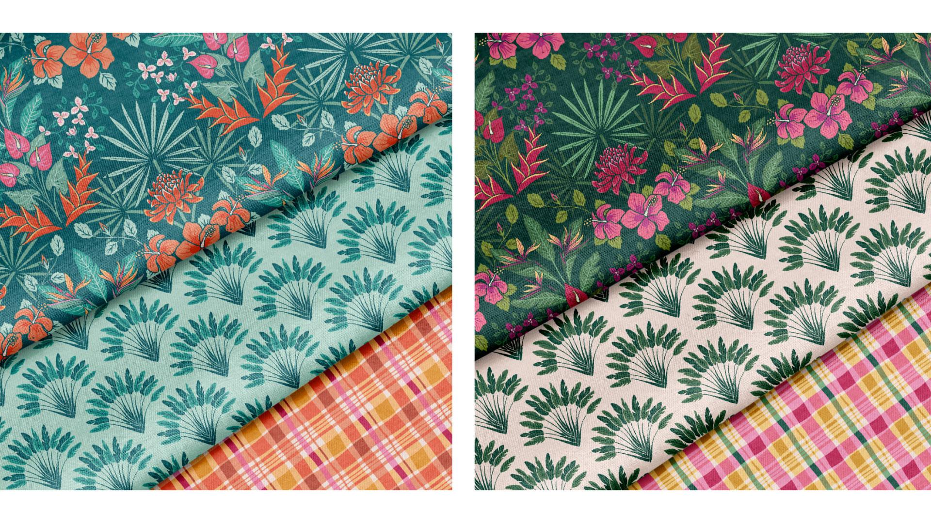
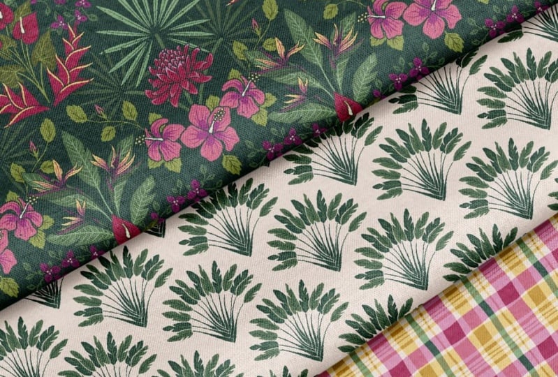
and your portfolio. So what is a mini collection? Well, in the fabric world, full pattern collections are typically eight to 12 patterns, and mini collections are typically anything
less than this. So there are three types of
patterns in a collection. Firstly, we have the hero
or the focal pattern. And in a full collection, we may have two or
more hero prints. Although I'm suggesting just one for this mini collection. The hero is the star of the show and really embodies the
theme of your collection. It will be the most
complex, the most colorful, and the pattern
that makes people fall in love with
your collection. So next, we have the
secondary coordinate print, which is a step down
from your hero pattern. In full collection,
we usually have four or five secondary
coordinates, and in our mini collection,
we'll do one or two. They're going to
have fewer colors, and they will be less complex
than your hero print. Their role is to support
your hero pattern. I see them as the best
supporting actor. They're not the main star, but their role is
still very important. And lastly, we have
the blender prints, which are the simplest and the most understated
patterns in the collection. They're going to be on
a much smaller scale and they'll only
have a few colors. In a full collection, you'll see maybe four or five blenders. And in our mini
collection today, we'll stick with one or two. To stick with the film analogy, these are the extras
in the movie. They aren't very
noticeable as individuals, but without them, the movie
just wouldn't be complete. The blender print is
going to support and coordinate with the hero
and secondary coordinates, but will be the least
complex of the three. Think a simple poka dot, a stripe, or a
sparse floral Dizzi. In this class, our
mini collection will feature three patterns. I suggest creating
one hero print, one secondary coordinate,
and one blender print. Creating many collections is
less overwhelming, complex, and time consuming than
a full collection, but it still allows
the artist to explore a theme and create an
impactful family of patterns. You could always expand
your mini collection into a full collection later
on if you feel like it. It could never hurt to have
more patterns than you need. If you do decide to create a full collection and
pitch to companies, just know that you may not license every single
pattern in your collection. I have had companies remove a few patterns or pick and
choose from other collections, so it can't hurt to have more patterns than what
you actually need. And those unused
patterns can always be revised or incorporated
into other projects. If you become a
licensing artist, you'll find out
sooner or later that a large proportion of your artwork takes a
while to find a home, and sometimes it never does. It kind of stings a
bit when that happens, especially when it's
a great work of art, but it comes with the
territory of surface design. The majority of my design income comes from a handful of designs. I am currently sitting on a lot of artwork that is
waiting to find a home, but you never know
when that can change. I recently licensed a pattern
to a kids pajama company, and I created this
pattern three years ago. So don't lose hope. So to recap, we're about to
create a mini collection with three complimentary
patterns that has a cohesive style
and color palette, consisting of a hero print, a coordinate print,
and a blender print. In our next lesson, we'll choose our travel
destination and explore the brainstorming phase of
building a mini collection.
4. Get Inspired: Choose Your Destination: No, Welcome back. It is time to choose the
travel destination that will be the source of inspiration
for our mini collection. I have chosen my most
recent family vacation to the French Caribbean island of Martinique for the theme
of my mini collection. Martinique is
nicknamed Lille Afleur or the Island of flowers, and I am so excited about the potential for
beautiful patterns. The diverse flora,
fauna, spices, music, and traditions
offer so much possibility. I honestly don't know
how I'm going to narrow down my ideas to
only three patterns, so I may have to expand this one into a full
collection later. Now, please don't
worry if you haven't traveled anywhere
distant or exotic, you could choose a
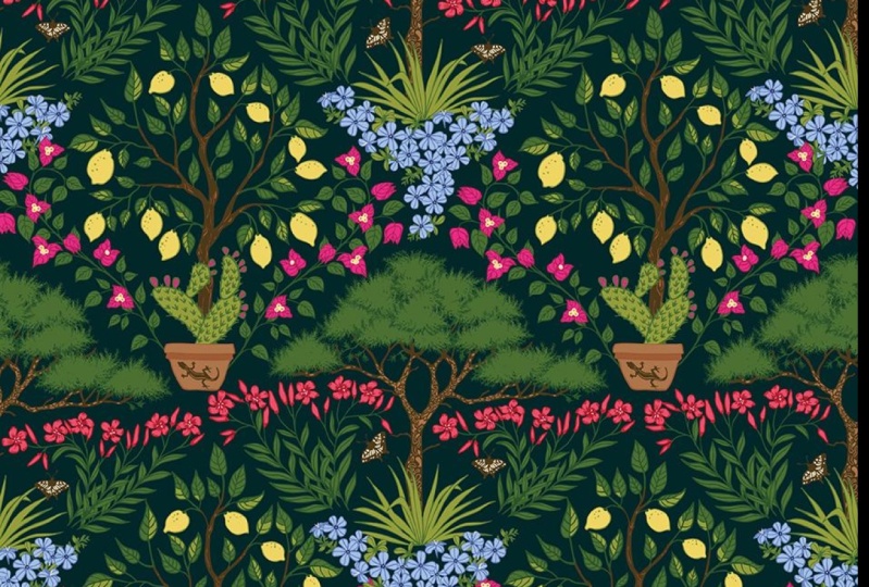
destination that is close to home like a park or a garden. In fact, I based my a Ville Rose collection on my adopted
hometown of Toluse, and I based my hero patterns
on a nearby botanical garden and the window styles in a typical neighborhood
in Tuluse. My coordinates were based on simplified architectural
details and flora from the garden. I've even done a mini
collection based on the wildflowers in
a roadside ditch near my parents'
house in Michigan. So, believe me, when I say, you do not have to go far, the point of this
mini collection is not for you to travel, but to make your viewers travel. The goal is to
help your audience experience a place
through your eyes. Once you've decided
on your place, it's time to gather
your inspiration. You can dive into
your photos and keepsakes and souvenirs
from your past travels. Or if you have a trip coming up, you can plan to collect
ideas while you're there. If you're able to squeeze in
a bit of time for sketching and jotting down your ideas during your trip,
that is fantastic. But don't worry if
that doesn't happen. On my trip, my twins
were learning to walk, and my 7-year-old was
learning to snorkel. So needless to say, I did not get much artwork done. How I imagined the trip
in my head and how it actually turned out are
two very different things. I was mindful of the fact
that I wanted to use my trip as inspiration for a
pattern collection, though. So I purposefully took tons of photos and
video with my phone, often while carrying one of my children on my back
through the rainforest. I took a lot of
close up shots of flowers that I would
want to draw for later, and I took them from
multiple angles. I also took a lot of
photos of textures or tiny details that could have great potential for detail
or even blender prints. Since my hands were often full, I made sure to, at the very least
document my inspiration and take some mental notes about the themes I wanted
to explore later on. I suggest compiling a mood board or even just a photo folder
of your favorite images. You can include not only
individual elements you'd like to draw as motifs, but also photos that
convey the atmosphere, the colors or the feelings
that you want to express. You can also create a Pinterest board and compile
inspiring images there or even cut out images from a magazine
or postcards. You can even add patterns, illustrations or color
palettes created by other artists that you
can use as inspiration, obviously as inspiration
but not to copy. So the point of the mood
board is just to gather your inspiration in
one place so that you can get a better
understanding of the vibe that you want to
capture in your collection. So I've got my mini
collection workbook here in Procreate, and I've curated some
photos from my trip. As you can see, there are
a lot of flowers, leaves, and colors that I want to incorporate into
my color palettes. Now, I'm ready to start
brainstorming and refining this inspiration.
So now it's your turn. Once you've chosen
your destination, make a selection of your
personal photos in a folder on your computer or in your mini collection workbook
that I created for you. You can also create
a Pintres board that contains the colors, feelings, imagery, and ideas that you'd like to
express in your collection. In the next lesson, we'll brainstorm ideas
for our patterns.
5. Brainstorm: So are you ready to start brainstorming for
your mini collection? There is a special
place for you to record your ideas
in my free guide, which I created specifically
for students in this course. Remember, you can download my free mini
collection workbook at Jamie alexander.net
slash Workbook. In my workbook, I have created a space to jot down
your ideas and sketches either directly on your iPad or printed
out on paper. Of course, you can
also do this in a notebook or on your computer. Alright, so I've got my
workbook open in Procreate. As you can see, there
is a little space here to do a brain dump. Well, that doesn't
sound very poetic. How about heart storming, which means using
the emotional part of your brain to brainstorm? I'm going to jot down a list of the meaningful
sights, sounds, smells, textures,
tastes, feelings, and anything that
embodies my trip. It helps if you look
through your photos or at least your mood board
while you do this. I also like to
free associate and just allow a free stream
of words to flow, writing down whatever
comes to mind. And while I made several notes
while I was in Martinique, I am not going to skip
this important step of reflecting on my trip and writing down these
ideas right now. So here is the list, the stream of
consciousness, if you will, that I came up for for
my trip to Martinique. I've also provided a space
for colors in my workbook. And I already know
from memory and from my photos that I want one of my color ways to incorporate a brilliant turquoise
blue of the ocean, the fuchsias, reds and yellows of the beautiful
tropical flowers, maybe some neutral sand colors, and as well as the
emerald deep greens of the dense rainforest. Finally, I have also
included a space to record any adjectives
that come to mind and that convey how the
travel experience made you feel and how you can carry that into your
visual patterns. So here are my
adjectives, tropical, lush, verdant, vibrant, serene, crystal clear, shimmering,
sandy, breezy, blooming, warm, aromatic, melodic,
inviting, zesty, ornate, creole, historic, proud,
authentic, expressive. I'm going to keep
these words handy. They're going to help with the visual development
of my patterns and also in creating the story and the names for
each color way. So now it's your turn. You can download my
collection creation workbook or grab a notebook and
jot down your ideas. And the more you
have, the better. In the next lesson, we'll give our collection a name and write a
compelling story to get started. Oh
6. Set the Tone: Give Your Collection a Name and Story: Welcome back. Before we get
too far in our collection, I would like us to write a story and give a name to
our collection. The story is the theme
of the collection, and it should make it perfectly clear what your
collection is about. Moving forward,
your patterns and your color palette should
tie in with this story. Your story sets the tone
for your collection, and it should help determine how you proceed
with the artwork. You can always tweak your title and your story as your
collection evolves, but I think it's very
helpful to have something to start out with before
you build your patterns. Story is this
grounding force that I periodically return to during
the phases of creation. So here are a few examples of stories that I've
created for collections. I decided to call my new mini collection Lille Haufler or the
Island of Flowers, which is the nickname
of Martinique. So here is the story
that I have written. Remember, it might get tweaked
as my collection develops, but it gives me a definite
vibe to aim for in my designs. Wander through
Martinique's lush gardens where coconut palms sway in
the salty Caribbean breeze. The air is alive with the sweet scents of
hibiscus, plomeria, and sugar cane, while
the earthy hint of cinnamon and spice drips in
from the island's rich soil. Each pattern evokes the island's natural beauty
and intoxicating fragrance, inviting you into its
tropical paradise. Okay, so now it's your turn. In your workbook, write three to five sentences that explain the meaning
behind your collection, what inspired it, or the feelings you're trying to
evoke in your audience. That will be the
compelling story that will become the
basis of your collection. Don't forget to give your
future collection a name. In the next lesson, we'll create the preliminary sketches for our mini collection.
See you there.
7. Thumbnail Sketches: Alright, so it is time to
start sketching our ideas. This is your moment to
let your creativity flow and bring your
ideas to life. Don't skip this
crucial step, please. It is the foundation for shaping your mini
pattern collection. Thumbnail sketches are quick, rough preliminary drawings that lay the groundwork for
your finished design. I use thumbnail sketches for just about everything I create from greeting cards to wall arts to surface
pattern design. Focus on creating as many ideas and variations as possible, spending no more than 30 seconds to a minute on each sketch. Since they're small and fast, you can experiment without fear. There's no wasted time if a sketch doesn't turn
out as you'd hoped. Embrace the ugly duckling phase. These sketches might not
look impressive at first, but they pave the way for your illustration to transform into something truly beautiful. So I recommend sketching at least eight to ten thumbnails before settling on your favorite three for
the collection. I encourage you to push beyond the first idea
that comes to mind. Some of my best concepts don't emerge until I've
explored several options. And remember, any unused ideas can always be saved
for a future project, or if you decide to expand your mini collection
into a full collection. In my workbook, I
have a page dedicated to thumbnail sketches to help plan out your
mini collection. You can either print it out
or sketch with your pencil or use it on your iPad by
importing it into Procreate. I've included space for hero prints, secondary
coordinates, and blender prints, as well as a few lines to jot down
notes for each sketch. So here are a few tips to consider when planning
out your mini collection. Remember to vary the types of patterns in your collection. You can mix florals with
geometrics, stripes, polka dots, checks, plaids, toss patterns, and so many more. Vary the scale.
The largest scale should be used on
your hero print. Use the medium size prints in your secondary coordinates
and opt for small scale, minimal and often non
directional patterns for your blender prints. Alright, so I'm pretty excited about this
theme, as you can tell. For me, the real challenge is not going to be
thinking of an idea, but picking just three of them. So as you can see, I've
sketched out some very simple, minimal thumbnails for
my mini collection. Here are my hero print ideas. I'm imagining a dense floral of interlocking medallions of
tropical flowers and foliage. Perhaps two
alternating vignettes. I have another idea for
a hero print here with some stamps and postcards
and little scenes with landmarks of Martinique
and another one here of the beautiful varieties of fruits that grow
all over the island. For my coordinate prints, I've got this idea for
a scallop pattern. And if you know me, you know, I love a good scallop pattern. I was really struck
by the beauty of the apre voyager
or the travelers palm trees and thought that their natural fan shape would make a stunning scallop pattern. I've also got some
humming birds, which are the official
bird of Martinique. And here I've got a trailing
floral of hibiscus. And for my blender pattern, I have a few ideas. I thought about doing a
hand drawn Madras pattern. The Madras pattern holds a huge cultural historic
and symbolic importance in Martinique as a key
element of creole identity. I'm also going to try some cute crabs because they
were literally everywhere, and I just loved them. May also go for
these textures of the Fique mode or
the banyan tree. The roots have these
amazing textures, and I could turn them
into an abstract pattern, which would function as a
beautiful blender print. Okay, I'm going to put a star
by my favorite patterns. It's so hard to choose. When this happens,
that is a great sign that you are fully
inspired by your theme. Remember, no one is
obliging you to stop at only three patterns.
Now it's your turn. Sketch out your thumbnail
sketches to give yourself a taste of what your
patterns will look like. And in the next lesson, we'll talk about color palettes for your pattern collection.
8. Color Palettes: Welcome back. In this lesson, we'll talk about color palettes for our mini pattern collection. While there are no set in
stone rules about this, typically a pattern
collection will feature 12 to 18 colors. I tend to favor the lower
end of this range because I love the cohesiveness of
a limited color palette. Color is one of the
most powerful ways of creating unity between
patterns in a collection. Personally, I try to feature a variety of warm
and cool colors, as well as a few neutrals, which could be browns, creams, grays, tops, beiges,
and even some greens. I also aim for a mix
of lights, midtones, and dark colors and plan for a few accent colors
that really pop. A good strategy is to
choose a few main colors, for example, a pink, a blue, and a green, and then providing two or three different shades
for each of those colors. For example, a dark, a mid tone, and a light, and then adding a few neutrals
in different shades. So here is a color palette for
my a vile Rose collection. As you can see, I
have used 14 colors. Do you see the mix of light and dark to allow for contrast? Also, I have a mix of
neutral creams and beiges, a few different
pinks and oranges, and a few blues and
several different greens. As you can see, I use
pretty much every color from my palette in the hero
prints for this collection. For my secondary coordinates, I am using fewer colors
and less detail. And for the blender prints, even fewer colors and
less detail still. Another thing I recommend if
you're feeling motivated, is to create a secondary color
way for your collection. This will create more options for companies or
customers to choose from. As you can see, this is the first colorway of my
viele Rose collection, and here is the
secondary color way. The second colorway should
be different from the first, but also maintain
some cohesiveness. As you can see, this
hero pattern is quite dark in the
initial colorway, but it completely transforms in the second color way
going from dark to light. So in this collection, you see two very different
effects in the two colorways, but they are still cohesive due to the fact
that I carried over a handful of primary colors and neutrals from the first
color way into the second. This will allow the person
who buys my fabric, if it's on fabric, to mix
and match these patterns. The prominent colors
that I carried over have become secondary colors
in the new color way, and I have introduced
new colors into the mix. This way, the two color ways are distinctly different
and yet feel related. I tend to aim for contrast
between the colorways, perhaps playing on warm versus
cool or night versus day, summer versus winter or
cheerful versus moody. In this collection, which
is called Enchanted Autumn, you can really see the
difference in the color ways. The first is lighter, warmer pinks and oranges, and the second is a lot more of the traditional Halloween colors that you're familiar with, with a lot of cool, deep
purples and a black. Also, I usually don't choose my second
color way until I've finished coloring
all the patterns in my collection in
the first color way. The only way to know if you have a good color palette is to color your artwork
and see how it works. And when I'm coloring my
collection more often than not, I don't like how the contrast or the color combination
is looking. So I will then
adjust the contrast in the color palette itself, switching colors around
or even bringing new colors in until I
get the desired effect. So I've got a few photos from my trip with
inspiring colors, and I've pulled a selection of colors that I like
the most by using the eyedropper tool in Illustrator to pull the colors
directly from my photos. And once I'm happy with the amount of lights,
darks, midtones, neutrals and accent colors, I will select ten to 18 of my favorite colors and
create a palette here. As I illustrate my motifs, I will use these colors, and only then will I know if
the colors need adjusting. If you'd like to see an in depth lesson on how I choose
a color palette, you may enjoy my staff
pick Skillshare class. Create a stunning
wall art series, simple designs for any
space and procreate. In this class, my lesson
on color palettes reveals the process of
selecting a powerful, limited color palette
from a photo. Remember, if you don't feel comfortable creating
your own palette, you can always use
websites like Pinterest, Et Sea and Creative Market to download or purchase
beautiful color palettes. Building a color palette is definitely a skill that
improves with practice. So here is the color
palette that I came up with for this
mini collection. For my first color way, I want to focus on
the lush greens and vibrant pinks and
reds in the flowers. And so here we have
my second colorway, which is more in the universe of the Turquoise blues and some pops of complimentary
oranges and pinks. As you can see, I
have carried over some of the colors from
the first colorway, which will allow people
to mix and match across my two colorways without creating a difference
or clashing effect. So now that I'm happy
with my selection, I'm going to select all of
these boxes that I've made in Illustrator and then click on the new color group icon
in the Swatches panel. It's asking me to
give it a name, so I'll call it Martinique one, and I'll click Okay. Now you can see my color
palette in the Swatches panel. So now I'm going to go to
the Hamburger Menu icon in the Swatches panel and click on Save Swatch Library as ASE, and I will again name
it Martinique one. Now, anytime I need to access this color
palette in Illustrator, I can simply open the Hamburger
menu in the Swatch panel. Click Open Swatch Library and click User
Defined to find it. So now I will repeat
those steps with my second color way and
call it Martinique too. It helps to have a fully established first
color way and see how it looks with your
patterns before you color your designs in
your second color way. Also, these colors are not
going to be set in stone, as I mentioned earlier. On the contrary, they will
probably evolve as I see how these colors interact and play together in the
patterns that I create. It may be necessary to add lighter or darker tones or perhaps a new
color altogether. I'm going to keep an open
mind about it. All right. Now it's your turn. It's time to choose
your color palette for your first color way. You could either go for a
palette of 12 to 18 colors, or if that overwhelms you, you can opt for a
limited palette of six to eight colors and then gradually add additional
colors if the need arises. There are so many ways
to approach this. Again, my suggestions are just that they're
suggestions, not rules. If you're feeling motivated, make a second color way as well. In the next lesson, we'll
create final illustrations for our motifs. O.
9. Illustrate Your Motifs: Preliminary Sketches: Welcome back. It's time to illustrate our motifs
for the mini collection. I have my thumbnail
sketches here, and I've selected three that I'd like to move
forward with today. I think it will
help my workflow to start by sketching
all three patterns before moving on to
the next step of inking my artwork for
the final motifs. Okay, so I'm going to
start with the hero print. I'm imagining these two
interlocking medallions full of florals that
will intertwine, and it will feature some of my favorite flowers and plants
that I saw in Martinique. So I'm going to start
by coming up with a rough sketch to kind of flesh out the idea
from my thumbnail sketch. Alright, so I've got
Procreate open now, and I'm going to
start by creating a square by pressing the plus sign to
create a new Canvas. I'll be using a square shape. The size is not as
important as long as it's big enough to produce a clear sketch that I
can vectorize later. So my Canvas is 2048
pixels by 2048 pixels. I've got CMYK for
my color profile, although that doesn't really
matter since I will be coloring my motifs in
Illustrator today. And I'm going to hit Create. Okay, so this should be
enough for me to get started. So what I'm going to do first
is grab a lighter color, maybe like a light gray, and this is not going to
be in the final design. It's just to help me
see what I'm doing. And I'm going to fill that in by dragging the color
onto my canvas. I'm going to then
click the arrow on that layer and I'm going to make sure that snapping and magnetics are
both switched on. And I'm going to turn
this square like this, like a diamond shape. Don't use the corner handles, but the ones on the sides here. And I'm going to make
sure that the square or the diamond is in the middle
of my canvas like that. Because what I
want to do is make a sketch in this lozenge or diamond shape so that I can plan out what
I want to draw. So now I'm going to sketch out my idea in this
diamond shape, knowing that there
are going to be two alternating diamond shapes or lozenges that will
feature tropical flowers. So what I'm going to do is once this inside square is done and these things
can overlap the lines, as you can see, that's right. I'm going to then draw what's in the white spaces here
as the inner square. You'll see how that
works shortly. It's my little hack
that I'm going to do to plan out my design. So I'm just going to be using the dry ink pen in
the inking palette. So I can do something like this. Maybe the palm trees
can be like this in the middle and two off
to the sides like this. Remember, this is still
a pretty rough sketch, just so you know,
we're still not at the stage where we're
trying to please anybody yet. This is just to get a
more certain idea of where everything is and
everything that I want to do. So I've got these fan
shaped palm leaves that I think are kind of cool. And I think I want to draw
the rose of porcelain, which has a nice ona
shape right here. It's really a cool flower. It has these scale like
petals kind of overlap. And below, I'd like to do
some hibiscus flowers. If I want to copy and paste, I can do that, too, because it will save myself some trouble and
some time, you know. Maybe some sort of
leaves like this. They can overlap and intertwine with the other
diamond shape medallion. And once again,
I'm just going to reflect some leaves
like this over again. So this is pretty rough, but it's enough to give me an
idea of what I want to do, a more clear idea
than my thumbnail. So now I've got this cool rows of porcelain flower
here in the middle. And I've got these three
palm branches here. And I've got these three
hibiscus flowers here with some leaves and tendrils that will overlap the
top of the artwork. So now I'm going to
do a bit of a hack. Well, it's not really a hack. This is commonly used in surface design to make repeating
patterns and procreate. But I'm doing this just
for my sketch planning. I'm going to make
sure everything is on one layer by pinching
them together, and I'm going to
duplicate it three times so that I have
four of the same layer. And remember that we have the snapping and magnetics
features turned on. So what I'm going to do
is drag the top layer to the top left corner until do you see how those lines have lit up to show that it's
aligned correctly? That's just going
to snap into place. And I'm going to do that
again with the next layer down and pull it up to the top right
corner this time, okay? And you can kind of feel
when it snaps into place. Okay, I think that's
pretty close. And then the next layer down, I will pull to the lower left. And the last one I will pull
down to the lower right. Okay, so now everything that
was previously drawn in that inner lozenge is
now on the outside, and everything that was on the outside is now
on the inside, and we have a new
diamond shape to draw. You can see that
there are plants which are overlapping
and intertwining, and that's what I'm going for. I'm going to fill in this
square with my second sketch, knowing that there will be
two alternating diamonds in the final design. So here I go, I'm going
to start with some of these beautiful bird
of paradise flowers. Okay, so here is
the rough sketch of my second diamond illustration. I have filled in the space with some bird of paradise flowers, some nthuriums and some Bugava
and some Balisie plants. Again, this is just for me. It's not meant to
look beautiful. It's just to plan out exactly
what I want to place where. And so now I would like to
test this whole thing out. I'm going to merge all of
my layers into one Again, I'm going to duplicate
that layer three times so that we
have four layers. And now I'm going to
shrink them down to a quarter size and
drag them into each corner and snap
them into that corner. Okay, so they're snapping. I probably should have
turned off the color of the square before merging
the layers together, but oh, well, it will help
me to line things up now. So now I can see I can kind of see what
we're working with here. I think that maybe this tree needs to be bigger to
fill in that square more. And then what else can we do? Maybe some flowers
can cross over or this flower can come down
to fill more of the space. So, again, we're only worried
about these two squares, this one and this one. And we see what we need to tweak or fix before we continue. But I think this is going to turn into something very nice. I think we're on
the right track. So I'm going to play with this a little bit before I proceed with the actual linework or
inking of the drawing. And again, remember
that the squares, these gray squares that
I put behind there, they're not going to be a
part of the actual design. Okay. So now I'm
going to move on to the sketch for
the second pattern in my mini collection. I wanted to do that
scallop pattern with that tree that I
really liked in Martinique, which is called the
Abre de Voyager or the traveler's palm. So I'm going to create a new square shaped
canvas in Procreate. I believe this one is
2000 by 2000 pixels, but again, it can be
whatever you want it to be. And I'm going to grab the studio pen from
the inking palette, and I'm going to draw
a circle like this. Okay, and I'm going to hold my pen down without
lifting it up. And then I'll press
my finger down here, and you see what happens. It creates a perfect
circle shape. And then I'm going
to take the color white from my palette, and I'm just going
to drag it over and fill in this circle. So that's going to
help me build and see the scallop shape in my pattern. So what I'm going to do now is I'm going to duplicate
that circle, and now I'm going to drag
it all the way to the edge. And if you notice, snapping and magnetics are still enabled, and that's going
to help us to move things exactly
where we want them. Okay, so now I'm
going to duplicate that original circle and
move so that it's centered. See the snap will come on, and then I'm going to
move it halfway down. Got to wait for it to
snap. Okay, here we go. See, now we have the horizontal and
vertical stripe lighting up to show us it's
perfectly centered. So now we're going
to duplicate that one and drag it
over to the right. So now you see you have that perfect scallop shape to use as a guide
for our pattern. So like I said, before, I want to draw a traveler's tree inside and just repeat
that again and again. Okay, so we'll get
rid of all that. And what we're
going to do now is merge all of these
layers together and just blow up this
one scallop shape because that's all
I need as my guide. And I'm just going
to make it really big and bring down the opacity
so that I can draw on top. If you don't want to see
all those extra lines, feel free to erase them. All we really care about is
what's inside the space here. So next, I will take my dry ink pen and
sketch out my tree. Okay, so here is my sketch for my secondary
coordinate print. Now I'm going to sketch
my blender print, which is going to be inspired
by the Madras pattern. The Madras pattern originated in India but was brought
to Martinique during the 18th
century because of colonial trade between
India and the Caribbean. It's a really significant
element of creole dress, and it signifies cultural
fusion of African, Indian and European influence
on Martiniques identity. So today, it's a symbol of cultural pride and resistance
to colonial oppression. Now, Madras has a lot of
cultural significance, but it is also very popular
in mainstream casual fashion. To avoid cultural appropriation
when making a pattern, I think that context matters. As long as we are showing
appreciation to the origins of this pattern and treat it with awareness and respect,
it should be fine. Certain patterns and
various cultures may hold a sacred meeting or use
restricted symbols, and in that case,
paying homage to the style might become
more problematic. So I advise you to do a
bit of research if you ever have a doubt about
cultural appropriation. So for this pattern, I am using a square
as the repeat, and I'm just creating
some variation with the thick medium size
and thinner stripes. What gives Madras its
distinctive look and feel are its off kilter
asymmetrical shapes. Okay, so here is the sketch
for my blender print. Now that we have our sketches, it's time to ink our motifs. I'll see you in the
next lesson. Oh.
10. Illustrate Your Motifs: Ink Your Motifs: Welcome back. In this lesson, we are going to ink our motifs. I'm going to start
with my hero print. Now, because this
design is going to have two complex elements
or lozenges, as I've been calling
them, I'm going to make two separate
canvases and procreate. It's a good idea to
duplicate this project in your project galleries
so that you can go back to the original if need be. Okay, so I'm going to zoom
in on this sketch and concentrate on inking the design in this white area first. I'm going to turn down the
opacity on this sketch and create a new
layer above that. I'm going to select
the studio pen, and I've got that at
size six for reference. Maybe I'll go up to size seven
for the thicker outlines. So I want this to be like an arts and crafts
style pattern where the outline is the same
color as the background. I really love that
effect because it appears like there is
no outline at all, and I think it adds
some beautiful detail. So what I'm going to do
next is I'm going to make sure that each plant
group is separate. So I'm going to
treat the leaves of this bird of paradise
plant like its own group. Another group for the
bird of paradise flowers, another cluster for these
narium flowers here, and another group for these little Bugenviler
flowers which are right here. So essentially, I'm really just going to draw
this part here. Same over here for
the Balisie flower. I can just reflect it. These two details can be
reflected to the left later on, so I don't need to
draw them twice. However, my bird of paradise flowers are not
completely symmetrical, so I won't be able
to reflect them. I'll just have to draw
out the whole thing. The objects that are closest to the front should be
on the top layers, whereas the objects
that are further away should be on
the bottom layers. So basically, try to organize your layers in order of
closeness from front to back. I'm going to start drawing these leaves on the back layer, which are further away from us. I'm making sure to
close my forms that I draw so that I can easily color them in
Illustrator later on. Okay, since my outline will be the same color as
the background, I needed to use a
different layer for the stem and the veins here. So this layer is closest to us, so we'll be on the top
of the previous layer. Okay, so now I'm going
to hide these two layers because I'm starting to have trouble seeing the
sketch underneath. So I'm going to turn those layers off for a
minute while I create a new layer on top of those
bird of paradise flowers. So this is part of the stem. This is going to
be a closed form because I'm going
to color it in. This part at the bottom
won't be visible because we'll have
another flower in front of it, you see? And they have these really cool, I don't know what you call it. The stamen or
something like that. Okay, so I'll let you watch
me work for a little bit. Okay, so you can see that
the whole outline for the Bird of Paradise
flowers is on one layer. Everything has a
closed space so that I can color it all in an
Illustrator later on. And now I want to do some detail on top of these
flowers in a different color. So for that, I'm going to get a new layer so that I
can draw those lines, and those are going to be on their own layer in
a different color. So, again, you can see
that these details are on a separate layer
from the actual flowers, and you can see
underneath that I have my big leaves going on as well. So it looks kind of funky, seeing them overlap like this, but it will all turn out once I color them in in
Illustrator later on. I can just hide
those layers for now so that I can see
what I'm doing. Okay, so now I'm going
to create a new layer on top of everything else
for the Aneium flowers. Remember that
anything you want to have an outline around
must have a closed form. Okay, so I'm making a separate
layer that will go on top of these flowers with some details that will
be in a different color, maybe a deep red. And I'm using the dry ink brush in the inking palette
for the texture. And now I'm going
to do another layer below these guys to
draw in the leaves. And now I'm going
to do another layer below these leaves for the stem. I'm making a closed form so
that I can color it in later. Okay, so on top of these leaves, I'm going to add another
layer for the veins. Remember, if it's hard to see, you can always hide layers temporarily so that you
can see what you're doing. Now I am going to turn on all of these layers and I can
see the existing plants, the bird of paradise
and the antherium Okay, so now I'm going to draw
the next group of flowers, the Bugenvdia on a layer behind everything else since
they are in the background. I'll start with the branches with some lovely curved lines, and now I'll do the leaves. Okay, so now on another
layer on top of that, I will draw the flowers. I want them to have an outline around them and color them in, so I'm making sure, again, that we have some closed forms. I'm just going to turn
off the branch layer to clean up these flowers a little bit with the eraser tool. Okay, so now with these
Buginvila flowers, there is this cute little
detail that I love. It's a tiny collusor of
white mini flowers on top. And I think I'll just draw one of them off to the side for now. I know that it's
going to take me forever to draw them
again and again. So once we vectorize
it in Illustrator, I can just copy and
paste it and rotate it and reflect it a bunch of times and place it
on each flower. So it's a little hack
to save some time. And now I'm going to do a
layer on top of the leaves and the flowers with some
more vein details that will be in a
different color. I know it's not very
pretty to look at yet, but I have a vision, and I'm going to pursue it. So I'm going to turn
the vine detail on now so that you can see
everything that's going on. Remember, I only need to draw the Bugenvila flowers
once because eventually, I'm going to reflect that
plant to the other side. Okay, so I have one more
element to draw for this motif. I'm going to make
one more layer, and on top of everything, it's going to be
the Balisie plant, and it's going to
overlap everything else. So I'm putting it on
the very top layer. So I'm just going to draw
the outline of the plant. This is such a cool plant. Apparently, it's a cousin
of the banana tree, and these flowers are like little cups that
catch the rainwater. Okay, so here we go, I think I also want to add another detail
because you know me. I cannot resist another detail. I'm going to use the
dry ink brush to make a stripe in the new layer behind the outline
of this plant. It's going to have a
nice bit of texture, and it's probably going to
be yellow. And there we go. So now, I'll be able to reflect these two plants
here to the left, and we can do that
in Illustrator. And so here is our first
lozenge. We're ready to go. It looks kind of
funny right now, but we can see that
we have everything on different layers
because that's going to help us when we vectorize. And again, this is just
my way of doing things. If it helps you to
actually color in your motifs while you're in Procreate, you can do that, too. I wanted to skip a step
and save some time, which is why I did it this way, but there really is no
right way to do this, okay? So you can do whatever works best for you
and your workflow. So I'm going to turn off the ugly sketch layer
now in the background and only export the inked illustration
over to Illustrator. But wait, isn't there
another diamond to ink? Oh, yes. I love
to punish myself. So before I export, I'm just going to go
back to my gallery and grab the other rough
sketch that we created. I'm just going to grab
that layer and blow it up and concentrate on
the other motif now. And now I'm going to
repeat the process, the same one that I
did for the first one. And thankfully this next one is a little bit less detailed, a little bit less involved. Okay, so now we're
ready to export these two motifs to Illustrator and vectorize
and color them in. So we'll just return to
our Procreate gallery, and we'll go to select, and then we'll select our
two diamond motifs here. And we're going to select
share and then PSD file, which is a layered
Photoshop file, but it can also be
opened in Illustrator. And now I'll use the airdrop and send them over
to my computer. Now, I still have to ink
the other two patterns, but that won't take very long. So let's just do that right now. So I'm going to move on to our secondary
coordinate pattern, which is going to
be a scallop print with the oper de Voyager
or the traveler's palm. So I've got the
rough sketch open, and I'm going to turn down its opacity and start
drawing on a new layer. I'm going to ink my drawing
with the studio pen again. Okay, so here I go. I'm making some closed forms for these branches because I want to color them in and have their outline be the same
color as the background. So now I'll do a layer in
front for these leaves. And now I'll make
a layer underneath those leaves but on
top of the stem, and I'm going to draw the leaves that are crossing behind. Okay, and now I'll draw a
layer on top for the veins. Okay, so now you can see
my finished drawing. So with this, you can see that I've got separate
layers for those veins, these top leaves,
the next veins, and the leaves
that cross behind, which will all be
a different color. And then we have below that
the branches or the stems. Okay, so this will be something
that we can export into Illustrator and turn into a beautiful repeating
scallop pattern. And now we just need to
ink our Blender print, which will literally take
no time at all, I promise. Okay, so for this Madras print, I could create the pattern
directly in Illustrator, using the square
or rectangle tool to make these perfectly
straight lines. But I wanted to
give my own spin on the Madras by giving it a
hand drawn imperfect look. Now, stripe patterns
are a bit special, so I'm going to make a square
Canvas in Procreate and go to the tool panel here and click on Drawing Guide
just to give me a grid. So this grid is just
a guide to keep my lines more or less
on the straight line. It won't be visible
in the final design, but it's going to help me keep those stripes on a more
or less straight line. A bit imperfect is fine, but I don't want them going
across the page either. I want the lines to be
a little bit wiggly, but straight enough
for them to meet up when we create that repeating
pattern in Illustrator. So I'm just going to
take a model line brush that can do very
thick or thin lines. And as you can see, I can vary the width here. Well, that one's a bit extreme. So this one I like, it's from Liz Kohler Brown's hand
lettering collection, but there's also
a mod line brush in the free kit that
comes with Procreate. And I believe it's in
the calligraphy set. So I'm going to play
with the width and make a few wiggly lines
in different widths. I'm going to stay on a
mostly straight path so that I can make them seamless
in Illustrator later on. So now I have some
variation to pick and choose from so that I can
build my Madras pattern. And once they're vectorized, I'll be able to adjust their
width and pick and choose which ones will work the
best with my pattern. I may need to squish them
or stretch them a bit, and that's okay because they're not really an illustration. They're just some vectorized elements to get started with. So now I'll click the wrench
icon and click Share. Since there's only one layer, I can just share that as
a PNG instead of a PSD, and I will click AirDrop and
send it over to my computer. I'll see you in the next lesson where we vectorize
our illustrations and get them one step closer to becoming beautiful
repeating patterns.
11. Vectorize Your Artwork: Alright, it is time to
vectorize our motifs. Vectorizing your patterns
has many advantages. First of all, it
allows you to rescale your images infinitely without losing quality or pixelating. Vectorizing your
artwork also means that each element
is kept separate, which makes it super easy to recolor or tweak your design. And many printers or
fabric manufacturers also require vector artwork since they print each
color separately. Vector artwork is also
much less cumbersome than the high resolution
raster artwork and much easier to share
with your clients. Now, I know many successful
surface designers who use lots of texture or
more painterly effects, and they don't vectorize
their artwork. I have also worked with
a few manufacturers in the fabric industry who did
not request vector artwork. But personally, I prefer to take this extra step for maximum
flexibility with my artwork. So I'm going to
start by creating a new Illustrator document
by clicking Command N. Letter size is fine. And I will make sure that
CMYK color mode is selected. And I will place
my exported PSD or PNG files of the illustrations we exported from Procreate. I've decided to start
with the hero print to get the most complicated
design over with first. Remember, for this
one, I'm working with two alternating
diamonds or medallions, and I'm going to do one at a time to simplify
as much as possible. So I'm going to
hit Shift Command P. Then select the file name
Hero one from my downloads. Remember, this is the first of two diamonds for
the hero pattern. And for the PSD files
with multiple layers, make sure you click
Show Import Options before you click on Place. Now, make sure that convert layers to
objects is selected. And now you can click Okay. Now, when we move
this design around, you can see all the layers
are grouped together. So what we want to do is click Shift Command G to ungroup these layers so that
we can easily edit them. And now I'd like you to click on the Layers panel and click the little arrow
so that we can see each individual layer
of our illustration. I'm going to go down
this list of layers, and I'm going to turn off
the little eyeball icon, which will hide the
layers that I'm not working on so that we
can avoid any confusion. I'll leave the very
bottom layer turned on, which is the furthest
in the background. Well, I can see that I have a blank white background layer, so I'll just delete that one. And let's start with the
next furthest layer from us, which has these two beautiful
fan shaped palm leaves. So I'm going to click
on that layer either in the Layers panel or
directly from the artboard, and I will go to Image Trace, which is in the shortcuts
menu right here. If you don't have image
trace in your shortcuts, you can find it under
Window and Image Trace. So with that layer selected, I'm going to click on the black and white logo
preset and then click Okay. I like this preset because it seems to capture
detail pretty well. I'm also going to click
on this Advanced arrow, and I'm going to check
Ignore color so that Illustrator does not include any white background
in the artwork. Now, with the vector artwork, it is very normal to
lose some detail. So I'm going to zoom
in a bit and see if I can play with some
of these levels here for better results. See that the leaves have lost
some of their pointiness, and I'm going to play
with the threshold, moving it down, and then raising the number of paths to
get some detail back. So for this particular layer, it looks like I am at 63 for
threshold and 90 for paths. So I just kind of play with these a bit until I'm
more or less happy. And if there aren't any
issues that I can get rid of, I can also touch them up later using the eraser tool
or the Smooth tool, or even the Blob Brush
tool later on. Okay? So I'm pretty happy
with this layer. I now need to go to
the Object menu and click Image Trace and expand. You can see now that
the line art has a blue outline when my
mouse passes over it. And if I select a color, as you can see, it
can now be modified. And now comes the fun part. We need to do this
for every layer. So I'm hoping your pattern
is less detailed than mine. I'm going to go back to the
layers menu and click on the eyeball icon to unhide
the next illustration layer. I will then grab that layer
and go to Image Trace, select black and white logo, and I will select
black and white logo, ignore color to get
rid of the white, and play with the
threshold and path levels until I'm happy with the detail. Oops, I just noticed
that I forgot to draw one of the veins
in the left palm leaf. But once it's vectorized, I'll just copy and paste one from the other palm
leaf on the right side. Okay, so I'm happy with this, and now I'll go over to object, image trace, and expand. So now I'm just
going to continue down the line for each layer. I have many layers
because I love to torture myself by making life
unnecessarily complicated. It doesn't really take that long once you get
into the groove, but bear with me while I
vectorize the rest of this. The Alright, so here is my hero pattern
all lined up and vectorized. I'm going to repeat
this process now with the second diamond medallion
of the hero pattern. So Command Shift P to
place the PSD file. Remember to click on
Show Import Options and then convert layers
to objects. Okay? So now I'll select the artwork and Command Shift G to
ungroup the artwork. And then I will go
to the layers panel, hide all the layers with
the little eyeball icon. And one by one, starting from the furthest layer
back and moving forward, I will select the visible
layer and go to image trace, make the necessary adjustments
to paths or threshold, and then expand. So here we go. All right. The two motifs for my hero pattern are
all vectorized. Now it's time to vectorize the artwork for my
coordinate print, which is my scallop pattern. This one will go faster, only five layers in this one. So Command Shift P to place the PSD file, show
import options, convert layers to objects, and then we're going
to hide all the layers except the furthest one away, image trace, and make
any needed adjustments. So object, image trace, expand, repeat, repeat, repeat. All right, so we've finished vectorizing the
coordinate pattern. It's time to vectorize
our blender print now, which is just a few
hand drawn stripes that will eventually
become a madras plaid. So this one again,
has only one layer. We'll save the easiest for last. So Command Shift P
to place the image, select the image
and image trace. Ignore color and make any adjustments to the
threshold or the paths. Okay, not so much to
do looks perfect. Object, image trace, expand. Alright, all of my
patterns are vectorized. I think it's time for a
coffee break or a cocktail. Well, I think we'll save
the cocktail for the end. I'll see you in the
next lesson where we'll assemble and
color our motifs.
12. Assemble and Color Your Motifs: Hello again. Now that we've
vectorized our motifs, it's time for the fun part. We're going to add color
and assemble our motifs. So I'm going to start
with my hero pattern because it's the most important
pattern of my collection. And as the star, it has first dibs
on the best colors. So the coordinating print and the blender print are
playing supporting roles. So the colors I choose for them are going to
elevate the hero print. It's a good idea to use all of your color palette in
your hero print so that it coordinates well with any other patterns which are going to work with fewer colors. So I'm going to open my color palette that I
created in Lesson six by going to the Hamburger menu in the Swatches panel and clicking
on Open Swatch Library. User Defined, and then
the color palette I want. I'm going to start clicking on the vectorized
artwork by clicking the shortcut V for the selection tool and then clicking on the element
that I want to color. And then I just click the color that I want
from the palette. I will probably click M for the rectangle tool to draw
a rectangle and send it to the back and fill it
with color so that I can see how the motifs will look against a
colored background. I think I want to portray a dark tropical rainforest with some striking pops of colorful
red and pink flowers. So let's start with
these palm leaves. I want to color the inside, but if you notice, I can only
change the outline color. So what I need to do
if I want to color the inside is first
select the leaves with the selection tool and then click Shift M for the
Shape Builder tool. Now, if you notice, if I scroll my mouse
over the image, these inside spaces
are highlighted. So I will click once inside of each space and be careful because if you
drag your mouse over them, they will unite everything
into one solid shape. And since I still want to
keep that outline effect, I will simply click once inside each shape
that I want to color. So I'll select this dark green. I want it to be darker
than the leaves in front to give us some
illusion of depth. Okay, so now I'll
do the other leaf. And now I'll color the
veins on the leaves. So like I mentioned earlier, I'd like to emulate the
arts and crafts movement by making the outlines the
same color as the background. I find that effect
very beautiful. So to select the black
outlines of these leaves, since I use the
Shape Builder tool to color them in, they
are grouped together. So, see what happens
when I try to move them. So I'm going to click twice on the black outline to take
us into isolation mode. As you can see, everything that's not in isolation
mode is grayed out, and only the black
and green color in the leaves are selected. And since I don't want to change the color inside
of these leaves, I'm going to click
twice again on the black outline to take me to a further level
of isolation mode. So now I can modify
just that part. Okay, now I just need to double click outside of the image
to leave isolation mode. Okay, so next, I'm
going to color the center palm leaves using a lighter green
to bring it forward. And I will use the
Shape Builder tool by selecting the image and then clicking Shift M and then click once inside each
space that I want to color. I will also go to Isolation
Mode to color the outlines. Okay, so next, I'm going
to color these branches. And since these elements
make up one motif, I will select them all and hit
Command G to make a group, and that will make them
easier to work with. So next I'm going to color the porcelain rose and
the detail layers. I will color the petals using the Shape Builder
tool again and I'm going to group the elements for this flower together
with Command G. Okay, so now I will group the elements for this
flower together. Next, I'll color the
three hibiscus flowers and group them together. Now I'm going to color this branch coming out from
behind the hibiscus flowers. I will make the outline leaves, veins and flower bud its own group by selecting
them and hitting Command G. And now I will
hit Command C to copy it and Command
F to paste in front. And next, I will go
to object transform and reflect to reflect the
branch on the other side. If I need to reorder the
groups to make something go behind or on top
of another object, I can simply go to
object arrange and then either bring it to the front or bring it to the
back as needed. I am keeping these
two branches separate from the hibiscus
flowers in case I need to move them slightly to better fit into the
finished repeat. Alright, so I've got my
first diamond finished, and now I'm going to repeat the same process with
the second diamond. Remember to fill in
the closed spaces, I need to hit Shift M for
the Shape Builder tool. I can drag it to
create a solid shape or simply click once to
fill in the inner shape. Alright, I'll let
you watch me work. Okay, here we have the two
elements of my hero pattern. They're ready to be
made into a repeat. We already have the objects
in their own groups. But what I'm going to do
now is I'm going to group them into two separate groups. That way, I'll be able to
move them around easily. When building my pattern, but I'll also be able to manipulate the smaller
elements of the group by double clicking the group and going into isolation mode. Okay, so I'm just going to select all of these elements for the first motif and click Command G to
group them together. See now, they all
move as one unit. But if I want to edit a specific element
like this branch, I can just double click
and double click again to enter the various
levels of isolation mode. Okay, I'm just going
to click outside here and move on to
the next motifs. So next, I'm going to color the coordinate pattern
using the same technique. Again, these colors will most likely change
before we're through. But what matters to me
right now is just getting some color down so that I
can get on with the process. Once I see the finished
patterns next to one another, I will certainly do some
tweaking and experimenting. Okay, I like this a lot. This is a really nice start. I'm just going to drag
this over to the side, and we've got one more pattern, our blender print that
we need to color. So for the moment, I'm just going to color
all of these stripes pink, and I'm going to
decide more later on. Because this is a madraplaid, the stripes will change
color where they intersect. And for that, I'd like to decide once the pattern
is all worked out. Okay, so now it's your turn to assemble and color your motifs. If they are complex, try to group the like
objects together so that they will be easier to move around when we
create our repeat. So I'll see you in
our next lesson, and we're finally going to
build our repeating patterns.
13. Build Your Repeat and Test Your Patterns: Welcome back. It is time to assemble our motifs into
repeating patterns. This part is magical, exciting, and sometimes
very frustrating. It requires a bit of patience, especially when
you're dealing with a more complex
pattern like mine. So I've created a new
Illustrator document right here. It doesn't matter what size. And I just went
with a letter size, and I selected CMYK. And I'm just going to paste my two hero pattern motifs
or diamonds, if you will. And I'm going to go
to my Swatches panel, and I'm going to click
the Hamburger menu and click on OpenSwatch Library, and then User Defined. And then I'll select
the color palette I created for this collection. Okay, so there it is. I'm going to grab that
dark green and click the shortcut M to draw
a rectangle background. And I'll just go to Object, Arrange and Send to back. And now I'll just
place my motifs on there and kind of
play with it to get a feel for what my
pattern will look like. When I select the motif, I can click the option button and make a copy of the motif, and then start dragging it. Click and hold down
the Shift button, too, so that the copy stays
on a straight line. Okay, so now I'm going to do the same for the second diamond, for lack of a better word. I'm going to duplicate
it by hitting option, then drag it while holding the shift down to keep
everything aligned. And I'm going to try and nestle it in there between
the other medallions. Okay, looking pretty good. And now I'm going to grab
those first three on top and, again, duplicate
them all at once. And this time, I'm going
to bring them down below. And now we can start to have an idea of what this
is going to look like. I know there is going to be
some overlap, which is fine, and I'm just going
to kind of inch them around a bit until
they overlap in a pleasing way without creating anything visually
jarring or confusing. Okay, so now I'm
going to get rid of that background and draw
myself a bounding box. I'm going to hit the shortcut M to draw a square
holding the Shift key. Okay, so what I want to do
here is find the repeat. You can really use any part
of the pattern to do this, but I think I'll use the tip
of this red flower here. Okay? So we are going to look for the same detail
over to the right. Here it is. And then the
same detail down below. Okay, here it is. So now we will draw the
square of the repeat. This is called the bounding box. If I go to Window Info, I can see the info panel which tells us now how
big this box is. Okay? So as we can see, it's measuring in
the partial pixels. So let's just round this number to something
more simple to work with. How about 1,100 by 1,100 pixels? Okay, so let's get rid of this first square because it doesn't have a
nice rounded number. And let's click the shortcut
M to create our new square. So this time, just click once on the artboard and define
the dimensions of the box, which will be 1,100 by
1,100 pixels in my case. Okay, I'm going to grab the first motif and just center
it in the box right here. Okay, so now I'm just going
to delete these other motifs, and we'll be left
with just these two. So for this pattern,
remember that what crosses over on the left also needs to cross over here
on the right side. Same for anything crossing above or below the bounding box. So this motif here is crossing both above and to
the left of my box. So now I'm going to hit V, which is the select tool, and then I'm going to
click on this motif. And then I'm going to click
the shortcut Shift Command M, or I can go to Object,
Transform, move. So we're first going to
move it to the right. So I will precise the
length of the bounding box, 1,100 pixels to the right, and then I will put
1,100 pixels for horizontal and
zero for vertical. Next, I will click Copy, and you can see the motif is now copied exactly 1,100
pixels to the right. So now it's time to
copy them down below. So I will click V for
the Select tool and then click on the two motifs that are crossing over the top. And I'm going to hit Shift to grab more than one at a time. And then the shortcut
Command Shift M. This time, I will put zero
for the horizontal and I will put 1,100
pixels for vertical. Now we have the
motifs copied over the horizontal and vertical
edges of the bounding box. Now it's time to
test our pattern. Before we do that, though, we need to grab this box, the bounding box of our motif, and we're going to
click Command C to copy it and then Command B to
paste it in the back. And now while that
new box that we've copied behind is still selected, we want to make it
transparent by going to our toolbar on the left here and getting rid of any
fill or outline. Okay, so now we're just going to select everything
with our mouse, and we're going to
drag it all the way over to our Swatches panel
here and then let go. And as you can see, we now have a little icon of our pattern
in the Swatches panel. So let's test it out. I'm going to click
and draw a rectangle. And then while that
rectangle is still selected, I'm going to click that icon of my pattern in
the Swatches panel. And Voila there is our pattern. Now, I see that there are a few little issues I
would like to change. So what I'm going to do
is I'm going to return to the repeat here and
make some adjustments. Just remember that if you adjust anything that crosses
the bounding box, you need to recopy it
over to the other side, or else your repeating pattern will have some visual flaws. Okay, well, I'm pretty
happy with this, but I'm going to do
a few more tweaks, and once I'm satisfied, I'll drag the new version
over to the Swatches panel, and I'll test it out
again with a rectangle. Okay, it's looking better now. So I'm going to go to
the existing rectangle that's filled with the previous
version of the pattern, and I'm going to select it and then click the new
pattern swatch, and it will update our pattern, and it's looking so much better. Okay, so now I'm going to
assemble my coordinate print, and this one is the
scallop pattern. So I'm going to make a new Illustrator file for this one and paste
the motif right here. Alright, so I'm going to
start placing the scallops, like I did with the
previous pattern, I'll select the motif
and start to drag it over and then hit Option and
Shift while dragging it. I'm going to hit Command D to
duplicate that a few times. Okay. And now I'll select
the whole line of scallops, and I'll hit Option
and drag it down, and then I'm going to
stagger it to the right to fill in those spaces and
nestle them in there nicely. Okay, so yet again, I'm going to grab everything
and duplicate it below. So now I have a fairly good idea of what my scallop pattern
is going to look like, and I can adjust
it if necessary, and then I can find the repeat. Okay, so I'll use the
bottom point of the tree as my reference point
to find the repeat. Okay, so I'll draw
the bounding box. That looks close
enough to a square. Okay, so I'm going to round the square to the
nearest pixel again. Okay, so now I'm going to center the scallop
in this bounding box and delete everything
else except for this one scallop that
crosses over right here. And I need to copy
it to the right, and I also need to
copy it down below. I'm going to click V for the selection tool and then click the motif that
I need to copy. And now I'll compose the shortcut Shift
Command M to move it. So let's move it 500 pixels horizontally and 500 pixels
vertically. Click Copy. Okay, so here is the pattern. And now I will press V
for the selection tool. Click my bounding box, and then click Command C to copy the box and then Command
B to paste in back. And then, while that
still is selected, I'll make sure that there is no fill in the box
in my tool panel. Alright, so now to
test our design, I'm going to select everything and drag it over to
the Swatches panel. Now we'll click on M on
the keyboard to select the rectangle tool shortcut
and draw a rectangle, and then we'll click
our pattern swatch to fill the rectangle
with our pattern. Okay, so I really like this. I'm going to place it next to the hero print to
see how it looks. So I'm not convinced
about this color way. Although I love it on its own, I'm not sure it's fulfilling its role of supporting
the hero print. So I will try to make some
other variations in color, and then I will
retest this pattern. It's really easy
to change color. I can simply click on the shortcut Y for
the magic Wan tool, and when I click a color
I'd like to change, it will automatically select all incidences of that color. So if I grab this green here, it will select all
of it at once, so I don't have to go
around one at a time. And now I can switch the
colors with a simple click. Okay, so I think that's
looking a bit better, but I'm curious what
my other options are, so give me a sec to play
with this a little. Okay, so I may have
gone overboard, but it's just so much fun
geeking out over the color. I've made five variations
of this pattern, all of which are very
nice in their own ways. And I'm just looking at how they relate to the hero pattern. And I think I've got an
overall preference for this dark green one and maybe
also the pink one. Although the yellow one
is also quite nice. So I really don't have
to decide right now, but it's nice to have options
that are ready to go. In one of my licensed
fabric collections, the manufacturer
actually offered one of my coordinate prints in several color options
for each color way, which gave it a lot
more versatility. Alright, so it's time to
assemble our final print, our blender pattern, and this one is going to
be a Madras plaid. And for that, I'm
going to go for the hand drawn spin
on the Madras. Okay? So I have my pink
vectorized stripes here, and I'm going to make
a bounding box square in this light cream
color to start with. I think I'll make it 400
pixels by 400 pixels, but this scale may change. I'm just going to copy the sketch that I made of
the pattern in Procreate, and I'm going to use
it as a guide so that I can see where my
stripes are going to fall. Okay. And I'm going
to get rid of it once my vectorized
stripes are placed there. Okay, so now I'm going to start to place my
vectorized stripes. I'm going to make them slightly longer than the bounding box, which is 400 by 400 pixels. And I may have to stretch or squish them a bit so that
they're the correct width. Because I hand drew them, they may not be very
straight up and down. And so with the guides
that I create here, I can straighten those stripes as much as possible
to start with. So I can just select each stripe and click the
shortcut R to rotate, and I place my anchor
point here with one click, and then I can address
that stripe as necessary. Okay, so now I'm going to
place the stripe at the top, overlapping that top line. And so remember that
anything that overlaps the top must also be
copied to the bottom. So I'm going to select a stripe, and I'm going to
click Command Shift M and move the stripe 400
pixels vertically down. Zero horizontal. Okay, so we see the stripe has
been copied down, but there's something
really funky going on here where
they overlap. It doesn't look very seamless. So what I need to do
is I need to select A, the direct selection tool, and manually move the anchor points on this bottom stripe so that it blends into the next stripe without any weird bumps or
anything like that. Okay? So it's looking better. And what I'm going to
do is I'm going to delete the stripe that
I did not modify. So I'll just select the bottom
stripe that I modified, and I'm going to click
Command Shift M, and I'm going to move it up. Since we're moving up this time, we need to put in
negative 400 pixels. Okay, so the line
is copied over, and I'm going to
select them both now. And in my Pathfinder
menu, which is over here, I'm going to click
the Unite shape mode to make this into
one unified shape. So now I can reuse this stripe, no matter if I move
it up and down, I know that it will be totally seamless for a 400 pixel repeat. So I can reuse the stripe
and move it or reflect it, and it will remain seamless. As long as I don't modify
the length of this stripe, I can adjust its width, and it won't make a difference
in the seamless repeat. Okay, I'm going to make a
few more seamless stripes, and then I'm going
to reuse them, and I'm going to place
them on my design. I probably won't use all of the stripes that I
drew, which is okay. I'm going to try
this medium stripe, and I'm going to adjust
it a bit so that it's the desired
length and width. Okay, and now I'm going to hit Command Shift M and copy
it 400 pixels down. So I'll just use the
shortcut A to access the direct selection
tool and move some of those anchor points to make the
juncture disappear. Okay, so now I'll delete
the unmodified stripe. Select the modified
stripe and hit Command Shift M and copy
it negative 400 pixels, which will move it vertically. Okay. So now I'm
just going to finish laying out all of my stripes
where I want them to be. Okay, great. So now is a good
time to choose the colors, although I may change my
mind about them later on. I think I want the two
fat stripes to be pink, and then this one
can be light yellow, and maybe this one
can be light green. And this one yellow again. Hm. And maybe these can
be yellow, too. So now I'm going to do
a little test before I finish the pattern to make
sure I like the look of the placement of the
stripes and also to make sure that this pattern
is completely seamless. So I'm going to select
the bounding box square, and I'm going to hit
Command C to copy it, and I'll hit Command
B to paste in back. And then I will remove the
fill and any outlines. So now I'll drag the repeat
into the swatches panel, and I'll test my
repeat by creating a rectangle and filling it
with this pattern swatch. Okay, so this is looking good. I may adjust the spacing of a few of these stripes
before I continue. I need to make
sure that it looks good because in the next step, modifications are going to get a bit more
complicated to do. Okay, so we have a sort of
plaid design going on here, but to make it truly look
like a Madras plaid, we need to have the
lines changing color, where they overlap one another. So what I'm going to do
is I'm going to select all the stripes one by one
until they're all selected, and then I'm going to the Pathfinder panel
on the right here. If you don't have a
Pathfinder panel open, you just need to go to Window
Pathfinder to find it. Okay, and I'm going to select
the divide icon this time, which is going to cut those stripes wherever
they overlap, forming some new shapes. Now I'm going to select
those stripes and I'll press Shift Command G
to ungroup the shapes. And now I will select each individual shape and
color them as desired. So I think I want
the intersection of the two light pink lines
to be in this red color. I think I'll make
the intersection of the light yellow
and the light pink, this darker pink color. I'm just going to select all those rectangles
where they intersect, and I'll change the color. Okay. And where the green
and the pink intersect, I think that I'll make
that a darker green here. And then where the green
and the yellow intersect, I'll choose a more
yellowish green. This is kind of
challenging for me because I'm working with
a limited palette here, and it's not exactly
a mix of the colors, the way a true
madras would appear. But, again, this is a tribute to the madras, so it's okay. Okay, so that's
looking pretty nice. I'm going to select that
bounding box square and copy it behind by pressing Command C and then Command
B and remove the fill. So now I'll drag my pattern into the swatch panel,
time to test it out. So I'll draw a rectangle. Again, I have to
press the shortcut M, and then I'll click
on the pattern swatch to fill my rectangle. And there is my maddress. Okay, so now I'm going to
place these patterns together, and we're going to see
how they all get along. So you may remember that
I was pretty torn about which color to use for
the coordinate pattern. And now I think it's between
the green and the yellow. Overall, I think the green
one is the best way to go. Okay, so now I want to show you my mini collection in
its second color way. It was really easy to recolor. I simply used the
magic wand tool, which is the shortcut Y and selected the colors
that I wanted to replace. So as you can see, if we look at the two colorways together, there are a few
colors that I carried over across both colorways. Now it's your turn to build your patterns and test
out your repeats. You can even work out your second color way if
you're feeling motivated. You may need to make a lot
of tweaks, and that's okay. I never get a perfect
pattern on my first attempt. I usually have to make
several tweaks and several tests in
my swatches panel before I'm happy with
the final pattern. So I'll see you in the next lesson and
we're going to talk about showcasing
your mini collection in an attractive mockup.
14. Mockups: Congratulations on the creation
of your mini collection. So now let's take a moment and show it off with a
beautiful mockup. Using mockups make your art come alive and will
help art directors or potential customers to visualize your artwork
in a real setting. It's a great addition to your portfolio and your
social media feed, and it can show how
your patterns would look on a variety of
different products. So I found this mockup
on Creative Market. It features three
types of fabric, which will really showcase
my three patterns. There are many beautiful options that aren't very expensive. There are also plenty of free download options at
websites like Mockup World, Graphic Burger, and Free Pick. Although some of them may require attribution
if you share them. Don't just consider
fabric, but also diapers, clothing, wallpaper,
notebooks, and phone cases. Choose mockups that suit the industry that you
would like to pitch to. So I've opened up the PSD file of my new mockup in Photoshop, and I'm going to go to
my Illustrator files, and I'm going to grab the square that I filled with
my hero pattern, and I'm going to select copy. And now I'll return to
Photoshop from here, and it's really as simple as double clicking in
the Layers panel. So I'm going to double click on the Smart Object layer to
open it in a new window. So now I'm going to replace
the placeholder image by adding a layer and using the
Control V shortcut paste. You may need to resize or
move it around a little. Once it looks good, you
can hit Command S to save, and then you just
close that window out and you head back to the
original Photoshop window, and now the image should
appear in the mockup. So now I'll just repeat that
with the remaining patterns. When I'm ready, I'll go to
File Export, save for web, and I'll export it as a JPEG to share on social media
or add to my portfolio. It's really just
as simple as that. And I just wanted to show you one more mockup that I found. How cute is this little
girl swimsuit mockup. I couldn't resist also buying this one from
creative market. I think it goes really well with the tropical theme
of my mini collection, and I could see this on shirts, swimwear, towels, sandals,
and even beach bags. Alright, I'd love
it if you posted your mini collection
either with or without a mockup in
our project gallery. I really can't wait
to see your work. I'll see you in the next lesson where we'll put the
finishing touches on your mini collection by creating a logo and naming our print.
15. Finishing Touches: Create a Logo and Display Your Collection: Now that we've created
our mini collection, I would love to add just a
few extra finishing touches. First of all, I
generally like to create a logo
featuring the name of the collection and a few motifs from the patterns that
I already created. A logo adds an extra
professional touch to the collection and gives our audience a taste of the mood and vibe
in our collection. In my current pattern portfolio, I display the logo and story together at the beginning of
each collection's section. It gives a really nice
preview of what's to come, and it rarely takes me very long since I just need to find a nice font that suits the theme and pair it with a few motifs
pulled from the collection. I create my logos
in Illustrator, and I start by
choosing a typeface or hand lettering that fits
well with my story, and then I play around with a few motifs until I find a
configuration that I like. I usually save this
step for the end because I will have already
drawn all of the artwork, and it's just a question of pulling a few existing elements. So here are a few other
logos that I've created. So now I'd like to display
my finished mini collection, color palette, logo,
and story together. In the course download
section for this class, you can download an Adobe
Illustrator template, where you can place
all of these elements, simply open it in Illustrator, and then you can copy and
paste your pattern swatches, your logo, your story, and mock up image. And once you're finished, it's time to export this page as a JPEG and post it in
the student gallery. I am so excited to see
your mini collection.
16. Final Thoughts: Cheers to you on
completing your class, and thank you so
much for joining me. I really hope that you enjoyed this class as much as
I enjoyed making it. There are so many directions that you can take with
your mini collection. Not only will it enhance your portfolio and your
social media feeds, but you can also pitch it to companies to design challenges, or even sell it on
print on demand sites. And if you're feeling
extra creative, you can even use it for
personal projects like home decor, clothing, or gifts. Whatever path you choose, I truly hope that this class has helped to spark
your inspiration. If you have any questions, don't hesitate to reach out
in the discussion section. I'm always here to help. Whenever you're ready,
please be sure to share your mini collection in
the class project tab. I get such a kick out of
seeing your creative progress, and I always make a point
to leave feedback because I am genuinely invested
in helping you succeed. Also, if you enjoy this class, I would be so grateful if
you could leave a review. Your thoughts mean a lot to me, and it helps others
to discover my class, and don't forget to hit the follow button next
to my name so that you can stay updated on new
content, tips and news. Now that you've created
your mini collection, you might want to apply your patterns to other
products like stationary, greeting cards, invitations
or even wall art. And if that's the case, I've got some other
Skillshare classes that might be perfect for you. In design a greeting card using inspiration from
your everyday life, I lead you on an
inspiration quest through my tried and true
techniques for defeating creative block and designing and illustrating a
successful greeting card. You can also check out
Art of the Invitation, design and Illustrate
for any occasion. This is a deep dive
into invitation design, tone, typography,
layouts, and more. If you're interested in applying your patterns
to a wall art series, check out my staff pick class. Create a stunning
Wallart series, simple designs for any space. Oh, and don't forget about
the free download that I created especially for
students in this class. My Mini collection
creation workbook is a handy resource for you to organize your ideas and sketches as you bring your
pattern collection to life. You can grab it at
jamelexander.net slash WCBok. I'm so excited to see your favorite travel
destination through your eyes with your Mini
Pattern collection. To quote a famous
Chinese proverb, the journey of 1,000
miles begins with a single pattern or
something like that. Anyway, I hope your mini
collection inspires and tells beautiful stories
wherever it wanders. Cheers to you, your
continued success, and the adventures that lie ahead. I'll see you next time.
 Jamie Alexander, Surface Designer & Illustrator