Transcripts
1. Introduction: Ever dreamed of creating
your own invitations? Hi, I'm Jamie Alexander, a surface designer and
illustrator in Toulouse, France. And use our cordially
invited to join me on an exciting journey into the
world of invitation design. I come from a graphic design
background and have had the pleasure of licensing my artwork with
partners like Target, Trader Joe's, minted, and Disney on a
variety of products. Invitations are a major part
of my activity as an artist. Skillful invitation design
helps set the tone and communicates key details that make an event truly memorable. It's not only a
profitable income stream, It's incredibly rewarding
on a human level. Invitations have
the power to create connections and generate
excitement for an event. They also have the potential to leave a lasting impression and be cherished as keepsake long after the
Occasion has passed. In this class, you'll
join me in creating an Inspired and
Irresistible Invitation to use for your upcoming event. Share on social media, add to your portfolio or
upload to sell on print, on demand sites,
or even pitch to a company will start by exploring the Anatomy
of an invitation. And next, we'll delve into
basics of Typography, how to pair different fonts, and how to create hierarchy. From there, I'll share some of my favorite layouts that you
can use in your projects. We'll also discuss
the importance of tone and how it influences
your entire design. Then I'll walk you through
my process of Illustration, adding text and exporting
and Invitation. By the end of this class, you'll have the confidence
and know how to create invitations
for Any Occasion. In this class, I'll be working in Procreate and Illustrator. And assume you have basic
knowledge of these programs. Whether you're
designing for a sheiks, why a joyful baby shower
or a milestone birthday. Together we'll Master the Art of invitation design and turn
your vision into reality. I can't wait to see what you
create. See you in class
2. Class Project: I'm so excited to
share my passion for design and provide
you with the tools and techniques to
create invitations that perfectly captured the
essence of any occasion. The class Project will level
up your design skills and seven ways which I will
detail in future lessons. The Anatomy of an invitation and important
etiquette to remember, Typography basics and how
to pair different fonts. How to create hierarchy, Fool-proof invitation layouts, The importance of
tone and how it influences your entire design. Illustration tips in Procreate and the finishing touches of
adding text and exporting your design in Illustrator are class Project is to create an inspired invitation for
the event of your choice. We'll start by establishing
the event type and the tone. I recommend brainstorming
adjectives and words that capture the vibe
of what you're looking for. Next, we'll create a rough
sketch of our design idea using one of the layouts suggested in the
following lessons. Reserve plenty of
space for text. We'll then create and finalize the illustrated elements
using Procreate, export it to our computer and
place in Adobe Illustrator. Will then use
techniques discussed in the following lessons
to place our text. Choose your fonts
and make sure that typographic hierarchy has
been clearly established. Then we'll export our design as a JPEG and post it in
the project gallery. Here are the materials I
recommend for this class, a pencil and paper for
sketches and notes. And for the creation process, I'll be using an iPad, Apple Pencil, and
the Procreate app. I'll be finishing up in Adobe
Illustrator on my computer. However, you are free
to follow along in the artistic medium
of your choice. In our next lesson, we'll
explore important elements of an invitation and how
that affects our designs. I'll see you there.
3. The Anatomy of an Invitation: Welcome back. Let's talk about the
Anatomy of an Invitation. Our goal is to provide clear and concise
information while maintaining a visually
appealing design. Before imagining what your
Invitation will look like. It's a good idea to know what information you're
guests need to know. Let's consider the
five W's and one H when determining what needs
to appear on an invitation. Depending on the event, you may not need to include
all of this information. What type of celebration is it? Is it a bridal shower, holiday party, a
corporate event? Who is it for? For example, this could be the mother to be in the
case of a baby shower, a person celebrating
their birthday, or maybe a couple
of getting married. Also, who is organizing it? In the case of a wedding, this may be the
family of the couple, or perhaps it's the institution organizing
accompany event. This information is
often omitted from the design depending on
the wishes of the host. This line of text is a key elements in traditional
wedding invitations. But these days, more
and more couples are dropping it
entirely from there. Invite. When will the event take place? This is for the date and
the time of the event. Where will the event take place? This is for the
address of the venue. If you're creating
a wedding suite, only the name and the city
of the venue are needed on the main invitation and the full address will be on
a separate directions card. In some cases, we may
ask ourselves why, which is the reason or
significance behind the event? It can explain why the
event is important. For example, a milestone
birthday being celebrated, or a cause being supported. The Y goes beyond the basic event
description and it gives a deeper sense of
meaning to the guests. How, how can provide information
on the theme that RSVP, the dress code, or whether
you can bring a guest. By the way, RSVP comes from the French expression
of hype on this, if we play, which
means please respond. Since the word please
is inherent in RSVP, you do not need to write please, RSVP as this would be redundant. Typically, the date specified in your RSVP is no less than
two weeks before the event. These days, digital
RSVP's are pretty common and they allow the guests to confirm their
attendance online. I design a digital invitation. I don't need to include
the RSVP details because the online platform company that hosts my design,
we'll do that for me. Once you've settled on the essential information
to communicate, you need to figure out how you will prioritize
this information. According to importance
using hierarchy. This can be accomplished
in a number of ways, including with fonts and
type size and weight, color, and order of information. We'll talk more
about hierarchy in another lesson, design elements. This is what elevates the practical information
into a work of Art. In addition to text, your Invitation may incorporate illustrations, patterns,
borders, photos, or backgrounds that will align with the
aesthetic of the event, and also lend visual
appeal to your design. Format. Consider the format
of your Invitation. Is it a traditional printed
card or a digital invite? The format should
align with the type of events and your target audience. Now a brief word on etiquette. First of all, it's
considered improper to use punctuation online breaks. So there's no need for periods. If the punctuation falls
in the middle of a line. For example, a comma between city and state,
then that's fine. The invitation should always
start with the name of whoever's hosting the event
if that text is desired. For example, the
parents of the bride. Traditionally the brides name will be coming before
the groom's name. If you have two brides, are two grooms, the couple can then determine the
order that they prefer. Traditionally, we want to
spell out the dates and the times and also avoid using
the word at before a time, which is redundant information. It's also considered improper to include a zip code
with the address. Also, you want to
avoid mentioning registry information on
the actual invitation, especially for a wedding. It's best to include this on a separate enclosure card
or on the wedding website. The goal here is to create a genuine Invitation
to your guests and make this information available to those who might
be interested. We don't want to
compromise etiquette and seem to gift focused. Separate cards are also best for events with multiple venues. For example, a
wedding reception. The main invitation. You can include the
information for the ceremony followed by the
text reception to follow, and then a separate card
for the reception details. It's important to send
these invitations in a timely manner and make
the RSVP information clear, giving the guests
enough time to respond. Also, don't forget
the importance of a thank you card after the event to thank
your guests for their attendance or
any gifts received. Now, I'm of the opinion that rules were
made to be broken, and I am the first to throw
some of these guidelines right out the window depending
on the tone of the event. For example, if I'm designing something more modern or casual, I won't be spilling out
the dates and times. And if it's a baby shower, I'm going to be putting that registry right at the
bottom of the Invitation. When it comes to baby
showers and bridal showers, gifts are the points. And there are a big part
of the festivities. I know guests will be
expecting this information, so it's no longer considered
tacky in this situation. What is most important
to take away from this lesson is
that as the designer, you are free to apply the
appropriate amount of traditional etiquette depending
on the tone of the event, your style and the
wishes of the host. Times and etiquette
are always evolving. Okay, Are you ready to talk, look and feel of
your Invitation? In the next lesson, we'll dive into beautiful
invitation layouts. I'll see you there.
4. Layouts: Welcome back. Let's talk about layouts. I know the first instinct is to dazzle our guests
with a great design. But it's important to
remember that our layout is actually beholden
to the information. Years ago when I worked
as a marketing intern, I learned the expression
content is king. And that definitely applies
to invitation design. We want our information to be as easy to understand as possible. It's complicated to walk the
line between easy to read, practical information
and Work of Art. But if we plan it right, or design can be both. There are so many ways
to do this personally, I tend to gravitate toward a
few layouts for invitations, which allowed generous
space for text. I reuse them over and over. And each time the results
are totally different, depending on the illustration, the colors, and the
tone of my design. Here are a few of my
favorite types of layouts. Borders are one of my
favorite layout types. They provide lots of
visual interests while reserving a large and central
part of the card for text, you can make them understated or elaborate, symmetrical
or asymmetrical. The border can go
all the way around the card or only partially. You may detect a pattern in some of these border
designs that I've created. I drew some cute little
illustrations at tied to the theme of the event and place them all
around the border. And since some of these illustrations
are different sizes, shapes, and colors, I tried to blend them together
by illustrating smaller, similarly colored
secondary illustrations, which I arrange all over the composition between
the main illustrations. As you can see in this
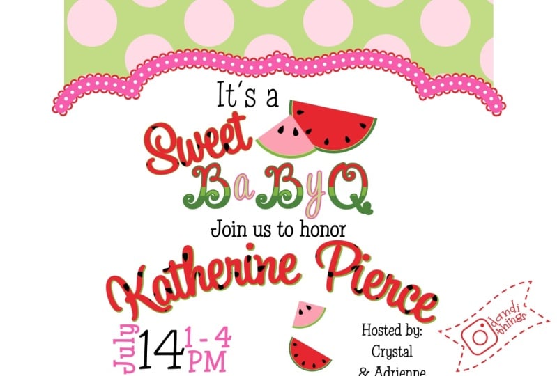
baby shower invitation, I've created these little
illustrations of the bow, the butterfly, the baby
onesie, cake and bunny. And after placing them
around the border, I created to secondary elements, which are the little
flowers and the cupcakes. I repeated them over and
over all around the border. So these elements and the
limited color palette really helped to tie everything
in this border together. Everything looks like it fits nicely together like
a little puzzle. When I do this, I
start by drawing the shape that I want the
text to be contained in. And then I illustrate
the border, leaving the inside
free for text. Once I've finished
the illustration, I can export to Illustrator and place my text in the middle. Here you can see another
example of this type of border for a barbecue
themed baby shower. Again, here is another one for this golf themed
birthday party invite. The same idea of design. And yet they all turned
out looking so different. Here are some other invitations with borders that I've created. Sometimes I simply fill the
border space with one of my surface patterns and
that works very nicely. Or I arrange some of my
illustrations behind a rectangle or oval shape
that contains the text. I allow a few flower petals
or leaves to overlap in front to be playful and give
the impression of depth. I suggest experimenting with allowing your border to
bleed off the edges of your card to give that impression that the
illustration goes on forever. This border involves just
one spot illustration that I created and simply rotated and resized
and placed all around the card for a more
natural irregular border. Also consider
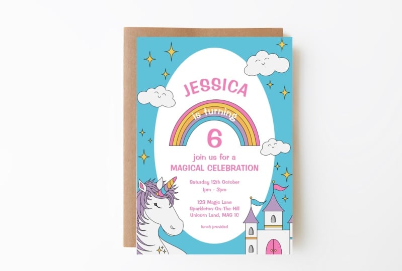
creating a scene for your border like this baby shower invitation
with the unicorn. The plants and the
flowers and trees make great framing elements. And here's another scene
border that I created with a fairy tale landscape. I use that one for my
twins baby shower. Single spot illustration. This is one of the
simplest concepts and one of my favorite types of compositions I find myself tirelessly using and reusing it. A spot illustration is a small
standalone illustration. We call it a spot illustration because it's placed
in a specific spot on the page and it's separate from the main text and
other visual elements. They can be whimsical,
decorative, or informative, and they're self-contained
so they don't require additional
context to be understood. I simply sent her a spot illustration in
the top part of the card. The size of my spot
illustration may vary depending on the size
or amount of text. But usually it is the
main focus of my design. I typically Center
the Illustration and the texts beneath it, but it's possible to
do some variations. Geometric shapes. I suggest exploring the
use of geometric shapes to create a modern and
visually appealing layout. You can incorporate shapes like circles,
squares, triangles, and other geometric
patterns to form a grid and give style and
structure to your illustration. As you can see in this autumn
leaves themed illustration, there are actually some circles that make up the composition. I also embrace simplicity
at times by opting for a clean and minimal is layout using lots of whitespace,
simple typography, and subtle design
elements to create an elegant and
refined Illustration, you can make your
design strictly Typographic or place a few
subtle design elements. Typography, focus. You can make typography
the centerpiece of your design by using Creative
Typography techniques, such as hand lettering, calligraphy, or unique
font combinations. Will I hope you enjoyed
these layout ideas. Remember, the layout
should align with the purpose and the theme
of your Invitation. I suggest experimenting with different ideas, playing
with composition, and finding a design
that best reflects the tone and style that
you want to convey. In the next lesson
will delve into one of my favorite parts of invitation design typography.
I'll see you there.
5. Typography Basics: Welcome back. In this
lesson we'll discuss one of my favorite
things, typography. Typography is The Art
of arranging fonts and a way that is visually
appealing and effective. It involves selecting
different fonts, varying size, weight, alignment, spacing, and establishing
hierarchy to create texts that is visually
engaging and readable. It also helps to
establish the tone, mood, and the message
that you want to convey. Different typefaces have
their own personality and are very important to the look and feel
of your design. Let's get something straight
before we continue. What is the difference
between typeface and font? We may hear people use
them interchangeably, but there are some differences
between the terms. A typeface is a font
family, if you will. A font is a specific
style within a typeface. Like a real family, there will be a common name
and shared physical traits, but also distinctive
differences. There will also be a consistent
style in the design, but each font within the typeface will have
different weights, like bold, italics,
or condensed. Here's Gotham, which is one
of my favorite typefaces. As you can see, there
are many fonts in this typeface with
different weights. It's also possible
to come across individual fonts that do not belong to a font family
in the traditional sense. They just function as a standalone font
with no variations. The word font comes from
the French word font, which refers to the process
of casting metal into movable type used in the
traditional printing systems. The term has endured
and continues to be used in the context of
digital computer Typography. Now that we understand more
about fonts and typefaces, let's discuss some different
categories of type. Serifs. Typography dates back to
ancient Roman lettering. See those little strokes at
the end of the letter forms. Those are serifs
back in Roman times, these letter forms were
actually chiseled into stone, which creates those little feet at the end of each
letter stroke. Serifs actually help with
readability because they guide the eye
throughout the text and they help with legibility. That's why we will see books, magazines, and newspapers
in serif typography. In Invitation Design
serve Typography evokes elegance and
classic sophistication. If you want a refined, traditional aesthetic
for your invitations, it makes sense to set the
mood with Sarah typography. There are many sub styles of serif typefaces, like old style, transitional, modern, and slab serif sans serif fonts
are the most versatile. They don't have those
little decorative strokes at the end of its letter forms. This gives us a more clean
and streamlined look. The feel modern, simple, minimal and straightforward
sans serif fonts are highly readable and they're great choice for the
text of your Invitation. Compared to the serif typefaces, the sans serif letter forms
look sleek and elegant. This is the perfect
typography for a contemporary aesthetic and
a stylish or casual feel. As with serif typography, you can use san-serif typography for display or long copy. Script fonts are based on cursive handwriting,
calligraphy, and flourishes. They range from formal and
elegance to fund and casual. They're loaded with
personality and they can be very powerful
would use correctly. Unfortunately, it's
really easy to get out-of-control
with a script, fonts. With script, a little
goes along way. We should use them
sparingly in invitations. For example, just
for the names are the initials or an ampersand, or a short line of text. Because Script fonts
are more ornate, they are more
challenging to read. And this is why we
should also avoid using all caps
with script fonts. The more ornate they are, the more illegible they become. It's really important to
maintain that balance between aesthetics and functionality and always consider the
legibility of your design. Display type is a
diverse category. These typefaces don't really
fit into any other group. They make a big visual
impact and they're great for setting the mood
or aesthetic in a design. But they're not suitable
for blocks of text. They're meant to be used at
larger sizes and they're usually visually
striking and expressive. Like with script
fonts, less is more. When it comes to
invitation designs. Here are a few more typography terms that
may come in handy. Size is an important
part of Typography. It influences
legibility, impact, and hierarchy at the text. In typography, we use
point size to refer to the measurement of the
height of a typeface. So one point is one
72nd of an inch. If a font is at a 12 point size, that means that the height
of the characters will be one-sixth of an
inch when printed. When I design an Invitation, my body text is usually 8-11 points depending
on the typeface. The more important details
such as the name or the date, will be substantially larger. Within a typeface, weight refers to the
thickness of the font. As you can see, it can
range from light to bold, using different weights
of the same typeface. And an invitation is a
great way to show hierarchy While still maintaining the look and feel of the typeface. Style refers to the variations
within the typeface, like italics or condensed. Legibility. In order to maximize legibility on
your printed invitations, makes sure to use a rich color that contrasts
with the background. Avoid using texts that is a similar color to
the background color. As this can create a
vibrating or blurry effect. Light text on a dark
background will also be more difficult to
read on a printed card, especially if the text is small. Also don't go too
small with the text. As I said a moment ago, I keep my smallest
texts 8-11 and point size depending on the
typeface that I've selected. Stroke is also an important
thing to consider. And your Typography,
especially when dealing with script fonts or Cera fonts
that have hairline strokes. In order to give text a
bit of a visual boost, I will add a stroke
of 0.1 or 0.2. When in doubt, it's always
a good idea to make a test print at actual size
to preview the final effect. Kerning refers to the
adjustment of space between two individual letters to create a more balanced and
visually pleasing result. Sometimes letter forms will be spaced out perfectly
mathematically, but optically,
something looks off. This could be because of a flourish or a swash
and the letter form, or simply a characteristic
of that typeface. It's always better
to trust your eye and how the design
looks optically, rather than wanting something to be mathematically perfect. Tracking is when you adjust
the overall spacing between all the letters
to make them more readable or visually satisfying. I often adjust the tracking
because I like a more loose every aesthetic
in my invitation type, I might adjust to
100 points or more for a serif or
sans-serif typeface. However, I would avoid adjusting the tracking
between script letters because if the letter
forms have ended tails to connect them to
the following letter, it looks really bizarre
to see them separated. Letting refers to
the vertical space between the lines of text. It comes from the word led. Back in the days of
the printing press, LED strips were used to increase the vertical space between
each line of type. This also influences
the readability and the visual appeal. A good suggestion for
letting is between 1.2, 5.1, 0.5 points higher than
the point size of the type. So for a 12 point size text, a letting should
be 15-18 points. Alignment refers
to the positioning of texts within a layout, generally in Invitation Design, you can have left aligned, right aligned, or
centered alignment. Centered text is the most
commonly used alignment for invitations because
of its symmetry. However, it's not as readable as left or right aligned text. This is because having a straight left or
right margin creates a clear visual reference for our eye to return to on each line. When the text is left justified, we see a straight line
where the text lines up on the left margin
and a more organic, jaggedy line on the
right side of the text. This is called a rag. When referring to
left align text, we can call it Rag right. When referring to
right align text, we can refer to it as rag lift. Centered text will have
the rag on both sides. The decision on alignment
is up to use the designer, but I suggest using consistent
line length and avoiding certain lines being
too long in a way that is visually jarring
or that affects hierarchy. For example, this
line of texts is much longer than the
other lines of text, even the name of
the mother to be. It's much better to create a line break with a soft
return in this situation. Well, I hope you enjoyed this brief introduction
to Typography. Now that we are all
seasons type enthusiasts, Let's move on to the
next lesson where we'll tackle font Pairing.
I'll see you there.
6. Font Pairing: Hi again, Welcome back. In this lesson, we'll
discuss font Pairing. Font pairing is important because it really contributes to the overall visual appeal
of a dynamic invitation. It creates visual harmony that aligns with the tone of
the Invitation in it also contributes
to hierarchy and signals which information
is more important. It also provides contrast
and readability. There's no exact science
to Pairing fonts. I'd like to think of it
more as like a love story. Sometimes it just works. Here are some of my tips for
successful font Pairing. Less is more, no more than two
or three fonts per design. Anything more starts to get
busy and lacks cohesion. Keep it in the family. Pair. A few fonts from
the same typeface. For example, Helvetica
book and Helvetica bold. Don't mix two
different typefaces from the same category though. For example, to sans serifs
like Helvetica and future, there are too similar
and it's confusing. The point of Pairing fonts
is to show contrast. The X-Factor. Pairing fonts with similar x-height is another
method to try and Typography. X-height refers to the height of the lowercase X in
a font or typeface. It's used as a measurement for the proportions of
characters in a font. It's measured from the baseline to the top of the lowercase X. Pairing fonts with a similar x-height will allow
for similar visual weight, which creates a
sense of harmony. Opposites attract to
a certain extent. Try to pair fonts from
different categories. For contrast, for example, a serif with a sans serif
or sans-serif and a script. However, I would avoid
Pairing fonts that reflect different eras in history as this can create a visual clash. For example, it's probably
not a good idea to pair this black letter
with an Art Deco font. The goal is for font pairs to complement one
another, not compete. Leave it to the professionals. Many font designers have created font duos that have
been designed to create a harmonious combination and just the right amount
of contrast imbalance. Check out these examples. Set the mood. Consider the mood or
aesthetic of your Invitation. This should be reinforced
by your font choice. For example, I may choose an elaborate script like
Galatia for an elegant wedding. It seems romantic or
intimate and upscale. Since it's a script, I will use it very sparingly just for the
names of the couple. I think I'll pair it with
this serif typeface, Mrs. eaves, for the
secondary text. It's a serif font that evokes
tradition and formality. It's a great choice to bolster the script
font that I've chosen. I can eventually use the
book in italics fonts from Mrs. Eve's typeface to further
differentiate the text. So here's another example
for this barbecue theme, baby shower, which should
evoke outdoors Fun and food. I paired a chunky slab serif
font with a playful script. For the secondary text
with all the details, I used a modern san-serif
called montage. I feel that sans serifs have
the possibility of being this neutral voice and they pair really well with
decorative fonts. Ultimately, it's important
to experiment and remember that there are no
rules, only guidelines. What is important
is to experiment as much as you can
and remember to remain true to the style and the vibe that you are going
for with this Invitation. Above all, have font. I'll see you in the next lesson where we get into hierarchy
7. Hierarchy: Welcome back my
fellow type of files. Let's unlock the secrets of Typographic hierarchy
and invitation design. When we read an invitation, we rarely read every word. Instead of our eyes, scan the document and only pause at certain
elements along the way. We may return more carefully to the secondary texts to grasp
the details more thoroughly. Effective invitation
design embraces this natural scanning process. If we take away the
secondary information, do we still understand the main information
with just a glance? Once we have settled on the
text of our invitation, we need to decide which elements are essential to
spotlight and which can be considered
secondary information typically will
highlight the names of the people involved, like the couple getting
married, the mother to be, or the birthday boy, or the type of the event
or the date of the events. Personally, I will only emphasize a few of
these elements. How do I make them stand out? Here are a few effective
ways to create hierarchy. Try out a few on your next
invitation, size and scale. If I want to emphasize and
element of my invitation, I will typically
make it stand out by increasing the type to a larger point size than
the rest of the text. If I consider information
to be secondary text, I will make it much smaller,
typically 8-11 points. I also choose a different fonts to make certain
elements stand out. This can be simply
using the bold form of the same type family or choosing a font from a
totally different category. This is a great
occasion to pull out a spectacular script or
a bull to display font. For the secondary texts, I will either employ a serif or sans-serif font that supports the aesthetic of
the display font. Remember with fonts,
less is more, I suggest using
two or three max. We can also establish hierarchy depending on the
placement of our text. Typically information
at the top of the Invitation will grab the
viewer's attention first. Grouping and spacing. This is another effective
way to denote hierarchy, especially when you
have lots of text, like a formal
wedding invitation. I'd like to divide
the information into little groups or paragraphs
of unrelated information. Use space to distinguish these
sections from one another. For example, the texts that explains what the event is with the host names is one group and then the couples
names is another group, and the event details
is another group. And finally, RSVP or contact information
is another group. This way the viewers can
easily find the information. Then looking for
the way you group information will depend
on the type of the event, and it still needs to support the overall hierarchy and
readability of your design. Color is another great way
to establish text hierarchy. I like to make certain
elements stand out with a contrasting
vibrant color. Using a more subdued color for the secondary
information, brighter, intense colors will
naturally pop forward while the lighter or less
saturated colors will recede into the background. Using a limited color palette
of five colors or less is also an effective
way to create a cleaner, more focused hierarchy. So there we have it just
a few strategies for implementing typographic
hierarchy on our invitations. When we prioritize the most
important information, we can guide the viewer's eye exactly where we want it to go. And the key details are easily understood at just a glance. Now it's your turn if you
haven't already done so, write the text of
your Invitation. Circle two or three elements
that you consider to be primary information that
deserves to be highlighted. Decide which techniques
you'll use to elevate your key elements and how you will designate your
secondary text. In the next lesson will delve
a bit deeper into color
8. Color: Welcome back. Let's talk color.
In our last lesson, I mentioned that color is a great way to help
establish hierarchy, but it's so much more than that. Color plays a major role
in Invitation Design. If sets the stage for the mood and the ambiance of the event. Here are a few tips
to consider when choosing the colors
of your Invitation. Choose a limited
palette for impact. I highly recommend using a limited palette and
your Invitation designs. This creates strong visual
harmony and consistency. The event decorations
and other cards in the invitation suite will
reinforce this color palette. Again, I'll be employing the less is more
approach with color. When you have fewer colors
competing for attention, the accent color can truly pop and make key
information standout. It is much more visually appealing to choose
a limited palette. Not to mention easier to modify
for different colorways. Too many colors can really
overwhelm a design. I suggest choosing five
or six colors max, including a light
color, a dark color, a mid tone, and an accent
color that truly pops. It's always a great
idea to include white or in neutral
in this palette. As I mentioned in the
Typography lesson, ensure that the texts
and the background have enough contrast
for top readability. We want this Invitation to
be as clear as possible. Avoid using colors that
are too similar in value as this can give
the illusion that the colors are vibrating. It really hurts readability and the viewer's eyes aim for a rich color that will show up well on a light background. When we use light-colored
text on a dark background, keep in mind that it will be harder to read the printed card, especially with
the smallest text. So be prepared to
make adjustments. I'm not saying not to design
on a dark background. I'm just saying to
tread carefully. Choose colors that suit the desired atmosphere
of the event. Different colors carry
different emotions, meanings, and cultural significance, which we'll get into
in our next lesson. By the way, if you need help creating your
own color palette, you can check out my
other Skillshare class, design a greeting card using inspiration from
your everyday life. In that class, I share
my favorite technique for choosing a beautiful and
eye-catching color palette. To conclude this lesson, don't be afraid to experiment
with color and to try several color palettes before deciding on your final design. Join me in the next lesson
for a brief word about tone.
9. Tone: Alright, now that we've discussed Anatomy,
layout, typography, and color, let's talk about how they all come together
to create tone. It's important to establish tone in your invitation because this is what sets the mood and the atmosphere of the event. It's the guests first
contact with the event. And it should generate
anticipation and excitement. We want to pique their curiosity and entice them to attend. We should be conscious of the theme or the
style of the event. Is it vintage and romantic, modern and minimal list, lively and festive,
fashionable and exclusive, casual and friendly,
intimate and calm. You get it. And who is the
invitation geared towards? Is it a kid's birthday party, a bachelorette weekend with
the girls, a work function. Whether the tone is
laid back or chic, it should be apparent
in your invitation. So how do we accomplish this? Well, let's check out some
effective strategies. Layout plays a big part in
setting the tone of an invite. It affects the visual
flow of the design. For example, a clean and
minimal layout with lots of whitespace lends itself to a
modern, sophisticated tone. A highly symmetrical layout with detailed illustrations could
suggest a formal occasion. Playful, asymmetrical
layout could indicate a more casual affair. The color palette established in the invitation will reinforce
the theme of the event and will probably be
echoed in the form of decorations or even
attire worn at the event. Bold and vibrant colors will
exude excitement and FUN, while the muted pastel tones are delicate and
software and tone, use of black and white conveys
elegance and simplicity. Various colors and
color combinations are associated with
different emotions. It's important to select a color palette that aligns
with the desired tone. Typography and font choice greatly influenced
the voice of design. This elegant ordinates script
feels luxurious and formal. Geometric sans serif fonts feel modern, competent and bolt. This serif gives an elegant
and traditional tone. Don't forget that the
factors of scale, weight, tracking, letting, and hierarchy can also influence
the perceived tone. If your Invitation features, illustrations or visuals, these two can impact the
tone of your design. A border of climbing florals creates a feeling of romance. And here, this sleeping mood Illustration is a
whimsical and sweet. Of course, tone can also be perceived in your
choice of copy. Your choice of language
can be formal or informal, poetic, or casual. Make sure it aligns
with the event. Now I know it seems
like there are a lot of individual elements to consider and that can seem
really overwhelming. Just remember to step back and look at your design
holistically. Do the color palette, imagery and Typography match the vibe that you're going for. Does the layout enhance
these elements? If they do, you will have a truly cohesive and
engaging invitation. If not, don't be afraid to let
go of what is not working. Above all, play, experiment, and have FUN in the process. Alright, now that we've explored the Anatomy of an invite, layouts, typography,
color, and tone. Are you ready to put
them all together? Grab yourself a cup of coffee and join me in the next lesson, where we'll illustrate our
Invitation in Procreate
10. Illustrate your Invitation in Procreate: Now that we've covered the
basics of invitation design, it's time to harness
our knowledge and create an
unforgettable design. I'm going to walk you
through the steps that I take to create an invitation. I've got my cup of coffee
to power through this. First of all, I need
to determine the event that I'm designing for and
the tone that I want to set. I decided to create a whimsical children's
birthday invitation. I want the tone to be
playful and magical, so we'll probably end up
illustrating a FUN seen using some happy colors and
some youthful typography. I've always been captivated by mermaids and the
little girl inside of me has been dying
to draw some since the release of The
Little Mermaid remake. Mermaid core is definitely
on trend right now, so I see a lot of potential
sales here as well. I started brainstorming
ideas and expressions before coming to the
dive into five idea. I imagine a little girls mermaid themed pool party or maybe in
event held at an aquarium. I like to complete eight to ten
thumbnail sketches to warm up and find
some ideas before I settle on my idea and keep my other sketches as inspiration
for future projects. If you'd like to know more about my thumbnail sketching process, you can check out my
other Skillshare class, design a greeting card using inspiration from
your everyday life. In that class, I demonstrate my thumbnail sketch process and provide a template that you can print out or using Procreate. So this is the thumbnail sketch that appeals the most to me. For my mermaid themed
birthday party, the mermaids and sea
creatures will form a sort of seen and an oval shaped
border around the text. And I think this will be a
lot of PFK-1 to illustrate. As you can see, it doesn't
look like much right now. Honestly, it's vulnerable
feeling to show you this process because I know how bad it
looks at this phase. I kept it loose and quick and use lines to represent the text. Don't be afraid to make bad ART. No one needs to see what
you're doing at this stage. Now that I have my idea, I'm going to start by opening
Procreate and clicking the plus sign at the top
right-hand corner of the screen. And then I'm going to click
on New Canvas on the screen. I'm going to select inches at the bottom of the
screen and I'm going to specify 5.25 " as the width
and 7.25 " as the height. Even though our
finished card will measure just five by 7 ", I'm leaving space around the edges to allow
for a full bleed. A bleed means that
the printed image extends all the way to
the edge of the paper. And the margins or the white border is
trimmed off by leaving an extra eighth of an
inch on each side of the design will be able to
accommodate that bleed. Now, I will set a
minimum of 300 DPI. Personally, I double that
amount and I put 600 DPI in case I ever want to enlarge that illustration for other
purposes in the future? Next, I'll click on
color profile to make sure that CMYK is selected. Of course, if you're
invitation is going to be a digital Levite, you can select the RGB option. You can always convert from one to the
other in the future. Okay, let's click Create. Finalize your illustration. Now, I'm going to reschedule my rough sketch in Procreate. I'll start by placing
my thumbnail sketch on the canvas and create a new
layer to start drawing on. I'm leaving ample room for my
text and keeping it loose. You can refine your
drawing with each layer, kind of like tracing paper and get rid of
what doesn't work, It's better to plan for
the text and image now for a truly seamless
design than to try to adjust a finished
illustration later on. Take it from experience. I recommend drawing a
shape or shapes where your text will appear on
a separate layer so that you can toggle on
and off to make sure your illustration is
falling where it should be. As you can see, I've got
this oval shape which will contain my text and
the illustrations, create a frame around it. Now I'm going to use my layers two, Refine
that Illustration. Make sure you're satisfied with your illustration before you
ink your design in color, because the drawing is the foundation of
your illustration. Watch me work as I
finish off this sketch. Okay, I'm pretty happy
with this sketch. I've got these young mermaids celebrating a birthday party. There are five of them to reinforce the fifth
birthday theme. But also because I'm
using the rule of odds, which is a design
principle that says that pleasing compositions often have an odd number of elements, like three or five. These mermaids are
playing beach ball, decorating with balloons and setting out cake and presence. They're arranged
in an oval shape as a frame for the text. You can see that I've
completed the oval shape with the rainbow in the
sky portion of the design. When it looks good to you, you can ink your illustration. Like I said, I recommend a
limited color palette of five or six colors that reflects the tone or
aesthetic that you're after. I tried to keep
similar objects on their own separate
layers to make future modifications
as easy as possible. For example, I'll put the
mermaid tails on one layer, the face details on another, the clouds on another, etcetera. I recommend starting with a finalized drawing
of your design on its own transparent layer that you can toggle on
and off as you work. If I click the color disk, you can see that I've chosen
my color palette here. I've got six colors that I like, but I'm also adding
five skin tone colors for the human half
of my mermaids. I'm technically
bending my own rule of a limited palette of
five to six colors here, which is okay. As the designer, I'm free
to make that decision. I really wanted to show a
diverse array of mermaids, but also wanted a lot of PFK-1 tropical colors
that appeal to children. Okay, I'll let you watch me
work as I finished my design. Well, I'm pretty happy
with this illustration. The only question I have is, am I too old to use this
for my own birthday party? Alright, I'll leave you to it. If you haven't already decide what event
you're designing for, make a note of the tone and the adjectives that contribute to the aesthetic
you're going for. Sketch out as many ideas
are layouts as you can. And when you find the one
you like illustrated, start with your loose, rough sketch and refine
with subsequent layers. Once you're happy with
the line drawing, it's time to ink your design. Don't be afraid to experiment
or create several versions. I'll see you in the next
lesson where we export to Illustrator and add our
text to finalize our design
11. Finishing Touches: We're almost there now. Our illustration is complete and it's time to add those
finishing touches. I'm going to export
my illustration to my computer and finish
up in Adobe Illustrator. While Illustrator is
what I prefer to use, you may prefer to use another design program
and that is totally fine. I'm going to click on the
wrench icon here in Procreate, and then click on Share. Here you have your
choice on what kind of file you would
like to export. If I create a flat
illustration with no texture, I'm usually quite happy with
the export quality of PNG. However, if I have
textural elements, I find the color and texture
is much better preserved. When I select the tiff format. Since my design
has some texture, I'll be selecting the
tiff format today. I'm just going to AirDrop
it over to my computer now. Alright, so on my
computer I'm going to open up Illustrator and
create a new document, 5 " wide and 7 " tall. I'm going to choose the
portraits orientation. For the bleed will
enter 0.1 to 5 " which is an eighth of an
inch trimmed off each side. Now I'm going to place my
design on the artboard and align it so that it is centered horizontally
and vertically. See how the design is a full bleed and extends
to the bleed lines. The design is going
to be cropped here at the artboard lines. Now, I'm just going
to add my text. Here is my unformatted texts
that I'm going to add by clicking the shortcuts T
to activate the text tool. See how my cursor has changed. I'm going to draw a rectangle where I want my text to appear. I've already got the text I
want that's saved in Word. I'm just going to
copy that text by hitting Command C and
head back to Illustrator, pasted into the textbox that I've created
using Command V. Each text section will
be in its own textbox so that I can easily modify
the typeface and the scale. Now I'm going to
modify the text. I'm going to consider hierarchy, and I'm going to emphasize the
expression dive into five, as well as the phrase,
ellas fifth birthday. The rest of the
information will be treated as secondary text. I'm going to try to find a playful flowing
cursive typeface for the key information. Because I want to evoke playful mermaids swimming
around in the ocean. I usually experiment with several type faces before
I make my decision. And if I have
several contenders, I usually copy them to the sides off my Art board so I
can keep them for later. And then I delete the
ones that I don't choose. I think I prefer the heritage script here
for my key texts elements. I'm going to elevate
it by increasing the scale and also using an accent color
for the dive into five portions of the text to further attract
the viewer's eye. To go with it. I'm going to use
fronted regular, which is a really beautiful
Sans Serif Display type. It's not suitable
for large areas of texts because it only
comes in uppercase, but for an invitation
it's just fine. It's readable and versatile. And I think the letter
forms are really beautiful. It has a hand-crafted quality, which I feel pairs really nicely with this heritage script. I'm going to also
incorporate a third font, Mrs. eaves, which is a
transitional serif font. I think that this adds
a layer of tradition and it reminds me of the
text of a fairy tale book. It's actually a variant
of the Baskerville font. I'm going to give the text
some error by increasing my tracking and letting for the serif and
sans serif text. I won't be changing the
tracking for the script font. Because as you can see, the end tails will look
strange if they're separated. I'm going to separate
the text into little groups that I think
logically go together. In the first group
I've got the dive into five text which teases
what the event is about. In the next group, I have my texts that reads, join us under the sea for
ellas fifth birthday. Next I have the party details, date, time, and place. And finally, I'm going
to add the RSVP details. As you can see if you skim
the details of the card, it's very apparent at
first glance that it's an underwater themed fifth
birthday party for ELA. The rest of the information
is clearly organized in the paragraphs or groups which the viewer
can quickly scan. I'm pretty happy with
how this turned out. I'll say the document
as a PDF for printing and under
the marks and bleeds, I'm going to make sure that
I check trim marks and use document bleed settings so that the printer can trim
off those bleeds. Here's how it looks.
Okay, so I've sent this to a local printer
and here is the result. Now it's your turn. It's time to import your
illustrated elements into Adobe Illustrator and
lay out your text. Next, you can apply your
typographic hierarchy. Save and export your
design as a JPEG. Go ahead and post that
in the project gallery. I can't wait to see
your Invitation.
12. Final Thoughts: Thank you so much
for joining me on this creative adventure
into Invitation Design. Your now officially in invitation aficionado ready to dazzle your guests with
your design skills. In addition to the Anatomy and etiquette of an Invitation, we've touched on layouts, the basics of Typography, The Art of font pairing, and how to establish
hierarchy, color, and tone. You can apply these techniques across many artistic
disciplines. You've also seen my
process of creating an invitation from
starting with a sketch, progressing to a
clean line drawing, to adding color, Typography
and the finishing touches. Invitation design is FUN, rewarding and
potentially profitable. I'm of the belief that
the party actually begins once the
invitation is sent out, since it is the very
first contact with the guests and establishes
the entire tone of the event. Generating anticipation and
excitement for an event is such a wonderful feeling as
is knowing that people will cherish your invitation as a souvenir long after the fact. Whether you're designing for personal reasons to
add to your portfolio, pitch to a company or
sell on POD sites. I hope my class has been a helpful introduction to the
world of invitation design. There are a few
things I hope you take away from this class. First, remember, don't be
afraid to experiment and play, and don't be afraid
of making bad Art. Secondly, in invitation design, there are many overwhelming
etiquette rules and guidelines which you can
opt to follow or not. As the designer, you
have the ultimate say in your project and
the vision you have. What is most important with
invitation design is to make something that is both
beautiful and functional. Keeping the viewer in mind. In the words of one of my favorite Graphic
Designers, Paula share, the job of the designer is to make things
understandable, usable, accessible, enjoyable, important to a public
that involves the public. I'm so excited to see your class projects and
give you my feedback. If you haven't already, please post your
Invitation Design in the project gallery. If you have any questions, you can ask them on the
discussions page of this class and please
leave a review. I would absolutely love
to know what you think. Don't forget to hit the
Follow button by my name. Finally, if you'd
like to download my free inspiration
guide for designers, head to Jamie Alexander
dotnet slash guide. As we conclude this
creative adventure, I wish you great success
and an abundance of RSVP's. I hope you're designs
ignite excitement and bring people together
and joyful situations. I can't wait to see your
creations. See you next time.
 Jamie Alexander, Surface Designer & Illustrator