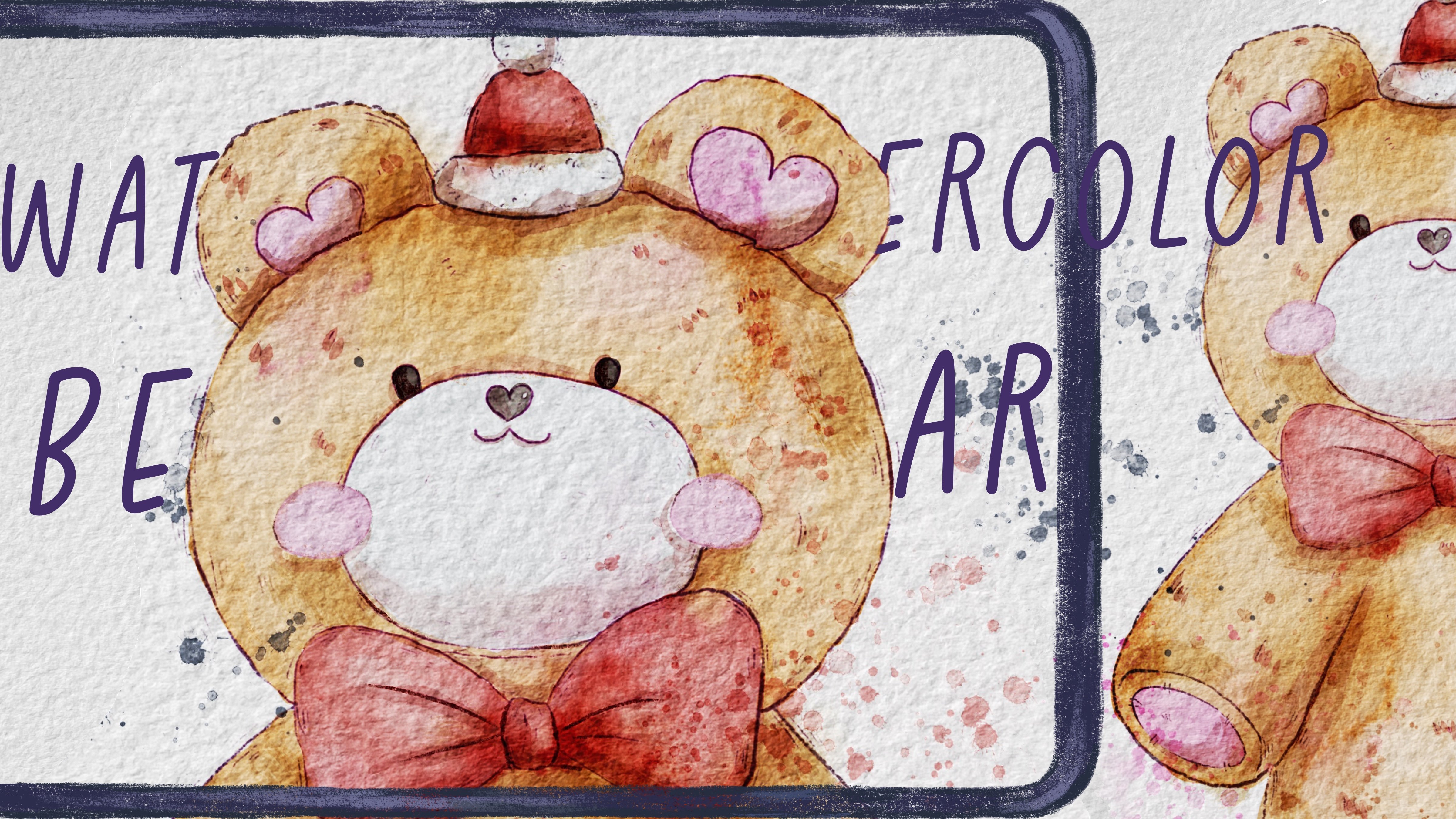
Transcripts
1. Introduction: Hello, my lovely artist.
Welcome to my class. Spring is here,
and it's time for some serious challenges
or just some fun. So if you're
dreaming or planning to create a cover
for children book, my class is for you. Well, let's dive into digital
gouache art and paint altogether cute cover for the book in fast and simple way. I will go with you
through all the basics, and I hope after my class, you will be more familiar with the book creation process.
My name is Inga Yoon. I'm here to show you that
digital watercolor is magical. And you can create
magical world with all those cute characters and whimsical nature
with your own hands. For that, we will need procreate and a little bit of inspiration. In this class, I'll start
by telling you where to find tools for the class and how to get ready for
painting process, like creating gouache paper and procreate and exploring all
the layers that we have. Also, I will tell you a
little bit more about the process of creating
covers for the book, dimensions, dreams,
margins, save zones, and so much more. Then we'll spend time
on creating sketches. We will have a whole new
brushes that for this process. And I prepared a few ready
to go sketches for you too. And finally, we will move
to painting process. I will show you
how to add colors, shades and texture to our art. In this class, we will explore the blending layer modes and we will talk about composition too. And the most important,
in the end of the class, you will learn how to create covers for the children's book. So by the end, you will be able to create cute cover for the
book with character in procreate using simple
gouache technique in fun and simple way. During the course, I will slowly move you throughout my workflow, explaining every
step and describing procreate features and
watercolor painting techniques. So what you will learn how to
create cover for the book. Second, how to paint in gouache style digitally
in procreate. Then how to create
gouache paper texture, how to paint in
more detailed way, reach traditional gouache look, how to paint background vase
textured opaque technique, and how to use layers
blending modes, how to add shades and color
variations to your art. What you will need
for today's class. I will use procreate with
IPad and Apple Pencil. You also can use procreate or some other drawing pads or just regular gouache
paper and paints, or just any paper and paints, even watercolor would
be suitable too. About course
resources as a bonus, I will share with you
all the digital tools that were mentioned in
a class texture paper, custom brushsets, to brushsets, color palettes, sketches, my
own pictures that I created. So now who is this class for? The class is great for
intermediate level and for advanced Procreate users for those who is interested
in digital art, cute characters, and
cover book design. So before joining my class, I suggest you to be a
little bit familiar with Procreate and
its basic features. And one more thing that
I want to mention, your opinion and your feedback
are super important to me. So feel free to tell me
what you think about the class in discussion
or review section, I will be glad to reply to you. My dear old fellows, I can't wait to start this
class, and definitely. I can't wait to see what you
upload to project section. So let's not wait,
grab your iPad with elbow pencil or just
gouache paints, and let's paint together.
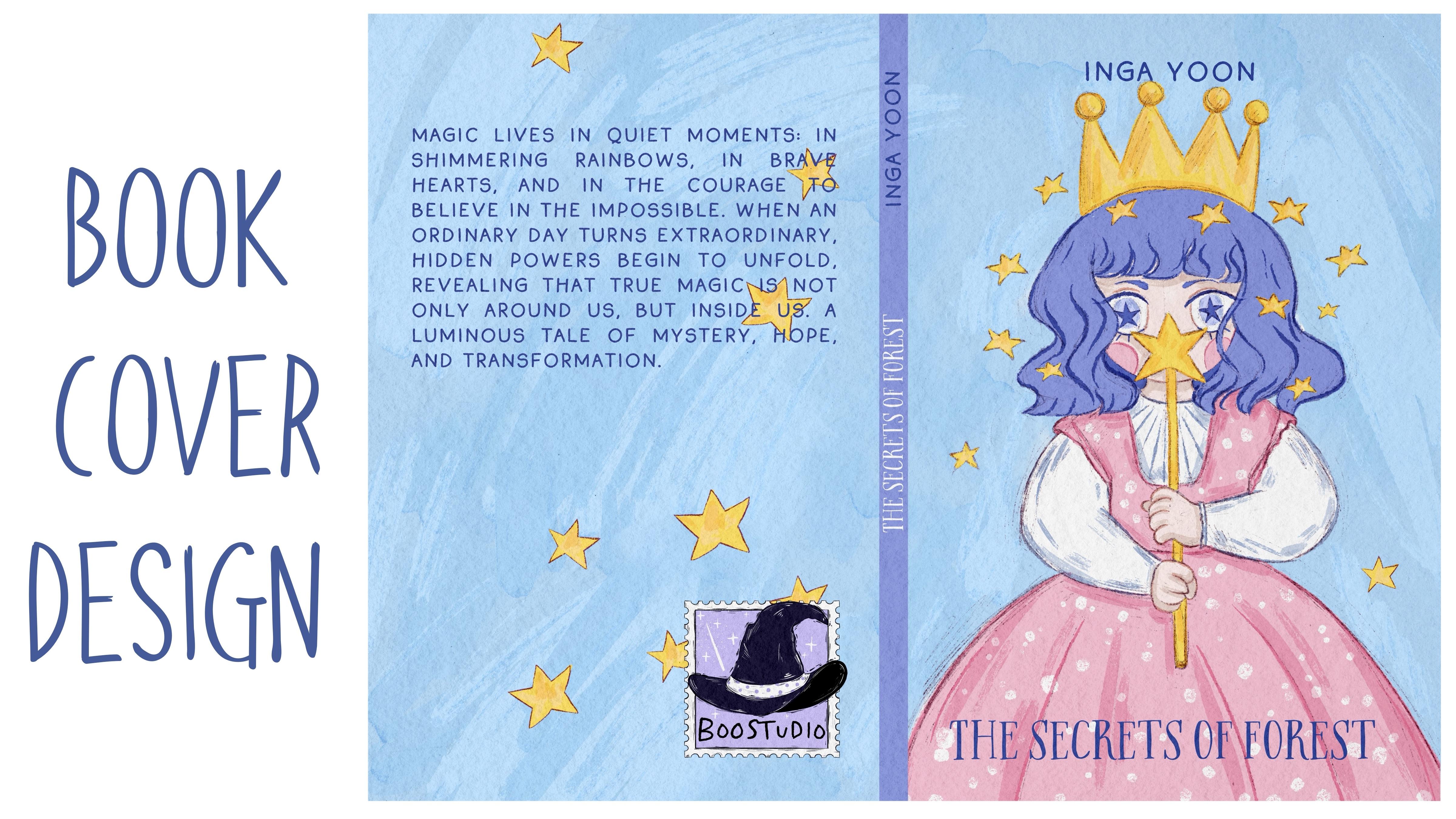
2. About Final Project: Now let's talk about
class project. Just follow a few steps, create a cover with
a cute character in guar style that will
bring joy to you. Of course, don't forget to use the tips that I gave you today. And if you want, you can create something
totally different. Anything that helps you to feel happy during the
painting process. I will use Procrit
for this class with iPad and Apple pencil. You also can use
them, or it can be some other drawing pads or just regular gouache paper and
paints, whatever you want. Oh today's class
is pretty easier, although it takes some time, and it covers topic of book design. Today's illustration can be used as a unique
cover for the book. And I want to tell
you that we actually gonna have so many
different options, so many different sketches. Let me just briefly
show you what is it? The first sketch, I
actually already united it together already with
an actual illustration will be our lovely magical girl. Second sketch will be a cute couple of kids in
a magical forest, too. Those two sketches are
related to each other. And also, we leave those
sketches among the freebies. And the other sketches we
will be creating during my class during the process
of creating sketches, let me just briefly tell you. So it just looks
something like that. So you see if we're going
to have a brave top topic. And we will be able to create this type of sketch
thanks to the brush set, which is called sin creator. Here you have so many
different options. So background, characters, even what color filling
you also can do. The last one will be the
last sketch that I do like. Is like chant and Forest. We also created this type of sketch thanks to the
creator brush set. It's up to you what to choose. You can create any
character you like. You can decide your own cover for the picture
book illustration. Feel free to do whatever
will bring joy to you. So our art our book
will be this one. Here we have the template. We're going to talk about
that a little bit later. And if we turn it off, that's our final result
for the final project. So are you ready
to experiment with digital gouache technique
and learn some new tricks? Once again, you can choose completely different
topic and draw something you try experiment
and enjoy painting process.
3. Where to Start: I think this part is crucial for understanding
where to start. The process of creating book
is not the easiest one, but we are ready to
learn something new and to succeed in this process. And today we have
pretty special class about creating cover for the
picture book illustration. I'll share with you
my experience what I did when I was creating
my own picture book. So if you are ready, let's jump into preparation process first. I spent weeks learning
about all those nuances, and I decided to share with you all the
knowledge that I got. We'll cover the main
issues that we might face, and also we will follow the
simple steps that can help us to get our cover picture
as fast as possible. And also, if you don't want to create a book, it's also fine. Let's just enjoy
painting process. I prepared for you
two brushsets today. First one can help you
with the composition, and second one is actually about painting. So let's do it. And first of all, what
you have to do is to type KDP Amazon com, and then you will need to enter the
necessary information. So the first thing that
we have to do is we need to know about the size. And while you are creating
your picture book, you already have
some ideas in mind. You already know whether it will have soft cover or hardcover. You'll know about
the dimensions, probably, how many
pages you will have. So all those details for now, I want to explain you my steps. We're going to create template. The first thing
what we have to do, we need to select type. Is it hardcover or paperback? I have hard cover,
then interior type, black and white or
premium colors. So you want it to be
colored or black and white. For the picture book, if
special is about kids, I chose color version. Then paper type
here, white paper. Then reading direction,
left to right, right to left, left
or left to right. Then the most important
measurement units. So you want to do all those calculations in inches or millimeters. It's up to you. I will stick to inches. Then trim sites. This is the size of
your actual book. So I will pick six
per 9 ", like that. And now we need to count how
many pages we will have. It's important because
we need to calculate the size in the middle of book
like 80 pages, let it be. If you want to learn
a little bit more, you can tap learn more
about trim size and page count that we're going to cover in our next
part of the class. Then you need to press
Calculate dimension. Ring so here we have the detailed information how
our cover will look like. Once again, the cover will have a little bit
different dimensions comparing to the actual book. So once you create
cover illustration, the size for the cover
will be different from the size of your inner
illustrations in a book. So here if you want to know
what are all those things, you can just tap
and here you have the explanation of
every important thing. So once you're happy
with everything, you need to tap
download template. Then it will be downloaded
to your download folder.
4. Tools and Resources: Less we will talk
about resources and tools and where to find
and how to use them. It's pretty simple
follow the steps, go to projects and
resources section, download previees,
go to Files app, and then invert all the
freebies into the program. So once you go to files
app to download folder, here you have the zip
files which you unfold, and here you have a few options. Make sure that you're
going to use PNG image because that's what we're going
to move to the Procreate. So after that, what
we have to do is to hold and then share
and open in Procreate. You already will have all those templates on the freebies that
I share with you, let me show you the folder
and what are the freebies, those are the files that
I prepared for you. So we have book cover swatches. We have a book cover brushsets. We have scene created brushsets. This one will help you to
create a pretty unique scene. For your cover. So if you don't know
where to start, your scene creator will
be a very good help. Also, I shared with you PNG files of the sketches
that I used for my own book. We're going to use it
for our final projects, and then we're going to
have reference picture, gouache paper that
will be our base, and we have our paper. This is a template that
I was talking about. So when we open it,
this is a template. Okay, the next step, we
are still in Fils app, and now we need to split
the screen into two parts. So we just take Procreate and
move it to the right side. And now from the left side, we have all our freebies
from the right side, we have Procreate App. And now what we have to
do is to drag and drop everything from the Fils
app into the Procreate. But I think let's get
started with our template. Okay. And as you see, the dimension is
so good, so big. So what we have is 8,375
pixels per 6,250 pixels. So we need to tap it. After that, what we
have to do is to keep moving all our freebies
into the Procreate. So let's just set our
template on the top, and we can rename
and write template. Template. D Then lovers up pacityO we can just
simply turn it off for a while and then take our gouache paper because you're going to use a lot of
gouache brushes today. Then rotate, tin
tin, fit to canvas, and then grab our Apple Pencil, and then let's move to
the edges here. Les it. Okay. The next step, we need to move this image underneath because it
will be our paper. Perfect. Now let's
duplicate it a couple of ties and write paper. Then paper again. And then let's name group paper. Nothing unusual and
duplicate one more time. So we're going to have
three paper layers. Later, we're gonna
deal with layers. Then we need to move
our girl here too, fit to canvas, turn
off our paper. This is our girl, turn it off. Now forest not distorted. Fit to canvas again. Now duplicate again. Now we have people hold and move it to the
Procreate again. And here, keep the uniform
on not free form or distort, and then you can place
it anyway you like. Turn it off, turn it off. Next thing, let's just
rename Alcona write sketch one with a girl, and then with a forest, I'll write sketch two. And with the people yeah,
it's also sketch two. It will be part of
our second cover. Turn it off. Next thing, we're going to have reference. Next, we have book
cover swatches. You also need to hold it, drag and drop into
the Procreate. And then you will
find the watches here in your swatches
palettes or library. Make sure that you see
we have set as active. Do you know that it's active? You will have this
blue dot here. Then when you go to the disk, in this area, you will
see our color palette. For the first one, we
will have those colors, and then we have empty space, and after the empty spot, you're going to have second row of the colors
for the second cover. So depending on what
you want to draw, you can create both covers or just one of them, the
one that you like more. O, you can create totally
new cover for the book. Next, book cover brush that
you need to hold dragon drop. Don't tap it because
you will open it in a preview book cover here, and we have very essential
brushes for today. I didn't prepare many of them because I don't want
you to get puzzled. And the second one is
scene creator, that one. Very, very good help. If you don't know what you want to draw or where to start, or what are your characters, or if you just want to
try yourself and just learn some new skills
about book publishing. So go ahead. I will be happy to see what
you're going to create. And you also hold and drop
it into the Procreate. And once you are happy
with the results, with moving everything,
just close our files Apple. And now we have just Procreate. Okay, so we moved
all our freebies. Now it's time to talk about dimensions, about the template, and all those tiny nuances and strange words that are related to the book
publishing process.
5. Self Publishing Book Basics : Now let's briefly talk about
book formatting basics. So before you start creating
a cover, my suggestion, do some research, go to library, take pictures of the books that you like, and that
you don't like. You actually can take ruler with you and just measure
the dimension, the size of the books. So decide what size of the book will match the
style of your book. Like the one that we use
today is six per nine, which is very typical. And it creates
this bookish wipe. So when people hold
it in their hands, they don't have some
weird feelings. It's like, very typical for them because there are so many
books of the same size. And also, consider the amount of pages that you
have in your book. You don't want to
have very big size for a very small
amount of pages. So try to balance and think what format would
work best for you. 6.9, like I said,
it's pretty big size, but it creates very ordinary feeling when you hold the book, and also you have enough space, enough room for the
cover book design. Now let's talk about
self publishing book basics, like the words. So what are trims?
What are margins? Like trim size is
the final white and height of your book
after the printed cuts. So you cannot place any of your design above the
trim, like lines. Margins as a quiet frame
around your words. There's like safe
wise space around it, and big margins are better
because they give you more air while tight margins can make book a little
bit overwhelming. So I think that's it for the very short explanation
of the basics. And now let's talk a little
bit more about it right now. Okay, let's very fast go through the explanation of the
template, how to use it. And first of all, what you have to
remember that you need to put your illustration
within this white color. That's where we're going
to keep the illustration. But there are also tiny, nuances for placing
our art here. And let me briefly
tell you about it. So this is two pages cover. Yeah, we have front
page and back page. Here at the front,
we're going to have the name of the book. We're going to have
the author name and an actual illustration. Also from the backside, we're going to have
an annotation, also probably some bar codes, information about
publishers, probably, and some other things that
you would like to add. Once again, the
dimensions will be six per 9 " for our illustration. So this white thin
is six per nine. But the actual size of
the template is bigger, of course, because we're
going to have extra space. We're going to wrap our
cover from the inside. You know, like when
you open the book, it's not finished just at the
edges of the white color. You actually have your paper
wrapped around the book, especially if it's
hardcover book, and that's what we have. If it's soft cover, so you don't need to wrap
your illustration, so the size will be
slightly smaller. We're going to have
our trim size, and trim size is where
you cut your paper. So the trim size will be here. This is, like, very
long black line. So trim size, black, solid line. This is where your book will
be cut to produce your art. So everything that is
behind those lines, you will not be able to see
or show at the cover page. So next in between, you see, we have a
tiny white thein. We also can write the
name, the author's name, the book's name, or
some, maybe you can use another color to
make it distinctive. It's up to your style, up to your design. So this is called spine
when book is folded. So that's what
we're going to see. So when you, for
example, put it in the bookshelf,
thanks to the spine, people will be able to notice and distinguish your
book from others. Also what we have to remember that in areas next to spine, you see we have the
small red areas. That's where you cannot play the most important information like names, anything like faces, for example, or numbers
or text because this area will be folded once you open and
close the book. So the illustration might
be slightly altered. That's why try to place all your important objects right in a center
or from some edges. It's also fine of
the white color. So red color, you also can
keep your illustration, but again, it will
not be that visible. Oh, let me tell you
about the names. So once you publish a book also your publisher might ask you about some of the tiny nuances. So let's come back to our Amazon website and then give you, like, a small explanation. Okay, so this is our
cover illustration. Here we have the
numbers where you will be able to
understand what is what. So we have front
cover, back cover, margin, number three, this one. This is the area. Let me show
you can just, like, tap it. So in the margin area, Again, this app
calculated itself. You need to actually,
if I'm not mistaken, to add 0.3 depending on
the size of your book, millimeters from each
side of the book, from the top, from the bottom, and from right and left side. Thankfully, the app
calculated it all for us. You also need to avoid placing in a margin area
your illustration. Rap, this is a rap
area, like I said. This part will be
folded to another side. Ch is, like I said, when you open the book, it's where your cover will bend. That's why the illustrations might be transformed
a little bit. So no heads, no nothing serious, no text in that area please. And also, the distance
of the spine will be different depending on how thick or thin your book will be. Okay, let's come back to Procry. Here you have
detailed, very brief information of how your book will look like in the end of
your preparation process. So once you have our template, I'll move to multiply, so I will be able to use paper, and I also will be able
to see my template, and I will see where I can
pay it or I cannot for now, we can turn it off
because in our next step, we will need to
prepare our paper for the watercolor
and gouache included painting techniques that
will really help us to get more traditional
look and that will just be part of our painting
process. Let's do it.
6. Creating Paper: Now let's deal with the
paper and answer question, how to reach authentic gouache
Look in your digital art. So it's hard to create gouache illustration
without texture paper. And we're going to
fix this issue. Let's talk about it in details. Now we need to prepare
our canvas paintings. First of all, as I promise, we will return to
the paper layers, and then we need to change the blending layer modes.
First is multiply. Second is color burn, and the last one is linear burn. Next step, what we have to do is we need to take color burn, move to the left side,
and press duplicate. Then select two layers
with color burn, blending modes likes,
and merge together. Now we need to go to
linear burn. Do the same. Go move to the left
side, press Dublkd, then move to the
right side and select two layers with linear
burn blending layer modes, and then merge it together. Next, we need to lower
the pasitytll 50%, color burn, 80% and
multiply, I think, 65%. Why we have to do it? Because in our
cover illustration, I want paper, even multiply
even less, like 30%. I want paper to be
barely visible. So it will help us to just
keep plain white paper, but in the same time, we still going to keep our
watercolor paper texture. So once we are ready
with everything, we need to lock our
paper layer group. Later, you also still can adjust the opacity of paper
if you don't like it. But for now, I'll
keep it that way. Then I created one more
layer for the text. We have sketches. We
have pain here layers. And what if I change one, and I'll write background, and I'll just duplicate
it a couple of times. So let's move to
the first sketch with this beautiful,
lovely girl.
7. Creating Sketch 1,2: Now it's time for sketches. And here we will
have so many options and so many ways
of creating them. We're actually going to
create five sketches. I hope you are ready for
this creative process, and let's not wait any longer
and keep working together. And remember, we have
our templates, this one. I lower the posited till 36%. So now I want to move our sketch to the first page,
like front page. Remember everything that is in red color will be removed or
will be like barely seen. Like that. Voyage be pencil. I just want to finish
this sketch like that. Okay. So this is our
front cover illustration. So you see it means
from the back, we don't have anything,
which is totally okay. But I decided to add, of course, something to our art. I'll make our template,
25% of visibility. And as you see from
this side, we also, if you turn it off, you see our background looks
a little bit plain. So I have an idea. For this illustration,
I will add more stars here and there, and it will be our sketch. So let's keep creating. Let's keep painting
stars everywhere. I just paint star. Then I go to the eraser and I just want
to remove overlappings. Then let's keep painting. And I want to select this star, copy paste, and I want to
place it maybe somewhere here, delete it again, copy it again. Maybe one star will
be from this side. You can adjust the
size and everything, but I think with stars, it looks very cute and lovely. So I didn't paint
anything here because, remember, we have the barcode. And in this area, I also
left the space untouched because I want to
have an annotation about the book here, too. So we're going to have the text. So now when we
have the template, I think it looks very cute. Then we can turn
off the template, and we can turn off
the sketch one. And let's go to the sketch two. We're going to have a
picture of the force. Let me show you the
reference illustration. What we have to do is to go to Canvas and press reference, and then move your image
into the Procreate. D. Okay, this is our
reference picture. So I'll add characters
to my first page too. Let's turn on template
because I want to make sure that I didn't cut some of
the characters body parts, and my visa size is
also very appropriate. So I just want to make
it a little bit smaller. So two characters will
be perfectly suitable. Yeah, I think it
looks very nice. Just place it somewhere here. Okay, so here we will be able to add our like on the bottom, I will have the name of
the author on the top, we're going to have
the name of the book. So happy with my template, with the position
of my character. Now let's go to the sketch two, where we have the
forest and of course, we need to delete all
of the overlappings. So let's go ahead. If you want to go,
grab Selection tool, select free hand and select the area where we
have our characters like this tinting tinting
and just delete Thing. Delete parts that are
overlapping with the body parts. So we'll go to the
girl and carefully go through her outfit
her like hands. Then three fingers
down and we press cat. Make sure that you
deleted everything. That doesn't look
right. Thing ding ding. That's how we're gonna
create our second sketch. Dank. So about references, where do I get my
reference picture? I got it from the
website, unsplash.com. It also can be pexels.com. Those are the sources
where you can use pictures for, for any purposes. I use them as my references. So then the next step, you might ask, how do we get
this sketch of the forest? So my suggestion
you can look and draw or you can trace
the illustration. So see which way
is better for you. But if you want to practice
your sketching skills, of course, my suggestion
is to just look and paint. Okay, my next step will be merging together those
two layers into one. So in this case, we'll
complete our second sketch. The composition will
be full and completed. Okay, I removed all
the overlappings, and now merge together
sketch two and sketch two. Next step, what we have to
do is grab Wedge B pencil, and I want to add our
characters into the background. Just a little bit bigger. I want to add some grass, so the characters
will look pretty natural in the forced
illustrations. They will not look
like out of space. So we're going to
add some grass. So it means we might paint
like shoes as our own, but I think they will be covered with greeneries with
plants and flowers. I might just add
flowers here too. Here we have some. So you don't need to follow
precisely our sketch. You can add as many
details as you want. You can add as many alterations. But remember that
probably let me show you. Not probably, definitely,
this part that is red, you will not be able to
show to your readers. So if you are happy
with everything, too, let's turn off the
reference picture. And if you like
your illustration, you also can turn it off
for a while. Thanks.
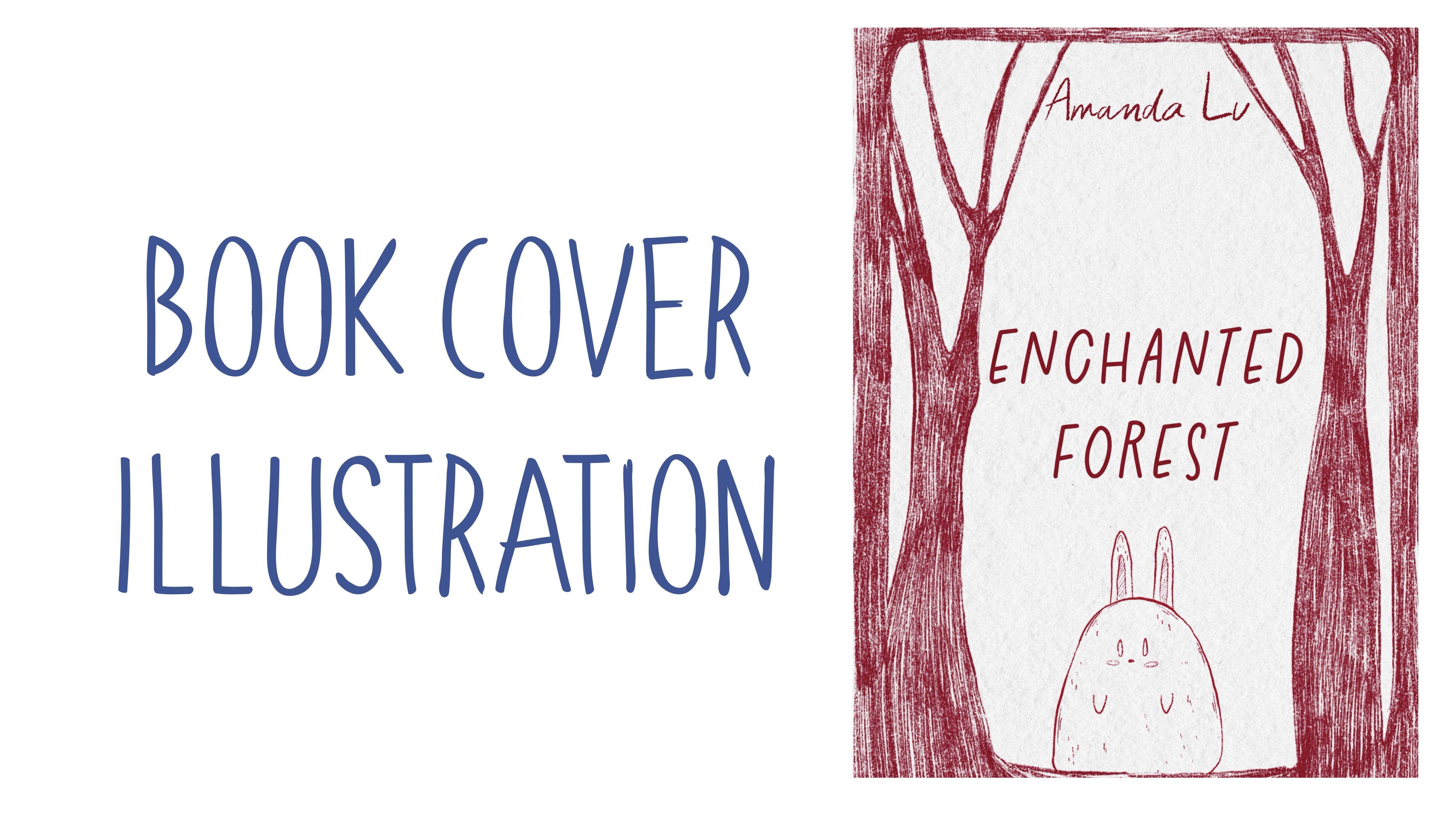
8. Creating Sketch 3,4,5: Now my last step of sketching, if I might say so is let's explore our scene
creating brush set, and I'll show you how to use it. Okay, our part three of
the sketching process, let's write sketch here. Just Sketch three. No here. Just three and just have a couple of sketches.
Keep our template. So let's go to the
first sketch three. And here we might decide
what we would like to have. What are our characters? For example, you might have, like those lovely
rabbits everywhere. Make it smother and do
something like that. Have one more rabbit. Place it from this side. No, no rabbit here. So, that looks very nice. I'm going to keep it like that. Like fox, for example, if the story is about fox
and Rabbit, like that. Here we can have a fox. Here, we might have
the name of the book. For example, we can add text, and we can write Rabbit and fox. Fox thin. Change the font. For example, Rabbit
and fox here. Template lowers up at 17 or 15. So you will be better
seeing what you are doing. I like it. I'll
merge it together. And I also add text,
and, for example, the author's name will be like, for example, Amanda,
oh, just like name. That just first came to my mind. And that's what I have
for the first sketch. So if you like it,
keep the sketch. Then I'll merge it together, clear, and I want to
create one more sketch. For example, I want
to have a dog. I do like this composition that came to my mind recently when
I was preparing this class. So we can just write,
here we have a dog. Remember that this part may
be a little bit smaller. Try not to keep it on the side
where you have the spine. Or you can just flip like that. In this case, it's okay. You can just fold
part of the scarf, but I think that's
not a big problem. So the dog will be
somewhere in this area, and then I'll go
to the book cover, Big B pencil, and like dog
will be standing somewhere. It's not like it's just like floating in the sky. Careful. Like ding. So that's our lovely dog, and the name can be brave dog. You can have this font
or some other font. I just want to write it Lexis. Lexi is a very, very big name. Emendel. I want to
change the font. I think it's better to
use two different phones. Emendel. Try to have your author's name a little bit smaller than
the name of the book. And remember, don't write
anything on margins, like the small red area. So this is brave dog
Emend looks very cute for I'll sketch
thin merch, merge. I'll have just duplicate. I'll have something
at the background. So, for example, here, we have a house, a boat. We can keep a small house if
it's related to the story. So actually about botanicals, we can have our botanicals from different sites like that. Keep it here. I think it
might look very, very cool. Now, keep one more botanical
here, control the size. Some of them can be
smaller, bigger, like that. I think the composition
would be better and just try to remove
the overlappings. Brave talk, and just remove the spots that
overlap with each other. Okay, so this is one more sketch that has
created right now, which is super fast
and super lovely, too. With something like that, too. So, you see, you can create
a cover within a second. Lear? Okay. This is a really
last sketch. Sketch five. Okay, this is a form that
I was talking about. And here you can change
it a little bit, go to the free form, and
move it to this part. Just try to adjust
it to the size of our white color of safe
area, if you might say so. Cool. And inside, we
can write the name of the book, for example, Mmhmm. Enchanted duplicate one
we going to place here. No, here for the
name of the author. So I'll write Amanda
Lou. Change the size. Trying to place it a
little bit closer. So Amanda Lou enchanted forest. I'm gonna use another font. The font looks good. Ls it. And here, for example, the story will be about
cute, lovely rabbit. Why not? Make sure it's uniform, and here we're going to have
a lovely cute rabbit dram and just keep it that way. The background, we can just keep very beautiful solid color, like a blue one or
something like that. You main focus will
be just on this area, but the rest of the book will
cover it in one mono color. So if you're going
to have sketch one, this is the one
that we're going to create today, paint today. Then we're going to
have sketch two. Then we're going to
have sketch three. You also can use
it for your art. You already know
how to create it, sketch four and sketch five. I like sketch five
a lot, by the way. If you are happy
with everything, you already get some ideas
about your own cover. So let's jump into painting
process of our first sketch.
9. Final Project: Background: And now I want to show you what we can do
with background. How to add opec. You'll know about it right now. Okay, so now we have sketch one, and we have background layer. So make sure you are
staying at the background. Now we need to return to
our book cover layer, and then we're going to use
Blue unpredictable ink. Later go do a first blue color. Turn off our template
for a while. And then let's just just fill
this area here and there. You can leave the apple pencil because I want to
have this texture. Later, we're going to blend it. Because this is quash brush,
so it's pretty thick. You don't have transparency as if we start painting just
with watercolor brushes. But I also do have
watercolor brushes. We will use them
for edding shades. But our main brushes
will be quash brushes. So the next step is I will go to the blending brush
and I will use Bartisti as a blending brush. Or if you want, you still
can use unpredictable ink. So again, the same brush that
you are using for painting, you also can use for
the blending brush. So you can keep some
of the textures. But obviously, it would be great if you could
blend some parts. So it means we'll be
having our texture, but we'll try to smooth bit. I like it. You see, I don't have I don't
blend it everywhere. Okay, now the next step. I'll still stay on the
same layer, same brush. But now I will go to slightly
brighter color, you see. I just want to
have some texture. If you don't press too harsh, your lines, your brush strokes
will be pretty like sharp. I think it really adds
very beautiful texture. Don't push too harshly, and I do like that the
texture stase like that. Let's come back to the
darker color and still add a little bit
of the dark shade. Blend some parts. Let's come back to the lighter
blue color again. And I want to add some of the light blue color
around the crown. So with this texture, I think the whole background
looks more dynamic. Okay, done with it. Super fast.
10. Final Project: Adding Colors: Now we are ready to jump into painting process.
Use the brushes. I provided Amaze freebies, or native Bridles or
your own brushes. Don't forget to paint on layer eta under the texture paper, and we will have very easy
painting technique today. Let's not wait and go to our
final project illustration, and I will show you
everything right now. And let's go to the paint
here, duplicate it again. And now I will be adding
colors to our girl. Gold color for the stars. Same brush, if you want, you can go to Buran inker brush because you need to paint stars. By the way, make sure
that your sketch is on multiply blender layer mode. So that means that
colors will naturally blend into our color of the
gouache and watercolor. So I'm going to
spit up the video. Let's just feel the color
of every star that we have. And we have many, so it
will take quite some time. In tinting. I also want to
add a color to the crown. You can have the same
brush or you can go with previous brush, the ones that we used before. I want to have those toothy
edgy lines at the edges, so I'm going to stick
with the liner first. And then once you are happy with everything, you
can just do Lexis. And then you can go to
slightly brighter color. And you see you can I know we will do shading in
the next part of the class, but I want to add shades
to the stars too. Okay. By the way, let's add color
to this little tiny star. So I just want to add some
color variations I want add too many details to
stars. That's basically it. Maybe even a little
bit brighter. Ding ding ding ding ding
ding ding. I'm here. Just like a few sprush
strokes here and there. Mm hmm. So this is the first step. We finished painting stars, and I'll duplicate
paint her layer again. And this layer is underneath
of the girls in sketch. So I want to start adding
colors to the dress and a girl's skin and,
like, everything. First, the skin, of course. I forgot about magic wand. I supposed to make
it golden, too. So let's return again. I think this painting
process is a little bit like pacifying Therapy class. So if you feel exhausted, or just want to enjoy
the time that you have, little by little, let's
paint the illustration. I really wanted
to share with you all this information
that I received, and I want to help you to avoid
all those mistakes that I did while I was making
my cover for my book. Thinking that maybe this
topic might be interesting, not just for me, but
for other artists. Let's come back. Pink
color again. Nick. Remember that the golden
color stays on the top. So even though if
you paint here, it will not be visible. I think for such type
of illustration, Gah brush would be
a perfect choice. I don't want my illustration
to be too thin, too plain, too transparent, and
especially for this girl, because it's pretty vibrant art. Mm hmm. We have
done painting skin. Now let's go to
the purple color. Ah, I decided to make
her hair purple. Like, something special. Because, like, we
have just, like, black, golden, brown color. What if we make her like girl
from a star or something like Thing Ting so fast. So here we can do the
same pains outline. Here Dun dun dun, dun. Oh, wait a second. Here. And like that. Super fast. One more hair here. Duck, I just shouldn't
forget about it. And the color of
eyebrows should be a little bit darker.
Like a tiny bit. And the hair hair
will be also tiny bit darker because they are
hidden behind her face. So we need to
distinguish her hair, separate them from
the hair that we have like the rest of the hair. Like that. And also, we're gonna
use later this color for outlining the
rest of her hair. But I'm gonna go and still run inker white
color for the blues. Be careful. Ding
ding ding ding ding. So white colour is easier
because you will not see it. Like, even if you miss a
spot, it doesn't matter. But we're gonna add a little
bit darker shades later. Okay, and some white color here. Ding ding ding ding ding, ding
ding ding ding ding ding. And also white colour
in the eye area. And now the color of her dress, I think pink is very,
very good choice. Again, what do we do is ring carefully paint here
ting ting, ting, ting, ting. Don't paint on hands because hands and dress
are on the same layer. So accidentally,
we can paint here. And a lion here. Very well. Now, this area. That's like coloring
book. I make it smoother. Tiny area. See? It just
saves so much time. And chicks also use pink colour, and I'm going to add
colour to the chicks. T and here. Now, eyes dark purple, same what we were using
for darker part of hair and for the eyebrows. So perfectly, if you don't use more than three main colors in your illustration, otherwise, the whole illustration
will be overwhelming, too heavy for comprehension. So three main colors in main, like percentage would
be a perfect choice, like in equal percentage. So for us, I think
the three main colors are, it's hard to say. Like, blue is a background, and the girl has gold,
purple and pink. Okay, about the
rest, the eyelashes, we're going to add in
the second part to the cloth why we're gonna
start adding shades.
11. Final Project: Adding Shades: Once we finish adding colors
to our final project, the second step will be
adding shades and we will use different planting
layer modes and procreate tricks and
different brushes too. In this part, we will spend more time and paint
way more details. Let's not hesitate. Okay, let's continue painting our lovely girl and
the first book cover. And as I promise,
let's paint eyelashes. So as you see, I picked
tiny with darker color. Mm hmm. And for the inner color, I'll take almost
white purple color. And I'll create it one
layer under knees. Remember I colored
with white color. So I have some section that
I would need to remove. Okay, love lim merge together. And I'll want to come back
and paint the lash line. So now the next step
is shade in part, and I'll just write shades. Here, All right, color, color, color, color, color. And here, all right
details details. Mm hmm. And this is
our background here. Let's go to the
shade layer and go to multiply blending layer mode. Oh, no. Let's go to color first. Grab white color, then
go to the funny dots. And I want to add some pattern. I painted on the same layer
because I don't want it to be in multiply
blending layer mode. So it's kind of like a shading
part like adding patterns, but because I want it to be in a normal layer mode and I don't want to create
extra layers for that, I just painted on the top of our girls dress where we
have the colors layer. This brush is very lovely
because it gives you unexpected sizes of the dot, which I think is very cool. Shade layer. Now let's go to the beige color. Run inky again or unpredictable
ink is fine, too, and you just want to emphasize
the color of the skin. So we won't be doing very detailed or very
complicated shading thing because that's not
what we need to do. It's already pretty bright. I do like this style. Here we have less shading. We have pretty
bright bold colors. Let's see. We we have
everything done? Yep. Now, where's my darker
color, maybe a little bit. Let's move a pasitetil 60%. I just want to add some shading. By the way for this
one, let me think. Okay, I'll still stay
with the same brush, but I will change
it a little bit later because I want
a different pressure. Okay, if you are happy,
unpredictable ink. But here I'm gonna need just
a little bit of shades. You see the shading
looks very cool. You can even adjust the pasity. You make it less
or more saturated. So we want our girl to
look pretty natural. Yeah. Shade from
the hair, always. And here. Okay. I do like it. I want to add a little bit of shades with the same brush to ice because I think
it might look good. Granny inker. Darker color. I looks wonderful. Pink colour. A
little bit brighter. Dk here. Almost done. Remember about
unpredictable ink Brush. So in the area where
we have two objects, one to each other,
next to each other, we're going to have the shade. So here we have a hair of our lovely girl that are overlapping with the
outfit, with the dress. So in those areas, we're
going to have more shades. Let's see where else we will
be able to add some shade. Looks super cute. Okay, now I think I forgot
about the skin color. You can use that color. Yeah. Here behind the neck that we're going
to have the shade. Then we're gonna
have shadow from the magic wand and
some parts from here. Do not put too much
of the shades. Runny inker. Yeah, but perhaps
some shade you. And the last one, I
think I want to add some of the defined lines. Let's make it tiny bit
darker on our crown. Same here. And now let's
switch to unpredictable one, lower the size, but
I don't want to have more shades here because
I think it's important. What about the other
ones, the stars? Mm hmm. And I want to come
back to Runny Inker and add couple of lines here to make
it look more beautiful, more tidy, like tidier, right? I think it's it.
12. Final Project: Adding Details: Almost the end of the class. Now it's time for
the final touches. We will add tiny details and
some text to our book cover. What we have to do is to
go and select the color. I will go with a little
bit dark purple. I think it's a nice color
for the name of the book, and then I will write at
at text. Let me find it. Choking board, working paste. So we need to add
this style adjusted to our liking my
suggesti to choose. This text organization,
can you call it like that? My mind, it can be darker. So the visibility will be
better. Okay, I like it. This will be my annotation. It will be here, remember,
about the template. What do we have?
Let's make it bigger, so you'll be able, Ahh. You see? You see what I did? I went beyond the red line. Here we're gonna
have my annotation. Here we will have a barcode
or something like that. I'm gonna just use my logo. Shades color, details. The That's my locum. I think it matches the girl. Let's think about the
name of the book. I'll add the text right in Gaun like my name. I
think it's better. So what you could do take a girl and I'll sketch and just try to just and then go to the
background and blend over Okay, got fine. So we have my name here. It doesn't interfere
with the picture, so I'm happy with
literally everything, the sketch and a girl together. And I want to add and I will merge together
the text and the logo. So I'll just write
annotation. Like that. Let's just duplicate my name, and that will be the
name of the book. And I'll write the
secrets of forest. Obviously, I'm going
to use another font. Dun diet. So here,
you can just, like, see which one works
perfectly for you. Let's turn off the
template for now. The secrets of forest. Remember about the position
of all the objects. Let's make sure we don't overlap with any
of the red lines. Yes. Okay, now, as I told you, you might keep it that way, or you can just select the color that you
like for the spine. Let me think it might be
let's create one layer. It might be pink
color, purple color. And then go to the
selection tool, select Reg ten gold and
fill the spine area. Like that. And see whether
this color matches. It looks good. I'm
going to keep that one. And then free form. Just move it to the
edges here and there. Transfer too, and just write
it this way, like that. So you might write the name of the book and the name
of author here again. It's up to you if
you would like to. Let's just I'll show
you how to do that. This is the name of the
author, you just move it. But here my suggestion,
choose white color. So this is the
name of the author and the secret of the forest, you also need to move here. Probably make it
slightly smaller. Like that. So you decide
about the proportion, the way how everything
would look like. If you want, you can
turn it to white color. So the secret of forest
will be like that. You see, I am overlapping
with the name. So let's just move
it slightly here. Turn off the template. And here we have our first
cover for the picture book. Oh, my lovely students, I hope you enjoyed
this final project. You learned a lot about creating picture
book illustration, and you got some inspiration, and now, you know, you see
clearly what are the steps you need to follow in order to create a cover for
the picture book. I will be waiting for
your own illustration, and let's teach
us in next class. Congratulations. This is
the end of the class, and now you definitely
should be proud of yourself. You learn some useful things and create a beautiful painting. And in the future,
you can create more. So what we have learned
and why we did it, so now you know more
about creating covers for the children's book in gorge style digitally
in procreate. Now you know how to create
gouache paper texture. Also, how to create sketches
and composition in easy way, how to paint in
more detailed way, rich traditional gouache look. How to paint background
in textured opic look, how to use layers
blending modes. Also how to shade and color
variations to your art. Why was this class useful? Now you can experiment
with your style, you gain some inspiration
and creative ideas. What's more important, we
can create digital art that is so similar to
traditional gouache medium. Guys, I will be happy to see all your artworks in project section and
give my own feedback. Also, I would really appreciate your opinion about the class. You always can leave it in review section. So what's next? In my future class, we will keep
exploring watercolor and keep adding magical
atmosphere to our art. So let's see each
other in a new class.
 Inga Yoon, Digital illustrator and teacher