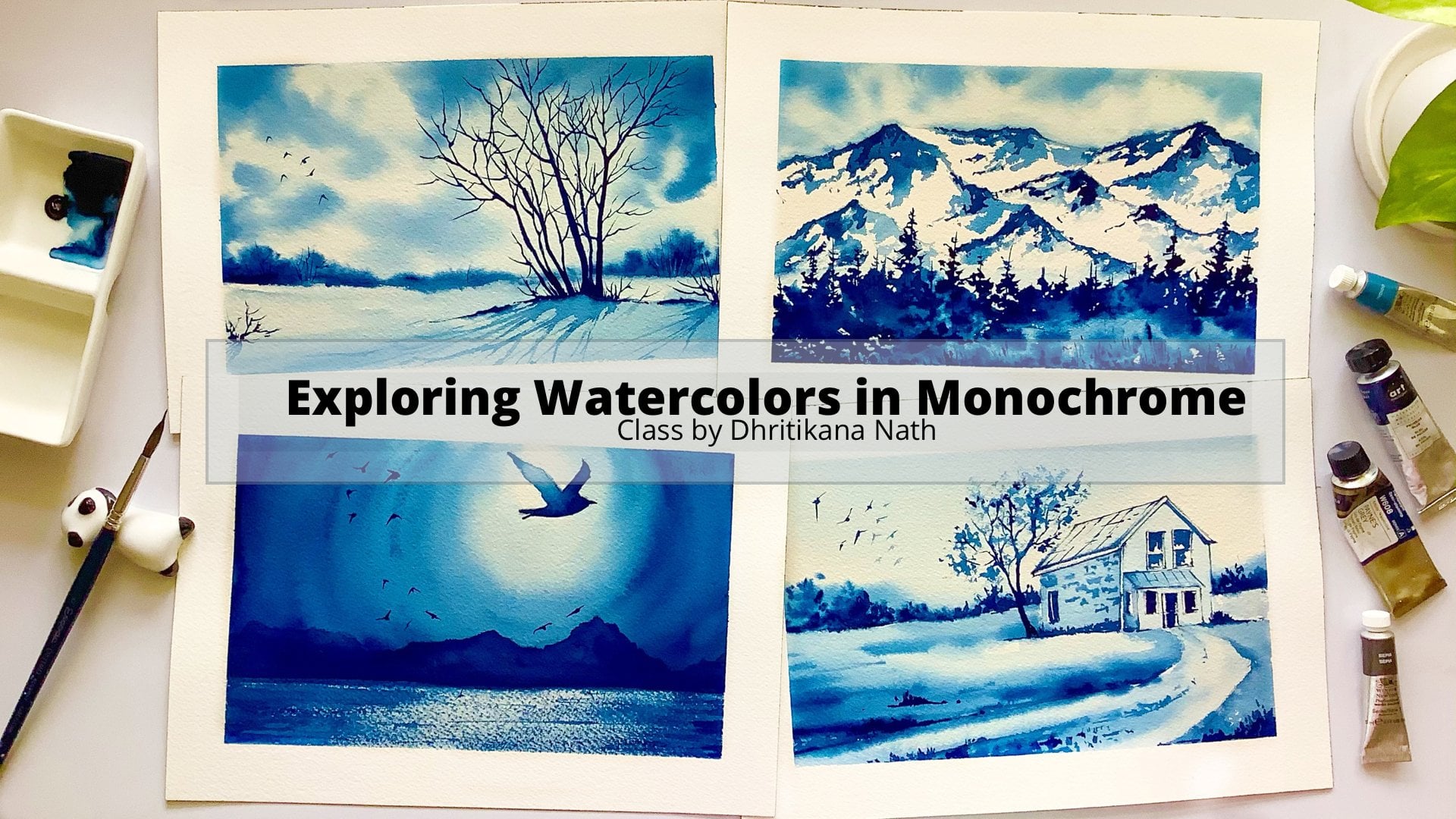
Transcripts
1. Dancing Lights in the Sky: Dancing lights in the sky, the phenomenon which we all want to see live with our eyes. Yes, you will find this phenomenon occurring in the Northern and the Southern hemisphere of the Earth. Most of the time we only paint the Northern Lights, but you cannot miss the beauty of the Southern Lights as well as the colors like opera, magenta, pink, purple, etc. Hey guys, I'm Dhritikana Nath, an artist, instructor, Skillshare teacher, a mother, and brand educator for Winsor and Newton. In case you are joining me for the first time, I go by the name, watercolor.illustration.letter on Instagram, you can find most of my artworks, displayed over there. Over years, I have been painting these Northern Lights and I have found people facing one simple problem, is how to control the water for painting these dancing lights of the sky. I'm going to walk you through the entire process where we start with all the materials required, understanding all the techniques to control the water, as well as getting the perfect blend and balance. Two practice exercises where we will understand how you can actually get two different sources of lights blended in one single painting, and then there are two projects. One One on the Northern Lights completely, and another on the Southern Lights. In case you are painting these Northern or the Southern Lights for the first time, I would highly recommend you to take my earlier class on Northern Lights, five easy projects and I cannot hold my excitement any further. So come and join me and let's paint these magnificent skies together.
2. Materials Required: I will walk you through all the materials required for painting these dancing lights. The first is all about the paper, so we are using Arches 300gsm, 140 lb paper. It is majorly two sizes that I would be using. The first one is my 15 into 30 centimeter paper that I have and the second one is my 18 centimeter into 26 centimeter, which I would be using. Now the first two paintings that we have is this one. The second one we'll be doing again on this paper, just the way I have done over here. The last two paintings, of course, are on the other paper which we have done. One is about the Southern Lights and another one is about the Northern Lights. Now let's walk through the masking tape. You can use any kind of masking tape of your choice. You do not need to go for any particular masking tape. I'm using an absolute carpenter-type masking tape for this one. I have two jars of water, one for the fresh supply and another one for washing my brushes. All the paints. Now, the paints are from different companies. As you can see, I do not go with one single company altogether. I like using many of them. There is a mix of [inaudible] then there is some Sennelier as well as there is some Daniel Smith. So I will walk you through what all paints I'm using for the exercises as well as for any of my other projects individually. Let's understand the brushes. Okay, you can see a lot of brushes. Am I going to use all of them? No, absolutely not. We will go for only a few of them. These are the brushes that we will be using. You can either use this half an inch brush or you can go for this three-by-four inch brush. Either of them is okay for completing these paintings. You can go for a size 6 Escoda brush, this is one which I really use very often and in many of my classes you would have seen it. It has a very nice tip. That's the reason I keep it very handy. As well as you can go for this Silver Black Velvet, size 8 brush, Silver Black Velvet size 2 brush. In case you do not have this nice tip. You can go for Silver Black Velvet size 2 brush. Again, I have Silver Black Velvet size 4 brush. There are many that you can use, but to be frank, you can pick and choose only 3-4 of them. One size 4, size 6, and a 0.5 inch, that would be enough. You can use either a white gouache like this or a gelly roll pen like this one for painting these stars in the Northern Lights and the Southern Lights. I would really need a tissue. Do keep these kind of tissues really handy. If you have committed any kind of mistake, then it can be taken off pretty easily. You can dab off the extra paints from the brushes on this, anything, it can be used. This is the eraser that I'm going to use, this is a kneadable eraser. You do not really need this kneadable eraser. You can go for any kind of eraser that is available with you. I'm going to use a monograph pencil. That's all from the supplies perspective. Let's move on to understand what all paints I'm going to use next.
3. Colors: Let us discuss all the colors we need for the techniques part. Payne's gray, bright yellow green, and Prussian blue. We will be having six techniques. Then for Exercise 1, it's Payne's gray, Prussian blue, bright yellow green, and compose blue. For Exercise 2, we have Payne's gray, bright yellow green, burnt sienna, Prussian blue, Quinacridone gold, and compose blue. For the first Northern Lights, we have Payne's gray, Prussian blue, turquoise de-phthalo, and white gouache. For the Southern Lights, Project 2, we have bright red, red violet, opera, Vandyke brown, and Prussian blue. This all you need.
4. Techniques: This section is all about working on the techniques. While we work on the techniques, I will first tell you what are the two colors that we will be using. One is my bright yellow-green and another one is Prussian blue and paints gray. As well as we will use some amount of white quash for splattering the stars. I'm going ahead with an even coat of my first color, which is my bright yellow-green. Once you've applied the bright yellow-green, go ahead and add some Prussian blue towards the bottom half of the paper. The top half of the paper will have the even coat of wash from the Sennelier ground that is your bright yellow-green. The Prussian blue you can take from any other brand of your choice. Now, many of you might already know that there is a yellow-green color available in most of the plants. If you do not have this bright yellow-green, go ahead with that particular color, you would be in a position to get this effect, something closer to this one. I'm going ahead and starting out with my bright yellow-green from the top and then going towards the bottom with the same color till I get a Prussian blue towards the bottom. There's an even blending that I have done in this case and in the second quadrant we are going on wet-on-wet method. Wet-on-wet method would be more of your even coat of wash on the paper. Then we will be doing a variegated wash, variegated wash will be going with a lighter value, that is, our bright yellow-green. Then I will add my Prussian blue in some of the areas where I want to add the darker value. Now, this is just a source of light. Since we are doing the Northern lights, therefore, I have added it in any particular way I want to. You can go ahead with the randomness of this medium and add it as you want. This is just to show you how you can blend the colors in this variegated wash method. I have taken very small piece of paper because I want to be quick with all these techniques while we paint. It will not be such a small paper. So be ready for exploring it on a larger size paper. This is just to let you know what are the techniques we are going to use as well as there are techniques which you can even use in your future projects. This should not be a problem. If you learn these techniques, you can try out Northern lights on your own. I'm just adding some amount of paints gray towards the bottom to make it a bit darker in value, as well as towards the top left-hand corner. I'm extending the colors a bit towards the bottom area as you absorb my brush movement. Keeping all of this in mind, you need to see that I keep the green light very prominent. You will observe these colors. Whenever you see any kind of a video of Northern light or any kind of photo of Northern light and if you have the privileged to go ahead and see the Northern light, of course, that's the best. You will be in a position to see these kinds of lights and the beauty that it holds in itself. I'm going ahead with a wet on dry method in this case, many of you might also like to explore this wet on dry method. This is how you go about it. You will start with a lighter value and then blend it with a darker value. That is our Prussian blue. Again, you'll go with a darker value on the left. I will keep some of the space in white and you'll see how I will blend that area with some clean water. This is how you get this area more in white. Yes, it is a possibility that Prussian blue is a very dark color and there will be some amount of stain which you'll get on the paper. Still you will observe that most of the area remains a bit white. Now I'm adding some more darker value of Prussian blue and just blending it. This is real-time video, just that some of the areas I didn't know show. I'm actually taking the color on my brush since this is very small in terms of the exercises I'm doing. Therefore, you are not seeing it in one by one or in a step-by-step manner. That's perfectly fine. I will go ahead and even show you how I'm picking up the colors. Now in this particular small square box here, I'm going ahead and doing again a wet-on-wet method. How we go about it? We are going for multiple lights. In this case, multiple sources of light means that there will be one source of light which is your bright yellow-green, then there is some white light, as well as there is another source of light, which is again in the bright yellow-green shade. Once I'm done with this bright yellow-green shade, I will go ahead and start adding my Prussian blue. As you always observe, that I'm going with my lighter values first and then going with my darker values. Now this is a method which really helps me to gain a lot of confidence when I'm working with my watercolors. You can observe how I'm picking up the colors on my brush and then adding it on my paper. Simple exercise, I think you will be in a position to make it. Then we will go with the next box where we are going to do dry brush technique for our mountains. This dry brush technique is very handy when you are painting mountains for any of your future projects. Keep in mind though whatever we are actually learning now, can be applied for all your projects or for all your work that you want to attempt. I'm adding some of water onto my paper. But it is okay if you want to add it, you can go ahead and add it or else you can leave it like that and then just go with the wet on dry method because this is a very very small area. But if you are having larger area, then I will ask you to go ahead and paint with the wet-on-wet method that would help you to blend the colors in a better way. I'm again for styling my lighter green shade and then adding the Prussian blue. Prussian blue towards the left-hand, light green towards my right. Just before the I go ahead and apply my dry brush technique for the mountain, which I did sketch with the help of my monograph pencil. I am adding some amount of darker shades of this green. How I'm getting this green, I'm just mixing my bright yellow green with my Prussian blue and you get all green just the way you observe on the paper right now. You do not need to exactly do this process, it's just that I wanted to show you how you can blend, mix your colors to get another color altogether. It's up to you if you want to follow it or in case you just want to experiment, yes, go ahead and experiment. I always say this, that experimenting is the best way you can learn. I experiment at every point in time when I paint with watercolors. We are going ahead and adding some dry brush technique. What I usually do is I pick up the color on my brush and then I dab it off on their tissue. Stop adding it on the paper. Now, the paper which I'm using is cold pressed, which means that it has certain amount of tooth or you can see certain amount of rough texture in it. It is not completely rough, hence the texture is not very rough, you can see. But yes, there is certain amount of rough texture or tooth which you can observe because of which this dry brush technique works well. In case you are using a hot pressed paper, it might not be the best case for a dry brush technique. Going ahead and just having a look at how you can paint your pines. Now, this is a round brush and I am just extending my brush strokes on the left as well as on the right. As we move from top to bottom, it would become more broader. That's how we keep on adding these strokes and we get all kind of pine look, or you can say this looks like pine once you complete it. I will show you even now with the help of other brushes, how you can actually paint your pines. This will be an exercise which you can do with the help of your flat brush, or you can even use your round brush. Whichever you're more comfortable with, go ahead with that and do it. This is a Filbert brush and I am using a Princeton Filbert brush to show you how you can paint your pines. Again, I am using it with the help of the tip. I am drawing this line and then I am extending it on the left and again on the right. You will see that this pine is a bit different than the one which we did paint with the help of our round brush. Still, this gives the appearance of a pine, and hence you can use these brushes for painting your pines. I will, again, try to show you or demonstrate exactly how you can paint your pine if you are using a flat brush. Now, I did not have the same size of flat brush, so I will be using the same Filbert brush to show it. You can use your flat brush to work this out the next way of painting the pines. While you are painting the pines you can observe how beautifully the colors are drying up on the left and on the top. The colors are looking beautiful and the effects looks so much real. I am very happy with it, I would even ask you to try it out. This is a very, very important section all together. It forms the base for any of your artworks or I always say this is the base for any class. Yes, there are a few classes where we go and just start with our first painting, slowly, steadily we build up, and we get to understand with each and every different, or you can say that each and every project, some of the other techniques. Here, you will see that I'm painting the pine just going straight zigzag manner. It is not much of loose strokes which I am adding. Now, the loose strokes were more while I was working with my round brush or you can say while I was working with my Filbert brush and extending it. I have picked up some color on my Escoda brush. This is whitewash that I have picked up on my brush, and I am just flattering some stars. I really love the appearance of this whole set of the six techniques altogether. Once you have added the stars, go ahead and start painting with the help of your round brush size 8. This is a silver black velvet round brush which I'm using. You can go ahead with any round brush that is available with you and keep extending it from the left towards the right. It's a small hill or you can say it's a small mountain that I am painting and it is with the darkest valley, which is my Payne's gray. You can also go for black if Payne's gray is not available with you. It would serve the same purpose, hence you keep painting these mountains, whereas while I'm extending it you will see that there is some flora. Flora, I mean that there are some trees or there are some small bushes, small pines which you see from a distance and hence I just made the top area uneven. It's just doesn't look like exactly a mountain. I'm even extending it towards my right and filling up the space with the help of my Payne's gray. That's one of the reason I have used my size 8 brush, but whatever size brushes available with you, like if it be a size 6 brush, or size 7 brush, size 4 brush. Size 4 brush would be a bit difficult to use because we are covering a bit larger area. Still I would say go ahead and do it. I would use the same technique for the bottom left one where we did paint the source of light, and then I will add some whitewash on top of that mountain, I will show it to you later on. First, let's just go with a Gelly Roll pen to add the largest stars. Do not worry much, go with the flow. Just let this beauty show up on its own. Keep adding these stars so that you are completely happy with it and you are contented that, okay, I have added the stars of my liking. I usually love to add smaller stars more, therefore I pick up less color on my brush so that I get those smaller stars. If you have lot of color with your water on your brush, you will get those larger stars that seriously, I mean, you will not like to add it to that extent on your paper. But still, again, one simple point, enjoy the process, keep experimenting, keep understanding more about watercolors and enjoy the randomness of this medium. Go head and then remove the tape at an angle once your paper is completely dry. But just observe right now that I am adding some amount of my whitewash on this mountain to show the snow. You can either paint the snow by keeping the white spaces off the paper or else you can paint it black and then go ahead and add your whitewash on top of it to show the snow. I would absolutely leave it up to you how you want to show it and how you want to do it. There is no hard and fast rule how you go about it. I'm removing the tape at an angle so that I do not rip off the paper. This is a very important aspect when you complete a painting, so go and do this. It is so important that I do not want you guys to anyway miss this part. If you are unable to actually take off the tape, just blow it with the help of your dryer. Some hot air will actually help to loosen up the sides, and then you can easily pull up the tape. The first whole process which we did was blending, the next is the variegated wash. I'm just naming each of these technique and writing it down so that it becomes easier for you to understand. The next one is wet on dry method, and then we will go ahead and paint multiple lights in this case. This is, again, you can say wet on wet method, and we are practically showing two sources of light with some bright light in the middle. Once that is done, we will again start understanding the dry brush technique. This is one of the very used or you can say the most important techniques that you can use when you are painting your mountains. The last is all about painting pines in three different ways. I hope this is helpful. Meet you in the next lesson where we'll work on exercises.
5. Exercise 1 Dancing Light: Hello guys. We are Here to the first exercise of Dancing Light. It's going to be a very simple and easygoing exercise. Just relax yourself. Have a cup of coffee or a cold beverage, depending on the season or depending on the place you are located, as well as the time that you have. This is a very small exercise. You can do it during the morning time or during the evening time. You want to relax yourself out. You want to do something really simple, easy, and try out watercolors, this is the one to go for. I am practically taking four colors for this, one is my bright yellow-green, then it's my compost blue, my Prussian blue, and Payne's gray. I've already provided all the details while we were discussing in the colors section. I will make two small mountains. Again, the paper size, I have told you in the beginning, it's a landscape size that we will be using for completing this painting. Do not worry, go ahead and apply some amount of water for the sky area, and then we will apply the colors. Make sure that you go slow and whole of the area for the sky is wet enough. We are going to apply some beautiful colors of Sennelier, then compost blue from [inaudible] and other colors from different brands. That's one aspect which I have always followed, that you should not go with any particular brand in purpose, and you should always test and try the brands on your own and then understand which works well for you. I have mixed some amount of my yellow-green that I have with my compost blue and then applied the color. Then I'm going ahead and just adding some compost blue. Again, I'm washing my brush and adding the bright yellow-green. You have to apply the bright yellow-green, leaving some space, and along with it, just add some amount of compost blue. You have to repeatedly do this for one or two times till you are satisfied. While I come from the right towards the left, my light becomes quite smaller. It originates towards the right. It occupies more space. That's what you need to keep in mind and then keep painting it. Wherever you think that you have added more colors, just pick it up with the help of your brush. I am now taking some amount of Prussian blue on my brush. This is an escorter, size 6 brush. I will go ahead and add it in a way that we start from the right and move towards the left. I will always wash my brush and you will always see that I keep a tissue very handy with me. I never go ahead and just take off the extra paints from my brush only by washing it, it's always a good exercise to dab off the extra paints on the tissue. Again, I am going ahead and picking up some amount of Prussian blue and applying it in the middle. You have to repeatedly do this process. It's very simple. Just go bold with the colors. You do not need to worry how the colors will look or how it is going to shape up. Just go with the flow, don't think much while you paint these northern lights. I will also explain you later how you can paint the southern lights, but right now, our only focus is to just get a good blend with these northern lights. Many of you, along with that, have always asked me, "How do you create these kind of lights in such a beautiful blended way?" I would say you'll always need a good paper while you paint any of these northern lights. Paper has been always an important aspect and I have always told you the importance of the paper. I love to go ahead with the 300 GSM acid-free Arches paper. In case you cannot have an Arches paper, you do not want to afford it, go with some handmade paper or 440 GSM. In case you are in India, Chitrapat is a very good option with 440 GSM, though your masking fluid might not work very well on it. But it's cheaper and it's good to work on. So as a cheaper option, you can go with Chitrapat. I'm not sure how many of you have heard of Baohong paper. You can go with Baohong paper or Fabriano paper. Those are great options. As I know many of you are only pursuing it as a hobby or might not like to invest it right now for your paper and that's absolutely fine. I am just telling you about the cheaper options which you can go ahead with. I'm applying some amount of paint scree towards my left as well as towards my right. I'm blending it with my Prussian blue, which I have on the paper. You will see a beautiful night sky which has appeared. Some of the areas I'm making it darker in value. It is absolutely fine to let the area dry off before you work on the mountains. Mountains is a very important aspect for this painting. So make it lighter in value because we are going to do a dry brush technique. This dry brush technique I have already explained you during my techniques section. So go ahead and check it out before you work on these mountains. First, apply a clear coat of water. This water is, of course, a bit bluish in color. Why it is bluish in color? I want to make it blue as the sky is blue and it is a snowy mountain. When there is snow it would reflect the color of the sky. Just like I always say, water reflects the color of the sky, similar the snow will also reflect the color of the sky. Again, I'm going pretty easy with the colors. I am going ahead with my Prussian blue, and I am adding it towards the top of the mountain. The mountain which I am currently painting is in the foreground. Wherever I see that I'm adding more colors, I will just go ahead and apply some water with the help of my brush and make it more diluted in the value. Wherever you want to actually dilute the values, just add some clean water or else you can even add the water where you are just taking off the extra color from your brushes. You can use any of the water that is available with you and then go ahead and blend it with the applied color of the mountain. That's how you make it lighter in value. I'm pretty sure about it that you would be very happy with the outcome because it way a very simple trick which you can apply in any of your future projects too. Go ahead and apply some darker values of Prussian blue. When you're applying this Prussian blue, make sure that it blends with the color that you will have already applied for the mountain. I'm adding some darker value towards the bottom of the mountain and some lighter values towards the top of the mountain. Wherever I find that it has become a bit darker in value, I will go ahead and just pick up the extra color with the help of my blending brush. You see that keep a tissue very handy with myself towards the lake. I just pick up the colors and take it off on the tissue, and then again, come back to the mountains and paint it with the help of the blue that is available on the palette. We are not going ahead with any other color of our choice. These are only the four colors which I'm using. You can alternatively even use Ultramarine. Ultramarine is a very beautiful color, and it is warm in nature. Why I'm not using Ultramarine rather than I'm using Prussian blue because Ultramarine has got some amount of, you can say, granulation in it and because of that granulation, sometimes it doesn't work well with these kind of colors. Go ahead and just pick up the colors like compost blue, or Prussian blue, or Payne's gray. That works better compared to the Ultramarine. But I leave it up to you how you want to experiment it. Again, experimenting will be all for great help for you. As you are starting out, always try the colors on a rough piece of paper, and then only apply it on the final painting. I will go ahead and apply some more darker values to my foreground mountains, just the way you observed. But my foreground mountain is still wet due to which the color is giving a wet-on-wet method and there are no hard edges that you can see. Hence, if you are applying these shades, do make sure that your foreground mountains is also wet, whereas in case it is not wet, let it be. I'm going ahead and just applying some dry brush technique. Just pick up the extra colors that you have on the tissue, and then start applying it on the mountains. This is how you will go ahead and apply it one after another. I do have a mountains class in particular if you want to learn more about mountains. This class will be more dedicated towards painting the Northern Lights. Though I have explained these mountains in a much more simpler way over here and you will find at least 50 percent of the time that we are painting, this whole of the Northern Lights is dedicated towards painting these foregrounds as well as the background mountain. I'm going ahead and using this dry brush technique very often and the foreground mountains look very nice with this dry brush technique. I will be using it even in my Southern Lights painting and in many other places wherever I feel that there is a requirement [MUSIC] I am now close to being done with the dry brush technique, and now I'm going ahead and adding some amount of small trees or you can say crosses or as well as these are small bushes, which is usually seen if you have any kind of snowy area and add it with the help of Payne's gray, I'm using Payne's gray create or else you can even use indigo as an alternative. My Payne's gray has got an underlying blue in it because I'm using this from Mijello Mission Gold. You can go ahead with any color that is available with you. I always tell you about the alternate colors that you can use, as I do not want you to spend extra money right away on the colors. Always go ahead with whatever is available on the palette, and we'll create these beautiful, majestic skies and dancing lights. Just add some more small dots here and there, and keep painting it. Once you are done with these foreground, we will move to the background mountains. Though there is some amount of good work that we will usually do in case it is a foreground mountain, whereas if it's a background mountain, we will go with some darker values, and less amount of work is involved as it is perspective. There will be more details that will be seen when there is a foreground mountain, whereas there would be less detail which you will see if there is a background mountain. Either go ahead and add some more details like small grasses. That's it, I'm not going to overwork for my foreground mountains. I want to keep these spaces which you observe in blue for the foregrounds because I want to show the snow properly as these mountains do have a lot of snow. It is usually in the northern hemisphere of the world that you see these Northern Lights, and therefore you either see it from Norway or you see it from Iceland. Those are the places which are really cold, hence, you observe mountains, snow, pines. Those are the specific phenomena which we always observe. That's one of the reason you will observe that I am painting these snow-laden mountains each and every time or whenever we are actually painting these Northern Lights, most of our projects will have an element of it. Hence, now when you move to the background mountains make it darker in value, that's all you have to do, so just to your brush. I'm using my size six-quarter brush, it has got a fine tip because of which I can do a lot of experiment, either you say it'd be a dry brush technique or you say adding any kind of detail. You can keep our size two brush with you. This is an Escoda Optimal brush in case any of you want to purchase this kind of a brush, go ahead and do it, but as per my opinion, you should always use whatever is available with you. Then only if you are more interested in buying it, then go ahead and buy it when you have a budget available for it. No need to always go ahead and pick up the expensive paints or the expensive brushes, slowly, steadily you can keep investing on the art supplies and always pick up the best from the lot. I will show you whatever I have available with me in terms of the brushes, colors, et cetera, which I have been using. Seriously, I do pick up one or two of these tubes each and every month when I was building up my whole, you can say, the number of colors or whatever I had to use. I was building it up slowly and steadily and that's the opinion that I would also give you that do not go with the one single set altogether, you can go with one or two colors, pick it up as you want. I would suggest you to always go with a dot card, see what you like out of the dot card for a particular brand, only pick up those colors and once you are happy with that, go ahead and check out the dot card of other company and then pick up the colors from other companies. Only one specific request that I have for you all is, do try to pick up the colors which are artist-grade because artist-grade pigments actually have a very different outcome on the paper and they last very long. I have always told you to pick up the artist-grade paints and the importance of artist-grade paints as they do last longer than your lifespan. We do want our paintings to last longer than a lifespan. But when you are only starting out, you can always go with whatever is available. Like you have any kind of a student-grade paint just try out those colors. No need to purchase the artist grade paints immediately. As we progress, I want to even show you how I splatter my stars. I usually pick up my white gouache on or thin brush like size 2 or size 4, and then I splatter my stars. I use a white jelly roll pen, the jelly roll pen becomes very hardy, then you want to actually just add some more stars on to the sky. You can even use the tip of any thin brush and also add these smaller stars. I think that's it, and I'm pretty happy with the outcome. I will let the paper dry completely and then have a final look at the painting. I always tell you not to get overboard and not to always keep working on a particular painting. We should know exactly where to stop. Each and every painting can be usually done in 20-30 minutes of time. If you take out the drying time of the paper, so always try to use that much amount of time for these kind of paintings. Go ahead and remove the tape at an angle. You have to remove the tape at an angle, that's a request so that you do not rip off the paper and get those clean, beautiful ledges. I will see you in the next lesson where we will attempt exercise 2.
6. Exercise 2 Dancing Light: We are on Exercise 2, and this is going to be very interesting because we're going to build up from where we have left last. We are going to add two sources of light this time and it would be a bit in a curvy manner that we will go ahead and add it. I don't think that it is going to be complex, it's going to be very simple. It's just that we will not have the mountains, we will have pines instead of it. That would be the major difference. We will be working with the same colors that you did see earlier. We are going ahead with light yellow green, then with compost blue, Prussian blue and Payne's gray. There will be additional colors like quinacridone gold, as well as burnt sienna. You can also use the Nike brown, if you are not having burnt sienna or whatever brown is available on your palette. Just do wet your paper completely and if you see, I'm doing a cross-swatch, that is, swatching it from left to right and then again, cross-swatching it from top to bottom. That's what I do mean by the cross-swatch. I'm going with the lightest value, which is majorly my bright yellow green. This is from Sennelier. If you do not have this color, you can also go with yellow green that is available on your palate. If you even do not have the yellow green, you can try with the yellow color, and then when you add Prussian blue along with it, there might be a bit of reaction, as well as it might turn a bit greenish in shape. Which is perfectly fine. We are experimenting and that's what we want to learn over here, how to just make these curvy northern lights and along with that, we are going to add one more, small area which is going to be next source of light and just keep some white space in between where we will go ahead and apply some amount of Prussian blue. You can use alternate colors like [inaudible] blue, but what I have usually observed, is that this green doesn't react very well with the [inaudible]. So you can even use indigo. Indigo is a bit darker than this particular color of Prussian blue. Hence, you need to keep these points in mind while I say, I did not like it much, but you might like the appearance of that, so go ahead and experiment. Experiment is the only way you can actually understand the properties what works best with which color. This is my observation and I have gone ahead and checked out on the colors. I'm adding some amount of compost blue, along with Prussian blue, which I have already added, and then just merging it with the bright yellow green. Again, I'm adding some more compost blue with the help of my size six Escoda brush. This is a real-time video and practically, you can understand how I'm adding the colors step-by-step. You do not need to just wait and think much. Just go with the flow, just paint. Pour your heart out into this painting and I'm pretty sure about it, you would be able to nail it. Again, I want to tell you this one thing which I always say in my classes that these paintings are at least tried twice by any of the teachers or at least as a class. Whenever I give a class, I make sure that I do a particular painting twice and then only I come up with the class if that is the kind of practice that I am doing and then you get this kind of result. Never get disappointed with whatever is the final result which you get or if you are not getting the exact way, you observe right now what I'm painting, don't be disappointed at all. It's okay, you were just trying it for the first time. We all have tried it twice at least and that's how we come up with these classes. I have practically tried my level best to make this class really interesting with one source of light, then with two sources of light, then with multiple lights as well as you will see, the dancing Southern lights usually, which is not touched upon much, but I can tell you those beautiful colors of opera pink-purple, they really attracted me and that's one of the reason I did add it in this dancing lights class. Let's go ahead and add some more Payne's gray and Prussian blue in few of the places. You exactly know that my second last color from the left is my Prussian blue and the last color on the left is my Payne's gray. So I'm going ahead with that kind of colors and I think I'm pretty happy with the outcome right now. There would be few more additions in terms of the colors that I would add and then I would let the paper dry off. I will not overwork for sure because that's one thing that I always keep in mind, not to overwork on my painting. Few of the areas where I want darker values, I would go ahead and add the Payne's gray. You can also mix your Prussian blue and Payne's gray and then add it. You can now keep adding more colors and blend it with the background. Just observe how I'm going about this particular part and then I will meet you once our paper is dry and we have to work on the next layer where we will be painting our pines. I'm close to being done, just adding some more darker values in a few of the places on the left where I think that it has gone really light. So I'm going ahead and adding that part to rest. I will let the paper dry completely as I've told you earlier and then we will go ahead and splatter some stars. Once your paper is dry, just take some color on your silver black velvet brush. So this is a size four brush or size two brush which you can use for splattering the stars, as I want smaller stars, but if you really want bigger stars, you can even go with a bigger brush. I would leave it up to you. Don't splatter or don't try to add a lot because we will be even adding the pines and at that place I would like to keep it simple and with less of stars. So go ahead and now just pick up some of the quinacridone gold with your white gouache. So I am using white gouache at this point in time. You can also go ahead and use some amount of your white poster color or you can also use some amount of opaque white watercolor. Those are the two other options that you can go ahead with and add it with your quinacridone gold. Now quinacridone gold in particular, I have added because I want this color to be yellow, because yellow looks really beautiful with the blue. I have picked up this, my shell of my quinacridone gold and opaque white watercolor. Or you can go ahead with white gouache with your brush. I have my size six Escoda brush and I have added some amount of the Nike brown into the quinacridone yellow and you can say the quinacridone gold and the white gouache which we have and I will go ahead and start adding the pines. You can see that it is really beautiful though this yellow looks on top of the blue. Some of the ideas I'm even adding with the help of my burnt sienna, because I see that the experimental obvious with Nike brown did not go very well. So yeah, go ahead and add your burnt sienna. I always say this, that we all do make mistakes and it's perfectly fine if you are experimenting, and there is nothing that is stopping you from experimenting more and more. I love to experiment and love to see how these colors appear on the paper and hence I do add an experiment two or three colors and then come up with a beautiful pine. I am going with a very loose stroke thing, make your brush dance or you can say just add some loose strokes here and there. This is wet on dry method, hence you will get hard edges. We do need hard edges. That's why we are going ahead with this technique. Keep on adding the colors, the shape of the pine is of course like a triangle. The top is thinner, whereas while you go towards the bottom, it is thicker. Hence, you have to make sure that you will have thicker areas while you go towards the base of the pine and you keep extending the pine once towards the left and then you keep extending the pine once towards the right. Do make sure that few of the pines or whatever you are painting, you can say few of the branches of the pines needs to be thinner or you can say they need to have less leaves compared to the others so that it looks more natural and rest while you keep extending it on the left and on the right, you will see that some of them will be smaller in size and some of them will be bigger in size. You need to mix and match the colors again. As you see over here somewhere, I'm painting a bit with more of, you can say burnt sienna and my white gouache. Then some of the places I am leaving it more with quinacridone gold and white gouache. Some of the places you will see that I will have more of a darkly brown and white gouache. So these are the mixtures which I have. Many of you might have in mind that why I'm using white gouache. So white gouache always gives me that edge to go over it and then paint. It is opaque in nature. That's one of the reason you will see the color appearing nicely whereas if you use a transparent color, the underneath color will be seen, which we really do not want to in this painting. Okay. Now let's continue painting the pines. Again, you will observe that while I keep painting the pines, I will go towards the right, as well as towards the left. We have to extend our pines throughout the whole of the foreground. The pines are in the foreground. Some of the pines will be smaller in size. Some of the pines will be longer in size. Some of them will have lesser leaves compared to the others. Some will have more branches and some will have less branches. It's absolutely random in nature. You cannot control the randomness of the nature and hence, I always want you to just imbibe or you can say, accept this randomness which you see in nature and even implement it in your paintings. That would really give it a very natural touch and the final outcome would be really pretty. I'm going ahead and adding a very small pine in-between. It's a short and small one, as well as you will observe that I leave one or two dots here and there even while I'm painting the pines. It is just to give a loose look to the pines which I am painting right now. Now, I would leave this up to you how you want to paint pines, because there are many types of pines that appears in nature and secondly there are many ways in which you can paint the pines. So it is not that you need to do this pine in a manner where I am showing or the way I am working it out, but it all depends on you how you want to take it forward. This is just a guideline, or you can say this is one of the ways which I have really discovered it to be very easy and you can just paint one small line and then extend on the left as well as on the right. Why I've made my mind you will observe that I'm using the tip of my brush in a few places and I am actually putting a lot of pressure in some of the other places while the tip of the brush I use mostly while I am moving outward from the middle of the pine, whereas I make it more broader as well as I add more pressure when I am in the middle of the pine. Although pines I'm adding just on the left as you observe now. It is by the side of the pine which I have already painted. It's a bit taller, you can see, compared to the one which I have painted last. Again, I always say this that I go absolutely by the randomness and randomness of nature is that few of the pines will be taller and few of the pines will be shorter. That's how we will go about it and I am extending this pine on the left. Again, I'm extending it on the right, which gives me less scope in terms of keeping the area of the background as blue. It would be more of the yellow or quinacridone gold which you are adding along with the opaque gouache or white opaque watercolor, whatever is available with you. Similarly, I do one more pine on the right and keep extending it towards the left and towards the right. See, all of a sudden we will not have a foreground. That's one of the reason I always say whatever you are painting in the foreground needs to extend completely on the left and on the right, or it has to originate on the right or originate on the left, and then just go or end somewhere in between. It has to be a continuous thing. It cannot be like it originates and it just stops at some other point. While I work with this, you will observe that I'm just adding some amount of paints gray to vary the colors, and that's it. Just make these simple brushstrokes if you see, I just move my brush from the bottom to the top and I want to show the grasses and that way I will keep adding these colors wherever I feel that I want to vary. Some of the places, yes, I will keep in the burnt sienna or in the quinacridone gold color, whereas some of the places I will keep the colors as paint gray and our white gouache. Yeah, it is an opaque medium as I've already told you, I want to keep the opacity. Hence I am going ahead and adding this opaque white watercolor or gouache and keep painting it. I think I'm pretty happy with the outcome right now, whatever I'm observing it on the painting. I am not concerned much about how my painting has turned out. Again, the main objective of any painting should be to enjoy the process, to enjoy the journey. If you stop enjoying the journey or the random ways in which watercolor behaves on paper or the randomness of this magical medium, you are actually missing out a lot of what you could have enjoyed through the whole of the process. I say this very often to all my students in each and every class or if whenever I am holding workshops, you need to enjoy the process. You need to see how you can work it out. See, I can only help you out with the techniques and slowly steadily once you keep experimenting it more and more, you will be in a position to understand what new techniques you find or how this particular color is behaving on the paper, how that particular color is behaving on the paper. You will find it for sure. It's just experimenting with the medium, enjoying the process, going along with the journey and never getting disheartened. One thing that I have realized with watercolors is not to get disheartened. It will give you challenges. It is going to actually make you feel that, okay, I don't somewhere know how this medium will behave with this particular color, but believe me, slowly and steadily, you will seriously get a hang of it and you will understand it very well how you can now make it work. I think I'm happy with the outcome now. Go ahead and let this paper dry. Once the paper is dry, then just take off the tape. Once you just pull off the tape, make sure that you are pulling the tape at an angle, because I do not want you guys to rip off the tape. It's very, very important and some of the highlights I'm doing right now with a lighter value of my color, like adding more of white and then adding one or two pines here and there. I leave this now up to you. I think I will not overdo it any further. Yes, there is always a tendency whenever you're working with watercolors to overdo it because we are seriously not satisfied with whatever we get as an outcome and somewhere there are other that's even the way I also see it. So it's okay. We all do it and I know we will continue doing it. It's important to know where to stop and that's one of the aspect that I want to tell you always. Have a final look at the painting and hopefully I will see you in the next one where we will start with our first Northern Lights painting project.
7. Project 1 Northern Light: Okay, So this class has been, I think, quiet, easy done now, given the fact that we discussed start techniques quite in detail. And then we started off with our exercise one and exercise 2. I should say that I have tried to design this loss for absolute beginners. And hence you will find most of the projects really simple and easy. The current one, I have tried to include the more techniques, watercolor details. And therefore you might find it a bit tough compared to the other one. In case you want to skip this on attended. At last, I would leave it up to you. You can go ahead and do it. You can try this other one likes first and then come back to this for attending it. For this one, you need to start off by doing our rough sketch, the sketches and 40 percent DO you start from the right and then you ended on the left with a slanting line, which is about 20 percent of the papal. This is to show those no, for the mountain and there will be a background hill or a background mountain which you need to, again, pink. I am applying the water on the top of the sky area. I am not actually covering any of the mountain area. Hence, do make sure that this water is only applied for this guy thought, when you apply the water, it has to be across swatch, cross swatches, really important so that the water is applied and all the Hadean or all the part of the papal, and hence there is no whitespaces type you have left. Do see that there is a sheen on the paper just the way you also right now, some of the parts should be shining. And I have created the people from the bottom towards the top, starting with my turquoise detail and applying it from there right towards the bottom area. This is my size four silver black velvet brush and I'm applying it in a curvy line. Again, it is a slanting line which I apply from the top right towards the lepton. Few of the places I applied from the right and move to the left, there will be two to three times that I would be applying the turquoise TTA low and you will keep covering the area. The way I will show right now. I'm going ahead from the top and moving towards the bottom. But before you do that, just tear your paper and then start off with the painting. I want to show some amount of wildlife, which is one of the reasons you will absorb that in-between. I'm leaving some spaces now these pieces, of course I will be covering with my Prussian blue, but except the Prussian blue, even I will be only occupying only some of the areas. Some of the EIA will be kept in white of the paper and you will observe this kind of a light usually in any often not done lights. I will go ahead and apply some amount of Prussian blue. Next, I will start from the top left-hand corner and then extended towards the bottom. You will also have that. I will apply my brush and blue from the top right-hand corner and apply it towards the bottom. The way I carry on this, I Start picking up the bush and blue with the help of my size four are my size eight silver black velvet brush. I would leave it up to you how you want to pick up the blue ocean blue because that would be on far larger area and hence your work and even your score to go brush compared to the one that you have, you're still now. The performances that are open. As discussed, I am going ahead and adding Prussian blue in few of the places and I'm trying to keep some of the places in white. So make sure that you do have this. So white light, which can be seen slowly, steadily, I might add some more colors in the whitespace too, but let's see how we want to proceed. I am not deciding anything about the way I am going ahead with my size four brush and having some more darker values of my talk wise detail. And then we will just stop blended with the symbol on the top right-hand corner. Pick up some amount of the darkest value. Guess we started with the lightest value, r, and my lighter value was some clockwise detail. Then I am going ahead rip my Prussian blue. Once I'm done with my Prussian blue, I am working with my bean scrapings. Green is the darkest value which I have. And I'm walking though with the Payne's gray towards the last two. That's how I like to progress. You can go and try our experiment as you want. But this is usually the process which has been followed by most of the artist. You will absorb that. I have added one line. That line is basically the pine tree which I want to paint. Therefore, I do not want this video to be too dark. Morals painting it in white or with whitewash will be very difficult. Once you are done with this guy, I would ask you to let the paper dry off completely. Once it is dry, then only start painting your mountains. That would actually help you to avoid any kind of paint flowing from your mountain towards the sky so that there is no running of paints from Herodotus there and there is no cauliflower effect that we see. You have absorbed how I am adding the colors slowly and steadily. So you need to also see that your people is wet for quite some amount of time before you keep on painting the sky. So do try to get 300 GSM Paypal or relative. It is difficult to keep the paper dry for a longer period of time. We are now starting with our mountain and I'm going with the way light wash of the acquires t-table. Once you are done with the turquoise TTA local, go ahead and add some amount of Prussian blue. Now this brush and load that I am mining, you can replace with any other color of your choice. If you want, go ahead and use our company. Now, our company Nam, particularly not using because it has some amount of granulation and that's one of the reason I have kept it out for this particular painting. And That's not the best choice which I make. You can still experiment before you go ahead and apply these colors on the paper. If you see that I'm painting part by part, which means that once I have finished this guy, I'm moving on to my mom than sign and then I will move onto my background mountains. It's important to walk step-by-step because this is a detailed painting and I do not want you to go wrong at any of those steps. Enjoy the process, keep your patients. That's very important for any particular painting or you can say for any watercolor painting, It's one of the most important aspects that you should have Call this is like meditation for me to be frank. And once I paint with watercolors, It's like I am in a different world altogether. This season is incomplete or width of class on their dancing lights in the sky. And we are going from the window to this spring season and still are in some of the places you see the snow and mostly you can't feel the spring vibes. But I wanted to bring this class altogether. Now I do not want to leave it any further. The season is incomplete. Do without this class are together. I'm walking with a lighter values of all the colors better at BTO quite detail, or it be your, your Prussian blue wings gree, any color that you take. I'm going with the very lightest to our value while I'm painting my foreground mountain, once my sky is dry, I will go ahead and stop painting on the ADL with the help of my Payne's gray. Now this idea is basically to show you the binds. Actually making some dancing brush kind of movements. Are you good safe. Not exactly dancing mesh. I'm extending from the top. I am going towards the left, then again towards the right. I'm moving again left hand towards the right in a cone shape lever go head and even paying the snow. This note that we are going to paint this flip, our white quash. My quash comes very handy in this case though, you can even go ahead and just keep these spaces and white by applying your masking fluid. But I wanted you guys to not use the masking fluid or together for this painting. And hence, I just applied my white quash to come up with the best that I could. As we all do not have masking fluid available with us, but mostly we have a white opaque watercolor or white poster color or we have a white quash for ourselves. Okay. Hello. Hello. Hello, hello. Let us start painting the trees and lethal few spaces in between. If you see that I want to leave these spaces so that I can walk with whitewash in this area. But do not worry. I am not going ahead and painting a lot are cleaving a lot of space in between the trees that Toby their painting. Let's first just complete the bank Round Hill or the background mountain, and then we will get packed total tree again, I'm starting with a very light wash of Prussian blue. I have added some color. And then again, I am going ahead washing my brush and diluting the colors further. Once I've added the Prussian blue, I am Further adding some amount of Payne's gray into it. Paints gray. I will be adding towards the bottom of the painting. Or you can say towards the bottom of the background, mountains which I have painted, go ahead and keep applying. The colors, are happy and satisfied or you have completed the space in white. One status stamped, let this dry completely. Once this layer is dry, you can go ahead and start painting your tree again. The background is, again, pretty important in this case because we will have background crease and background previous will be more about your watercolor. Darker trees of binds as well as some snow leading pine trees, which we are going to add for our background hill. That's it I think we are going to do in case it is the background mountains or the background here. I'm using my round brush to go ahead and complete the background hill, but you can go ahead and use any other brush that escape available with you. This is the silver black velvet brush size for psi six sides gate, anything that is available or else if you have any kind of a mop brush, smaller mop brush, that can also go well, in this case, let the area dry completely and then start adding some white quash. If you see, the white quash can only be added on top of the areas which you have already painted in the background. If you go ahead and paint on top of the white light, yes, the wide world shall not be seeing much. So what you can do is take a bit of Payne's gray into it so that it is seen even when the area is white. Or you can say the area is the white of the paper which you see in the background. That's how I have managed the snow. Well, part, I leave it up to you to discover what works best when you experimented. As I always say, keep experimenting, keep loving this journey of watercolors. Watercolors is something that is very helpful when you experiment. When you understand the nature of watercolor, you have to work with it more. And this class, again, is just a guideline of how you can have broach the subject like not all lights. And now I am painting more widow white wash and just extending vary randomly. On the left and on the right. Beneath, I will work with the Payne's gray to make it look like the buy-in is complete least nor laden. So do not worry, keep painting these areas in white. And once it is done, you can go ahead and add the Payne's gray. Why are you keeping with the white quash in total pints? I can tell you that you can let it dry now, it's perfectly fine. We want to complete the battleground in the meanwhile, and then again, get back to painting Pines. Yes, this is the main subject, but we cannot ignore that. There needs to be some intuition in terms of the background. You can say pine trees, which are darker in value as well as some good piece no late and I'm going ahead and picking up some amount of Payne's gray onto my brush, as well as going completely random while I paint these pines, I have picked up my has caught our optimal brush. It has got a nice tip. That's one of the reason I have been prevalent this brush very often. Whenever I have to paint a small tape or extended loosely, these spines keep painting more and more pints for the background. You can use any brush that is available. You do not need to use the same brush. Having a good tip of your precious always an advantage when you are working with your art supplies. Do keep in mind to get some good art supplies as and when you are having a budget. The most important art supply while you are doing a watercolor painting is basically your watercolor people. The watercolor paper should be 300 GSM, as I always say, and it should be cold pressed if possible because that start texture, which I like in particular, but you should always see the texture that you like. You might even like to go for a rough grain. And that's absolutely up to you. What you like and how you want to proceed. But do make sure that it is acid free and you can get 300 GSM or more people as we are doing a lot of heavy washes in this case. I think I'm quite happy with the background pines Now you will see that again, it is nature and I'm going absolutely random. Some of the points are taller, some are shorter, I am mixing and matching. Some of them have more leaves on the top, some of them don't have leaves on the top. So go the way you want. And then I'm coming back to the mean pine, which I did paint polio and adding some more darker values. And I am going just below those, no, and then adding the darker areas so that you can actually see that one of these branches is no laden. And then again, when you paint a second branch, that would also be solid. And so each of these branches are having a lot of snow which has accumulated on top of that. If you keep painting these bytes in the background, but you can first compute and, and then come back. Though, I just felt that I need to add one or two more taller pines and I went ahead and did it for the bank round area. Always. It's a good thing to step back and watch how your painting is turning out before you have a final local, you finalize a painting. Let's get started. 0, 0, 0, 0. While you keep painting the bind sign, keep adding more and more Payne's gray to show the snow in a better way. I will just share one of their experiences, which I had though with the one of my students from a workshop. They asked me that, who do it? How can you actually pick up on watercolors? I had the first question that do you paint the dark? Yes. He campaigned, but I am not an artist exactly. I told oh, okay, fine. How did you pick up painting? And the answer was that we did something or picked up painting and brushes during the school and during the college. But my main question has always been, have you have you ever pursue that or have has anyone actually taught you? The answer usually is no. And that's where I think the whole gap lies. Again. Now, all of these classes or all of these paintings are a guideline of how you can proceed and your watercolor journey. There are tips and tricks and I, you can see from afar, if you do not learn how to do particular classical dance or play piano or play guitar, how do you actually do it? So there has to be some amount of lessons are some amount of you can say guidance which you get in terms of pursuing any kind of a form of font. With this, I even want to tell you that watercolor is very popular and very demanding medium altogether. Demanding in terms of, I would say that it just drains out a lot from you because you will get unexpected results, which usually you can control if you are working in any other medium like oil, acrylics. Whereas the watercolor requires a lot less materials. If you were even blocking our doors, like you just need a papal set of pink brush or 1A2 paint brush, water on a box of pins. That's all you need to start off anywhere. Watercolor, some might seem really challenging when you begin, but believe me, it is equally rewarding when you start enjoying the process every time you make so Gallo or paint or some or the other kind of brush stroke you have launched something more, argue have actually progress to gain some experience. The more you practice, the more you gain experience, the more confident you will be at producing your final outcome. And in case your Keep swallowing or routine for painting, I am pretty sure about that you will be in a position to create masterpieces of a song. Okay. I think I'm pretty happy with Dr. Amman Tao, which I have got for my tree. And I will go ahead and just finish this off. We will go to our background, bind Sam, just hard to on top offered one more layer with the white quash, the pines in white quash, that would show that our pines are. Laden, nobody know. And usually northern lights are seen in areas like Norway, Iceland, which have a lot of snow. Hence, I am actually stressing a lot on this no part in this case. Keep adding these pines make it shorter and smaller compared to the background once I am taking a pretty dark or you can say saturated mix off my wash. It is having very less water has I do not want my Payne's Gray from the background to show off on too. Layer, which I am painting with my white quash. Again, there'll basic rule of painting Pines will apply, which is majorly having some of the pine shorter and some of the pines follow. You. Keep on adding finds in the similar way and keep making it shorter in few places and taller and few places. Just add the ROM, loose stroke here and there so that they look more natural and keep some of those pieces, Ethan and black in-between while you are painting the lines. If you see while I proceed towards the bottom 80 of the pines, yes, they are meeting each other, whereas when I am to watch the top, I'll try to show it in a better way that they are individually placed or they are individually appearing in the background. Once you are done with this white quash for the background, trees, we will go ahead and just add some shadows onto our foreground buying. Just make sure that you add the shadow because there is light on the top. And we would like to, and the shadow to show that the light is more prominent and you can't see shadows even in the NACADA light which you observe. You can even add some shorter pines for our background that you get say towards the right-hand side. But I leave it up to you. If your values are really dark clouds, the sky, you do not need to do that because anyways, it will not be seen. Hence, Don't make sure that you are just adding the shadow and that salt here under the last 45 minutes of the painting emphasis the best part of any watercolor painting. I do want you to step back, relax and take a small break. Now, one of the main reasons of asking you to take a short break while you keep on painting this find, or you keep on working on this particular painting is this has been pretty long for you to now compared to any other painting that you have actually attempted before this. That so one of the reason I have always made sure that you should take that illiquid break to understand that you liked this faint. They are, you want to change something in this painting. What exactly you want to turn this into? As well as we can, a white over-working in this case, if we are always sticking to our painting, there is a normal tendency or with the increased enthusiasm V are taken. Or we go ahead and keeping doing this ideas and hack the end. We sometimes absorbed that we have actually ended up spoiling the painting compared to what we could have done if we would have stopped or Liam are already in a position where you can go ahead and stop painting or just let your paper dry off. So I would ask you to let the paper dry off completely. And then you can observe that we haven't added stars for the must die. Go ahead and pick up some wash on your size for silver black velvet, whatever sizes available with you. Go ahead with that kind of a brush. I would prefer smarter brush because smaller brush actually helps to pick up less color or just do not make your white quash lot diluted BY, as we want the stars to be smaller in size compared to if you want bigger stars. There is a Jelly Roll pen. I'm using the Jelly Roll pen so that I can add bigger stars, but you can even use the tip of your brush. If you have a good tip for adding these bigger stars, I'll leave it up to you how you want to go ahead. So I am now pretty happy and contented though with the final painting, once I even happy with this star. So I will go ahead and remove the tape at an angle and have a final look at the painting. Before ending this, I would like to tell you that It's been a journey of painting northern lights. We have started with discussing their techniques from techniques we moved onto two different text sizes. And this is the final project which we did. But along with it, you cannot ignore the beauty of Southern lights and the colors. The different kind of opera, pink, purple, magenta, all these colors just make up the southern lights. Even more interesting. So I am waiting for you all to join me in the next lesson where we will be working through the southern lights completely and it appears in the sudden the bottom of our hemisphere. So you might even like to have a look at few of the photos or Southern Lights before you go ahead and painted along with me, I have lofted completely and hence, I wanted to include a lesson of Southern lives, even in the dancing lights section for this whole class. So I have gone ahead and done that at rest. You can even try this painting on a bigger science paper like an A4 size paper or a smaller people. I wouldn't leave the size of the paper choice up to you. I have done this earlier on one of my sketch books and then I did again repainted. So if you are not satisfied with your first attempt, do not leave a dare. You can try it again once more. And I'm pretty sure a bounded you would be in a position to kneel. It's never get this heartburn with the final look of the painting. Always, always enjoyed the process. Watercolor is all about learning and it takes some amount of time to get a hang of it. I will meet you in the next lesson. Next.
8. Project 2 Southern Light: This is the last project for today and it is all about painting the Southern lights. We are going to keep it really simple and easy. Southern lights usually appear in the Southern Hemisphere of the Earth, and I'm adding some mountains right now. Along with it, there will be some land area and there will be a foreground, as well as some background mountain. That's all, I think in terms of the sketch, which you need to do. Once we are done with the sketch, I will go ahead and just mask the area wherever I want to actually keep the white of the paper. Now keeping the white of the paper is a very nice idea. You can keep it more natural as well as it would make it more easy to work in terms of the paper, and you do not need to use any kind of opaque watercolor, or you do not even need to use any kind of opaque wash, or you can say white watercolor, whatever you are using as an opaque medium. You do not need to use all of that. Therefore, you can see the white of the paper and keep working on it in layers. White of the paper also gives us an opportunity to experiment with lot more techniques compared to if they are going ahead and working with the other things like the opaque watercolors. Or if you are going ahead and adding the black on top of it, you are adding some amount of white. Whatever you are doing, the experimenting part will become difficult than that case compared to if you can see the white. You can done more and more techniques or add more and more techniques, experiment more and work it out in a better way. You can see that right now I have already masked the area and I'm cutting a few pieces, so which actually can work as the whole of the mountain top. Once done, just go ahead and add some amount of water for the sky area. We will have multiple lights in this, and again, the technique will be wet on wet. We are not going to do any wet on dry technique in this case. I want to have beautiful soft edges, starting with the lightest value, which is my red, you can go with any red that is available with you. There is no hard and fast rule about using this red or that red. Go with whatever is available on your pallet. Then you will have opera, red violet and violet. You can use bright violet, you can use violet, you can use so whatever is available on your pallet. Yes, so many of you know that I love to use opera. Opera is a very bright color. If you do not have this color, you can even try out carmine. Carmine is not a very good option if you are not having opera, because opera really gives that brightness, or you can say the vibrancy to the painting. Keep adding the colors in the way that I'm showing you. Of course I'm starting with a lighter value, then going ahead and adding the darker values. Now I am adding some amount of red violet. Red violet looks really beautiful. If you do not have this color, what I can tell you is go ahead and add some carmine in your violet. More of carmine and less of violet, you will get something similar to red violet, which you observe right now on my painting. Then now you can go ahead and add some amount of your violet or bright violet, you can use a bit of blue, in this case. Blue why I'm saying is that the blue really helps to give that darker value while you are going towards the bottom. But to understand that we are going to leave some white spaces, I'm now again, adding some amount of red violet and this is a deeper value which you see that I'm adding on top of the paper, wherever necessary you can go ahead and add some amount of blue to create that bright violet look. You can even use, of course, your bright violet to create that look, it's absolutely fine. Go with whatever is available on your pallet, as I always say, no need to buy any extra colors. Whatever you have or whatever is closer to the colors that you observe on the paper, just use that and start painting. I am adding some amount of opera with my bright violet, or you can say with the red violet that you observe on the paper. This mix-and-match of all the colors of which I'm using so practically I cannot say that I am sticking to one single color, and few of the places I am adding bright violet, red violet and on few of the places I am adding opera. Pallet come towards the bottom. Yes, that is more of darker values as well as I am trying to leave some white spaces to show the light. Now the light can be of many kind. It can be green, it can be yellow, it can be red, opera, orange, purple, pink, magenta, whatever you want to show, that's absolutely fine. You do not need to define, okay, how you are going to paint the light. Just to see that you do not get any hard edges, do keep working only till the time you feel that there is correct amount of water on the paper and you can still work. You should not keep working on it that you get some hard edges while you paint these lights because that's one of the aspect which I would ask you to avoid every time. You do not need to add these hard edges as I feel very strongly that we are working only wet on wet as a technique we are only exploring that, hence, just keep blending your colors and you can even use a brush like this one which is a flat brush for blending in few of the areas. Or if you want to pick up some of the colors that is more of white which you observe on the paper you want to pick it up, just take the brush, then you'll need to rinse the brush, take the color off from the paper and then just dab it off on that tissue. Once you did dab it off on the tissue, go head, and again, you can wash the brush, dab it off on the tissue. Using the damp brush, you have to pick up the colors. Its one of the important aspects of watercolor painting where you need to keep picking up the colors. Picking up the colors is very, very important. If you can't pick up the colors, then it would be very difficult for you as your color has lot more [inaudible] than we need, and we need to show the white light which cannot be seen if you cannot pick up the colors. Do make sure that these kind of aspects you keep in mind while you choose your colors. Again, choosing an artist grade paints when you paint or when you start painting is very important. Artist grade paints do have all these aspects, which practically means you can work with the paints in a better way on the paper. You can work more textures on top of it. You can experiment more, so these are the important things which I have usually observed. Now I am going ahead and adding some splatters on top of the sky. These splatters are the stars, which I want to show. Just to pick up some of the white wash on any of your brush and keep splattering the stars. This is very bright and beautiful sky, which I usually observe. You can work in two layers. If you are not happy with the first layer, as I do see that for student grade pigments, it might not be the best outcome with the first layer, so go ahead and work out on the second layer. But when you work on the second layer, do make sure that your first layer is completely dry. Dry means just like the paper dry, under the sun or howsoever you can see. Then go ahead and add one more very, very light wash of water, add the colors what I have told you. For me, I'm pretty happy with the outcome that I see or observe on the paper, therefore, I did start adding the stars. I'm using the tip of my Escoda size six brush to add some more bigger stars onto the painting. Once I am done with adding the stars, we will start with the mountain area. I did paint with the bottom area with a mix of my red, violet, some opera and the red. You can say the first layer was with the lighter value that is a red and the opera mix and then on top of that, from the right and on the left I did add the red violet. Once that is done, I am going ahead and adding some loose strokes which you can say is for the mountain area. This is very simple. Just go ahead and add some of the Van Dyke brown. Few of the spaces leave the white and few of the spaces keep adding these strokes of your Van Dyke brown. Once that is a done, then give a go ahead and even paint the background mountain. This is the foreground mountain and I want to have a more detailed outcome for the foreground mountain compared to the background mountain. Hence, I am first painting my foreground mountain. Once that is done, we will start with the background mountain. We will start adding some more Van Dyke brown towards the bottom of our mountain area. Some of the spaces you'll see that I do even keep some loose straight lines that can actually look as some of the trees in the background. So nothing like a lot would be seen on top of the mountain. Some loose trees and some loose rocks. A mountain is made up of rocks and trees and we need to also show that, whereas it is not completely showing off the rocks and trees there are some amount of snow which I want to also show that. Therefore, it's a mix and match of this light wash of this Van Dyke brown in few places and some straight lines which are the trees, as well as some loose strokes which looks like your rock. Overall, you will get a feel that it is natural in nature and that's how usually you will also observe a mountain. Do try and check out the photos if you cannot physically visit a particular place. Therefore, you will observe that you found these strokes or darker areas in few and the lighter areas which is covered with snow in few of the areas. That's how it works in case you see any mountain. Next is you go with the light color of your Van Dyke brown, you'll get a deeper value, so that's perfectly fine. Then add these grasses. Now grasses are again absolutely in the foreground and it is towards the bottom most part in the painting. Hence, we will go ahead and add it on the left as well as on the right, and in some of the places in between. While I paint these grasses, you'll see that I'm going ahead and making more thinner strokes and I'm using the tip of the brush to paint it. Whereas when you were seeing that I was painting the mountains, it was more bolder strokes which means that there was a lot more pressure on the brush to get those longer and thicker strokes compared to what you observe now. You can use any of the brushes. I'm using my [inaudible] size six brush to work it out. I'm holding it pretty close to the hare of the brush so that I have more control part. That's how I want to handle the brush right now. There are many ways in which you can actually handle your brush. This is the way I prefer it, while I keep painting these areas and then start adding some amount of the darker value for the background mountain. I am pretty happy with the outcome to be frank, we're having a closer look now how we paint these background, foreground mountain as well as the bottom area of the snow. I don't think that I am going to work a lot after this on this painting because I want to keep it more simple and easy, whereas the other paintings which you did earlier were a bit more complex, I would say. Yeah, I think the Northern Lights painting, which we did as a Project 1 was more complex. That's it. I think the Southern Lights will be more simpler, only the colors red, a bit difficult to apply, I think. But still I feel that this was a good outcome which we had. So go ahead and keep adding these colors wherever necessary. I specifically mean the Van Dyke brown and then let your paper dry. Do not overwork any [inaudible] , very less scope two overwork hear. Leave some spaces in white and then just remove the tape at an angle and have a final look at the painting. I'm pretty sure about it. You would have loved painting this Southern Lights exactly the way I did. I am going ahead and adding some more brighter and larger stars with the help of my Gelly Roll pen. Gelly Roll pen is really handy when you want to paint some stars. You can even use the tip of your brush to make these larger stars. Absolutely up to you how you want to go about it. Rest keep a blow dryer if you can't peel off the tape at an angle because that would help you to actually let this tape loosen up a bit and then you can go ahead and pick up your tape easily from the paper. I do not want to rip off the paper, be very sure that you're not ripping off the paper. I exactly know how difficult it is to fix a painting in case you actually rip off a paper. I have an example in one of my older classes that is painting a Polaroid and it was about 22 different ideas. There I have even shown you exactly how you can fix a painting rather than just thinking that we can't do it if we did rip off a part of the paper. Yes, we can fix it but it's difficult and we can't do it each and every time. I think the winters without the Northern Lights is incomplete. That's one of the reasons I got this class before the winter ends. This is it.
9. Conclusion: I hope you did like painting these magnificent skies along with me. In case you are on Instagram, do share your projects and tag me on them so that I can share it back on my stories. In case you like anything further in this class, do not forget to leave me a feedback as it is not only a great source of motivation, but it also helps me to understand the highs of this class, as well as gives me an opportunity to work on the lows or the weaker links. I'm waiting to see your projects in the project gallery. See you in the next class. Till then, enjoy painting with watercolors.
 Dhritikana Nath, Watercolor Artist and Instructor