Transcripts
1. Introduction: [MUSIC] Many of us always wonder
how so many artists develop their own style. Many years of
painting, hard work, and practice is the only answer. Usually taking years to happen. But can we fast
forward that process? My answer is yes,
with some guidance. Hey, guys, I am Dhritikana Nath, the artists instructor, a mother and a business owner of VibrantParcels where we
make handmade sketchbooks, brush roll, pouches, etc. In case you don't
know me and are joining me for the first time, I go by the name watercolor.llustration.letter
on Instagram. Most of my artwork is
displayed over there. I'm a strong believer that no
one can teach us our style. It's a voice from within. But what can be surely do is experimenting and trying
different style of painting. It starts from the basic
choosing the colors, which makes your painting look aesthetic as well as vibrant. Then we will deep
dive into six styles. The four are majorly on hybrid, and two of them are just basic techniques;
wet-on-wet and wet-on-dry. You exactly know how to move
from one style of painting, supposedly from
single heavy washes as you are observing me doing it right now to multiple layers for
completing your painting. There is a quick use of ink and white wash so that it gives
you a feel of illustration. I always love to paint nature. That's one of the reasons I have chosen landscape as my topic. All the six paintings
are unique in itself, had they are organized in an increasing order
of difficulty level. I would request
each one of you to attempt each of these
paintings in a similar way. We are going to keep
everything very simple, real-time so that all of you can follow and
paint along with me. Lastly, if you are waiting to figure out your own voice
and watercolor painting, grab your art supplies, and join me know. [MUSIC]
2. Project Overview: Hi guys. Let's just understand how you have to
attempt your projects, how you have to go
about the class. The projects are about
six of them there. Though, you can
attempt any of them, but I would request you
all to go step-by-step. This is the first project. We are going to paint
lighthouse northern lights. It is going to be
a simple project where we are doing
more of wet on wet. Once we are done
with the wet-on-wet, we would move on to
the next project where we are combining
[inaudible] wet on dry, with wet on wet. That's how we go about it. here you will see more of the sky area which
is wet on wet, more of the watery area
that is wet on wet and then there is some of
these mountains. This is majorly do not
wet on dry method. Yes, that's how we go about
in the second painting. The third painting and the fourth painting
are quite similar. I would say there is more of a combination of wet
on wet and wet on dry. Though, I would request
you to take it like this. We will attempt the
wooden pathway. In the wooden pathway, most of the parts
are done wet on wet. One part, which is
your mountains, is done in layers and this is the first layer which
is really light. Then you see a darker layer, then you see the darkest layer. So here we start
understanding how to go about adding layers
for wet-on-dry method. As well as there are some details that you have
added for the wooden pathway. Once we are done with this, we would come to a
bit more complex one. Here there's the sky area. I had a real difficulty while
painting the sky where I had to apply two or
three layers of water. One was drying and then again, I added the layer of water. Then I painted the sky a
bit more and once again, my sky was dry. I again, added one
more layer and then painted the outward part. That was the challenge which
I faced for the sky area. Rest I think everything
is absolutely fine. We will work with
the white parts of the mountains and we
will add layers onto it. The first would be
a lighter value and the last would be the
darkest value that you'll also think you would be
in a position to see that we have two layers in it. The same goes for
your snow area. We have applied one layer
and then we have gone ahead with a layer of lighter value, though this is snow,
lighter value colors, have only being used. Then there's a small
hat on the left, or you can say a small bond, whichever you're more
comfortable with, we would be drawing it
and as for perspective, you will observe the
mountains in the background, which is smaller in size
compared to the bond, the snow which is the
more bigger in size. This really helps to set
the perspective well, as well as here I have explained
that we are not going to draw the horizon line exactly just in the
middle of the paper. We are going to
follow the rule of thoughts and how you do it, etc, is well-explained later
on also in the projects. Once we are done with this, then is our second
last project and here, you are going to learn
more about how you paint these beautiful mountains
with so much texture. Now, the textures
are being done in a very simple and easy way. It is majorly adding layers. You go with the lightest value, then one more darker value, one more darker value. This way you can go in
many layers possible. The sky is somewhere closer
to the wet on wet method. I would be using two
colors for this majorly the horizon blue as well
as your [inaudible] blue, or else you can even go
ahead with the blue. So anything is perfectly
fine for the sky area. Adding a few birds would
really make the painting look more complete and it just adds more life
to the painting. I would say this is the sunrise
and Julian Alps Slovenia. This is one of my favorite
paintings still date. Here we learn a lot. The sky is done in a
wet on dry technique. The mountains are
done wet on dry. As well as everything
that you also have over here is done in
a wet on dry method. We are completely moving
from a wet on wet method, that is our first painting, to a complete wet on
dry method in our next, or in the last painting. That's the transition that you observe from your first
painting to your last painting. Along with it, you even get to understand what
is your style. If you are more comfortable
with a wet-on-wet method, you carry on with the
wet-on-wet method but if you are becoming more comfortable
with a wet-on-dry method, go ahead and try out
more pictures, photos, references from various
websites to paint your own. I think as an artist, it's very important to
know exactly which is the method that you'd
like to follow or is it a combination that you
would like to follow? Now why I say this? It would help you to
build your own style. It would help you to build your own voice so that
it would help you to become one of the
standard part artists compared to the other artists
who are already there. I think I have told a lot about how we are moving
on to the projects and what is the way we would move from a wet on wet
to wet on dry method. You can attempt any project, but most of the
projects are done in an increasing level
of difficulty so I would request you to go in that way and
proceed in that way. This can be on phase taken
as a postcard size painting so I cannot tell you the size
of this which I have used. [NOISE] This one is close to about a bit more than six inches and
this would be even longer. I think it is close to your 15 and then it would
be around 7.5. It is around 22.5 centimeter over this side and about 15.5
centimeter on this side. You can choose any
size of paper, whichever you think
is good for you. There is no hard in first rule of going ahead and using the same size of paper. Let's move on to the
next lesson where we will discuss about
the materials.
3. Materials Required: Let's walk through
all the materials that we need for
completing the painting. The first is a paper. I'm using Arches 300
GSM cold pressed paper. You can go for Fabriano or any other paper that
is available with you. Try to get cold-pressed so
that you have less tooth, whereas do not go for completely plain [LAUGHTER] that is hot pressed surface. We need a bit of tooth
for this purpose. I will show you
exactly how it looks. This is the texture of the paper and all the
paintings are done on it. [NOISE] These are the paintings that are being done
on the same paper. Once we are sorted
with the paper, we have to tape it
down on something. I'm taking an acrylic sheet. You can go for any other board that
is available with you. Along with it, you will need a tape to tape down your paper, an eraser, then a pen. Keep a pen handy for yourself. We would need it for doing
some final sketches. Then there is a
scale that you need, Size 6 Escoda brush. Though the tip looks
a bit like this, but then you add water
onto it and then use it, this would get
absolutely straight. You can do it like this
and see it for yourself. It's a beautiful brush that I've been using for
many years now, and it is Escoda Optimo brush. [LAUGHTER] I think even the
writing is already gone. It's a Size 6 brush. Then Size 8 silver
black velvet brush. Again, the writing
is going away now. This is Size 2
Perla Escoda brush, Size 6 or you can keep
Size 4 Perla Escoda brush. If you have Size 6, then do not keep this one. You can go ahead with only
one of them and keep a Size 4 round brush along with it and half an inch wash
brush for yourself. We will need a pencil to sketch. This is really important
for our paintings. Tissue. You have to
lift off any paints. You will see how I have
made some of the mistakes and the tissue has come
really handy in those cases. Two jars of water
as you observe me using it regularly
for my paintings. One jar for washing
all the brushes, another jar for fresh supply. Then I have a huge box
where I keep all my tubes. Some of my other stuff too. I use it very often
for my paintings. Now, there are a lot
of cubes over here, you don't need all of them. I have even golden
color over here. You don't need each one of them, but you have to have an idea of what to use
for your final paintings. All these six projects will have about various different
kinds of colors. Some of them are done with
limited palette and some of them are done with many colors. I would list each one of them down before we start
with every project. That's all I have from all
the supplies that you need. We will move on to
the next lesson where you will know
a lot more about how you can approach
the subject and how the color theory
can come to your help.
4. Color Theory: In our color theory we are
not only going to discuss our traditional color mixing
way but we will add whites, we will add our blacks to make different shades for our neutral
saltwater darker values. This might look really boring to you but believe me this is the base when you are
thinking about colors. It's a very small way how you
read this color wheel card. Select the color on
the outside wheel. If you are selecting a
color supposedly red, and then align it with the color on the inside of the wheel and I want any other sheet supposedly
I want to add blue to it. See, the mixture
appears on the window. How my red and blue will give the color is
appearing over here. How red, violet and yellow will give the color is
around yellow ocher, violet plus red would give you the color which is
some amount of purple. Adding some white
to your red orange will give you a pitch
beach of a color. To your orange when
you add some black, you will get a dark ocher, yellow kind of a
color, a doty mix. These are the colors that you usually get and this
is how you read. Now, let me tell you
how I exactly see it. As for the basic there
are only three colors, which are known as
a primary colors. That is, your blue over here, then your red over here, and your yellow over here. You cannot have these color or you cannot mix these colors, this needs to be the base
swipe all the other colors. When you mix more amount
of yellow with your blue, you get this yellow green. Then you add more amount
of blue to your yellow, you'll get this green. If you have more amount of
blue compared to your yellow, you'll get this
blue-green color. This is very close to the turquoise color
that I have been using for a lot of my paintings. You'll get a beautiful
blue violet when you mix more of blue and very
tiny amount of your red. If you mix some amount of your blue and 50
percent of your red, then you get the violet and over here you
get the red violet. Now, this is basically your warm shade and this is
basically your cool shades. You can really understand
red violet is a warm shade, red is a warm shade,
red orange is a warm shade orange
yellow, yellow. These most often is
the warm colors that you can have and these are basically your cool colors
that you should have. Now, let's try to just
replicate what we have seen. I have a sennelier palette, and this is the orange
sennelier that we have, this is the rouge vermilion. I can go with ultramarine deep, then your lemon yellow and your vermilion to create
the other colors. Let's just add it as our base. Let's go ahead and
first add our yellow. Now, this is the
yellow that I have. Now let's just add
some amount of our red which is basically kind of vermilion that is
being called in this particular shades of
the red that I can have. Now you can go ahead with any colors of your
choice from the yellow, red, and the blue family. I would take some
amount of my blue, it is major in my ultramarine. Then I would create these dots. If I add this blue with only some amount
of a drop of yellow, I will get this beautiful green. More amount of blue, less amount of yellow
and I get this dark, neutral green over here. I really love this color. This looks really cool and nice. You can use it for your forest, you can use it for
any other purpose. Let me mix some more amount of my yellow into this
to get this green. Now, this is the light
green that you can have. If you add some more amount
of yellow into your green, you will have this warm
green kind of a shade. I usually use this
shade a lot for another one lights and
for many other paintings. Now let's go ahead
with some of our blue. Again, I will first
take some blue on my brush and then add very small amount of red into it to get more of this neutral violet
kind of a shade. Once I have this, let's just add some more
amount of our red into this. I think this is
just a lot of red that I have added so yeah. Now I have this
red violet kind of a color but this is again more on the red side and
this looks more cooler compared to other shades
that we usually observe. Let's add some more amount of
red into it and you'll get a beautiful shade like this one very close to the red family that you
have already added. Once this part is
completely done, we will go ahead and
add some red again into water and a bit of
our illuminate, you just add some more amount of water to get this
shade of orange. You can see there is a beautiful shade of orange
which we have created. Go ahead and add some
more yellow into it. Let's apply this warm
orange on our paper. I can see this, add some more yellow to it. A nice peach shade
that are always like, adding some are yellow to it. You see this so
warm, so beautiful. This is how you mix on your palette and then
apply it on your paper. I have another way
in which I go and add my colors like
I would go ahead and add some amount of my yellow and then have some amount of
palette on the base. Just how you can create
and check your colors. Let's do it once more. We will take some yellow again, then we'll add some blue, applying it on the paper. Now, if you are really
advanced as an artist, I think this works best for you. In case you are starting out with your
watercolor journey, I would ask you to go ahead with this particular exercise and then go ahead and try these out. Let's try it once more how
we can apply our blue. This time on the top, red we will apply
from the bottom. This is mixed up some
amount of blue with red. Again, you see how
the colors are. If you go more towards the blue, you will see this shade whereas if you go
more on the red side, you will see neutral and
more reddish shades. Let's repeat this again. I'm taking some blue. Let these colors match into each other. That's one thing you can always see that how
these colors match, that's exactly how you will
get the beauty of the colors. That's exactly how
you get to see how they work and flow
into each other. That's a really
important exercise as a watercolor artist, I must say that they should
flow into each other. The more blue I add while I
go towards the yellow part, the lighter it would
be. Let's see. You see how the colors are
moving into each other. See this one you get such
beautiful tones over here. If I give you a closer look, you can see how beautifully the shades
are appearing over here. The middle part of these
tones are really interesting. Again, the middle part of this, you can also have the
middle part of this. Again, this one. I guess that's what is the
most important part. If you are mixing on the paper, you have to be a bit
more experienced with watercolors and how you get it. I would like to tell you
a bit more about adding some white into your colors. Now, this is a very
interesting exercise. Many of you might not be using your white very
often but there are times where we need to meet
some colors and adding white can give you the beauty of the color
that we actually need. Now there are two kind of whites that are
available in the market. One is your opaque white, that is also called
as titanium white, and the other one is
your transparent white, also called as the
Chinese white. These are two kind of colors
I prefer using titanium white or else I can
even use white gouache. Now both of these gives
me a beautiful shade. I will tell you
exactly how I use it. I would pull up some of my white color that
is already there. This is basically my
titanium white I add to my orange shade over here and then try
getting our shade. Once I've got the shade, I will add some more amount of white to get another shade. Let's add some more amount
of white to get one more. Now, this is highly used when you are
working with skies. You just need a bit
experimentation with the colors
that you are using. I think that will
really help you to ace your game all
together every time you do not need to
own up different kind of colors or different types of tubes you do not need to buy. Just make your own shade
and then paint it. You see how the
colors are changing. This is more on the orange side, then it become more like
peach and from peach it becomes absolutely
dull orange color. Do you want to repeat
this exercise? Let's repeat it even with
some amount of yellow now, or let's just try to
make a green and then from green we will get to the other shades that
you really want. Adding a lot of blue into it to get this shade of green, very neutral and nice shade. I would add some amount
of my white into it and get this color. This looks so pretty
good adding some white. There are a few more things
that I want to tell you is, if you add any white to your pigment that
is already there, it is called a stint. When you are working
with one single shade and creating different
values of that color, which means basically making
it more lighter with water, those are the values that
you get within a color. Another name for a color is hue. If you add some black
into your color, we will get various shades. We will also experiment
with that, do not worry. In the meanwhile, I was
just talking to you about these few things
which came to my mind, adding more and
more white to it. This is such a beautiful
color that you see over here. It's absolutely transparent. You can practically
see the color, how it is changing, and how beautiful it is. We will create some
more shades of this. So many of us do not like to
create shades with white. I'm not sure exactly why. I just make sure that they
are transparent enough. They are nice. Every time, do not need to go ahead and buy your colors, experiment with
whatever you have. Let's add some black
to our red shade. I am taking some red
shade on my palette. Now, what I best have for closer to the black color on my
palette is Payne's gray. Let me go ahead with that. I always love to use the same
color that is available. Now, I have added a bit of
my Payne's gray into it. Let's add some
more Payne's gray, and let's create
the neutral colors, which we love to use. Now, this red is a really,
really warm shade. We can even make
cooler tones in it. You can add some amount
of your black into it and then see that it becomes
more on the cool side. You see how my shades
have changed completely, going from my red to changing
it more like a red crimson. This is really important
to understand. We have played with the whites, we are playing with a black now. Many might say that, "Okay. Why are you playing
with a black?" But it's a very, very interesting color, and you must use it for
your neutral tones. I use it very often, and I really get beautiful
colors from there. Let's see some of our
color definitions as we have already walked
through the warm shades, the cool shades, as well as how we can use white
to our advantage. There are a few color
definitions that you must know. As I've told you, what
are the primary colors? It is red, yellow, blue. They cannot be mixed
with any other colors; secondary colors, that is
orange, green, and violet. Now, this is the violet color
that I was talking about. This is the orange
color that we have, and this is the green color
that you have created, there are many shades
that you've created. Aggressive colors. Now, aggressive colors are majorly your red, oranges, and yellow. They are from the warm side
and receding colors are, you can even say cooler
tones are green, blues, and violets. This is the basic of
your color theory, and you must know this. This might be an old
traditional theory, but believe me, this is the
base for all my paintings. When I choose my colors, I usually go with either the
same warm shade or else, I will go with the
opposite color. Like if I choose yellow with it, I would love to choose
my violet with it, and I would love to choose some amount of my
orange with it. That's how I go about
choosing my colors. If I'm choosing light green, then I might go ahead and
choose some amount of the darker red violet
kind of shade with it, or else, if I have
to paint my grounds, I would majorly use all the
greens that I have over here. In case I want to paint my sky, I have already told you that these are the shades
I go ahead with, or else, I might go with
these shades altogether. That is my blue to red if I mix all these
colors, I would take. If I have to create contrast, then I would like to
go ahead with the yellow and the blue
that I really like to create the contrast with for the sky area or even
for the water area. I can even go close
to opposite on it, and I might choose
a color like this. This one and this one over here. These are the colors
that I might choose for my painting of the sky area
that looks very beautiful, as well as for my grounds. I like to add some amount
of my darker tones. That is adding
some of our blues, or you can say
red-violet kind of tones with our greens over here. That's how I go
about my painting, and that's how I
choose my colors. I again, use a lot of whites for my water or for my skies, and this is how I get it. I would go ahead and take
some amount of white into my already existing red-orange color on the palette, and then mix it to get
a shade like this one. This is a very beautiful
and pretty shade. In case you are using
it for the sky, it will not react to give
you those dirty blacks or dirty neutral colors which we want to avoid for a sky area. Again, another important aspect of watercolor
painting is always, always check your
colors on the paper before you apply it on
the final painting. This is really important
as a concept to follow, or else, you might get dirty sheets at the
end of the painting. There are a possibility that
some of the colors might mix with each other and give
some amount of textures, or you might say
they usually break, and they give some
kind of granulation, which we usually want to avoid. You can also work with
granulating colors. They have some minerals into
which so they granulate. I try to avoid it. If I am working for a beginner or if I am working as an
intermediate-level artist, those are the two things
that I like to avoid. If you are an
advanced-level artist, then you are really
pro with all of it. You just know what to apply. Go ahead and try it. Let's move on to our
next lesson now.
5. Techniques: Hey guys, this is one of the
templates which is going to help anyone who is a
beginner, intermediate, or an advanced level
artist to understand these three beautiful
techniques which is wet on wet, wet on dry, and a hybrid between wet on wet
and wet on dry. If you are an advanced
and intermediate artist, you can just watch and enjoy. In case you are starting
out with your journey, I would really love you to take a printout of this
and try working through it in this class at a spare time and you
can follow along with me. First, go ahead and apply
some water on the paper. Once you have applied
an even layer of water, we will start
applying some colors. I have taken horizon blue or aqua green
for this painting. So go ahead and start applying the horizon blue compose
with anything that you have, it's just not a
requirement that you need to have this
particular column. It's a simple flat wash
that you are trying to do. Now, again, if you are not very well versed with flat wash,
that's absolutely fine. Just try and apply some paint on top of the water that you have already applied on the paper. Every paper is different
and you might not get an even wash.
That's absolutely okay. It is just a practice exercise
which I want you guys to take before the final experiment or before the final
paintings we'll do. Once we are done
with the first one, that is a wet on wet, we will move on to wet on dry. I would first like
to tell you how a wet on wet is different
than wet on dry. If your paper is wet and you are applying some
paint, it's wet on wet. If your paper is not wet
and you were just applying some wet paints on top of a
dry paper, it's wet on dry. That's the absolute layman terms of explaining wet on
wet and wet on dry. These two methods are the basis for all the hybrid paintings
that we're going to do. Where we will be using a lot of these techniques
but in our own way. In few of the areas
we would be working wet on wet and few of
the selected areas, we would be working
on wet on dry. On wet on dry, we will
even work in layers. We will start with
absolute wet on wet and once we are done with
wet on wet completely, we will move on to an
absolute wet on dry, so there is a full
transition and you will understand from the first
painting to the last painting, that is the sixth painting. In-between, there will be four different
styles of painting where there is a movement
from wet on wet, wet on dry. We are using 70 percent
of the paper where we are applying wet on wet
and 30 percent is wet on dry. Then the next one, where
it has 50/50 ratio, we're using both of
these techniques. Then the next where there is
about 70/30 you're using. Then last one where
you move on to an absolute 100 percent wet on dry. The second last one
that we have is more about 10 percent usage of your wet on wet and rest of
everything is wet on dry. Overall, when you have this
kind of a hybrid model, it would help you to develop your own style
and understand what is the way you want to move forward in your
painting style. When we keep working
with wet on wet, let's just see how you
can do variegated washes. Variegated washes
is nothing but just applying two different colors
and blending it together. Now you can do variegated
washes either in wet on wet or you can do
variegated washes in wet on dry. We will experiment
with both of them. Like I have told you, flat wash, it was majorly about applying one flat color on
top of your paper. You might get an absolute
flat wash, you might not get. I'm not here to ask you to
get to the finest stuff. Just has something which is closer to the one that we
are trying to achieve. From the top, I apply the
horizon blue and from the bottom I'm going ahead
and applying my aqua green. Now this aqua green is from the [inaudible] you
can go ahead with any other green or blue that
is available on your palate. It can be also that
yellow, green, blue that you have, anything that is available
that's is fine. You can go ahead with two
different blue colors to experiment with it. You have to get an absolute simple and
clean blend within these. Though again, as I said, we are not going to go ahead and see that we have got
the perfect blend, we have got that
perfect requirement. It's just an exercise
where you get to understand these two
techniques in a better way. Here we're not going to apply any water before we
apply the paints, we start with the paints and blend the colors only
with the paints. From the top, we
go ahead and start applying our horizon
blue or compost blue, whatever you want to use. From the bottom, we will go ahead with
aqua green and blend it with the color that you
have applied from the top. Again, the whole intent will
remain just to blend and get our two separate colors giving one single
variegated wash. While you do wet on
wet and wet on dry, you will observe one
single common thing. When you directly apply
your pigments on the paper, it would give you a
more vibrant painting. Whereas if you were
going with wet on wet, you will get one or two
shade lighter compared to the colors that
you are choosing. That's one of the important observations
and that's one of the important note depending on what you select
for your painting. Now, how you go
about your style? If you're going with
a wet-on-wet style, you need to know that it
would be lighter in value. Whereas if you are going
ahead with wet on dry style, you have to note that you
might get some darker values. If you are using a very
dark pigment, quarrels, you might have to apply a lot
of water before you apply for any small area or you are working with
something lighter value, then you need to apply
a lot of water into your pigments as you keep on
applying it on the paper. This is basically a
wet-on-wet technique, but we will go ahead and mix some uneven lines to give
the ripple formation. It is very important for
one of our paintings. That's one of the
reason I have added it, as well as it would help you to understand how you can blend a wet on wet
with wet on dry. The first layer of your
painting is wet on dry, where you are practically applying a single layer of color on top of your paper and
your paper is not wet. Once the paper has
become wet enough, we will go ahead and apply some of our darker values into it, which is majorly your
wet on wet concept. We are going from wet on
dry to wet on wet concept and that's the beauty and that's the hybrid model
which I always say. You can move along, you can see what
works best for you. Do these techniques and
all of these we know, but to differentiate it in
order to develop a style. It's important to understand
how you move between these. If you are going wet on wet, then you might not
want to work with wet on dry or else if you're
going wet on dry, you might not like to
work with wet on wet. All of these all together might have a different
impact on your style. That's one of the reasons of differentiating it
one after another. As I always say, it's
important to differentiate and understand how you are
getting to your own style. This as I've told you, is already available as a PDF. You can download it and you can use it for your techniques spot, or else you can even draw it with your hands and use it as, I would leave that
decision up to you. The last part of the painting or the last part of this wet
on wet and wet on dry is more hybrid in terms of we will go from wet on
wet to wet on dry. I am applying one wet
layer that is majorly one layer of [inaudible]
water on top of the paper. Once I have applied this layer, then I would go ahead and
start applying my blue. Now the blue, you can either do a flat wash or else you can
even do a variegated wash. I would leave that
decision up to you how you want to go about it. I would like to make
it a bit more complex and start with my darkest value, that is, your aqua green, mix some white spaces or leave some white
spaces in between and keep applying
these smaller lines and it would look like ripples. Though I did apply some water, still this gives a very
beautiful and nice outlook. Once we are done with this part, go ahead and apply some horizon
blue on top of this part. These two colors were merging to each other and you
will practically not even know about it is a wet on wet technique
that we are doing. Once that part is done, I would allow this
paper to dry for a while and then only go
ahead with my other values. Though I'm still playing
on the paper which is wet, once this paper is
completely dry, we have to play with
our wet on dry method. That is a very, very interesting part which
I'm going to tell you. We are going to do
another hybrid over here, where we apply only water and then went ahead
with our sky and our waters [inaudible]
rather than doing one first and going
ahead with the next later on. Go ahead and take some darker value of
our aqua green and then apply small-small
lines for our water. We have already applied
one layer of water. Then we went ahead with
our wet-on-wet technique. Once this paper is dry, we are going ahead with this layer of wet
on dry completely. You see how the model has changed from a wet
on dry to wet on wet in the earlier
one that we tried and here it is wet on
wet to wet on dry. You can practically move between these two different kinds
of styles and create so many different
ways of painting and adopt any one type of
the painting as your style. This is a guidance altogether, the whole of this. I would say the
exercises that we're going to do as I'm a
firm believer that you need to work to your exercises to understand
what you really like and what you really want
to experiment with as your [inaudible] Yes, I think we are good to go. You are all ready
now to start with your lesson about painting
with watercolors. If you are even a
beginner, go ahead, give this class a try as it's going to help you in
your long run as well as you can come back to
all of these projects in your future to create
your own style. It can provide you guidance for any of your future
projects altogether. I'll meet you in
the next lesson.
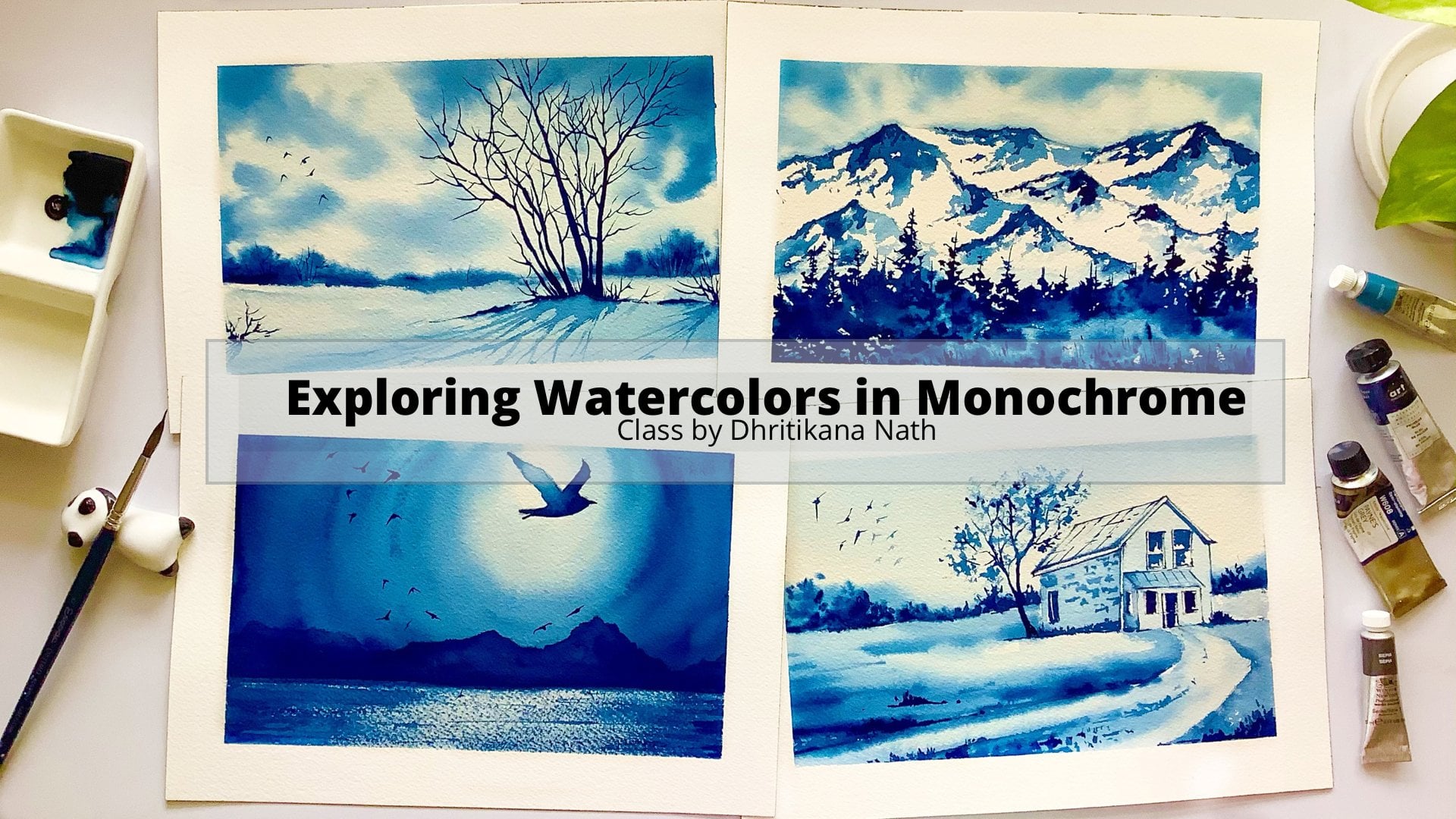
6. Project 1 Light House: Let's talk about
the colors that you need for completing
the painting. It is bright yellow
green, Prussian blue, Paynes gray, yellow,
and burnt Sienna. This is going to be our first
project and I would like to tell you one thing that we are going to paint one of the most, I would say wanted
topics of every year. It's about painting night
sky and then lights. I hope all of you are equally
excited the way I am. Along with it, we have to first understand how to draw
our horizon line. Now, there is a very
simple rule which I follow and it is
the rule of thoughts. I never placed my horizon
line in the middle. I always try to place it either a bit towards the top or a
bit towards the bottom area. Now, placing your horizon line just in the middle might give you a very different
look into your painting. But yes, there are specific paintings where
we even do those things. But putting this rule
together would really help you to ease through any of your landscape
projects pretty easily. I'm making a very
crooked line, Why? Because it is a mountain. Mountain look, which
we want to give. Of course, they are not
actually mountains, they're close to being hills. You can say small little hills. Then there's a
lighthouse by the ocean. There a lot of places where
you have this line mountains as plus your water
area of a close by. I have seen talent where I get this a look as well as
I have gone to marshes, so where I have even
seen these things. Yeah, I must say there
are various areas. There are various
places on this earth which has this combination. This was specifically
from my mind that I wanted to paint something
that has all of this in it. That's where the
whole of the idea generated and I could figure out a photo on Pinterest and from
Pinterest and from my idea, we could figure out this
Northern Lights painting. Yeah, you might see many
photographs on Pinterest, but I usually don't
exactly copy those ideas. I like to put
something of my own before I go ahead
and paint them, as they are mostly
copyrighted and we don't want to get into
the issue of copyrights. That's always a problem. Okay, let's make a
small lighthouse. This lighthouse is
pretty small compared to what you would like to see
usually on a sea side. We're absorbing it
from a distance. That's the reason of the same. Once you are done
with the lighthouse, just add a small window. Even on the bottom side add your windows
wherever possible. Once done, we are going
to mask this out. Now, why are we going
to mask this out? As we do not want our colors
from the sky to get into it. We would be working with more brown and burnt
sienna shades as well as there is a possibility that because we will have
the yellow of the sky, then your burnt sienna, it might give us
some muddy look, or as even from the view from the sky will make
it look more like a Van **** brown rather than the burnt
sienna which we want. Yes, going forward, I must say that this is the only reason I would
like to mask this area. You can either use a masking
fluid or you can use a masking tape like I am
doing to tape down this area. Very simple process. Once you are done with that, go ahead and just
add some water on the entire art of
the paper or on the entire area of the
paper that you are using, then go with the lightest value. This is the bright yellow green. I love to play with water, that's one of the reasons I
wanted to show you the shift that I have made going from
wet-on-wet to wet on dry. This was one of the
perfect class where I did feel that it can really
help you guys to achieve or who are wanting
to achieve something in wet-on-dry and now struggling because they have always
worked mostly wet on wet. Yes, those are the
reasons or those are the major factors behind me teaching this
particular class and actually telling you
how to walk through wet on dry even if you have paper
which is less than 300gsm. Because on wet-on-dry, you can really work on
even lesser gsm paper, which is a 100 percent cotton. That's absolutely fine to
work around with those. Yes, all of this put together, I think it is going to be a great opportunity for you all. Now, let's just understand the how I'm applying this blue. My bluest Prussian blue, I love to add this color. The yellow, that is a
bright yellow green. It is from Sennelier. Then I'm adding
some Payne's gray. Now this Payne's gray is
from Mijello Mission Gold. That's one of the reasons
that it doesn't move much and I don't want even a lot
of movement for this one, so let it be as it is. It is easier to paint
the sky that way. Now the sky will take
a lot of time, guys. I can tell you that
because I have gone through it to get
that perfect length, to get that perfect color. It just takes a lot out of you. That's one of the
reasons I would like you guys to be patient
over here and as well as try to just have a good paper if
you are working wet-on-wet. I have been stressing
on this for quite some time to all my
other classes that I've taken. I stress upon the fact that
we should use good paper, rough grain or cold
press doesn't matter. You should have a 100
percent cotton paper. That's what matters the most. I like to go with
less grain paper. That's the one which
I'm using right now. As well as this paper, I have cut out the sides as I wanted something
more which looks like a postcard and which
I can send over to my friends on their birthdays or on their special occasions. I'll just take as a travel wire. I think those are the things which you can
look forward to in case you are going ahead and seeing something
like Northern Lights. This class is going to
really, really help you. I'm using more of bigger
brushes, in this case, Size 8, silver
black velvet brush. I'm using it to blend my colors. You can use anything else
to even work this out. Now it's not a very difficult
way to work it out. I must say, it's going to be really easy and fun
exercise for all of us. Why you are going ahead
and doing this painting? I would love to tell you
one important aspect of watercolors and one
important aspect that I follow with
Northern Lights, I add lots of water. Along with lots of water, there's less of pigments. I love to play with water when it is about painting
Northern Lights. There are so many of
you who have asked me how do I get that beautiful
blend of the sky. The more and more water I apply, the better blend I get and
those smoother other effects. How to smoothen
up more and more, I must say, add water, and then only add your colors. The better you think
about adding the colors. Just think that, okay, how can I do it in a better way? Add water then add color, add water, add colors. I can say that's the best way because none of the papers can stay wet for 30 minutes. It's something that is very, very difficult to achieve. Yes, if you are ready to put some amount of
water here and there, and then again blend it. Those are the
things that I do to achieve this beautiful blend. Many of you might
even think that I am going a bit
overboard with it, but believe me, once you
get the final output, you will seriously understand that there is nothing
like overboard. You will see how
this water floats on my page and how all of this
painting comes together. Seriously, the smoother or the softer edges which
are always have, there is nothing
called a soft edge. But the softer colors, and the beautiful
outcome that you can get with
wet-on-wet technique. I can say those
effects you usually can't see when you are
working wet-on-dry. But there are other
things that you can always achieved through
wet-on-dry technique, like painting mountains or
painting any other cityscape, painting any other
urban sketching. Those are the areas where you
can work more wet-on-dry. I think there is always
this transition that is important for an artist to understand both of
these together. If you are working
well with wet on wet, it's always good to even try something in wet on dry
because that wet on dry would really give you
an outcome of how you can achieve even difficult aspects that you might have
always tried to avoid. Just think in a different
direction and think how you can achieve those things which
you have never tried. It's more about
challenging yourself. It's more about how to
achieve different effects, different textures,
different blending. All of this put
together in watercolor. Each and every day is always
a challenge in watercolor, it's never going
to be very simple. It's not going to be very easy. Believe me, the whole
of the painting of the sky took about 15
minutes of time at least. It is difficult to keep the paper wet for such
a long period of time. When I applied water, I did apply it two times
so that it becomes easier for me to paint when I
am adding my colors. In few of the areas wherever I think
there is more of blue and less of bright yellow
green that I've added earlier, I would go ahead
and add it again. There are things that I do on iterative or
repetitive basis. That's absolutely fine. There will be a few things
which you will miss out and there will be a few
things which you will not. Always go with the flow. There is something that
I've learned about watercolor is going
with the flow. Every time you will get
something or the other, which is different
only if you go with the flow only if you
partner with this medium. Let watercolors guide you, than you guiding watercolors. I'm cleaning the edges. Cleaning of edges is always
very important process. If you do not do this, there will be backgrounds. Now, what do you
mean by background? Water will flow into
your paper again. Because of that, you might
get some cauliflower effect, which we really don't want. In this painting we want very
smooth and beautiful blend. That's what is required. Let's go ahead and
just have a look at it once it is dry and just keep painting
along with me. Hold on. This is going to be another
level experience. Believe me. You will find something that is really amazing through
this painting. You can seriously
create wonders. You will understand how easily and how beautifully
something can work for you. I'm adding some more of my Prussian blue along with
a bit of Payne's gray. If you see it is a bit darker in combination when you
have a look at it. Yes. Now you can
have a closer look. I did show you how my paper is looking now and
still it is wet, you see. That's the beauty of
using Arches paper. I guess I have figured
that this is one of the most beautiful papers
that I've worked till now. I don't have any
complaints from it. There has been so
many times where I have loved working this
paper more and more. Every time I paint on it, more every time I
do understand that this is something that is really amazing and I don't know the quality of delivery
is so good that you can keep it wet for such
long period of time that you get so much of the time for your paintings and how you can go well with the
wet on wet technique. But for the wet on dry, you always do not
need this paper. I can tell you that
because I would be teaching you each and everything about painting with wet on
wet as well as on wet on dry. Wet on dry, if you have even 185 GSM Arches paper
that's good enough. We will need quick drying and this takes quite
a lot of time to dry. If you are going
out and painting in the open area or somewhere you
are doing urban sketching. I would say wet on dry is a
very good method to go ahead with as it would be very
quick to walk around, as well as turning your
photos or turning what you see into your painting would be a real quick and
easy process that way. Once we are done, we would just have a final look at it and then go ahead and
start painting our hills. I will show you exactly
how I make my mistakes. Why as I am trying
to just stop with some color to have an effect? Yes, I did not like it
so I'm blending it. This is how you will
do your mistakes. Why I show always the mistakes
that I do on my painting, because it can really
give you an understanding that all the paintings which
we do are never perfect. There is lot of to and fro that goes behind
each of the paintings. Most of the paintings are
done twice, at least, before we go ahead and
put it up for you guys. Yes, it's not that the
instructors are perfect or that you get the perfect
outcome in the first go. There is a lot of to
and fro and there is lot of paintings that are there. There is lot of
practice which happens. All of it put together it takes a lot of while you see
the perfect picture. Yes, there is a lot and
lots of work that goes behind each and every class and each and every painting that
you'll solve in a class. Before I teach
something to you guys, I do make sure that it is
being understood thoroughly. This is a very sensitive
and important topic for watercolor artist. But even for people who are really advanced
in their journey, I must say that there are
a few aspects which we do understand as and when
we keep painting. Now, why I say this? Because from my
personal experience, I have understood this, that you can't understand
everything in one go. There is a lot of work that
goes behind all of it. Yes, put together, let's just see how we can
make this thing work. There will be a few aspects which you might not
like in a painting. I might not like this guy fully, but once all of the
painting is done, it should be appealing to
the eyes of the spectator. That's the most
important while watching your painting and how
it is coming together. I'm using my Size 2 brush to add this dark Payne's gray color. I love to add Payne's gray. I do not like to add Ivory
black most of the time. It is how I work around with, but you can take neutral tint or else so you can even go
ahead with Ivory black, whatever is available
on your palette. Something that I have understood over the years is
you do not need to have the same colors that your instructor has
in their palette. You can have a few
here and there, and you might love to
purchase one or two, seeing what they have painted, but always try to use
whatever is available. I am now using my blending
brush to blend the colors. You can go ahead with
Size 8 brush or else you can also use any
smaller size brush to blend your colors so that it looks a very real image in
water as there will be soft image of your lighthouse as well as of this hill
in the water area. We need to achieve that. How we achieve it is
the most amazing part. Going ahead and adding some
more blending techniques. Now blending is always
very soft for me as it is wet on wet and I would
love to keep it that way. Whenever I am going ahead and
adding any darker values, I will make sure that
I blend it again with my blending brush to make
it look more realistic, to make it look more appealing. Using my size six
color brush to make these small lines as
you also doing it now? These are, I would say, the details that I love to
add for all my paintings. It makes it look more
original and more real. Though, we are not here to
create realistic paintings. I always say this for any
kind of watercolor artwork, we are just trying to portray what you see
or what you observe. It is in your own language, it is in your own words. How you get these words, how you learn these words
is that I'm here for. But it would be your own voice, it would be your own words. It might take a while
for you, but believe me, as you practice more
and more watercolors, you will understand it better. I did apply some amount of my clean water onto the surface and then I'm
adding this burnt sienna. Now, this burnt sienna is from my Dan Daniel Smith brand. Though you can use any
other brand of your choice, but I really loved this brand for creating this burnt
sienna light color. It gives this golden
glow fit in it. I've tried so many
burnt siennas, but this one I really like along with the Winsor
& Newton burnt sienna, which has a beautiful
red underneath color. Those are aspects small, small things that I really
like about these brands, and I would like you
to also try them. If you are thinking about
to buying burnt sienna, try this color, you will fall in love with it. I'm going ahead and
adding some stars. Stars are for the sky. Now, for this guy, I do not want to get overboard
or do not want to go overboard with more
and more stars, just taking my thin brush to add the stars with some bike
wash. For bigger stars, you can take a more
runny watery mix onto your brush
and then apply it. You will get those bigger and thicker stars that you need. I love to clear out
my piece of it. While I work here, you might see me
always cleaning up, but that's how I am and I
love to do it very often. Removing the part
that we applied for masking this section of our tower as well as you
can say Light House. Yes, that's it. Then applying some amount of our
burnt sienna for it. Once you keep applying
the burnt sienna, you can change the color of it. Why I say this, do not apply flat colors, flat colors do not
show the view and tier that usually a
building goes through. I have many more urban sketches which are done and everywhere I have mixed a lot of colors. You can find all of that on my social media handle and you can see how I mix my colors. I'm adding some amount of my paints grade that I did
use for this painting. I love to use the colors that's already available
on my palette. You do not need to
always pick up a color. Yes, use that and be very particular about using
that particular color. Color and pigments do
not make a painting, believe me, guys, it
doesn't make a painting. It is all your thought process. It's called the painting
and voice that you have which makes this
painting come to life. Really, that's what I have understood through all
these years of painting, and I do understand that you can really understand this medium once you start falling in
love with this medium. The more you love this medium, the more it is going
to give you back. I didn't make some of my Payne's Grey into
the burnt sienna that I already had
available on my palette, and it looks more like
a Van **** brown, or else even see yellow
lighter version of sepia. And then you can see how the whole soft look of this
tower is coming together. Every time I teach
urban sketching, I have this thing
in mind that may need to have the soft effect. More precise or detailed
effects I like to add only either with my pen
or with my liner brush. I do not like to add Connie burnt sienna
or with the colors. I do not try to add the
[inaudible] thicker paints and make it look more original or make it looked
like urban sketching. That's one part which
I follow a lot. This soft loop, that's one
of the reasons I added the smaller part of any building that you can
add for this painting. Once you are done with it, just add some amount of
your quinacridone gold. Quinacridone gold is
of very amazing color. It has got that
yellow tint on it. Again, this color is
from Daniel Smith. You cannot try out this color. The smaller tubes always
go ahead and try out. Then if you like the color or if you fall in love with the color, then only purchase
the bigger ones. That's for some details
on the Light House. If you see, I have added
a darker value first. Once I've added this taco value, I would go ahead with some burnt sienna
and then blend it. The blending is going to
be a very simple process. Just add to let
your college flow to everything wet on wet. Then use your tennis brush
that assigns to scatter brush, which I'm using to just
clear out this space. Once you have your
outer space, again, non pick up some
doctor value and then add one small window, which we did even during
our drawing session. I'm adding it back into my
painting and then I'm losing my paint to make
some more details. The whole of the painting
has already dried up. Then only I am taking the
step to add these small, small details with the
help of my gelly roll pen. It's a very simple ordinary pen that you'll get in the market. Now it is water-soluble, that's one of the reasons
I'm using it later on. You can use more
specific go job ends, so whatever is available to you, there is no best way
I can say you can understand how to create
these small details. Just don't make a
whole line everywhere. That's all I can see it break and add it in few of the areas. That's what I have understood
from my experience. We do not need to detail everything possible
in a painting, only a few details
here and there can practically help you understand that this painting has
come to life already. Once we have added this pen
on creating the details, so I would go and even added
a bit on the top carrier. Then just remove the
deep at an angle. Whole of the
painting IS auditor. Have a final look at it and I am pretty sure you would be
super proud of yourself. I'll have to write what I
did in this session today. Adding the name as Light
House and Northern lights. That's all. Meet you
in the next lesson.
7. Project 2 Evening Light: It's going to be one of the most interesting paintings as we are going to have more of
contrasting colors in this. It is naples yellow, permanent yellow
deep, white gouache, phthalo blue or ultramarine, indigo or payne's gray, prussian blue you can
keep as optional. You can use any other blue
that is available with you. I have always gone with whatever is
available on the palette. This is our second painting, and many of you might think
that this looks smaller. You might need lesser
time to paint this one. Of course, that's the truth. But this is a bit difficult compared to the
one that we already did as we would be painting
the ripples on the water and I know it's not a very, very easy task to paint water. I have already two classes, painting water and
then painting ocean. You can always go ahead and check out the class
on Skillshare. It is by the name of watercolor ocean waves 1 and or watercolor
ocean waves 2.0. These are the two classes
that I have about watercolor ocean waves and
about waterscape itself. I have watercolor waterscape. You can always go ahead
and check that out. Overall I have three classes and all of these are
pretty detailed. You can have beautiful projects once you take this class and
you will understand a lot. Okay, while I was drawing, I think that you have
already followed me. It's a very simple process. We would be drawing
a horizon line. It is a bit lower than half of the paper which you
have already taken. I have cut the size
of around like, you can take our A5
size or a bit bigger. I would like to take it a bit bigger than A5 size
that I am using, but you can go ahead, feel free to use any size. It's just that the size looks
good for demonstration and I was so happy to have the final outcome on
the size of a paper. It's as per my choice that I've selected the paper
size and everything, but you can go ahead with
whatever is available as well as what you think
works best for you. Going ahead and adding
a few mountains. Once I have added the mountains, I would just wet the paper. You see how much time
I usually spend while I do this wetting
part altogether okay? Then we would go ahead with something like naples
yellow or else you can also use some amount of your chrome orange or
else gamboge orange, whatever is available with you. There is no particular name
that I would go ahead with. You can use winsor
orange or any orange, you can even mix red and yellow to get this
kind of an orange. Mix it with some amount
of peach or else, mix it with some amount of your naples yellow
light and you will get a color that is the
one you saw on the paper. Then take some amount
of your ultramarine though I'm not very happy with the ultramarine
that I've got, so I am adding some amount of my indigo to wet the top part of the sky as this one I want in the yellow
and blue combination, which has been my
favorite irritate. I have taken so many classes where there is a
quick demonstration of how you can get
this yellow as well as this blue without
getting the greens. That's the beauty of painting it with naples yellow or else
painting it with peach. I think that's great, every time we are
learning something new, but it's not bad to sometimes repeat what
we have already learned. Whosoever is joining
new in this class, I think this is one of the best subjects
that you can explore. It's one of my own favorite
subjects, some waters. Painting waters is
not only therapeutic, it's meditative I must say. You see how slowly I am
adding the brush marks and it is loaded with
pigment so you can see that, how I am slowly and
easily blending it. Everything in watercolor is about keeping patients and not rushing through the process. This is known as one of
the toughest mediums, but I feel this is one of the most beautiful medium that I have come
across till date. I know many of you wash
and end up acrylics. There is always a room
to come back and there is no mistakes that you
make in those paintings. But seriously, when
you are making mistakes and you get those random effects
in your watercolors. I think that is
beyond love that you can think about getting
from a particular medium. Adding and mixing some amount of my orange into this orange. Another option of orange
is permanent yellow deep. It is something closer to
yellow and orange mix and it gives a beautiful color when
you apply it on the paper. But do make sure that
you're leaving some gap between this
ultramarine as well as your yellow that you have
applied so that you can get this beautiful blend of not having any green
on your painting. Once you have applied the color, this is what I must tell you
how I make my mistakes and because I'm using
Arches paper 300 GSM, even if I make mistakes, I can apply some amount of water and then just
get away with it. You don't need to do this. Just see how I am making
my mistake and still, I get away with it by
applying some amount of my water and then using
a tissue to lift it up. Applying some orange again. Now this orange is either permanent yellow deep or else the orange that
I was talking about, winsor orange, or any other
orange that is available. Once you have applied it, make a mix of your ultramarine, as well as your indigo, and then you can apply
it on the paper. On the wet surface, you have to take a
real thick mix or you can say more pigmented
color of indigo, and then apply it on the paper. Once you apply this
pigmented color and make smaller strokes, you would understand that these ripples are
already formed. It's something that I have
always loved to create and this only happens when
you have a wet surface. You should not have a
lot of water on it, nor you should have really
less amount of water on it. Overall, it should
be a combination of having the optimum amount of
water to create the ripples. In few of the places, I love joining these ripples, and few of the places I
like to keep it simple. Just a small line and that
would give the impression of getting the perfect ripple which we need for this painting. Overall, you can see that I
am joining in few places and I am keeping it shorter in few places with no
joints I must say. If you are not satisfied with any indigo which you
have already painted, I would ask you to just add some water and lift
out the colors. Lifting out is one
of the aspects in watercolors which
is my own favorite. Lifting out gives us so much more possibility
in watercolors. There is so much
more that we can do. There are so many
mistakes that we can make and still be fine with it. That's one thing which I have
understood from this medium that if you are working with
any kind of good paper, then you can practically do a lot of things
in watercolor. Whereas if you are not working with that great paper, then it might be
difficult to an extent. So I have been
always pretty much telling you to use a 100
percent cotton, 300 GSM paper. That's because of the reason
that I want you guys to understand that all of the papers can't
take heavy washes. All the papers are not great
for lifting exercises, so everything put together, it takes a while to understand
which paper you should use, how you should walk
around with it, as well as what is
most suitable for you for art particular style. As I say, in the process, you will get a
voice of your own. You will understand
watercolors in a better way. You will understand how
you want to work with this medium and how easily you can paint
with this medium. So you will be really
comfortable with this medium and that's
what is required. Once I have added the repulse, you will understand that
while I go towards the top, there is only smaller
ripples that I add and fewer compared to the ones
that we have done already. Once that is done, we have to add the mountains. Now, mountains, I'm going
absolutely wet-on-dry. Here is the introduction of
your wet-on-dry and slowly, steadily you will understand
more about this technique. We will work with the more
white of the mountains. Now that is not exactly
white, I must say. It has some amount of yellow which we have already applied. That yellow would reflect as it is snow and there
will be ridges, there will be rocks, there will be everything
that's there for a mountain. Those are all things
we need to show. That's what is most important. Overall, I must say
that this is one of the paintings where
I was super happy. As there is so much to learn, we are moving from the
wet-on-wet medium to wet-on-dry. There is water, there is
ripples, there is mountains, as well as there is a
beautiful night sky which has a small amp moon. It's a moonlight
that you will see. You practically do everything
that a landscape requires, sky, land, and water. That's what a landscape
is made up of. Yes, you put together
everything in a painting and I think that should make you
super proud of yourself. You are attempting something
that is not very easy. Yet you are moving from
wet-on-wet to wet-on-dry. There are many people
who love to use wet-on-dry and may not have less knowledge
about wet-on-wet. This class is practically
suitable for everyone. If you are not just who loves
to work with wet-on-dry, you can always go ahead and
try out this wet-on-wet. Every single person or
every single artist who has a particular style might be moving between different
types of techniques. That's what is most important. Techniques is what
you should learn. Later on, I think
each one of you can build on to your own style. Now, finding your
style, of course, might be a bit difficult
initially, but believe me, as you progress in your journey, you will understand what is your style and how you
can change your style. There will be lot of
changes that would come in your style
and slowly, steadily, you will get to understand more about this medium
and this medium will become more and
more rewarding for you in your own particular way. Yes, I guess that's what
I wanted to tell you and let's continue
painting our mountains. You see how slow I
go with my painting, I go with more watery mix initially and then
as we progress, I would add more
darker values in it. One aspect of watercolors, when you are doing wet-on-dry
is go with less amount of pigments because there's always a chance to come back
to darker pigments later on. That's the golden rule
which I have always followed throughout most
of my paintings till date. I'm using my size 2 scatter
brush to paint this. I am now making a small border while I come towards the bottom. I think one of this
looks better and slowly, steadily, you can see the whole perspective
is coming together, the whole painting
is building up. Most of the things
we are done with. There is only five, six minutes of this painting, which is left and practically
you will be super amazed to see that you
are done with the sky, you are done with the water and the only thing that is
left is your mountains. Even in a busy day
where you are juggling between your job and this
might be your side hustle, I would say that taking out about 15 minutes to half an
hour is not really difficult. It is for your own passion, it is for your own self. It helps to meditate, it helps to motivate you. It helps to keep you going. It's like a stress
buster for all of us who are artists typing. For me it's been
really empowering. Every day I think about a
new subject to paint and every day I think how short or how less amount of
time I get gift to particular painting
and still be in a position to create
something beautiful. Now, that's the idea. As we progress in our
journey initially, you might take a lot of time to create a painting, but slowly, steadily as you progress in
your watercolor journey, you will understand that you can take lesser amount of time to create something more beautiful. You don't always need to
actually invest a lot of time into your
paintings or a lot of time into your watercolors. There are a lot of other things that you can think
about while you do, but it all comes with practice. It all comes with experience. I have years of experience and that's part of the reasons
I can suggest you this. Believe me guys. If you love this medium, that medium is going
to love you back like anything and you will get so much more in
terms of satisfaction. Why I say satisfaction? Initially, you
might not be happy with many of your
attempts, but slowly, steadily as you progress
on this journey and with such
amount of guidance, you can really create magic. You can really be one of the most amazing painters as
you will be in a position to showcase your talent, showcase what you have
to anyone and everyone. Once this part is done, I did blend my colors a bit
because I wanted to show the reflection of these
mountains into the water area. Every time I do not paint the mountains
exactly the way it is as there is ripples in the water and we will
not be doing that. Just a bit of I must
see some amount of darker value into
the water body can really help and just blending
exercises, good to go. Once this part is done, I would allow my paper to dry off and just make a small moon, as I did tell you
all you earlier. Now, moon can be round
moon can be C-shaped, moon can be of any
shape of your choice. I am making it really
small and simple. You can make it bigger, you can make it smaller. I would leave that
decision up to you. But for this painting, I think our major
focus is not the moon, it's majorly the landscape that we create and it's
majorly the mountains and moving from your
wet-on-wet to wet-on-dry technique is what I understand. So blending a bit
more here and there. Once this part is dry, I will just add small lines with the help
of my size 6 scatter brush. Now, this is called an
optimal brush and I have been asked a lot of
times, what is the brush? How you have this beautiful tip? Guess I have two of
these brushes one is size 6 and one is size 12. I have been using
the size 6 brush for over two years now, I guess. I am most satisfied, I must say with this brush. Once you have added
these smaller lines, peel off your tape and then
have a look at your painting. I'm pretty sure about it. You would be super
happy and super amazed. You can even use these as your holiday cards or
as your postcards. You want to send it
over to your friends. You want to gift it to anyone. Everything can be
done with the help of these small paintings that
you can make and then gifted. There are times when there
are backgrounds or there are lines like these which
happened on a painting, I usually wet that area and then lift it up for the
help of my tissue. There is so much of lifting
that we did in this painting. I have not done so much in any other painting till date but every time it's
an experience. It's not that we do not come across these mistakes or
we don't make mistakes. All of us do make our own mistakes and there
will be a way by which you can always get through it and get a beautiful
final outcome. Once you see that there
is a step in the water that we can fairly observe
near the mountains, I feel that the whole of the
painting has come together. There is step, there is ripples, there is water, there is
sky, and beautiful moon. We just need to write a
bit about the moonlight, which we have a witnessed
and mounted it. All of these paintings
are done in February and March because that's when
I was shooting the class. You can date it as
per the present date. I will meet you in
the next lesson.
8. Project 3 Wooden Pathway: Colors are brilliant
pink, lavender, bright violet, indigo
or Payne's gray; you can keep for the mountains. Prussian blue is optional,
you can keep it. Crimson, burnt sienna,
and quinacridone yellow. These are the colors
which we will need and we can mix some
amount of our indigo into the burnt sienna to get
the darker values of the brown along with it people,
like Charlie Robin. Let's take out our
postcard and this time, it's majorly painting
on your postcards. This can be used as
holiday season postcard, or else you can even use it for doing your daily exercise, painting anything that you want. I'm taping down my paper and we would be doing
a wooded pathway. It is a combination of
wet-on-wet and wet-on-dry. You must have all the more of
wet-on-wet first painting. We are moving from wet-on-wet to wet-on-dry
where we will be exploring wet-on-dry in more
details as we progress. Before we go ahead
with that one, let's understand how to
tape down our papers. Yeah, it's a very
important first step for any painting, so just tape down
your paper well so that there are no gaps and water can't get in
at any point in time. Once you have taped
down your paper, you need to understand where exactly you would be
placing your horizon line. Placing your horizon line is an important concept
in watercolors. I have been stressing on it for quite some time and I would like to always say that never place your horizon line in the
middle of the paper. Always try to place
at either a bit below the middle or
above than the middle, that's how the rule of
one-thirds usually work. Now, what do you
mean by one third? Usually you divide your
paper into three halves, either it be horizontally, either it'd be vertically
and accordingly, you usually place
your horizon line. You can even place your
objects as per that. These are a few
rules of perspective that I love to follow
while I paint. I have already placed
my horizon line, it's a bit towards the top area. Then I made the middle line. Once I have painted or I have added this middle line
with my graphite pencil, I would go ahead and start joining it from the bottom area. It's a very easy
and simple process. Always try to have the same size on left as
well as on the right. I usually do it with
the help of my pencil. Pencil is always a great
idea to check that all the lines that you are
making can go straight. Use your pencil to just see how much you have left on
the right and on the left. I have been using my
pencil to actually do all of these process
for quite some time and it has some practically
turned out so well. Though I do encourage
anybody not to use your scale for
painting any of these. But if you are not
very comfortable with using your
scale or you want to move from using your scale to your pencil for getting
an idea about how much you should use in terms of the space and how
much you should leave, how much you should be using
for your painting area, I think pencil can really
help to mark ball of that. We'll get erasing at
any point in time where you feel you
are not comfortable, so erasers are always for that. Just free to use it
at any point in time. I'm adding some lines now for the fencing of this wooden
pathway on the water. This is the only time
where you can see that we are going a bit in terms of the perspective from
the more bottom area, which is larger than size, to more smaller as you go
towards the horizon line. That's how a perspective looks. Whatever is closer to your eyes is bigger in size
whereas when you go towards the horizon or whatever it goes
out of your site, which is far away, is smaller. It's basic rule of thumb and I think if you keep
this point in mind, you can even nail any of
your other paintings. Once this area is done, you have to start
with your painting. Before I go ahead and paint, I have this simple rule of
masking this wooden pathway. Now, masking this wooden
pathway is really important as I do not want any of the water to get into this pathway and hence, I'm using my masking tape to
practically mask this area. I have used it even in my
northern lights to mask my small area of the tower or the lighthouse
which shouldn't paint. Similarly in the same way, I would be masking this
wooden pathway even. Again, a basic step and
it is a simple step, as I always say. Try using each and
every resource that is available with you that would really leave
you with a lot of help when you are painting. Every time you don't need
to use your masking fluid, try to use your masking tape. It is a great way to
explore watercolors. Masking tape can
really help you to work around with
anything of your choice. Now let's paint the sky. I am so happy with this enchanted and
beautiful sky that came up. It is the brilliant things that we would be using
and the lavender color. Now this brilliant pink again is from Mijello Mission Gold, you can have this color. There is an adult
coral color from one of your White Nights corals. You can even use a bit of
white with your pink to get the shape and then we would be using
the lavender color. Both of them are a
bit opaque in nature, so yes, you would need a bit of pink or a bit of
purple to blend it well. I think the pink is good for the brilliant
pink that I have, so I am blending it with
the lavender for the sky, going wet-on-dry right
now if you all saw. As I wanted darker
values for my sky, hence I'm going ahead
with this shade. I guess the blending is becoming better and better as we
are using a flat brush. Now, flat brushes are always great when you have
to do blending, but there might be
some marks or lines, so keep blending it till you are happy with
the final outcome. Now let's add some more
darker value of our purple. You can use a bright palette, you can use purple, whatever is available with
you for the top area. Once you are done with the
top area we will move towards the bottom and just add some water to blend it
well with the bottom area, or else even use a bit of
brilliant pink to blend it. If you see, the blending
looks way more well now and it is so much better. There is no space that
I can practically see. Adding some more pink
towards the bottom area. Once I have added
this brilliant pink, I would go more
towards the bottom and add some amount of my
lavender and purple. As I have told you, use your water to the
greatest possible way. Watercolors is more to work with water rather than
working with pigments, and that's been the rule
for quite some time. If you get the simple rule
of working with water, you can practically nail
any of your paintings. Going ahead and adding
some more lavender. Once you have added
this lavender, just add some more of your bright violet
and make it more and more brilliant and vibe into the bottom area with this
beautiful purple that I have. You can use any other
purple that is available on your palate and
get this color. These are a few basic colors, it's just that you might have to prepare this brilliant pink and the lavender by adding some amount of your
titanium white. Now titanium white
is a bit opaque in nature compared to
your Chinese white. Chinese white is not
opaque in nature, it's more transparent. I think that's the
only gap which I see. Adding some more of my bright
violet towards the top. You need to make sure that your paper is wet while
you add this layer. We are not going
ahead and adding this layer while our
paper has dried off. I will get those
dark bad bad patches and I really don't want that. Whenever you are working
with your colors, do make sure that
it is still wet. I am using Arches paper, so it gives me a
lot of time to work around and get the best blend. But in case you are
using any other paper, you will still get
a lot of time to work around if you are
working wet-on-wet. In case you are
working wet-on-dry, you have to work more quickly as wet-on-dry gives you
less amount of time to work on the paper and it's important to move around at that point in time very quickly. I'm using quinacridone gold and burnt sienna for
making this spot with. Quinacridone gold is a very beautiful
yellow-brown mixed color and I have been using
this very often whenever I have to
paint in a pathway. It gives me so much of beauty
while I add this color. You can see how
brilliantly the yellow is spreading and then blending
it with my burnt sienna. Both of these color are
from Daniel Smith brand, but that's not what you
have to follow obvious. It's just for your
reference that I am adding the brand
colors which I am using. The rest, whatever is
available with you, you should be good
to go with that. That's one aspect of watercolors
which you can follow. Whatever is available on
your palette, go with it. If you are final that
you want to pursue with these watercolors as a carrier or as one of the most important I would say hobbies in your particular
day-to-day routine, then only invest on everything that is your
colors, your brushes, paper. I would say paper, yes. Certainly, you might have
two because we want 300 GSM, a 100 percent cotton paper for doing any
of your painting, but the rest for all the others you can wait and
still will invest. Do not rush while you invest. That's very, very important. One thing that you might
have seen when I added the lavender into my pathway, it gave me a bit of muddy
color which I slowly removed by adding
some burnt sienna. That's how you have to
deal with your colors. Sometimes don't add
a lot of colors, or else it would be
difficult for you to just leave it and move along. In some of my CPO, this is towards the bottom area, blending it as it is wet on wet. I have told you we
are trying to use both wet on wet and wet on dry for this
particular big thing, and slowly we will move to more of wet on dry techniques only. That's something which takes some time for anyone to develop. Wet on wet I think
is more easier. It's just that the
control of water is a bit difficult,
but the rest, I guess most of
the areas you can walk around and you will
get a decent outcome. If your paper is 100
percent cotton and then you are following a few steps
which are important. Adding some carmine, that is a bit of red, I really like as my sky is pink and the red would really
look nice on the South. I guess so I'm good to go and I am not adding
any more colors, any further colors,
would practically ruin my wooden pathway. If some amount of darker values you want to add
towards the bottom, you are good to go.
But don't overwork. Overworking in something that
you should always avoid. Let your paper dry off, and then let's start
adding our mountains here. I'm so happy when
I add and paint the mountains in all
wet on dry technique. This is something that
I have learned overtime and I must say that it takes a while to
understand this technique. It doesn't come overnight
and you have to actually make an effort towards learning
each one of them. I think learning is a
constant progress for us all, and we need to keep learning
each and everything. Once I discovered the
new world wet on dry, I really wanted to just show
you all how beautifully our painting can turn up if you aren't using a wet-on-dry
as a technique. I am first adding some light
blue color towards the line, like towards the area, just above the horizon line. This is practically the
light indigo color, with a lot of water,
I'm using it. I'm using my size. It's for the brush to add this. Once this cell dries off, we would add some
amount of snow. How do we add some
amount of snow? We will make a few brushstrokes
to show that snow. I guess we will allow
the wooden pathway also to just become dry
before we work on that. Then blending with the help
of our blending brush, size 8, silver black
velvet brush I have kept. Once the wooden pathway is dry, we would go with our SCADA size 6 brush
to add some lines. Now while we add these lines, we have to make sure that we even blend a bit with
our blending brush. That's something that I
have learned that blending that really help you to get that wet on wet look which you really need for any kind
of a wooden pathway. Few of the areas need to bleed and when few of
these areas bleed, it gives a very, very
different outcome. Practically, you will
fall in love with it. Keep adding more and
more darker drum values of CPM while you go to
watch the bottom area. I'm slowly joining a few parts and some of the parts
I'm even leaving. If you observe I'm using
the tip of my brush. Now, if you do not
have any kind of brush which has
that beautiful tip, go ahead and use
a thinner brush. That would really help you to walk around all of these
things pretty easily. Blended either with
the size 8 brush or else even with the size
too brush as I'm doing, make it bleed in few
of the areas as I was very sure I
want these bleeds. Yes. Something that
I'm really proud of is how to add these bleeds
and these bleeds really shows the wear and tear which happens
on any kind of a wooden pathway if you are using it for a longer
period of time. Blend it, blend it,
blend it wherever it doesn't necessary,
and practically, when you observe the wooden
pathway now you can really see how the whole of the
painting is coming together. I think the wooden blanks
look now more original and it gives me a
sense of satisfaction. Once I am adding this water
to blend a few of the areas, now this blending can
only happen if your paint is still there on the paper
and it has not dried off. That's one of the
reasons I always say to use paper as that is 300 GSM. I have been stressing
more and more on it. At every point in time, use 300 GSM paper, a 100 percent cotton, at least minimum that I
always tell you to 70 GSM. I think that's the bare minimum, which we should always go ahead and use even
as a beginner, we are always dissatisfied that why our painting is not turning out exactly
how we observe, but the only major
reason which I have also a painting not turning out exactly the way we
want is the paper. I think you can still
be with some of the other aspects like
not having the best from the brushes or not having
the best of your colors, you can scroll the
hard all of that. But if you do not
have a good paper, the outcome might
not be similar. That's the only thing which
I wanted to stress on. I have been stressing
on this for long. I think that most of my classes I have stressed
a lot about the paper. Since I do more of heavy washes
and heavy washes really, really needs good paper. But as we move from wet-on-wet, to wet on dry and you can go ahead with a lesser GSM paper, but still, quarter that I
have suggested as to 17 GSM, but it should be at least
100 percent cotton. That's what I would
prefer you using. Adding some of the CPR
and few of the areas, and as we move to towards
the horizon line, you can also from these fences becoming shorter or
smaller in size, adding more and more of these with the help of
size 2 is called a brush. I'm using the tip of
the brush to add it. I have to even add on some more lines to show
the wooden pathway. Going slow is very
important in watercolors. Every time you can't
fight with watercolor, you have to practically
partner with this medium. This medium is something the more and more you
partner with it. I'm going ahead and
adding some more lines. But I have not added any music for this
particular painting, and even not for all the
previous and future paintings, as I want you to select your
own music and paint along. Some of you do like music
while you paint along, and many of you might
not even like it. There are times
when I am painting, I practically don't switch
on any kind of music. I just like to
concentrate and work, as this is my main career
and I'm a full-time artist. I try to concentrate
a lot while I paint. It is individual choice, hence I do not see the utility at any point
in time to add music and then even force you
guys to just listen to it. You can use any of your music of your choice
and paint along with me. While I am towards the top
area or near the horizon, I would go ahead and just
finish off with a darker value. Rest, while I come
towards the bottom, I would use the tip
of my brush and few of the areas and make
it a bit more bolder. I think now the area of my
mountain is already dried up, and going with some
darker bold values. We'll add a lot more intent and it would add a lot more
depth to our painting. Now, depth is
something which I have not told a lot or not
stressed about a lot. But every time we
paint, adding depth, adding values to your
painting is very important. I added a lighter value
just to show the outer, or you can say to just show the part where your
mountain should exist. Once that area is dried up, we need to actually
portray the snow, that is there on top of our
mountains. How do we show it? We would go ahead with some
darker values and add it. While I am towards
the bottom area, I would change the value a bit. Now you can even
keep the same value, but changing the values
would really give you the depth that I
have been talking about. Everywhere you will not
use the same value, that is the darker
indigo which I am using. Now, you can go ahead and use some lighter values
towards the bottom area, and some darker values
towards the top area. We will use some darker value even towards the bottom area, but after a while. You can see now how the whole of this painting
is turning up slowly, and using my water, wherever I think
it is necessary, and then adding my paints. It's easy to go along this way. I must say, according to me, this is something that I really like doing when it is
a wet on dry method. I try to move from wet on wet, to wet on dry, as I am oriented towards
wet on wet method. I feel it is really
easy for beginners to play around with the colors,
understand your colors, but while you are maturing more in your
water-color journey, you must explore wet on dry and wet on dry has
its own magic, as you can observe me
adding so much more depth. Now, I always blend the
bottom area of our mountains. Now that's important, because there will be some reflection on
to the water area. Since it is quite
far away from us, so we can't see the exact full reflection and the water also has a
bit of movement in it. It's not absolutely stagnant. Just a bit of it can really show the reflection of the
mountains into the water. Rest, I guess, I am good. We will use our white pen to add some more highlights onto the water as well as
onto our wooden pathway. Blending a bit with
my blending brush. This is my size eight
silver black velvet brush that I use
absolutely damp. Now damp, I must say that
you can wash your brush and then take all the extra water that's there on the
brush on the tissue, and then start using it. On the paper, that's
absolutely the damp brush, which I have been telling you. Adding some of my flora
or you can say some of the trees towards the bottom
area of the horizon line, and then using the best, I must say, flat brush
to add these small, small lines to show a bit
of movement into the water. It's the night sky and I am splattering some stars for
this beautiful night sky. You can either depict the
night sky or leave it. I would again, leave
that up to you. Either you want to add bigger stars or you
want to leave it there. That's a decision now
which you have to take. But do not get overboard because the whole of the painting
has come together so well, we do not want to get
overboard with our sky, or even with our stars. Only a few elements can always
complete your painting. Do not add a lot of elements
anywhere onto your painting. Adding elements always
confuses people. We are focusing only on our wooden pathway
and the mountains. Adding some of my white
gouache to show the line. You can also use your pen. As I have told you, if you have a Gelly Roll
pen, it's good to go. Use it to your advantage, and then just add some lines exactly the way I am doing
right now on the paper. It's a simple way. I feel these highlights
add so much more value, and so much more beauty, so much more depth. All of this put together, it makes a painting
look so magnificent. That's it, I guess last two, three minutes says something
that I always say, step back, relax, and then only work
on your painting. Do not try to work
a lot right now. It's just a few
details that we are working on and that's it. You will have to use the
tip of your brush or your pen to do these
small, small details. I'm using my black pen. Yes, in few of the areas where
I think it is necessary, black pen comes really handy. This is a very simple
Gelly Roll pen. Now, it is not waterproof
hence I use it at the last. You can use any other pen
that is available with you. I am going ahead with a very, very simple locally
available Gelly Roll pen. It works well on
water-color paper, so why not go ahead
and give it a try. Whatever is available. As I have told you
earlier also that I have a white Uni-ball Gelly Roll pen, which I would be using, if I am not using white gouache, wherever it is necessary. Yes, I am practically so happy, to see everything
come together now. I don't think there
is much need any further to touch upon
or to work upon. Just let your paper dry off, well before you remove the tape. Then only do remove your tape. Always remove your
tape at an angle. Do not go ahead and remove
it very fast or quickly. Adding some more white
for our mountain area, to add just a few
highlights looks good. These are just a few
dots here and there. Let's have a final look now. I think it's very
important to be satisfied, happy with your painting. How it has turned
out is not the idea, always trying to learn
something new is the idea, enjoying the process
is the idea. Whenever I discuss
water-colors with you, I am always so overjoyed. One of the reasons is
that I love painting, I love doing this. So I am so happy, I never think about how this painting is
going to turn out. I just go with the flow. Going with the
flow would really, really help you to
understand this medium well. Adding the date and
then have a final look. Now, now is the time.
9. Project 4 Sunset by the Winter Cabin: The colors for today's
painting is naples yellow, permanent yellow deep, bright violet, indigo
or payne's gray, prussian blue,
which is optional, crimson, burnt
sienna or red brown, white gouache, and this is it that we need from
the color's perspective. Hey guys, we are onto our
fourth painting and it's a bit more challenging
compared to other three or four
paintings which we did. We are first going to
mark our horizon line and then go ahead and
meet the winter cabin. I will make a middle
line and then I would just use
my pencil to mark the left as well as
on the right side to take the distance
which should be equal, and then go ahead and make
the lines on the left, which is the slanting line, as well as a straight line. We will go with another line on top of
this slanting line. Once that is done, then make sure that
you are adding the doors as well as the
window to this winter cabin. As well as when you
extend on the right, you have to make sure that
all the lines can rest to one single point which is
majorly your vanishing point. Now, this is as per the
rule of perspective, a bit of drawing is always an advantage when you are
working with watercolors. I have learned it over time, and I think all of
you can also learn. There is no problem and benefit towards starting
out with watercolors. You can go wet on wet, but as you progress
in your journey, knowing more of drawing and
then thinking would really help you to grow in
this journey and to get a better outcome each and
every time when you paint. Learning is unending and
it doesn't stop anywhere. That's one of the
reasons I always say that keep learning
new tips, tricks, techniques key for learning how to add perspective
to your painting, how to make the painting
more effective. I have added the windows
as well as the door. Once I have added all of these lines and
made all the details, I would extend on the right and make my lines that would
converge to one single point, as I have told you earlier. Once this is done, we will make sure that we
have a very beautiful sky. For the sky, I would be using
really warm shades. Most of my shades are florescent
and newton this time. Now, florescent and Newton
professional grade colors is a bit expensive, so if you have something else, go ahead and use
those colors though I have already told you all
the colors that I've used. But again, the main
idea is to learn and enjoy the process rather than thinking about
what are the colors, what are the paints,
what is the pencil, any of your
instructors are using. Knowing everything is good, but going with the flow, understanding the process
and enjoying journey is most important aspect
in watercolors. You enjoy this medium. I can tell you it's one of the most rewarding medium
set you can think about. I'm adding some mountains
above my horizon line. Do stop anywhere you
think it is so important, just most of the painting is real-time except
applying some water or just some of the other
spots small axial and dead. Its real-time video you
can paint along with me, stop wherever it is necessary. I am not adding
music on purpose, so you can use some music of your choice
and paint along with me. Applying the first scale
of water for the sky. Once I have added the
water on the sky, I would go ahead with
the naples yellow. That's one of my go-to
colors when I am working with the sky area
and getting sunrise, sunset, or any kind of warm sky. This is something that I
really look forward to. Once I have added this color, I would go ahead and
just add some amount of winsor orange or cadmium orange or permanent yellow deep, or whatever orange shade
that is available with you. It is wet on wet, so you must see that you are not adding a
lot of colors and you're using a thinner brush
when you want to add some lighter strokes
as it is wet on wet technique and the
paint will move around the paper altogether if you are going ahead and
adding all the colors. That's the meeting which
you should keep in mind, going ahead and
adding some orange. Once I am done with
this naples yellow. Using my size four
[inaudible] brush, I'm adding some lines. The paper looks a
bit dry already, though it's still in a
working condition and I would keep on adding this color. Let's add smaller lines. I'm trying to make the clouds. This is one of my favorite
clouds from the whole series of the winter painting that we did as well as some
mountains along with it. You can learn how to paint these warm skies in
my other classes too. Most of the classes that I have do has some vibrant
and beautiful skies, so I'm looking forward
to value even there. I have two clouds
classes where you can learn a lot about
painting the clouds. This class is not dedicated to painting
the clouds in part, yes, there's a lot that I did
input from my end while we paint these clouds and try to make this class more
cohesive and inclusive. Adding some more pink in few of the areas so wherever I
think it is necessary. This is the carmine than using. You can use any other pink
that is available with you. There is no requirement of using the same carmine or the same thing that you see
or observe from the papers, something which is closer to what you observe
is good to go. Once you have added
this pink color, go ahead and just add some amount of your
purple on the top area. I will be adding
some darker value of purple and this is measured
with a bright purple. If you observe, I did
allow my paper to dry off as my paper was more and more dry when I was
adding the carmine. Wherever you think that your
paper is getting dried off, just allow it to dry
completely and then add a very light wash of water
exactly the way I am doing. Touching it only on
a few areas and not trying to blend the colors
that you have already applied. Adding some darker purple
values on top of the top area. While we go towards the bottom, I'm not going to touch a lot, while we are towards
the top area, I would allow more of my
bright purple or you can say more of my [inaudible]
to add on the required, I would say, expressive
clouds that I really wanted for this
particular painting. Adding some more
lighter wash off water and then allowing
it to dry off. When I exactly say let
the paper dry off, it's only after you have applied all the
colors that is required. Do not allow your
paper to dry off before you have added
all the required colors. I would be adding some
more carmine as I feel the red that I've added or the pink that I've added to the
sky is not enough, and some more of the
carmine can really do a lot for the sky area. One important aspect
that I want to tell you through this
painting is that I did see the painting
drying off pretty quickly. Why? I don't know, but yes, the area of the sky was
drying off and I had to practically wet it two to three times to get the exact result. Always work wet on wet if you are a firm believer of
having the soft skies, but if you want to
add some hard edges, of course I would bet from you to add it and see for yourself. But for me I wanted to work with wet on wet for
my sky and rest of the areas I actually
made it more of wet on dry. It's something that
is very close to you. You have to understand what
you want to add to your sky, whether it being any values or I should say any
dry or wet on wet, whatever works best for you, you should go ahead and do that. I think the sky looks
really beautiful now, you can see so many
colors popping up whether it be your orange, yellow then your purple red, pink, everything
looks so perfect. It gives me the feel
of an evening sunset. I know you might have taken some time to get through
the whole of the process, but believe me, there
was a challenge even while I was
painting the sky area. I don't know for what reason the paper was drying
up and I had to practically make it more
wet as we went along. But nevertheless,
I guess finally when I see the outcome,
it is amazing. I'm applying some water even on the water body that
we have to paint now. Water body is exactly the
reflection of the sky. It doesn't have any
color of its own. I have been hydrating
this for quite sometime. In case you are new, you will get to understand that water doesn't
have any color, except a few water bodies where there is some red algae or there is any other kind of existence of life
underneath the art. At that point in time, you might feel that the sea or vertical large water body
has some any color rested, will reflect the same color
that you see in the sky. Adding some yellow, then some of your Carmine or any red
that is available with you. Every time that I add
Carmine I feel so happy. This is a very beautiful
color and always available instead of 12 or
smaller sets two, and that's the best part
about this particular color. So it's readily available, it's easy access as
well as you can use it. I'm using my thinnest brush right now to add a
few more strokes. Once I have added these strokes you will
get to understand that how the whole of this
painting is coming together. Painting water, ocean, or any
water body is never easy. So I have already
existing two classes which is watercolor
ocean waves part one, and the next one is
watercolor ocean waves 2.0. It's basically done in
two different parts. While the first part
is more detailed about painting only
watercolor ocean waves, whereas the second part is more detailed about going ahead and working with more
of many triples, waves, etc and it's more with the Carmine version of the
watercolor ocean waves whereas the first one is more with gushing and
roaring the surf. You will get a flavor of
both of it and I think you will be in a position to
improve your water bodies, etc, how to paint all of
them in a better way. Once this part is done just
add these small lines. Now I do add these lines once the whole of the water
body is already dried up. Now, we are moving
from wet-on-wet, to wet on dry because
I being on beginner, I started working with
wet-on-wet way well so it was difficult for me to actually move from wet
on wet to wet on dry. There are always
elements that I add into my painting which is
more of wet on wet. But with time I have
understood that we can actually integrate both of
these watercolor techniques, and once we get a final
outcome it is better than only going ahead with
one single technique. So adding some blue now and
once I've added the blue, I would add it for
painting my mountains. Painting the mountains is the best part of the
snow clouded mountains. I will use the white
of the paper which you will absorb and this white of the paper can actually
help you to show the snow and the beautiful clouded
mountains that you have. Only in a few areas you
would be adding this blue, and once you have added
the blue you will get to understand how easy it is to practically show
or paint mountains. You're not giving any
other background color to these moments and
that's the best part, you don't need to
go over in layers. It is less of work
and a better outcome. Painting the mountains is
one of the favorite parts from this particular painting because you need
very less effort. It's just few touches
of brushes here and there and then the whole
painting comes to life. That's exactly what I said, that you should be
using few strokes, and still you should be in a position to get
the best outcome. Once I have added these small strokes I will move a bit more
towards the left-hand, keep adding more and
more darker values as you absorb me now. Overall I would say that this is one of the
paintings where you have a lot to learn because we are working
with wet on wet, we are working with wet on dry, everything put together
it is something that is a very beautiful choice
that anyone can have. You can learn so many
more techniques, you use the brush in so
many different ways. This is psi stewards called
a brush which I am using, it is a mix of a bit
of purple and blue. You can use any other
color of your choice, you can even use purple. But I like mixing
a bit of blue with a purple it gives me
a better outcome. I feel when you put that on
paper it's just amazing. I would leave one or two
dots here and there, you can even use a very thin liner brush like
this as you observe me, and this is another darker value compared to what we
have used earlier. Going over a few places and adding one or two
lines here and there. Once this is done, an important aspect is to actually add a bit of
reflection into the water. Now how do you add a bit of reflection and make
it more softer? Is something that you
would love to learn. That's one of the most amazing, I think ways of showing
the reflection. Now this is pretty far
off and you cannot actually see the complete
reflection in the water. That's for sure you cannot see and there is lot of movements. That's one of the
reasons we have actually added this
small lines and strokes while you see the
area of the water body. Now once this is done, you can add some small
lump line like this. And how do you add
this small line? Take a darker mix, add the line and then blend
it with your blending brush, that's if you need to do. And you can see that
there is a bit of reflection of the mountains
into the water area. Once this part is done apply
some water on the ground. Now ground is again only the snow that
you have to absorb. Now when it is only snow, you just need to
make a few strokes. It is again wet on wet. We will work wet on wet as well as wet-on-dry
for this part. Go ahead and add some purple, I have not mixed
any blue this time but I would be mixing a bit
of blue here and there. Now you can take indigo or else you can take Prussian blue. You can use any blue that is
available on your palate, you are good to go with it. Go with a bit of darker value, whatever you have even
in non-tone blue is a very good option if
you want to try it out. It's an amazing and
beautiful color. I have been recently using it for many of my clouds
painting and I think the outcome that
I get is something that I am falling in
love with every time. Using my size four escorter
brush to add some strokes. You see how beautifully all these strokes is added? Small lines, that's it. We are not going to add a
lot of lines here and there. Some water and adding
a bit of stroke. Once that part is done then we would go ahead and add
some more darker values. Now again the darker values
are again small lines, a few dots here and there. Everything put
together, you will observe that it will come to something that is up
to your liking and you will fall in love
with it completely. Actually snow is one
of the most beautiful, I would say seasons
that I can see the winters and the
full fun is so much, it's so cozy, you can have that hot cup
of water or hot cup of tea, hot cup of coffee, every time you can
feel the winters, the cold and freezing,
everything put together. I think that it's something
that I am falling in love with and I will keep falling in love with it every season. Going with a bit of darker value and then adding some more lines. Guys just absorb the
stroke and just add it. You don't need to
think about it much. They're very simple
and easy strokes. No complexity over here
and once this is done, I would ask you to take
a permanent brown. This is from Art Philosophy. You can also use red brown if you don't have
this permanent brown. Now red-brown is from
Magellan mission goal, you can add a bit of Carmine into your burnt sienna
and then also use it. So these are the
options that you have, but the same color
that I'm using. In case you don't
have any of this, go with burnt
sienna or any brown that is available
on your palette. Every time, whenever
I am painting, I love to give you options to think what
you can work with. I would add this for the house. Once you have added
it for the house, just wash your brush and then add a bit of lighter value if
you are washing your brush. Or else go ahead and add some
more darker value in few of the ideas and then blend
it with a clean brush. I love to mix my colors. Some of the areas I would add the darker value and some of the areas I would add
the lighter value. I like to add some CPR with the darker brown color or with the permanent
brown that you observe. Now I always like to blend
the different set of colors. I say that because I don't
want to make a flat wash, I love to do a
variegated wash. Now, if you are not aware of what is variegated wash and
what is flat wash, I have taken a class already where you can learn
about these washes too, so go ahead and checkout
the watercolor, waterscape class, it has this particular part where I have to a bit about
variegated washes but nevertheless let's just see variegated
washes majorly where you do two or three
colors blending together making it a wash, whereas a flat wash is only working with
one single color and having an equal distribution of the pigments throughout
the total lab paper, or throughout the total area wherever you are
adding that color. That's the difference
between a variegated wash whereas what you can do for this particular
painting I would say, never go with a flat wash.
A flat wash would look absolutely immature as
an artist to work with. Yes, when you are
starting out that is a good idea but when
you are maturing as an artist and when we are on an advanced level like this I would ask you to just blend your colors with two or
three different shades. Now one can be darker value
of one single color also or else you can have a mixture of two colors like I
am having right now. Adding some more darker
values here and then. Once I have added the
value I would go ahead and just use the darker
value and then blend it with some of
my yellow ocher or else you can also
use Naples yellow. Naples yellow is a
beautiful color, I have been using this
color for my skies. I have been using
these colors for my winter cabins, bonds, anything that I paint
I think this is my go-to color and it is opaque in nature a bit so be very evade how you use the
transparency of this color. Transparency is a very important
aspect in watercolors. If your watercolors
is not transparent enough you might not
get the best outcome. I'm using just a tip of the
brush to add the colors in some places and then
add these long lines to show that the bonds
is made up of wood and wood panels are there so
it makes it look more original and it makes it look
more pretty I would say. Go ahead and add these
lines here and there. Once you have added these lines, it's important to just see that they are not
becoming close. That's very important. Adding some more darker
values in few of the other areas where it
is necessary to show and once this is done we
would go ahead and add some lighter value for
the window and for the door. You will observe how I do it. I might even use just a brush and the water which is
already dirty to do that. But every time I
don't use a lot of pigments and that's the best
part about watercolors, you don't need to
use a lot of colors. It's just the buying of
that initial part of artist great colors
which is expensive and frankly each and every
watercolor might last you six, seven months or a year
depending upon your usage. Most of these colors
for me I buy in cubes and these cubes
last me pretty long, about a year or two
sometimes but I do try to use it once or sometime or else what happens is the binder comes out separately from the pigment
which we do not want. Adding some brushstroke. Yeah, that's what I was saying, that I am not going to
use a lot of color over here just a similar
brushstroke and you can see that this is majorly my door. Once this part is done
go ahead and just outline the roof
a bit and then I would even outline the left
side of the line because there is one more line that
we need to add over there. Making some more lines
for the roof area, once we have added these
lines I would go ahead and just add a bit of blue
with my blending brush. You see how I'm using only a few brushstroke for adding on top
of the roof area. You don't need to
actually go ahead and use or everything that is there. One thing that I've
understood with watercolors is a few
brushstroke is really enough to depict that
you are painting a bond or you're painting
something of your choice, whatever you are doing, yes, so me few brushstroke is
good enough to show it. Adding some more lines and some more structures which are basically showing
those dry plants that you usually often see in the window season as
they are dried off and once the spring is there
the bloom start coming out. All of that we need to just
show here and there a bit. Once that part is done I think most of your
painting is complete. It's more about the detailing
now that you are doing. This is the time to step back, relax and think that you
have practically done a fantastic job at
completing the painting. You only need to just refine it a bit here
and there. That's it. Once this painting is
completely done then you can remove the tape at an angle and
have a final look. That's my own favorite part, to remove the tape, see how the wall of this
painting has turned out, see those beautiful
white edges on the sides and once that is
done it's like something that I have practically loved through the entire
part of the painting. Yes, we should not focus a
lot on the final outcome. I do say that we should not, but you cannot always ignore the fact that
we are going to see how the whole
painting turns up and don't lose your whole
any point in time, all of these paintings
are not very simple. It would take a bit of practice. We are also practicing, you might see me
practicing each and every day and it takes a while
to understand everything. It takes a while to understand even perspective to
understand how to paint snow, it just doesn't come like that. Yes, hold on, be very sure that you can
nail it and one thing that I have realized over my
watercolor journeys you have to think in your
mind that you can do it. Just seeing a photo
or seeing a painting, oh it has become very tough, we will not be in a position
to nail it and all. Practically doesn't
work then your mind is already having an idea
that you will not be in a position to nail this
painting and when you just know even be difficult I
will give my best try, that's what is important. Frankly, I have seen
myself nailing paintings, which are really tough
but still because I have that particular thing in
my mind that I would be in a position to nail
it, I could do it. Frankly and it's not that
we were never beginners, every one of us might have been a beginner at
some point in time and that's what is most
important to think positively, to move on having that mindset
to reach where you want. You have to improve
on these lessons, etc., so yes, keep painting, keep practicing, go with the mindset, go with an approach, have a small plan and try
to practice regularly. That's one important
aspect in watercolors. Please try to paint
even a bit regularly. I have even smaller
classes of 10 minutes, 15 minutes, go ahead, take them, go with
the right paintings, go with the smaller paintings. Just try it and I think you would be in a
position to nail it. A 10 minute exercise is something that you can
always look forward to. Adding some white gouache in few of the areas with my brush. Now these are the details
that I was telling you about. You have to do this at the end, wherever you think
that now it isn't necessary every time we
are not going to do it. You can even need
this if you want to. But I would say go
ahead and try it out. It's an A5 size paper
that I am using, you can go with even bigger
size paper if you want. I would leave that
decision up to you how you work it around, so yes, that's all. Once you are done with this
part just draw a small line. I'm using my Gelly Roll pen and I have also used a black pen where I did add a bit of
detail here and there with it. What I want to since this
part is something that you can avoid or you
might carry on with. You can add these lines or you might not even add these lines. It is not a necessity, so you need to know what is the necessity and what
is not a necessity. Now, if something is not a necessary you might
even avoid it, it's just a bit quantities, it's more sharpness that
you add to the painting. Something that might look
or please your spectators. Overall it's not that this is going to make or
break your painting. Now earlier whatever we did was important to us
but here it's not the most important
aspect so go with the flow to add whatever you
think you want to add it. Rather than just going a bit
more blindly behind this. It is over. The painting looks perfect, you don't need to
work upon a lot and do not overwork then it would practically
spoil your painting. Just know that here you need
to stop and there is nothing else that you need to add to the painting to make it
look more beautiful.
10. Project 5 Himalayan Range: Let us discuss the colors
for this painting. It is horizon blue, phthalo Blue, Indigo, or you can keep Payne's Grey. Keep prussian blue as
optional for yourself. This is going to be the fifth
painting from our series. It's one of the
paintings which I really like because there's so much
to learn from this painting. We are truly moving
to wet-on-dry technique and we are going to paint mountains because
that's one of the subject that can be easily done in
wet-on-dry technique, though it took me a while
to understand how to do it. But once I am in a position to get an
understanding of it, I can see this is one of the most beautiful ways
to paint mountains. Going ahead and adding
a few mountains. This is basically the
Himalayan Range from India. You can take any photograph
which you observe and then you can try to paint it
and I think that's it. You need to just understand that one of the areas
of this would be in darker values for the
mountains and one of the areas would
be lighter values as there will be
shadows, ridges. We will work like that. I have taken on new
horizon color from my mijello mission
gold family and adding some amount of my
[inaudible] phthalo blue. Now phthalo blue is again, a favorite color for anyone
who has come across that. I think it's one of the
most beautiful colors that you have ever worked
with. It's beautiful. What I would like to say is it adds the brightness to the sky, it adds that beauty to the
sky which you really need. Yes, I did that. Once we have added
these two colors, go ahead and blend it with
you horizon blue, a bit more. Guys, these are just a name
to always understand how various different brands have
got its different names, so do not go by
the names to just go by what you see or
whatever you have. If you mix a bit of any opaque white or into the
turquoise that you have, you will get a color which
is similar to this one. I am putting my
border bit as I want the colors to flow automatically
towards the bottom. The Mijello mission Gold is a particular brand which
doesn't flow a lot, and I do understand that
fact that it will not flow just the way winsenia
or any other brand flows, so we have to make
an effort if we want the colors more towards
the bottom area. That's what I understand. Let's go ahead and keep
adding the colors. Once we are satisfied with the blend that we have
created for the sky, we will start painting
the mountains. Now, while you paint
the mountains, you have to keep in
mind that you are not touching the
areas of the sky. Your paints will
go into the sky, that's something
that we seriously do not want when you start
painting your mountains. Also there is another
way what you can do is allow your sky to
dry out completely, and once your sky is dried out you can start
painting your mountains. Now this you can do when you are flipping in-between
your paintings. That's something that I
would like you to do. You want to paint
one and then take a quick break and then
come back to the next. That's how we do it or else you want a
quick coffee break, you can allow your painting
to dry off and then come back to it once you think that you are ready now and you had your coffee
or you had your break. This is how I keep
returning to my paintings. I have a very small
kid of 15 months and she is often not wanting to play
or keeps me occupied, so there are times where I
go to my studio, I work, and then again go
back to her during the smaller breaks so
that I can spend a lot of time with her as well as she's not more than
the process or else it would be very difficult for me to keep working
along with the kid. There are many of us who have these kind of
responsibilities, and I think even for mothers
or for working people, this is a great way or this is a good outcome that you can expect when you
start painting. Once this part is done, I would just add a
very light values so to view of the areas
off my mountains, as I did tell you earlier. I keep blending the colors with some more water as we
proceed in the process, you will see more of loose
brush marks on this and I'm not going to add a lot
of wet-on-wet technique, as we are plotting
to learn wet-on-dry. Let's have a closer look at how we are planning to paint
that in a better way. Every time I stop my painting, I'll have to show exactly how I would want my
painting to progress. That's something which
I have learned to work, my journey that you can give
a way to your painting. I have done only going
with the flow though, it's good to go with the flow, but you should have a
rough idea in your mind, how you want to add
colors to your painting. Some of the areas you
might want to highlight, which is in the foreground, and some of the areas you might highlight less which
are in the background. Overall you're painting should convey the wise and overall, the painting should
say it is about you. If these paintings were basically done during the
winter season though, it is spring right
now, but overall, I was so happy to see
those beautiful mountains, those snow-capped
mountains storeys , everything put together. What I wanted to
convey was beauty, and love for nature. That's one aspect of my
watercolor paintings. I am truly inspired by
nature and there is so much that I want to share
from nature with you all. Most of my paintings is
truly inspired from nature, and I love painting
nature in my own way. Each and every detail that I
add today is inspired with the thought that we have many ways to paint
with watercolors, and I think that's what we all need to understand that you will not be getting everything together in
only one single technique. You can practically follow a
lot of techniques to get the best out of your watercolors, your ways of painting. Once you have added the
colors to your right side, I would ask you to add
the colors towards the top of the area as well
as add a darker value. I basically have three
colors over here. One is my indigo, and other is a bit of
French ultramarine, as well as you can see, a yellow blue as well
as Horizon Blue. Horizon Blue was majorly
being used for the sky, and rest of the colors I'm
using for the mountain area. I would leave some loose
strokes as you observe me. This is size 4S Coda
brush which I have been using as well as
size 2S Coda brush. Now you can go ahead
with any other size of your choice depending on
the size of your paper. Now that's one aspect
of watercolors, which I have always told you that depending on
the paper size, you should choose your colors, you should choose how
you want to paint. Everything should depend
on your paper size. Because if you have
a very small paper, you can go with very
limited palette paint something and come out of it. Whereas if you have
a very big paper, you might not be
willing to go ahead with only a very
limited palette, or else a single color. Those are the aspects you should look into
while you paint. I think that's the only thing that I wanted to say that
whatever is available with you, the batch size, etc, good to go, do not try to invest
in brushes right away. If you think that this is something which you
want to proceed with, this is something
which you want to learn then only
invest on your brush, or else your colors
are slowly add on. There are a lot of
brushes which I own, but many of them I hardly use. There are times where I
do need those brushes, but practically speaking, you don't need a lot of brushes. There are a few go-to
brushes which I have, and you have been often
noticing it back. I use mostly Silver
Black Velvet Coda brush. Those are the ones in which I have been using
for quite sometime. I'm pretty happy with the
final outcome that I get. You have to choose
your own brushes, a few brush that you see. You don't need to
on that, okay guys? In the meanwhile, I have
been painting a lot on the colors that we
have already applied. I think this is the second
layer that we are adding. Practically on Arches
paper 300 GSM, this is quite difficult, I would say, as the paper is wet for a longer period of time. But when you are
using Arches 185 GSM, I think you will get
quicker results, as well as this painting will also turn out well on
non lesser GSM paper. You can give this a try and then see how
it works for you. I always encourage each one
of you to try your own papers before you actually commit a mistake in your
final painting. Always whenever you are painting something from your classes
or whenever you are taking any class from instructors where you
personally feel that you want to try any paper or
else you want to try something that is
really your love, all of that you can do with
the help of your watercolors. You have a new watercolor set, you want to try to use it in any of your classes that
you are taking. You have a paper, either it be Arches, either it be Fabriano, or either it be any others tried in any of the class
see if the lifting, etc. happens. Do not try to use it in any of your final
paintings, okay guys? If this is your final painting, please do not use a paper
which has not been tested. Always test your paper
with masking fluid. Test your paper how it works
with your masking tape. Those are the aspects
that I feel is very necessary for your
watercolor journey. These are something that you
cannot avoid in long run. You might be willing to
wait for using all of it, but still we all can't avoid
it altogether, I must say. While I keep adding
small, small strokes, I will be talking a lot about other aspects
in watercolor, and I hope that you get an understanding of
watercolors in a better way. Most of my classes
is designed in a way that we do learn as well
as talk in the process. I feel the more experience
that I share with you guys, it is easier for you as
a medium to understand. This medium has been really tough on me during
the initial days, and I do not want you
guys to experience the same or leave it because of
sheer frustration from it. This medium is
something that can give you a lot of
frustration and this medium is something
which can give you a lot of love as well as enjoyment. I would want you guys always to be on the greener side and feel the enjoyment and love that this medium is all about. Keep adding a few
of the areas with darker values and
keep adding a few of the areas with
lighter values. I use a very small brush size
2 or size 4 of his quantum. That's the size which I
usually love where I add these small strokes and they are a bit rounder use a polar brush. You can go ahead with whatever is available as I've
told you earlier. Now let's have a closer look at it and paint on the mountains. One thing that I
always surely try to do whenever I'm
painting mountains with wet-on-dry technique is called the three levels
that we have added. This is practically
the third layer that we're going to add. It should be visible to
the eyes of the spectator. If you see we are going with the various stages
of watercolor. The first is the lightest
layer that we have added, the second is one shade darker, and the third one is
the darkest layer that we go ahead with. All of this you can practically
observe on the paper. I would love to give a class
about florals on the same. Florals turn out even better
with this wet-on-dry medium. If you can practically use both the techniques like
wet-on-wet and wet-on-dry, it's a different
feeling altogether. While I say this thing, I must even tell you that all of this comes
with experience. Do not try to tell yourself
that, I can't get it, this is not happening, the painting is not turning out exactly the way we
wanted, and all of it. The painting will turn out, it's just a bit more compassion and love you want to show yourself because you are
trying it for the first time. I practically failed at this painting when I tried
it for the first time. I just knew what are
the mistakes that I was doing in the first one, which I literally changed in my second attempt and that's how I got this
painting correct. That's one aspect
of watercolors, which I want to tell you is, not to bombard yourself, not to feel sad, not to feel frustrated. It's a medium which has very less opportunities
in terms of going back. If you are making any mistake, there is a possibility
that you might have to work around with that or else you might
have to discard it at some point or the other if it doesn't turn out
exactly the way you want. But I would always
encourage you to complete a painting before
you discard anything. We don't know what happens until you have completed the painting. There are so many aspects
of watercolor which usually changes a painting
once you progress. Though I have told you that this particular
painting I had to discard as my first
layer was too deep in that
painting and because of so much deep in
that first painting, I could not proceed with the
second and the third layer. They became really, really dark, which I did not want for this explanation or for
this wet-on-dry method. If we are committing
any mistake, there are possibilities
that we are doing it for a reason or there is
something that has happened, then we can get the final
outcome as we want. These are small things that you can keep in mind
while you paint. That said, I wanted to convey, and let's keep painting. Whenever I think that my final layer needs
a bit more blending, I would go ahead and blend it. Practically, you can add as
many layers as you want. If you are going
with lightest value, then you are going with one more layer of a bit
darker value like this. You can practically add as
many layers as you want. It's all up to you how much you want to add
to your painting. Now, depth is something that I have not talked about much. I would say that the depth of
a painting is when you can understand each and every aspect of a particular painting well. That is going to
practically give you wings in a way that you will be happy with your final
outcome as well as you will understand the medium very easily as well as quickly. These are small aspects
to one watercolor, but it can really do a big change in your journey as well as it
can be a game changer, guys. I always say this, that I have learned a
lot of things over time, but I want you guys to learn
it as quickly as possible and it can practically help
you in your own journey. Going ahead and adding
some more small dots towards the right
side of the mountain. Once I have added it, I would go ahead
and start adding some more smaller dots and some more small additions
to my mountains. Once this mountain looks better, I would allow you guys to just breathe and breathe because you have all practically
done a tremendous job. You have three layers, so it is not easy guys. You have done a great
work over here. Just painting along with me can be a bit boring sometimes, but you have gone into it, you have understood it, and you are nailing it. Be happy about
those small aspects and be happy that you
are the one who is actually doing all
of this and can practically get the
best from this outcome. Once this part is done, I would ask you guys to just step back
and relax a bit more as we are left out with the final few aspects
of watercolor. I'm not sure that you would
like to keep working, working and working
and that would lead to more of overwork
maybe in the later on. Step back at this point in time. Also, if you're painting,
let it dry a bit, and then start adding
another layer if you want. In wet-on-dry, you
can go ahead and add as many layers
as you want until you feel that your painting has not exactly turned
out the way you want. This thing that I observed
in my watercolors, I wanted to really
share with you all. I'm using my deepest value or the darkest value I must say and it is practically my indigo. Now, if you want to
learn more about values, I have a class where I'm teaching everything
about monochrome. It is a seven-day class, you can go ahead and take it, we very small projects on
each of these days and you can practically near your paintings with
the help of that. Going on, adding some
more loose brushstrokes, not loose brushstrokes
because we are not trying to define
anything over here. It's just that one
or two small lines, dots here and there
and that's all we are painting to get
a final outcome. Every time I add these
small dots, I think that, I will not be painting
anymore on top of it but it's an addiction, I must say wet-on-dry. The more you paint
along with it, you will understand how this wet-on-dry can
create so much magic which you might be still not in a position to understand until you
start creating with it. When I started creating, I did feel a lot as I
have told you earlier but once I started
getting the outcome, oh my God, it's a different
world altogether, it's like some other
creative process. It was like a progress to me, it was a new process to me. It was something that I had
to unlearn and relearn a lot. That's what I wanted to
share with you guys, that every process comes up
with its own challenges. But practically once you start
working on that process, they are surely progress that
you make and progresses. What is most important
in your journey? Just all I think you
can walk around, that's not a problem. Making someone loose
strokes here and there to show the ridges, then to show the rocks
of the mountains. You can even show some pines if you are willing to do that, it's up to you what
you want to showcase, you want to paint
any photograph, you can also do that but I would ask you to take this as
a practice exercise and then move on to
your own painting or to your own photograph and try to recreate that
whatever you want to do with it. Some loose, lighter strokes wherever I feel it is necessary and I'm using my size
to escort our brush. It's the polar series,
as you-all know, it gives me those
small round dots, which I need, though
if I look back, I have been using a lot
of silver black velvet. But I think both of these brush sets have
different brushstrokes and for this
particular painting, I needed more of a round
or oval shapes on. It is easier to
[inaudible] brush. That's one of the reasons
I chose this one. Going ahead and making
some more strokes, guys, it's pretty
iterative over here. I do not want to
sound iterative. It's the same process that you do each and every
time you are painting mountains but there's
a shift that we did from going wet-on-wet
to wet-on-dry. It's the only change that we are doing but it's a lot
of change that you expect in your watercolor
journey. Why I say this? Because wet-on-wet gives you less opportunities to change, whereas wet-on-dry
is even more tough. I feel as you have
applied one layer, you cannot go back and again lift it up and then
again apply the second is. Most of these things we
do not do and wet-on-dry. Hence, there's even
less opportunity in wet-on-dry compared
to wet-on-wet. I guess that's all
I wanted to convey. Let's just finish
off the last 3, 4 minutes of the painting. You can name the
painting if you want to, you can now keep it as a
sketchbook exercise up. Another aspect of watercolors, which I really like
is to paint on sketchbooks, so yeah guys, I have been keeping sketchbooks
and I can show you how pretty it is to keep
sketchbooks and how beautifully you
can paint on them. You can track your progress, all of that is possible if you have a sketchbook
with yourself. I keep sketchbooks
from my initial days. Now when I go back and
check my paintings on the initial time and how I paint now there's a huge
difference which I observed. It's always good to
keep these track and to understand how you're
maturing in this journey, how you are changing, how your work is changing, how everything is coming
together for you. I guess that's all and now
I would leave it up to you. You can meditate, I would come back whenever it is necessary. I have not added any
sound effects over here, as I wanted you guys
to work it around, only with the sound effect
that you want so you can switch on any music that you want and
paint along with me. It's a beautiful painting
which has turned out. I'm super happy and super
amazed to paint this one. I'm so glad that it happened
and how it happened. The whole painting is coming together within 13 minutes and that's what I say is
beauty of watercolors. You can take out
as much less time as you want and still get
a great outcome out of it. I saw the favorite part of my painting and it is
painting my birds. I would go ahead and
make some smaller birds. Now, whenever I paint birds, I make it in a way
that it is irregular. We do not get the
same shape and sizes. Some of them will flop
their wings on the top, some of them will flap their
wings towards the bottom. Some of them will be straight, so all of it put together, you have to understand how
you want to paint birds. If you want a specific
lesson on painting birds, I do even have a class on that, so go ahead and check it out. If you were not very good with painting birds and
how you want to add them into your sketchbook exercises or into your
watercolor paintings, I think that's a
thing that is very helpful and it gives a different
life to your painting. Since birds are
living animals and they are adding so much of
flavor to your painting, that the whole
painting looks so much more better and
beautiful, I must say. Let's just write that, it is Himalayas and
did the painting, I think that's what is
most important now. Once you have written Himalayas
and dated the painting, then you can now have
a final look at it and see how it has turned out after so much of work that is being done and so many layers that
you have added overall.
11. Project 6 Travel to Slovenia: The colors are Naples Yellow
or you can keep yellow, orange, bright violet, indigo, Payne's gray, Prussian blue, which
is always optional, then yellow ocher, burnt sienna, and white gouache. You can also keep any other
color like burnt umber, etc. if you would like to use
it for this painting. Let's start with the
last project for today. I know that you all have been really patient and
working along with me. This is the 6th
project and this is majorly wet on dry that we
would be working around with. If any of you has been
struggling with this technique, this work, then I guess this
is the painting for you. Just go ahead and add these smaller lines as
I continue adding it. As I draw, I would tell you a bit more
about watercolors; about how I struggle
with watercolors, what are the positives
of wet on dry, as well as what are the
negatives of wet on dry. You can just follow along
and draw these lines. It would take a while. In the meanwhile, I will
just guide you a bit more about how to go
about painting the sky, you're hills as well as this small love tower
that I want to paint now. Back to where we were. Now, this painting where you are majorly working
with wet on dry, your paper doesn't
have any water on it. You would be applying the
wet pigments on top of it. That's how you will
get your final result. One thing that I want
to be sure about this part is that whenever
you are applying wet on dry, it is maximum one-shade lighter compared to two shade
lighter if you are doing wet on wet as
you have not applied any water and the colors
will be really vibrant. If you are until now struggling with the
vibrancy of the paint; so you're not happy
with the outcome, how the other people
paint in a better way, their paintings
are more vibrant, I must say that this technique
will help you to come over or to come to a point where you will start
appreciating the colors, where you will start loving all the colors
that you paint with, and they would appear almost similar to what you have
added on the paper. That's the first thing which I did identify
when I started working around with my
wet-on-dry technique. The second thing that I must say is you will be
working in layers. There is a lot of
opportunity to come back. Now, when you are
working in layers, there're 2, 3 things
which happen. First is that you have to go with lighter value and
then with darker value, and depending on the amount
of water that you add in your pigment which
you apply on the paper, you can decide the number of layers which would like to add. This is something that you will understand and you
will only practice, then only get a hang
of it in a better way. But I must say, if you are struggling
with watercolors, this is one of the ways
where you can actually avoid any difficulty in overcoming your wet on wet effects where you can't
control your water, where you are
struggling how do I control these pigments, they are flowing all over, I don't understand, I'm unable to partner
with the medium somehow it's not
working as I want. All of this will be taken care of in this particular method. Yes, I guess that way, this is one of my own favorites, and in this case, the way I would like to
concentrate and I would like to go ahead and walk
around with for my watercolors. Then next, let's
understand how it is more helpful compared
to your wet on wet. In wet on wet, what usually
happens is there is a chance of your paints moving
into any subject. Or you want to keep a particular subject way
more lighter compared to what you would like to see. In those lighter areas, sometimes what happens is when
you are painting the sky, it might get into the other
parts of the painting too. As you can't control
the movement of water. It flows all around. This is the way to
go where you just know that you are applying
paints on these parts, there is no way that your water is flowing
here and there, and it would not enter anywhere. That aspect of working
with wet on dry is great. You have so much more control, as well as the style
in which I must say you can paint
is easy to find. In wet on wet, it's
always difficult. It takes a while to understand how your paint should
be applied, etc. Whereas, if you are working
wet on wet completely, it is really easy that way. I myself feels so amazed when I was working
with the wet on dry. I had so much more control
over the painting. One thing that I must say is, sometimes it takes
one or two attempts to get where you
really want to go. That will always remain. If you can be patient
in that aspect, I guess rest of all things
will fall in place. I had a mix of my
peach color with my orange and then I'm
applying it on the sky. I want to have a mix of my purple and orange
color for the sky area. I would be using
the lavender shade too from Mijello Mission Gold. It's a beautiful shade guys, you must try it out. In case any one of you is willing to invest
on good colors, I guess Mijello Mission Gold is one of the brands
which is my favorite. Try a few colors. I think horizon
blue is something that I would like
you guys to try out, as well as lavender is one of the colors that you can
always go ahead and try out. You have to be really, really sure about how the lifting technique
works on these colors. There are a few
staining colors which I have seen with Mijello
Mission Gold whereas, if you are working
with Winsor & Newton, the staining doesn't happen. Overall, you have to be
sure of what colors you choose and how it
appears on the paper. Can you lift it out and the colors should be good enough for you,
the vibrancy, etc. I think that's one of the good criterias which is
made by Mijello Mission Gold. I guess you would get the
vibrancy as you want, and that really helped anyone
to decide on the shades. That's not only the one thing; the opacity of the color,
the light-fastness, as well as the other aspects like can you
lift it out or not. All of it put together, you have to understand
what colors you must use. I did apply some
amount of my lavender, and then I'm going a head with our darker value of my purple. This is bright violet or purple or any other shape that
is available with you. Wash your brush and then go ahead with your clean
brush and blend your orange with lavender
that you have for the sky. It should be an
absolute smooth blend where you don't get to understand how the sky is blending the
colors on their own. That aspect of watercolor
is very important, but you see how
vibrant the sky has turned out as we have
only applied them, your pigments on
top of your paper. Your pigments, I must say this, going ahead with wet on dry technique,
that's what I meant. Once you are happy
with the blending of the sky go ahead and let it dry. We would just allow to
work on the ground. Now, I do not want the
colors to move around. That's one of the reasons I'm working for the ground
area right now. This is the burnt ocher. You can also take any other yellow ocher that
is available with you. I think it's just the way you work around
that's most important. We will be basically discussing
about all of that rather than going ahead discussing
about the pigments, the colors that you must use. Which one is good,
which one is bad? Of course, I have
always told you that your student grade
pigments will turn out 2-3 shade lighter because they have more amount
of binder in it, whereas there are less
amount of fillers and binders when you are working around with your
artist great paints. That's the only
thing which I would request you guys to follow, and use any artist
grade pigments only. Once you have added this, go ahead and add some more burnt sienna
towards the top area. The blending should be
absolutely smooth enough. You would see I am
using some amount of water wherever I feel
it is necessary. Once I did apply
the burnt ocher, I just blended it with
some amount of water. Here I am adding some
amount of my darker brown, it can be a brown sepia or any other dark brown
that is available with you. Overall, the process
might look a bit slow to many of you and
that's really true. We are focusing on each and every area and then we paint it. It takes a while, but you can now move around. You don't need to wait for
one layer to dry or for a particular place and then only touch upon the other areas. That's one thing which I have
learned with wet-on-dry. That you touch on a few areas, but you can continue working on the other areas and there
is no problem that way. I'm adding some amount
of my burnt sienna again to blend it a
bit on the lower side. I would go ahead and lift out a few colors wherever I
think it is necessary. Once I have lifted it out, it would be in a better
position to give you a view that it's a small hill. I must say, it is a small area. You can even use a hut. You can use any other object or tower or a
particular building. Now, this gives a flavor
to your landscape. Now, if you are working
with the rule of thoughts, that's one of the golden rule, you have to divide
your paper into three equal halves and then
have an object like this. Now, this object can clearly define your landscape
in a better away. It is from perspective
that I have learned it. Of course it took me a while, so I did not want
you guys to wait for all the time and then come
back and understand this. I just thought to
help you out and understand how to do it pretty
quickly using any blue. Now, I'm not particular
about the blue that you use. You can use cobalt blue, you can use ultramarine, you can use Windsor
or Taylor blue, whatever is available with you. Use that blue and try to
paint a bit over here. This painting, initially
I just thought that I would leave
it over here as I was not sure how it
is going to turn out. There are times in many
paintings I don't like it or this is not exactly
how I wanted it to work. But going and working till the end is very
important always. If you just want to see how your final
painting has turned out, you should keep working over it. Now there are times we lose hope and we just leave it there, but there are times
where you should pick up yourself and say that you are doing
it for the process, you want to see how this
whole journey works, how the wrongdoings or what are the mistakes
that you are doing. If you can correct that in the next one, then
it would be great. Practically, your original
painting works best for you. That also happens. There are a lot of cases where I have seen a lot of
things happening. This whole painting is
done on your time basis so that you guys can follow along with me and
paint along with me. I always keep the
videos real-time. That helps everyone to get a
hang of it and paint along with the same pace and finish
off the painting together. That's the best thing which
I love about watercolors. If we are working together, let's work together,
let's keep it real time. Let me tell you how much
time I needed to paint this. It's not that when we see
your final painting we can always understand
everything about it. There is a lot that
goes behind each and every painting and there is a thought process
which goes around it. While I was painting,
and I told you, that I was really
not happy with it. If you see right, it is not going anywhere. You can understand it. It's really not going anywhere. Over time when we
started filling up the other areas which
are still white, then you can get a hang of that. This painting is turning
out something which is pretty nice or good that
you would like to paint. There is a contrast of
colors that I'd like to add. The blue for the mountains and the yellow tones or the audit
tones for the other areas. This really helps me to
create the beauty which I wanted with the colors
that I was applying. Contrast really helps to show each and every subject that you are painting
in a better way. If you were blending
the colors together or you are taking
the same colors, like the greens and we are using some blue
for the mountains, overall, it's not a bad
idea to do that either. But in the long run, it's just that you are not defining each and every subject or each and every
area differently. This way, you can really define every small detail that you wanted to show
for the painting. Once this part is dry
we would go ahead and add some more layers on it, like the one we are doing
now for our ground area. Ground area is simple. We will be adding
one more layer. Some of the areas I would blend, some of the areas I
would leave it just like that so that you can
see how the ridges, how the smaller rocks etc, everything, how it works out. Everything put together, you will be happy
to have an outcome which goes hand-in-hand with the painting that
you like to do. I have increased the
speed of it to 1.5 since there was a lot of to ensure that we were doing and you might be getting
bored, I'm not. Keeping it a bit
more interesting and trying to give
you all the insights. There is no change that
is going to happen. It's just that the size
or you can say the timing that you see now is a bit lower than what you
would have seen earlier. A few minutes here and there. But in case you want to adjust
the speed of the video, go ahead and adjust the speed of the video from the
bottom-left corner or from the top right corner if you are seeing it on
a smaller screen. All these things
can always be done. You can adjust the speed, etc. But more than that, I am going ahead and adding some more smaller lines with
the help of my dark brown. That's what I was
always telling you. I was seriously not happy
with the final outcome or I was really not sure of where the
painting was going, how it is going to
turn out in the end, but somewhere or the other, I do not want to lose the hope. I just knew within myself
that this is going to work out exactly the
way I want. Let's move on. Let's keep painting it. I moved on to the mountain area so that I gain a bit
more confidence now. As I was really
not happy with how the other areas and the other parts were
turning out exactly. Small areas. Working on it gives you a lot more confidence and you
can pick yourself up at any point in time and start
painting the final goal. In the final goal of a particular painting
is to learn something, is to understand
how you should work around with this beautiful
medium watercolors. How you can apply
different techniques. One thing over my journey
that I have understood is, you can only learn techniques, you can only learn how to add the colors or what not
to do in watercolors, what are the mistakes
that you have been doing which you can avoid? The rest is most about practice. It's more about finding
your own style. That can only happen when
you have a guidance, which I was always saying
about the techniques, etc. You practice on your
own exactly how you want to work around
with the colors, how you want to work
around with the painting, what other subjects you
want to try and give yourself an opportunity to understand each
and every subject, to try out different stuff. That's something which
I have understood. I was initially working
with only landscapes. But now I like to work
around with florals. Every year I like to include
something new to my journey, whether it be a different
medium that I want to work around with
acrylics or wash, or else I add some
different subjects. It keeps your journey
really interesting. You can practically
nil many more subjects that you would have thought. Though it's always good to
stick to only one single thing and achieve what you really
want in that medium, for that subject or
for those subjects. But frankly speaking, I love to try out everything
like urban sketching, painting of flowers
painting landscape, painting nature,
anything that has to do with nature I love each
and every part of it. Even urban sketching more now, as I can relate to it, I can relate to
these old buildings, I can relate to these doors, I can relate to the windows, I can relate to each and every aspect of
these small things which we see putting
everything together, I guess. I'm a lover of nature and
whatever I see I like to paint. You can also follow along
if you are somewhere closer to what I see if you
really think the way I do. Let's add some more loose lines on the left side
of the mountain. Once this spot is done, we will go ahead and add
some darker values as the next layer for
the mountains, which is closer to us. Now, either you can call them mountains or else you can
even call them hills. They're snow-capped. They may not be very
high or something. I would leave that
decision up to you. What you really want to paint
and how you want to paint, what you name it. It's all your imagination. It's all your love
for your painting. There is no one who can
actually tell you how to paint, what to paint and how to
go about the process. The process is also yours. It's only the enjoyment
that you get out of the process and how you can practically turn
your basic passion for art into something that
you really love to do. All I can say is that if you give 100 percent
to this medium, it will reward you back. This is another way
in which you can get your rewards as
it is really simple, easy way to paint along. You can go over in layers
as you all saw me do it. You can also do it
in the similar way. Some of the places you
will have in darker values and some of the places you
will have lighter values. Do make sure that
you're not overworking on any painting which
I have realized. Try to create contrast. Contrast will actually help you to define your
objects in a better way. Now I would go ahead
and add some foliage. I think the top area of the
mountains is completely done. I'm pretty happy by
adding only two layers. This decision I have
made for myself that will not had
any further layers. Right [inaudible] and their details, that's absolutely fine. We can even do it later on. But overall, this
looks pretty complete. If you look at the top
part of the mountains. Once you are done with that, go ahead and add some more foliage to a
few areas like I do. This is adding some
more darker value of indigo into it and
then adding it. It is loose, simple,
interesting, and I really like
doing all of this, as this gives the painting
so much more definition. It adds so much more depth
that there are bushes, trees in the background, which usually people ignore or might not like to add
or forget to add. It really creates that look
for your painting where you are making everything possible to make it look more original, to make it look more closer to the nature
that you observe. As always, I have not
gone ahead and added any kind of music
in the background, as I wanted you guys to just follow along and
paint along with me. You can put on your own music. You can just follow my
brushstrokes and you can get exactly the
colors that you want. I'm adding some
more darker values of brown for my grounds. You can even ignore the part if you are happy with
the final outcomes. Since my left lower
part was a bit darker, so I just thought to add some more darker value even for my bottom part
of the ground. These are loose stroke. Again, we are not going to go ahead and
add it everywhere. It's only few places that
we are going to highlight. This majorly works
as a definition and it helps me to define the
area in a better way. As I did tell you, add some more here and there. Once you have added the lines
and you are happy with it, go ahead and start
painting you're painting. I would leave it over here as I do not want to
touch all the areas. One or two drops or one
or two small lines, one or two small round shape
that I want to add a rest. Everything should
look similar easy. I think the whole of the
painting was simple. It's just that I have done
the painting in parts. First attempting the sky, then attempting your grounds
going on to your mountains. Overall, we are going very step-by-step in this
painting process. Step-by-step actually gives
you a lot more opportunity, but it also takes
away a lot from you. You have to wait and you have to know how you want to paint
each and every aspect. You should be completely sure in your head how
you want to add it. For me, sometimes I have even gone ahead painted my sky, and just added some amount of trees for the
background. That's it. I have finished the
painting over there. Those kind of paintings
I have also done and still I could manage
a good outcome. That's all happens in
wet on wet technique. It really doesn't happen
in wet on dry technique. This is where I must say that you have to
find your own style. You have to really
work hard to get how you exactly want to walk
around with this medium. Do you really want to walk
around with only wet on wet or you even want to
give wet on dry a try? I feel that it's all a good try at least you should try it
as a wet on dry medium. It's really pretty when you see the final outcome and
you would be really, really happy with it. Believe me, I have worked with this medium intensively
and I know that most of you will be in a
position to nail it and find your own style which really doesn't happen
in wet on wet. Many of the places
you just end up working exactly the way
your instructor is working, or you just understand
the medium a bit more and then apply some colors, paint the same things. But here you have so much
to work around with. You can work with
lesser GSM paper, which means even on just 185
GSM should work for you. Working with the better paper
is not a concern at all. You can go ahead with
any shape, size, etc. When I think about this part, I can't say that this is one of the most interesting
aspects that I have seen. Going ahead and adding
some naples yellow. Now, naples yellow is one of my favorite colors that
I walk around with. For my sky, you
can see buildings, everything, naples yellow is something that I really
like to walk around with. It can help you. It can guide you. It is a medium of
colors which do not blend and give you a green if you add some
blue on top of it. Overall, I can say one of the amazing and beautiful colors that I have come
across too date. Even if the building is a really small part
of the painting, you can add as much
texture to it. You can add as much
of details to it. I have understood this with my own experience of doing urban sketching or
off doing buildings, that buildings is one of
the life for a painting. Along with human beings
if you can, of course, go ahead and add, but
everything is a process. Human beings of course is a difficult subject
to paint initially, it might be really
difficult for you, so while you are moving from your easier parts
to difficult parts, I must say that somewhere the other buildings
come in between this human anatomy and when you're working
with only landscapes. Putting it together, I
must say that whenever you start with your buildings
try to keep it a bit, I would say, color shift. Color shift is very
important in this case, some of the areas
should be white and some of the area
should be dark. If you are keeping everything
as one single color, it would turn out
the way we want. That's the rule that wherever you are applying the colors, you have to apply it
in a way that some of the areas are
highlighted and some of the areas stays the same height. I'm so much eager to give you
a class on urban sketching. There is so much
that I have learned over time for myself and I would love to actually tell
you everything about it, but I guess it's
taking a while to get on top of it and give you all I usually see in it at what
all you can paint from it. Super soon there will be a small class on it
for sure as that is on my mind for
some time and I really want to add a bit on it, tell you about perspective, tell you how to paint buildings, tell you how you can
add human beings. Everything that is
possible for a painting, I would love to
tell you all of it. I have taken a lot of time to understand as I was
learning on my own. Whereas when you are here, I really want you
guys to simplify everything and just
paint your heart. That's all I must say. Using a scale to draw the lines, and I'm using my Gelly Roll
pen to add these lines. You can use any black pen
that is available with you. It's always good to use your favorite castle
permanent ink Gelly Roll pen or any other kind of
pen like lamina, etc. I am going ahead with whatever is available with me. I always see this
that do not try to have the best of the supplies that
really is not required. Slowly, steadily as you
progress in your journey, you would really want to
know what you would like to own rather than owning
everything and then figuring, this is all that
is not required. Over time again, one thing that I've realized is
few things you might not use at all and give a few things that you will
add on as your style. Keeps on changing
with watercolors. Watercolors is a medium which gives you a lot
more opportunities. Slowly, steadily there are a
lot of things that add on to your portfolio if
you are building of one or even changing your style, getting a voice off your own,
understanding the medium, working with some opaque
colors like we are adding some gouache into this medium. We are blending it here and
there is some highlights. All of these put together, I must say it will
take some time. It will help you to
get a hang of it. It will change. You will understand how your whole nature of
watercolors painting, sky, etc, is changing. Every time you paint, every time you do something, you will be more and
more happy about it. You will understand
how it works, how you can blend your colors, how in a better way you
can give an outcome. I think it's so satisfying. Once you are a bit
advanced in this journey, you are more experienced. It's not about
creating masterpieces. It's more about
understanding the medium. It's more about shifting. It's more about
knowing your voice. It's more about how
you paint across. Overall, it's a very empowering and powerful
medium I must say. Empowering in a way
it can help you build your own career as an artist. Everything put together. I am so excited
and happy to share all my knowledge
with you guys and thank you for giving me an
opportunity to share it. We will now move on
to the next part. That is all about how you can straighten up your
paper in the next goal. Just add the, what
is the description. Then finally look
at your painting. Do remove your tip at an
angle once your paper is dry.
12. Tips & Conclusion: Many of us have seen, once we complete a painting, they are not straight enough. You'll see that it is wavy. Whereas there are
a few paintings, when I complete it, I see they are
completely straight. How do I do it? Now, that's the best way. I would say if you
see this painting, it has a single line, it's not wobbly at all. If you place it on the paper, you can see it's
absolutely straight. There are hardly any ridges or anything else that you
also wonder painting. How do I do it? It's a very easy way to do it. You see how the painting is, it goes away from the sheet. I take an acrylic sheet, and then I go ahead
with a very flat, big brush like this,
apply some water. Oh, my God, it has some things on it. I have to take it off. Okay, fine, let's apply it. It's always good to
have a clean brush, but if you don't have it, that's not a problem. It's all for your practice. But if you are planning
to send it to someone, do make sure that you have a clean backside
of your painting. I always say that you have to be really
professional when you are sending it over to anyone as a gift or as a painting
or as a token of love. Let's be absolutely
professional about it. You see how it is
now, it is all wet. I will go ahead and place
it on the correct sheet. Now you can just
use your pen or use your hand and finger to move through and then just press
it a bit along the edges. Our hands are always not clean, so I would prefer
using any of cover gloves before I go about
just flatty pressing it. Here is one of the
books that I refer. I am placing it on top of this. It's by David Webb, Painting with Watercolors,
an Indispensable Guide. Once this is done,
leave it overnight. Once you leave it overnight, it will become absolutely
flat like this one. There's no wobble, so when
you place it, you can see it. This is one of the tips that
I really wanted to give you. Along with it, I would
like to tell you that, please do leave us a
review if you like, anything about this class. Do submit a project in
the project gallery. I eagerly wait for
each of your projects. I really like to
give my feedback in case there is anything
where you can improve upon. I would like to even
tell you about that. If you like anything
about this class, then do leave us
a positive review that would really help me to reach out to many
more students who would like to take
a class like this, or who have a similar interest. If you are on social media, do tag me, and give a photo or just share
your photos on Instagram. I go by the name,
watercolor.illustration.letter. You can tag me. It's always good to tag me. I can have a look at it and
get back to you on that, and I would really love to share that on my stories
wherever you paint, as I'm pretty proud
of all the students that follow me and
take my classes. I usually come up with a
unique class every month. See you very soon
in the next class. Spring has already arrived, so, you know what we will
be painting next.
 Dhritikana Nath, Watercolor Artist and Instructor