Transcripts
1. Introduction : When I started with watercolors, I always wanted to
paint landscapes. Frankly, I was pretty, not sure of where to start out. This class is going to be
for pillows as well as intermediate artists who are struggling to paint landscapes. Guys, I am with Lana and
artist instructor, mothers, share teacher and
of vibrant parcels where we manufacture
handmade stage book artists, great things and much more. I usually give out videos
every week on Youtube. You can find me bargaining, but como dot
illustration dot letter, as well as on Instagram where
all works are displayed. Today's class is
all about painting 14 beautiful and
amazing landscape within the time frame of 15 to painting minutes
on a daily basis. This class is for
14 days in total. And every day there will be a new project that I will
upload for you guys. We will start with
a practice excess, it's a very small practice, and move on to the first
day of the painting. Every painting has got its own set of colors
that we are going to use. Some of the paintings are done
in limited color palette, and few of the paintings are
done in multiple colors. So that you guys can have a complete range of colors
even during the winter season. Each of the landscape
is special. Some of the landscape
has mountains, some of the landscape
have water. Some of the landscape is all
about the light of the sky. You are going to
experience a full frame of these winter landscape
through this entire journey. Come and join me
enjoying these 14 days, which are all packed with lots and lots of information
about water colors, as well as easy paintings
that you can hang on to your wall or give it away as gifts to your
friends or family.
2. Key Pointers: There are a few
important points that I want to discuss before
we start the class. The first and foremost
is the paper. The paper needs to be
100% cotton, 300 GSM. You can go with arches,
Fabriano saunders, or any of the 100% cotton
paper rather than celos paper. Celos paper will not allow your water to stay on the surface for a
longer period of time. And hence the emphasis
on 100% cotton paper. If you're going for
a lower GSM paper, your paper might buckle. And that's one of
the reasons there is a stress on 300 GSL. Only watch this glass on a bigger screen so that there are no
details that you miss. Either you can watch it on laptop or Lm pad or any of the bigger screens
that's available with you. Watercolors is all
about being patient. Do not hurry up
with the process. Believe me, none of the
projects are difficult. It's just the mindset
that you need to have for completing
each of the projects. Give it the stipulated
amount of time that it needs for the paper to try out and then only go
with the second year. Most of the projects are done in one or two layers
and you will not require a really huge amount of time to complete any of the. Lastly, whatever colors or brushes are available with you, you are good to go, just
have the colors that are approximately the same as what I am using from my palette. Let's start off with
our first lesson now.
3. Materials Required: Let us discuss all we need for completing this
series of paintings. You can see that I've already painted this particular one, now this is made on Fabriano
Artistico, 300 SM paper. But my most favorite and go to papers is the Arches paper. It's from brand Arches
and it is 300 SM, 140 LP got paper. The size of the paper is 17
centimeter by 20 centimeter. It's not a very big paper, but it's close to around
five size that you guys are comfortable painting on a medium sized paper in
15 to 20 minutes colors, I would be using the
colors from hole, being artist square
water colors. This is a 24 set color
which I have as well as I will use some of the
colors from my own palette. You will get the
set of colors for every painting at the
beginning of the video. Let's discuss the brushes. The major and the most
important brushes, which I'm going to
use is a wash brush. Of course, we needed
for all our paintings. Now, this flat brush is
usually used for softening of various parts in our snow. You can also see it in
this particular painting, I will use my flat brush
to soften up these areas. That's the major purpose of
keeping this flat brush. I'm keeping a round brush, the three by zero
Pitt that's there. Then the brush of
the Vince Casino. You can also keep
a size bore brush that I would leave it up to you. The C Casinoobrush. This is often used for all my practice exercises
or for painting. Disguise bust is zero by zero, this is double zero. Silver ruby satin brush, I will use it for making the
trees branches and lot more work that you will see as it comes up as the
story unfolds. All the 14 days of printing, keeping our tissue very handy. Of course, I am re
using this tissue, it is used from back side, I would be using this side. I like less of paper wastage and hence
that's the way I go about it. A washi tape for taking
down your papers so that we get these kind of clean
edges in our painting. I will have an acrylic board. Now this acrylic board is more like any surface which
you want to stick to, that gravity can work, we can move our
painting and there, and that becomes very easy, a ceramic palette
for your paints. Lastly, two jars of water. This is for washing
your brushes. Another one for
picking up any of the fresh water whenever you need it is bleed proof white. It's not exactly,
it is white color. This white color is
opaque in nature. I have been using it
for quite some time. Just thought to introduce you guys to this
particular brand. You can use wash or any other
opaque white water color. Petting white is
also great to go.
4. Cutting the paper: It's all about cutting
imperial sheets. I usually prefer cutting out the smaller sheets from an
imperial size of paper. I usually take the longer side of the imperial size sheet. Then I do mark out
about 17 centimeters. So that it is of exact size that I really
need for my painting. The size of the painting
is 17 into 20 centimeter. You can also take
it as 20 centimeter and then cut out as 17,
17 centimeters each. I would leave that
decision up to you. So I went ahead with
17 centimeters. And I feel using 20
centimeters would have been a better idea
compared to 17 centimeter. Do exercise that
option and let me know if you did
like that better. I have gone ahead and I
am now folding my paper. Once my paper is folded, I would use a paper cutting
knife and just slit my paper down now so that I
can get a long thin paper. After I get this
long thin paper, I need to take out about three
to four papers out of it, like whatever be the size, exactly that I need. And accordingly, if there is a smaller size paper
which is left out, I usually take it or use it for any of my other
paintings on Youtube or I also do it on Skillshare or any of my other
gift cards, et cetera. It can be used anywhere, as this is, again,
a 300 SM paple. Another question that you
guys might have is that, why am I even insisting on cutting out
an imperial size paper? Imperial sized paper are
usually cheaper compared to the ones that we
usually buy as five, size, four, size
three, et cetera. Imperial size paper gives you
with more freedom in terms of the size or the choice
that you want to exercise. You want a circular paper. Just cut out a circular paper. You want a square paper
of any size shape. You can cut that out. I always like the fact that I have a lot
more freedom with imperial size compared to the paths that I usually
get from outside. As well as the third point is
this is a bit more cheaper compared to the ones
that you buy as pads. Lastly, if storage is
an issue for you all, then of course I
would refer that go ahead and use any pads
for this painting. You can also go ahead
with five size paper. That's absolutely okay. Just take down the
exact size and shape and then it's
perfectly fine. I am again, using my
knife to cut down. You can see how closely I
am just cutting out from in between finally getting
about 14 sheets ready for my entire journey. Every day will be a new sheet in case you are
failing on one side. Do use the other
side of the paper. I have also done it
for my paintings.
5. Practice Part 1: This part is all about
our practice session. Now in the practice session, we are going to understand few important basic techniques. One is your gradient wash. Now before I go ahead with
the gradient wash, let me tell you the
speed of the video. The speed of the video
for this practice part is going to be two X. I'm
mixing two colors. One is my royal blue and
another one is my blue. I will go ahead and just
start adding the gradient. Every time I add a darker value, I will go ahead wash my brush. And then again go with whatever amount of
color left in my brush. Again, wash the brush and start
adding the colors towards the bottom area till
the time we get the lightest of the value
towards the bottom. And the darkest of the value will be for the top of the sky. I did apply a line. Now this line really allows
me to depict the horizon, which is majorly separating
my sky from the snow area. I'm going ahead with
some of my burn Siena. Now the burn Sienna, I think already had
some blue in it, so I'm not getting
the correct color. I have again picked
up the color, and now you can see that
my colors are moving. But at this stage, I did wait for about a minute
and my paper doesn't have a lot of water because of which the colors are not moving
to a great extent. The second part is
that I have used a pigment which is
from the brand C, and it doesn't move a lot. Whereas there are
pigments from Whole Bean or other brands
that do move a lot. Some of the senaliar
pigments also move a lot, because of which I try to not use them for this
part of the painting. Going ahead with my flat brush. Now this flat brush is very
important at this stage. It allows me to give
that soft effect for the bushes which I have added
for my background area. This is majorly differentiating
my top part of the sky, that is my horizon line on top of that line
only I do add it. Now I'm going ahead with the scene mix of colors
which I had had. The paper is Dqd. I'm going ahead with
a few lines and at this stage I'm going with my thinnest brush
to add these lines, as I don't want my colors to
be moving to a great extent. Now, this particular part, what this particular thing
which we say is water control. Now, water control, of course, is a tricky thing and you might not get it
at the first go. There are points at which
I also don't get it. Something that I've
learned over the years is a flat brush is of
great use when you are not getting the correct flow or there is a lot more
colors that you have added. Use a flat brush to just pick up the extra colors or
create that soft effect. This is a really simple trick, but it has worked wonders through all
my paintings you will observe going ahead with
a mix of my ultramarine, include the colors that
we have already added audio that is royal blue and plow blue again,
the gradient. I'm going ahead with
the darkest value towards the top and while
I come towards the bottom, it is the lightest value. Adding some of my brown again towards my left
to show the bushes. Now this time you
can see my burn. Sienna is glowing absolutely. I will even add a bit of my ultramarine into
the burn Siena. Wherever I have extra colors, I will go ahead with my
flat brush again to just pick up the extra pignans towards the bottom area or
towards the horizon line. I'm going ahead and adding
the darkest value of brown. Okay, time to add some
colors for my mountain area. The mountain area will
have some of the area in snow and some of the
area in darker values. Though I haven't planned anything where I
should add the darker or the lighter values while
I come towards the bottom, it would be more darker
towards the top. As you know, there are snow
capped mountains, et cetera. I'm mixing two
colors as you know. One is the Tra Maine and
one is the Bn Siena. I have created most of
the darker values of brown or the darkest value which you want through
these two colors. Only in most of the paintings, I will again use my flat brush
in the area where I think that I have added more pigments or I'm not
really happy with it. I will go ahead and
use my flat brush to just pick up
the extra colors. Okay? Adding some blue to create the ridges
of the mountains, the depth into the mountains. And picking up some color, making the area more
soft as you know that the flat brush can soften
it up to a great extent. Now applying some water and then some amount of
blue for the snow, we will be using the
white of the paper. The white of the paper is always amazing and you should
use the white of the paper to be used or to
be seen as snow always. The transparency of watercolor
is the important aspect. If you are doing winter
landscape paintings, you can always go ahead and use the transparency of watercolors and show the white of
the paper for the snow. It is easier than go and it looks much more
realistic that way, as well as it shows
the maturity of the artist as you progress
in your watercolor journey. The right side of my
painting is still wet, whereas the left side is
completely dried off. You can see some dry
plants, et cetera. Over there. I will
go ahead and check that whether my
paper is a dried or not and then go ahead with an absolutely part
of the tree area. These are basically the
branches of the trees. It's pretty imaginary
that I have added. These two are separate
paintings and they are showing two different kind of
paintings in total. Let's remove the tape pattern
angle and have a look at all the important points or the takeaways
from this painting.
6. Practice Part 2: Colors are coral opera
composed violet, saprine, ultramarine. And paint screen. Let's
start with our basic sketch. Of course, it's a simple
mountain that I'm going to add. This is a thumbnail sketch. For thumbnail
sketches, you have to frankly divide your
paper into parts. First is your horizon line and the second part is the
mountain that you want to show are not going to
add any more element to it. We usually leave out
a lot of elements. I go ahead and add
in my full painting. The size of our paper is really not this small
and hence we will get an opportunity to add more elements as well as
show a bit more details. Let's go ahead and first
check the sky colors. I am adding coral along with it. I have kept some amount of brilliant print from the
brand Jello Mission Gold. You can leave this out.
You frankly don't need it. You just need opera and compost. If you don't have opera, you can use quin alone Coral. Or you can go ahead with any
of your other pink shades. Car, mine or even your red, scarlet, red, et cetera.
Anything can work. In this case, you have to
see that how harmoniously these colors are moving
into each other and that's what we are doing
in this Thumbi sketch. This is frankly your pre round. It takes half of the time that we will use for our
final painting. Why thumbline sketch
is important for me? It's most important so that I can understand my color palette, how it is going to move
around with each other. Second, the most important part is how I am going to
place my elements, how I am going to work
on this composition. That's another very
important aspect. While we talk through the
more important points of this thumbnail sketch, let's go ahead and add some water towards
the bottom part. You can see the size of
the paper is really small. I'm going ahead and
wetting the bottom part of the paper where I want
to paint the snow. This is basically my
ultramarine that I'm adding. It's a very, very light shade. One thing in watercolors
that I've understood is using light shades always help you through
the entire process. It's difficult to get back to the white surface
doing it with the help of lighter shades or
just diluting our colors more always be of great help
in any kind of a painting. This is more of ultramarine
that I have added. Now going ahead with some
of my darkest value, you can use pcindo
or else you can also go ahead with any
kind of paints gray in co. These are the shades
that you need to some of the parts
of the bottom area. Once you have added
these colors, go towards the top, which is just near
the horizon line, and then add some more colors over there on a smaller paper. To a great extent, you cannot control your
colors. They will move. That's one of the
reasons you should try a Thumbail sketch
on smaller paper. And once you do it on a
larger sheet of paper, you get to understand that
this smaller paper is a great help towards the final painting
that you have planned. Let us use our flat brush to our advantage wherever
it is necessary. And I am cleaning up the space a bit because the
white is really less. While we come towards
the bottom area, I'm applying some
water for the top part of my horizon line. It is just the bottom
half of the mountain. Then we will start out by
painting the mountain area. I'm going to go
ahead with a really, really light wash of any
shape that I want to apply for my mountain area as
well as I have plant, a small set of plants, or you can say trees that we are going to have towards
the right part. And then it would move a bit smaller in size while we
go towards the left side. You can start out with
pain play or pico. As your paper responding, we, you will see that the colors
will automatically flow. You do not need to do
much in this case, just apply the colors
and they start moving. Only thing that you need to keep in mind while you do this is not to use the colors
in all the spaces. Give a bit of gap so that the white or the snow or
the mountains is seen. Well, I'm going ahead
with my size three brush, or size four casino
brush is also good. I have both of them. You
can use any one of them for adding this kind of strokes. These are smaller strokes and you can see now I'm
starting out with green. As I did tell you earlier, simple simple lines
just to show that, yes, there are trees that is
there in the background. We will even add these trees to showcase our horizon line
in a bit better way. I will mix the colors. Initially, I have gone
ahead with Sab Green. And slowly I am working
through the darkest value, which is my forest green. As I go towards
the horizon line, it would be more
darker in value. You can also make some
amount of blue into your sap green and then get a darker sheet off your
green and apply it. Now is the time to
create contrast. Now, what do you mean
by creating contrast? Either your mountain
that you are trying to paint has to be darker in value than the four grows
that you are painting. Or it has to be
lighter in value. Now this is something that
I always keep in mind when I am creating
any of the painting. Either my background has to be darker or my foreground
needs to be darker. Either of it will help you
to define depth as well as contrast in the
painting that really defines your painting
in a much better way. I'd like to add some loose
lines here and there. The paper is almost dry and hence I can't do
much at this stage. I am blending it with
my blending brush. Now I'm using the same
brush of cost to blend. That's absolutely fine. Once we are adding
the blue color, you can see it touches the green and then
they move together. Bleeding into each other
is absolutely fine. We do not need to worry
about the bleeds code, let them bleed with each other. You will see the small things which you are more worried
about while you're working on the
smaller painting get absorbed as you work on the
bigger part of the painting. This is a very important
practice session. I have a lot of stress on this practice session when
it comes to watercolors. When you try in the first
home may not turn out well, but when you give
it a second try, it is always going to help you in a much,
much better way. I'm adding some of
the lines like this. You can see even
flat brush can be used for adding your smaller or the darker
shade of the trees. As I'm doing right now, blending the colors now while I go towards
the bottom area, leaving a few loose
lines here and there, I have to also go ahead with a few dark brown
marks on the top. You can also go ahead with
absolute paints gray. For me, I love to mix a bit of brown into my paints gray and get the darkest value of color. Though I say paints
gray is equally good. Go ahead and use only
your paints gray. This is just a small thumb sketch which
we are going to do, adding one or two
smaller dots here and there as you
see me progressing. Then we will add some
more of these dots. You can see how well
we are adding it and progressing very easily through the entire part of the mountain. One more thing, which
happens when we are working on smaller
Therminale sketches, you get to practice, which means that there is
very less scope that is left in terms of the mistakes that you can make in
the final painting. The final painting
that we are going to do is on a bigger size paper, and there are chances to
make a lot more mistakes. The stage of paper would
be much more higher. If you actually do
this small exercise. It might look like
a bit more effort, but I can tell you
that it is one of the best things that you do to yourself and create the beauty. I have created overall,
three paintings. One of the the name
exercises another painting, and then I got the final
version done for you guys. It happens, we also
make mistakes. Watercolor is never
perfect and it is best to leave
it as imperfect. This whole painting was out
of my own imagination and I'm so happy that it
came out so well. Let's move on to the final
painting now and then have a look at this smaller version
on a bigger size paper.
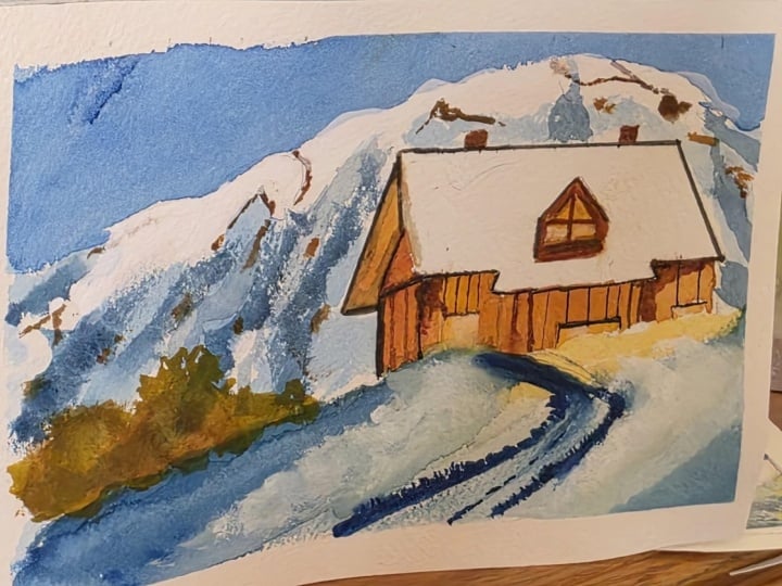
7. Day 1 The Red Barn: The colors are Conacdone, coral, crimson or pink purple, ultramarine blue, Bruscian blue, royal blue, Perk Siena
as gray or indico. Today's painting is
all about red pan. We all love to paint this pan, but we have to see exactly what's the
perspective horizon line, the vertical point,
spanishing point, et cetera. So many things come up in this whole sketching
painting, et cetera. I want to relieve you from
all this and just enjoy this painting because of which I'm going to simplify
the whole process. I have divided my
one simple line that is from the middle
into three equal halves, almost two of the halves I would be utilizing
for the roof part, one of the parts I would be
using for the Porto Media. Now, this is as per
what I have observed, this can be even named
as a snow cabin, but you can always go ahead and decide for
yourself what works best. I am adding a small tree, or you can say it's a
plant basically which is dried up and there is
some snow on top of it. We will be leaving
white spaces as well as using a bit of quash to create the snow
wherever it is needed. I will be highly using
wet on wet technique. Along with it, you will see
that I even use a lot of wet and dry technique which is going to make the
whole painting come to life. That is a combination which
I guess works the best, though I am a supporter
of wet on wet completely. If you are someone who is
in love with wet on wet, I have a previous class of mine which I did release
some time back, and it has five winter paintings inspired from the winter season, it's a winter marathon. Please go ahead and refer
back to those paintings. I think you will fall in
love with each one of them as they're all
inspired from the quinto, as well as this crazy celebration season
that we usually have. Though all of us want to be in that cozy corner
of our house which works the best for
us because of which you have this series
that we are doing today. It's all about painting
in 15 to 20 minutes. We are not going to go beyond that for any
of our painting, I have added the
mountain as well as the four grows
the horizon line. There is not much in
the four crows except the few trees going ahead
with a mix of my blue, this is my royal
blue along with it. I'm using some amount of lavender color from the
brand Magello Mission Gold. You can also go ahead with
any of the other shades that you have or else mix some
amount of Chinese white. I would not tell you to
mix a lot of your titanium white into it because
it is opaque in nature and we don't
want a lot of opacity. Though. You can
have a percentage which is like 30%
of Chinese white, 20% of the titanium white, and 50% of the purple
color that you have. And get something
closer to this, the most important
factor at this stage is to create some peaceful
shades for the sky, which are more from
the blue as well as from our purple shades. I mixed a bit of
yellow on the top, but really did not like it. I took it off with the
help of my biggest brush. Now going ahead and adding
some of the shades, the same color, that
is blue and purple towards the top part
of my mountain aum. Usually wherever there
is no clad places, you will see that there is some other mountains or
it could be some hills. It's usually at a
elevated region. That's one of the reasons
we are also going ahead and adding that to our painting
to create that realism. Having said the realism part, I would say for me watercolors
is more like a freedom. You can always go ahead
and interpret the language in which you want to describe your painting in your own way. So many of you have asked me, how do you find your
voice in watercolors? What should you do more, et cetera, to get that voice? I would say the style of painting for every watercolor
artist does evolve a lot. And it takes years and
years of practice to have only one single style
that you absolutely love, adore, and you want to
continue with that. Even that particular
style will go through some minor
changes as you progress. Hence, it is not so important to stick yourself with the fact that we need to have a
voice style, et cetera. Keep painting. And that's what will help
you to get your own style, process, progress, et cetera,
everything that you want. By the way, in the meantime, I did apply some of the colors of the pastel
shade for my snow, as well as I'm using the
same indigo and brown mix for the background bush as
well as for the bottom area. There is touch of colors
that you would see. I'm using with the
tip of my brush. It's not that I want to
cover the whole area. The snow clad mountain
remains the same. The top area has some amount
of dampness in it and that's one of the reasons
whenever I apply the blue or the browns
in the top area, you will see that some of
the spaces might become more lighter and the colors will move or the
pigments will move. I would continue to do
the same for the tree. It's not that I want to have a lot of branches
or leaves on it. It's a very simple
process, pretty dry, but yet there is a lot of snow and I want to show the
same through this tree. Let's go ahead and do that. Blending the colors in the bottom area with
the blue that I had. And I'm using Pi mop
brush from the Vince. This is size zero mop
brush from Series Casino. It's one of my go to Series. Always. You might have always seen that I use this for
most of my painting. I'm using the royal
blue again for the top part as well
as the bottom area. Also, I'm de touch
with royal blue. Along with that, I'm
using the same mix of indigo and brown for a
few parts of the trees. This is mostly in muted colors. The only bright part that we are going to
have is the barn. I have kept the
rest of the area of the background completely
in muted shades. The whole focus of the
painting is on the bar. So we are going to even add
a few more details here and there to the tree or to any of the other background
things that you see. But with the help of my color, what I've done is I have tried to focus on the barn itself. Okay? Adding some amount of
smaller dots here and there. And once that part is done, we will go ahead and add
the colors to our bar. Always, the process
is slow, interesting, as well as it helps us to mature in our
watercolor journal. The only thing that
I always stress for each and every person
who has joined my earlier classes and
who continue to join me, I always say a regular
practice is very important. I have seen it for myself. For the past five years, I have been painting daily and I still love to paint daily. Though there are
occasions where I have to release classes or
I have to travel, I have to work on my business. There are things where
I can't do much, but I try to always
do even smallest of the painting just to send across as a thank
you card to someone. Those kind of things
I do keep in my mind. Okay, going ahead and adding the mountain
for the background. Again, using the
beautiful blue along with a bit of mix of
your glue and brown. Sometimes it's just
touching the brush with the color and then just
applying it on the paper. That's all we are going to do in whole of this particular
painting though. There are other paintings also which we are going to make. Just hold on, you will see
a lot of things coming, adding one of my most
beautiful color, that is my Quinacridone coral to the whole of the barn area. Though you might have
only seen red bars and people love to
create red burns, but I just wanted to
do it as a twist, and I created this
bit of pink in it. I mixed, and then I created
this whole of the barn area. Okay? This is a
red violet color. And the red violet color is nothing but adding some
amount of your purple into the Quinacridone coral or the pink that you
have and creating the darkest value
for your red violet. Okay, add some more color.
Continue to do that. Just add, add, and we will leave out some
of the spaces for the white area of our smallest plant that we
have in the foreground. You would see the
whole of the painting is mostly done in bicker brush. We have really not switched
tower brushes much because I wanted to complete
the whole of the painting in largest
of the brush possible. We always do not need smallest, thinnest brush to complete
our gly paintings. That's one big
important takeaways for everyone who's starting out. Because this
particular lesson or this particular class
is for each one of you who wants to dive into this beautiful
medium of water colors. Please do not stop yourself with your brushes or with
the colors that you have. Paper is the most
important thing. If you have the paper of
the correct 100% cotton, I would say even 185 GSM, it is great to go
ahead and paint on 185 and above any GSM is great. Your paper doesn't buckle much. If you have 300 GSM or else
paper mind buckle a bit, but this 185 GSM arches paper is amazing to work around with. You can go ahead with
200 SM Fabriano paper, 190 GSM saunders. I mean these are great
brands to work on. They're all 100% cotton
and will give you almost the same kind of result that you see on a 300 GSM paper. I have been using Sketchbooks
made out of these paper that we do under the brand
fibrin parcels that I own. And they are seriously something that you can
think about working on for. Continue to add some
of the darkest values. Touch your brush and go. I have switched on to my
finished rush right now, or else the colors
will move a lot, and I don't want
that at this stage. The colors are still
wet on the paper, though we have gone
ahead with wet on dry method at this particular
stage of the painting. But still, there is a lot
that you can play with. Mostly these red
pants are made out of woods and then you
paint on top of it. That's one of the reasons
I'd like to even add these lines with the dark value to show that part of the wood. I would continue to add
it even for the top area. Adding fuel lines like this as you observe me over
here, continue to do that. Even for the top area, just the way you
see on the right, we will replicate the
same for the left. It's time to paint our windows. I do keep some of
the white houses. You all know that white is something that I always
love to preserve. The white of the paper. Though yes, there are areas where I do use
even the white ph, but we are not going
to use any kind of masking fluid throughout
the S. That's the best, we will be making use of
any kind of masking tape. That's something which I have used in many of my
earlier paintings. And if you have washed my
earlier class where we did winter paintings for
around 28 to 30 days, you would know that? Yeah, I do use a lot of masking tape to mask out a few areas wherever
it is necessary. That's something I
always keep up to adding some brown as well as some
amount of neutrotent. You can also go ahead
with black or nico as well as paints gray if you do not have that
particular neutritent. Because my neutritent
does flow a lot and I don't like to use it
for the same purpose. I mix my indico
with some amount of brown to create that
darker shade that I need. Going ahead and creating, adding some lines, some dots. I love to add these dots. They look so loose yet so
beautiful and interesting. Over the years, I have learned nothing about water
color painting. The more loose you can paint, I think that gives you
more freedom to express. Now, freedom of
expression is something that each and every
artist have on their own. I feel very strongly, I have a particular way to show the backgrounds,
backgrounds, everything. And it's the freedom of my own expression that is working out through
my watercolors. Someone might like to
do it more hard edge that their freedom of
expression In watercolors, this is more to do with how loose you
want to paint for me. Painting loose comes over time. It doesn't happen
on one single day. It did take me a lot of
years in terms of to learn what is my style
of loose painting. I like to have those
pleads on the paper. I love to have those. Soft edges, which really helps the whole of the
painting come to life. These are what I
think worked for me. But there might
be different ways in which you should also explore for your freedom of
expression in watercolors. This is a particular
term that I use for myself when I have to express
in a particular style, in a particular way
through my watercolors. I have done it in
other paintings too. As you see the series moving, there will be a lot of
paintings which will come up. Most of them are wet on dry. We have not applied much
of water initially, and yet we have achieved those soft edges that
usually will see in my other classes where I have used lots and lots of water. This fine balance of using water is something
that you learn. I'm here to help you out with all the doubts, et
cetera, that you have. Please drop messages or
please drop your doubts. In the discussion section, I would be more than happy
to address any one of them. If you cannot get
something right or you have doubts about
it, do right over there. Okay. Going ahead and adding
a few lines for my tree. Before that I did Go
ahead. White quash. It is opaque in nature. I am using one of the opaque white
mediums from H. Martin. Of course, it is water soluble, it just works like white quash. Hence, I'm using it for quite a number of years
now. It's amazing. It's a small bottle and
you can use it for years. It doesn't end or it
doesn't just go away. It is not hard. That's one of the best ways to use this particular go for me. Okay, continue
with your painting of the trees and the branches. I would continue to touch few of the spaces with some
of the other dots that I want to add into
my tree or into the snow. The snow is practically done
in lavender and the blue, I have told you these are more to look like pastel colors, though you will find
other paintings, like a tree that we did paint, covered with snow in the sunset. There are a lot of colors as well as paints which
we are going to use. Do not worry and do
not stress a lot. There is everything done
in real time, step wise, which you can
follow and you will get almost the same results. You just need a bit
of patience and that's the key to any
watercolor painting. Okay? Adding a few of my white quash dots
on the tree as well, even on the barn that
we have painted. I have already told you that most of us do paint
the red barn. And I did go ahead with
a bit of pink in it. Just splatter some more of the snow and you are
done with the painting. There is not much
to be done Now, you should know
that where to stop. This is something that I always say in most of my paintings. It's important to know to stop. Or else what happens is that
we continue to paint and the whole painting might
get through in somewhere, or it might have turned a bit better if we would have
stopped at the correct time. Those are the things
that do come to mind, and I really don't want that
to happen to anyone of you. Continue with it. Have a look at it before you finalize it. I've even added a few
blue dots here and there. It's the royal blue
from the Branson. Eli continue to work with that, then have a final look. I think you would be also
happy with the final outcome. See you all again with
the next painting. The key takeaway from this painting is how
to draw the barn, that is, something we
all don't know properly. And how to add the snow
with pastel colors, using less of wash and presoking the white
of the paper itself.
8. Day 2 The Winter Forest: Let's check out all
the colors for today. I will go ahead more
with a limited palette. Persian ultramarine, royal
blue paint sky or indico. We are starting out by marking
major the horizon line. Or you can say this is
the snow area which divides the sky from the snow area is this
particular line. Okay? And there's a
small stream which is, we have to mark the
area of the stream. Of course, I was not
very much okay with how I want to show the
stream to be flowing. That's one of the reasons
I did erase it a few times before I wanted to
finalize it in a particular way. Once that is done, we will go ahead and start
out with our painting. There's very less
sketching that we have in this particular part and there are majorly only strokes for the trees that you
have to keep in mind. Going ahead with our royal
blue and tramini mix, I will just add some more
royal blue towards the top. We will work out with some of our burned CNO while I go in
and around my horizon line. Sometimes the horizon
line is not straight, it is more curvy In
this way, of course, you can draw even a
straight horizon line that marks the difference between the sky as well as the line dum. I am going ahead and mixing it with my quite a huge mop brush. It is size zero from
the Brand casino, but you know that the size
of the paper is really big that way and we are going and covering
out a lot of spaces. The best part about
painting on white is we will be a lot of
white of the paper. There are a few things that
I'm going to show as such, which you will
understand that can help you even in your future
watercolor paintings. Let's wait for that before
we go ahead with it. We are just working on
our background bushes. I'm mixing some amount
of my ultramarine and just blending it with the
brown that I've already added. This looks pretty amazing
and I'm very happy with the dark and the lighter mixes of the brown that
I have over here. Of course, the colors
might end up not so dark. And do make sure that
you have a lot of water in your brush when
you're adding the colors. As I want the colors to get mixed up with the
sky and not have any difference between the brown as well as the blue that
you have of the sky. Going ahead with
some of my brown and then blending it with
ultramarine color. Now, ultramarine and brown will even give some darker
values here and there. Now these darker
values are very, very important when you
are working in a river or because some of the areas will be in the
shadows and some of the areas will be reflecting
the sky along with it. Some of the areas which
are in the shadow will even show the reflection of the trees that we
are going to paint. Yeah, there are a lot of
trees and a lot of bushes. It is a very easy
painting just that you need to have some
amount of patients. I'm going to even help you
out with how to not make your paintings look flat
like here we have curves, et cetera, of the snow. But to make it better, we will add more
shadows into it. Once we add the
shadows of the trees, you will see how beautifully
the curves get shown up. This particular lesson that
you are actually working on can really help you to work even your future paintings when you're adding some stream trees, et cetera, in a larger painting. The whole idea of
the painting goes beyond just working through
this painting as of now. That's what was always
in my mind when I wanted introduce you guys to this whole set of landscapes. Landscapes has been
my favorite forever. I wanted you guys
to also experience the magic of working
with winter landscapes that are super convertible to spring or to any
other way you want to hold it adding some darker values just
near the snow area, You can see I am just
mixing with some brown to get the darker colors, although I have kept some
neutritant with myself, but I'm not adding it much. You can use your paints gray or indico rather
than Neutrotant. I'm to create some
reflection of the trees. As I did already mentioned, we are going ahead and going
with the darkest value. You can see that I'm going with my paints gray or you
can also take indigo. As these are two alternative
colors that can always be used to create the darkness or the
depth into the painting. Contrasting is very
important at this stage. Contrasting will
help us to really understand that there is
no which you can see. And this reflection will
help us to actually show the fact that the stream doesn't have a lot of movement. It's more of a mix of a calm
as well as moving water. I am adding some now. What are these blues? Now these blue lines are majorly your shadows of the trees
into the snow area. This also helps us to define
the curves of the snow. Will the land area is
not flat, it is curved, and it moves downwards as
we come towards the stream, the stream is basically
breaking into this land area. You have to see that there are some more amounts of snow that has ended up on
top of the land part, whereas it is not there
in the stream area. Okay, I will go ahead and
just blend it in few areas. I will keep the whites
intact of the paper. That's very important. I don't like to use H, as I have told you, it is usually used in really, really less quantity in
spaces where I need, not for mountains, not even
for any of the spaces. You will hardly see
me using white Bh. I'm so much not in favor of using in terms of
winter paintings. Winter paintings are
supposed to be fun. Watercolor is a
transparent medium. We should not be mixing
it up more with some of the very opaque
mediums that we know. Try for the left side two in the similar way of
adding the shadows. And then we will let the
paper to dry up completely. Once the paper dries
up completely, we will start out with
our trees or plants, whatever you want to say, they will be absolutely dry. There will be only a few lines. You choose your own brush, whether it be size 01234, whatever you want to take. I prefer size zero brush
for creating my trees. I will continue with that. You can go ahead with the brush that you're more
comfortable with. Comfort is very important
at this stage because it is all about strokes
and straight lines. You have to be really comfortable with your brush
as well as with your hand. It should be stable enough. If you are someone who
has yet to try these out, write out on a simple paper. Any paper is fine, even the paper we take notes
without any GSM, anything. You're just trying out how to go ahead with your
straight strokes. Just go ahead with any
paper and try them out. My paper is dry now. I will go ahead with
my background trees. When you are creating
your background trees, always know that they need
to be in lighter values. They are far away from
our eyesight and we cannot see it really dark. Always make it more lighter and with the lightest
value that you have, even if it be a
dark brown color, it has to be the lighter value or more transparent
value of that. When you are coming to
the foreground trees, of course, they have to
be more darker in value. You will see that at
regular intervals I'm adding these lines. I'm not cluttering all of
them at one single place. If you start adding all the
lines at one single place, then it will not look gratural, it will not look the random things that
usually we see in nature. And hence, I keep it all throughout the
whole of the place. Let's start with
our four rounds. This is going to be the
most interesting part. I did already tell you a
lot about the four rounds, how you should have your steady
way of adding the lines, and how much you should be
comfortable with your brush. You can see how I'm adding the darkest value
towards the front. I will not branch out all
these trees to a great extent. I will just continue
adding some of my trees. That's what I will
do and you can see even the reflection of these dry trees into the water, few branches here and there. And we will continue to
add more of the trees. I love to add trees and these
are one of my strengths. I feel very strongly that
adding the trees helps me to not only calm myself down, but it also helps me
to work on things that I feel actually helps
me to become more patient. As well as it gives
more perspective in terms of just
going with the flow, not thinking much about
the final outcome. We have already
created the shadows. Adding a few trees will help
us to justify those shadows. That's all that's going on in my mind when I
paint all of them. Few of them of course, have to be in the background or they are not very
close to our eyesight. Few of them will be really
close to our eyesight. There are a lot of
reflection that I've already added into the painting. And there will be a lot
more that you can also add. But yeah, a few more will add
then I will just even add a bit of movement
into the water. That's also I'm going to create. Let's continue with
our trees for now. I want to be very focused on it. It's one of the best things
that I do in the day to create this cheese and I only get to create them
when they're dry, like these during
the winter season. I don't want to get away
with this winter season. I think it's one of the best seasons to
paint your trees dry. Leaves, less of spring, is there less of colors are
there But those red burns, these dry trees make up for everything that
we want to paint. Okay, continue
with your painting and sells you with your
branching part. Just be focused. I think you will
mail this painting. This is not as tough
as the first one. Of course, the worst has more to do with the intermediate
kind of a level. But this is lowered down and you will see
the third painting, more lowered down, which
is more of a mountain. And you can do it within 15
minutes of your time span. So there is a mix
of your bigness to intermediate level worth
in this whole of the series. And I have not decided
much in my head when I was designing it in terms
of the flow of the class, it is just like random as I say. I've kept it like nature
because landscapes are one of the most beautiful aspects of nature and I wanted
to leave it as such. Go with the flow.
Enjoy your paintings. Love doing everything that you
want to do in a landscape. Landscapes are always
lot more beautiful and it gives me so much
pleasure to bring to you all these landscapes. Okay, let's see you and add
more trees on the left side. Continue adding them and I am branching it
out few places. You know that I
love branching it. I have only used my size zero brush for creating
the whole lot of trees. And that's one of the
reasons you may find that I have taken more time, but for me having the control in my hand and I have a really
good control of this brush, which I want to keep it that way and continue to
create the trees. Okay, cool. I guess some more trees
needs to be there. It seems pretty less when
I look at the foreground, some of the foreground trees
will come up very, very soon time for the moment
which I was waiting for. I did tell you yes, there are more fork ground
trees which are coming up. I am not adding much of shadows of all of this
into the snow anymore. You have already
seen that I did it earlier and I'm going
with the same thought. Adding the trees is what
is there in my mind. Because I have to justify
those shadows that I've added earlier as this has been
the flow even earlier. So we will continue with the same flow and
mindset that we had a. Remember that some of the
trees needs to be thinner, some of the trees
needs to be thicker. A few of them will originate
from one single point. Maybe two trees originating
from one particular space. Only some of them will
be branching out more, some of them will be
branching out less. All of this you will
continue to work on when it is watercolor landscape, a bit of reflection into
the water and I am done. I'm creating some of
the darkest parts of the bottom area for showing
the snow that is major. This part is dark because
snow is on top of it. Usually you'll find the bottom
area into the shadow part, hence it is on the darker value, adding some thinner lines into the water area. This is it. We are not going
to complicate it anymore and leave
it at this stage. We'll let the paper
dry off completely, Then only remove
the tat n angle. There are a few key takeaways
which you should stop and read before you finish
off with this painting.
9. Day 3 Mountain Calling: Colors for today are royal blue, marine paints, Gray
or Prussian blue. Any of these shades can do. This is a very easy to go, a mountain painting
that we are to doing. We are starting out
with two long lines. You can see they're almost
parallel to each other, but at a distance
from each other, what I'm going to
do is I will join them as you see
me working on it. Let's make some of the ridges as well as some of the areas which are more darker in values
than some of the areas that are being more
lighter in value. By only defining a
few lines, et cetera, we are going to go more wet on wet for some of the areas and wet on dry for
some of the areas. This particular series has a lot of mix in terms of wet
on wet and wet on dry. We are not completely adding water on all
the parts of the paper and yet you get a lot of feel of the wet on wet technique, which you are going
to experience in every painting that you
are going to do. Okay. Continue to work
and then I will add some of the pats exactly the
way you observe overhel. The sketching is easy, the painting is equally easy. Believe me, it did not take me more than 15 to 16 minutes, except the drawing
time that I had. It's a real time video. You can follow along and
paint along with me. No need to worry, just do it. Most of the colors that you are using are like
indigo, et cetera, which is equally easy to
have in any of our palettes. And hence, everything would
be a very, very smooth flow. Let's now wet some
of the parts for our mountain area as these
are more darker in value. And I'm going to wet
those parts first. Some of the areas I
am going to preserve in white that I
have on the paper. You know that I am a person who is in love with the
white of the paper as well as I like to keep that itself but without
any masking fluid. For this series. Exceptionally
excited to seriously check out and do this because there have been many paintings where I've used masking fluid, but it is not available for
each one of you And when it is not available or it becomes difficult than even peeling off, sometimes the paper that
you use as handmade paper, which is around 300 or 400 GSM, that works well
with water colors, but might not support equally the masking fluid
that you are using. Keeping all of that in mind, I just thought a sees without any masking fluid part having
a lot of whites in it. So let's continue
with this part. I have mixed a bit of my black into the Pruscian blue earlier, but this also has a
similar tone and value, just the way you
get in an Indico. And hence you can
also go ahead with Indico though I do not
like to use black. But the whole being
series that I purchased a while back has the black in it and
I thought use it a bit as this whole tube
might go for a waste, which I really don't want
as each of the tubes are pretty expensive and
they are great colors. They don't move a lot, which is great and amazing thing that I saw exactly the way
Magello Mission Gold operates. You can use these colors also
in a similar way it will not move on even a wet
surface to a great extent. That way your water control
becomes way more easier. I have tested many
colors till now, starting out with Megello, Michel Gold, Senala,
Winsor, and Newton. Or as well as this
particular brand. Hole being my favorite, two of them is
Magello, Mission Gold. And being as they
do not move a lot, but if you're doing a
lot of it wet or dry, you can of course go
ahead and use QR moves the most out of it and the other shades don't
move to that extent. Values play a very important
role at this stage. You know that I am
actually creating lighter values as I go towards
the top of the peak area. While I am towards the
bottom or moving downwards, I am making it more darker. That's how I like
to keep my colors. At this stage, we might go ahead with bit more darker
values as we progress. Progress is very important. Progress is a very
important word when it comes to watercolor. You don't always need to have that perfect outcome,
I would say. Always compare yourself to your own painting a while back and I do it on
a regular basis. I just want to improve
on my own skill set. Anything and
everything that helps me to improve on
my own skill set. I'm super happy to explore this. I would request you
all to give that 15 to 20 minutes in the day
to create these paintings, because I know that they're
very easy to go, Asmlls. You can gift it out
to your friends, or you can keep it and frame it for your own
self in your houses. Send it across to your
near and dear ones, maybe in next Christmas. Or just say a happy New
Year with a beautiful card. Say thank you With these
cards, what's your weights? And they are not small
paintings that the best part, it's a bit smaller, I think
it's a bit larger than five. Or maybe a similar
size like five, which is not a very
small painting. And I'm really happy
and appreciate the thing that we could cover this huge area of A five size paper two
within like 15 to remain. So it's not an important aspect to go ahead and just think that you can't do it or
you need a lot of time. It's a daily practice. Even when you are sipping
your cup of coffee, you can't paint alone. So it's just taking
out that perfect time. What I usually do as a particular way of
operation, I will tell you. But before that, go ahead and apply some darker values
till your paper is wet. You can see I am
doing it right now. I have switched over
to my size three. Or you can also go ahead
with size two brush. This is particularly the Vinci round brush
that I'm using, again from the casino series. You know that I'm more addicted towards brushes of the Vince as well as a lot of my brushes
are from the poles from Cada. Yes, those are two
of the brands that I have been referring
to for quite some time, and I've been using it very often for majority
of my paintings. I always say that whatever
you have is good to go. I preached it from the
bottom of my heart. I have been doing it for
myself this whole year. I just purchase, I think, two or three brushes for myself, but I just go or spend a
bit extra for that purchase as I want myself to be happy with those brushes
as I continue to paint, you can see that
my paper is damp. Now, there is a difference
between when you have a lot of water on the paper
and when you want to work with the
dampness of the paper. For me, this is
more to work with the dampness or the
moisture of the paper that's really not shown as a
sheen on top of the paper. It's a very simple
process of understanding, I would say, but
it takes a while. If you have seen the
techniques part, you already know that yes, there is a free flowing
water where there's a lot of water and your
pigments will move a lot. Whereas if you have controlled water on the paper or
you just know that this is exactly the amount
of moisture that I need for painting the clouds or for painting a particular
part of the painting. You are going to nail that
painting and that's what I am using for the darker
parts of the mountains. It's just, this
whole painting took me to two attempts,
I will show you. It is once done on
the back side of the same paper and I do on
the front side of the paper. I was not really happy with how the outcome was and I
wanted to try it once more with more of wet
on wet idea in my mind. The second time I tried, it was just a flow. It did not get stuck anywhere. I was not thinking much. I just enjoyed the
flow of water colors. This flow I have always looked out for in every
painting that I do. If you enjoy water colors, you are going to nail
any of the buildings. I am just taking off a bit of your colors from fewer areas. This is my flat brush from
the brand silver ruby satin. It's one of the beautiful
brushes that I've explored very recently and I'm still exploring more of it. Having said that, I think this one is
more to do with wash, but it works even well
with water colors. That's the beauty of I
guess black velvet brushes, they are always amazing. Any silver brush, the create. Going ahead with some of my Errelium blue towards the
top part of the mountain. We will have a very
faint mountain towards the back side
of this painting. You will observe we are having
more mountain painting. Do not, do not worry. Continue to just there are
a few lines that you see towards the foreground
part of this mountain. It was just a bit of
lines that are I don't want to cover all the areas of the white that I
have on the paple. I have told many
times, but I'm again, iterating it as it is
something that usually doesn't sync in
with us when we are starting out how to
preserve the whites. We have so many questions. Why can't we use
the masking fluid? Why we have to leave? Why not the quash can be used? Of course, I am someone who does use a bit
of white quash too. Or any water color, opaque white color, maybe something like
the titanium white. You can also use anything
that is naturally done, which is more, the
paper looks better. That's the only thing
which I always say, and this is something
we learn over years. I want it takes the same. Believe me, it
looks so beautiful. Always it looks very amazing. It's so natural. I am
adding some dry brush. Dry brush strokes is
nothing but you have just the least amount
of water on your brush. And you will get
strokes like these, majorly for the mountain area, we usually need it. You can also do it like these similar kind of
brush chokes for any of walls or you want to paint wooden
parts areas, et cetera. Those can also have these strokes very
easily on top of it. And it looks very nice, maybe even for the old gates
and all locks, et cetera. What happens is, over
these years or usage mainly gives out the fact
that it is all rugged, the look, feel, et cetera, any route is higher on it. And hence these dry strokes
shows that pretty well. Adding a few pine trees
towards the bottom corner, and you can see that how
I'm adding it again. They're small, it's not
that they're really large, we are not doing any
large pine trees. Some more dots here and there, and that's all I think before
I act on it, you will see. I just see that.
Do I need it here? Do I add it here or I
add it somewhere else? It's something that is
there always in my mind, I think, and then I progress. I don't want to add everything. Something that I've learned over the years is to paint less. Less is always more. If you paint a lot,
of course it's good. But covering up
in watercolors or getting back to the lighter
values is very tough, which is one of the reasons whenever you are working
with watercolors, make sure that you are not going overboard with any of the
colors, paintings, et cetera. Okay? Time to create
that beautiful mountain. For the background,
you saw that I left my sky to dry up a bit. I did not touch it, and now I'm going ahead with my blue color. This is the royal blue shade. And then blending it a
bit with the bottom area. Once this part is done, we will do a touch
of our or mine most, one of the most go
to blue colors, which is ultramarine blue. And then add a bit
of ultramarine blue towards the top
and the bottom area. Okay, just some
more detailing and then we will have a fun
look at this painting. Let the painting dry off properly before you
actually take out the tape. Now this is something that
I've learned over the years. If the tape is not
peeling off properly, do use a hair dryer. And that hair dryer will help you to peel off
the tape easily. If you are doing a hair dryer, it has to be hot air. Basically, whenever
you are adding the hot air on the sides of it, washy tape comes
off pretty easily. A quick request to
everyone who has been using the carpenter
tape or the masking tape, which are white, they stick to the paper and sometimes
they don't peel off at all. That's one of the
reasons I always say in each of my classes, do not use those tapes, please, to invest some money
on washer tapes. Washer tapes are very important for all
your paint things. If you want to leave out
that white space rest, I think it's good enough to progress with whatever you have. As I say that, do not stop yourself because of the products or
materials you don't have. Let's remove the tape
and have a look.
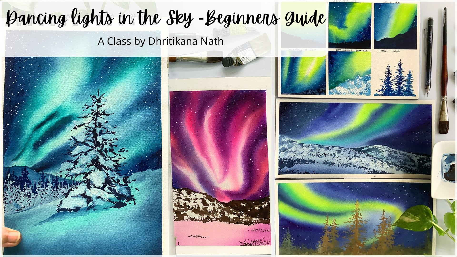
10. Day 4 Northern Lights: Getting a list of
all the colors. The first one is cobalt green, permanent yellow
or lemon yellow, crucian blue, indico
or paint screen. These are all the
shades which I need. I'm going ahead and marking
my horizon line now. This is basically a
very simple line. I do not like to make straight horizon lines for
this kind of painting, and hence I am going ahead
with one of a crooked line. I would say to an extent because
there is small mountain, usually these
northern lights are seen in Iceland or in Finland, in Canada, et cetera. These are more colder places. Hence, you will have some
mountains, et cetera, existing going ahead and
just cutting out my tape and then adding it on top
of the paper along with it. I have added some water
towards the top area. After adding water, I will
just check the glaze on top of the paper and then start
with my lightest volume. Now the colors can be
lemon yellow or it can be permanent yellow Orlin
or any of the shades that's existing with you
line I usually don't prefer because that's a shade which really moves around a lot. Very difficult to control. Having said that, every company has various or different shades. And to be frank, when you are doing our
Northern lights painting, hardly you have a freedom or you are left out with less freedom in terms of the
control of water. You have to let water
do its work and just sit and enjoy the flow
of the pigments in water. I'm going ahead
with my Coba Green. Now this Cobain you can also replace with horizon
blue or turquoise blue. I would leave that
decision up to you. I am using the Coba greene from the brand allow Mission Gold. You can also get this
Cobaltreen and Siningliar. Most of the brands to
have it even whole, been, has this a shade which is in between the green
and the blue color. I am just moving around the
colors to a great extent. There is a lot of water
that's there in the sky area. I'm using that water
to my advantage. I cannot imagine a series of winter paintings without
the northern lights, and hence, I am going ahead
with the darkest value now, which is prucian blue. All the colors
that I have taken, I wet with the help
of my spray bottle. This is really
important so that you can easily get the colors to
move around on the paper. You can see now I am allowing the colors to move
towards the bottom. Areum, always keep a tissue
for the cleaning purpose. Very, very handy. Of course, you are seeing that the green is coming towards the bottom. And we might have to again, go ahead and add some amount of our yellow to show the yellow that is there
towards the bottom area. The addition of colors we keep doing at various intervals as my yellow is
the lightest value and the most important thing that you should keep in mind is the lightest value
will be covered with the darkest value
very quickly if you allow water to
only do the work, and this happens in
any kind of painting, you have to move
around your board. Having a base for your paper where you
can stick onto is very, very important for
these paintings. I have kept the
painting really simple. The bottom area is
more lighted one, and when you go towards the top, we will have more darker
values coming in. The colors that I have is
from artists, great paints, whether it be
senior, whole pain, or any kind of watercolor like white nights,
Mijello, mission Gold. All of them are good to go. Whatever is available
in your own country, you should go ahead
and purchase that. No need to go ahead with
the highest value, one. But somewhere in between, you can purchase and then start out with your
watercolor journey. As many of you do, ask me that how my colors
are so bright, vibrant. One of the important
reasons for the same is using artist
rate pigments. Having said that,
if you are going ahead with a student
rate pigment, you might have to go with two layers to get
the same vibrancy. Or maybe three layers as they have more
of fillers compared to pure pigments and only binder which you find
in artist rate paints. One of the reasons for artist
rate paints being more expensive compared
to the other paints that you find in the market. I have already
rested my paper now, but there is some
amount of blue which I want to add on the left
as well as on the right. Majority of the time
that we are going to spend in this painting
is for our sky. Let your water do the
work and don't worry, when you are working
with Northern Lights, whatever final outcome
will be pretty and nice. You need to be fearless while you work with watercolors in a space which is more dictated with water compared to
what you wish to add. I'm clearing out a bit
of space on the right. And then I would go ahead and add some more amount of cobalt green and then just add some more blues
towards the bottom. This is it. I am
just moving around the water a lot so that I can relax and just leave it with water rather than me
doing any job as of now. Clear out the edges always
with the help of your tissue. Whenever you are working
with Northern Lights, I did mask out some of
the areas of the bottom. You know, because I like to preserve the whites of the paper intact and hence use the
masking tape to do the same. I have purposefully, not used any masking fluid because
there has been a lot of cases where you have faced a lot of difficulties while using masking
fluid, et cetera. Masking fluid and Gh are used. What white gash is used as minimal except the
snow, et cetera. In a few cases where we
need to use it orals, I have just tried to avoid it as much as possible.
It can be avoided. And I did understand
that not many years ago, just one or two years
back, initially, I was okay to use
wash at any moment, but over time I have
realized the transparency of water colors and the white of the paper can
frankly do our job. We really don't
need anything else. I did allow my paper
to dry off and can see such a smooth and
beautiful blend which has come out of
this northern light. I'm going ahead and
wetting my paper, then using some amount of the existing colors
on my palette. Adding a bit of my
going to it or paints gray and then getting a very
transparent wash off it. Adding it towards
the bottom area, it will move on it soon. We are not covering the entire
white space that you see. Switch my brush and I
have loaded it with some more paints of indigo or paints gray,
whatever is available. Again, I always like to give you a lot more
options when you are working with watercolors because many of these paints are
usually not available, always with every one of us. And hence, having some
options with us is helpful. Okay, the top part is more darker in value as
that is in the background, and I love to keep it that way. The bottom part or
the foregrounds, which is more closer to us, it has snow on it and hence it is much more
lighter in value, with a lot more snow showing up. I'm going ahead and working
with my flat brush. Now, this flat
brush really helps me to soften my
edges every time. It is a very, very
simple technique, which I discovered pretty late in my journey
of watercolors. Believe me, I was not aware that this simple
technique of using a flat brush can
make your paintings look so much soft in nature, as well as it gives such beautiful glow
to your paintings. I am now using this technique in most
of my paintings that you are going to do with me as the bottom part of the painting right now
is already dried up. I have to just use a damp
flat brush again to make it a bit more wet and then use the colors
on top of it orals. I will not be in a position to frankly use the water colors. I'm using the same dirty mix of water color and adding
a few more lines. The bottom area, of course, would be darker as
you always know, but it is not as dark as we have painted the background
mountain or the snow area. It is night time and you can see that there
would be stars, et cetera. I did not paint till now. I
will go head and paint it. All of that is still pending, but let's do the
toughest of the job. For me, it is practically
painting our Pines. I have trouble in
painting Pines, believe me or not. But being a teacher
myself, I say this, that every brush
is very different, every brush has
different strokes. If you are adding the
background pines, go with a thin brush
and just add some thin, thin lines crossing it
and make the pines. If you are going ahead four
ground trees which are pines, then you have to use
a broader brush. I usually prefer the
Vinci Mob brush, which is three by zero,
something like that. For doing this, it's not even the zero size
that I'm going to use. Three by zero is usually much more smaller
than the zero ones. Going ahead and adding
some few dots here. And this is just my
own depaling part, which I want to continue to do. I continue doing it in
most of my paintings. It's time to get back to
our smaller pines again. We will start it out and
just make some thin lines. You can see that I go really slow when it is about
painting pines. Yes. When I'm making
foreground pines, I will go a bit more
quicker because they are broader strokes and it becomes
easier for me that way. For the background
ones, of course, I'm using my thinnest brush and hence it is taking more longer. These are smaller in
size, shape, et cetera. Though you can also
make some small lines and just depict points exactly the way you
will learn in the next. I think within one
or two paintings, you will see how I make points
for other paintings too. There are different
ways of doing one single tree or one single
part of a painting itself. Whether it be trees,
whether it be skies, we have various ways
of painting it and you continue to learn
each and every way. See, if you are
learning on your own, then the process is
way more longer. As I always say, I
always do it on my own. And the process has
been really long, but there is a lot of enlightenment and
discovery, happiness, et cetera, When you
just get to learn something on your own which you did not know, maybe Odium. Those things, of
course, stay the same, but you can learn from
anywhere and everywhere. And each and every learning
in watercolors comes very handy when you are
doing watercolors. Watercolor is a medium that you have to get it
right in the first go. There are no second
chances most of the time way I would
say many other medium. Scrolichtcea leaves you with a lot more opportunity
and space to play. Whereas watercolor, having said, is a tricky medium. But the kind of happiness
that it brings in, the colors, the
lights, et cetera, I don't think that I really can play with so
many techniques, et cetera, in any of
my other mediums. Going ahead and making the
bottom area more broader, you will see how I continue
to make it more and more broader as we progress. This is very thin pine
that you observe. We cannot have such a
thin pine for water. Colors are at this
space where there is so much snow, et cetera. Okay. Continue with softening of the bottom area of the
pine as it is on the snow. I will just blend
it with the snow, it looks more organic that way into the painting,
it moves in. We continue to use the same method for the other
pins of the foreground. Usually, I like to paint
one or two pins together. That's how I will
continue to add it, even for this part
of the painting. One of them, of
course, is larger, some is smaller
because we want to really hold the
randomness of nature in front of all the spectators
of this painting or just replicate it in our own painting
that we are doing. Most of my paints are
different from each other, they are not look alike. Usually, that's how nature is, and I love to hold the same, even in my paintings. Okay. Going with some more
darker values here and there. For the other pine
trees I extended, while even I go towards
the bottom part. You can go ahead and add one or two more
pines if you want. Just a few lines here and there. Smallest of the tree that I'm adding now
towards the right. Okay. Let's start
adding another pine, and this is on top
of the snow area, which is our foreground. I'm going ahead with very
simple brush strokes, extending it towards the right and extending it on the left. Not thinking much while
I do this process. I just want to make sure that as the pine goes towards
the bottom area, it is more broader. I continue to add, add it and add it. If my colors become
lighter in value, you can always go ahead
and retouch it with some what darker value
of dico or paint scray, whatever you are using. The same process of
blending is used over here. And then you can see how softly these pines are
touching to our ground area. Adding few pines
for our background. Frankly, now it's
all about detailing. Only we have done
the majority of the part that is getting
the sky area correct, then just adding pines
for the trees part, we just need some
stars of course, in the sky that I would
love to add always, but not a lot of them. Of course, we want
something in between that is not as well
as not much to say covering the pine trees with my hand as I think
they were still wet. So I did not go ahead and cover
it with any of the paper. I am going ahead and
again, splattering it. If one or two drops
falls in here or there, you can use your indico touch
some parts of the pine, just exactly the way
I am doing right now. After I removed the tape, I did realize that my
pins have really turned out light and I wanted to
make it a bit more darker. You can do this
process a bit earlier rather than waiting for it
just exactly the way I did. What happens is sometimes
you can just get away with the sharp edges
and let it be fine. But otherwise, there
can be times where you get one or two marks over there, which did not happen,
luckily for me. But it can happen for anyone. If you have dark
parts for your pies. No need to retouch it. It is only because I have
really, really light values. There are a few takeaway like let water dance
with the pigments. We will only pave the
way for the same. We will help it to dance, but we are not going
to control it. Stars lit up the skies. Use Opah or opaque
watercolor for the same, retouch your paintings
only if need be, and enjoy the flow of
water colors at the end. Let's have a final look and
meet you again tomorrow.
11. Day 5 Pastel Skies: We have already discussed this particular painting to a great extent during
our practice session. Please go ahead, check out
the colors given on the top. And let's start out
with the basic drawing. I am going ahead and
just drawing a mountain. You will get this painting as your reference in the
resources section as well as all the
other paintings. Day four is also uploaded
in the resources section. Go ahead and check it out there. Once we are done
the mountain part, let's go ahead and just make another small hill
towards the bottom, there will be a small line
which is basically marking our land area or the
snow area that is more flat and it has
a lot of snow in it. So yes, I would be
marking that area too. I have already
practiced this painting earlier on a smaller paper. That's one of the
reasons I'm very, very comfortable
right now doing it, though there are a bit
of increased elements, but that's absolutely okay. We can go ahead and always
deal with that later on. First is the less value and
that is Co. Then I'm going ahead with Opera paint on
top of that compose palette. You can also go ahead with
any purple shade that's available on your palette in
case you don't have a coral, you can mix some amount
of your orange into your naples yellow that you have and create a shade that's closer to the coral
that I'm using. You can also use brilliant pink from the brand
Mijello Mission Gold. I have been using
this brand color for quite some time and I'm in love with that
particular shade. To though that is more towards pink and
less towards coral. But it can also serve
as one of the shades. Do remember that these shades are really opaque in nature, which makes it difficult
to work with it in future. And hence, the transparency might be a bit of a challenge. Use a lot of water. While you are adding these
sheets on top of the paper, I will continue to work
through my cloud area, then move on to the bottom part. You will not see that I have
created a really dark sky. I did create earlier, I made three paintings of these. One was the first one that
I really did not like, as the sky was very
vibrant and bright, which is usually not the case
during the winter season. This one is particularly
from my own imagination. That's one of the
reasons I did not strike the perfect balance when I
was just starting it out. It takes a while. Painting
from your imagination is difficult and hence you
need one or two trials. That's one of the reasons
you should always try on a smaller piece
of paper and then get onto the bigger size paper. I am just wetting the bottom
part of my hill area. You can see that I'm using my biggest wash brush and then going ahead with my sap green. Though this was not our approach during the earlier
painting because I had a smaller paper
and I was going ahead with the mountains first and
then with the bottom layer. But in this one, I have changed the
approach a bit. It is usually the case
when you're working with bigger paper compared to the ones when you are
working with a smaller one. First, I'm applying a sap green. Once I have applied
the sap green, I would go ahead with some
of the darker values. Either it be forestry
or paint scray, or indico, whatever be the color that's available
on your palette. You can always mix
some blue with your sab green to get
the darker values. Values and tones really play a very important
role in your painting. That's one of the reasons if
you want me to water colors, I would request you to
go ahead and check out my earlier classes on
monochrome paintings. You can get two of them
already published. One is with multiple
colors and one is only with my favorite shade
that is crucian blue. Both of these classes can
be of real help to you. I am really in love
with the shades, or you can say the
darker values. When we add it
towards the bottom, usually that's the case. And the soft wet on
wet approach really, really touches me as well as it can help you to make the
painting looks so much organic, nice, soft, and it's actually
the touch of winter. Therefore, going
ahead and just adding some more darker values
towards the bottom, I am extending it, that is the right
side, a bit lower. As you can see, the
forest has to be random. It cannot be in one
single line, right? The horizon is also
not always align. That's one of the reasons I just wanted to keep it
a bit more random. Adding that randomness
to this painting, I continue to add a
lot of randomness to my nature inspired painting. Of course, most of my paintings
are inspired from nature, some of them uninspired
and some of them are more from my imagination. Though even from imagination, it is inspired by nature. Nature is a huge inspiration for me and it stays the same. I'm going ahead with
my darkest value, And you can see I
have two brushes. One which is going to help
me add the darkest value, and another one is helping
me to blend the colors. That's how I go about it. Now this is a bit of an
advanced technique compared to the ones that you may be
as big no can follow, but that's absolutely okay. Go fearless with
all your paintings. Anyone who is a
bigger will also be an intermediate as well as
an advanced level artist. Always think that way, you can nail every painting of yours. There have been days. During my initial years, I have struggled to paint. I did paint like 2345
paintings in a day. Nothing worked out in my favor. Slowly, steadily. I did build on a regular
habit of painting. Now, I paint 34 paintings
regularly on a single day. There are most of
them as videos, some of them for skillshares, some of them for other
channels which I have. And yes, it's a habit that you have
and you are not scared of it. Some of the area on
the lower hilltop, I've kept it as bite to
show the snow and then I did apply some amount of water
towards the bottom area. I'm using my tram hering
and just blending it a bit. Taking it towards the top, you can observe me
doing this exercise. Like in most of my
paintings, it is similar. This particular easy way of blending your colors
with background, using a flat brush, can be used in all
your paintings, and I would thoroughly use it
in all my winter paintings. You can see how easily the blending happens and
how soft is the approach. Cleaning up some of
the white spaces wherever it is needed. With a bigger brush, sometimes a smaller brush
can't do the job and you do need a bigger clean, damp brush to work on the same. I'm pretty happy
with the whole snow and the darkest value that we are adding now it is mostly the Ingco
or the pain scray. I usually prefer pain scrape because my pain scray
has some blue in it. It is not as dark as you usually see in
most of your shades. This is from the brand
Jello Mission Gold. And I have been
using this pain scra for quite some time though. I think every brand has two
or three pain scrap of their own and some of the pain scra darker in valve and they have
less of blue in it. Once we are done and the
top part is dry enough, we will go ahead and start
adding very light color of opera into the snow
part of our mountain. The sky is a bit more darker compared to what you
might have observed earlier. But do not worry,
There was a big, huge drop of water that
did fall on my sky area, so I had to redo it a bit, but with a light wash
of water, I did it. And hence, once it dries up, you will see that it is similar
to the earlier sky that we did point and the one which we have in the
small size painting, going ahead and adding some more of the pink in
view of the areas. I love this opera. I have been in love
with this color for quite a few years. And then my next favorite is
being Quinacrodone coral, as I have used it in many of
my floral paintings as well as now I am using it,
the Quinacdone coral. For skies for everywhere you
can think of, I'm using it. Okay. Time to go ahead
and add some more blue. Blue has to be ultramarine. Ultramarine is my favorite
shape that I go ahead with. If you don't have ultramarine, you can go ahead with Don three. You can also use Pri blue blue. Ultramarine still remains
my favorite shape. Yes, I'm blending
it a bit more and then getting the lighter
values here and there. I will keep the
pink which I have added in the background. I will love to have it as very light value on
my mountain space. It's time to add the
darkest value to our basic part of
the mountain area. I am going ahead with my darkest value of paint
screen and adding it, you will see that
I have worked in layers throughout my mountain. I work from the lightest value and then go to my darkest value. Creating the contrast,
contrast and to values, as I have always stressed, is very, very important for
any kind of a painting. You can observe that
the foregrounds, which are lighter in snow and the background
that are darker. This really helps me to get a good hang off the foreground
as well as the background. To anyone who is looking at this painting can
understand, Yes, the background is mountain, it has some greenery, whereas the foreground is there, completely laden with snow. That's how you create that contrast and lighter
and darker effects, though there is snow
even on the mountains. But yes, it is done
in a way that we can see the ridges then
some rocky areas. So keeping all of that constant, we keep working on it. Let's just add
some darker values while we go towards the right. I'm using my smallest brush that is size zero
by zero for doing this as of now and then extending it towards
the top for my mountains. You have seen that I go
from the darkest value of that is in the bottom area and then going towards the top, I have mixed some of
my paints gray into the burn Siena and adding
few dots here and there. These are basically
the ridges or some of the rocky terrains that you
can see in the mountain area. I'm clearing out few of the
edges which are bleeding, but bleeds are good even if
they are there, do not worry. Continue to add
these smaller dots. These are basically details. We are not going to add
it in a large amount, we are not going to
completely occupy the space. We are going to add it in really small amount on
towards the bottom, or only towards the top. It would be mostly towards
the top, you will see. And while we go towards the bottom in few
of these spaces, it would be dominating
in few of these spaces. It would not be seeing much. Booby Frank. I'm pretty happy with how this painting
has turned out. There is not much that we
need to do at this stage. Most of the work
is already done. You have to just
add a few details and then your painting
is all set to fly. You can go ahead just complete your drawing process and then remove the
tape at an angle. Have a look at your
final painting. All these paintings
I would request you to do on 100% cotton paper, as I did even tell you earlier. So that will always
stay constant. Some of these pieces
are still wet, and in those spaces, my colors are becoming
a bit like bloom. But that's absolutely fine. Let it be bloom. I think blooms are good for watercolors and we will continue to allow the paints to
bloom in a few spaces, wherever it is blooming
or where it to sweat. After working with
watercolors for a few years, all I can say is watercolor is a medium which has its
own happy accidents. And there will be blooms, there will be plates, we cannot avoid
it in few spaces. We might end up adding more darker values or
sometimes more lighter values. Over the lighter values, you can again go ahead. Whereas when it is taco value, you have to go and paint again. These are some of the takeaways that I had
from my What color Jewry, which will always
remain the case. As I did tell you, I had to paint this particular
painting three times, like this is a third attempt
and then I got it tried. It takes a while
and still I have doubts or still I do not get everything
right at the first go. Yes. Even after so many
paintings under my Belton, so much creativity
that has gone in. All I can say is failure
is way to success. That's always been the case. The more you fail,
the more you learn, the lesser time you take
to paint something. The first time I painted
this particular one, it took me 30 minutes. And when I ended up
doing it the next time, I did it in ten to 12 minutes, and this time it was 20 minutes. So you can see how it changes. The smaller one, of course, took around ten to 12 minutes and the bigger one came
down to 20 minutes. So yes, you're improvising
each and every day you paint. Let's go ahead and have a look
at the key takeaways now. Again, there's a big bloch. I don't know why this keeps
happening, only to me. So, yes, I am, again, adding a bit of
color over there. Please, do not retouch
your paintings. It's not a good habit and
I don't know why it is happening to me every
time I am retouching it. If you did not have any problem, do not retouch any of the areas. Watercolors is not
about retouching. It's about one shot. Less is always more. Continue to have that thing in your mind and have a
look at this painting. It's breathtaking already. See you again
tomorrow, and we are going to explore various colors, the sky. So be ready.
12. Day 6 Evening Sunset: Colorful skies have
always attracted me. And today's painting is all about adding multiple
colors to our sky. We will be leaving a larger area for the
sky and then we are going to have a bit of
perspective into the bottom area. There is a background
mountain that's existing. Then for the fronts, we have smaller hill
like structure. Or you can say these are small, small snow like structure
here and there. On top of it we will have
one single pine tree. I will show a close up
absolutely how I am drawing the tree and it would be a wet on wet technique that
we are going to exercise. I'm super excited
to introduce you to a few more advanced
techniques compared to what we have done irritate the initial
three paintings. Of course, the first
one was not so easy and it was more like
an intermediate level. But the second and the third one where big intermediate
in between there. And hope you have enjoyed those paintings to
a greater extent. Going ahead and
marking the areas of the pine which I
want in the snow. Then, I would add some more of this part while I go
towards the bottom. We did not sketch a lot in the
last two of our paintings. I just thought to introduce bit more sketching in
our fourth painting, it is something like this pine
tree is occupied by snow, some of the area is absolutely
having a lot of snow. And some of the areas where I want to add the darker values, I'm going ahead and shading it. What happens with the shading
is you get a better idea of how to progress with the
darker values over there, I'm adding a small rock towards
the front which is again, um, completely
covered with snow. I continue to add some
more shading Pima tree, where I'm going to add
the darker values. Once this part is done, we will go ahead
and start adding our lights or you can see
beautiful colors to the sky. I always like to
add some dry plants or maybe absolutely dry
branches to my painting. This usually marks
a winter season because most of the plants or branches of the
trees, et cetera, do not have any leaves except
the pine trees of yes, I usually add all
of that to show the winter season has arrived and hopefully you are
also feeling the chill. It's pretty cold over here, even in the eastern
side of India. Let's go and continue to add some of our lightest
value for the sky. I am not going wet on wet this time it's
completely wet on dry. Going ahead with some
of my Naples yellow. And then I am just adding some water on the
top part of the sky. Once I've added
the naples yellow, I'm mixing it with some of other ingan yellow that's
always existing in my palette. I have my palette always ready with these beautiful
shapes that I love to use. Mixing it with some
Moseningir orange. I will take this
color a bit towards the top and then mix it
with some of my car mine. Now car mine is a very
beautiful color and I would be using this shade for this part
of the paint thing though. You can go ahead with any pink
that's available with you, whether it be carmine or
any of the other pinks, whichever is there
in your palette. As I always say, the important
part of creativity pinks, et cetera, you can always
go ahead and match. I'm going with my
favorite Tra, Marine, and you will see that
there is a bit of a granulating effect
which I really like for winter season skies. Completing the top part
with some royal blue. You can also go
ahead with any of the other lighter shades of blue or even cobalt
is good to go, go ahead with some more
pink and mix of orange. Now is the time where I go ahead with my
Quinacridone coral. Now this is a beautiful
shade and one of my favorite shades from
the brand, Daniel Smith. If you are someone who is
in love with the pinks and wants to paint any kind of
floral skies, et cetera. This is a good to color though. If you are not having
this, go ahead with, again, any pink that
is available with you, mix it with a bit of orange and you will get a shade
that is closer to the one Quinacodon coral. Always try to mix and match your shades
rather than buying it from like individual
tubes, et cetera. I know all these artist
red paints are pretty expensive and all of them are always not
available with us. That's exactly my point of view. I have accumulated
all these colors over years and years
of investment, into smaller tubes, et cetera. It goes long and hence I usually have it existing with me for a good
long period of time. One thing that is
very important at this stage is how
my tree will look. You are saying that I am
actually covering at this point in time with a good amount
of color shades, et cetera. How is it going to work for us? It is wet on wet. And you can see that the
sky has come up still. We have to show the
snow of the tree. Now is the moment where I'm going to go with a
damp plane brush and clear out a
few of the places from my snow laden pine tree. I will keep clearing out with the help of my flat
brush, all these spaces. And believe me, when
you clear it out, usually that layer
of paint which is existing on the
paper also goes away. I have been using this
method for clearing out the spaces with the
help of my flat brush. Very often, even
for the sky area. You can see when I
need to do this, I will go ahead
with my flat brush and out the areas
wherever it is needed. This flat brush, of course, is damp in nature and hence it blends very
well with the tree. Going ahead and adding some
blue towards the bottom area, you can see the blue is my favorite, which
is ultramarine. I have been using this color very often for all my paintings, and it's been an amazing, amazing discovery to actually have a color like
this in your palette. Some darker value
that is Prucian blue. I would go ahead and add towards the top area
somewhere. That's all. We will continue to just define the horizon
line a bit more. Now, since the paper is wet, what happens is anywhere where
I'm adding this color will become like a bloom and will
work around that area well, so just blending it a bit more with the background
and then again, just cleaning up
some more spaces. Yes, cleaning is
very, very important. I am still cleaning
the area urals. I'm not sure how my
blue is going to react with all these
shades that you have. There is yellow also, which means that it
might become greenish, which I don't want
in this painting. The color of the blue
can be ingo uls. You can go ahead
with paint three. I'm using my size three brush to apply
the colors right now. This is going to spread a bit as the paper remains
damp at this stage. Or you can say it is
moist at this stage. Not exactly the
water is flowing, but still there is dampness or there is some
wetness in the paper that exists and it really helps the colors to
move around a bit. I'm to add the darker
values right now. We will go ahead with
the darkest value, that is my paints gray and take it on a
really small brush, more in dry way. And drop in some one or
two dots here and there. I'm going to apply
the same process for all the parts of this tree. I will add some more drops
of this darker shade, even towards the top. But you can see that I touched my brush a lot less while
I go towards the top. Whereas I am going
towards the bottom. I do touch my brush more. The paper has the
moistness which I need. It is all about water control. Now, water control
is something that, believe me, no one
can teach you. It takes a while for you
to understand and it took me a great number of
years to discover it myself. Having said that,
I have tried to make it easier for
you and hopefully you will be in a
position to also get the same kind of effect that I have right now on my paper. You need to create some more loose branches here and there. And once our known
and the shadow area which is majorly the
tree leaves is done, we will go ahead
and start painting our branch or the tree trunk. You can see the
branch which is like the major of the
branch and the main, main tree trunk will have more
of the brown shade in it. I am going to go ahead with
Per Siena to work that out. Along with it will mix it
with a bit of paint screen, just blending the
color a bit more as that part remained white
to a greater extent, which is not the idea. This tree looks so
much snow laden, but I guess till we complete it, you cannot have a
final look at it. I'm super excited and
super thrilled to show you this small and simple way of creating your branches,
leaves, et cetera. And yet it is so fascinating. And initially it was overrated. I feel when I thought how we can create it and how it
can be easily created, there was so much of
experimentation which went in. And I guess finally
the outcome that I have right now on the
paper is very good. I am very happy with how
it looks, the whole tree. And then go ahead with some more of the blending as
you observed over here. Once the blending is done, we will just add some
more darker values towards the top part to show the tree trunk again
in the middle area. Which you did see that I
applied the darker shading into it while I was catching it's peeping out from
a few of the areas. Yes, That's how this dreamy, snowy, beautiful pine
tree looks like. It's, of course a bit advanced than what you might
have created earlier, but it is something
that is different from all our audio creativity and it looks super fantastic
at this stage. It is the highlight
of the painting, and I hope you are
also liking it, dropping in a few
dots here and there. And now it's time to
work out the snow. Snow is going to be the
lightest value in our painting. If you are someone who
is still struggling with values in watercolors, I have two classes
and monochrome, please do, go ahead
and check them out. I think it would
be of great help for anyone who is working out. Snow is something where we are going to use the
transparency of the paper. I'm someone who loves to
use the transparency of the paper rather than using white quash or any
of the masking, the masking fluids, et cetera. At this stage, at
least when we are creating all the
beautiful landscapes, I will allow my paper to about one or 2
minutes of time before I start adding these lightest
of the lightest values. But this is still darker than
what we have already added. It is to create the
contrast and the depth. Everything that you do in a snowy painting is
with very light values, whether it be you are
adding it on top of any rocky area or creating
the contrasting places. Whenever you are
working in white, you cannot leave
white just like that. You have to add a bit of
blue grays in it to create that white final outcome
of the painting. Painting white or snow has been really challenging
for many of you. And believe me, some of my
colors that I always use, whether it be a white flower, we snow is your ultramarine. Then your paints gray,
your neutrotent. These are the sheets
that I always use in lighter shades or tonal
values to depict these parts. Because then you can
actually show the snow in a better contrasting manner rather than only
leaving it white, just which is there
on the paper. I'm really not happy with how the colors are spreading
at this stage. In my background heal place. I would go ahead and just blend the colors and remove it a bit with the help of
my damp clean brush. I guess now it looks better. That's all added some clean water on top of the smaller hill. Then going ahead with some of my browns to just
show the background, drier trees, et cetera. That's all I would be doing
even on the right side, blending it a bit with
the background area. Once this part is done, we will just clean
up the space a bit and add a bit more darker value. That is the paints gray While we go towards the bottom part, I will use the same paints gray to apply some
dots here and there. Even on top of the snow. See wet on wet and wet on dry. Both are very, very important
methods for every painting, and you need to strike a
balance between both of them. Some more dots here and there. And then we will add
some of the lines, which are basically the
dry plants which we did. Of course, you have already
sketched them and we need to go ahead and
just add those lines. I think I'm pretty
happy with how this painting has turned out and it is very much detailed. Just a few loose
strokes and lines which is just giving this
uplift to the painting. Now I'm for some browns or you can say these are basically the rocky
parts that you can see when a snow is there
on top of a hill rock, et cetera, that also
I wanted to show. You can see it in many of
my mountain paintings too. The last one that
we did also had a similar effect
and we are going ahead with the same effect
that we are creating in day six of today's painting. Time to add the lines
and go ahead with your thinnest brush to create
these lines here and there. These are very thin lines
which we are going to create. And then add these lines towards the bottom part of the area
which is majorly in the snow. All of us have this
in our nature. We continue to
work on a painting till we are happy and satisfied. But it's important to note
where we want to end it. I have learned it
over time that you have to always in
water colors less, Do not continue with
lots and lots of det, it and let it flow. Flow is what is most important. Let's have a look at a few of the key takeaways from
this day of ours today.
13. Day 7 Winter Cabin: Let us discuss all the colors which we need for
today's painting. Yellow, burnt sienna
in go or paint. So yellow, blue, ultram, it's a small palette. Let's go ahead with
the sketching. Now I'm going with
the bottomost part, which is basically my snow area. I would take some time
to draw the heart. Where exactly I want to place the heart is very
important for me. I usually follow
the rule of Thirds. The rule of touch
is pretty simple. When you divide the paper
into nine equal halves, you will get the
intersecting point. You should place your
subject over there, for me to be subject
over here is majorly the heart that is littered
up in this winter season. Of course, the winter is
pretty chilly right now, even in this part of my country. Hence, I wanted to show
the same to you all hope. You are also feeling that with
the help of this painting, and you can also see the dazzling stars in the sky which we are going
to observe and paint. We're here. Let's go ahead
with a simple heart structure. It is not much of
a difficult part, we are not following any
perspective, et cetera. Very simple way of drawing and then adding a few windows so that you can see the light from those windows
falling into the snow. For most of my drawings, I am trying to stick to using only my freehand
line drawing. I do not want to go
ahead and use a scale. See, freehand line drawing
is the best if you can do. But there are cases where you are not so confident
in those cases. You can, of course, take
the help of a scale, but preferably freehand drawing. One more thing that it
really helps you to develop your own skill set
in drawing straight lines. Now, the drawing of straight lines doesn't come
so easily to everyone. Even for me, it doesn't
come so easily. It's just a lot and a lot of practice that you need to put in when you want to draw
straight lines anywhere. Like all the lines that I'm drawing a straight and
it takes a while to, I mean, draw that to way,
it's perfectly fine. You want to draw need rules. Start drawing straight
lines wherever possible. Horizontal, vertical, every kind of straight
line you can draw and see. And then also go ahead
and approach the shut. I would leave that
decision up to you. The sky is really small area that I want to go ahead with, and most of the part of my
mountain is covered with snow. We will use the blue
color to show that snow. You have already learned in the last painting that there are many shades which can be used
to show the white color. Now the pale or more of
watering mixture if you use, then you can frankly show the snow in the lightest
of the blue colors, in a bit of darker color. Also, all that can be done, it's just that you need
to go ahead and try out lighter values first is my lightest value for this
painting, which is yellow. You can go ahead with any
yellow that's available for me. It is Indian yellow
from my palette. This Indian yellow is
from the Branzinalia. I have been using it
for many years now. I forgot to make the chimney
of the house, and hence, I'm just adding two of them in two different
places. That's it. And a small window
on the top part. This is just the scene I had. I used to watch a cartoon during my early childhood
days, and it was Heidi. I don't know how many
of you have watched it, but they used to have a very
beautiful house like this. And I always wanted to go back to those days and watch the
sky from that small window. So yes, sometimes we want to see beautiful skies,
beautiful winters. And feel the cold too
in the winter season, because winters are
meant to be cold. So you should feel
the cold, right? Go with a mix of yellow
and burn Sienna. You will get a lighter color and then slowly you can go
ahead with only burn sienna. My burn Sienna has some amount of red in it, underlying red. And that's one of
the reasons you can see that it looks more
like a red brown. You can also go ahead with
red brown as your color. I would leave that
decision up to you. See the colors really don't
matter to a great extent. The only thing that matters
is a daily creative practice. And this daily creative practice comes from easy paintings. But you should also think
about the fact that slowly, steadily, all of us need to level up with
these paintings. And most of the
paintings that are there in this
particular series have got more of big no friendly or it is somewhere in between bigners
and intermediate. It's not absolutely
like Big Nurse, where one or two paintings of course you will find which
are absolutely big nose. And I always put it that way to enhance your
skill set more. The more you enhance
your skill set, the better you will find yourself growing with
the medium watercolors. Hence, the more you
grow with watercolors, I think that challenge, or to accept the challenge
of painting daily, daily creativity
comes on its own. You don't need to, at
that time, do much. Going ahead with some
of my paints, gray, and adding these lines with
the help of my sales brush, which is zero by zero. Yes, this is from
the silver velvet. And of course this is not
the silver velvet brush, it is from the brand
silver brushes. I am super happy with
how thin the lines are and how beautifully I
can add these lines. The paper is moist, or you can say damp. Now, what's the difference
between damp and having water, or a lot of wetness
on top of it? The only difference is that you will not find the
colors to be moving to a great extent in damp or underlying wetness
that's there. Whereas if you are
not having that underlying wetness and
you have a lot of water, you will see the colors
moving to a great extent. And that might become
difficult to many of you like for many of
us also to control. For me also at one
point in time, it was very difficult
to control this. And I really did not understand
how to work around with this medium on together so that I could get that
perfect wetness. Usually what happens
is once you pink, just wait for one or 2 minutes, you can see that the shine, which is there on top
of the paper is gone, but still the paper is wet. That is when you should go ahead and start
painting over it, adding some more of
my burnt sienna and then clearing up if
it is just too much. That's okay. For the top part of this house, I would keep it an
absolute white. Some of the things that
I haven't told you is sometimes you can also use absolute white of the
paper for your painting. This is what I'm
going to do even in this painting with a mix of my ultramarine and
paint scray to get a sheet that looks
similar to this one. You can also mix some amount
of your tailor blue in it. I would leave that
decision up to you. Just any blue mix that you can take and start adding a sky. I do not want the
sky to be too dark. That way, I would be in
a position to preserve the softness of the
whole of this painting. I'm just adding some more
colors towards my sky area. You can see how
beautifully the colors are spreading and moving
into each other. Once you touch your brush with your people and try to blend it, it's one single shade. You can also go ahead
with a mix of shades. I would leave that
decision up to you. Just do not make
it a lot darker. That's the only request. Once this part is done, we will let this area
to dry off and we are not going to work on
the mountain right now. We will focus a bit
more on our heart. Heart is taking a lot of time. You might see that most of the time till now has
gone behind the heart. All the parts that you're
going to paint is not the focus area and hence we are not going
to detail it so much, it's just the foreground, some backgrounds
that we are going to create for the mountain
area and that's it. Whereas for my heart, we have to focus a
bit of the light on how we want to add
smaller lines, et cetera. You can also do this painting on a bigger paper if
you want, though. I've used the same size
paper which I have been using for all
my other paintings. But as there is a good amount of detail living in the house, you can switch on to
bigger size paper. I'm using a bit of my
white ph and adding it in the white part of the window area just to show
the light in a better way. I would go ahead and
also add the light in another window as well as in all the other windows
which are existing. I guess I'm pretty happy with
the final outcome till now. Let's add some more. Uh, for the light, this is not majorly the quash. It is opaque in nature
and hence you can see the light of the window
in a winter way. What happened in one of
my previous paintings? I think you all have already
done day 5.6 Usually, I have this tendency to drop some water and I have to go again over the
sky to paint it. And hence, what I did this
tempt to cover up the sky rather than allowing the
water to move into it. Because it is in a
semis situation, the paper is not
affecting the sky, but it is also
helping to protect that particular
area from getting wet or not getting the exact, I would say texture, et cetera. Because what happens is
once water falls on it, you have to go
with another layer and that layer might
become darker, Which I really don't
want for this painting, just adding some more of the darker values
towards the corners. I love to keep my
corners a bit more boring compared to
the other areas. This blue really looks a lot more darker
than what I wanted. Hence, I'm blending it. Blending is always good. You will see that all the colors that you add will be
one or two shades lighter than all
the other shades that you right now
see on the paper. What happens in an
artist's red watercolors. It might dry out
one shade lighter if you are doing
wet on dry method. Whereas it might dry off two shade lighter if you are
doing a wet on wet method. Whereas if you're going ahead
with a student red paint, it is a possibility
that it might dry way much more lighter than what you can think of as it
has way more fillers into it rather than only
the binder and the ping going ahead and using my thinnest brush
to draw the pathway. This is basically painting
the pathway that goes into or follows you to the house
that takes you to the house. Very happy with how the whole thing is
adding up together, we have to go with a bit
of darker value again, to create some more
dots here and there, a bit of line and then some dot. That's it. I think this
has turned out pretty much as I wanted it and I will not
touch it a lot after this. We have to go ahead with the top part of our
mountain and paint that. Now it's time for the mountains
going ahead with a very, very light wash of
our indigo palo. Once I've added the color, I would add some
more clear water and make a bit of lines
and add the colors. Take it towards the top,
towards the bottom. Just wash your brush and use the colors that's
there in your brush. It's always been
the case for me, or just pray some water like
this on top of the paper, but make sure you do
not touch your sky. That's something which is
always there in my mind. I have ruined one or
two paintings that way. And hence, I want
to be sure that I don't ruin any more
paintings of mine. You can see how
light my wash is. Now I'm again washing my brush, blending it towards the top, just extending the colors
that we have already added. Nothing else which
I am trying to do, just clear or go ahead and add the complete colors on any of the white areas
that we are having. Towards the bottom
area of the mountain, The bottom area of the mountain
would be darker in value, and the top area would
be lighter in value. The top area is more snow laden. Now it's time to
add the darkest of the value towards
the bottom area. Again, I'm going with
my thinnest brush and just adding colors, or you can say, this is
basically my light value of. Paint, screen color, which
I'm adding on top of the values that I've already added on the mountain of the values of the colors, of course, was one way more lighter compared
to what we are adding. Now, I always go
from light to dark. That way I can protect
myself from going back to any kind of a or just regretting your decision that why did I not make it lighter initially and then going
ahead with the darker leaves. A lot of confidence. It also builds up a lot more intent of you to understand water
colors in a better way. How it flows and how
you can frankly go with layers or even work
on a moist paper and create some amazing
and stunning outcomes. Not going only with a lot
of water or wet on dry, using somewhere in between the technique where you are
working with moist kind of paper and getting an outcome
that looks super pretty. I would be process
again and then I will meet some of the
areas with brown, smaller dots, et cetera. Those are basically the
pterin that you can usually see in a mountain
area during the when you go towards the bottom left corner as you can see, I want to add some of
my bushes over there. There are still some whites
and I really don't want that white at this moment,
I'm covering it up. If we would have just
left it as mountain, I could have let it
be only white spaces, which is usually the snow. Otherwise, let it cover up and
then we will go ahead with our blues and rounds to
create the background bushes. I'm using my burnt sienna to create the smaller
ridges, et cetera. These are random
lines that I make. Believe me, I do
not have any kind of particular thought
process while I create this. Just adding some lines
practically shows me that there are some of the spaces which are rocky and they are not
covered with snow. Which looks more
authentic, real, and it has real closeness
to the reality. Adding some more of
my brown over here. Now the background
is red paint screen. When your background
is in paints gray and you add some burns
and on top of it, the color will become
darker or it would become somewhere in between
your CPR or Nk Brown. These are the colors
that you may get. It's absolutely okay. Do not mind if you get
these kind of shades. Go ahead with one more
darker value of paints, gray, and add a few pots. As you have already
added this color, what happens is that the new color which
you had on top of it will become a bit like blue and it looks more
like wet on red. But it is wet damp technique, which you're applying right now, it is way more
advanced and you can see how by simply
doing a few things, we have made our whole
painting look advanced, as well as how it
creates the pup that you capture of the nature in every painting is something that is truly
amazing to my eyes. Every time I paint, I think
it's a real blessing, which we have when
we can seriously create nature and whole
nature in our own painting. And you can row with
your brushes on paper. Something that I am
always fascinated about. Okay, continue to add some
more dots here and there, and then let's just
add the final details. Final details are not much. It is just a few
lines here and there. To mark this snow laden
caven in a better way, I've forgotten to
paint the chimney, which I should go
ahead and do next. Going with some of
my burnt sienna and doing it, the burn scena, of course, it looks more like the darker value
of burnt sienna. Or you have mixed a bit
of paint screen to it, which is of course fine. Once this part is done, let's have a look at the stunning and final
landscape. Blending it a bit. This inner artist of mine
doesn't allow me to stop. And sometimes I have to really
stop myself and say that, no, I'm not going to add
anything more on top of it. Let's go ahead and discuss a few takeaways while we
paint the stars on the sky. Let us discuss our takeaways. Always work with water, more and less of pigments. While you create the snow, place your subject either on
the right or on the left. Never place it in the
middle of the painting. If you want to create a
balanced composition, stop at the correct. Do not keep working on your painting because that
would lead to overwork. And it would practically make a Missy painting rather than
making a balanced painting. Finally, a few bigger stars. Then let's remove
the tape and have a final look at this
breath taking painting.
14. Day 8 The Legendary Tree: Colors are ultramarine,
royal blue, Burn, Siena, and paint screen. Today's painting is
going to be really fun. We are starting out with lots
and lots of crooked lines. First to mark the horizon, There is no straight
horizon line. The curve horizon line
that you can see, the background, of course, would be in darker values. Or you can say it would be more a mix of brown
and ultramarine, which has always been the case. And the front would
be just a tree that we are going to add painting. I'm super happy with how this
whole painting is balanced with just one single tree
that we are going to paint and rest everything. We are going to keep
it pretty simple. Let's go ahead and
start making our snow, which is more rocky, and have some of the
lines which are really, really crooked for the trees. Trees is absolutely
random, as you guys know, hence, I'm just adding some
crooked lines as my sketch. The better you can sketch, as I always say, the final
outcome is always better. What happens when you sketch? It's like a framework for
your final painting though. When I started out
with watercolors, all I can tell you is that I did not like to sketch anything. It was like, let's
just make our eyes in line and move ahead
with our painting. But slowly as you progress
in the watercolor journey, as we are also progressing
in our watercolor journey, sketching has a very
important value. It holds a real, real important space
in our final painting. That's one of the
reasons I have now started a bit of emphasis
on the sketching part. You would have seen even the last painting where
we were making a winter came and had a
bit of sketching involved. Similarly, the next one
that we're going to paint, that again, is just
like a winter cabin. We are going to
make a house and it is in snow area, winter season, sunset, and then some of water control things like
we did for our pine tree. We are going to repeat in
this one too, so be ready. We are going to explore
lots and lots of things. And it's not complex, just that we have to
think, it's easy. Taking it easy really makes the whole painting come
to life very quickly. And the whole fact that you guys can do it because everyone
has done it in the past, cannot be a rocket
science, right? It is really easy, just that our thought
process sometimes holds us from painting something or we just think that we
don't have the time, we don't have the energy. Why do we need to even spend so much amount of time on our creativity when
we can do some other course? I did also come from
the same school of thought, and believe me, it took me a few years
to develop that habit. It always takes some time and some push from your own end. Going to gym is not something
that everyone enjoys. But over a few months, you will start enjoying it. And how does this happen? It doesn't happen overnight.
It takes a while. Every habit that you
develop takes some time. Believe me, you will start
enjoying it like anything. Okay, let's continue making
our branches of the tree. We have already done the trunk. We are onto the
branches and it's very, very exciting for me. We are going to, again, work with limited pallet and
create the magic on paper. Limited palette has been my go to a palette for the winter season when
you can work minimal. Why to go ahead with so much
or so many of the colors, et cetera, we can. It's not that we're not
working with multiple colors, we are working with
multiple colors. But along with it,
I would request you guys to also
focus on the being minimal with minimal shades and colors that we can
work around with. I sometimes do erase a lot of my branches or whatever
I'm trying to do. I really wanted to show that we all don't get
it at the first show. It takes us a while even. The eras and pencil is
given for the same reason. But do make sure that you do not erase it a lot on the
watercolor paper, or else there might be marks. Or if you are
working with a very, very dark graphite pencil, what happens is that once you start working with the
transparent watercolors, you can say to profit
marks may show up. The black graphite marks, which I mean may show up, which might not look great when it's about painting
with watercolors. That's the only thing which
I keep in my mind while I paint with my watercolors
is to erase it a bit. If it is really dark
orals, leave it as such. Because anyways,
after the first wash, it's going to get way
more lightened going ahead with whatever ultramine
I had on my palette. And then I would go ahead
with the fresh ultram which I have on my main palette. This being my palette
for quite some time, I think the whole of last year, I've been working with
the same palette. And I'm pretty happy with how the final outcome is
with this palette. I did set up the palette, which are my favorite colors, and these colors can
be used for florals, for urban sketching, as well
as for kind of landscape. Let's continue to paint
with the ultra main color. Again, it's my favorite
color, as you guys know. It has a bit of
granulating effect, but that would look good when it's all about the
snow laden tree. We are going ahead with the
blue color to show that snow. Then working with
the background, you can either do
it with Cerelia blue or you can go
ahead with royal blue. I would prefer not to go with ultra meaning at
this stage though, the ultra meaning that we have added is pretty light in value. But going with a different color is always, always helpful. Just go with either
the royal blue or else the erlian blue or any other lightest value of blue that is available
on your palette. Adding some more colors, continue to add it on the
branches of the trees. This process is a bit slow. Enjoy the process, enjoy
the flow, enjoy the colors, See how it moves around and how it creates the
beauty all on its own. I have loaded my size four
brush for adding these lines. And then you can see that I would even add some more
of the smaller lines here. And the rest, we will just wait for our smallest brush
to do the magic. Okay. Background. Now
it is the royal blue. As I did tell you,
I'm going ahead and spreading it everywhere
for the background. And then we'll go ahead with Burn Siena for the tree area. You can say it is me, Joe. The dry trees which usually found during
the winter season. If you are thinking that
your colors are bleeding, let blades are good
and enjoy the blade. I'm telling you you will
not be in a position to enjoy these kind of blades later in many of your paintings, so enjoy it and then
start adding the burns in exactly the way
I am doing this is size three or
size four brush. Whichever brush you're
more comfortable with, go ahead and add it with that. When you make some amount of ultramarine into
your burned skinner, you will get some of the darker values
like this, as well. As you can see, the granulation. Granulation usually happens
when you are working with water colors,
which is ultramarine. It is by nature, more granulating
compared to other blues which you usually
have on your palette. But I like this granulation, at least for the winter season. Let's continue to work
with this water color. Sometimes I'm really
practically amazed with how a whole white paper can really give life or can really turn into
something so beautiful. With the help of only colors, it really keeps on
amazing me while you continue to paint with
some more ultramarine. And the darker values, I will keep even paints
very handy right now. What you see on the
paper is really not what's going to
finally come up. I'm just applying some
amount of ultramarine now and then blending it with
the help of the same brush. I'm using a more brush
from brand Casaneo Vince. It's one of my favorite brushes, using some amount of my pins
gray to apply on few of the spaces where I have just now applied
some of the colors. I have specifically left some of the areas in white
while I was painting. It's okay because
it's so you don't need to actually paint
the complete areas. You can always go
ahead and leave some areas is in white to depict the
snow in a better way. Okay, going ahead and
making some more lines. Here and there, you can
see how it is coming up. We are continuously
mixing some of the colors or picking up some colors and adding
it on the paper. Your painting is still not done. It's not even halfway
through, believe me. But what I am more happier right now is
we have started adding the elements that are
important to complete the painting and it's time
to add the burns burns in. If you mix it with
a bit of paints, gray, you will get
a color like this. And that can, of course, be used in most of
the rocky area, which you want to show
wherever there is snow. Of course, sometimes
it happens not all the areas to get
covered by snow and hence there are a few spaces which remains more
rocky as well as it is more like not
covered with snow. That also you need to show for showing nature
in a better way. I would say it's not
always it happens. But yes, many of the times
it happens that way. Going ahead and blending my
colors a bit here and there. I'm using my size
zero brush right now. Why I'm using zero? Because my paper
already has wetness. It is damp or it has some amount of moisture
which makes it wet. It's not that it has a lot of water which is
there on top of it. And you need to keep
this in mind when you are painting through
the entire series, which you have
joined in right now, most of the time we are
using the wetness of the paper and not the water wetness which we have
added on top of it. Now, how do you use the wetness or the
dampness of the paper once you have applied water and waited for
three to 4 minutes, the shine on top, which comes when you add
the water goes away. And once that goes away, your paper becomes damp. Moist. A bit wet in nature, but it doesn't have
a lot of water. So that any strokes that
you make becomes a bloom, which we really don't want
in this kind of painting. And you can see how I'm using this particular
wetness to my advantage. I know that it might take a while and it's
absolutely fine. Do make your mistakes. I have made like at least
eight to ten paintings, which I did not like, or I did paint on the back
side of that painting. It's absolutely fine. You do not need to furry. We all make mistakes. We all make failures. Failures are the pillars. Believe me, every time I fail, the next painting
that I do is much, much better than the
earlier painting, so do not do not give
up in the process. The process is tough, but if you start enjoying it and if you do not think
about the failure, just enjoy every
stroke that you paint. Keep enjoying the colors
that you are adding. Try to or fall in love with this limited palette
which we are using. Where there are
only minimal amount of colors that you use. Some Ceriliu blue or
you can use royal blue. There is a from marine then
paints gray and burns. These are like three
to four shades that you use in the
whole of the painting. It can make up a
beautiful painting. I mean, full blown
putiful painting can come up from very, very simple excises and I am lady in love
with this painting, Believe me, I'm already already
so much in love with it. It's slowly picking up and once we start adding
these branches, I can tell you that the whole of the painting will come
to life very soon. Some of these pieces have
dried up and that's also okay. Go ahead and add some
strokes over there. For the background trees, I will make one or two lines
just to show that yes, there is tree in the
background which is dry. I would add these strokes
even on the right side. Time to fill up all the whites. That's still pending. You can see most of our
painting is done. Once we are done with this
white particular space, then almost it's going to be a complete
full blown painting. I'm getting more excited
at this point because I know that the whole painting is coming to life very quickly, which initially, I was not sure of how it
is going to turn up. I did this painting
two times myself. On the back side of
this is also painted, believe me, and we all do it. We all may sometimes
not like what we paint and then we go over it
again and paint it. I really did not like the
first time what I did, and it was just too long. In terms of sketching and all, I don't like to sketch so much. I'm not saying that we
should not sketch at all. We should sketch to
an extent where it is simple and easy to
understand with watercolors. All I've understood this,
simplicity is the key. The more simple
is your approach, the better would
be your outcome. As I always say, less is more in watercolors. I mean it completely that
always more watercolors. Go ahead and drop in
one or two drops of your darker value of
paints here and there. Once that part is done, we will just add
some more lines, dry lines like structure and
even some in the background. The background random, I have
not thought about anything, just added some colors and now making a bit
of a darker value. Adding the darker
value, of course, for the background trees, or you can say the darker bushes to show the contrasting effects. Contrast is something
that I've always, always vouched for
because it helps us to create the depth
in the painting and the required amount of showcasing the foregrounds
and the backgrounds. Once you start
adding the contrast, you can actually see
it in a better way. Some of the area of the paper
still has that dampness. Now this happens when you're
using 100% cotton paper. For me, I'm using archers. You can go ahead with any
other 100% cotton paper that's available
in your country, but it has to be
100% Cotler doesn't allow your water to stay
on top of the paper for a longer period of time
or even get absorbed. The water gets
absorbed very quickly, and we do not want that
in this kind of painting. Going ahead and making
some more lines, you can see I'm
dropping in a few dots. Once I have added these
dots on the top part of my watercolor branches, I would then add some more depth and contrast even in the
other parts of the tree. Let's just add it to
make it more dramatic. I would say the tree looks
more and more dramatic now though it was not
planned, but it happened. That's the flow I
always talk about, that's how we start
getting the partnership, or we partner with this medium. Watercolors, It's not that
you always plan a few things, it just happens in the process. And I really like
that planned nature. In watercolors, it is such great and happy Accidents which happen sometimes, yes. They are not so good also, but most of the time you will actually see the beauty
coming up on its own. There are a few takeaways
that we have already learned, but it's just that I want to go through it again,
is all about. Don't try to plan
every bit of it. Whatever you paint, work with limited palette to explore
the painting in an easy way, Create contrast to
show the depth. Even a few dots are sometimes enough to show
the rock and terrain. Less is more. You should always, always keep this thing in mind in every painting of yours. Final few dots here and there, and I'm not going to touch
my painting anymore. Let's have a final look at it. Remove the tape at an angle, and then we are moving to
tomorrow as our day nine.
15. Day 9 Colourful Winter: Colors are quinacrodon
coral maple, slow composupera ultra
marine paint screen burn, sienna, and eneliar orange. This catching is very simple. Just a few points that you
need to keep in your mind. First is that we are going
to mark a horizon line. The horizon line
is not straight, it is a bit curvy,
Keep that in mind. And then you have to mark a few lines which are
slanting in nature. This is majorly meeting at one single point which is called as
the vanishing point. The whole of the sketching is as per perspective
and you will see how I'm going to add the roof
of the heart or the cabin, whatever you want to say, how I am going to
add both sides of the cabin according to this rule of perspective
which you say. Let's just add a
few lines according to actually this is
on top of the line that you have
previously drawn and we are going to only add
some straight lines. Now for showing the heart, it is simple, but you need to only draw the initial
sketching lines. Those initial
sketching lines are the most helpful lines
which you do for yourself. Now, I could have introduced
more difficulty in this, which I really did not want. The sketching needs
to be simple. The more simple you keep, the better is always
your outcome. Keep adding some more of your
windows as well as doors. I'm first adding the door
towards the right side, and there will be
three to four windows, which I'm going to
add on the left side. Along with it, I will do
a bit of shading into it. Now, this shading will
practically help me to add the darker blue color into a few of the areas where I
think it is necessary. The sky is a lit, so we are going to add
multiple colors on the sky, but do make sure that you do not end up making it more dirty. Try these colors on a
sheet of paper earlier. In any sheet of paper, it doesn't need to be
100% cotton paper. And then go ahead. On top of your paper, I have the palette
made for myself. I have tested all those
colors on my paper, and then only I go ahead on top of this paper
and paint with it. Let's continue to add
some more windows. You can see how beautifully the windows are getting added. I'm going on top of the same lines that
we did add earlier. This is according, again, according to the
rule of perspective. So we will go ahead
and continue to add some cross lines
for the wingers. Some of the pieces where
I want to mark the snow, which I want to show it a bit more in darker
graphite marks. I'm going over the same lines
and marking it. That's it. We are going to do
this as well as I'm going to add
some tree branches, dry tree branches which
are laden with snow. You will see, I will mark all of that towards the foreground. The background has this
beautiful evening sky along with this cabin. From where you can
see the sunset. Yes, it's an amazing evening. I am waiting to show you
or walk you through. The entire painting is
one of my favorites, again from the series. There are a few
favorite paintings of mine was the Pine tree, which was snow laden. Another is this
particular painting, which is and dear to me. Yes, there are a
few of them which I really like while I do a series, and these are one of them. You will find another boat
painting coming up very soon, which is also one
of my favorite. Time to add some water
on top of the paper. I'm going ahead with the
entire part of the paper. While I'm wetting it though, I know I would be only painting
the sky at the first row, but still I would love
to wet the entire paper. I want the colors to
be flowing a bit into the roof of the that we have, though the colors
of the sky will get reflected into the cabin
and hence a bit of flow of the same sky color into the cabin is great, Naples. Yellow is my first
favorite and I would be going ahead with the same color
when I'm starting it out. This is the lightest
value which we are going to add into our sky. Once we have added
this lighter value, you can go ahead with
any of the other shades. Now you can use the colors
which are analogous in nature, or you can also choose
split complementary colors. I would say analogous colors
will be better in this case, colors which are just
lying next to each other. In the color theory or
in the color palette, they will work well. This is more warm, I would say the sky, and hence I'm going
ahead with the pink. Then your Quinacridone coral, These are the shades
which are my favorite and I love to go ahead with them
mixing some amount of blue. And you can see
how we are getting the purple to the sky area. Now you can also leave
the sky at this stage, but I really wanted something
more glowing and vibrant. That's one of the reasons
I went ahead with darker shades of purple
and some amount of blue. Then blending it with the already existing
colors of the sky. Blue, purple, and
acrodone coral. These are the colors which
is litting up my sky. Frankly, they are not
blending into each other. That's one of the reasons
I'm going ahead and again trying to blend
with a smaller brush, bigger brush, so that they
can move into each other. Till they move into
each other and blend in a very,
very easy manner. You will not get the kind of sky which you
usually look into, like if it's nature. They are continuously
blended with each other. The colors do not
show separately. And that's what I'm also
trying to achieve over here. If you have already got it, leave it at this stage. Blending took me a while for
this painting and hence you can see the time has
increased a lot, making some of my background
bushes in the orange, red brown shades,
whatever you have. And then we are going to go ahead and clean
up our roof area. This is my flat brush, which you have already seen
in the other paintings too. I am going ahead and
cleaning up this area with the help of my
damp, clean brush. It's a good exercise that we have done even in our
previous paintings. And I'm doing it even in this painting just
to show you how easily you can clean up or keep the white
spaces as white. Only get some brown in your palette or whatever color you have that is in
the darker shade. Maybe even a bit of
purple is great. Do not need to
worry on that part, It's only the background. And add it for the bushes, I'm using my Naples yellow. And then blending the
colors again a bit. Of course, it took
me a while to blend the sky because it's a really small area
that we have used. Have a bigger area, your sky blending will be
way more quicker and easier. But since it was a small area, it took me some time,
my Naples yellow. Again, for the ground area, blending it and again
blending it more, applying some more of
the Naples yellow. And then I will add
some clear water. Water needs to be really clean. If you are working
with watercolors, you always need to have one jar of water which is clean
for the fresh supply. Fresh supply usually works
very well in watercolors. We often need to add this particular p of water to our painting, adding some blue. This is the beautiful
ultramarine. It has property of granulation
and I really like it. You can see once the
color settles down, it will move away
from each other. There will be spaces that you
can see will be more blue, and some of the spaces
would be more in. The white, which is basically
the texture of the paper, can be seen in a
better way because of the granulating colors of
the artists may like it, many of the artists
may not like it. But for me, granulating
colors really adds a great outcome. Or the sheets that you get from the granulating colors
are seriously amazing. I am, myself, always
amazed when I work with the granulating watercolors
for the snow area. Because some of the areas
become more whiter and some of the areas
are not that white. Overall, it's very, very good experience cleaning
up the spaces wherever needed with the
help of my damp brush. And then blending it
for the snow pathway, which we have coming from
the basically or the cabin. We're going to add
the blue shade as well as extend it a
bit the snow area, the colors you can see are
blending with each other. It doesn't give me a green. That's the best property
of your Naples yellow. It will not create
the doty green, which we usually get
with the other shapes. If you even use Low blue
with Naples yellow, you may get that shade, but you will not get it with Ultra Marine and Naples Yellow. Both of these colors are
tested and then only I have practically
applied it on the paper, or I keep applying
it on the paper and use it in various
other paintings too. There are frankly two ways of
approaching this painting. One is to clean up the space and then apply the blue
that you have to add, because otherwise you will
get the green like colors. Just exactly how we did during
the pine tree painting. And you have seen that that project turned
out very well this way, but I wanted to keep it
more loose in this one, and hence, I went ahead with just wropping in the blue
shade here and there. It was not a much
thought through process, I would say very random, and I went ahead with
just thought that we will add a few of the
branches which is snow laden. And hence, this kind of
structure I did add, the paper was already wet because of which
you can see that the colors which are being added with the help of the
brush have become more blue. Adding a very light
color on the roof, which is majorly in
the same colors. I would go ahead and pick up a darker value after this and start adding some of the darkest
value onto my tree area. These are majorly the
branches which I am going to add and some drops for the
darker leaves here and there. Most of the places are wet. There is wetness of
the paper that's allowing the colors move a bit, whereas some of the
spaces are not so wet. And hence, I'm going ahead
and making the branches. Now this is more of an iterative process and you will continue to add
one or two branches, some of the dots here and there. That's how we continue
to go about it. As you know, some
places are wet and hence the colors in those areas. Continue to add some more
of the darker values. For this darker value, you can take paints
gray or nico, whichever is available with you. You can also go ahead
with neutral tint. If that's something
you painted with, I would not refer altogether. I am not a person
who really falls in love with black all the
while or all the time, and hence I just avoid black
in most of my paintings. You would have not seen much of black in any of my paintings. Okay, let's continue
to paint a bit more with these leaves and some
beautiful dots here and there. Let's just pick up the
colors from some of the, and then just rub it
off on the tissue. I am again picking up the
colors now and rubbing it off. We continue to do this
process again and again. When any of the places
become too dark, just add some more of this darker value of
blue or paint screen. That's all you need to add and then just have a look at this. It looks so beautiful. The blooms look more like
it is laden with snow. And this darkest value adds
the depth to the painting. Overall, the contrast
really helps this painting to bloom
a lot on its own. Contrast really
creates that depth, and you would see me
adding a lot of contrast. In most of my paintings that we have done for
the winter season, I have concentrated more
on one single focus point. But over here, the focus point, of course, remains the house. But with that, there is some good amount of
foreground also, which we are going to paint. Having said that, I am not going to detail out a lot
in the foregrounds. I am just going ahead and adding some details to
this no laden tree. That's it now adding
some browns and making some dry
small small plants. You can see these plants are always dried off during
the winter season. As the winter becomes spring, in the same dry plants, you will get the
leaves and beautifully they will bloom with
flowers, et cetera. Blending is the key right now, keep blending it
with a damp brush. You can see how I am
blending the colors. Take it a bit towards
the middle area. This might look a
bit advanced and it is longer than the usual
15 to 20 minutes video, but there are quite a number of elements that we
have added in it. And hence, keeping
it absolutely, very, very simple or easy would have not justified this
painting, to be frank. And that's one of the reasons
you're finding it a bit longer than any of the other
videos that we have done. I'm going ahead with my
most beautiful shade, and that is Quinatrodon coral. I will mix some amount of
my compose opera in it. That's again one of the colors which I have always
fallen in love with. Along with it, you can also use some amount of your orange. Now, this is Sceniliar Orange
from the brand Sceniliar. Yes, adding a bit of my Sceniliar orange over
here towards the bottom. I will not touch the windows. I would go in and around
it with the colors. Some of the spaces, of course, are in the blue shape
that I'm going to add. The darker value will be in the blue shape for the door
as well as for the window. Then you can just
mix some amount of the orange again with the Quinacodon coral and
extend it towards the right. This is a beautiful
winter cabin, is all I can say. Into the woods painting, where you can see beautiful
pine trees snow laden. Then there is. Winter snowy effect soft. Nice. Yet, so interesting. Please believe me,
keeping the paintings soft is all I'm
looking forward to. In most of the paintings
you would see, there is less amount of
work that we have done towards the wet on dry
approach or even wet on wet. We have kept it in a way that we get the softer approach
like right now. Also, I have blended
the colors and I've just added some
amount of blue. Now this blue can be
your paint screen, or it can be even the
ultramarine that you have added. The colors are moving a lot, and hence I have to shift
to my thinnest brush. Now, the paper was wet because of the colors
that I've added earlier. And some of the paints are
becoming a bit like blue. That's what you can
avoid in your paintings. I guess that can
really help you to ease through many
of your paintings that you want to
work around with. Going ahead with some
royal blue and then blending it with some amount
of paints gray or Go. We will go ahead with Go
or paints gray even for the shaded region of the other windows,
which you can see. I would slowly just take
it towards the bottom. I'm not going to extend it, only the shaded area
with the pencil, I'm going to apply my
colors on top of it. Here are some lines
that I'm going to add. Once these lines are done, then we will go
ahead and make some. You can see how I'm
adding lines which are grooming a bit on top of the house that we
have already painted some more dry fees
and it's done. Let's have a look at all
the takeaways we had. I would focus on one
major important takeaway, when you're working
with too many colors to test them on the paper separately so that you do
not get any totally mixes. The second most important
thing is always, along with perspective, always use a vanishing point
when you sketch your hut. These are the two most
important takeaways, and let's go to
the next painting.
16. Day 10 The Frozen Lake: So the colors are Tello blue, ultramarine paints, gray
burn, Siena, optional. You can keep a CPM. Let's go ahead and start
with our sketching. I would just make a middle
line which is basically slanting and then cut it
out into two equal halves. Now how do we cut it
into two equal halves? On the left as
plus on the right, just measure 3.5 centimeters on the right and 3.5
centimeters on to left. Once this part is done, we will start making
a curved line. As I go on the top, my pencil is to etch, and hence you will not see really dark lines on the paper. Something that I always avoid in each one of my
watercolor paintings. If you have dark graphite marks, what happens is that
you may not be in a position to see the colors, or the transparent water
colors may shine over that, and the underlying graphite
marks will also be seen. In that case, I
usually try to avoid the situation and hence I
go ahead with wet pencil. You can also use any
kind of other pencil. This is more of a
drafting pencil, which I am right
now using for my sketching Only the boat is
the tougher part to sketch. And once we're done
with the boat, you can go ahead and start
making the horizon line. The horizon line is bit
towards the top area. You will see how I added this
boat is lying on the snow. Because it's winters and the
lake is completely frozen, the boat cannot say
anymore, and hence, you will see some amount of snow even on top
of the boat area. Let's go ahead and
add that part. And once this part is added, these are more crooked lines
here and there you will see how we continue to paint with blue to create
all the snow. I'm super happy with the limited palette that we have created during this
winter season, and I have always used
the winter palette. But this time, I guess
I'm just happy to see how the winter palette
has resulted into beautiful outcome of
various subjects. Sometimes it's trees, sometimes it's mountain, then it's a boat. There are so many
different sceneries that we have painted, the landscape that
we have created. Everything has got a
small subject in it. I usually like to
keep it that way. You can observe even over here, boat is a subject
and we are going to paint only the boat
a bit in detail. Rest everything that we are
going to paint. Very simple. Even the sky is pretty simple. We are going to go ahead with shades like palo
blue or from rain. But when we are
working on the board, you have to be careful
about how we go about it. This is a small area, again, as per the
rule of thirds. If you divide the paper
into nine equal halves, there's a focus point or the intersecting point are usually known as
the focus points. Now this intersecting point, which is lying on
top of the paper, you can see I have painted
the boat over there itself, some dry trees which I'm adding to show the
winter season. Once this part is done, we will start with
the easiest of all to gain a lot of confidence
and that is my sky, whatever it is, Just try
to keep the sky lighter. That's the only request because
we are going to focus on the boat and hence
keeping the sky lighter will always give
you an added advantage. I'm going ahead with a mix of Tao blue that you
can see on the left and some amount of my ultra marine I would
add on top of it. Continue with your To blue, wherever you need,
just put it off a bit. Wherever it is needed
on top of the tissue. You can always use the tissue
to clear out your brush. I am again adding some amount of Taylor Blue going from the
right towards the left. Some of the areas, of course, will be left in white. I will use my pain screen while I go towards
the bottom area, cleaning my brush and
then blending the colors. While you go towards the bottom, I am adding a bit of the
Taylor Blue initially, and then we'll add
my pain screen. The Taylor Blue of
course, moves a lot. And you have to
always keep this in mind the kind of colors
that moves a lot. It would be difficult for you if your paper is
too wet, in that case, in case your paper has the
correct amount of wetness, in which case, majorly, your paper is damp and doesn't have a real huge
amount of shine on top of it, then these colors will
work wonders for you. But if that's not the case, then the colors may not work. And you will see a lot of moving of the colors
from here to there, which sometimes we do
not like in a painting. For me, I really don't want to have that in this painting. And I'm cleaning up a few spaces because they have really
become like Bloom, which was not needed. Having said, all of this can be done with the help
of a dry damp brush. I'm using my thickest brush, which is majorly my wash brush. You can use any wash brush. I'm using this one
as the wash brush, but anything and
everything can do time to make some
ultramarine and add the taco values
wherever you want to just take off the
extra colors from the brush off on the tissue. The tissue is just lying
on the right side. Now why most of the things of mine right on the right side, I'm a right handed artist and that's one of the reasons
if I put it on the right, it's easier for me to go ahead, pick up the colors or just take off the extra
paints on the tissue. Having said that, I do try to even show the
palette which I'm using. And hence, I have placed the palette on
the left hand side. I make a lot of mistakes. That mistakes are like,
you will see that there is a whole amount of water which is come on top of the sky
sometimes because I was trying to do something with my brush and I did fall
on top of the sky. These things to keep happening
with me always today. It happens each and every
time I try to do something. Yes, happy accidents
are common with me. And I am okay with those happy accidents because they bring me so
much amount of joy. And there are times when
these happy accidents have created such
beautiful paintings, which I never thought
I could create. Going ahead and adding some of the blue towards the
bottom area of the boat. And you can see how I am
blending it with my biggest. It's the same mix which we
have used for our clouds area. The middle part I have
kept as MD and I would be working on it once my
sky is absolutely dry. I do not want to
touch it right now or the colors will move
from here and there, which we are not
ready to accept. Yes, we are not going
to let the colors move a lot right now
into the lake area. Going with some of
my ultramarine again and just adding a few lines. These are random lines which I'm going ahead
and adding over there. The left side would
be a bit more darker in value as
the boat is tilted. And hence, we would
like to keep that sometimes even making
very simple paintings with simple sky and your bottom, which is more of
the fore grounds, can really add a lot of, I would say, beauty
to your painting. Rather than always
going ahead with a lot and lot of complex work, you can focus on the
simpler parts too. Simpler paintings are better
paintings. As I always say. I'm to add the snow
for the boat area, I'm going ahead with a beautiful color
which is telo blue. Yellow blue has been one of my favorite colors for
quite some few years, but the only problem with
this is you will get a green even when you mix
it with Naples yellow, which is a very, very
subtle and nice color. That's one of the reasons I have practically switched to
ultramarine or Coval blue, which really doesn't
give that kind of an effect with Naples Yellow. And you know that
I have worked with Naples Yellow and blue as a
combination for a really, really long period of time. If you observe me, yes, there are a lot of
paintings which are done in both the colors. Going ahead and just blending my colors a bit in a
few of the spaces, I'm even going ahead
with the darkest of the value that can be your
indico or paints grade. These are alternate
colors which can be used. I always love to suggest you with any shade and
color which can be of much help to you as you progress because you do not
need to own all the shades. You can mix a few shades and
get the colors going ahead. Again with the tailor blue, whatever I have on my
brush, it's a very, very light wash that I'm
adding for the lake area. You can see how the
colors are very. Light wash means that you
have a lot more water in your brush than the pigments that are actually picking
up from the palette. You need to keep that in mind
when you paint this part. Just blending and making the
horizon line more softer. You can see that I have done this exercise even previously and I'm doing it in
this current part. Two, I always blend my colors to a great extent. And it's important to keep blending the colors at
every point in time. Once your blending is done, we will go ahead and start
adding the rocky area on top of our horizon line
that we have already added. Now this is the brown
shade or burn sena, whatever is available with you, we are going ahead with that. And then adding
in some amount of paint scrap for
the darker values of particular mountain or here, whatever you want to
say in the background. I infuse the darkest
of the values with the thinnest of
the brush as I don't want it to move a lot in all the space that we have covered with the
burn Siena part. I'm going to add it
only in a few spaces and hence it's going to
flow only in those spaces. The paper is wet. It has the right amount of
moisture in it, and hence, going with a darker
value will always help the shades to mix up well and blend well and give a
good final outcome. I'm even adding the
same shade on top of the area which is majorly
covered with snow for the boat. And then taking it
towards the right side, even in the middle,
we're going to add it. Once that part is done, we will go ahead
with the burn Siena. My burn Siena has an
underlying red in it. If you do not have
this kind of burnsena, go ahead with any burn Siena
that's available with you. It's good to start out with and then extend it in
the entire boat area. This was more like a
flat wash, which I did, and now I am just picking up the colors from the
middle part of this boat. Once I have picked up the color from the middle
part of the boat, I would go ahead and start adding some of the darker
values of my brown. Now this is more concentrated and a mix compared to what
we have added earlier. I'm going with my thinnest brush for adding the same colors. And then again, I am going ahead with the darkest
value of the burn, sienna and then making this
line in the middle part. Okay? Extended. Extended in all the areas
wherever you think, we will either get a CPA to mark a few of the
darker areas better later on or else you
can also mix a bit of pain screak into
your burn sienna to get a really dark shade, just the way I am
adding right now. And to work on the
left side of the boat. Again, the same exercise we are going ahead
with Bern Siena. And then we will extend with
the darkest of the value. You will see how I work with my thinnest brush to create all those lines that you
usually see in a boat. Now, sometimes what
happens is the dampness of the paper can actually
create wonders. I try to go ahead with
the same dampness for the entire part of the
painting, which we are doing, some amount of CPR
that we are adding, or else you can also add any dark value as
I did tell you, to mix a bit of burn sena into
the blue that you have and create a dark value or a dortal mix of color
that can act as CPO, dry all the shade before you apply it on the
final painting. That's something
which I always say do not just apply
directly on the paper. Then what happens is after so much of effort that
you have put in, in the sketching and
even in the painting, everything will go for a toss, which we really don't want. We are almost about to get done with this
part of the painting. Just some shading
which is needed on the left side of the
board that is more into the shadow and the dry trees which I'm going to add
again on the left part. Some dots and final
details along with it. Do take a thin brush for
creating the lines that is basically plants and
branches or the dry, dry phones that
you want to paint. First, I'm trying to go
ahead and blend the area in a bit easier way and make it
more softer as you observe. And then I would go ahead with the darkest value
of brown or CPR. Darkest value of Brown either
would be your Brown or CPR. Though there are various values even with one single color, as I did tell you earlier, even if you are
working with Burnena, you can have various
values of Burn, Siena, but over here we
are working with the darkest value
which is Major Vendi, K Brown or CPA, whatever. You want to go ahead
with simple lines, break the lines at few
intervals and that's it. We are going to create
one or two more and then let this paper dry off
for a good amount of time. Once that is done, remove the tape pattern angle and have a final look
at the painting. I very, very excited to see how easily and how only with minimal colors painting
can come to life. I usually always say that to each and every
person who joins in, that less is always,
always more. And we're going to keep working with less
colors and shapes. Let's have a walk through
with all the takeaways, Though there are
really less takeaways on this painting, but still, let's do it for the recap, kind of what we created, how we created, et cetera. Finally, this is done
feeling so excited. Let it dry off before
you remove the tape. Never, never peel off the tape before your paper
is entirely dry.
17. Day 11 Birch Tree Forest: Colors for this painting is ultra marine burns and A
paints green, naples yellow. You can keep more colors like CPA et cetera. That's
up to your choice. Let's start out with
a basic sketch. I am starting out
with my horizon line. Once I have added
the horizon line, I would go ahead and
start adding the trees. The trees, I am going ahead and only making
the tree trunk. I do not want to
add the branches in details right now because we have a lot of time
to go through all that. But this major tree
trunk is very important as I'm going to
mask out this area. It's more of birch tree
that we are going to add with the help of
only the masking tape. You will see how I'm going to
just mask out these areas. You just add the masking
tape on top of it, then throw it, cut it out, and again just paste it
on top of the paper. Make sure that you continue
to do this process. For most of the birch trees because these are only
in the foreground, we do not have much of
difficulty in painting all of these as it is just
a few trees here and there. And that's all we
are going to add. Even in our painting, I've told you it's a
simple, easy art challenge. If it's a simple art challenge, we will paint a few trees, and sometimes we are
not even thinking about what is snow and how we are going
to paint the snow. Snow is, of course, in a really, really light of value, hence, we will go ahead and
add just a bit of color with ultramarine to show
that the colors of the sky, of course, will be
reflected in the snow. And that is how every time
it has been, I am done. Now it's time to spray some
water on top of the sky. Either you can spray the water or else you can also
go ahead and apply it. With your wash brush, there is no need to only spray the water exactly the
way I do right now. Going with my most beautiful
and favorite shade, which is ultramarine,
applying a very, very light wash on
top of the sky area. The whole of the painting will come together very quickly, just that a bit of patients. That's all you will need. I guess watercolors is
all about being patient. And every painting that
we have been doing, I have been preaching
this to everyone. That if you are into watercolors and if you are painting
with watercolors, it's important to be patient if you are not patient
enough that it might be really difficult to get a final outcome or the outcome which is
up to your liking. Going with some of my burn sienna and you can see a few of the
spaces that we are getting has become
be more darker and value because
ultramarine and burn Siena do always mix up with each other to
give us dark values. The bottom part where you can see I have added the
naples yellow blue. It still doesn't give me a bad, dirty mix of green or it
doesn't show as green. That's what I'm
always happy about, and I have told
that even in many of my other paintings,
Naples Yellow. When you mix it
with ultramarine, it will not give you a bad
or a green kind of a shade, which you usually see
in other paintings. Watercolor somewhere
or the other can be overwhelming because
of its varied colors. And all the colors, most of them, are
really vibrant, which makes it very
enticing for each one of us to go ahead and
paint with each one of them. But having too many colors in a painting is always
not a good idea. As well as boot, try the shades on a scrap paper before you go ahead and
apply it on the final paper. This is something
that I have been following for many
years, though. I haven't shown you this
in this particular series, but of course every series does have something or
the other coming up. You will see in day 12
how I test my colors on a rough piece of paper and then only apply it on
the final painting. Though, I know that these are the colors that work
well with each other. I know my palette well. I have worked with my
palette really well. And that's one of the
reasons I do not need to always test the shades which goes together or which
doesn't go together. I know telo blue and maple yellow will
not go well together because it might
produce some amount of greenish color or bundy mix, which I really don't like. These are the shades that
I already know exist in my palette and yet they may not work well
with each other. Potato blue individually is
a great shade to work for. E. Or if you really
want to create the cobalt green out of it
or a turquoise out of it, it's one of the shades
that always go forward to. Hence, I do have that
shade on my palette. Continue to add your colors. This painting particularly
is kind of go as you like. There is not much that I need
to practically teach you. All of you already know
how to make trees, how to add trees. Just a few strokes
here and there, and sometimes a darker
value while we go towards the bottom with the help of blue and some amount of
flower Bird Siena, that's all we are going to do. You can see I'm going ahead and adding some water
on the snow area. Then we'll add a
bit of my yellow. Followed with the ultramarine or the blue that
you will see will come up for the shadows of the trees and we will have
beautiful lines coming up. Super excited and happy to see how the whole painting
comes together. Sometimes when my round
brush is not of much use, I would go ahead and use
my flat brush to clean up few of the areas
wherever it is necessary. Going with the thinnest brush, or you can say the size
three brush of casino, but this is still thin compared to ones
that we have used. And adding a few lines, which are majorly shadows of the trees onto the snow area. Snow is again yellow
in shade and color. This is because it's a sunset or sunrise painting,
whatever you want to say. For me, it is more of a beautiful shadow that
is falling on the snow. This creates a lot
more contrast. Now, why is a contrast so
important in a painting? Contrast actually helps to
create the depth as well as it helps you
to see an object. Whatever may be a tree, may be a shadow in a better way. It helps to distinguish various
objects from each other. That's one of the
reasons contrasting the color sheet Tonal
values becomes very, very important as you progress through any of your
watercolor pagans. Let's continue to work on this. You can see that my
paper is still wet, which is one of the reasons the lines that I'm trying
to add with the help of my thinnistbrush may
become a bit like a bloom, which is absolutely fine. Let them move, let them
create their own beauty. Let accidents happen. Yes. Sometimes you should let, go off all your fears. This is something which I have learned in my
watercolor journey. Sometimes I'm too much of a
controlling kind of a person. But overall, when I understand how I want
to look forward, how I want to move forward, it's important to not have so much control
over your watercolors. Another common mistake
that I would say most of the people do is to have a lot of control
on water colors. Watercolors cannot be
controlled to a great extent. It's a very random as
well as it's a medium which has its own way of
flowing because it is water. And we cannot control
water to a great extent. Hence you have to leave it asis. Continue to just add some more water towards the top here with the
help of your flat brush and adding some dots as well as soft structures which look more like your
leaves, et cetera. Though there are
not much leaves in the trees and that's
absolutely okay. We are making it really
soft and easy to go rather than making it
really tough or difficult. And again, I'm just waiting
some more space and then adding some more of these smaller dots
here and there. Though, the colors, you
know that di is granuting, which is one of the
reasons you can see various colors coming
up in different places. Whenever you mix
your blue paints, gray and burn sin, there would be different
colors that you would get absolutely different
shades, et cetera. I really like when you mix it up on the paper rather
than mixing it separately on the
ceramic palette and then bringing it to the paper. I love the color mixing on
the paper to a great extent. And believe me, this color
mixing has got so much. Value in itself when you see more of your paintings
on bigger papers, the color mixing actually plays a great role
in those cases. Continue to add some more of your browns which is Burn Siena, and then we are going
to add beautiful, beautiful branches
to these trees. Though you could have also
avoided adding branches, but I think branches is the key. It's dry winter season, It's dry winter season means there will be dry branches dry pre trunk and it's
limited pat way. We are again moving forward. Yes, this is it. And then removing
the masking tape. Now, the masking tape removal is should be taken up very quickly. Or one more thing you
should always keep in mind. If you are working
with a handmade paper, it becomes really difficult
in those cases to take off the masking tape hence, or the washing tape,
whatever you want to say. I always prefer
using washing tape than masking tape
because it is easier to remove it rather than using all those carpenter tapes which are
really difficult. Get off from the paper and peter off your paper
if your paper is a bit older or if it's
not a dried off, all those things and
accidents to keep happening with the carpenter. That's one of the
reasons I try avoiding it to the greatest
possible extent. The white of the bur
strain now needs to be filled up with a bit of
our darkest value of brown. You can mix a bit of ultramarine into your burn ciena to get
her darker value color. Or even CPA ins gray into your brown will also give her darker color like the
one you are using right now. Most of the work is done. It's just these trees and the branches which
are left out which is going to take the maximum
amount of time that we're going to spend in
this particular painting. The backgrounds and the
foregrounds were very simple. These trees are the
more complex ones that we are going to take up. Having said all of
it, this whole of the painting will come to
life very, very quickly. And it looks maybe
a bit complex, but once you start doing it, you will get into the habit of working quickly
with this medium. As well as the final outcome of all the paintings that we
have done till now is so great that I'm very
excited and happy to see all your lovely projects
that you have been uploading on the
skillshare platform. So yes, there is lots of
beautiful paintings which I am observing and I continue
to watch each one of them. Okay, let's just add some
more of our branches, breaking it up further. Add the background trees to. These trees are also like in the background and
pretty far away, so we'll get away with
only a few lines. Just draw a few lines and
you will be done with it. Really less to
explain in this part. As of now, it's just some amount of lines that we
are going to add, then few of the spaces which
we are going to cover, some of the spaces, we are
going to keep it as such. I will use my thinness brush
to create all these lines. And once this is done, we have to create some
more lines to show the, I mean, the empty branches
without any leaves. All of that will be done. This is an iterative
and repetitive process. As I did tell you even earlier, it's a bit boring, but it's very
meditative as well. It helps you to not only actually develop a
lot of patients, but also it has helped me to really improve my brush strokes. Now some of the strokes are more controlled
that I can do, and some of the strokes
are less controlled. Even every brush
that you try to use, thin, large, whatsoever
you are using. The most important
part is to understand how well you can use the
tip of that brush for me, I'm going ahead with a very
thin brush and then using it. But you can also go with maybe a zero sized branch rather than 00, which I am using, and create all the branches which you observe
me also adding it. As we progress through
this painting? Yes. As we progress, you can see more
and more coming up. One thing that you
have observed is that the color which I have been
using is almost the same. It's a mix of your paint
screen and Burn Siena. It's nothing different than what we have used even
for the background. Only differences that now. It is much more darker in value compared to what we
have used for the background, which was more lighter in value. That's the only difference. We continue to work through it and add more and more
branches. Oh my God. I can't keep saying
the same thing, but yes, that is it. There are so many trees and we have to continue to work through these trees before all of
this painting comes to life. Okay. I guess we are onto the thinnest and the smallest
tree that we have over here. There are some of the branches
which I would be even, I mean few of them. I will break it up. There will be a
lot more branches arising from one branch, and some of them will be
one or two here and there. I forgot to tell you the
backside of this painting is also as per your an nine. You remember the house that we did make, the colorful house? I first tried that painting
on the back side of it. Now, what color papers can
be used on both the sides? I used this paper on both sides because watercolor papers
one side can be used. If you don't like it, you
can use the other side. And if you get a good painting, why not continue
to work with that? I'm doing the same thing
for this watercolor paper. I have told this earlier, but I use it for
my own self too, in many of my paintings. But when you see all these
paintings individually, yes, I have 14 paintings and even more because some of the
paintings I did not like, and I had to practically
discard or use the backside of those paintings again,
again, paint them. There were a lot of
tools and fos when I was actually working through all
of these paintings together. Yes, it takes a while. We also commit a
lot of mistakes. Mistakes should be
happy to accept, You should be way, way happier to accept these
mistakes and move on. Let's have a work
through or look through all our key takeaways
from this painting. Few key takeaways are, simplicity is the key, using less number of colors, even going with a
very simple drawing, that's how we go about it. Mix the shades and colors
to create your own like all the colors and
shades we have used till now, burn N and Ultra Man can be
used to create darker values. Use both sides of the
watercolor paper. If you have failed on one side, do not hesitate to
use the other side or do not burn down your paper. Do not ruin your paper
thinking the fact that you have not got success in one
side of it. Remove the tape.
18. Day 12 The Ropeway: Colors are Naples
Yellow compost opera from burn siena indico
or paint screen. It is sketching and painting
is a bit special because many of you have seen me using a lot of colors
in my painting. But I want to really tell
you how I select my colors. I always select
three of my shades, which practically
dominates my painting. In this particular painting, my three shades which dominate
my sky are Naples yellow. Then any kind of pink you can take for me, it's
composed opera. I would be taking
some art fromer. These are the three shapes which are going to dominate my sky. It's a very easy painting, just that a bit of
sketching is there. Which is majorly for the rope way which
we are going to add. The majority of the part that we are leaning
is for the sky area. Now the sky area will be dominated by the three
colors as I've told you. Now, in between that, of course, we can go ahead and add a
bit of different color, maybe ind, three blue or something like that to
get the darker values. But do make sure
that you are adding weight on red. Why wet on wet? If you're going with wet on wet, what happens is that your colors will be one
or two shade lighter. Whereas, if you are
going wet on dry, then mostly it will just
be one shade lighter. In wet, it can be
two shades lighter. I wanted my sky to
be really subtle, hence I wanted to go ahead with a soft approach for the sky. Going with the line area, the reflection of the
sky will be on the line. And it is a bit of a
Rocky Mountain Rocks we will show in burn, Siena and some of the other sheets which
is darker value of burn. And now once we add a bit of blue into burns and
you will get it, okay. I'm adding the stands
of the rope way over here. And then we will join
it with the rope. Now the ropes, of
course, are there, but along with it there are
carriers of the rope way. This carrier is majorly a bit difficult to add once I was
drawing it in the beginning. But then I got a very
easy way to approach it. Just draw a
rectangular structure, you will see how I do it. And then divide it into shapes
and sizes majorly square. And all the shapes
and sizes that we are going to do every time. Whenever I approach a painting, I just think about the
easier shapes and sizes, how I can break my whole any difficult part that
is there in a painting, I would break that into
easier shapes and sizes. Even that's the case
when I am drawing any floral or any
of flowers and all. Let us now draw
this carrier which I was mentioning earlier. I have already divided into a rectangular structure
and then I am further dividing it into
smaller structures, fuel lines. I will add another
line from in between and add one smaller
line from the middle. Just follow this, I mean, watch it on a bigger screen. As I always say, then you can easily follow the instructions the way
I'm drawing it right now. Then a curved line towards
the top. That's it. Which we are going to add for our structure of this
particular seating arrangement. Then let it work for other
like in a similar way, we would be adding it
on the left and further away as you go further away
from the foreground area. What happens is the difficulty that we have included right now will also become
way more easier. And it would be simple, simple structures that you
just need to add. Always keep in mind whatever is in foreground
or whatever is closer to your eye will be way more detailed compared to the ones which is away from your eyes. While I continue to
add all the structure, all I want to say when we paint our sky is you can
continue to drop. But let me just get into the bit of details
into the sky area. The bottom area would be
lightest in the value which is a Naples yellow that is near the horizon line or
near the mountain area. Then as we go further
away from it, it would become
darker and darker, which means that towards the middle tone and
towards the middle part, it would be Naples Yellow. Then some your compose opera. When you mix compose
opera with Naples Yellow, it will give you something
like a orange shade. This is also quinacrodon
coral that you can consider then why I have
chosen ultramarine blue. I really wanted the beautiful granulating
effect for my sky. And hence, that was
the color which I did choose for my granulation
of the sky area. Okay, let's continue to draw. Yes, there's a bit
of a drawing that you might have to
follow in this case, but I've tried to simplify
as much as possible. Once this is added, then we would go ahead
and start adding some more of the structures
far away from us. You know that I love to
add these structures and this structure actually
is pretty wholesome. You will see that I have
not placed the middle part of the basically the pillars of the roof in the
middle of the painting. Now, initially when I
was trying to draw, it was placed in the middle. But as you know, as per
the rule of thirds, you should never place your focus or the major part of the painting
somewhere in the middle. Always try to place it in the areas which are the
intersecting points, and hence, that's what
went into my mind. I have had two small people over there sitting
in the rope way, pretty excited to start out
with the painting process. You can see one third of our time that we did a lot
majorly to our sketching. And sketching is a very, very important aspect of
any watercolor painting. The better you can
sketch it is just like a framework that you
have in your painting, though I could have made
the sky a bit more easier. It's just that I wanted
to add all the colors in a very harmonious way and not allow it to look
more chaotic in nature. That's one of the
reasons I always, always try to add the
colors initially, the lightest value, and then
going to the darkest value. Why I say there's a lot of noise if you add too
many colors in the sky? Because first of all, it's a winter painting. It needs to be soft, it needs to be that nice
effect along with it. If you have too many colors, you may get some muddy mixes
or you may get, I mean, you may lead to overworking on this painting because there are
too many colors. We don't know how to handle it, how they are reacting
with each other. Always make it a point that
you test this color on a separate piece of paper and see how harmoniously they're
mixing into each other. As I know, the Naples
yellow doesn't react with your blue. It leads the ultramarine
blue to produce the green. That's one of the reasons
I'm using ultramarine blue. Even with donthrine blue, it doesn't react much. But if you use low blue, you will see a lot of reaction. I mean reaction in a way, it will become more
greener and we really don't want those greens
in our painting, hence, you can see that I'm slowly taking all the colors
towards the middle part. I start from the sites and
take it to the middle. All whether it be bottom area, whether it be top area, the corners are always, always very, very boring. That's how I like it to be that whenever a spectator is having a look at my painting, they concentrate on
the focus area which is majorly my rope way and
the pillar of the rope way, as well as some parts of
the foreground mountain. Right now my sky might look way, way vibrant, but it
will not be like that. You may not believe me
actually right now. But as we progress, you will see the colors will
become way more lighter. In fact, it went two shades lighter than what
you're observing. As well as you may pour
some water exactly the way I am doing and take the colors
towards the corner area. By this method, what you do, you keep the middle portions. Very, very lighter in value and continue to work
on the outer side. Most of the work
that we are going to do is in the middle part, which means that the colors
that I'm going to add, or you can see the rope way, et cetera, that I'm
going to work on is majorly in the middle
left side corner. And I'm keeping that
area pretty lighter in. I continue to add bit more
colors here and there with the help of my flat brush and take it towards the middle part. Blend it with the sheets that are already existing
on the paper. I'm to add some more sheets, and this is the sheet of pink. As I see the colors becoming
very light in shade, and you can see how
I get this purple. This purple is majorly a mix of the blue that
was already existing. And I did add some amount
of compose opera in it, giving me this purplish shade
that you see on the sky. I'm pretty happy with how
the sky has turned out and I'm not going to work on
it a lot more from here. I would let it dry to a
great extent and then have a second layer which is
majorly my bottom area. It would also reflect
the same colors of the sky rather than it
having a color of its own. This is majorly
covered with snow. That's one of the reasons you have to work it. Oh, that week. You can see that
I'm almost done. And this will turn
to shade lighter because of wet on wet effect. Wet on wet is one of my
favorite ways to go about it. And now I'm adding some
indigo onto my paper. Along with it, I
would use the pink or the compost opera that
is existing on my palette. Just add it on the
mountain area. I did allow my paper to dry off completely
because I really did not want the colors to move around from the
top towards the bottom. Yes, I did make sure that
the area is completely dry before I work on the ground or the snow
area of the mountain. The snow is never
white in shape. As I say that though
it is white in shape, But it would always reflect
the shade that's there, the sky or if you say whatever be the shade
of the sky, water, et cetera, like water
will reflect the sky, then the snow will
reflect the sky. These are the things
that usually happens in nature and we have to
work around the same. Water has got a different
nature altogether. There are different
kinds of water that we have practically, if you really want to
work through water. I think I have two
beautiful classes, which is about watercolor. Ocean waves 1.0 and 2.0 Then there are
watercolor Water scape, which is majorly a class that is only having two
kind of paintings. And it's very easy to follow along while we
continue to paint. With our beautiful
shade of burn Siena, our blue, you can mix a bit
of ultramarine into it, or the indigo paints gray. Whichever you have used for the lightest value of this noia, you can actually mix that to get the shades like this one
and add onto the mountain. Once I've added the Burn Siena kind of shade or a
darker shade of brown, I would go ahead and
add the darker shade. That is the paint
scrape and it has very, very light amount
of brown in it. Now it's time to
make the pillar. I will mix the burn Siena
as well as paints gray to create the shades and just continue to
paint on top of it. There is not much over here
that can be explained. It's all the similar
color shades, et cetera, which we are going to use to
continue to paint all of it. I am to work through the
seating arrangement of the rope way on which
usually people travel. So let's just go ahead and
use our thinnest brush. To do this complete exercise, I am loading my brush with the same mix that
I have used for my darkest value of the
pillar that we did draw. And using the same one I'm just, or going over the lines
that we have already drawn, now we are painting over it, just allowing it to look more nicer, natural,
and everything. For me, this is a very
interesting painting as it has very less exercise
in terms of painting, which is practically only going with two
thirds of the time. Whereas one third
of the time we did spend on the sketching
part itself, where sketching
becomes the base. And we have not done much of it in any of our
previous exercises. But as we progress
on this journey, it's important to
even work a bit on our sketching part rather than only concentrating on
the watercolor part. Actually, it can
help as a framework. Always, it boosts up
a lot of confidence when you are going towards any kind of watercolor painting. It helps you to improve your watercolor painting
to a great extent. I'm not saying
that this is it or this is all that you
should work through, but it is a major part of
your watercolor painting. It's almost time that we
should now draw our rope. Always, always go with
the thinnest brush. Now this brush you
should be also comfortable with
because we do not want a lot of lines or we want
very, very stable strokes. That's one of the reasons I'm going ahead with
my thinnest brush. While I paint any part
of this painting, it may take you a bit longer time compared to what
you would have spent if you would have
gone ahead with any of the other brushes. But over here, it's
all about detailing. And detailing takes a
good amount of time. So whenever you are detailing, make sure that you
are going with the brush that you are
more comfortable with. It should be thinner and you should have stable
strokes. With that, let's have a look through on all the key takeaways which
we had during this painting. The dominating colors are very important for any paintings,
so choose your color. Do not use a lot
of colors at it, creates a lot more noise. Try to focus a bit
on the sketching, as it is the framework
of the final painting. If you have a good
sketching talent, I'm pretty sure about it, your final painting will
turn out even well. It also helps you to develop
a lot more confidence while you are confident in a
watercolor painting. It also helps you to actually develop your skills
in a better way. Okay, let's continue to
add some more lines and then we are done with
hole of the painting. I'm just waiting to take off the tape and have a final
look at this painting. It's one of my favorites
again from the series. Hope you also like it. We are just left out with
two more days and it's done.
19. Day 13 Skiing: We have gone to in depth length
about a limited palette, but I guess it's
still not enough. I have a lot more to tell you, and winters are all
about using less colors and getting a beautiful painting out within a limited
period of time. As we do not need to add a lot of colors each
and everywhere, it's only about a few shades and you are done
with the painting. I'm going to do a skiing
painting in this particular one, and I'm super excited to peach
you the skiing painting, there is, of course, you can consider it a girl or a guy whatsoever you
want to go ahead with. We are going to make
that person skiing. I have not placed the person
in the center as always. I like to place it either a bit on the left or a bit
on the right side. That's how I go about
in all my paintings. When I have to place
my subject anywhere, there will be mountains
in the background. And we are going to also paint
a bit of sky and clouds. Going to be a very easy
to go kind of a painting. You do not need to
go with the flow. There is hardly much of work
that you would be doing, just how I go about
it step by step. I think you would be in a position to understand
how easily each and everything can be drawn out in very, very simple steps. Simplicity is the key
for this painting. We are going to keep
everything very simple. First, let us just go ahead
and sketch the person. That's the most difficult part out of this whole
of the painting. Everything is going to
be super easy, so yes, continue with how I go about it and then we will make
our background mavens. As I did tell you, that's
the only thing we are going to add for
this painting part. You can always go ahead
and use your eraser, but only thing that
you need to keep in your mind is whenever
you are using an eraser, there will be a graphite that
would be left on the paper. What happens during this time? If you leave a graphite
mark on your paper? It may lead to not so good lines which you
do not want in your painting. That's one of the
reasons I like to use my eraser as much
less as possible. I go ahead always with my
drafting pencil when I am drawing my mountains or drawing the foreground
background, anything like that. Now it's time to start out
with a background mountain. Now for my background mountain, whatever color is
available on your palette, that should be put for me, it would be ultramarine blue. But more than that,
first you need to go ahead and
apply some water. This is a wet on wet technique, which we are going to do. Be confident while you do this. I can tell you you are going
to nail it completely. You have done lots of
paintings before this, and it is nothing new that
we are going to apply. Going ahead and starting out with a few
simple brush shots, you can see I'm not applying the colors on all the
parts of the painting, only on few of the parts. I would go ahead and apply
the rest of the parts will be having all the
white of the paper. I would be using the white
of the paper as always. The transparent medium of water colors will
enhance its beauty. When you have the white
of the paper seen in a good way for all the snow covered or Snow Pak mountains. Let's go ahead and
add some direction. Now why do I see it
as a direction now? The direction is how the
mountain is carved out. Direction of the mountain
is very important from where it is going
towards the top. Like you can see, all
the lines are running. Together and they are converging to one single point
on the right. Similarly on the left it is in the same way we are
going ahead and adding. I would apply a bit amount of my dico into the
ultramarine that we have, then apply it towards the top. We will continue to do
this process again and again from the bottom
to the top area. This is a pretty continuous
process and there is not much that you have
to work around in this. It's very simple process of adding the colors
darker, lighter value. We are changing the
tonal values to, we have already added the blue, going ahead and adding
some darker values. Now on top of it,
I'm not covering the entire area where I have added moving towards the top of the mountain and adding
it in view of the areas. Very tricky, right.
Wherever you think about this and whenever I
initially thought about it, it was so tricky for me. How do I go about it? How do we create
these mountains? How can I really show that this is how my snow
covered peaks are? How do I create the direction
but slowly and steadily. As I was more friendly
with my brush, I started using the
tip of my brush. I made the broader
strokes towards the bottom and the thinner
strokes towards the top. Everything started
falling in place. That's what I always say. Start being comfortable with
the brushes that you use. If you really want to
invest in good brushes, please go ahead and
invest one at a time, which is very important
for any watercolor artist. If you really plan
to go ahead and keep working with watercolors
even in your future, I'm adding the darkest value. While I go from the bottom
and move towards the top, some of the parts,
even from the top, I add the darkest value. Those are basically the rocky
regions which you can see sometimes in a snow
mountain area. It is the area where
skiing is done and hence most of the
areas will be in blue. We are, again working
with limited palette. As I did tell you earlier, the best part about snow
or snow laden mountains, et cetera, you will go ahead and work with a very
simple palette. You really do not need a very difficult palette
to work around with. And that's the simplicity of any kind of
paintings that you do. Okay, continue to work around with some of the further colors. And this time it's burn sienna. My favorite of the shade it is the burn sienna that
I've been working with. I basically use two
kind of burn Siena, one from the brand PWC, and another from the brand
Mijello Mission Gold. Both the colors are manic. There's a bit of a
difference between them. But they have some
underlying red in it, which I'm really not sure of. But it gives me a mixing results when I mix it up with some blue. The burn Siena
that is there from general machine Gold of
course gives a bit of a dirty green kind of
shade Because of which I'm avoiding it for the
current situation. I'm using the PWC one. But you have to experiment
with your colors to exactly know how it works. Continuing with the browns
that we observe and adding it while
we have the peak. Now there are some dots and some small rocky area which
we want to show nothing much. It's more about detailing. Go with a lot of confidence. You have majorly done the difficult part of
the mountain area. Some of the background trees which is majorly your pine tree, that again we are
going to do a bit in an abstract way is
going to come up. Now I'm wetting my paper, which is already bit dry up and adding
some amount of burns. And of course, burn sena will be my lightest value over here. And then we will go ahead
with some amount of my paints gray or the blue that I already have
on the palette, and add the trees for the pines, et cetera, which I
really want to show. Continue with this process
and keep adding it with all the confidence you are absolutely
going to engld. It's a very, very easy painting. Sometimes when we
see your painting, we think that it
might be tough or we not be in a
position to do it. But as you progress, the
confidence increases. And that's what I want
for each one of you, to increase your
confidence and go with a lot of confidence when you're
working with watercolors. Let's go ahead with
the bottom part. Right now we have a weighted this surface and once
the weighting is done, we are going to go ahead and
add some amount of blue. The blue is again the one that is available
on the palette. It's more to do with the paints, clay or the indigo,
which you have. Once you have applied the blue, I would just let
the area dry off before I go ahead with
some of the dryer parts. On top of this snow area, you need to make the pines or the area which is majorly in
the forest one more softer. And hence, I'm going ahead with my flat brush to
work around with it. Adding some of the dots
towards the top area and then blending it with some of
the darker value of brown. Once you have added
the darker value of brown in a few dots
here and there, and it is almost done,
the background mountain, we will go ahead
and paint our sky, but I'm pretty happy with how the background mountain
has turned out. It is so soft, nice, and the effect is
the gloomy one, which usually happens during the winter season time to paint the person whom we
are going to add over here, this is majorly in
some vibrant color, which I want to add because the whole of the
background is pretty dark. And the foreground,
I want to have something which is
really vibrant and nice. Going ahead and adding it
with some of my orange. You can also use Pon. You can go ahead
with any red kind of color for getting
this part done, for the jeans or for the
lowers or the bottom area. We are going to go
ahead with our blue and add that area
with the blue color. I'm using my thinnest brush because this is a
really small area and I do not want to create
any blunder at this stage. Most of our painting has turned out pretty well over here. We just need to add some darker, lighter values exactly
the way you see me adding some of my purples
in few of the areas. This is to just
create the contrast. Once I have created
the contrast, will go ahead and
add a bit more of my darker value and see how
the painting is turning up. I think that this
looks really nice. You should observe this
on a bigger screen. This is a really,
really small space, and I'm going ahead with some of the darkest
value right now, which you might not
be in a position to see if you do not observe
it on a bigger screen. One of the reasons I
always say do work or do see all these classes on a bigger screen and then
work on your paper. That really helps you to is through every painting
which you go ahead and do. I'm adding some of
the other areas the cava use and then
creating the skiing stick. Once that past part is done, I think it's time to just
go ahead and add some of the dry brush technique
for the bottom area. I really want to add some
dry brush technique to show that there is
some movement or some lines which has happened
on the snow as people are skiing and it's not a flat
and even snow anymore. Those kind of lines and dry brush as dots here
and there. I want to add. You can go ahead and
just finish it off the area which is majorly the
head in some of the value, again, that would be
my value of blue. You can also use Burn
Siena kind of a color, and then just blend it with some water to get the top part. After adding these smaller dots, I would go ahead with
my wet brush and just make it a bit
more softer and nicer. This is equally important to show the snow in a
pretty soft way. I'm not saying every part
I'm going to do this, but in some of the areas I would make it a
bit more softer. Okay. I guess I'm pretty okay with how this
has turned out. Some of the lines here
and there to show that there are some details which
is there in the background. I just wanted a
bit of highlight. And it had with the pink, but I'm not sure how it
is working out though. I felt that this
is good and hence, I just added in making one more line to show the
perspective in a better way, and then leaving it as such by adding some
more lines here there. Once this part is done, let your paper dry
off completely and then only work on the sky area. This is a very
important trick at this stage because your
bottom area, if you touch, then you may not get the
final painting in a good way, let it dry off, and
then only work. I'm going ahead with
my lightest value. And my lightest value
is the royal blue. You can see there is a lot
of water which I have inside the hole of the full pan which
I have of the royal blue. It's more of water and
less of paints going over it with some of my
darkest value of blue. And that darkest value
will be also pretty light in shade so that our whole
painting shines through. This is something
which I always, always want for any kind
of snowy landscape or water color painting that you
guys are doing. This is it. I'm pretty happy.
Let's remove the tape at an angle and have a
final look at the painting. I'm pretty sure about it. You're already fallen
in love with it. Let's see through a
few of the takeaways.
20. Day 14 The Castle: One of the softest skies
that I have ever painted for any of my winter landscape is the one that you are
going to observe today. We will start out by
drawing the castle. For the castle, I will make a middle line and after this
middle line, I will cut it. The top part is majorly the tomb kind of the area
which you usually have, the roof area of our castle. And the bottom part, we will again divided into
two or three halves. To get the outcome, you have to remember one thing, that castles are easy to be
made or easy to be painted. Just that we are not
concentrating so much about the only castle
that we are painting. We are looking at the overall
beauty of the painting. And that makes a
lot of difference, I guess, to this whole painting. There is a beautiful pastel
sky that I'm going to add. And after that pastel sky, we are going to go with the bottom area that is
majorly the snow part. There are a few arcs which
I am adding as well as further I would be adding some of the windows
towards the top area, as well as some more windows that you will see at
the second level. Now overall, what I can see from this particular painting
is this is the last day and you should be
the most relaxed one for actually
making this painting. You have nothing
to go wrong about. And we will be working with very thin brush
so that there are no ways that we
can go wrong with our clouds or with
our bottom part. Anywhere smaller or larger area. Do not worry, just go with the flow and
enjoy the painting. You have already
done all the 13 days and this is the last
day that is there. You should enjoy
this as the most, I would say, important and the easiest of the painting
that you can think of. See the painting is not going
to take much of a time. It is around 20 to 25 minutes, though it is a bit
more extended than all the other paintings
that we have done earlier. Having said that
all the paintings cannot be done in a
particular stipulated time, and sometimes I also
go with the flow, adding a lot more details than I would have expected that
I would be adding on. Hence, you do see what you
see right now on the paper. Continue to just sketch. Once we are done
with the sketch, we have a framework
ready for us. This framework will act as
a piece for our painting. Why? I always focus
a lot on the, I would say the important
part of the painting, which is majorly your
sketch part, you know, there is less chance
of going wrong then I would not say that there are
no chances of going wrong. Still struggle a lot of
times with the sketching and I still struggle a lot
with the painting. So all of this anyways, will remain and we do screw
up a lot of paintings, and that's absolutely fine. But this actually builds in a lot of confidence
and it helps you as a guide to pave the way for the
final beautiful painting. That's why there is so
much of, I would say, stress that I do add when it's all about
the sketching part. Continue to add some more
windows on the castle part, and then we are just adding a background mountain as well
as a foreground mountain. Of course, this is
situated on a hill. You will find many castles situated on hill or
by the seashore. We do find all these
castles there. Hence, I am going
ahead with the same. It's pretty much not how I do plan to always
paint things. I do change a lot when it is about a winter painting
or any of the paintings. This particular photograph,
when I observed, is not exactly what
I did come up with. You will just see that
idea I get inspired from, but I do change it to
a great extent and then convert into my own. Going ahead with
my Naples Yellow, I'm very, very excited to use. Naples Yellow always is
more like a pistol shade, and that impresses me more when you want to use
it as a pistol shade, it works as a pistol shade. If you want to use
as a yellow shade, it works as a yellow shade. If you want to use it
as a brighter one also, then also it works. So something that I've always gone ahead with
is Naples yellow, deep. It is from the brand Senala, and I have been using
it from the time I have got introduced
to watercolors. So that's the beauty
of Naples yellow. And that's the beauty which I think it has added to
all my paintings to date. Almost of my paintings
have naples yellow in it, and it creates the best of
the paintings, I would say. Going ahead with some
more of our coral color. Now this coral color is from
the brand White nights. If you don't have this color, there is another color called this brilliant pink from the
brand Mijello Mission Gold. They both can be
exchanged for each other. I would say whatever color
is available with you, it's good to go in case you do not have any
of these color, just mix a bit of your Chinese
white plus titanium white. In the ratio of Chinese
white would be two is 23 add titanium
white would be 123. Along with the color that
is your pink pink is in a very less quantity
as we want it more in a pistol shade that
you are observing it over here towards
the top area, I have added my purple shade into the coral color
that was already existing going ahead and cleaning up my castle area. Now this castle area, I'm going to paint over it. And before I go
ahead and paint it, I think the sky
looks less dramatic. Let's go ahead and make
it way more dramatic. How do you do that? Go ahead
with some of your purple. Mix it in the peach color that you already have or
the coral color, whichever you have selected, and then start adding these
cloud like structures. These are majorly just
simple brush strokes. You would see how I would add one or two dots
here and there and extend it as we go on the side. I would do the similar process for even the top
part of the cloud. I do not mix my paints in
the same ratio every time. That's one of the
reasons you will see that the clouds are
of different values, shapes, sizes, et cetera. That's how I do like to keep it because
clouds or painting, any kind of watercolor
landscape which has cloud, scapes, et cetera, in it. Again, clouds is a part of
nature and part of nature. Whatever you are going to
paint needs to be simple, easy yet it should
have that kind of beauty that the
nature holds in itself. Keeping it random really makes a lot of difference to
the whole of the painting. Not adding much of the
darker value initially, and slowly spreading
the darker value towards the bottom area. Towards the top area so
that the drama increases. This A really makes up the
whole of the painting. It, I think elevates the
painting to another level. Though this is not a clouds
class, and believe me, I am not teaching clouds in detail in this
articular section, just that I missed it. I think throughout the whole of the series wanted to include it, at least in the one last
painting that we are doing. Once I'm done with the purple, you will see that I
add a bit of blue into the purple peach
mix that we had. Then that blue with the ultra marine creates
some more different value, which usually we do not get in any kind of simple
color that you choose. That's one of the reasons I always say experiment
with your colors, experiment with your shades. Do not just go ahead with whatever I am saying
or I'm telling you. Just try your colors on a different and then go ahead
with the final painting. I'm pretty happy how the sky has turned out and I'm not
going to touch it anymore. I would let it dry and clean up the space of my
castle a bit more. That part of the
castle is majorly in snow and we have to show it in the white,
whatever is available. You can see that my colors are not staining
to a great extent, which is a very good
thing or which is a very good news for anyone
who is a watercolor artist. The better is the
concentration of your color, or the less chaining
is your color, the better would be the
final outcome if you are planning to lift out your
colors from a particular place. Secondly, if you are adding
a lot of concentration in terms of adding more
pigments and making it darker, then lifting out
that particular area may become a bit more tougher. Whereas if you are having a
very medium kind of values, which means that you have about. 60, 70% water, and 20 to
30% of your paints into it. I'm pretty sure about it that lifting the colors will
be way more easium. Once we have lifted the colors, let's go ahead with
the bottom area where we did spread
water already, and now we are going ahead
with our ultramarine color. Ultramarine has been
my favorite color as you guys all know. So adding some more of it, you can already
see that the paper is having two different shades
or 23 different shades. Now, why I say 23
different shapes? The colors or the
pigments do not stay at a single place
and it's not even, they just move
around and some of the spaces will have
more of the blue, whereas some of the spaces
will have less of blue. That is what is all about
gratulating colors. But I love to use granulating colors to a great
extent in my paintings. They look amazing
even for florals. And I do tell one who is into watercolors to use a bit of granulation in their watercolor. Every watercolor pigment
has got its own property. And if you do not use that beautiful property of their own into your watercolors, I'm not sure how
you are going to unleash all the beauty
that's there in this medium. This medium is vibrant, beautiful, quick to work with, easy to handle, and all the good qualities are
also there in this medium. That's one of the reasons I love to work through
this medium completely. Okay. By the way, I
forgot to tell you that we have to add
the darkest value first and it is my pain scray you can also go
ahead with in Nico. Once that is done we are
going with the darkest brown. You can have Vk Brown or CPA. I usually make some amount
of my burn siena into the shade of pain scray and get a darkest value like the one you're
observing over here. Let's add some more
of our darker values. What happens is, once you add the darkest of the values,
they will move a bit, which means that they may become bloom as the paper is still wet. And you are working with the wetness of the
paper right now. There is no particular
shine on the paper because of which you will
not see the colors moving. To a great extent, you should know exactly
the water control. Now this is all about
the water control, which I have been
telling you about. Water control has more to do with the wetness
of the paper, which means that
you should not have oodles of water on
top of your paper, but you should have
the correct amount, which does allow your colors to move only to one
particular extent. That means it is
not moving a lot, Whereas it is not
concentrated only to a specific area so
that they become dry patches or they
are just dry marks. The painting that you do is
always a combination of your dry as well as we
both the techniques. It is wet on dry and
wet on wet that we use. But initially when
you are just applying the colors are covering
the whole of the space. It is wet on wet, which you will experience in
most of the paintings. Let's start working
on our castle area. I'm going ahead with the
darkest value of brown. It is a mix of my bon Sienna and some
amount of paint spray. And then adding it towards the bottom part of
the top roof area. You can see I'm going with
my thinnest brush as of now. Then I may switch the brush
to size three or size two. As we progress with
the broader areas, it's important to
highlight some of the darker values here so
that the shape looks more organic and it just
looks like it is a snow covered castle roof area. Rather than just making
it look like that, as simply not adding
anything on top of it. Yes, I would add a
bit of lines here and there and I'm breaking the
lines at few of the intervals. You can see I do not want
to add it everywhere. Going with my burn, Sienna burn. Siena is one of my
favorite colors again for the winter season. And then just adding
it and taking it towards the middle
of the castle, once that parts done, would go ahead and add some
more of the burn. Sienna. As we complete the middle part. And then we are going with our darkest value
you can absorb. This is again a mix of your burn Siena and
some amount of paints, gray or indigo,
whatever you have. And then again, adding burn Siena towards the bottom medium. I'm not going to show
any reflections, I mean to say any
shadows and hence we can go ahead and
leave it just by adding some amount of lighter
values towards the right and some of the Garcer
values towards the left, but not showing
exactly the darker or the lighter shadows is
what I have in my mind. Adding the windows, it
is more of wet on wet. And hence, you can
just go ahead with your darkest value and add
it as simple, simple lines. You will see that
the colors will start moving to some extent. And then add the same colors for the other windows that
we have on the castle. Adding more of my colors, darker values towards
the left area, and then letting it dry. After this, I'm not
going to touch it to a great extent or I will not
keep touching it everywhere. I will leave it and then go
towards the bottom area and add some more of the marks
and dots here and there. This is again with
the darkest value. Once that part is done, we have to go ahead with the background mountain
or the hilly area. This is again the same color
that is there on the sky. I'm trying to reflect
the same color towards the hilly area portion as it
is also covered with snow. Adding some more of my Naples yellow over here and then
the blue on the left. I will keep my backgrounds
lighter than my foregrounds, which is one of the reasons you will see that there
will be only a few of the darker batches
coming in for the background. And more of the darker
batches, or whatever we have, is majorly to do with the foreground areas
going ahead and adding some more drops of paints here and there
as you can observe. And once this part is done, we will go ahead and
add some of our lines. Now these lines are majorly the dry plants that we
usually observe when we are in any snowy landscape area or any of the areas which
have these dry plants. Majorly, because there is no a leaf anymore
on the plant and there is only some of the dry lines which are
existing at this point, I will keep on adding
these dry plants to some more extent because this is quite
a meditative process. And I'm pretty happy with how
it helps me to concentrate. It relieves me from
a lot of stress. It also allows me
to just have fun with my brush of the lines. I, some of the lines
I just made straight. You can have as much fun with your brush as
much as you want. There's a lot more
opportunity when you continue to do simple thing
again and again and again. You can play with your brushes, the tip of your brush. Understand your brush in a better way and be
comfortable with your brushes. This is something that I
have allowed myself to soak in the time that it needs to be comfortable with
any brush that I use. Because every brush
is very different. And with time, of course, there is a lot of wear and tear in your brushes that
I have observed. Always, always try your brushes before you work on
a funnel painting. That's something which
I always, always say, do wash it at regular intervals with the help of the soap. Let it try, and never
leave your brush in water. That's something which I always, always truly say to everyone who is working
with watercolors. You should not dip your brush in the water for
a longer period of time. What happens? It's completely
spoils your brush, which we really, really do not want for any of our brushes. All the brushes
are expensive and hence we should take care of
them as much as possible. Once this part is done, I would allow this
painting to try off completely and then add
anything more if needed. Be just the way you observe by I'm
adding some more lines, some more plants, something or the other detail
I keep adding. It's time to have a look at
all the key takeaways from this final painting and then move on to our
conclusion part. Sharing my learnings with you
don't run after perfection, because watercolors is
only about pure enjoyment. It's not about
fantastic painting. Enjoy, whatever you
do that will make the final painting come
your way very easy. Don't leave your
painting midway. Try to complete it. Failure
is a part of the process, so keep enjoying the process and keep rocking
with watercolors.
 Dhritikana Nath, Watercolor Artist and Instructor