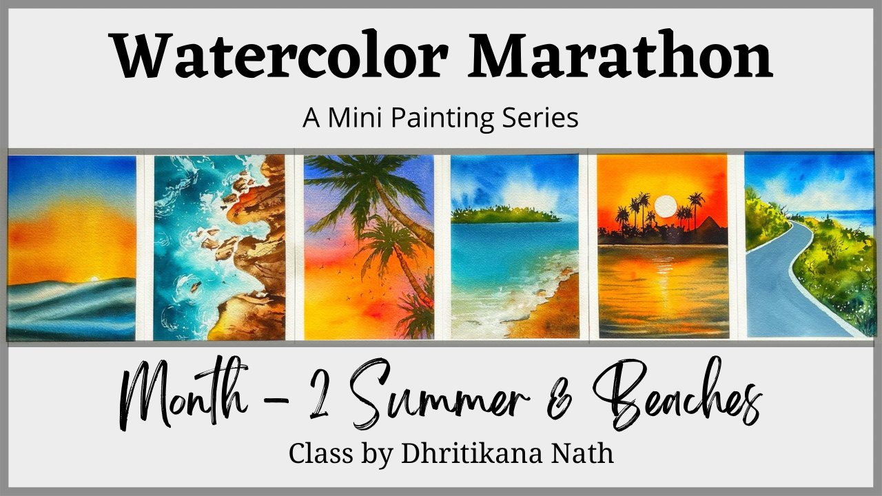
Transcripts
1. Introduction: I've tried. Usually I take lot of photos and videos of Flowers
because there is a famous pro box around it when it's dollars. So does my job. Guys. I am dhritikana Nath and I'm
going to hold my muscles. Webbing manufacturer
makes much more. I do even have a use for section where you can find
these subjects being covered. And once you have
me for a lifetime, we are going to start
out with the letter a and going to the end, which is set overall 26 speckles that we are going to cover along with it,
full compositions. I will discuss a lot
about point using simple, as well as how to transfer the full composition
by pressing method. And then finally,
working in Layers with what colors to complete the individual
floral composition. It is a great add-on. We have an understanding about sketching and insights
on watercolor. But even if you are a big nerd, there's a lot to lot as this can be your starting
beautiful watercolor. Ultimately also and our V0 time. Hence, you can paint
along with me. If you are convinced, stock-out, and then go and join me?
2. Class Overview: Let's understand pumping about what this class
we're starting with. Understanding how to
go about bronchi, each and every florals
starting with alphabet. I'm walking consent. Every alternate day, I would be uploaded for project. So you can go watch
that project has full as you have to be used
to be both for yourself. Notice all section has the project of donors so
you can download it for yourself and then trace it
back with the help of a racing be Four and back
off a light box. And other option is
to draw along with me and paint in years. Louis has called the
beauty in it can, hence we are going to go 113
finalizing compositions. Every day. You would be walking on
one full composition. Before we start out
with composition, we will get to know about all
the colors that is needed. That is even given
at the list in terms of the individual photos
that you would be doing, as well as though people, the brushes, pencil,
sketch, everything. You do not need to
worry like array. In the next lesson, we are going to discuss
only a buffering
3. Materials Required: Let's start out by understanding all the videos which we need for completing each
of these paintings. The first one is basically
our young people. So what, I'm going to use these
one at five years people, and this is 31 ankle 40, 1 cm. What we can do is we can
actually pick up out of these kingdoms of
smaller size paper and use them for our paintings. The next is how a sketchbook, what I'm going to use is, again, for wanting effect
GSM paper sketchbook. You can see that I have done
a lot compositions on this. And we will be paintings, this particular composition
in our final painting. Okay, there are two jars
of water that I have, and usually I always keep two jars of water
for our painting. The size of the
people is around 15.5 cm into 10.5 centimeter. I am keeping or pencil and
eraser cosmology tape. Then I have a small scale
by my side along with it, I call compounds, Drawing sofas and three to four different
types of brushes. Now, this is majorly
the brushes which we are going to use for
our smaller paintings, which are the flaws
six paintings. And as we progress
into the composition, I will give you all
for the look at what we need to add on in terms of brushes,
Kahlo, etcetera. I have other than C3 by
zero peptide brush that I have a SCADA Paula size one brush is quadripolar
size zero brush. You can also keep us
quadruple in size two brush. I have a DaVinci
size four brush, these are my brushes and in case sometimes these kinds of things to happen
on your brushes. What your brush in water and
just let it dry like this. You will get a nice
tip on the top case. So that's all I have
from the brushes. I have a ceramic
palette by my side. I have been using this
even in my paintings as you can use any palette. Just That's anomic pallet, will not have any color on it, which usually a
plastic palette does. So I always preface
ceramic palettes. I keep a tissue pretty
handy by my side. You can also do that
in terms of the color. As you progress through
each and every painting, you will understand
how about the Colors. I do love to use. Some beautiful squeezed out, nice paintings from the tubes. Hence, I will be using that
for most of our paintings.
4. Painting in Layers: Okay guys, so I'm taking
this cobalt blue from the brands in your and
what we are going to do is we will walk in Layers. I've taken a rough paper
because I could cut coffee. Which paper? From parent? This was a piece which came out. It is 100% cotton,
300 GSM paper. Fabriano, though you can take any other people for
doing this exercise, just that I have taken
100% cotton paper. You can also use the
people which you are going to work on for
your final Painting. That's something which
I always love to do. I'm pretty used to 1AD five GSM, hundred percent
cotton arches people. I have been using
one at five Js. I'm not just people for
quite some time on hands-on, completely well versed with it. How to usually the watercolor
spread on it as well as how much water I
should add on it, etc. but for anyone who's
starting out and a beginner, I would ask you guys
to use the same people that you are going to work
on for your final painting. Okay. Let's go ahead and have a good and decent amount of
water in our Watercolors. Something that I've
always told you is to have good amount of
water in watercolor. What is all that we are going
to use for our painting? I'm going ahead with real
flat wash in this case. And you will see that there
is only one single wash. This is one layer that I'm
like, Well, I'm working on. You can walk around with as many layers as you
want and him florals, the more layer you whack them. What? Theft? Nicer details. You can push you create. Hi, continue to work on it. And had the caller was just running my fingers with
violet go to the bottom. Okay. No, I will have some more water in pigment that I've taken. And then I will run through
the entire painful. I see this scholar to
has degranulation in it. So if you are looking
forward to some pink, like a Watercolor
that has condition, I guess this can be also used as a granulating
thing, watercolor. Oh, okay. I guess so this looks great for posterior
what we were to, we will make it dry and then only we will
go head width later. Let's see how we can
continue to work in VRs. So let me take my brush, some veins on it. And let's work to
the second layer. There's a very simple
painting where there's a small lake and the ground. Mountains along with it, of course, has to be
poured Lake also to exist. We need to see how we
go ahead and paint it. So all those things are there. What rest is a very, very simple and easy
to go for painting. Its just came in my mind and I went ahead and added
painted, nothing. Like I have seen something
and I'm painting from that. Sometimes you do even paint
from your imagination. It's a very simple, easy
exercise for anyone. Even if you are a ignored
the sandy or create help us. You just need one single payment for completing the
whole of the painting. Though this might be
a landscape painting, but hold the learnings
that we have even in a landscape
painting can be used. Gentle floral painting is all what I'm going
to show you today. If the knowledge that
you've gained always has a future use in
your own paintings. You can continue to add some dry clouds just
exactly the way I'm doing. The top right-hand part, of course, is way more broader. And as we come towards the
bottom on the left-hand side, it would become thinner. Though I always love to paint clouds in wet on wet method. I know many artists
who do wet on dry method and they
do it very well. This is just a quick
example and it is one of the ways you can use your knowledge that
you in go anywhere, whether it be a landscape,
Floral portrait, any particular place
in your future. Paintings, continue to do this. And then we will add
a third layer to add more depth into
our original painting. Almost time to gear up
for our layer three, the top part of the
cloud is done as well as the bottom
part is almost dry. I will go ahead with my
full crown mountains and add another layer on
by full ground mountains. Right now the speed
of my video is 2.5. I have altered the
speed of bit goofy here as there was
not much to explain. It is just for an understanding that
I've created the video. While I go towards the bottom, I do understand the paper
is still not fully dry, but I guess we can
apply another layer and have a clear understanding
of the whole Painting. While I always say that Layers
to have a story to say, as well as the magic lies here, I must tell you that when you work in Layers, it's
more forgiving. As the first layer which you apply is always
pretty light. And as you progress, you will figure it out
that you Layers either are becoming more and
more darker, lighter. Do you need to apply
another layer or is it fine just to keep
exactly the way does. Hence, working in Layers gives us more opportunity
to play around
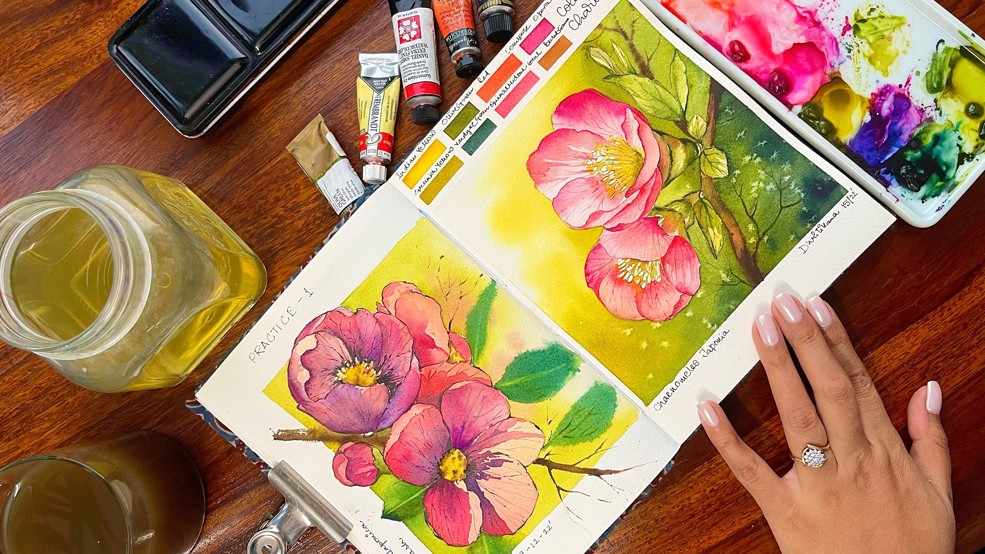
5. A - Anemone - Colors: I'm going to discuss all the
colors which we need for completing the painting to
fosters the permanent yellow. The second is permanent red. You can go hit with any
rate of your choice. Greenish, yellow. You can
make some bit of yellow in your olive green
or in your sapling, get her calm exist. The next is paint it green
on the last one is Kindig. Now let's want to
do Fine Painting
6. A - Anemone - Painting: Here we also false reading from the CDC to set up florals, we have to start
with the Lego E. And I have chosen
animal as my flower for the letter in meeting
stack by making the so-called I'm
using haul compost. I would ask him to just
with the washy tape in the sandal and then had
compounds, metal particles. What happens is sometimes
we have or we get this small hole
which we do not want for the flower do the middle
part isn't absolute value, but still going ahead with
smallest circle again. And once you are done
with the smallest circle, then we are going to
mark off few lines. Now, these lines are basically a guideline for
adding to our petals. Something that I've
always, always wanted. Each one of you to
follow is half-full, very simple and easy method of adding flowers or
petals or anything. Use as many resources that
is available with you. Go ahead with complex ascii
or lines and try to make your work more and more
simple and easy way of approaching your florals gives a lot more
confidence as well as they are very less chances
of making any mistakes. And yes, people, it
is a handy try to have really light lines on the paper because
it is watercolor. And watercolor is a very
transparent medium, as it is a transparent medium. So if you mark darker lines, they will be seen and
we do not want that. Again, the next partners, we are going to walk in
Layers which will make your life more simpler
as per my understanding, that is way less
work or we list, I would say if we
calculate because you are going to finish
off one layer and then go ahead with
the second layer and then go ahead with the told you we did two to three years
or Painting between them. And frankly, this whole
painting is going to take you about 22:20, 5 min. That extra that you
see is majorly to mark all the different kinds
of color sheets, etc. which we have use
for the paintings. These are kind of small, small costs that you
can also use for gifting or else you
can also use them. Has please cards for any
of your readings etc. that you want to, if you are writing on kanye also plays cards for
wedding invites. They can also be used
in this particular way. So once you actually understand how to paint
all these kind of florals, not only it opens up one single do it opens up
many other tools even for your own purpose of painting or creating or
business grading a channel, having some side hustle
of your own, etcetera. Okay, then let's on some
Jake on our drawing, we are making those which
are actually below. So these fads, the
top ones and now I, the ones which are beneath them. Once I'm done with the spot, I wouldn't want to leave the
stem and some loose leaves. Though there is one definition, but I paint my florals, whereas this definition when
I play in my only leaves. Now, this is the kind
of approach which I did choose for
my first Painting, which might be very
different when we are going ahead with the quad
auto paintings. Three, painting that
you do not only give you all understanding
of the flower that unique, but it could also
get you ready for final composition that
we are going to Vietnam, but of course six
individual florals. So what happens is once we're done with, of
course explore those, we can pick up any
of that Floral and then go ahead with
a final compensation. Along with the
leaves background. At second, you will get
a complete hang of it as we progress. Stopping. Yellow, red You can go ahead with any rate that is
available with you. No need to go with
this particular read. Anything and
everything is great. The next is the yellow. Now this is permanent yellow
deep which I'm using. You can also mix it with any other yellow that
is available with you. And then I will keep blending
it with my blending brush, the darkest value I'm
applying to the side. And as I move towards somebody, I will make it 100 more lighter. Okay. My brush had
some paint and paint. That's absolutely
fine. You can wash it. Again, take some water in it, and start taking it
towards stomach. I am practically pulling the paints to goods,
the middle part. It is nothing but
an exercise which I have done even oligo in
many of my other paintings. And you would have seen that
I worked a lot with water. Has all these see all your paintings or
Glisson's Watercolor. Water is somebody and
Colors comes second, which means that we are going
to use more often what'll, whenever you're painting
with watercolors, you walking with
this particular way or in this particular way, only tell what the Floral. Once I'm done with the first
curator of the pleura, I will even take some light
green and start off with the bottom part where I have to green as well as the
stamp of the Anemone. I know that the initial part where we were drawing
and sketching, if my copy on top. But if you have a clean brush
available with the pad, one brush to add your colors, it is quite good enough. Continuing with the first step, every painting that you do
actually happens in Layers. And as we progress and journey, we get to understand how much would be work to get
the perfect outcome. Working in Layers
actually gives us what Unfortunately, to not overwork. Because in the first year you are only adding have
very light color. And once you are done, you get to understand
how much you want to go ahead with
for your secondly, we're not going to
touch all the areas. Which means once you are
done with your layer one, you already know
that majority of the pot is already worked on and there is only but another area which
you will be touching, the ghetto, depth as
well as the highlight. So the highlights Anabaptist
something which is very, very important in our painting and we continue to do what? For all our Watercolor florals. If you haven't taken any of my other watercolor
floral painting classes, I would request you to go ahead and check out the
class seven days, seven different florals and
it is seven different styles. It is Watercolor
Floral Masterclass. I hope that you would be in a
position to gather a lot of knowledge from that class and it can be even applied
in the current class. This is, I would
say more beginner friendly and you get,
wanted to stand more. I'm glad some greens now, I'm starting with cold
greenish-yellow kind of a color. You can go ahead with me, green or any other green
that is a beautiful by Tim. It's great to mix call but
also all of green into what you can get calling Panther something
concert with this one. If you are having a yellow, then you can make some amount of light green into what I'm good, a color that's similar to this. I would be using
the tip of my brush just to create some
of the leaves. Because the US and
approach I would say I'm also going to leave
a few dots urine there. Now these dots will actually continue to get the
impression that the leaves are loose and
usually you can add a lot more in terms of
the Drawing, etcetera. But I did not want to complicate the first painting
for each one of you. And hence, I wanted to keep
their leaves easy, simple, so that you guys will be motivated to
continue with, okay? Okay. The top of the
partners already dry and we need to go ahead
and work with our red. Now, I am starting with
my red. I'm adding it. The bottom of the flower
petal that you see. I am only creating a few lines. It's not that everywhere I
keep painting along with it. I am making some
darker lines are darker tonal values for
petals which are beneath it, which means that we
are not going to darken each and every
part of the flower. It's just few petals
which are going to be taco and few petals which
are going to be lighter. One the lighter petals
there will be highlights in few opaque areas
and they will be areas where we are not
going to touch even. Hi, thank some
amount of think into the wreck to create
a darker value. Now, this is very
important so that the top remains in
the highlighted area, looks different than what we have to put some bottom area. It is all important
aspect of creating depth. And I hope when you are also starting out with
any of your Painting, you get to understand that
few of the places will be darker to not only
create the contrast, but also create the
depth hand we have to showcase or just take
you the areas where you want to highlight and give more importance to
rather than giving importance to each and
every part of the pleura, we're going ahead and creating
some of the importance and only the areas which we want
to go ahead and focus on. If you focus on each and
every part of the flower, what will happen is that the person is having a look at your flower,
make it continuous. We want to keep the
focus on the tension. One of the area had
control of attention, often spectator or
die for the whole of the attention of the spectator only to that particular area. Let's continue working
with our second year. Again, the second
layer is very simple. You have to go ahead, touch your brush and then
pull it to what somebody while you are going from the outside towards
the inside PBOC. This is how we have been
doing it for all our petals. We will go from the outside
and then go towards stomach. The outside part has
more area to work on. Enhanced also gives
me more confidence. Wildlife Live from the outer ear to the inside of the bottle. The whole watercolor
medium is not to do with how you
handle this medium, how you partner with
this, meet him, and you should never get
scared of this medium. This medium is a
beautiful medium if you treat it with love, respect as the last. If you start enjoying it, to be more precise, when you start enjoying
this particular medium, you will get to realize that many of the things
just simply fall in place and you do
not need to give any extra effort to walk around You can go ahead and make some sap green or
olive green arch when I think Jamie
into your indigo and start with them
really Patoka flower. The left part of
the flower is a bit darker compared to
the right path, which is the area. So I'm going to even approach our particular painting in
the seminar week apart. A bit more darker compared to the other part of the
whole of tau Painting. Let's add a second here to
the greens that we have. Now, you can go ahead with
any doctrine of your choice. What I think the spot, I am going ahead with me
or few ads what adding the darker value or cream every time whenever you what
adding an auto New York. Who should keep in
mind that we had walked going to cover the first. When we are going
overboard of us there, we have to make
sure that most of the areas of the
posterior is saying yes, maybe in our small space like a stem that would
not be possible, but in all the other areas, whether it be your leaves, coordinate petals,
the first knee, or should be seen properly. The intent of finding
news is to create the light and shadows
hospitalized. Know that it in terms of Colors. Then the EDS, which needs
more concentration and focus. So overall, when you have a look at flower that you are watching, you would be in a position to understand that this floral has. So I'll focus area
which is in the middle, or it has a focus area which is just around the petals only. We're not going to focus on the entire ads that you, what, those are the aspects that
you need to keep in mind now, going ahead with our
darkest value of the pink. And I'm just highlighting
a few ads for our petals. Many of you are more
experienced into Watercolors. We have walked through
the light and shadow part adequately,
yours very often. But many of you might
be starting out. You may not be Valois. She went this method. Just be more patient. I would say that can help you to east to the spot very easily. Patients is lucky in
Watercolors, as I always say. Literally when you are
working through the layers, you need to be more
and more patient. As well as one important
aspect that I can tell you is once you're done with you for so you can
easily take a break, come back, do your second layer. And then again, if you were
done within second-year, you can go ahead and work on
the third layer later on. So practically you can
work for ten, 15 min, leave it, you can get back
to it maybe in the evening. You are doing another
session in the morning, get back to it in the morning. So overall, you can have
multiple sessions to complete one single floral that
I have been doing very often for many
of my compositions. Because compositions are more longer compared to what we have. Now for our individual neurons. I told you you put the paint. I need to be very short, but I'm not having
it everywhere. One or two lines within
the petals had pen. I'm going to mark the border. War. Videos hold the petals
which are on the outside. This is still makes sure that individual petals
are seeing well. The have the required amount of focus and tension which
we need in the Painting. Time to add the
statements and ponens in the Murray Park continue
working with your indigo works. You can also go ahead with Payne's gray for this
particular part. I'm very open to
you using any kind of color that is
available for you, but I'd like to use
the black as it is not the color that really entices me or who knows me towards
the painting much. Go ahead and use
all these shades. So for your Painting, while completing this
particular painting, I would ask you to go with Payne's gray oriented
go for the middle part. Individually, you have
to make these colons. And once you have made these
Poland's smaller or bigger, do auto those sites. Now, altering the slides also gives you a lot more randomness, just the way you
did. Your petals. All of them are not
of same size and they are not having the
same kind of lives, as well as they do not have the equal number of areas
in darker like a week, keep altering all of that nature as random
as I always say. And hence, when you
walk Painting nature, they will have its
own randomness appearing even in the Painting. Embraces, as I say, do not try to fight with it or do not try to have a symmetric. We are not here to
create a cemetery. The I here to just go ahead and enjoy the
process of painting. All the paintings that
is taught in this particular draw
series car in Layers. As I say, the magic
is in Layers panel. That's what we are exploring
in E2 is no florals. This is meat easy as you
progress in the paintings, this might confuse, good tough because it's the first painting
that you weren't doing. But as we progress
when you paint on the Daffodil, ischemia, etc. and many other photos. You will understand
that how easy it is. It's just more concentration and some more patients,
that's all you need. And those are the
key ingredients for any Watercolor Painting. Continue to add these textures to the middle part
of the flower. And then we will just add the colors that we have
used for those painting. I love to add that
information when I am making any kind
of cards like this. It's a really small people
and hence would be in a position to even finish
it up into stipulated time. Hope 22, 25 min, maximum, half-an-hour irrespective
of the drying time. So that's all. And let's pad all the colors
one-by-one to power EVL, which we have added
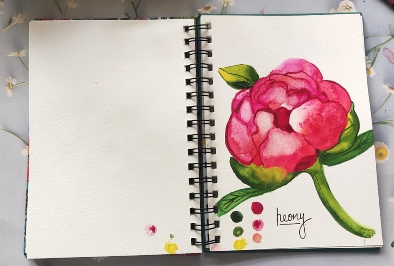
in the bottom. Once that is done, let's just write Anemone and we are done. I am super happy and excited
to see your Painting do uploaded in the project gallery as I'm waiting for
each one of them. Can't wait to upload
the letter P, which is up Bloom,
Balloon Flower
7. B - Bloom Balloon - Colors: Let us know all the colors which we need for completing
the painting. Again, this is all kind of a limited palette exercise
that you are doing. We are only taking four Colors, greenish-yellow when I K green, bright violet, and
ultramarine deep
8. B - Bloom Balloon - Painting: Today we are going to
paint a Bloom Balloon. It is one of my own
favorite flowers. And if you see here, we're going to work a lot about how you can actually
fix the angle alpha flower. Now, this flower is actually opening towards the left corner. If you put a straight line
from the left corner angle, you will see that the flower is moving towards
that direction, drop them in becoming
absolutely straight, or it is not facing upwards, it is not facing downwards. It is facing on the site
towards the left-hand arrow. So that's, that's how I am going to actually go ahead
and work it out. Since this particular flower
is working at an angle, it's important for
us to not make equal soccer on both sides. Now have so-called that you see towards the top
left-hand side is off because radius compared to the one that we Drawing
towards the bottom. According to my understanding, 30 of the florals, it's very important to
decide where exactly your flower flowers
opening and at which angle you want to draw it. This might be a
tough decision right now for many of you
who are starting out. But believe me, as you
progress in your journey, this will be one of the most important decisions
that you take. The contour of the flowers
now becomes important. What do we mean by the contour? It is basically the outline of the petals and how
you design it at this moment practically defines
the whole of the flower. It might not sound very
exciting at this moment. But has we progress to our
Watercolor florals journey? You will see that
when we paint or Daffodil, full
blown competition, there will be angles that is very much important
for me sketching, drawing or tracing DO for
these particular flowers. I am not asking you to trace it. You can, of course, go ahead and trace. I have holiday uploaded the flowers on the
projects section, but it's great to draw
it with your own free flowing sketching pattern or
howsoever you want to do it, try to make these
lines as few progress, we have to get to a situation where we are drawing the
contours on our own. Though we will have
a framework like a circle or square or lines, but they help offer scale. But the final contouring
or how you define the petals will be upon your
own freehand line drawing. Initially, when I started out
my journey of watercolors, I only did landscapes. And it was mostly free
flowing landscape where I had to
really sketch lot, lot less than what I
usually like to do now. I love to have a bit more
control over my landscapers. That was never the case earlier. Stolen steadily as
a progress tend to florals as well
as urban sketching, I got to realize that there is a lot of importance that we
have to give tours sketching. Though there are
various tools that are available for us to measure, to understand, like we have scale or
compounds, so-called. There are many other
tools that you can use for drawing lines, etc. but the final sketching out, the final join that I
always say has to be done by you and never
tried to break alike. So if you are moving, you will see I go
straight though. I might not make it correct, but I still try to make the whole line or
make the whole goal, rather than breaking it. Breaking it actually gives us we more or less confidence
in this process. And slowly, steadily what
happens is that we keep breaking our lines and then
only keeps catching it. Whereas if we go with the
whole confidence that yes, I'm going to make
a correct line, but me even make it incorrect and we have to go ahead and erase that later on. That's absolutely okay. Eraser is for your own use. Only one thing that you need to make sure us that
you are not doing all the experimentation of the Drawing on the paper itself. Now what happens
in a final paper? Our paper is watercolor paper and the pace are
also transparent. Your graphite parks or
the pencil marks that you might have done all
you will show up, which we really don't
want him this case. Okay, let's come to do, to make some colons
and the statements. This is an important
aspect of a flower. Every flower has pulled
an and statement mostly. Yes, I'm also adding
that along with it. I have to cover this molten
as well as the statement a year with the help
off my masking fluid. But what I usually do
for my masking fluid Will dip the brush in my soap that I have
my brush soap and then pick up my masking fluid with the brush added
on the people. Again runs it will
wash it that way. I can really preserve my brushes well and they go,
You're on your. In the meantime, I
will continue with my sketching part of the flower. Now. I have a small part
that is on the right, as well as I need to
make some leaves. Let's continue to do
the sketching part, and then we will move
on to our painting. The painting will be
again done in Layers, which gives us way
more opportunity in terms of it is more
forgiving, I would say. Because if I even make
a mistake in layer one, I can cover it up in layer two, though you have to
understand that the intensity of the pigments or the amount of pigments that you can use in the layer one has to be 3D less compared to the one that you
use. And layer 2.3. That way, you have to keep a control over the
whole of the Painting. For this particular flower, I've ever been big
S2 important Colors. One is my ultramarine blue are the second is
my bright palette. Now, if you do not have
these colors, but you, you can go with
any other blue of your choice and some
amount of violet. You can also go ahead and mix the pink and blue to
get a color that is similar to the one which I am using from main color
does have some kind of granulation and it's so
be sure to not go ahead and add a lot of in
your first year. Therefore, it has
to be more watery, it has to be more diluted in terms of the
pigments that we're using. It should be really, really
less than the first cool. I'm going ahead with
a flat wash, right? Tell, but you will see how I add more and more depth
into what as we progress even without
were firstly, I am going ahead and finishing off the sides of the florals and trying to have one
single color throughout. It is more like a flat
wash. And you guys have all the great knowledge
about the flat wash. You might have gone ahead
and seeing how I have used the flat wash
for our Layers section. And in case you did not, please go ahead and
have a look at it. It's very important for
all our paintings as we progress going with the
darker value of the mix, which is mutually my ultramarine
and go bright violet. I will put it in the center. Now, as I add this
in the center of what usually happens
on a wet surfaces, the Colors keep moving. The colors with
more intensity or they have more Depot value, will move to more lighter value, that is towards those sites. But if this doesn't
happen so quickly, then you can also use a brush to go ahead and add
these types of lines. Once this part is done, we will go ahead and I'm can add some darker value in the
middle of the flower Trying to even out the scholar
of wet from the sides. Once I'm done with the equal proportion of
colors, wherever I needed, I will go ahead and add some more taco values wherever it is necessary and
make some lines. Now, this makes, of course
is truly dependent on you. You do not need to have
only blue or only purple. We are mixing two colors
to get a color like this. And adding these lines basically helps us to define the
direction of the flower. To a great extent. I will let the colors dry off. Now we are not going to
touch this layer anymore. Our first layer is
completely done. We will go ahead
with the greens. Now. I will continue
adding absolute flat wash. The whole of the painting
that you see is real-time. Hence, you can follow
along with me. It even takes me a lot of time to complete any
Painting and hence, I like to keep it absolutely. You time for each one of you. All these cards that
you see or florals on a smaller paper is
usually the one that I love to eat
for my references. Now, these have been
great for references whenever you are going ahead
with full composition. These small cards which you have painted might
come pretty handy of how you should think of Bloom Balloon or any other
flower like Anemone. And maybe if you are going ahead with the
bigger size paper, then the approach
might change a bit. Still. They are helpful in the complete understanding of the colors or off
maybe the size, shape, how you have done it, how you did approach the
whole of the painting. All of it makes a lot of difference to your
future paintings too. I always see this, that every exercise that
you do is never wasted. Whenever you try to go ahead
and paint something more, or try your hand
on something like florals for landscapes or
urban sketching, etcetera. They all add-on to your
whole process of practice. Am your whole process
of Watercolor journey. All are Watercolor
journey is different, but still, we do keep making
progress as we practice. That will not change as such. I am going ahead with another
layer for my Bloom Balloon. This is one layer
darker than what I did add audio to my painting. I will go ahead
with three layers for the School of
the floral painting. You need to see
that I missed out a small part of the
green former posterior, which sometimes
does happen for me. Even like it, it does happen. I do miss out at some point in time and then I come
back to what and again, paint that area and whole kit going with free
flowing lines in the middle, it is darker and it is Prato. As we progress to
what's the auto side of the contours are
towards the outside. All these petals, they become
less so as well as Theano. You can see me again getting back to the green
that I did not add as I did tell you
that I forgot it while I was working
through dreams. It is the yellow green, which I am adding. You can go ahead with any
other green of your choice. Practically do not
need the same green. You can go ahead
with the Van ****, a green or any
other darker value, maybe some other green,
viridian, etcetera. They can also replace
even a sap green is good. You can use a bit of yellow into your sap green and
yellow of your choice, and your yellow, lemon
yellow will be preferred. But get a color that is
similar to this one. Of course, going with my second layer now for those
stem and few of the areas, I'm adding a darker
value and then I am blending it with clean brush Of course have been brushes, the one with which I
did apply the color, but I'm washing the brush and using the water to blend it. You can see that the
top right-hand corner either add or taco
value on my leaf. And now when the
paper is still wet, I am adding some lines for
the wings of the leaf. This you can always
do and going with the thinnest brush
that is available with you will be
helpful in this case, investing on good people, brushes, paintings will
never go for a waste. The most important aspect of a Watercolor Painting is
to have a good paper. Even if I'm using a
one at five GSM paper, it is 100% cotton
and it is one of the best that is available in the market, which is Arches. Do invest on grid paper. If you even have two
to three brushes, That's great to cook. They should be
good brushes which can help you to hold
a lot of water, even make these thinner
lines whenever it is needed. I am adding some lines
for the bot of prime, but now this bot will open and you can see
that there are paint, some petals which I
want to show right now. If I'm trying to
add these lines, it's not of much use
and hence I'm just blending it with the
entire part of the button. My paper is still wet and hence am going ahead to
meet these lines, which was what I
wanted to do volume. It makes more sense as of
now to do these so that you get the depth which you
need for the spot of been. Of course it has to. You can see how much more
depth we have added in our day to time to go ahead and even add the layer
to four hour job. Next part of the green, not the status on the left side. But not to be surprised, I have again forgotten. That's why I keep
forgetting about it. I don't know why, but yeah, Let's continue to add
the darker value for our third layer on top of
the Bloom Balloon Flower. This is one of my
favorite law Flowers, believe me, it is
so easy to make. Its only the sketching part, which might take some time and is hardly anything else that we are doing much into what you have to work in Layers and
like the paper dry off, That's one of the reasons I
have told you to take one at five GSM people rather than
going ahead with 300 years. I'm thankful as this people is well-worth in terms of taking multiple washes to
four to five layers they can easily take
not at all an issue. Even sometimes are 300
GSM paper can not take three to four wash or five
wash. One of the reasons is either it is a handmade paper or maybe it's a cellulose paper, or maybe it's not 100% cotton, even if it's written
it's 100% cotton. So you should go
ahead and always test your paper on which you are going to paint initially. Whether it be any kind of practice session you
are doing in it, or you just go ahead and see how your pains are
moving on top of your paper. If they move very evenly
on top of the paper, it becomes pretty easy. If it doesn't move from even
be on top of the paper, then sometimes it becomes really tough to
continue working on it. Have a go ahead and define
the contour of my flowers, which is majorly my offline, as well as add some more veins. This is the darkest
value of the pigment, which I am using. Two more squeeze out the paints
directly from your tube. And then you said it
could be very, very tough If it's an artist grade
paints or else if you are going ahead with
student grade paint, it might take you awhile
to get a color that is closer to the one
which you absorb vitamin. This is the time where I
usually see most or many of my students to go ahead and
lose all their patients. Yeah, it might sound
that why at this moment, you might be asking yourself, but it's almost towards the end. You have done all the efforts
that was needed earlier, but you are not in a mood
to complete it or you did not find that to be coming
out as you wanted it to. There are so many things which goes in an artist's mind
are a creative mind. When we create
something, please do, push all those thoughts
on the backside and continue working on
a bag day and completed. Completion is the most
important process for any of your painting. And believe me, I
complete each of my paintings whether it'd be good or bad, it doesn't matter. You have to just
complete one painting for a basic understanding of all the mistakes
that you didn't. I'm painting all the mistakes which you even do an
a Painting is going to add onto your knowledge of not going ahead and
making the same mistakes. Finally, let's work on
Art forgotten leaf. We are done with even the third
layer of the other parts, but we have to walk on the second layer of this
forgotten leap altogether. I will continue working on
it and then just finish off the whole of the painting by writing all the colors that we have used
for the painting, as well as just adding a touch of my
calc trophy on the top. I love to do this and
I hardly get this. Unfortunately do much of
calligraphy wherever I get it. I just love to do it. It takes awhile for
an understanding or your warm of calligraphy, how you want to do it. Do you want to do any fancy or do you want to keep it simple? Whatever you want to do, go ahead and try it
this easier time. Be creative as much as you want. This is your opportunity
whenever you are sitting all by also time is yours and use it to the best
of their ability. One thing that I have realized after giving birth to her now, she is two-and-a-half years old. That all the time, which I had initially
is not mine anymore. And I struggled to
get time for myself. I struggled. I was so stressed out that
I am unable to Tellico. I was unable to work on
what I really loved. I had to really think of how to complete a particular painting
or how to do voice-overs, how to take classes. But that's my passion was driving me crazy.
Slowly, steadily. I got to understand
that we need to take out small bits and parts
of time here in there. Sometimes when she
is just watching TV for a particular time of say, ten, 15 min, I take the
time I found myself. Compete. Because that's very
important for my own heart, soul, as well as for my own well-being. Time for yourself. It's really, really
important using some of my goulash or what
you can say is so Ph Martin's
bleed proof paint, white paint for some of the
parts of the statement. Finally, just adding
the color chart for all the colors which I
have used in this painting. Okay, great. I hope that you enjoyed
this lesson and we will meet again day
after tomorrow with the third Floral,
that is camellia. It's a beautiful
flower and I have painted so many chemical
goes till date, but still it touches my heart. And that's one of the reasons I, I wanted to include this in our Floral series of eight 2M. Do not forget to upload your class projects
in the project, Kathy, I'm waiting to have
a look at each one of them.
9. C Camellia Colors: Let's look at all the
colors which we are going to use for this painting. It is yellow, orange, permanent yellow light,
permanent red, green is shallow. And when I can create, these are the only
five sheets that we are going to use to complete
the whole of the Painting.
10. C - Camellia - Painting: Today is the third day where we are going to paint
Camellia flower. Camellia is very
beautiful flower and I am completely
smitten by it. I actually had a look at it when I was last time
in the arginine. And there was a house called as camellia house where
we were saying, and just before the entry I saw this beautiful Camellia
plan that had to full Camellia flowers on
it posts that I could not stop myself to share this beautiful painting
with you guys. Okay? What I've done
is I have created a circle with the
help of my compounds. And once we are done with that, we would like to mock the
middle part of the flower, which has the statement
as well as the polar. Now why do we mark the
middle part first? This middle part really allows me to understand how I want to shape as well as create the other petals
in and around it. Once that is done, you can very well create the who loved to sketch
as well as it provides the base layer or the basic framework
which I always see for your final painting. Going ahead with
one simple approach that my Floral is towards
the right top and corner. And it's opening
towards the right. Which means that the petals
which I have that is going towards the bottom area will be smaller compared to the
ones that are on the side, as well as on the top. That's how I approach
my Painting. This can be the basic sketching with part which
you can understand. Yes, everything is
perfectly fine. We are going to pick up
next task, Daffodil. Daffodil is very exciting. We are going to use all the
learnings of the Daffodil into our final Daffodil
painting that of course, we will be doing
on the sixth day once we aren't done with the paragon flower posts that we will be working on the
full composition of capcom. Anyways, let's go ahead and continue with our
camellia for now. And you can see all my petals are putting in
various directions. I will continue
to go pretty slow as I keep adding all the petals. One of the reasons for going slow in my painting
right now with I do not want to create
any mistakes as well as I'm trying to put together a quick as well as
on good sketching so that there are
no mistakes which we create where we
paint this floral. Something that I have learned
over time and I always preach that even to each
and every student of mine. Sketching is your base. If you can get your base
are the basic, correct. I can tell you all
for everything else that you are concentrating
on will fall in line, going with the petals and
continue to work on it. The left-hand side petal is opening on the top
left-hand corner, on the right-hand side
is again opening on the right hand corner. But with that, there
are other petals too, on the top as well as
towards the bottom, which we need to go
ahead and just adding. It would be a quick Painting, believe me, there will be three layers that we
are going to apply. The first layer is
basically how a base layer, and then on top of
it we will keep adding the second day
as well as a totally I have a small bought
on the left hand. Then I would go ahead with how quick stem as well as one single leaf on
the right. That's it. You can add further more to it when we have full
compositions coming up. But right now, we don't have any full compositions
to be taken care of. And hence, I guess only very simple outcome
serve our purpose. We're here to understand
more about how to create various kinds of florals
with very basic knowledge of Creating the petals, which
is drawing, sketching, and then finally working with
the final outcome that is going ahead and adding
layers to create the depth has well as the contrast within
the single painting. All the knowledge that you
have right now through all these individual florals can be applied in your
future paintings, as well as you will absorb that. I would be using all these
learnings in our compositions. Do for the background, I would be working ahead with
some of the pro kinds of techniques that I
have been using for all my flowers as well as
discussing that with you, how to create the bank balance, how to create more enhanced as well as
complicated backgrounds. We will continue to work
on each one of them and give you more and more
tips and tricks as a progress. So with our journey
of a to Z or florals, some links that I'm
making for on leaves. And once are these
things are done, then let's go ahead and continue working with the
colors that we need to be going ahead with any
kind of an orange you can go ahead with and have
a pink buyer side. These are the basic two
sheets which I am using, Hubbard of yellow and green. Greenish yellow when
Nike Green, basic, basic Colors is
great for all of us. Whatever color is closer
to the one that I'm using, you can of course, use them
in your family banking. So do not need an exact match
of the color which you see. Okay, it's time to now
go ahead and paint it. I'm going with the
lightest value for now. It is majorly my
permanent orange. Now permanent orange or any
other orange of your choice, you CDC don't mean the color
that you absorb right now. I'm going from the sides and then we'll move
towards somebody. This is my first year. And if you go ahead
with this layer, go with utmost ease. I would say go with the lightest
value that is possible. Wash your brush just
the way I'm doing, and then pull the colors towards the bottom area of the
particular pattern. Continue to work through
each and every petal, exactly the way you
observe me doing. There is nothing much
to explain has off now, as you can really see, that it's a very simple
and easy process. Relax and enjoy it. There is no difficulty and
there is no different, or I would say, difficult kinds of strokes
that I would be using. Hence, relaxing and
enjoying is the whole motor of our first-year go with
the lightest value and the paints towards
the middle part with applying some amount of
water, pulling the paint. So it's a process that you
do either with simple brush, which doesn't have
any color on it, or just washing the
brush which has some color that is there
within the brush on it. So you continue to do these kind of work for your
painting process. So pulling the paint is so amazing technique that can be used each
and every place. Where will you are going
ahead and painting. It can be used in any of your future landscape portraits or any of your
other projects too? Knowing with another
petal now, yeah. I did not go ahead with the
address and pedal while I was working on the top-left as
well as on the right part. Polite go towards the bottom. I'm going from the
darkest part of it, which is on the sides and then blending it with
some clear water. Though the clear water
is not absolutely clear. It does have some color in it as I'm just
washing the brush on. The brush does have some color
in it even after washing. So all those things remains
the same as I did tell you, even though I have been
titrating a lot of things and I know because I don't want you guys
to be struggling exactly the way I struggled
a few years back. There are mistakes
that we all do. Or you might see Colors flowing from
one petal to another. When you were working
on it, send petals. If it's still wet, you can go ahead and
add some amount of permanent red or
pink of your choice, and then let the colors bleed And blend into each other. I'm blending is a great
technique and it can be used for most of your paintings whenever you are going
ahead and working, at least with the florals, I use it very, very often when I'm
working with roses. But even on other flowers as
you also now you can use it. Okay. Continuing
with our journey of Floral, which is camellia. This time we are going to
finish it off the other parts as well as then go ahead with our greens to complete
the butt area, as well as the leap. The middle path is all about this team and sounds
well as the poland. It has some long statements
that I'm trying to meet with really light
value of orange. And then making
some rounds on top of the ad using my
permanent yellow light. Permanent yellow
light or in India, no one me on the
yellow of your choice. It is not that you have to go ahead with the
same yellow color, which you are so small
dots here and there's some circular kind of
movements also we can create. So that's also up to you
how you work at around, but do leave some white
spaces of the people. And some of the
spaces of course, would be occupied with the yellow dots that we are
going ahead, I'm adding. Once these dots aren't done, we need to work upon the
left top petal for sure. We cannot let that petal. We get them forget it for sure. There are times where
I do forget one particularly for one
particular practice, those things to keep happening
even with me till date, howsoever experience
to our howsoever. You may be working
in these fields. But there are times where we do forget a lot of things
and it's absolutely fine. We never need to worry about those smaller aspects we need to work and think about
the bigger picture, what we are learning through the entire process of
painting these florals. Another thing that I'm
going to teach you is working in Layers, but covering each
and every layer with the colors that you see, which we are going to apply. Of course, for our leaf area, I do not usually do it for
my floral part for sure. Because I want each and
every layer to be seen. All these concepts which I am sharing with you is co-learning, which can be used in any
of your future paintings, as well as if you want not also using them in any of
your future paintings, you can enjoy working
on it right now, because right now
is your moment. You have taken out some
good amount of time. And as I always say, time is really what is difficult for each one of us to get after having the baby. I do understand that every
minute is so important. You have to use each and every time that
is available with you. You need to respect your time. You need to actually get away with some
time for yourself. That is so very important. And slowly, steadily
as I have understood that concept and I've
explained it to myself. I think I do enjoy the process
of painting even more. I have all set time available for myself
and I need to get all the work done
due menu class to understand that creativity
doesn't depend on the time. But yes, what is
dependent on time? Is that how much you
can use it to your own numb to the best possible
of your own ability. Like right now, you can divide this whole of the Painting
into three different parts. One can be your sketching. One can be going ahead
indifferently or slightly. One mid to late three
can be broken up into three different
parts altogether and you can clap your sketching
and layer one to cancel, leave it to dry,
and then come back only to once the
layer two is done, then you can again come
back to layer three Why have you observed that
some of the places I woke from thaw bottom and take
it towards the top. Whereas in fuel petals I will be coming from the
top towards the bottom. These kinds of
cheeses I to work on. And it's not that we
have to always have a few dark value while we
are in the middle area. Or even a very dark value while we are on this
side of the area, do make sure that
you are not covering the entire part of the
piece here for the plural. That's one important
aspect of floral painting. As I continue to work on this one request which I have with each one of your do
not cover the entire part. I will show you exactly if
you cover the entire part, how it works for the leaves. We will work upon
that because most of us are always asking
this question. But why are we not
covering the area? Okay, what happens when
we covered the area, etcetera? Don't do it. I am going to also show
you that in the leaf, which I have added on top area of the petal
is pretty dark. It's good to just wash
your brush and use the clear water to take it
towards the middle part. I told you that sometimes, yes, we will move from the bottom
towards the top and from top of the petal towards
the bottom plot. These are interchangeable
as always. Secondly, the most
important aspect is to create these lines. Now, what do these lines
basically tell you? These lines going to show you
the direction of the petal, in which direction
it is opening. Why is it important? It is important for every
Floral to be seen as separate. Each and every petal hustle or a role in this
whole of the painting. And while I say that the Floral is opening towards
the right top corner, you need to show that, well, with the help of these
lines into the petal, embedded into the battle, right? Because once you show
that each and every petal is some thing is
moving towards the bottom. One of them is actually opening towards the
top right-hand corner. Something is opening towards just the top side,
left-hand side, then it becomes really easy
for anyone to even see to it. And that particular aspect
of Watercolor Painting, which helps you to add this kind of clarity
and tap is layering. Layering has so much of, I would say, intensity, as well as the clarity
which it brings to any painting in it that I always say magic
is only in Layers. Many of you might have seen that we have worked
a lot of it or wait, and there is hardly any
layers we have created. Yeah, there are many
paintings like that to, but one of my own favorites as co-create and
Layers nowadays, enchanting the biggest secret
of mine with you guys. It's time to walk on the second year of statements
as well as components. I will go ahead and add some lines on top
of the Poland's. You can go ahead and add some orange circular motions or else you can even
go ahead and put some dots that should
be good enough. Now, check your
paper if it's dry. Now, if it's dry, go ahead
with the third layer. This is with our smallest
brush that I'm adding. You can go with any size one
or size two brush motor. Good to go size one brush, would it be better as our
paper is really small? So I'm going ahead
with my size one brush Thirdly, it off our petals
does have a lot of impact. First of all, I'm
not going to cover up my first-year or secondly are completely it's only one or two ninths
you are on there that I'm going to add and make the
bottom area a bit more.com. Then a lot of broken lines even which I add to my painting. And hence, as you progress, you do understand that this is the third layer which
is going to give a bit more direction
to our petals. That's all. Continue working on the total ER for all
the other patterns to. And once this is done, Viva, go ahead with the second
layer of our greens. It's time to show you
how you can cover the entire space with
second and third layer and then also burlap on Colors
and keeping it soft catch. So that's one of the ways I have worked on
for the leasing me. Do our florals remain
the same in this part? This particular
part changes a bit. And I'm going ahead with some more of migraineurs
shallow in other parts to let the colors bleed
into each other going ahead with our darker
value of my green, and then allowing it to bleed into the lighter green which
we have already added. I would paint mixing
this darker green on the whole of the leaf
with the head bolts. My light greenish color, which I have added earlier, as well as the basically
are practically serves as a lighter value for
our future paintings. You can also go ahead
and add some yellow, just exactly the way
I imagine right now. Some lines for layer
three onto the pot Asia, as well as my leaf is still wet, so I will go ahead with
wet on wet technique. Now, this technique is majorly going with the darkest
value and then getting blended with thin sheets that we have already applied. Of course, it's so very
nice bleed that you see. I am pick up all the
extra colors on top of the tissue and then adding it on the right and on the left, creating the wanes which
is needed for the leaf. Once this is done, let's just go ahead and add the final detailing,
whatever is needed. Like adding color list or
naming the flower as Camellia. Once all of that is done, have a final look
at the painting and being brave and happy with the fact that you could
complete the painting and have this beautiful
painting for yourself. You can eat gifted
to anyone else. Keep it for your
own self when you start your own
full compositions, this might come very handy
in your future paintings. Meet you in the next
lesson where we are going to paint beautiful
yellow Daffodil. And that particular Daffodil is in the direction
which is downwards
11. D Daffodil Colors: Let us discuss all the colors which we mean for this painting. One is permanent yellow
light, permanent yellow, deep, permanent red,
green, shallow. And when I K green, you can use all these colors or other options like sending your orange if you don't
have common and yellow deep, you can go ahead with forest green if you don't have
this pen like a green, Let's go ahead and start
with our painting now
12. D Daffodil Painting: We are on day 4.3, we're going to actually
draw or Daffodil. For Daffodil, I will go
ahead and make osmoles. So it is with the
help of my compass. You have seen that I have
made a lot of circles or our Watercolor flow rules of the florals are
circular in shape. That's one of the reasons
we can take advantage of compounds or any
so-called object, also glow object that is
existing with you for making these kind of so-called
mark the middle part. It's kind of a triangle, but that has more curviness into what we are going to mark it
as the middle of the flower. That is majorly where
we are going to have the Poland as
well as the statement. Now, once you have marked
the middle of the flower, we will start adding some lines. Now, these lines
will majorly define where exactly you are going
to place your petals. Every Daffodil has few petals, which is so good part, you can clearly defined each and every packing
In a great way. And it leaves you with more
opportunity to play with, as well as the definition
of each of the petals can frankly makeup the
painting very well. As you keep progressing on. Once I have need
the straight line, I'm going to go ahead and
start contouring the area. Now, what exactly I
mean by contouring? It's basically marking the
eight year or drawing. Or you can even say sketching a particular pattern of
the Daffodil flower. After I am done with
the sketching of one of the petals for
my Daffodil flower. I will go ahead and start
with the next adjacent petal. You may also go ahead with the top as well as the
bottom most petal first. But as per my understanding
and as per what I have usually gone ahead and made
in terms of the drawing, I love to always add the absent petal first and
then mark the other petals. Continuing with the
straight line journey. Yes, every Pepe is defined
with the straight line for me or these straight lines because are at an angle
as you can observe. But yeah, that's how I
like to always define where I'm placing my
particular Patty yes, angle, as well as these
lines play a very, very important role in
the floral sketching. Always simplify your florals. You do not need to go head and complicate your
florals to a lot extent. Simplifying our florals not only gives you more confidence, it also leaves you with a
lot more energy to work upon a better outcome when you are starting with your
final painting. Why you will have on great
base or what I can see is a great framework
upon which you can lay your final painting. Often I'm done
marking on my petals. I will go ahead and
remove the socket, which I did add initially. Why? As I do need it anymore. And we have to draw the stem, as well as the lease
that we are planning to add for this
Daffodil daughter, Daffodil as a single
flower that we are adding, but still we have some
amount of work on it. Adding the leaf, of course, adds a bit of green. And that really lifts up the mood of this ward
floral painting to a lot extend some curves
and random lines, I would say, to make a better outcome in the
middle part of the flower. That's how usually you will
observe what Daffodil is. All real Floral photograph
or in a real Porto also. But along with it, we do keep in mind that there is no realism that we are
aiming for at this stage. What we are aiming for
is to get good and nice, feel-good kind of
a painting when we are done with this Daffodil Let's make some bolus towards the top of the a or where you
absorb me adding it. I'm not going to add a lot. Five-six max and bedsore
knee will then add the stem. As I live tell you
all you as the last one or two leaves you are. And their idea is
to paint of floral, individually,
floral, I would say. This particular painting we are going to use as reference in our composition that
you will observe me working on as we progress
to the sixth day. This is the fourth day and
point D is about Daffodil. Then we will be doing of Floral with the letter E. Once
we're done with E, we will have a full composition
with the backgrounds, etc.. for our first and
full Painting of daffodils. Hence, all I can say is that this particular painting
is one of the base for your important paintings that you are going to do
next in this class. Hence, I would request
you want to have clear vision as well as understanding of
this Painting well, and create your
own muscle memory so that it comes
really handy when you have to go ahead and paint for longer hours and
that composition, yeah, it is longer than what
you are doing right now. There are two
daffodils and hence, any ways you can add
on the total time is going to be a noun
one-off order to daffodils, backgrounds, etc.. will take
somewhere 15, 20 min more. And that's how we are
going to finish a dog. Of course, I'm going to add the whole of the painting
in one single day. But you might approach it
in breaks, as I always say, just like you are doing
the Daffodil over here, you can do the sketching. Keep it. Come back to what later on
with the painting part, I have started
adding yellow color. Does a beautiful yellow, which I have on my palette. You can go ahead with any
yellow that is available with you particularly do not need
the yellow that you observe. This is permanent
yellow light from the brand Magellan Mission Gold. But you can get this color, gamboge yellow or any other
yellow of your choice, maybe even Indian
yellow is good. But in Indian yellow
you can add a bit of lemon to get off Colors something closer
to what you also, I keep altering the
values to great extent. In some of the places, I am adding more of the
darker value of yellow and in few of the places you can
see more watery mixture, which means that I am having much more vital value
in those areas. Adding some water or picking
up a bit of color here, and there is a regular process
of altering the values, are changing the sheets. Oh great extent to achieve
the different tonal values that we have been absorbing in all floral or else, if you, even if you see a photograph, you will not see that
the particular petal has equal amount of pigment
in each and every place. Because sunlight has a lot of perfect or whether it
has a lot of effect on the floral petals as well as
the opening of the petal. And for how many
days it's there. Is it that you were
just seeing it in the morning or you're
seeing it in the evening. Lot of factors go in even a photograph when you see they might not be
seeing as those same, same amount of
yellow in each and every place, even
on a photograph. And hence we are
doing the same and replicating the same
method even in our photo. As I say, that all the flowers are random as well as they
appear in nature. Nature has got a
lot of randomness. And you should also have that randomness
in your painting. Rather than creating
flat washes, always create washes which has different values or
they are more valid gated. Though, the color that we're using is only one single color, but the values do need to
change at various places. You can go with any
orange it is, I guess so. Permanent yellow
deep back the space, but you can go ahead with any other orange of your choice. It can be gamboge orange or any kind of shade that is
available on your palette. Not a person who
thinks much into what you are using
for your paints. But the most important is people do I am using on
one at five GSM? Hundred percent
cotton Arches paper, but it is one of those good papers
that's available in the market which can take three to four washes to
this particular paper. I prefer completely for
most of my paintings. But there are other
kinds of papers do in the market which are cellos or which are not
one person, cotton. And I would really not prefer
that for any are popping things while we are towards the top part of the
pollen in and around it, we are going to add a bit of green and then blend
it with the orange that we are using to cover
the area of the metal part. Just blend it more with water so that you can see the
lightest value while approaches towards the top part where exactly you are placing the pole and I'm going
ahead and adding some red. Now this red while
I had is towards the outer area and then I will just pull it
towards the middle part. You will see how I do it. The most important aspect is to just blend it and blend it. The blending that we
are doing right now is blending on the people
rather than on the palette. And I really liked that
method for the florals. The better you
blend on the paper, the better would
be your outcome. Slowly, steadily as you
progress on this journey, will get to realize that
planning on the people is more huddle as
you see me doing it. Yes, it's not very easy. Plenty. On the palette
becomes way more easier than what you observe
me doing part, it has the most amazing results. So, yes, there is some
kind of difficulty, but it does fetches great
amount of reward along with it. Oh, good. I guess there are some
athletes that are absorbed and I want to
clean those pleats a bit. Once I cleaned up, then we will go
ahead with Anatolia. Now, Player two can only be applied once your
layer one is dry, made sure that we are
one is drying up. If you want not
getting good lines on not getting the yellow
that you wanted, it, just mix a bit of
your permanent yellow, deep orange into what? You will get a bit
more darker value, which can be applied well. And then you can make
these kind of lines. These are thin lines and upon it I will go ahead
with broader lines. Now, you might think that why
are we doing the opposite? As I do not want
these lines to be seen in very strong way. Hence going over it with another layer of
more broader strokes would be a better idea. Continue to work upon these strokes as you
absorb me doing it. For individual petal. Do not worry about
the broader are thicker strokes
that we are going to apply in the third layer. It's just that right now, we need to concentrate
on these thinner lines. You can use any of your
smaller brushes size one, size zero, size two brush
to continue painting with? I don't happen not to
explain over here, except the fact
that once you start working with your Layers or once you start
adding your layers, you will understand
that each and every Lear really adds a lot more depth
into your painting. That is something that
is very important. Your flat washes can not had the depth that we
are looking forward to. It will not exactly
sure that how your package should appear or how your Floral
should appear. You can yourself see how we are developing one single
floral in many layers. And layers can do so
much of magic and there is so much of life
that it adds to Painting. Keep adding more and more lines. And let's continue
with our progress. Progress is most important
and just enjoy the process. The process is something, as I always say, each one of you should enjoy. The more you enjoyed
the process, the better will be your outcome. So 12.3, do not
count the layers, do not count the time. Just keep enjoying
the process and everything will fall
in line for you will enjoy the whole journey of
your floral watercolors. I can guarantee on that Thank to add some greens. Now, I'm going with the
lightest value of green and this ease my yellow
green. The yellow green. I'm going ahead and applying
to the entire green area, which I want along with it, some of my yellow. I'm adding the same
yellow that is permanent yellow
light for green part. And blaming it with the
green that you absorb. Process of adding
Colors is very slow. I usually take my own time and pink while I paint
each and every part, That's how I always
defined my progress. Thinking is always good compared to getting back
and correcting it. What happens is in Watercolors, what house, wherever
and whatsoever. I say that it is forgiving when you work in
Layers, etcetera. But if you add a darker layer in the first school and you want to come back in the second layer, it becomes really
tough in that case. So always, always make sure that when you are
adding your force-field, it needs to be
really, really like. And then you can add
your second meal, which can be one shade darker
than what you have added in there one time to
add the third layer. You can see very well how I'm
going ahead and adding it. I am adding some well-fed
from the bottom of the petals and she's taking
it towards the outside area. Similarly, I would be walking
on the other petals to getting back to the green. You can go ahead with any
olive green or a mixed. When I came clean with the yellow green
that was existing, get a Colors similar to the one that you
observe right now. Add more green while you go
towards the bottom area. Again, it should be the
darker value of at ease not or great idea to go ahead with the same color
that we added audio. That is the greenish yellow. I would request you guys to work with one shade darker
value for sure. If you even want
to go ahead with three layers, it's good. But yeah, going with the
darker values, of course, is all changing the color
is most important that the stage adding some darker green to show basically the depth and the contrast
down there is a stem and leaf. How do you show the
contrast you just created by adding the darker
shade in few of the areas, lighter shade on
few of the areas. The lighter shade would
be the stem area, and the darker shade would be the area of the leaf that
is in the background. Each and every element in
this Floral is important. But the most important
part that we had while we want it to work on the Florida was the middle area where you have painted
your Daffodil. Though, I will not deny
that the stems and all the contrast that you
are adding is something that you should always,
always work on. Also hold Painting is not
going to come together exactly the way you would wish
to work for yourself. Hw1 not be great with
the middle part. It would be difficult
for the whole painting to come together anyway. So give some good amount of
time to that particular part. These parts, of
course, is an add-on. These low, even in the
process of painting, watercolor is easy to work with them because it takes
less time to dry up. If you are staying in places where it dries up
quickly than it is even more quicker for your whole painting
to come together. Having said that,
you need to also understand that
Watercolors is one of the medium where you really
need lot more patients than any other
medium. You cannot Come back each and every time and hence it
is less forgiving. Last and most important part
is the contouring part, which I'm doing now to
just show few of the areas separately on each of
the petals separately or but I'm not touching or each
and every ad altogether, a few of the areas dropping
a bit of a straight line, breaking it and just adding it. It's important to define
the middle part of the flower where you
have these columns and statements in a
bit more better way. And the detailing
becomes very important. So go ahead with our
darkest value of red. You can add a bit of
green into it and see you will get
pretty dark value. They like pinching
green into what? Tan, you can get a color that is what you're
observing me using it, as well as add a bit
of red and blend it with the top part
of the background. It will basically show this middle part separately compared to the petals
that we did drop, as well as have pink and yellow. And the spot was also a yellow, so it was not distinctly see, having said that, you
need to go ahead and always show these
parts separately. Each and every small
detail might not look important at this stage. But as we progress
in Albert journey of watercolors and as we become
more mature as an artist, these smaller details actually
does come pretty handy. And it really shows on
maturity as an artist. Even a small touch of orange on the top eight you can make up painting looks so much more
from realistic and ninths. I would say. It gives such a beautiful appeal to the painting that
I can't tell him. Now adding the contrast
in a better way so that I can define my major part. That is the step a bit better
than what I did earlier. Going ahead with my
thinnest brush to do so, continue walking on this and just blend it with some water. It's the darkest value of green. I'm mixing my green with some amount of my yellow
green that's on the palette. And going ahead with this, Some more contouring
with the orange for the middle part where
I'm showing my colons. Once this part is done, then let some Fine
look at floral. I can pretty well say this
floral has taken your heart. It took mine as I am
actually showing it to you. I can say how much I was happy
to see the whole Painting turning out that I really wanted to share
it with you all. It's important to
write down and paint all the colors which I have
used in this painting. This is majorly, are kind of your go-to place
where you can always, always check what
are the colors, how do painted it, etcetera. Everything should be documented. And hence, you can also do this on particular sketch book. I would be more than
happy to see that. But for me, I'll just
create to go ahead and too wet on these
smaller pieces of paper.
13. E Erigeron Colors: Let's have a look at all the
colors which we need for completing our painting
to first is yellow, this yellow, permanent
yellow deep. Then we have quinacridone coral, or you can go ahead
with Compose Opera. These are the two colors
that can be used. The next is my red violet, then by burnt sienna. The last is, of course the
olive green or sap green, which you can use alternatively for completing
the wall of the Painting. Let's go ahead with
the main Painting now
14. E Erigeron Painting: Any of us do have this overwhelming feeling when we see a blank page of paper or NBC or blank watercolor
paper or anything like that. If you do have, I would say this is
the painting for you. We are going ahead
with two circles. And believe me, the
painting that I'm going to do is in-between what you see as loose floral and what you are have done to date, that is the past for
florals that we have made. It is one of the most
easiest in its approach. But yet there are
various layers that we are going to add to complete
the whole of the Painting. I haven't made any stem
or even though leaves, it's okay right now, we are going to complete the fluorophores and then
we would be approaching that going with some yellow
and then some of my orange, this can be your
permanent yellow light and permanent yellow deep. Both of them put together
along with some of your bones. Cnr can make up the middle
part of the flower. What we have as an approaches starting from the middle and going towards the outer side, do make sure that
your middle part is completely dry before you start. I think the colors
on the outside, the outside will have three set of colors
which I usually use. One is your drum,
permanent yellow, deep, which is majorly
in-between orange and yellow. Then we have another color
that is quinacridone, gold. And the third color is
majorly red-violet, which he's in-between
pink and purple. So most of the colors that
I'm using is a bit darker than what I would like to go
ahead with as a warm shade. Having said that, you
can always go ahead with a lighter value of it when you want starting
with your first TO. And as we progress, we would be going with
the darkest value. Compose Opera. I have used this color very often in many
of my paintings. And you can also see how the colors from the
middle of flowing towards the outside and using
a size two brush to make these kind
of longer petals. Simple process. As we progress, we just need to keep in
mind the direction of the flower as well as you
can go head and your, from painting to get the exact way you want
to add the petals. Moving yards from paper is absolutely fine
while you paint. The first layer is
all about going the confidence and lots
and lots of energy. All I can tell you is
you have to just go ahead and add longer petals
without a second thought. We need to only occupy this space which is in-between the two circles
with longer lines. I know. Kind of space which
looks more like petals. That's it. We are not going to think
much in this process. Go with the flow, enjoying the process and
enjoy the moment altogether. Watercolors is one of the medium which can make you
fall in love with it. As well as it's really, really helpful when you are sad or when you
are stressed out. You can always look forward
to working with Watercolors. It just uplifts your mood, your life, but a
lot more Colors. Okay. Now, getting back to
our painting of it, going with some more lines, I am not moving my people yet. But if you really
want to do that, please go ahead and
move your paper. You will see me
also doing the same to the middle part is still wet. That's one of the
reasons the colors are flowing towards
the outside area. I did, Daniel,
initially that you have to let your metal pot trial. But while I started
off, it was Joe Wicks. So I went ahead with it. Bleeds are always good. But if you want more
control in your hands, it's always great to
let your paper dry off Lagging a bit of
quinacridone coral. Now, I'm mixing it with
the pink which I had. It was majorly upper up Carlo. But you can see
once my paper has dried up to Colors,
really light, I would be going with the same when leaving a few
spaces here and there. These are majorly lines or smaller petals which
I need to add. This is the second layer
and eat ease majorly, adding depth to the
painting that we have done. The midi part of the
flower is still as is. We're not going to
patch it as of now. We will continue with
the outer part and add more and more lines
exactly the way you absorb. I usually use a
combination of really nice and shakes while I paint. I go ahead with these
yellows, orange and pinks, which couple of some mood, as well as we feel so happy
while we paint with them. But if you have the whole focus on this
warm part of the flower, you will need to then New the colors which
are in the green. Which I would say
is my olive green and brown that I'm going
to use for my bottom part, where we are going to add a
step as well as two leaves. This is overall
the particular way I go about my painting. Choosing your focus or choosing the main
area where you want your spectator to focus on
is very, very important. We are not here to actually
make each and every part of the flower hugely interesting or just die voting the focus to every part of
the flower that we paint. Hence, keeping the
important areas as important as possible is only happening with the fact that you are not The dealing
all the parts equally. We will go ahead
with more layers and more detail in
the floral part, whereas the leaf part
we are going to detail to an extent that it just adds up to our
painting how you said that we are also not going
to leave it just like that. Going with our mix
of pink a bit over the colors that we
have already added in the few areas
starting with the left. Let's go ahead with more and more lines as well
as more and more layers. I am keeping my first
layer also in that I am not going ahead
and retouching every part wherever I want to. Its not occupying
the entire layer but just making a few lines. Urine, they're
pretty loose, easy. Yet it should look like petals. I think that you are
now getting a hang of how to make it because you have already done two rounds of it. All you, and this is the third round that we are
going ahead and Painting. Leo's have all the magic. As I always say, the more layers you add, the better would
be your Painting. Having said that,
if you're going to make a layer very dark
in the initial goal, then adding more and more layers will spoil your Painting. Whereas if you go with
real light value, watery, and less of Colors, then you will see a lot
more happening in the mid own your painting as well
as inside your Painting do. Why did I discuss
about Watercolors? It is always so exciting as I am not only in love with
this medium, but Painting. Each and every floral
gives me so much of happiness and it
spreads so much of love. I feel the highs of my day when I share these
projects with you guys. This is more from a
personal point of view. I feel so happy, elated, and all these worries that I
had during the day go away. Every floral
painting, which I do. Florals are not easy. Having said that, it does need some kind of guidance
as you progress. And I Learn very hard way when I was into this whole journey of understanding
Watercolor florals. I didn't make a small
promise to myself that someday or the
other would like to produce a class
which would make this journey easier
form many more people who are
struggling with florals and there might not
be enough materials, or there might be so much
of material that we don't know which one to go
ahead and foresee. For me starting easy, it's more important
as you always know, how you progress will define your own path towards fostering
these Watercolor florals. Okay, time to add
more and more leaves. It's just an outline of
the stem that I have done. And adding two leaves. That's all along with it. I would go ahead with some
kind of green that is an olive green on you can go
ahead with sap green mixing a bit of yellow in it and getting up Carlo
what you absorb, blending it with the
yellow that you saw. And then covering this area of the stem as
well as or belief. Time to blend, blend and blend. Blending is very important as we progress in our journey
of watercolors, we blend mode on
the people rather than what we blend
on the ballot. Blending on the people means you are actually going
ahead and either changing your values for adding two different colors to get
Alcala that is more muted, exactly the way we are doing, like DOM adding some brown with my olive green
or Sapling whatever is available with you
and then mixing it to get color
that is mod mutant. Adding the same kind
of from mates even to the left side of stem. Very happily. So adding the color and then
mixing it with some time. Finally, I feel that I am getting the food Floral
ready for ourselves. And once it is ready, I think you should be
super proud of yourself. As you have done a great job. Along with it, you
did create lots of textures for the middle
part of the Floral. We have gone very simple
incomes of the approach that we have taken yet
created or phi, nice and yet Lorin,
watercolor floral. I'm to add some things
into the leaves and I'm going ahead
with my smallest brush, taking some mixed off more on the brown side
and less so queen. And then going in with a wet
on wet sofas that we had. Now, if you have to
do this process, you need to wait for three to 4 min till your
paper is not so wet and is evenly wet to an extent
where you can go ahead and add these kind of
flights, autos. All of these will become low. And we do not want
that for our painting. Adding more and more textures. And I'm going ahead
with our darker value. I mix some green with my brown ahead and now adding some smaller dots
towards the middle part. We haven't discussed much
about the knee Morgan flower. Can you really gets it. Okay. Let's let me now it is Erigeron. I hope that's how
you pronounce it. But pardon me if I'm wrong, going with the color scheme, you have the scholars
shown in the middle part. And I'm going with the
final contouring, all these Smaller and beautiful petals that we have added for
the Erigeron plot. Okay, taking my darkest layer, this is called as
the red violet. And you will find this
color in between your peak, scarlet, lake crimson, and
a bit of purple in it. If you can add, you
will get a color, something like what you observe. You always do not need to have all the colors
existing with you. You can go ahead mix the color, gets something that is similar in look and feel what
you observe on Painting. Start painting with
it. Every time. You do not need to purchase
all the colors to try, just have a look at Watercolors, each and every teacher or
instructor that you follow, maybe using and which
one you like out of ten, go ahead and then
only purchase it, as well as before you meet
in purchase, it's very, very important to understand
the pigments that it, if it has multiple amount
of pigment center than it would become very
tough for you to mix it with another follow, as it might give
you muddy mixes. Whereas if you have
single pigment color, then the next mix
that you might find, we be way more helpful. And there will be hardly any
money mixes that you may get with any other shade which you mix with
the single pigment. Said that what is best
available to you, you should use it as of now. Continue with your
Floral journey. I'm super excited to watch
this Painting of yours. And next what we are going to
do as it is our sixth day. And on every 60 we are going to make a full fledged composition. Composition is
really exciting as well as I think it is
one of my favorites. I would exactly tell you how you are going to approach
your background. I would be even telling
you how to go ahead and apply or Colors,
masking fluid, etcetera. It would be done in parts, the whole of the Painting. So be ready for a bit more
longer Painting than what you have been to when these
are more bite-size sessions. Whereas that would
be more longer one compared to what we have
been following till now. But the enjoyment is, of course, double or
way more than that. Has you have bogged down. So you have florals and you have so much more space to play with. I would request you
all to try to find composition on an A5 size paper, at least me, five size paper. You can go ahead with even a bigger size
paper in case you want. But an A5 size paper should be ideal for going ahead
and making that Painting can't actually contain my excitement anymore
to be friend. This Painting is
already going to get over and I'm so much more excited to share the
hold 60 with you. If you haven't done
the Daffodil Painting, please go ahead and once
watch it and paint. We are going to do
a full composition about Daffodil only. So that last painting would
be of real help to you. Once you start out with this, of course, you can go ahead
and see my audio classes, which I have given seven days, seven different style of painting which we have
done for the florals, is one of the best out of them. And I think you have lot of learning as it has all
the techniques covered. Do it is not done in Layers
exactly what we're doing now. But it has way more techniques, glazing then your bleeds, etcetera, wet on
wet, wet on dry. All of it cover to
a great extent. Okay, let's now
finalize the painting. We are almost done with all the paths that we
wanted to highlight. Just a bit of it left. And then naming. It would be great going
ahead with Erigeron. Yeah, that's that's my favorite. When I see regrown. It's almost complete. So, so happy to see this sum. At this stage, we started with an absolute blind people
where we did not know where to and how to approach it to something like
this is commendable. Do tap your back and I hope you are happy with what you have
right now in your hand. Can't wait to see you next, even if you are a beginner
or an advanced level artist, I think that makes
Painting is of real interest to each
and every one of you. It has so much to
not only teach you, but also in terms of an
understanding of how to approach a full
composition for everyone, should be a great
learning and you will, for sure enjoyed the whole
process of the Painting. It would be slow
and Dan and Pat, So be ready for a bit more slower and less exciting or quickly
done kind of a project. Have a final look at this
project and have a great Bloom.
15. Composition 1 Daffodils Part 1: So we add on to our
full composition. It is D6, and I'm going to go ahead with two
Daffodils in this painting. You will have to understand that composition, in this case, is all about adding
more and more florals, having leaves,
creating a background. So there is lot of work. Only one thing that I've
want from each point of view is to have a lot
of patients new, go ahead with an A5 size Paypal. Either a B or one at
five GSM, arches, hundred percent cotton paper, which is great to go like
I am using right now. Orals even are 300 GSM,
hundred percent cotton. Any brand paper is good. Do test those people are out before you go ahead with
the final painting. Because as per my
understanding and what I have seen that many of
the peoples and not well-suited for Watercolors, even if they say
it's 100% cotton. So always, always go ahead
and try it before go Hank ahead with the final
Painting key. That's it. From here we are going
with two circles. One of the Daffodils, the spacing a bit downwards on the right-hand
side at an angle, as well as the left-hand side, when you can see, is also moving towards the
left side at an angle. Both of these florals are
done at an angle to show you how of floral
composition usually is. You will usually North find the floral composition
facing towards you write. And hence, it's very, very important to
start focusing on compositions that has florals which are indifferent direction, direction is one of
the very important. And I would say, an aspect that needs to be always look into
whenever you are doing a floral drawing and sketching becomes the base of
our composition. And in this case, you can also go ahead with
tracing of this project. Tracing is really simple. You can use a lightbox for
doing it or else you can go ahead with any
other method to trace, like just adding or
graphite mark on the backside of your
tracing people and having the lines that you can dig from the
resource section, I have already uploaded the full painting over
there so that we also, you can trace it on
your final papal order. Go ahead and just make the composition exactly the
way I'm explaining over here. There is a small circle. And I'm going ahead by just finalizing the middle
portion of the circle. I did, of course, take out the pencil
mark which I had. Even if you erase
the pencil mark, there is a very light
mark which remains. And that's what we want. As this is a
Watercolor Painting. Watercolor Painting is
really transparent. If you are not going ahead and taking care of the
graphite monks, they will show off. And we do not want that. I even teach you how to
paint white Daffodils. Now, this is a thing
that we always want to know how to paint white, but we exactly don't
know what colors to use to be even keep the whites
of the people intact, or how much lighter
the value should be to create these
white florals. Believe me, white florals
are the easiest of all. You need to only keep
in mind that whatever color you are applying needs
to be of the lightest value. And as you progress into the leading part
of these florals, they need to become
more and more darker. While you continue sketching. You can already
observed that there is a middle portion and I have started marking the lines
which are moving outwards. Each of these lines, as they move outward
actually denote the petal. Every petal is really
important for a composition. There will be a few overlaps and some of the petals which you actually make or paint will not be exactly similar
to the other one. Therefore showing
lot of randomness that usually exist in nature. So some of the basic
rules for Painting, anything which exist in nature, like whether it'd be florals
or whether it be trees. You will need to capture
the randomness of it and naturally
how it takes us, rather than going ahead and
trying to make it perfect All the petals to not need to have the
same size and shape. They can appear in
different size and shape. Some of them will be
leaning a bit downwards, so some of them might be more
tilted whatsoever it be, you can create all of that
within this painting itself. It's going to belong, as I did tell you, I have those sketching as well as the outlining with the
help of the masking fluid. Taking about 19 to
20 min of the time. Everything is real time
that you see over here. So you can follow along with me. Do not need to worry
about anything. Go with an absolute
free mind and have all the confidence in yourself while you
approach this painting. You have already done a
beautiful Daffodil in the past. And we are going to replicate
the same learnings of that Daffodil in this particular
painting. A bit differently. Maybe. All the layers, etcetera remains the same. It's nothing new
that we are going to understand except
the backgrounds. As well as the backgrounds are also done in a way that it is using the same colors which
lie in your floral painting. So overall, there is no change in terms
of the colors or in terms of what we have learned from the
past into the present, there is no change at all. Hence, all the learnings
that you've had is going to help you in this
painting altogether. But if you are approaching
this as the first painting, I would request you to go back, have a look at the Daffodil
and the other florals to, as each of these florals are not done in an absolute
similar manner. Though they are done in Layers, but few of them have some
sketching in the background. Few of them don't have. Some of them have this pulling the paints inside, outside. All of these
techniques available. Some of them use more. What are some of them don't. Having said all of it, I think you already know that we have discussed so many
techniques in the past that I cannot continue to
repeat them right away. And everything can not be comprehended through this
particular composition itself. It's important to go ahead with all the paintings that you have done or whatever is
being done in the past. All the five paintings
are really important and every learning is
going to help you in any of your future
paintings that you do. I usually break my
subject supposedly I have to florals into
basic shapes and sizes. Basic shapes mean. It can be usually a circle, square, triangle, rhombus,
Hexagon, whatever it is. I will get that into
this basic shape. If you are clear with
this basic shape, you can automatically create other things so everything
is going to fall in line. If this basic shape
remains intact, it's time to continue
with your second Floral. Now, go ahead and sketch exactly the way you have seen me doing it in the first one. There will not be full petals. In this case, there will be
some half petals, etcetera. As this particular Floral
is on the backside compared to the
one that you have done on the right top and side, which is just in the front. So you observe that fully
compared to this one which is only about three-fourths seen or somewhere around two-thirds. So keeping that in mind, let's continue with our
drawing and let's go slow. Let's understand how we add each and every
thing, statements, Poland, petals, leaves,
lines, etcetera. Everything has importance
and no composition. So continue sketching along with me and I will
meet you soon. Once I have more to explain. Till then you can go
ahead, enjoy the music. It's slow and
hopefully soothing. Continue with the whole of it. And wherever I have
more to explain, I will get back to you Time to add more and more lines. These lines are also
crooked, corvee, etcetera. They are usually the
stem of the Daffodil. You can go ahead and check
in any of the photographs. It usually appears this way. And I will also add
a few leaf in there. Once we start adding the leaf, you will get to understand how the whole sketch or the
composition is coming together. There will be four
to five leaves here and there are
two of the stem. And few of them would be larger, few of them will be smaller. Each one of them will vary
to work great extent, so that there is no exact demarcation that they are same or they have
any kind of symmetry in them. We're not going to
keep any kind of symmetry except the fact that, yes, they are all leaves
on their own stem. So that's what we
will continue to do, and that's what we are
continue to walk around with. I will again get back
to you once we have to go head and Moscow, few of the AVS that we
want to paint after this Before we go ahead with
any kind of masking, I want you guys to work or
know a bit more about masking. You need to go ahead and
try are masking fluid on the people who plan to
finalize your painting. This needs to be
done beforehand. Why is it important? Because there are
many people which do not actually support
masking fluid. Maybe any kind of handmade
people that you weren't using might not support
these masking fluid, which you are going ahead with. Secondly, when you finalize your Painting with
the masking fluid, always, always dip your brush
in some kind of a soap. I'm using an SCADA
brush cleaner soap. When you dip your
brush in this soap, it usually takes care of the
brush in a good way. Why? Once you dip it in the
soap and then you dip it in your from masking fluid. The masking fluid doesn't
stick to your brush anymore. And your brushes saved from all the difficult
situation which usually happens in case you
have multiple uses of your masking fluid
with your brush. I'm going ahead and contouring the outside areas of the petal. And this process,
I'm going to repeat even for the left
side of the petal, I'm going to contour
both of these petal and keep these two of the
Daffodils intact. Whatever we go ahead with in terms of the
background Painting, is going to happen only
on the outside part of this petal or the whole of
the florals which you absorb. The outside part is somewhere
that I focus on initially. And this is something else compared to what we
have load tilted. I usually paint the middle
part are usually paint the Floral first and then go
ahead with the outside part. Whereas in this case we are
going to go the opposite way. That is going with
the background first and then going
with the petals. I usually take
away ten brush for marking my outside areas with the help of
the masking fluid. And then I would leave this masking fluid
to try completely. That's a very, very
important step. If you go ahead and start painting in and around
this masking fluid, it might stick to your brush, which you use for your background painting and
may spoil it completely. This is what I'd never
want for any of you as all the brushes are
pretty expensive and we need to preserve them
and use them over yours. I have brushes which I've been using past five to six
years and they are completely good and in great
shape for further use. I'm pretty aware of the
fact that we all have limited resources
and hence we need to use a pretty carefully as well
as in are responsible way. So continue using
it in a good way. Use it wherever it is needed and don't use it wherever
it is not needed.
16. Composition 1 Daffodils Part 2: We are onto our second step, and this is majorly applying the colors
on your background. So many of you have told me that my background's
look amazing. What do I do? How do I
apply the colors for me? The rule is pretty simple. I go ahead with the same colors that I'm using for my Painting. There can be a bit
off, like orange, red here and there that I apply, which are similar to the colors that I have
on the color wheel. I usually keep them
make soft, warm, and cool tones to balance
the whole of the Painting. If the warmer side is more from the yellow side
on the top part, then I would like to
keep it a bit more cool with some darker
tones of green and some of my indigo or
Payne's gray to add on to the cooler side while
I go towards the bottom. These are simple takes on what I usually
do in my painting. Along with it, I need
to also tell you that keeping our
painting simple and just thinking it from the perspective that we
are going to complete the background only with the similar kind
of colors that you apply in your
Painting is going to make your life not
only much more simple, you would be working
with less shades, which is much more
or less complicated. As well as you are going to
actually erase the whole of the Painting with this
simplification of yours. Initially, I was not
really sure of that. Should I use more sheets? What can be more
interesting that we go and go and go on using
more and more Colors. In a particular painting. I would say I was
all over the place when I started out
with my florals. But slowly, sadly, I
understood that the most simple your composition is in
terms of the color sheets, etcetera, which you use. The better is your outcome, as well as when you are beginning in your
watercolor journey. As a beginner, I feel these simple things that
you do really is a lot, are really count a lot in your whole journey
of Watercolors. This is Payne's gray,
which I am using. It's a bit darker and shade. It has less of blue in it
compared to what I usually use. I'm going ahead with
majorly Four shades. You can see one is my yellow that is
permanent yellow light, then is my green that
is greenish yellow. I'm going ahead with some
sap green or when it green, whatever is available with you. You can also use Hooker's green. And finally, the darkest value which I need
for my painting, it is my Payne's gray. Payne's gray are of two types. One which has more
blue in it and one which has less of
blue in it, right? So it appears more
like a black sheet. This is the one
where you can say it looks more like
the black shade. Just go ahead and
complete the eight here. That is there in
the bottom part. Main surely the light
green I'm adding. If you see it's wet on wet technique that we are
applying in this whole part. We are not going ahead
with wet on dry. As I want to keep
you up the spaces completely on the white side, the top area will
not be completely occupied with the yellow
or with the warmer sheets. There will be few spaces
where we are going to only add the warmer
tones of yellow and use the white of
the paper to keep some of the spaces and
absolutely light shade. Okay, having said that, let's continue with our
process of adding colors. At this point, I'm
just trying to add few shades urine
there so that they look more like plumes
as well as I can continue to go on adding more and more wet
on wet technique on the areas of the background. Wet on wet has been
really interesting. It's not only helps me to ace
my fluidity of Watercolors, which is majorly how I see
my Watercolors flowing, mixing on the paper. In terms of blending, you add all the colors
and see it blend. But this is one of those
spaces where I would always ask you to experiment
and then go ahead. All the colors when
they mix with each other might give you
some muddy mixes. Now, usually muddy mixes a pure when there are
a lot of pigments, a particular brand
might have used to manufacture one
single pigment. In those cases, you will get these muddy mixes which we really don't want, no Painting. Hence, go ahead, try
out all the shade, how they mix with each other on a rough paper and then add
it on your final Painting. It's very easy process, but it really adds lot more intent as well
as it helps you to, is true your Painting much more easily hiding the last
color to my Painting, which I wanted to, because I am using the orange to in the
middle part of those, my floral, which I am paintings. So adding a bit of it here
and there are even for the background is going
to help me a lot. I prefer to use all the colors from my florals itself
into my background, as I've told you, this is one way you approach a Painting. Of course, there are many
ways you can go ahead and check out all the other
ways how I select my colors. I have shown that in one of my early or clouds classes
which are released, there are analogous palette. There are a harmonious pallet. There are many other kinds
of palette which you have. So you can pick up the colors that way and then apply
it on your people. One that I have realized through my own
Painting journey of watercolors is all the paintings are not going to be perfect. They're not going
to be exceptional. Every day. I'm not going
to make a masterpiece, so it's absolutely fine
to let it be hazardous. And right now you can see
my people is already dry. I would go ahead with my second
layer for the background. I'm going ahead with a mix of my greenish-yellow can
buy Nike cream. You can also go ahead
with a color that looks more like olive
green or Sap Green. I'm not much sticking to
the colors that you want to use or you have
whatever is available, please go ahead
with those shades. Just trying to add
the color on top of the areas which I did
mark in my kilobyte, mark like while I was sketching. And then had some
of the areas and darker values and change the color for few
of the other areas. This is how we are going to show the depth as well
as we are going to add lot more
shapes and sizes. Shapes and sizes can be also
in the form of your lines. Then in the form of your leaves, in the form of your stem, etc. that works in the background. Every background
that you paint is not how you actually get it. In the final painting. The background will be one
shade and then we have to work either on
the outer spaces, which is majorly your
negative painting. Over here. We are not using
that technique as of now. We are going ahead with of
very simple glazing technique that is working poor widow layer that we have all the
added by going ahead with another layer of a
second coat of color. Whereas if you are painting in them around this
particular space, keep would have been more to do with the negative
Painting. Yeah. There are many techniques
that I would be, of course some mentioning as well as we will
be using them. Even in Huo paintings. Believe me, I plan to teach
whatever I know through this whole class and I plan to make your Floral journey
much more easier that way. Okay, Has it tells
you we are going to do a small negative painting in this part that you
observe over here. I have gone ahead with your
dark value of my green. Do. I am altering the
value as I always do through any of my paintings that you might have
seen till date. And then adding the colors
of the darkest value, two words, one of the sides, blending it with
the Murray part. This is a wet on dry
technique that is majorly picking
up the wet paints and adding it on
the right people. It's very easy technique
and it's one of my own favorite techniques for any kind of floral painting. I use both the techniques. Though. I must tell
you that wet on wet has been my favorite
for quite some time. It's only very recently
that I have started going ahead with this layering
technique in my florals. And I must say that this is one of the best
that I might have. Till date, understood, or till
date explored in florals. Okay. Adding some
more darker values and few of the spaces, which is majorly my
negative Painting. I am painting in
between the leaves and the stem with the
darkest value of green and altering
the values of green You can always create
a shade card for yourself if you are however, much out of view
of what color are, what value you should add or shade guard always
comes through really, really handy in that case. I love to provide you with
lots of hacks and tricks which can be used even in
your future paintings. Having said that,
believe me, all of it, I really can't
teach you till you put up with the fact that
you need to practice. Now back this is
very, very important. That is one of the reasons for this whole class of
a to set florals. Forget to learn not only about
eight to read or florals, but also practiced
so many varieties of florals and the process, as well as work on compositions. Now, each of them, of course, is taking some good
amount of time, though individual florals
might be off much more, shorter time and you will get done with
it pretty quickly. But these full compositions
will take awhile. And believe me, once
you start doing it, you will fall and
laugh more with these compositions compared
to the individual florals. That how I started out with individual florals and
Stoli started falling in love with the full
compositions that I usually do now
most of the time. Okay, Let's blended,
blended at Colors. Just change the values here and there when you are working
with the negative spaces, it needs to be darker in value. When you are working
with the stems, etcetera, it needs to
be lighter in value. That's how we go about it. I don't have much to
explain over here, so let's continue with
the progress of each of these Painting and get
back once it is necessary. One important aspect
of blending is to go ahead and blend
with the background. You can only do it
with the clear water. That's one of the
important reminder for all of us who are doing watercolor painting is
to keep one clear jar of water which can help you
with Leo water supply. Whenever in the'd
like you need to blend it with the background
or something like that, or use clear water
for the plural spot. As it is way more lighter
than what you have used for your backgrounds. According to me, you should take this painting as
two step process. One would be your initial
sketching and background and, and others should be your
lettering as well as florals. It would not only help
you to divide your time, but hold so complete this
whole of the composition. As you see it
happening over here. What he's, sometimes, even while I am working
on the negative spaces, you would watch me going absolutely clear in
terms of the blending. I do not everywhere
apply lot of water. I like to keep it as this it
has in the background area. That's one of the reasons. So while I continue
with my painting, it might look more
difficult initially, but when you have the final
painting ready with you, it will look very organic
because you're blending, etc. is happening. As
for the background, you are not trying
to do more than what it shows off
in the background. And it looks so way more natural in terms of when you finish
it off, you will see it. I know I'm cleaning
it right now, but once you finish it, you would be super
proud of yourself. And believe me, this is
not a very easy Painting. It peaks lots of patients
and I can tell you, you guys are doing excellent
at this point in time. You will see a very dark
value on the top part of this stem or elif. Once you add or you want to make it more lighter
while you go towards the bottom,
just blend it. A bit of a part which is
really dark and that really shows the continuation
of the top darker area. Whereas while you paint it, you make it lighter so
that it just blends, blends and looks
like the colors are not even for a continuous
flow of the leaf. I guess we already have
a background layer set, which really helps
our painting to get the Colors moving and
flowing pretty easily. So continue with that process. You need to keep that
in mind while you work and meet the areas darker
variable, it is needed. It's always good to use the colors that are
already available. Which means that I have Leo, That is the background. I would like to
keep the color of the background to white
and extent compared to what I would just
go ahead and add if there what have been no
color in the background. Some of the areas when
they are not defined well or when I do not see that it is coming up and
I can see it distinctively. I go ahead with non-negative painting
and blending technique. I do not like to
paint negatively, absolutely with the
same shade everywhere. So I changed the value
and define in and around this particular stem
in a bit darker value, and then blend it with
my background area. Let's go ahead and add
some darkest value towards the bottom area
of this particular. And then slowly, steadily add few more
colors urine there. We're almost done with
the stem and leaf part. It's almost time to go ahead
and start with your florals. Though. I will not say
that we don't have more work for our
background, stem, etcetera. We do still have some parts left was where we might
have to go ahead and work. But it's Oslo process. It's thought that I will go
ahead and keep working on it at an even pace
which you observe. It takes some time. So it's absolutely good to just continue with the
process of creating. Creativity has its own way to unleash the magical watercolors. And I would say it will
come to you very easily. Just that you have to work with the fact that you have to
practice and practice, it really makes a
lot of improvement. I have seen it in many of
my students and belief me, the students who
have practiced on a regular basis have a
history like anything. Watercolor is not a
dangerous medium. It's a very friendly medium. You can partner with
that very, very easily. Just that you will need your
patients to partner with this medium or else it's going
to backfire like anything. Patients is all you
need for this medium. I have lot less to explain. Again, I continue to add
darker values in and around the stem and in and
around the leaves for working with the
negative spaces. And I go ahead with my darkest value of
two green that I have. In case you don't have
the spin like a green or a darker value
go head by mixing some amount of indigo or paint screen to wait
to get a Colors similar to what you
observe and then blend it with some clear water. Continue to do that and
continue to change your values even when you are doing or
negative Painting everywhere, you can't have the same
color, shape, size, etcetera. So make sure that you're
Painting also shows that kind of irregularity while it is on negative
Painting space. We are not going to add
the colors equally. This might look a bit advanced, but you can surely do it if you have already painted my
all your florals that we have caught ahead
and done during the process of the
first five paintings, a to E. Let us
17. Composition 1 Daffodils Part 3: Finally, the last and the most important
part of overflow room, where exactly we are
going to paint the Floral and see how to hold
painting shapes up. In the meantime, we are starting with the
lightest value that is yellow and a bit of
neutral tint orals. You can also go ahead with CPM. Cpr is a very dark color, as well as the neutral tint is also a very, very dark shade. So be very sure while you
are applying it that you need to add light value of it. Absolutely close to clear water. Don't make that shore while you paint the florals
in the middle. As you observe, we
will go with some of the yellow and then ASPE
move towards the outer side, it would be a bit of
neutral tint or CPL, whatever is available with you. Mostly I have seen
many of you using CPO. That's one of the
reasons I have given CPR as the alternate
color option. Blending with clear water is the best option while
you go outward. Now, there are
many florals where you have added the
darkest value towards the outer area and then taking it towards the interior with
the help of clear water. And this is one of the
florals where you have the lightest value
towards the middle, blending it with a bit of a darker value and
then with clear water. That's how the blending
happens on the people. You're the blending is not
happening on the ballot. We are going ahead and
adding it on the people. It's a wet-on-dry technique that you are currently
working with. I'm going with the first Floral that is more experimental. I do not want to touch
the right side currently. That's one of the reasons I'm going with the left-hand side. Once this left-hand
side is done, you can go ahead with
right-hand side though. I know you guys are really confident about
Painting Daffodils. Most of you have near
the Daffodil paintings, which you have done in the past. So I know that you are
doing great overall. I have no doubts about it. Going ahead with the Painting. Now, once we are done with
this part of the Floral, I would go ahead and
add more detail. Now this is the first layer, as I always say
that is layer one. Layer one is basically
your base layer and basically are really sets
the tone of the painting. Now when I say setting
the tone of the painting, if you add the
layer one to dark, going over it with more
layers become really tough. So always, always keep in mind to have all real
light value for your LEA. One. It's always good to add more and more
layers rather than going with the darkest
layer on the Four score and then not ending up
with any further Layers. This is something
which is absorbed when you work with darker values, the tendency is to
add a lot of pigment. Guys, in Watercolor, water is forced and
color goes second. And that's what I
always preach to each and every
student in my class. It has lot to do with water rather than to
do with pigments. Hence, you should play more with water rather than pigments. Overall. It only gives us
the intent to go ahead and work with more water
for the darker values, as well as in Paul
lighter values. When you are working with
artists grade pigments, it gives you all the rights to go with the lightest
value later on, Add more and more darker value. I'm adding a bit of my orange, which he's majorly
my vomiting yellow deep into those CPR or the
neutral tint that you also, and get our Carlo, which has more of
a brownish effect. And then I add onto my Painting. This is the second
layer which I'm going ahead with and adding
on the Painting, do make sure that you have some, because strokes
towards the outer side and even in the middle, we will observe the same process
in the other florals to, I will go ahead with some of
the bigger or larger strokes in the middle and then pulling it outside with thinner
lines and strokes. This is simple and
easy to do, just that. You need some patients. Patients is the key reasons is the whole formula for
your Watercolor Painting? Okay, let's add more of the
darker values on the petals, which are not exactly
full listening. It's not that you have to
add a lot of layers, urine, there are a lot of lines
and the second layer, you can go ahead with
what you think is appropriate and what really
suits your Painting. All I can guide you through
the process of Layers. Every painting that
you do in terms of different florals that you pick up will have a
different approach. And most of the paintings that I myself to have a
different approach. So all I can tell
you over ureters, you can learn various
techniques that is applied, as I always say, use it in your final paintings, which you have or which you
will be doing in your future. I would love to
enable each one of you with so much
of techniques and get you prepared for your watercolor
floral journey to an extent that none
of you are lost. I have faced it when
I was starting out, I really did not
know how to start, where to start where
to find the materials, how to work upon it. It was a slow and
gradual process. It took me many years. Whereas I really
want you guys to shorten up this time
for each one of you, the style and the kind of
paintings you do will differ. And we'll come to you
only when you practice. As I always say, style is ever evolving. So what I paint today
might change tomorrow, but the techniques
will remain same. There is no different
techniques that you can apply. Maybe those strokes
will change a bit. Sometimes you go ahead
and add smaller strokes, which only used to be
bigger strokes. That's it. Or there might be a better way of how you
structure your florals. Your drawing improves
your searching, improves those other aspects
which you will touch upon in future as you progress. Whereas how you paint or what techniques you
use remains the same. So continuing with
our journey of watercolors and
specifically florals, I'm mixing a lot of darker values now and adding
a few lines creating veins. This is with my smallest brush. Go ahead with size zero or size one brush to create the same. There is not much in this case that you
need to understand. It's going with the flu and
just loving what you do. If you fall in love
with your own Painting. I'm pretty sure about it, you are going to nail it. Every painting that you do has something to see if you want, even committing any mistakes. Do not worry. This is a learning, an atheist going to
help you in future. There have been
so many paintings which I scrapped out all your, and I don't like it. There are many
paintings to which I come back in layer
two, layer three, and I love it then that's one of the reasons
I always see that to your paintings in one
or two different sessions, orals might get irritated with the fact that you are
getting to work so much in so many of you
are juggling between so many things and
it's not easy having said everything to work upon and to just have a final
outcome, etcetera so easily. And juggling between different
book of offers, etc. you might not get a
full session together. I'm starting with
my phone and dread. And what I'm going
to do is I can start blending it with some of the orange or permanent
yellow deep which I have, and then pull it back inwards. So I am applying
it the other way round where I'm adding
the darker tones on the outer side
and then blending it with just clear water
towards the inside. I did tell you that
we are going to use different techniques
for painting different parts of the florals. And most of them to get
used in full compositions. That's one of the reasons
I'm always very excited to paint compositions rather
than only single florals. You get to explore not
only their techniques, but also understand
more about how to paint different kinds of florals than different
kinds of subjects. Each and every subject like your leaves stem
negative Painting. All forget that you do come
so handy in these cases. Moreover, we get
to launch so much within are very specific
period of time. All you, we did individually
approach each and every Floral and we were getting to learn one or two techniques
and every floral. Whereas now when you
do full composition, all that learning is getting use to get the final outcome. Okay guys, Let's
continue working on the middle part of
the left side Floral and you can see it's
almost complete. I feel so happy and
elated right now. We have almost done it, and now we have to go
to our second floral, which is only left. If you can frankly mean
your first floral. I can tell you you are going to even in your second Florida. At this moment, I'm
going ahead with my thinnest brush and
trying to make some lines. If you have not off
Colors on your brush, go ahead and pick it up on the tissue that you have
on the right-hand side, and then try adding these lines. Okey, while I teach you how to add the colors to your florals? Yes, that is at the
back of my mind. I continue watching this Painting altogether,
how it looks. There are times
where I feel that the negative Painting do
not come together well. So I do add some
colors and blend it with clear water
or a blending brush, which is majorly damp and clean. You can do this as a process even in the next several
of your paintings. See always step back, relax and see inner total
basis how the Painting is putting up
together when you are doing a composition
individually, just working on a flower will
not work in a composition. We have to work on other
aspects of a composition to do. I do not deny that are
full focus has to be most D on the composition
which you are painting. That is the subject,
which is florals. But yes, there are stems, there are other leaves. Then I'll, we need to also divert our attention
to or great extent, continue with the process. And then we are going to go ahead with the next
floral pretty soon. My approach for the
second Floral is exactly same as what I
had in my first floor. The second floral will also start with some
yellow in the middle. And then you have
to go ahead add some sepia or neutral tint, whatever you have blended with clean water on separate petals and then continue
with the process on other petals to it
is a simple process. I did tell you about this audio. We will continue working the exact way you absolve
me over here. Not going with the
antecedent petals are the whys the Colors
move into each other, giving the time to
each of the petals. I mean, in a way
that they dry up. And then going ahead
with the next one. Though, I will not see at this stage it really makes
much of a difference. It's just the one
that we are doing. But still having a
conservative approach is good for Painting. You can watch that
each and every petrol that I have chosen
till now is alternate. Which means that I'm
not going ahead and doing any kind of rush in
terms of painting the petals. But now it's time. You can go ahead and
start adding a bit of lighter value as this part of the petal of
return on the left. And hence, I'm not going to
touch the left side at all. Whereas my right
side is almost dry. Going ahead with clean
water and then blending it. As I've told you,
blending on the people is something that I
do very often in my whole compositions as well as wherever I'm going ahead
and Painting florals. More than this, what I do learn in each and
every Painting, which are do is to go ahead and just flow with what
you have in your mind. Which means that
enjoy the process, feel like you are a nine
or 10-year-old person who just wants to play with
your pencil eraser, people fan, but you have the knowledge of a much
more mature person. Hence, when you
approach your painting, you will be much
more happier and much more scared to
approach it in a good way. Continue with the process. And let's complete this
part of the Florida. I did mask out my middle part, which is majorly my Poland
send now going ahead and removing it with
masking fluid eraser. Once I'm done with that, I will go ahead with
some yellow and cover a bit of these Poland's, I think somewhat darker
color is also needed to make it glow or to just
show that it is separate. Let's see how we
continue working on it. It's time for the darkest value which is majorly or put off my neutral tint and mixed with red that I had
on the brush already. And then contouring
these smaller Poland's. Of course, each and every
part has caught a lot of importance and you have already done it in the
Daffodil Painting. We are repeating those same
process over here too. And then finishing this
particular floral. Starting with layer two
on my second Floral. It's so similar process
what we have followed in our first Floral
and then we will go ahead and add a few lines. Your Embed, That's it for our second floor will do
which we are going to paint. I will go ahead and
continue with the process on the adult part of
this float or two, you'll see that when I
paint, it's really slow. And quite a long process. Yes. We all long paint or slowly and that's
absolutely fine. You can also take your time and continue
with this Painting. Finish this off, and then let's move to the mental
part where we are going to add another directional Colors for the Poland's as well as for the middle
part of our Daffodil. I will go ahead and tell you another simple approach that
I take for my painting now, since both of this ATO, which you have seen, can be done in two
different ways. One, what I did tell
you that is pulling the paints inward and
another way is to go ahead, add your reds towards the
top area as you did see. And then some yellow
as you observe. Of course it's a very, very light yellow
that you did see. Once that is done, we will go ahead with some orange and then
finish it off with thread. That's another
approach of working through the middle part
of this Daffodil flower. Now, this is another way. I will not say there is any best way to walk
around with it. You can use whatever
works best for you. I would say that's the
only way to go about it, are Poland's are
completely mass. Hence, it is very easy for us to continue with any
process that we want to the Colors and
not going to go ahead and get into our Poland's Going ahead with
the third layer, which is majorly the more
detailed layer that we want to add into our each and every
petal of the Daffodil. Now, in some of the
Daffodils that you observe, I may even gone to Rabbet. You can also contour
on the sides and continue with your
Daffodil Painting. Now contouring
really helps to add that kind of detail
which we want. Now contouring is not
done on a total basis. You, it's not a continuous
line that you do. It's more broken. And hence whenever
you are contouring, need showed that it doesn't
look like a pen mark. It's more like some of the places that Stan few of
the places it's not there. I don't have much to
explain at this stage. Only one point that I want one to each one of you
are a request that I want to make to each one of you if you are losing
patients at this moment, believe me, it's one of the worst things
that you are doing. You can get up, Just have some water,
or take a break. You can get back to
this Painting either tomorrow or day
after or when Emily, you want to do not lose patients at this
particular moment. Continue with your painting. You are going to meal
this Painting completely. I continue with more of
these contouring and contouring are basically
your final details that you continue
to add and just finish off by adding some
gallows into your Poland's. Though some of you might even leave it white
if you want to, but I would like to
add a bit of yellow. And then again, cuando writ a bit with my neutral tint and then get the sheets and the colors that I've
always wished I wanted. So that's it, guys. This was very, very
interesting session. I must tell you I loved
painting the whole composition. I hope you do also love painting the composition and to upload your class projects in
the project gallery. I know it's quite a
long class and many of you might not be in
a position to paint TV. So I have the smaller paintings which you can try
and work on daily. Whereas leave these
larger paintings maybe for the weekends. In ways we have upload
only every alternate day. Hence, it is easier for
you to follow along. Okay, this looks complete to me. Let's go ahead and
remove the tape at an angle and have a final
look at our painting.
18. F Four O'Clock Colors: Let's have a look at
all the colors which we need for completing
the painting. The first is in yellow, the next term is
called holes overall, you can either use
greenish-yellow on frame, sap green, and the last darkness value of the green that I'm going to use
this forest green. Let's all the colors which you see is basically
on me, so forth. Let's move on to
our painting now
19. F - Four O'Clock - Painting: So guys, it's time for letter F. Let's start with
our sketching. Now, in this catching, what I've done is I have added a small masking
tape in the middle. And then on top of that, I am using my compounds
to draw circle. This particular
painting is done a bit differently than all
the other paintings. So in terms of the approach, what you can see is that a
04:00 flower usually has some of the parts
which is in yellow and some of the parts
which is in pink. I will tell you much more
in detail as we progress. In the meantime,
let's first mark out the areas where we have
to draw the petals. Now, these lines that I will
now make in-between those, you will find different petals. Rather than being the middle
point of every petal. It is basically
marking the area where each and every petal
should be in-between. So it is a kind of contouring
you can see altogether. And now you can start
with your first petal. I'm forming a V shape and
then going pretty random with my concentration of the petal that I'm
adding slowly, steadily, you will
see how I keep adding more and more lines and go
towards the middle part. Once this is done, I will go ahead with
my second petal. Again. It's simple, easy, just that you have
to mark these areas. Well, the petal is, of course, smaller and bigger wide dislike that the flower opens
on the top left corner. And you will find those teams
and the pollens over there. From the middle it moves towards the top left corner, and hence, so my flower has bigger petals
towards the top and smaller petals towards
the bottom area. That's how we will go about
the whole of the Painting. And simple, yet interesting, we are working only
with two layers, in this case for
the floral part. And some of the
parts of yellow are not having even two layers. So that should be much
more comforting for you. The sketching will take
awhile and we have to mask out the area
of the stamen as well as the pollen because that is more in the white
which I want to keep. And then we are going ahead with the rest of the
area in yellow and pink. We need to add a few
leaves here and there as this 04:00 flower has some
beautiful smaller leaves. And to add a green, really adds that amount of
beauty to your painting. I'm also going ahead with that particular
beauty I would say. And then extending it a bit
towards the bottom area. Once this part is done, we will go head with a bit more sketching in
terms of the Poland's, I will mastered area
out as I did tell you. But individually, when
you are drawing these Poland's and steam and makes
sure that they are curvy. Curvy in a way that you are not going ahead and making a mistake while you
are masking it out. So if you have curvy lines
while you do the drawing, then becomes easier for you to mask it with the masking fluid. For whole of this reason, I always say that
you're sketching is basically what you do
in your final painting. Its like a framework. If you have a good
sketching biocides, your final painting
will be great. Now let's add more curves
to our stamen and Bolan. You will see how
I add these gov. I just make it more. Some of them will be smaller, some of them will be larger All originated from the
middle part of the flower. You will see that this particular part from where
they're originating, I would add a bit of darker
value to make it more shader. And they will all
look like they're originating from
that part itself as that looks into the shadow a bit more than the other
parts of the Floral. Having said that, let's go ahead and get ready with our painting. Super-excited and super
thrilled to teach you this one. It is exciting as well as it is something new that we are
going to learn together. I'm more excited when I share more and more
knowledge with you guys that I did have to like with lot of
difficulty, have to get it. But I love to share
all that with you so that your particular
journey can become much, much more easier than what I
did face in my own journey. Yellow is a really warm shade and I'm starting out
with my Indian yellow, which I have on the palette. You can go ahead with me a
load that's existing with you. You'll frankly, do not need
the yellow that I have. I would be leaving
some white spaces as you also in those pieces, we wouldn't be working
with the pink. You can go ahead with
compost operon as you opaque or else you can
also have scarlet lake, crimson lake, whatever
is available with you. Go ahead with that as your pink. Keep adding these lines. Some of the places you have broader strokes and some of the places you have
thinner strokes. One thing that I would
tell you at this moment is use the brush that you
are really comfortable with, which has a nice tip. And you can even use the tip of that brush pretty easily for
completing this Painting. Continue working,
working and working. I am excited to paint all these petals as it is
first of all, real time. So you will not face any
issue while you paint them. You can paint along with me. I'm going really slow. Some of the places I'm
creating as white. You can also create these
gaps where you paint along with me and continue
with the process. Do I know that pink can
go over the yellow, but sometimes what happens is if you have an underlying
bright layer, it might become more orange way, which I don't want
for this floral. That's one of the reasons
it's good to always preserved the areas of the white that
you have from the people. Preserving the
area of the white. First of all, not only
helps to add that pink, but also gives the brightness which you need for
the floral area. One thing that you have to
always a green Watercolors is the module preserve
the white which is originally there
of the people. The better is your outcome
of the final Floral. Having said that, you do have
a lot of paintings where we have one layer and
then going over in more Layers,
those will remain. But every floral is different, as I always say, and every floral has a
different approach of painting. Once you have painted
so many florals, what happens is we get
will understand what exactly and how exactly we
should approach any florals. So that we'd becomes
way more easier as we progress in
our Watercolors. So many of you have been telling me that you're
enjoying this class and you are actually
learning a lot through this. I am super excited and
accelerate it to be frank, knowing these points from
you that you are happy and so sweet in terms
of learning from me. So let's, let's continue on
and journey more and more. When you add these lines, don't go very dark.
That's one thing. I would tell you. Some
of the areas needs to be bit lighter and some of
the areas can be darker. What happens is we can
always come back on top of one layer with another layer in case we
want to make it darker. Hence leaving it a bit lighter
is always a great idea. So continue with the pain day. I meet you when we have
to add our paints. Okay. Let's start
with the things I usually don't like
to add any bleeds. There are draw for some reason
I think called displacer still wet though I will not
like it to spread a lot. So let it be, let's try to use a very
small brush to add the pink. I'm using compost operand is a beautiful shade of from the brand
Magellan Mission Gold. If you ever happen to
purchase any of the pinks, I think this is
one of the things you should always
look forward to. Okay, let's continue
adding the pink more and more in all the places
wherever it is needed. I guess I'm just filling up the whitespaces along
with the domain. Sure that you are not actually spreading it on
the entire space. We have already added the yellow and we do not want
to cover the yellow. The whole of Painting
is really low. You can see an, I really wanted to enjoy
this process altogether. You will see that I have taken each and every step in
or very slow manner. You will not find
me rushing through any of the steps
in this painting. That's one thing
which I did think. Then this particular painting
was I want to enjoy it. That's what I want to do. I want to enjoy it like a kid. I want to feel like
or Tank world, 14-year-old kid who just
wants to enjoy painting, coloring, or maybe even smaller, just wants to paint. That's it. And I have
skills which are often offer grown-up adults
so I can actually paint. Well. I kept
enjoying the process and this is one of my
favorite flowers till date. As I did not go
with any mindset, what I need to paint, how I need to paint. It just came with the flow. I initially thought
that I would be preserving the spaces
of the white and I presorted and I'm just filling those spaces up and it
just came out so well, there are days you
don't need to do much. It's simple, easy
and you just go with where you want
to paint that. All. Putting your brush and paper
together is all you need. Okay, great. Let's continue. Now, I think I have
given you a lot of a pep talk for your painting, as this is very, very easy one and anyone
of you will name it, believe me, it might
look like it's so 28 min or 29 min session. But simple, interesting,
and he are on there. You need to add colors to
make it look more organic, nice and just like the 04:00
flower, which you see. One thing that I might mention
at this point in time, some of these bases have more of pink and some of these
pieces have more of yellow. There is a beautiful balance between this yellow and pink. It's not that you are going to cover all the areas but paint, nor it is that you
are going to cover all the age girls
with the yellow. How I usually figure out this balances all the
bigger petals that we have. I have added more of my yellow
because that is going to make our painting look more brighter adore the
pink is equally I would say bright and nice, but the yellow just
makes the painting look so appealing as well
as it is serine. Handsome. That's
how I look at it. Okay. Going with another
lever and making it a bit more darker in few of the areas for the
pink, It's good. You can always go with a lighter
value in the first Whoo, As I see, and in the second one, you can darken it up. I have told you my approach. You can follow this and I'm pretty sure about it
that you will get good results that I have left more areas of pink in
those smaller petals, which is in the bottom. And more AVR, soft yellow
in that top petals. In this piece from the same TO where all these Poland send
statements our origin at. I want that space to look
a bit in the shadow. Otherwise, it will
not look like that. It is originating from that particular space and the whole painting
will look more flat. Okay, contouring is important. We will continue with
contouring to as well as add one or
two darker drops, urine of the pink, you can always see me adding
the pink urine then drops. And in contouring areas, I love to contour with a bit
more darker value of pink. You can even add a
bit of green in it. I know that it might sound not exactly how
we want to do it. See the pink and green I have mixed and now I'm
adding it to Biola. We go towards the bottom part. I usually use the pink with the green for many of my
other floral paintings, which I'm going to show
you as we progress. I know this is a pretty
enormous and pretty long class, some dough. If you are there and if
you continue painting, I can tell you this everyday
practices going to mean so much more FUN and it is going to take so much
less energy from you. I would like to keep
the green more subtle, which means that I will go ahead with my olive green mostly. You can also go ahead with
sap green, whatever suits. So for this painting, the changing of values
remains constant. Few of the areas would
be Daffodil values and few of the ideas would
be lighter in values. Even if I need to create
a darker value of green, you will see me mixing it with a bit of pink that we have on the palette and then adding it on some of the parts of
the greens that we have. It's basically the
opening of the Barto. From there though,
flower is now a whole blue and we have that
bottom part still there. So we are trying to add a bit more darker value I've
taken also are darker green. And I'm going ahead with
it to come to a few areas. Let's also add some lines to Sure the veins which are there for this
leaf, value paint, make sure that everything looks
absolutely organic, nice, pretty whatever you
want to show through your Painting at
that complete heart and love into your Painting. Believe me, if you enjoy, if you pour your love
into our painting, its going to be excellent. It's always been, I have always seen that
happening with me. I find the Painting
coming out so well once we just go with the
floor, enjoy the process. So yes, enjoying the process
becomes most important. I've been operating
this again and again and at by this
time you guys might be irritated with me to know that I have been mentioning
it so many times. Why am I even mentioning it? Because it's the key to
any painting that you do. If you are enjoying something, you are bound to actually love doing that forever and you are going to
get success and it. Whereas if you're really not enjoying something,
then I don't know. I mean, you might work
for it for awhile, but then it's not going to bring a lot of
happiness for yourself. And that's what I don't want. Always, always treat your
Art as your happy place. And if you treat your
Art as your happy place, it's going to give you so
much back into your life. It's mixed lives,
so much stress-free you fields so much of energy. Well, every day you work. This has been my
pigs on Watercolors, how it has worked from, and how lovely it is to come back to a new
painting everyday. There are days where I
do quick only paint. And yes, yesterday was one of those days where I was
experimenting with one of watercolor techniques and
it just zooming so much into what that I forgot
any other painting. So I was just experimenting with something new and loved how each and every
Painting donor. Okay. Continue with the rest of the parts that
you have to do. And then we are going to finally see how whole of the
painting has come together. I'm to go ahead with
the second layer. Are we going to add the second learning can
every place I would say no, that's not how we are going to add in this particular Floral. Most of the parts is done
within the first year, only in a few areas
where we needed. We have only added the second layer as our
Floral is bright enough. And over here, I'm going ahead
with the second layer to show the bottom part as
well as so of the Florida, which is very, very important for the opening as well as it really defines how the
Floral is showing up. That That's why every part becomes so important in
our floral painting. If you are defining something, define it in a way that it can be seen by even
your spectators. We're absorbing your Painting. Okay, going ahead with some of the darker shadows that I
did tell you originally, and then adding that
color over here to show the parts and then contouring it a bit more
would be very helpful. You did this part of
contouring all your also and we're not going to
touch each and every part. We are going to just
use some are far Dakpo, value off paint. You can use a bit of green to get this color and shade
that you absorbed. That is, I've added a bit
of darker green into it and got a sheet that looks
something like this. Okay. Headed for the contouring
and then just go ahead, have a look at your
final painting. But do not forget to remove the masking fluid which
you have added. None of these paintings are done with masking, tape, etcetera. So much, much less hassle. You can go ahead, go out and then
paint if you want. You can sit in your
studio and paint whatever is suitable for any one
of you, you can do that. I'm adding a very light
value of yellow, very, very light value of yellow
in the white that we have, you can see that it's
almost negligible. There is hardly any color
and that's what I see. Value, value has a lot of role to play in
your painting and you guys should be always playing with the
values of ink color. You can change the
values and gets so much more in a
Watercolor Painting. Finally, I didn't make
a small swatch got off the colors which I have used for the painting along with it, I have written the
me off to Florida. That's finish it off
20. G Gumemela Colors: Let's have a look at
all the colors which we need for completing
the Painting. It is Indian yellow than
there is Sennelier orange, orange, orange that's
available with you. I'm going ahead with the pink. Any pink of your
choice, sap green, as well as I'm keeping, or brown for myself, it can be burnt sienna
or any other red brown
21. G - Gumamela Painting: We're starting out with very
pretty and nice painting. Do you know the name
of this floral? Okay, So the letter
is G and we are starting with Gumamela flower. It is also known as hibiscus. Now, every flower has
multiple names and hence per going to paint
the hibiscus this time, the sheep and the size of
the Floral as in a way that it is shaping to the
right top inside corner. You're going to
paint all kinds of florals and shaping in
different directions. So be ready for fantastic and yet challenging
for Watercolor journey. Where not only we are
going to learn a lot, but also going to
experiment a lot. Experimentation is
something that I always say is very,
very important. Your style, the way
you paint, etcetera, everything is pretty
much decided by how you continue to work
with your watercolors. Now, many of us have a definite style menu of us
move between many styles. So it all depends how you
want to shape up for me. I work wet on wet, wet on dry. There has been many ways. I have more than myself in terms of the style of painting, how I want to work
around with it. If it's Illustration, I like to have more of wet on dry method. Whereas if it's not
Illustration, it's a landscape. I would go ahead with wet on wet composition, more floral. I use a mix. Usually when there is full negative
Painting that we are doing a lot with
the florals in it. I think that I use a
mix or my wet on wet, wet on dry native Painting,
as I've told you. As we progress, you will see all these techniques finding
its way in your Painting. And you are the only
person who would be deciding on how to
actually work it out. Continuing with our
floral part of sketching, I think now you guys are pretty well-versed with how
you should sketch. Now, this is something that of course takes a
while and that's one of the reasons once
you are done with all these 26 days and for
compositions of your own, you will be in a position to
get most of the sketching, at least for the florals,
absolutely correct. That's what I feel very
strongly for each one of you. We have covered almost
florals in every direction, as well as I think I would even show you how to
simplify or Floral. I always see my florals
and a specific way, whether it be a half circle, a full circle, square,
triangle, etcetera. So I basically he walked around a shape and then give
it all Fine look, conditioning with our simple
way of adding the lease. Let's go ahead and
add two leaves on two sides of
this bottom area. And then going ahead
with the stem, It's again a single floral, so it's not going to take
you more than 25 to 30 min. And absolute easy one hand, it's real time so you can
follow along with me, paint along with me, let me know how it is going. If you have any
doubts to post it in the discussion section, I would be more than happy
to address each one of them. Let's continue with
our sketching and then I will get back to you once we start with the Painting. Let's add the masking
fluid in the middle part, which is majorly your Poland, as well as your stamen. Once you have added that
in the middle part, I would go ahead and
let it dry completely. If you are not letting
it dry completely, what would happen is that you might spoil your brush
and we don't want that all these masking fluid to stick to your brush and I
don't want that for any one of whom continue with
this masking fluid journey. And then let's start
with our final painting. I will go with a
mix of the yellow that is majorly your
Indian yellow and semi-lunar orange or any of the other orange that's
available on your palette. It can be cadmium, orange can be
gambled to oranges, can be in kind of orange
that's available. So it's kind of a
mix of both of them. We are going to do
a flat wash, musty In place I'm going
to alter the values. It would be between this yellow and orange that
I'm going to order. Okay. I guess this is too light. We might have to go with
a bit more darker value. Once it dries, you
would exactly see the color. Right now. It is just a mix of this yellow and orange
which you absorb. But once it dries, it would be evenly distributed. Most of the pigments get
evenly distributed and get to understand
that actual shape. It might look more
bright at this moment because it's wet on dry. But once it dries up, it would be at least
one shade lighter than what you've figured
out right now. Oh, gay, I guess. I'm pretty happy with
how it is working out. Continue working with it. And then once we have to
start with our next part, that is the leaves, the stem, as well
as the next layer. We will be going
simple and easy. Having said that, we are
going to work in Layers, in this case, I'm
absolutely in Layers. There will be at least
three layers, so be ready. You have to let each of
these layer dry off. And then only you can go
ahead with the next layer. Be ready for this challenge. Now, as I know, last painting was very easy. It was almost in
one to two layers that we've finished it off. But this painting demands something with different
than what we did already. I'm going to make and heart now, this park is going to help you in terms of
the guidance that this particular area from the middle part of the Floral is arising
needs to be darker. And I'm going to
then blend it with my blending brush or wash
this particular brush with some water and then go ahead with lighter
values as you know. Okay, my paper is
completely dry, which means that whenever
I'm going ahead, I'm trying to pull
the paints from the middle till the outer area. This is one of the
ways which you have learned from the first,
second, third painting. I'm meaning we
have already done, you have already done it in many of the
paintings and we're going to repeat the same
process in this case. To you can go ahead with
our permanent red florals. Even quinacridone coral can be hungry Colors at this moment. You can otherwise use some
of the darker pink values, maybe crimson or
maybe scarlet lake. These are the other
sheets which can be used. Alternatively, if you
mix some amount of orange into it or some
amount of yellow into it, you will get a sheet that
is closer to the one which you observe on
my paper right now. Heading a bit of a darker value. Now, this taco value can be
any value of your choice. I immediately use some of
my papa to add over here. It helps me to create
the depth which I need for the floral
from the middle. Your steam in Poland and all these petals are
originating because of which displacements
to be way more darker than the outer areas. So that's how I look at
this particular Painting. And going ahead with the similar approach
for all the petals. While I walk on the
bottom two petals, I don't want to pull the
paints from the middle and take it towards the
outside AVL orals. The whole part of depth that we want to add to the
middle part will form, might get a bit difficult or you might feel
difficult to achieve that. And that's one of
the reasons I'm just keeping that in
tact and going from the sites towards
the middle part and making even the middle
Part bit more darker, slowly and steadily. The colors will not move
much into each other because the middle
part is almost dried out from where we wanted to show that the pollen
and semen has arisen. So it's majorly giving
the look that this is the particular part which
has these petals also Going into it. So yeah, Having said that, we need to go ahead and paint it in a way that
it shows that there are five to six petals
arising has well as those stamen Poland's everything in ising from
that particular area. Okay, going with
my yellow and then mixing it with some
of those sap green. You can also use all
lean and sap green. They both compliment each other
to a great extent and had a bit of brown to make it more and more darker
and give it more often. I'm using two to three shades while I'm painting my leaves. This is some amount
of my yellow. I would prefer you guys if you can use oral lean and then go ahead with some of your
sap green along with it. You can, of course. So use some brown to give the, are the look orals go ahead with a darker value of green
to have a look at it. Do change the values that you have tau changing
the values will give you a lot of depth in the
original goal itself. And you might have to work with lesser than what
you usually work. That's how I always
look into what and keep blending the
colors on the paper. You will know that
blending the colors on the paper is a very
important technique. And many of you maybe
new to this technique. So I would request
you all to go ahead with the other
paintings that we have done and then come back to this paintings so that you
exactly know what do I mean, my blending on people, Though, I can tell you a bit in short, we are going to blend two to three colors
on a smaller surface. Whereas when you
blend on the palate, it is two to three colors. They get to same shade here, we don't get the same shade. All key going with the
lightest value of green. You can either mix it with a bit of yellow to get or
green like this, or else go ahead
with the sap green, whatever is available with you, then add a bit of brown. Again, this gives an OD look and I'm pretty happy
with how it is turning up. Okay, continue with some
more of our floral parts. Before we does the floral part, let's fix the bit of
green that we had. I would start with the
middle part of the Floral again and add more depth to this part as it has
become lighter than what I did originally
add in my painting. Let's use those
same dark shade of red or the darker value all think whatever you are using and extended from the middle
towards the outer areas. We went with a lighter
value in our second layer, we're going with
a darker value in our third layer and add
a bit of contouring. That's how we go about this. I'm going to keep
it simple over in this space just that you might have to wash
your brush a bit. And then again at some more
lighter values, orbitals, the whole Painting will
become really dark and we don't want any dark at painting or colors that are a lot of vibrancy and via
painting at this stage, because our whole paintings
be subtle and nice, though it is warm, but it is not in
any way dark enough to show that it is some
darker flower that we have. We have more brighter
and beautiful, warm and a very cute
looking flower with us. So let's continue with that. And even contour are few areas. Wherever it is necessary. It will come together. Once you complete all these
five florals at this moment, you might not be in a
position to look into it absolutely in the correct way. So you might have to wait a bit before you get the
exact picture of it. So do not, do not give
up at this stage. As I always say, there is a tendency by
each one of us to give up. And those stages usually
when you have some of the things not going
as per how you want or you are not exactly getting the
picture of the painting, we just plan to give up. I don't want you guys
to give up because this is where you are going
to name the painting. You will have done already
a lot of work and there is only less amount of
work. The sun's left. Some of the lines
here and there, even the leaves just need
some lines and veins, which we'll define them
well. And that's all Why do you see me moving
my people who had never, ever think not to
do that because people we are taking so
that we can move on. If it would have
been a sketchbook, it would have been
lot more TOFEL and hence using of people
becomes way more simple. In this case, you
should go ahead and use a paper to get a
good final outcome. Use a lot of water
at this stage, even if you are going
ahead with a darker value, it's good to alter the values and then
go ahead with lines. We have preserved the first
three or two or great extent. And hence, whenever you are
going ahead within layer, you will understand that the first layer is
seen in a way that you don't need to worry
and you can continue working with the darker
layers along with it. You can perfectly
see now the Floral. It is actually opening towards
the right top and side. The darker values from
the middle have added the depth that was needed for
it to look more like that. And we are now just finishing
off the last of our petal, which again will give the same look and feel
to your Painting. Okay. I guess I am pretty happy with
how it has turned out. Only these lines are
important and they are really important to give the
direction of the petal. Now, if you can get
the direction, well, what happens in that cases, you will get the final
outcome also in a good way. Always, always important
to add the direction to any kind of painting
that you want to do. Whether it be your
floral or whether it be some kind of
landscape, etcetera. Every, every thing
has a direction like your modern suburbs. Particular direction, your
grasses our direction. Your tree has a direction, your shadows have a direction, everything has a direction. It just depends on New
how you want to paint it. If you want to paint it
in a wet on wet method. There are different
ways of approach. If you want to paint wet on dry, then that is again
different approach. If you have both
of them in mind, then again, you have a
different kind of approach. It's just the approach
with matters. It's just the usage of the
technique which matters. So knowing the technique is not the most important
thing exactly. Using it wherever it is necessary is the
most important part. That's one of the
reasons I have been emphasizing a lot upon
the practice spot. Do practice guys. If you practice, you'll get to know exactly how you
should paint anything, whether it be floral
landscape whatsoever, be your most likable subject. You can go ahead and paint that. I have added veins to
my needs as well as I'm adding a bit
more depth to toe, middle part of those stem and I think I've added more depth
than Required anyways. Just pick up the color oral, so just cut it evenly
on all of the stem. I think I just choose to add it evenly on all of
the stem, that's it. And then dropping one
or two darker values of this red on the top side. You can see it properly and
continue to work with it. Fine. My guess, this is it. Let it work as we want. And I have added all the colors. I've gone ahead with
yellow, orange, red, orals. You can even go ahead with dark pink like
crimson, etcetera, Pero and some amount
of your green. The green is majorly your sap green or any other
darker value of green? I did remove some of
my masking fluid, which I did add to my painting. Now, going over my Poland areas, some of them would be darker and some of them
would be lighter. This is just a darker
dots that I want to add. And I've added one dark line to show the middle part of
the flower number to obey. Adding a few lines, smaller, longer, taller, whatever
you want to add, you can go ahead and they would be smaller modelling thing as the Poland's up
close to each other and we are adding it the way you would have
always loved to do it. All came the top area, there are a few bigger ones
and view because circles, which I'm going to add, it's already in white. I'm just going ahead
and adding it. Some of the areas
is more darker as I do and some of them I
would add a bit lighter. I guess now it's time to have a final look
at the Painting, super happy and do post your paintings in
the project gallery.
22. H Hypericum Colors: Let us discuss all
the colors which we will need for
completing know Painting. I have first made these small
boxes where I'd like to write and take a note of all the colors
which we have used. Starting with my
permanent yellow deep then as mine
greenish-yellow. The third would be
my olive green, and the fourth would
be my red brown. Now, this is more often limited palette exercise
start you are doing. You can also go ahead
with the sum of your job, greenish-yellow and mixing it with some of your brown to get the final color and even have three colors for
the whole of the painting. Let's move on to the next
lesson where we are going to learn everything about
painting this beautiful floral
23. H - Hypericum - Painting : Okay guys, So today it's
time to paint our Hypericum. It's wonderful,
beautiful flowers. And I must say that I'm dividing my line into
two equal halves. One would be the drop-off and another would
be the bottom half. That's how I start my sketching. And I do always see that though, size of these lines as similar with the
help of my pencil, if they are similar,
I would go ahead with my side angle line
and on the left-hand side, there would be one, and on the right-hand side
there would be another. Finally, once I'm done
with those lines, I would go ahead and start
with the bottom part. The bottom part is majorly, are huge battle as
you always see, which is facing downwards. It is not really huge in terms of the size
of the petal part. The breadth of the
petal is bigger, or it is greater compared to
the one that we will have on the top left side
and on the right side. I need to add more curves and may need to make it more
random in its approach. As I always say, that
randomness is what prevails in a Watercolor Painting or any watercolor,
floral nature, etc. you need to also added
to your Painting before you add it
to any other place. If you start adding
it to your Painting, what happens is you train your mind to
think in those lines. The more you paint, the more you train yourself to
understand that. Okay, we have florals which
are random in nature. They can not have
similar kind of petals. They can not have the similar
bread length, etcetera. They need to vary in size, the shape, and even
how you see it. Like, some of them
would be just top up, whereas some of them would be towards the left hand corner, towards the right hand corner, how the flower opens is an absolute amusement
that I always think we guys should be looking forward to and adding it
in all the ways possible. Okay, but it's draining right now in Kolkata
and I am enjoying it to the oldest every now
and then it drains and I can tell you how beautiful
the whole city looks. Everything looks more green. I stay on 31st floor, so yeah, I do a great extent. I can see quite a
part of the city. Having said that, let's
get back to the Painting. Okay. Going with the flow, I'm adding a small part
to the right-hand side. I've already added a huge petal, I'm going to which the bottom right-hand
corner and adding the smaller half petal as the petal is on the backside and you cannot see
the full petal. The petal in the front is actually taking the
whole of the space. Again, on the left-hand side, we would do the same. The petals are, in a way
shown that they are twisted. Anton, you will see how we also paint that we would be
painting a bit of the part, but the lighter value and few of the parts, but
the darker value. It's simple, easy, interesting. And I would say this was one of my favorite flowers
after I painted it. I, it was something
different than what I used in terms of Colors, etc. to date, I have used red brown
as a brown color in this. And it came out so amazing. There was no other
color rather than the red brown and the yellow which we use for the
entire paintings. So let's continue
with our painting and then finish it off. The sketching is pretty simple. We will go ahead with
two leaves towards the bottom, add one stem, and on the top there would
be some of the poland stems, etcetera, which usually you
will find in every Floral. And if you watch hyper CMU can actually understand
it in a better way. Always, always, whenever I'm saying name of a
particular flower, I would request you
all to go back and check on the pictures
because that way, you can also paint from the photos that you see
rather than only Painting from my own reference that I'm giving you and
we're Painting together. All the knowledge that
you have from New York can be taken and can be used in the other photos which you absorb and which
you want to paint. Finally, let's continue
working on our sketch part and then we are going to
move on to the Painting If you see my color palette, I have a very simplified
color palette over here. I'm going ahead with yellow. This is Indian yellow, or you can see
permanent yellow light. This is not exactly
the lemon yellow or Dorling which many of
you might be using. So just look out
for the scholar. If you have, in case
you don't have, then whatever color is
best available with you, you can go ahead with it. I'm going with an absolute
flat wash for my fullest. You are in my full Stewart. I am going with simply this light value of yellow color and adding
it on all the petals, as well as the AVS where I have the bug or as well as
the green, it doesn't matter. It's an underlying color. You can always paint
over it with the green. I'm starting with by green. The green is basically
my light green. And you can use main green
or some yellow green, whatever is available with you. You can also go ahead
with Arlene and mix it with sap green to get a
color which looks similar. As well as I would say, it's important to blend
your colors on paper. So I'm mixing again my sap green with the yellow green which
I have on the people. I would do the same process for those second leaf of mine. Hence, I guess both of them
will look pretty organic and it would be more like that they are from
the same plant. Okay. I guess that's it to what we
need to do in our leaf plot, we have to go ahead
and paint stem as well as some of the green
of parts of the bud. But before we do that, makes sure that your
paper is completely dry. Continue with this process, continue with the
blending process. Do shift out to a smaller brush if you
are using your red brown. I've gone ahead with red-brown. Red bound is one of the beautiful colors from the brand Magellan Mission Gold. But you may get this brown
and many other brands to. You can go ahead
with bonds sienna. It's not important
to go ahead with the same color that I'm showing, but mixing it a bit width
red brown of course, can give very nice brownish
and are the kind of tones which you might miss if you weren't mixing the
orange or the pinks, which is available with you. Continue with these
second layer strokes. The middle stroke is the biggest and the other
ones are smallest. One or two lines here and then, and then I leave it. I'm going to continue with the same process on
the right-hand side, as well as just adding some of the darker
values in few of the areas, whereas few of the areas
are in the lightest value, which was my layer one. Okay? Initially,
I just think and decide where I want to add
it and then I add my colors. It's important to
always think before you go ahead and start adding
your Colors orals. At the end, you might
find yourself in a difficult spot where you might not know exactly where and how you have
to add the Colors. Continue with the process of
addition of these Colors. And then we are going ahead
with our darkest value. That is mixing it more with the red brown when it
is the third layer I'm going ahead with
the lightest value of green for the middle
part of the Floral, as you can see. And then covering most
of the area except a bit which is in yellow on the right side of
the middle part. Adding some of my
darkest value of green for my leaf area. This is important
for both the leaves. It's important to
add this taco value. As I always say, we love to add more
layers to our painting. And layering is always a great idea to add more
depth to your painting, as it is way more forgiving than working in one single layer. One single layer
is not that great. It is, it is less forgiving. That's the only thing I can see. Continue with the green Part, continue working
with the green part. And we will go ahead
and add the stem. Once we have added the stem
and some of the green area, I would go ahead and add the smallest detail for this bird area and have
a closer look at it. Going ahead with my
red brown color now, you can see I'm mixed more
of the red brown and adding it on these simple
and easy petals. Go ahead. The word blended. Add just a water somewhere, and add more of these
Colors somewhere. Do contouring is a good
idea in this case. And it's always great
to go ahead and work on the layering Part four,
even though areas, so which is like the
other side of the petal, you can see two
sides of the petal. One side is basically
the inside and even the outside is also
seen towards small extent, leaving one or two dots
while you add these lines. So that's how I
always go about it. This is a simple process
which you need to continue even for
you are the petals. If you add your third layer
everywhere on your Floral, what will happen is it
might not look great, and the whole painting might not look appealing to the
eyes of the spectator. Hence, I always like to D few
of the parts from my layer one layer to be seen
compared to the layer three. Layer three is of course
always seen, but yeah, to a lesser extent compared
to what we usually scene layer one and let every layer
has a lot of importance. So you have to keep that
particular from important, or that you have to give that
importance to the Layers. And hence, you should not
cover every layer completely. But seeing all this is only true when you weren't doing like
a layer wise Painting. If you weren't doing a wet
on wet layer wise Painting, then also the whole
process changes to work great extent this is a wet
on dry layer wise Painting. That's why the whole process
looks like this part. If you would have gone
ahead with a wet on wet, it would have been
quite a different one. I have other classes
where we have done wet on wet to go ahead and check out the other classes on
florals where we work completely wet on wet throughout the whole
of the Painting. I even auto my values. And the third layer, you will
see few of the places are darker and values and then I apply some water to
make it a bit lighter. Altering value is a
common phenomenon that I have done ten now in
many of my paintings. And if you have pink, following all the
other days where we did paint Anemone and
odd or various florals, you will realize that altering the values actually gives a lot more depth
to your Painting. Depth is something that I always want and any kind
of total Painting. And this particular Painting
is way more forgiving when you walk in mirrors as have I iterated even
earlier about it. But having said that, I know we tend to
forget a lot of things, but this is one
thing that I want to always keep you updated on. If you are working in Layers, what happens is if you even go wrong somewhere in
your layer one, only two, you can, again get back to Leo three
to get a better outcome. With that. Keeping in mind, always known that you
Layers need to be really light to get back to
your Painting orals, it is difficult to
get back to Lear, which has like all very, very dark blade one or very, very dark led to. Then layer three automatically will have to be
darker and darker, which will make dope
Painting look not so great compared to what you would get if you are adding
lighter values. Cool. I guess. This isn't what I wanted to say. Let's continue without
contouring and then we will get back to the
other parts of the Painting. Adding a few wings to my leaves, I go really slow and just
start adding one or two lines. Urine, there are even
break it at few moments. My stem, I'm going ahead with one more darker layer and I'm adding it on the
whole of the stem. Why? Because there's a
very, very small part. If I try creating depth of you, it might not look as great as having just a flat
layer over here. Okay, Let's continue,
I guess vivo. Go ahead and make some of
our stamens and woolens. I'm going with the same color
and I'm making some lines. There are curvy lines, sterile, long line, short lines. We will have a lot of lines for this on the left
as well as on the right. You do see that I did twist
my paper and now it is lying In our horizontal MyNode rather than the word go manner
which we have been using. Along with it. I will also
draw these same lines on the left side as I did tell
you all you continue with it, continue drawing these lines. And then we will add to Poland's the process of
creating the whole of the painting has
been really simple, just that you have to follow a few steps to get to
all final painting. I'm going ahead with
smaller dots urine there. And once I have added
my smaller dots, I will go ahead with
some of my yellow dots. Again. Few of the dots are smaller because they
are a bit more at a distance or they
are not seeing much compared to the
ones which are bigger. And they are seen better. So yeah, They are
brighter and nicer. So that way I just
combine all my Poland's and that's how it
even appears in nature, right. So we have to keep that in mind. I have been nitrate again, I know have been
nitrate and again and again and again.
Let's paint nature. Let's read me to your
nature has something that I love each one of you to explore and I would like
to teach it in a way that you are painting something which looks absolutely natural. Okay? I guess this looks
just the way I wanted it and I am super happy
with how it has turned out Somewhat contouring
in a few places. And then we will put down the
Colors which we have used. This is kind of a
limited palette that we have gone ahead with. If you see, we have just
used for different colors. That is yellow, red, brown, green, and some amount
of your olive green. That's it for the
whole of the Painting. And I'm super happy because every time I
use a limited palette, it gives me so much more
possibilities in my mind. If you haven't taken the class, which is about limited palette, I would request you
guys to go ahead and go back to one
of my older classes. I released it. For
this particular class, which works just with
limited palette. There are many
paintings which are done in the monochrome
me and there are many paintings which are done in limited palette
exercise ways. So go ahead and check them out. I'm pretty sure about it. You would fall in love
with each one of them. Continuing with
my Painting more, I'm contouring as
I did tell you, let's work with it. I'm not going to bring
on all the parts, as I have told you, even audio, I will break a few parts
and I will only update on a few Ivan not contoured
an each and every side, whichever is needed or whichever just seems
like we should do. I love to add these
colors at the bottom. It is my yellow than my green, olive green, and red brown. I love to do this, but we'll make sure
that the colors are dry enough before you
touch your paper anymore. I'm going ahead with our
darker value of this brown. You can either mix
a bit of green your brown to get this
kind of work done because we have already used the red brown that
really came out well, but I guess one more layer
will not be a bad idea. Okay, continuing with the stem of the body real and finally, let it dry completely and have
Fine look at the Painting. See you in the next session.
24. I Iceland Poppy Colors: The Paulos which we need for
completing this Painting. It is in yellow,
vermilion potters, pink, crimson, rose
madam, ultramarine, yellow, green, and sap green. The stem, there are lots of
colors that are going to use for this particular
Iceland Poppy. Let's go ahead and paint now
25. I Iceland Poppy Painting: Let us just mark a so-called. Then we are going to start
with our Poppy Painting. It is the Iceland Poppy, which is pink in color. You might have done read before this and one of
my earlier classes, but let's do paint this time. Let's start with
our joint process and the Drawing processes, of course, pretty simple. I'm going to go ahead and mark my floral parts
somewhere here. So I would go ahead and just me oval shape and then take
this cup like this. Okay, that's the place where I will be making
the middle of the flower. Let's now move ahead and work on the other parts of this floral. Okay. I am going ahead and
making these kind of lines for the outer part of the bigger petal
that is on the top. Let's continue making it
and move somewhere here. I will have another petal that is going to come up like this. Okay, so let's talk
a bit more again. And we are going ahead with
cough petal over your sketch, the outlines, the heel and make it look a
bit more flatter. That's it. We will move
somewhere here in between. Don't make very dark lines
to dark lines will stay. Has watercolor is a very
transparent medium. Go ahead and make one line. This particular way. This is one of the
petals which is there. And I will let it
move like this. Going ahead hand making
some of my lines with your directly inward. Okay, along with it, you will need to show that the that is something like this, right when the tab opens, you can see the
backside of it also. And that's what we have to even show in our painting today. So we are going to actually mark some lines here like this. Let's go ahead and
add some lines here to I guess that is it. What I'm going to
mock. Once this. Let's go ahead with nodal petal. Now, poppies have
very few petals on it and it's pretty random. That's one of the
reasons I'm not going ahead and showing
you exactly how to place your petals and in which place you need to go ahead and place your petals. Just mark of Plato fit. We will just make
it more random. The outer part. This looks pretty good. Me. And we are going ahead
with our last petal from here. Let's start with
our final petal. And we're going
to paint it here. Guys. This is how it's going to can. Let's go ahead and
mark our line. That is basically the
stomach my Poppy make. But by the side, now, where exactly how I
would like to make my pod is something that
you need to decide. I love to place it downwards. I do not want to go and touch any of the
parts on the top. So let's just go ahead
and make it someday he'll get a bit more closer. Like this. Just extend it a bit.
Take it from here. To time to make the
part of the Poppy. I would go ahead and just make
it this way. Good, right? Nothing, no issues as such. We have a nice Poppy that is
Cubiculum for us to paint. Now, let's just remove these lines to have a better
look at our painting. This is something that always, always to Four
pull my paintings. I don't like to keep
the outer lines at all. Fine. I guess this is good. You guys have already done Poppy earlier in
one of my classes with IMB chains seven
days or florals. And they are done in
seven different styles though this is a bit different
than what we have done, but here there would be a lot of layering that I'm going to do. So it is again different than
what we have done earlier. Landing is also
known as glazing. And hence you will
get to understand a lot more about
glazing as we progress. Okay, great. Let's take our Colors. Start with our first, their first wash your
brush thoroughly, and then just see that there
are no Colors on the brush. Exactly the way I'm doing. I have taken some potters, pink and I'm taking
some Chinese white. The best fireball Chinese
white is not at all opaque, hence, it is easy to
walk around with. I would be working
with another color, which is rose madder and
mixing it like this, getting nice shade and blend
form I, Iceland Poppy. Okay, great. Let's go ahead and start
with our painting now. It's very easy Painting. If you just start
with that thought, you would be very
happy to work upon it. Okay. I'm going ahead and just Painting all the parts
are in the meantime, I forgot to do one thing. Let's just make some
borderlands in any zone. You can either Mass them down
or else keep it as such. Exactly how you are
having a look at it. That's cool kid to do it. Well, I do that. This part might dry off. I have to take care of
putting things together. These kinds of things to happen in Painting am absolutely cool. To walk around with Tom
multiple things together. As it is an open florals. So someday he'll, and
also you will get it. Okay, guys, I guess
this is great. Let's move and work
on our petal now. We don't want it to
dry off completely. And potters pink is bad
granulating in nature. So I'm mixing of my rows model to get a
color like this one, which you observe on my paper. And pushing it
towards the bottom has always. That's okay. Even if you go, Who were these? Because we will be
painting them in yellow. And what I really want at
this moment is more coef, think are the darker
pink on the sides. And like a pink will come
later on in the middle part. And mixing all the parts and adding more of the Colors
now on all the petals, if you cannot solve, the first layer has to
be very, very light. I have been saying
this very often in all my painting sessions
that we have ductile now, which is major
theme month at all. Ab and C, though many of you might find it difficult
at this moment to apply the lightest
value exactly the way you absolve me
adding it on the paper. But believe me, litem, the better it is, right? So go ahead and make it more and more light as much as you can. Just bring it towards the
bottom of the Painting. All good, mixing some more
of our potters pink and some more of my rows matter and
adding it on the sides. When see how this Painting
tones up has to be progress Let this dry off and then we will come back
with our next layer. Let's go ahead and start
out with one next layer. It's a very simple
and easy process which I'm going to follow
in this particular flower. We are going to make more
of to spank at this layer. And maybe a bit of orange to our vomiting on whatever
is available with you. It's good to go. You do not need to actually have the same colors
that I show you. Let's just read so better. Yeah, This looks perfect. And I'm going to add it here. I think I'll just switch my
brush tool bit smaller one. This case though,
size four brush from the brand C and going with more photos pink and just blend it a bit. Just remove any marks. Then again, blending it a bit. So let's continue to blend it. Okay, I guess I'm good. And will it over here. And then just leave
it at distinct K. Let's go ahead and
again, try this out. Let's move on to our oh, area. From here, we started
from the bottom, but over here I would be
starting at more from the top. And then what's the bottom? This just blend it. I guess this looks fine. You have to continue doing
this over in this part. Again of the toe
familiar on into the color of better-off
potters pink. Again, I'm pulling the paints. If you've also, well, I am going ahead and pulling my paints from the
top and bottom part. Cough, my floral bouquet, not covering everything that
we did in our layer one and just adding some darker
values towards the top. I guess I'm going to switch my brush tool of Flowers open. 11 more, thinner. One. Let's just try it again. Into this mix. We are going to pull it off. What these are very
easy to paint, just that you need to
keep all of this little, little important aspects in
your mind when you do it. I'm going ahead and adding
some watercolor brush. Just blending it with my back. Again, trying to blend
it with the background. They look nice, but we need to go with one more
shade, darker, which means that I have to
pick up some crimson lake, which would be picking
up for my next layer. In the meantime, let's continue to work on the other petals too. It's done in the same process. I am going with a bit of warming beyond into the
bank that I've taken. And then going ahead with the darkest value from
your work cut out. This looks enticing how we work it out as something that we need to figure
it out of costs. We will continue to figure out
everything in our painting Just full bore. Don't think much while
you add these slides, we are not covering
the entire space. That's something which is absolutely best
about this painting. You can always come back as well as live and
you walk in Layers. You know, it is so
much more forgiving compared to if you do
not work in Layers. Layers are way, way
more forgiving. You'll do not need
to think much value. Add the colors exactly the way. I've now. Some darker values
here and blending it all the sides again
to the same process. Reopen the photo. This looks great. Fine. This case my second meal, which pipe headed again, I'm going with some more pain. Or you can say rose
madder was Emiliano. Has well as my potter's pink. Okay, let's go ahead and
work on our loss. Outdoor. Yeah. Great. I just feel so happy
when I paint my florals. They have so much to tell you. Oh, I always say that all the florals have
a story of their own. We just need to go ahead
and discovered that story. Poppy is something that is very, very dear to me. I love painting them. It's easy to paint as well
as they come out so well. Bright, beautiful, and nice colors that I always also see, the bigger you paint, the better it is. And that's one of
the reasons we have like bigger compositions
coming up as we progress. So those things also matters a lot when you're working
on your florals Painting. Floral paintings, which
column bigger in size, has lot more intensity and you can play a
lot more in that. Rather than when
you're working small, you can save a lot
of papers, space, etcetera, as well as
you may not commit the mistake that you would have committed on a bigger fable. Having said all offered still I feel working on bigger paper, at least an A3 size paper. On an A4 size paper
is good to start off, don't think that
you are going to actually just waste your paper. It's always are learning. But having said all of it, I do understand that
the papers are really, really expensive and hence, we can't do this process
with every flower. That's one of the
reasons actually came up with this
particular painting. Okay, I will just add
a few lines here. I guess. That's all. I'm not
going to add a lot of lines and it has
some sunlight on it and we are just going to dark over here somewhere
heel and take it to touch a bit on the
sides and let it bleed. Time to go with our toward
layer for the petals, we have real dark
value. In this case. We are going to mix up
better for me, leon, to get a shade of my choice. Let's start with
cohort last part. I am going with the
patent for now. Then we can few darker lines. Go ahead and few lines here. Having said that, we need to
know where exactly to stop, we cannot continue making
nice given in our Poppy. So that would make it
look more like Overwatch, which we really want
for just Painting Let's continue to work on
next part called the Floral. This case, we want to talk with the pinks that we
have already had it. And I'm just making the shadow
area will keep blending, blending it and then picking
your to compete salad. Again, blending it and
take it no outside, not that KV where I'm
going to add these slides. Sometimes it takes more
than three layers to, to complete one quarter Floral, and it's absolutely fine. You will even find me doing that in many of my
other paintings. As we progress. We have done that audio, though. I say it's great to
finish it off within the three particular
Layers and three layers, what happens is by
then we already have our painting almost and
place and we do not want to go ahead and
continue to just work on it and make it not look
so organic. Great. So that's the thing, okay. Blaming it. I think I am good. Just the top part. I'm might have to blend it. Hope it as the lines
that much to be seen. I will go ahead and
blend it a bit more. Sometimes this happens, we just make way more lines
than be short. But you can always go
ahead and blended. Fade. Let's make all over shades. We're orange into it. And let's work on
the UDL status. Again, she did this theoria to think that I
would go ahead with, well, but of ultramarine, ultramarine blue
help send this case. When you want that darker shade somewhere and you want to show, or you can say, you want to practically
go ahead and show that this is the ETL, which is under the shadow. Last font that is
in the middle part. This part is really we can
just work on another layer. This is the fourth layer and
exceptionally four copies. I'm adding it, though. This is not the case with me off my other florals and
you can see that. Let's continue with the Art
of bit more again. Why? Because I just want to add some more of my lines over
here with their doctors to argue that is my
heart for money that I'm going to add it
towards stuff off the bat Though this is the fourth layer, as I was not really satisfied with how my toddler turns out. It's not that in every
painting I do this. So be sure that we are
not going to do this and every painting or else our
painting will become really, really dark, which we
do not want at all. Hi, I'm beating this process. There's nothing
different, but I'm going, I'm just trying to show the
Poland's and empathic way. That's one of the reasons
I'm walking in and around. These pollens are bit more. I guess you can see on lot of difference now
compared to where we, where you and how
we then walking through blended blended and pick it up while we
are moving to what? I'm trying to pull the paints
that we call the applied. I'm working with the
same shade that we had. Nothing to front and
hard edges are good. You do not need to
worry at all while actually paint with
these hard edges. It's kind Absolutely Great. Okay, good. Fine. Fine. I guess. I just
love how it has turned out and I'm to go and some dutiful lines in and around the flower that
we have our painting. Why are we adding the lines from the place where you
also pay having it because of the simple
fact that we are not going to go and show the separately in
terms of the Poland's. How do you show the
poland separately? They are very light value, which is again, some yellow, and you cannot
practically show it well, when you kept out,
practically shows something. Great, then you will go and just add some contrast and high, just love to add that contrast. Every time I paint. I break my lines and
add a lot of them. You have to understand
that if you continue earning a
lot of these lines, then the whole painting, the go for a few of
you are good to go. We will pull the paints. You just had lines like this. Good, right? It's easy. Just that you need to get a
hang of it, how you do it. Okay. Great. I think it's just the last
petal where we need to work and I will have darkest value. What's this as this
keys on the shelves, this is basically in the shadow. So it's not directly
facing towards top area. And continuous with these has just become
three parallel lines. Okay? We need to again blend it. I'm going to see how we
want this around later on. I'm not going to touch
it more in this case. And going with my
yellow creamy ripe now, for finishing the stem Hello, queen has been my favorite raped
for quite some time. This has been my
real, real secret. For all the green
fonts that I need to go head had into my Painting. Green part is just
clear one that we did. We have to do more layers and
add more layers into what? In the meantime, let me even Art Queen into this
particular part. Good To Go. Hi, I'm happy
with how it is toning up. So let us Part dry
off and we'll be back with another word for lens
as well as the statements. Okay guys, so while I
continue with my Painting, there is something that I
need to show you when you add taco values for
the outer radius. Now, this side always
two as you move a bit of contouring to meet
these Part, look organic. Go ahead with some
of my control. Even in these areas. Though we had done with our fourth layer and
still I'm contouring. This is a bit of a
longer painting. We are detailing out more
as you saw me doing it. Practically, the detailing part which I am doing for Floral. Hopefully I'm not going
to touch it any further. Yeah, I do not want them because if I continue
touching it, the point is that it
is never going to end. For sure it's not going to N 0 K mixing some of my ultramarine
with the crimson lake. I think it is dark enough. I don't want to touch
call the areas as such. Just a weird prompt
him to school. That's it. Again, the contouring part. Nothing much to
show in this case. Just that we have to
show called The Layers. That's one of the reasons
is good to continue on a few plots of the flower. Finally, we have to
focus on the last part, which is majorly
battle that you saw. Let's go with a darker sides. I guess this looks perfect. We do not need to
do more than this for this particular
part of the Painting. Okay, great. Let's go with some yellow. You can use any yellow
of your choice. For me, it's majorly Indian
yellow that I love to add. This is all for our columns that we have will be your and I will add a bit of green
also on the sides. You will observe
how I tore it up. In the meantime, let's
continue with yellow It could have been even crane. I would leave that up to you what you want to choose for me. I'm just choosing
around the scene sheets that I tell US former floral
part of the paintings. I'm using the same sheets. Adding the lines. Let's walk or middle
part of the flower now. Okay, this is it that's going to be my middle part of the Floral. I will go ahead maybe with
an under layer on this, but that would be later
on in the meantime, let's just add a bit
more darker value. I'm mixing some
amount of my olive green to create this
darkest value over here. And then I would be blending
it with my background. Background of the
basically the green that I had over here. Yes. So that we do not mess
up at any point in time. Grid. I guess there is
more that we can do. Poland's adding a line with
my potter's pink again. I love to use the same colors that I have
been using in my florals, even in most of the areas
of my Poland's etcetera, I do not like to go ahead and paint with a different
set of column. You can also use some indigo
or of color like this, which is in this way. Again, it's more
about contouring and just showing the area. Well, let's pull with our darkest layer and then
just blend it with background, 30 or 40 painted. Again, I'm going to do going to be doing
the same process. You can use them and
it green, olive green, or mix a bit of your greenish yellow into
the when Nike Green and get something closer
to the one that I'm that you are
absorbing over here. Before. Know. Some my wash or the yellow
is not well seen and hence I am just
highlighting it up with this comes very used
to me like, like anything. Okay. I use this opaque
medium which is majorly my Ph Martin's bleed proof
white everywhere for stars, for skies, for these kinds of areas where I've committed any mistakes or I want
to fix something. So every, every thing
like this works web. We can also meet her
few lines like these, which usually now
I can do it and white because the people
has all the white. Hence we have to go ahead and
make it in a can be seen. We beat this one. Yeah. Now, if you
had a background, I would have suggested it doing it with a width awake follow. But as we do not have any
background in this case, I would go ahead
and give that who miss darkest value
cream and then lunches. The middle part. Extending
it again towards the sides. Great. I'm happy with how this
Iceland Poppy has turned out. I hope that you, and also do it exactly
the similar way. Even you can use a
bit of Emiliano. You can use actual
meaning Colors. I am not. If you keep touching
it, we will be we will keep touching
it every way possible. So that's how it works
for any painting. The more you touch, the more you continue
working on it. I think we can add a bit
more of our green and to the process because
I just feel that we are still not done
with the green part. We can go ahead and paint
or had another lever. I have finished
my Iceland Poppy. Now it's time to add the colors that we have hired for
the entire Painting.
26. J Japanese Kerria Colors: This is an unlimited
palette excise and we just need two or four shades. One is in yellow, the next is Sennelier, orange, sap green, and burnt sienna
27. J Japanese Kerria Painting: Let's paint Japanese. Katie. This is one of the
Roses saw from Japan. They say, I tell some
Japanese rules also. So we're starting
with the fact that my whole of the flower is
actually facing this direction. So whenever to start
drawing or painting, I have to understand that
my flow rule is Painting somewhere like my Floral is
actually somewhere here. And then I have to read, just to show how my floral arrangement is
completely, is altogether. Over here. There are only five
petals on this case. This would be one petal. This would be in until petals Sunday he will am going
to meet length of Peggy. Then next petal is
coming over here. Though, petals coming
someday, he'll this place. And the last battle
is over here. Let's just this video. I'm going to start out with all very simple and easy process of marking called
contouring these places. Now you exactly know that
I say it is contouring are together and I'm going
to take it inside. You have done quite a lot of five petaled flowers buying now, I'm pretty sure about
it because we did do quite a number
of fluff florals, but yeah, this is one of the most common Floral
that we'll see. That occurs in five
petal or six pack. Somewhere closer to that. And that hawkers more in nature compared to
AM, cannot say that. Yes, we don't have other
kinds of floral arrangement. We do have a lot of
floral arrangement, but this you will find
very often in many places. Going ahead with this, we will keep us small
symmetry with you, but I will be this size. I would try to even. So keeping that symmetry. In fact, I would just flower on, I guess the symmetry is not
exactly tag because mic, please move the middle
part has changed a bit, but still it looks great. Let's keep these, this spot
and then start out with our next one, which is this. I will go ahead with
the tryptophan overlap. My vacuum, which is this way. So you can see even this
part of it like this. So this fiber is also visible in this part is also
possible that way. And I'm going ahead with my john lying for
controlling Part. Once this contouring
part is done, we will go ahead with it. Just wait. Let me do those small
Malcolm at home. Yeah. Okay. So let's just think I have to just make it a bit
more than what it was. This looks more organic. That's the thing. Now since the Floral is
facing upward like this. So I'm going to make this
protein, the more smaller. Let's go ahead and work. Finally petals. So
it is over here. We have lots and lots
of lines coming up. So V going to leave this. Okay, Let's go ahead
and continue to paint. Lots and lots of them. Yeah, there are a lot of
fallen stamens, camelCase, office, Japanese rows
are Japanese, Kerria, whatever you want to save the continuing with starting I hope this is the one. What we do. We will go
ahead and just draw a line. Not exactly Hillard. Now it makes sense. So this is usually
small, long stem. And I'm going to go ahead
and draw from this bond. Along with it. I will also drop a
leaf suddenly, you can guess this case. Now. We will go ahead and Nick can. Okay, Fine Lingus. This is it. I think I can remove this
leaf oral set will just go for this place which
we really don't want. We want to keep it small, easy and nice kind
of full flower. I have a full Painting of this sort of to
not do not worry, we will have more coming up as we progress in the
journey of watercolors. Let's go ahead with
our layer one. Layer one is going
to be very easy. Believe me. We are
going to finish this off very quickly compared to what we take for
other paintings, you did introduce you to a
lot of concepts already. And I know you guys and our
kneeling all the paintings, some just that I wanted to be sure that this Painting
thumbs up well, so we will continue with our
simple process of Drawing. Middle part, which is
with the masking fluid. That is basically the Poland's, which we want to show
in our painting. Forelimbs and stamens are a common phenomenon that we will also very much in
any kind of Flowers. So, yeah, it is not that it
happens in every flower, but most of the flowers are
going ahead with the same. Okay guys, this looks I
guess that's what I wanted. Let me go ahead.
Wash my brush again. Some of my soap will take the masking fluid
for more thinner lines. Let's start hiding
these thinner lines. You can even do it
with white quash, but sometimes the white that
you preserve is so amazing, we don't want to
touch it anymore. Fine. I guess this is cool. Now let's wash our brush tools, some of the masking
fluid be taken. See what I have
preserved my brush. Well, you can see over here. So that's the thing. If you can keep your brush, well, it is the best thing
that happens to you. And in the meantime, we
think might have to throw my current masking fluid and work
with a new masking fluid. Okay. Let's continue with the process of working with masking fluid. More. As we progress in our
water column florals journey, I will tell you how we can make full composition of this
particular flower names. So I'm going ahead
with my follow. That is Indian yellow. I'm going with full
very light wash of it for my Painting. Thought If you can see it very clearly that the color is
really light in terms of the first layer that I'm
going to add starting from the middle part
and then I will go towards the outer area. You can also have the masking
fluid that's for detail, is not allowing the color to go into the spaces which we have marked with
the masking fluid. I am going with the lightest
wash for now and I will allow it to dry off to
the simple, easy process. You are again, picking
up the same color going with does seem space. We are not going to do much of change in this new color
variation, nothing. We go ahead with the
second layer to add that. And hence, it remains
pretty constant in terms of the flat wash manual
class serovar that flat wash makes coping thing
looks pretty darn, etc. and I also preached the same. But when you are
working in Layers, that really doesn't matter
whether you are going ahead with a flat wash in the first go or you are working with any of your
darker pigments. It depends. If you're working
with darker pigments, of course, you are. One single flat wash will really define your
bullae Painting. Whereas if you are going
ahead with multiple washes, that flat wash is basically
an underlying layer which is going to really look up your
painting to great extent. Finally adding some more of my yellow into the Painting and then adding it
towards this area. We have to take more light. And as I go, I'm not changing much
in terms of value. I'm working with
the scene Colors. I just did not have
the even amount of color and water on the poll
that you have on the left. So it took me awhile to mix it a bit more
and victim back to it. Simple, easy,
interesting, has full, as I can tell you, this is going to be a really
easy Painting altogether. As we are going ahead
with multiple layers, it gives you a lot more
opportunity to come back to your painting and paint it
in a way that you want. So keeping all of that in mind, I guess this would be an
interesting painting for you. All. It is kind of
relaxing to be frank. You all had a pretty, I think, intense session to
relax over ten, enjoy this whole part of
easy yet beautiful Painting. Going ahead with
my lighter value of brown and mixing it
with a bit of yellow. To create the stem. I can mix it with a bit
of cream maybe later on, but all that I'm going to
do later on in the process, I remember why this one
is coming out every time. Going with some of
my Oliver sap green, whatever you have
available width, you go ahead with that. I always see this in
many of my classes. I've set this the most
simple your Painting is. The better would
be your outcome. Because you exactly know what
you want to go ahead with. You are not much
into the Colors. You're not thinking much
about how to apply, what to apply, etc. as we progress
through your painting or has you progress
through your painting, you can further understand
each and every step, how you want to walk
around with it. Once this part is dry and
then only I will touch my yellow and other areas. I'm not going to do anything more that we are going to paint. All key. Let's allow this to dry off
and then we'll come back. I would go ahead
and hide to form more small leaf over here. I'm doing a flat
wash. Has you all know I'm not altering
the values much. We will go ahead in
the second year to get better as we are
working in Layers. And I always say that Layers or be more forgiving
than going ahead with one single your,
for your Painting? Going ahead with
my bright yellow. And I'm just mixing
some of my sheet. What happened to my plot? Whatever it was. And I am, I think for mine, yellow, starting
from the middle. And then I will go ahead with
my long strokes like this. I am not going to
add it everywhere. But having said that, we are going to
add it and few of the places where
v1 to the darkest. Oh my god, kids went outside. I use my fingers to a lot extend to get the perfect outcome. I have left a few spaces, which I did leave even when I apply any
kind of a second layer, you will usually absolve
me leaving a lot of space. We did paint that Daffodils in a similar way and we're applying the same technique
for this part too. I am blending it a width
and then applying it. Going ahead with some of my
more yellow. Bit more yellow. Yeah. That looks nice straight for
meals, which looks nice. I'm even learning it for two. Let's just Glen little bit. Tip lies some perfect, right? I just love how to fold
Painting comes together when you have florals like this one, you just know exactly how
you want to paint it, how you want to go
ahead apply or Colors. And all change two values. Like high will change the
value picked over here. And I've even change it here to create extent and
give it like this. I will come back another day or to get the whole of
the painting together. It's time for some more brown and green in
some of those spaces. So let's just mix up a bit
of green job to get darker. You can see that I have to use these mixes of green and brown to create the lovely
sheep, which you also, I think I'm going to
cover the entire area, has my last sheet was so light that you did not even see
here to where it altogether. Now I'm going ahead
with another layer. If I have to darken it a bit, maybe in the next year, we'll see how we do it. In the meantime, we will
get back to our sap green and mix it with some of are prone to get
hillshade like this. It is more muted and already, as you will see how
I'm going ahead with my more muted and OD shade. I think I'm covering
the entire space now. Again, I was just aren't sure that you do not come on
exactly how I wanted it to, so covered the space but
changing the values of bit. We'll come back in toward your for hiding all
the lines, etcetera. Sometimes I do change a lot
of things as a progress. It's not that I go
as per my plan. I've tried to stick with a plan. But when you're doing
Watercolors, believe me, you cannot always
go with the floor. Go with can you have to go
with Duflo to be frank? You cannot go has for
what we have planned, I would say this is really fine and good. Here I have added of
weighing more light of value towards my left. And I'm going ahead
with contend. Taylor Fine. Lending it a bit.
It looks so nice now I just feel the Painting
is coming together. I will mix a bit of orange
into my yellow than had. I love to do that for the
totally up because I'm not using for men in Piazza
we'll D, for one color. Like to go ahead with
Cannata earlier. Okay, Some more of
orange and orange, yellow, I would say. To get my layer three. It looks simple
and it is simple. Just keeping the fact in mind as we're not going to
occupy this case, we have that set. I'm going to start with the
darkest value on the sides. What I did not apply it on the other part would be
three to just add it here. Blended a bit with clear
water and you see so much of change and so much of light that you have
now in thinking, Oh, let's go ahead with
the lungs. Movies. Now let's just wash the
brush a little bit. Fine. Exactly, right. I guess that I wanted to do
right now. I will go ahead. Width, thinner
brush, floor mine. Of course, and using a lot more muted
values for my greens. If you want, you
can also go ahead with any of your other greens. This places still wet and
walk in my fever to be frank, if it's not wet, then also
it's OK. You can go ahead and just pads to veins to your leaf. Reiterate how game it's time to go with
our darkest value. We may even blend
these lines later on. That's not a problem. Ahead with my lines. What I need to do is
some more contouring. Now why I need a contouring? I want this to be
seen in a better way. Hand contouring it
a bit like this. Let's Contour, contour
and contour lines. Think this looks good for me. Hi, hope that you're also
getting the same results. This pieces resorted. So we kept picking up
the color of protecting. It was really more
darker than the shake. Good. Some more orange will
mix with your florals. You can also mix some
brown into your yellow. Start contouring the areas. Over here. The approach will not
change for every painting, the approach for the paintings
will remain the same. Only in few of the
paintings we will be able to change the
approach to grid. But exactly what you should always know where to use,
what kind of technique, and that's what
comes with more of your practice and the more you'll see of Floral
how to approach it. So those things will
only overtaking. I'm pretty happy with how can we will allow
the paper to dry off. Once it is dry, we will go back toward
remove the masking fluid, which we did apply towards the beginning for the middle
part and then create those. Poland's understanding. I would call head
and contour a bit. This carrier protein. I guess. That's yeah. That is what I wanted
to do. Let's see. No, this is still wet when
you're be for us, wait, never ever touch
your masking fluid, let it run off completely
and then get back to it. You're moving it with an eraser and adding some dark lines. Adding the darkest value for
some of my Poland's kind of a repetitive process and
there's nothing much to go head and exactly
how to do this. It's just simple lines, a thin brush, and it's done. Okay, I'm adding more
and more of my Colors. Yeah. Let's add some color. Fine. I guess this is it. I don't want to add
Colors on everything. I'm just going ahead
with some more lines. This looks really pretty to me. I hope you also like it. It is Japanese. And let's go ahead and finally add the colors
which we have used
28. K Kaffir Lily Colors: Let us discuss all
the colors which we need for completing
the Painting. It is in yellow. Quinacridone, coral, Venice
opera composer para, ultramarine, sap, green
and orange screen
29. K Kaffir Lily Painting : Let's start with
power 6 s flower. You have done a lot of
five petaled flowers. So I just chose another
six petaled flower. I will tell you the
name towards the end. But first I want you to understand how we go ahead
and make this floor. Now, this is a pretty huge, I would say though, so full that I've done. And I do not want to
occupy some space, so I might have to go ahead
and shorten it a bit. Okay, let's go ahead
and remove the tape. And now let's take center. The center would be
towards the bottom. So this is the floral which
is facing towards this part. In particular, techniques show the petals where I want to one. Then three. Here. Somewhere
here there would be for somebody who That's
all I will go ahead, hand down, make it. So this is my high
position drafting pencil, which I usually use for
my Watercolor florals. Okay, let's strengthen this line fit exactly how I
want to add it. Then. I'm going with
backing now. Fine. So you see how I'm working each and every petal we are going in and around the lines, which are basically the lines that we usually always draw. 14 floral painting. This helps us to basically define our petals
and a better way. And it's a guideline
which is easy to follow. I wanted to show the
outside of the petal, but this is way more than
what I wanted to show. So let me raise it a bit. By now. You all know exactly how you paint your petals and
even make your petals. It's just that I wanted to provide you with this guideline, doula and I want to provide
you with all the guidelines. Start his possible for
a Watercolor Painting. As I don't want you guys
to be struggling the way I struggled for my
Watercolor florals. And I realized one thing, if there is something that you have available
for yourself, it becomes way more
easier that way. Okay, Let's go ahead.
Let's change your bid. Go ahead and add it. I guess sampling happy
with tau, this case there. Let's remove the lines open. You can easily see how
the Floral is, just that. I think this particular
floral leaves a bit more adjustment. Okay, cool. Here is the statement
I hadn't of Poland. As always. This Floral also has
stamen and Poland. I would like you to
guess this tongue. What's the name of
this Floral though? I will tell you when we are
working on this floral. So do not worry. It's just that I want
you guys took also know a bit and start searching out for your own
reference images. Where you can find reference images that
are a lot and lot of places where you can
go head and check-off. For me, it's always
mean Unsplash. Pixabay, Excel. So these are the
areas where I am going ahead and go
searching my own images. But you can show short. Go ahead and select your images, which is majorly even your, it can be even North loons. From where did the scholar pump? Let's take it with a no
lowers becomes easier for us. I would go ahead and add five. So this is how it looks. Let me show me how
it works in total. With that scholars coming
up again and again. Okay. Let we do not need to
get disturbed by anything that's creating any
issues because we will solve all of
it where the paint. And let's just go
ahead and meet this. Hi, guess this looks great. Let's go ahead and
add more of our These are majorly
your phone for door, which will give rise
to future florals. So we should be
even handling that. That's what we're
doing over here. Let it continue. We
don't have any issues. We will write the name
accordingly because there are different kinds of cases that we get every time. There is no problem. We can deal with all okay. Going ahead and
adding one line for the bottom area, the floor. This is a really, of course, you can guess it now. It is a really
exactly which Lily, I'm going to tell you
once the stock Painting removed all extra lines
that you have got. And then let's start
with our be scholars. Start masking out these areas. And I'm going ahead
with my Sennelier masking fluid that you
have seen me using. Okay. Let's go ahead
and add all of that. Okay. I am going ahead with
some of my yellow and get your Coke in the middle. The Floral and I'm just
mark this area in yellow. Then I think it's good to
go ahead with some orange. Can proceed with those units. Again, I'm going with a flat wash. You
don't need to worry. This is a very, very light. This is just rent out. Then, but I thought it would go I'm going ahead
with the orange. We will continue to work
with orange and we go work on the outer parts and pick it a bit inside that
Salvia going to work, I'm going to change the values. Can this case, if you see closely there is lot
of changing the values when the go out and using very dark color in
the first for itself, for the outer sides. And I will add some
red in the next door. Let you will see lot of darker colors compared to what
you might have put solved. All you continue with the process of adding
the followers. I have gone ahead
with my size four brush majorly from the prime. C. C has been one of my field CO2 brands
for quite some time. So yeah, I just love
using of brushes. They're so soft,
nice. The a great. And it looks like
butter on the paper. So having said all that, let's continue with
our floral part. This looks very
pretty to mean for us because of the Colors. I think it's the warmth, it's the beauty that takes
it completely wrong. It helps to start out, you know, the warm really helps
any painting to stand out compared to any
of the Hadoop Painting, 32. Okay, let's continue
with our Floral and Once this part is done, we will go ahead with top area. Again, I will start
with a bit of yellow while I am working
from the bottom. Then I will of course, at some of my orange, or I think this time I would go ahead with
my Compose Opera, which I really love
to add a log with my Quinacridone as
beautiful shade. It is better than
red, I would say. But if you don't have
a choice, use red. Oh my god, this looks so pretty. Okay. Let's continue with
the process of our painting. This time, it's sap green. We will mix a bit
of sap green into the shape that is already there
of the yellow and orange. You would see me doing
all of this hiding. This was yellow,
green that I added. But below card sap
green for Don. Other pods. And I will continue
with go very light wash. I will add the water. We're just that I
wanted to go ahead with some of the parts
by adding Colors. And this is our first wash, so it has to be really light. We will just go head and paint within the area that we
have mocked in our drawing. Drawing is always a great
framework to start with. If you have a good Drawing
available for yourself, I can guarantee on it
that you will have a better outcome
than anyone else. So that's one of the reasons
I've stressed so much throughout this whole
of the Floral series. Upon Drawing, we should draw, we should know it should fathers lot of stress on
the drawing part. And I know many of you
might feel that it is a bit unnecessary,
but believe me, as you progress in your journey, this will become one of the most important
aspects of your Painting. Let us try off and then
you will again work on my the way did
you guess the name? It is? Kaffir Lily. Yeah. So that's the name of the plant which we
are painting now. And I'm going ahead with one of my most beautiful colors which has can
quinacridone coral. If you do not have this color, please go with your red
that's available with you. I am going with
the darkest value, and I'm going to apply
it on the sides. Just blend it a bit. Towards the middle
of the flower. Again, I will do the same thing. Apply this and just take
it towards the middle. Which is another thing like pushing the paints as
you have already done and you're going ahead
with the value right now. Okay? Let's do the same thing. Darkest value in terms of
the layer tool that we have. I am not saying that you
will take a lot of pigments. You will not load your brush
with a lot of pigments. That's what we don't do because we are continuing
with the process of Painting. And I want you to
load your brush a lot with things that would
really spoiled or Painting. At this stage, we are
going to add more layers. That's the best way
to go about it. Look carefully, it looks like. So you pretty now, something that I've
always learned over this whole process of Watercolors is you just fallen in love with
the painting that you do. And it only happens over time. The first day when I
started painting in that I was never falling in love with my paintings.
I don't know why. It was just the process which I started
enjoying later on. And that process really helped me to grow a lot as an artist. Because enjoying the process is something that's most important. If you enjoy the process
of creativity, altogether, you will be repositioned
to create petal as you progress in your
journey of watercolors or any, any medium that you try. Equally hard edge procure. It looks like really hard. And I'm going to
plan this video, but I will mix of bit of my quinacridone coral as
well as my overall in this. And start off with the
other layer that we How to go ahead and now this is how we are having
more and more layers. I'm leaving a very small
gap in-between and adding another layer
with my sap green. Now I am letting this part of the Florida or to
dry off completely. In the meantime, let's just wash our brush and start
blending this kahlo. And I'm going with
my darkest green, which is any green
of your choice. It can be when Nike Green forums for any green that is
available with you, we don't have a
particular choice or cream that I want you
to ahead with me now. I want to create
some contrast, okay? How do we create the contrast? So we will create the contrast. Design, adding the green, the way you are solving
me ending it with you. I'm going ahead with my darkest value of
cream and then yellow, green to blend reticulum. We'll do some
contouring later on. Just add the darkest
value or green over here to blend it with
some of my header, it has to be yellow, green, or green, whatever
works in this case. We will do that. Okay, this looks fine to me. Now, let's go ahead
with another layer. Just a little bit anti-codon. What's, let's say? We're not going to add
anything more yet. This is also equally dry. We will just go with our
darkest value. That's all. We're not going to touch it
more and leave it as such. I'm going to add very minute
amount to my darker green to this particular part and then blend it
with my background. Ahead and add. This looks cool. Let's go with our darkest
value which we want to add. It's better if you go ahead
with compose corporate. In this case, knocking case, you would not have this column. It's absolutely okay. Go ahead with whatever
is available with you. Similarly in this case also, we can just add a few lines control and not add lines
everywhere that we wanted to add it only in a few places. It's just on the sides
and I'm trying to add are not going inside of it much. I want to keep the
colors that we have already added to it. Okay? I guess this is good. Let's continue with our process. Forget. Start with the topic. You can just add a few lines. Children, they're just blend it and pick it culprit in Word. And on the sides, I would eat at third
darker value flu. Okay, this looks good. Let's just blend this area. And to get insight. Have a use the same process for this part of the flower to Let's continue with our process. Okay, I'm going ahead
with my Compose Opera. And this is the darkest
value which I have. Just showing the top part. Like this. You will even go head and short. Your leave it. Let's just work on the part now. Has always, I love to work on the part later on and
leave confused spaces. Never, ever cover all the
places that you have. Added Colors on. In the first and
the second layer, it looks great when
you add levers. So always, always select
the layer hook for you. It's going to recreate that mesmerizing effect
which you want Painting. Okay, simple process, I
am just blending bit. Not that all the parts. I'm going to keep hard-edged. So you have few parts. I'm going to even blend of it. And I'm going to mix my greens more to get some word lyric. I'm going ahead
with my lost fat. This is what I have. I'm going ahead with this. Okay. I'm going to be in the
upper area because that's going to create the difference. Well, okay, I guess this
looks will create to mean maybe we will just
makes a bit more operon. And some of our work,
ultramarine blue. Ultramarine blue has been one
of my perfect go to shades. That is the red violet
shade you get over here, which is very
important for many of our florals and we have
done it previously. Do. I will just add some more
fine lines that's needed. I will do a bit of
contouring along with it. I think I have to
switch to my brush. My size zero brush. That's one of my favorite again, for any smaller paintings, it works so wonderfully. I can tell you how beautiful a beautiful is the final effect. Okay, let's add some
water lines, urine. This is more you not
to get the detection to any kind of Floral that
you have painted this. These are great, we do
in the direction and to add that contouring that is
always needed for any floral. You can even go outside
your drawing proportions. That's also okay. You do not need to
find in those cases. I think I've learned lines. I will also add some more
lines, in this case, darkest value of green. For our final reading. This, you'll need all
this you may not to. Again, how good of
contouring with this part is not really the contouring
part that I wanted to add. Leo kind of thing. Okay, now this
blaming could eat. Let's just even blend this particular part and
take it towards the bottom. We will go ahead and again, add some more darkest
value of our queen. So we have hand contour, corporate, wherever
it is necessary. For me. Something
that I love to do in all my paintings and I love to share all of this with you guys. Because something that alone, I love to share and it takes a lot of time
to learn on your own. So sharing really sold
someone else's problem. Quick look, and that's
a small way I can help guide you through
the process of Painting. And I agree, I'm
really always looking forward to that. School ahead. And I'm going to do petaflop. Key guys. Yeah, I know its mean a well and we are trying to paint Lily, which might sound to be really, really easy, but
believe me, it's not. If you have to paint it
the way I did show you, let this dry off and then you're just going to add
our Poland stats. The favorite part where
I'm going to remove the masking fluid can have a look at our Kaffir
Lily Painting
30. L Lathyrus Colors: Lathyrus, or also known as VP. We are going to paint
this today and there are about six columns
which I need. One is Rosie door. You can have all very like Microsoft Word
file using some of your orange and white to create the combo
that is from sitar, we need compost overall. You can also go ahead
with carmine or any other pins status
available in the goal. Greenish-yellow, all
three and Forestry, these are the only
Colors which we need
31. L - Lathyrus - Painting: Lathyrus, we are going with letter L stands so
it is Lathyrus. Let's see how it works
because it is a to petaled flower and we
haven't done this template. So it is a new one for
me as well as for you. So let's go ahead
and started out. I am going to go ahead
and make a small, exactly the place where I
want to place my sweet pea. This is an outline of the so-called where I wanted please. One of my spiffy cannot are part of
my circle where I want to place another
sweet pea flower. Let's go ahead and make
are triangular shape. I'm going with this particular
way of my Floral now, one thing you need to see is that this stays more
or less Kievan. I'm not saying it has
to be absolutely Even. More or less, has to be even. We have to make sure that the
line thumbs down this way. And then you get your sweet
pea flower like this. Okay? Now these particular
petals are called, and that's why you'll see
it the way it is right now. I'm going ahead with
the bottom plot. And I'm just finding one-on-one, one line over here. We will go ahead and
make a line like this. Go here. And I think there's just too big for this
particular Sweet Pea. We go. Okay, and I'm going
ahead with another one. But I guess we will end it
on the upper part itself. I'm just going with
one more line. This is going to be HESI. I am going with three
of these over here. That is basically the one that encloses your
hand when it opens, you will get these kind
of small structures. I'm just forgetting the name
bullet you don't in a way. In the meantime, first, let's go ahead. Now. This Floral is facing
towards us, okay? Whereas this particular
Floral is facing this way. And hence we have to go as such. Once you have done
with the even now, but you have to go ahead
and make it like this. Okay. This looks fine
to me and I have to go head and me to bottom Part. One thing, this
has been just too much out competitive
what I wanted to. So yes, Drawing on, I always see this, that it's sometimes goes How
than what we have thought. But that's absolutely okay. You always can not have
a perfect drawing. You can use your eraser, you can use his scale. So all these are important
aspects that can be used. You don't need to worry on those facts that you
can't use all these, these are for your benefit, only that you have it over here. Okay? Now we are going ahead
with one more line. You can easily see the
sweet pea is like this and the SPP is facing towards this. Let's go ahead and
start adding our stem. Streak. How exactly you're absorbing. More of we have to do
this change of going ahead and ending the light and taking it
towards the bottom. Okay, cool. I guess this
looks concrete now. And I go ahead and just
remove the how to say Bart's, which is majorly
how we want it to please our petals, etcetera. That's all done. Go ahead and add the columns. Now, these are the areas
which will be lighter in value and these are the hideous which would
be darker in value. One thing I guess that we to do with me, put more product. Let's make it the way
exactly it is over here. We will start with four very, very light wash of Colors. And I'm going to
take a bit of white, has some amount of my
Rosa door in my God, this is like very light. You see how light as the
shape that I need right now. Hello Eva. Go ahead with the
entire floral part. For this high. Don't want to change
it has of now. We will see how we
work upon it later on. Right now we do not
need any change. And you're good with the
shape that we're cutting. It's absolutely light
and very pretty. I'm going to move the
other parts later on. We'll see how we do it. Because watercolor is a very,
very transparent medium, you should remove your graphite
parks and if it remains, it would become very tough for
you to remove it later on. Okay. Hi, I'm pretty okay
with my first wash. I think this is good. High will just wait and let it dry before I come
back with my second. First. Let's go ahead. Okay, I will go ahead
and just blend it a bit. This is my layer two. Now, this looks really pretty. Again. I will do
the same over here. Just add a bit
more darker value. Just let it blend a bit. In few years, we
will go ahead and just some more
amount of think into the orange that we
had to get our color, which is more on the pinky side, but we should have lots of
water in it. Full width. At blend it to fit. Have a cool head
and even some of the darkest value in
this particular part. Let's again go ahead with pink. Okay, Now, this looks
really nice to me. We can see how slowly our Colors sad the club Painting and how slowly the horror
also the fingers. All Painting. Now we
are going with Word. Second. Squeak be again the processes saying going ahead
with some of the areas We're not adding it everywhere. We will just blend
it in a few alias. This might look a bit tough at this stage,
but believe me, we have to just show that
there are a few areas where we have the color and
there are a few areas where there's just a
posterior that we have added. That's the only difference
so which you will see we are creating
to our painting. And I will leave this
part as light as of now. We'll see how we
work on it later on. We will add some of
our lines literal. No going with all fit more orangey and
Vici kind of shade. So orangey and peachy shade
is the rosy door that we had. And you're going
with the Roseto. I'm just blending it. I guess this looks great to me. I hope you are also
finding it easy and quick now that it
would take a lot of time, but having said that, it's not that you can make it within 10 min,
so five-minutes? Yes, it takes awhile. Let's like a half
an hour session every day that you
need to go head width. Then only this comes
to life as I see. Light value of green
at this stage. I do not touch it in the liver. I'm only touching it now. Maybe we do not need
actually three layers. We'll see how we work
upon it as we progress. Painting my greens. It's a pretty flat wash that I'm doing for all the
parts of the green. I've done all mixed off my greenish yellow
and sap green and you can continue to add it
throughout the entire part. Few green area. This looks great. I feel like now. We are going to
next go ahead with another layer or 4
h sweet free flora. This time, I'm taking more of this peachy mix and adding
it someday he was just to create the contrast of this particular space with
the Floral for heart. Then I'm going to plant it. We did not touch this part kit. One touching it now. I don't want to touch
this area for sure. So I will go ahead take
some of my compose overall, mix it in my light shade
of pink and orange, which we had that is close
the door plus your orange. You can also mix
your quinacridone. If you have the quinacridone. A few lines like
these two goods, this particular place, just pulling inwards and
making a few lines. We will add some
darker lines later on. I'm just telling you realize
you're mixing it up. Again, taking this
exact blending it. So you have to blend it, make a few lines, splendid and the wolves. Okay. I am pretty happy
with how it's turning out. And let's just length of
colors a bit more towards Lend some lines as you can
solve me adding if now. We have added a few lines
again in this space of mine. For this, we also have other blended. Again. You can see how
the blending is working. We will go here to with your this time it is
to darkest value. I'm not occupying each
and every piece for sure. So it is only hope of the area that I'm taking some sap green and now I will mix
it with Four Good of my dog. And like a green screen which evoke is
available with you. In a few areas where revoke
it isn't this three? Some of our blue. Okay. I guess this looks great. Now, let's go ahead
with Harvard size one brush and try to me lightest value lines
for your game. Going to add some
more FUN lines. Not that I'm going to
occupy the entire space, I'm going to only how to blend the rest of the
area with the background, which was called the Fine. So overall, I do
understand one thing we need to add a lot
of lines everywhere, just a few of them
to make it looks more like the flower
that you are Painting. So that's it. We will go ahead and I guess I'm great. Right now. We will just go with a very dark value called phos. Mix it with Cooper, the bird of glue that
he had on the ballot. Want, which is to
take value here. Just to show the
contrast effect. That's all. We will also do the same
in this particular petal. Then move it inwards Okey, I will just go
ahead and Sunday. The column. That's all. Know, we will go
towards this spot to create that contrast which
we created for our last. Yes, we have created the
contrasts that we needed. More defined line. Lot Manchester's to love
sweet pea, florals. I hope you were enjoying it. Yes, it's a bit longer process compared to what
height we expected. But just that I felt that this is one of the florals
which you might enjoy. You have already turned
lot of easy florals. This might be a bit tough, but still you guys are
going to enjoy it too. A lot extent. That's it. I am not going to extend it Lotvall than Required. So yeah, I don't
want it to go with our darkest value
and then complete this battle before we go
ahead with another one. Contouring, going to
add, and it is done. Let's go with a nice
fractal yoga is I think that we are doing
it very quickly now. You just need to
get a hang of it to understand how you
want to progress. Because nothing is tough. It's just that we don't know how to work at our own Taxol. I feel very strongly for
any florals, any Painting. We don't know how to
progress with our subject. If we understand how
we can progress, there's no way anyone can
stop period Watercolors. And it only comes with lot
of tractors, etcetera. If you can get pulled guidance, that is way more easier. That's one of the
reasons I always say that if you get a guidance, get hold of it. Now it's time to work creams in this do I will mix with
the blue that we had. Then. You all look in, go ahead with our darkest value. Your blended with some maltose. We will come can go We will go with some dark green. Okay, great. Work. This is way more darker
than we thought. Then actually I
thought it would be. So mean, just pick up
some of to Colors. Not going to get picked
up to be taught it. Yeah, we have to blend it
and make it lighter in value with our lightest value. And then just had
it on the bottom. What I will go with my
darkest value here own. So somehow it is
not still though. Be wondering and it's just
moving lot more than Required. I'm typing like this. You don't drive
things really have to hard tart couple or to your painting without moving a lot if you take
only one thing, dense and then added, of course, it's going to give you less movement in terms of the color that
you were expecting. Let's go over darkest value. Green with my dog because I am done with this clonal. I'm so happy how
it has turned out. Can I hope you have
also enjoy painting this light and beautiful sweet
pea flower along with me. I want to add some
somewhat darker green. Only on this. Hello Part two, I could
have lifted and purchase some lines over here. Great
32. M Meconopsis Colors: Let's have a look
at all the colors. It is in yellow, quinacridone,
violet, ultramarine, greenish, yellow, sap, greener, olive green, and forest green. So now we're starting
with Meconopsis
33. M Meconopsis Painting: Meconopsis, which is basically another name for
Himalayan Poppy. This is one of the very beautiful flowers which I wanted to teach in our series, and how much better than
following the letter M. So let's go ahead and
start with a so-called. I will have one more
circle inside it. It would be a bit smaller
than what you also right now. Also because I really important to just define
that the whole of the petals are going to remain within the
outer circle max, we are not going to go
beyond that for sure. I have not done this earlier, but I think this is
a great guideline. If you want to
restrict yourself to a particular area or you have
a small space to work on. I start with the middle
part of the floral, which is majorly to define the stamen as
well as the pollen. So that is the area which helps me to just
understand how I want to go ahead and place my petals the way my
petals are organized, his very random, and hence, I would go ahead and also asked you to capture
that randomness. Some of the petals are twisted, which means that we can see
the backside of these petals. And few of the petals are
just on top of another. Hence you can see lot of
overlap between each other. So continue to just add all these petals one-by-one
can go slow in the process. You do not need to
fast-forward this process. This is one thing that I have realized over all these years of learning how to paint floral
is not too fast forward. Your process of
painting florals. Florals is of very, very beautiful creation
of our mother earth. And I really don't
want you guys to fast-forward this
process of Painting, Watercolor, any waste
is called median, which can work pretty quickly compared to other medium
where you have to always, always work in Layers do we
are going to work in Layers, but layers are more forgiving
as you already know. And hence it becomes easier for each one of you
to follow along with me and not get into
any kind of mistakes. Okay. Continue with
the process of growing a few lines urine there
as you also have me. But the entire process of adding line squad the
petals is very light. We are going to remove any
extra five marks as you want. No Watercolors is of very,
very transparent medium, and hence we do not want to keep our Colors
from showing off. To clarify that we have for
the added onto our paper. Using one at five GSM, 100% cotton arches people, many of you know that I
really prefer this paper, whether it be light washes, whether it be heavy washes or even it be the washes like
going in multiple layers. This has been one of my go-to people for
quite some time now, most of my sketchbooks are also made out of the
same paper though a lot description is given
in the materials Required, but I really wanted to mention
it to each one of you. Going ahead with the bottom part of the sketch after this, where we are going to add one stem of few leaves
as well as a button. Now, they will all
originate from one space or one
particular place itself. So we ready and I
guess then we are going to go ahead with
our final painting. I'm all excited
to teach you guys this painting because
there's so much to learn. We are going to work with lighter value on darker
value in our second layer, which is the most exciting
part that I want to teach you. So let's continue
and I will meet you once we are ready to
work on our painting. You didn't. The circle is
very important at this stage. Not this so-called
frankly defines where exactly you want
to place your opponents. There are multiple
Poland's which you have in the Somaliland Poppy. And hence placing all of
them is very important. I'm going with bigger
and smaller Poland's. I usually go with a mix because you will not
be in a position to see all of them
an equal way are, some of them will be pico add, some of them will be
smaller because of the distance or
how close it this. Once we're done with
the sketching Viva, go ahead and mask
out our Poland's. That's the only thing
which we are going to do. You can just mask it out or go ahead
with the yellow color. Initially, paint them in yellow, and then go ahead with
the family petals. What happens in that cases? You'll me go over it and I really want the
white of the people to be preserved for our Poland's going with
my lightest value. And that is quinacridone coral. Now quinacridone coral has been one of my favorite colors, even many of the other
paintings you have also seen me using this
quinacridone coral. It's frankly a mix of an
orange or you can say pink. It is somewhere like rosy, but also somewhere like orange. And hence, it really has so
much beauty toward that. I really can't miss
out on working with it through this
entire CDs or florals, I will make some amount
of my purple into this shade of
quinacridone coral. You can go ahead with any other pink that is
available with you. Mix a bit of orange into wet and then go with the color that you. Another aspect of
watercolor floral says, we're not going to go dark. Now, if you add are really
dark value at this stage, your second and
third layer will be freely difficult to
walk around with. Go with Overview real watery mix while you paint your florals. It has to be in-between though. Think that you have an summit. It is close to the red
violet that you absorb. I am adding this color on
the auto side in the middle. I have majorly used my
quinacridone coral, again, a real light
value of quinacridone. Continue walking through the
entire space of this Floral. And then we will go ahead
with greens that we, you can see in the bottom
part of the Floral area. On a few might be thinking
that this is a one at five GSM people and how I can keep it wet for such a
long period of time. I must say there are two important factors that
are responsible for it. One is that my climate is really humid because
you'll Fitch, my paper stays wet for a
longer period of time. And although facto
that I always says, use a lot of water while
you apply your force clear, which helps to keep people wait for longer
period of time. You can also do it another way, apply some water on the
backside of the people and then go over the top
part for your Painting? I didn't know some
of my life go values and few areas where I
think it is necessary. And after my first code is done, I would let the paper dry off before I go ahead
with my second layer. Layering is somewhat
very important when you are the wing
Watercolor Painting. And if you want going
with Layers unique to get your first layer dry before you add a second layer and then
go ahead with the totally. Okay, let's continue
with our painting and I will meet you when you are going ahead and
adding layer tool. I'm the will mix my colors, which is majorly my Indian
yellow and quinacridone coral. I will get orange as you absorb. And I will start off
with my lightest value, which is the same color
that you're absorbing, blending it a bit
and then again, taking it towards the top. This is majorly
pulling the paint from the middle part,
the outer side. Okay, going ahead and
adding the darker value, this color me actually
looks like red violet. And you can also go ahead and
add a bit of ultramarine. As we progress, you
will observe how I had my ultramarine
to this Painting. Continue with the process
of adding the Colors. And the most important aspect in this painting is going with my lightest value of the orange and yellow or whether darker value that
I've already added. Now, since the darkest
value that we have added was practically pretty light when something is really light, you can of course, go
ahead with another layer, often darker value or even lighter value over it to create the depth
that you need. I am going with the same
mix of quinacridone, coral and the yellow that I had, blending it with red violet. You have to also
create some more of the red violet as the red
valve is already over. I am simultaneously creating all my colors. You
can very well. As we continue
with our painting. Some of the videos I'm creating darker tonal values and some
of the areas I am leaving, as it was in our first layer. I'm to add the lighter
as well as taco value, which you absolve me
making over here, and then blending the
Palo with clear water. Blending the follow
is one orbital, good or best techniques
that I have load over time. Some of the followers you should blend and some of the
colors or the tones, as well as the strokes that you add should
be left as it's that really creates the lines that we want in our painting. It is majorly those
smaller lines of the florals which complete
this Floral Painting. Going ahead with
our darker value, and then again adding
it towards the top part Darkens value of violet is
practically my red violet. And this is the
color which you have to always make if you have
it readily available. I know the brand Mitchell
omission goal of passes kahlo and maybe
with some other names, some other brand has it, but it should be in between, don't think, as
well as the bubble. Now, it's time to go ahead
with all very shade. That is ultramarine. Some of these pieces, I'm going ahead and
adding the ultramarine. You need to understand
that this is my third layer that I
am right now adding. So it becomes very important at this stage to know where exactly you want to
add your layers. We are not going
to add the layers at each and every space
wherever we see you. And also that there is
a need or requirement. We will only add it to create the shadows and the
light that we want. In this Floral Painting. I usually add a darker
value of the blue, exactly where my
petals are poor. Or I can see the
backside of the Pepe. So if you're paddlers cold, what happens is that
particular area is more darker compared to what? Usually it is exposed to light. I even leave some thoughts
and some lines urine there just to make it look more
natural and organic. What time it can become your style in which
you may paint. You can distinctly see that this particular person
paints and this way, and this particular person
paints and that way, because of the change of
style and the way they beat each and every stroke, each and every way you
paint becomes very, very important in a
Watercolor Painting. Everything that we do really helps us to define our
style in a better way. We need to also keep this in mind that every petal
meets do we touched. The contrast can be
seen in a better way. We are going to go ahead with our Leto in each
and every petal. Not going to leave any
petal. Just like that. Going ahead with my top
petal now and adding though pink that we need
and then some blue. This is the ultramarine
that we have. And going with the
blending brush, of course, I just
washed my brush and then added onto the people. That's how I go about it. I'm going to that I added and then adding some blue on top of it
as the Himalayan. Bobby has a lot of
doing it, though. I did not want to
add a lot of blue, and that's one of the reasons I have kept blue for the last. I just went ahead
with Docker's pieces with the Bloom and left my lightest pieces
in the quinacridone, as well as the red violet color
that we created together. Some of the area which has not been touched and it's in white. So I'm going with the darker
value to create that ad, or in a better way, adding the darkest
value of blue and then contoured and a few areas wherever you would
think it is necessary. One with a few
longer strokes and longer strokes aren't
done only when you are really confident that
you can dig this Painting, do a different level. I know by now you guys have all the neared so many
paintings and you are already equipped with
all the knowledge that is needed for completing each and every petal
that we are working on right now. Okay, great. Continue with the sum of the areas and darker
values as I see, and some of the ADOS
would be left as this. We are not going to touch every part of the petal or
every part of the total. That's always my idea. Okay, some things, and this
is my layer two greens. It's a mix off my
yellowish green as well as those sap
green or olive green, whatever is available with you. Again, I'm not going to
touch all the areas. I'm trying to keep few
of the areas and darker value and few of the
areas and lighter value. The floral. I might keep it darker because I just feel
that that is more in shadow. And as we add more and
more darker value, it would be more prominent. We have this Floral
plumbing, oval, as well as this small
bud of the Poppy that we can also observe and hence
keeping it more dark. That is the stem which you
also will be a better idea. We're going to add a flat wash in the middle part
of the floral, which has to be again in
green and some bit of yellow. I'm going ahead with
my yellow green. You can also use a mix of
your oral lean and sap green to get a color that looks similar to the one
which you also. Okay, time to go
ahead with our layer three for our wardrobe
greens. I guess. This is something that I
have been waiting to add. I'm going with my
doctors layer and this is majorly my forest green. You can also go ahead with
when **** a green for the spot and some
of the areas where you want more darker
values, you can mix. Some Bupa, get the color
that you really want. Some more blending, blending, lemming as I'm not very happy with the color that I have added all the
way I have added. I do not want to create
this line for sure. And hence I bought
leave it as is. So it's time to create
some more of our layer three and add some of the lines in the areas that is necessary. Now, this dip, as well as
the light that I plead is majorly the way I look at a particular flower or the way I usually
create my florals, you might have a different way. And that particular
way you get always discover as you continue
to practice your florals. I'm to add more layers in the
middle part of the flower. And then we are going to
add some more of the lines. Urine they're contouring is
very important at this stage. Once you aren't done with
the contouring part, we will go ahead and just to add one more layer
maybe for our grades. Yeah. I am telling you I'm still not satisfied how
it has come up. So yeah, I would go ahead
with one more darker value. And that can be only created by mixing some amount
of our ultramarine. Or in Dawn three nor any other Prussian blue that
you have on your palette? Time to blend our colors a bit. And once this is done, I can only tell you that you will be very happy and
proud of yourself. This is not an easy Painting, but it is real time and you
can follow along with me. It is Strokes and then leaving it as is lot of longer strokes,
shorter strokes. That's all you have to do. And creating the light
and shadow effect. Now how do you
create the light and shadow effect that is mutually by using various
values of Colors. Now once you are
done with that part, I think you will
be super proud of yourself and I font tell you how excited I am to see you guys uploading your project
on the project gallery. Okay, fine. Let's go ahead and add all the colors that we have
use for this painting. Once that is done, I am pretty sure about it. You can either frame
this Painting, old gift, this painting to someone who
is really special to you. I would be using a bit of
white gouache to just add the lines which is majorly holding your Poland's a
better fit here and there. So you can also use on white Jelly Roll pen if you'll do not have a guage
for this part, that's absolutely fine though. Liver off my masking fluid, I have already peeled
off and now I'm adding some amount of
my yellow on top of it, going with my thinnest brush
to add the white quash or any other white opaque
lines for the spot. And then have all finally look. I think this was one of my date, one of my very best
experiments, what I did, and hence, can't wait to
show you the letter N, 0, P. So yes, waiting for all those days. Let your paper dry off
once you have added all the colors and then remove any extra graphite marks
that you see on the people. And that's it. I will see you tomorrow again. Would the next floral?
34. N Nasturtium Colors: Let's have a look at
all the colors which we need for completing
the Painting. It is already in Indian
yellow, Sennelier, orange, quinacridone,
coral than we have. Compose Opera, compose, file it. Olive green for screen
or the Nike Green, whatever is
comfortable with you. Let's go ahead and
paint Nasturtium now
35. N Nasturtium Painting: This is going to be
an easy exercise. We are going to start
with our circles. So clothes have been
my favorite till date. And you guys know that I use a compass to draw these circles. There will be multiple circles
that I would be drawing. Some would be smallest, sum would be larger. Just get along with it and
I'm pretty sure about it. The final outcome, you are
going to love it completely. We will have to have circles. So you can see how
I'm adding them. Towards the bottom has well, as towards the top,
it's simple, Floral, but there are two leaves
that I'm adding to it, and it makes the floral looks
more complete and nice. Today we are working
with circles, and tomorrow we're going
to work with triangle gap. I am going to make you work with more and more
geometric shapes and sizes. Because our basic shape and
size practically shows how we can go ahead and paint any kind of structure
or any kind of floral, or even the most random
things that appear in nature can be practically done through basic
shapes and sizes, whether it be straight line, whether it be so-called, whether it be anything else. Hence, going to learn that
more during the second half, I would say all of our Floral sketching
as well as Painting. I'm going ahead with a
five petaled flower. And you guys absolutely know that a five petaled
flower is pretty easy. You just need to make a
few lines and that's it. We are going to walk around with me five straight lines
and in and around it, you would be placing
your petals. Some of the petals of costs are behind and some of the
petals are in the front. Hence, I would be
laying the structure. As you observe me
adding a tow vehicle. I'm going ahead and using
drafting pencil from Monograph. And I guess this is one of the good pencils
that I have discovered over time that really helps
me to paint in a better way. And I am now going to add more and more petals
to my floral. Once this part is complete, we will go ahead
and add our basics. Or you can see a bit of a
structure for our leaf. Leaf is also very easy. It's rounded shape, which makes it way more easier for
us to describe or paint. As we are not very well-versed
with the initial part, but you can say, is that
going absolutely freehand? And I do not say that
you have to go freehand. You can go ahead and
use anything that is comfortable for yourself
and cool with the flow. Always use whatever you
think is necessary to paint, whether it be pencil, eraser, but make use of your results and pencil less on a
Watercolor people, as you might see, some of the grid
bite marks left out. We do not want that because
these graphite monks would show off as your watercolor
medium is pretty transparent. Once we're done, but the leaves have removed this masking tape. Masking tape really access
a great way to not allow your compass to go through
or get into your paper. Because the people
is one effect. She has some arches. It is great for multiple washes as many
of you have this concern that we how can we use 1AD fact she has some people
rather than 300 years since. Only one thing that you need
to keep in mind that it has to be hundred
percent cotton paper. Keep adding a few lines on this Floral and then
add a few lines. These are basically
directional lines that you can see of how your particular leaf is opening or where exactly your
Floral is moving. That is, each and every pattern has a
particular way of opening. And these lines really helped to showcase at an
and petal width. Having said that, we
need to add some stem. I always like to add
some stems, the Floral, whereas they have
these long stems, which you might not usually see. Sometimes I just go with
a bit of my imagination and hand it as I want to Okay. I guess this is it. We are done with our first part. I would go ahead and
start adding Colors. Now, the color that I am going
ahead with his quarterly. Now, you can either go ahead
with only in Indian yellow. I would leave that
decision up to you. I have shown practically
how you can use Arlene in, in yellow as well as
Sennelier orange for all of these floral paintings. So, which is majorly how you can mix your colors
and blend it together, let it flow on its own. I'm going wet on dry, so make sure that you
work very, very quickly. Or else you might have some hard edges that we really do not want
for this painting. The middle of the Floral
gloopy absolutely like. And we're not going to add
any kind of Colors into what? If even we add,
it would be very, very light color or
Four rolling or RAM, light wash of your
shrunk, Indian yellow, whatever color is available with you if you
don't have Arlene, you can also go ahead
with lemon yellow. Lemon yellow is called bit
more translucent. I would say. It is not as transparent as we have Arlene
and hence some. I would ask you to go ahead
with Indian yellow if you do not have this particular
Orleans, follow. Okay, adding some of my Sennelier or
incentive your oranges, a beautiful orange color. If you do not have this orange, you can make your
red with yellow to get a color that is
closer to this one. Why did we go towards the
outside of the petal? We are going to add
more of orange. And while it is
towards the inside, it is going to be
more of your yellow. I alternatively use my Arlene
as well as Anemone yellow, but has told you
earlier also you can go ahead with any color
that is available with you. You should have sheets that look more similar to what
I'm applying right now. Your first layer is going
to be lightest though. We're not going to
apply a lot of layers. In this case, it would be
only three layers that we are going to apply and then
we're done with the Floral. That's one of the reasons I have applied a bit more darker value compared to what we usually
apply for other florals. Even adding some clear water, dropping some clear
water really helps told. Go ahead and make this particular
space look more whiter. We always use the whites of the people that is
available with us. Let your paper dry off
and then start adding the yellow or you
can say yellow, green, whatever is
available with you. I would even show you
how you can mix your orally with your sap
green or olive green, whatever is available to get a color that looks
similar to the one that we are adding right now on the bottom part of the leaf. Keep altering the values
of your leaf color. That is very important if you alter the values
to great extent, what happens is that
you will get all very nice and beautiful. Now why I say this, you know, all of these glands
to occur in nature. And if we have a
constant or if we have a light wash for all the
parts of the Floral, it doesn't look more organic. And to make it look,
the look and feel, you should be so much
more organic that I like to change the values
to a great extent, not only of the green, but also of the yellow, etcetera that is existing. I mix the colors to great
extent and just finish it off. I am using a smaller brush. It is size four brush
from cancer, Neil, you can go ahead with any size four brush that
is available with you. You know that the size of the people is pretty
small, which I'm using. It's just like any postcard
which you have for yourself. You can paint as many
postcards as you want. What does Aiken said? Use them as affirmation
cards or gifted to someone. Eat them for you also
get prints out of it. Whatever you want to do it. You can see, you see you do that as well as use all
the learnings that you have in this particular
series in your future. Paintings. Once we're done with
our leaves fever, go ahead and work on the stem. I'm going with obiter falling on my brush and extending
it towards the bottom. I will again do the same
with the other part of the stem and extended
towards the bottom. We will go ahead with some
sap green or olive green, whatever is available
with you and just add a bit of it
towards the top area, as well as some parts of
it on the bottom part. Okay, let's continue
with our painting, but before we paint
the middle areas, you can allow this Part two, completely dry off
and then only work on your floral section. That's absolutely
up to, you know, I don't think that should there should be much of an issue as we are going ahead with our
second and third layer. We will go with our
Sennelier orange, and this is bit more darker than what we
have already applied. I am going to actually work
on in the which full petals. Which means that each of these
petals are going to really play all great role in shaping up the
whole of the Floral. Most I would go head
and some orange and then blend it
with my background. Again, I will wash my brush and just blend it in
the bottom area. Use some of my orange
to add a few lines. Of course I use a lot in the OBS of my
fingers to clear out any areas where I think that we have made any
mistakes, etcetera. This is just like that. I do. Okay, let's
continue with paintings. Some of the areas,
as I've told you, wouldn't be darker in value and some of the areas
would be lighter. I would leave part of
the petals as dark and part of the petals
as light as I want. Some of the areas to be
shown as more prominent compared to the other
areas which are not as prominent as you'll
see some of the areas. And these contrasts
really have to actually find each of the
petals and a better way. Contrast helps to show that this one particular petal
is lighter in value hand, the other petal is
darker in value, which means that each
and every petal has a particular way or has
a particular shape, size, etcetera, which can be better shown
this particular way. Continue with the same pattern
of adding your Colors. You guys have also done
this previously in the other paintings and I'm
not going to hydrate a lot. I would just leave it up to you. Have the time that you want. Take the time that you
want, I would say, and go pretty slow with
this second layer. The first layer can be done very quickly compared to
the second layer, you need more patients
at this stage, we're not going to occupy the entire petal of
each and every part. We're just going to add some
of the lines and leave. The first layer has a purpose. We want the first-year
to be seen, as I always see in my previous paintings to blending the bottom
part is very important. We are going to show a few
what those statements, so over there,
stamens and Poland. So do not worry, we are
going to add that later on. At this stage, our
main focus is to go ahead and just had
some of the darker, lighter values for the areas
where we really want to show some lines and create
the depth, light, etc. which we want for this painting. The contrast, etc. is going to really lit up this Painting
tool great extent. Blending the colors is
very, very important. So while you keep
adding your layers to make sure that you
blend your colors. And it doesn't look patchy or it doesn't look like as we have
not worked around with it. Well, I want you guys to just continue working
with your layers. Right now we're working with
our quinacridone coral. It's a beautiful color. I would Stoli add
some darker values. And next would be my compost. So proud they are a lot of Colors which I am
using in this case, I'm going ahead
with my size three round brush up DaVinci
at this stage. You can also go ahead
with size to size, one brush, whatever best
is available with you. I'm to add more lines as well as some thinner
and some broader ones. I'll few places as
I always tell you, I like to blend. So keep blending, keep
adding these lines to show that there is a
particular direction. Keep on working with it. And I'm using some amount
of my quinacridone coral If you do not have this color, you can also go ahead with red
or any color of your pink. Now, you can mix a bit
of red in your paint to get shade that is closer to
the one which I'm using. I guess. That is it. We will continue working on each and every petal separately. Few of the thoughts,
some broken lines. This is how I like to always
walk through my petal area. I always check that whether my last layer is dry
or not before I apply. My third layer. This is majorly important
layer at the stage, as well as there will be a few lines that I
might add up to this. So this becomes very,
very important. Continue working through it. And then we will add some of our lines so to have a
better look and feel, even on our smaller
areas of the leaf. The leaf is not really
important at this stage, we are concentrating
more on the petals and the Floral because
it is a floral class, whereas everything becomes or is important when you walk
through full composition, which we are also going
to do as we progress. So yeah, I'm excited. Let's continue
walking through what and have a meet you on can. When. There is some
more to explain. In the next stage. I love to add the contouring. The contouring really helps me to define the petals
and a better way. So Abby has been defining, I know for quite some time now. But at this stage, even adding the
contouring really helps to a great extent. While you are walking
through the contouring part, I would ask you to add a few more lines here
and there wherever it is necessary and then use some
water to blend your colors. Go head on the left part
of the petal as well as on the other parts of
the petal which you absorb. Hi, go with a bit more
darker value in some of the box because that helps me to add the contrast
which I need. I always say contrast is a very, very important aspect when you want doing a
floral painting. In fact, not only
florals, it's a very, very important concept to
create the depth which we need for any kind of a
Watercolor Painting, even for your urban sketching, I think contrast becomes
very important aspect. Continue working with
your compost opera now, composite graph is a
very beautiful color. If you don't have this, you can also go
ahead with crimson. Again. I am adding some dots and some
lines here and there. Once I've added
the dots and lines urine that I would go ahead and paint some smaller lines. As you observe, I
take a lot more than I would have thought to add in terms of the pink
but Colors and nice. Wherever I feel that
I have added more, I will just pick it up with
the help of my damp brush. Now, damp brush picking up
technique is always great. And it's time to add
some of our fallen snow. Yeah, I'm going ahead with my another sheet and
it is Indian yellow. That's one of the reasons
I told you to keep the middle portion
absolutely light. As I wanted to add this particular shade
for our Poland's. I will go head width, my brown sheet for just gone to bring
these Poland's a bit, but it is very, very less So. I'm not thinking much
while I contour lines, you are in there.
And then it's done. Fine. You the darkest
value of Compose Opera, I usually mix of very, very light value of Portland
too wet to add fees some lines 123 and then even break those lines
a bit here and there. It is necessary. So that's it. And we will continue walking through each of
the petal for these lines For any kind of lines
that you paint, it's important to go ahead with very thin brush rich people who are pretty much used
to working with. Now at this stage, this
becomes very, very important. If you are working
with any brush that you one not very
comfortable with. What happens is
that you might get some broad strokes which
you really don't want. Always be more happy with
the brush that you use. And it can only
happen when you have worked pretty extensively
with that brush. Hence, ending everyday
becomes very important for anyone who was
working with Watercolors. See, this is
something that I have learned over the years
that Watercolors as a medium where you need
to work every day, ordered some kind
of skills that you actually add on to your
existing skill set. In watercolor is only
refining those skills sack. And if you don't keep on
adding more than what? I would say, important points, like what we discovered
when we start. We are initially only well-versed with some
flat washes, etcetera. Then we start mixing
the colors slowly, steadily we develop
on those mixes, and then we start adding layers. If we don't even work in Layers, there are many times that
we work only wet on wet, but that also happens
and livers and how we actually East through all of it only happens
or you get your style, you get your voice of watercolor once you keep working toward its not that I was
always like this. Do my florals or I always knew the florals very
well, but slowly, steadily as I progress through each and every day of
Watercolor Painting. I think I just loved painting
more and more florals and it is pretty regularly that
I have been doing now. And every Painting is to front. Every Painting has more learning coming up and you can
see it your self, how we have started with Anemone and where
we are right now. It has not only help you, but it has also helped me
to a great extent in terms of how I worked through
each and every Floral, because it's not so easy to
have a particular skill set. Whereas if you start or work through it on
each and every day, you start adding so much. In terms of learnings as well as new techniques that
you learn on your own. So I think this is something
that is unparalleled. The more you paint,
the better it is. So I cannot explain
this in better words. Just continue with
your painting and I think you will eat through
each and every part. Okay, let's blend some of
the parts for our top area, which is majorly our green. And I am so much in
love with the green that you also mean
hiding over here. Okay, cool. Great. Let's
continue adding it. And as we progress, I will break a few
lines here and there. Add a few longer lines and a few shorter lines. That's it. And we are close to being done. We have to add the number
of colors that we are going ahead and using for those Painting towards
the bottom area. As well as I will add
the name. I love to. Actually, my initial
love was calling to see, but somehow watercolor
happened and I was so much into Watercolors that I could not concentrate more on telegraphy, but sometimes I do love to add lettering to the
florals that we paint. And hence, I thought in this
series I would be adding more and more lettering to these small and beautiful
florals which we paint. Okay, continue with
some more contouring and few of the
paths I have added a bit off our compost valid. And then I am adding these smaller dots
and lines CRM there. It's simple, easy, and I hope you have enjoyed
today's lesson a lot. I did enjoy painting
this florals so much. It is so quick, easy as well as so much
appealing to any one or two, every person who is
painting along with me. Okay, continue
working through it. And I don't mean to again, when we are on our next
day, that is letter. Clean up all the
graphite months and have a final look
at the Painting.
36. O Ohio Spiderwort Colors: Let's have a look
at all the colors which we need for our painting. The first is my oral link. The second would
be my blue hand. That blue is particularly
ultramarine. You can also use a mix
of your ultramarine as well as some
amount of a low blue. That's an option
which I would leave it up to you to exercise. Then we have our compost
valid and sap green. You can mix a lot Colors to get various other darker sheets. Okay, let's start
with our painting now
37. O Ohio Spiderwort Painting: This time my letter
is all and I'm going to paint Ohio Spiderwort. Yeah, we are going to convert triangles into
beautiful So roles. That's what all I can
tell you right now. Let's go ahead and forced
draw two triangles. Of course I have not tried
to make it parallel. And the shape and
size is not like those equilateral triangles
or something like that. Draw as you want
these triangles. And then we will convert them
into three specific petals. Okay? I have taken, are really small scale. I've been using this scale. You have seen it very often
in most of my paintings as this particular portion
is really small and it is important to use
that small space. I prefer to use smaller
objects, in that case, going ahead with our line now and then I will just
pick up a middle point. Once I pick up a middle point, I will draw three lines. The are mostly from the middle and it ends
towards the corner. Same way I would be even working on my left side of the triangle. I am going ahead by
making a few petals. This is basically go off line
that joins the top area. Now, all these three
petals that you are going to draw need not be equal. Or even though petals in terms of the
curved lines can be. But we still want to keep the randomness that
we see in the nature. And I want to use
that randomness into my painting to practically
show the Floral. Now how we go ahead and do it
is something that is very, very important. Right now. As you progress in your
journey of watercolors, nature is something you want to show or
you want to paint. I guess this particular
point comes very important. Even when you are working with geometric shapes and sizes which look very much like lines,
triangles, circles still, you can capture
all the randomness by using different kind of group gerd or various
lines, symmetry, etcetera. They will not be any symmetry, but you can use
different aspects of your own freehand drawing
to create that randomness. Anyways, we have
talked a lot about it. I guess I would go ahead
with my second triangle. Now, in this is a
bit smaller than the triangle which we have
already made on the top one. I am going with my smallest
of the triangle as often now. And then I will go
to the other petal that is on the right side as well as on the bottom left side, I guess, right now, you exactly know how I do it. I use my eraser for a few of the parts where I
think it is necessary. And then continue with
my Floral Painting. I'm using my '80s on now to go ahead and remove
any extra five marks. I always use my erasers for a moving truck or
five months quarters. What happens is, since watercolor is a
transparent medium, you will see the five months
coming up are showing up all together even after you have painted
or particular white area. Okay, that's great. Now it's time to go ahead
and add of fuel leaves, as well as some of the buds in the areas where
you absolve me, I felt these are very small, but in fact, the florals
are also pretty small. It's just that you are seeing it much bigger way I would sink. And I will continue with some of the lines
to show the step. Some leaves on the
right hand corner and some leaves on the left
also be, would be adding. But before that, I will
just work a bit on my stem. I'm going to extend it till the bottom and then
leave it there. You might have to go ahead
and broaden it a bit. I use very light mass
of my monograph pencil. This is basically, well, I mean, drafting pencil, which can be used to when you are sketching. It leaves really liked
maths and that way I'm to add some Poland's
now on the left side also, I will add some Poland's as
well as on the right side, I will also add a few bullets. One thing that I need to
tell you is that it would be only four to six Poland's
that I'm going to add. And secondly, I will apply
my masking fluid on top of this Portland area to keep it preserved as have to get back
to it with my yellow color. Now, I would be using oral
in yellow in this case, you can also go ahead with Indian yellow or
any other yellow, dominant yellow, whatever
is available with you. You do not need to think twice before going ahead with the
yellow that you want to use. Time for some of these beautiful small
ideas to be covered. I enjoy every step
of my painting. And that's one of the
reasons I guess so. Painting really gives me all fills my heart with
a lot of happiness. Let the spot dry up completely. And once it is dry, I put the chew how you can go ahead and
paint your petals. Basically two ways of
painting your petals. One is we will move ahead, apply some water, and then
start adding your colors. This is your wet on wet for
we can go ahead and paint. Another one is wait
on Drawing that I would be teaching you
in the next floral. So that is just add sent to the one which you were
painting right now. I'm taking a mix of
my ultramarine blue. You can also go ahead and
only use ultramarine. That's a choice that I
would leave it up to you. Now, I have practically mark the only ultramarine as
one of our major Colors. But taking a mix helps to
avoid any kind of granulation. So I don't like more of granulation in this
kind of Painting, whereas my ultramarine
is pretty granulating is French Ultramarine from
the brand Winsor and Newton. It's still artist grade
paints that I'm using, which is Winsor and
Newton professional one. And hence saw, you
might see that the Colors do
granulate, sometimes. Just trying to avoid that
situation for my florals. Do I love granulating
watercolors? And I have class where I have discussed more about
granulating watercolors. It's basically about meditating with Watercolors for 14 days. If you want to go ahead
and check out that class. It's an amazing one who can
see monochrome Watercolors. You can go ahead and check how we are working even with
granulating watercolors, there are lot of Colors which
we have used at mostly it's to deal with from monochrome to limited palette that
soul we are using Macs, three Colors, Scarpia
using for anything. Anyway, let's continue
with our painting. I will mix a bit of our open at any point
in time where I need. You can also called as bright pallet somewhere
it's called as compost. There are a lot of names
for violet Colors as the army doubt of different
pigment urine there. So just check out the
color that you have, how it mixes with your
Art, Romanian, etc. before you go ahead and paint, this is my palette and I
know my valid pretty well. That's one of the reasons I have been working
with this palette. And know that they will be no
granulation at this stage. Okay? You have to take care that the darker values we're only
adding on the sides are dropoff here and then
I am working wet on wet though this is mostly
to do with wet on dry. But really I wanted to discuss
this technique with you. So not giving it a miss, I don't want any of you to
miss anything and hence, just choose a very
small flow rule to show this particular techniques. Anyway, go ahead and
make a few lines on the wet surface as you
absolve me adding it right now. But do make sure that there is not a lot of
water on your brush. It has to be semi dry or you can even pat dry on a tissue and then apply it on your people. Adding some water. Again. Of course my water has turned a bit purple, I can see. And then I'm going
ahead and adding some of my blue on the corners. Of course, the water will do its job and you're paint
spill move around, let it happen on its own. The paints that I'm
majorly use is from brands like Winsor and Newton or PWC
on my journal machine code. Now, PwC moves a bit more
compared to micelle Amish cord. And hence, I sometimes
prefer Magento much more than PWC to all these. If you're paint move a lot. What happens is that
the colors will move so much that the whole
part will become blue Which we really don't want in
a small painting like this. And hence, it's
important to know these few important factors about your page
really, really well. So as you progress in
your watercolor journey, you will understand
this more and you can seriously have a much,
much better outcome. Going ahead and adding
a few more lines, you will see I go pretty
slow in this process. I think I wait, and then I move ahead with it. It's an absolute
real-time video. You can go ahead, follow it. You want to pause
it at any stage, you can pause it and continue
painting along with me. Now it's time to discuss
on our wet on dry method. What I usually do is
I will apply some of my Colors and then
blend it with my brush. Now this brush, I did wash with some clean water or whatever
water is available. Again, go ahead and
apply the colors on the side and blend it with
locked to your water. This is one of the ways I will
show you in non-dual way. I am forced applying the
Colors and then I will go ahead and blend it with
water. That's another week. Anyway. There are various
ways in which you can paint. It's just what
works best for you. All these techniques are
done for your from input. Or I can say that it
really empowers you, would the knowledge of working around with
your brush paints, etc. and with water. But what you really use in your painting style or how it works for you is
only with practice. And once you start painting all of this
florals on your own, then only it will come to
your particular equals orals. It might be really,
really tough for us to gauge to the fact what
works best for us. Hence, I always
say it's important to be there and to
start painting. That's something I always, always preached to each and every person who has been
following my classes. Okay, let's make
some more lines. Lines freely help us to see
the direction of your petals. And that's one of
the reasons you have seen me adding
lots of lines, even in my audio paintings. This petal is still
wet and I guess you can add some of
small, small details. In this case right? Now, I'm going with
my smallest brush that is size zero as
caught up brush and adding a few drops off our darkest value in
some of the areas. You can use this technique
even for painting hydrangea. That's another Floral. And I guess you would
love to work with this technique as it
requires less hassle. I mean, it's really hassle-free
kind of a technique. You apply the Colors and then blend it with
the blending brush. That's if you need to do some of the areas
which are still wet, you can touch it
with darker values. And you can have three
separate brushes for all of these exercises. That way you are solving your own work and you can
get through the thing very, very quickly and easily. Okay, continue working with your darker shade so I will
apply it on various areas. As I keep touching this area. I hope you are also
Painting along with me and enjoying
the process. I am especially
really happy to share this Painting along side all the other paintings
that we have done. This is a bit more and once compared to the ones that
we have discussed till now. But having said that, I guess this is something that will really help you to
use your floral paintings. So in a better way, continue working with your blue. You can go ahead with any of
your loose. In this case. Some people even like
to use cobalt blue, I would be the decision up to you if you don't
have ultramarine, you can also use go back to, this is a more closer look at
what we are trying to pink. You can add some of
your values like this. I'm using a size
three brush DaVinci. I have added the Colors and
then I'm going ahead and just blending it with
my same blending brush. So yes, that's how you work
through the individual petal. Adding a few drops
of darker values on the left as well as on the right wherever
it is necessary. We will even add one single
line from the middle. That's absolutely okay. Continue with some of
your darker values. That is by adding some pople into the color that's
already existing. Some more magical aspect. Let's go ahead and add a bit of your burnt sienna
into the petal. The petal is already wet. What I'm trying to
show is some kind of I would say every petal
is not perfect, right? It cannot be all correctly, blue and purple, etcetera. There will be some beer and
tear on few of the petals. And we want to show those
bots in our painting. And that's why I
have added this. Okay, going ahead
with our yellow, green and adding
Colors on to our step, as well as on our body, we are going with a
pretty flat wash. In this case, I will add some of our sap green as we progress. It's not that you cannot
do it. You can do it. You can actually meet
this kind of a color by mixing some amount
of your orally as well as some amount of your sap green into it to get a color that
works best for you. Practically this
whole painting can be done with me, Julie,
three colors. That is your ultramarine
or lean and Sapling, sorry, for Colors in total, that's what you need. Okay, continue
adding this color on the top-right corner
of your leaf, as well as on the top left
corner of your leaves. I'm mixing it with some of my
blue and adding the color. I practically use all the colors that is even available
on my palette. I don't like to always go head and just squeeze out more and more paints
for our painting. This is something that you can also use for your paintings. Use the Colors that's
available on your palate. Don't let it go for a week. I didn't show you how you
can only work with overline. Now, this is Arlene and a bit off for your
blue and the width. I am adding it on the
top left corner of it. And then again, adding some more blue into it to get caught
darker shade like this. Okay. That darker shade I'm even adding on the
right-hand side, picking up some of my
darker sap green color and then adding it and drop by
drop on few of the areas. I do not like to add it
on all the areas, though. I have taught it
in the similar way when we were working through
all the other florals. But in this case, it's a bit special. And I wanted to explain
some more new techniques. Though. I have explained you
wet on dry in a great way. And I think that wet on dry
is really, really forgiving. This particular
method, really need some more concentration and it leaves you with less opportunities
to make any mistake. That's why I like to only keep it restricted to
few of the florals I did not want to introduce and the initial BOD and
I wanted to keep it for Rome had wants as we keep progressing
with our florals, I really wanted you
guys to try this out. Some lines on few
of the areas just to show that there
are a few lines on. These are basically though, once, which are the petals. So adding this depth is very
important at the stage. Ok. Now this particular leaf is actually showing
the backside. That's one of the
reasons I have added some of my darker blue color. You can go ahead with
your ultramarine, mix it with a bit of your
sap green and get a color that's darker than the sap green which is
already existing. Adding some more depth
on the stem and even on the areas which is in and around the but we're not going to
touch the bud right away. We will touch it a bit later. Good. A shape that is
darker than Sap Green. I even mix it with my poeple. That's absolutely fine. You can always do these small, small mixing and matching In every stage
wherever you want. That leaves you with more
color options as well as you know that this is how you want to add more and
more oaky switching to our smallest brush that aside CDO and adding a few lines on these
smaller areas. Once this is done, we will go ahead and
just add some of our lines even on the board that we have
not worked on till now. Lines, I guess, are our best friends for this
particular painting. I wanted to switch my brush
off course, this is a really, really small space and
without size zero brush, I could not walk
on it very well. So yes, that's it. You can even make it on a bigger row space of A4 size paper or
something like that. If you are not happy with the small postcard size,
that's absolutely fine. Use A5 size people. That's also great to all
those things can be done. At this stage. I will just remove the masking
fluid which I've applied and going ahead with some
of my oral linked to add the colors over here on the space that we did not use and we did preserve
with our masking fluid. Then we have to
make the statement of these Poland's
that we are adding. Now, I will use the darkest value off my Poppy
to add those statements. Just fill up the
whitespaces and use your smallest brush to add some simple,
simple small lines. We've done all the colors
that we have used for this Painting and
the DAO we are done. I hope you have already fallen
in love with this Floral. If not, then try it yourself. I have a meet you tomorrow with beautiful Paeony
Floral Painting.
38. P Peony Colors: Let's discuss all
the colors which may need for this painting. It is quinacridone coral that is composed or per hour
compost violet, yellow, green than right now, I have sap green. You can also use olive green. Now next option is
either you get, go ahead with when
Nike Green orals, you can work with the forest green or any other dark green that's
available with you. If you don't have
the dark green, you can go ahead and
mix a bit of your blue into the sap green to get
a color closer to this one
39. P Peony Painting: Hey guys, so we're starting
out with our little p.sit. This time it is a
Peony I'm going with, because circle and
as ball and socket, I have already added
it on my painting. As you guys know,
I use a compass for adding these circles. You can also go ahead, use your compass
for these circles, as well as tomorrow, when we paint the letter Q, you will know how exactly you can not paint a circle and just have to cross lines and then add your raw florals
with the help of that. So, yes, there are more ways
that I'm going to teach you. But for today, we will take
the help of the circle going ahead with our
background petals, which means the ones that
are far away from us, as well as our
foreground petals, which are more closer to us. Units have a lot of petals, as you guys already know. And here also we are going to mean quite a
number of petals. Of course, but not like a huge
are a lot of them because that is going to occupy maybe our whole of the space
that we have over year. We do not want to give
away all the space. We want to add some greens two, and hence there would be about nine to ten petals
maxim that I'm going to add. And mostly we will be working in detail for the petals which
are in our foregrounds. Now foreground is where I
want to concentrate more and then work on our other
parts of the background. Going ahead and just changing the left side of the petals and adding some
green parts to it. Of course, it is
mainly the sepal. It's mainly the ones that
really helps to protect these petals inside
and they open up as the green of the petal. Of course. So we want to show all of it for
this painting to, going ahead with some
parts of samples. Now for Peony is the sepals are a bit larger and hence we will be taking care of that in
the particular way it is. Or it usually appears in nature. Nature is the most
important aspect when you are Painting
any kind of florals, whether it be your Peony, your crunchy, or any other florals that you
have in your mind. This is more of wet on
dry method of class. So we are not going to wet the entire area and then
go ahead with our colors. We are going with our wet paint on the dry surface and then blending it with
the blending brush. Now, mostly what you will see
me working on now from this particular Painting is going
with our dry technique, but in a more wet. So it's a mix of
your wet on wet, but not exactly what own
where it is so wet on dry yet it will give you a
look and feel of wet-on-wet. So that's what we are going to learn as we progress
in our journey. I know this might be one step ahead of
what you have learnt. And now, and in
your last painting, you have learned two ways
of working on a battle. One is wet on wet and
other is wet on dry. For your Ohio Spiderwort, high will be using
those second method. What you learn in this Painting, amphi, I'll floral,
I think things are really important and I love
to add each one of them. So I would go ahead
and add a few leaves here and add my stem as well as towards the
top left-hand corner, we are going to
add another leaf. Now, you can say that. You may are also say
why we are working so much on leaves and we have to concentrate more on the florals. But a bit of greens really add that X factor, I would say, or it makes the painting
looks so much more lively and so much
more enriching. It gives so much more
depth to your Painting All of these, so add-on together which you get
with adding the green 3D. Actually, it motivates me to add more of it in every
painting that we do. I think it's something
that you need to go ahead and paint even in
your full compositions. I would be coming up with
another composition very soon. It's one of the other
compositions that I painted, but I was not very
convinced with it. So might have to go ahead
and again painted before I, of course, uploaded
for each one of you. Once I'm done with
the sketching, I will go ahead with my quinacridone coral
that's up to full color. It is in-between any kind of
pink or orange that we have. And I really liked this one. You can go ahead with any
shade of your choice, which is closer to the one that you'll solve
me using right? Now. Again, as I have told you, it is a wet on dry method. I'm going ahead with
my paints post, and then I will wash my brush, pick a blending brush to blend the colors
with the background. Now, this blending brushes
usually brush that has, which is majorly damp and
it has clean water in it. Or you can have an absolute clean brush
to do this exercise. Blended, blended, blended. And then you can
go ahead and apply some more Colors as we continue adding more and more
Colors for our Peony, you will also how the
whole painting shapes up. Something what I have always
liked about Watercolors. Add these watercolor bleeds. And I felt I am pulling the
paint towards the top here. These car from some of
the exercises which is basically wet on
wet full process. Of course you can even do it
as you people are still wet. But if you are not
well-versed with Watercolors, I think you can simply go
ahead with only Colors just in threes to become more and more darker
from top to bottom. Whereas if you are going from
bottom to top, as I did, you can apply the darker
values and then go ahead with the lighter values
as you approach the topic. Okay, continue working on
this particular space. And then we will move ahead
with an auto pep book. You can also use your thin
brush like the one I did use. Now, it helps to
not only control, but it also helps us to really have less color on our brush and move to
Colors and a better way. Again, I am loading my brush with some
quinacridone coral. This is my size two
brush from the Vinci. And then blending the
colors with the help of my size four brush
from the vinci. I am going from the left side towards the
middle of the fourth. Now, if you observe the pattern
in which we are going to paint the florals is from
darker to lighter gallium. And I'm applying my Colors on or dry surface as we progress. Of course, you will have the
contrast getting added on. So there will be lighter
or darker values which will really play a great
role in your Painting. Wherever you think that you can not work well or it
is darker in value, I just go ahead and
apply some clean water, would remove the colors
from that particular space. This is all very quick, easy, and great way to remove any kind of Colors from
the ED on that you'll want I'm now working with
my thought petal, I usually don't like to work
on and the sand pebbles. But there are times where
I do because you will see me doing that in the next
storm. Floral painting. In that way you should have a great control over the
water that you are applying. Now, the moon quarter you apply, the better is your painting. But with that, you need
to understand that your paints me flow from
one petal to another. So controlling that is very
important in that case. Okay, continue adding more
and more clear water. You will see I will just dip
my brush and then again, get back to the please swear I have to add
some clean water. Wherever I need to add
some more darker values. I will go ahead with my
nozzle brush to drop chest. Small, small drops of the
colors here, I'm there. Okay, it's time to blend
the colors more and more. You know, this is one of my favorite exercises
concept is blending. It helps me to bring this
painting to live, to be frank, this whole exercise
of color transition, that is from darkness to the lighter value
is not so easy. It takes a while.
And that's one of the reasons I have pleased
these kinds of lessons. Towards the end, there will
be a starting out with the dry paper altogether. And then we're going ahead
with how our wet paint on top of it to give dark shade, using some clean water to blend it as you observe me
doing it right now. Some of the areas, of course, you get up closer, look at it and few
of the areas I have just given a complete took. I hope you are
enjoying this be one. It is very, very close
to my heart to be frank. And I cannot tell
you how excited as well as how nervous I was while I was doing this painting. As I really wanted
each one of you to understand everything
in the one only thing that you need to work on is each and every petal is different and you
have to highlight the contrast as well as the various shades and how
they are moving around. Some of the areas are lighter, some of the areas are darker. To show this light and
dark effect for the depth, as well as the contrast, you just need a bit
of understanding. I guess that is it. Then you are good to go
ahead with your painting. Let's go a bit more
in detail and then add the colors,
the other petals. Now this petal is a bit
open and towards the top. The other petals that I'm going ahead with will
be in the middle. Of course, I am just changing
my drawing of it as it was not very correct in terms of where I wanted
to apply the colors, which particular middle area
will be absolutely duct. So all of that, I'm just trying
to add a few more lines. That's it. Once these
lines are none, we will go ahead with the darkest value
in the middle ear. That's the best part. The darkest value is
usually in the middle. Whereas in all my
other paintings that you would have seen, and even in the next Painting, we are going ahead with
the lightest value. That is some yellow
or some other colors. For the middle portion. There's a constant
way in which we need to go ahead and
keep adding our Colors. For this watercolor wash in the area where you absorb
that there is lighter value. For the other petty, we will get some of our darkest value in
an add-on bit to show the contrasting areas
as well as to show how the petals are different from each other and how
they are overlapping. This is a very, very important process and you
should not miss it. This will be all great. Use to yourself. Whenever you are going ahead and doing another
painting of your own I am picking up a bit
of a darker shade and then adding it over here for the
foreground petal again. Of course this is a
Art which is there in the foreground
petal and the other is majorly to make it
more and more lighter. Continue adding the lighter
values as you progress. And then just wash your brush. Of course we are every
time.com brush with the darkest value than washing our brush and adding
the light of value. As you continue to work
towards the middle area. I'll go paintings that you
have done along with me have been like 234 petals. I practically did not want to introduce multiple pet
will accept Aragon. Now in air gun also, you do not have a detailed multiple
petal kind of Painting. And hence, I kept this
Paeony towards the end. You will gain more
confidence as you progress. That's one of the reasons
every class when I give, I say that always move from
the start towards the end, do not jump lessons because I usually organized
my lessons in a way that the toughest
ones are towards the end and the easiest ones
that towards the vaping. Once you keep progressing, even if you are a big no, you wouldn't be able to
get this if you have taken the initial view
Watercolors sessions that I did give you the initial
few letters that we did. If you have taken
the composition, It's an added on advantage for any painting that
you are going to do. I would be using
some of my violet. Now this is compost violet. I'm mixing it with some
of my compost or para to get a valid which is
majorly like red violet. You can also have red
violet for yourself. I am reading the space. Again. I did all the apply
some of my water. And of course this is the second layer that
I'm going to add. I want to keep an absolute
wet on wet fulfilled right now though you can again too wet in the similar way
like we did earlier, that go with your lightest value or you bow with the
darkest value in the bottom area and
then moves towards the lightest value
with your water. Now, water is your best
friend in Watercolors. As I always, always say, Watercolors thought with
water and then comes follow. So you have to keep working
with more of your water. Having said that, never add lots and lots of
water on your paper, it will make puddle. And that puddle will literally flew around here and
they're everywhere, which we don't need for
any kind of Floral. As you progress, you will see how I am blending
my colors. Now. I did tell you this even
initially that I don't have my wet on wet method
in this kind of a Painting. I love to go wet on dry. Wet on dry actually helps us
to play lot more and it is a easy way as well as it
is way more relaxing. Rewarding. You have chances of making arrows still
you can cover it. So that's the best part
about working wet on dry. I feel that it is way way better than wet on wet anywhere I go wrong
and wet on wet. There is really less
wait to come back or it is difficult to come
back in those scenarios. Going ahead and adding a few
lines on the wet surface, you will absolve me
using a very thin brush. At this stage, the whole of
the Painting is very small. And hence, even if I am
going with my second layer, it's important to use a thin brush for adding
the darkest value. Or else the Colors
will move around a lot and all of your paintings
will not come together well. Finally, working on the
left side or the left petal You have seen initially also
that when I was doing it, I went with my darkest value. And then slowly, steadily I use my blending brush to blend the areas to make it really light as you progress
towards the top area. This is the similar
way I would be working on even for
my second layer. Though here, you will not also the layers separately
or together. But every layer
has a lot of role in terms of your building
up off the floor. Now, there is a base layer
which is very, very important. And then there is
of accent layer, which usually each one of us
AD or you can sell it to, which usually gets added. Now for me, there are four or five layers
that you can add, but it is not required venue
have smaller paintings. If you are working on really
large Painting where you can go ahead and experiment
lot what I think, then Layers make a
lot of difference. And you can frankly walk with light and shadow
to all great extent. Adding some more darker values and continue with the spot. You are happy. And you can see how
I also continue painting all the pods
before we add or go ahead with our grids
slowly, steadily. You will see that each
of these petals will have so much of a role to play
in the whole of Painting. Let's create sag that
I've been telling you. Okay, going ahead with
our darkest value, this is majorly my
compost cooperate and I'm going on
the darker side. You can absorb as well as I
will blend this area that we, what happens is the
petal that is on the opposite side can be
seen very, very well. So that's how we actually create contrast and depth in any
kind of floral painting. I would be doing this more
often as we progress, you will absolve me. That's one of the reasons I have been using smaller brushes yet. That's actually the reason. So let's continue and I am going with my
doctor's tomorrow. As we progress with
our darkest value, we will even blend
a bit of power, quinacridone,
coral, and to what? To get some of our various values
of Colors which we always see we should use
for any floral painting. This is the middle portion
and it has lot of shadows. That's one of the reasons
it is pretty dark in value. Come back to the
other areas which are lighter compared to
what also over here. This particular Painting
is going to help you actually learn the exercise
of blending in a week. Now, every time we do not just go ahead and blend
Apollo's with the help of for different shades on first we apply water and then
just go where it with darker values to give a nice blending and you'll
get home beautiful shape. That's how it doesn't
bulk every time. We have various ways
of making it work. And I guess to this
particular painting, you will understand
it in a better way. I want to tell you for florals, every petal is important. Feedback needs to be seen and every petal has
a story of its own. If you'll do not concentrate
on one particular pattern, you might miss out
a lot in terms of the column shade values
that you should live for that. So do not think that any petal is less compared to
the ones that you have already painted
like our foreground pay is way more
important that we do. The petals that are
far away from us. Or maybe in the background, that's never the case. Yeah, me, the background pedal is a bit less important part. Your foreground petal has a bit more story to say in the story to
tell him that day, but your background petals
are also equally important. In a Peony, every petal has a lot of flow
just like hydrangea. Most of the petals have a great and important
role in that case. So yes, treat them equally, treat them more width. Lot of loving kid affection. Use your brush to
paint darker, lighter, as many values as
you want to make it look organic and
beautiful, nice. And believe me, once
you, this painting, you would be so much super proud of yourself that I can tell you. Yes, it's time taking,
I will not deny. We might lose out
on our patients. That happens even to me. I always take a
break one side that paint some parts of this floral. I just took a break
for five to 10 min before I went ahead and
completed the Painting. As that is so much that
I had to concentrate on for this painting that I literally needed
that break orals, maybe the whole Painting will never work out what something that's important to keep a watch on and to
notice, oh, great. I guess now we are almost at a stage where we have
to apply our greens. I will go ahead with them mix of our Floral and a yellow-green. Now, these two colors,
really good, oranges, kind of ashamed, but it's important to go ahead with
this kind of a shade. And along with it, there will be sap green
that we are applying. Now. Sap green is going
towards the bottom area and then I have to blend
it with my background. Once we are adding
the sap green, you can absorb that. We will get shades that are the ones that
we have applied, as well as some of
our lightest value of sap green compared to
what you are applying. Now, What's, what's the sides? I'm going ahead with the
3D matching dark shade, as well as some of
the areas to there. It would be ductile
compared to what you will absolve me adding
in the other areas, continue with this doctest
value towards the top part, few other areas dropped a bit of your sap green and that's it. We will clear out the
areas where it is not required with a
damp, clean brush. That's a great way. Always remove the extra things that you have added
into your Painting. I'm really excited
about the greens. Now. The green saw helps to elevate the beauty of
a particular painting. I would like to use only those sap green mostly
in this case, though, I will not say that you
can not use so greenish, yellow or yellow, green, but more of sap green
is being used in areas where you absolve
me adding green. Though there is even for a screen that I've
used are not denying, but in the sepals, mostly the sap green and
the yellow-green. Okay. Going ahead and finishing
off with the other areas, I do switch my brush pretty often and I keep
deciding on my brushes. Which one to eight, which one? Not. As these areas
are really small, I do not want to make any
mistake at the stage that 11 of the reasons to
not not make a mistake, even pick up my brush. So yeah, continue working
and continue adding your Colors as you progress
in when on the stem Once you add the
color on the stem, go ahead with some
more darker value, drop that darker value. I'm using my forest green for
the darkest value, though, you can go ahead and mix some
ultramarine to into it and then get all doctest value of green which you want
for this painting. I am not going to add the darkest value to
the whole of the stem. I would leave some of the
pot in my sap green that I've already added and
some of the pod is basically in my darkest
value of green, which is Forestry nerve and it Greenwood if he's
available with you, you can also make up this color, as I did tell you all you. I always laugh mixing up my Colors and that's one
of good reasons you will absorb me Painting lot
of yellow and green. Sometimes it's just the
orally and the blue that I use for my whole of
the greens that I wanted to. I think it's a choice that
you make for yourself. Whether you want
to go ahead with the Colors that's
existing on your palette, or you want to prepare
your own sheets and then go ahead with it. Now with your own ****, the only challenge that license that you might have
to prepare in good quantity and that we might
go ahead and wasted because we don't know that how much we will need
while you paint. We're never sure of how much
we are going to use it. The whole of the painting like this Painting needed lot more of the corals as well as
the compost or pro, compared to any other
color that we have made sure that we have
used for the PebblePad. The greens are also
lower compared to all the other sheets that
we have used for the okay. Continue with the
process of debating and do not leave
it at this stage. We are just for five-minutes away from completing
the Painting. And believe me, you guys have
already made the Painting. Most of the difficult parts
of the painting is done. It's only the easy part
which is left now, I think the green is just to
clean and I don't like it. I might go ahead with some of my sap green or yellow green to just add that flavor into the darkest value of
green that I've added. That's one of the reasons
I see to add your blue into the yellow that we have and get the
green that you want. Rather than now what is
already available with you? The greens are
available with you. There's not much to play in it. So we have to keep adding all the other colors to
play with it. Okay, Great. I guess I am happy
with the left part. I would just go ahead with the right-hand side and
add a bit of yellow, green, and orange,
some yellow into it. Once. I have removed
the darker value, I have right now adding it, but yes, I would be removing
it from the top part. I will use my damp brush
to do that process. I have done it much in the
bust and I use it as very, very good way of removing any its droppings from my paper whenever I need it. Okay, cool. I guess you can continue painting along with
me at this stage. And we have to complete a few more paths where
we will go ahead and add a darker value like
you're doing right now. Add a few lines on this. Leaf, has well as some on
the left hands, I wonder. You will see I'm using only
blending as my method had the stage that are
only highlights that I'm adding
for this painting. I am not changing anything more. So yes, whenever I'm
adding the darkest value, I love to blend it with the
background that I did create. Once that part is done, like your painting dry out
completely and then only write Peony or add the sheets that you want to
for the top area. I love to always add my shades that though I have
used for the painting, because that really helps
me to keep understanding of what I have Painting
and how I have painted, as well as what are the
colors which I need even for my future
paintings for any Peony. If I like it, I know that
these are the colors. If I don't like it,
then also I know give these other colors
that I should not be using. So it's a great
reminder that way. Some more highlights
in few of the areas. And then it's dumb. I'm to create the shade
card that I did tell you. And I'm adding my sap green as well as I would be
going ahead with evil. But Nike green are the
darkest value of green that as far as doing whatever
is available with you, just add that, remove the extra verified
false wherever it is. Tesserae. Have a look
at your Painting. I know you're already
in love with it. See you tomorrow with
the next letter. Q
40. Q Qince Colors: Let's have a look
at all the colors which we need for completing. So painting the first
is my oral lean. I am going ahead
with Arlene oils. You can also go ahead with
lemon yellow, Indian yellow. These can be the shades. Going ahead with my Sennelier
orange, quinacridone coral. One codon coral is
a beautiful shade from Daniel Smith
as you all know. The next is my compost operon. You can use crimson or any
other color for the shade. Then further for
darkening of your spaces. I will go ahead with my purpose. This can be composed violet or any other color
of your choice. Sap green and yellow, green
41. Q Quince Painting: Today we're going
to work with lines. Now, many of you
might think that why not so good the
way we did audio. But I want to also tell you if it's supposedly
that you don't have any kind of so close or
unbiased available with you. You can also use a
scale or simply use your room straight
line with the help of your freehand line drawing
and then start this way. So we cross two lines. Then I to denote some
of the areas where I want to actually add my
petals in between them. I'm going ahead and
adding my petals. You can see it pretty
easy and simple way I go ahead with the toy. Now, some of the petals, of course, are cold, which means that you can see the other side
of the petals two. And hence when you are drawing
these kinds of petals, you need to be a
bit more vigilant that the top layer has to be a bit smaller compared
to the bottom layer, which would be a bit more. First of all, the
size of the battle is not going to change
to a lot extent, and that would medially
happen in the foreground. Petals are which
are closer to us, whereas the petals that we are drawing right now
are on the backside. And at that point in time, you might not be in
opposition to see those petals called etcetera. Hence, why you draw all these things in a very
natural and random main thing. You need to keep
small, small aspects. Nature, florals,
etc. in your mind. Continue with your drawing. The whole of the Painting
is absolutely your time. You might think that it does take a bit of
time because we have added bit more elements
compared to what we did polio. We have not only
focused on the Floral, but we have added a few parts as well as there is
poor tree branch. I'm going to teach
you how to work wet Antoine, along with it, we will also do a small part
where we work wet on wet. And you will see
how things work a bit differently in this case compared to what we
have learned Codio. Now, every painting
that you are doing is a bit advanced and what you
have done has two last one, having said that, I will
allow you to relax a bit as we progress in
the process of painting. But yes, it's going to
advance a bit more from your and then stay at that
level before away to weekend. I guess. We're not much far
away from the end now. I'm completely enjoying
the process of this Painting as there
are so much that we have covered and there's
so much more that we have to cover along with it. Continue with these
small progress and everyday you paint, it's a small win for yourself. It's like you are giving
wings to your own self. Why? I would say you are focusing on something
that might not be your daily routine or that might not be what you
are doing regularly. It's majorly giving away
to your own creativity. And creativity is all about learning as much as
you learn, I guess, you continue to
reap the benefits once you start on your own
compositions, etcetera. That's something
which I always say to every student of mine or to
anyone who approaches me. Everything that you
learn over here is just your learning
hand will have to use these learnings in your
final future paintings that you have to
go ahead and do. What else DO whole of the process of this
learning will go for it. So that's it. I guess. This is all I
wanted to tell you. In the process, our
sketches almost ready. I did lighten up the
graphite Vmax of it. It is pretty transparent. The whole medium of
Watercolors and don't want to introduce lot of dark
colors in this case, I want to keep it warm, bright, sunny as well as though I know for
has already started in few of the places or you're waiting for just the
fall time to come. But still, I want to feel those summer vibes and those summer vibes
come with a warm, beautiful shade of those orange,
yellow, peach, etcetera. Continue with your drawing and then we will start
with our painting I always like to just denote the middle area where I want to add my stamens and Poland's. I'm not going to individually define my stamen or
Bolen this case. I'll just add a few drops
of yellow and brown to show the depth as well as the darkness and the
whole of the Painting. While you see that I have
created or really light orange, or you can say this
is permanent yellow, deep kind of color. You will need to make some
amount of your oral lean into the orange that you have. It is Sennelier orange for me. Who can have any other orange
that's available with you. And then get a color like this added on few of the
spaces that is eaten around the corners or along
the lines that you have already added high-school
graphite mouths for denoting the area where you want to paint your petals. And the middle area from where basically your statement
Poland's is done. After that. Then we will use our
blending brush or you can go ahead and take off
all the extra Colors. So from your brush
that you have used, added has a damp
brush on your paper. You don't need to think much while you do
this exercise is a pretty repetitive exercise that we are going
to do in this case. Having said that, I'm going to introduce one more
color that is coral, as well as some amount of my compost or pro this
is quinacridone coral, and it's from the brand. Daniel Smith. I am in love
with the scholar to be frank. If you are also looking for a beautiful peachy pink shade, then this is the
sheet to go for. I have used it in many of
my paintings still now. And most of my
Watercolor florals does have this kind
of color in it. As I love to paint those
warm yellow, orange, and pink color for most
of my floral paintings. So this is a must to have a
color form. For me, at least. Now you can always
experiment with the colors you
would like to know, okay, what color
works best for you? What are the kind of paintings of florals that you
want to do? Some of. You might like muted colors and you might not be willing to go ahead with the shades that
though I am referring to. In that case, you can, of course go with you are
muted, granulating colors. So maybe potters pink color. So potters pink is amazing, beautiful shade of pink, which is pretty much muted. And you can use it in any of your paintings if you
are someone who loves going ahead with how color that is a bit dark compared
to what we usually use, which is really want. Okay, continue with
your Painting. I don't like to add Colors
on the accent petals, but still I did in this case, I guess, because you are continuously Painting
individual petals. It's okay to go ahead
and add your colors. It's not a huge paper anyways, so you don't need to worry much while you do this exercise. So anytime you can
just give it away or may not like it and try the backside
of the same people. Do not, do not. Just use one side of the people
when you are practicing. This is something
that I did initially every time and I
do it very often. And in fact, I do
what? Every time that I'm working on a sketch. That's one of the reasons, this case full piece, one of my favorite go-to
places for all my paintings. You can very well absorbed
that I have added my orange and some
of the areas and now I'm going with my blending brush or you
can also wash your brush, go with a damp brush to these
areas and just blend it. Yeah, sometimes what happens is whatever intensity we
needed in some places, it doesn't work out the
way exactly we wanted. But it's always good to go back to the same
Painting and had though darker values for
me right now I'm going ahead and adding some coral and blending it with the
orange that you see. So over here in this case. So I will do the same. I will go ahead with some of
our orange and then not had the other sheets which
are mutually tool, that is the quinacridone coral as well as your compost Oprah. These are my go-to sheets
to Compose Opera I'm using in lesser quantity compared to the
quinacridone coral. And I'm trying to distinctly
show each of these petals. The contrasts really
helps, in that case, the petals which
are below or which are actually on the top
can be lighter in value, whereas the one which is below, as it has a brush, shadows are falling on it. It can be darker in value. That way you are actually
showing the depth as well as the values can define your petals in
a much better way. Hence, I guess these are small, small aspects which you can
keep in mind why you paint. And it can really help you
in your future journey of any watercolor paintings
that you're doing. Whether it be throttled, whether it be landscapes, anything like the
contrast really helps even to define
objects and landscape. That's something which I
have learned over time that these small things can make a lot of difference
to our painting. And every small hack
that I share with you can really help
you in your journey. It took me so long, yours to get your
and we frank it. He's still a long journey for me as I'm learning
everything on my own, but I really want to share all the knowledge that
I have it you guys, so that you can make
the best use of it and have an amazing
outcome out of it. I would be going ahead and
detaching in a few ads better, but I think it's necessary
and wants this is done. We will start by adding
some of our lines. Now, these lines and medially to denote the wings that
we have on the petals. And each of these, so petals will have their
individual weights. This is a very, very important step that
I'm going to tell you just few minutes away from your, yeah, and I hope that really helps you to even define your
painting in a better way. You can use that kind
of technique even for your future rows
painting or future any of your other row Painting
where you think that it can actually add lot
more up to you Painting. Some of the contrast are very, very important time in
this case, I guess, adding a bit of
my compost operon into quinacridone coral. Along with it, just
blending it with some water is a must
for our petals, which has this underlying layer
also been shown properly. So yes, that's how
I go about it. And I love to do these for the
other or for no other drum Various, so I would say
florals, petals, etc. everywhere we can
use this technique. This is a technique that
can be used even in leaves. If you have leaves which are called in those
also you can use, okay, continue with
the left petal as you want to work on it. And then we will move ahead
with our drum. Second step. As I did tell you earlier, it's time to add these lines. Now. I'll be adding
only a few lines and I've switched onto
my smallest brush. This is size zero from the band has
caught up Paula series. You can go ahead with any brand or any brush that
is available with you. It needs to have a very fine tip or else you can go ahead with Latino brush that
really helps us to ace through this part of the
painting in a better way. As you get more
confidence that way, as well as there are
no mistakes that you are going to do
with the same way. You can continue to paint all these petals and
add these lines. Once you are done
with these lines, do try to also change your bet in terms of the
values that you add. If you are changing the values, what happens is that you
can frankly showed again the randomness of the
nature that you see in our photograph or
you see no real flower, you will be actually imitating
the same in the painting. So doing the same repetitive
exercise for awhile. And then Viva, we'll walk
through those next spot. It's time to add some
colors on our borders. And this is what we
always see us contouring. It's a very, very
important part of any kind of floral painting. And I'm pretty
sure about it that you guys are well-versed
with how I control. I have taken a pretty
darker shade in this case, and it is my compost operon. Most of our floral part is done. Now, all the rest of the time that we are going
to spend is practically for the branches as well
as for our smaller buds. Now, this is something
that I always say that sometimes a plead floral
painting or a full composition, Or even though things
that you are trying to show in a painting takes a lot more time than
the real subject. The real subject has
already completed. And half of the time
of the complete video, you can observe just that
the rest of the parts is going to take some more time and you are
going to frankly enjoyed, believe me, the whole
process flow is amazing. There is nothing that is tough. It's just that you have
to play with colors. You have to play with the pit of your wet and wet technique. To this time I have
touched upon actually wet on wet in easy
way I would say. I'm not saying that there's lot of tough things
that we are going to do just the same way as you saw me adding some of the water
on the middle part. And then going
ahead with orally, you have to add
some of your bonds Sinopterus that you can also do one more thing to show the contrast
as well as the depth. Even in the Poland's, you can go ahead with your darker value of brown and add it in
few of the paths. Either you can go
hit with CPO or mix a bit of blue into the color
that's already existing. And you will get darker shade
of brown which you need. Okay. I guess this is it. It's a very small area and
we do not want to overdo it. No, I have used Indian yellow, but I'm going to pick up the
entire follower over your, I do not want you
guys to overdo it as I've told you, so yes. Do not do not add Indian
yellow at this stage. I did it and then I was like, Okay, I don't like it much. And hence I had to go ahead with some of my darker value of brown to add and add basically the
contrast and showed that, yes, there are a lot of bullets
that are there in-between Some green here and
then we put, add those, some of how Rome, thanks to get those
sheets that we want. Okay, so I've added my green and then there
will be a bit of pink that I'm going to add in few authors pieces
as I've told you. Along with it, you
have to make sure that these are basically the sepals which are
on the outer side. The petals are in-between. While you paint, even though other parts of the bugs, etc. you have to keep that in mind and go ahead
with the process. Some of my permanent
yellow deep this you can also create with the help of Orleans and Sennelier orange. All the colors that you
see in this case can be created or something
which is closer to the colors that you
observe can be used. You do not need to get
worried a lot about the colors that
you should use are about the brushes
that you should use. The overall intent of
the whole Painting is to enjoy the process as well as learn something
in the process. As I always say, this is
not your final painting. This is just practice
exercise for you. The final painting
that you are going to do is something of your own. And you should be in a position
to actually learn from the mistakes or even from
the positives that you gained from this
particular session. You can apply it in your final paintings
of your choice of the florals that you
want to paint and have an amazing
outcome for yourself. The regular practice we're
happens in this case is you get used to or
daily exercise, which really eases any kind of painting that you want
to do even in future. For Watercolors. If
I don't paint for one day, I become agitated. Why I can't paint? Well, just the way I
painted a day before. But the real part is
that you should even use a very small paper to
paint whatever you want to do. And they easily you
should go ahead paint something and
get out of that zone. So even small paintings are
good for a daily exercise. You do not need to spend a lot of time for your
daily exercises. And I do have a few classes
if you are looking for that, there is 15 min exercise,
which you can do. There are six paintings and
that then there is a 10 min. So watercolor exercise
on a regular basis. Of course there are
motor do with landscape, florals, loose florals, I
usually don't do in this. Its not that I've not tried. Of course I do paint them, but I think that these florals do appear to me more than
the loose florals. You can also paint loose florals and they do work very quickly. And it is very easy
for you to actually walk through the loose
florals to, in this case, I would ask you
to first go ahead and then just draw once, paint how four-foot or go
ahead with your first layer, leave it and then again,
go back to the skin. In the meantime, while
we were talking, I think we missed a bit in terms of I did
apply clear layer of water and then went ahead with my darker value of the brown. Now this is of
course burnt sienna, added a few branches. Some of the places,
of course was still wet and some
of the places where not as bad as you can see. Of course, the lines became
Bloom in those spots, whereas the other spaces, it was absolutely fine. I am mixing a few Colors, whether you say be
orange or quinacridone, coral and some pink. To get beautiful shade of
the bots that we have. Of course gives more depth
in some of the areas. This is a mix that I
usually do it for myself. I don't like to use the
exact Colors That's given. If I want to change
the shader bit, I go ahead and mix one or
two shade of your composite. Then some of your
coral, Ohio, etc. to get some of the
taco values going ahead with the auto parts of the florals and
then completing it? I think what has really helped me through
my Watercolors, you one, while you continue with
this Painting is going with confidence in having confidence in yourself that you can do it. Yeah, you complete the whole of the Painting, never give up. All the paintings are great and you can work very
well and shows that you have to look forward to it and say that the process that you are
following is amazing. You're going to have
an amazing outcome. Just believe on yourself. There are so many
paintings that I always thought will not turn out
exactly the way I wanted. But it did because I
did believe on myself. I'm saying that of course it's a very nice Painting
and I'm going to do it. I think that nothing else can be compared
to the happiness which you get once you have all beautiful painting
done for yourselves. It just makes my
day or together. I have less to teach in
the spot to be frank, you guys already know how to work through your Watercolors, how to add your colors
on wet surface. You have done it
previously and mostly in this particular
painting you're going ahead with maximum two layers. We are not going to
add lot more layers. I love to tell you my difficulties as well
as how I move through it. So yes, I love to talk
to you on those parts. And I think that is really, really important in a
Watercolor journey. Watercolors can be very
frustrating at times. There are so many
times that I have also just thrown away your
paper or did not like it, did not complete my Painting. But when you see my
sketch book today, all the pages offered and
all the pages I've pasted, it's only the willpower
that makes you go forward and every page
should be respected. First of all, the
sketch books are pretty expensive that you have. And if you go ahead with
100% cotton sketchbooks, many small sketchbook owners
do have those kind of small business owners have to do provide those
kinds of sketchbooks. And they are first
of all expensive. They are hand woven, hand bound. And it is something so
amazing to work on them. We should respect every
page that we use, as well as the money that
we have spent behind those sketchbooks completing
that is very important. Every page is very important. I'm not saying that
every Painting would be excellent or every Painting
will be a masterpiece. We're not looking forward to
any kind of masterpieces. What we're looking
forward to is completing the pages and completing
the paintings grid. Let's move ahead with
some more greens, some more pink sand
brighten up our day. This is a very, very warm painting as I
did tell you all your, and I was so much touched by the summer vibes that
I got from this Painting. Adding some more darker
values of green on few of the sepal areas
wherever we need. Mostly I'm using my sap
green work on these areas. So I did use an absolute
orange and the initial part while I was going ahead
with my first-year, the orange of course was like no permanent yellow
deep kind of an orange. It was not an absolute orange. And hence, that's what it
is all about going ahead with some of my green and
brown in few of the places. And then some more green
in the other side. Wants this part is done. We will go ahead with our pigs
for this particular small. But of course it's not fully like a full initial part
and it's got opened up. So you have lot more
things that you can see, whereas you will see a lot more greens
while you are painting your other buds which you
are now seeing me do it Right away. Okay, go ahead, continue with the process. And then we will add
some of our pigs also in few of the areas you
will see how I use the pink and then completing
with our branches. It's been orbital long. I know you guys might
be a bit tired by now. You can go ahead take a
small break at this stage. Believe me, it's
good always to take a break and come back and again, start painting your abs. But just go ahead
with the Painting. And I'm just losing
the whole intent and the site with which
you started with the NLG which you started
is not what we want. We want, although Good Energies, goodbyes to continue
flowing and have that fantastic and
amazing outcome. The next TO Painting will be
with the letter R. I'm super excited for that letter because I'm planning to
paint a rose for you-all. And I hope you're going to
enjoy the rows Painting. I hope to upload it
by tomorrow or day after one site uploaded, you will get a
complete insight into what though I do not want
to make a really complex. And we'll try to
keep it very simple and easy for each one
of you to follow. Boot, try to attempt all the other paintings
before you go ahead with the rows
painting because that's not going to be very
simple and easy. And hence, I would request
you guys to attend all these floral paintings that we have been when
we started with Anemone. Anemone was one of the easiest and the process
what we painted, but as we're progressing
to Q, R, S, T, you will see how things have
changed to a large extent, and I don't want you
guys to face any kind of difficulty in the
process and feel that, no, this is not exactly how it don't doubt or it is
not working for me. Hence, I do always say that paint everything
that's being done earlier because there is a
process that I also follow for myself and I
follow even for my classes. Always going from easier points, two more tougher box, rather than going from
tougher to easier. I feel that going from easier to tougher is
always a good way for any kind of approach that you
do for our painting grid. I guess this is it. I'm pretty happy with how all these floral buds
have turned out. Time to work on
the smaller ones. Some of the areas for the depth and some of the
areas will be lighter. This will help us
to actually get amazing outcome for
the so Painting. I know I am so excited for
this Painting icon tell you, he disliked one of my favorites and I wanted to share the
whole process bit by bit. Every part of it, everything is real time. Every part as your time. I didn't not want to
shorten any part and hence went ahead
with it for you all. I do like to add
some pink so bile. I'm contouring the top area or in the middle part
of these sepals. You will see that they feely add up to the depth as
plus you will find these kinds of ways in which you will find
different kind of Flowers, as well as the sepals, petals, whatever you see, you will see that these
kinds of areas to exist and hit looks
convincing that way. Sap green is one of my own
go to Colors in this case, and I'm going ahead with the sap green blending it
with the clear brush Of course, the, your brush
that you see is very thin and it takes awhile for even just blending
it along with it. Do the same process. I mean, it's a very iterative
and repetitive process that we have been doing for all our watercolor
paintings that is done now, I would say, it's not so simple, but they are great as
a practice exercise. And this can be used even
for your full compositions. So you can just add a simple
color in your background. Maybe you can say your Payne's gray have various values
in and around the floral, you can have a bit darker value, but as you approach two sides, you can have lighter
value of it and make it completely transparent. That thereby, already
you create a background, you have a Floral,
everything is ready, a full composition
is done that way. So I am trying to help you to move towards a
full composition. Okay, three, continue this
process and then we will just finish it off
with our bid offer. Lines urine there
for our stem as well as few of the branches
which we want to add. Always. Good to go ahead
and have more clear view. And you can get a clear view when you magnify it a bit more. So yeah, magnifying
it for all of you. I'm using my size three
brush for this process. Hoop. You also have our brush. I'm in some brush like
this for the spot. When there's excess of
brown that we have added. I do try to clear
out the space of it before I go ahead though with my darkest value for the
branch and then added in some of the areas so as you absorb me
doing it right away. Some of the areas of
course article and some of the areas are from more loose. Some of the areas
are well-defined, some of videos or not. And that's absolutely great to go ahead with this
kind of a structure. You always do not need to have a very well-defined
Painting tool. And this series, we have done more of a
defined paintings, but at this stage we have changed ourselves and molded ourselves
to a great extent. Hence, I would like
to keep it a bit more interesting and more
nicer in approach, I would say, Okay, I guess some of the finer details that you are adding and then have a final
look at your painting. I'm pretty sure about her that you would fall in love with it already and oils you are
already in love with it. Let's just go ahead
with our Colors, so just have them on
the right-hand side. I usually do it in small blocks. Meet you soon with the letter R
42. R Rose Colors: Let's have a look at
all the colors which you need for completing
the Painting. It is Naples yellow
quinacridone, coral samples corpora,
bright violet, or any other violet
of your choice. Go ahead with
ultramarine for adding the darker values
are creating yellow, green, then your raw
sap green florals. You can also go ahead
with holocrine. The last would be your
Nike Green or else you can also go ahead with your
forest green. That set
43. R Rose Painting: This has been one of the
most requested tutorial I guess saw to all the time
that I've been on Skillshare. So many of you have asked me
how we can pay interests. So let's go ahead and
start with the rhombus. Once you've provided
the rhombus, I'm adding a few further lines that looks like a triangle. Then our line from the
middle that is connecting the middle of this
triangle to the top. But once that part is done, we are starting with our petals. Now I am going ahead
with the site petal, and then I will go ahead
with the main petal. This particular Rose
has not completely open because I did
not really want to bombard you with some
kind of furrows. It was all very, very tough and rules
some exercise. So let's keep it simple, easy and yet called great
place to learn something new. Okay, continue adding
some of the lines. Of course I would be using
an eraser to go ahead and just remove the lines wherever I feel it as necessary. That is the biggest petal, which is empire of a challenge. When you think of painting it, I'm going ahead with it, but this might not be the
final outline of the petal. I'm might reshape it
a bit more once we again progress in
our floral sketch. Now, I always like to take it from the sketching because it is very easy to go ahead and TreeSets though I to
tell you to trace it. Even I have a class where you are going ahead and
Painting points, ETS. We can of course refer back to the class if you are more into your tracing Art and how
you go ahead and set etc. but for me, I always
like to keep it from the drawing for
this whole class. Each and every letter, each and every Floral we
get draw from scratch. And I'm also keeping
the rules that way. Okay, going with the
petals on the top, there, there'll be multiple
petals at this stage. And you need to
go ahead and keep adding those bigger
and smaller petal. That is not much to explain, just that you have to go
ahead and keep following how I add my graphite
mounts to the paper. I am thoroughly excited to share this whole
tutorial with you. Frankly, this is something that I have taken
a lot of time to understand and it has really
been difficult for me. But having said that, I know you guys will
absolutely neil it as you have lot of experience from the previous floral
that you have Painting. And we are going to use that experience even
in our current ending. Of course, the whole of the
Painting will be wet on wet kind of thing and we
will be working in Layers. I would be adding a very
light layer for the base. This is basically, are basically what that
I like to add Four though florals which are
more in the pink, etcetera. I usually added given
for my other florals to. But this exceptionally,
of course, it hits the one where I love to add more and more lines and more and more petals and how you go about it as something that you have
to explore yourself. Believe me, it's going to be
great and as well as a huge, huge learning exercise
for each one of you. All the learnings
that you are doing in this particular roles can be used even in your
future paintings. Once we have outlined our area, we will go ahead and
like to add the sepals. The sepals are longer. Why? Because this is
not a full-blown roles. And hence we will
have longer sepals and I am going ahead with
three to four sepals, a few towards you or which face was you and if you did phases,
I'll be from you. All these sepals will
be separately Painting. And first of all, we're going to paint the top part,
which is the Rose. Then we will move ahead with those samples and
the stem portion. I do not want to complicate those object much
more at this stage, we could have easily gone ahead
with everything together. But I guess so keeping the Rose as the primary
is our main focus. As the Painting is all
about painting roses, and it's about the letter Sometimes I do read draw
to a great extent and I just erase it at
Exhibit exit and then kept up to the third or
fourth time that I do. But do make sure that
you're going ahead with all very,
very light pencil. For my case, I'm
going ahead with all monograph pencil and this
is majorly drafting pencil. Hence, it becomes easier
for me to Eddie's. They'll graphite lines or
the moths that we have. This is one of the important
things that I had. Or you can say this is one of the important tips that you can take in your watercolor journey. It is really going to help you, even in your future paintings. The lesser darker
in graphite marks, the better is your outcome has watercolors are
transparent medium, and we need to treat
it that way. Only. Use as much as less
graphite marks as possible for any of your Watercolor
Painting do not suggest that forum
goulash or else, even for other paintings
with mediums like relics, those can of course cover-up
most of our five months. But Watercolors is a bit more tricky than
the other mediums. And we should go by the learnings that we
have in this case, because right now you
are experimenting with medium and more you experiment with the medium the
more you learn with. But as you progress
in your journey, there will be less
space to experiment. But I will not say the same. It's just that the
experiment style becomes a bit different. Even the failed experiments
look good at that time. If you are more and more experienced, you
might not like it, but most of the people or
most of your app is friends. Your other friends will love it. You can go ahead
with a very light wash off quinacridone coral. Now, you can mix a bit of your Naples yellow
in the middle part. Add lots and lots of
Bordeaux to the spot. It's absolutely fine. The LEA would be
way more lighter. You can always add more
layers to darken it up. Hence, I guess that's all we have to explore
at this stage. We will let the spot
dry off and then go ahead with power beautiful
quinacridone coral. In case you do not have
quinacridone coral, go ahead with your
mics off Sennelier, orange, and some of you
compose overall all those. You can also use carmine or any other thing for this
Art of the Painting. I love to see the Bloom sand. That's one of the
reasons some adding it with some darker values as
important at the stage, we already have a lighter value or the base layer existing. So going with her Dakpo value is allowing the whole flower
to add more of intensity. Some amount of Naples yellow,
those are very light. Naples yellow that I'm adding. Not all the areas
I would be adding. First, let me tell you
all the full colors that I would be alternate feet, alternatively,
actually adding on this whole of the flower. The first is my
quinacridone coral, the second is my Compose Opera. The third would be
my Naples yellow, and the vote would be my purple. The combination of these Colors only am going to work on for all my thoughts. The florals. As you can also have added
some amount of purple into the portal that was
existing on my palette. And I'm going ahead and pulling the pains towards the bottom. This is an exercise
which you all have already seen in
the other paintings to, and we are going ahead
with the same exercise. Who right now, adding some
lines for our darker values. Of course, you cannot
have the same values for a Floral and you need to change the values to a great extent. We are going ahead with some of our Naples yellow in
the middle part to show the change of the
Colors as there are some virulent than there is light which falls
on these petals. So keeping all the
atmospheric condition, etcetera constant, you cannot have caused flat wash going over the
entire part of the petal? A bit of purple is
very important, if not only increases the
intensity of your Floral petal, but also it helps to really add that soft and beautiful touch to the petal which is needed
for a Rose Painting. Adding some amount
of purple, again, Nando then no, adding
it from the top, taking it towards
the bottom row. That has to be contrast
within the layers. When you go ahead
and add it more than the layer it's to do. It is, it is going to do a lot with each and every
petal that you add. So there is one single petal
that you add on top of it. If you are adding
a darker value, the dark value and
dark value will cross each other and
you will not get the required change or the Required floral
pattern that you want. In this case, if my darker
values are on the top, those ideas should
be in lighter value. And some areas I'm
adding in purple, etc. and pulling it towards the bottom that
will always remain. Continue with the next petal. I'm going ahead
with my size three, the Vinci brush, It's all
very beautiful brush. You guys know that I have been using this brush for
quite some time now. Of course, I purchase
at sometime when I was in Ohio this yeah. I guess during that
time I purchased it and I've size three and size
four round brush of the VC, flat brush off this as
well as apathy brush, which is majorly to do
with your flow of water. It's practically very thick and hence it can
hold a lot of water. Every petal offer
also is important, and hence me have to
treat it that way. We are going to go ahead with all narco value in
few of the videos, but it isn't necessarily
just exactly the way you will see
me doing it right now. While you start from the left, I will go ahead and
add some purple now, then blend it with water. Now water is very, very important for
all these paintings. Now what are really plays an important role when
you have a soft Painting? Now what do we mean by
soft edges and hard edges? Normal though, Colors
that we're using over here on the people is
majorly or carnage. We are going ahead with all
soft edges. In this case. In soft edges are really going to is our painting
to a great extent. I know you have done
all the hard edges and I've told you how to work
with the hard edges. But few of these paintings
as we are advancing, I want to keep it a
bit more advanced. And that's one of
the reasons you are seeing more of the
US that you see. Of course, directly
you are Painting from your wet brush
on a diet dry paper. But the blending it
with clear water, that's something you
need to learn over time and it will not
happen overnight. Believe me, it took me yours. What I'm trying to
even explain away here is a bit difficult to be frank because it's more to
do with the water control. And there are a lot
of times that we have to go ahead and add some of the areas
in darker values I'm of the areas and
lighter value let it bleed, then blend it with clear water, pick up the entire from
extra water on a tissue. All these things of course will happen in anytime to of course, Watercolor Painting, which
is done freely software. Having said that, yes, there will be a few
hard edges that we are going to add for
this Painting tool. So be ready for
those surprises to every Painting needs soft
as well as hard edges It's only done a
mount that varies. So some of the paintings
are very soft. Only a few lines you are
there and that's it. What happens in a
Painting and fueled the paintings are in-between that has mostly equal amount of soft edges and equal
amount of outages. And there isn't another
extreme where you have hard, it's just more and really
less amount of soft edges. Now, for soft edges completely you must have hundred
percent cotton paper and we're working with 18055 GSM hundred percent
cotton Arches paper. This is amazing for
smaller size paintings. And even for larger size
paintings on sketchbooks. I have done it on the web difficile sketchbooks
and they are amusing. But for even larger size, maybe a three or more. I would ask you to go ahead
with 300 GSM paper of arches that really helps you go east to any kind of
painting in a better way. Adding more and more contrast
to each and every petal. And every petal
is given a lot of importance while we
are Painting some of the areas I'm keeping
in the dark which are majorly in the shadows and some of the areas on both libel. I'm trying to keep the lighter and darker
values in a way that it can give the kind of contrasting effects that
we want for our painting. But there will be smaller
areas where you can't do much, even though darker and
the lighter values, you can play a lot because
there is some amount of, I would say, we can not do everything in a small Painting. That's one of the
reasons if you are working with a
larger size paper, it becomes very easy to work on each and every detail
offer Painting. I'm going with the total
IO for the front petal. This is not going to be added
in each and every pot pan. We will extend it
to add a few lines. These are majorly the
veins that you see in the Battle of roses. And that's it via
going to show a few of them do not overdo
it at this stage, we didn't lot of lines etc. while we were Painting camellia, as well as other florals
and the initial part. But in this case we are
going to respect ourselves while we add the hard
edges or had these lines. Let's add our greenish
yellow onto the sepal area, as well as our ADL, which is therefore the stem. Yes, we are going to add it
for the lease for the stem. This is again, the base
layer that we are adding. I have bought you a lot
of ways in which you can actually paint florals. And frankly, you can choose any style that you
love out of these. Even you can mix your
style to great extent. And once you continue Painting, each and every
Floral you get will understand what is the
style that you'd like? You can adopt to that style. You can improvise
that style and have a voice of your own in
Watercolor Painting. That's something which I'm
looking forward to in each of you and hopefully you
attain it very, very soon. Okay, going ahead with some more details and few
of the areas of the petal, my people is getting dry
for the area of the sepal. As I did tell you, the sepals are a bit longer as this is just a bad
which is about to Bloom. Not that the whole of the
Rose did Bloom at the stage. Hence, I'm going ahead
with my darkest value of the sap green or olive green and then mixing it
with the compost. You will be surprised
to be frank. Some of you might
think that again, I'm using brown, but
believe me, it's not brown, It's sap green plus
your opera to give a muted brown color that looks amazing in
any kind of a Rose, you will find this kind
of Floral everywhere, whether it be photographs, whether it be if
you are going ahead and mine something for yourself, are buying a bouquet of
roses, you can also see it. Okay, going ahead and adding
more darker values as well as some of the compost operon in the other areas where I
think it is necessary, continuing with more of the
Colors even on the sepals. Now the backside
of the sepals are darker in value is compared
to the other sides. And we will continue to achieve this kind of work
for all the samples. So this backside would be
darker for all the sepals and the front side
would be lighter for this Apple because they
are more in shadows. Where's the front side
is more in the life. I'm frankly using three to
four shades at this stage. One is hover opera that you
see I have been picking up. The other color is
my olive green. Or you can also go
ahead with sap green. The darkest value that
you've see me adding, which looks a lot, lot, a lot greener, is when Nike
Green or for a string, whichever is available with you. On the sides, you see that I'm adding the darkest
value and the middle. I'm keeping the same shade or the base layer which
we did add initially. Along with it, some of
the areas, of course, I would be adding more taco
values as we progress. So keeping all of that intact, Let's keep blending our colors. Let's keep adding the darker
values wherever necessary. Whenever our paper is wet, what happens is the colors will flow on its
own and we don't need to think much while
we paint at this stage. Wherever you see that you are
doing any kind of mistake, of course you can take it off with the help of
a blending brush. The last sample that
we are adding on is the color of olive green and then blending it
with the lightest value offering even on the leaves, I'm going to add this operon to make
it look more organic. And it really helps to define lot more of look like Rose compared to what
we have done that now. Okay, blending,
blending and blending. And once it is blended, we will go ahead with
the darkest value for our middle area, which is majorly the stamp. This is our third
layer at this stage. And if required, we put darken up some of the areas better,
but it is necessary. But this is more like
you are finalizing. All the layers that you are doing in this
particular painting, of course, is going wet on wet. And that's one of the reasons
you are not seeing or you cannot see the paisley or in a better way compared
to what we did earlier. Though, I like to keep it
even the way we did earlier. But having said that, we have some of our limitations
and few of the paintings and we need to keep all of
that in mind while we paint. Some backside of the
sepals are getting more darker and showing
more and more shadows Even for my last supper, I will go ahead with some of my compost and then
blend it with my green. Of course, the green
is more muted. If you are using an olive green, it is way more neutered than any of the other greens that
you have in your palette. I love to use my olive
green at this stage. And then you will see me adding some amount of operon
in various parts of the sepals wherever
I think it is necessary and then blending
it with clear water. So water is one
jar that I always, always need for all
my bait things. I have one few jar of water and one where I wash my brushes. Some further lines
to show the details. And once these details are done, we are done with most of
videos with the Painting, except a few where you
might need a bit more work. The rest, except the leaves where I want to add
the Wien's etcetera. Most of the stuff is done, and I'm super happy with
how it has turned up. We will add some of the colors that we have
used on the left side. I love to add the detail
colorless to always. That not only helps me to
keep this as a reference, but also it helps to understand
that what is the kind of colors that have caught by using the sheets that
we have on the palette. You can, of course, go
ahead and experiment with other Colors tool
in your next painting. If you are not very happy with the shapes that
you have got now or even for your
experimentation, you can use other sheets. Grid. I guess this is it. We don't have much
to play as of now. Just going ahead with the veins. So for the leaves, as I
did tell you earlier, this is with the
darkest value of Queen. And it is my Van ****, a green, forest green, whatever
is available with you. Once this part is done, we will just add a bit
more of darker value. That is, your quinacridone, coral and composite mix. Even the composite pro on the shadow area of
the left side petal. I hope you are happy with
the family painting once you are done to upload it
in the project gallery, I would be more than
happy to have a look at it and give my
valuable feedback. Okay, great. Let's go ahead and erase all the graphite Mux
44. S Saffron Colors: Let us discuss the
colors first is Naples yellow Senalar orange. Compost opera
Quinacridone Coral. That is an alternative
to the compost opera. The violet, sabrine,
olive green. The last two are my forest. Greet and burn Siena.
45. S Saffron Painting: Saffron is a great spice, and it is usually used in
India in many of our food, as well as we use
it in desserts. Now it has lots and
lots of positives. Like it helps gain weight loss, it helps a great source
of antioxidants. It improves our mood and
reduces PMS symptoms. This is what saffron
is all about. And of course, there are way more positives in this
particular flower. But what today I'm
trying to show is how to draw this flower altogether
in many of the other places. It's also known as
crocus in India, since we use a lot of saffron in many of our flavorful dishes, I just thought to paint this
flour along with you all Going ahead and
making a cone and then extending it
towards the bottom. Then I'm adding a few lines
as these lines are going to depict where I'm going
to add my petals. There are about five
to six or seven petals that you need to add in total. And then you need
to have some of the stamens, pol***s, et cetera. You usually get this flower
in winters or the places which are really have a
lot of snow, et cetera. And that's one of the
reasons we find this in a lot of quantity
around Kashmir. They are the largest producer
of saffron in India, and you get various qualities
of saffron from there. Having said all of that, let's go ahead and add our
petals in a easy manner. Frankly, this is going to be
a very, very easy painting. You don't need to worry. I just wanted to help you relax over this weekend
and thought to introduce a painting which
really doesn't take a lot of your time and is great on the go
kind of a painting, we would be adding the statements
as well as the pol***s. There are these long saffron, four to five approximately, that usually gets produced
from a single flower. And that's what we
also need to show. Of course, I'm not going
to show all of them, so around two to
three you can show for the saffron
part of the flower. Okay? I guess this is a pretty easy sketch
and you guys are doing pretty well as you have done much more difficult
sketches till now. And I have made you
work so, so hard. But it's all for your own
good cause I know that there are a lot more
difficult parts which can be done and you guys
are already so amazing. I have been receiving so
so many of the projects in my project as this is alternate
day upload kind of class. Yes, I'm alternate day
uploading the projects slowly, steadily, so many of
you are joining it. Pretty excel***t to see each
and everything continue to add some of the grasses part which is majorly
your greener areas. Along with this greener area, I would go ahead and start
adding some more greens. Even on the left, this is majorly grass like structure
that you need to add. And it would come from a simple middle part where we would be
adding some browns, et cetera, to show the soil. That's all is going
to be a painting. Continue, put the payer apart. I mean, first is the
drawing and then, as I always say, drawing is the base for the
final painting. If your drawing comes right, your painting is
anyways, pretty simple. So it is not going to take you
more than like 15 minutes, or maybe even lesser, when you add the colors. Most of the parts
I've tried to add only with one single wash, We are not going to add
lots and lots of washes. In this particular case,
keeping it simple, easy, yes, simplicity is
the key, as I always say. And sometimes keeping
the painting simple also gives us a lot of boost to continue with our painting. Okay, remove all the
extra graphite marks, whatever is necessary with
the help of your eraser, and just add some of the graphite marks in the
areas which is necessary. Naples yellow has been my go to color irritate and
I'm going ahead with a very light wash of Naples yellow in the
middle part of the flower. And then I would go
ahead till the bottom. Okay. This particular
part which you see just below the part of the floral
is going to be in ground. And that's one of the
reason even adding a base layer is not
going to change. A, adding a base layer is always great for any kind
of painting that you do. At least for floral painting it as the whole of the floor. Okay, Continue with this
part of the floral and then we will add more and
more colors as we proceed adding the Naples yellow, even for the grass area. And then on the right side, as well as on the left
side, you can add it. Once this is done, there are
two other colors that I'm going to use or there
would be more use of it. One is my purple. And the second, either
you can go ahead with Quinacodone Coral
or compose opera. Compose Opera is one of my favorite that has got
the pinks which we need. Let's start with a mix of
purple and compose opera. Once we have added the color, we will go ahead and just b***d
it with some clear water. I will repeat the same exercise
for each of the floral, and in some of the places
wherever I need to add the darker values will go with a more thinner
brush to add it. I have added the purple
as I've told you earlier, and I am now making
two parallel lines. Of course, I'm even
cleaning up wherever I think the colors are
flowing to a great extent. That way I can really control the color as well as
the water on my paper. This is 185 GSM paper. As I've told you earlier, I'm going ahead in the
whole series with 185 S, 100% cotton arches paper. Again, adding the darkest
value of purple on the sites to create the contrast as well as the depth in
the floral painting, you can very well see that the current color
is more of a mix of your compose opera and
a less of your purple. A lot of your compose opera and less of the purple
that we are adding. As well as b***ding it with the darkest value of purple
to create the depth. Depth is a very, very important concept in any kind
of a floral painting, and I would request you
to go ahead and keep b***ding this color with the color that's
for the existing. Now, many of you
might also think that the paper is not so wet. That's what I also
want to tell you. There is some amount of
water control that I'm also doing as the space for these
florals are really less, hence going ahead
and controlling the water to get the
best kind of a result. Once we have experimented a bit with all the other
parts of the petals, I'm going ahead with
the middle part of the floral and
applying the color. This is the biggest petal, hence we have to go
ahead with this one a bit after we are a bit more experienced in the
petal painting, just b***ding the color. You can see that there's a yellow color that's
there in the bottom. And it's b***ding well with my pink as well as the
purple shade that I have. You can also use red
violet if you are not having this particular
shade of your choice. If you directly have the color, use it and add depth on
the sides of the petal. This is majorly to
do with contouring. You have all done contouring, but this time we are doing
contouring with the wet shade. Now, how does the wet shade
work? It's nothing else. The paper is already wet. So going ahead with a
wet brush on top of it will give you a direct way in which your colors
will move around. Once you have painted a few lines in the middle
part of the petal, we have to go ahead
with the petals which are a bit
far away from us. We don't work a lot
on those parts. And that's the best thing
about a floral painting. This one is practically very, very simple and very, very easy. Because I wanted to
actually help each one of you with a lot of confidence as well
as only understand how you can b***d your colors better Even
on a smaller area. We would be going ahead with a bit more tougher
painting as we progress. I mean, day after tomorrow. Yeah, that's going to come, but right now I am not
focused on that area. Let's go ahead and continue
with our painting. Once this part is done, we will add some
orange to the top area of this statement as
well as to the Po***. It's a mix of my singular orange as well as naples yellow, which you will observe
me adding it over here. Of any less amount of it, you need to add and then use your thinnest brush
to add these colors, as this is the part which
is very, very important. If the colors go out, then it might be
very difficult to come back to this painting and we are almost at the of
finishing the painting. For the floral part, we will go ahead and now add
some for the bottom area. And you can very well observe that I am b***ding the colors. Now, it's a broader approach
that you can observe. The brown that I have is a bit of red in
it and that's one of the reasons it looks
very organic and nice. Sap green or olive green
is my go to color. And this is majorly for all my greens that
I'm using recently. Greens are great. Go ahead and try it. Even on your watercolor florals, I think you would be in a
great position to continue working on it and the final results are going
to be very, very amazing. Yes, that's it. Once you are done with the base
layer, let it dry, or else you can even
go ahead and start painting as these areas
are really small, b***ding it again
and we are almost covering the top area
which we have applied. And once we are b***ding, the colors of the layers
can be seen, but yes, they will not be seeing
the way we have been doing our initial few paintings,
layering is important. But we have moved
a bit from being an absolute dry wet on dry an approach to a bit more
wet on wet approach. Finally with more of green and add more green towards
the bottom area. I am going ahead and adding
some more green even on the last area of the
grass, kind of workout. Once this part is done, go ahead and just add
the darkest value of green on the side and
make it a bit more of, this is more twisted, this particular grass altogether and hence I'm going ahead
and painting it as such. Just remove the water
from your brush and then continue with a very light wash while you go towards the bottom, adding some brown
and then b***ding it with the same brush. After washing it and taking off all the extra water
into the tissue. You can see I use my tissue to a great extent for all
my floral paintings, and that has been the way
I have be going forward, adding somewhat depth even into the plans that I've
already added. And then b***ding it
with my b***ding brush. Here comes the beauty. Those are the long saffrons which I
have been telling you all through and why this painting I did choose for myself. Okay. Adding one more saffron on
the left side and that is it. We'll go with the bottom
area and then some purple. I love the fact that if you mix a bit of purple
into your brown, you will come up with a
very beautiful color. Though I did add a
darker value of brown, but you can actually
avoid it altogether. Mix a bit of purple into your
brown and get a shape that took something closer to the one that you are
observing right now. Have a final look
at the painting. And I know that you guys are, are super excited to have
a final look at this. Okay guys, see you in
the next after tomorrow.
46. T Tulip Colors: Let's have a look at all
the colors which you need. The first is my compose opera. Now, this is a beautiful
sheet that I'm using. The next is my French
Tram from the Winsor and Mutant compose opera is from
the brand Megellomiionld. Third is line from
the brand Senalar. These are all artistry paints
that I'm using right now. The fourth is my Senalar, orange again from
the brand Senalar. The fifth color that I'm going to use, and
this is really warm, which is greenish yellow from
the brand Gelo Mission Gold then is my olive green
plus a bit of my forestry.
47. T Tulip Painting: We have done a lot of
circles, squares, rhombus. Everything we have tried
out for our sketching today is all about free hand
line drawing and sketching. Doing a circle. Of course, this is not the
perfect circle which I want. It's more like an
oval that I've added, and then adding a
few lines in and around which I would
be adding my petals. It is simple, Easy, believe me, you can do it. It's just that if
you have practiced all the other
sketching till now, I think this will fall in
line very, very quickly. You do not need to worry, just go with the flow and
enjoy the whole process. I always believe enjoying
the process is more important compared to what you create as the final outcome. There can be many
final outcomes. To be frank, you
can paint better. You can paint less. But what is most important is enjoying
each and everything that you do through this process continue to work
with the petals. There are a few larger
petals that you see and few smaller petals
that we are going to add. The top petal that
you're going to add is on the back side, because of which you might find it a bit more smaller
compared to the other ones. I'm going ahead with
the smallest one that is towards me or facing
me, what you can say. And then in the middle, we will go ahead
with the statements, stigma, pollens,
everything that you see. Okay, great. I guess you are also adding the sketch in the similar manner. I
am going ahead with. The whole of the
painting is real time, so you do not need
to worry at all while you continue
painting along with me. Go slow, take it easy, it's fun. Enjoy the painting. I always love touching
my brush to the paper, and that's what makes me
always very, very excited. When I started out with
the sketch, believe me, I was not sure that whether this painting is going
to turn out well or not, but once I finished the whole
of the color combination, the beauty that it had in
itself was something else and I completely enjoyed every bit of the whole process that
I was going through. Yes, converting a sketch
into a final painting has various steps and you might feel nervous at one or
the other point in time. But holding on at that
particular time and just keeping your patients level is most important aspect of
a watercolor painting. Watercolor will come up with
happy accidents and you will find it easy as you progress in your
journey of watercolors. Watercolors takes
some time to learn. It will give you lots
and lots of energy, as well as it fills my
heart with so much of happiness when I work through
the entire composition, not only the final outcome. The learning that I have in every painting is
something that is amazing. How I create my depth shadows, lines, soft effect, hard edges. Everything has so much
to teach me, Believe me, whenever I sketch, I just
sketch with a very open mind. May not be that all
the petals wall in the correct place or the
sketch the exact way I want, It doesn't turn out
the same way too. But finally, when I have
a look at this painting, I become so excited about
the whole part of thinking that I have
practically turned out a black piece of paper into
such a pretty outcome. I guess that is where the beauty of painting
as well as the creativity of doing
something more than someone else who hasn't
done it or tried it lies. You are trying it and trying is most important at this point, the whole process as
I've told or enjoy it. But more than the enjoyment, you should be very proud of yourself that you
did give it a try. How many people actually have the courage also to give
these kind of things a try? So go ahead and continue
with your sketch. We are now just adding
the stem and a few of the leaves that I'm going
to add for this tulip, it's a beautiful tulip. We are going to do a pink
and purple combination. It's more of a red
violet combination that I'm going ahead with. And believe me, I am so much
already in love with it. It's something that I never
thought that I will do well, but it came out really well. My favorite part of
the whole painting is the final green
paths that I added. The whole painting actually came to life when we added
the green areas. Yes, the tulip is
important, but overall, the balance that I could
strike with the green that I added was something
absolutely fantastic. Okay, let's start with our pink. Once we have added the pink, we will go ahead
with our purple. Now, I'm not going to
add directly the purple. I will go ahead with
ultramarine blue. For creating any purple, I mean, any shade of
purple that you see. This is something that I learn very often and I
really like doing that. It's important to
go ahead and create your own colors that would leave your petal with various
colors and shades, and we really want that
in a floral painting. Whenever you see a flower, you will not get a flat
kind of a color or wash. It is different, it
has various shades. You will see that some or
the other part might be torn out or some
more weirded out. Some part has more
darker colors, some part has a smaller color. Everything is random in nature. And I have been pretty
iterative about this fact that we have to
hold on to that randomness. If you are not holding
onto that randomness, we are not doing justice
to our painting. Once we have added the yellow towards the bottom
part of the petal, we will go ahead with some blue. Now, when you mix your
think with the blue, you will automatically get either a red color or a purple. You can get practically
various shades of this color. But yeah, having said that, this is one of the most important
shade that I would love you guys to have a look
and even try on your own. Maybe try it on a separate paper and then add it on
your final painting. If you actually love
painting tulips, then that is a better
way to go about it. But if you have just
started out with your journey of water
colors and want to experiment a bit more, then it's always good to go about experimenting
on this paper itself. That's perfectly fine. I have been saying that it's important to go ahead
with 100% cotton paper. And repeatedly that
would remain the same. There is no difference while we work through this
process of painting, all these florals on
100% cotton is a must. I would ask you each
and every person to go ahead with
cotton paper urals. Your colors will not stay on top of the paper for a
longer period of time. It gets absorbed very quickly
by the paper and you will not have much time to
paint the soft edges, soft lines that you see me
adding right now on the paper. You can go about in two ways. Painting one is applying the water and then
going ahead with the values and adding it on top of the paper,
blending it further. Another way to go about it
is just add the colors. Then go with clean brush, exactly the way you
observe me doing it. Right. This is wet on dry method and still it
is somewhere in between. I would say exactly wet
on wet and wet on dry. I will not say that
it is not wet on dry. Of course, it is wet on dry. But when I apply my next color, maybe a darker value, I will go over this
part of the petal. I practically use
it to my advantage as I do not want much of
Hartig is in this painting, keeping it more softer. This way I can balance it out. I will again, continue adding some darker values and try to get these lines
in the middle, which usually you observe
in a tulip flower. I will add more of these
darker lines as we progress. And some of the colors that you see me adding right
now is a combination. Now, what is a combination? I would say you will see some of the places
in darker values, some of the places
and lighter values. Still, the final outcome
that we get is a good one. We are going to continue
with that process. We are going to continue
altering the values, as well as changing the values from dark to light and
from light to dark. It's always easier to
add the lighter values initially and then go over
with the tako values. Now I will not say
that it is impossible to go over darker
value or remove it. You can always lift it with the help of a damp
brush or tissue, or just add a damp brush
on top and just remove it, wipe it off with the tissue. Once your paper is
absolutely dry, that's also a way
to go about it. Having said that, I
would tell you that it's not the best option for
every painting that you do. I always like to work through
the painting in a way that helps me to build
on step by step. Now step going about the painting and building
it up really helps you to actually get a edge over your whole of
the painting that you do. If you are going ahead
with darker values, coming back to lighter values, it might not be the best idea you have to lift to
a greater extent. And if your color is staining, then you will see that
the white of the paper, I mean, you haven't been
in a position to use it. Well, why you should use
the white of the paper? Water color is a really
transparent medium or a semi transparent medium. Many colors are
semi transparent. I will not say that
everything is transparent. But we need to use the
white of the paper to our advantage to show
that transparency, some of the subjects that you paint has to be in
lighter values, some of the objects have
to be in darker values. So that you can show
the two dimensional or the three dimensional effect of the object or the subject
that you are trying to paint. Let's continue with the
process of painting. The middle area, I
have kept it in line. I have used line
to my advantage. In some of the areas where I
feel it has become too dark, I would go ahead and just remove it with the
help of my brush to work on the middle petal. And I'm really
excited for this one. This is a bit in shadow
so you can make it darker than what you did on the left
as well as on the right. Yes, blending it with some Tra Marine would be
a great idea as you go towards the corners and working with the pink in
the middle would be better. In this case, we
are going to blend it towards the bottom
with some yellow. And that's it. Pretty easy. Now you are well, worst after you have done three
to four petals, there is less to learn. It's only going with the flow. Enjoying the process as
I've told you earlier. And making it work. Making it work is also about going ahead
and giving it a try. Everyone who is
painting along with me, I have an interesting
give way waiting for you. Of course, if you're
joining me way, way later than what when we
have released the class, that you guys might
not be eligible, but you can always, always enjoy the
process of painting. Continue on the right side, towards the top area, I would add some more of my ultramarine and pink as
well as on the left side. I love to just mix the
colors on the paper. This is very interesting,
I would say. The more you mix the
paper, I'm sorry, mix the colors on the paper, the better is your outcome. It's easier to mix the colors on the palette rather
than on the paper. I always say this. As you
understand more water colors, you would love to
mix your colors on the paper rather than
doing it on the palette. Try this. I think you will
also enjoy the process. Continue working through this, and then we will work on the other two
petals which are left. Once those areas are done, we will move on to
the green parts, as well as to the orange and some stain in
pollens, et cetera. Everything is left right. We
have to also work on that. When I see the top area is pink, I'd like to go ahead with the purple kind of a
color from the top, and then I will mix it with some pink while I go
to with the bottom. This helps me to differentiate the petals in a better way. If you go with the
same flat colors, each and every petal will not
get distinguished and you will not have this
difference in petals. You have to either do a contouring to show
the difference, or else you might
not be happy with that flat and easy
kind of a wash. It's important at this moment to understand how you go about
the whole of the painting, as well as a bit
about color harmony. You will see that I always use a mix of warm and cool shades. The warmer part is maturely the pink as well as the
yellow that I've used. I've mixed it with ultramarine. And it is one of the cool shades from blue
that I am going ahead and using blue is more
of to do with the cool. Though in blue also, you have the warm and
the cool side of it. But for me over here, blue is doing the balancing act rather than everything
becoming warm. Summary, I have tried to strike a balance
somewhere in between. And this balance
practically brings in a lot of energy
to the painting. Now, how do we actually see that there is a lot of energy
when you see the painting. You will have this nice effect
and you will feel that, okay, this looks so nice. It is such a beautiful
kind of a painting, I feel like framing it or I feel like gifting
it to someone. So those are the
energies that you can feel when it is really positive and nice compared to
if you are not sure of how the painting
has turned out or you do not get those
kind of wipes. Yeah. I mean,
painting has a lot to do with energy as well as understanding of how
it can work out for you. Okay, great. I guess this is it. We will go ahead with
some more orange and some more yellow to
define the middle part, which is majorly, or pollen
steam and et cetera. And once this part is done, let's move on to
the bottom area, which is majorly to
do with the greens. I love adding greens in
most of my paintings, and you will see a bit or part
of it as a balancing thing in the greens really helps me to strike a balance in the
whole of the painting. And it turns out my
painting as a very pretty, you want to be frank. So, I love to add the warm, the cool greens
into my painting. Over here I would say I have mixed some of
the warm green, which is greenish yellow, with some of my olive green
and brown burn sienna. So I do mix these colors. You can also go ahead
with a darker value of any kind of green
that's available with you, no problem in it, and just
paint the final outcome. I am now getting so excited about the
outcome, believe me. When the whole of
the petals are done, you exactly know the major
part of the painting you have already covered and few
areas are only left. That is the time when I start getting more
and more excited. But you have to be very, very vigilant of how you go about painting at this moment. There are chances of
overdoing at this point. We do not want to overdo, we just want to add
the bare minimum that is needed and get done
with this painting. While you are always
finalizing your painting, note that you should
not go ahead and add a lot of colors or a lot
of details at that moment. You should think about the simplicity of the
painting at this moment. What more or minimal, that you should add
now and how you can add that minimal to
finish off the painting. Finally adding my
greenish yellow. Yes, this has been one of my favorite colors in
most of my paintings. So you know that greenish yellow is the color that
I would always go ahead with and for
creating Aco values. You can either mix ultramarine
with the greenish yellow, ultramarine with olive green, or else you can also go
ahead with suburnciena in olive green to get a darker, earthy kind of a color. Now this is all
dependent on you, that whether you want
more muted shades or you want more vibrant shades, you are someone who loves to go ahead with
more vibrant shades. I would say going ahead with yellow green and mixing
some forest green into it will give you more brighter
values compared to if you are looking for more muted
or Earthly kind of shades. Then you have to mix
some burn sienna into the green that you
have to create. The muted values. I love to go ahead with a
combination of both. Always I would be doing that. I'm going to add some orange more now to my **** just to get
the final look and feel Going ahead and
just adding some more of the darker values for my stem as well
as for my leaves, I would be adding this. The colors, of course, are moving to a great extent. You might have to clean up
or just blend it a bit more. That is okay, we can
continue doing it as we progress in this
whole painting. I'm pretty excited
with the way that it's continuing because there is so much less left
at this moment. Less is more. Do
remember this concept. While you are finishing off
a painting, less is more. Don't try to work a
lot at that moment. Go with the flow and work
as less as possible. Most of the work
is already done. You just have to add a few more darker values for your light and shadow effect or else for creating the depth. And going in layers is only
the way at this moment. We are also working in layers
as we have done earlier. Only one difference
that we have at this moment is we might be
covering the entire area, blending the colors and
adding some darker values. And few areas
blending it to make it more lighter as we
progress in the other areas. Finally, my which I am working on excited and super happy to see
how it's turning out. Frankly, this tulip, I always
wanted to paint for you and I had this in mind when I started off
this whole series. I wanted to paint only tulip. And though I know that
there are many other, I mean florals and many
other color shades, et cetera, that might be more love to you and
you might like it more. But just took away my heart. The whole combination of
colors has been my favorite. Whether it be landscapes,
whether it be tulips, whether it be sunset like this has been my got to color
for quite some time, for quite a few years. And still I like it whenever
I see these shades. I just get attracted to it like anything and there is no
coming back at that moment. Sometimes I do also go ahead and pick up the colors
wherever it is necessary. And once it is done, I will just blend it
with the background. You can see I'm doing it with a very small
portion of the tulip that you can observe adding some more
lines here and there. Once this part is done, it is almost over. We'll go ahead and create
a small swatch card of all the colors that we have used in the whole
of the painting. The first is my compose opera. The second is my ultramarine, then yellow, orange,
greenish, yellow. You already know the colors, some of the brown
into my Oli greene to get the shape that I'm using. Okay. Now I'm adding some
more darker values to this leaf and then I will
blend it with the background. That's how I did develop
the whole of the leaf area. For this painting, we did
not have like hard edges, we are moving towards
more softer parts. Okay, again, see you tomorrow with another beautiful
floral painting. Do post your paintings
in the project section.
 Dhritikana Nath, Watercolor Artist and Instructor