Transcripts
1. Welcome!: Welcome to this
grassroots introduction to mixing neutrals. In this series of classes, we're going to be creating effortlessly beautiful
neutral backgrounds. We'll be using gouache, but you could also mix your favorite watercolor
with white gouache. In some classes, the focus
will be on the neutrals with a brief painting and in
others, on the studies. In this class, we're going
to create a daisy study, and I chose a deep violet
for the background. Neutrals make the
best background, as they don't compete
with your paintings, but rather offer a
balancing, supporting role. Neutrals can be warm or cool near two hues
like pastel peach, green, mauve to deeper
hues like rich violets, brownie pinks and
Russet red hues. We'll be using only the
three primary colors plus white and black. If you found even getting
started on neutrals, a bit overwhelming, then this is your space to
develop and explore, to tune into your
intuition and relax, to challenge art world ts, shods and have tos and allow yourself to mix
colors with abandon. We're going to engage with our curiosity to ask ourselves, what would happen
if and then do it? The great thing about
neutrals is you won't mix any yucky colors because the white or black
is so balancing. The addition of these transforms even the muddiest colors
into sumptuous neutrals. We're going to reach a place of confidence where we'll feel able to replicate
our neutral recipes time and time again. Even better, we're going to
name our curated colors. So I invite you to explore, experiment, and
express yourself. Before we move on, I just
want to take you through quickly all the different
sections underneath the class. So our About section is
full of class details. And it's also where I
leave materials lists. Next, we have our projects and resources area where
you'll be able to submit your class project and access any additional
class resources. Next, we have reviews and a huge thank you to all of you who have taken the time
to leave a review. It means the world. Discussions is our lovely
community area where you can ask me questions or
share tips and feedback. And in our last section, you can find a full
transcript of the class. So shall we get
started? Let's go.
2. Practise | Mixing & Painting Our Background: So let's prepare our background. And because this class is
part of a series of classes, I often came about a color through mixing
other backgrounds. So let me show you how I reach the liquid all sorts
for our practice. So I started out with
white and Pyl red. Then I added some
French ultramarine and a tiny bit of
handsy yellow light that mixed a lovely green, a little bit more pyl red. And then I just added touches of that green to
the pinky white. And I called this color chemise. Then I added more white and red. Some more water, a
little bit of the green. And I called this
one rose quartz. Then I fancied making
a peachy color. So I added quinacridone gold, a little bit more Pyl red, a little bit more white, but a lot more white. And I just gave that
a really good mix, a bit more quin gold, and I just kept
pushing that way with the quin gold to see what kind of peachy
pink I could mix. I called this water AvnPeach. And I like that, so I added
a bit more quin gold. Interested to see
how far I could push that and some more white. Then I was interested
to see what would happen if I
added some black. So that's lamp black, a small amount, and
some more white. And then just mixed
it all together. Such a pretty color. So that's our summer storm a
little more white, and some Pyl red. Now, this color cloud Blush is the one that we used
in our rose leaf study, another class in this series. So added some Pyl red. Isn't that a gorgeous color? Now, this one I called
freshwater pearl, adding some handsy yellow light, really changing the
nature of this. So that's our freshwater pearl. And then I mixed a
color pewter gray. So adding some Prussian blue. This is a cool color. And I really loved the mix of using this cool blue
with the very warm red. So I then decided just to use up the paint and create a very
quick sheet to work on. So I put some of that down, and then I added some white. And I called this wind vane. I can't say that this
sheet is very neat, but it did the job. This one I absolutely loved
called it pink pigeon. And then we're going
towards a peach again with the quin gold and bringing
in all of your white, mixing everything
in at this stage. And this I called wet sandstone. Cool sun took us in
a cooler direction. So I added some handsome
yellow light and white. Love this color, too. And then finally,
liquid all sorts, which was just me mixing everything that I had
on my palette together. Just added a little
bit of ultramarine. I had the cool blue of
Prussian blue there, little bit of py roll
red, gorgeous. So white. And then I wondered
what would happen if I put some ultramarine in and a little handsy yellow light a
little bit more red, and it gives you a
really natural gray. And we can use that now for
our practice daisies. Mm hmm.
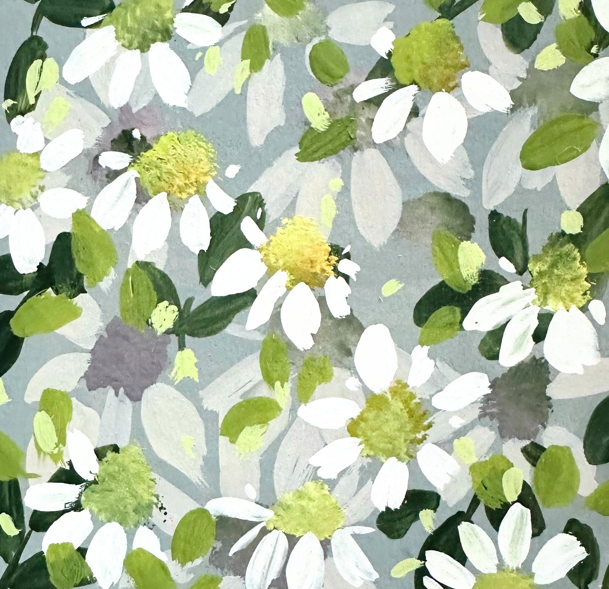
3. Practise | First Layer Daisies: So let's start mixing a quick palette for
our practice run. So we have ultramarine, quin gold, and
hands yellow light. I'm going to add some white. And so we want this
nice and opaque. And we're to start off
by mixing a green. And then I'm going to mix
a pale yellow here with some white hands yellow light with a little bit of that mix. And then over here, let's mix, what I would call
a neutral mauve. So we've got our quin gold, ultramarine and pyrole red. So give those a mix together. And because the Pyle
red is so dominant, it's kind of taken
over the color, so I'm just going to balance it with some more ultramarine blue. And then let's add some white. And whilst we have the mauve
and light green together, let's just mix some
neutrals on the side. So on the left there green added to the mauve and on the
bottom right there, a small amount of
mauve to the green. So picking up the stippler now, bobbing up and down with that, the stippler brush is very dry. And then let's just stipple
in some daisy heads. This is perfect because we want this first layer to be very
much in the background. We're going to be working with a much darker background
for our class project. So all we need to do
really is concentrate, getting used to our brushes and mixing the paints
that we want to use that will allow us to get some dimension
and depth in there. So now let's mix a paler
color of the mauve. Adding a little bit
of that darker green, and that will mute it even more and make it into a
very dusky mauve. And then with the size
five or close to that, size four or six
would be perfect. Let's just add some
petals to these centers. A little bit of a
wiggle on some of them. And I'm painting some
petals larger than others. It's so handy having
this little sheet. I think I will do this
more in the future, just so I can grab
it and, you know, just do a little studies or
map out some ideas on it. So our little two stroke petals and little dashes and dots. So I'm working in to the
flower head and outwards. And we don't need to worry about which Daisy is going over, which Daisy, because we're going to be adding
another layer on top. So this is really
just the groundwork. It's going to really
allow us to create depth. I'm going to add
another one up here. And add some little highlights
to the other petals. At this stage, we're
just experimenting.
4. Practise | First Layer Leaves & Top Stippling: I think it would be nice
to add some leaves. So let's go into that quin
gold and ultramarine mix. It's such a lush color. And you can start to
experiment here and just mix in all of the colors
together, see what you like. It doesn't have to be
the same mix as me. And then let's just do some
really simple shaped leaves. This is the same
stroke as the petals. And we can keep this layer dark, as well, because we're going to be adding a second
layer of leaves. Keeping it really simple. And, of course, these aren't really daisy shaped
leaves at all, but I don't really mind. I just want something simple, and a nice blanket of flowers and leaves
for us to work with. I do love that green.
And that's cute. So this is a bit I really enjoy, and that's adding our
top layer of daisies. So we're continuing really to use neutrals
for these layers. Let's mix a lighter version
for our top daisies. And I've gone with that
lighter mix where we use hands yellow light and then mixed
in quin gold ultramarine mix. And you can see here that I've
not really mixed that in. I've left the colors semimxed. That will allow the
stippler to pick up various colors so that it's
fairly uneven on the brush. That just really adds interest
to these daisy centers. I just felt I needed
a bit more paint, so I've added more
handsome yellow light and quinacridone gold. And some of that
lovely green mix. That's looking a lot better. Bit of everything going on. When I'm stippling, I always
have a scrap piece of paper because getting
just the right effect can be a little challenging. I'm just adding a little bit
more white there, as well. Let's see. Yep, that looks nice. I like that it's a lot brighter
than the bottom layer. Oh. So just two, three, or four bounces on
your stipple brush. Okay, there was a
few more there. And already, these
are really popping. Oh, I love that over that
green. That's so nice. So random placement again. I do like that
these really shine through over those dark leaves. And just bringing
them up to the edges. Uh
5. Practise | Top Layer Petals: I went on awe side quest, as my daughter calls it. And just on that pink
background, I'm neurodivergent, so my brain does
tend to skip around, and I generally follow it because I think that's
really important. Follow the energy. But back to the daisies now, and let's prepare for
our top layer petals. My palates got a bit messy, but I'm just gonna
wipe a little area. This tin tray is
really easy to clean. So we have some white there. And it doesn't need
to be kind of like a clean white because we're
going to be mixing a neutral. So a bit more white. And then borrowing from the colors
that we've mixed already, slack gives us a kind
of a blush white. Watch out for drips. Drips are gouache
paintings nemesis. We're just going to
replicate the daisies underneath two little
strokes for the petals. And again, we can change the direction of the daisy depending on how
big the petals are. So you can see on that one, the petals are
larger towards us. And then as we work
round the daisy, I've just done two
little petals, and it looks like it's
then facing upwards. I do like that they're escaping
the little swatch area, so I might do that in
our class project. Might be quite sweet. I think I'll make
this a whole daisy. So very simple petal shape. Working outwards and inwards. And then this one,
I'm just going to do some smaller petals around the edges so that looks like
it's heading up and right. Nice big daisy head here. I love the white over that dark green
leaf. That's lovely. So, have we got them all?
Yep, I think we have. Oh
6. Practise | Warm Green Leaves: So let's bring our black down and add some of the
handsy yellow light to that. To create a lovely rich green. I think I'll add just a little bit more
handsy yellow light. Because we want these leaves
brighter than the dark ones. So I'm washing my brush, and this is a tip that I recommend before going into
painting with gouache. If you've been mixing
with the same brush, just give it a quick wash, and then you can go in
afresh to the paint. Just gives you lots of control. And then just the same
two stroke leaves as we did underneath. And we can go over some of the flowers and
the darker leaves. Going over the flower there. So I've gone over the darker
leaves with most of those. Now I'm just feeding those
into the daisies a little bit. And then doing some tiny leaves. Now, I'm just putting a
little bit more white down. And as I have a little bit
of green on my brush anyway, I just started with that
and then let's move up some of the mix
that we've just used. Just to create a paler version. And I really like these now. And this paler mix really
ties in with daisy petals. Very sweet. I'm just scattering them around. Some are just tiny
two stroke leaves, and others are just dashes and little dots. Super restful. Love, love, love. So simple. Really love that now.
7. Class Project | Mixing Neutrals Part 1: Because we're
creating backgrounds, there's quite a few
papers that we can use. I'm using Fabriano
studio hot press paper, 11 " by 14 ", 28 by 35.6 centimeters. But you could use your
favorite watercolor paper or mixed media paper. And you can see here
I just folded it in half and creased
just one tiny edge, and then cut that in half. And then I did the same again, creating a little crease. I couldn't see that one, so I'm just making a pencil mark. And there we have
our study papers. Now, as the class went along, I did actually cut those in half again to create some
smaller backgrounds. One of my favorite all time
colors is cap at mortem, so I thought it would be really nice to mix something
close to this. This is a watercolor, but I'm just going to
do a little swatch of this so I have
something to refer to. So we're going to use
our primary colors to reach this color. I hope. Just go to
get some scrap paper. I'm using my half
inch flat brush. Now, obviously, this will be en a mix because
it's watercolor. But I'm just wanting to
look at the properties of the color. So lush. There's a great history
surrounding cap at mortem. I don't know if you
know you probably do, but they used to make the color
from ground down mummies. Um, which is so weird. Obviously, now it is
a synthetic blend. So let's put down a cool yellow, and I'm using handsy
yellow light. And ultramarine. So we're going to start
by mixing those together. And because the
yellow is so bright, that will mix a lovely bright
green on the cooler side. And then I'm adding pyrrol red. This is a warm red. I need to put plenty
down because red is going to be the dominant
color in this mix. And then just look at
that forming so quickly, a beautiful, deep red, rust red. And I'm just going
to adjust that slightly by adding
some more ultramarine. Let's have a look
at that. Now, it is hard because the
swatch is watercolor, but I think this is very
close to cap at mortem. I'm really happy
with that. So nice. Now, the final ingredient
is a tiny bit of black. That deepens it a little bit and really brings out
that cap at mortem feel. Okay, so let's put this down. It's a veritable
feast, fuddy eyes. What a beautifully deep and
yet vibrant color this is. And the great thing about it is you don't have to buy
lots of tubes of paint. So whenever I'm going to want a color close to cap at mortem, I now know that I can
mix this myself really easily with the three primaries and a little bit of black. So I've got a tiny bit
of water on my brush, and I'm just going to meld
this together a bit more. I could have done better.
It's a little bit patchy, and that's because I added water to try and
make it go further, and it watered it down too
much, but that's okay. I don't want my
backgrounds perfect. And I do love the
rough little edges. So that's our first background. So I want to use all
of this lush color. So how about if we added white? So it's really lovely, actually, that we're using both black
and white with this color. I find that so balancing. So giving that to
really good mix, and I'm just seeing what it looks like with even
more white in it. And I like that, so
let's go for it. I do love Earthy pinks. That looks gorgeous
on the paper. The one thing I am finding you don't need loads
of tubes of paint, especially when
you're starting out. I have got loads, and I don't use them all. I know now that I've got all of these mixes with just primary
colors black and white. It's a thrifty way of
looking at things. So I am really going for a very textural
background with this. Oh And that's another lovely color from those three primaries. What next? And you know what? I'm not planning too far ahead. I just like to work with the energy and
see what comes up. Doing some little studies
would be nice now, so I'm just going to cut the quarter of the
page in half again. So I'm just going to
add a bit more white. I'm going to bring in the
black that's left over. Adding a bit more red,
bit more ultramarine. At this stage, I really
don't have a plan, and I think that's the
beauty of mixing neutrals. It's a process which requires a little bit
of trust and surrender, I would say, kind of playing with color and allowing the
colours to come forward. So a little bit more handsy
yellow light, that is. And really just playing with the margins of this space
color of cap at mortem. Bit more white. It's such a natural
and enjoyable process. I just want plenty of these backgrounds so I
can have a wee practice. Another slight variation,
which is lovely. Scooping up all of
that gorgeous color. That is pretty. Then I'm just going
over again with a slightly damp brush to
merge it all together. I'm now adding a little
bit more pyrol red, seeing where it
takes me. Me white. Mm. I don't think I've ever enjoyed mixing
colors as much as this. It's so much fun. So this is
a more opaque white version. Again, very pretty. I can see me using this. And I hope you feel the same way that you feel inspired by the
colors that you're mixing. I like that one better, I think, than the
one on the right. Lovely blush color.
8. Class Project | Mixing Neutrals Part 2: So onto another
color completely, and I have Pyl red and
handsy yellow light. Just starting off with those. I have a kind of an
idea for what I want. This is Prussian blue. Cooler blue than
the ultramarine. So we're going to get
different colors from that. It's wonderful to work with cooler and warmer colors
when you're mixing neutrals. Tiny bit of white to this. I adore this color,
isn't it lovely? It's almost matching
my gloves there. It's such an easy mix. I mean, how quick was that? Chocolate brown. It reminds
me of a very specific thing, and that is the sandstone soil
that we have in Eslovian. And when it rains, it kind of grows this color. So now I'm going to push this
in a different direction. And I've added a lot
more Prussian blue. Quick test of that. And then I'm going to use all of this
to make a larger background. And this is the one that we're going to use
for our study. You can see as I'm
brushing through there, the kind of red undertones. But the blue I can't
describe that color. It's just so beautiful. You can experience
the different layers of the two colors
working together. It's gonna look lovely
for our daisies.
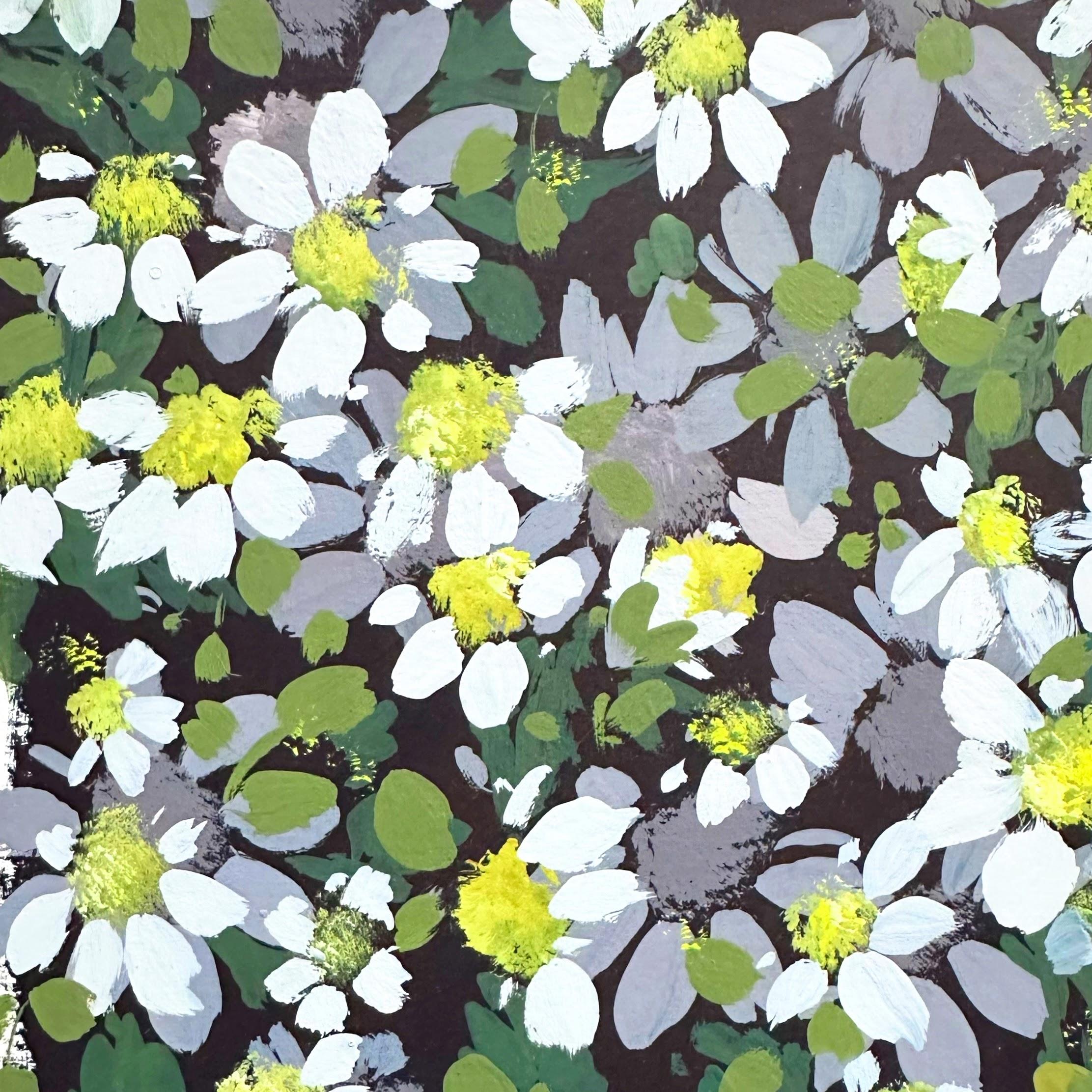
9. Class Project | First Layer Daisies: So I decided to use
that color and call it Ud because it just reminds me of don't you know
what I don't know? Ud to me, sounds
earthy, very deep. So I just kind of went
for it as a name. But again, very excited to see
what you call your colors. So a bit of a messy
palette here, and I am adding quin gold, Pyl red, and ultramarine. So our three primaries together
ring on the Pyrone red. And I decided that I wanted to use the colors that we used for the background for
the foreground. It's not necessary to do that. You could bring in new colors, but just something
I wanted to do. So I'm adding dutch
more blue there, and I'm just mixing with
my size five round brush, a little bit of white there, so I'm just going
to mix that in. Because with this study, I really wanted to work
with depth and dimension. So we're going to aim to create the first
layer of daisies, which is going to be
darker and setback. And then we'll start to
layer up our daisies. So I'm trying to aim
for a color which is just slightly lighter
than the background. I'm just going to see
what that looks like, and it's still a bit
too dark, I think. So I'm going to lighten it
up with a bit of white. And I'm going in steady
with the white because I don't want to lose
the depth of the color. So now we're going to
stipple in some daisy heads. I'm using my deer
foot stippler there. But if you have any old kind
of roughed up paint brushes, that would be great for
stippling, as well. Or, as I've used in other
classes, makeup brush. Makeup brushes have
all the same shapes as artists brushes at the
fraction of the price. So I'm just kind of
experimenting there first off. I think that might be too light. So I'm just going to
add a bit more blue. Et's see what that looks like. Just making sure that my
stipple brush isn't too wet. We're trying to attain a
very dry stipple effect. Those look nice, though
I'm just going to dot them around
the page randomly. Some larger than others. So closer together.
I love it already. Using the same colors as the background is
going to create a very cohesive study because they're
going to be talking to each other closely, and that's going to give us
the effect that we want. Don't want there to be a huge
dynamic between the colors. For this study, I
really wanted to explore working around
those same neutrals. Oh, So, as I've been talking, I added more white to this mix. What we're doing here is creating that base
layer of daisies. I'm thinking that's too light. So I'm just going to
knock those back a little bit by adding some of the
darker hue on the left there. And that's perfect. So I'm drawing in petals
from the outside to in and adding tiny little
petals in between in places. And then also drawing
from the center outwards. I just like to vary
my brushstroke slightly in size and direction. Mm. We can slow right down here. It's such a beautiful process. And, you know, if you
wanted a simple study, you could stop right
here with this layer. And when we want a petal
to be facing upwards, it's fairly easy to
create the direction of the daisies just by your
placement of the petals. Mm hm. I like that that petal
went off the page. Sweet. I think I'm going
to make this a full daisy. And while I'm here, I'll just add a couple
of petals there. And you can decide whether
you want your petals to go under or over
neighboring motifs. So I've got this small one here, so I'm just going to paint
in the petals for that. I see how I want those to
react with each other. And I think I'll just leave
it as it is, actually. We've got quite a few
daisies altogether here. I've chosen this one
that I'm painting as the dominant one that's going
over that larger daisy. And then over that one. I never tire of these
two stroke petals. So restful to do. Mm hmm. Lovely. Just having
a look round. And I'm really liking
the placement, actually, of these daisies, because it's going
to give us lots of scope when we get
to our upper layer. And just because, you know, I like kind of stray petals, I'm just going to add
some little kind of dashes like little
daisy confetti. And that's our base
layer of our daisies.
10. Class Project | Dark Green Leaves: So now let's do
some dark leaves. And we want these to
stay in the background. So I'm going to mix
French ultramarine. Really need to buy some more. I have been hitting the
ultramarine a bit hard lately. I love it as it is, and also for a mixing color
a little bit of quin gold. My favorite green one of them. This mix is a lovely warm green. And I want to keep it on
the blue side so that these really offer a kind of a lovely cushion for our
additional daisies and leaves. So because I mentioned earlier that quingld is
fairly transparent, I am adding a little bit of white this is something I learned when I was doing a
background with this mix, and it just wasn't
settling very well, and I realized it was because of the properties of the Quin gold. So I would recommend just
adding a tiny touch of white. That makes those
colors meld together, and it also gives you that
lovely opaque coverage. I might add some of the mix
from earlier from the petals. Because I do like colours that kind of
contain other colors. So just borrow one color, to mix with the other. Just a tiny touch, really. And then I'm going
to do some scribbly leaves just seeing
what they look like. So I'm adding more
blue ultramarine. Yeah, that's better. That
was kind of a forest green. So I'm doing a
little stem first, then this is one of my favorite ways of doing
leaves at the moment. I do these little scribbly lines over them on either side. I'm just working around
the petal there, so the petal lies on
top of that leaf. Let me just show you here because I did a different
leaf in the practice. A little line here and then
just little scribbles. That's one side, and then this
is the other. Very simple. In some of them, it leaves
a little white space, but of course,
that's going to be ood or whatever colour
that you had mixed. I love these. They're just
like little zig zags. Doing it this way
across the page, you adjust your scribbles. In some ways, that's an
easier way to do them. And then going a
little faster with these Just a little two stroke leaf there underneath the petal. So we want these traveling in different directions just to give us that all over
coverage that we want. Squiggly line. Perfect leaf. And again, deciding
whether I want to go over or under the flowers. So we can vary that
as we go along. I'm gonna go over the
page there a little bit. Quite like the idea of the flowers escaping
over the edges. These leaves are so restful
to do. I love them. And I'm going to ease that
in underneath that daisy. And then just another
two pronged leaf there. I want this one just going
out towards the edge. And here just
showing you slowly. Like the fact that one of the sides is darker than the
other. That's quite sweet. So there's a bit of space
here I want to fill in. I'm working that
around that petal. And again, from underneath. I like working around the edges. And some little filler leaves. I find the best way to do these is not think
of them as leaves, but just blobs of green, really, poking out
from underneath. These soften the other leaves, I think, 'cause they're
slightly softer look. So I like that combi. Oops. I noticed there
was space here, so I'm just going to
add another leaf. Our second layer of daisies are going to sit on
top of these anyway. So I try not to worry
about placement too much. It's more about a blanket of leaves and
daisies to work on. I didn't like that
those two sets of leaves at the top left
were very similar, so I just added another leaf
there and one at the top. Just want to come out of
the edges a little bit. Sweet.
11. Class Project | Stippling Centres: A little bit of
handsy yellow light. And mixing that in with the ultramarine
and Quin gold mix. So we're borrowing some of the warmth from
the green gold, adding a touch of white. So now let's do
what we practiced. And I'm just loosely
dotting in colors. We don't want a very
neat, flat color. We want different colors to
be mixed up on the brush. So this is my stippler now, and I'm using a deer
foot artist's brush, but you could use an
old brush that you might have or even
a makeup brush. So I'm just plunking my brush around all of those
different colors, taking the excess
paint and water off. We want this to be
quite a dry effect. Touch more white.
We want these to sit really well on top of
those background daisies. And as we know, handsome
yellow light and quin gold is going to make
a lovely orangey yellow. So now, making sure that my
brush is as dry as it can be. This is why I always try this out because
going straight into the page, you don't know what
it's gonna look like. So getting that little
comb of colors on your palette is gonna
be well worth it. And don't they look
gorgeous already. I love this. I really
love stippling. So we're not really aiming for the spaces that the
base layers created. We're kind of just, again, approaching this in
a fairly random way. Some are going to
land on daisies, some on leaves, some on
the space in between. And we're definitely
looking for that. I always think that these would look lovely
for pineapple weed. I love pineapple weed. So sometimes just one is enough. That's something I've
learned about stippling. The more you try, the more you
lose, if that makes sense. So just kind of one or two, three bounces, and that's it. Alright, a little bit
more for that one. Oh, lovely. So much. And now, just kind of aware
that I want this random feel. So doing some smaller heads and putting some close
together and some apart. Now, what I'm doing here is
going in with neat white. And again, just like bouncing
in very small amounts because we don't
want to obliterate that gorgeous yellowy green.
12. Class Project | White Daisy Petals: Hello. So I want a nice,
clean, whitish gray. So I'm just going to clear
an area on my palette. For the background layers, we wanted kind of muddy colors, which transform into
these beautiful neutrals. But for the top layers, a trick there is to
use brighter colors, and it creates that separation between the background
and the foreground. So here we go with our
white and quin gold. Touch of pyl red. H. And ultramarine blue. So our primary colors again. Again, I'm choosing the colors that we've already used for the background because I wanted to use colors that
were close to each other. So that's very similar to
the pale caput mortem. But I want it a little
darker, a little bluer. I was quite red, so a
bit more ultramarine. And some more white. Let me just try that out. It's nice and cool, and that was what I was aiming for because I do think we need to add a color to the white
so it's not so dark. Oh, dear, running out of white. And now we're really proficient at mixing grays and browns. It is no problemo. Look at my fingers. Verily, I say, such a ky pop. Okay. So size five again, and one thing to bear in mind because I've
learned the hard way. When you're using Gase, just be really careful of drips, because once that
drip falls onto, particularly the background,
it will blemish it. You can paint over it,
but it's a bit of a faf. These are going
to look stunning. I can't wait to see
this all over the page. So we're doing the
very same movements, those two stroke petals. Little filler blobs and dots, and I'm varying
the strokes again, working from out to
in and into out. And also just deciding on the direction that
I want them to go. If you're wanting
them to face upwards, larger petals at the bottom, smaller petals at the top. You can also decide
as you go along where these are going
to poke out from. Are they going to be over the one that you just
painted or underneath? And I'm just going to
leave that one as it is. So it looks like
it's facing left. The stippled centers have
really set up this beautifully. I do think it's one of my favorite ways of
creating flower centers. Because they're kind
of multifaceted, there's a lot of texture, a few different colors in there. It would take you a while
to try to recreate that. I love how these daisies
have a mind of their own seem to decide themselves
which way they want to go. And I'm embracing that
little one that's coming out of the page.
I really like that. So, again, this process very meditative because we're
doing the same stroke, and it's a beautifully
repetitive thing to do. Plus, there's
something comforting about daisies, don't you think? I kind of remember them from my childhood making
daisy chains. A little tiny one
there. I love that. So sweet. Could you
tell I love daisies? So I'm just looking at the
direction of the daisies, and I do want them
generally moving upwards. Some off kilter. But I think I would
like that direction. So decide what you want. You might want them
multidirectional and That one, I've decided is very
much facing to the left. I do love this process
because one by one, you're going to see these
daisies bloom towards you. Love that. That's a closed
one or semi closed one. Each one has its own character. Ultra sweet. I also like that we plan to keep these random because now we've got that
kind of second layer, which is also random. And the interplay
between the layers is lovely. I'm
really liking that. Being careful not to smudge the lower
daisies on the page. And just that mix
of strokes again, one little petal stroke or
the larger two stroke petals. Deciding that that will go
over that one underneath. This one I'm going to bring out over the edges of
the background. Okay, only two left, I think. Uh And one more here. Just those tiny dots on the top side of
the flower center. So looking around and just
taking in how balanced it is. And I do feel that there's
a bit of a space there. I think I might do an
extra flower head. So just mixing up and then taking off the
excess water of the brush, we want this to be really dry. That's not light enough, so I'm just going to add
some handsome yellow light. Let's see what that looks like. I want it to match
up with the others. Still quite a lot of
water and paint on that. I'm just gonna keep going until I get the texture that I want. And let's go for it. I'm
going in quite carefully. I don't want to upset
the balance too much. So I'm just going to add I think three, maybe
another one there. Okay, maybe another. Aid.
Okay, that's looking good. Just showing you the
different variations there, how you can add some drybushing. So that happened kind
of accidentally, but I do love a little
bit of dry brushing. And I find with
paintings like this, just a little bit is great. If you did a whole
daisy like that, I'm sure it would not look as good with
the other daisies. So just like the odd one or two dry brush
petals, I think is gorgeous. The and we have two left, little one here. Oh, my gosh, so sweet. And then our little
daisy up here, little two stroke petals, little dashes in between. And maybe a couple of blobs. Yeah, that's really nice. It would have been so
simple to go over the mid right there with the
large gray daisy underneath, but I quite like that we
chose to be random. Oh
13. Class Project | Warm Green Leaves : So I think it would
be really nice to mix almost a kind of
earthy green gold. We did those darker leaves purposefully dark to keep
them in the background. I think these leaves are going to support the
centers as well. We've got a lot
of gray going on. And I think this green is going to really tie in with
those flower heads. So I'm just having a think
felt that was too dark, so adding a bit more
hands yellow light and maybe some black. Now, I know it's controversial, but I do like handsy yellow
light with black for a green. You've probably seen
me use it before. It's a lovely,
easy green to mix, if you ever need to
do that in a hurry. I think I added too
much black gone way. So I'm going to balance
that with some white. All part of the process. I want to take my time and mix the colors that I
feel would work the best, 'cause this is all about intuition and not putting
any roadblocks up. If you want to try
something, try it. Okay, so let's try this. Doesn't look much different, but gonna have a go. Yeah, I do like that.
Yeah. So I'm going to do is feed some of them
underneath the daisies, just so they're not all just
poking out in full form, but like half leaves in places. Placing them
underneath the daisies helps them come
forward, as well. So I do love this
green because it's not taking away attention
from the daisies. I think if it was too
bright, it would do that. So I'm really happy
with this color. And pretty much doing exactly the same brush strokes as we did with the daisies. Little two stroke leaves. And just to add, these aren't really daisy
shaped leaves at all, but I don't really mind. I wanted softer leaves to complement the more
jaggy ones underneath. So in places, I'm doing
this little group of three maybe more
like rose petals. This area, I think,
I just want to add something different here. So I'm going to go
over that large daisy. And this green looks lovely
over that background. So again, working that little
group of leaves over that petal and giving that
little daisy some sepals. And bringing the leaves
down in size now, a variation in size, I feel is always a lovely
tactic when you're painting a balanced
variety of motifs. Going out of the edges. I just want to do
a few of those. Taking my time there. So reducing now to little
finishing touches of leaves. Just paying attention
to the edges. Now, you could argue that
it looks finished, but no. So I'm just referring back to the little
practice that we did. And it's wonderful to
see how it's evolved and how different it is with that deeper color
in the background. So I want to just do some tiny
little finishing touches. And I think it would be nice just to add some very bright, either white or yellow
to the daisy heads. The reason why I'm doing it, and I often do this is because
we've added the petals, we can just direct the stipple brush to go
slightly over the petals. I'm not doing that
intentionally too much, but it just feels nice to have that extra little layer on
top once the petals are done. So we've got to have
our brush really, really dry here,
like really dry. If it goes into wet, it will disrupt the
paint underneath. And just one dab. So this is pretty much mostly white with a touch of
handsome yellow light. So this is a super light
touch of our brush. And because I liked
those scent so much, thought I'd add
some little details in between the daisies. These might be seed heads or pollen and some just
hovering around the daisies and in others over that lush,
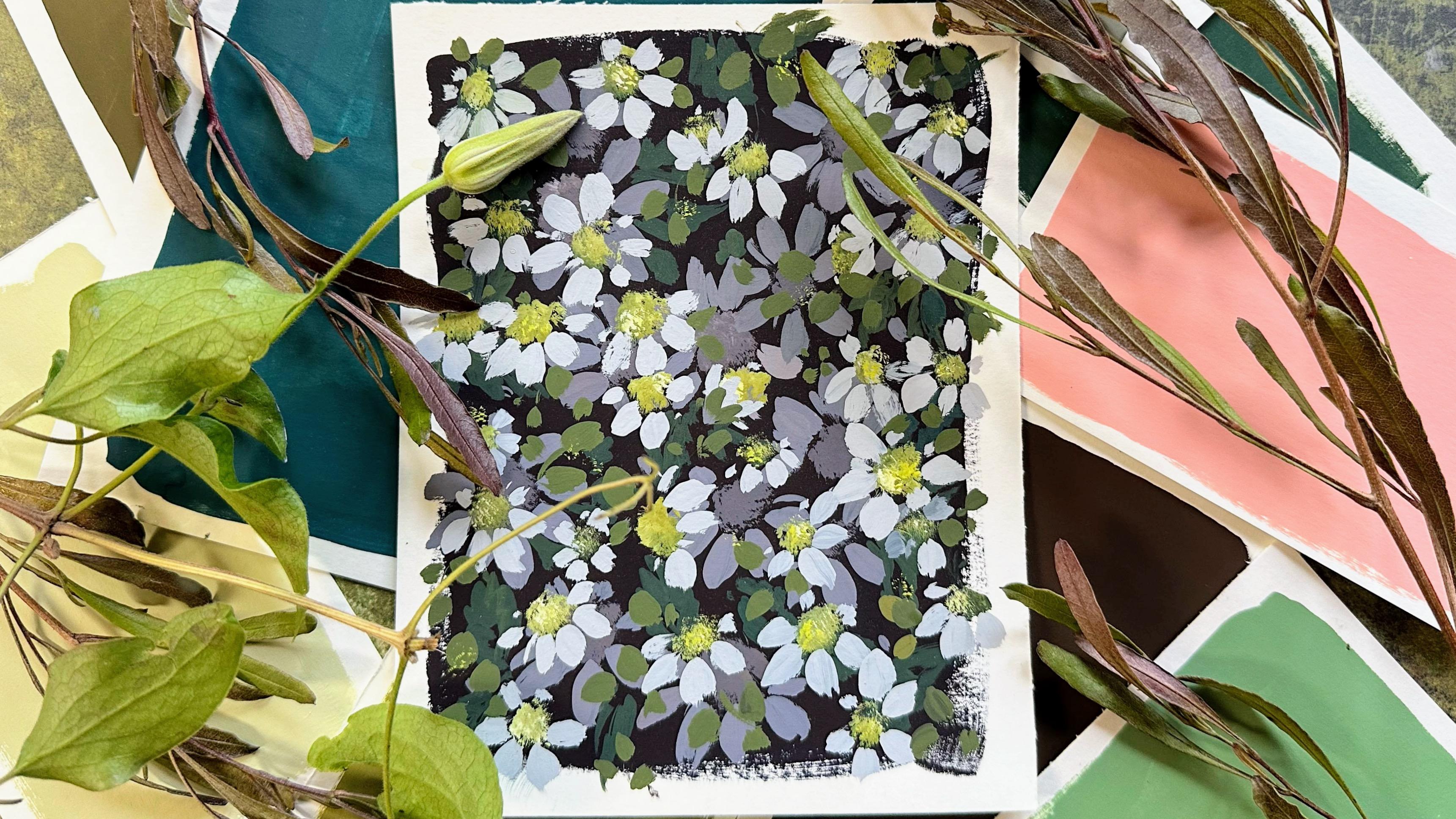
dark background. And I'm happy now. That's our daisy class. Daisies on what I called Ood.
14. Thank You!: I hope you're going away feeling so much more
confident about mixing neutrals and using them for your own
little studies. In other classes in this series, we're going to be painting
yellow blanket flowers. Rose leaves. And Woodland motifs. So keep a lookout
for these classes. You can build up your array of studies on your
beautiful backgrounds. Any questions? Fire away. You can contact me through discussions when you upload your project or
over on Instagram. Thanks again. Take care
of yourself. Bye for now.
 Holly Tomas Art, Watercolour | Gouache | Mixed Media