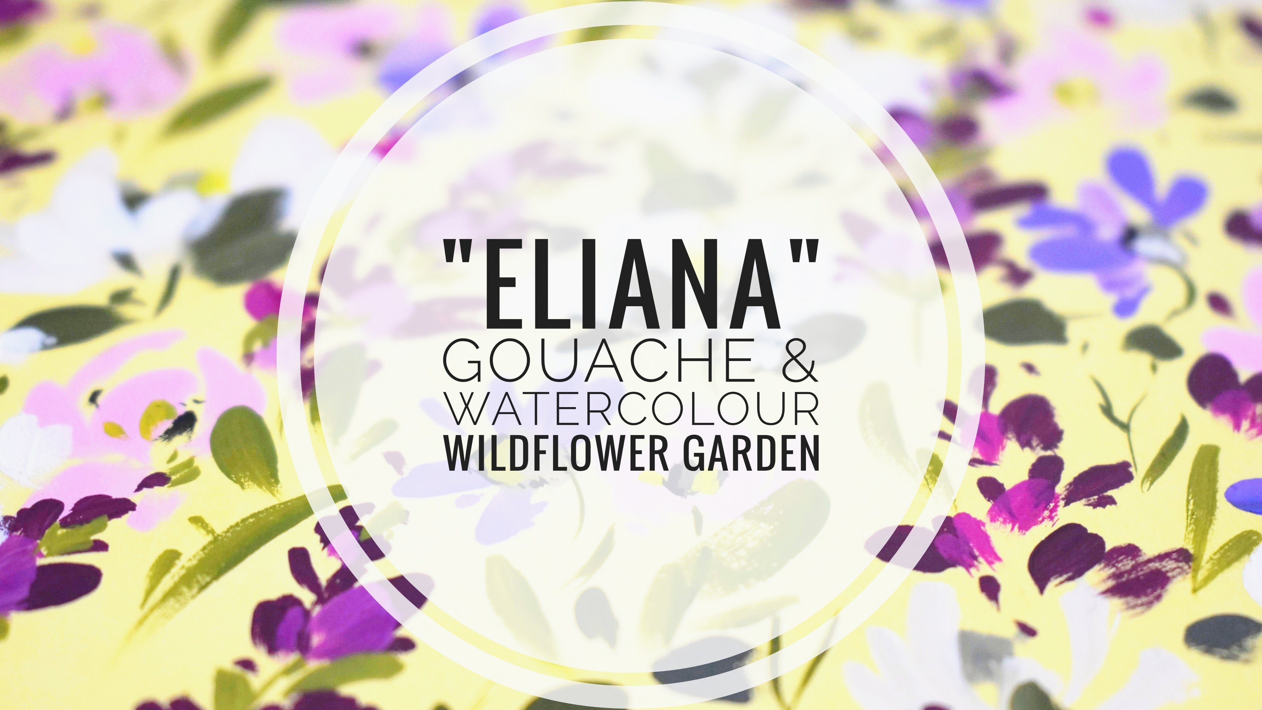
Transcripts
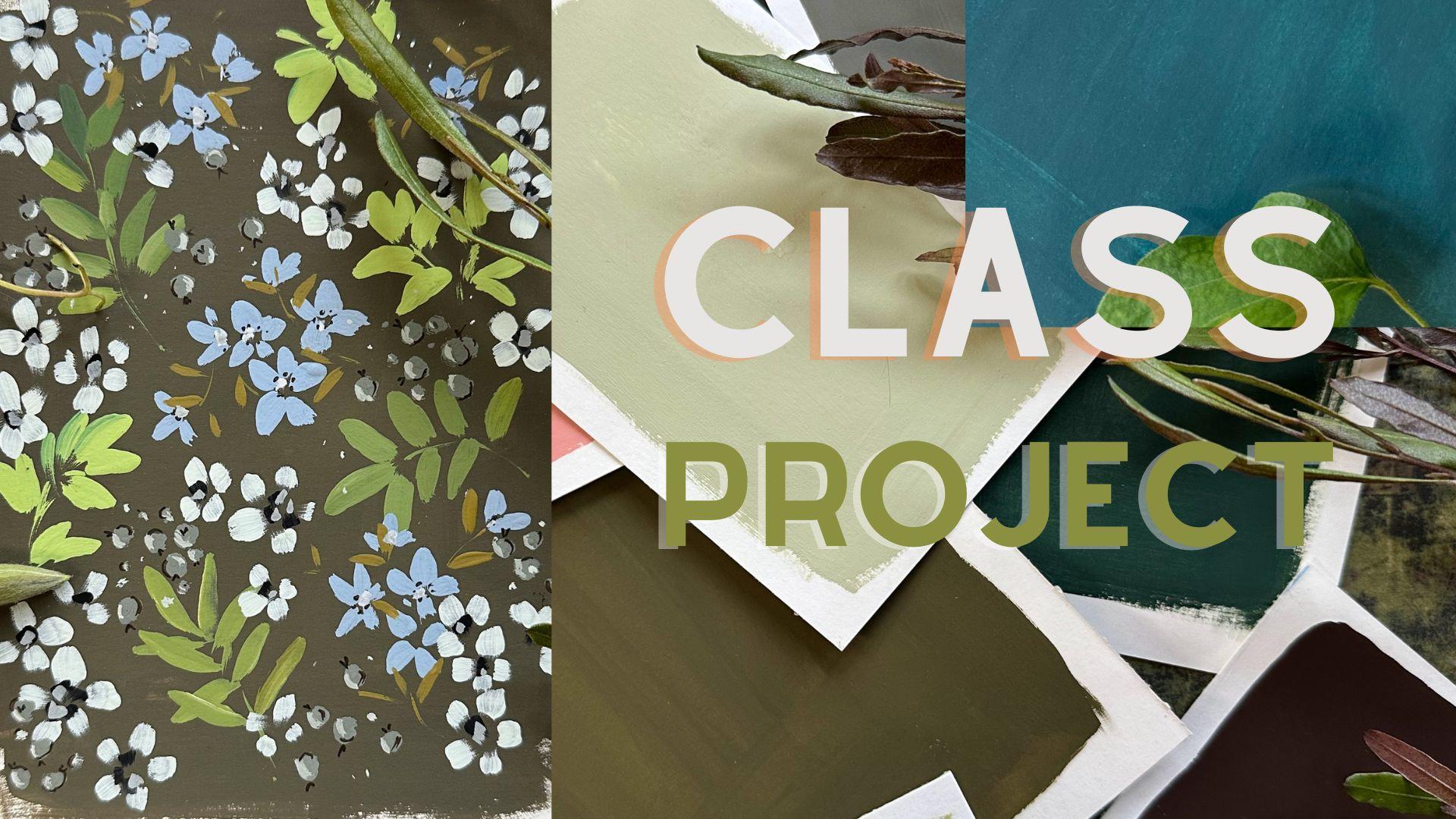
1. Welcome!: Welcome to Woodland Walk designed for
confident beginners. This is class four in
a series of classes, focused on three outcomes. Firstly, to mix our effortlessly beautiful
neutral background. Secondly, we're going to do a fun thing and name
our chosen palettes. And thirdly, in each class, we're going to choose
our favorite background to paint or study on. Hi, I'm Holly, and I
teach from my studio in a very drafty 18th century
house in Southeast Scotland. As well as teaching
on Skillshare, my designs have been chosen for greetings cards,
wallpaper and bedding. My inspiration comes primarily
from my surroundings. I adore trees, and
wildflowers are my passion. Any Slothean we have the
heathertrewn Lamamre Hills. And a 40 mile coastline
including the iconic bass Rock, which is home to 150,000
Northern gannets, and it's the largest colony
of gannets in the world. I was brought up in a
very landlocked area of Northwest England. So when I was a
child, I promised myself that I would
live by the sea. And although I don't
paint seascapes, I feel I can breathe more
easily next to the sea. So back to our class. And have you ever wondered how artists allow their
paintings to pop? It's very often to do
with the background. I'm going to share with you
the secret of how to mix luscious backgrounds which don't compete with your paintings. We'll be using gouache, but you could also mix your favorite watercolor
with white gouache, using only the three primary
colors plus white and black. In this class, we're going
to paint woodland motifs, bursting with leaves,
flowers, and berries. We're going to reach a place of confidence where we'll feel able to replicate our neutral
recipes time and time again. You will have given
them names and added floral foliage and berry
elements to your glossary. And just a quick reminder, you can always
upload your project in our projects and
resources area. It's a lovely way of seeing
other students work, as well as sharing tips
and getting feedback. For my deaf, hard of hearing, or neurodivergent followers, you can access
subtitles to the class. As well as a full transcript. So shall we get
started? Let's go.
2. Materials: So let's run through
materials together. And if we start with
paints and our blues, I'm using ultramarine
blue and Prussian blue. Ultramarine is a warm blue, and Prussian blue is cool. The same with the yellows. Hands yellow light is cool, and quinacridone gold is warm. Now, that's a watercolor
because I love it so much and I want
to use it all up. Pyrrole red is my go
to color for mixing. It's a neutral red with maybe a slight hint
towards the cool. And then just a
black and a white. Running through brushes, I
used a half inch flat brush. This is a Jackson's make, and it's great for laying
down our initial layer. Then I used a small flat brush. That's great for our flowers, and that's a size four. Now, this is my favorite
brush size two Escoda. Now, unfortunately, it
seemed to damage the brush. During filming, I had to pick up another brush just until I waited for my new
one to come through. And that's a size four
round by Princeton. And then we have a
size five round brush, and this is by memory point. But a size four or six
would be great, too. And finally, a liner brush. And this is a Billy shawl brand. Now, with paper, I used fabriano student grade
paper, hot pressed. We don't need good
quality watercolor paper because we're going to be
creating a background. So a more affordable
paper is perfect. And then all we
need is some water, and I often use two pots and something to
blot our brushes on. So let's get started
on our practice fonts.
3. Practise | First Leaves: So let's put down our
French ultramarine. And I'm using quinacridone
gold in watercolor. And I've written about Quinn
goold in our A section because it's now a discontinued
color. Plenty of white. That was a new tube, so it
came out quite runny at first. And then we're just going
to mix those together. I love this green. Mixing blue and
any orange really is a lovely alternative
to mixing a green. And then we're going
to add the white. It's looking a little cool, so I'm just going to add some more quin gold and
a little bit more white. And to brighten it, some
handsy yellow light. So this is clogged now
with all the paint. So what I do generally is give the brush quick wash, blot it. And then it gives
you back control. Now, I happen to ruin my brush, my little travel brush. It's lost a little
bit of its form, so I'm just going to
pick up a size six, I think it is, round brush whilst I wait for my
new brush to arrive. So this is a very
common brush stroke. It's the tip belly tip movement. So tip down, press down, and allow the brush
to flare a little, and then up again, releasing the brush
from the page. So let's just do one
on a little stem. We can practice
different angles. And another wee stem. Alice is going out to in. And we can take our time. Let's try a cluster of
slightly larger leaves. And this time, we're
just going to vary the direction and also
the size of the leaves. You can see that this is
kind of a lot more pleasing. I think so, anyway,
I love the fact that it's a little bit
more higgledy piggledy. Let's go back to single strokes. Practice all
different directions. And make the brush work for you. The more that you practice this, the more you get
to know the brush that you're using, as well. You'll be able to choose certain brushes for
particular leaf shapes.
4. Practise | Berries: A very quick and
easy lesson now. Let's put down some black
and a little more white. Just a very quick
and easy gray mix. Or you could mix three primaries together
and add white to that. But for the purposes
of this lesson, let's just keep
it really simple. And all we're doing
is creating circles. I think this gray will look really lovely over
our background. Super, super easy. I can vary the
size a little bit. Throw some smaller
ones in there. And we're going to do some
lovely details on these. Very sweet and simple. Oh
5. Practise | Blue Flowers: And my favorite flowers now. And let's just put down some
ultramarine blue and white. The ultramarine is just such
a lovely color on its own, that I don't feel that we need to add anything
else to that. Just washing my brush so it's nice and clean when
I pick up the paint. And then let's just
do a side sweep. So we're placing the
tip of the brush down, but we're kind of angled, so it goes sideways down to maybe a third to
halfway down the brush. It's a lovely brush stroke, and I use it a lot. So again, a tip, and then just pressing
sideways down on the brush to about halfway down. And then the same
going this way, tip sideways and up. And then out the way. Another one, and then
another from in to out. This is just how I do these. I do one downwards, another one out to in. Another out to in.
And then to out. And finally, in to out again. I do change my mind
a lot about that, but when I'm painting
these quickly, I kind of just have
my way of doing them. So find your way of doing these. Now, here I'm just showing it's a slightly interrupted
brush stroke. And if you like that, you can get a slightly
textural edge on your brush strokes. So showing you slowly here. So it's down and then
a very quick lifting up off the page. And the more you practice, the quicker you'll become, and I am a great
believer in doing things quickly
because I think it allows our intuition
to work a little bit more and also to really start to trust our muscle memory that they all come out with
their own little character. So ones here and
maybe some little Vs.
6. Practise | Bright Green Leaves: My favorite leaves now, not dissimilar to the
first leaves that we did, but with a little
bit more character. So handsome yellow light, ultramarine, and some white. This is guaranteed to mix a lovely zingy green every time. It's really vibrant. And what we're doing
there is using the slightly warm tones of the ultramarine
with very bright, zingy, handsy yellow light. Lovely mix. So here we are starting off the
same as we did above. Really varying the
size of the leaves. And a mixture of
out to in into out. That's side sweet there. So we get varied shapes, varied size, very
similar to those above. And as you do these, you start to loosen
up quite a bit. So have a good
practice with these. And then when you
get to your project, it'll be really warmed up. So moving more quickly here, and it gives me
less time to think, which actually brings out
some lovely detailing. So a similar brushstroke to the petals I
did to the right. Well, we lift the brush up very quickly towards the
end of the movement, which creates a
slightly rough edge. You may not want to do
that on all of the leaves, but I think it's
really nice addition. And here I am just slowing
down and then speeding up. So we get a little bit of
texture in there as well. Akin do two little stems. Just adding little
dots and dashes. So just showing you again that movement where we get
the slightly textured edge. Slow and very quick uplift. And these strokes are
pretty much all the same. The first sleeves
on the top left. It's also the movement of
the petals on the right. And what we're doing
here is bringing that together just to create a
little bit more movement. And I'm showing you here again how to paint one upside down. Now, I feel this is actually a really good tactic
sometimes because doing things upside down
means that the brain is actually laying down a
different neural pathway. It's not going down
on normal route. And it really does kind of
loosen things up quite a lot. So I do enjoy doing
these upside down. And I'm just carrying on because
I'm having a blast here. Just love these leaves. Another good practice is to
paint with your eyes closed. I know that sounds
a bit strange, but you might find that you get some really
surprising results, and it allows you to switch
off your visuals and just really focus on the movements of your hand and your intuition. Not even thinking
of them as leaves, but just as shapes. And it's quite amazing
sometimes just doing things slightly differently. And
7. Practise | Gold Leaves: Another leaf shape that I
really love and I've used for years is one created
using a fine liner. So I'm just putting down
some more quin gold. And as I mentioned in
the previous lessons, you can't now get
quin gold as it was. And this is because it
depends on car manufacturers. And when a car manufacturer decides it's not working
for them anymore, it also becomes obsolete
in the artist paint world, but not all is lost, and there are alternatives now, which I've left details
of in or about section. So one of my favorite
mixes very quick, very simple, lovely, bright
color is quingled and white. It's another very
reliable color, as ultramarine is
beautiful on its own, comes alive with white. Let's just create a little stem. And then we're doing the
same movement, really. It is a tip, belly tip. But obviously,
we're going to get really slender
leaves with a liner. This is a belly shoal make, and I've used this for
a couple of years, I would say, this
brush, and I love it. So very similar to
our previous leaves, adding little dashes and dots. So just showing here tip, belly, tip, tip, belly tip. And just keep practicing until you feel you've
got to know your brush. Let's get some
movement in this now, so bringing slight
curves into it. I would say this is the
second step with leaves. First, we learn
the tip belly tip, and then we can start to really enhance those by bringing
in some movement. What I would suggest is really focusing in on the
brushes that you have, and maybe for a week or two, choose just three brushes. And what it will do is
get you really familiar with those brushes
that make, that size. And if you're not
getting on with one, you could always try another. It's taken me years really to get to know
all of my brushes, and I realize I have
far too many and actually probably only
use four or five. So let's add some to our
little flowers here. So a mixture of out to in
and into out brushstrokes. And this gold is going to really work to bring
everything together. It's a lovely, bright, joyful color, slightly
muted, as well. So it's not going to compete, but it's a lovely color with our limey green and our darker
green at the top there, the gray, and also, of course, the blue because blue and orange are
complimentary colors. I can't get enough of these. I really enjoy doing these. It takes a little bit
of practice with Alina, but well worth it, and will be a lovely addition
to your glossary of leaves.
8. Practise | White Flowers: Onto our white flowers. Now, because obviously
we're working with white, let's just lay down
a foundation to work on because obviously we're
going to have a lovely, neutral background to work
on in our class project. So just black and white. Again, just for the
purposes of this lesson, This is actually a
billlyshle mixer brush. I just happened to
have it nearby. I've not had it very long, but it worked as a
little wash brush, as well, so that's
lovely. Fresh water. Now, that's really key here
because we're using white. We want white to really stand
out and look nice and pure. So this is a small flat brush. It's one of my favorites
at the moment. And I love a flat brush
for petals because you can use it both on the
broadside or on its side, and it creates these
gorgeous petals. And we're very much working with the shape
of the brush here. Our brush is working for us. It's almost like printing. We're putting the brush down and then just pulling
it across the page. And again, we can get those
lovely abrupt endings, which gives us a slightly
rustic textural look. Now, depending on how you
want your flower to point, we could do three smaller leaves and then two larger
leaves at the bottom. And immediately that has the direction of going
up and to the left. Here on the side of the brush
for some smaller petals. Almost a flick of the brush
on some of these petals. You can see by interrupting
the brush stroke, it also shows a little bit of the background
through as well, which is a really
desirable effect. So the side of the brush again for these little dotty flowers. A larger one here. And again, mixing the movements
out in into out, depending on what
feels comfortable. I'm getting slightly
quicker now. Don't be afraid this
is a practice run. Nothing can go wrong. So just have some fun, really get to know your brush
and what it can do for you. And let's just add some
final little details. I love doing tiny flowers.
Little dotty one.
9. Practise | White Flower Centres : So let's move over
to the centers. This is a very easy
process as well. Let's just put a little
bit of black there. I've washed my brush, and then we're going to
use the same movement as we used for the petals
to create centers. So let's just have
a little practice. Placing the brush down, and then we're not really
dragging it very far. We are bringing it
up very abruptly. And it just gives
us this choppy, squarish look with a
little tail on it. Almost printing with the brush. I'm just pressing the
brush down onto the page. So it's hardly
traveling, really. I do like black for a center. I know it's slightly unorthodox, but I do like the contrast, and you'll see that
we're going to knock that back a little bit
with an additional layer. Once we've dotted these
flowers in amongst the other motifs in
our class project, it will all sit really well. At the moment, they look
very center of attention. A little dots really for
the smaller flowers. And then let's go back to a gray and mixing a
lighter gray there. And then let's just add
small little details. And on some, I'm just using
the side of the brush, on others, that very
square choppy look. It leaves them very
noticeable still, but will allow them to sink
into the whole painting. What's great about
contrasty flowers like this is that they are going to be sat at
the front of the piece. If we imagine background that we're creating has that depth. The flowers are very
uppy and bright, so they're going to
come to the fore.
10. Practise | Berry Details: Let's go back to our berries, and we're going to add
these little's on the top. We've done this together
in a few classes now. I love doing berries like this. Some of these can be done inside the gray area just so they look like they're pointing
in different directions. Such a simple little detail, very pleasing to do.
And that's that. And then we can add a highlight. So going back to
my line of brush, but if you'd prefer to use a small round
brush, that's fine. Whatever feels comfortable. Very simple little sea curve
on one side of the berry. I'm never tire of these. That's so quick
and simple to do. I love a few berries
in with a painting. Cool. So that's one side. I love dotting. I feel it just adds another beautiful
finishing touch. So let's add some to our leaves. You could use the tip
of a round brush. Or as we've done in the past, you could dip one of the
clay modeling tools. The ones that have little
bubbles on the end, dip that into paint, and then onto your page.
11. Practise | Blue Flower Centres: In our final lesson here, let's go back into
our blue flowers, and I'm just going to show you an easy center here with a pen. And it's like doing
little scribbles, little Ms, and little dots. I do them quickly, so I'm not really thinking
about it too much. Let me show you larger here
as if I'm doing a letter M, but I just carry on with that scribble and then
some little dots. Super easy center. I used to be scared
of flower centers. But I've kind of just
developed over the years. Centers I go back to
time and time again. And this is one. I just
love a little penditail. So this is my pigma
micron in sepia. This is your practice time, so embrace it and don't be worried about doing
anything wrong. There is no wrong.
There are no mistakes. I do these quickly, so I don't have to think
too much about them. I find quick movements
for me work. If you work slowly, that's absolutely fine,
too. Everybody's different. Going back into some white, and because we've been
painting a while here, the white is slightly off white, and I've just added a
touch of Quinld there. And we're going to use
the tip of one side of the brush just to go in and add a little blot of
white in the center. When we get to our class
project, of course, that will show up a lot more because we're working
on a darker background. So adding that
touch of quin gold hopefully allows it to show up a little bit
on this white page. You could always
do the white dot first and then do
your pen details. It's just I was impatient, so I thought I'll do the pen
first and then add the dots. Otherwise, I'd have to
wait for the paint to dry. And then as a final
detail on our berries, let's do some sea curves. We're going on the opposite
side of the white. Just to bring them away
from the page a little bit. It defines them and
it starts to bring them forward. Very quick. I'm not taking
loads of time over this because I know
that the more I try, the shakier my hands get. And there we go. So let's move
on to our main project. A
12. Class Project | Mixing Our Neutrals : Let's start with some Pyle red. Handsy yellow light. And then choose our cooler
blue in our Prussian blue. You could also use hallow blue. And leaning towards the red, we get a lovely rich brown. And I'm just adding a
little bit of white there. This reminded me very
much of the Earth around East Lothian where
I live after the rain. It goes this lovely
deep, loamy colour. Now, let's see what happens if we had some
handsy yellow light. This was a slight
surprise for me because I wasn't sure how
it was going to lean, but it created this gorgeous
green, which I called fen. And I'm just going to speed
this up a little bit. I'll definitely be coming
back to this color as well. Let's see what
happens now if we add some more handsy yellow
light and some white. And that makes
this bright green. It still has the echoes
of the deeper green, but it's a lovely,
near to neutral. Now, this is how I reached the color that we're going
to use for our background. I called it harbor wool
and we get this gorgeous neutral just by mixing in all of the colors that we
have in our palette. I live near the sea, and in our local town, there are two small harbors. And again, after the rain and the wild sea beating
at the walls, this is the color that I see. It's going to be a beautiful
background for us. Now, I've got some
leftover white there, so I thought I might
as well use it up. And I've also picked up a tiny
wee bit of Prussian blue. And then just adding
little remnants of paint. And I named this one after one
of my favorite birds, Hen. We're lucky to have a
burgeoning community of herns near where we live
because there is a trout farm not too far away. I'm so interested
in seeing what you name your colors and the
stories behind them. So I think we're ready to
move on to our Woodland walk.
13. Class Project | Leaves & Berries : Moving over to our first layer, I'm going to create some
leaves and berries. So I've put down ultramarine, hands yellow light,
and quinacridon gold. Little bit of white. I tend to move that around, so I've got a few little splges and then some primary
black in the center. I'm choosing to use my size two Escoda round brush and I'm mixing ultramarine with a
little bit of quin gold. And then let's add some white to make that into a
lovely light neutral. I felt it wasn't
quite bright enough, so I'm just adding a
little bit more yellow. I do love this brush f leaves. And then we're just doing that tip belly tip move. Tip belly tip. And I'm bringing them
into the stem here. So moving out to in. This background is
just ideal for this. And I find swifter movements
create a lovely leaf shape. So that's our three fronds. And then I to create just a very quick gray
with white and black. And just to warm it
up a little bit, I added some quin gold. Or you could always mix a gray with three primaries and white. I love doing berries. So we're just creating
simple circles. Changing the size just a
little bit. And the grouping. I love this gray. I've not made them all the same. So here I've just added them
to the top of the leaf. And then just dotting in
some little tiny dots.
14. Class Project | Blue Flowers & Bright Leaves: So onto some flowers, and we're going to use ultramarine and just
mix some white to that. Ultramarine needs no help. It's such a gorgeous color just to use it on its own with white. And then this is the same movement that
we used with the leaves, but just a shorter movement. So we're lifting
the brush much more quickly to create these
little petal shapes. I'm using my paint
quite thickly. That tends to be my style. I do use gouache quite thickly. And I do it in this case
because I don't want to lift any of the
background paint underneath. These are extremely easy to do, and you can see I do a movement of moving in with the
brush and moving out. So I don't need
to turn my paper, although I probably will, and there's nothing
wrong with that. Aren't they just lovely? I do love ultramarine. At the moment, I think
it's my favorite blue. It's gorgeous on its own, and it's a really effective
color for mixing. So again, I'm keeping
these fairly random. I don't want the groupings
all to be the same. So let's just aim for some
flyaway flowers here. A tiny wee grouping of
little dots and dashes. This style is a lot more considered with
slower movements. So now I'm going to create a green using the ultramarine
and hands yellow light. And I know that's going
to mix a cooler green. If I had used the quin gold, we would have gone
down the route of a much warmer, deeper green. And adding white. So this is a lovely mix to
remember in the future. Ultramarine, handsome
yellow light, a little bit of white, and you will always get this
brilliant green. It's kind of a
zingy, limey green. The reason why I chose this is to contrast with the
very earthy background. Also when we're layering or just adding elements
on elements, bright colors come
forward so we can start to in play with dimension. That is a really lovely color. This leaf shape, I've actually brought forward from
another of my classes, which is the peony class, and I loved it so much. It's actually become
one of my go to leaves. Slightly random. And what I would describe
as friendly leaves. I just see them as friendly. I love this color against
that very earthy background. So zingy. So, again, a mix of bringing the brush into the stem and going
outwards as well. And then little dashes and dots. That has just brought
new life to this, I think. I'm really loving that. H
15. Class Project | Warm Gold Leaves: So let's mix a different color
altogether for our leaves. And I'm just adding
white to our quin gold. And that also
creates a beautiful, vibrant, very warm color. Just adding a little
bit more quin gold. Quin gold and white, another mix made in heaven. Definitely keep a note of it. It's a lovely compliment to the bright limey green and also that earthy first
layer of leaves. So I thought it would
be really sweet to add some leaves around
the blue flowers. I switched to my
liner brush here, which is a Billy shoal make, and it's one of my
favorite brushes. It's lovely for little
delicate leaves like this. Here I'm moving quite quickly, just adding little stems just
to get in the flow, really. And then let's add the leaves, and again, moving
out in and into out. If you wanted to invest
in a smaller brush, I would recommend this brush because it's great
for finer details, but it also creates these
lovely flowing leaves. And you also have quite a
lot of control over it. I'm holding the
brush further down. I do that when I'm doing
small delicate work like this and almost feels
like you're using a pen. I do hold my pen and brushes
in a very unusual way. It's not what I think
most people do, but I'm just weird that way. So can you see how complimentary
this is to that blue? And it is, you know,
literally complimentary because orange is opposite
blue on the color wheel, and this is a very kind
of warm gold orange.
16. Class Project | White Flowers: Oh. Let's move on to flowers, and I'm just using neat white. And I'm using zinc white. Just having a quick practice. This is also a really
lovely brush to have. It's a small flat brush and makes these
lovely petal shapes. Really effortlessly, actually, because the shape
is already there. Almost like printing
with the brush, really. It's a very delicate
tip movement. So we're not using the
whole of the brush. And using a smaller
flat brush like this gives us even more control. I'm moving fairly quickly. I don't want them
to be too precise. We've worked very
slowly up till now. And now I want to get a
little bit of movement and almost ring on
the dry brush effect, so not very much
water on the brush at all, mostly just paint. And just the tip and going in and then outwards
with the brush. This, by the way, although I'm
using it here straight on, makes gorgeous petals when
used on its side as well. So that's one of the
advantages of a flat brush. I think they make beautiful
beautiful petals. So incredibly simple movements. Just working around a center. You could always place
your centers first if that felt a little
bit more achievable. So when I'm pushing down, I probably using tip
to maybe halfway down. We the brush is definitely
doing all the work for you. Incredibly pretty. I do love white flowers. I've done these so many times now that it's fairly
second nature. I usually start off bringing
the brush to the center, and then as I go around,
I go out the way. A little wee one here. Keeping the grouping
fairly random, but also not stopping too much just going
with the intuition.
17. Class Project | Berry Details: I'd like to add some
details to our berries. I don't want them left out, and it will help bring
them forward a little bit. So I'm going back to
the grade that we used. And before we start on highlighting them
and adding shadows, I just wanted to add a few more. It's a lovely way of
balancing the whole. And I'm just encroaching
on a flower there. So where there are a few gaps, let's put some more berries. I do love this gray for a berry. I normally do red
or blue berries. So it's a nice change. So now I am thinking
it's time for some highlights and maybe
some shadowing, as well. Before we do that, one of my favorite little movements is the little tops
to the berries, using my pigma micron. Any fine detail
pen would be good. Very soothing to do. And even before we've added
any highlights or shadows, this is giving them a
little bit more form, and we know for
sure what they are. You could do some of
them in the center, and then it looks
like it's facing you. That's so very sweet
to do. Lovely. Now I'm thinking of adding more highlights to the berries. And how I'm going
to go about that. And because I want to
show the whole process, I did try a Caron
dash luminan pencil. They are gorgeous and very soft, and I loving using
them at the moment, but it wasn't showing up on
this particular painting. So I went back to my fine liner, and then what we want
is a lighter gray. So we've got that
pool of white there, just adding a little bit of that to the gray mix that
we used earlier, and then just on one side, creating our little
highlights, little sea curves. And again, super super restful. Suddenly, they seem to belong on the same layer,
if that makes sense. They were quite away in the background
because they're very close colored to our neutral
first background layer. So this is just allowing them to move forward with
the rest of the motifs. But the white flowers are still very much in the foreground. I always think of these very detailed flower and
leaf paintings as a dance. So everybody is dancing
together. Nobody's left out. And it's a lovely way to
work because it's like going round and just nourishing all the little facets
to the painting, it almost feels like
a loving thing to do. Like tending a garden. Just adding a few
little dots. Why not? I do believe in these
very fine details. They're not always
picked up by the eye, but they're definitely
working hard to create our finished
garden or woodland walk. And a fine liner
is great for that. If not, you could always
use the base of a brush or, you know, the little clay modeling tools that I use with a little
bobble on the end. Absolutely brilliant for this. So, have a look
at what you have. And I love just including
some of the elements there and some on the
background color. So pretty. Ooh, maybe one more here. Alright, a couple. Maybe
a few. Very addictive. Can't stop. Must stop. Holly, stop. Okay. Oh.
Alright, one more. Oh, that was so
delightful to do.
18. Class Project | Flower Centres & Finishing Touches : So let's add some centers
to our white flowers. So I'm placing some
primary black down. The reason why I use
black is it's very contrasty and used in small quantities for
the inside of a flower, I think it's really effective. Sticking with our flat brush. And the movement that we've
done with the petals, we're just going to
do in the center, and just trying to keep
with one brushstroke, maybe a few as we move around. So with these smaller
ones, just one movement. And then on the larger
ones maybe two or three, exactly the same movement
as we've just done with the petals and very throw away, you know, trying not to
get hung up about these, but just do them really
quickly and move on. I'm aware that lack is
a very dominant color. So I'm just going to see how we go and we may just add some
other color to the centers. Again, just relying on
the shape of the brush. But of course, you
can do this with a filbert or even a round brush. So I'm thinking
about the centers for the blue flowers now. I think I'm going to use my pen, so just a pig my micron and
some little dots and circles. Extremely simple to do. And this is something I've
discovered when I'm doing like a bouquet of flowers like
this or a garden of flowers. The details can be very, very fine and small
and throw away almost because what we're bearing in mind is
the whole concept. So we're not looking
for one flower to outshine the others. We're looking for balance, balance between the
values or the colors, the warm, the cool,
the placement, the depth, and all
of this starts to come together the
more we practice. Every artist probably paints ten pictures and maybe only
get one or two out of that. I've started to look on it a little bit
like going out with a camera and how you could
take like 60 photos. But you may only just
whittle it down to two or three that you're
really, really happy with. So I've started to view
painting like that. I think we shame ourselves
quite a bit and get frustrated that
we're not able to just sit down and do
something easily. But that's the process of it, and I think it's all
the more rewarding when we get to a place where we're really
happy with something. And, you know, process
is even more important. So tapping in just a
little bit of white there, so it's not poking up too much. Back in with my pen, and let's do some little shadow
lines around our berries. If you've done
other classes like this with me on this kind of ditzy or very crowded
garden of flowers, you'll know that
these little details are all really important. And what we're doing is
laying down the flat ideas, the flat motifs first. And then we're
working with all of these gorgeous motifs to bring
them forward towards us. So once you've done one element, you notice that
the other elements are falling too far behind. So what we're doing is just
these little details and lovingly allowing them to be balanced out with all
of the other motifs. So still using our
flat brush side on just so we get these
smaller movements, tapping in areas of white. Try not to obscure
the little pen marks. This is the part as well, which I think is very relaxing. We can just go around. Just add little touches here and there.
19. Woodland Walk Outro: I hope you're going away feeling so much more
confident about mixing neutrals and using them for your own
little studies. In other classes in this series were going to be painting yellow
blanket flowers. Rose leaves. And daisies. So keep a lookout
for these classes. You can build up your
array of studies on your beautiful backgrounds.
Any questions? Fire away. You can
contact me through discussions when you upload your project or over on
Instagram. Thanks again. Take care of yourself.
Bye for now. And
 Holly Tomas Art, Watercolour | Gouache | Mixed Media