Transcripts
1. Introduction: Hi, everyone. Welcome to
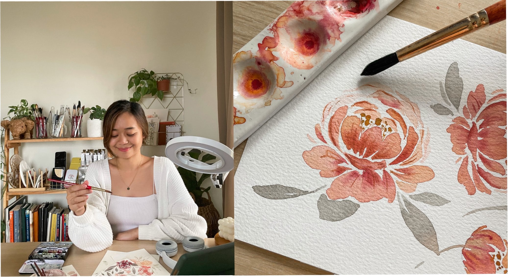
my watercolor Dahya class. I am Yen, a watercolor artist
based in the Philippines. I love painting flowers that give off a good
and relaxing vibe. You'll find most
of my artworks on Instagram in my art
account sincerely Yen. This class is created
for beginners. Even if you have never
held a brush before or you have no knowledge or
experience in watercolor, I'm sure that at the
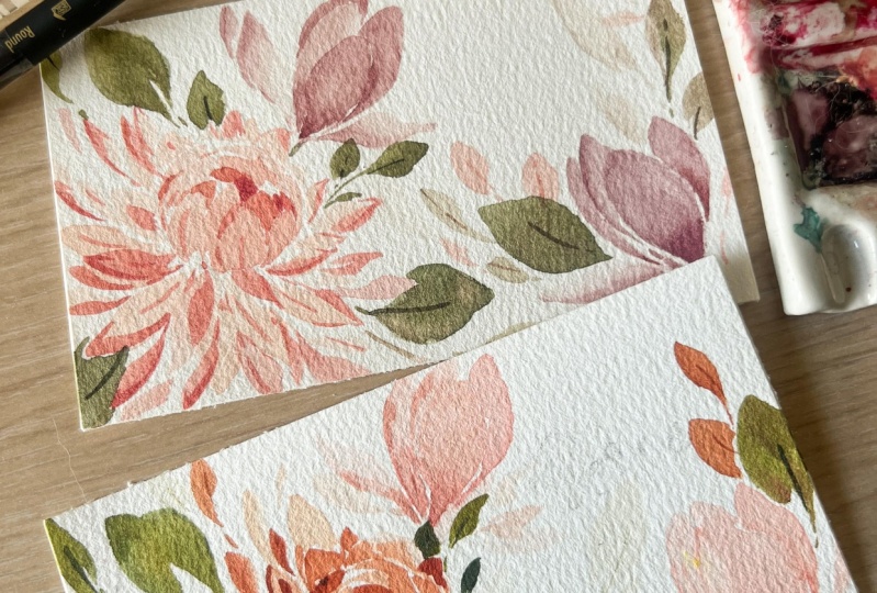
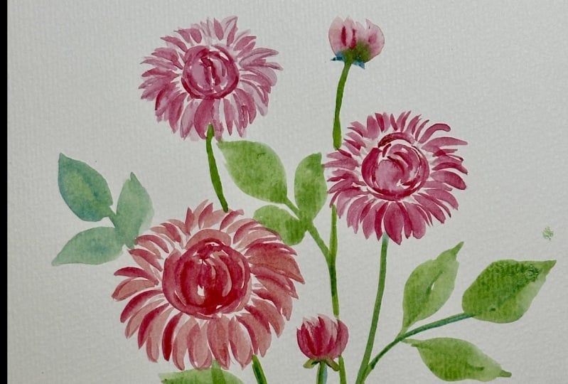
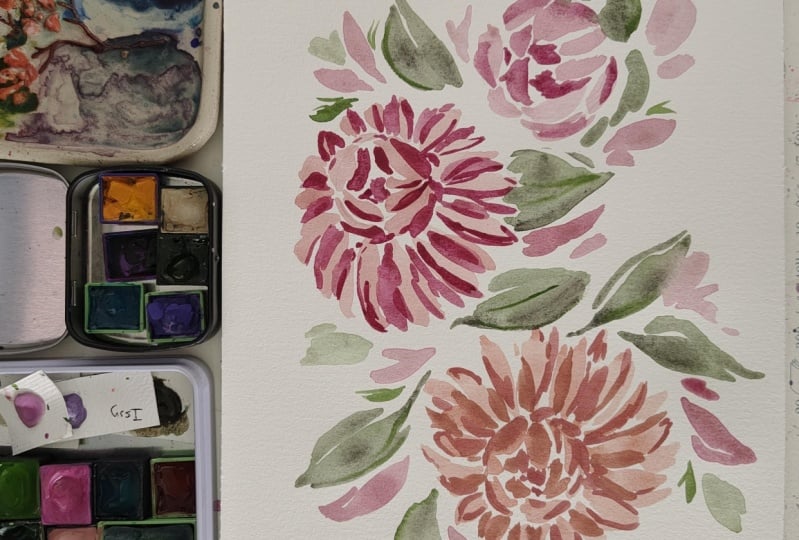
end of the class, you'll be able to paint this
beautiful spring flowers. This is a very
comprehensive class and I will guide
you step by step. Stroke by stroke from the basics to more complex techniques
in painting florals. Here's what you
will learn from me. Materials. We are going to
talk about the brushes, types of papers, paints, and other materials that are best for floral
watercolor painting. Color mixing. I'm going to share my favorite earthy and vibrant
colors and how I mix them. Basic brush strokes. We're going to have
a warm up exercise, and in this drill, you're going to
learn water control, how to properly hold your brush, when to add pressure, when not to add pressure. If you notice my paintings
are characterized by lightness and looseness
of brush strokes, and I'm going to share
to you how I do that. Painting flowers. Looking at this class, it might be overwhelming, especially if you're a beginner. You don't have any
idea where to start, but don't worry in the
fifth module of the class, I am going to teach
you composition. This may seem a
lot for beginners, but really after this class, you'll be surprised
at what you can do. If you're ready, let's start.
2. Materials: In this class, we are going to use the following materials. Cold pressed watercolor paper. This is 300 GSM, that's grams per square meter, so that's the thickness
of the paper. The thicker it is,
the less likely for the paper to
buckle when it's wet. I prefer using this when
painting loose watercolor floals because we will use
a lot of water and this type of paper
is very absorbent. Here it also says 100% cotton. So it allows the colors to be more vibrant and long
lasting on the paper. Now let me show you the texture of this cold pressed paper. It's not super smooth.
It's textured. You can see there
are little bumps and dimples on the surface. I prefer using this more than hot pressed watercolor paper because hot press
is very smooth. Sometimes it's more difficult to control the water on the paper. Now, let me show
you another type of watercolor paper that's
the rough paper. See this is more textured. There are bigger bumps
and dimples here. Just to compare there. These two are good for the loose style of
watercolor painting because the granulation of watercolor is very obvious in
these types of paper. Plus the texture makes the
painting more interesting. If you're a beginner, I suggest you invest in a good
quality of paper, 100% cotton and
at least 300 GSM. That way, you will be able to see the full
potential of your work. In my experience,
paint really reacts differently based on
the quality of paper. Next, paints. These
are in tubes. I'm using Daniel Smith
and Michello here, I am using Daniel Smith. These are the examples
and Michel here. We will discuss per lesson the colors that we
will use later. You may also use paint sets like this where the paints
are placed in pants. If you are a beginner, you
may start with cheaper brands like NevskyaPalitra,
and Koi watercolor. You may also buy sets like
the one I showed earlier. They have this in Daniel
Smith and other brands. Now for the brushes, we will use a pointed
round brush size six. You may use other sizes. This is Princeton Neptune. I love using this for floals because the
bristles are soft. See, let's try to bend that. It's not snappy and the
belly is very thick here. This is the belly of the brush. It can store a huge amount
of paint and water mixtures. Perfect for loose floals. If you want to have more
control of the brush, you may use other Princeton
lines like the velvet touch. But personally, this
is my go to brush when painting,
especially floras. It has a huge belly and
a pointed tip hair. We will also use a
detail brush, this one. It's size zero. This is also pointed round
brush but it's very small. It's perfect for
adding the details. We will also use
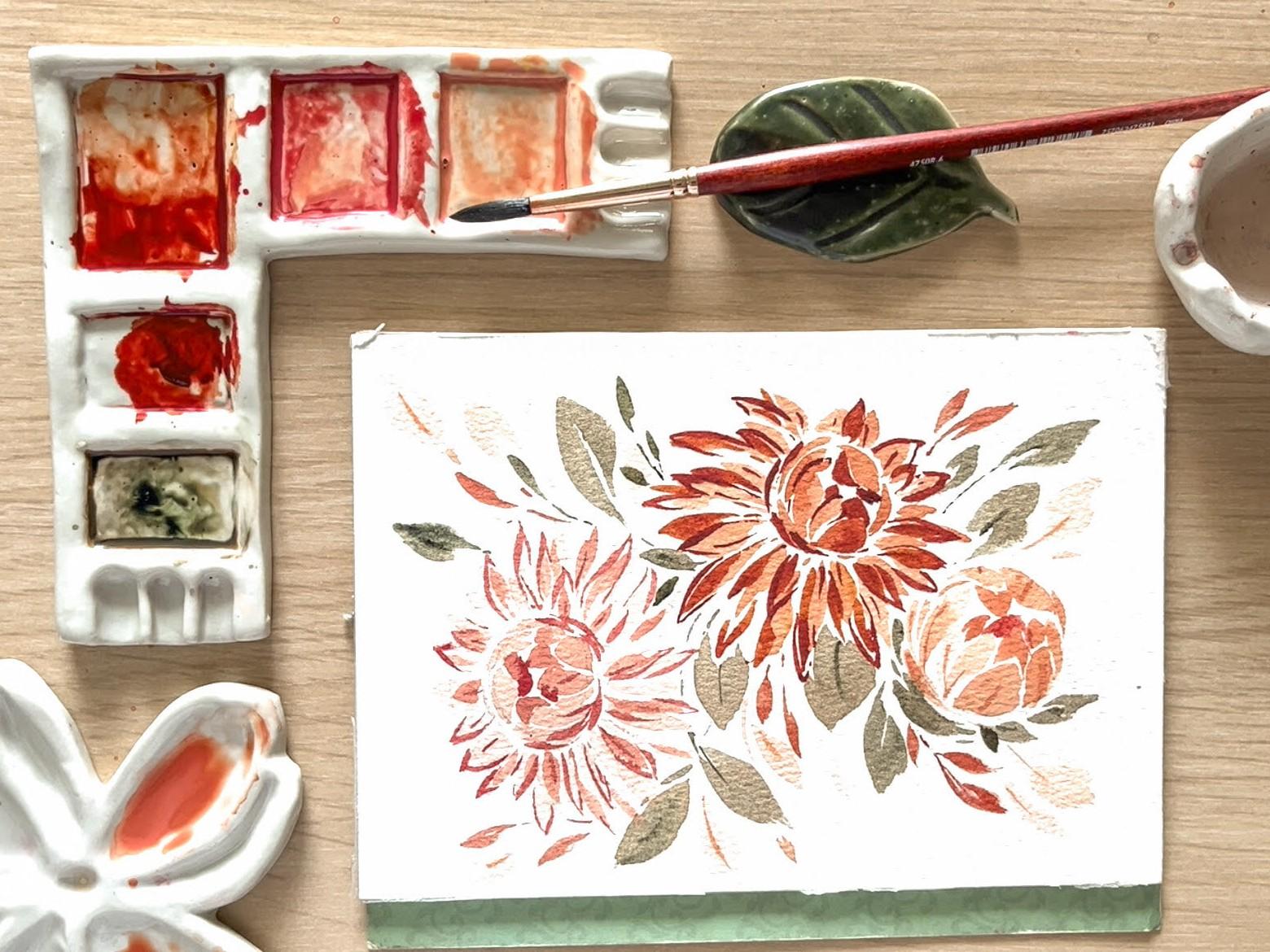
a mixing palette. There are different mixing
palettes. This is resin. But personally, my favorites are ceramic palettes like this one. It's easier to mix colors
here and it's also easier to clean as compared to the plastic mixing palettes. Plus, it's more
aesthetically beautiful. Then we will use
two cups of water, one for cleaning the brush and one for mixing the
paints in the palette. This one's going to
be dirty later on while this one will stay clean. Let me just show
you how I use this. I use this thing to add water to my paints in the mixing
palettes like that, just to make sure that you're
adding clean water and not dirty water so that later on the colors
wouldn't be muddy. I also use a cloth. You may use a tissue paper if you don't have
extra cloth there. I use this to clean
my brushes or in removing excess water or paints
in my brushes like that. Just to demonstrate,
for example, you think there's too much
water in your brush there, you just clean that
using the cloth. Then lastly, we
will use a pencil. We're not going to draw the
flowers and the details. We're just going to sketch some circles and
lines for the guide. So these are the materials
we're going to use. If you are a beginner,
I do not suggest that you buy very
expensive materials. But of course, you
still deserve the best in order for you to
see your full potential. I suggest if you would
invest in anything, it would be the
brushes and the paper. When I was a beginner,
I used 200 GSM paper, but when I discovered 300 GSM, it was a game changer.
3. Basic Brush Strokes: Before we learn how
to paint the flowers, we first need to practice
the basic strokes. First wet your brush
and load it with paint. You can use any color. This is just a warm up exercise. Then make sure that the
bristles are loaded from the tip of the brush
to the heel of the brush. The first stroke is the
thin, thick thin stroke. There. Just start
with just a tip, then press and slowly lift. Again, that tip,
press and slowly lift the brush. Like that. You can also try doing this
in different directions, different sizes,
different lengths. Later on, when we paint
flowers and leaves, we will want to
add variations in the sizes and directions
of the strokes. This is so that the flowers
and the leaves will not look very stiff and natural. This exercise helps you
to master brush control. At first, very light pressure, and then you add more pressure and then
light pressure again. You need to do this 15 to 20 times or until you're comfortable
in doing this stroke. Now I want to show
you what happens if your brush has too
much water like this. Very difficult there to
paint thin strokes because the water is building
up at the tip of the brush and the tip
is no longer rounded. Just remove excess
water by doing this. Now on the other hand,
this is what happens if the brush is thirsty
or it lacks water. You saw it was very difficult
to spread the paint, let me just show you
there are white spaces. The paper isn't fully covered. Load the brush with paint and water and then there it's
easier and smoother. The second stroke
is the C stroke. This is like the thin
thick thin stroke, but we will add a
little curve like that. So that's thin, press
and curve and then lift. You try doing this also in different directions
and in different sizes. Again, remember that
when you're doing the strokes when you're
painting strokes, don't be very conscious
about painting the perfect size or perfect
shape of the stroke. There's no such thing.
Just feel comfortable in doing this there. The third stroke is
the belly press. So from the name itself, let's do that in slow motion. You press the belly, move the brush upwards,
and then down. Press, move up and down. Press, upwards, down. Like that. And then you may also try doing this
in opposite direction. So press downwards
and up like that. So just feel comfortable in pressing the brush and
then lifting the brush. So press, lift, press, lift. Press, lift. Just keep practicing doing these three strokes
because this will be a warm up exercise
and we prepare you in painting
the Dayas. Enjoy.
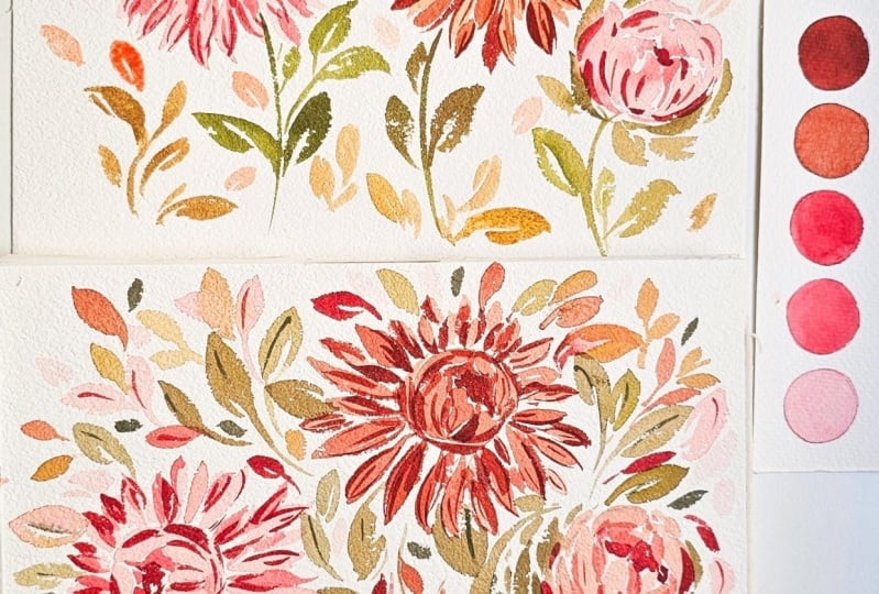
4. Color Mixing and Painting Dahlias: These are the colors
that we're going to use in painting the dahlias. Rose madder, perylene maroon, kinacridon deep
gold, buff titanium, naples yellow, undersea green. Now we're going to mix
the colors to come up with a shade that we want. If you don't have kinacadon
rose or rose madder, you can use any pink
in your palette. If you don't have naples yellow, you may use any
light colored yellow that's supposed to be warm. I'm just going to
put a little bit of the mixture of rose
madder, naples yellow, and buff titanium here and create a watery mixer
by adding more water. These watery mixers
will be used in the first layer of the Daria. This is the thicker mixture. And this one's the
watery mixture. Then in this mixture, we're just going to use rose
madder and naples yellow, no buff titanium because
you want this to be darker. Then let me just add more perylene maroon there to
achieve this darker color. This will be for the
third layer later on. For the next flower, we're going to use
combination of perylne maroon and
kinacridone deep gold. For this first mixture, there is more kinacidone deep
gold than perylene maroon. There. Then in the second mixture, there will be equal amounts of kinacidonGld, and
perylene maroon. Then for the last,
the darkest color, it will be purely
perylene maroon. There, then we'll use the
green for the leaves later on. In painting a dahia, start by drawing
two circles a sky, one small inside
the bigger circle. The smaller circle is placed on the side where the
flower is facing. The first flower here
is facing to the left. Now using the most
transparent mixture, paint C strokes and
belly strokes inside the inner circle like this
and one C stroke like this. It's okay if the strokes
are overlapping, but make sure to still leave white spaces in between some of the strokes and also leave the inner part of
the circle blank. Don't paint on the center
most part of the circle. Then paint thinner and longer se strokes around
the inner circle. Now let's paint in thin strokes
around the inner circle. These are longer, but you should use the bigger
circle as your guide. You don't have to be very
conscious to follow the circle. It's just a way for
you to limit yourself from creating a very long petal. You can paint a petal with
just one stroke like this. There or if you want
to make it thicker, paint two strokes like that. Make sure that the strokes
have different sizes, different thickness,
different lengths. Now check. Look at
the flower from afar, and check if you're happy with the shape and the petals
in the first layer. You can add some
lines if you want. Now for the second layer, use a thicker mixture. Just wait for the first
layer to dry first. The second layer
should be darker. Let's start by painting belly strokes or if you
want to be very careful, you can draw using the brush, the petals inside
the inner circle like this, like what I'm doing. It should look like these
petals are inside the petals, the first layer in
the inner circle. Then let's add darker lines at the bottom again like this. Then let's paint thin, thick thin strokes or
see strokes again. But this time, we only need to paint less strokes
than the first layer. You can paint se strokes or
thin thick thin strokes on top of the first layer or between the petals
in the first layer. You want to make sure
that there are still white spaces left in the
flower in the bigger circle. You don't want to overdo this, so be careful in deciding
where to add there. I'm adding strokes in between petals and some strokes that are overlapping the first layer. There. Now the last layer
is the darkest. It's like the shadow
or the outline, just to give emphasis on the
shape of the petals and on the layers of the petals to
give it some three D effect. So these shadows
should be placed like at the back of the petals. That's what we want
to make it look like. We're going to paint
subtle outlines like this. In painting this, make sure to use just the
tip of the brush, but you can slightly
press like this. Let me show you again
in slow motion, slightly press on the side, then back to thin on the
other side like that. You don't have to
put outlines to all the petals,
just random petals. Again, we don't
want to overdo it. See, I'm not adding
outlines to all the petals. Then I'm adding some
thin strokes here. Again, we're going
to add shadows at the center of
the inner circle. It's like the petals that are inside the petals in
the inner circle. That's not yet in full bloom. Then add the stem. The stem is just a
long thin stroke. Just use the tip to
make sure it's thin. Then let's add leaves by
painting two sea strokes. One sea stroke and
another sea stroke. These strokes are facing
each other. Like that. Now let's try to do that again
using a different color. This one perylene maroon
and Kenacydone gold. Start with the center, some belly strokes
and see strokes. Then at the bottom of the inner circle and the long sea strokes and
thin thick thin strokes. Notice how I add curves just to make
it look more natural. There. We don't want the
flour to look stiff. That's why we're adding
curves when we're painting the long sea strokes
for the first layer. Then the second layer, you should only do this when the first layer is
dry because if not, you're going to ruin
the first layer. Again, it should be darker, meaning more paint than water. That's 75% paint and 25% water. Then paint overlapping. Then just add the
second layer here. Again, we don't
want to overdo it, so we're just adding
some random see strokes and thin thick thin strokes in between petals or on top of the first layer
of petals like this. And if you notice they're thinner than the first
layer of petals. Then the darkest,
this is almost like pylon pure Beryl maroon and
very small amount of water. We're just adding some
outlines like this. There. Every now and then, try to
look at the flower from afar, just for you to see if it needs more outline
or you should stop. There. Then I like to add some thin lines at the middle part of each
petal, but not all. Then let's add a stem. And then the leaves,
just two see strokes facing each other there. Now to paint a dahia bud, we'll just need one
circle as guide. Remember how you painted the center of the
flower earlier, we're going to use the
same technique and method. Again, make sure to leave the center moost part
of the circle blank. Some sea strokes here. Then a second layer, darker layer of strokes. If you notice, I'm
kind of drawing the petals now using my brush. We wouldn't want the
darker petals to overlap the lighter petals because we
want to make them look like they're inside the
first layer of petals. Let's add some
green strokes here. Small leaves. Like this. Let's add the stem
and some leaves. Then again, just do
this if the first layer and second layer
are already dry, adding some folds or
creases or some veins here. Very thin lines. I'm just using the
tip of my brush. There. Now the next
lesson is a bonus lesson. Let's paint Ataya Bouquet.
5. Class Project: A bouquet of Dahlias: Now we're going to try to make
a simple bouquet of Dayas. These are the colors
that we're going to use. A mixture of enacridon rose, naples yellow, and
buff titanium. A mixture of perylne
maroon and enacydon deep gold with more
kinacidon deep gold. A mixture of kinacydon deep gold and perylin maroon
but this time, more perylin maroon and undersea green mixed with any
color used in the flowers. You may take a screenshot
for reference. So before we started painting, we first drew circles as our guide to know where
to place the Daias. Let's start with the
first layer of strokes. The first layer should
be very transparent. We use a mixture
that's very watery, almost 75% or 80%
water than 20% paint. This is because when we
add the second layer, we want the strokes
to be very visible. H And in watercolor painting because this isn't opaque, we always start with
the lighter colors. Once the first layer
is already dry, we're adding a second layer. The second layer is always
thicker or creamier, so that when you paint on top of the first
layer, it's visible. Then the third layer, again, you do this when the
first and second layers are already dry. The third layer should be the darkest of the three colors. It's the thickest and
creamiest mixture. We're going to use this to create subtle
outlines for some, not all of the
petals of the dahia. Now onto the second layer. For the second layer, we're using more perylene maroon than kinacridon deep gold. About 50 50 ratio. Then we're squeezing
in some thin, thick thin strokes or see strokes in between the petals or on top of the petals
in the first layer. Now on to the third layer. The reason why I don't use
perylene maroon purely is because it's a cool tone. So we're trying to add kinacridone deep gold
to make it warmer, just to be consistent with
the first and second layers. Okay, now we're done
with the flowers. Let's try to Let's So painting the Dahlia
bud is like painting the center part of the Dahlia
flower, the round part. Now we're going to squeeze in some leaves in all the
awkward spaces left. This is the true role
of the leaves to make the bouquet fuller and to
remove awkward spaces. It adds volume, and it also defines the shape of
the entire bouquet. The sleeves are only made of two sea strokes or one thin
thick thin or sea stroke, depending on the
size that you want. Of course, if you would
like to make it thicker, then you can add more strokes, more than two strokes. Okay. So instead of adding
leaves that are green, we're adding leaves
that are orange or the combination of Perlin maroon and kinacridon deep gold. This is because we don't want the bouquet to be mainly green. We want it to be mainly
the color of the flowers. We're using this color. Now I always add some very transparent leaves at the end of
painting the bouquet. First is to add depth
to the bouquet. So these leaves look
like they're at the back part of the bouquet. Now let's add some details, just a few details
on the leaves. No So I hope you painted with me and I hope
you enjoyed this process. You don't have to worry
if your output did not turn out to be exactly
like this, that's okay. As long as you painted with me and you have Atalia
bouquet with you, then that's already progress, and that's a good start. So congratulations, still. So there.
6. Finale: Thank you so much for
joining the class and congratulations
for finishing it. Before it finally ends, I'd like to share five
important reminders. Number one, don't underestimate the importance of mastering
your brush strokes. If you're more confident
in your brush strokes, you'll find that your
floral painting will be more soft, loose, flowy. It shows in your artworks. Number two, choose
your materials wisely. Remember that the quality of your materials,
especially paper matters. Try experimenting on
different types of papers, different types of
brushes and paints until you find what you're
most comfortable with. Remember that you
deserve the best, not necessarily the
most expensive, just the best materials to
bring out your full potential. Number three, planning matters. Unless you're in the mood
for random floral doodles, planning the structure and color scheme that you're
going to use matters. Number four, if there
are awkward spaces, add some loose strokes
or some fillers. If you're painting a
flower and you find that you're not happy with
the shape of the flower, just add some loose strokes. If you're painting
a floral wreath or a floral bouquet and you find awkward spaces
between the flowers, just add leaves and fillers. This will make your
wreaths and bouquets more balanced and fuller. Five, lastly and
most importantly, enjoy the process of painting. Remember that you're
painting to relieve stress and not to put more
pressure on yourself. Be patient with
yourself and focus more on enjoying the process
than on the output. I was also a beginner before, and when I started, my roses and flowers
look like blobs of paint or cabbages or
clouds or just blobs. But with constant practice, I was able to develop my
skill in watercolor painting. Remember that practice
makes progress. You don't have to compare your works with the
works of other artists. If you're going to compare, compare your pleasant works with your works
when you started. That way, you'll
appreciate your progress. I hope that you
learned a lot from this class and I hope that you enjoyed joining this class as much as I enjoyed
creating the course. Connected. If you have
comments or you'd like to start a discussion
or you have questions, just leave your comments. Or you can also message
me on Instagram. I would highly
appreciate it if you tag me when you post your class
projects or your practice, I'd share it in my
stories as well. Again, thank you so much
for joining the class, and I hope you
learned a lot from all the lessons and all the
tutorials that I've shared. Happy creating and see you.
 SincerelyYen, Watercolor Artist