Transcripts
1. Introduction: Hi everyone, Welcome
to my class. Today I will teach you
how to paint one of the most popular spring
flowers the field. Whether you are a
beginner or you have experience in
watercolor painting, this glass is surely
going to teach you how to interpret this flower and
turn it into a beautiful, loose, expressive
combination of brushstrokes. Throughout this class, I'm
really guide you step-by-step, stroke by stroke on
how to paint a peony. So that at the end of the class, you will be able to paint a beautiful peony bouquet and
then beautiful BOD, ready? If you're ready, let's
prepare your materials.
2. Tools and Materials: This class will use
watercolor paper, preferably 300 GSM,
so that it will be thick enough to absorb large
amount of paint and water. However, if this is
not available at home, you can use thinner papers
only up to 200 GSM. This is also what we're
going to use for that. We will also need
binded round brushes. One big and one small
farther details. Make sure that the tip of
the brush is buying that so that it's easier to make
thin and thick strokes. This art Princeton brushes
size eight and size, will also need a pencil to draw a rough
guide in painting. Watercolor paints. You can use those in tubes, are those in thin scans? Whichever is available at home. Will also need clean water
to clean our brushes. And a mixing violet. This is where we'll
mix paints to achieve the colors
and consistency that we run. Issue paper. This will be used 30 move
excess water on our brushes. Lastly, eraser to remove
pencil marks afterwards. Once you have this, we are now ready to do that.
3. Brush Stroke Drills: Before we start painting, it is very important to have a warm-up exercise will help you master how to control the pressure that you
apply to the brush. They'll make thin
and thick strokes. Load your brush from
the tip to the here. You can use any color, but I suggest that you use the least used color
in your palette. The first row is
the thin stroke. If you notice only the tip of the brush is touching the paper, that means we are putting very little pressure on the
brush, just knife heads. Also, if you notice I'm holding
my brush in this manner. That just the tip of the brush. Also my hand is very
close to the tip. You to have full control. The drills will also
help you how to master the amount of water
that you've put on the brush. So this is what they do. I point my brush downwards. If what they're drips, then it means it's
through what, 30. So we didn't move
excess to 1 third. Now the second stroke, thin, thick, thin stroke. I have mentioned this in all my watercolor classes
here on Skillshare. It's very impart
that is very useful. If you notice that that first just the tip of the brush is
touching the paper, then they slowly add pressure. The belly of the brush
touches the paper, then I slowly lift again. Again, that's slightly lift. Press lift. You can also practice doing
this for at least 20 times. The third Braille
is the C stroke. Just the tip. Then
press using the belly and this trope will be used meaningfully. Again. Just load the brush. Again, that's breasts and curve. So I'm just dragging the belly of the brush to
create the curve. Again, that's the fourth is the hoop stroke. This is very similar
to the C stroke, except that this one ends it. That's that. Then for the C stroke and then
back to the tip. Again. That's then use
the belly of the brush, drag the Great the curve
and then back to that. If you find it very difficult. The hook stroke, you
can do this instead. See Stokes that
they're facing a job. There. It looks like a hoop. So you can do this in any manner that's
more comfortable for you. Practice doing this in
different directions. This will also be used
mainly in painting, the painting the leaves. I think it's the most
fun of all the strokes. It's the stroke. It's like paintings,
thin, thick, thin strokes, but
in a curvy way. Notice that I am
using the belly of the brush to spread the paint
on the paper like this one. You may have noticed that in
some parts I am no longer painting the strokes,
that thin strokes. You can also opt
to do with that. There's no grabbed
them with that. Just makes sure that you can present them spaces in between. Stokes like this one. Again, that's bending. Also used this stroke
in painting the bed. That's, that's it. Once you master these strokes, it will be a lot easier
for you to paint. The few.
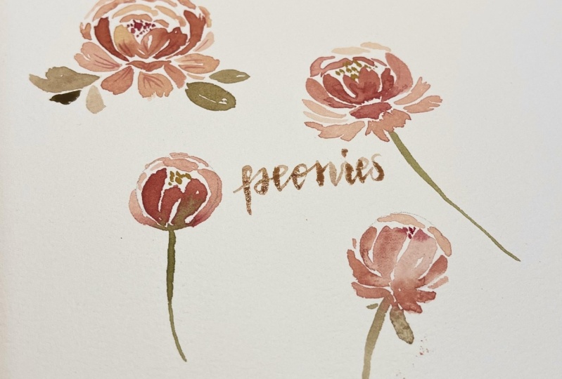
4. Analyzing a Peony: This lesson is just
a bonus lesson. I just wanted to show
you how I came up with the farm of my puny and the
steps on how to paint it. We really use this
photo from Pinterest as our reference to get the
basic shape of the flower. This will be our guide
when you paint later on. It's made of two circles, one small and one big. Mark this point as the center
or the point of origin. Now let's try to
draw the petals. The first set of
petals are smaller. We're just going to
follow the shape of the circle here,
the inner circle. You won't be doing
this for this class. I'm only trying to give
you an idea of how we want the petals to look like
later on when we paint. Now the next set
of ethos outside the smaller circle, bigger. They appear to be
facing sideways, a little bit sideways. There also longer. Again, you have to follow the shape of the Second Circuit. The bigger one. The third set of petals outside
the two circles. Lot longer and beaker, and they are more
irregular shapes. Then you have that that's at
the center of the flower. Then we're going to
add the details. This part, this option of
an painting, this BOD, since it's the loose style of watercolor and we're not trying to make it look like
it's realistic painting. This just helps identify the flow or the
movement of the petals. But if you try to
notice all the linings, all the details that
I am drawing right now originate from the
center or our reference. Now let us try to remove the reference photo to
see our illustration. There. And I'm going to
show you the steps. This is our flower. We started with the
two different circus. And we identify the center, then the first layer, the second layer,
the third layer, and then the details. We really use this now as our
guide in the next lesson. Following the steps
that I showed you, we are now ready to
begin our appeal.
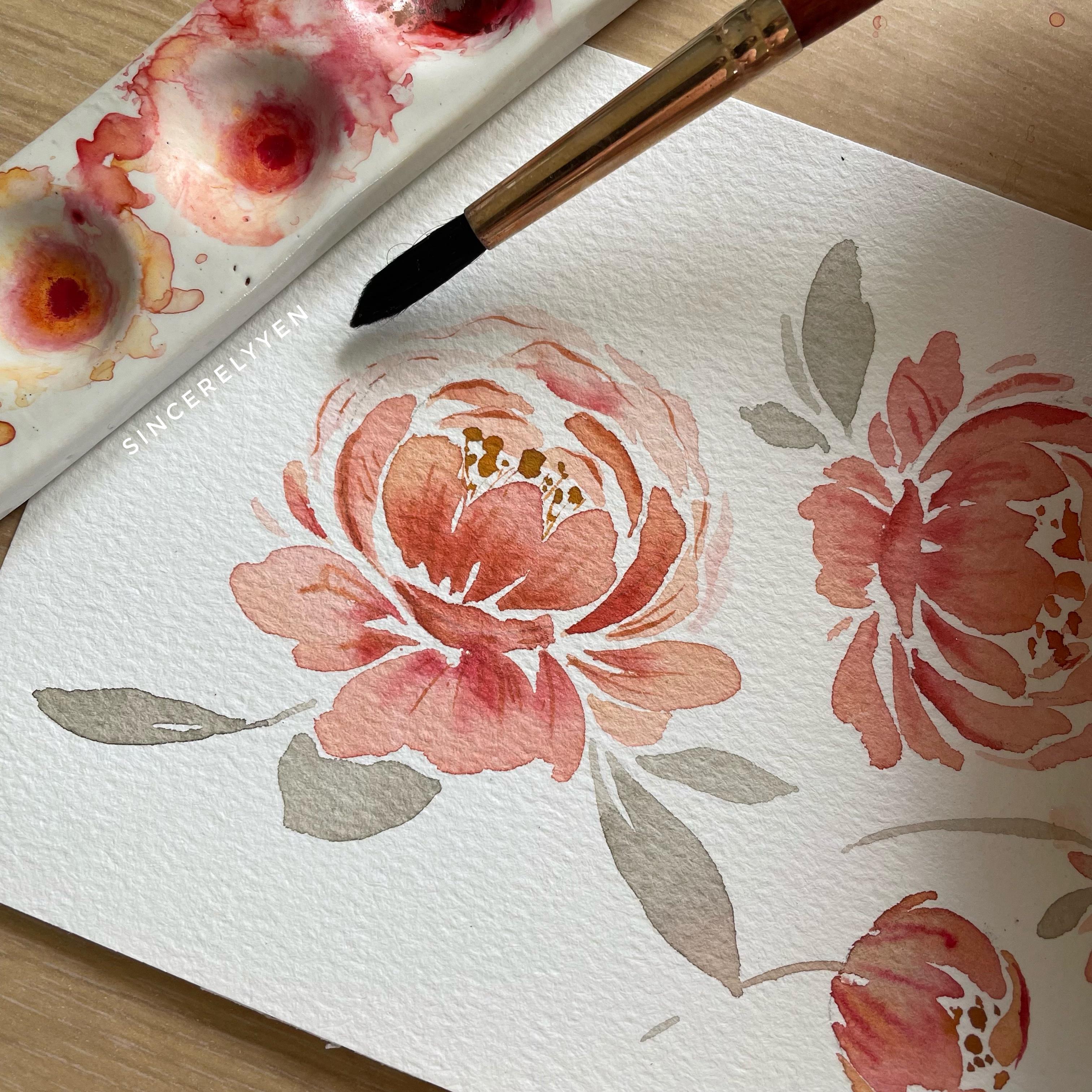
5. Part 1: Painting a Peony: Now we are ready to appeal. Phrase things first. Let's prepare our paints. You can actually use any
color that you want. But for this class we'll use
cream sun, and yellow ocher. If you do not have crimson, you can use any dark ink
like rose madder, Carmen. And for the yellow, you can use any warm yellow, cadmium yellow. If you notice, there is just equal amount of paint
and water for this mixtures. Also just a tip
just to make sure that there will be a
good blending of colors. I mixed a little of each other. I mixed a little yellow to the crimson and a little
crimson to the yellow. So as mentioned, we will use this circles as our guide
in painting peonies. For the first set of
petals will paint, see strokes and thin,
thick, thin strokes. Following the shape
of the inner search. You'll notice that I
am randomly picking up colors between crimson
and yellow ocher. This is just my technique
in order to have a beautiful blending of
colors within each bet. You will appreciate
it more when if device I did not follow the inner circle because we do not
want the center of the flower to be very big. We just added the thin, thick, thin lines to
enclose the center. For the next set of
petals, we'll be longer. See strokes between the
small and the big circles. These petals should enclose the phrase set of
Betas that we painted. This should look like the
top view of the battle, since this are facing sideways. Again, we make sure to leave
a space at the center. This is just a technique when the paint or the first
layer is still wet. I tried to add a more
concentrated a mixture of colors. That means more
paint than water. To achieve the bleeding
effect of watercolor, you'll see that the darker
color is moving from the center towards the
outer part of the pathos. Now for the third set of Betas, remember this are bigger and longer and they have
more irregular shapes. This is where we
used the strokes and the hoop strokes. The stroke. They'll forget to
leave whitespace is important to have whitespaces
when you're painting, you're using the loose
style of watercolor. Again, you have to enclose
that in their circuit. But if you notice, I am already using a more
watery mixture for this part. That means there's
more water than paint. This is because we want
it to look like it's at the back part of the flower. Again, for the meeting effect, just add darker colors in there. But they think the
first layer is already dry so the paint
is spreading too well. So what we're gonna do here
is going to clean our brush. Using a tissue paper, then using a clean brush
will spread the paint. This is just to help
the paint blend with the first layer of the flower. Because you do not want
it to be super dark. It looks much better. Now use a very watery mixture to finalize the
shape of the beauty. And once you're okay with it, let the first layer dry. And then we'll add the details. First, let's add the dots at
the center of the flower. I'm using different
sizes of dots in here. We want it to be very random. Now let's use a
smaller brush size. And then creating a mixture here that's very concentrated. It means there's more paint
than water because we want the second
layer, the darker. Again, remember your
point of origin. All of the details, as mentioned in the
previous lesson, details should be all originating
from the center point. Makes sure that you are using very super thin
lines for this one. Again, this part is optional. You can add the details. It's okay as long as you're
happy with your building. But if you still want
to add details and you can follow the steps here. Far the beta's at the back. I'm just trying to add thin, thick, thin strokes. Remember? The details or the thin lines should look like they're artists and they think from the
center point of the flower, except for the shadows that
I'm adding here like this. Now you don't have
to add thin, thick, thin lines on all of the
strokes you created earlier. You can stop if you think
there's enough details. We do not want to overdo it. Now I'm adding just
thin lines over here. Now let's paint more Bill
knees in the next lesson.
6. Part 2: Painting a Peony: Now in this second part of the
lesson, painting a beauty, I am going to show you
how to paint a puny that's facing to a
specific direction. So let's assume that this
building is facing upwards. But of course you
can move the paper around and make it
look like it's facing. The third steps are similar to the steps that we followed
in the previous lesson. However, there will be a slight difference on
how we paint this tropes. It's still the same
up to this part. Would add more paint
here for the BD Effect. 3d loved that bleeding effect. The petals. Now this is where the
difference we welcome. The petals are a little bit
more facing to the side. So the strokes are shorter. There will be more
strokes that they're facing to the side like this. Once. Basically shorter strokes. Strokes that are facing either
the left or to the right. That's the only difference. So every time you want them to look like it's
at the back of the, of the other petals. What do we do is we use some
more what, 30 mixtures. Remember that? Now we're adding the details. You can see that they use a different color for the
thoughts at the center. That's also depends on nu. As long as it's visible, as long as it's pretty. Then we can use that a thin strokes for the details. There. Now I'm going to show you how to
paint a peony bud. Instead of using two circles, we're just going to use one circle for this
one as every guide. You will follow
the first step in painting up regular Paeony, just thin, thick,
thin strokes and C strokes following the circuit. This one, the BOT
bud is enclosed. The petals are enclosed. We ended here. Then we add
the details at the center. Again, more thoughts, random. Now I'm going to show
you another peony bud, but this is slightly open. It's pretty much the same, but we add more. Just small, thin, thick,
thin strokes here. The bleeding effect. Now I'm going to show you
how to add the leaves. If you notice, I mixed green with the colors that they
used for MATLAB worries. I always do that
to make sure that the color of the leaves will
blend well with the flowers. Leaves are just thin, thick, thin strokes, strokes that they're facing
each other, this one. Now the first layer of paint is already dry for the buds
begin to add the details. Just thin strokes that look like they're artists or anything from the center of the circle. Staying with a regular puny. Now that you can paint different peony flowers
and PO need buds, we can move on to
your class project.
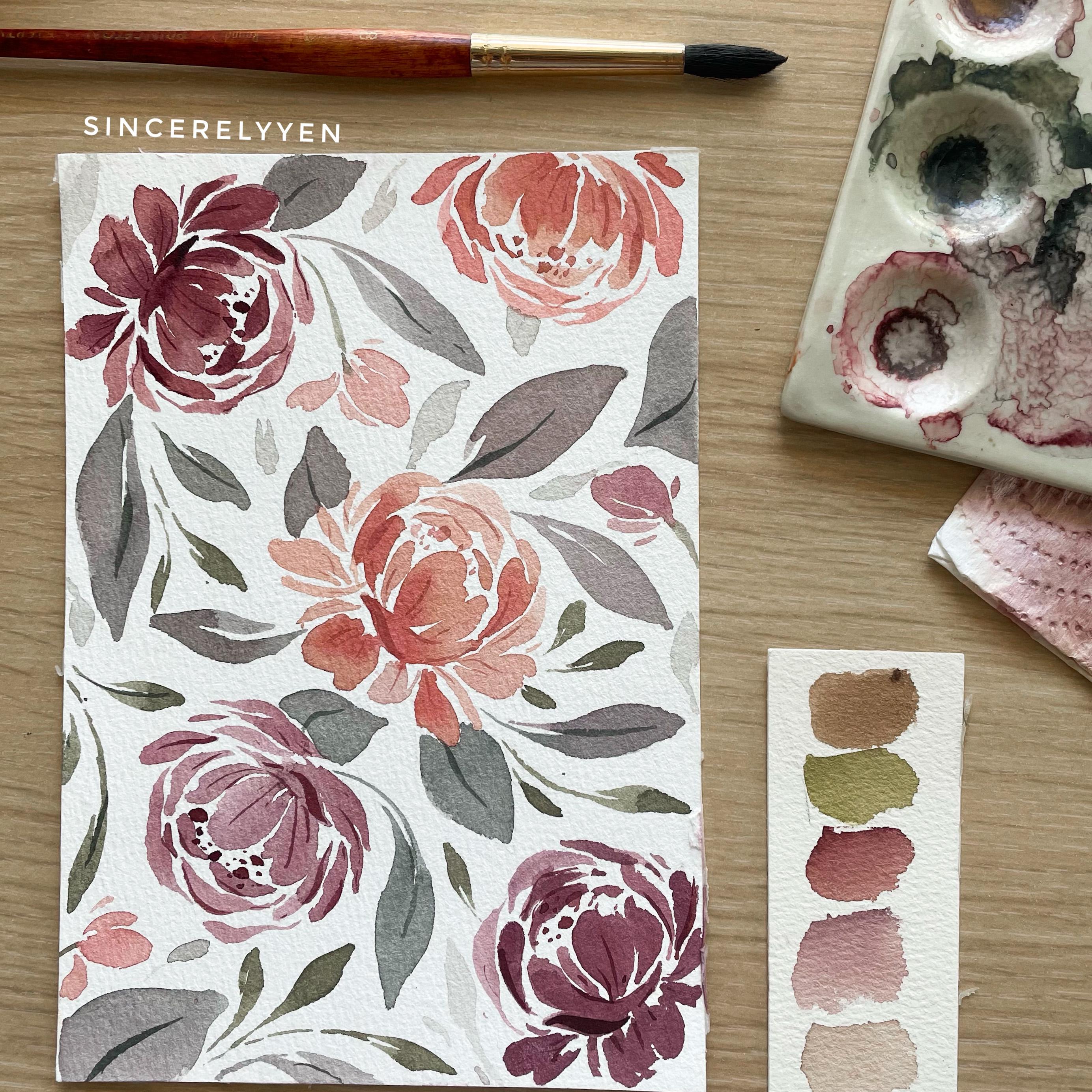
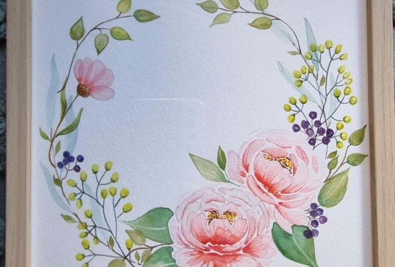
7. Class Project 1: Peony Wreath: For this class project, we are going to
need two coins for the Paeony and one
larger down guide for the shape of the leaf. Let's start by
mixing our paints. Achieve the colors that we want for the flowers
and the leaves. This is scar mean, I'm going to add
a little yellow. This is warm yellow,
cadmium yellow. You can use any warm
yellow in your palette. We're going to mix
them to achieve a slightly peachy shade of pink. Then I'll take a little of that mixture and put
it in a different way. I'm going to add more water. This is because he wanted to
have a more watery mixture. When we are going to create. One is cadmium yellow and
it added a little car mean, this thigh more
yellow then Garmin. Then I'll take a little bit of that again and add more water. If you're not yet happy with the colors that
you're achieving, discontinued to mix and
add colors, other colors. I am creating another
mixture here, this is Carmen and yellow, cadmium yellow, so this is
more concentrated mixture. So unless water, this would be used in adding the
details or when you are going to add the beading
effect under flowers. Now for the leaves, as
I always mentioned, and I mixed green, any green in your palate with the colors that I
used in my flowers. So I added a little Garmin here. But since I want it to be a little more thing, I'm adding. This is Davis grief
from Michelle. Hello. Again. I took a little bit of that
color and added more water to create more advanced patterns
strokes later on. Now let's try on the
mixtures that we created. This part of the
painting process is very important because
this is where you'll establish the theme of
your florida compensation. Not yet happy with
the second color. I think that it should be a little more of the yellow sites. I'm adding in yellow
that this mixture. Then for this one,
I think that it's two times Pi and so
I just added more. Now I'm happy with the
colors that I've achieved. Certain member European
knees are made of two struggle guides. We are using coins. This process is also very important because
this is where you, where you want it to be. Where you're going to land
the composition of your leaf. Where you're going to
make sure that there's proper balance of all the
components of your Florida. Again, from the
center of artisan. This set of petals is
a combination of thin, thick, thin strokes
and C strokes. You really have to
enclose the center part. The first set of F. Again. A bleeding effect. It seems that I am a
little late and adding the bleeding effect because the first layer is already dry. So again, reusing a
clean brush to spread the smooth and soft, blending the dark color with
the first layer off the, off the bed, which
is more than fair. Feel free to move your paper
around while you paint. Now ready for your hoop
strokes and the strokes. I'm just randomly
adding strokes here. And then I'm going
to enclose it. So if you notice I used the more dense parent mixture
for this one because we want it to look like it's at
the back part of the flower. Now let's add the
bleeding effect. Keep adding transparent,
thin, thick, thin strokes or your circle guides until you're happy
with the shape of your POD. Now let's move on to
the second flower. Now this one, it'll be very similar to the flower that we
painted on the second part. Painting the peony less on your strokes and
your hoop strokes will be facing this side. It's okay if the petals overlap, but we do not want to cover the petals in the
first flowers over. We're going to adjust
a little here. And that's still okay. It looks like the flower
is facing sideways. Now let's add the bleeding
effect on this flower. My Florida watercolor
leaves class the very first constraint
glass that I've shared. I've mentioned that you've paid your main flowers
followed by meet leaks. This is because
it's a lot easier to squeeze in smaller leaves and your filler flowers and
your Paeony buds later on. Because they're smaller. Leaves are made up
of thin, thick, thin strokes or keystrokes that they're facing each other. And I'm just squeezing
in those leaves between the bill nice and
underside of the buildings. I'm randomly picking up dark, dark green and the
lighter shade of green. And this one will
have a variation. Now let's start with
smaller than the hips. So these are thin
leaves made up of two thin, thick, thin strokes. I'm already starting
to squeeze in. This leaves those ACE. Now let's paint the Paeony buds. I no longer drew a circle
guide for this one. But if you're a member of
the shape of your BOD POD, it's made up of your C
strokes or your thin strokes. You can add some smaller
petals if you want to. Make it look like
it's slightly open. This or filler flowers. Just adding filler
flowers for this one to finalize our
Florida composition. Now I'm going to use
a smaller brush. You're ready to add the details. Again, as mentioned,
for the details, we are going to use a
more concentrated mixture of paint and water. So there's more
paint than water. Combination of
Carmen and yellow. Similar to the colors that
we used for the first layer, but this is more concentrated. I went to remove excess paid. We do not want it
to be super dark. Now remember your point of
artist in your thin strokes. Details should look like they're originating
from the center point. Except for the shadows
on this leaves For I get that
thoughts at this end. It's very important that
your thoughts shouldn't have same sizes and even shapes. You can make them
different from each other. Because the more
random the shapes are, the sizes are, the
more natural it will. Add details to our
second flower. Now we can add the details on the leaves similarly
to the flowers. When adding details
on the leaves, you have to make sure that
the first layer is dry. The paint that
you're going to use. Further details
should be content. Read that, meaning there's
more paint than water. So this is green plus
a little car mean. Their details or the leaves are just made of thin,
thick, thin strokes. Adding veins and thin strokes. It's really important
to master how to make her thin strokes. Because these are very critical
and adding the details. We do not want that he
does to be very thick. It will overpower the shape or the phrase of the painting, which is the most important
part of the beam. Now let's add details
on our Paeony buds. I think we can add more yellow dots to
create the variation. More yellow dots here. The thin lines. Once you are happy with
your pain, let it dry. It's better if it's overnight. Don't be too excited to erase the pencil marks or or else
you'll ruin the painting. Just carefully. Remove
the pencil marks. The following day or once
the paint is completely dry. Now, we have our appeal needs or don't forget your signature. If you're going to post this, please tag me on Instagram so I can share it on my
Instagram account. Ready for the next project.
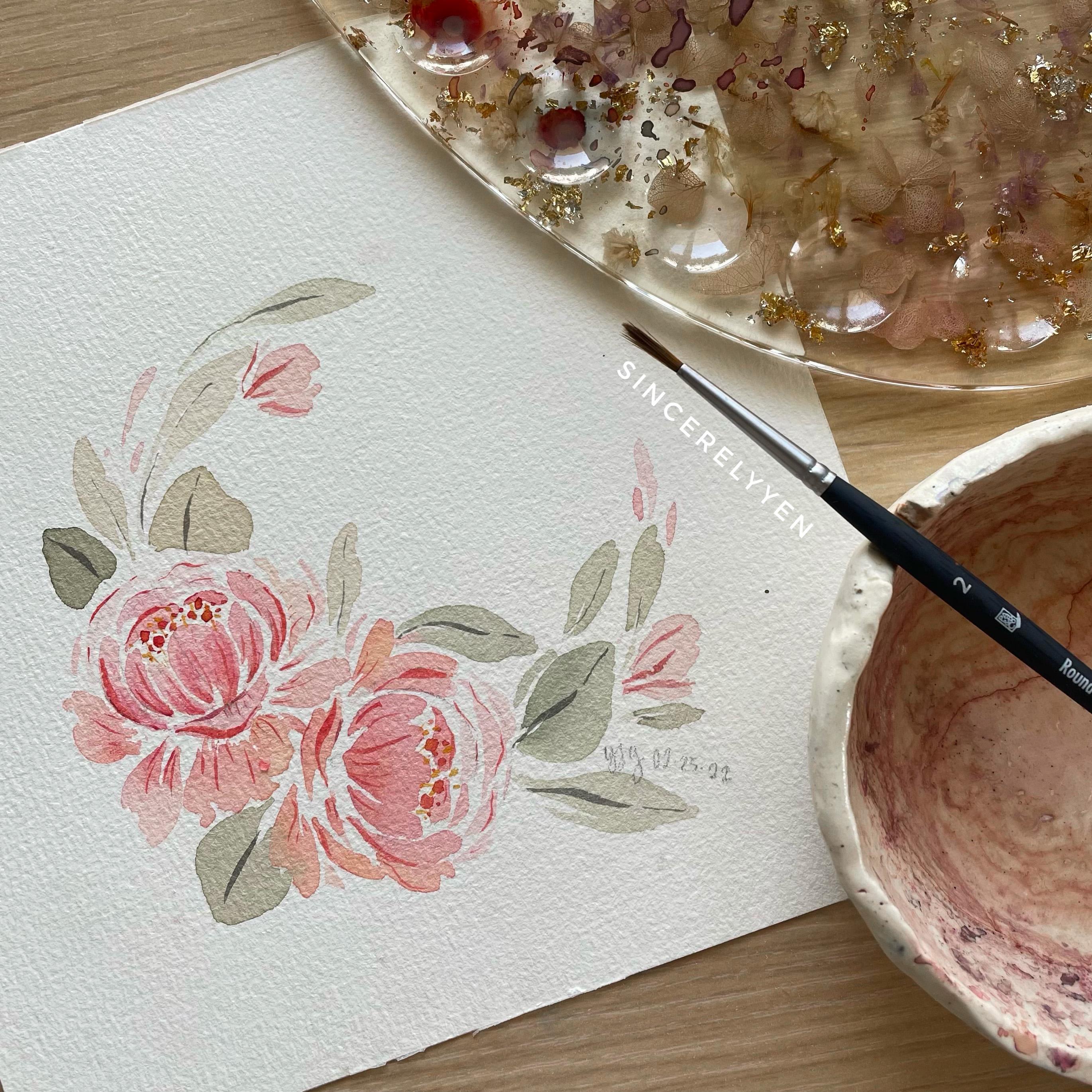
8. Class Project 2: Peony Pattern: In this second class project, I am going to teach
you how to make a Paeony phrase,
prepare our colors. This set of paints is
from Magellan mission. This is perylene maroon
mixed with violet. Next, check if you're
okay with a mixture. I think it's those strong, so I'm going to add
a little green. This is Davis. A better. Next, let's mix Carmen
and yellow ocher. Again, it's those strong, so let's add Davies gray. Next is shadow green. Davies gray, shadow green
is too dark and too strong, so we're adding a
little green to make it more of a study and
to make it lighter. This is Davis gray, shadow green mixed
with yellow ocher. This is the byte offset of colors that we're going to use. Next step is to setup where
you want to feel nice. Using your circle
guides requirements. You can blot where
you want to be in the inner circle. Darker colors at the
Center for the bleeding. Close the first set of the bigger circle for the second set of Beta's. Upstrokes and downstrokes for
that outermost bedfellows. Again, as a reminder, that are farther from the inner surface
should be more intense. Thus, more what they
are in the mixture. While the paint is still wet, we can add darker colors. This part, the bleeding effect. Same procedures
apply to the other. Once we are done with
the flowers weekend, US offensive to mark
where you want to paint. Remember the leaves
are mean that thin, thick strokes that are
connected to each other. You can just randomly
add the leaves. Bigger leaves first,
fill in the spaces. Then we'll pay the smaller
leaves later on because they're very easy squeezing. I'm using the other shades of green for the smaller leaves. They're very easy to squeeze. The buds. Some bill
any buds or includes. Some are slightly open. Now I made this
mixture very watery. So weekend super
inspiring leaves. We do not want the bathroom to look like it's super crowded. The first layer of paint
is already, but I, let's add the details
using a smaller brush. Finishing them here on Skillshare or tag
me on Instagram and you owe stem so I
can also share them.
9. Final Thoughts: Hope you learned a
lot from this class. Please know that even if
we end the class now, I will still be a teacher. Afterwards. You can send
me your class projects. You can upload them
here on Skillshare or you can post them on
Instagram and tag me. This is my Instagram icon
that I will be able to give my comments and suggestions and how you can improve
your paintings. Before we end, I would
like her to my view of this five important tips
on how to be feelings. First, master your
basic brushstrokes. This will help you create bolder and more
expressive strokes, thus making you more confidence
in painting florals. Second, the membrane,
your point of origin. This is where your petals and your details should appear
to be originating from. Third, the farther you are
from the inner circuit, the lighter or more than
spotted the strokes should be. Thus, you should
use a mixture with more water and
less paint Horace, you can choose to
not add the details, but when you do, do it only when the first layer is
already the right. Lastly, do not worry too much about the outcome
of your painting. Instead, just enjoy
the process of creating and appreciate your
progress in every practice, no matter how little
piece. That's it for now. See you in the next class.
 SincerelyYen, Watercolor Artist