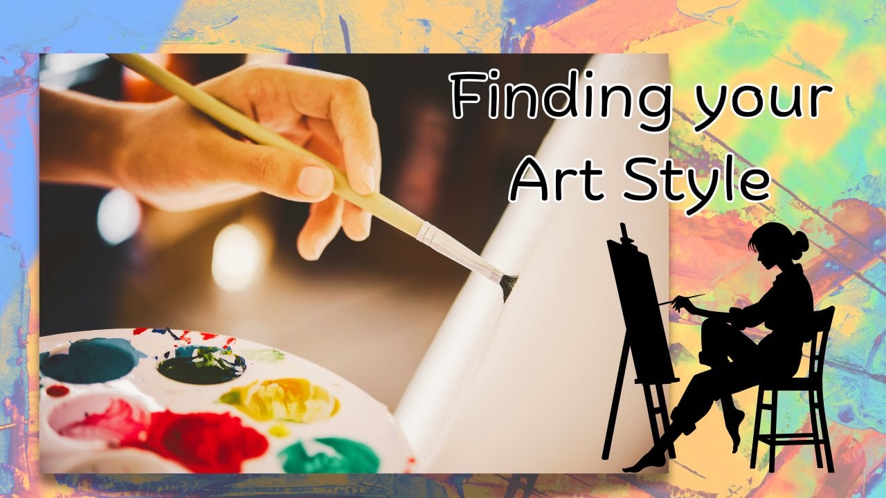
Transcripts
1. Introduction: Hello, and welcome to
this Skillshare course, where we're going to be
having a look at cubism. This is going to be suitable for both beginners and
intermediates, but we're going to be
keeping it very simple. I'm Cali, a landscape artist based in Cumbria in the
northwest of England. I enjoy teaching here on
Skillshare and also over on YouTube, primarily
teaching beginners. So we're going to be
looking at cubism, which was developed
by Picasso and Back. Brack was slightly overlooked by Picasso as we go on in history, mainly because he wasn't
just as eccentric, but equally important in
the development of cubism. And it's basically about taking simple objects and
looking at them from all angles in order to get that three D feel that we usually get in more
traditional ways. So we'll be talking about that and looking more into that. But your actual painting
itself is going to be very simple and
very easy to do. Looking at simple shapes, almost building a jigsaw puzzle of shapes, textures and colors. As I say with many
of my courses, this is not about perfection. It's not about creating
a masterpiece, it's about learning
something new, having a bit of fun,
relaxing, enjoy the process. We can learn a lot
just by trying a different subject matter and a different style that
we've never done before. Before we begin with the
actual painting process, we could just talk a
little bit about cubism, just make yourself
comfortable and we'll have a look at
what it actually means.
2. Cubism Explained: Whatever level your art is at,
whether you're a beginner, an improver intermediate or
even if you're advanced, we all have the same problem, not a problem, something
to overcome, really, is that when we're creating
a painting a picture, what we're attempting
to do is to create a three D image on what is essentially a
two D flat surface. So whatever you're working in, whether you're working in paint, pencil, charcoal, and whatever surface you're working on, whether
that's paper, canvas, board, we've all
got the same aim there, and that is to create something three D on this flat surface. Now, that can be very difficult, but we learn all sorts of
techniques for doing that. And I'll show examples
as I talk about this. So, traditionally, not
in the cubist way, but traditionally
what we would do, we would use color to recess so we put blues
to the background and yellows to the
foreground so that the blues go further away and
the yellow jumps forward. We would use perspective. So, you know, the road going
off into the distance, and we would also use tone. Quite often, things have
got less tone further away. That's particularly in a
landscape. We would use shading. So think about drawing a ball
or an apple or something, or if you're drawing
a vase and you would use the shading to show where
the shadows were falling, but also to show that form. And to try and get that
three D image across. There are lots more things that come into
getting that three D feel in a traditional
painting, things like scale, size, focus, all sorts of
different techniques that we combine together
traditionally to get that feel of some
three D and some depth. Now, the cubist had a completely different
approach to this, and that's what we're
going to look at today. Basically, if we take
a look at this one, we'll take a look at
Picasso's weeping Woman, which is probably
one of the ones that you're more familiar with. By looking at different angles, you might refer to these
as planes or angles or viewpoints of every object, and then putting them on
the same painting flatly, you're getting the whole thing, but not in the traditional way. If we look at this one,
her mouth is in profile, so we're looking at
her sideways on. Normally when you're looking
at somebody's sideways on, you would not see both eyes, you'd only see one eye. But he's changed that and
given us the view of both eyes because he's giving us
all angles at once. And we can have
another look here, and that's the same thing. But here we go even further. We have two different
angles of her nose, so she looks like
she's got two noses, but it's the same lady looking at her from two
different angles. He goes a lot further with this one and a lot
more abstract, so we can go very, very
abstract if we want to, and we really don't have
to go as detailed as this. So these are just examples. We're not going to be
doing this detail today. So that's basically what it is, is looking at things from different angles
and putting them all on together so that
we're getting that. And let's just have
a look because this one as well is
another good example. And we think of things like here we've got two eyes
and she's a gaining profile. The bull here, we're
seeing both his eyes, which we wouldn't
see from that angle. So what we're going to be doing is taking an
everyday object. So I've got two objects
here that I've chosen, and we'll have a talk through
what we can do with these.
3. Choosing your object: Okay, so I decided to do two of these containers rather than just one to make it a little
bit more interesting. If you prefer to just concentrate on one
object to begin with, that's absolutely fine
because you can come back later and do a second
painting with more objects. But I thought I'd choose these two quite interesting
things to do here. So I'll just pop this one to the side first, and
we'll have a look at this. So this is just a nice vase
with some texture on it. And as you can see the top, this may not be in focus when I do this because it's
focused here, but let's see. So the top here is much
smaller than the bottom. Now, if I was just drawing
this in a traditional way, I would pop it on the
table and draw it, and I'd have this shape here, and then I would
have all the put this weather lights catching and the shadow to get
that three D feel. So it would just be a
very traditional drawing of the vase with the
shadow and the shading, the texture, and the color. But I wouldn't see this shape, and I wouldn't see this shape. So what we're going
to start by doing is getting all of those shapes
on one flat surface. This one is slightly
more complicated. This is an old antique bottle that I dug up some time ago, but we've got this
little stopper, which is an interesting shape. So again, we would normally be painting it or drawing
it like this with all these reflections and the
shadows to get that shape. But we could get
this shape here, but also the shape here
from here and this shape. And then, of course, the
little stopper there. So we've got a lot
to begin with, and we've got quite
a few curves shapes. I like working with curves. But whatever you choose, it's going to be the same technique, so it doesn't have to be a vase. You could choose any sort of object that you can
find in the house, a cup, a mug, something
really simple. It's got a few
simple lines to it.
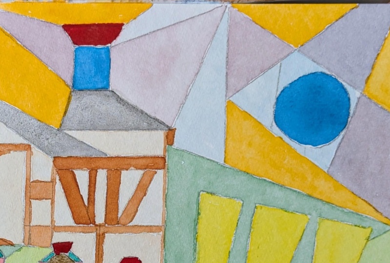
4. Drawing 1: Might help you to think of
this as a jigsaw puzzle. We're putting shapes together, fitting them together
quite abstractly. So think about a
jigsaw puzzle and splintering some of
these shapes and pieces. So I'm going to put
this shape in first, so the flat one that we
perhaps traditionally draw. But we're going
to be doing that. I'm going to pop it over here. And it's not going
to be perfect. Don't worry about perfection. I'm actually going
to take it right to the edge as well
and go right the way down so that we're filling in the whole
section there with this shape. So it's quite a bit narrower at the top, and it comes out. So I've not quite
got this side right. You're going to be able to
spend a little bit more time than me getting some of these
shapes right, but again, it's an abstraction, so it's not something that we're
going to be getting judged on or worrying
too much about. So we're seeing that shape. I'm going to make it fatter
to make it more interesting. That's come out here a bit more. This is a canvas paper I'm using just an ordinary pencil
to get these lines in. It's all going to
be painted over, so it doesn't matter
how perfect this is. And then I'm going to
look at this shape, so we've just got the sorry,
I'm holding it over here. If we've got this shape here, we can also see here, can't we? So we've got concentric circles. So we're going to have let's put this over here somewhere, so we've got the circle at the top with the lip around it. But then we can
also see the neck. So we've got those three
circles we can see. And I'm very randomly
putting these on the paper. You might want to take
a little bit more time thinking about where
you're placing everything. And then I'm going to
do the bottom as well. So the bottom, you're just
seeing the bottom basic. I'm going to put it here
going off the paper. And again, we can see some of the outside of the vars as well. So we've got that double
circular line there. If you're not confident about
drawing circles freehand, you can always draw
around something, and there's nothing to stop you actually just drawing around
the vars that you're using. So I want to pop
that to one side, and then I want to take
out this little stopper. I'm also not worrying
about scale. So if you look at
Picasso's weeping woman again and various
things that he's done, the scale isn't always there entirely the difference between the eye and the lip
and everything else. It's not always spot on. Again, we've got more
concentric circles because we've got this little
stopper going out. So that's quite nice.
We've got two kind of same shapes there,
only a different size. So let's get that and
we'll have to remember which is which and do
the colors differently, and that's going to
give us some interest. But this is a nice shape
from the side as well. So let's just draw
this as we see it. Flat. Like a little peg there. And you don't just have
to draw things once. You can put the same item
somewhere else as well. And again, let's look at this bottle and I'm going
to put the bottle behind. So I'm going to come down. Out and down. By doing that, we've ended up with that inside the bottle, so that's sort of starting to split things up a little bit. Again, we've got another
circle at the bottom, so let's put another circle up here and we've got
plenty of straight lines going on with the sides here. So let's put some more
straight lines in. Perhaps got the
neck again there. And then let's have a look
at it from this side. So from this side, it
could be going along here. An in and along. Then you've got the neck
there, joining there. So we could spend a lot
of time doing this, and I'm hoping you're going to spend a lot more time than me. So that's the first
step of your drawing and we'll come on to the
second step in one moment.
5. Drawing 2: Okay, so like I said, some of these were
very abstract, and they didn't only draw
the planes of the objects, they also drew backgrounds to them that were quite imaginary, and they also split some
of these lines up as well. So I like to just join things with random
curves and lines, split things up a little bit. Like I said, make it look
a bit like a jigsaw. And how much you do this, how complicated you make
it is entirely up to you. Makes it more
difficult to paint, obviously, the more
lines you've got, but you can make some
cuts across your objects, make some nice geometric shapes. We've got a lot of
curves going on, so I want some
quite sharp angles, some more squares perhaps
in there. Think about that. Think about what you've already got and what
you haven't got. We've got no triangles in here. Let's think about
perhaps putting more triangular shape
there, curve here. And actually, if
we look at this, I don't know if you can see
that actually to the camera, but we've got lots
of air bubbles in this very old old
antique glass here. So that might be
quite a nice thing to put within some of
these other shapes, these little air bubbles. So, again, a lot of what we're doing is very geometric shapes. So try and stick to very
bold geometric lines, not having anything too, I
don't know what the word. It's too realistic
looking really. I think this is going to
be quite a large area. I think this needs
breaking up a bit, so let's break that up there
and perhaps they again, putting quite sharp
straight lines in there and some more of these bubbles to
balance over here. I think we've got a lot going on at this side and
not so much here. And for me, I think
that's perhaps enough for now. You could do more. Like I said, you could make
it much more complicated. But what you perhaps want to
do is do one very simple one to begin with and then progress onto something more complicated, particularly if
you want to tackle a person or an animal
or something later on.
6. Choosing Colours: Or is a very personal thing, so I'm not going to tell
you what colours to choose, but you do want a
bold color selection. These are quite muted here, but they're still quite bold. They all work together. We've
got that nice rich red, the rich and vibrant. And if we look at some of
these, they're very colorful. But they stick very much to
kind of primary colors there. You know, you're
not seeing you've seen some pinks and blues
in this one, actually. Again, keep it simple
and keep it bold. Don't be faffing around
with lots of mixing. Keeps us some very
basic bold colors. Look at this just
blocked in in red. So the background, if you start with some
of your backgrounds, the backgrounds are very simple, bold colors and then perhaps put a bit more texture
in some of what your actual subject is. So here we've got a
very plain background of whatever this is curtain
or whatever behind, and then a little
bit more detail and texture on the
people themselves. I rather like ones that he's
done with instruments with guitars and you get all these
violins here, isn't it? You've got the swirl
of the violin up here and then various parts. You'll see what I mean about
it looking like a jigsaw. It's all chopped up with these lines similar to the lines we put in
here to chop this up. You can see how this
is very much very basic paired back look
at something like this, which is much more complicated. So try and keep it simple. But yeah, again, he's got a combination of soft
lines, and hard lines. But think about the color. So nice, rich, warm, or nice and bold, this again, some warm colors here,
some bold colors don't be too muted. Some of these, these are
different ones. Is cubism. But this is a whole
book on Picasso, so just flicking through that. But yeah, so get
your paints ready, and it doesn't matter
what paint you do it in. I'm going to do it in acrylic, but get your paints
ready and get some fun bright colors and
have a bit of an experiment. Perhaps, use a color
you've not used before. We've all got those tubes of
paint that we've never used, and it's good to use them
on an exercise like this. And, you might find some new color combinations
that you like. So get your colors
together now and make yourself comfortable before
we start the painting.
7. Background: Before you move on to
doing your objects, it's probably a good idea
to let the background dry. You can put some more texture
in there if you want. You can put more color in there, but I want to keep it
bold and abstract. So I'm not going to do anything
else with the background. I'm going to save the detail and the texture for the things
that are in the foreground, which were the actual
abstract abstractions that we got from that vase
and that little bottle there. So don't worry too much if
you go over your lines. I've gone over a
little bit there. I think it's a better feel
for it if you do it freehand. Like I said before, if you
feel you need to draw around a circle or use a ruler or whatever, that's
entirely up to you. But I always prefer, if you can, to draw free hand and to not
worry too much about that. And you actually get some nice
darker colors where you go over the lines and the two
colors merge together anyway. So like I said, I'm using acrylics, I'm going
to let those dry, and then I'm going to
come on to doing some of these shapes and perhaps
put more detail in those. I'm not going to do
realistic colors, but I am going to edge more towards the colors
of the objects. So I will video that and we'll go through it
and we'll come back and talk about that a
little bit later on. But for now, I'm going to
start up here probably with these bubbles and move with
my way across the paper.
8. Detail: Before I go to put the last
little bit of detail on, we'll just have another look at these because I always said about doing block
colours and we've done block colours
in the background, he has used some texture here looking you can see
that there's the wood there. It's not a flat
color everywhere. So I've let some of these
colors mixed together. You will have noticed that
I did add some white to the paints just so that we've not got the same color
sitting next to each other. So to make this
lighter than this so that we've got a
variety of colors. So as you're going along, don't have the same
colors joining. Here I made a bit of a mistake because
this was the bottle, if you remember, lying flat. And here, I've got
that as background, but we've got the bubbles in. But it doesn't really matter too much. So let's
just have a look. I was going to have a look,
sorry at let me find it. This one here. So this
is incredibly abstract. We've got these very
geometric shapes, a lot of triangles in there. One thing he has done here is
go round with a black line. So you could do
that if you wanted. You could outline
if you wanted to. I don't think I'm
going to. But also look at each color here. So look at this red here. It's not a flat red. Um, it's not completely flat. There are other colors in there. So some of the black, presumably when this was still
wet has gone into there. We've got other colors in here. This isn't a flat
stripe of orange. It goes from quite pale to
slightly darker down here. So for your foreground, for the actual objects themselves,
just think about that. Let your brush pick up some
wet colors from elsewhere, let the colors mix a little bit like I have
done here and here. You know, just have a
bit of a play with that. The hardest thing now for us is going to be
knowing when to stop. We need to, at
some point, think, I want to leave it
for today and come back to it perhaps
tomorrow or something. When you come back
to it a day later, you do see things
that you perhaps want to either add or change. The great thing
about acrylic paints is you can paint over them. But what I'm going to do
now to finish this off really is talk about that little bit of detail
that I was going to add. Now, I don't mean lots
and lots of detail. I don't mean going back
to a realistic painting, but if we look at
the objects here, I don't know if the
cameras picking this up, but this is raised these
little marks on here. It's quite a rough pot here. We've got some of
this crackling, I don't know if you
can pick that up, but you know where it's
cracking the glaze. So a little bit of that texture. We just want to get this
color with some more whiting. I'm going to put some
of these shapes on top. And also again, like we said, we've got these
bubbles in the glass. So I use the green for the glass because it has got a
green tinge to it, but we could just
use some white and get some more of those bubbles. So just a little bit of
texture and some bubbles made by adding white to some of those colors that we
had from earlier. So this is your pot, so we could put
some going across the across the two colors there, adding that little
bit of texture, but only in places,
not the whole thing. We're not going to cover
the whole pot with texture and use the same color. We know that this is
all one object here. You'll notice I've used
the same brush throughout. Try not get too fiddly by
using two smaller brushes. And that crackling
glazing kind of shape is very much
geometric, isn't it? Fine lines. And we're just getting an
impression of that it's not an accurate thing. Okay, so we've got that there. Again, this is the pot, as well, so let's put a little bit
of that texture on there. And on here. And here we can use it to kind
of go around there, and again, cross the line just
to break things up a bit, make things a bit
more interesting. And for more of those bubbles in the glass which were
in this little stopper, I've gone lighter still
with a touch more white. And again, we can
put some on here. And we could go on
and on with this, and that's the problem. We've got to know when to stop. I'm not happy with
this color here. I'm going to put more
of the brown in there. It's gone very green. But I've let things
mix on the paper. And you can see I've got things mixing on the brush as well. Okay, so I'm going to
leave that, she says, fiddling around and come
back to it probably tomorrow and have
another think about if I need any more detail or indeed, if I want to outline
those things in black, which I may do,
I'll wait and see.
9. Project: Okay, so to recap
for your project, what I want you to do is in
whatever media you choose, you can use acrylic,
but you could just use pencil cranes if
that's all you've got, or you can use your watercolors. Whatever you've got to hand, you might want to do
some colored pens. You can use that because it's
not about what we're using. It's about this
concept of having all these different planes
on one flat piece of paper. So seeing things from
different directions. Okay, so you want a simple
object, either one or two, I would suggest no more
than that to begin with, unless you're feeling
really confident and you want to have lots
of detail in there. Start with one or
two plain objects, a vase, something like that. Break it up into shapes and viewpoints and then have
fun with your color. So don't worry about
it being realistic. Think of it as an abstract thing and have a lot of fun
with very simple shapes, abstract shapes, and some color. I'm not overly happy with this. I've kept fiddling with it, I've added extra lines. So what I want you to do when
you've finished it or when you've got to this stage
is stand back from it. Like I said before,
perhaps even leave it till the next day and then
come back and look at it with fresh eyes. Get about your objects at
that point, put your objects, your vase to one side, and just look at your painting and think about what
your painting needs. Don't think about representing
that object anymore. Think about finishing this off by what it might need extra. So you might feel it needs some more lines to sharpen
some of these lines. You might feel it needs some
of the color contrasts. Here, it's a little bit
dark compared to here. I might need perhaps put
a paler line up here. You see, I put a
darker line here, I might continue that
with a paler line here. I might put something around these circles to get
more detail there. I'm not too happy with
some of these colors ups. I've rubbed it off anyway,
but don't worry about that. But this is just an exercise. We are not making a masterpiece. We're not trying to be
Picasso. We're having fun. We're learning
something as we go and doing this as an exercise. And what you'll find is once you've done that
initial drawing, particularly with
the backgrounds and you're blocking
in those colors, put some music on
or something in the background to
listen to whilst you're doing that and you'll find it's really relaxing because you're just blocking those colors in, not thinking too hard once you've got those
initial shapes in. Your project is to go off and do that and then it'll be lovely
to see those of course, I will give you feedback
on that when I can.
10. Conclusion: Carefully remove your tape. Always remove your tape moving
away from your painting. Not not pulling it this way, across, pull it away from it. If you've taped down,
you might not have. You might be just using a pad. Okay, I think things
always look better, don't they when you've removed the tape and you've got
that little ledge around, makes it framed a little better. So as I just said, you'll have a lot more
time than me to do this. You might want to go on and
think about what it needs. Like I said, I've put
some extra lines around. I mixed this colors rather nice. I mix these two colors
together to get that. I've actually used a little
bit of dry brush on there. Let the brush run
out of paint to get a bit more texture as well. Think about texture and color. Once you've put those
basic shape shapes down, think about your textures and your color and
play and have fun. That's what it's all
about this exercise. It's about relaxing
and having fun. Okay, so just to conclude, I think that's done okay. I could have been better, but, you know, just with
those simple objects, it shows how you can
make something bright, cheerful, colorful,
and quite abstract. So I look forward to
seeing what you've done. As you go along
through this course, it's quite a quick course. But as you go through
it, if you've got any questions whatsoever,
please do ask me. You can contact me here on Skillshare or you can use
Instagram to talk to me there. Also if you do use Instagram, do tag me in works
that you're uploading. If you do upload your
things to Instagram, you can tag me there and
I can have a look at it as well and share it with
other people. That's great. I'll always give you
constructive feedback where I can here on Skillshare. Please do ask questions
as you go along. If you want to have
a look at my work, you can see that
over on my website, completely different to
this that we've done today. Like I said, this is
a good exercise for both beginners and intermediates
just to make you think. Think about seeing things
on those different planes, if you're very brave
and if you're a little bit more advanced perhaps and you like
drawing people, you like drawing
animals, have a go at something similar
to the weeping woman. Take a look at her or you could do an artist's
copy of her first. But just have a bit of fun with this and
have a play with it. I did actually do one on
myself quite a while ago. I'll have to root that out, and if I can find it, I'll pop a photograph of
that on here, too. So I think in conclusion, I just want to say
thank you very much for doing this course with me.
I hope you've enjoyed it. That's the whole idea of it. I'll be back again with you
soon with another course. In the meantime,
you really enjoy your painting and
drawing and have fun. Bye bye for now. I
 Cally Lawson, “Paint like no one is watching"