Transcripts
1. Intro: Trading Crypto & Stocks with MACD (Moving Average Convergence Divergence) : Hi, welcome to Crypto and
Stop trading with the MACD. My name is Kundai and I'm thrilled to be
your instructor on this exciting journey
into the world of crypto and stock trading. Whether you're an
experienced trader, looking to go back to the
basics and shop in your skills or a complete beginner eager
to dive into the markets, this class is designed
to empower you with the knowledge and the tools
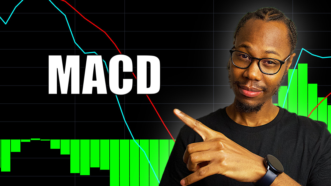
that you need to succeed. At its core, the MACD, short for moving average
convergence divergence is a versatile and
powerful indicator. It's widely used by traders across the globe
to identify trends and momentums and potential entry and exit
points in the market. In this class, we'll
cover everything you need to utilize
the MACD together, we'll explore its foundational
principles and see how you can apply MACD strategies in real world trading scenarios. So here's a quick look at
what you'll be learning. We'll start with
the basics where you will learn how the MACD is calculated and what
the MAD is and why it's a go to tool
for many traders. Next, we'll discuss the key
components of the MACD, such as the signal line, the MACD line, the histogram, and explore how
they work together to identify trends
and momentums. Then we'll dive into
actionable MACD strategies, including crossover signals
and divergence analysis. And you also get to see
these strategies play out in real market examples using live trading scenarios
and case studies. But that's not all. You
also have the chance to practice hands on by
completing the class project. This practical exercise
will guide you through applying the
McDe in trading view, ensuring that you ensuring
that you fully understand the concepts and can effectively apply these to
your own trading style. And by the end of the course, whether your trading
goal is day trading, swing trading or
long term investing, understanding the MACD will give you an essential advantage. Additionally, make sure that you follow me on Skillshare
so that you're able to be notified once I upload additional content
onto the platform. So without further ado,
let's get right into it, and I'll see you
in the next video.
2. What is the Moving Average Convergence Divergence (MACD): Lesson, I'm going to teach you a key indicator called MACD. The MACD is one of
my favorite tools because it is very
simple to use. The MACD uses moving
averages a histogram, and I'm going to be
explaining how you can use these tools to
your advantage when you're performing
technical analysis or trading cryptocurrencies
or even any stock. This strategy of using the MACD indicator
works on any market. Make sure that you pay attention and go over this
class if you have to because grasping exactly how this indicator works
will be very profitable. So without any further ado,
let's get right into it. So what is MACD? Well, MACD is what we're looking at right at the
top section right here. So if I just zoom into this chart and open
the top section, this is what MACD is. It's the visual representation of moving average
convergence divergence. And MACD is actually just an acronym for moving average
convergence divergence. And this indicator is
a tool that's used to identify moving averages that
are indicating a new trend. So whether it's a bullish
trend or a bearish trend, the MACD is used to
identify these trends. That's the main purpose
of a MACD indicator. And most traders, as
you guys know by now, for most traders, in fact, for every trader, the
trend is your friend, and finding the trend is one or one of the top
priorities in trading. So, you know, it's important
to be able to find a trend, and then that way, you can just ride the trend, and in the trend is where
all the money is at. So if you find the trend,
you can ride the trend. So it's as simple as that. So that's actually
one of the reasons why the McDs are very
popular indicator, and a lot of people
seem to like the MACD. So whilst just
looking at the Mac D, you can see that we've got two moving averages right here, one at the top, this blue line, and one at the bottom,
this red line. And then we've got this
green section right here, and this is a histogram, and a histogram is
part of the MACD. So before I get into how the MACD can be used
and what exactly it is, let me just show you how
you can actually add it onto your chart
in trading view. So if I just click out of this, if you don't have the MACD
indicator on your chart, all you have to do is select the indicators icon at
the top right here, or a shortcut to just
open this is by pressing the forward slash
on your keyboard if you didn't know in case
it's quicker for anyone, but you can just bring your
mouse to the top right here and select the
indicators icon, and you will get this search
bar pop up onto your screen, and all you have to
do is search MACD, so MACD and under built ins, you will see MACD right here. And if you select this ones, that will add a MACD
indicator onto your chart, and you can exit
out of this search. So once you get your MacD so minus popped up
at the bottom right here, and you can see
that it will be by default in red and green and
light green and light red. And you can see that it's different from how
I've customized mine. Mine is customized and
to customize yours, all you have to
do is just double click on the moving
averages, any one of them. If you double click on it, the default should be on style. I had already just selected input so that I could
amend the settings. However, when you open it up, it should open up on style, and this is where you
can actually customize the colors and amend it so that it suits your needs and so that it's personalized to
whatever your preference. And just in case your MACD popped up with different
settings to mine, the only other setting here
that may differ in terms of visual representation is
how the histogram looks. So you may not have these bars when you actually
add your MACD indicator, and that would be because I
have changed mine to columns. So if you click this icon
right here next to color zero, where my mouse, if
you click this, you'll have a few
settings, yeah. Yours might be at
default settings. I think I believe that
at default settings, you've got this
histogram selected, and personally, I don't like
that visual representation. Hence why I changed
this to columns. And I feel like the
columns are very good, especially for visual
representation and just being able to see where things are whilst doing your technical analysis. So just to do it really quickly, I use a bright green. So I'll just select this green. And I also like to thicken my moving averages so that I can see them quite well from afar. So if I change this to the third one and change all
the colors to green, um, Right, and then the MACD, the blue line, I like
mine to be a bright blue, so I'm just going to change that to a nice bright blue line. And I also like my
MACD to be thick, so I'm just going to use the second thickness
right there. The capacity is already 100. And the same thing with the red, I like a nice bright red. So if I select this
red right here and then change the thickness
to the second line. And you can see that's
how I've come to exactly this look right here. And to just move these around, depending on your settings, you should be able
to just select the up arrow to move it up or the down arrow
to move it down. Depending on where it
pops up on your screen, and I like my MACD and RSI to be at the
top here somewhere. So usually, I'll
have the RSI and then the MACD and then
my chart or Vs verse. You can play around
with where you want to put your indicators and
whatever suits you best. But mine is always at the top, the MACD and the RSI. And right now we're
talking about the MACD, so I just wanted to show
you quickly how to add your MACD and customize the
visual presentation of it. So I'm just going
to exit this one, the new one that I've created. Now you know how to create it. The only other thing I'm
just going to show you is I'm going to dive
into the MACD and double click on one of the moving averages
and select inputs. Okay, so under inputs, you can see that we've
got fast length 12, slow length, 26 and
signal soothing nine. Usually, when you open
MACD on any chart, including trading view, these will be the
default settings. So the numbers that you'll
have on your fast length, slow length and signal soothing
would be 12, 26 and nine. And these are usually
the default numbers. And these are the
numbers that are used to calculate your MACD. So the data that is used to calculate your MACD is represented by these
settings right here. And I won't be going deep into
the calculation of MACD if you really want to find out how exactly it's calculated
mathematically, you can Google it, and
you'll be able to find pages and pages that
you can read upon. That will explain the numbers
in more detail for you. However, on a basic level on
just understanding the MACD, how it works and making it
work for you whilst trading, this is basically what
you need to know. So the first number, this fast length,
this number, this 12, this number is the
number that is used for the periods that are used to calculate the
faster moving average. So if you look at these
two lines right here, this blue line and
this red line, these are your moving
average lines. So this blue line moves
faster than the red line. And the blue line,
as you can see, it's got more movement
than the red line because the red line moves
slower than the blue line. So the red line will
always be a bit smoother or much smoother
than the blue line. And this 12 right here represents the number
of periods that are used to calculate the
faster moving average, which will be this
blue line right here. The second number, this 26
right here is the number of periods that are used in calculating the slower
moving average, which is the red
line right here. And the third number, this nine right here is the number of bars that
are used to calculate the moving average
of the difference between the faster and the
slower moving averages. So this nine right here under signal smoothing is
the number of bars that are used to calculate the moving
average of the difference between the faster and the
slower moving averages. So for example, you can
see that we've got 12, 26 and nine right here
as the MACD parameters. So like I said earlier, these are usually the
default settings, and these are the settings that I use when I'm
trading personally. And once you understand
the mats behind the MACD, you can change these according to however
you want to trade. However, I've always used
the default settings, and they've worked
perfectly well for me in my strategies. And I'm sure they'll
work for you and many others for many, many more years to come
unless you come up with your own strategy that uses different settings
so in this example, this 12 right here represents the previous 12 bars of
the faster moving average. And then the 26 would be
the representation of the previous 26 bars of this slower moving
average line right here. And the nine represents the previous 9 bars of the difference between
the two moving averages, these two moving
averages right here. And this difference that
is calculated between the blue moving average
line and the red line right here is plotted by vertical
lines called a histogram, which is this green visual representation
right here on the chart. So the histogram basically represents the
difference between the blue moving
average line right here and this red moving
average line right here. And this will all
make more sense, as I'm giving you more examples and you're actually
starting to use the MACD and when you start
using the MACD on your end. But just follow along and watch this video over
if you have to to fully understand how this indicator
works so that it can actually be very useful for you when you're actually
using it in your trading. And one thing to
note is that there's a common misconception when it comes to these moving
average lines right here. So you may find that a few people are not aware that the two lines
that are drawn right here, this blue moving average line and this red moving
average line, a lot of people or a
lot of traders are not aware that these are not
moving averages of price. These two moving
averages right here, these are not moving
averages of price. Instead, they are
moving averages of the difference between
two moving averages. Because if you're
following along, when I was stating how
these lines are calculated, these lines are calculated based on these settings right here. And if you want further
information on that, I'll just suggest
you Google it and then read upon it so that you can actually see the
mathematical calculations. But just note that these moving averages are not the same as moving
averages of the price. Instead, they are just
the moving averages of the difference between
two moving averages. So for example, just to clarify, this faster moving average, this blue moving average line right here is the
moving average of the difference between the 12th and the 26 period
moving averages. That's how this blue
line is calculated. It is the moving average
of the difference between the 12th and the 26
period moving averages. Hence why these moving averages are not moving
averages of the price. And the slower moving average, this red line right here, plots the average of
the previous MACD line. So once again, this would be the nine
period moving average. So this means that we're taking the last nine periods of this blue moving average right here and plotting it as our slower
moving average right here, which is this red moving
average line right here. This soothens out the
original line even more, which gives us a
more accurate line. And that's how we get
these two moving averages. And the histogram simply
plots the difference between the faster moving average and the slower
moving average. And the histogram may actually sometimes give you an edge
in the market because it can help you to see early signs that a crossover
is about to happen. So if you look at
this chart right here, um, where my mouse is, you can see that as
this faster moving average separates from this
slower moving average, this red line right here. You can see that
as the blue line separates from the red line, the histogram gets bigger. You know, the histogram gets bigger on this positive
side right here. So the top side is
the positive side, and the bottom side
is the negative side. And you can see that
to the right here, we've got numbers that
go from zero, upwards, positive, and then from zero,
again, downwards, negative. And as you can see, as
this blue moving average, faster line right here, separates from the red
moving average line, the histogram gets bigger, and this is called a MACD
divergence because the faster moving average is diverging or moving away from
the slow moving average. So this blue line is diverging from this
red line right here. And this is called
MACD divergence. When you're seeing the MACD diverging or moving away from
the slower moving average, this blue line right here, moving away from the red line. And as the moving
averages get closer, so if you see the MacD diverged away from the
red line right here, and he carried on moving away, moving away, moving
away, moving away. And at this point right
here where my mouse is, this blue faster moving
average starts switching direction and it starts coming
closer to the red line. It's coming closer and
closer to the red line. And this is called
convergence because the faster moving average
is converging or getting closer to the
slower moving average, which is the red
line right here. This blue line is getting
closer to the red line. So this moving average is converging or getting closer to the slower moving average. And that is actually why or
how you get the name moving average convergence
divergence because of how the MACD works. And literally, that is all you need
to know about the MACD for it to help you in your trading and to help you make good and
profitable trades. So next, what we're going to do is
we're actually going to go through some examples
and see how we can apply this MACD indicator
to some strategies and some of the
things that we've already learned in
the course so far. So if we select Okay,
on the settings, we are going to continue this
lesson in the next lecture, and that's it for this
lesson. Thanks for watching.
3. Applying the MACD Strategy: Right. So how can
we actually use this key trading indicator
called the MACD to trade? So as we have
already spoken about the moving averages on
the MACD indicator, these two moving averages that
have two different speeds. The faster one will
obviously move, you know, a bit quicker than
the slower one, which means that
it will react to price movement much quicker
than the slower one. Therefore, when there is a
new trend, the fast line, which will be the blue line, will react first and eventually cross the slower line,
which is the red line. So when this crossover
happens and the fast line, which is the blue line begins to diverge or move away
from the slower line, which is the red line, it often indicates that a new
trend is being formed. So I'm just going to show you an example of this
on the charts. So if you look at
the above chart. I've just gone into
the MACD indicator to quickly show you a
visual representation of what I was just explaining. So when a new trend happens, usually this blue line
right here reacts first. So in this situation, if you look where my mouse is, you can see that
this blue line has started moving
towards the red line, which means it's diverging you can see this blue
line right here, this moving average is beginning to move
towards the red line, and it crosses over and
goes above the red line. It was below now it is
above the red line. And once that crossover
has happened, the fast line starts to diverge or move away from
this red moving average. The fast line, which is the blue line is moving
away from the red line. And this often indicates that a new trend
is being formed. So this will increase the
probability of a change in Mum. So looking at this chart, you can see that we
crossed over right here where I have
just drawn a box, and I will actually
just make that clear. And let's make the box yellow. So as you can see, we've crossed right here
on this chart. And if you look
at the histogram, as the blue line was moving
towards the red line, the histogram was
moving towards zero. Anytime we cross over, that's when the
histogram hits zero. And anytime the blue line
goes over the red line, the histogram goes to the
positive side and vice verse. So anytime the blue line
goes below the red line, the histogram will go down
to the negative side. So as a trader, we have just defined that this
indicator helps us to see that there is a
probability of a change in momentum or a change
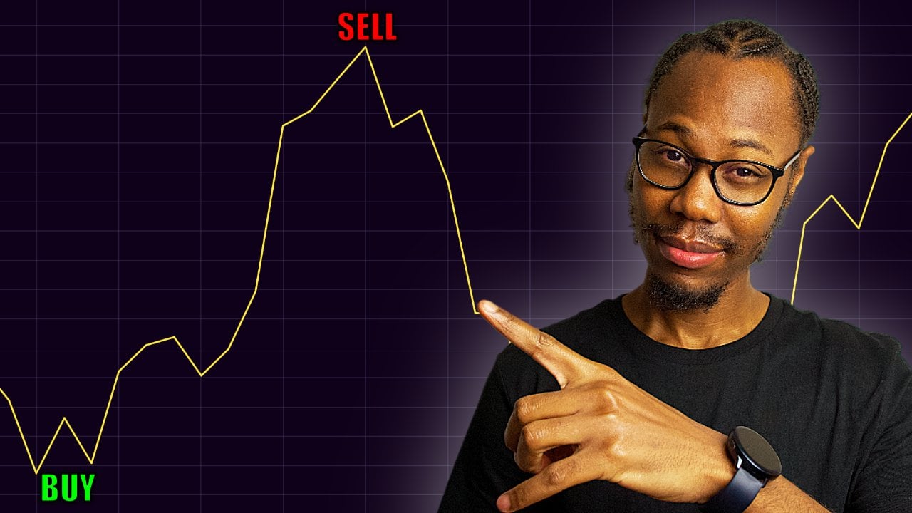
in direction or trend. So at this crossover right here, you would anticipate that
the market is going to move in a new trend opposite to the way it
was moving previously. So if we look at our chart now, we have highlighted this point as we would execute a
trade at this point, depending on what
the momentum is on the price action
on the actual chart. And if we just forecast ahead, and if we predict that, we will execute another trade at the crossover,
again, right here. So depending on the
trend movement, prior to this
section, right here, we would predict a change in trend from whatever the trend
is prior to this crossover. Once we're in that trend,
when this crossover happens, we would execute a trade
because we reckon that there's a high probability
that the trend will change from this
trend to a new trend. So let's find out
and see if this will actually work
in this instance. So right now, we
can see that we've got our highlighted
area right here. So this is around the time
we would execute our trade. So we can see that judging
from this chart right here, the price had moved downwards. The price was moving downwards
in a downward trend. So if I actually just
zoom in so that it can be easier to see right. So we're saying
we're going to enter a trade right here because
of this crossover. We didn't know
which trade it was because obviously
I was only looking at just the MACD
indicator in full screen. Hence why I was explaining that we would enter trade here, but we don't know
which way because we didn't know what
the trend was. But now that we can actually
see the price action, we know what the trend is. So prior to this crossover, we were on a downtrend
slash sideways movement, but it was mainly a downtrend because it's
either it's going up or down. And I know that because
if we look at the data, prior to this, point where
we want to take a trade. We can see that if I actually zoom So before this point where I'm saying that
you'd execute a trade, you can see that we had
hit a high right here, and the price was
moving downwards. So this is a downward
movement in price right here. So price is moving downwards, and as you can
see, the blue line is underneath the red
line on the MACD. So price is moving downwards
until we get this crossover. So you can clearly see
that this was a downtrend. And then we see this crossover, and this crossover was assigned to show us
a change in trend. And this is the uptrend. As you can see, the price has started going in
an upward trend. So we are saying we would enter a trade
at this crossover. So that would mean
that we would have entered this trade on this
candlestick right here. So if I just highlight that, because this is where
we crossed over. And because we are
now in an uptrend, on the next crossover
on the MACD, that is where we would
execute our cell order because when the MACD
crosses over again, we are anticipating that
there will be a change in momentum from the trend that we're in to a
different trend, which would be a
downtrend because right now we are an
uptrend, as you can see. So if we check the
data that comes after, we can see that we
carried on in an uptrend. And if I'm to actually just add a long position indicator, as we are taking a long
position right here, let's say we cuart it in
between this candle right here, and we put our top loss at
the bottom of the wick, which would be whatever the
low is for this candle or actually just underneath
the 21 moving average, because this would be
a good strong support if price was to change
momentum and come downwards if you actually add the moving average strategy along with your MACD strategy. I wasn't actually supposed
to say that right now, but it just came out because
when you trade, the power, the great thing about
trading is once you have an arsenal of
tools under your belt, it's the combination of these
tools that help you make very good probable trades that will give you
a lot of profit. You use all these tools
together in a balanced manner, you will definitely succeed
in trading. You will succeed. So it's literally just
learning all these indicators, how they work,
practicing using them, and using these tools to make perfect trades
because these tools will help you increase the
probability of you being able to make a good
and profitable trade. So we can see that the
price keeps going up. So we've now just set our long
position and a stop loss. We don't have a target because our target
is we're going to execute a trade once the
moving average crosses. So we bought here. You buy here on this crossover, and then you sell on
the next crossover. So let's see what
happened in this case, and let's see how well
this trade could have been or was or wasn't as
nothing is guaranteed, it just improves the probability of you making a good,
successful trade. So if we carry on, we can see that we're
moving in an upward, and we slightly moved downward, and it looks like the eight
EMA is supporting the price. This is the eight
EMA right here, where my mouse is, this
blue moving average line. So if you remember the previous
lesson before this one, the moving average strategies, this is me combining again, the MACD with the moving
average strategy. I was just explaining why I would anticipate the
price to be going up. It's because this
red candle seemed to Supported by the eight EMA. And then, again,
the price couldn't break the support
of the eight EMA, and the price seems to be
moving in an upward direction. And at the moment, it's looking very bullish. So we can see that price
carried on moving upwards, and then we've got this nasty
candlestick right here. Oh, soon as you see
this candlestick, I would be very cautious. This looks bearish. However, we're still in a
very, very bullish trend. So let's see what the
next candle looked like. It's a nice candlestick, so we're still going upwards. So this would have just been a caution candlestick
right here. Be cautious, be looking
and be ready to get out of the market if the
trend moves against you. That's if you are combining both the MACD strategy and
candlestick pattern analysis. Can you now see how
having a lot of these tools on your belt will help you with your
technical analysis. So right now, we're just
focusing on the MACD strategy, so I will try not
interrupt that by making suggestions and how my or sharing the thought process
early in this stage. So we're waiting for
this MACD to cross over. So let's actually
move on to where it crossed over and see how this trade would have
actually come out. So we can see that
price carried on going up. And up and up. And right here,
this candlestick. Okay, let me backtrack
back to McDi. We can see that the line, the fast moving average has just started moving
towards the red line. And as you can see
on the histogram, we've got this
convergence right here. And if we carry on going, we can see that we're now
entering that zone that we outlined that we will
be executing a trade. So this will be our sell order. We are saying we would
sell right here. So if we go back to the chart, we would have sold on this
candlestick right here. So just to highlight, we would have made
our purchase or our buy this first white line that I've just
drawn on the chart, let me actually make that line green just to represent our buy. And then let me actually make this line red to
represent our sell. Right. So we would
have purchased right here and sold right
here just using the MACD strategy of execute a trade on the crossover and execute a trade
on the crossover. That's literally
what you're doing. So you buy or sell at a crossover and you buy or
sell at the next crossover. And as you can see, this
is on a daily timeline, and this is with the
pair of Bitcoin USD. So that's literally how
easy it is to use the MACD. It's very simple, in my opinion, and it's a very, very key
tool to have on your belt. And I guess a lot of people love this tool because
of its simplicity. It is very simple to
use straightforward, and it does the job. It works very, very well. And like any indicator, it doesn't work all the time. However, when it does
work, it really does work. So for example,
in this instance, we've just gone through
this, and let's just see how much profit we would have
made if we took this trade. So we're saying we have sold on the red
candlestick right there. So we would have sold
roughly about here. And that would have
been a 67.70% trade. You'd have made 67% profit. If you want it to the
nearest percentage, it would be 68% that you'd
have made on your trade. Like, you'd have made more
than half your money back. So if you put one K, you'd have made around 670 back. That's profit. So that would
have been a great trade. This would have been
definitely a great trade. And let's see how many
days this trade was for. This would have been
a 27 day trade. So you'd have made
67% in 28 days. You'd have made Let me, guys, I hope you're understanding
how powerful this toy is, especially when it works, and when you use it right, it is definitely a very
good strategy to use. And when it works,
it works well. However, like I said, remember, this is not guaranteed. This does not work all the time. However, if you use
the arsenal skills that you have learned and that you're learning
in this course, you will be able to make
these trades day in, day out and have less losing trades because you actually
have a stop loss setup, and you're taking good risk
to reward ratio trades. So that is the
reason why there is technical analysis and why
technical analysis is key. It's because of that edge that
it gives you in the market if you actually know how to perform good technical analysis. So at this chart, you may think, Well, I saw down here, the trend had already changed. We had already changed into a downtrend before I
actually got to sell. And you are correct if that
is what you're thinking. And that is one downside about
using the moving averages. Naturally, moving averages
tend to lag behind price. So because these are
moving averages, this is a moving
average calculation it's basically historical data. So once this crossover
happens with the MACD, it represents a
change in momentum. This change in momentum
would have already happened. So as we can see, once this blue line started
moving towards the red line, that's when the change in
momentum actually happened. And that's the lag. You know, you can see that
the moving average is behind what's actually happening in reality in terms of price
movement in real time. So if you were thinking, Well, I want to be
selling at the top. This is where using your
arsenal skills comes in handy. Hence why it is important
to know how to use the key main indicators
and also other indicators, the more tools that you
can use and that you know how to use and that you can apply
to your strategies, the better or higher the probability of your
trade being successful. So for example, with the tools that you've already
learned in this course, such as candlestick analysis, as soon as you would have seen this candlestick
right here, you would have been thinking
that this is very bearish, and I need to be cautious. So let me just highlight
this candlestick right here. As soon as you'd have seen
this candlestick right here, you would have been
very cautious. You'd have been thinking, Uh oh, the same way how when we saw
this candlestick earlier, I think it was this candlestick. Yeah, it must have been
this candlestick earlier. And I was saying,
I'll be thinking, Uh oh. That looks bearish. It is exactly the
same way how you'd feel about this candlestick,
but even more so, because that looks like a doge, and a doge is a very
powerful candlestick. So after this
candlestick closed, if it closed the way it
is, I would be very, very cautious and
be looking to get out because this is a dodgy candlestick that is
happening on an uptrend, and that usually represents
a change in momentum. And rightly so the
momentum changed. So I'd wait until this
candlestick opened, and as it looks bearish or as it gets bearish,
I would cash out. I would get out on this
candlestick or this candlestick. One of the two, I
would either wait or using my risk
management skills, I would maybe take out 25% on this candlestick and the rest on this candlestick or vice verse. So this is why it is key to have a good arsenal
skills under your belt. And even just looking at the moving average,
if you recall, I did say that the histogram
can be a good indicator of trend change before using the actual moving averages
on the crossover. So as we can see right here, the histogram started ticking
downwards right here. And this indicates that the blue line is moving
towards the red line. And when it meets the red line, what's going to happen
it's a crossover. This can also indicate towards, you know, this is
looking bearish. So these are more reasons as a trader who is performing
technical analysis that you're seeing through visual
representations and knowing how to use these tools that
you've got under your belt. So you can see, first, we get this candlestick
that looks very bearish. And we look at the MACD, we see that the MACD is now
moving towards the red line. You know, the faster line of the Mc D is now moving towards the slower line of the
Mac D. We're seeing that the histogram is ticking
to the downside. And as you know, when
it crosses zero, it goes to the negative side, and that's where the
crossover happens at zero. And we're seeing that
the moving averages are moving towards a crossover. And once you guys
learn how to use the RSI indicator as well, you will just have
the perfect package to execute good and
profitable trades. These are the indicators
that I use to trade and that most
professional traders use. So these indicators are
very powerful indicators. And if you understand these and are able to
apply these along with other tools
that I'm going to be showing you guys
in future courses, you will be able to perform
really, really good trades. Like, trading is a journey. There's so much more
that you can do. So we can use even more
tools to set targets. So, for example, using this MACD strategy,
there was no target, whereas using other tools, such as the Fibonacci
extension tool, you can have targets. And these are more
advanced tools. However, with the tools that you're learning in this course, those are the major tools that build the principles of trading, and you can be successful
just with those tools. However, everyone is different and we all have
different preferences. This is a good
foundation for you to take your trading
to the next level. So this is basically how you use the MACD to execute trades. And this would have
been a nice 62.7% gain. And if you had actually cashed out on this second
candlestick right here, you'd have made a 90% gain, and, you know, that's
that is really good. Okay, it may be
easy for me to say that it's easy, but
it's subjective. It is only easy because of the hard work that I've
put in to actually understanding how
these indicators work, how candlesticks work, how the price data is actually represented and putting
those things together with, you know, risk management, managing your emotions,
the right mindset, practice and actually
taking trades, whether it's your paper trading or you're actually trading
using small amounts. You can be trading using
something small like $25 or 25 pounds, you know, start small just for
that experience because technical analysis
is also different from when you actually
press that buy button. Is also another realm in itself. But both combined
together is when you have a full package where you're actually trading an
investor, you know, I personally think,
in my opinion, that the best way to go is by having all the tools that
you need and being balanced. So using technical analysis, using fundamental analysis,
and psychology, you know, the psychology
within trading and having a good mindset,
risk management, all these things are all important and they
all have to be balanced for you to be the most successful
trader that you can be. And that's it for this lesson, guys, and I will see
you in the next one.
4. Next Steps: And that brings us to
the end of our class on crypto and stock
trading with the MGD. I hope you found this
journey into the world of trading as insightful
and exciting as I did. We've covered the key concepts from understanding what the MACD is and how it's calculated
to analyzing its components, such as the MACD line, the signal line,
and the histogram. Together, we explored strategies like the MACD crossover signals, which help us to make more
informed trading decisions. We also looked at real
market scenarios, discussed practical
trading examples, and most importantly, by now, you should have had
the opportunity to apply what you learned
through our class project. At this point, your ability
to analyze market trends and make decisions using
the MACD has developed, giving you a
significant advantage, whether you're day trading, swing trading or investing
for the long term. Want to thank each
and every one of you for your dedication
and enthusiasm. It's been an absolute pleasure guiding you through this class. Keep pushing yourself,
keep learning, and don't be afraid to
challenge yourself further as you continue to develop
your training skills. If you've enjoyed this class, I would love for you to leave a review and share
your experiences, and it is very helpful for me and future
learners like you. Remember, the learning
doesn't stop here. Thank you once again, and I look forward to seeing you
in the next class. Bye for now. And
 Kundai Dzawo, Digital Learning, Trading & Investing