Transcripts
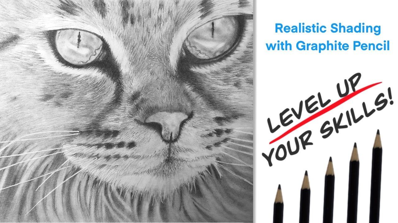
1. Introduction : hello and welcome to the class, creating realistic wildlife with pan pastels and pastel pencils. In this class, I will teach you all of the techniques necessary to create this piece of art you can use The techniques that you learned in this class to create other pieces of wildlife are as well. Whether you have used pan pastels and pastel pencils before our this is your very first time. I encourage you to watch this class and give the project to try. Even though this technique is a little time consuming, it is not a difficulty technique toe learn, and the results are amazing. I will explain everything every step of the way. And if you have any questions, feel free to ask in the discussion section. I will be more than happy to help. So grab your supplies and let's start creating
2. Supplies: the supplies that you'll need for this class are pretty simple. Not necessarily cheap, but pretty simple. The first thing you'll need is pastel Matt paper. Now, this to me is the very best paper to use with pan pastel and pastel pencils. It is, um it has, like, a very fine sandpaper grit to it, and it will hold a lot of layers of the pastel pencils. So to me, this is the very best. If you use any other paper, you may not get the results that you see in the class. So I highly recommend getting this. It comes in a pack that has multiple colors in this class. I will be using the color Sienna. So be sure to use passed on that paper. Also for the pan pastels I have the Jason Morgan Wildlife sent. And I chose this set because it has a large variety of colors that that you use in wildlife paintings. If you don't want to buy the whole set, you'll definitely need the brown. Ah, lighter brown, maybe the yellow and definitely the white. You will also need wash and a paintbrush. I used Winsor and Newton design. Urgh wash the color is ivory black. You can use other brands of wash. It really doesn't make a difference as long as it squash. Um, if you use acrylic paint, the acrylic paint dries kind of shiny, and you won't get the results that you want. So as long as you get black wash, you should be fine. Now for the pastel pencils I have and use the fabric. Castell Pitt Pastel pencils. I have a set of 60. If you are going to be creating wildlife art, um, or landscape art with your pastel pencils, I highly recommend this set. Like I said, this this isn't cheap, but it is a very good investment, and you will not regret it. You also need a cloth. I use a micro fiber cloth. You could use a paper towel or any any other type of cloth. You will also need a pencil sharpener. I do use the Feber Castel. It's like a triangular shape, and it has a variety of different sizes. So it this is not super expensive. Seven or $8? I believe so. I highly recommend this sharpener for your pastel pencils because you do want to keep ah fine point on your pencils, and that does the job. So I think that's it. The past Oh, met paper, the pan pastels, the Jason Morgan wildlife set or the other colors that I mentioned. The black wash, the paintbrush, the micro fiber cloth and your set of pastel pencils.
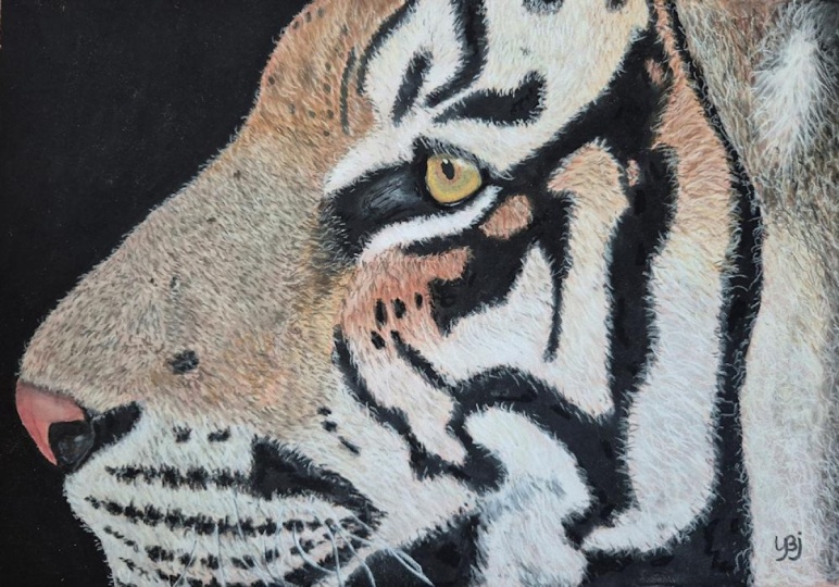
3. Painting Black Stripes with Gouache : Let's get started making the tiger I with pastel and pan pastel the first thing I did. I printed out the reference photo on 8.5 by 11 paper and then trimmed it down. I want my final size to be eight by 10. So I marked off my pastel matt paper eight by 10 and then I transferred my image onto the paper. You can hand draw this or you can use transfer paper for this class. I used transfer paper, and what I did is I just got the basic shape and the basic. I'm sorry, the basic shape of the eye and then also the basic shapes of where I am going to put the dark tiger stripes. So now the next step, I'm going to use the gua sh with a brush, and I am going to paint in the areas that I marked off for the tiger stripes. Now, if you don't have wash, that's fine. You can either go buy it, or if you would want to use acrylic paint, that's OK. The only thing is, acrylic paint is slightly shiny where ASG wash When it dries, it is completely Matt like the pastel pencils. Now, if you want to use you're pastel pencil or if you have pastels or if you want to use the pan pastels to fill in the dark areas, that's totally okay to um, the reason I don't like to do the black areas with pastel personally is because it it can smear very easily and can make a mess of the gua. Sh makes it very, very nice. It stays flat. It is very dark in the pastels. Work beautifully over top of it. It does not ruin the tooth of the pastel mount paper. So I am going to put some of the quash Oh, I should have prepped this. Sorry, I'm going to put some of the gua sh I just have a glass plate that I use whatever container you used to their palates paper you want to use. That's fine. And then a little bit of water. Sorry. Dipped the brush in the gua sh and just start painting in your black tiger stripes. Nothing special. Nothing hard. You don't want the gua sh super super thin, but you don't want it full strength thick, either. Ah, enough to spread it around like like that is fine. And I'm just going to continue like that and paint in all of the dark areas that you see on your reference photo that you have transferred onto the paper paint in all of the dark stripes and around the area paint all of those in with the gua sh I'm going to do that off camera and we will let that dry as well. And I'll see you back here. As you can see, I've got, um some of this put in already the black area. So I am just going to continue on with the Quash. Like I said, a little bit of water mixed with the gua sh and just keep painting in the very solid, dark black areas that you see on your reference photo. This does not have to be perfect. We're going to do a lot of pastel work on top of it. So as long as the placement is correct and the black areas are where they where they are supposed to be, you'll be absolutely fine. But you know this This isn't the perfectionist part right here. You know, you just, uh, slather this gua sh in the designated areas. Nothing. Perfect. Right now I am going to go in the direction of the for that. I see. I don't know why. It just just feels intuitive for me to do it that way. So maybe there's a reason for that. But I'm not sure that you have to do that. It just feels right for me to do that. So I'm going to go into the direction of the for when I'm painting the Black wash, All right. Now, if you'll notice I am going a little bit above and beyond the line that I had drawn out for the eight by 10 mark. That's because, um, when you went to frame this, you'll get an eight by 10 frame, and then your image will be inside of that. So a lot of you know, all the anything over that will be outside of that matted framed area, so it won't matter. So I like to take it a little bit beyond that line. And trust me, you're gonna wanna frame this. This is going to come out beautiful. You just wait and see. You're gonna You're gonna love doing this project, and you will be amazed that it seems like it's going to be difficult and it looks rather difficult, but it really isn't. It is not that the results. Like I said, you're you're gonna be amazed. So let's just keep going and you'll see. So just keep continuing with the black squash in the areas. I just have a few more down here and a little bit in the eye, so I will go ahead. I think you get the idea. I'm gonna finish that off camera, and then we will move on to the next section. All right. The black area is laid in. I am using Windsor and Newton Ivory Black gua sh If you don't have that brand, any other brand of wash will be fine. Ah, highly Mick, recommend wash because of the flatness, the matte finish that it creates when it's dry. So you can see that all of the black areas have been added with the quash. And if I tilt this Oh, see, you can see some right there that shiny. That means it's not dry, not dry. So you 100% want to make sure before you go any further, make sure that this is completely dry because you can and will ruin this if you try to pass Still on top of wet gua sh I tell you this because unfortunately, I have learned that the hard way and got impatient and started doing other projects where I started doing the pastel when the wash wasn't dry. And trust me, it is not pretty so going to give this a moment. It is going to dry, and we are going to then move on to the next step, which is starting to lay down our pan pastel. All right, let's get this dry. And, um, I'll meet you back here.
4. Adding PanPastel: that is 100% dry. You can see the beautiful Met finished that that wash dries to it is perfect for pastel. So our next step now is going to be to lay down a layer or maybe two of pan pastels. Now I am using the Jason Morgan color set of pan. Pastel is the wildlife set. So it it does have a lot of nice, um, Brown's that will be able to use in this tiger. So the thing with past ill pencils and pan pastels and, um, the stick pastels you work from dark toe light, which is the opposite of color pencil, which I'm used. Teoh. I started out doing color pencils, and I've been doing that for a very long time. So it was rather odd when I started doing pastel pencils to do the opposite, to work with the dark colors first. And I'm like, Oh, my gosh, this isn't gonna happen, but it really does. Surprisingly, um, the light pencils go right over top of the dark colors and with pastel, you want those layers. That's that's what makes the picture. So we're going to begin doing that and the neat thing about the pan pastels. They come with tools and you can buy extra tools there, spongy things. And, um, these tools that have sponges on him, and then if you have a color that you've already used, you can turn it over. Um, with the pastel, Matt, they do have a tendency, Teoh. Ah, kind of get ground up, um, as you use them. But if you're not super rough with, um, they do last quite a while. Ah, these These tools last ah, lot longer again. You know, you don't want to be super rough because we don't want to ruin the tooth of this past all, Matt. We want it to be able to accept multiple layers so that we can lay down lots of nice colors on this and they're all going to show through. If you start grinding away immediately on this paper, you will ruin the tooth, and you will. It won't accept a lot of layers. So we want to avoid that. We want to be nice and gentle and start lightly with the layers. So I am going to going to choose this brown color if you don't have this exact set. Uh, chooser brown color that you think for the majority of this area here and in here just choose a color. It doesn't have to be perfect. The perfect color cause, Like I said, we're going to use lots of pastel pencils and layer on top of it. So in the long run that this is gonna work out fine. So at first you're going Oh, my gosh. What What is going on here? This looks nothing like the color I want. It doesn't matter layers and layers of color or what pastel is all about. So very gently start applying the pan pastel. And I'm just If you've never used these before, I'm just taking this sponge, applying some onto the sponge and just very, very gently rubbing it onto the paper. Now the really super cool thing about pan pastel, let me show you. You could see this area right here where it's pretty light compared to down here, so I'll show you something really neat with the pan pastels. You could just use a regular sheet of copy paper. Whatever you use in your printer, cheap copy paper is fine because it's going to be smooth enough and what you're gonna be able to do. Take some color, put it down onto the copy paper, take some of the lighter color. Put that on your sponge. Put that on the copy paper and look. It blends and mixes them like paint. It's pretty cool. So let's add that to this area cause it has has some some yellow tones right here. So I'm going to use. I might even add a little bit of yellow. I have. I have yellow here. Let's let's do that. So you just mix that right on the copy paper and you got a nice And like I said, it does not have to be exact. Go in the direction of the hair and just started playing that, and you could see a lot of that's white. Whoops. That's okay. You know what? Like I had mentioned before. Light colors will cover dark colors with pastel, so that's not a problem. But do try to pay attention there. I got excited and did not pay attention. So, uh, let's let's try to avoid that. So now I'm going to go back to that straight, darker brown color and, like I said, not not too much all at once because we don't want to destroy the tooth. So we're very lightly applying this. This is going to be the base backdrop color for our Pasto pencils. Now, you can, in fact, draw whole entire paintings with ease. Pan pastel. So, uh, I encourage you Absolutely, to try that. Um, but this class is about using these pan pastels along with pastel pencil. So I'm gonna I'm gonna stick to that for this class. So we're gonna use this as the base, so I'll just continue with this darker brown color, lightly applying it to the paper. Probably speed this up now that you've got the general idea. Like I said, main point mix some colors. Apply em straight, if you would like, but gentle, gentle strokes and a light layer. You don't want to put way too much of the pan pastel powder on here, and you don't want to scrub extra super hard. So those are the two takeaways for this, So I'm going to speed this up, and then we will move on to the next color after we finish this right ? - All right. We have got a very nice based down of the base color. And now we can move on to the to the white areas with the white pan pastel that I have that comes in that kit or if you already have one. Great. So we're gonna use the white, so I thes are washable. You can use, like, a micro fiber cloth to get rid of that. Or I think I'm gonna get rid of some of it on the micro fiber cloth, and then I'm just gonna turn it over and use the brand spankin new side to it so it doesn't , uh, sully the white there. But like I said, I believe they are. They're washable. Is only to let him dry. Really, Really, really well, before you try to use them on your pan pastels again so we'll just give it a little bit of that excess brown just so that I don't accidentally legend in there. Just rub that. See, it wasn't that bad onto the micro fiber, but then I'm gonna turn it over. Use that side. We're gonna use the white now and start blocking in the white areas of the tiger again. I can't stress enough. It doesn't have to be perfect as long as you're getting the general idea of where the white is going. And you got the white in the right spots and the black in the right spots and the brown in the white spots. Right spots. Sorry. Um, you're gonna do just fine if you could go over the lines. I mean, we're going to go back in with black later. So at this point, don't worry about being perfect at all. It's It's pretty loose at this point. So remember what I said about covering up? Look at that. That white goes right over that, and it actually blends nicely to make that that color. So we did. All right was a happy accident. So in the direction of the for, just continue putting the white pan pastel in. I will speed this up so that you could see the process. But again, nothing. Perfect. We're just getting our base color down into the background. - All right? - I'm just using the brand new edge of this spongy tool and lifting some of that white off. That's Ah, no big deal. Yeah, like I said, it could stay there, but I just decided Teoh to lift it off. Uh, and we'll just continue. Try not to go too deep into the black, but you do want to get right up to the edges with the white pan passed out. All right? Right. I am going to stop there because I don't want to overwork this and I have a tendency to try to get too detailed too soon. Uh, the idea of the pan pastel background is to lay a foundation down on the background so that your pencils don't have to work so hard. The color foundation has already laid. Now your pencils can go in and start creating more layers of detail. Um, like I said, you you can do this with the pencils. It just it doesn't eat up a lot of pencil, and it's time consuming. Ah, these Pam pastels make it very nice. Uh, toe lay a nice, solid foundation for your background for your pencils to go over top of them. So here is what your project should look like. Thus far, we've got the black wash areas. We have got the foundation laid of the pan pastels in the background and now the superfund part. We're going to start adding the details in the for with the pastel pencils and, more importantly, the eye. That's where the fun begins, so let's start on that next.
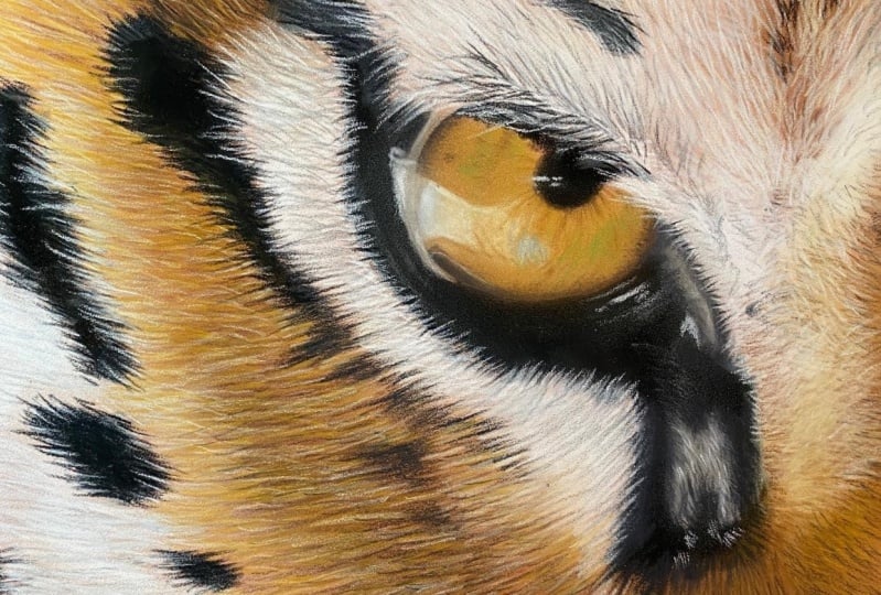
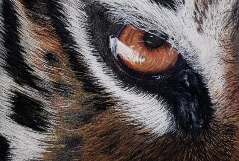
5. Creating Eyeball: we're going to start working on the actual eyeball, so we're going to use the pastel pencils. I am using the fabric Castell Pitt past ill pastel pencils. And I have the set of I believe it's 60. If you have that set, great. If you have a different set, Um, just use the colors that you see in your reference photo. They don't have to match exactly what I have if they do great. But I'm not gonna be calling out the colors. Um, I will just show you the color that I'm using, but mainly we're just going to look at our reference photo and used the pencils that you have that are close to that. Also, the pastel map paper comes with sheets of this. I believe they call it glassine. If you have glassine sheets or you can use these sheets that come with the pastel matt paper, they come in between to protect each sheet. So I use those. I rip one out, folded in half, and that's what you're gonna use so that you don't get ah smudges all over your hand and smudge your paper. So use that as your hand rest. So This first color is like a yellowish brown, and that's what I'm going to lay for the foundation. Uh, the eyeball. I'm going to use my finger, too. Push that pastel pencil a little bit into the pastel, Matt. Not too hard. Just just enough to rub it in their bid. And then I used the micro fiber cloth to clean my finger off for the next color so that they don't get mixed together. So you just use your usual micro fiber cloth wipe off your finger, and then we'll go to the next color. I don't know. I kind of season some Darfur, brown's and some green area. So let's find a darker brown color. I don't wanna go to dark. That looks about right. I like to use a very sharp pencil. So I use this fabric Castell sharpener. This is my favorite one. It makes a very, very sharp point. And fabric Castell, pastel pencils, air. Very nice pencils, and you don't get too much breakage, which is very, very nice. So just very gently sharpen. Get a decent point on there, get rid of any or don't sharpen on top of your artwork, sharpened somewhere else unlike what I just did. So I'm going to use this and I'm going to start putting in the streaks that I see in the eye from the reference photo. Blend that in a little bit with your finger and just use the reference photo and find the color that you're using and fill that in. I see some of it in here, some pattern in here, So I'm just going to do that. Looking at the reference photo, we start off using a very light pressure. We're just getting the general idea of the colors here. We're not pressing super super hard. Now I'm going to move on to that all of green color. I'm going to use a little bit of a darker green, too, right? We'll blend that in. You might be thinking, Wow, it all disappeared. That's OK. Like I said, pastel pencil is all about layers. That's why you don't wanna press too hard and load up the paper too soon because then you won't be about add as many layers. So we want to avoid that by just working very softly and very gently, and I think right now I'm going to start adding the white area in so we can see where that reflection is going to be. - All right, now we have an idea of where that reflection is going to be. So now I'm going to work on this gray area in here and the darker area around the eye. So I'm going to pick a very dark gray color for that. And then I'm going to use a lighter grey for this area here and around the edge here. And I'm going to go ahead and use this gray for this portion of the eye and you'll notice has this portion and then some of where the eye folds. I don't know what those would be called, uh, in the eye as well, like around here so we can pull that gray down to here, and then I'm also going to do this area to with this color gray. Like I said, even though it's actually lighter in the reference photo, we're going to start darker, and then we'll add the lighter colors on top. - All right, now we'll start really getting into these darker colors here around the eye. - All right, so it's just a Siris of adding color blending and then adding more color. You can see that's already starting to take shape very nicely. That's a good sign. - All right, I'm going to go back to this very dark gray color because it is pretty dark right there. All right, I'm looking at my reference photo to see where to go from here. It looks like there are tiny details in the reflection. So I am going to choose a color which looks like a brownish color to start making those very intricate reflection details. Just look at your reference photo and do the best you can. It doesn't have to be 100% perfect. Just the idea of it is going to make it come out wonderfully. I'm also gonna use this color test, keep adding the texture of the pupil, not the people on. I think that's the people. The Irish area. - I need some more green in here, Aziz. Well, and I'm going to go back to the white to brighten that up. But I need to sharpen my pencil. Oh, yeah, that sharp. So very gently. Very lightly. Brighton that reflection up with the white pencil. Okay. Since I have the White. I am going to start adding some of the reflection that's cast down here, all right, We can always go or not. Wait, we will go back and add the tiny details later on as well to so, like I said, Unfortunately, I have a tendency to focus and do a bunch of detail all up front, and I have learned that that's not always the best thing to do. It's better to get a foundation laid first, and you can always go back in and add detail later. But for now, this is his detailed is We're going to get on the I. We will come back to this, but you can see that's Ah, that's coming along, not so bad. So next we will start working on the for, so let's move on to that
6. Short Fur: Let's start creating for with our pastel pencil. So we have our foundation laid with the pan pastel color, and now we're going to start with the darker color and we're going to start adding for so to do that with the darker color, I am just going to use very small first drugs because this is very, very short for on the Tiger, and you could press pretty hard. No, I might actually have to move to a darker Yeah, let's move to a darker brown because it's not the color that I just had isn't showing up on this. So let's move to a darker and then we can always Oh, there we go. We can always add the lighter colors on top of it magically. I don't know how it does it, but dark first and then the lighter colors on top of the dark. So we're going to very short first strokes and fair warning. This is pretty time consuming, but it's well worth it. So you want to avoid going like in a straight line like that to make them you want to kind of stagger them a bit like that kind of randomly when you're placing. I'm just kind of place them willy nilly. Don't Otherwise they'll be too precise. And it looks to, uh, what's the word I don't like like fabricated at that point. So you you can get pretty Massey and just start making random first drugs with the darker color for the for. You want to keep a pretty sharp pencil. You don't want that to dull down or turn. Turn your pencil so that you can keep a fine point to make those short first drugs. Okay, and I am seeing in my reference photo that there's some pretty dark for and they're almost black. So I am going to choose a color that is almost black. It's not quite black, but it's It's pretty dark. So right on top of the strokes and kind of in between the ones that you just created. Add the darker first strokes, right? Okay, And now, looking at the reference photo, I am going to look for a color that looks like a yellowish brown. I think this is what we used in the eye. So I'm going to now start adding that on top of the dark strokes that I just created So again. Sharp pencil. Very small, not too hard. Start adding the lighter for on top of the darker ones and kind of in between. You can you can see with their spaces in between to start adding, and you can see how nicely that starts to layer up in. Really, really. Let's look like the for on the tiger Flint a little bit. Okay, so you can see how that's done. That's the technique for the for, and that's the technique we're going to be using during this whole process for this Brown for. But now, while we're here, I'm going to work on this. Reflection will not really reflection. I don't know. It's just the lighter part of his eye there. And so I'm going to start with a gray and I'm good. Sorry. I'm just going to go in and try to replicate the shape. Now that I see on my reference photo and I made it, I need a much darker color than that. That's not gonna work that I was too light, so I'll find a very, very dark grey. Let's see if that Oh yeah, that's perfect. So now we can just go in there and replicate the shape. These are very small first strokes like we did before. I think it's, like, kind of wet fur around his eye, so it would make sense that it's the first strokes. So we're just going to make very quick, short movements for this. All right? All right again. You don't have to be absolutely perfect with this. As long as it has. The general idea of the shape will leave that there for now. We can always go back later and fine tune it. Now I'm going to move on to this darker grey area of the I, and we'll put that part and eso We could start working on the white around it, and I can show you how the white fur is put in. But first, let's let's put this gray down. You wanna work from the bottom up? Yeah. What I mean is, these white hairs are going to go on top of this color, so we want to put this color down first, and I'm going to use the darker color and we're gonna blend that in. I'm gonna very lightly. Okay, add this darker color and you can see how it blends nicely with the lighter color that I applied first, we could have done it the other way, but I didn't. You could have put this color and then blended the lighter color. Either way will work with we got it. Now I'm going to use this dark, dark gray and the areas where I had the white pan pastel. You can just kind of go over those like that. See, Like, great here where it went over the wash. We can use the short first trucks and blend that in and it's not a problem. All right, I see. I'm going to use very, very light gray, and I can see some very fine for very, very light for in here. And we're also going to lighten this up a little bit as well, so just very lightly. Very gently start adding that for into their All right, all right, again. I don't want to get ahead of myself. I start getting too detailed too quick, so I want to avoid that. So I promised I would show you the white for now around his eye or her. I I'm not sure which it is, So we're going to do that right now. So back to the pure white pencil and we're going to start adding these very, very fine first strokes into the dark area. And you can see how nicely that that white shows up over the dark area. Amazing. And we can start adding the white first strokes with with the white pastel pencil on top of that base just to make sure we're getting it covered. Press a little bit harder when you're trying to go over the black areas or the very dark grey areas you might need to to press a little harder. Same thing with this white For that that's going on this black area here, we're gonna use a pretty good amount of pressure. All right, now you can see the magic of the layers. You can see how the for the white for went over that black area and gives the illusion that that first setting on top, just like it is in the reference photo. So that's the technique for that. So let's move, then very similar down here in this area. So we are going to use white, but we might also use black to draw some of the black strokes down. But we're also going to use white to draw the white strokes up. So bear with me here. Very, very small, Very, very small stroke. Sorry, I have a habit. I'm not finishing my thoughts. I know what I'm thinking, and I forget to say it on camera. I apologize. Pay attention to the direction of the for on your reference photo that that is very important if the first supposed to be going this way. But you you have it going a completely other way, and it could make or break your piece. So pay very close attention to the direction of the for on the reference photo. Now, if you notice I'm not going to go all the way down in here with the white because like I said earlier, we want to use some of that darker grey first and create some of the grey for, And then last step will go on with the white. But for this find area right here around the tigers, I we're gonna use the white, and then that doesn't look too bad. We're going to use the blackest black pencil that you have, which you know, you're gonna need a pure black pencil. And of course, it's not sharpened. All right? Yes. We have a super fine point black, which is what you want, because we're now going to create the dark hairs that are coming down in between these white hairs so pretty hard, strong short strokes will create that. Definitely. We'll create that look. He could just go in between the white areas that you have and just dark in those up and pull pull it down a little bit into the to the white area. It will give you that nice contrast. Look at that. Yes, I could do the same up here that we have already done previously with the white. We can pull and create some of the dark hair now that goes in between there. And that really creates that for Look. Oh, it's beautiful. Look at that, right. I'm gonna leave well enough alone for that. And let's start adding some of the grey into the white area. See, there's a lot of gray in there, so we want to do that Gray first before we start going in with the bright white. So let's work on that next
7. White Fur: we're going to now work on the white areas of the for. But as you can see in the reference photo, there are a lot of gray areas underneath. So we're gonna do that first with our gray pencil, and then we'll go over top of that with the white pencil. So we're this is ah, a lot longer for than the for that was down here. You can see the tiny first strokes where this this for is a lot longer. So we'll use longer strokes to create that gray under base, if you will. So we'll just go in and start lightly creating the long for paying attention to the directions in the reference photo. Okay, now we have some gray hairs created for the under layer. Let's start. I think I'm going to darken in the black where I have some of the pan the white panne Paris Still, but I'm not going to use the blackest black. I'm going to use a super dark gray, so I'm gonna make hair strokes with that. I'm not gonna color and solid because we can retain some of that white under layer. It will look good and we can go into the white area as well. Like that, we can use this dark, dark gray in this area as well. Right now we can use the white and start going into that black wash area with the for, And we could start adding white strokes over the gray strokes with a long for all right. - See , it starts to blend that black wash area in with the for All right, we'll continue adding lone white for strokes and color pencil. I'm sorry, not colored pencil pastel pencil is all about layering. And like I said earlier, the nice thing is, the light colors layer very nicely over the dark colors. You could see how we're starting to get very nice for a texture. All right, continuing with that same method, we can start to do this area as well right here by the I this black area. We'll do that. We'll do the same. Will use the really dark, dark, dark gray and add the first strokes into the area where you started to create the first so that we don't want that sharp line where we painted the wash. So we'll blend those with the pencil strokes all right, all right. And you can see in the reference photo this has a little bit of the oh, let's see, like a brownish color. So we'll add some of those in. - Then we'll go back in with our white. But you really want a very sharp pencil for this. These air. Very small, very fine hairs. So you want to get your pencil pretty sharp. Then you can add the white hair on top of the hair that you have already created. All right, and let's go in with the pure black now, all right, you can see how that's creating the black hair that goes into the white hair and the white hair goes into the black hair. So that ends up blending very, very nicely like that and looking like for than when we first started, when it was just a pure black wash blob is now a nice for area. So let's see. I think now we will move on to other for areas and do like we did here, here with Short for, and then we'll continue to do the long white and great for so we will work on that next
8. Fur: Let's continue on with the for. I think I'm gonna work up in this upper left corner here, so let's see what we have going on with their reference photo. We got some darker browns and some yellowish brown, and then some of the very light, almost white color. So we're going to blend that in with the black stripe up in this corner, so we'll get our glassine paper and we'll start with a brown not too dark. But it's pretty dark because we want that as the under layer. So this for is not as short as this for, but it's not as long as the white. For that we did. It's kind of in between, so we'll adjust the pencil strokes accordingly. So kind of medium, medium length pencil strokes and just start laying down first strokes for the for the under layer of the hair. - Next , I'll we use this yellowish brown. Put some of that for color on top of the dark hair that we just put him. So just create their first strokes on top of the dark for strokes that you just dio. And now I'm going to use, uh, this off white color that came in. This said. It's not the brightest white white, it's the next one down. It's an off white color. So I am going to keep adding the first looks like we just did with the other two colors. Now we're going to use the black and we're going to blend where we painted with the gua sh We're going to blend to that end with the for to make it look like the for texture, right? - I'm just using very, very light strokes now to blend that together. What we're trying to avoid or get rid of is that line where we painted the gua sh We don't I want to see that So we're going to use the black and blend that up into the other colors of for so that it's not that straight line and then two further blend that will go back to the off white color, and we'll start creating some down strokes down into that for into that black for to further blend the very light strokes that did the trick. Now you have the for texture that's blended with the black for texture right there and next we will go down to this area and repeat that same process will use the dark, the darker color brown and add the lighter color brown and then the off white. And then it looks like we'll be able to use some pure white. So let's start doing that in this section. So back to her dark brown color, try to blend away some of that pastel parent pastel from earlier. But that's all right. We don't have to, you know, we'll get that later, like we did up here. So again, paying attention to the direction of the for Create the first strokes and it looks like looks like I can use for this area right here. I could use a darker, darker brown than than what I just had. So let me sign a pretty dark brown color, almost glass, but not quite think of going to go even a little bit darker right there because that is almost black, some of that for readier, and I don't want to go full on black. I don't believe so just the very, very dark brown, and we'll add a lair affair. Yes, that's not bad. And then, as you can see, there are several different colors. So this is one of them. So that yellowish that we used up here, you could see a little bit of that in there. Not too much, but very lightly will add some of that for color and ever says light, very light. We'll use this off white color, just a few of those hairs, just just to give it the the layered look with the with the for some highlights. Okay, that's not bad. So now onto the section beside it, it is a lot lighter, but there are some some darker hairs in there. So let's go back to this member medium brown here, not the super darkest one. But ah, this brown should be enough to create the under layer again, very light pay attention to the direction of the Firth and then right beside it is very light. So we will use this yellowish brown for the base, and we can add this yellowish brown to the glare that we just created over here, all right, And then we'll use the off white and ever so lightly add some in to the previous layers that you created over here and then on top of that yellowish brown because this is the lightest area over here. So we could add a little bit more on that side. And now we're going to do the black for stripe here, blend that in with this. So using the black, the same technique that we did on these stripes we're going to do with this section here. So find the direction of the first start, creating the first drugs and start bringing them down into the fair that you just created a minute ago. All right. And there are some very dark hairs in this areas of very gently. I had a few of those into their and now the go use the yellowish brown and add some of those into the dark for like I said, at the very end, weaken, take a look overall, and we can add more details at that point. But at this point, we are just laying down, you know, the the foundation of the colors of and building up the layers for the for texture. So, um, again, by all means, it doesn't have to be perfect. You've lay the strokes down, and it's gonna look like for so You don't have to worry about looking at your reference photo. I have toe. I have to put this hair exactly right here. You know you This is art. So you're creating something. You're using your own style and you experiment and you practice, and it's gonna turn out wonderfully. So we will continue. Let's let's do the white area under the Tigers. I we will do that next.
9. More Fur: Okay, let's tackle the next section. I think I'll do this upper right portion now. So, using the techniques that I showed you, we will add a gray base and then add some white for going up into the black area. I'm going to use not a super dark gray, but it's not a light one, either. Might be the gray that I had already used will use that as the base. We'll start off with that, and this is pretty pretty long for, so we'll make long strokes. And then down here in this section, there is the the brownish color for So we'll get a brown brown pencil and start start adding that in that goes up into the dark stripe, and then we'll go with the off white hand start adding that on top of the grey that we just put there and this will go up into the the black area. So we'll pull that up into the black area to blend that in, and then we'll use the black and pull the black fur and blend that, like we did with this section over here, so that we don't see that line from the Quash and it looks like there's some black areas in here, so we'll start adding those as well blended pretty nicely. We can go back a little later and add some more details to the for. But for now, we'll keep moving down into fix this section right here, which looks like more, more gray and more white. So I'm going to use Ah, lighter gray and start adding those hairs into their The's go in a lot of different directions. So just look at your reference photo and just do the best you can. Doesn't have to be exact, but just follow the basic direction of the for in the reference photo. Looks like the first starts getting pretty short in this area, so we'll make shorter strokes and will go in with the off white and add more and maybe some darker Agree up here. All right, we'll continue down into this area so we'll look and see what we have. It's very short, short hair, so we'll just try to emulate that the best that we can. Some of this is the line with a for kind of separates and goes in different directions, So I used the dark gray for that, and we'll get some of the dark brown in there, too. In this area in this area, we'll use the dark brown, and I'm gonna try a different color brown darker and a little bit darker than the last one that I was using. Get some of that added into that layer. I don't use the very, very, very dark gray a little bit in this area right here. And now we're going to use the whitest white and had that into this area here. All right, that's not too bad. We can. Like I said, come back to that area later on after we get the rest of this finished. And let's do this. Now, I I thought I said I was gonna do that earlier, but I guess I changed my mind and did up here. But let's do this white area now, so we're not going to use the white White. We're gonna use gray for the base of a lot of this, and then we'll go back in with the white. So let's create the gray base. We'll get a decently sharpened gray color. All right, we have our gray base for created. Now I think I'm going to work on creating the base color of for like we did for this area down here. It's that same type of for a little bit longer than than this for, But it's the same same technique and let's create the base here. So I'm going to start with this darker brown, pay attention to the direction of the firm and the length of the for and start creating your first troops. I'm going to use the darker brown color, and I'm going to use the gray dark, dark gray because there are some darker colors in this for here, but going to sharpen this Hannah. Okay, decently sharp pencil sharpened pencil. You want to use, Ah, pretty sharp pencil when doing the for. Otherwise, if it's too dull and too rounded, it will make very, very, um, just thick strokes, and you want very fine hair like stroke. So you want to keep your pencil pretty sharp. So we are going to start adding this dirt gray hair in around the area and in this cheek area. I guess it's his chief. Yes, using light pressure, very short hairs Good that blended in with the area that we had done earlier. All right, well, I'm here and well, I have the dark gray. I'm going to start adding some of that detail, pulling some of that dark wash. Start blending it in with the for here. And what's a me me. A little more start great here in this base for color, because next, we're going to go in with the lighter color and keep adding layer upon layer to create that beautiful for texture. All right, that will do it for now for that color. So let's go, then. See what other colors you see. I do see this yellowish brown. So let's start adding very short. Yellowish brown hairs. Okay, Now we're going to use Theo off white cream color. Add in a layer of that. Okay. In the next section, we will finish working on blending the black stripes over here.
10. Even More Fur!: all right, Have a nice, sharp black pencil and we're going to do like we did appear and over here and we're going to blend thes black stripes into the rest of the for just like a reference photo shows. So we'll do that with the black first, very short, quick strokes into the white area and blend that wash line into the for All right, - all right, right right here. I'm just creating some of these spots that I did not create with the Gua Shi. So we'll go ahead and create him with the black pencil. All right, Now it's time to lay down some gray for the foundation, and then we were at the white. But first, let's let's get it's got a gray. Not the dark, dark gray, but, um, pretty like gray. Add some for strokes into their into the black stripes that we just blended out. We'll add this gray. I don't know if you just saw what happened here. It's very subtle. I got dark pastel pencil on my pencil and then it transferred. That's why this ah micro fiber cloth also comes in handy If you see your pencil starting to get another color on it. You can just wipe that off, uh, on there, and this right here will blend in. It's not a problem, but it can't happen. And it happens more often. That's why one of the reasons that I don't like to create the black dark black areas with black pastel, Um, because the chances of that happening are more and more. Whereas if you created with the gua sh the majority of it is the paint, and then you're just adding the black pastel to the edges. But when you're using that black pastel pencil, be very aware when you start adding other colors that those colors can can pick up that dark pastel, and you just have to wipe that off periodically, and you can turn your pencil also to help avoid death. I'm actually use a little bit of the darker grey as well very, very light to help create that for texture in the white areas. - All right, now we're going to use the lightest white and start cleaning the white hair white, for we should say, all right. And you can see that happening down here where we had black pastel and then it gets on, it gets on your your pencil tip. So, like I said, you can swipe, turn your pencil swipe, turn your pencil, and then wipe it off on your micro cloth. And then any of the blobs you can you can blend in so you could see how it gets on the tip of the pencil. Wipe that right out for their and again sharpening your pencil helps as well, turning it and wiping it off. That's that's the best way to remedy that. But it it's it's going to have it. I'm going to sharpen because it's happening. Whoops. Sorry. Happening a lot now because we have a lot of dark, black pastel pencil here, so I'm going to sharpen and then keep going. All right, I got it pretty good. Sharp tip here. So keep going. I'm also going to turn the pencil as I go and then wipe off, - okay ? It looks like we have a very solid foundation there. So the very next step and the homestretch, we are going to just go back and really scrutinize our reference photo and just fine tune and put in any little details that you may have missed or want to add or make any sort of color adjustments or just just, you know, like I said, maybe we had a little a bit more details in the for that we might have missed earlier. So in the very next section we're going to do that, I'll meet you there.
11. Final Details: Okay, This is the very final section. This is where we really scrutinized the reference photo and go back into our pastel drawing and just really start to find Tune it and, um, yeah, just start to find Tune it with all of the details that you may have missed as you were doing the rest of this. So the first thing I'm going to start with, I noticed there's ever so slight. I mean, slight amount of of blue in the reflection. So I am going to use the lightest blue that I have, which is actually kind of dark. So I'm going to use a very, very, very light hand and maybe add a little bit of blue in there and then go over that with the , um white to lighten it up even further. So I'm gonna go ahead and do that Just a hint of blue, make some of the areas pretty bright white in the reflection at a slight bit more reflection in the pupil. A few more fine hairs here. I'm gonna use the black and add some fine hairs. Black hairs coming out from that area. Hey, looks like I may have missed some white hairs have been here the first pass. But that's all right. We can add them right now. Now is the time to do it. Just some little fine details, that air that they were going to help create that realism and maybe some more. Here, let me wipe that off. Make sure I don't have any dark grey or black on there. Get somewhere white for coming down from his I or her eyes. I don't know if it's a girl honorable way. - Now here you'll see what I meant by the tooth. Once you have too many layers or too much color laid down, you'll see when I try to add. Hang on, let me see if I could do man. When I tried to add white, you really can't see much of a difference as opposed to like over here where there were. There's no pastor whatsoever. This was loaded up with with different layers. So when I try to add it, there's really not much difference and you can't really see it. That's what I meant by if you go to dark too soon with the colors that can happen and you won't be able to put the layer upon layer to get that for texture. So you do have to be aware of that. But since we're pretty much done and we're just adding detail, we'll be right. That's fine. Okay, I am going to use the black and maybe add a little bit more of the very, very short black for here. Very little, very, very light pressure. Very small strokes. This is very short hair, right? All right. I think I am all right with this. So the very, very last thing to do is to sign your work. Now, there are several ways you could do this if you could see this. This particular picture has dark area down here. You could sharpen your black pastel pencil. Um, you could use a white pastel pencil. I I'm going to just very carefully use. I'm using a fabric Castell Pitt artist pen, and I'm just going to put my initials down in the the bottom right corner like that. Um, I just find that when I try to do it with the pastel pencils even really sharp, they're just They're not the It's not. It's not crisp and clear, So I just do it very small. My initials with the pit pastel. Or you could use the Coptic multi liner ink pen or any type of ink pen like that. Just experiments. See what you like best. So I think that's it. I hope you enjoyed the class, and I hope you stay tuned for the next section, which will be the project.
12. Project Assignment : your assignment should you choose to accept it is to create the tiger. I You can use the reference photo that I provide it or you can use any other reference photo of your choice. When you're finished, don't forget to upload your project to the project section. I would love to see it. Also, you can follow me on Instagram at Art Milovan and you can tag your artwork with hashtag art by Laban Project. And I will be sure to see it. I can't wait to see what you created.
 LaVonne, Artist, Illustrator