Transcripts
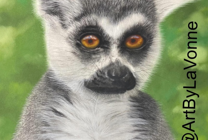
1. Introduction : In this class, I will teach you step-by-step in detail how to create this cute little lemur using pan pastel and pastel pencils. By the end of the class, you will know how to create a background using Pam pastel and also laying a color foundation for your projects with Pan pastel. And also how to use pastel pencil to create details. You will learn techniques how to create for eyes and other parts of animals that you can use, not only on this lemur project, but also for other animal projects. So stay tuned. Grabbed your supplies and let's get started.
2. Supplies : For this class, you will need clear Fontaine pastoral matte paper. You can use other paper, but be aware that you will not get the same results as you see in this video. Past omit paper is highly recommended because it works very, very well with pastel, pencil and Pam, pastels. It has a very heavy tooth and as almost like a very fine sand paper. The next thing you will need are pan pastels. I will be using shades of green, at least four shades for the background. I will also use white, black, and dark gray. And last but not least, you will need pastel pencils. I will be using a set of 60 fabric Castile pastel pencils.
3. Background - PanPastel: The very first step is to use the reference photo. I have an iPad that I use, because you can zoom in and see the details and zoom out. Use the reference photo and draw onto your paper just a very rough outline of the lemur. I just use a mechanical pencil very, very lightly. Doesn't have to be exact as long as you get the proportions correct. Like I said, by looking at your reference photo as long as you have everything in place, just general rough outline. Because we're going to go over this with the pan pastel and the pastel pencil. So, but we need to know where our first layer of colors are going to be. So you can draw this freehand. I drew this free hand for this subject. It's pretty simple, so I didn't I didn't trace or use the grid method or anything like that, but use whatever method you feel comfortable with and get the pencil outline down onto your paper. And then we'll move on to the next step. The next step is to put the background. And I like putting the background and first, because we are going to start doing the for and that's going to go over the background. So we don't wanna do the for first and then try to try to put the background on after we've done the for. I don't know. That's just what makes sense to me. So that's, that's how I do it. For this, I'm going to use, I have a set of green pan pastels in different shades. So I am not going to put in as much detail as we see in the reference photo. I am just going to, oh, and I'm not going to do this now to the other lemur in the background. I am just going to use multiple shades of green just to try to get the suggestion of a leafy background. So this isn't anything super precise with a lot of detail. I'm just going to pick color in-between. The darkest one that I'm going to use, but not the lightest one either. So you can use either one of the tools. Some of the past out Pam pastel sets come with tools or you can buy these tools separate. And then once, once they're worn out, you can turn them over and use the other side. There's also these things that look like makeup sponges if you're familiar with that, but there are a lot more dense and say thicker, but they're not that they're more durable. So they're not actual makeup sponges there. More durable. So I'm going to use both of those things to get this background on. So let's start with with that. We just put some onto the sponge thing and just start getting that color down. I'm also going to use a different color to start adding some of the variation. Because you don't want to all one color because that's just not what leaves look like in the background. There's going to be different variations of different colors. So we'll get a little bit of that second color of green in there. So this is just a matter of putting the color down with the sponge and then moving it around. Just print it out. That's about it. There's no special no special magic here yet. And just putting that color down and spreading it around. And again, if you want to use this tool, it's the same concept, gets some of the color onto the tool. And I use a circular motion ad that color onto there and spread it around. But when I'm doing a larger areas, this tool is fine for smaller areas, I'll use it on the actual lemur, but for the larger areas, it's just easier to use the sponge. You can cover larger area more easily. And they're going to be some fallout. Like what happens here, you can just use your finger and I were gonna cover that color anyway, but that's why one of the benefits of doing the background first, if any of those happens, it's not going to ruin the VR area if you did that for first and have all of your detail in there. If you accidentally had some fall out while you were doing your background, it would be harder to remove that. So like I said, I suggest doing the background area first or Set your container off to the side. And don't just be aware when you're moving the sponge that it doesn't drop any of the past to help. Just, just be more careful, I guess, but I'm not always careful. It happens. Alright, so on this side we have that first midtown colored laid down in there. So now I am going to use the smaller Tool and I'm going to start adding just smaller patches of different color variations within, within the layer that we just created. So we'll have a bit of this color into it. I'm also going to go to a darker darker green to get some depth like that. Like I said, absolutely nothing precise. It's just a matter of getting different shades of green to make it look like a blurred jungle. Jungle like background. That's what we're aiming for. I have other green colors in tool. Like I said, we're just going to Mosaic camouflage. It looks like camouflage background. I'm not going to put a lot of detail in the background because I don't want it to take away detail from, from the actual lemur. I don't want it to distract from the lemur. I want the lemur to be the focal point. So the background is just the idea of a jungle background knowledge. So we just keep choosing different colors and blending them in with the first layer to get, like I said, subtle variations of color in the background like that. Nothing difficult, nothing precise. And sometimes I'm going back to that Midtown that I used originally. Just to make it a little to make it darker and more solid. Circular motion. Blending them together. I tend to use the darker colors in each of the corners because that has a way of drawing your eye into the center, onto the focal point, which in this case is our lemur. So anytime that you put a darker color in the corners, it naturally draws the eye to the center of the paper, which is your focal point, your main subject. And I'm going to use a little bit of this lighter color and also like this lighter yellowish color because let's see, that would exist in nature, kind of how the light is coming through on the leaves. So let's go ahead and add some of that. Now. Let's try with this really gets going in there like that. And like I said, it's going to look like out of focus, background. Leaves, jungle, foliage, foliage, however you say that. So that's the I'm aiming for here. So we can just kind of dab now lighter colors to get that patchy luck that the light is coming through the leaves and the trees. All right, so that's the technique that I am going to be using for the whole, entire background of this piece. And we'll do that off camera and come back and show you what the finished background looks like in just a moment. I have finished now laying down the general colors. The midtown, the darker tone, and some of the lighter tones of the whole entire background. And now I am just going back in and adding some of the lighter colors, like I said, where it would appear as if the sun is shining through the leaves. So I know I did a little bit of that earlier, but now I am tailoring that up a bit, making the shapes a little more round instead of rectangular how they were earlier. So let's make those a little bit more around. I'm using this yellowish green and there's very, very light shade of green. And I'm going to start doing that. I'm also going to use the, the darkest green that I have and put some of that in sometimes beside some of the light areas because like I said, that that helps add depth to this background. So I am going to continue doing that then throughout the rest of the background. And I will show you what it looks like when it's finished. Ok, this is what I have now for the background, you can see that I got all of the colors, blend it in. I have some variation. The lights and the darks and just different array of the leaf colors. And you might be thinking, I don't, that's not very impressive. Well, no. It kinda looks like a third grader at this point, but that's okay. Once we get to the lemur, that's where our detail is going to be. And trust me, you will thank me later. This background is going to look absolutely awesome. So now let's jump in to the next section, which will be the lemur.
4. Lemur - PanPastel: And now for the beginning of the fun part, we are going to now work on the foundation of the lemur with the PAM pastels, I am going to be using a dark grey. It is natural gray, extra dark. This came in a kits the Jason Morgan wildlife set. So there's a dark gray. There's also a white and black. Now we're going to use the black very, very sparingly, and we're going to use the pure white. I have another one of those, titanium white very, very sparingly. But I am going to show you something. The beauty of Pan pastel is you can mix colors on a plain white piece of copy printer paper, you know, just paper that you use to print stuff out on your printer. And we can make any variation of any of these colors with just these three colours. So again, this is just the pan pastel foundation layer. We're not getting into any details were just laying out the general blocks, if you will, of the foundation colors. So look at your reference photo to get an idea of the colors. So I am going to use this oval tool here. And I'm going to use the gray, the dark gray. And I'm just going to very, very gently start in circular motions. Adding in where this, Like I said, General foundation blocks of color are going to be, don't get too thick with this. So you can add some and then spread it out in circular motions. Don't lay way too much Pam pastel down right out of the gate. Because with this paper, you'll notice that it's kind of rough slightly with a tooth to it. If you start grinding in a lot of the PAM pastel into that paper, you will lose that tooth and you won't be able to get the detail with the pastel pencils that you want to achieve later. It will fill in the tooth and grit of that paper very early on. So you want to be very careful with that. Lay down some of the color and in circular motions, start spreading it around from there. Like I said, this is just the foundation. We don't have to get every single area filled with an exact color. We are going to use detail later on with the pastel pencil. This is just to lay that, again, nice foundation of color. So we'll start with the Greys, the dark gray. And you will notice in your reference photo that, you know, the white isn't really, really pure, pure white. So like I had mentioned earlier, we are going to mix some colors. We're going to take some of the white. We're going to put it down onto paper. And we're going to take a hint of the dark gray. And we're going to mix that together until we get i and we're going to need a lot more white until we get a very, very light gray. And then that is what we are going to use in some of the areas down here that aren't pure white. And just spread that around. We can add lighter colors on top of that later. It's not going to hurt it. 1-bit Pam pesto mixed with pastel pencil. You put the darker colors down first, and then you can add the lighter colors on top. And that works out very, very, very well. So don't be afraid. If it looks like it's too dark. We're going to add pencil into their later and it will lighten that up. You can also, like I said, adjust over here when you mixture colors. If you need a much lighter gray. And you can do that as well over here, get a lighter, really light grey as the foundation for his white fur or her white fur on the chest area here. And I use this is the paper that comes in between the layers of the still matte paper. And I just rip one of those out and fold it in half. And that way, you're not smudging your piece if you need to hold it or if you need to put your hand down, you can use this paper to do that with so that you don't smudge your piece. And again, this isn't a detail part of the the steps here. This, this is just very loosely knowing which color goes, excuse me, which color goes where. So these are going to be the whites, these are going to be the greys. And we'll, we'll do some black right around the eye area. But like I said, we're just very loosely. Laying in our color foundation. And if you notice, you start to get these. The sponge starts to eventually start eroding out on other eyewear and starts to peel off. And you can just blow that away unceremoniously. As it's happening. It's just the nature of the pastoral Map paper. It will grind away at your tools. So again, just keep using these colors to smear around so that you know later where the white is going to go. And it doesn't have to be pure white right now. And I'm not, I'm not pressing super heart at all and I'm just very lightly adding this color and you don't want to press too hard. Again, it will ruin the tooth of the paper. Ok, so I got the light gray white areas in. So we'll go back to the dark gray, dab it on. And then we can gently use that. We can go back to that color and draw from it. Later on like that. Just smear someone your tool and use it in another area. Gently dabbing and then very gently blending in. Like so. Just getting the general shape and idea of where the colors are going to go. Nothing fancy at this point, nothing detailed. Just laying down the color foundations. Okay, okay. Now I am going to add the black end, but I'm not gonna go too, too crazy. With the black. We can add that detail in with the pencil. So I am just going to dab a little bit of that black into the areas that I see on the reference photo that are really, really, really dark. But again, very lightly, just dabbing, dabbing that onto they're not using a lot of pressure. Just, just getting a little basic foundation of the Black onto that layer right here. And just smudging it around. I think that is enough for this portion. We have the basic foundation layers of the lemur for and in the next section we are going to start laying in the detail with the past OUT pencils. And at this point you might be thinking what the heck? This, this looks like a four-year-old drew it. Well, yeah, yeah, it does. But to me that's the beauty of Pam pastel and pastel pencils is you get something looking like this. And as you keep working on it, it starts developing and the details start coming out. And it's just absolutely amazing. I love taking pictures of my work in various stages of the various steps and you're able to see how it goes from that to that to that. And then in the end it's like, whoa, how did, how did this even happen? So anyway, this is what it looks like at this point. So now join me in the next section and let's start adding detail to the lemur.
5. Fur Detail 1: Now we are going to move on to the step where you start using the pastel pencils for detail. So I'm going to start up in this corner here. I am going to use this paper that came with Declare Fontaine pastoral mats to set my hands-on so that you don't smudge your work and you don't get it all over your hand. I'm going to zoom in on my reference photo so I can start looking at the details of the ear. And so we have our basic color foundation already laid down. But it looks like there's a lot of different variations of gray in here. So I am going to choose different gray pencils to work with for this part of the ear. So starting with the darkest, because in pastel pencils, you do start with a darker color and then start adding on lighter colors to form the layers. So one of the main tips is to start with a pretty sharp pencil and continue to keep that sharp. Because when you are doing for, you don't want a blank pencil and for you're not going to be able to get a lot of detail. So always keep a sharp pencil. And we're just very gently, easily starting to make first strokes with the darker grey pencil. Like this. Now, we will move on to a lighter gray pencil. And we will just use those same type of strokes over top of the dark grey pencil that we just put down. Like so. And we're going to start going into this dark area of the year here. Like your reference photo shows these hairs here. So like I said, sharp pencil, just very pressing, really hard, medium, medium pressure. And just start drawing in the hairs. Be aware of the direction of the hair from a reference photo and the length of the hair from your reference photo. And just continue adding them with the light gray hairs in the ears. Here Hicks. And now with the white, very sharp, sharp enough, pretty sharp. Start adding in the white hair. And you can put that right over top of the other two colors that we just laid down. Just keep adding further strokes again, paying attention to the direction and the length of the hair. So with those three colors, I am going to continue working on this ear area. Let's see, let's see. Oh, I'm going to use the white and we can start going into the background. Like so. And so you can see how that now that hair is going to stand out from the background. And if we would have done this part first, it would have been impossible or it would have been very awkward trying to then put the background on and then going back over it. That's the importance of putting the background in first when you're doing any type of fur, put the background in first, and then you can, you can draw the hair like so on top of it. So with that in mind, I am now going to finish this air area using the colors and technique that I just showed you. And I will come back and show you what that looks like. When I'm finished. I am almost finished with this first year area. But something that I wanted to show you, I am using the it's not black, it's like the next shade up from black. It's very, very, very dark gray. And you can make hair strokes. Going into the lighter for to create the illusion. It's called negative, negative space, creating negative space. So you're using the dark color to go into the light color. And it helps create more of the detail. You don't have to press really hard and you don't have to use a lot of this, don't, don't overdo it, just certain smaller areas. And it helps really, really been that detail to life. And I will do a little bit more of this and then we'll move on to the next section.
6. Fur Detail 2: All right, so this is what I have so far on the ER. We can always go back later on and add more detail if need be. But for now I'm going to move on to the top part of the head. And so these are very, very small, short first strokes. I am going to use the very dark gray. And I am just going to start adding those small first strokes. Paying attention to the direction. Looking at the reference photo. And just start adding those in everywhere to this whole, entire top section of the head. I will go ahead and speed that up. And when I'm finished, we'll move onto the next step. But for now, like I said, just add very short, small first strokes with the dark gray. And this is what it looks like with the dark gray layer of for added in. And now I am going to go in with a lighter gray and start adding that in to this layer. And I would do that on the entire head area. And I will show you what that looks like when I'm finished. And this is what it looks like with that dark, lighter gray than we used for the foundation, but dark still was darker gray and now we're going to use a much lighter gray. And if you can see on the reference photo that there's a lot of this light gray on the very upper portion. That's what we will work on now. So very short small strokes where that here. And we will add that to this section of the head here. And I will show you what that looks like. When I'm finished with this color, I'm going to start going a lot more over the background like that. So that that hair goes up into the background like like that. So I would do that off camera and show you what that looks like when it's finished. Alright, so that's what it looks like now with the very lightest grey. Now I am going to go in with this light grey and start adding strokes into the ear on this side. Like so. And some of that's longer, so we'll do longer, longer strokes with the light gray over this entire area. And now I'm going to go in with the white and start adding long hair on top of the light grey that we just did. And I will use the white to go into the background like that so that you could see the hairs. Let me zoom in. You can see the hairs now adding detail and going into the background. Again, just paying attention to the direction and length of the for. So I am going to continue doing that all around the ear. And I will finish that part and show you what it looks like when it's finished. So that's what it looks like at this point, you can see the white hairs make it gives it that fuzzy fairy field going into the background like that. I'm going to get the medium colored grey now and start adding some of those wispy hairs into the ear. According to the reference photo, just add sparingly some of the darker wispy hairs into the ear area like that. Some shorter hairs down here. And then back to the very dark grey. Now we can add, since we've already added our light grey and white into the ear. Now we can finish with the detail of these darker hairs going into the, the lighter hairs in this area here. Heavier pressure. So you can get some some detail. There's probably could be sharper. I didn't listen to my own advice of keeping a sharp pencil aware. Okay. And we can start adding just a few really dark hairs now into the head area. Just to give it some more depth and detail. Now you can see how that's looking pretty good. So let's move on to the next section. We will begin working on this upper area. So for that I'm going to use the light gray and continue with the light. Short first strokes. And also keep in mind for, for you don't want to do side-by-side, even strokes like that. You want to kind of angle them and make the strokes very random. Because that's how for rows it doesn't grow in a straight line. It, it, you know, it kind of goes off into different directions. Like so. So I would do that for this whole upper area. And I will show you what that looks like when I'm finished. Alright, here is that area with the light gray added into it. I am going to continue on and use that same technique with the light gray and do this area over here. I'm going to sharpen my pencil and I will do that. And I will show you what that looks like when it's finished. Alright, I have used the light gray and added into this area. It's very subtle. But you can see the strokes here that I created. Now, I'm going to start working on the eye area. This very dark portion here around the eyeball. So I'm not going to use the pure black, I am going to use the very darkest gray. And then we can start building up the eye area. Now this isn't for at this point. So we can use strokes like that instead of the first strokes. And looking at your reference photo, you'll see there's some light gray. So I'll leave that light gray and add the dark gray where the dark gray goes. Or just start building up this eye shape. And then you can see that it begins. The dark for begins. And so you can just add the very short strokes up into the lighter area up here. And we'll start blending that together. These two areas. And here where it's darker, you can use a heavier pressure. Just adjust your pressure as need be. For the lighter hairs. And then for the darker hairs, you can apply more pressure. And you can already see how that's starting to take shape compared to how it was before we started. You can, you can really start to watch it come to life as you start shading and adding more detail. Okay, I will leave that like that for now and then begin working on the other eye so that it's balanced so that we have the same amount of detail on each side. So again, looking at the reference photo, we can see where the dark areas are, like we did with the other eye. And we can start we can start building on that. Ok. We'll leave it like that for now. And in the next section, let's start working on the eyes.
7. Eyes: Alright, for the eyes, I am going to look at the reference photo and start choosing colors that I see in there. It doesn't have to be an exact science. That's why I'm not calling out the colors. You might have a different set of pencils. Just experiment and use your own judgement as far as what colors we can start layering and mixing colors. So It's, how do I put it? It's, it's important, but it's not. Don't stress yourself over it. As long as the colors are close, it's gonna come out wonderfully. So in the center of the eye, I am seeing this darker, orangey brown color. So I am just going to add that into this portion of the eye, like so on each side. And like I said, we can adjust later on. But just to get some layer of color down, we're going to start with this. So we will add that orangey, dark orangey color. And I use my finger. And we're going to smear that, can smudge the a bit. Using a light pressure. We just keep adding layers. Circular motion I am using. And then I am going to use this yellowish brown colour here for this portion of the eye and apply that in a circular motion like this. You can even add it on top of the orange color that we just placed down. Just very lightly, little by little ad that color into these areas. And as always, at first you're going, oh my gosh, what the heck is this does not look good. Well, that's how it goes. But The beauty of it is you keep working at it and you keep adding to the layers little by little, and eventually it molds into shape. So don't stress out if any point you look at it and go, whoa, what the heck is this? What am I doing? It just means you've got some more work to do. That's OK. Now I'm going to use a brown color and very, very lightly. Let's apply that to the orange areas that we just did. And I'm also going to add it very lightly around the edges down here. And over here. Again, just using my finger to blend. I have a microfiber cloth that I wiped my hands off with. And then let's add the pupil. I'm going to use a very, very dark gray just so we can see how the eye shape and everything is going to be. Let's add the pupil in now. We can adjust the shape a little bit over here because I had it not round. So we can adjust for that with this dark gray. Okay. And we can see we need a little bit darker colors. So let's. Let's try like this reddish. Yes, that's not bad. This reddish maroon color. Add a little bit of that into here. And you can see this I is darker on the reference photo because of the way that the shadows are. And everything. There's there's more shadow cast on this i so this eye color is a lot darker than this eye color. So we're going to emulate that. Get some darker colors in here. And we keep building layers like this. This is what helps create the depth of the eyes. Just adding very, very lightly adding color. You can smear that with your fingers a little bit. And then taking a look, maybe go back to that yellowish brown. Add some of that back, in fact to the ground color again. And back to the pupils. Now we're going to add the highlights and to the eye. And this is what is really going to make this pop. And you can see that it's not white, it's not totally white. It looks like a very, very, very pale blue. Let's see. What I have. I don't have a super, super light blue, but I do have a blue. So let's very, very lightly add some of that. The lightest blue that you have into there. And then I am not going to use here white. I am going to use the lightest gray that I have. And with the lightest grade that I have. I will just very carefully start to add the highlight into the top portion of the eyes like that. So you get a better idea now. You can see how the eyes are starting to take shape. So you would just continue to use your colors that you see in the reference photo and use the colors that you have that are close to that and keep building up the the coloring of the eyes. And I will go ahead and do that off camera. And you can smudge and then more color back in and just continue to work on that until you get the effect that you like. So this is what my eyes look like Now, I just continue to layer the different colors. I ended up using some green in this area here. And I also added some, some blue on top of the highlights just to give that a little more depth and dimension. And go over the iris pupil, sorry, the pupil a little bit more. And you can see these aren't completely round and they're a little blurry. So you don't have to be exact like that. All right, let's move to the next section. Next, let's begin working on this nose area.
8. Nose: We're now going to work in the nose area here. And starts I'm using the dark gray and just start marking out where these area, dark areas and the nose are going to be. I'm just using circular motions and I'm just using lighter pressure now to fill in this nose area here where the, where the whiskers and the Farrar does very light pressure with this dark gray circular motion. And same thing, very light pressure. And start to get the shape of this for here on the nose. And now there's darker area where the whiskers are. So they're kind of round circles like that. We'll put those in. And back to the very light pressure circular motion. Get this shape of the muscle going in there. And we deal with the heavier pressure for the darker areas. Now I'm going to use a lighter gray. That's not really live enough. Let's go to and even lighter gray. And with just light pressure circular motions add in some of the texture that you can see in this nose area here. And the light pressure going over the color that we just laid down. And I'm going to go back to the very dark gray and make his cheek here a little more around. And like I said, you don't have to be exact as long as you get it. Close enough to the reference photo. It'll be fine. It doesn't have to be exact because no two lemurs in nature are going to be the same. So your lemur that you draw on my lemur that I draw, they're going to have their own, each individual little personality just, just as they occur in nature in the same, same thing. Now I'm going to finish the fur on the face in the next section. So that's what we have here now for the nose and his little chin area here. So like I said, next section, I will work and finish the fur on the face.
9. Face Fur Details: For the firm that base, I am going to use this gray. It's not a super dark line, but it's not the really light on either. It's kind of a medium tone gray. So I'm going to use that to make very, very small first strokes. All over this face, hair area like that. On this side it's longer first stroke. So we will use the longer first strokes. And the side of his face is a little more shaded because of the way the shadows are. So this is going to be a little bit darker on this side. So we'll use this grade first. Get these long hairs in place here. So I'm just going to continue that on this whole entire face area with this medium gray, I'm either going to use the longer first strokes or the very short first stroke. So I am going to put all of that in and I will be right back. Now this is what it looks like with the darker, medium, medium gray, I should say, laid down in there with the longer for strokes and then the shorter first strokes. And now I am going to adjust the darker part of the eye right now. Because looking at my reference photo, I could see that this needs a bit of an adjustment. So medium to light pressure just alter a little bit the shape of the dark portion that I had here for the eye. And just add in first strokes to give that more of the shape. The ISI and a reference photos and with down here, either first strokes or circular motions depending on where it is. And then around the edges it's rich. First strokes in here can be circular motion. And I am going to do the same on the other side of the I just like I said, adjusting the shape of the black portion of the fir of the eye. So I will do that and show you what it looks like when I'm finished. Now, here's what I have after I have adjusted with the dark gray, I have adjusted the shape of the dark area around the eyes. I added a little more very small hair strokes in this for area here as well. And now I'm going to use a very light gray and start adding some of this for on this side. And this is where we're going to go into the background with the long first strokes to give it the very appearance, the fuzzy appearance with this color. And I will keep doing that along this whole entire area. And I will show you what that looks like. When I'm finished. That is what this section looks like now with the very area going into the background on this side, I'm going to continue with this light grey and start adding some of the highlights here in the eye area. And also some small first strokes to get, get some texture into that area as well. And same with this nose area. We'll get some of these highlights in here. Okay. Now the next section, we will start working on the for down on his body.
10. Body Fur: For the body for, I am going to start with the dark gray and I'm going to do the dark gray areas first, which will be here and along this side. And because the light first going to go on top of that. So we'll start with the darker color first, and we'll just start adding that firsthand. Medium pressure. It's not super long, but it's not super short here. So we'll just follow the reference photo and have those strokes in with this dark gray. And I will do that all along this area and this area. And I will show you what that looks like when I am finished. And now you can see what I have done so far on still using this dark, dark gray. And I am varying the length of the first strokes. I have some very short first strokes and very long first strokes. And also by varying the pencil pressure. I am emulating that for texture just with this one, color of grey. So I just wanted to show you that, that this is the same exact grey pencil, but just by varying the pressure and the length of the strokes. It really can create that for texture that we're looking for. So I will then finish this with this dark gray and then we'll move to the next color. All right, so we have the darkest gray foundation laid on the body for it's starting to take shape. So the next area I am going to work on is the fur on his chest here. And I'm going to use that medium colored gray. These are kind of longer first stroke. So like I said, looking at the reference photo, paying close attention to the direction of the firm and the length of the for. I'm going to add this medium gray into this entire chest area and into the area over here and over here in the body. So again, with the techniques that I have already shown you, adjusting your pressure. And the first strokes start creating the patterns of third according to the reference photo in this chest area. So I will go ahead and do that. And of course, I will show you what it looks like when I'm finished. All right. We are in the final stretch of. Creating the cute little lemur. So you can see what I have done using the medium color gray and again, various pressure and various links of first strokes. Just with this one pencil, I created this look here. And I also went in over the darker color and added another layer with this color. So it helps, it helps add depth to two. And same over here. I also used this medium gray to go into the background area to create for look the fuzzy for. So that's what it looks like at this point. And now I am going to use the lightest gray. And again, repeating that process, different lengths of first strokes and different pressures. I am going to go into this area of the body and add to that layer. Same technique that we used up here. The first just a little bit longer, so, but it's the same, same technique. Just adding another layer to that for with the lightest grave. So I will do that and show you what that looks like when I return. And just to show you some of that process here so that you don't think that I'm skipping out on anything so that you can kind of see without watching every single second of this. I am simply using this light grey and going over the top of the for that I have already laid down on the previous layers. Adding, adding more hair in various, various links all throughout. And that's what creates that for texture. So that is the technique that I am using. I will do that. I will finish all of that now off-camera and show you what it looks like when I'm done. Now, after adding that layer of the very, very light gray, this is the effect that you will have on our body for so. Now. The very, very last and final step is to just look at the overall picture and go in and addressed any colors or any any small detail that you see that you might have missed earlier, any anything that you want to add or just adjust, you can do that now at this point. But for the most part, as far as technique, this is finished. So in the next section, I will give you the assignment and show you the finished final product after I go in and just tweak and make some very small adjustments, I will show you that in the next section. So please stay tuned for your assignment and to see the final project that I have created.
11. Final Details and Assignment : And this is how my final piece came out. You could see that I just added a few more details in the fur and whiskers in the face. And, you know, just adjusted and tweaked and added some more details. I could probably go on for hours and hours of adding details, but, you know, you gotta stop somewhere. So this is it for me. This is my final piece. And now your assignment, should you choose to accept it, is to create your very own cute little lemur using all of its techniques that I taught you during this class. Create a lemur and please post it in the project section of this Skills share class. You can also follow me on Instagram, art by Lavon. And you can tag me at art by Lavon and I will be sure to see it. I hope you enjoyed the class. Thank you so very much for watching and as always, have fun.
 LaVonne, Artist, Illustrator